
The Aesthetics of Diagrams
Michael Burch
VISUS, University of Stuttgart, Stuttgart, Germany
Keywords:
Diagrams, Information Visualization, Aesthetics.
Abstract:
Diagrammatic representations are omnipresent and are used in various application domains. One of their
major goal, in particular for information visualization, is to make data visual in a way that a spectator can
easily understand the graphical encoding to finally derive insights from the data. As we see, there are various
different ways to visually depict data by using visual features in various combinations. In this paper we come
up with some thoughts about existing diagram styles, for which we first discuss the benefits and drawbacks
of each of them focusing on aesthetics based on readability. Additionally, we describe some initial results on
the aesthetics of diagrams which we recorded in a web-based experiment. In this, we asked participants to
vote for one of two given diagrams of a given repertoire of 70 of them covering all examined aspects which
focuses more on aesthetics in the sense of beauty, not readability. The major result of this experiment unhides
a trend towards colored, 3D, and radial diagrams which stands somewhat in contrast to readability user studies
in information visualization oftentimes tending towards 2D and Cartesian diagrams for data exploration.
1 INTRODUCTION
Nowadays, there are various diagram types occurring
in different styles combining several visual features
into a single representation. The major goal of those
diagrams is to graphically depict data or scenarios in
some intuitive way. In particular, for information vi-
sualization, those should represent abstract data in a
meaningful, intuitive, readable, and understandable
way as described by Bertin (2010) and Tufte (1983,
1990). Moreover, the visualization should be as com-
pact and space-filling as possible serving as a good
overview of as much data as possible. When talking
about these aspects, we refer to diagram readability
aesthetics. Aesthetics in the sense of beauty often-
times plays a second role.
But on the other side, the second kind of diagram
aesthetics also plays an important role since ’good
looking’ visualizations much more attract users’ at-
tention and consequently, those might be used from
a broader field of data analysts and in particular,
by laymen which oftentimes only know diagrams
from newspapers and magazines. These assumptions
make diagram aesthetics an important topic worth dis-
cussing and studying.
In this paper we discuss the benefits and draw-
backs of diagrams by looking at them from different
perspectives. As a first attempt we come up with a
very flat categorization in which we subdivide a dia-
gram type depending on one visual feature it is based
on. These features are in particular, if they are old
ones or developed recently, if color is used or not, if
they represent data in 2D or 3D, if they use animation
or depict the data statically, if they are mapped to a ra-
dial (circular) or to a Cartesian coordinate system, if
they are space-filling or not, or in which research field
those are used more frequently, i.e. either in infor-
mation visualization or scientific visualization. Typi-
cally, many more categories can be found, but to this
end, we only explore this list to get some ideas for
future directions.
To get a hint about user preferences on diagram
aesthetics in the sense of beauty we conducted an un-
controlled web-based experiment in which we let peo-
ple vote for exactly one of two represented diagrams
chosen from a preselected repertoire of 70 of them.
In this preliminary study we found that people tend
more to colored, radial, and 3D diagrams which are
considered as being not that readable and explorable
as for example 2D diagrams mapped to a Cartesian
coordinate system making them more space-filling
and space-efficient. Colored diagrams were consid-
ered more aesthetically appealing than non-colored
diagrams which is beneficial because using colors is
important for both, readable as well as aesthetically
appealing diagrams.
It may be noted that this work is just a very first
step towards understanding diagram aesthetics. There
262
Burch M..
The Aesthetics of Diagrams.
DOI: 10.5220/0005357502620267
In Proceedings of the 6th International Conference on Information Visualization Theory and Applications (IVAPP-2015), pages 262-267
ISBN: 978-989-758-088-8
Copyright
c
2015 SCITEPRESS (Science and Technology Publications, Lda.)

are too many parameters serving as independent vari-
ables in a user experiment that much more empirical
research must follow to come closer to solutions of
this problem.
2 RELATED WORK
The international conferences on the theory and ap-
plication of diagrams, held every two years, built a
platform to discuss recent developments in diagram
research, of which the last twelve years are surveyed
by Purchase (2014). But also the traditional visual-
ization conferences and journals provide various ap-
proaches including diagrammatic aspects focusing on
producing effective visualization techniques.
From this point of view, we can subdivide exist-
ing diagram types into several categories of which we
know that this is by far not a complete list. Based on
these categories, a discussion on benefits and draw-
backs can be started to get more insights on which
ones are more suitable for readability tasks and which
of those look more aesthetically pleasing in the sense
of beauty. The best diagrams, at least in our opinion,
are those which fulfill both aesthetics criteria.
In general, the term ’aesthetics’ comes from the
field of philosophy which contains aspects such as the
general nature of art, beauty, and taste. In a scien-
tific sense it can be more understood as the study of
sensory-emotional values by judging applying senti-
ment and taste as described in Zangwill (2008). The
definition of this kind of aesthetics is consequently
not driven by a specific user task as information visu-
alizers would understand it.
In contrast to that, diagram aesthetics in the sense
of readability and effectiveness is more based on de-
sign principles such as the reduction of chart junk de-
scribed in Bateman et al. (2010), a balanced lie factor
illustrated by Tufte (1983), and a reduction of visual
clutter as discussed in Rosenholtz et al. (2005). In
particular, in the field of graph visualization, graph
drawing aesthetics are important to produce read-
able node-link diagrams which is researched by Harel
(1997) and Ware et al. (2002). For example, Bennett
et al. (2007) discuss the aesthetics of graph visual-
ization but they define aesthetics more in the sense
of readability which they evaluate in a comparative
user study. It is not clear if a viewer also finds the
presented graph beautiful, i.e. aesthetically appeal-
ing. There are some user studies which indicate that
participants might find node-link diagrams with acute
crossing angles not that nice as node-link diagrams
with angles close to ninety degrees which was inves-
tigated in an eye tracking study by Huang (2007).
van Wijk (2005) discussed the value of visual-
ization. He measured the value of it by using effec-
tiveness and efficiency. Based on this he discusses
why visualizations are used in practice and why not.
Finally, he explores two views on diagrams by look-
ing at them as art or as scientific discipline. As a
good example for aesthetics in the sense of beauty
and in the sense of readability and explorability of
data, van Wijk discusses the work of Kleiberg et al.
(2001) on botanical trees. Those are inspired by the
metaphor of 3D trees in nature for visualizing hierar-
chical datasets.
In our work we try to subdivide diagram types into
several categories based on visual features. Those cat-
egories are then used to discuss benefits and draw-
backs and finally, we ask a larger population how they
judge the aesthetics of them. This may help to gen-
eralize the beauty of diagrams and to compare them
with results of typical existing empirical user studies
on diagram readability aesthetics.
3 CATEGORIZATION OF
DIAGRAMS
Diagrams come in a variety of forms combining all
imaginable visual features to produce depictions of
data that benefit from a high degree of readability.
Consequently, they allow to detect visual patterns
which can lead to derive insights when those can be
remapped to the original data.
In this section we propose a list of possible cat-
egories in which a diagram can fall in. These cate-
gories are used as basis to discuss benefits and draw-
backs concerning insight detection as well as diagram
aesthetics in the sense of beauty.
• Old vs. New. This reflects if a diagram appears
before the invention of the computer (before 1941
as illustrated in Rojas (1998)) or after it. Con-
sequently, diagrams of the first type are either
hand-drawn or produced mechanically, see Bertin
(2010). Diagrams of the second type are gener-
ated with computer aid, i.e. either by using a clas-
sical visualization tool which reads in datasets or
by manually composing the diagram of graphical
primitives.
• Colored vs. Non-colored. By these categories
we subdivide diagrams into those types that only
depict data as colored or non-colored images.
• 2D vs. 3D. Diagrams might also be categorized if
they make use of 3D, i.e. if they use a third di-
mension to project data on or not. This makes in
TheAestheticsofDiagrams
263

particular sense for data that already has an inher-
ent spatial dimension but it is more questionable
for data with an abstract 2D structure.
• Animated vs. Static. ’Animation is used for pre-
sentation, static displays for exploration’ is often-
times heard when dealing with this aspect of vi-
sual representation. We base one categorization
on the fact if data is shown in an animated fashion
or not.
• Radial vs. Cartesian. Some diagrams might be
mapped to polar coordinates making them to ra-
dial (or circular) representations whereas others
are mapped to a Cartesian coordinate system.
• Infographic vs. Traditional Diagram. Info-
graphics are typically used in newspapers and
magazines making a diagram more attractive to
the readership. Traditional diagrams are those
that are used in scientific research which typically
avoid visual ornaments.
• Space-filling vs. Non-space-Filling. The dis-
play space might be used efficiently by avoiding
empty spaces in which no data is encoded. In this
case one might speak of a space-filling diagram
whereas a non-space-filling diagram is the result
in the second case.
• Scientific vs. Information Visualization. Dia-
grams can also be categorized by the research field
in which they are used most frequently. Scientific
visualization more frequently uses 3D visualiza-
tions since the analyzed data there has typically
an inherent spatial dimension and is of continu-
ous nature. In contrast, information visualization
typically deals with discrete (non-continuous) and
abstract data.
4 DIAGRAM READABILITY
AESTHETICS
Although there are many diagram types it is often
questionable which diagram is best suited for a given
scenario and task to be solved. In the sense of read-
ability aesthetics, comparative user studies can be
conducted focusing on finding a good candidate for a
certain purpose. The intent of this section is to briefly
discuss diagram readability aesthetics and the benefits
and drawbacks when diagrams of a certain category
described in Section 3 are used to visually support a
data analyst.
• Old diagrams typically use simple shapes and
simple geometrical primitives. In many cases, the
used color codings cannot compete with those of
today’s high-resolution displays. Consequently,
we expect that those old-fashioned diagrams are
not that useful for readability. Moreover, interac-
tion techniques as we understand them as com-
puter users are missing in such diagrams and they
do not scale to large datasets. Examples of such
diagrams are those designed by Bertin (2010).
• Colored diagrams have one great advantage over
non-colored diagrams. They have an additional
visual dimension on which a data attribute can be
visually encoded. But due to perceptual issues
we cannot use that many colors in a diagram as
illustrated in the book on perception for design
by Ware (2000), which can also be challenging
for people suffering from color deficiencies and
color blindness.
• Typical negative aspects such as occlusion effects
and visual clutter come into play when an ana-
lyst is dealing with 3D diagrams. Interaction tech-
niques such as rotation are a meaningful concept
to achieve more readable 3D diagrams. This is for
example also discussed in Heinrich et al. (2014)
who described the use of 1D, 2D, and 3D visual-
izations for molecular graphics. They came to the
conclusion that in this specific field researchers
tend more to the 3D representations. Compared
to them, only a few number of 2D candidates ex-
ists. In the field of software engineering, instead,
various 2D visualizations are used but 3D as in
software cities as described in Wettel and Lanza
(2007) is rarely applied.
• In particular, in fields which have to deal with
time-varying data, the question arises if it is dis-
played as a natural time-to-time mapping (anima-
tion) or as a time-to-space mapping (static). For
example, in dynamic graph visualization, there
exist these two concepts as surveyed in Beck et al.
(2014). Animated diagrams soon lead to prob-
lems to preserve the mental map, in particular
when subsequent diagrams have to be compared
to explore them for time-dependent visual pat-
terns. This is much easier in static displays for
dynamic data but there, visual scalability prob-
lems might occur. Moreover, the application of
interaction techniques is difficult in animated dia-
grams. An interesting discussion on these aspects
is described in the work of Tversky et al. (2002).
• Bar and Neta (2006) found out that humans rather
tend to prefer visual objects when they contain
curved shapes. This aspect speaks in favor of ra-
dial or circular diagrams as surveyed by Draper
et al. (2009). But Burch et al. (2011a, 2013) eval-
uated in an eye tracking experiment that radial
IVAPP2015-InternationalConferenceonInformationVisualizationTheoryandApplications
264
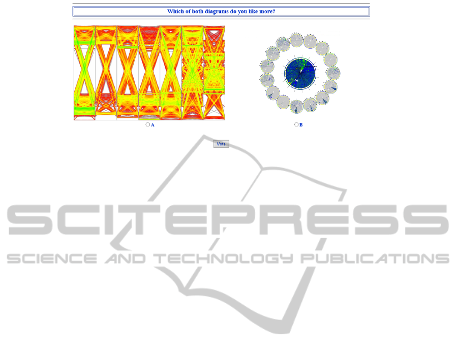
Figure 1: Our voting framework for recording diagram preferences: A dynamic graph visualization with applied edge
splatting by Burch et al. (2011b) received 41.7 percent of the votes (58th place) (Left). A dynamic graph visualized as
TimeRadarTrees by Burch and Diehl (2008) received 58.9 percent of the votes (9th place) (Right).
tree layouts cause twice as long completion times
and more complicated visual task solution strate-
gies as when traditional Cartesian tree layouts are
used. Consequently, it seems as if radial diagrams
are aesthetically appealing but from a readability
and space-efficiency point of view they are rather
questionable.
• Infographics typically use visual ornaments to
make the data depiction more aesthetically ap-
pealing. In traditional diagrams those ornaments
are regarded as chart junk which are not needed to
make data explorable. In many cases the viewer
has to inspect more visual elements in Infograph-
ics until he can derive insights. Infographics typ-
ically display statistical data and cannot handle
large data sets as information visualizations can
do.
• If a diagram is space-filling it can display a larger
amount of data into a single view, i.e. an overview
of a large amount of that data is visible as a start-
ing point for further explorations. But also non-
space-filling diagrams have their benefits. If we
think of hierarchy visualizations like treemaps or
node-link diagrams, the treemaps are more space-
filling but the hierarchical organization in node-
link diagrams becomes more apparent.
• Typical diagrams in SciVis have to deal with
continuous, three-dimensional, and time-varying
data. This makes the corresponding SciVis dia-
grams more complex to design and generate. Con-
sequently, more complex algorithms are used to
compute visualizations which can compete with
the vast amount of data. In contrast to that, in In-
foVis, diagrams are typically 2D representations
and visually encode discrete data by using simpler
algorithms.
5 AESTHETICS STUDY
The focus of this study is not on diagram readability
aesthetics but more on the fact if a diagram is aes-
thetically appealing in the sense of beauty. To find
this out we asked people in a web-based experiment
to vote for one of two given diagrams. The goal of
this crowdsourcing experiment was to get an impres-
sion about how the mass of people decides when it
comes to aesthetics judgments for diagrammatic rep-
resentations.
5.1 Diagram Collection and Stimuli
We collected 70 diagrams by using the image search
functionality of Google. We strategically looked for
diagrams of all categories, i.e. we integrated diagrams
which are static as well as animated, are 2D as well
as 3D, are radial as well as Cartesian and so on. It
may be noted that a diagram can contain several of
those visual features, i.e. a 3D pie chart is three-
dimensional, radial, static, and is frequently used in
information visualization but less frequently in scien-
tific visualization.
All images were of high resolution and were
scaled to fit to the horizontal and vertical display
space. The question ’Which of both diagrams do you
like more?’ is clearly visible above both diagrams all
the time, see Figure 1. We use animated gifs to vi-
sually depict animated diagrams in an endless replay
scenario. Each participant can vote for exactly one
of both diagrams by selecting either A or B and by
confirming this decision by a mouse click. After that
a new voting scenario was created, i.e. two different
diagrams were randomly selected and displayed in a
similar way.
TheAestheticsofDiagrams
265

5.2 Participants
Our study particpants were recruited by posting a link
to the experiment on an author’s web page. To take
part, a login and a password are required. We did not
record any additional information such as the partici-
pant’s professional level, age, or gender, because we
do not want to discourage people from taking part in
the experiment. After two weeks, 127 people have
taken part voluntarily in the experiment which voted
6,744 times in total. We also recorded the timestamp
of the voting and how long it took them from seeing
the diagrams and confirming the vote.
5.3 Study Design and Procedure
We ran the voting experiment for exactly two weeks.
The web-based experiment could be let run in each
standard browser by just logging in and using the cor-
responding URL. The voting web page was imple-
mented in PHP. Technical problems during the exper-
iment could be reported but fortunately, nobody re-
ported one.
The single task for the participants was to vote
for exactly one of two displayed diagrams. For this,
they had as much time as they wanted. The data was
recorded and stored in a text file which was later used
for evaluation of the study results.
5.4 Results
We counted how often a participant voted for a spe-
cific diagram and how often the diagram was involved
in a voting. This gives for each diagram a ratio of
positive votes and the number of total votes for that
diagram, giving a percentage value expressing the di-
agram aesthetics in the sense of beauty.
We base the ranking of all displayed diagrams in
our experiment on these percentages and computed
a decreasing order. Somewhat surprisingly, the 3D
pie charts (the only ones that we showed) were on
places one and two with 68.34 percent and 67.33 per-
cent, respectively. The diagram on the third place is
again a 3D diagram, but it is a very colorful three-
dimensional bar chart (Cartesian) representing quan-
tities in the plane (64.11 percent). This lets us assume
that colored and 3D diagrams tend to be more aesthet-
ically appealing to the viewer.
An also interesting phenomenon is the fact that
simple and well-known diagrams seem to be preferred
by the viewer, i.e. pie charts and bar charts as well as
weather maps with an animated hurricane on it (64.10
percent). A metro map (63.42 percent) also belongs
to the higher ranked diagrams.
Node-link tree diagrams, for example, of which
we showed eight, are only ranked lower than 53th
place and got an average percentage of only 38.59.
The lowest only got 32.95 percent. All the non-
colored diagrams are ranked very low which indicates
that colorful diagrams might be more attractive and
more beautiful.
What we also found interesting is the fact that
treemaps are ranked very low. A general treemap
only achieved 34.96 percent, which makes a 67th
place in the ranking. The cushion treemap is even
worse, getting only 29.37 percent at a 69th place. It
seems, as if there are two many rectangular shapes in
a space-filling representation, although the presented
treemaps are very colorful. Our assumptions might go
in the right direction if we inspect bubble treemaps,
being less space-efficient, but using circular shapes.
Those bubble maps are ranked on a 6th place with a
percentage of 62.91.
Infographics are not considered that nice, all of
them are ranked in the second half in the ranking.
Maybe the color coding is responsible for that.
In summary, we can say that 3D, colored, and ra-
dial diagrams perform better in the study. Also ani-
mated diagrams are typically not ranked very low but
those are also not the winners in this experiment.
5.5 Threats to Validity
It may be noted that this is an uncontrolled experi-
ment, i.e. we know the login data from the participant
but we do not know who is actually taking part in the
study and we also do not know how much attention
and importance the participant is given to this study.
Consequently, we must be careful with the recorded
results and just present the results as a very prelim-
inary step towards the direction of investigating dia-
gram aesthetics. Many more studies must follow, also
in a controlled user study setting, maybe also by using
eye tracking techniques.
What is also problematic in this study is the miss-
ing comparability of the diagrams. This means, we
randomly show diagrams which depict different kinds
of data. A scenario showing different diagrams for
the same dataset would be beneficial but then we can-
not compare, for example, diagrams for hierarchical
datasets with those for multivariate data. Moreover,
we only tested a limited number of diagrams. Since
there are various of them, it is nearly impossible to
test all of them. We tried to find a ’good’ candidate
for many of them and to show them as representative
diagram for this class of diagrams in the study.
The evaluation of differences between user
groups, i.e. male vs. female, young vs. old, expe-
IVAPP2015-InternationalConferenceonInformationVisualizationTheoryandApplications
266

rienced data analyst vs. layman etc. would also be
worth investigating. But in this study this is problem-
atic due to the uncontrolled web-based setting.
6 CONCLUSION AND FUTURE
WORK
In this paper we presented a discussion on the use
of diagrams in the field of information visualization,
in particular we described benefits and drawbacks by
categorizing them based on the visual features they
are based on. Apart from having a look at the useful-
ness for specific data analysis tasks we look more on
the aesthetics of the diagrams. To obtain better judg-
ments on such aesthetics and to strengthen or weaken
our subjective impressions of diagram types we con-
ducted a preliminary web-based user experiment. Par-
ticipants are confronted with two diagrams and have
to vote in favor of one diagram. The major result
of this uncontrolled comparative aesthetics study is
that our participants find 3D, radial, and colored dia-
grams more aesthetically appealing than for example
2D, Cartesian, and non-colored representations.
REFERENCES
Bar, M. and Neta, M. (2006). Humans prefer curved visual
objects. Psychological Science, 17(8):645–648.
Bateman, S., Mandryk, R. L., Gutwin, C., Genest, A., Mc-
Dine, D., and Brooks, C. A. (2010). Useful junk?:
the effects of visual embellishment on comprehension
and memorability of charts. In Proceedings of the 28th
International Conference on Human Factors in Com-
puting Systems, pages 2573–2582.
Beck, F., Burch, M., Diehl, S., and Weiskopf, D. (2014).
The state of the art in visualizing dynamic graphs. In
EuroVis State-of-the-Art Reports, EuroVis STAR.
Bennett, C., Ryall, J., Spalteholz, L., and Gooch, A. (2007).
The aesthetics of graph visualization. In Proceedings
of Eurographics Workshop on Computational Aesthet-
ics in Graphics, Visualization and Imaging, pages 57–
64.
Bertin, J. (2010). Semiology of Graphics - Diagrams, Net-
works, Maps. ESRI.
Burch, M., Andrienko, G. L., Andrienko, N. V., H
¨
oferlin,
M., Raschke, M., and Weiskopf, D. (2013). Visual
task solution strategies in tree diagrams. In Proceed-
ings of IEEE Pacific Visualization Symposium, pages
169–176.
Burch, M. and Diehl, S. (2008). TimeRadarTrees: Visualiz-
ing dynamic compound digraphs. Computer Graphics
Forum, 27(3):823–830.
Burch, M., Konevtsova, N., Heinrich, J., H
¨
oferlin, M., and
Weiskopf, D. (2011a). Evaluation of traditional, or-
thogonal, and radial tree diagrams by an eye tracking
study. IEEE Transactions on Visualization and Com-
puter Graphics, 17(12):2440–2448.
Burch, M., Vehlow, C., Beck, F., Diehl, S., and Weiskopf,
D. (2011b). Parallel edge splatting for scalable dy-
namic graph visualization. IEEE Transactions on
Visualization and Computer Graphics, 17(12):2344–
2353.
Draper, G. M., Livnat, Y., and Riesenfeld, R. F. (2009).
A survey of radial methods for information visualiza-
tion. IEEE Transactions on Visualization and Com-
puter Graphics, 15(5):759–776.
Harel, D. (1997). On the aesthetics of diagrams. In Proceed-
ings of the Symposium on Visual Languages, pages
128–130.
Heinrich, J., Burch, M., and O’Donoghue, S. (2014). On
the use of 1D, 2D, and 3D visualization for molecular
graphics. In Proceedings of 3D Visualization Work-
shop@IEEE VIS.
Huang, W. (2007). Using eye tracking to investigate graph
layout effects. In APVIS 2007, 6th International Asia-
Pacific Symposium on Visualization, pages 97–100.
Kleiberg, E., Wetering, H. V. D., and Wijk, J. J. V. (2001).
Botanical visualization of huge hierarchies. In Pro-
ceedings of the IEEE Symposium on Information Vi-
sualization, pages 87–94. Society Press.
Purchase, H. C. (2014). Twelve years of diagrams re-
search. Journal on Visual Languages and Computing,
25(2):57–75.
Rojas, R. (1998). How to make Zuse’s Z3 a universal
computer. IEEE Annals of the History of Computing,
20(3):51–54.
Rosenholtz, R., Li, Y., Mansfield, J., and Jin, Z. (2005).
Feature congestion: a measure of display clutter.
In Proceedings of Conference on Human Factors in
Computing Systems, pages 761–770.
Tufte, E. R. (1983). The Visual Display of Quantitative In-
formation. Graphics Press, Cheshire, CT.
Tufte, E. R. (1990). Envisioning Information. Graphics
Press, Cheshire, CT.
Tversky, B., Morrison, J. B., and B
´
etrancourt, M. (2002).
Animation: can it facilitate? International Journal on
Human-Computer Studies, 57(4):247–262.
van Wijk, J. J. (2005). The value of visualization. In Pro-
ceedings of 16th IEEE Visualization Conference (VIS
2005), pages 11–18.
Ware, C. (2000). Information Visualization: Perception for
Design. Academic Press, San Diego, CA, USA.
Ware, C., Purchase, H. C., Colpoys, L., and McGill, M.
(2002). Cognitive measurements of graph aesthetics.
Information Visualization, 1(2):103–110.
Wettel, R. and Lanza, M. (2007). Visualizing software sys-
tems as cities. In Proceedings of the 4th IEEE Inter-
national Workshop on Visualizing Software for Under-
standing and Analysis, pages 92–99.
Zangwill, N. (2008). Aesthetic Judgment. Stanford Ency-
clopedia of Philosophy.
TheAestheticsofDiagrams
267
