
The Stor-e-Motion Visualization
for Topic Evolution Tracking in Text Data Streams
Andreas Weiler, Michael Grossniklaus and Marc H. Scholl
Department of Computer and Information Science, University of Konstanz
P.O. Box 188, 78457 Konstanz, Germany
Keywords:
Story Visualization, Text Data Streams, Twitter.
Abstract:
Nowadays, there are plenty of sources generating massive amounts of text data streams in a continuous way.
For example, the increasing popularity and the active use of social networks result in voluminous and fast-
flowing text data streams containing a large amount of user-generated data about almost any topic around the
world. However, the observation and tracking of the ongoing evolution of topics in these unevenly distributed
text data streams is a challenging task for analysts, news reporters, or other users. This paper presents “Stor-
e-Motion” a shape-based visualization to track the ongoing evolution of topics’ frequency (i.e., importance),
sentiment (i.e., emotion), and context (i.e., story) in user-defined topic channels over continuous flowing text
data streams. The visualization supports the user in keeping the overview over vast amounts of streaming
data and guides the perception of the user to unexpected and interesting points or periods in the text data
stream. In this work, we mainly focus on the visualization of text streams from the social microblogging
service Twitter, for which we present a series of case studies (e.g., the observation of cities, movies, or natural
disasters) applied on real-world data streams collected from the public timeline. However, to further evaluate
our visualization, we also present a baseline case study applied on the text stream of a fantasy book series.
1 INTRODUCTION
In recent years, there has been a continuous increase
of social media services on the web. Unprecedented
success and active usage of these services result in
massive amounts of user-generated data. The amount
of information in the generated data increases as well.
For example, a large proportion of user-generated
content is automatically enriched by the geographical
location of the user’s device. As social media services
changed the way we use the Internet and play an in-
creasing role in our daily life, it was only a question
of time until social media became a source for infor-
mation gathering. Unfortunately, the vast amount and
the high variability in the quality of user-generated
data is obstructive to analysis tasks. But, at the same
time, user-generated data enables us to extract inter-
esting insights into a variety of different topics.
A popular example is the microblogging service
Twitter. Initially introduced in 2006 as a simple plat-
form for exchanging short messages (“tweets”) on the
Internet, Twitter rapidly gained worldwide popularity
and has evolved into an extremely influential channel
for broadcasting news and the means of real-time in-
formation exchange. Apart from its attractiveness as a
means of communication—with over 140 million ac-
tive users as of 2012 generating over 340 millions of
tweets daily—Twitter has revolutionized the ways of
exchanging information on the Internet and opened
new ways for knowledge acquisition from social in-
teraction streamed in real-time.
Due to the diversity of the provided information,
Twitter even plays an increasingly important role as
a source for news agencies. In fact, news agencies
use Twitter for two important functionalities in their
daily work. On the one hand, agencies use Twitter
as a publication and distribution platform for current
news articles with a high throughput rate. For exam-
ple, any reproduction of a tweet (“retweet”) reaches
an average of about 1,000 users (Kwak et al., 2010).
On the other hand, news agencies, such as BBC, are
constantly increasing the usage of Twitter as a refer-
ence in their daily news reports (Tonkin et al., 2012).
A further characteristic of Twitter is its vibrant user
community with a wide range of different personali-
ties from all over the world. The whole spectrum of
use cases can be subdivided into a few categories of
Twitter usage patterns, such as daily chatter, informa-
tion and URL sharing, or news reporting (Java et al.,
2007). Further research undertaken has discovered
29
Weiler A., Grossniklaus M. and Scholl M..
The Stor-e-Motion Visualization for Topic Evolution Tracking in Text Data Streams.
DOI: 10.5220/0005292900290039
In Proceedings of the 6th International Conference on Information Visualization Theory and Applications (IVAPP-2015), pages 29-39
ISBN: 978-989-758-088-8
Copyright
c
2015 SCITEPRESS (Science and Technology Publications, Lda.)

that the majority of users publish messages focus-
ing on their personal concerns and matters, whereas
a smaller set of users publish for information sharing
(Naaman et al., 2010).
In this paper, we present an application for visu-
ally tracing and monitoring the importance, emotion,
and story of user-defined topic channels in the contin-
uous data stream of Twitter. Our work presents a com-
pact visualization for time series event data, which
supports users in identifying interesting data points in
the large volume of tweets. Additionally, it is possi-
ble to overview whole sets of topics and to compare
the evolution of different topics with each other over
time. Furthermore, the application automatically dis-
plays the most influencing episode terms in a tag list
over time. The observation of the evolution of im-
portance, emotion, and story of topics is a task that
needs to be done in various fields of analytics. For
example, an analyst who wants to keep track of nat-
ural disasters appearing in the Twitter stream or any
other news stream needs an appropriate application,
which displays a compact overview of all appearances
of the topic in the data. In the case studies section, we
mainly focus on the visualization of text data streams
of the social microblogging service Twitter. However,
to further evaluate our visualization, we also present a
case study applied on the text data stream of the fan-
tasy book series “Harry Potter”.
The remainder of this paper is structured as fol-
lows. We begin in Section 2 with a presentation of the
state of the art and the background in which our work
is situated. We then present the system design, in-
cluding the implementation of the processing pipeline
with Niagarino, and the design goals of the visualiza-
tion in Section 3. In Section 4, we discuss a series
of case studies that give qualitative evidence as to the
validity of our approach. Finally, concluding remarks
are given in Section 5.
2 BACKGROUND
A lot of research is being done on the analysis and
knowledge discovery from social media data. As
a good overview, Bontcheva et al. (Bontcheva and
Rout, 2012) present a survey of sense making of
social media data, which lists state-of-the-art ap-
proaches for mining semantics from social media
streams. Because of the fast propagation speed of
information in social media networks, a high num-
ber of research works focus on event or topic detec-
tion and tracking for various domains. For example,
Sakaki et al. (Sakaki et al., 2010) presented a sys-
tem for earthquake detection and Weng et al. (Weng
et al., 2011) a system to detect events during elec-
tions in the Twitter data stream. In addition to do-
main specific systems, open domain event detection
systems, like “TwitInfo” (Marcus et al., 2011), “en-
Bloque” (Alvanaki et al., 2012), and “TwiCal” (Ritter
et al., 2012) tackle the challenge to detect events of
all different kinds and present the results with various
visualizations.
Further research is undertaken in the area of epi-
demics tracking (Culotta, 2010), situational aware-
ness (MacEachren et al., 2011), and disaster man-
agement (Lee et al., 2012). However, none of these
systems combine the dimensions importance, emo-
tions, and story to visually guide the perception of the
user to unexpected and interesting points or periods
in time. Nevertheless, there are a number of works
that emerged in the area of visual analytics for Twitter
streams. For example, “SensePlace2” (MacEachren
et al., 2011), supports overview and detail maps of
tweets, place-time-attribute filtering of tweets, and
analysis of changing issues and perspectives over time
and across space as reflected in tweets. However, in
contrast to our work, they use a crawler to systemati-
cally query the Twitter API for tweets containing any
topics deemed to be of interest, instead of using the
data stream directly.
“ScatterBlogs2” (Bosch et al., 2013) is another
approach that lets analysts build task-tailored mes-
sage filters in an interactive and visual manner based
on recorded messages of well-understood previous
events. In contrast to our work, it is possible to re-
define filters and also to create more powerful filters.
However, they do not provide an overview visualiza-
tion to follow the evolution of topics over time and
also do not include any information about emotions.
Another work is presented by (Dork et al., 2010),
which they called a visual backchannel for large scale
events. They present a novel way of following and ex-
ploring online conversations about large-scale events
using interactive visualizations in a timeline fashion.
Furthermore a series of research was done in the
area of news messages visualization. Havre et al. de-
scribed “ThemeRiver” (Havre et al., 2002), an ap-
proach, which uses a stacked graph to help users to
identify time-related patterns, trends, and relation-
ships across a large collection of documents. Most
similar to our approach is the work proposed by
Krstaji
´
c et al. (Krstaji
´
c et al., 2011), which presents a
technique called “CloudLines” showing both the cur-
rent and the historic amount of news for pre-defined
topics and try to capture the problem of high density
and over-plotting via an importance function. An-
other application in the area of news streams can be
found in (Wanner et al., 2009). Further work is done
IVAPP2015-InternationalConferenceonInformationVisualizationTheoryandApplications
30

with location reports (Overby et al., 2009) and fo-
rum posts (Wanner et al., 2011). In contrast to our
proposed idea, which uses a fast, uneven, and noisy
stream of short messages, almost all of the systems
mentioned above are applied to well-structured text
and lack the flexibility to add new topics on-the-fly
and monitor topics from a continuous stream of data.
3 SYSTEM DESIGN
The main contribution of our approach is a visualiza-
tion for tracking the evolution of self-defined topics
by analysts, information seekers, or default users in
the massive stream of Twitter data. The high volume
and propagation rate of tweets makes it difficult for
users to follow the evolution of topics inside the con-
tinuous data flow. Furthermore, it is a big challenge
to discriminate between normal behavior of the topic
evolution or unusual and abnormal behavior, which
usually is an indicator for an interesting event in the
context of a topic. Therefore, the visualization is tai-
lored to support the characteristic of fast distribution
and spreading of information of social media services.
However, it can also be applied to other types of tex-
tual data like a book series (see Section 4.2).
In the following, we introduce the design of the
Stor-e-Motion visualization and motivate the three
major design goals of visualizing the evolution of the
Importance, Emotion, and Story around a topic. Fur-
thermore, we describe the different options for defin-
ing Topic Channels to follow individual defined topics
in the data stream.
3.1 Processing Pipeline
In order to support the exchange and extension of
components in the processing pipeline, we use Nia-
garino
1
, a data stream management system that is de-
veloped and maintained by our research group. The
main purpose of Niagarino is to serve as an easy-to-
use and extensible research platform for streaming ap-
plications such as the one presented in this paper. The
concepts embodied by Niagarino can be traced back
to a series of pioneering data stream management
systems, such as Aurora (Abadi et al., 2003), Bore-
alis (Abadi et al., 2005), and STREAM/CQL (Arasu
et al., 2006). In particular, Niagarino is an offshoot of
NiagaraST (Li et al., 2008), with which is shares the
most common ground. In this section, we briefly sum-
marize the parts of Niagarino that are relevant for this
1
http://www.informatik.uni-konstanz.de/grossniklaus/
software/niagarino/
paper. Niagarino is implemented in Java 8 and relies
heavily on its new language features. In particular,
anonymous functions (λ-expressions) are used in sev-
eral operators in order to support lightweight exten-
sibility with user-defined functionality. The current
implementation runs every operator in its own thread.
Operator threads are scheduled implicitly using fixed-
size input/output buffers and explicitly through back-
wards messages.
In Niagarino, a query is represented as a directed
acyclic graph Q = (O, S), where O is the set of opera-
tors used in the query and S is the set of streams used
to connect the operators. The query plan of a sin-
gle topic channel in the Stor-e-Motion visualization is
shown in Figure 1. Each query plan emits the results
to the visualization node, which continuously updates
and visualizes the results. Niagarino implements a se-
ries of operators. The selection (σ) and projection (π)
operator work exactly the same as their counterparts
in relational databases. In our case, we use them to
select tuples corresponding to the topic channel def-
inition. For the selection operator, we use different
predicates (keyword selection and geographical based
selection) to express the channel definition.
As shown in Figure 1 these predicates can be com-
bined with “or” and “and” by using a logical pred-
icate operator. Other tuple-based operators include
the derive ( f ) and the unnest (µ) operator. The de-
rive operator applies a function to a single tuple and
appends the result value to the tuple. In our case, we
use the derivation functions to add the terms included
in the content attribute of tuple and the sentiment of
the content attribute of the tuple to the tuple. The
unnest operator splits a “nested” attribute value and
emits a tuple for each new value. A typical use case
for the unnest operator is to split a string and to pro-
duce a tuple for each term it contains. Apart from
these general operators, Niagarino provides a num-
ber of stream-specific operators that can be used to
segment the unbounded stream for processing. Apart
from the well-known time and tuple-based window
operators (ω) that can be tumbling or sliding (Li et al.,
2005), Niagarino also implements data-driven win-
dows, so-called frames (Maier et al., 2012). For the
Twitter case study (see Section 4.1), we use time-
based and for the Harry Potter case study (see Section
4.2) chapter-based tumbling windows.
Stream segments form the input for join () and
aggregation (Σ) operators. As with derive opera-
tors, Niagarino also supports user-defined aggregation
functions. Niagarino operators can be partitioned into
three groups. The operators described above are gen-
eral operators, whereas source operators read input
streams and sink operators output results. Each query
TheStor-e-MotionVisualizationforTopicEvolutionTrackinginTextDataStreams
31

Figure 1: Query plan of a single topic channel.
can have multiple source and sink operators. Source
and sink operators used in the processing pipeline are
shown as rectangle in Figure 1.
3.2 Visualization
To visualize the evolution of topics over time and to
retain the original sequence of the text stream, we use
a shape based visualization in which all three major
design goals are incorporated. The visualization is
tailored to point the user to important and interesting
patterns in the streaming data and also to support the
user in serendipitous findings in the topics. The major
design goals are described in the following.
• Real-time visualization of the topic’s evolution of
frequency and emotion
• Presentation of the topic’s story in a compact but
significant way
• Detail view of the story’s content
Figure 2 shows the shape, which consists of a
rounded rectangle, which reflects the frequency and
the percentages of the sentiment values of the time
window. These shapes are continuously added to the
next position at the right side in the panel and there-
fore form different patterns by visual aggregation in
the ongoing time series of the topic.
The examples in Figure 2 show a time series
with unchanged frequency but with increasing posi-
tive sentiment (a), decreasing negative sentiment (b),
Figure 2: Left: Shape for a single data window with 40%
positive and 40% negative sentiment; Right: Examples for
(a) increasing % positive, (b) decreasing % negative, (c) de-
creasing % positive and increasing % negative sentiment.
and decreasing positive and increasing negative senti-
ment (c).
Importance
The visualization of the ongoing topic evolution needs
to reflect the continuous and dynamic change of the
importance of a topic over time. Therefore, the impor-
tance of the topic in the time window is visualized by
using the size of the shape. Since the length of a time
window is pre-defined and static, we use this value as
the width of the rectangle. For the height of the rect-
angle, we calculate for each shape a value against a
pre-defined static max height. To calculate this value,
we use the values n (total number of tuples inside
the window) and m (total number of tuples inside the
topic channel and window) and calculate the Inverse
Document Frequency (Sparck Jones, 1988) for both
values. Then we use the two frequency values in the
following formula to get the height value.
height =
log
n
1
− log
n
m
∗
max height
log
n
1
!
Emotion
The emotion of a topic is visualized by using the col-
oring of the shapes. The filling color of the shape
signifies the average sentiment (red = negative, green
= positive, yellow = neutral (see Figure 2) of the text
in the data window. The value of the sentiment for a
text segment is calculated by using an external library
et al. (Thelwall et al., 2010). The library analyzes
the text of the message and returns values for the sen-
timent between -4 to -1 (extremely negative to neg-
ative), 0 (neutral), and 1 to 4 (positive to extremely
positive). To reflect the different levels of the senti-
ment, we calculate a stepwise (0.1 steps) color value
corresponding to the average value of all positive as
well as all negative values. The darker the color the
IVAPP2015-InternationalConferenceonInformationVisualizationTheoryandApplications
32

higher is the average value. The color mapping can
be seen at the left side of each topic channel.
To visualize the ratio of positive and negative sen-
timent in the data windows, we use a linear gradient
with the colors according to the color map and the per-
centage of positive or negative text segments in the
overall text in the window. For example, Figure 2
shows a shape for a single window, which has 40%
of extremely negative and 40% of extremely positive
sentiment.
Story
Since the story around a topic also evolves over time,
it is a challenging task to keep an overview of ongo-
ing context changes in the topic channels. Therefore,
we visualize the story by using a tag list for a pre-
defined number of data windows in a continuous way.
We call this collection of windows an episode and the
included content episode terms.
The tag list is created by tokenizing the contents
of the text segments and removing terms which are
included in a standard English stopword list or are
classified as noise terms (terms that are too short or
too long, terms with a repetition of the same charac-
ter, or terms without a vowel). Furthermore, we filter
out terms that are included in the topic channel defi-
nition, because these terms would always be very fre-
quent in the resulting term set. To reflect the ongoing
evolution of terms around a topic, we use two rules
to increase the importance of newly occurring or in
their frequency increasing terms. The newly occur-
ring terms are multiplied with the average frequency
value of all terms from the previous window and the
already seen terms (in previous windows) are multi-
plied by their increasing factor. By taking the top five
terms of our computation to be shown for the corre-
sponding time window, we ensure that only terms are
displayed that have a certain influence to the story of
the topic.
The resulting episode terms are added to the space
of the corresponding episode. Since single terms,
even if they are in a group of episode terms, are some-
times not self-explanatory and it is therefore very
helpful to obtain additional context information of
single terms, we added an overview of the respective
texts for selected terms. For example, in the city ob-
servation case study (see Section 4.1) of Boston, we
are able to get an insight into the first on-site reports
about the explosion (including a hyperlink to the very
first image about the event). Additionally, each single
text in the overview is colored with it corresponding
sentiment color. This approach supports the user in
getting a better insight, into how much each text con-
tent has contributed to the overall sentiment value.
3.3 Topic Channels
A topic can be defined in several ways. In text
streams, in which the only source is the text, the topic
definition mostly consists of one or several keywords.
However, by using social media data, which contain
a large amount of additional meta-data, topics can be
defined in a great variety. For example, a topic chan-
nel could be defined by the rules to follow specific
Twitter users in terms of their geographic location or
timezone. However, since we are interested in the
evolution of important and specific topics, we focus
on the textual and the geographical dimension of the
data stream. The three possible topic channel defini-
tions are described in the following.
Keywords. Hereby, we can create a topic channel,
which follows a topic about one or several key-
words. There exist two alternatives for this chan-
nel definition. First, the text segment needs to
contain all of the defined keywords (“and” clause)
or second it needs to contain at least one (“or”
clause) of the keywords.
Geographic. We can also create a topic channel,
which follows topics in one or several geograph-
ical areas. For example, it is possible to define a
geographical location as the center and radius of
the surrounding area to observe the importance,
emotions, and story inside a certain city or coun-
try. Note, that in this case only the “or” clause is
reasonable.
Mixed. To observe topics in a certain geographically
area more precisely, it is also possible to combine
the textual and the geographical filtering. For ex-
ample, if a user is interested in an earthquake in a
certain country and not all over the world, it is for
example possible to query for the keyword “earth-
quake” and a country definition of Indonesia.
Since the ongoing evolution of the topic’s story,
which eventually deals with important subtopics and
surfaces serendipitous findings, can trigger the inter-
est in new topics, it is always possible to add new
topic channels with a totally new definition or ex-
tend/restrict topic definitions of existing topics. By
using the Niagarino framework we can easily change
or substitute the definitions of channels and also com-
bine different types of channel definitions by using a
logical predicate operator.
4 CASE STUDIES
In this section, we present case studies for two differ-
ent data sets. In the first three case studies, we use the
TheStor-e-MotionVisualizationforTopicEvolutionTrackinginTextDataStreams
33

public live text data stream of Twitter. The fourth and
final case study uses the entire text of all volumes of
the fantasy book series “Harry Potter” as a text data
stream.
4.1 Twitter Stream
The Twitter platform provides direct access to the
public live stream of Twitter. By using the Twit-
ter Streaming API
2
with the so-called “Gardenhose”
access level, we receive a randomly sampled 10%
stream of the public live stream. An exemplary evalu-
ation of a representative sample of days shows that the
10% stream contains an average of over 1.5 million
tweets per hour with an average of 25,000 tweets per
minute. We can also conclude that there is an increas-
ing availability of tweets with geographic informa-
tion with currently about 2,000 to 4,000 of incoming
tweets per minute. The geographic information either
consists of the latitude and longitude value, which is
automatically set by the used mobile device or a loca-
tion manually added to the tweet by the author of the
message. The live creation of a single topic channel
for a 24 hour period of data takes about 15 minutes
(3,2 GHz Intel Core i3 processor and 8 GB of main
memory) to process all tuples. The parallel creation
of the four topic channels of the first case study took
about 23 minutes. Therefore, we can conclude that,
while it is still possible to follow the live stream of
tweets, adding further topic channels slows down the
processing.
For the following case studies, we collected the
tweets as they are streamed out by the API for the
specific dates in the central Europe time zone (CET).
Because the sentiment derivation function only works
for English texts, we pre-filtered the data sets for
tweets whose content is in English by using a lan-
guage detection library
3
. After the pre-processing, we
get a tuple stream {T
1
, ..., T
n
} in which each tuple has
the attributes {a
id
, a
creationdate
, a
content
, a
coords
}. Note
that the coordinates attribute (a
coords
) is only set if the
tweet contains geographic information. The visual-
izations are created in the following manner. For each
tuple flowing through our processing pipeline the
topic definitions are checked and terms as well as the
sentiment value is derived from the a
content
attribute.
After this pre-processing each tuple has the attributes
{a
id
, a
creationdate
, a
content
, a
coords
, a
terms
, a
sentiment
}.
The w
size
value of the tumbling window operator is
set to one minute and therefore a shape reflects the
aggregated values of one minute consisting of the
importance and emotion for the topics. The width
2
https://dev.twitter.com/streaming/overview
3
http://code.google.com/p/language-detection/
of the shape is set to two pixels and the max height
to 120 pixels. For each episode of 60 minutes a
tag list with the most influencing episode terms is
displayed. By selecting an episode term, the content
and sentiment of all tweets that belong to this term
and episode are shown in the detail view (see Figure 4
for example).
City Observation
The first case study describes the observation of the
city Boston on the day April 15
th
, 2013. The data
set for that day contains a total of 20,046,861 tuples,
which is an average of about 830,000 tuples per hour
and about 14,000 tuples per minute. Figure 3 shows
the visualization of four topics for the whole day. The
first topic channel Boston (Geo) is defined by using
the city center of Boston and the surrounding area
of 25 miles. The second topic channel Boston is de-
fined by using the name of the city as keyword. These
are the two starting topic channels a news reporter is
likely to choose in order to follow the events around a
specific city. These definitions make it possible to get
an overview of the tweets using the name of the city
Boston as well as the tweets that are sent from within
the city (and probably report on-site reports), but that
do not include the name of the city in the content of
the message.
By observing the ongoing evolution of the topic
channel Boston (Geo) and Boston, we can see that
the frequency decreases after a couple of hours. By
that time it was night in Boston and people send-
ing tweets from Boston or about Boston are less ac-
tive. The story after these low frequency episodes in
both channels mostly consists of episode terms re-
lated to a sports event (e.g., “running”, “team”, and
“marathon”). Attracted by the term “marathon”, we
are also interested in following this topic. Therefore
we choose to follow this term (see the blue rectan-
gle in Figure 3 inside the Boston (Geo) topic channel)
and a new topic channel with the title Marathon ap-
pears. In this topic channel, we can now see more de-
tails about the marathon event. In the Marathon topic
channel, we can identify the episode term “desisa”
and “ethiopia”. Also in the Boston (Geo) the episode
term “jeptoo” is mentioned. By getting more in-
sights into these terms by using the detail view of the
tweets, we can derive that these are the winners of the
marathon. The most interesting pattern appears a few
hours after these first runners finished the marathon.
The negative emotion of all three topic channels in-
creases and drifts into the extremely negative. Also,
the overall importance of all three topic channels in-
creases significantly and therefore reflects the hap-
pening of an interesting event. In the Marathon topic
IVAPP2015-InternationalConferenceonInformationVisualizationTheoryandApplications
34
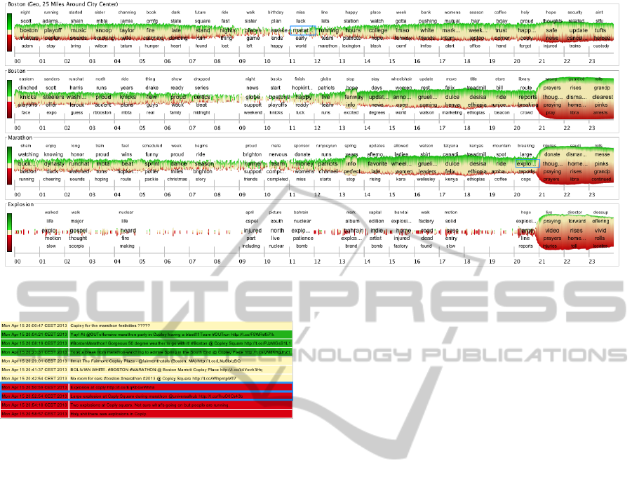
Figure 3: Visualization of the topic channels (Twitter stream from April 15
th
2013) of Boston (Geo), Boston, Marathon, and
Explosion from top to bottom. Blue rectangles are the activators to start the corresponding topic channels.
Figure 4: Detail view of the episode term “coply” from the
topic channel Boston (Geo) in the episode 21.
channel, we are now attracted by the term “explosion”
and again add a new topic channel for this term. We
can derive that, at this point in time, an explosion took
place at the finishing line (episode term “line” appears
in the tag list) of the marathon course.
Shortly afterwards the terms “prayers”, “cops”,
and “injured” appear in the tag list of the different
channels. These terms reflect the current situation in
the ongoing topic. By having a look at the episode
terms of the Boston (Geo) we can see that the term
“coply” (Copley square is a public place in the city of
Boston) appears in the episode before the event. The
detail view of this term (see Figure 4) shows the first
two on-site reports, which are written very shortly af-
ter the event, about the event (with hyperlinks to the
first on-site pictures). It also indicates that the earlier
tweets about “coply” are positive or neutral and the
latter are changed to negative. We can derive that our
series of topic channels effectively reflects the parallel
evolution of the ongoing events in the city Boston.
Election Observation
The second case study describes the observation of
the papal election on the day March 13
th
, 2013. The
dataset for that day contains a total of 19,470,337 tu-
ples, which is an average of about 810,000 tuples per
hour and about 13,500 tuples per minute. Figure 5
shows the visualization of two topics for the whole
day. The source topic channel Pope is defined by the
rule that a tweet needs to contain at least one of the
keywords “pope” or “pontifex”.
By observing the ongoing evolution of the topic
channel Pope, we can clearly see that the frequency
stays almost constant until the point of time when
the term “whitesmoke” (term is used as hashtag by
the Twitter community to signal that the papal elec-
tion is finished and a new pope is announced to the
world) appears in the tag list in Episode 19 and the
frequency increases significantly. The co-occurring
episode terms “habemus” and “papam” (latin phrase
for a successful pope election) imply the same.
In the next episode, the tag list of the topic chan-
nel shows the term “argentina” and therefore we are
also interested in the topic evolution of this topic. We
can recognize in the topic channel Argentina that the
election meets the people in Argentina with a posi-
tive response. Furthermore, we can see that the burst
of tweets about the election event takes place in Ar-
gentina almost one hour later than the event is re-
ported in the source topic channel. Also two more
indicators for that event like “pope” and “elected” ap-
pear in Episode 20 in the Argentina topic channel.
Movie Premiere Observation
The third use case describes the observation of a
movie premiere on the day July 20
th
, 2012. The
dataset for that day contains a total of 12,760,600
tuples, which is an average of about 530,000 tuples
per hour and about 9,000 tuples per minute. Figure 6
TheStor-e-MotionVisualizationforTopicEvolutionTrackinginTextDataStreams
35
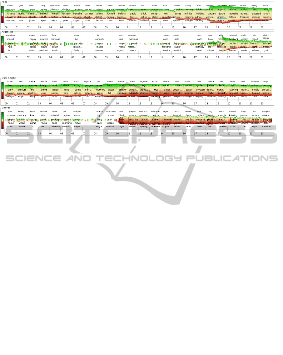
Figure 5: Visualization of the topic channels (Twitter stream from March 13
th
2013) Pope and Argentina.
Figure 6: Visualization of the topic channels (Twitter stream from July 20
th
2012) Dark Knight and Denver.
shows the visualization of three topics for the whole
day. The source topic channel Dark Knight is defined
by using the keywords “dark knight” and “batman”
The evolution of the topic channel Dark Knight re-
flects the ongoing movie premiere of the movie “The
Dark Knight Rises”, which premiered on that day. We
can identify that there is a slight increase (in Episode
10) in the frequency within the time frame when the
premiere starts in the cinema. The emotion per minute
in the time frame at the beginning tends to be more
positive than negative because of the anticipation of
the movie. However, after a short period of time
(starting with Episode 11) the sentiment drifts to the
negative and the episode term “denver” appears in the
tag list. This triggers us to start the new topic channel
Denver. The unexpected increase in negative senti-
ment is a clear sign that something unexpected hap-
pened.
In the Denver channel episode terms like “killed”,
“victims”, and “security” appear in the Episodes 11
and 12. An interesting observation is that the fre-
quency and the negative sentiment increases signif-
icantly for the Denver topic channel, while for the
Dark Knight topic channel only the negative senti-
ment increases. Also we note the term “james” that
appears in Episode 15 of the first topic channel, which
we are able to determine (by inspecting the detail
view of the tweets) as the name of the suspect.
4.2 Text Stream
Another promising application for a streaming text
visualization are single books or complete book se-
ries. Therefore, we use this kind of data to further
evaluate our visualization and perform a final case
study, which uses the complete text of the fantasy
book series of “Harry Potter” as text data stream.
We pre-processed the complete book series and ex-
tracted a total of 195 book chapters with a total of
33,939 sentences that contain more than ten charac-
ters. After the pre-processing step we get a tuple
stream {T
1
, ..., T
n
} in which each tuple has the at-
tributes {a
chapter
, a
book
, a
content
}. For each tuple, the
topic definitions are checked and the terms as well as
the sentiment value is derived. The derivation pro-
cesses add the new attributes a
terms
and a
senti
to each
tuple. The w
size
value of the tumbling window op-
erator is set to one in order that a shape reflects the
aggregated sentiment values of one chapter, consist-
ing of the importance and emotion for the topics. For
each episode of five chapters a tag list with the most
influencing episode terms is displayed. By selecting
an episode term, all sentences that belong to that term
and episode are shown and are colored in the corre-
sponding sentiment value. The creation of the entire
visualization takes about 30 seconds. Figure 7 shows
the visualization for all topic channels that we used in
our exploration. Note, that for this case study there
is more horizontal space available per data window
and therefore we set the width of a shape to 12 pixel
(max height is still 120 pixels).
The first topic channel shows the overall evolution
of the importance, emotion, and story of the book se-
ries. Since the height of the shape is normalized to
the total amount of sentences in the chapter, there is
no change in the shapes height for this channel. How-
IVAPP2015-InternationalConferenceonInformationVisualizationTheoryandApplications
36
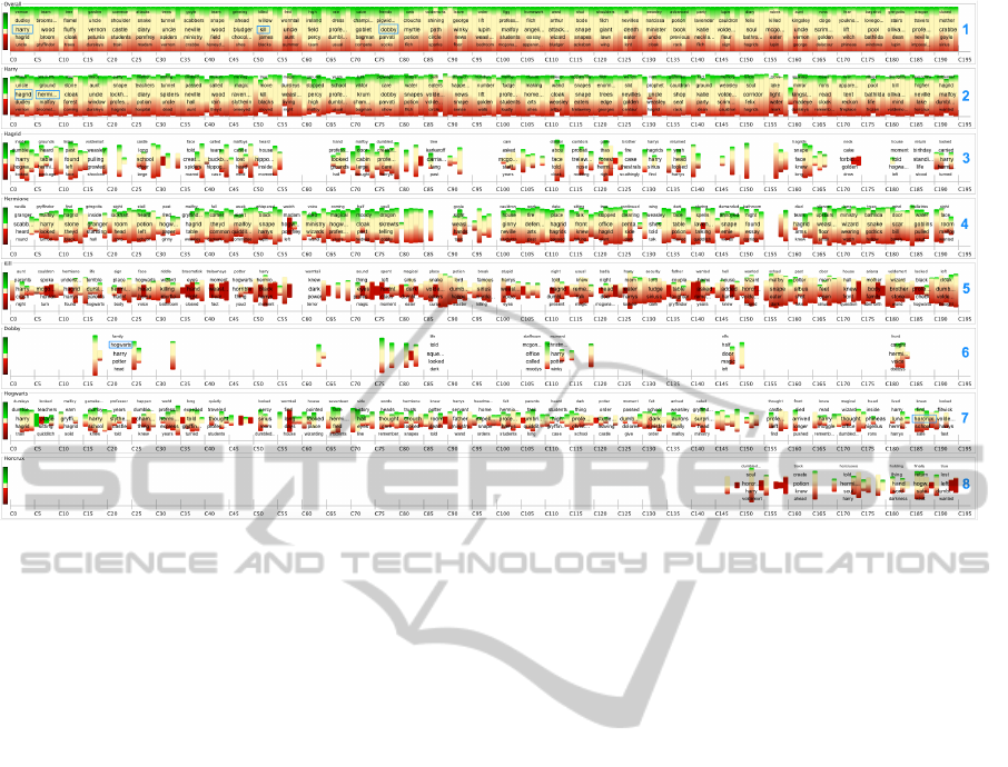
Figure 7: Visualization of the text data stream from the complete fantasy book series Harry Potter. It shows the overall
evolution of the story without any defined topic (first line) and the evolution in the topic channels of Harry, Hagrid, Hermione,
Kill, Dobby, Hogwarts, and Horcrux from top to bottom. Blue rectangles are the activators to start the topic channels.
ever, the overall channel supports users in reviewing
the full evolution of emotion and story as well as in
finding potential terms, which we might be interested
in following and exploring in further topic channels.
By tracking the episode terms of the overall chan-
nel, we see that the term “harry” is influential in
the first episode and add this term as a second topic
channel to the visualization. In this channel, we di-
rectly recognize two additional terms in the first two
episodes. First, the term “hagrid” and second the term
“hermione” are used to build new topic channels. The
topic channels Hermione and Harry clearly reflect the
interplay between these characters in the story. By
further tracking the episode terms of the Overall chan-
nel, we can identify the term “kill” in the Episode 11.
In order to explore the term “kill”, we have a look
at the corresponding sentences and can recognize that
the “death” of characters is an always important topic
in the story. Therefore, we add another topic channel,
which we call Kill and that is filtered by the keywords
“kill, death, died, killed, or dead”. Since these are all
terms which are related to negative things the topic
channel for this topic is mainly colored in red. How-
ever, we can still recognize the uneven appearance of
the topic in the ongoing book series and detect some
extremely negative patterns. The next topic channel
(Dobby) is also added as a consequence of the occur-
rence of this term in the Overall channel.
By following the Dobby channel, we see the
episode term “hogwarts” as one of the influencing
terms in the story of this channel. As we assume
this to be an interesting term, we also track this term
within a new topic channel. In this channel, we
can see the episode term “horcrux” in the second-last
episode, which also seems to be important and there-
fore we add this term as the last topic channel to the
visualization. This leads to the observation that there
are very unevenly distributed topics in the full story.
The topic channel eight directly reveals that Horcrux
(magical objects) have only been introduced in the
last books of the fantasy series. Also, we can derive
that the character dobby only occurs occasionally and
leaves the story with a shape in negative color. By
looking at the corresponding sentences, we can derive
that these shapes signify the death of the character.
5 CONCLUSION
In this paper, we presented “Stor-e-Motion”, a shape-
based visualization to track the ongoing evolution of
topics’ frequency (i.e., importance), sentiment (i.e.,
emotion), and context (i.e., story) in user-defined
topic channels over continuously flowing text data
streams. Our case studies show that the visualization
supports users in keeping the overview in following
and tracking topics over time and also guides them
to interesting points or periods in time. Furthermore
the visualization contributes to a common, timely, and
TheStor-e-MotionVisualizationforTopicEvolutionTrackinginTextDataStreams
37

relevant situational awareness of topics and allows
them for serendipitous findings. These findings can
be easily added to existing or form new topic chan-
nels and therefore support the refinement of topics.
Future work includes an evaluation and a user
study of the visualization and to further extend the an-
alytical functionality. A possible idea would be to ad-
ditionally include an event detection mechanism and
automatically feed the resulting terms into the visual-
ization to create a large landscape of events and top-
ics.
A further improvement would be to extend the
system with a zooming feature to provide a more de-
tailed view to the users. This allows data to be dis-
played at different levels of granularity in order to get
deeper insights into the interesting points or periods in
time. For the topic channel definition, further options,
such as the source of the tweet (e.g., mobile phone or
web), the geographic region of the tweet or the type
of the tweet (e.g., retweet or direct message), could
be derived from the meta-data of tweets.
For a more powerful search and to improve the re-
sults, more full-text options, such as fuzzy search or
the exclusion of negative terms could be added. The
importance of the exclusion of negative terms can be
derived from the city observation case study, in which
the results shifted from tweets about the original topic
(reactions to the sport event Marathon) to a differ-
ent topic (reactions to the explosions) and therefore
it would be helpful to separate the topics from each
other.
REFERENCES
Abadi, D. J., Ahmad, Y., Balazinska, M., C¸ etintemel, U.,
Cherniack, M., Hwang, J., Lindner, W., Maskey, A.,
Rasin, A., Ryvkina, E., Tatbul, N., Xing, Y., and
Zdonik, S. B. (2005). The Design of the Borealis
Stream Processing Engine. In Proc. Intl. Conf. on In-
novative Data Systems Research (CIDR), pages 277–
289.
Abadi, D. J., Carney, D., C¸ etintemel, U., Cherniack, M.,
Convey, C., Lee, S., Stonebraker, M., Tatbul, N., and
Zdonik, S. (2003). Aurora: A New Model and Ar-
chitecture for Data Stream Management. The VLDB
Journal, 12(2):120–139.
Alvanaki, F., Michel, S., Ramamritham, K., and Weikum,
G. (2012). See what’s enblogue: real-time emer-
gent topic identification in social media. In Proceed-
ings of the 15th International Conference on Extend-
ing Database Technology, EDBT ’12, pages 336–347,
New York, NY, USA. ACM.
Arasu, A., Babu, S., and Widom, J. (2006). The CQL Con-
tinuous Query Language: Semantic Foundations and
Query Execution. The VLDB Journal, 15(2):121–142.
Bontcheva, K. and Rout, D. (2012). Making sense of so-
cial media streams through semantics: a survey. In
Semantic Web journal.
Bosch, H., Thom, D., Heimerl, F., Puttmann, E., Koch, S.,
Kr
¨
uger, R., W
¨
orner, M., and Ertl, T. (2013). Scat-
terblogs2: Real-time monitoring of microblog mes-
sages through user-guided filtering. IEEE Trans. Vis.
Comput. Graph., 19(12):2022–2031.
Culotta, A. (2010). Towards detecting influenza epidemics
by analyzing twitter messages. In Proceedings of the
First Workshop on Social Media Analytics, SOMA
’10, pages 115–122, New York, NY, USA. ACM.
Dork, M., Gruen, D., Williamson, C., and Carpendale, S.
(2010). A visual backchannel for large-scale events.
IEEE Transactions on Visualization and Computer
Graphics, 16(6):1129–1138.
Havre, S., Hetzler, E., Whitney, P., and Nowell, L. (2002).
Themeriver: Visualizing thematic changes in large
document collections. Visualization and Computer
Graphics, IEEE Transactions on, 8(1):9–20.
Java, A., Song, X., Finin, T., and Tseng, B. (2007). Why we
twitter: understanding microblogging usage and com-
munities. In Proceedings of the 9th WebKDD and 1st
SNA-KDD 2007 workshop on Web mining and social
network analysis, pages 56–65. ACM.
Krstaji
´
c, M., Bertini, E., and Keim, D. A. (2011). Cloud-
lines: Compact display of event episodes in multi-
ple time-series. IEEE Trans. Vis. Comput. Graph.,
17(12):2432–2439.
Kwak, H., Lee, C., Park, H., and Moon, S. (2010). What
is Twitter, a social network or a news media? In
Proceedings of the 19th international conference on
World wide web, WWW ’10, pages 591–600. ACM.
Lee, S., Lee, S., Kim, K., and Park, J. (2012). Bursty event
detection from text streams for disaster management.
In Proceedings of the 21st international conference
companion on World Wide Web, WWW ’12 Compan-
ion, pages 679–682, New York, NY, USA. ACM.
Li, J., Maier, D., Tufte, K., Papadimos, V., and Tucker, P. A.
(2005). No Pane, No Gain: Efficient Evaluation of
Sliding-Window Aggregates over Data Streams. SIG-
MOD Record, 34(1):39–44.
Li, J., Tufte, K., Shkapenyuk, V., Papadimos, V., Johnson,
T., and Maier, D. (2008). Out-of-Order Processing: A
New Architecture for High-Performance Stream Sys-
tems. PVLDB, 1(1):274–288.
MacEachren, A., Jaiswal, A., Robinson, A., Pezanowski,
S., Savelyev, A., Mitra, P., Zhang, X., and Blanford, J.
(2011). Senseplace2: Geotwitter analytics support for
situational awareness. In Visual Analytics Science and
Technology (VAST), 2011 IEEE Conference on, pages
181–190.
Maier, D., Grossniklaus, M., Moorthy, S., and Tufte, K.
(2012). Capturing Episodes: May the Frame Be With
You. In Proc. Intl. Conf. on Distributed Event-Based
Systems (DEBS), pages 1–11.
Marcus, A., Bernstein, M. S., Badar, O., Karger, D. R.,
Madden, S., and Miller, R. C. (2011). Twitinfo: ag-
gregating and visualizing microblogs for event explo-
ration. In Proceedings of the 2011 annual conference
IVAPP2015-InternationalConferenceonInformationVisualizationTheoryandApplications
38

on Human factors in computing systems, CHI ’11,
pages 227–236. ACM.
Naaman, M., Boase, J., and Lai, C.-H. (2010). Is it re-
ally about me?: message content in social awareness
streams. In Proceedings of the 2010 ACM conference
on Computer supported cooperative work, CSCW
’10, pages 189–192. ACM.
Overby, D., Keyser, J., and Wall, J. (2009). Interactive vi-
sual analysis of location reporting patterns. In Visual
Analytics Science and Technology, 2009. VAST 2009.
IEEE Symposium on, pages 223–224. IEEE.
Ritter, A., Mausam, Etzioni, O., and Clark, S. (2012). Open
domain event extraction from twitter. In Proceedings
of the 18th ACM SIGKDD international conference
on Knowledge discovery and data mining, KDD ’12,
pages 1104–1112, New York, NY, USA. ACM.
Sakaki, T., Okazaki, M., and Matsuo, Y. (2010). Earth-
quake shakes Twitter users: real-time event detection
by social sensors. In Proceedings of the 19th inter-
national conference on World wide web, WWW ’10,
pages 851–860. ACM.
Sparck Jones, K. (1988). A statistical interpretation of term
specificity and its application in retrieval, pages 132–
142. Taylor Graham Publishing.
Thelwall, M., Buckley, K., Paltoglou, G., Cai, D., and Kap-
pas, A. (2010). Sentiment strength detection in short
informal text. Journal of the American Society for In-
formation Science and Technology, 61(12).
Tonkin, E., Pfeiffer, H. D., and Tourte, G. (2012). Twitter,
information sharing and the London riots? Bulletin
of the American Society for Information Science and
Technology, 38(2):49–57.
Wanner, F., Ramm, T., and Keim, D. A. (2011). Foravis:
Explorative user forum analysis. In Proceedings of the
International Conference on Web Intelligence, Mining
and Semantics, WIMS ’11, pages 14:1–14:10, New
York, NY, USA. ACM.
Wanner, F., Rohrdantz, C., Mansmann, F., Stoffel, A.,
Oelke, D., Krstajic, M., Keim, D. A., Luo, D., Yang,
J., and Atkinson, M. (2009). Large-scale Comparative
Sentiment Analysis of News Articles (InfoVis 2009).
Poster at IEEE InfoVis 2009.
Weng, J., Yao, Y., Leonardi, E., and Lee, F. (2011). Event
Detection in Twitter. Technical report, HP Labs.
TheStor-e-MotionVisualizationforTopicEvolutionTrackinginTextDataStreams
39
