Drawing Georeferenced Graphs
Combining Graph Drawing and Geographic Data
Giordano Da Lozzo
1
, Marco Di Bartolomeo
1
, Maurizio Patrignani
1
,
Giuseppe Di Battista
1
, Davide Cannone
2
and Sergio Tortora
2
1
Engineering Department, Roma Tre University, Rome, Italy
2
Product Innovation & Advanced EW Solutions, Elettronica S.p.a., Rome, Italy
Keywords:
Graph Visualization, Visual Interfaces, Networked and Geospatial Data.
Abstract:
We consider the task of visually exploring relationships (such as established connections, similarity, reacha-
bility, etc) among a set of georeferenced entities, i.e., entities that have geographic data associated with them.
A novel 2.5D paradigm is proposed that provides a robust and practical solution based on separating and then
integrating back again the networked and geographical dimensions of the input dataset. This allows us to
easily cope with partial or incomplete geographic annotations, to reduce cluttering of close entities, and to ad-
dress focus-plus-context visualization issues. Typical application domains include, for example, coordinating
search and rescue teams or medical evacuation squads, monitoring ad-hoc networks, exploring location-based
social networks and, more in general, visualizing relational datasets including geographic annotations.
1 INTRODUCTION
We address the problem of exploring a georeferenced
graph, i.e., a graph with some geographic information
associated to it. Typical applications include for ex-
ample, coordinating search and rescue teams, super-
vising medical evacuation squads, monitoring ad-hoc
networks, visualizing Internet routing events, and, on
a more familiar and playful side, exploring location-
based social networks.
The requirements of the interface are the follow-
ing: the area of interest consists of a terrain where
a number of entities are located, and possibly move.
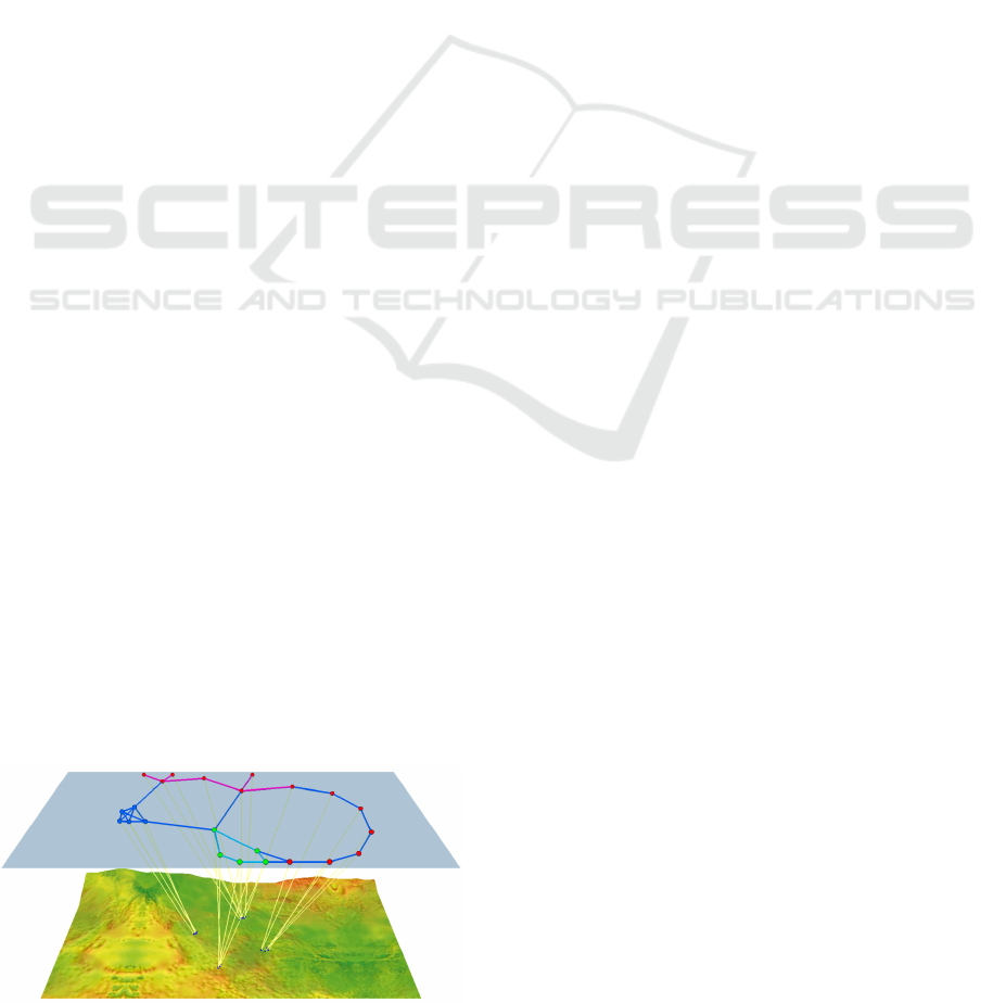
Figure 1: A snapshot of the proposed 2.5D interface. The
logical layer, above, shows the networked data, while the
geographic layer, below, displays actual locations of the
entities contained in the logical layer, whenever available.
Their geographic position may be declared by the en-
tities themselves, tracked by radar stations, inferred
from their transmissions, or, in some cases, com-
pletely unknown. Entities have a number of rela-
tionships, such as established connections, similarity,
reachability, etc. The purpose of the interface is to
represent in the most intuitive and unambiguous way
both the relationships among the entities and their po-
sitions, conveying at the same time the degree of un-
certainty associated with the geographic information.
User’s tasks involve the analysis of both the net-
worked and the geographic dimensions of the infor-
mation. Let’s suppose, for example, that the data rep-
resented come from a social network. Typical queries
may be: What is the shortest friendship chain lead-
ing from a friend of mine living in London to any-
one located in Berlin? Is it possible to find a friend-
ship chain from London to Berlin without involving
any person living in Rome? How many friends of my
friends are currently in the same location as I am now?
We propose an innovative 2.5D paradigm to visu-
ally explore data with both a relational and a geolocal-
ized nature. Our proposal is based on first separating
and then integrating back again the networked and the
geographic information. Namely, the geographic in-
formation is shown within a map, called geographic
layer, while a second logical layer is devoted to the
relational information. The two equally-sized rect-
109
Da Lozzo G., Di Bartolomeo M., Patrignani M., Di Battista G., Cannone D. and Tortora S..
Drawing Georeferenced Graphs - Combining Graph Drawing and Geographic Data.
DOI: 10.5220/0005266601090116
In Proceedings of the 6th International Conference on Information Visualization Theory and Applications (IVAPP-2015), pages 109-116
ISBN: 978-989-758-088-8
Copyright
c
2015 SCITEPRESS (Science and Technology Publications, Lda.)

angular layers are placed one above the other, and
viewed from a side in a 2.5D fashion, so that there
is no overlap among them, i.e., no ambiguity between
the two types of information (see Figure 1).
Entities are placed on the logical layer in such a
way to reduce cluttering and to make their relation-
ships readable and clear, while leaders are used to re-
late each entity on the logical layer to its known loca-
tion on the geographic layer, whenever available.
All the screenshots in this paper are taken from a
JavaScript demonstrative prototype, implemented us-
ing the WebGL graphics library (The Khronos Group,
2013), that runs within any compatible web browser.
2 VISUALIZING NETWORKED
AND GEOGRAPHIC DATA
In this section we describe a visualization system,
based on a novel graphic metaphore, that overcomes
the limitations of traditional solutions with respect to
user tasks that are typical of the visualization of geo-
referenced networks.
2.1 Problem Statement
Our visualization problem has two different inputs:
the first one is from the user, who controls a rectangu-
lar area on a map, which is the current area of interest
to be monitored and that can be translated, rotated,
and zoomed. The second one comes from the out-
side world and is, essentially, a set of relationships
among the entities of the considered domain. Each
entity comes equipped with its type, its position, and
the degree of uncertainty of such geographic infor-
mation, which is provided by specifying the size of a
geometric shape (usually a circle) that approximates
the area where the entity is assumed to be.
The available data defines a network, whose nodes
are the entities and whose edges are the relationships
among entities. The purpose of the system is to show
both the networked and the geographic information,
meeting the following high-level requirements.
Effectiveness. The visualization should show in a
clear and readable way the number of entities located
on the selected area, their current position, and their
relationships.
Intuitiveness. The graphic metaphors and the inter-
action primitives should be natural and intuitive, with
low cognitive load.
Robustness. The visualization should support incom-
plete information, handling, in particular, missing and
uncertain geographic data.
Unambiguity. The representation should be accurate
and unambiguous. For example, the degree of uncer-
tainty of the geographic information should be clear.
2.2 User’s Tasks
When exploring a georeferenced graph relevant user’s
tasks involve both the networked and the geographic
dimensions of the information. Some of these tasks
address simple quantitative queries, as estimating
what is the amount of entities that share some target
location, finding the location that hosts the more in-
terconnected entities, determining whether a specific
location hosts unconnected clusters of entities, etc.
We also identify more complex tasks that strongly
rely on the analysis of the structure of the networked
information. For example, finding the shortest chain
of entities leading from a source placed in location A
to any target located in B; finding a chain from lo-
cation A to location B that does not involve any en-
tity located in C; determining how many entities are
reachable with two edges and are placed in a spe-
cific location; determining how strong are the connec-
tions among entities placed in location A and entities
placed in location B, etc.
All these high level tasks primarily require the
ability of the user to explore the structure of the rela-
tionships among the entities on the logical layer. Sec-
ondarily, the user needs to quickly grasp the area that
hosts a given entity or, conversely, the set of entities
that are located in a given area. These basic opera-
tions are complicated by the fact that some entities
may not have a location associated and that a number
of entities may share the same location.
2.3 Limitation of 2D Interfaces
The simple approach of placing icons on a 2D map
based on the entities’ geographic coordinates would
not meet the requirements. In particular, since some
entities share the same location, any 2D map would
fail to unambiguously show both the location of the
entities and their relationships. Also, entities on a ge-
ographic map are rarely equispaced. Instead, it is of-
ten the case that they gather in specific points (e.g.,
cities). Long and short distances among entities have
to be simultaneously represented in the same view.
When some entities have very close locations, their
icons overlap unless the user zooms in on them. This
zooming in and out has a dramatic effect on the us-
ability of the interface due to focus-and-context is-
sues: when some specific details are on focus the
whole picture is no longer in sight and vice versa.
To complicate this scenario, some entities may
IVAPP2015-InternationalConferenceonInformationVisualizationTheoryandApplications
110

have unknown geographic position. For example,
users of a geolocated social network may disallow
their applications to take advantage of GPS data;
some devices of an ad-hoc network may not host
a ground positioning circuit; routers of a computer
network may not have an associated administrative
site; end-points of a phone or radio conversation may
be unknown; etc. Wherever such entities would be
placed on a 2D map, it would result in an ambiguous
representation since the user would assume that those
positions are the actual positions of the entities.
Finally, a 2D map does not convey in a natural way
the degree of uncertainty of the geographic informa-
tion. Placing icons on the map at the center of the area
where the entity is supposed to be may result in the
user’s false confidence about the actual position of the
entity. Drawing on the map some shadowed shapes,
rectangles or circles, proportional to the degree of un-
certainty on the position of the corresponding enti-
ties yields a representation that is not self-evident and
that is confusing when several entities, with different
shapes and different degree of uncertainty, are close
one to the other.
2.4 Exploiting a 2.5D Visualization
Our strategy is to separate and simultaneously visual-
ize the networked and the geographic information of
the input dataset. Namely, the geographic information
is represented on the geographic layer, which is in the
bottom part of the interface, while the networked in-
formation is represented on the logical layer, which
is parallel to the geographic layer and placed in the
upper part of the interface. Leaders among the two
layers relate nodes with their geographic locations, if
any. The interface is shown in Fig. 1. In order to
avoid overlaps between the two layers, which would
give occlusion among the two types of information,
we restrict their size to two equally-sized rectangles
and suitably place the point of view on the longest
side of the rectangles as shown in Fig. 2.
It has to be pointed out that the size and the ori-
entation of the rectangles representing the logical and
geographic layers are fixed with respect to the screen
coordinates. Panning, zooming and rotating will have
the effect of changing what is represented in the geo-
graphic and logical layers, but will not move the point
of view with respect to the layers themselves. This de-
sign choice allows for a very simple and intuitive nav-
igation of the scenario, that does not require the user
to cope with fully 3D navigation primitives. Hence,
in spite of its 3D flavor, our representation is a 2.5D
one, both because the graph is actually drawn on the
2D surface offered by the logical plane and because
z
y
x
c
z
l
z
l
y
l
x
camera
c
y
p
z
(a)
Figure 2: The position of the geographic and logical layers
with respect to the point of view (we used l
x
= 1600, l
y
=
900, l
z
= 650, c
y
= 2000, c
z
= 1600, p
z
= 260).
the user interaction is limited to the 2D primitives of
panning, zooming, and rotating. From a practical per-
spective, this is realized with four clipping planes that
move together with the point of view and that cut out
the world scene lying beyond the prescribed area.
Nodes are placed on the logical layer with the pur-
pose of conveying as effectively as possible the struc-
ture of the graph, reducing cluttering and crossings
among edges (see Fig. 3). To this purpose, we devised
a specialized force-directed algorithm, described in
Section 4. The computed layout tries to achieve both
evenly-spaced distribution of nodes and few crossings
among edges, while seeking to minimize the distance
of each node from the corresponding position on the
geographic layer. The goal of the geographic layer,
instead, is that of displaying the current position of
each node shown on the logical layer. Such a position
is represented by means of a marker on the map with
a straight-line leader connecting it to the correspond-
ing node on the logical layer. When the position of
the node is affected by uncertainty the marker on the
map is a geometric shape, usually a circle, enclosing
the area where the corresponding object is supposed
to be, and the leader consists of a cone with its apex
on the node. Nodes with no geographic information
associated have no marker on the map (see Fig. 4).
Therefore, in our approach, we have two types
of links: (i) the edges on the logical layer and (ii)
the leaders connecting the two layers. We privilege
the readability of the graph induced by the first type
of links, by trying to reduce crossings on the logical
layer, which severely jeopardize the comprehension
of the graph structure (Purchase et al., 1997; Pur-
chase, 2000). Crossings among leaders have lower
impact on readability, since the structure of the graph
induced by them is of limited interest to the user. In
fact, each leader establishes a connection between an
DrawingGeoreferencedGraphs-CombiningGraphDrawingandGeographicData
111
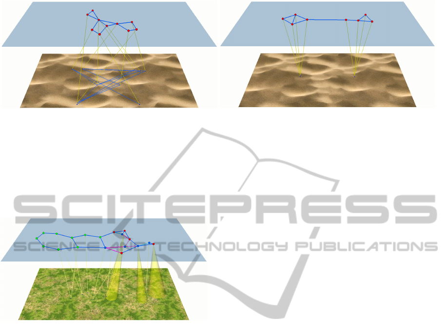
(a) (b)
Figure 3: Two snapshots of the interface showing (a) crossings are reduced in the layout in the logical layer (the edges on the
geographic layer are drawn for comparison) and (b) entities with common locations are clearly shown in the logical layer.
entity and a geographic location, and paths of lead-
ers are never considered by the user. Also, when the
mouse hovers a vertex on the logical layer, the in-
terface highlights its incident leader to help the user
identify the leader endpoint on the geographic layer.
Figure 4: A georeferenced graph where the position of
some entities is unknown and the position of other entities
is known with some approximation.
The graph represented in the logical layer is com-
posed by all the entities inside the area of interest of
the user (in-sight entities) and all the entities that have
links with such entities (linked entities). When the
user zooms, rotates, or translates the area of interest
(for example by pressing keyboard combinations or
by dragging the mouse) the system updates the graph.
Appearing nodes are placed on the border of the log-
ical layer, in the point which is nearer to their actual
geographic position or in the point which is nearer to
the position of one of the nodes they are linked to (in
case of linked entities with no geographic position).
3 RELATED WORK
Visual Links in 2.5D Visualizations. The use of vi-
sual links (i.e., edges) to highlight relationships be-
tween multiple views has been pioneered in the two-
dimensional setting in (Weaver, 2005; Aris and Shnei-
derman, 2007; Shneiderman and Aris, 2006) and fur-
ther explored in (Steinberger et al., 2011; Hadlak
et al., 2011). The third dimension has been often used
to add extra information to a traditional 2D layout. In
particular, the use of inter-plane edges accounting for
the relationships between nodes of separate 2D visu-
alizations of the same graph has been proposed by the
authors of VisLink (Collins and Carpendale, 2007).
The VisLink system allows the user to change the po-
sition of the planes hosting the drawings of the graph,
stacking them horizontally, placing them side-by-side
vertically, viewing them from the top, etc. In (Streit
et al., 2008; Lex et al., 2010) a similar approach has
been used for the exploration of interconnected path-
ways. In this case, the planes are usually more than
two, and the system does not rely on the user ability
for arranging the planes and for efficiently using the
available screen space. Instead, the planes are placed
on five sides of a cube and the user looks at them from
the remaining side.
Spatial and Non-Spatial Data in Cartography. Our
target visualization problem can be viewed as a par-
ticular case of integrated spatial and non-spatial data
visualization, where the non-spatial data can be mod-
eled as a graph composed of entities and relationships
among pairs of entities. Providing an integrated visu-
alization of spatial and non-spatial data is a traditional
topic in cartography where thematic maps are used to
visualize the distribution of statistical variables. The
values associated with the points on the maps can
be represented, for example, by colors (choropleth
maps), by the sizes of suitable symbols (proportional
symbols maps), by the density of dots (dotted maps),
etc. Although thematic maps may go so far as to rep-
resent a small chart for each location (Wood et al.,
2011), usually the non-spatial data represented has a
very simple structure.
Reducing the Visual Clutter in Spatial Data. The
problem of reducing the visual clutter of symbols on
interactive maps has been approached with different
techniques. Google Earth (Google Inc., 2013) auto-
matically collapses into a single symbol spatially co-
IVAPP2015-InternationalConferenceonInformationVisualizationTheoryandApplications
112
incident placemarks, which are exploded again in a
cluster when clicked. Spatial dithering and changes
in symbology (e.g., colour, opacity, line thickness and
size) can be used to reflect the existence of unseen or
coincident data (Wood et al., 2007).
4 THE Retina LAYOUT
ALGORITHM
In this section we describe the algorithm that com-
putes the network layout on the logical layer. Spring
embedders are natural candidates for our application,
since they grant, besides good quality results, the flex-
ibility needed by our interactive system.
Although spring embedders are standard force-
directed graph layout algorithms, our visualization
problem is somehow special, as the logical layer is
viewed from a side by the user, who, therefore, sees a
picture distorted by the perspective. This has the ef-
fect of increasing the cluttering of the objects in the
background with respect to those in the foreground.
Hence, we conceived a variant of the spring embed-
der algorithm that computes the layout directly on the
view plane, which is essentially the user’s retina. This
is why we dubbed it Retina layout algorithm.
A spring embedder boils down to be a very simple
iterative process that, given the configuration at iter-
ation i, computes the configuration at iteration i + 1
by summing up, for each node, the forces acting on
it, and then translating the node in the direction of
the resulting force and proportionally to its magni-
tude. Such process then stops as soon as the sum of
the forces acting on the nodes drops below a certain
minimum threshold. Like (traditional) spring embed-
ders, Algorithm Retina searches for an equilibrium
configuration of a physical model obtained by replac-
ing nodes with equally charged particles and edges
with springs. On the one hand, since particles have
the same charge, the Coulomb force, decreasing with
the square of their distance, pushes them apart. On
the other hand, as edges are replaced by springs, the
Hooke force tends to keep adjacent particles close to-
gether (our springs have natural length zero and never
exert a repulsive force). Further, in order “to keep
the node close” to its geographic position, we intro-
duced a geographic force that attracts each node to
the point on the logical layer corresponding to the
node geographic position. Algorithm Retina intro-
duces a major, although conceptually simple, differ-
ence with respect to standard spring embedders. The
forces and their sums are computed on the projections
of the nodes’ positions on the view plane, so to avoid
the perspective distortion perceived by the user. Once
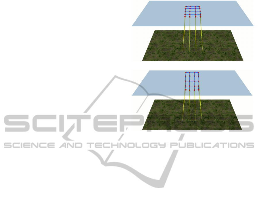
(a)
(b)
Figure 5: The effect of the Retina algorithm is apparent
when grid graphs are represented. (a) A grid graph drawn
by a traditional spring embedder. The perspective distortion
is apparent. (b) A grid graph with the Retina algorithm.
the sum of the forces is computed for each node pro-
jection, the translation vectors are unprojected again
from screen to world coordinates, yielding the new
positions for the nodes. Boundary constraints are not
implemented as forces, but rather as restrictions on
the nodes’ translations.
Figure 5 shows a drawing of a 5 × 4 grid graph
with and without the Retina algorithm. The perspec-
tive distortion of the traditional spring embedder that
computes the layout on the logical plane is apparent
in Fig. 5(a). Such distortion is reduced in Fig. 5(b).
5 EXPERIMENTAL EVALUATION
We evaluated the effectiveness of the proposed 2.5D
visualization and of Algorithm Retina by contrast-
ing them with “traditional 2D visualization” where
entities are place in their geographic position and the
screen is fully devoted to a 2D representation of the
area of interest. With respect to the problem require-
ments, we claim the following statements.
1. The interface allows us to unambiguously repre-
sent networked data enriched with geographic in-
formation which may be missing or uncertain for
some entity (Req. Unambiguity, Robustness).
2. The interface allows us to clearly represent enti-
ties that have coincident or very close locations
DrawingGeoreferencedGraphs-CombiningGraphDrawingandGeographicData
113

(Req. Unambiguity).
3. The logical and the geographic layers allow us to
represent the networked information in a readable
way (Req. Effectiveness, Unambiguity).
4. Algorithm Retina improves the readability of the
drawing with respect to a traditional spring em-
bedder run on the logical layer (Req. Effective-
ness, Unambiguity).
The first claim, in our opinion, is self-evident, as
we are not aware of alternative visualization tech-
niques to represent in an unambiguous way geolo-
cated networks where part of the entities have miss-
ing or uncertain geographic information. Therefore,
we will give evidence of the other three claims by as-
suming that all the entities have a known position. To
this end, we set up the experimental setting described
in the following subsections. In all the experiments
we allowed the on-line layout algorithm to reach an
equilibrium configuration.
5.1 Quality Measures
To assess the effectiveness of the interface we adopted
the following readability measures.
Crossings Percent Reduction (cpr). There is strong
evidence in the literature that reducing the number
of edge crossings is by far the most important aes-
thetic to improve the readability of a drawing (Pur-
chase et al., 1997; Purchase, 2000). This metric esti-
mates the ability of the interface to reduce the num-
ber of edge crossings in the representation of the net-
worked data. In particular, we measured the average
percent reduction of the number of crossings on the
logical layer with respect to the number of crossings
that would occur if the nodes were placed at their ac-
tual location, as in a traditional 2D visualization.
Homogeneous Edge Length (hel). This measure
is based on the average percent deviation of edge
lengths using a mean central tendency (Fowler and
Kobourov, 2013). We compute this metric on the pro-
jections of the edges on the view plane:
hel = 1 −
1
m
m
∑
j=1
|e
j
| − |e|
avg
max{|e|
avg
, |e|
max
− |e|
avg
}
where m is the size of the edge-set of the graph,
|e
j
| is the length of the jth edge, |e|
avg
is the average
edge length, and |e|
max
is the maximum edge length.
Observe that 0 ≤ hel ≤ 1. A value of hel = 0 could
indicate that half of the edges have length zero while
the other half have length 2|e|
avg
. A value of hel = 1
indicates all the edges have the same length.
Node Separation (ns). Our purpose is to measure
how well the interface is able to separate close nodes.
Metric ns is the minimum distance between the pro-
jections of the nodes on the view plane divided by the
length of the diagonal of the viewport
We remark that our 2.5D visualization is unfa-
vored by measures hel and ns as it uses only a portion
of the viewport to distribute nodes, whereas in a 2D
visualization the whole viewport is used by the map.
We also observe that our readability measures do not
take into account the crossings among the edges that
link the entities on the logical layer to their geo-
graphic positions. Such crossings are due to the 3D
perspective and remain in the background when the
user explores the network on the logical layer. Hence,
they may have a reduced effect on the comprehension
of the structure of such a network.
5.2 Testsuite
For our experiments we adopted a mix of real-life
and synthetic data. In particular, we obtained real-
life data about geolocalized entities from the maritime
data collected by the Automatic Identification System
(AIS), which is an onboard navigation safety device
that broadcasts time-labeled messages with the loca-
tion and characteristics of vessels in real time. We
used a historic dataset of AIS data collected by the
U.S. Bureau of Ocean Energy Management and by the
U.S. National Oceanic and Atmospheric Administra-
tion (NOAA Coastal Services Center, ). Precisely, we
used the dataset relative to the Zone 14 of the Gulf of
Mexico area, collected during January 2009. Starting
from this dataset, we produced 300 test instances of
increasing size and density.
First, we chose an arbitrary rectangular region
whose aspect ratio is 16:9. We selected ten time in-
stants uniformly distributed in the available time win-
dow. For each time instant, we selected in the area of
interest the last s vessels broadcasting their position
and considered their last update, with s ranging from
10 to 100 with a step of 10. This produced 100 sets of
geolocated entities with distinct geographic positions.
AIS data are not provided with information about
relationships between the vessels. Therefore, we cre-
ated graph instances with different edge densities as
follows. We randomly added edges to each set of n
vertices, among all the possible
n∗(n−1)
2
edges, until
we reached the density of 5%, 10%, and 15%. This
produced 300 geolocated graphs, which compose the
testsuite for our experiments.
IVAPP2015-InternationalConferenceonInformationVisualizationTheoryandApplications
114
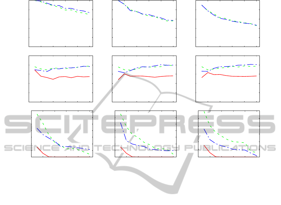
EDGE DENSITY = 5% EDGE DENSITY = 10% EDGE DENSITY = 15%
cpr
0
0.2
0.4
0.6
0.8
1
0 20 40 60 80 100
0
0.2
0.4
0.6
0.8
1
0 20 40 60 80 100
0
0.2
0.4
0.6
0.8
1
0 20 40 60 80 100
hel
0
0.2
0.4
0.6
0.8
1
0 20 40 60 80 100
0
0.2
0.4
0.6
0.8
1
0 20 40 60 80 100
0
0.2
0.4
0.6
0.8
1
0 20 40 60 80 100
ns
0
0.005
0.01
0.015
0.02
0.025
0.03
0.035
0 20 40 60 80 100
0
0.005
0.01
0.015
0.02
0.025
0.03
0.035
0 20 40 60 80 100
0
0.005
0.01
0.015
0.02
0.025
0.03
0 20 40 60 80 100
Figure 6: Results of the experiments. Charts in the first row report cpr measure; the second row is devoted to hel; and the third
row to ns. The density of the graphs varies over the columns. The x-axis shows the size of the graphs, while the y-axis reports
the measure of interest. The solid red line is the measure for the 2D visualization. The dashed green line is the measure for
Algorithm Retina. The dash-dotted blue line is the measure for the traditional spring embedder with no Retina distorition.
5.3 Results and Discussion
Figure 6 shows the results of the experiments. Each
dot corresponds to the average over ten values. Re-
garding measure cpr (Figs. 6, first row), crossings are
completely removed for sparser and smaller graphs
and are greatly reduced both by the traditional spring
embedder and by Algorithm Retina, with the latter
performing negligibly worse for sparse graphs (see
Fig. 6, first row, first column). Even for bigger and
denser instances of our dataset crossings are reduced
of more than 40%. We remark that the number of
crossings on the geographic map for the denser graphs
is huge (for example, the last point of Fig. 6, first row,
last column, corresponds to more than 6, 000 cross-
ings). The second row of Fig. 6 is devoted to metric
hel. For all the tested densities and sizes the readabil-
ity of the layout is steadily improved both by the tra-
ditional spring embedder and by Algorithm Retina,
which appears to behave better for small graphs. The
advantage of using a 2.5D interface is confirmed by
these charts. It should be also noted that georefenced
graphs coming from many real-life applications have
the property that adjacencies are more likely among
nodes that are geographically close. However, in or-
der to prove the effectiveness of Algorithm Retina
with respect to metric hel, we decided to perform our
tests against unfavorable instances that do not exhibit
this property. Algorithm Retina performs better than
the traditional spring embedder with respect to met-
ric ns (see Fig. 6, last row), while the 2D visualiza-
tion has very unsatisfactory results. Denser graphs
are more effectively handled by Algorithm Retina.
Overall, our experiments confirm that the 2.5D in-
terface meets the system requirements. In partic-
ular, it allows us to represent the networked infor-
mation in way that is considerably more readable
than a traditional 2D interface. The adoption of Al-
gorithm Retina is justified by its improvement on
measures hel and ns at the expenses of a negligible
worsening of the cpr measure. When the user fo-
cuses on smaller instances, the superiority of Algo-
rithm Retina is apparent.
6 CONCLUSIONS AND FUTURE
WORK
We described a 2.5D visualization technique for ex-
DrawingGeoreferencedGraphs-CombiningGraphDrawingandGeographicData
115
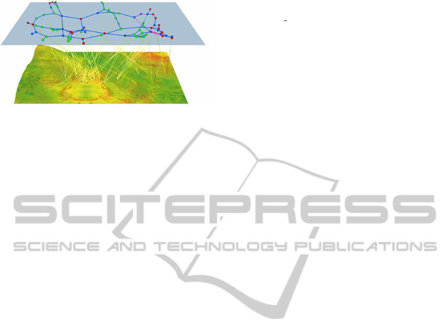
Figure 7: A georeferenced graph with 76 entities and 96
edges. The size of the graph makes cluttering hard to avoid.
ploring networked data enriched with geographic in-
formation, where the latter may have uncertain or
missing values. Adapting, to our knowledge, for the
first time a force-directed algorithm to a 2.5D setting,
we conceived a variant of a spring embedder algo-
rithm that directly computes the layout on the view
plane (i.e., on the user’s screen).
We measured the effectiveness of the proposed vi-
sualization and layout algorithm by contrasting them
with a traditional 2D visualization with respect to
three relevant readability measures. Both the experi-
mentation and our experiences with the interface sup-
port our confidence about the effectiveness of the pro-
posed techniques for small instances of geolocalized
graphs. In fact, when the entities are more than a few
dozens the readability measures show very poor per-
formances and the drawing on the logical layer be-
comes too cluttered to be clearly readable (see Fig. 7).
Although the results are promising, our experi-
ments only evaluate the static setting and do not ac-
count for the dynamic scenario, where changes occur
both in the area of interest selected by the user and in
the environment. An evaluation of the effectiveness of
the dynamic scenario would be much more complex
and could not leave aside a thorough user study. An
interesting evolution of the Retina algorithm could
consider additional forces to take into account cross-
ings among leaders. One line of further investigation
is given by the possibility of representing on the logi-
cal layer further information. A simple idea is to show
a network that is wider than the area of interest (we
call it neighborhood visualization), so to enhance the
situational awareness of the user. Our preliminary ex-
periments in this direction are encouraging.
ACKNOWLEDGEMENTS
We wish to thank Francesco Elefante, Marco Pas-
sariello, and Maurizio Pizzonia for their friendship
and help with this project. This work is partially
supported by the MIUR project AMANDA “Algo-
rithmics for MAssive and Networked DAta”, prot.
2012C4E3KT 001, and by EU FP7 STREP “Leone:
From Global Measurements to Local Management”,
no. 317647.
REFERENCES
Aris, A. and Shneiderman, B. (2007). Designing semantic
substrates for visual network exploration. Information
Visualization, 6(4):281–300.
Collins, C. and Carpendale, S. (2007). VisLink: Revealing
relationships amongst visualizations. IEEE Trans. on
Visual. and Comp. Graph., 13(6):1192–1199.
Fowler, J. J. and Kobourov, S. (2013). Planar preprocess-
ing for spring embedders. In Graph Drawing GD ’12,
volume 7704 of LNCS, pages 388–399. Springer.
Google Inc. (2013). Google Earth. http://earth.google.com.
Hadlak, S., Schulz, H., and Schumann, H. (2011). In situ
exploration of large dynamic networks. IEEE Trans.
on Visual. and Comp. Graph., 17(12):2334–2343.
Lex, A., Streit, M., Kruijff, E., and Schmalstieg, D. (2010).
Caleydo: Design and evaluation of a visual analysis
framework for gene expression data in its biological
context. In PacificVis 2010.
NOAA Coastal Services Center.
http://www.marinecadastre.gov (acc. 2014).
Purchase, H. C. (2000). Effective information visualisation:
a study of graph drawing aesthetics and algorithms.
Interacting with Computers, 13(2):147–162.
Purchase, H. C., Cohen, R. F., and James, M. I. (1997).
An experimental study of the basis for graph drawing
algorithms. J. Exp. Algorithmics, 2.
Shneiderman, B. and Aris, A. (2006). Network visualiza-
tion by semantic substrates. IEEE Trans. on Visual.
and Comp. Graph., 12(5):733–740.
Steinberger, M., Waldner, M., Streit, M., Lex, A., and
Schmalstieg, D. (2011). Context-preserving visual
links. IEEE Trans. on Visual. and Comp. Graph.,
17(12):2249–2258.
Streit, M., Kalkusch, M., Kashofer, K., and Schmalstieg, D.
(2008). Navigation and exploration of interconnected
pathways. Comput. Graph. Forum, 27(3):951–958.
The Khronos Group (2013). WebGL, Web Graphic
Library – OpenGL ES 2.0 for the Web.
http://www.khronos.org/webgl/ (acc. 2014).
Weaver, C. (2005). Visualizing coordination in situ. In IN-
FOVIS 2005.
Wood, J., Dykes, J., Slingsby, A., and Clarke, K. (2007). In-
teractive visual exploration of a large spatio-temporal
dataset: Reflections on a geovisualization mashup.
IEEE Trans. Vis. and C. Graph., 13(6):1176–1183.
Wood, J., Slingsby, A., and Dykes, J. (2011). Visualizing
the dynamics of London’s bicycle hire scheme. Car-
tographica, 46(4):239–251.
IVAPP2015-InternationalConferenceonInformationVisualizationTheoryandApplications
116
