
Assesment of Online Bank GUI based on User Experience Evaluation
A Case Study
Malgorzata Plechawska-Wojcik
and Kamil Kolodziejczyk
Institute of Computer Science, Lublin University of Technology, Nadbystrzycka 36B, Lublin, Poland
Keywords: User Centered Design, User Experience, Online Banking, Web Personalization.
Abstract: The paper presents a case study of User Centered Design (UCD) assessment. The case study is aimed to
design and test GUI of online banking application. The procedure is multistep, based on UCD phases. Case
study implemented such methods as Contextual analysis, Heuristic evaluation, Prototyping and extended
iterative User test. The paper outlines contain description of applied methods and results including survey
summary and users recommendations. The adjusted version of GUI is also presented.
1 INTRODUCTION
Intuitive and functional interface becomes one of the
most important requirements for modern web
applications. To fulfill this requirement User
Experience (UX) needs to be regarded in the process
of application development. According to recent
research (Isomursu et. al, 2012) the expanding role
of User Experience Design became more and more
industry relevant. Interface adaptation to user needs
and recommendations and its personalization is a
key factor of today ICT project, especially web
applications (Prenzel and Ringwelski, 2012). Impact
of UX on ITC, business and projects has been
explored by numerous authors (Dhir and Al-kahtani,
2013, Blomkvist, 2005; Chamberlain et al., 2006;
Dayton and Barnum, 2009; Detweiler, 2007).
User Experience has an interdisciplinary
character. A designer needs to: have psychological
knowledge, know principles of ergonomics,
understand the technology and, that is the most
important one – have empathy. The ability to
understand the needs of future users increasingly
becomes a key factor in the success of the resulting
product.
In recent years in the European online banking
market we can observe a trend of offering customers
modern interfaces, formed under the principles of
User Experience. Their projects present new insights
into GUI (Graphical User Interface) design.
These changes were initiated by the rapid
popularization of tablets and smartphones.
Applications had to adapt to different resolutions
and conditions (Resmini and Rosati, 2011).
In addition, mobile devices made it easier to use
the Internet by less experienced users, who expect
mostly intuitive solutions. Especially for them it was
necessary to put more attention to the overall GUI
usability and to apply User Centered Design (UCD).
The aim of the paper is to apply a set of UCD to
design and test GUI of online banking application
2 USER CENTERED DESIGN
User Centered Design is the methodology applied to
create useful, ergonomic products. It requires
understanding of the target users and needs to meet
their expectations. This aim can be achieved by
putting the user into the center of the design process.
The task of the designer is to focus the attention on
user and simultaneously consider capabilities and
limitations of used technology (Rubin, 2008).
UCD consists of a number of methods dedicated to
involve users in the process of the project designing
and evaluating. UCD is divided into five phases:
Planning (i.e. Contextual analysis)
Requirements analysis (e.g. in-depth interviews,
analysis of existing solutions)
Design (e.g. prototyping, heuristic evaluation)
Implementation (e.g. lo-fi prototyping)
Tests (e.g. heuristic evaluation, usability tests)
Simple is an interesting example of UCD-based
online bank (Figure 1). The main objective of this
startup is to provide a personal account equipped
365
Plechawska-Wojcik M. and Kolodziejczyk K..
Assesment of Online Bank GUI based on User Experience Evaluation - A Case Study.
DOI: 10.5220/0005109203650370
In Proceedings of 3rd International Conference on Data Management Technologies and Applications (DATA-2014), pages 365-370
ISBN: 978-989-758-035-2
Copyright
c
2014 SCITEPRESS (Science and Technology Publications, Lda.)
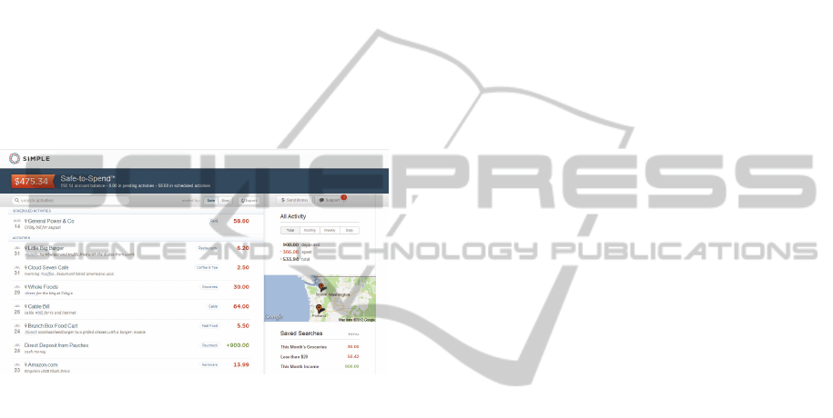
with innovative web and mobile services. A lot of
attention was paid to fulfill requirements gathered
from users. That is why Simple is sometimes
referred as "Anti-bank".
Home page is focused on presenting transaction
history in a way to make quick and efficient
searching. The horizontal menu enables to display
statistics and to sort data. Its location remains
unchanged for all pages, but the searching panel and
supportive buttons adjust to currently presented
information.
Other interesting feature is Safe-to-Spend, a
function that shows the available funds. It is
calculated based on the free funds, planned expenses
and saving plans. This solution reduces visual clutter
by focusing on what is important for the user.
Figure 1: Bank Simple.
3 APPLIED METHODS
The most important methods applied in the case
study are: Contextual analysis, Heuristic evaluation,
Expert Analysis, Prototyping and User tests.
3.1 Contextual Analysis
Contextual analysis of the project consists in
preparing a detailed description of the target user
and cases of application usage. Performing surveys
and in-depth interviews enables to understand the
future users profile and user requirements.
It allows to detect the expectations and
requirements of the project. In many cases it enables
to discover latent user needs and, as a result, they
allow to better understand their motives.
3.2 Heuristic Evaluation
Heuristic evaluation is a popular method of suability
checking. It allows to evaluate the interface based on
a set of established guidelines called heuristics.
Unlike usability testing which needs to be performed
with end users, heuristic evaluation can be made by
everyone, regardless of skill level (Martin, 2012).
Evaluation enable to assess the conformity of the
application with heuristics to identify and eliminate
inconsistencies in the project. Consequently, tests
usability performed later are more effective.
The most common set of heuristics is a list
created by Jakob Nielsen (Nielsen, 1994). It
contains:
Visibility of system status
Match between system and the real world
User control and freedom
Consistency and standards
Error prevention
Recognition rather than recall
Flexibility and efficiency of use
Aesthetic and minimalist design
Help users diagnose, and recover from errors
Help and documentation
3.3 Expert Analysis
In order to obtain the results in a web application
testing, the conglomerate of expert analysis might be
applied. The expert analysis criteria applied in the
paper contain the detailed list of areas and subareas
with questions assigned to each point. The group of
main areas contains (Milosz et al., 2013):
Application interface, Navigation, Feedback and
Content. Detailed list of questions is presented in
Table 3 in the paper’s results sections. Table 1
presents the grading scale used to assess each
evaluated assessed area.
3.4 Prototyping
Prototyping is a technique consisting in creating
mock-ups (interface schemas). They allow to detect
any potential problems with the application early on.
They present the look of individual application
elements and enable performing heuristic evaluation.
They assure minimum cost of changes. Minor
modifications of the interface can result in
significant changes in the implementation. It
contributes to a significant increase in production
costs (Mathis, 2011).
3.5 User Test
User test is the best way to verify the effectiveness
of the interface. It shows if the application is
DATA2014-3rdInternationalConferenceonDataManagementTechnologiesandApplications
366
understandable to users and what areas might be
difficult to navigate for them (Mathis, 2011).
Table 1: The grading scale applied to the LUT list.
Grade Description
1
Critical usability errors were observed,
preventing normal usage or discouraging
user from usin
g
the application.
2
Serious usability issues were
encountered, which may prevent most
users from task realization.
3
Minor usability issues were observed,
which if accumulated may have negative
impact on user performance.
4
Single minor usability issues were
observed, which may have negative
impact on user work quality (e.g. poor
readabilit
y
).
5
N
o usability issues influencing either
user performance or work quality were
identifie
d
.
In order to ensure the effectiveness of the test it
is necessary to define the most important tasks for
users (Allen, 2012). Only one user should be tested
at a time. Thinking aloud protocol might be applied
in order to achieve better results.
4 CASE STUDY
The presented case study describes the analysis of
created GUI of online banking application.
Performed multilevel analysis consisted in: Planning
and requirements analysis, GUI Design and
implementation and Usability testing.
4.1 Planning and Requirements
Analysis
Contextual report was the result of the planning
phase. Table 2 focuses on general information about
members of chosen user group, their abilities and the
tasks they need to perform.
At the end of this phase competitive analysis was
conducted to understand possible solutions for main
problems and to locate potential unaddressed issues.
In result twenty EU online banks were subjected to
cognitive walkthrough and heuristic evaluation.
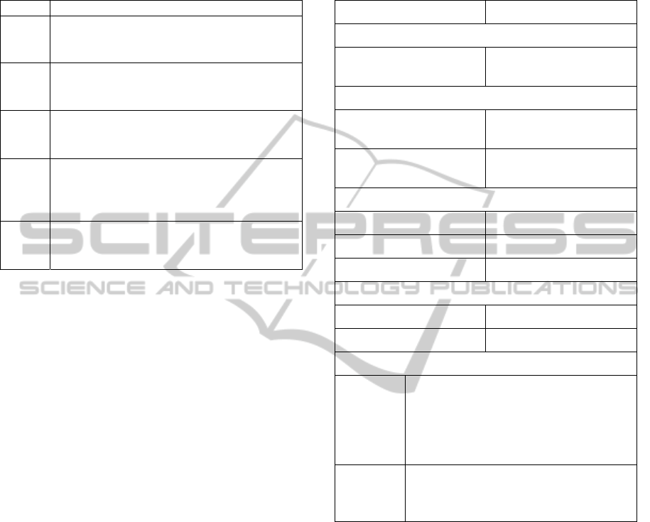
4.2 GUI Design and Implementation
During the design phase two low-fidelity interfaces
were prepared (presented in Figure 2 and Figure 3).
They show two different approaches to fulfill the
project requirements.
Table 2: User type description.
User t
y
pe Bank account owners
Skills and knowled
g
e
Training and experience
in the business processes
N
early all experience
d
Experiences
Using other product with
similar main functions
Majority familia
r
Using products with the
same interface style
Majority familia
r
Ph
y
sical attributes
Age 14+
Typical age 16
–
65
Gende
r
50% male, 50% female
Motivations
Attitude to
j
ob and tas
k
Hi
g
hl
y
motivate
d
Attitude to the produc
t
Var
y
in
g
List of tasks
Tasks
identified
Checking transaction history
Making money transfer
Making payment
Expense analysis
Credit card management
Tasks for
usability
evaluation
Checking transaction history
Making money transfer
Expense analysis
Ten experts representing the target user group
were selected to test both solutions. They filed the
survey presented with collected data in Table 3.
The results conclude that the overall assessment
of both interfaces was good. The second interface
got a slightly higher score. In addition it was
considered a more interesting alternative. Although,
its readability could use improvement. Moreover,
feedback section shows users weren't as sure about
what needs to be done to complete each action.
4.3 Usability Testing
Based on the user feedback the second interface was
improved and redesigned as a high-fidelity mock-up
(Figure 4) dedicated for the usability testing.
AssesmentofOnlineBankGUIbasedonUserExperienceEvaluation-ACaseStudy
367
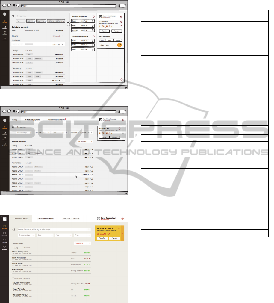
Figure 2: First interface.
Figure 3: Second interface.
Figure 4: High-fidelity mock-up.
Conducting expert analysis helped to reduce the
number of potential issues, thus making the study
more effective.
Usability testing consisted of two series of
studies. They were separated by the design phase,
which focused on fixing the most important issues
discovered during the first round of tests.
Table 3: Results of Expert analysis.
Questions
Interf
1
Interf
2
Application interface
4.4 4.425
Is the interface readable? 4.7 4.4
Are the interface elements
arran
g
ed properl
y
?
4.4 4.4
Is it consistent? 4.6 4.7
Is it clear why the interface is
arranged this way?
3.9 4.2
Navigation
4.4 4.5
Is the access to all sections and
functions easy and intuitive?
4.3 4.4
Is it easy to get around the
application?
4.6 4.5
Is the menu eas
y
to use? 4.5 4.5
Is it easy to find required
information?
4.5 4.4
Is the navigation well planned?
4.1 4.7
Feedback
4.15 4.2
Is it easy to perform all the main
actions?
4.2 4.5
Is it clear what needs to be done
to perform each action?
4.1 3.9
Content
4.35 4.4
Are labels and headlines easy to
understand?
4.5 4.6
Is the application content easy
to understand?
4.4 4.8
Is there an access to all actions
you consider necessary?
4.5 4.4
Is it possible to customize the
interface based on your needs?
4 3.8
The entire interface
4.353 4.413
Five people participated in the first study. Their
experience in online banking varied from average to
high. Each subject received a set of tasks to perform
using the mock-up. They were also asked to think
aloud during the test.
Instructions were put in a form of typical
everyday scenarios, which required users to perform
tasks chosen during the contextual analysis.
The list of tasks contained such items as:
1. Making a regular money transfer from the main
account and saving the wire as a new template.
2. Making a self-directed money transfer between
personal accounts.
3. Checking details of one of the incoming
transfers.
4. Changing primary account in the sidebar.
5. Checking current week expenses summary.
Each test took place at participants home, on
personal computer. The session length varied from
DATA2014-3rdInternationalConferenceonDataManagementTechnologiesandApplications
368
ten to twenty minutes, and was followed with post-
test interview about the overall experience.
The goal of this round of tests was to verify
reactions and feelings about the interface. It also
allowed to identify the most apparent issues.
Prototype was appreciated by the participants.
The widget with quick access to the main account
was assessed as helpful. All users admitted they
check the history after each transaction. That's why
the integration between new money transfer form
and the history view was considered useful.
Two issues took place during each session. Users
weren't sure how to switch their account in the
widget and they had problem with editing money
transfer form. For a few participants proximity
between elements led to confusion and some
phrasing proved to be ambiguous.
Table 4 presents task completion rate for the
study. The average rate for a task was 76.67%. It is
worth noting, that the most important tasks got
100% completion rate.
Table 4: Task completion rates for the first study.
Task 1 2 3 4 5 All
Making a money transfer
1 1 1 1 1 100%
Saving it as a template
0 1 0 1 1 60%
Making a self-directed transfer
1 1 1 1 1 100%
Finding particular transfer
1 1 1 1 1 100%
Changing primary account
0 0 1 1 0 40%
Checking average spending
0 1 0 1 1 60%
Based on user findings a list of needed changes
was created. It contains such items as:
Main menu needs visibility improvement
Money transfer should be easier to edit
Information architecture should be improved to
emphasize the connection between search,
filters and the activities
Widget should provide easier way to switch
between accounts
The list of changes for the interface, based on the
summary of findings, was used to improve the
prototype. It consisted of a total of twelve
improvements that needed to be addressed in five
areas of the mock-up.
The second series of tests was conducted in
a laboratory setting. It focused on discovering
remaining usability issues. Improving the mock-up
allowed to invite unexperienced users as well.
Eight participants were asked to perform the set
of instructions on the revised interface. Each test
took place on a computer connected to eye-tracker.
This allowed to obtain more accurate data.
Table 5 presents task completion rates for the
second study. This time the average rate was
95.83%. Usability tests helped to improve the
interface and to achieve much better results.
Table 5: Task completion rates for the second study.
Task 1 2 3 4 5 6 7 8 All
Making a money transfer 1 1 1 1 1 1 1 1 100%
Saving it as a template 1 0 1 0 1 1 1 1 75%
Making a self-directed transfer 1 1 1 1 1 1 1 1 100%
Finding particular transfer 1 1 1 1 1 1 1 1 100%
Changing primary account 1 1 1 1 1 1 1 1 100%
Checking average spending 1 1 1 1 1 1 1 1
100.0
0%
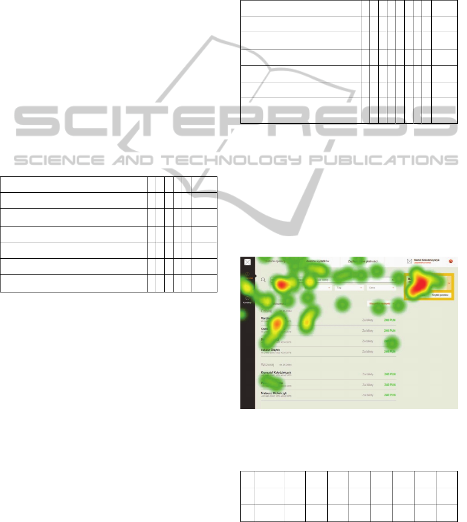
Collected data was used to generate series of
heat-maps visualizing eye fixations for specific areas
of the interface.
Figure 6 presents heat-map for the first five
seconds of the test. The biggest hot-spot was
detected over the widget. This is where the most of
the attention was focused during the first task.
Average time until the first fixation is shown in
Table 6, to present users' behavior in more detail.
Figure 5: Heat-map.
Table 6: Average time until the first fixation for Main
Menu (M) and Widget (W).
1 2 3 4 5 6 7 8 All
M 197.5 141.8 4.6 91.6 131.7 3.9 3.3 8.3 72.8
W 0.6 0.4 35.7 1.8 2.23 2.9 0.9 5.2 6.2
AssesmentofOnlineBankGUIbasedonUserExperienceEvaluation-ACaseStudy
369

As concluded by the heat-map, widget grabs
more attention. However, some people decided to
focus on main menu, even though the widget could
also be used to complete the task.
Similarly to previous study, a list of needed
changes was created. It contains such items as:
The button for sending money transfer should
be more visible
Emphasize the fact that the money transfer form
has three steps instead of one
Search and filters should have visible labels
Search results list should have visible label
The list will be the foundation for the final
design phase, which will result in creating the final
graphical design for the application.
5 CONCLUSIONS
The paper provides evidence for the positive impact
User Centered Design can have on a designed
interface. The process equips designer with the
necessary tools to come up with appealing solutions
that will benefit users. It helps to gain better
understanding of users' habits and expectations.
That's the reason why the interface, created as
a result of the case study, brought positively-
surprising experience to the usability study
participants. We trust that applying user centered
approach is a necessary step towards crafting better
interfaces for the users.
User Centered Design is an iterative process, that
is why our case study project was subjected to two
series of design, implementation and testing phases.
Second series of studies helped to eliminate all
important issues and get optimised design solution.
REFERENCES
Allen, J., Chudley, J., 2012. Smashing UX Design:
Foundations for Designing Online User Experiences,
John Wiley & Sons Ltd, Chichester.
Blomkvist, S., 2005. Towards a Model for Bridging Agile
Development and User-Centered Design. Human-
Centered Software Engineering — Integrating
Usability in the Software Development Lifecycle.
Human-Computer Interaction Series, 2005, 8, IV, 219-
244.
Chamberlain, S., Sharp, H., Maiden, N., 2006. Towards a
Framework for Integrating Agile Development and
User-Centered Design. Extreme Programming and
Agile Processes in Software Engineering. Lecture
Notes in Computer Science, 4044/2006, 143-153.
Dayton, D., Barnum, C., 2009. The Impact of Agile on
User-centered Design: Two Surveys Tell the Story.
Technical Communication, 56 (3).
Detweiler, M., 2007. Managing UCD Within Agile
Projects. interactions 14, 3, 40-42.
Dhir, A., Al-kahtani, M, 2013. A Case Study on User
Experience (UX) Evaluation of Mobile Augmented
Reality Prototypes. Journal of Universal Computer
Science, vol. 19, no. 8 (2013), 1175-1196.
Isomursu, M., Sirotkin, A., Voltti, P., Halonen, M., 2012.
User Experience Design Goes Agile in Lean
Transformation -- A Case Study. VTT Tech. Res.
Centre of Finland, Finland.
Martin, B., 2012. Universal Methods of Design: 100 Ways
to Research Complex Problems, Develop Innovative
Ideas, and Design Effective Solutions, Rockport
Publishers, Beverly.
Mathis, L., 2011. Designed for Use, The Pragmatic
Bookshelft, Dallas.
Milosz M., Plechawska-Wojcik M., Borys M., Laskowski
M., 2013. Quality Improvement of ERP System GUI
Using Expert Method: a Case Study, 6th International
Conference on Human System Interaction, in print.
Nielsen, J., 1994. Heuristic evaluation. In Nielsen, J., and
Mack, R.L. (Eds.), Usability Inspection Methods
Prenzel A., Ringwelski G., 2012. Design of Human-
computer Interfaces in Scheduling Applications.
Proceedings of ICEIS Conference, pp. 219-228.
Resmini, A., Rosati, L., 2011. Pervasive Information
Architecture: Designing Cross-Channel User
Experiences. Morgan Kaufmann Publishers.
Rubin, J., Chisnell, D., 2008. Handbook of Usability
Testing, Second Edition: How to Plan, Design, and
Conduct Effective Tests, Wiley Publishing Inc.,
Indianapolis.
Thomas, C., Bevan, N., 1996. Usability Context Analysis:
a Practical Guide, National Physical Laboratory,
Teddington.
DATA2014-3rdInternationalConferenceonDataManagementTechnologiesandApplications
370
