
The One Hand Wonder
A Framework for Enhancing One-handed Website Operation on Touchscreen
Smartphones
Karsten Seipp and Kate Devlin
Department of Computing, Goldsmiths College, University of London, Lewisham Way, SE14 6NW, London, U.K.
Keywords:
One-handed Operation, Mobile, Web, Wheel Menu, Interface Adaptation, CSS3, JavaScript, HTML.
Abstract:
Operating a website with one hand on a touchscreen mobile phone remains a challenging task: solutions to
adapt websites for mobile users do not address the ergonomic peculiarities of one-handed operation. We
present the design and evaluation of the One Hand Wonder (OHW) – an easily-adaptable cross-platform
JavaScript framework to support one-handed website navigation on touchscreen smartphones. It enhances
usability without the need to redesign the existing website or to overwrite any CSS styles. User testing and
quantitative evaluation confirm learnability and efficiency with clear advantages over non-enhanced browsing,
and a discussion of the OHW’s versatility is given.
1 INTRODUCTION
The majority of smartphones sold today use mod-
ern operating systems such as Android and iOS,
both of which have a powerful and largely standard-
compliant browser paired with a touchscreen inter-
face. Numerous websites already automatically adapt
their layout and handling to the constraints of the ac-
cess device to provide an adequate user experience,
using web technologies such as JavaScript, CSS3 me-
dia queries or server-sided device detection.
With the help of established adaptation techniques
for websites on mobile devices (W3C, 2008; ASA,
2007) as well as responsive themes (Envato, 2013),
device-independent websites are becoming the norm.
In addition, further approaches exist to adapt web-
sites to mobile device constraints, although these are
either proprietary (Akmin, 2012), dependent on a
proxy server (Gupta et al., 2007) or bound to a spe-
cific browser (Mobotap, 2012; Yu and Miller, 2011).
These result in an adapted and improved display on a
range of mobile devices, but not in an adapted inter-
action model for thumb-based use.
For non-adapted pages, built-in actions such as
pinching and tapping to zoom can improve matters.
However, none of these account for the one-handed
operation of the phone, which has been identified as
a preferred mode of operation by many users (Karl-
son and Bederson, 2006). The limited mobility and
reach of the thumb represent completely different
challenges to the designer regarding the layout and
operation of the website; simply crafting it to ensure
a correct display of the page elements does not suf-
fice.
While some browsers (Mobotap, 2012) offer im-
provements for one-handed operation as part of their
interface (using simple gestures, for example), we ex-
plore whether one-handed operation can be reliably
improved regardless of the browser or plugin used.
We do this by improving the display and control of el-
ements operated via direct touch, without the need for
gestures. As devices and browsers become increas-
ingly powerful, the question arises as to whether such
improvements can be made directly at runtime in the
browser, and how efficient and usable these improve-
ments are in comparison to non-enhanced websites.
In this paper we present a JavaScript-based frame-
work which we have named the One Hand Wonder
(OHW). The OHW prototype provides an on-demand
thumb-based interaction model for all interactive ele-
ments on a web page, facilitating operation and navi-
gation across a wide range of websites. It gives quick
access to the most common functions and elements
and augments the interaction model of the browser
and the standard HTML elements of a web page with
additional one-handed UI features that can easily be
toggled on and off. These augmentations are tem-
porary and do not change the design of the website.
The OHW is built using solely client-side technolo-
gies and is implemented by simply embedding the
5
Seipp K. and Devlin K..
The One Hand Wonder - A Framework for Enhancing One-handed Website Operation on Touchscreen Smartphones.
DOI: 10.5220/0004791800050013
In Proceedings of the 10th International Conference on Web Information Systems and Technologies (WEBIST-2014), pages 5-13
ISBN: 978-989-758-024-6
Copyright
c
2014 SCITEPRESS (Science and Technology Publications, Lda.)

code into the the web page. Initial user testing to-
gether with informal feedback during a demo session
has confirmed acceptance and learnability. However,
in this paper we assess more closely the usability, per-
formance and practical implications of this approach
and thus focus on:
1. Description of design and functionality of the
framework and its interface.
2. Head-to-head comparison of the OHW’s perfor-
mance against normal, non-enhanced operation.
3. Discussion of its suitability for different types of
websites based on its implementation into popular
sites.
4. Overall discussion of the OHW as a tool for one-
handed website operation on touchscreen smart-
phones.
2 PREVIOUS RESEARCH
When designing thumb-friendly interfaces, Wob-
brock et al. (Wobbrock et al., 2008) suggest sup-
porting and evoking horizontal thumb movements as
much as possible, as vertical movements were found
to be overly challenging. On this basis they sug-
gest a horizontal layout of interactive elements on
the screen to accommodate the economic peculiari-
ties of the thumb and improve usability. Katre (Ka-
tre, 2010) shows that a curved arrangement of ele-
ments on a touchscreen is perceived as comfortable
and easy, as it supports a more natural circular motion
of the thumb. An application of this is found in inter-
faces such as ArchMenu (Huot and Lecolinet, 2007)
or ThumbMenu, where the user moves their thumb
over an arch of elements placed in the bottom right
corner of the screen.
Other researchers have explored the use of con-
centric menus such as the Wavelet menu (Francone
et al., 2010) and SAM (Bonnet and Appert, 2011) to
enhance thumb-based interaction, similar to the first
generation Apple iPod. In the case of the Wavelet
menu, research has shown that this approach with its
consistent interaction model is easy to learn and ef-
ficient to use. L
¨
u and Li (L
¨
u and Li, 2011) present
Gesture Avatar where the user can highlight a GUI el-
ement on screen to gain better control of it via an en-
larged avatar. While this is an innovative way of im-
proving one-handed device operation, it requires the
user to draw their interface first, depends on a pro-
prietary application and cannot be customised by the
webmaster.
In terms of general adaptation of websites for mo-
bile devices, one approach is web page segmenta-
tion (Hattori et al., 2007; Gupta et al., 2007), using
a proxy server to re-render the page into new logical
units which are subsequently served to the device. A
proprietary solution is the Read4Me browser (Yu and
Miller, 2011) where the browser offers to optimise the
page for mobile display via a proxy-server that then
serves it to the user. Bandelloni et al. suggest a differ-
ent system (Bandelloni et al., 2005) where the devel-
oper creates an abstract XML-based description of the
layout and a proxy server renders the information for
the respective access device. In addition to these tech-
niques, various services, themes and frameworks exist
to adapt websites for mobile devices and CSS3 media
queries offer a flexible approach for display adapta-
tion.
While existing approaches are all concerned with
the display of a website on mobile devices, the OHW
addresses a so-far neglected aspect: the specific sup-
port of one-handed operation of the web page. By
implementing the OHW into a website, improvements
are made to the operation – rather than the presenta-
tion – of the site, as this remains problematic even on
well-adapted sites when operating it with one hand.
Most importantly, the enhancement is done at runtime
and on the client, can be fully configured by the web-
master and is dependent only on the browser itself and
the user, who can choose to switch the enhancements
on or off at any time.
3 METHODOLOGY
To verify the findings of previous researchers (Katre,
2010; Wobbrock et al., 2008) promoting a curved in-
terface for thumb-based GUIs, we conducted a small
user study with 7 participants (3 F, mean age 31.43
years, SD 4.65), all of who declared to be frequent
users of touchscreen mobile devices. Participants
were asked to swipe 10 times using their right and
left thumb without looking at the device. They were
instructed to swipe in a way that was most natural and
comfortable to them, avoiding bending and stretching
of the joints. Traces of these swipes were recorded on
a hidden layer and saved. Stacking the resulting im-
ages on top of each other shows the curved movement
created by a horizontal swipe, supporting the findings
of previous researchers and informing our design of
the interface (Fig. 1). To develop and verify our de-
sign, we iteratively tested paper prototypes with users
to transform the wheel menu metaphor into a com-
prehensive website interface, supporting a more nat-
ural operation and minimal strain. Building on dis-
cussions with web developers, we made the OHW as
non-intrusive and supportive as possible in the form of
WEBIST2014-InternationalConferenceonWebInformationSystemsandTechnologies
6
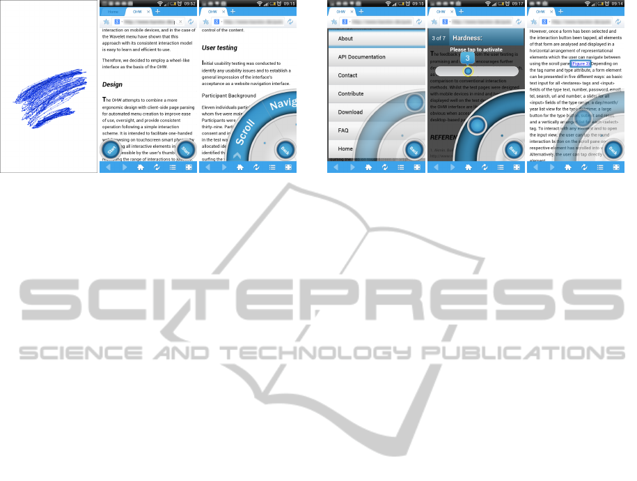
Figure 1: Visualisation of the swipe results (left), the OHW
as it appears on start-up (middle) and launched (right).
an easily accessible, half-circle-shaped interface that
can easily be added to a page by simply dropping the
code into the website.
The OHW facilitates one-handed web browsing
by assembling all interactive elements on request in
a region easily accessible by the user’s thumb and re-
stricts the range of interactions to just two – swipe
and tap. The layout of the page stays untouched and
users can decide whether or not to use the interface
at any time by switching it on or off (Fig. 1). Thus,
the OHW is not an interface for mobile optimisation,
which can be achieved using the techniques outlined
above. Rather, the OHW’s purpose is to enhance one-
handed operation of a website regardless of its degree
of adaptation, without spoiling the design. It aug-
ments the interaction model, not the display. To func-
tion, the OHW requires a browser with CSS3 support
together with the jQuery JavaScript library – the most
popular JavaScript library to date (Pingdom, 2010)
– present on the website. Other than this, there are
no minimum standards required and the OHW can be
implemented into pages that already include libraries
such as MooTools, for example. It has been trialled
on a range of Android and iOS devices with HTML4
and HTML5 mark-up in Standards and Quirks mode.
The OHW interface consists of a variety of mod-
ules whose availability depends on the content of the
website and the interface’s configuration. Each mod-
ule is represented as a wedge and together they form
a wheel-type interface, either at the right-hand or left-
hand bottom corner of the screen, depending upon the
user’s choice (Fig. 1). Only the modules that cor-
respond to elements found on the page are loaded,
but additional modules can be added at runtime by
listening to updates of the Document Object Model
(DOM).
To implement the OHW, the webmaster only
needs to ensure that the jQuery JavaScript library is
available on the website before linking to the OHW’s
code using a basic <script> tag. The webmaster
Figure 2: Basic list view of the site navigation (left), an
augmented input field of the type range (middle) and the
scroll functionality (right).
can optionally edit the configuration file, which is a
JavaScript object, and adjust themes, selectors and
custom functionality. As each and every aspect of
the interface can be adjusted via CSS and HTML, the
OHW can fit the look and content of a wide variety
of websites. Once implemented, the code scans the
website for certain tags from which to build the inter-
face. By default these are basic HTML elements, such
as <nav>, <video>, <audio>, <form>, <h2>,
and <a>, and from these the standard names of the
wedges are derived. This can easily be extended by
using CSS selectors and custom wedges declared in
the configuration file. The OHW contains several
methods to cope with incorrect mark-up and can re-
port any encountered problems to the webmaster.
The OHW’s use is optional for the user and the
interface can be hidden and brought back at any time.
The interface is launched by tapping the Start button
on either side of the screen to make it visible (Fig. 1).
It can be spun by swiping over it to reveal all available
functions. The Start button then becomes a Back but-
ton and can be used to either hide the interface com-
pletely or to go back one level. For example, if the
user was standing and only had one hand free, they
could tap the Start button and operate the site one-
handedly with the help of the interface. As they sit
down and free their other hand, they could hide the
interface by tapping the Back button and continue to
operate the website with both hands, without a change
in design or presentation.
4 FUNCTIONALITY
The OHW offers improved presentation and one-
handed operation for all interactive page elements.
This can be achieved either by accessing them via the
respective wedge in the wheel or by directly tapping
them on the page. By default, the OHW uses basic
TheOneHandWonder-AFrameworkforEnhancingOne-handedWebsiteOperationonTouchscreenSmartphones
7
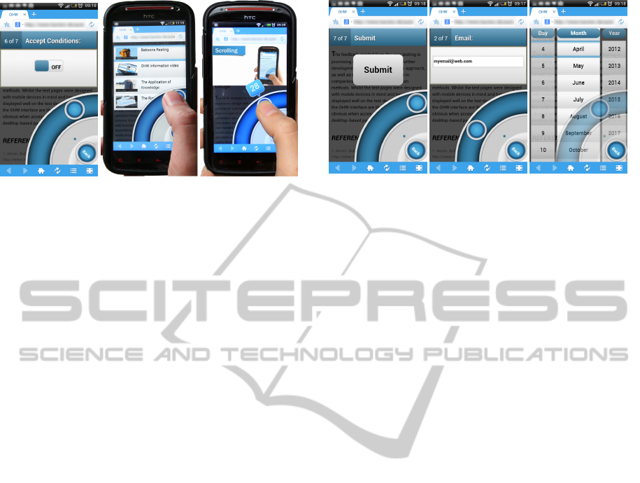
Figure 3: A checkbox input rendered by the OHW, where
a tap on the OHW interface toggles the state (left), a user
selecting a video from the media menu (middle) and video
playback control (right).
list views (Fig. 2) that can hold images and text. In
addition it offers on/off switches, sliders, buttons and
a media player (Fig. 3, Fig. 4). These views are
used in combination for the augmented presentations
of otherwise hard to use elements and can be con-
trolled by swiping and tapping. The OHW also pro-
vides scroll functionality similar to that of the Opera
Mini browser (ASA, 2012). While scrolling, inter-
active elements closest to the current scroll position
are outlined one at a time (Fig. 2) and can be acti-
vated by tapping the interface. Text input uses the sys-
tem keyboard as initial tests showed that users found
the OHW’s own concentric keyboard hard to use. In
addition to the functionality provided, the above can
be easily extended by the webmaster by combining a
CSS selector, one of the OHW’s views and a custom
function to suit their needs.
5 INITIAL USER TESTING
After iterative paper prototyping the interface was
built and a pilot user test with 11 participants (6 F,
all frequent smartphone users) was conducted to iden-
tify usability issues and to establish acceptance. Users
were given a set of tasks one might perform on a page
consisting of headlines, forms, videos, navigation and
links, which they completed using the OHW with-
out assistance. The page was designed to be device-
independent using CSS3 media queries. All actions
were recorded in video and audio, and feedback was
given in a questionnaire on a five-point Likert scale.
Feedback was predominantly positive and in response
to the collected data we created an improved version
of the interface for a usability study determining the
efficiency and speed of the OHW in comparison to the
normal operation (with one hand without the OHW)
of a mobile-optimised website. During a demo ses-
Figure 4: OHW representations of form elements: A button
(left), a text input field (middle) and a date field. Users can
swipe over the interface to navigate between elements in a
form and tap to engage with the active element. Each ele-
ment can be operated by performing swipe and tap actions
on the interface.
sion at a conference (Seipp and Devlin, 2013) we
presented the improved interface to visitors, imple-
menting it on a range of popular websites to be ex-
perienced “hands-on”. Informal feedback from users
during these sessions was consistently positive, com-
plimenting on the ease-of-use, usefulness and qual-
ity, thus supporting the validity of our approach to
improve one-handed operation of websites on touch-
screen mobile devices.
6 USABILITY STUDY
Altogether, 22 participants (7 F) aged 20 to 34 took
part in the study, 19 of whom were final year un-
dergraduate Computing students and the remainder
were young professionals. All of them were right-
handed, regular users of touchscreen mobile devices,
such as phones and media players. The 19 Comput-
ing students were briefly introduced to the OHW dur-
ing class and asked to do some self-directed explor-
ing on a test page. On the day of the study, all users
were given a 5-minute explanation of the usage of the
OHW to ensure its operation was fully understood.
Using a within-subjects design, participants car-
ried out the study one-handedly both with and without
the use of the OHW. The study was counterbalanced
by altering the mode in which the tasks were first per-
formed. The first part of the usability study comprised
10 separate standard tasks a user might perform on a
website and cover the whole spectrum of the OHW:
1. Finding a menu item in the navigation
2. Finding a video and forwarding it to a certain time
3. Finding a form and activating a checkbox
4. Finding another video and starting it
WEBIST2014-InternationalConferenceonWebInformationSystemsandTechnologies
8

5. Finding a form and filling in a date
6. Finding a link in the body text
7. Finding a form and filling in a range value
8. Finding a headline
9. Finding a form and pressing a button
10. Scrolling and clicking on a link
The study featured a website presenting the OHW.
It was coded in HTML5 and CSS3 and contained a
page navigation (<nav>), headlines (<h1>, <h2>,
<h3>), a form with various elements of input types
(“text”, “range”, “datetime”, “submit”, “checkbox”),
paragraphs of text (<p>), three video files with poster
images (<video>), links (<a>), images (<img>) as
well as various <div> elements for the layout. These
elements are very common and can be considered
as representative for many websites. CSS3 media
queries and relative measures were used to make the
website’s presentation device-independent. To con-
duct the study we used a HTC Sensation XE with An-
droid 4.03 and the Maxthon Mobile Browser.
Tasks were performed directly on the website and
were preceded by an instruction screen. Each task
commenced from the top of the page. The number
of interactions and time needed to accomplish the
task were recorded using JavaScript. Recording be-
gan when users pressed OK on the instruction screen
and stopped when a task was completed. For exam-
ple, recording was only stopped once the target link
was clicked or a certain value was entered into a field.
While the above is well-suited for determining ef-
ficiency on discrete tasks, it is less suitable for pre-
dicting the OHW’s “real-life” performance on a page
containing any number of these elements, where spa-
tial proximity could affect performance. To address
this we also measured the performance in 10 addi-
tional, consecutive tasks (1c to 10c), mimicking a set
of coherent actions. After each part of this use case,
recording was paused to show the instructions for the
next part, but the current state of the website (scroll
position, opened menus etc.) remained unchanged:
1c. Navigating to a headline in the text
2c. Scrolling and clicking on a link
3c. Finding a menu item in the navigation
4c. Finding a video and forwarding it to a certain time
5c. Navigating to another headline in the text
6c. Finding a link in the body text by scrolling
7c. Finding a form and entering a word into a text
field
8c. Activating a checkbox in the same form
9c. Filling in a date in the same form
10c. Pressing a button in the same form
7 RESULTS
The data was evaluated using a Wilcoxon signed-rank
test. Due to the varying, skewed results and small
sample size we chose a series of non-parametric tests
over the ANOVA. As tasks were not comparable in
their results because of their different nature, they
had to be treated as separate. Comparison of the
one-handed task performance of users with the OHW
against the normal, non-enhanced way draws a clear
picture of the benefits the OHW offers to one-handed
website operation. The effect of the OHW on effi-
ciency can be derived from the median number of
interactions required to perform a task (Table 1) as
well as from the time needed to complete it (Table 2).
Note: The values of the use case (shown in the tables
as C) are based on the time and interactions needed
to complete the whole use case, consisting of the 10
additional parts 1c to 10c, forming one large task.
Table 1: Median interactions per task and the use case (C)
w/out the OHW including Z and p values as well as % of
interactions (I) needed with OHW (Normal = 100%).
Task OHW Normal Z p %I OHW
1 6 19 3.49 < .001 32%
2 14 13.5 0.63 .526 104%
3 14 22.5 2.93 .003 62%
4 9 12.5 2.1 .036 72%
5 26.5 27 0.15 .884 98%
6 7.5 16 3.9 < .001 47%
7 12 12.5 0.06 .952 96%
8 14 19 1.97 .049 74%
9 13.5 9.5 2.95 .003 142%
10 51.5 26 3.98 < .001 198%
C 104 127 2.18 .029 82%
7.1 Results: Number of Interactions
Needed
In 5 out of 10 tasks, the OHW allows users to com-
plete the task with fewer interactions (Table 1). This
is most visible in Tasks 1, 3 and 6 where the same task
could be accomplished with only 32%, 62% and 47%
of the interactions required without the interface. This
highlights the OHW’s enhancement of tasks such as
finding an item in the navigation, operating a check-
box and retrieving a link from the body text. Other
tasks that took fewer interactions to perform with the
OHW than without were locating a video (Task 4,
72%) and finding a headline (Task 8, 74%). How-
ever, the results also show areas where more interac-
TheOneHandWonder-AFrameworkforEnhancingOne-handedWebsiteOperationonTouchscreenSmartphones
9
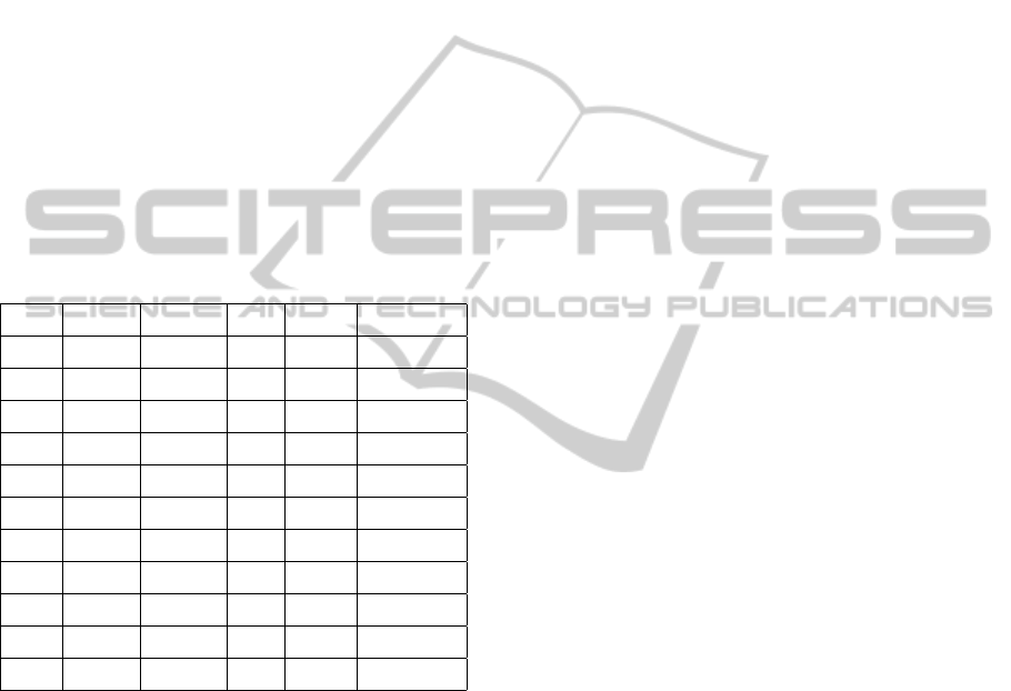
tions are required with the OHW than without. This
includes finding and pressing a submit button (Task
9, 142%) and lengthy scrolling to find a link (Task 10,
198%).
7.2 Results: Amount of Time Needed
Evaluating OHW performance based on the actual
time needed to complete a task draws an even clearer
picture of the OHW’s effectiveness (Table 2). Using
the OHW in all tasks but one is significantly faster
than performing the same tasks without the OHW.
The most striking differences can be observed in Task
1 (33% of the time needed), Task 3 (47%), Task 4
(36%), Task 6 (33%) and Task 8 (46%). However,
scrolling through the document (Task 10) takes more
time with the OHW (147% of time needed).
Table 2: Median time (T) in seconds needed per task (1 to
10) and the use case (C) w/out the OHW including Z and p
values as well as % of time needed with the OHW (Normal
= 100%).
Task OHW Normal Z p %T OHW
1 11.40 34.30 4.11 <.001 33%
2 25.90 45.10 4.07 <.001 57%
3 20.50 43.90 4.11 <.001 47%
4 10.20 28.60 4.11 <.001 36%
5 33.90 46.60 3.98 <.001 73%
6 9.50 29.10 4.11 <.001 33%
7 18.80 26.30 3.85 <.001 72%
8 14.80 31.90 4.07 <.001 46%
9 15.50 22.10 3.17 .002 70%
10 65.40 44.50 3.56 <.001 147%
C 153.20 255.10 4.11 <.001 60%
7.3 Results of the Use Case
The results of the use case show that in a real-life ap-
plication the impact of the OHW on efficiency is sig-
nificant, as overall it took participants only 60% of
the time and 82% of the interactions when using the
OHW as opposed to operating the website normally
(Table 2 and Table 1).
7.4 Implementation into Popular
Websites
To determine the OHW’s versatility and suitability for
different types of websites, we implemented it on sev-
eral popular websites via a proxy script that injected
the OHW code into the loaded page with the follow-
ing results:
7.4.1 Wikipedia
(Wikipedia, 2013) The mobile article view divides the
content into sections which can be expanded, each
headed by an <h2>. Out of the box the OHW was
useful for quick access to the navigation, links, search
and scrolling, but not as useful for jumping to a head-
line, as the user would still have to tap the element
on the page to expand it. Overall the interface was
quick to load and very responsive, but the number of
links on the page shown in the OHW Links menu to-
talled 538. This resulted in a very large list with jerky
scrolling despite the use of hardware-accelerated CSS
transitions.
7.4.2 BBC News
(BBC, 2013) Standard configuration offered quick ac-
cess to the page navigation and search form, but the
headlines menu combined stories from all sections,
making it hard for the user to discern where a story
belonged. This indicates that the content to be made
accessible by the OHW needs to be defined by the
webmaster when configuring the OHW using custom
wedges and selectors. Start-up was quick and opera-
tion was very smooth. The Headlines menu held 32
items, the Links menu 15 and the Navigation menu
35 items. Implementing the OHW on the desktop
version of the site, however, exposes a weakness of
this client-side approach. The desktop contains var-
ious JavaScript-based fading animations which heav-
ily impact performance on mobile devices. With these
animations, the otherwise smooth operation was oc-
casionally interrupted as the OHW has to share the
processing resources with other page elements.
7.4.3 W3C
(W3C, 2013) The OHW performed very smoothly
with 20 items in the Links menu, 10 items in the Nav-
igation menu and 22 items in the Headlines menu. As
stated previously, the labels of the wedges could use
simple customisation by the webmaster to reflect the
content of the website.
7.4.4 Google
(Google, 2013) The OHW was quick to load and very
responsive with 11 items in the Navigation menu, 10
items in the Results menu (Headlines), and 11 items
in the Links menu. Some customisation is required to
better match the content.
WEBIST2014-InternationalConferenceonWebInformationSystemsandTechnologies
10
7.4.5 WordPress Blog
(WordPress, 2013) The OHW performed smoothly
with 6 items in the Navigation menu, 16 items in the
Links menu and 12 items in the Posts menu (Head-
lines), but again the wedges could be renamed to rep-
resent the content meaningfully.
7.4.6 YouTube
(YouTube, 2013) Smooth performance with a ba-
sic configuration showing 4 items in the Navigation
menu, 9 items in the Videos (Headlines) menu and 6
items in the Links menu. Unfortunately, videos could
not be played back within the OHW as these were
served as 3gp files. The OHW can only play back
files which are natively supported by the browser.
7.4.7 Flickr
We were unable to receive the mobile version of the
site (Flickr, 2013) using our proxy script, despite
manually altering the header information of the re-
quest to mimic a mobile device. Attempts to mirror
parts of the site locally did not allow sufficiently ac-
curate reconstruction of the mobile view either.
7.5 General Performance
Performance of the OHW (Table 3) was tested in
the standard browser with varying amounts of con-
tent on an HTC Sensation XE with Android 4.03 and
an iPhone 3GS with iOS 6.1. First, we measured the
start-up time of the interface on each device on the
websites discussed in the previous section. Then we
measured the time it took each device to create a list
view with varying amounts of items after tapping a
wedge in the wheel. For this we chose the Word-
Press blog (WordPress, 2013) as a base and injected
additional elements into the DOM when fetching the
page using the proxy script. All measurements were
performed three times on each device with a cleared
browser cache.
8 DISCUSSION
First we discuss usability and efficiency from a user
perspective. Next we discuss the performance of the
framework to determine the boundaries in which it
can be deployed.
Table 3: Mean time in seconds needed by the HTC Sensa-
tion XE (S. XE) and iPhone 3GS (3GS) to create a list view
(Fig. 1, right) after tapping a wedge in the wheel. Second
part shows mean start-up time (SU) when implemented on
a website.
Task S. XE 3GS
List view, 30 items 1.1 0.6
List view, 60 items 1.5 0.7
List view, 120 items 1.9 0.7
List view, 480 items 2.4 0.6
SU Wikipedia 1.4 0.9
SU BBC News 2.3 1.4
SU W3C 0.3 0.8
SU Google 0.3 1.0
SU WordPress 1.5 1.4
SU YouTube 0.9 0.9
8.1 Usability and Efficiency
When operating a website with only one hand, the
OHW presents a clear advantage over the normal,
non-enhanced mode of operation. In the majority
of cases, using the OHW requires less interaction to
complete a task and in 90% of the examined cases,
a task is completed significantly faster when using
the OHW. However, the results also highlight a weak
point of the OHW. When the user has to scroll a large
section of the page, the performance of the OHW is
significantly weaker than the normal mode of opera-
tion (147% of time needed). It shows that scrolling
with one hand is already very efficient and that the
OHW’s approach cannot compete with the existing
solution, but needs improvement. This has since been
addressed by combining native scrolling and OHW
scrolling so that the user can scroll the website as
usual, but can make more precise selections by mov-
ing their thumb over the interface at the same time.
8.2 Versatility
Implementation into different types of websites high-
lights the pros and cons of our approach. Customisa-
tion of the OHW is easy: the webmaster can quickly
adapt the text of the wedges to reflect website content
using the supplied templates. Custom functionality is
achieved by using the OHW’s plugin model to accom-
modate a website’s own set of interactions, such as
the accordion-like blocks on Wikipedia (Wikipedia,
2013) with custom callback functions. Thus config-
ured, the OHW is suited to pages with categorised
TheOneHandWonder-AFrameworkforEnhancingOne-handedWebsiteOperationonTouchscreenSmartphones
11
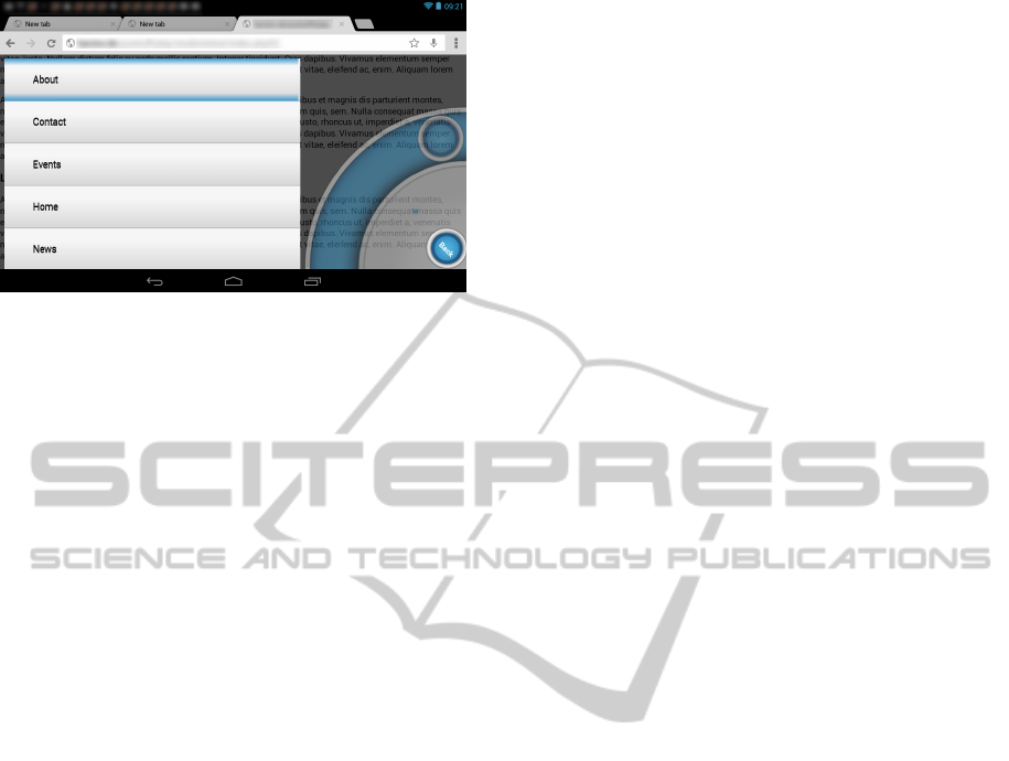
Figure 5: The OHW on a Nexus 7 in horizontal orientation.
text and images that stretch over many screens and
would otherwise need scrolling to access, as found on
news websites, wikis, forums, blogs and search en-
gines. Benefits for all types of websites include quick
access and operation of forms, navigation, and con-
trol of audio or video items if supported natively by
the browser.
The OHW performs well on mobile-adapted pages
if the content per menu is not excessive. Operation
is smooth even with 120 items to be displayed and
scrolled. Beyond that the list scrolling performance
decreases on the HTC Sensation XE with the amount
of data to be presented, whereas it stays the same on
the iPhone 3GS with up to 480 list items. While this
decrease is likely to only happen in rare cases on mo-
bile websites – as observed in our Wikipedia test – it
is more likely to occur on desktop-oriented pages due
to the larger page load and other resource-depleting
processes. Therefore the webmaster has to be con-
siderate when implementing the OHW: a site loaded
with badly coded animations that already struggles
being displayed on a mobile device will not neces-
sarily be improved by the OHW. This highlights the
main problem of using an integrated client-side ap-
proach: the interface has to share the resources with
the content of the website, which can directly influ-
ence performance. Luckily, this is in the hands of the
webmaster implementing the OHW and thus straight-
forward to address. However, it also shows that the
OHW is not a magical one-size-fits-all solution for
making any website easier to interact with when oper-
ating the device with one hand. What it does, though,
is significantly improve operation and efficiency on
already mobile-adapted websites (Table 2) together
with a short start-up time and high responsiveness
(Table 3).
9 CONCLUSION
Our research shows that applying the wheel-menu
metaphor as the basis for thumb-based website in-
teraction and offering a curved input control based
on solely swipe and tap for all interactive elements
clearly improves one-handed website operation and
allows users to complete their goals more quickly and
comfortably as they do not have to loosen their grip
on the device when trying to reach elements outside
the arc of their thumb. Given the demand for a sim-
ple, one-handed way to access websites on a mobile
device (Karlson and Bederson, 2006), the OHW is
a practical and highly effective solution from both a
web developer and end-user perspective, if the tech-
nical requirements are met. The OHW promotes a
free and inclusive way of improving user experience
on the mobile web for modern touchscreen smart-
phone users and supports openness and flexibility.
The use of standard web technologies allows it to eas-
ily adapt to new challenges and ensures its longevity
and ease-of-use for the webmaster. Future work will
address performance optimisations for the operation
of large lists and the development of a SVG and
core JavaScript implementation. We plan to evaluate
the OHW’s applicability as an interface for HTML5-
based smartphone apps and the development of an ex-
tended plugin model to allow more advanced custom
functionality. As it stands, the OHW is a promising
approach for enhancing one-handed web browsing on
a wide range of mobile touchscreen devices (Fig. 5).
REFERENCES
Akmin (2012). Build your own mobile website ... in min-
utes. http://www.mobisitegalore.com/index.html.
ASA, O. S. (2007). Making small devices look
great. http://dev.opera.com/articles/view/making-
small-devices-look-great.
ASA, O. S. (2012). http://www.opera.com/mobile/specs.
Bandelloni, R., Mori, G., and Patern
`
o, F. (2005). Dynamic
generation of web migratory interfaces. In Proc. Mo-
bile HCI 2005, pages 83–90, New York, NY, USA.
ACM.
BBC (2013). BBC news. http://m.bbc.co.uk/news.
Bonnet, D. and Appert, C. (2011). Sam: the swiss army
menu. In Proc. IHM 2011, pages 5:1–5:4, New York,
NY, USA. ACM.
Envato (2013). Signum mobile — html5 & css3 and
iwebapp. http://themeforest.net/item/signum-mobile-
html5-css3-and-iwebapp/1614712.
Flickr (2013). Flickr. http://m.flickr.com.
Francone, J., Bailly, G., Lecolinet, E., Mandran, N., and Ni-
gay, L. (2010). Wavelet menus on handheld devices:
WEBIST2014-InternationalConferenceonWebInformationSystemsandTechnologies
12

stacking metaphor for novice mode and eyes-free se-
lection for expert mode. In Proc. AVI 2010, AVI ’10,
pages 173–180, New York, NY, USA. ACM.
Google (2013). Google search results.
https://www.google.co.uk/search?q=something.
Gupta, A., Kumar, A., Mayank, Tripathi, V. N., and
Tapaswi, S. (2007). Mobile web: web manipulation
for small displays using multi-level hierarchy page
segmentation. In Proc. MC07 4th Mobility Confer-
ence, pages 599–606. ACM.
Hattori, G., Hoashi, K., Matsumoto, K., and Sugaya, F.
(2007). Robust web page segmentation for mobile ter-
minal using content-distances and page layout infor-
mation. In Proc. WWW 2007, pages 361–370. ACM.
Huot, S. and Lecolinet, E. (2007). Archmenu et thumb-
menu: contr
ˆ
oler son dispositif mobile ”sur le pouce”.
In Proc. IHM 2007, pages 107–110, New York, NY,
USA. ACM.
Karlson, A. K. and Bederson, B. B. (2006). Studies in one-
handed mobile design: Habit, desire and agility. Tech-
nical report, Computer Science Dept., Uni. of Mary-
land.
Katre, D. (2010). One-handed thumb use on smart phones
by semi-literate and illiterate users in india. In HWID:
Usability in Social, Cultural and Organizational Con-
texts, volume 316, pages 189–208. Springer Boston.
L
¨
u, H. and Li, Y. (2011). Gesture avatar: a technique for op-
erating mobile user interfaces using gestures. In Proc.
CHI 2011, pages 207–216. ACM.
Mobotap (2012). Dolphin browser. http://dolphin-
browser.com/.
Pingdom (2010). jQuerys triumphant march to suc-
cess. http://royal.pingdom.com/2010/03/26/jquery-
triumphant-march-to-success/.
Seipp, K. and Devlin, K. (2013). Enhancing one-handed
website operation on touchscreen mobile phones. In
CHI ’13 Extended Abstracts on Human Factors in
Computing Systems, CHI EA ’13, pages 3123–3126,
New York, NY, USA. ACM.
W3C (2008). Mobile web best practices 1.0.
http://www.w3.org/TR/mobile-bp/.
W3C (2013). W3C. http://www.w3.org.
Wikipedia (2013). Deusdedit of Canterbury.
http://en.m.wikipedia.org/wiki/Deusdedit of Canterbury.
Wobbrock, J. O., Myers, B. A., and Aung, H. H. (2008).
The performance of hand postures in front- and back-
of-device interaction for mobile computing. Int. J.
Hum.-Comput. Stud., 66(12):857–875.
WordPress (2013). Just another wordpress weblog.
http://en.blog.wordpress.com/.
YouTube (2013). Youtube mobile.
http://www.youtube.com/results?client=mv-
google&q=sublime.
Yu, C.-H. and Miller, R. C. (2011). Enhancing mobile
browsing and reading. In Ext. Abstracts Proc. CHI
2011, pages 1783–1788. ACM.
TheOneHandWonder-AFrameworkforEnhancingOne-handedWebsiteOperationonTouchscreenSmartphones
13
