
Symbol Adaptation Assessment in Outdoor Augmented Reality
Maria Beatriz Carmo, Ana Paula Afonso, António Ferreira, Ana Paula Cláudio and Edgar Montez
Faculty of Sciences, University of Lisbon, Lisbon, Portugal
Keywords: Augmented Reality, Symbol Adaptation, Mobile Devices, User Study.
Abstract: A challenge in presenting augmented reality information, particularly in outdoor environments, is to distin-
guish the virtual symbols from the background image. In this paper we report on a user study that leverages
prior knowledge about adaptations to improve symbol conspicuity by expanding its application to outdoor
environments and mobile handheld devices. We considered two types of adaptation that yielded good results
indoors, namely adding a border around the symbol and adjusting the colour luminosity, and tested them
outdoor in daylight. We also introduced partial and total adaptation modes that differed in the scope of the
symbols to adapt: only the ones that are almost imperceptible from the background versus every symbol
overlaying the real world image. Results from users’ questionnaires reveal that the border adaptation contin-
ues to be the favourite regardless of the outdoor lighting conditions, and yet we did not find differences in
symbol detection performance in comparison with adjusting colour luminosity. The border adaptation was
also considered the best to preserve symbol semantics when combined with the total adaptation mode, thus
making it a versatile option for augmented reality applications.
1 INTRODUCTION
Augmented Reality (AR) applications superimpose
virtual graphical representations on images captured
from the real world to provide additional infor-
mation to the user. Nowadays this technology can be
used in smartphones and tablets, which has led to an
increasing interest in its use. But the virtual symbols
may not be easily detected on the image when their
colour is similar to the background colour. This is
even more severe in outdoor AR, where there is no
control over the environment and lighting conditions
vary widely (Gabbard et al., 2007).
Dynamically adapting the graphical attributes of
symbols when they become indistinguishable from
the background image can improve their visualiza-
tion, but drastic changes in the symbols’ appearance
may confuse the user. Consequently, the adaptations
should make symbols more salient while preserving
the original semantics associated with them.
Another example of the pertinence of this prob-
lem is the visualisation of scientific data in AR ap-
plications, for instance colour-encoded pollution
levels in urban landscapes (White and Feiner, 2009),
which also requires dynamic adaptations that main-
tain the semantics of the graphical representations to
support correct and consistent interpretations of the
data.
The goal of our research is to investigate how to
adapt symbols automatically in order to improve
their distinctiveness from the background images,
preserving the original semantics and without mov-
ing them to new positions.
In a previous work (Carmo et al., 2013) we stud-
ied a set of adaptations that make controlled adjust-
ments to the colour or size of the symbols, or change
the colour of the letters or digits inside the symbol,
or add a border around them. We assessed user pref-
erences in scenarios where the symbols were pur-
posefully very similar to the background image and
the results revealed that adding a border and adjust-
ing colour luminosity were the preferred symbol
adaptations. However, we did not evaluate if the
adaptations maintained the semantics of the sym-
bols. Moreover, the study was carried out indoors
and using a laptop.
Since outdoor environments are more demanding
than indoor settings, in this paper we focused on the
two favourite adaptations and studied their use in
AR outdoor applications with mobile devices. Fur-
thermore, we assessed if symbols maintained their
semantics considering two separate modes of adap-
tation: adapting only the symbols that might be im-
perceptible from the background versus adapting
every symbol in the image.
387
Carmo M., Afonso A., Ferreira A., Cláudio A. and Montez E..
Symbol Adaptation Assessment in Outdoor Augmented Reality.
DOI: 10.5220/0004693003870396
In Proceedings of the 9th International Conference on Computer Graphics Theory and Applications (GRAPP-2014), pages 387-396
ISBN: 978-989-758-002-4
Copyright
c
2014 SCITEPRESS (Science and Technology Publications, Lda.)

The results obtained are organized as follows:
section 2 describes the related work; section 3 ex-
plains the symbol adaptations that we tested; section
4 describes a user study for evaluating users’ prefer-
ences as well as the efficiency and effectiveness in
symbol selection tasks; sections 5 and 6, respective-
ly, present and discuss the results; and finally, in
section 7 we draw conclusions and point out future
work.
2 RELATED WORK
One of the major challenges documented in the AR
literature is how to provide users with additional
information about the real world as it evolves.
Kalkofen et al., (2009) proposed several techniques
to support the combination of virtual objects and
real world images, and suggested the use of artificial
colouring when objects have low contrast with their
surrounding background. In Gruber et al. (2010) the
colours of both the virtual objects and the real world
images were harmonised based upon aesthetics
guidelines. Since the colour of some real world ob-
jects may be important for their meaning, while with
others that may not happen, the objects were classi-
fied accordingly, thus restricting or allowing colour
manipulations by the AR application.
In this paper, we also make adjustments to the
colours of virtual symbols, but leave real world im-
ages untouched, following a classical trend in AR
(Azuma, 1997). Furthermore, in one of the adapta-
tions presented in the next section, we focus on en-
hancing symbol conspicuity by controlling mainly
the luminosity component of colour, that is, we in-
duce symbols to be perceived by the user as being
slightly more or less bright, rather than, say, turning
black into red, which could more likely alter symbol
semantics (Silva et al., 2011).
Thomas et al. (2000) studied what should be the
adequate colours to draw monsters in the ARQuake
game, an outdoor/indoor mobile AR application. The
authors conducted an informal experiment to deter-
mine the best colours for specific outdoor settings,
using nine different colours with four levels of in-
tensity in each setting. The results showed that there
is a set of appropriate colours/intensities for each
outdoor setting. The goal of that study was to rec-
ommend a set of colours for a specific setting; how-
ever, our work aims to study symbol adaptations to
make them more salient in any outdoor setting.
Besides graphical symbols, text can be used to
provide additional information in AR applications.
Gabbard et al., (2007) analysed the influence of out-
door lighting conditions in text readability and tested
algorithms to improve text contrast relative to the
background image, for instance by outlining the let-
ters. This feature relates with the need that graphical
symbols should be perceived as units of information,
preferably forming closed figures and having well-
defined boundaries (Sanders and Mc-Cormick,
1992, pages 122–123). For instance, Nivala and Sar-
jakoski (2007), regarding the adaptation of graphical
symbols for maps on mobile devices, suggested add-
ing a border around points of interest. Naturally,
maps are different from real world images, but nev-
ertheless the same problem of symbols being con-
founded with the background exists.
Another study of text readability was carried out
by Leykin and Tuceryan (2004), who did experi-
ments with users to create pattern recognition mod-
els to automatically identify regions in which labels
should be hard to read due to interference caused by
background textures. They used grey scale images
and computed the contrast between the text and the
surrounding real world image, and ultimately moved
the labels to regions which allowed higher readabil-
ity. Our work aims to adapt graphical symbols so
they become distinguishable from the real world
image, without moving them to new positions.
Wolfe and Horowitz (2004) analysed the attrib-
utes that guide visual search and concluded that col-
our, motion, orientation, and size are the most
important. Almost the same attributes were studied
by Paley (2003) to distinguish the text in a transpar-
ent, overlay, window from the background text.
Taking into account these studies, and guided by
the need to preserve symbol semantics and avoid
modifying real world images, we proposed, in a pre-
vious work (Carmo et al., 2013), a set of adaptations
for AR applications and performed a study to evalu-
ate users’ preferences to improve symbol conspicui-
ty in a controlled indoor environment and with a
laptop. In this paper we leverage the knowledge
about the users’ preferred adaptations by expanding
its application to an outdoor environment and mo-
bile handheld devices, and by evaluating semantics
preservation, as described in the next section.
3 ADAPTATION OF SYMBOLS
The aim of our study is to identify good adaptation
approaches to make virtual symbols more salient
from the background in AR applications when the
colour of the surrounding image and the virtual
symbols are similar. These adaptations have to be
thoroughly chosen to ensure that the semantics of
GRAPP2014-InternationalConferenceonComputerGraphicsTheoryandApplications
388

the original symbols is preserved.
In previous work, we considered four major
types of adaptation (Carmo et al., 2013):
Adding a border around the symbol: white and
black borders were considered to avoid mislead-
ing interpretations that could be introduced by
the use of colours (Figure
1b and c, respectively).
Adjusting the colour luminosity: symbols are
drawn slightly lighter when the background is
dark (Figure
1d), and a bit darker when the back-
ground is light.
Enlarging the symbol: a factor of 1.5 relative to
the size of the base symbol was used (Figure
1e).
Changing the colour of the letters or digits inside
the symbol: the characters on the symbol were
depicted in white when both the background and
the symbol had a dark colour (Figure
1f).
The base symbol (Figure
1a) is adapted whenever
the dominant colour (the colour having the highest
frequency) of the symbol and the dominant colour of
a rectangular image region that encloses the symbol
are considered similar. This happens when the abso-
lute difference between each of the three RGB col-
our components is less than a threshold.
A1
H1
E1
AA
B1
C1
(a) (b) (c) (d) (e) (f)
Figure 1: Examples of base and adapted symbols.
The results from a user study revealed that add-
ing a border was favoured by the majority of the
participants followed by adjusting the colour lumi-
nosity. Although we chose a neutral colour to the
symbol border and adjusted only the luminosity (not
hue or saturation) to preserve the semantics of the
symbols, we did not assess if the adaptations
achieved our goal. Furthermore, the study was con-
ducted indoors and using a laptop.
These two limitations were the motivation for
the work presented in this paper. As a starting point
we used the two favourite adaptations of our previ-
ous work, then we proceeded our work on adapta-
tion of symbols considering their use for AR outdoor
applications in mobile devices. In addition, we ad-
dressed the study of semantics preservation by con-
sidering two separate modes of adaptation: adapting
only the symbols that might be imperceptible from
the background versus adapting every symbol in the
image. That is, we wanted to assess if the adaptation
of only some of the symbols could confuse the ob-
server, raising the question of why supposedly
equivalent symbols look different.
Adjusting the Luminosity. As stated before, to pre-
serve symbol semantics it is essential to ensure that
there is no abrupt change of their original colour,
which is why we adjust only the luminosity of the
symbols. For this purpose, we used the HSV model,
which represents colour according to the three com-
ponents hue, saturation and value, because it allows
direct control of the luminosity through the value
component. This model is preferred for image en-
hancement applications due to its separation of the
chrominance and luminance values (Asmare et al.,
2009).
We conducted a preliminary study to identify the
minimum variation in luminosity that makes a sym-
bol distinguishable with both light and dark back-
ground images, particularly outdoors in a sunny day
(Montez, 2012). In fact, in AR applications used
outdoors it is difficult to control lighting conditions,
which can vary from 1 lux to 100,000 lux (Gabbard
et al., 2006).
Considering situations in which the colour of the
symbol is similar to the colour of the background,
the results of the study revealed that it should be
considered a difference of 0.25, in the range [0,1], in
their value’ s components. This is the minimum dif-
ference to ensure the user distinguishes the symbols
from the background, regardless of the background
colour being light or dark.
Mode and Type of Adaptation. As mentioned before,
we considered two adaptation modes: adapt only the
symbols that are imperceptible (PA - partial adapta-
tion) or adapt all the symbols (TO - total adaptation).
In the latter mode we considered two cases: firstly,
after the adaptation all the symbols remain percepti-
ble (TA - total all adaptation); and secondly, some of
them that were originally perceptible become undis-
tinguishable from the background after the adapta-
tion (TS - total some adaptation).
The adaptation type corresponds to adapting the
base symbol (BA) by adding a border (BO) or ad-
justing the colour luminosity (CO). Adding a border
means that we add a white or a black border to sym-
bols depending on the type of the background image
being dark or light, respectively.
The base symbol is a square of 40x40 pixels and
the border is a line with a width of 3 pixels, as rec-
ommended by Huang and Chiu (2007).
The adaptation that adjusts the colour works by
increasing or decreasing the luminosity of colour by
0.25 in the range [0,1], as described above. It is in-
creased if the luminosity of the dominant colour of
the background of the symbol is less than or equal to
SymbolAdaptationAssessmentinOutdoorAugmentedReality
389

0.5, and reduced otherwise. A special case is when
the colour luminosity of a symbol is less than 0.1,
because in these circumstances it is perceived as
black when outdoors (Romani, 2012). To avoid that
a symbol that seems black become coloured, we
adjust the symbol in a gray scale, that is, the satura-
tion is set to 0 and the luminosity is set to 0.35, ob-
tained by adding 0.25 to 0.1.
4 USER STUDY
The user study is organized in three parts. The main
objective of part 1 is to analyze the users’ prefer-
ences on the adaptation mode per type of adaptation.
Part 2 compares the efficiency and the effectiveness
of each adaptation type and in part 3 we want to
know the users’ preferred adaptation type.
Considering these specific purposes our main
hypotheses are:
H1: Participants prefer the adaptation of all symbols
(total adaptation mode) to preserve semantics when
considering the type of adaptation adding a border.
This hypothesis is based upon the Gestalt similarity
principle, which claims that elements tend to be in-
tegrated into groups if they are similar to each other
(Dix et al., 2004). Thus, if all the symbols are equal-
ly adapted they should be equally interpreted seman-
tically.
H2: Participants prefer the partial adaptation mode
to preserve semantics, when considering the type of
adaptation adjusting the colour luminosity. As men-
tioned before, this adaptation type only manipulates
the luminosity component of the colour to enhance
the contrast of the symbols with the background and
avoid affecting its semantics. Therefore, when ad-
justing only the symbols that might be imperceptible
there should be no significant change of semantics,
because colour perception depends on the surround-
ing context (Stone, 2005). Also, the application of
the same adaptation to all symbols (corresponding to
the total mode) could lead to a degradation of the
visibility of some of the symbols that were original-
ly perceptible.
H3: Participants are faster (efficiency) and more
accurate (effectiveness) in carrying out symbol se-
lection tasks when considering the type of adapta-
tion adding a border. This hypothesis is motivated
by the results obtained in our previous study that
showed the majority of the participants preferred
this type of adaptation in a similar type of task.
H4: Participants prefer adding a border as the best
adaptation to improve the detection of symbols. This
hypothesis is also based upon the results obtained in
our previous study, which was conducted indoors
with a laptop.
Participants. A total of 22 participants, 14 men and
8 women, volunteered to the study. The median age
was 28 years, with 14 participants aged between 15
and 24 years, 4 from 25 to 39 years old, and the re-
maining 4 had between 40 and 53 years. 5 were
undergraduates, 10 participants were graduated, and
7 had a master or a PhD degree.
A self-assessment of mobile device and AR ex-
perience revealed that 15 participants used mobile
devices daily, 3 weekly, 1 rarely and 3 of them had
never used a mobile device. Some of the participants
had at least one previous experience with AR appli-
cations, 6 weekly, 5 rarely, but 11 were not even
aware of the concept.
A convenience sampling was used to select the
participants, who were recruited from social con-
tacts. No monetary reward was offered.
Apparatus. The tests were performed outdoors in
sunny days, in the shadow, but near a sunlit area and
with illuminance values that ranged from 2500 lux
and 13000 lux, with an average of 6070 lux. The
illuminance was measured with a light meter Model
YF Yu Fung - 1065. These values are in the range
suggested by Gabbard (2006), from 2000 lux to
25000 lux, which represents the limits in outdoor
environments. This means that it was possible to
evaluate the adaptations using normal external con-
ditions and very similar for all participants.
The tests were conducted in June and July, be-
tween noon and 8pm.
We developed and used a Java application with a
SDK for Android API 8 for the user study. This ap-
plication is composed of a training part and the tasks
that comprise the study. The study was carried out
with a LG P500 smartphone, running Android OS
2.2, featuring a 600 MHz processor and a 3.2 inch
touch screen with 320x480 of resolution. The lumi-
nosity of the device was set to 35%.
Tasks. Participants were asked to perform selection
and preference tasks. In each test, an image with
superimposed symbols was shown to the participant
and to ensure that s/he identified all of them s/he
should touch all the symbols in the image. The pref-
erence task immediately followed the selection task.
The participant answered verbally to questions about
the mode and type of adaptation and the researcher
wrote down the answer.
Part 1 of the study concerns the preferences
about the mode of adaptation (TO and PA) to evalu-
ate which was preferred and if these adaptations
GRAPP2014-InternationalConferenceonComputerGraphicsTheoryandApplications
390
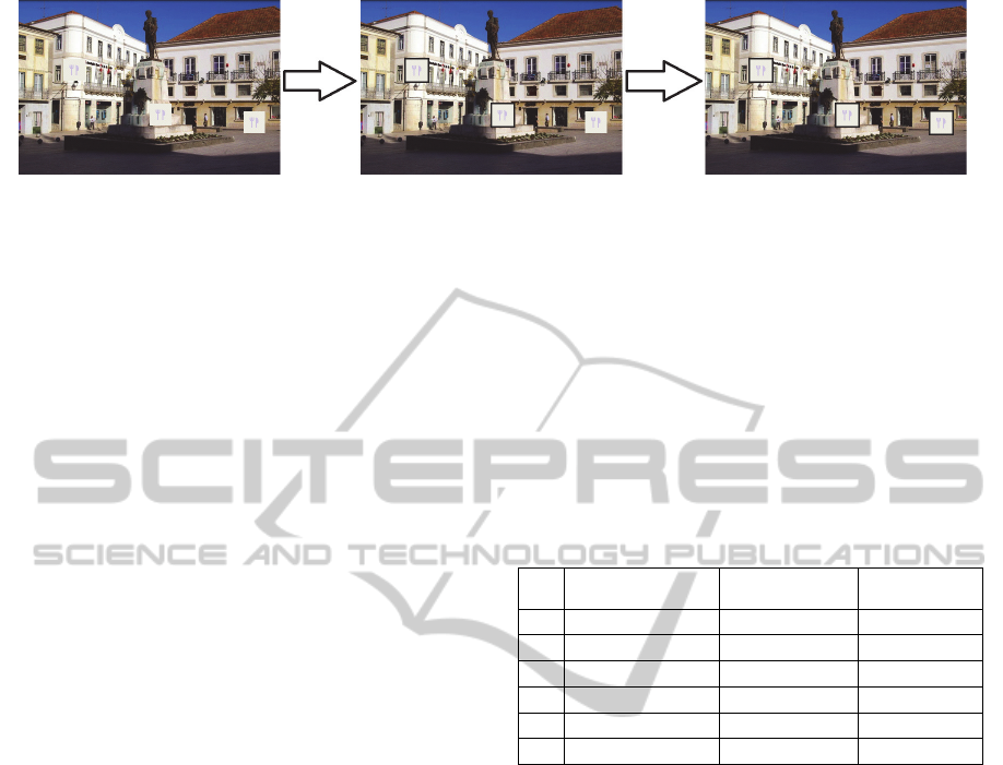
(a) (b) (c)
Figure 2: Example of the first part of the study - Sequence of images of test T1.
maintain symbol semantics. A participant was ex-
posed to one adaptation mode at a time and was
asked if s/he considered that semantics was pre-
served. After been exposed to a total mode and par-
tial mode s/he was asked which of them was the
preferred.
Part 2 regards the efficiency and effectiveness with
each type of adaptation (BO and CO). The partici-
pant was exposed to one adaptation type at a time.
We measured and compared the efficiency and ef-
fectiveness with each type of adaptation by counting
the number of tapped symbols and registering the
time it took to perform the task.
Part 3 of the study refers to the preferences about the
type of adaptation (BO and CO). The participant
was exposed simultaneously to both adaptation
types and, in the end, said which was preferred.
Design. We set up the user study according to a re-
peated measures design, that is, in each trial the
same participant was exposed to different condi-
tions.
In part 1, we manipulated three independent var-
iables, namely, background, type of adaptation BA,
BO and CO, and mode of adaptation, TO and PA.
Notice that the TO mode of adaptation includes two
cases, TA and TS, as mentioned before. The depend-
able variable was the preferred mode of adaptation
(total or partial).
Regarding the background variable, we distin-
guished between dark and light images over which
the symbols were placed. We used two sets with 3
images each, representative of natural scenes with
shadows or poor illumination (dark background) and
bright sunlight (light background), respectively.
For the virtual symbol we considered a square
with a colour similar to the dominant colour of the
background and containing a fork and a knife (a
popular representation of restaurants) whose colour
had a low contrast with the symbol’s colour. This
aimed to make the symbol not easily detected by its
content in order to study whether the adaptations
were effective. All symbols displayed were equal
and, purposely, only some of them were difficult to
distinguish from the background (Figure 2a).
In each test, a background image was presented
three times to the participant and the position of the
symbols did not vary (Figure 2b and c). In the first
case, the symbols were shown with no adaptation
(BA); then, with one of the adaptations mode, either
a total (TA or TS) or a partial adaptation (PA); and
finally with the other mode (partial or total).
The manipulations of the type of adaptation and
background were organized in 6 tests according to
Table
1.
Table 1: Tests in part 1 of the study.
# Adaptation Type
Adaptation
Mode
Background
T1 BA, BO TA, PA light
T2 BA, BO TA, PA dark
T3 BA, CO TA, PA light
T4 BA, CO TA, PA dark
T5 BA, CO TS, PA light
T6 BA, CO TS, PA dark
The pairs of tests (T3, T4) and (T5, T6), each
one with a light and a dark background, deal with
colour adaptation, but illustrate different approaches.
With the first pair, we a have a TA case, in which all
adapted symbols are distinguishable from the back-
ground. But with the second pair, we have a TS case,
where some of the symbols become undistinguisha-
ble after being adapted, even though they were orig-
inal salient from the background. For the border
adaptation, we only have a pair of tests (T1, T2) cor-
responding to the TA case, as we cannot consider the
TS case: if a symbol is salient, even if we add a bor-
der similar to the background, the symbol will con-
tinue to be salient.
In part 2, we manipulated two independent vari-
ables: background and type of adaptation (BA, CO,
and BO). The dependable variables were the number
of selected symbols and the time to select all sym-
bols in the image. The symbols were adapted with
the total mode. The tests were organized according
to Table 2.
Regarding the background variable, we consid-
ered two images: a dark image and a light image
SymbolAdaptationAssessmentinOutdoorAugmentedReality
391
with the same illumination requirements as in the
first part.
Table 2: Tests in part 2 of the study.
# Adaptation Type Background
T7 BA, CO dark
T8 BA, CO light
T9 BA, BO light
T10 BA, BO dark
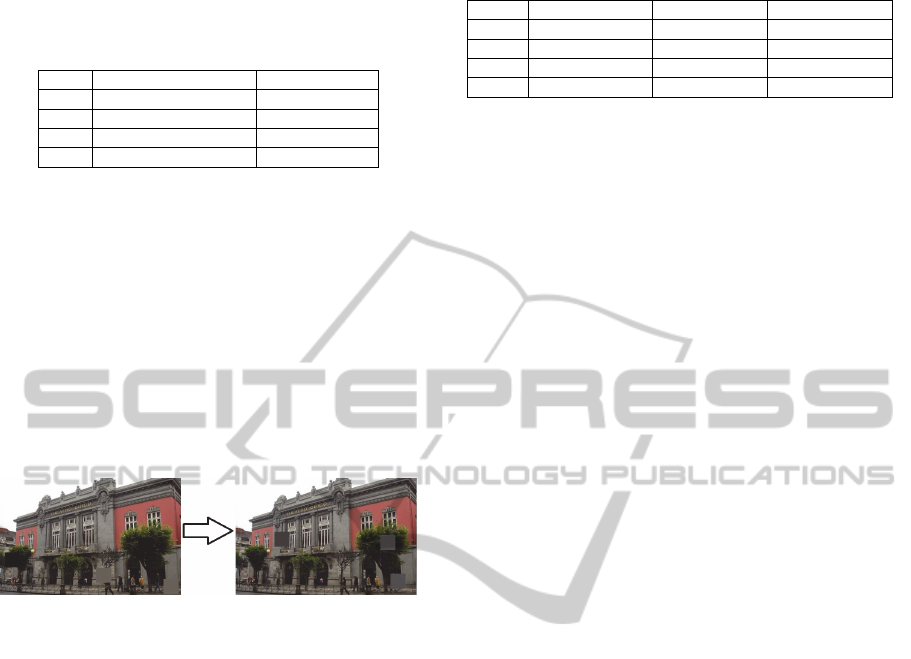
We used square symbols filled with a uniform
colour similar to the dominant colour of their sur-
rounding background, making the symbols hard to
find. The goal was to measure how many symbols
were found and how long it took to find the symbols
with and without adaptations. In each test the back-
ground image was presented twice to the participant:
first, it was displayed with only base symbols; then,
with all symbols adapted (Figure
3). The location of
the symbols was different in successive images to
avoid learning effects. The same light and dark
backgrounds were used for both adaptation types.
Figure 3: Example of Part 2 – Sequence of images of T7.
In part 3, we considered three independent varia-
bles: background, type of adaptation (BA, CO+BO)
and symbol content (PL - plain symbol, LE – sym-
bol with a letter). The symbols were adapted with
the total mode. The dependent variable was the pre-
ferred adaptation type (border or colour). Light and
dark backgrounds were considered as in the preced-
ing parts of the study.
In each test, the background image was present-
ed twice. In the first case, the symbols were not
adapted and were located in places where they were
not salient. Then all of them were adapted, some
with the border adaptation and the remaining with
the colour adaptation. The location of the symbols
was different in successive images to avoid learning
effects.
We considered two types of symbols: square
symbols filled with a uniform colour similar to the
dominant colour of the surrounding background, like
those in part 2; and symbols containing a letter in
the center (“H”) to give them semantics and assess if
the participant’s answer was different. Table
3 pre-
sents the list of tests and the respective independent
variables values.
Table 3: Tests in part 3 of the study.
# Adaptation Type Symbol Content Background
T11 BA, CO+BO PL dark
T12 BA, CO+BO PL light
T13 BA, CO+BO LE light
T14 BA, CO+BO LE dark
Procedure. A trial started when a participant re-
ceived the mobile device in an outdoor location. The
researcher annotated the test conditions, namely,
location, date and time and the illuminance values in
lux. Then, an introduction to the nature of this ex-
periment was given, along with an estimation of the
time that the trial would take: between 20 and 30
minutes. Next, the researcher filled out a demo-
graphic questionnaire (age, gender, academic de-
gree) according to the answers given by the
participant, which also contained questions about the
degree of familiarity with mobile devices and aug-
mented reality applications. Then, the researcher
described the type and modes of adaptation and the
tasks to be performed in each part of the study.
After this introductory phase, participants were
presented with training tasks to let them familiarize
with the application and clarify any doubts concern-
ing the tasks. Hereafter, participants carried out 14
experimental tests, organized in three sequential
parts, as mentioned earlier. To start each part of the
study, participants were required to tap on a “Start”
button displayed on the screen. In each part, to pro-
ceed to the following task, the participant tapped in
a “Next task” button. Each task ended when partici-
pants tapped on the last symbol presented. If a par-
ticipant did not select any symbol s/he received a
message asking if s/he really wanted to proceed.
We created eight versions of the tests to control
the order of the presentation of experimental condi-
tions. In part 1, in half of the test versions, the par-
ticipant began with an adaptation adding a border
and in the other half, with an adaptation adjusting
the colour. The mode of adaptation presented to the
participant was also controlled creating half of the
versions starting with images with a total adaptation
(TA or TS) and half with partial (PA). In part 2 we
created four versions to control the order of expo-
sure of the adaptation mode and for each one the
order of the background type. In part 3, there were
also four versions, controlling the order of the expo-
sure of symbol content and type of background.
5 RESULTS
Results are organized in 3 parts: firstly, we evaluate
GRAPP2014-InternationalConferenceonComputerGraphicsTheoryandApplications
392
partial versus total adaptation modes; secondly, we
compare the efficiency and the effectiveness of add-
ing a border and adjusting colour luminosity adapta-
tion types; finally, we access the preferences of the
participants by adaptation type.
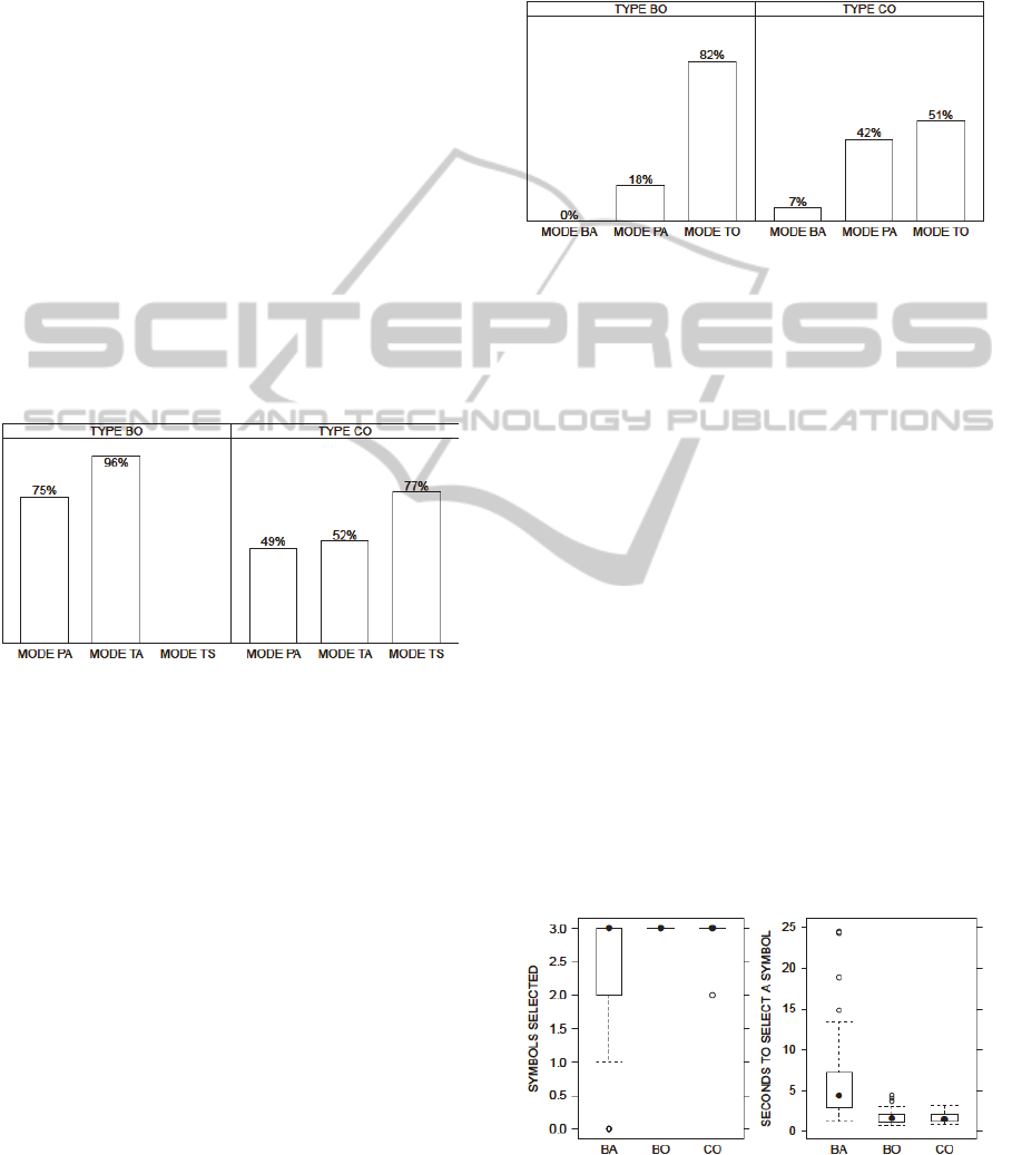
Partial versus Total Adaptation Modes. The opin-
ion of the participants about the preservation of se-
mantics by adaptation mode is presented in Figure 4
for adaptation types BO and CO, respectively. The
TA adaptation mode obtained the best results for the
BO adaptation type and a test of equal proportions
showed that the differences to the PA mode are sig-
nificant (X
2
=7.31, 1 df, p<0.007). This result sup-
ports hypothesis H1. However, when the adaptation
type is CO, the TS adaptation mode received more
favourable opinions about semantics preservation,
which is contrary to hypothesis H2. A two-sample
test for equality of proportions, with Bonferroni cor-
rection, revealed that the differences between TS
and PA (X
2
=9.74, 1 df, p<0.002) and TS and TA
(X
2
=6.03, 1 df, p<0.0015) were significant.
Figure 4: Positive opinions about preservation of symbol
semantics by type and mode of adaptation.
There were no significant differences in the re-
sults considering genre, background (light or dark),
background image, and the order of the tests (p>0.07
in all tests of equality of proportions). Regarding the
luminosity, there were no interferences for the BO
adaptation type (p=0.07), while for the CO adapta-
tion type luminosity influenced the results of the PA
adaptation mode (X
2
=8.56, 3 df, p=0.04).
In the question about the preferred mode of ad-
aptation, we combined all the answers correspond-
ing to the total adaptation mode in the CO
adaptation type (TO=TA+TS), as both represent an
opposite choice to the PA mode. For the BO adapta-
tion type, TO has the same meaning of TA. Results
show that participants preferred the TO mode for
both adaptation types (Figure 5). For type BO, a test
of equality of proportions for the pair (TO, PA) con-
firmed significant differences (X
2
=35.64, 1 df,
p<<0.001), which again supports hypothesis H1.
However, for the pair (TO, PA) in the CO mode, the
test of equal proportions reveals that hypothesis H2
should be rejected, as there is no significant differ-
ence in the adaptation mode’s preferences (X
2
=1.46,
1 df, p>0.22).
Figure 5: Preferred adaptation mode by type of adaptation.
The preference results for the BO adaptation
type did not have significant differences considering
the background image, the type of the background
image, the order of the tests, and the luminosity
(p>0.12), but were influenced by genre (X
2
=5.59, 1
df, p=0.02). The results for the CO adaptation type
also did not depend on the luminosity (p>0.80) and
on the order of the images (p>0.24), but reveal in-
fluences from the background image (X
2
>10.69, 3
df, p<0.01), background (X
2
>3.78, 1 df, p<0.05), and
genre (X
2
=4.22, 1 df, p=0.04).
Symbol Selection Performance. The number of
symbols selected by participants was frequently
equal to the 3 available symbols. Thus, the data dis-
tributions, regardless of the adaptation type, were
not normal as revealed by a Shapiro-Wilk test
(W<0.74, p<<0.001). The box-plot in Figure
6a sug-
gests that several data points were below the maxi-
mum for the BA condition, and indeed, by applying
two-sample Wilcoxon tests, we found significant
differences in the overall counts between BA and the
other two types of adaptation (W<1113.5,
p<<0.001).
(a) (b)
Figure 6: Effectiveness and efficiency of symbol selection
per adaptation type.
SymbolAdaptationAssessmentinOutdoorAugmentedReality
393
However, a difference could not be accepted be-
tween the BO and CO conditions (p=0.32), and, in
spite of our efforts, the results suffered from inter-
ferences by variables such as genre, background,
outdoor illuminance, and others. Thus, we find no
ground to accept hypothesis H3 regarding the num-
ber of symbols selected.
The other element of symbol selection in H3 is
the average time to select a symbol, which was on
average 5 seconds (median 2.7) greater in the BA
condition, as shown in Figure 6b. A Shapiro-Wilk
test showed the data distributions were not normal
(W<0.93, p<0.012), so we applied two-sample Wil-
coxon tests that revealed the difference was signifi-
cant (W<3397.5, p<0.001).
However, symbol selection efficiency was most-
ly the same in the BO and CO conditions (Wilcoxon
test, p=0.58). Thus, we cannot find evidence to sup-
port hypothesis H3.
Preferred Adaptation Type. In this part of the pa-
per we wanted to complement the results obtained in
our prior work (Carmo et al., 2013) by evaluating
the preferred type of symbol adaptation in an out-
door environment, rather than indoors, and using a
mobile handheld device, instead of a laptop.
Actually, the results reinforce the previous evi-
dence: adding a border to symbols (BO) continued
to be preferred by the majority of participants with
96% versus 91% from our earlier study. The remain-
ing 4% corresponded to the other adaptation type
participants were simultaneously exposed to, which
was adjusting the colour luminosity (CO). A test of
equality of proportions naturally revealed a signifi-
cant difference (X
2
=145.45, 1 df, p<<0.001).
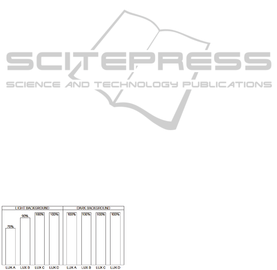
Furthermore, Figure
7 shows a complete domi-
nance of the BO adaptation with dark background
images, regardless of the outdoor lighting conditions
that we recorded during the experiment.
Figure 7: Proportion of BO preferences per background
and outdoor lighting. The illuminance scale (LUX A, B, C,
D) ranges in equal parts from 2500 up to 13000 lux.
The choice of the preferred adaptation type was
not affected by genre, images of the real world, and
order of exposure to the tests (p>0.24). However,
with light backgrounds, the outdoor lighting proba-
bly influenced the proportion of participants choos-
ing the BO adaptation (X
2
=7.7, 3 df, p=0.05).
Nonetheless, the absolute value of those proportions
was always very high (>=70%).
In these circumstances, we can accept hypothesis
H4 stating that adding a border around symbols is
the preferred adaptation.
6 DISCUSSION
One of the goals of this work was to increase real-
ism and generalizability when compared with our
previous study (Carmo et al., 2013). Some limita-
tions pointed out were that the tests had been con-
ducted indoors with a laptop computer, as well as
the simplicity of the symbols used.
So, although the experiment described here must
have similarities with the previous one, such as the
adaptation types, and the light/dark background im-
ages, we addressed the realism limitation in two
ways: firstly, all tests were carried out outdoors with
a mobile handheld device, reproducing a plausible
activity of consumers; and secondly, we enhanced
symbol semantics by choosing symbols identical to
those used in the representation of points of inter-
ests, such as the fork and knife of restaurants. Nev-
ertheless, additional work is necessary to explore
more complex symbol designs, as we continue to
have square symbols.
For the sake of precision and comparability, we
set the luminosity of the handheld device to 35%
and all the participants were exposed exactly to the
same images.
Concerning the generalizability of the results to a
variety of populations, we tried to find participants
covering a wide range of ages, both genres and with
different experiences in using mobile devices. In
further studies we intend to cover a wider range of
participants.
Regarding semantics preservation we verified
that when adding a border the preferred adaptation
mode is total adaptation (hypothesis H1).
However hypothesis H2 was refuted: when ex-
posed to symbols with adjusted colour luminosities,
participants did not prefer the partial adaptation
mode. Colour perception depends on both the colour
of the symbol and the colour of the surrounding
background, that is, it is contextual. Therefore, it
could be expected that only the symbols that are not
distinguishable from the background needed to have
an adjustment in luminosity. Nonetheless, the total
GRAPP2014-InternationalConferenceonComputerGraphicsTheoryandApplications
394

mode adaptation was the preferred one. This may be
due to the influence of some variables, especially,
luminosity.
Further research is needed to improve the colour
adjustment algorithm. A limitation of the present
algorithm is that it darkens the symbol when the
value component of HSV is above 50%. This
threshold should be increased to preferentially light-
en the symbol. Another enhancement is to consider
the second dominant color of the surrounding back-
ground to detect similarities between the symbol and
the background.
Another extension to this study is to consider dif-
ferent lighting conditions, using a broader range of
illuminance values, including, for instance, direct
sun light exposure in a bright sunny day.
Taking into account the preferences expressed in
our previous study, we expected that the selection of
the symbols would be performed faster and more
accurately when considering adding a border adapta-
tion than adjusting colour luminosity (hypothesis
H3). Actually, the results do not show significant
differences, as they were influenced by some of the
controlled variables. We also admit that there were
few symbols to be detected due to the limited size of
the screen. The experiment could probably be im-
proved by exposing participants to a larger number
of symbols over periods of time, instead of consider-
ing s fixed number of symbols superimposing a stat-
ic background image.
This study reinforced the results obtained in our
prior work in that adding a border is preferred over
adjusting the colour luminosity (hypothesis H4) re-
gardless of the outdoor luminosity conditions.
7 CONCLUSIONS
Given the results from our previous study, leading to
the conclusion that the two favourite adaptations
were adding a border and adjusting the colour lumi-
nosity, our goal in this paper was to evaluate if these
adaptations maintained symbol’s semantics.
We investigated preferences regarding two alter-
native modes: adapting only the symbols that might
be imperceptible from the background versus adapt-
ing every symbol in the image. That is, we assessed
if the adaptation of only some of the symbols could
confuse the observer, raising the question of why
supposedly equivalent symbols look different. The
user study was performed outdoors with a mobile
handheld device in conditions close to real use.
The main findings of our study were: we con-
firmed the result obtained in our previous work that
adding a border is preferred over adjusting the col-
our luminosity regardless of the outdoor luminosity
conditions; we concluded that with border adapta-
tion all symbols should be adapted to preserve se-
mantics; and we identified also the same tendency
when colour luminosity adaptation was used.
Ongoing work explores these approaches in AR
scientific data visualization, which is particularly
demanding regarding semantics preservation, using
a tablet instead of a smartphone. Further research is
needed concerning other types of symbols and adap-
tations, and a broader range of lighting conditions.
ACKNOWLEDGEMENTS
We thank the Portuguese Foundation for Science
and Technology (FCT) and the R&D unity LabMAg
for the financial support given to this work under the
strategic project Pest OE/EEI/UI0434/2011.
REFERENCES
Azuma, R. T. (1997). A survey of augmented reality.
Presence: Teleoperators and Virtual Environments,
6(4): 355–385.
Asmare, M. H., Asirvadam, V.S., Iznita, L. (2009). Color
space selection for color image enhancement applica-
tions. In ICSAP’09: Proceedings of the International
Conference on Signal Acquisition and Processing, pp.
208-212.
Carmo, M. B., Cláudio, A. P., Ferreira, A., Afonso, A. P.,
Simplício, R. (2013). Improving Symbol Salience in
Augmented Reality. In GRAPP 2013, pp. 367-372.
Dix, A., Finlay, J., Abowd, G. Beale, R. (2004) Human-
Computer Interaction, Prentice Hall.
Gabbard, J. L., Swan, J. E., Hix, D. (2006). The effects of
text drawing styles, background textures, and natural
lighting on text legibility in outdoor augmented reali-
ty. Presence: Teleoperators and Virtual Environ-
ments, 15(1): 16-32.
Gabbard, J. L., Swan, J. E., Hix, D., Kim, S.-J., and Fitch,
G. (2007). Active text drawing styles for outdoor
augmented reality: A user-based study and design im-
plications. In VR’07: Proceedings of the Conference
Virtual Reality, pp. 35–42.
Gruber, L., Kalkofen, D., and Schmalstieg, D. (2010).
Color harmonization for augmented reality. In.
ISMAR’10: Proceedings of the 9th IEEE International
Symposium on Mixed and Augmented Reality, pp. 227-
228.
Huang, K. C. and Chiu, T. L. (2007). Visual Search Per-
formance on an LCD Monitor: Effects of Color Com-
bination of Figure and Icon Background, Shape of
Icon, and Line Width of Icon Border. Perceptual and
motor skills, 104(2): 562–574.
SymbolAdaptationAssessmentinOutdoorAugmentedReality
395

Kalkofen, D., Mendez, E., Schmalstieg, D. (2009). Com-
prehensible visualization for augmented reality. IEEE
Transactions on Visualization and Computer
Graphics, 15(2): 193-204.
Leykin, A., Tuceryan, M. (2004). Automatic determina-
tion of text readability over textured backgrounds for
augmented reality systems. In ISMAR’04: Proceedings
of the 3rd IEEE and ACM International Symposium
on Mixed and Augmented Reality, pp. 224-230.
Montez, E. (2012). Visualização de Pontos de Interesse
em Dispositivos Móveis Utilizando Realidade
Aumentada. Master Thesis, Technical Report FCUL.
Nivala, A.-M. , Sarjakoski, T. L. (2007). User aspects of
adaptive visualization for mobile maps. Cartography
and Geographic Information Science, 34(4): 275-284.
Paley, W. B. (2003). Designing better transparent overlays
by applying illustration techniques and vision find-
ings. In UIST’03: Adjunct Proceedings of the 26
th
ACM Symposium on User Interface Software and
Technology, pp. 57-58.
Romani, S., Sobrevilla, P., Montseny, E. (2012). Variabil-
ity estimation of hue and saturation components in the
HSV space. Color Research & Application, 37(4):
261-271.
Sanders, M. S. and McCormick, E. J. (1992). Human fac-
tors in engineering and design. McGraw-Hill, New
York, NY, USA, seventh edition.
Silva, S., Santos, B.S., Madeira, J. (2011). Using color in
visualization: A survey. Computers and Graphics,
35(2): 320-333.
Stone, M. C. (2005). Representing colors as three num-
bers. IEEE Computer Graphics and Applications,
25(4): 78–85.
Thomas, B., Close, B., Donoghue, J., Squires, J., De Bon-
di, P., Morris, M., Piekarski, W. (2000). ARQuake:
An outdoor/indoor augmented reality first person ap-
plication. In ISWC’00: Proceedings of the 4th Interna-
tional Symposium on Wearable Computers, pp. 139–
146.
White, S., Feiner, S. (2009). SiteLens: Situated visualiza-
tion techniques for urban site visits. In CHI’09: Pro-
ceedings of the 27th International Conference on
Human Factors in Computing Systems, pp. 1117-
1120.
Wolfe, J. M. and Horowitz, T. S. (2004). What attributes
guide the deployment of visual attention and how do
they do it? Nature Reviews Neuroscience, 5(6): 495–
501.
GRAPP2014-InternationalConferenceonComputerGraphicsTheoryandApplications
396
