
Traffic Visualization
Applying Information Visualization Techniques to Enhance Traffic Planning
Matteo Picozzi
1
, Nervo Verdezoto
2
, Matti Pouke
3
, Jarkko Vatjus-Anttila
3
and Aaron Quigley
4
1
Dipartimento di Elettronica e Informazione, Politecnico di Milano, Via Ponzio, 34/5 - 20133, Milan, Italy
2
Department of Computer Science, Aarhus University, Aabogade 34, DK-8200 Aarhus, Denmark
3
Center for Internet Excellence, University of Oulu, FI-90014 Oulu, Finland
4
School Of Computer Science, North Haugh, The University of St Andrews, Fife KY16 9SX, U.K.
Keywords:
Traffic Visualization, Oulu, Map Visualization, Calendar Visualization, City Planning, Mashups.
Abstract:
In this paper, we present a space-time visualization to provide city’s decision-makers the ability to analyse and
uncover important “city events” in an understandable manner for city planning activities. An interactive Web
mashup visualization is presented that integrates several visualization techniques to give a rapid overview of
traffic data. We illustrate our approach as a case study for traffic visualization systems, using datasets from the
city of Oulu that can be extended to other city planning activities. We also report the feedback of real users
(traffic management employees, traffic police officers, city planners) to support our arguments.
1 INTRODUCTION
Transportation systems can now be accessed by mo-
bile, desktop or web applications. As more data
becomes available, there is a need for more data-
driven transportation systems (Zhang et al., 2011) es-
pecially to improve traffic data analysis, evaluation
for traffic quality determination (Wang, 2005; Ehmke
et al., 2010) and to evaluate congestion (Bacon et al.,
2011). Our work leverages previous research on the
integration, analysis and visualization of traffic data
within geographic information systems (GIS) (Clara-
munt et al., 2000; Shekhar et al., 2002) using spatial
and temporal dimensions to provide user specified ag-
gregation levels (Song and Miller, 2012). These ap-
proaches have used one or more visualization tech-
niques including line charts, maps or images (Zhang
et al., 2011), but have limited interactivity and static
levels of aggregation.
Mashups have been used to represent geospa-
tial data and can be suited for exploratory visual-
izations (Wood et al., 2007). We have adopted the
mashup approach by combining three specific toolk-
its to build our mashup as a web application using
classic visualization techniques. Cluster visualiza-
tion have been used to enhance traditional calendar
visualizations (Van Wijk and Van Selow, 1999) and
a combination of time-series visualizations has been
used for understanding spatiotemporal hotspots using
multiple geospatiotemporal data (Maciejewski et al.,
2010). However, classical visualizations are more
suitable for decision-makers that have not training
or experience regarding advanced visualization tech-
niques. We provide a solution that can support a rapid
overview using dynamic levels of aggregation of tem-
poral and spatial data to explore and compare traf-
fic events. In this paper, we introduce our case study
based on an Oulu traffic dataset to create an interac-
tive space-time visualization. We describe our pro-
posed methods and tools and a preliminary evalua-
tion based on interviews to a group of Oulu decision-
makers. Finally, we conclude and present our future
work.
2 CASE STUDY
Our primary aim is to provide a mashup visualiza-
tion using a combination of data mining, visualiza-
tion techniques and Web-based tools to help decision-
makers in their exploration of traffic data.
Requirements. To explore historical traffic data,
decision-makers need to navigate data with respect
to time and space. They must be able to understand
local traffic state from different time periods, such as
during rush hours or special events and an overview
554
Picozzi M., Verdezoto N., Pouke M., Vatjus-Anttila J. and Quigley A..
Traffic Visualization - Applying Information Visualization Techniques to Enhance Traffic Planning.
DOI: 10.5220/0004291605540557
In Proceedings of the International Conference on Computer Graphics Theory and Applications and International Conference on Information
Visualization Theory and Applications (IVAPP-2013), pages 554-557
ISBN: 978-989-8565-46-4
Copyright
c
2013 SCITEPRESS (Science and Technology Publications, Lda.)
of a certain time period, e.g., a week or a day, for a
specific region of the city. The visualization must be
interactive and flexible to enable users to dynamically
refine the view of the dataset focusing on the problem
they are trying to understand, while hiding the less
useful information. Finally, the atomic visualization
elements of the mashup must be synchronized to help
the user to isolate useful information.
Oulu Case Study. The Oulu city traffic allows us
to demonstrate the feasibility of our space-time in-
teractive visualization mashup using the Oulu traffic
dataset. We illustrate its potential, using a dataset
with a minute resolution of traffic data collected over
a one month period (May 26
th
, 2011 to June 21
st
,
2011). This dataset is composed of approximately
600,000 traffic records in total, for all of the intersec-
tions with traffic lights (77 traffic intersections) and
detector lane-locations in intersections (4-32 lane in
each intersection). Our current implementation uses
traffic counter data hence it displays traffic volume in
terms of number of vehicles in a given time frame. In-
terviewing some decision-makers of the city of Oulu,
we outlined the following use cases:
Traffic planning: re-programming of traffic lights.
With the current system (see Section 4) users have to
export history data for a given intersection. They have
to import data to Excel to calculate statistics. Hence,
they calculate new optimal timing and re-program
specific traffic lights - 20 traffic lights at a time.
Police: movement of units in the field. Mid summer is
one of the major holidays in Finland when people are
leaving the cities and travel to the countryside. Based
on their experience, police historically knows when,
how and to where people are leaving the city and sup-
ply police units to specific places when it is needed.
However, if their guess fails, a re-placement of units
has to be done, which is time consuming.
In Section 4, we explain in detail the current sys-
tem used in Oulu and the decision-makers’ evaluation
of the current implementation.
3 DESIGN APPROACH
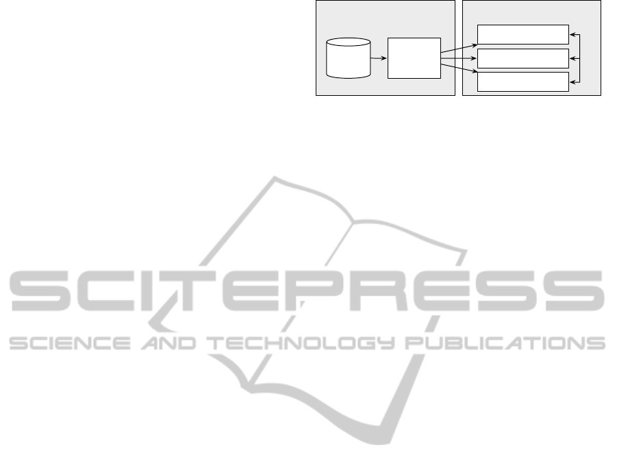
We propose a system architecture (see Figure 1) that
provides the aforementioned interactive visualization
mashup. The high-level architecture is composed of
two components, the Data Miner and Web Mashup
Front-end.
Input Data. To get the input data for our Data Miner,
it was necessary to clean, pre-process and rearrange
the Oulu dataset according to the needed visualiza-
tion input.
Offline processing
Input
Data
Data
Miner
Online processing
Chart UI
Map UI
Calendar UI
JSON
Synchronization
Figure 1: System architecture.
Data Miner. We sorted the input data for each inter-
section considering time and intersection id. Then,
we generated JSON files from the raw Input Data of
the original dataset as output to be imported from the
web user interface.
Web Mashup Front-end. Our design follows Shnei-
derman’s visual information seeking mantra (Shnei-
derman, 1996), “overview first then details on de-
mand”. Considering the related work in Section 1,
our aim is to provide an accessible overview with dy-
namic levels of aggregation of temporal and spatial
information. Thus, we combined three different vi-
sualization techniques using UI web-based compo-
nents, based on the idea to support decision-makers
with classic visualizations that can be easy to use and
the author’s experience.
• Chart UI. It facilitates analysis and exploration
of traffic variations flow for all intersections, a
specific intersection or selected regions. Our
Chart UI was implemented using Highstock API
(http://www.highcharts.com/products/highstock),
a JavaScript library to visualize timeline Charts.
• Map UI. Each intersection is placed in the Oulu
city map using circles. The color of each circle
indicates the traffic volume on that intersection for
a specific period of time. Our Map UI uses the
Google Maps API and its color scheme.
• Calendar UI. We additionally integrate a calendar
view to illustrate the traffic variation flow using
the calendar cells and a color scale per day. We
used D3.js (http://d3js.org/), a JavaScript library
for visualizations.
Preliminary Visualization. Figure 2 shows the vi-
sualization traffic described above using the three
main components. First, the Chart UI (Figure 2a) vi-
sualizes the total traffic volume in terms of number of
vehicles with respect to time from 26
th
May to June
21
st
, 2011. A grey background is used to represent
missing data from the original dataset. Second, the
Map UI (Figure 2b) shows a spatial representation of
the average volume of traffic with respect to intersec-
tions during a specific period of time. Third, the Cal-
endar UI (Figure 2c) shows the mean traffic volume
in which each day is colored according to the number
TrafficVisualization-ApplyingInformationVisualizationTechniquestoEnhanceTrafficPlanning
555
b) Map UI
a) Chart UI c) Calendar UI
Figure 2: Traffic flow visualization combining: a) chart; b) map; and c) calendar visualizations.
of vehicles. These components are synchronized and
provide the following functionalities:
Meta Overview. It is presented using three different
visualizations of spatial and temporal traffic data.
Zoom. Due to the size of our dataset, we restricted
different levels of aggregation on our Chart UI: per
day (1D), per week (1W) and all data. A spatial zoom
is provided by the Map UI.
Interactive Filtering. Users may wish to focus on
a specific intersection, specific time or specific pe-
riod of time (see Figure 2). They can select a spe-
cific point/region in the Chart UI that will update
both Chart and Map UI. Selecting a marker (circle)
in the Map UI will update the selection in the Chart
UI adding the area related to the intersection as an ad-
ditional line to facilitate users’ interpretation.
Details on Demand. Users can get details regarding
the amount of traffic of a specific intersection or time
represented as a marker by selecting it from either the
Chart or Map UI.
4 RESULTS AND COMPARISON
To validate the decision-makers’ requirements we vis-
ited the Oulu traffic control center. They showed us
the system they currently use. Then, we showed them
our mashup for a preliminary evaluation.
The current system summarize historical data us-
Figure 3: Representaton of the current system in Oulu.
ing traffic reports but neither graphical nor statistical
representations are available, except for a black/white
map as the one shown in Figure 3, which is a rep-
resentation of their system – we were not allowed to
take pictures. Each point on the map represents an
intersection, the color of each intersection only refers
to its location. Hence, no visual information about
the traffic intensity is provided. They must use a
repetitive manual process to get intersection histori-
cal data: (i) select one intersection from their system,
(ii) select the properties they are interested in, (iii) se-
lect time/data, (iv) export data as a table, (v) import
data into a spreadsheet (i.e., Excel), and (vi) gener-
ate graphs using the spreadsheet program. They must
repeat all the above steps if other intersection infor-
mation is needed. The interviews brought three spe-
cific user groups to our attention. The traffic manage-
ment employees that have to export data to Excel and
do manual processing to generate statistics regarding
IVAPP2013-InternationalConferenceonInformationVisualizationTheoryandApplications
556

traffic data. A lot of effort is needed and a system
that enables graphical and real-time statistical anal-
ysis of traffic data is desired. The traffic police of-
ficers are interested in a real-time calculation of the
traffic because this can help them to place units ahead
where the masses are moving. Finally, the city plan-
ners consider traffic estimation as valuable informa-
tion for city designs.
During our preliminary evaluation, we got feed-
back from our interviewees. They were enthusiastic
about our tool like and they had even requested sim-
ilar improvements for their tools. They provided im-
provement ideas for our visualization. For instance,
the traffic management employees suggested that our
tool could be combined with the Oulu statistical mod-
els to estimate traffic data. The traffic police officers
could combine the information provided by our tool
with their accident database to get more insights about
traffic consequences. For the traffic city planner, it is
important to combine road traffic and pedestrian data
in real-time. This provides the opportunity to offer
optimal places for companies to set their outlets based
on the pedestrian traffic around the city.
5 CONCLUSIONS
We described our case study for a space-time visu-
alization of traffic data in the city of Oulu. We pre-
sented our exploratory visualization design by build-
ing a Web mashup, applying several visualization
techniques and validating it with three Oulu different
decision-makers. We argue that a proper combina-
tion of different visualization techniques that consider
multiple data dimensions, and an interactive synchro-
nization between space-time visualizations are suit-
able for traffic planning activities. This can sup-
port data analysis and evaluation of traffic data to re-
veal trends about interesting traffic events. In future
work, we will address some limitations that affect our
current implementation: (i) it needs to be combined
with city statistical models that adjusts traffic capac-
ity per road to support estimation of traffic data, (ii)
it currently refers only to traffic data but, according
to decision-makers’ needs, it can be easily extended
to pedestrian information, and (iii) real-time data is
needed to support real-time decision-making activi-
ties.
ACKNOWLEDGEMENTS
We would like to thank the traffic control authorities
of the city of Oulu and University of Oulu for the sup-
port during the development of this project.
REFERENCES
Bacon, J., Bejan, A., Beresford, A., Evans, D., Gibbens, R.,
and Moody, K. (2011). Using real-time road traffic
data to evaluate congestion. Dependable and Historic
Computing, pages 93–117.
Claramunt, C., Jiang, B., and Bargiela, A. (2000). A new
framework for the integration, analysis and visualisa-
tion of urban traffic data within geographic informa-
tion systems. Transportation Research Part C: Emerg-
ing Technologies, 8(1-6):167–184.
Ehmke, J., Meisel, S., and Mattfeld, D. (2010). Floating
car data based analysis of urban travel times for the
provision of traffic quality. Traffic data collection and
its standardization, pages 129–149.
Maciejewski, R., Rudolph, S., Hafen, R., Abusalah, A.,
Yakout, M., Ouzzani, M., Cleveland, W., Grannis, S.,
and Ebert, D. (2010). A visual analytics approach
to understanding spatiotemporal hotspots. Visualiza-
tion and Computer Graphics, IEEE Transactions on,
16(2):205 –220.
Shekhar, S., Lu, C., Liu, R., and Zhou, C. (2002). Cube-
view: a system for traffic data visualization. In In-
telligent Transportation Systems, 2002. Proceedings.
The IEEE 5th International Conference on, pages 674
– 678.
Shneiderman, B. (1996). The eyes have it: A task by
data type taxonomy for information visualizations. In
IEEE Symposium on Visual Languages, pages 336–
343.
Song, Y. and Miller, H. (2012). Exploring traffic flow
databases using space-time plots and data cubes.
Transportation, pages 1–20.
Van Wijk, J. and Van Selow, E. (1999). Cluster and calendar
based visualization of time series data. In Information
Visualization, 1999. (Info Vis ’99) Proceedings. 1999
IEEE Symposium on, pages 4 –9, 140.
Wang, X. (2005). Integrating gis, simulation models, and
visualization in traffic impact analysis. Computers,
Environment and Urban Systems, 29(4):471–496.
Wood, J., Dykes, J., Slingsby, A., and Clarke, K. (2007). In-
teractive visual exploration of a large spatio-temporal
dataset: Reflections on a geovisualization mashup. Vi-
sualization and Computer Graphics, IEEE Transac-
tions on, 13(6):1176 –1183.
Zhang, J., Wang, F., Wang, K., Lin, W., Xu, X., and Chen,
C. (2011). Data-driven intelligent transportation sys-
tems: A survey. Intelligent Transportation Systems,
IEEE Transactions on, (99):1–16.
TrafficVisualization-ApplyingInformationVisualizationTechniquestoEnhanceTrafficPlanning
557
