
VIZGR
Combining Data on a Visual Level
Daniel Hienert, Benjamin Zapilko, Philipp Schaer and Brigitte Mathiak
GESIS – Leibniz Insitute for the Social Sciences, Lennéstr. 30, Bonn, Germany
Keywords: Visualization, Web, Linked visualizations, Social software, Social data analysis, Collaboration, Visual
analytics.
Abstract: In this paper we present a novel method to connect data on the visualization level. In general, visualizations
are a dead end, when it comes to reusability. Yet, users prefer to work with visualizations as evidenced by
WYSIWYG editors. To enable users to work with their data in a way that is intuitive to them, we have
created Vizgr. Vizgr.com offers basic visualization methods, like graphs, tag clouds, maps and time lines.
But unlike normal data visualizations, these can be re-used, connected to each other and to web sites. We
offer a simple opportunity to combine diverse data structures, such as geo-locations and networks, with each
other by a mouse click. In an evaluation, we found that over 85 % of the participants were able to use and
understand this technology without any training or explicit instructions.
1 INTRODUCTION
Presenting data in an appealing or at least
understandable way is a common task in the modern
working environment. While the classical business
application is presenting company data to support
decision making, it has also become important in
any teaching job or marketing. The reason for this is
that raw data, such as can be found in databases are
collected very easily, but the pure tables are hard to
understand.
Since it is such a widespread task, it is clear that
most of the people that are making such
visualizations are not experts in data visualization or
statistics. They are experts on the data they want to
present and this data is typically complex and
interconnected.
The classical spreadsheet approach often does
not adequately represent neither the complexity nor
the interconnectedness. Also, the people who are
typically using such applications are not willing to
learn complex data-centered techniques to represent
this interconnectedness, as they are typically just
modifying the data so it can be visualized more
appropriately.
The solution to this dilemma is the option to
interconnect the visualizations directly. Since the
visualized data is what users are thinking of anyway
when handling the large arrays of data, it is only
logical to allow them to work on the visualizations
directly.
In Vizgr, we allow users to interconnect their
data visualizations like they could any other object
on the Internet. The web-based framework allows
sharing of visualizations (connecting to people),
connecting visualizations with each other on a data
level and connecting visualizations with web sites to
fully embed it into the World Wide Web.
As our survey shows, the user acceptance and
usability of Vizgr is very high. Most of the
participants can imagine scenarios in which they
would like to use this tool in their daily work.
In the next few sections, we will, first, discuss
related products and ideas. In section three, we will
give an overview on the capabilities and technical
details of Vizgr. We will proceed in section four
with some use cases we have been studying. In
section five we present the survey and the results of
the survey we have conducted, to investigate both
the usability of the tool and the usability of the idea.
We conclude with some final remarks on future
work, we have planned.
2 RELATED WORK
Vizgr integrates the key ideas of collaborative
sharing of visualizations on the web, the coordinated
202
Hienert D., Zapilko B., Schaer P. and Mathiak B..
VIZGR - Combining Data on a Visual Level.
DOI: 10.5220/0003299902020211
In Proceedings of the 7th International Conference on Web Information Systems and Technologies (WEBIST-2011), pages 202-211
ISBN: 978-989-8425-51-5
Copyright
c
2011 SCITEPRESS (Science and Technology Publications, Lda.)

views of multiple visualizations on one web page
and extends the concept to manual, semiautomatic
and automatic linking of visualizations for browsing
and coordination purposes. In this section, we first
present related systems and their key ideas and
conclude how Vizgr distinguishes to them.
2.1 Visualization on the Web
IBM Many Eyes (Viegas et al., 2007) and Swivel are
online tools for sharing data and visualizations on
the web. The user can upload data, choose a
visualization type and create a visualization that can
be viewed and commented by the community. By
integrating an HTML snippet the visualization can
be embedded on other sites or blogs. The underlying
data set can be reused by other users to build their
own visualizations. (Heer et al., 2009) gives an
overview of these and other online visualization
tools, their functionality and impacts.
VisGets (Dörk et al., 2008) uses different
visualizations to show and filter retrieved web
resources in several dimensions like time, location
and topic. Based on the concept of dynamic queries,
results can interactively be filtered by manipulating
the visualizations. VisGets also implements
coordinated interactivity. Hovering with the mouse
over a visual element highlights all related elements
in the visualizations and in the result list. The new
introduced approach of Weighted Brushing is used
to highlight strongly related items more than weakly
related ones.
Dashiki (McKeon, 2009) is a wiki-based
collaborative platform for creating visualization
dashboards. Users can integrate visualizations that
contain live connections to data sources. Data sets
are embedded into data pages by a special markup,
via Copy&Paste from spreadsheets or by an URL.
Live data is dynamically fetched and stripped from
formatting tags, so the user can wrap the content
with needed markup. Dashiki uses a simple technical
approach for coordinated selecting among multiple
views. Simple attribute-value pairs are propagated to
all visualizations via JSON format.
Exhibit (Huynh et al., 2007) is a lightweight
framework for easy publishing of structured data on
the web. Users can import data via JSON, which is
presented on the web page in different views
including maps, table, thumbnails and timelines.
2.2 Coordinated Views
The simultaneous display of the same data structure
in several different views was first defined by
(Baldonado et al., 2000). They set up a model for
coordinated multiple views and provide guidelines
for not disrupting the positive effect through
increased complexity. The main idea is that data in
different views can be linked. If data is selected in
one view, it is also highlighted in other views
(brushing-and-linking).
North & Shneiderman (North and Shneiderman,
2000) provide an alternative visualization model
which is based on the relational data model. The
system Snap (North et al., 2002) is an
implementation of this model. It allows the user to
select databases and assign visualizations. In a
second step, the user can then connect different
visualizations and generate coordinated
visualizations. Highlighting or other actions are
coordinated between the different views. For
example, if data is selected in one view it is also
selected in the other views.
VisLink (Collins and Carpendale, 2007) is a
system for revealing relationships amongst different
visualizations. Multiple visualizations are drawn on
2D planes and can be placed in a 3D space.
Relationships are displayed between them by
propagating edges from one visualization to another.
Relationships, connections and patterns between
these visualizations can be explored by several
interaction techniques.
2.3 Unique Features of Vizgr
Vizgr is similar in certain aspects to the presented
systems, but differs in some others. On a basic level
Vizgr can create visualizations like the
aforementioned systems. However, most tools
concentrate on one or some information types like
tabular data, text, maps and so on; in contrast Vizgr
supports heterogeneous information types like
tabular data, text, locations, events and network data
and heterogeneous visualizations like business
graphics, tag clouds, maps, time lines and network
graphs in one tool. Vizgr supports the user with easy
creation of visualizations with different forms,
possibilities for copy & paste from spreadsheets and
automatic data import from Wikipedia.
Similar to Dashiki and Exhibit Vizgr supports
the integration of several visualizations on one
webpage. But in contrast to those systems, the
selection of visualizations in Vizgr is based on the
relationships between visualizations.
Vizgr has a similar approach to highlight related
visual items in different visualizations to VisGets or
Dashiki. But in Vizgr the coordinated view is not
only based on the same data items in different visu-
VIZGR - Combining Data on a Visual Level
203

alizations, but also on relationship data.
A completely new aspect in Vizgr is the support
for the manual, semiautomatic and automatic
mapping of heterogeneous visualization types and
from visualizations to websites. This allows the
creation of networks of visualizations for browsing
and coordination purposes.
Figure 1: Vizgr system overview.
3 VIZGR
In the following section we describe the architecture
of Vizgr and the workflows to create and map
visualizations to each other and to websites. We
introduce the browsing approach and the possibility
of coordinated views.
Vizgr includes components to create, view,
modify, save and connect visualizations. Figure 1
gives an overview of the system’s architecture. All
modules are integrated in a web framework, which is
implemented in PHP. The creation and editing of
visualizations can be done in one single HTML
form, the workflow and exact details are described
in section 3.1. The entered data is stored in the user
session and in the Vizgr database. In a second step
the user can either connect two visualizations to
each other or a visualization to websites. The
workflows for connecting visualizations are further
described in section 3.2. Connection data is also
stored in the user session and in the database.
Visualization data and properties are committed to
the visualization component via XML. The
framework creates an XML file that contains all
information that is necessary for the visualization
component to create the visualization, set the linking
buttons and mark individual items.
The core component for building and viewing
the visualization is a Flash application that is
implemented in ActionScript 3. We have chosen
Flash, because it is widely distributed, does not need
any preloading time to start a virtual machine and
offers all available possibilities to implement
advanced graphics and user interaction. The module
parses the XML and builds the appropriate
visualization.
3.1 Creating Visualizations
The user can create different visualizations with the
help of an HTML form. For creating a visualization
the user has to go through four steps: (i) enter a title,
(ii) enter a description, (iii) enter data and (iv)
choose a visualization type. As a result, a preview of
the created visualization is shown. All steps are
accomplished in one single HTML form. This makes
it possible to edit and correct certain entries and to
see the result immediately in the preview. Title and
description are metadata fields the user can fill out to
identify and describe the visualization. Data can be
entered with (i) different data input templates
belonging to the information type, (ii) by copy and
paste from spreadsheets or (iii) by automatically
loading the data from Wikipedia or the DBpedia
database.
For small amounts of data the user can enter the
information manually. The framework offers data
input templates for (i) tabular data, (ii) text, (iii)
locations, (iv) events and (v) network data. The
tabular data template is structured like an excel
sheet. The user can enter different attributes and the
respective data. Textual data can be entered simply
by copying it into a text field. The location template
offers fields for title, description and address details
like street, house number, post code, city and
country. The framework has a built in geocoder to
add latitude and longitude information to the record.
Events can be entered with the attributes title,
description, start and end date. The network data
template is a simplified table data template with
three columns. Related nodes can be entered in
columns one and two. Column three is an optional
field for entering the relationship between nodes.
Copy and Paste from spreadsheets is appropriate
for large data collections already available in CSV,
like for example finance data from Yahoo. For
locations, events and network data the user has to
format the columns in a certain order. Then data can
just be marked in the spreadsheet, copied to the
clipboard and pasted in the form.
For the information types text, location and event
exist the possibility to load the data directly from
Wikipedia and the DBpedia database that offers
structured information from Wikipedia articles. To
get the text of a Wikipedia article the user can enter
Framework
Create & Edit
visualizations
View & browse
visualizations
Connect
visualizations
Browsing
Database
XML
WEBIST 2011 - 7th International Conference on Web Information Systems and Technologies
204
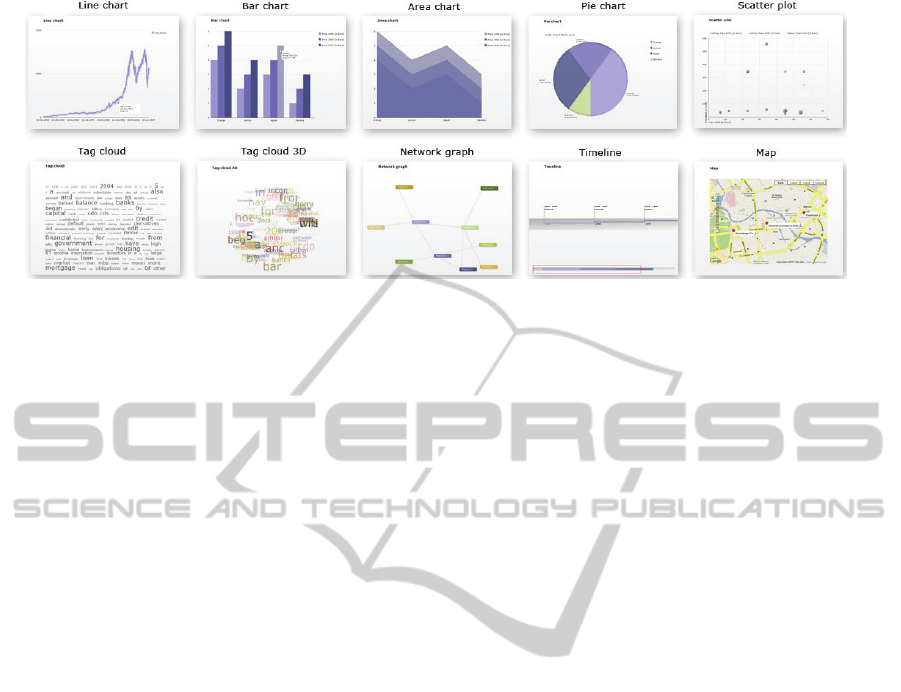
Figure 2: An overview of visualizations that can be created with Vizgr: for tabular data: line chart, bar chart, area chart, pie
chart, scatter plot; for text: tag cloud and 3D tag cloud; for network data: a network graph; for events: a timeline; and for
locations: a Google map.
a topic in the search field. Via an autocomplete list
the user can identify existing topics and choose one.
With a click on a button the text is loaded and can be
used for tag clouds. The benefit is that links to other
Wikipedia articles are automatically extracted and
provided by linking buttons (further described in
section 3.3). For locations on a map the user can
enter different location names in the fields.
Coordinates, description and links are loaded from
DBpedia. The user is again supported by an
autocomplete list of relevant topics. For events in a
specific time period the user can enter a start and an
end date. Vizgr checks for appropriate events in the
DBpedia database that can be visualized in a
timeline.
Depending on the chosen information type, the
framework offers appropriate visualization types.
Figure 2 shows the different types of visualization
which can be created. For tabular data as follows:
line chart, area chart, bar chart, pie chart, scatter
plot; for text: tag cloud and 3D tag cloud; for
locations: a Google map; for events: a timeline; and
for network data: a network graph. Users can choose
visualization types and see the created visualization
in the preview section.
3.2 Connecting Visualizations
In order to connect two visualizations, some kind of
relationship data is needed. This can be
automatically derived, e.g. from relational data in a
database, an RDF store or by a matching
attribute/value pair in a table. Also an editor for
entering and editing the relations by hand is
provided. The editor is directly based on the created
visualization and is thus seamlessly integrated into
the workflow of creating and viewing visualizations.
Vizgr supports the connection of all its visualization
types.
3.2.1 Connecting Two Visualizations
Graphical objects of two different visualizations can
be manually connected using the Mapping Editor.
The system supports the user by making suggestions
for possible connections.
Graphical objects of the different types of
visualization are, for example, a location marker on
a map or a bar in a bar chart. A graphical object or
glyph represents several data fields or properties in
one simple graphical representation. The Mapping
Editor utilizes this to simplify the mapping process.
The user does not have to deal with the complex
information structure on a data level, but can select
graphical objects directly in the visualization. For
the simple identification of a graphical object, the
user receives additional information in a popup
window by hovering with the mouse.
The user interface is organized as follows: at the
top, the two chosen visualizations are shown side by
side. The visualizations appear with the same
functionality as in the view modus, this means that
information for the graphical object is available by
hovering with the mouse. A list of the connected
graphical objects can be found below the
visualizations. On the left side, each record displays
the graphical object value of the origin visualization,
and on the right side, the visual object value of the
target visualization. A button is available to delete
each record. There are buttons for Save, Cancel and
Suggest Mapping actions at the bottom of the list.
Figure 3 gives an overview of the Mapping Editor.
The first step in the mapping workflow is to
choose the visualizations to be connected. To create
a connection, a graphical object from the left or right
VIZGR - Combining Data on a Visual Level
205
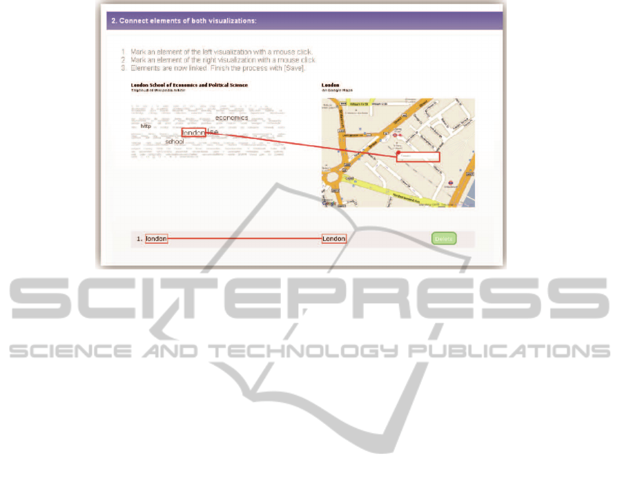
Figure 3: The Mapping Editor: mapping the w ord London in a tag cloud to the place on a map.
visualization is selected. Objects that are available
for selection are marked with a thin red border when
moused over. Clicking the mouse selects the object
and it is then marked with a thicker, red border.
Moving the mouse towards the target visualization
makes a red connection line appear that will visually
connect the origin and target object. Clicking the
mouse a second time will select the target object.
Once a connection has been created, it appears in the
list and is visible in the visualizations as two marked
objects connected with a line.
All connections are similarly colour-coded in the
visualization and in the list. This allows connections
to be easily identified, for example, to find them in
the visualization in order to delete them from the
list. Clicking Save completes the workflow. The two
visualizations are now connected, and the mapping
process can be continued for other visualizations.
All created connections can again be loaded into the
Mapping Editor and edited.
3.2.2 Semiautomatic Mapping
The system can support the manual mapping process
by making suggestions for connections between
information items. By clicking on the button Suggest
Mapping the system analyses the underlying data set
and shows possible links in the visualization and in
the mapping table. The user can check these
mappings and delete unwanted links.
The algorithm for automatic search of mappings
works by pre-processing the underlying data for both
visualizations. For graphics with tabular data we
build an array of attribute/value pairs in a simple
format. The mappings are created on a graphical
level, but visual elements need a different number of
attribute/value pairs to be visually created and
identified for different visualizations. For tag clouds,
we take the whole text, for Google maps the title and
description and so on. Text elements are again split
into single words. The algorithm then checks for
every array element if there is an equal element in
the array of the other visualization.
For example, if we connect a network graph of
persons with a visualization of a timeline with
publications, for every network node value the
system searches for any occurrence of the name in
the title or description. Meaning that all names are
compared to all publications and immediately
connected if a match is found.
3.2.3 Connect a Visualization with Websites
Connecting items of visualizations to websites
offers the possibility to create links from visual
items to any resource on the web. This can be
websites, URIs for literature references or
visualizations in other portals. IBM ManyEyes e.g.
supports addressing different states of visualizations
via URL. The benefit is that visualizations and their
visual items are included in the process of web
hyperlinking and thus elevated from being fixed
non-interactive illustrations.
Connecting visualizations to websites works
similar to the workflow described for connecting
two visualizations. The user chooses one
visualization in the drop down list. Now he can mark
any graphical object in the visualization with a
mouse click. The object is then highlighted with a
coloured border.
WEBIST 2011 - 7th International Conference on Web Information Systems and Technologies
206

Figure 4: Hovering over the linking button of New York
City shows a window with a link to the tag cloud of the
Wikipedia article.
For every marked object a list element appears
where on the left side appears the object’s name and
on the right side one can enter a title and an URL for
a website. The elements in the list are also visually
connected with a frame in the same colour as in the
visualization. The user can continue the process until
he finishes it with a click on the save button. He then
can have a look at the created connections in the
visualization or start a new mapping process. The
connections are listed in the personal area and can be
edited later.
3.3 Browsing in Visualizations
All created visualizations appear in the gallery with
title and thumbnails. Users choose a visualization
which is displayed with functionality to edit, share
and comment. If a graphical object in the source
visualization is connected to another object in any
target visualization or to a web resource, it is marked
with a small green linking button (compare figure 4).
Hovering over the button with the mouse pointer
shows a window with the explanation that the
element is linked to another visualization or website
and with a click on the button one is forwarded. The
window lists connected visualizations with title,
visualization type and thumbnail and websites with
title and URL. If the element has just one
connection, clicking the button directly forwards the
user to the connected visualization or website.
Otherwise if a graphical object has connections to
other, multiple visualizations or websites, a click on
the button opens again a window listing the target
visualizations by title and visualization type and
websites by title and URL. The related visual
element in the target visualization is highlighted
with a red border. The target object is also marked
with the linking button, which leads directly back to
the origin visualization or other related
visualizations and websites.
3.4 Coordinated Multiple Views
Beside the possibility to explore relations between
visualizations by browsing from one to another in
full view, the original and all related visualizations
are also shown on the individual visualization page
in half the scale. This way it is possible to see at
once multiple related visualizations. Based on the
approach of highlighting the same data item in
different views, we choose an approach to highlight
connected data in the different heterogeneous
visualizations. Hovering the mouse pointer over a
linked visual item in the original visualization
highlights all connected items in the connected
visualizations with a green frame (compare figure
5). If these items are linked to other items again,
they send secondary events to all related
visualizations that appear with a yellow frame. So,
the user can interactively explore which
visualizations are directly or indirectly connected to
the chosen item. For example, when hovering with
the mouse pointer over a person in a network graph,
the connected location on the map is highlighted
with a green frame. The location itself is connected
with several events on a timeline that are highlighted
with a yellow frame. The user can see that the
person is indirectly connected with these events.
4 USE CASES
In this section we demonstrate the capabilities of
Vizgr by giving two examples of visualization that
can be produced within minutes. Simple mappings
produce graphics showing relationships which may
be retrievable in the web. But with Vizgr they are
much easier to explore and produce. In our first
example, we show relationships between 60 years
stock prices and historical events on financial crisis.
Relationships between minima and maxima of stock
prices and related historical events can be explored
with a mouse click. Our second example is also the
basis scenario for our user study. We show the
workflows to create a tag cloud and a map of chosen
Wikipedia data and connect the visualizations to
each other and to the web.
In the first example, we connect a line chart of
historical data for S&P 500 stocks with historical
events on financial crisis on a timeline.
VIZGR - Combining Data on a Visual Level
207
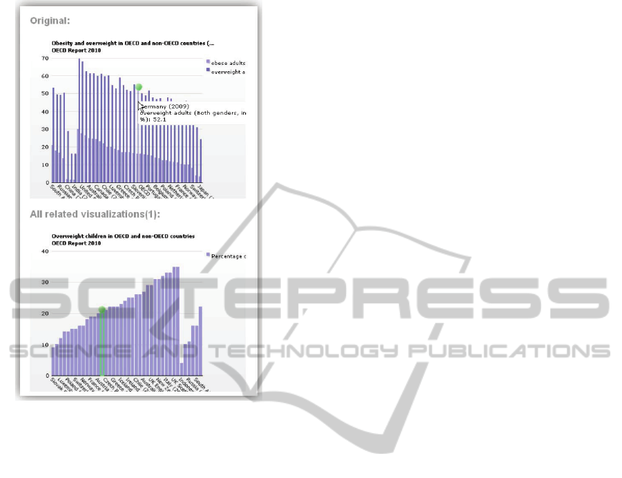
Figure 5: Coordinated Multiple View: Hovering with the
mouse over a graphical object, highlights all related object
in other views.
The stock data is taken from Yahoo, consists of
about 15,000 rows of daily adjusted closing stock
prices from 1950 to 2009. The data is entered via
Copy & Paste from the provided CSV file. Selected
historical events on financial crisis with title, details,
start and end date is entered manually. In a second
step, we connect the visualizations in the Mapping
Editor. Both data sets have a date field, so the
system propose a mapping automatically. The result
is a line chart with historical stock prices connected
with a timeline of historical events on financial
crisis. The user can click on certain points of the line
charts maxima and minima marked with the linking
button. A click forwards to the appropriate historical
event on the timeline which is highlighted with a red
rectangle. A click on an event leads back to the
appropriate stock price of that date. Figure 6 shows
the line chart with historical stock prices and the
timeline with historical events across financial crisis.
The visualizations could be connected simple and
fast and result in interactive linked visualizations
that can be explored with a mouse click.
In our second example we show the workflow to
create two visualizations from Wikipedia data,
connect them to each other and to a website. First
visualization is a tag cloud of the Wikipedia article
on London School of Economics. We choose Create
Visualization and enter a title and a description for
the visualization. In the data input menu we choose
Wikipedia. We now enter the first letters of London
School of Economics and Vizgr proposes matching
articles from Wikipedia in a drop down list. We
select the entry with the mouse and click on Load
text from Wikipedia. In the next step we choose tag
cloud as a visualization type and click on Create to
see the preview. The visualization has been created
and can now be saved. Second visualization is a map
with Wikipedia data from London. The workflow is
similar: enter a title and a description, choose
Wikipedia, then Places. We enter the first letters of
London, choose the matching article from the drop
down list and click on Load places from Wikipedia.
Map is already chosen as a visualization type; we
can click on create and save the visualization. Now
both visualizations can be connected in the Mapping
Editor. Therefore we choose Connect Visualizations
from the main menu. We choose both visualizations
from the drop down lists. In the Mapping Editor we
click in the tag cloud on the word London and a
second click on the location marker of London in the
map. The visualizations now are already connected
and the mapping can be saved. Then we connect the
word London in the tag cloud to a web site.
Therefore we choose the menu entry Connect
visualization with websites to enter the Mapping
Editor. We choose the visualization and mark the
word London with a mouse click. We now can enter
a title and an URL of a website and save the
connection. The visualizations now have multiple
connections to other resources of which some were
created automatically. The tag cloud contains links
to Wikipedia for every word that represent a
Wikipedia article, the location London in the map
links to related web sites. The visualizations are
linked to each other and additionally we have
created a link from London to a related web site
manually. Within minutes we have what could serve
as a info graphic for tourism etc.
5 EVALUATION
We have carried out a user study to approve that
users can create visualizations simple and fast and
can connect them to other visualizations or websites
with the help of the Mapping Editor. We asked for a
detailed assessment of each task, asked questions to
approve the user has understood the concept and
asked for scenarios.
WEBIST 2011 - 7th International Conference on Web Information Systems and Technologies
208
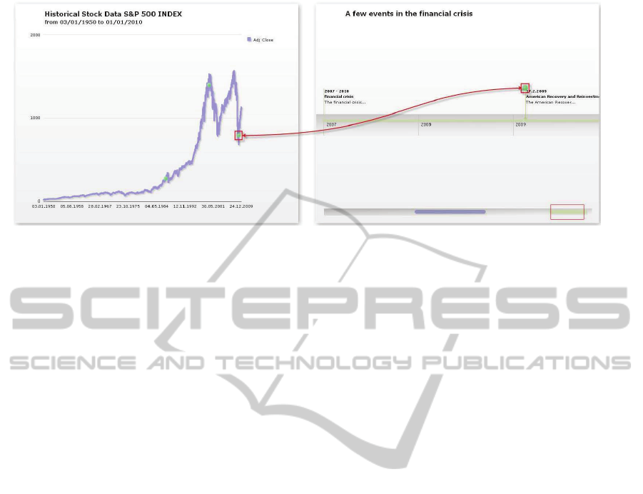
Figure 6: The left visualization presents historical stock prices of S&P 500 index in a line chart. The right visualization
shows events on the financial crisis on a timeline. The user can browse from a minima of the line chart directly to the event
on a timeline by clicking the green linking button.
5.1 Method
We gathered the participants of our user study by
using the Mechanical Turk, an online workers
marketplace offered by amazon.com. For 4US$
each, 100 participants were asked to complete 6
tasks on vizgr.com and then fill out an online survey
about it.
We cleaned out all surveys that did not contain
the basic information on demographics. Three of the
surveys were only half-filled. As the corresponding
accounts did not suggest technical difficulties (all
tasks were fulfilled), we removed the unanswered
question from the evaluation.
5.2 Demographics
The demographics seem quite typical for the internet
population and surprisingly unbiased towards the
archetypical heavy internet users (although we do
have them). For the evaluation, we asked four
demographical questions: Gender, Age, Education
level and average internet usage.
Out of the valid surveys we received 53.6% were
male and 46.4% female. The most common age
group was 18 to 29 with 59.1%, followed by 32.7%
30 to 39. All participants have a high school degree;
most (52.7%) even have a college degree. The
average time spent on the internet was given at 29.4
hours per week, but varying from as little as 4 hours
to an unrealistic 105 hours.
Although we did not explicitly ask for country of
birth, the IP addresses used suggest that the vast
majority (over 90%) of the users were logging in
from the United States, with small minorities from a
variety of rich first-world countries (Germany, Sin-
gapore, …).
5.3 Questions and Tasks
The participants were asked to complete four basic
tasks on the Vizgr website. For each of the steps:
1. creating a tag cloud of the Wikipedia article on
London School of Economics,
2. creating a map with Wikipedia data from
London,
3. connecting both visualizations,
4. connecting the word London in the tag cloud to a
web site,
We asked whether the participants had succeeded in
the task, how long it took them, how difficult it was
and how they would judge the usability of this in
their life and in general.
The success rate was (in order): 97.3%, 94.5%,
87.7% and 87.6%. Failure was consecutive, all three
that failed at the first step, also failed at the other
steps, e.g. one person did not find the save button
and was thus not able to finish any of the
visualizations. When asked about obstacles, many
participants found the first step “easy” or “simple”,
even though some of them never knew what a tag
cloud was, before they entered the survey. There
were some complaints about the save functionality
or other minor user interface issues. 74.6% managed
to finish the task in less than five minutes and 82.8%
found it normal to very easy, compared to only
17.2%, who found it difficult or very difficult.
In the second step, creating a map, the three new
failures were based on a misunderstanding. They
had simply found and then used the prepared map
for them, without even trying to create a new one.
VIZGR - Combining Data on a Visual Level
209

Only one of them also failed at the next steps. The
commentary on this step was very mixed; some
found it easier than the last step, others exactly the
other way around. 75.5% finished in less than five
minutes, 23.7% found it difficult or very difficult.
This is somewhat comparable to the last step.
Connecting the visualizations seemed to be more
difficult, with only 87.7% success rate. Besides the
inherited failures from the tasks before, many
participants were unsure on their actions, because
they had no clear picture on what a successful link
would look like, both visually and conceptually.
This made some of the participants to give up on the
task, but it also is the predominant theme in the
commentary of the more successful participants.
81.1% of the participants managed to finish in less
than five minutes, 21.7% found it difficult or very
difficult. When we asked the participants, what the
effect of the connection was, 69.8% of all
participants explained it visually and/or
conceptually. 11.9% either answered very generally
(“it combines”) or off-topic (“user friendly”); the
rest (18.8%) either did not finish the task or did not
understand the idea.
Although the success rate for linking the
visualizations and linking a visualization to a web
site are very similar, the participants failing were not
identical to each other. No one seemed to be
confused about the purpose of linking to a web page.
The failures and negative comments were mostly
due to technical or GUI problems. A common
comment at that point was that fulfilling the steps
before was helpful in understanding and executing
this step as well. 83.8% finished in less than five
minutes, 20.0% found it difficult or very difficult.
5.4 Conclusions
The great majority of the users had no or only small
difficulties when working on the tasks. The
difficulty of the different tasks seems to be stable
when looking at time consumption and perceived
difficulty. The failure rate seems to be much higher
when being confronted with a new concept, be it tag
clouds or connecting visualizations. The last step of
connecting the visualization to a web site was
technically the most difficult, counting e.g. the
number of distinct mouse clicks. Yet, its conceptual
simplicity ranked it near the technically much
simpler task of connecting the visualizations.
A problem here seems to be the metaphor for the
linking. About 10% of the users had not understood
what the green dot or the red dot does in the
visualization, although they had created the link
themselves. This is a rather high rate, when
compared to better known symbols, such as
underlined text in a web site. But since the
connection of visualization does not have such a
standardized metaphor, we are quite satisfied with
this number, although it does offer room for
improvement.
The effect of the education level on the rate of
failure or perceived difficulty is slight at best. While
higher educated users were taking less time on the
tasks and generally rated them easier, they also
failed more often to complete the task at all. Also,
unlike we conjectured, a general aptitude with the
internet also did not help with completing the tasks.
In fact, one of the three participants that were not
able to complete any of the tasks was also number
three when it came to internet usage, with 68 hours
per week.
5.5 Scenarios
In last two steps about connecting visualizations, we
asked the participants to give us scenarios, how they
themselves or the general public could be using the
tool for their benefit. 58.8% thought they could use
the tool in their daily life, 35.6% could give an
example, different to the one we were providing
them and 10% could even give more than one
example. 82% could see a use for the general public
and 47.2% could give one or more examples of a use
case, often different from the one they had given for
the last question.
The scenarios ranged from general organization
of thought over social linking, e-learning, tourism,
marketing to the organization of knitting pattern and
crime solving. Many pointed out that they found the
layout and presentation appealing, so they would
like to use it instead of traditional methods of
presenting information. Scenarios similar to the one
given in the example were most often. Most were
connected to tourism, planning vacation or giving
locality information to a friend or a guest. The
second largest cluster of ideas was connected to e-
learning, researching and presenting topics.
5.6 Feedback
We had a lot of general positive feedback at the end
of the survey, several commented that they would
like to use the tool in the future. Others were very
eager to point out small bugs, spelling mistakes or
the unfavourable colour scheme and promised to use
the tool as soon as this was fixed. We received no
general bad comments, just that two participants
WEBIST 2011 - 7th International Conference on Web Information Systems and Technologies
210

could see no benefit in Vizgr at all.
6 FUTURE WORK
As became apparent during the survey, not all of the
participants immediately understood that the green
dot was supposed to be the connection point
between the two visualizations or to other resources.
This is something we need to be working on; trying
to find a more intuitive metaphor. We are planning
to start another survey on this in the near future.
Apart from this and other minor GUI changes,
we need to expand the tool into broader use cases.
Different types of media should be connectable, not
just data visualizations, but also images and
annotated text e.g. from web sites.
The integration of semantic data sources like
DBpedia, whose availability increases massively
since the emerging Linked Open Data movement,
has great benefits for the creation and linking of
visualizations. Data like text, locations or events are
imported user-friendly and fast. Linkings to other
resources are already integrated and can be made
visible on a visual level. We plan to integrate more
semantic databases like freebase and want to offer a
finer selection of resources.
REFERENCES
Baldonado, M. Q., Woodruff, A., & Kuchinsky, A., 2000.
Guidelines for using multiple views. In information
visualization. Proc ACM Advanced Visual Interfaces
`00, 110-119.
Collins, C. & Carpendale, M. S. T., 2007. VisLink:
Revealing Relationships Amongst Visualizations.
IEEE Trans. Vis. Comput. Graph. 13 (6), 1192-1199.
DBpedia, http://www.dbpedia.org, retrieved 09-28-2010
Derthick, M., Kolojejchick, J. & Roth, S. F., 1997. An
interactive visualization environment for data
exploration. In Proc. of Knowledge Discovery in
Databases, 2-9.
Dörk, M., Carpendale, S., Collins, C., Williamson, C.,
2008. VisGets: Coordinated Visualizations for Web-
based Information Exploration and Discovery, IEEE
Transactions on Visualization and Computer Graphics,
1205-1212.
Freebase, http://www.freebase.com, retrieved 09-28-2010
Fruchterman, T. M. J., & Reingold, E. M., 1991. Graph
Drawing by Force-Directed Placement. Software:
Practice and Experience, 21(11).
Google Maps API for Flash, http://code.google.com/
apis/maps/documentation/flash, retrieved 09-28-2010
Heer, J.; Viegas, F. B., Wattenberg, M. & Agrawala, M.,
2009. Point, Talk, Publish: Visualization and the Web,
Trends in Interactive Visualization, 269-283.
Huynh, D. F., et al., 2007. Exhibit: lightweight structured
data publishing. WWW '07: Proceedings of the 16th
international conference on World Wide Web, 737-
746.
IBM Many Eyes, http://manyeyes.alphaworks.ibm.
com/manyeyes/, retrieved 09-28-2010
McKeon, M., 2009, Harnessing the Web Information
Ecosystem with Wiki-based Visualization Dashboards.
IEEE Transactions on Visualization and Computer
Graphics, 1081-1088.
Mechanical Turk, http://www.mturk.com/, retrieved 09-
28-2010
North, C., & Shneiderman, B., 2000. Snap-together
visualizations: can users construct and operate
coordinated visualizations? In Int. J. Human Computer
Studies (2000) 53, 715-739, New York, NY, USA:
ACM Press.
North, C., Conklin, N., Indukuri, K., & Saini, V., 2002.
Visualization schemas and a web-based architecture
for custom multiple-view visualization of multiple-
table databases. In Information Visualization 1, ¾,
211-228.
Resource Description Framework (RDF),
http://www.w3.org/RDF/, retrieved 03-30-2010.
SPARQL Protocol and RDF Query Language (SPARQL),
http://www.w3.org/TR/rdf-sparql-protocol/, retrieved
09-28-2010.
Swivel, http://www.swivel.com/, retrieved 09-28-2010.
Viegas, F. B., Wattenberg, M., van Ham, F., Kriss, J. &
McKeon, M., 2007. ManyEyes: a site for visualization
at internet scale, IEEE Trans Vis Comput Graph 13
(6), 1121—1128.
Vizgr, http://www.vizgr.com, retrieved 09-28-2010.
Wikipedia, http://www.wikipedia.com, retrieved 09-28-
2010.
Yahoo Historical Stock Prices of S&P 500,
http://finance.yahoo.com/q/hp?s=^GSPC, retrieved
09-28-2010.
VIZGR - Combining Data on a Visual Level
211
