
SPARKLINE HISTOGRAMS FOR COMPARING EVOLUTIONARY
OPTIMIZATION METHODS
Ville Tirronen and Matthieu Weber
Department of Mathematical Information Technology, University of Jyv
¨
askyl
¨
a, Jyv
¨
askyl
¨
a, Finland
Keywords:
Evolutionary optimization, Comparison, Visualisation, Histograms, Sparklines, Tufte.
Abstract:
Comparing evolutionary optimization methods is a difficult task. As more and more of articles are published
in this field, the readers and reviewers are swamped with information that is hard to decipher. We propose the
use of sparkline histograms that allow compact representation of test data in a way which is extremely fast to
read and more informative than usually given metrics.
1 INTRODUCTION
The performance of evolutionary algorithms is gen-
erally evaluated by repeatedly running them against
a set of test functions; this process generates a set of
values for each algorithm/function pair, leading to a
large amount of data which then needs to be inter-
preted. The common practice is to present tables con-
taining average and standard deviations values, some-
times along with minima and maxima. When read-
ing those tables however, one is not so much inter-
ested in the numbers as in the relationships between
them: which algorithm is nearer to the global opti-
mum? How far is one algorithm from another one? In
this paper we present a new method for displaying the
results in accordance to three constraints:
1. Convey more information than the usual tables of
numbers.
2. Use no more space in print than the tables.
3. Be readable at first glance.
Table 1 shows an example of a traditional numer-
ical table compared to a table containing stacked fo-
cused histograms. One histogram represent the dis-
tribution of the values in the set of results produced
by one algorithm repeatedly applied to one test func-
tions. Additionally, all the histograms in the same col-
umn are “focused” on the range which is considered
interesting. One histogram therefore shows the reader
all the result values, showing how spread or clustered
they are; minimum and maximum values can be com-
pared without needing to read actual numbers, and av-
erage values can be estimated and compared as well.
This example moreover shows that the table requires
no more space than the traditional one, and because
it uses a graphical representation rather than a textual
one, it is instantly readable.
2 SHORTCOMINGS OF
CURRENT PRACTICES
As mentioned above, the performance of an evolu-
tionary algorithm is generally evaluated by repeatedly
running it against a set of test functions and statis-
tically analysing the results and comparing them to
those of reference algorithms. On a typical article of
this nature, 3 to 5 algorithms are applied to a bench-
mark of 10 to 25 test functions, often in several di-
mensions.
Evolutionary algorithms being by design stochas-
tic processes, one cannot compare the performance of
two given algorithms A and B on a given test function
f by applying each of them only once to the function
and comparing the results: the result of this single run
may not be representative of the actual performance
of the algorithms. The common practice is therefore
to run each algorithm multiple times, typically 25 to
100 times, which produces as a result a set of several
thousands of numbers. This set obviously needs to be
reduced in order to fit on the few pages allotted for
that purpose in the article, which in turns poses the
question of their presentation.
The current practice is to summarize the numbers
in a double entry table containing, for each algorithm-
function pair, the average end result reached by the
269
Tirronen V. and Weber M..
SPARKLINE HISTOGRAMS FOR COMPARING EVOLUTIONARY OPTIMIZATION METHODS.
DOI: 10.5220/0003110402690274
In Proceedings of the International Conference on Evolutionary Computation (ICEC-2010), pages 269-274
ISBN: 978-989-8425-31-7
Copyright
c
2010 SCITEPRESS (Science and Technology Publications, Lda.)

Table 1: Stacked focused histograms convey more information regarding an algorithm’s performance than a table filled with
numbers and are readable at first glance.
Function 4
Method 1 −3.06e + 02±5.68e + 00
Method 2 −1.22e + 02±2.59e + 00
Method 3 −3.11e + 02±1.49e + 01
Method 4 −3.51e + 02 ±3.58e + 01
Function 4
Method 1 p p p
Method 2 p p p
Method 3 p p p
Method 4 p p p
Min Max -3.971e+02 -2.871e+02
algorithm when applied repeatedly to that function,
along with the standard deviation. Although it ar-
guably provides the reader with as much numerical
data as it is possible in the given space, reading such a
table is difficult: while the best results for each func-
tion can be highlighted (e.g., using a boldface font),
the relative results of the various algorithms on on
given function is visible only if the reader takes the
time to read the numbers carefully and compare them.
3 THE SPARKLINE
HISTOGRAMS
Histograms are a common data visualization tech-
nique that is often used for comparing dense sets of
numbers. This visualization technique fits very well
to task of comparing optimization algorithms, as it al-
lows to present all the results of repeated experiments
at the same time. This technique has been used in,
for example, articles (Garc
´
ıa et al., 2009; Fan and
Lampinen, 2003). The use of histograms conveys
more data than a single statistical number, is easily
readable, and easily satisfies the constraints 1 and 3
presented in the introduction.
Large histograms require a significant amount of
space and often cannot be included due to the con-
straints on the article length. To solve this prob-
lem we look at the work of Edward Tufte (Tufte,
2006), which demonstrates that very small graphics
can be as legible as large page filling graphics. In
some cases, smaller graphic be a better choice due
to more favourable aspect ratio. Tufte applies this
idea in time-series visualisation and dubs his inven-
tion “sparklines”, with the definition “data-intense,
design-simple, words-sized graphics”. In essence, a
sparkline is a font-high, one-word wide time series
plot. Similarly to equations, sparklines can be set out-
side of the flow of the text, i.e.:
temperature 22.4
◦
C,
or be set inside it, , to visualise evi-
dence on the spot. In a stacked, or a table form, such
as shown in Table 2, they provide an easy way to com-
Table 2: Example of stacked sparklines.
Laboratory environment
temperature 22.4
◦
C
humidity 32%
light 412 lux
pare several time series at a glance.
We propose to use similar sized graphics to rep-
resent the empirical distributions of the algorithm re-
sults. Our visualization consists of a table of normal-
ized histograms (see Table 5). Each column of the
table represents a given test case (e.g., a test function)
and methods under comparison (e.g., algorithms) are
stacked vertically. Histograms in one column all have
the same range, which is the smallest interval con-
taining the data from each of the methods presented
in that column. This interval is then divided into a
given number of subintervals usually called “bins”;
the height of a column thus represents the number of
data points falling into the corresponding bin. Reader
can verify that we indeed use less print space than
usual statistics table and thus meet the constraint 2
presented in the introduction.
When the data produced by each method is tightly
clustered, but the clusters are spread over a wide in-
terval, the resulting histogram becomes quite uninfor-
mative, presenting only a few spikes in each cluster
center. However, not all data needs to be shown: the
reader, whose goal is to find the best algorithm for
a given task, is likely to be more interested by the
fact that one method is very much inferior to others
rather than by how far behind it actually is. Thus we
can greatly improve the value of the visualization by
zooming in to the interesting region and by discard-
ing the clearly inferior results. To do this, we aug-
ment the histogram by adding a “dump bin” at the far
right of each histogram, separated from the other bins
by an ellipsis (“. . . ”). This “dump bin” contains all
results crossing a given threshold and considered in-
ferior and uninteresting. This addition has significant
effect on the readability of the visualisation which can
be seen in Table 3. The naive way of plotting the data,
shown on the left, is dominated by the worst algorithm
and effectively hides the variation between the other
three. This is exacerbated by the single outlier run of
ICEC 2010 - International Conference on Evolutionary Computation
270

Table 3: Comparison between regular and focused histograms: the latter convey more information regarding the “better”
algorithms.
Regular histograms
Function 3
Method 1
Method 2
Method 3
Method 4
Min Max 1.05e-02 3.77e+01
Focused histograms, with a “dump bin”
Function 3
Method 1 p p p
Method 2 p p p
Method 3 p p p
Method 4 p p p
Min Max 1.05e-02 1.68e+00
Method 1. The “dump bin” strategy effectively un-
covers the important details between the three domi-
nant algorithms.
In reading the graph the “dump bin” can then be
read as the number of runs where the algorithm has
failed to produce a meaningful result. The final and
the most important component, the range, is depicted
at the bottom row of each column. The range fixes
the results in place and also documents the authors
view on what is the interesting range of values. Ta-
ble 5 presents a full-size example of stacked, focused
sparklines and is compared against the traditional ta-
ble of average values (in Table 4; see Section 5 for
a detailed description of those tables). Reading a
sparkline histogram is a three step procedure:
1. Verify the range, which gives a rough estimate of
the scale of the values, serving the same function
as the average value, or the y-axis of a conver-
gence graph. If the range is outside of what the
reader considers interesting, the rest of the graph
can be discarded.
2. Focus on the dump bin. Those algorithms that
are entirely, or almost entirely dumped can be dis-
carded as uninteresting.
3. Draw conclusions from the remaining part, which
is the one the author of the graphic has deemed
interesting.
To create a stack of histograms as presented
above, the following procedure has been applied. It
must be noted that this procedure assumes that the
optimization problem is a minimization, and that
lower values are considered “better” than higher ones.
Preliminary experiments have shown that histograms
composed of N = 25 bins including the dump bin lead
to dense, yet still legible graphics when set in a size
equivalent to a 7pt font.
While binning the data is trivial, the choice of the
threshold defining the “dump bin” is of first impor-
tance. However, additional preliminary experiments
show that a good threshold can, in most cases, be de-
rived automatically with a simple heuristic: ensure
that 95% of the values of minimum two algorithms are
displayed in the graphic and then find the threshold t
so that total number of bins with data in the whole
column of algorithms is maximised.
4 ON COMPARING
OPTIMIZATION METHODS
The problem of comparing the performance of A and
B on function f can be expressed as a comparison of
two distributions based on an initial sampling. While
conclusions are easy to draw when the two samples
are not overlapping and are standing “far” form each
other, those conditions are usually not met, making
the comparison of A and B a difficult task. For sam-
ples which are normally distributed, one can apply
Student’s t-test to determine, with a given threshold
probability, if the results of A and B are significantly
different. This is however usually not the case, as ex-
plained in Section 2 as well as in a thorough study
in (Garc
´
ıa et al., 2009). Even non-parametric test
such as the Mann-Whitney U test (also known as the
Wilcoxon rank-sum test) (Mann and Whitney, 1947)
cannot be applied to the two samples since, although
this test does not assume that the two samples are
drawn from any particular distribution, it may be in-
appropriate if the distributions are too skewed or oth-
erwise ill-behaved (Feltovich, 2003), which may con-
fuses even this test. It is also worth noting that the
use of this test is an implicit admission that the dis-
tribution of result samples is not necessarily normally
distributed, which is in contradiction with the usage
of average and standard deviation tables.
There is often a large difference between mean-
ingful in statistical sense and meaningful in general:
the difference between algorithms may in practice be
insignificant (both perform in/adequately for the task)
while statistically significant (samples have small dif-
ference in means and even smaller variance).
Moreover, the algorithms often have properties
that are not evident in their mean, median, or simi-
lar statistic. Consider a simple case where two algo-
rithms have the same mean statistic, but one has larger
deviation. In the above perspective of comparing
SPARKLINE HISTOGRAMS FOR COMPARING EVOLUTIONARY OPTIMIZATION METHODS
271
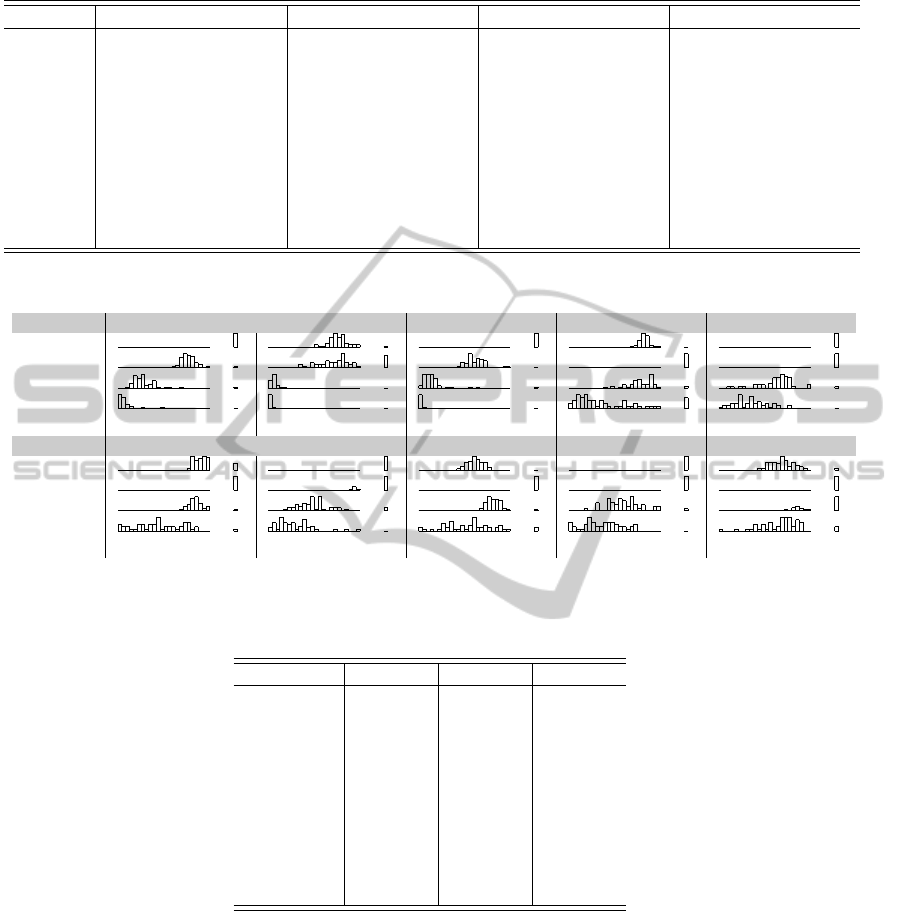
Table 4: Average Fitness ± standard deviation at the end of the optimization.
Method 1 Method 2 Method 3 Method 4
Function 1 1.62e − 01 ±1.67e − 02 3.57e − 02 ±3.47e − 03 1.52e − 02 ±7.50e − 03 6.47e − 03 ±4.88e − 03
Function 2 8.88e + 01 ±1.26e + 01 8.87e + 01 ±2.39e + 01 7.05e + 00 ±3.95e + 00 1.98e + 00 ±2.36e + 00
Function 3 1.92e + 01 ±3.57e + 00 1.05e + 00 ±1.77e − 01 3.37e − 01 ±5.80e − 01 8.82e − 02 ±1.95e − 01
Function 4 −3.06e + 02 ±5.68e + 00 −1.22e + 02 ±2.59e + 00 −3.11e + 02 ±1.49e + 01 −3.51e + 02 ±3.58e + 01
Function 5 1.91e + 03 ±9.94e + 01 4.64e + 03 ±1.18e + 02 1.08e + 03 ±1.42e + 02 8.64e + 02 ±1.38e + 02
Function 6 −1.30e + 05 ±3.17e + 03 −5.62e + 04 ±1.47e + 03 −1.33e + 05 ±3.27e + 03 −1.50e + 05 ±1.14e + 04
Function 7 2.15e − 01 ±2.50e − 02 7.42e − 02 ±6.98e − 03 4.45e − 02 ±9.44e − 03 3.36e − 02 ±1.03e − 02
Function 8 −1.76e + 02 ±7.76e + 00 −6.78e + 01 ±2.35e + 00 −1.56e + 02 ±7.13e + 00 −1.83e + 02 ±2.58e + 01
Function 9 1.95e + 03 ±1.51e + 02 4.95e + 03 ±1.24e + 02 1.16e + 03 ±1.55e + 02 9.61e + 02 ±1.65e + 02
Function 10 −1.65e + 05 ±4.74e + 03 −6.55e + 04 ±1.99e + 03 −1.54e + 05 ±6.07e + 03 −1.66e + 05 ±8.11e + 03
Table 5: Result Distributions.
Function 1 Function 2 Function 3 Function 4 Function 5
Method 1
p p p p p p p p p p p p p p p
Method 2
p p p p p p p p p p p p p p p
Method 3
p p p p p p p p p p p p p p p
Method 4
p p p p p p p p p p p p p p p
Min Max
2.41e-03 1.75e-02 1.67e-01 7.15e+00 1.05e-02 3.96e-01 -3.97e+02 -2.87e+02 5.96e+02 1.18e+03
Function 6 Function 7 Function 8 Function 9 Function 10
Method 1
p p p p p p p p p p p p p p p
Method 2
p p p p p p p p p p p p p p p
Method 3
p p p p p p p p p p p p p p p
Method 4
p p p p p p p p p p p p p p p
Min Max
-1.70e+05 -1.29e+05 1.82e-02 4.44e-02 -2.37e+02 -1.47e+02 6.63e+02 1.25e+03 -1.91e+05 -1.53e+05
Table 6: Results of the Wilcoxon Rank-Sum test (Comparison with Method 4). A “+” symbol in the table means that Method
4 performs significantly better than the method it is compared to; an “=” symbol means that there is no statistically significant
difference in performance between the two methods.
Method 1 Method 2 Method 3
Function 1 + + +
Function 2 + + +
Function 3 + + +
Function 4 + + +
Function 5 + + +
Function 6 + + +
Function 7 + + +
Function 8 = + +
Function 9 + + +
Function 10 = + +
means, we would have to conclude that they are equal,
in practise however, the difference can be crucial as
we can run the highly varying algorithm several times
to ensure significantly better results. Skewed distri-
butions complicate the matter even further since we
would need to observe more statistical parameters in
addition to variance to decide which algorithm would
be better at the case at hand.
The remarks above do not mean that statistical
testing must be rejected: it is a powerful tool that does
allow to draw conclusions from large and otherwise
difficult to manage data sets. But their application re-
quires planning and risk of misuse is high. In medi-
cal research, where statistics are of great importance,
this situation has already been identified since the
1980s (Altman, 1991b; Strasak et al., 2007) and entire
books on the field have been written (see e.g., (Alt-
man, 1991a)) on how to do statistics correctly within
this single field. With the increasing access to any
type of information by the general public in the re-
cent years, the awareness of the problems posed by
improper use of statistical tools has moved out of the
circles of scientific research and has reached the gen-
eral public, as can be attested by an article on the sub-
ject in a popular science magazine (Siegfried, 2010),
which is an enjoyable description of rampant misuse
ICEC 2010 - International Conference on Evolutionary Computation
272

of statistics in fields of science.
When the hypotheses on which the statistical tests
are based are not verified, no statistical test can be
naively applied to the data in order to perform a quan-
titative analysis; one must then resort to a qualitative
approach to the problem. The method for data presen-
tation described in this paper is thus based on graphi-
cal representations of the data, especially in the forms
of histograms. The readers are thus expected to exert
their best judgement when comparing multiple, judi-
ciously presented such figures in order to draw the
appropriate conclusions regarding the performance of
the algorithms. This method also aims at conveying
as much information as both the usual average and
standard deviation table and the statistical test table
without making any assumption regarding the distri-
bution of the data, while occupying about the same
amount of space. Finally, it is believed to be readable
at a glance.
5 COMPARISONS TO OTHER
DATA PRESENTATIONS
To illustrate the effectiveness of our visualization
method we present a comparison of four evolution-
ary algorithms that was computed for an earlier
work (Weber et al., 2010). The data consists of four
stochastic optimization methods, with two baseline
algorithms (1 and 2) and two proposed improvements
(3 and 4). The tests consists of a set of ten typi-
cal functions, commonly used in the field, in 500 di-
mensions. To evaluate our visualisation method, we
present the same data in three formats: as the aver-
age and standard deviation in Table 4, as a statistical
comparison in Table 6, and in our preferred format in
Table 5. The first comparison is between the averages
in Table 4 and the histograms in Table 5. A cursory
comparison between Table 4 and Table 5 reveals that
the required print areas needed for both tables more
or less equal, leading to the conclusion that replacing
the numerical table with a graphical one is feasible
within the strict page limits imposed by many pub-
lishers. Moreover, the histograms table is composed
of self-sufficient tiles and can, unlike the numerical
table, be laid out more flexibly. The data can for ex-
ample be presented as a square table, as a long column
on the side of the page or even as separate blocks near
the explanatory text of the article.
One claim could however be made in favor of
average and standard deviation tables: they present
the numerical data precisely and in an absolute way,
which is not accomplished by the histogram repre-
sentation. This is naturally true, but what is the im-
portance of knowing the exact value of the average?
Reasonably, this level of precision could be necessary
only when making a comparative study but, as argued
before, averages and standard deviations are not suf-
ficient for this purpose. Since fitting all the numeri-
cal data in a printed article is infeasible and distract-
ing, the only reasonable recourse to rely on the repro-
ducibility of science and to re-compute the numbers
for the tests. Alternatively, one can publish the gath-
ered data in its entirety outside of the article.
To evaluate the work, the reader is instructed to
first study the Table 4. Casual study reveals, mostly
due the bold font, that Method 4 is likely to be the best
candidate. At this point we make a claim: there are
four functions for which this might not be the case.
How long does it take to see which ones they are?
This simple test clearly illustrates the fact that reading
this table is difficult.
In contrast we observe Table 5. We instantly see
that in many cases Method 4 has produced results
closer to the optimum than other methods, with the
closest competitor being Method 3. Method 2 seems
to be in general not competitive compared to the other
methods and Method 1 is in the competition but los-
ing. In four cases (functions 4, 6, 8 and 10), we
see significant overlap, which confirms the result of
the Mann-Whitney U test in Table 6, indicating that
for Functions 8 and 10, Method 4 is not perform-
ing significantly better than Method 1. The same
test indicates however that on Function 4, Method 4
is outperforming Method 1 whereas the distributions
are mostly overlapping. This might be caused be a
long tailed and skewed histogram for Method 4 which
causes Mann-Whitney-U test to give an counterintu-
itive result. These examples therefore illustrate the
fact that our visualisation effectively conveys at least
the same information as the Mann-Whitney U test, as
well as information complementary to the test and its
limits.
The visualisation shows several other points of in-
terest, that are not evident in either standard devia-
tion table or statistical test. Method 1 seems to have
a rather robust behaviour. Although it rarely com-
petes in the best solution quality, it seems to reliably
achieve a certain level of fitness, which is most evi-
dent in Functions 2, 4, and 8. Method 4 works the
opposite way, having a wide distribution and some-
times finding excellent results and yet at times failing
badly. When considering repeated experiments, there
is little use of running Method 1 again to improve the
result, but running number 4 several times could be
very beneficial. In some cases, some algorithms have
their data entirely in the “dump bin”. This is the au-
thor’s way of visually claiming that those algorithms
SPARKLINE HISTOGRAMS FOR COMPARING EVOLUTIONARY OPTIMIZATION METHODS
273

did not manage to produce any meaningful results.
6 CONCLUSIONS
In this text we have presented a novel visualization for
comparing evolutionary optimization methods. We
claim that this visualisation can convey more informa-
tion than average/standard deviation tables and statis-
tical test tables while retaining nearly the same usage
of space and still improve on the readability of the pa-
per. We also offer our opinion that reporting averages,
standard deviations or any single statistical number in
context of stochastic algorithms is not a useful prac-
tice and can be misleading. In our view, sparkline
histograms completely supersede the use of average
and standard deviation table.
We also present that histograms are a easier ap-
proach than statistical testing, which requires great
care to do properly. We do not claim that statistical
test are not a valid tool, but instead fear that, based
on experience in other fields, they that can be easily
misused. Sparkline histograms carry the same infor-
mation in a form that is easily understood by a layman
and offers far fewer places for mistakes and misinter-
pretations.
REFERENCES
Altman, D. G. (1991a). Practical statistics for medical re-
search. Chapman & Hall/CRC.
Altman, D. G. (1991b). Statistics in medical journals:
Developments in the 1980s. Statistics in Medicine,
10(12):1897–1913.
Fan, H. and Lampinen, J. (2003). A trigonometric mutation
operation to differential evolution. Journal of Global
Optimization, 27(1):105–129.
Feltovich, N. (2003). Nonparametric tests of differences
in medians: Comparison of the wilcoxon–mann–
whitney and robust rank-order tests. Experimental
Economics, 6(3):273–297.
Garc
´
ıa, S., Molina, D., Lozano, M., and Herrera, F. (2009).
A study on the use of non-parametric tests for ana-
lyzing the evolutionary algorithms’ behaviour: a case
study on the cec’2005 special session on real param-
eter optimization. Journal of Heuristics, 15(6):617–
644.
Mann, H. and Whitney, D. (1947). On a test of whether
one of two random variables is stochastically larger
than the other. The Annals of Mathematical Statistics,
18(1):50–60.
Siegfried, T. (2010). Odds are, it’s wrong. ScienceNews,
177(7):26.
Strasak, A. M., Zaman, Q., Pfeiffer, K. P., G
¨
obel, G.,
and Ulmer, H. (2007). Statistical errors in medical
research-a review of common pitfalls. Swiss medical
weekly, 137(03/04):44–49.
Tufte, E. (2006). Beautiful evidence. Graphics Press
Cheshire, Conn.
Weber, M., Neri, F., and Tirronen, V. (2010). Parallel differ-
ential evolution with endemic randomized control pa-
rameters. In Proceedings of the Fourth International
Conference on Bioinspired Optimization Methods and
their Applications, pages 19–29.
ICEC 2010 - International Conference on Evolutionary Computation
274
