
Automated Repair of Asymmetric Web Pages during Resolution
of Mobile Friendly Problems
Md. Aquib Azmain and Kishan Kumar Ganguly
Institute of Information Technology, University of Dhaka, Dhaka, Bangladesh
Keywords:
Mobile Friendly Problems, Symmetric Structure, Web Application.
Abstract:
In software development, software usability is an important aspect to ensure the end-user does not strain or
encounter problems with the use of a product or website’s user interface. Mobile friendly problem (MFP)
causes the low quality of the website visibility and has a potential risk to decrease usability for a mobile
user. The existing solutions to mobile friendly problems do not address symmetrical structure of web pages.
To address this limitation, we have proposed an automatic repair technique that generates symmetric mobile
friendly patches by tuning the symmetric criteria of a web page. The empirical evaluation shows that this
approach gets better structure on the basis of symmetry in 90.7% of the evaluated websites. Moreover, A
survey based evaluation shows that 88%, out of 54 websites, have been considered as more preferable than the
previous version by the users.
1 INTRODUCTION
The web is being accessed more and more on mobile
devices. Mobiles have become a common medium of
accessing the internet. Designing websites to be mo-
bile friendly ensures that the pages of that website is
readable and usable on all devices (Mob, 2020). The
websites which are developed for desktop viewport
might be difficult to view and use on a mobile device.
Alternatively, the mobile-friendly version is readable
and immediately usable. Google has updated its rank-
ing criteria and included mobile-friendliness as a cri-
teria while returning search results for mobile devices
in April 2015 (Mul, 2020). This concludes that if a
website is not mobile friendly, the probability of get-
ting higher rank in the search results will be less.
The main problem of existing approaches is the
violation of symmetric structure of the website. Sym-
metrical design relies on proportion to create a style
with mirroring sides. Symmetry happens when the
composition of design is distributed evenly around
a central point or axis of a website (Yang and Shi,
2009). Symmetry is considered one of the most im-
portant predictors for visual appeal according to the
gestalt law which describes how human perceives pat-
terns. (Bauerly and Liu, 2008). Gestalt theory is a
psychology theory to describe the perspective process
of human (Wertheimer, 1938). Lavie and Tractin-
sky have also argued that symmetry is also an im-
portant factor in the aesthetic perception of websites
(Lavie and Tractinsky, 2004). In Zheng et al.’s evalu-
ation, symmetry significantly correlated with partici-
pants’ subjective ratings on aesthetics (Zheng et al.,
2009). Symmetry happens when the composition
of web elements, contents and design is evenly dis-
tributed around a center point of axis. The work in-
volved in making a symmetric mobile-friendly site
can depend on developer resources, business model,
and expertise. There is no automatic way to ensure
symmetry of a website. The developers have to im-
plement the symmetric design manually. So this is
time consuming and costly.
The existing approaches of repairing a mobile
friendly websites do not ensure the symmetry of the
web page. There are some existing approaches to fix
presentation issues of websites. For example, one ap-
proach repairs layout cross browser issues caused by
the inconsistencies in different browsers’ rendering of
a same web page (Mahajan et al., 2017). The other
solution shows a framework of repairing faulty CSS
of a web application but it does not address mobile
friendly problems (Walsh et al., 2015). Elsewhere.
PhpRepair (Samimi et al., 2012) solves HTML syn-
tax problems in web application. Moreover, Wang et
al. (Wang et al., 2012) proposed an approach to fix
presentation issues using static and dynamic analysis.
However, none of these techniques identify mobile
friendly problem and provide repairs for them. Maha-
Azmain, M. and Ganguly, K.
Automated Repair of Asymmetric Web Pages during Resolution of Mobile Friendly Problems.
DOI: 10.5220/0010500504610468
In Proceedings of the 16th International Conference on Evaluation of Novel Approaches to Software Engineering (ENASE 2021), pages 461-468
ISBN: 978-989-758-508-1
Copyright
c
2021 by SCITEPRESS – Science and Technology Publications, Lda. All rights reserved
461

jan et al. (Mahajan et al., 2018) proposed an approach
to produce CSS patches automatically that can fix the
mobile friendly problems of a web page (Mahajan
et al., 2018). To distinguish the best fix proficiently,
this methodology evaluates metrics identified by lay-
out distortion and mobile friendly score to achieve
the solution. None of the existing approaches ensures
symmetry during resolution of mobile friendly prob-
lem.
The goal of this research is to deliver a technique
to improve symmetric structure of a website during
resolution of mobile friendly problems. This pro-
posed method has been compared with the existing
works. This methodology helps to develop mobile
friendly websites with a symmetric structure. More-
over, this approach has decreased development time
and cost as it automatically fixes a web page accord-
ing to the viewports of the mobile devices.
With this aim, this study answers the following
Research Questions (RQs):
1. How to improve symmetric structure during
resolution of mobile friendly problems? By an-
swering the following sub-questions this question
can be answered.
(a) How to identify CSS properties and values of
the HTML elements that cause asymmetry
of a web page? By answering this question,
we will get a solution to find some problematic
HTML elements that cause asymmetry.
(b) How to improve symmetric structure of a
website in different viewports? By answer-
ing the question, a patch will be generated au-
tomatically that will modify some CSS prop-
erties like position, height, width, padding etc.
so that the whole page will be symmetrically
structured.
To answer these questions, a search based technique
has been proposed that uses balance score and pro-
portion score to address an optimal solution to get
symmetric mobile friendly CSS patch. This technique
first applies patches to fix mobile friendly problems of
the target patch. Then, the approach evaluates sym-
metric structure of the web page on the basis of sym-
metry based metrics named proportion score and bal-
ance score. It also finds the faulty HTML elements
that cause asymmetry. After that, the approach gen-
erates patches that modifies some CSS properties like
position, height, width, padding etc. so that the whole
page can be symmetrically structured. Therefore, the
approach generates patches that maintain trade-off be-
tween symmetry and layout distortion. The approach
repositions the segments to maintain symmetry by up-
dating CSS values of the HTML elements. The so-
lution can be applied to any types of viewports be-
cause the size parameters are configurable in the me-
dia query according to the accessed device viewport
size.
To evaluate this solution, the proposed solution
has been validated using both metrics and survey-
based evaluation. The repaired version has achieved
better score in terms of balance score and proportional
score. This symmetric mobile friendly approach gets
90.7% better balance score and 96.2% better pro-
portion score than the existing mobile friendly ap-
proach. It confirms that the repaired versions have
more symmetric structure than the existing mobile
friendly technique. A survey based evaluation has
been conducted on 25 professional software engineers
of Bangladesh. This survey shows that 88% websites,
out of 54, have been considered as more preferable
than the previous version by the users. On average,
the rating (out of ten) of updated symmetric mobile
friendly version had a 21% improvement than the mo-
bile friendly version.
2 METHODOLOGY
This section contains the core parts of the technique
which are later described in details throughout this
chapter. The following points are the main constitutes
of the proposed approach.
First, the approach parses the document object
model (DOM) tree of the target web page to identify
the segments. After that, the approach incorporates
the existing mobile friendly fix (Mahajan et al., 2018).
This applies patches to fix mobile friendly problems
of the target patch. This step uses two metrics named
mobile friendly score and layout distortion for evalu-
ation.
Then, the approach evaluates symmetric structure
of the web page based on symmetry based metrics. It
also finds the faulty HTML elements that cause asym-
metry. Moreover, the CSS attributes and the values of
the elements is identified. For example, an image con-
taining absolute positioning, fixed height and fixed
length can cause asymmetry. To detect the asymme-
try, the approach checks the balance between the two
sides of a web page according to the centralized verti-
cal axis. The approach identifies all these problematic
properties and values that cause asymmetry.
After that, the approach generates patches that
modifies some CSS properties like position, height,
width, padding etc. so that the whole page can be
symmetrically structured. However, improving sym-
metry can cause layout distortion. Layout distor-
tion means overlapping of the segments of a web-
ENASE 2021 - 16th International Conference on Evaluation of Novel Approaches to Software Engineering
462

Figure 1: Overview of the solution approach.
site. Therefore, the approach generates patches that
maintains trade-off between symmetry and layout dis-
tortion. The approach updates the position property
value (static, relative or sticky) to achieve the most
symmetric structure possible for that web page. How-
ever, the updated element can overlap on other ele-
ments that cause segment overlapping. To resolve
this, the approach repositions the overlapped seg-
ments maintaining symmetry. The overview of the
solution approach is shown in Figure 1. This step
uses two metrics named proportion score and balance
score to generate the symmetry mobile friendly patch.
New values are made into CSS style declarations by
converting it into a CSS selector. A CSS media query
is formed by these updated CSS style values.
2.1 Segmentation of the Web Page
The primary stage analyzes the structure of the page
to recognize fragments - sets of HTML components
whose properties should be balanced together to pre-
serve the visual consistency of the repaired page. An
illustration of a segment may be a arrangement of
text-based links in a navigation bar where on the off
chance that the text style measure of any interface
within the section is little, at that point all of the nav
links ought to be balanced by the same amount to pre-
serve the links’ visual consistency. To maintain con-
sistency, the fix value of a target element has to be
close to the related elements.
The document object model (DOM) tree of the
target web page needs to parsed to identify the de-
sired segments from a web page. There are several
types of segmentation process, such as Block-o-matic
(Sanoja and Ganc¸arski, 2014), clustering based par-
titioning (Chakrabarti et al., 2008), correlation clus-
tering(Bansal et al., 2004). We have chosen to use vi-
sual representation based segmentation process called
VIPS (Cai et al., 2003). In the VIPS algorithm, the
vision-based content structure of a page is deduced
by combining the DOM structure and the visual cues.
First, DOM structure and visual information, such
as position, background color, font size, font weight,
etc., are obtained from a web browser. Then, from
Figure 2: Example of Web Page Segmentation.
the root node, the visual block extraction process is
started to extract visual blocks of the current level
from the DOM tree based on visual cues. Every DOM
node is checked to judge whether it forms a single
block or not. If not, its children will be processed in
the same way. When all blocks of the current level
are extracted, they are put into a pool. Visual separa-
tors among these blocks are identified and the weight
of a separator is set based on properties of its neigh-
boring blocks. After constructing the layout hierar-
chy of the current level, each newly produced visual
blocks is checked to see whether or not it meets the
granularity requirement. If not, this block will be fur-
ther partitioned. After all blocks are processed, the
final vision-based content structure for the web page
is outputted. Below we introduce the visual block
extraction, separator detection and content structure
construction phases respectively. The steps of VIPS
is shown in Figure 2. We can see that, the segments
are the header content, multiple content pane and the
footer. The blue blocks are the separators of the seg-
ments. The red blocks are intermediate segments and
the black blocks are the final segments of the web
page.
2.2 Applying Mobile Friendly Fix
After segmentation, this approach incorporates the
existing mobile friendly fix (Mahajan et al., 2018).
The overview of the process is given below:
1. Identifying Problematic Segments. To detect mo-
bile friendly problems in a web page, google mo-
bile friendly test (GMFT) is used. The GMFT tool
identifies the problems with the faulty elements
and their CSS properties. Then it is easy to de-
termine which segments have faulty elements by
analyzing the CSS properties. This approach ap-
plies a update to the segments to recognize which
ones may be tricky with regard to that mobile
friendly issue. The issue with the CSS properties
is, they inherit styles from their parent HTML el-
ements. Therefore, this approach introduce Prop-
erty Dependence Graph (PDG). This graph repre-
Automated Repair of Asymmetric Web Pages during Resolution of Mobile Friendly Problems
463

sents style relationships among all of the HTML
elements of a web segment based on CSS inheri-
tance. This approach defines three type of PDG:
font, content size and tap target PDG.
2. Repair. The repair step uses two metrics named
mobile friendliness and layout distortion. The
Google mobile friendliness test scores each web
page on the basis of mobile friendliness. This
score has a range of 0 to 100. The measure of
update in a layout can be controlled by building
models that express the relative visual position-
ing among and inside the parts of a page. To de-
cide the edge marks, the methodology registers
the Minimum Bounding Rectangles (MBRs) of
each section (Chaudhuri and Samal, 2007). This
is done by finding the largest and smallest X and
Y coordinate values of the components, which can
be obtained by analyzing the DOM of the page.
3. Computing Candidate Patches. The best CSS
patch balances between the mobile friendliness
and layout distortion. It irritates adjustment fac-
tors as to find the appropriate fix that vary a little
from the original web page. This approach finds
that the mean and standard deviation values are
the best in context of Gaussian distribution. Fi-
nally, this approach included an amendment fac-
tor to permit the way to get the optimal solution.
4. Generating Final Patch: The method creats a set
of fixes. The CSS properties are updated accord-
ing to the fix result for all nodes in the PDG. A
CSS media query is formed by these updated CSS
style values. When an user access the page, this
media query cause it to be rendered.
2.3 Evaluation of Symmetry Structure
In this stage, the approach finds the faulty HTML el-
ements that cause asymmetry. Moreover, the CSS
properties and the values of the target elements will
be identified. For example, an image containing ab-
solute positioning, fixed height and fixed length can
cause asymmetry. To detect the asymmetry, the ap-
proach will check the balance between the two sides
of a web page according to the centralized vertical
axis. The method has to identify all these problematic
properties and values that may cause asymmetry.
After getting all the HTML elements along with
the CSS properties, the approach detects the faulty el-
ements that cause asymmetry to the web page. This
detection is done separately for each segments of the
web page. The symmetric evaluation of the HTML
elements is concluded by two metrics. They are:
(a) Balance Score. The equal distribution of visual
weight in a design is defined as balance. Visual
balance occurs around a vertical axis. Our eyes
require the visual weight to be equal on the two
sides of the axis. Balance score is a metric for
measuring equilibrium along a vertical axis in the
layout. It is calculated by the summation of sym-
metrical balance, vertical balance and horizontal
balance. The balance score of an individual ele-
ment, B
i
= (N
i
, H
i
, C
i
, E
i
) is defined as follows:
(i) N
i
The number of elements in each segments on
both sides.
(ii) H
i
The distance from the closest headline and
sub-headline on both sides or not.
(iii) C
i
The distance from the closest call to action
button according to the center.
(iv) E
i
The number of elements under the heading
on both sides
The total balance score is the summation of each
balance score of the targeted web page. If the the
total balance score for a page p is B(p) and total
number of elements in that page is n, then
B(p) =
(n ∗ 100) −
∑
n
i=1
(N
i
, H
i
, C
i
, E
i
)
n ∗ 100
(b) Proportion Score. It is the ratio between the di-
mensions of elements. The ratio is calculated by
dividing the height of any element by its length.
The proportion of every elements in a web page
needs to be similar to maintain symmetric struc-
ture. The proportion score of a web page is calcu-
lated by the difference of individual mean propor-
tion score of each mirror side of that web page.
The solution is looking for a proportion score
close to zero. If the height of an HTML element e
is H
e
and width is W
e
, the proportion score of that
element is P
e
.
P
e
=
H
e
W
e
The web page needs to divided into two sides on
the basis of vertical axis. Then the elements will
be separated into two sets such as left set and right
set. The elements, which are overlapped on the
vertical axis, are the common members of the two
sets. If the proportion score of left set is P
L
s and
right set is P
R
s,
P
L
s =
∑
n
l
i=1
P
e
n
L
where the number of elements in left side is n
L
and
P
R
s =
∑
n
R
i=1
P
e
n
R
ENASE 2021 - 16th International Conference on Evaluation of Novel Approaches to Software Engineering
464

where the number of elements in left side is n
R
.
Therefore, the final proportion score of a page W
is P
W
,
P
W
= P
L
s − P
R
s
These two metrics are used to detect the faulty ele-
ments in that web site which cause the distortion of
symmetry. Moreover, the approach gets the faulty
segments by analysing the faulty HTML element’s
segment.
2.4 Generate Symmetric Mobile
Friendly Patch
The idea behind the solution is to achieve optimal so-
lution efficiently. Search based technique has been
used to generate candidate patches to get symmetric
mobile friendly web page. The value of balance score
and proportion score has been changed dynamically
to gain highest balance score (close to 1) and lowest
proportion score (close to 0). Search-based strategies
start by choosing a sample set from the solution space.
For this, the method iterates over each of the elements
in the site. For every component, it repeats over every
node of the PDG, beginning with the root node, and
updates value that will be referred to CSS property.
When new property estimations have been completed
for all nodes in the PDG, the method creates a bunch
of fixes. The values have been updated according to
achieve the highest balance score and lowest propor-
tion score.
New values are made into CSS style declarations
by converting it into a CSS selector. A CSS media
query is formed by these updated CSS style values.
When an user access the page in a mobile viewport,
this media query cause it to be rendered with the up-
dated CSS patch.
3 EXPERIMENTATION AND
FINDINGS
This section contains the implementation details,
experiments, result discussion of the proposed ap-
proach. The discussion of the results to explain some
important insights are also presented. This section
also describes the subjects, tools that is used in the im-
plementation, environment setup and evaluation ques-
tions.
3.1 Implementation Details
The proposed methodology was implemented in Java
using Eclipse Photon 4.8 Integrated Development En-
vironment (IDE) (Ecl, 2020). Moreover, We used
python 3 using virtual studio code to develop the an-
alyzer tool named UIAnalyzer. An Object Oriented
Programming language such as Java provides exten-
sive support for polymorphism, inheritance and en-
capsulation which are necessary for reusability. This
is why it was used to implements the approach.
We have used Google mobile friendly test api to
identify the mobile friendly problems in a web ap-
plication.Mobile Friendly Test is a tool that allows to
easily carry out a mobile site test telling about a web-
site’s score in terms of mobile responsiveness. To ren-
der the document object model of a webpage and to
get information about XPath of the HTML elements,
an emulated Chrome browser v65.5 has been used for
mobile experience. Selenium Webderiver is used to
get all the HTML elements parsed. We have used
jStyleParser for detecting defined CSS properties for
every HTML nodes in a web page.
3.2 Subjects
For result analysis, 54 websites were selected from
the most popular websites list across all categories
listed by MOZ top 500 websites (The, 2020). We
selected MOZ website list as the source because it
gives the popularity based ranking and a mix of dif-
ferent layouts. We have used HTTrack (HTT, 2020)
to download all the HTML files, images, CSS and
javascript files from the website.
3.3 User based Case Study
A user based case study has been conducted by doing
a survey. The purpose of this survey is to evaluate the
visual appeal of the updated web page that is incor-
porated with symmetric mobile friendly patch. The
participants were asked to compare the previous and
updated versions of the subjects in that survey. For
each subject, the survey included a screenshot of the
original and updated pages when viewed in a view-
port of the mobile device. The questions of the survey
were:
1. Which version between two screenshots (One is
mobile friendly, other one is symmetric mobile
friendly) is more visually attractive?
2. Which version they would prefer more to use in a
mobile device?
3. Rate the each version of the target page on a scale
of 10.
We used Google Form service to do this survey. For
the survey, we had 25 participants who are currently
Automated Repair of Asymmetric Web Pages during Resolution of Mobile Friendly Problems
465
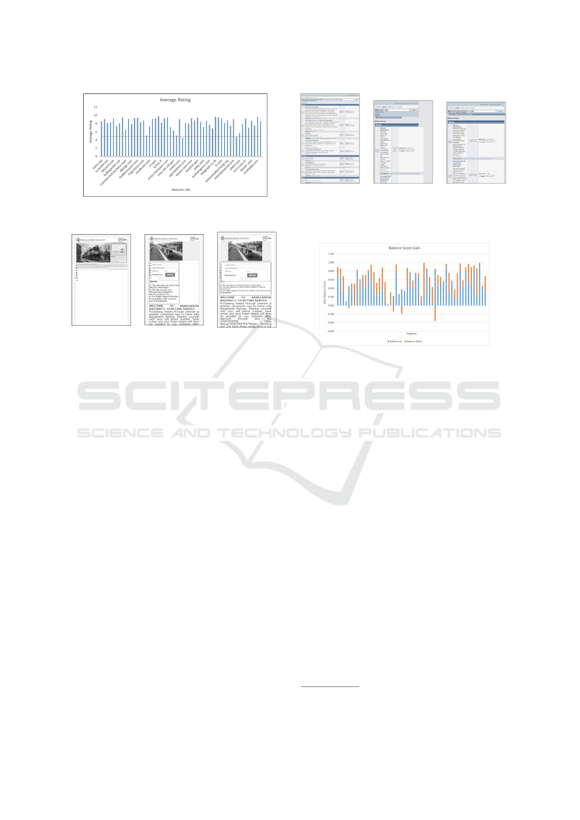
Figure 3: Average Rating of symmetric mobile friendly ver-
sions of 54 subjects.
(a) Website with
mobile friendly
problems
(b) Website after
applying mobile
friendly solution
(c) Improved
symmetric
structure
Figure 4: Screenshots of the outcome - 1.
working as software developers in different multi-
national software companies of Bangladesh. Based
on the result of the survey, the participants preferred
using symmetric version 48 out of 54 subjects. Only
6 subjects had a negative preference for using the
symmetric version. On average, the rating of up-
dated symmetric mobile friendly version had a 21%
improvement than the mobile friendly version. Fig-
ure 3 shows the average ratings of symmetric mobile
friendly versions of all 54 subjects given by the par-
ticipants. It shows that 53 of them have a rating of
more than 5.
There are some screenshots (4) given. 4a shows a
website with various mobile friendly problems. After
applying the solution for mobile friendly problems,
the website has asymmetric structure (4b). 4c is the
final result that shows how the website looks after fix-
ing the structural problem. Figure 5 shows one more
example of the symmetric mobile friendly solution.
4 RESULT ANALYSIS
The effectiveness of the approach is dependent on two
metrics such as balance score and proportion score of
a web page. The range of two metrics is 0 to 1. If the
balance score is close to 1 and the proportion score is
close to 0, it is evaluated as more effective. First, these
(a) Website with
mobile friendly
problems
(b) Website after
applying mobile
friendly solution
(c) Improved
symmetric
structure
Figure 5: Screenshots of the outcome - 2.
Figure 6: Distribution of Balance Score Gain.
metrics have been calculated for the version with mo-
bile friendly patch. Then, these metrics have been
calculated for the updated version of the website with
symmetric mobile friendly patch. As we are targeting
to increase the balance score and decrease the propor-
tion score, it is easy to evaluate the effectiveness of
the approach by analyzing the difference of the two
versions of the subjects.
The balance score and proportion score of the mo-
bile friendly versions and symmetric mobile friendly
versions for 54 websites can be found in this link
1
. 49
out of 54 subjects have gained balance score. There-
fore, the effectiveness of the approach on the basis of
balance is 90.7%. Moreover, 52 out of 54 subjects
have lost proportion value. The effectiveness on the
basis of proportion score is 96.2%. The figures 6 and
7 show the distribution of balance score and propor-
tion score. The blue portion indicates the proportion
score and balance score of the mobile friendly ver-
sion. The orange portion indicates the improvement
of proportion score and balance score of the symmet-
ric mobile friendly version. It shows that the symmet-
ric mobile friendly version generates better patch than
the mobile friendly patch in terms of symmetry.
Table 1 shows that the mean value of balance gain
is 0.20 and the mean value of proportion loss is 0.25
which are greater that 0. It confirms that the repaired
versions have performed better than the previous mo-
1
https://doi.org/10.6084/m9.figshare.14184635
ENASE 2021 - 16th International Conference on Evaluation of Novel Approaches to Software Engineering
466

Figure 7: Distribution of Proportion Score Loss.
bile friendly technique.
Table 1: Summary of Evaluation Metrics.
Max Min Average
Balance Gain 0.705 -0.361 0.202
Proportion Loss 0.858 -0.658 0.253
5 RELATED WORK
In this section, the existing mobile friendly problem
solving approaches will be discussed. In the litera-
ture, most of them have proposed the detection and
resolving process of presentation failure of web ap-
plications (Walsh et al., 2015; Panchekha and Tor-
lak, 2016; Mahajan et al., 2017; Alameer et al., 2016;
Wang et al., 2012). A few have proposed the resolu-
tion process of mobile friendly problems in web pages
(Mahajan et al., 2018). Some of them have shown the
significance of visual symmetry as an important factor
in the aesthetic perception of websites (Bauerly and
Liu, 2008; Lavie and Tractinsky, 2004; Zheng et al.,
2009).
Walsh et al. (Walsh et al., 2015) proposed an au-
tomated method for detecting potential faults in the
layout of responsively designed pages. This approach
models the layout of a responsive web page across
a series of viewport widths, explicitly taking account
of the key aspects of responsive layout, namely the
changing visibility, width, and relative alignment of
web page elements. This approach can not detect mo-
bile friendly problems. Moreover, new HTML ele-
ments namely header, footer, section etc have been in-
troduced recently. This approach does not work prop-
erly with these elements.
Alameer et al. (Alameer et al., 2016) proposed an
automated technique for detecting when a web page’s
interface has been distorted due to internationaliza-
tion efforts and identifying the HTML elements or
text responsible for the mentioned problem. This so-
lution is too specific to generalize to the broader do-
main.
The continually expanding number of internet
browsers with which clients can get to a site has pre-
sented new difficulties in controlling visual issues.
Differences in the appearance of a site across vari-
ous web browsers are known as Cross Browser Issues
(XBIs) (Mahajan et al., 2017). It is caused by the con-
trasts in how different programs render HTML and
CSS rules. The XFix technique repairs layout Cross
Browser Issues (XBIs) — presentation failures. In
this domain, the “correct” presentation of the page is
available through one of the browsers, the layout of
which must be mimicked in another. Mobile friendly
problems entail a different approach, in which the pre-
sentation of a page must be changed to correct a series
of identified issues. There is no correct reference ren-
dering available to the repair process, which must also
maintain as much of the original aesthetics of the page
as possible.
Mahajan et al. (Mahajan et al., 2018) proposed
an automated approach for solving mobile friendly
problems in web application. They proposed a way
to dynamically create CSS patches that can improve
the mobile friendliness of a site. To effectively get the
best fix, this methodology checks different aspects of
the problem to evaluate metrics identified by layout
distortion and the calculation of the solution. The ap-
proach is divided into 3 phases - segmentation, local-
ization and repair. The repair phase computes a repair
CSS set for the web page. It identifies a patch that
improves the web page’s mobile friendliness score. It
also ensures that the generated patch does not signif-
icantly distorts the layout of the web page. They an-
alyzed 38 real-world subjects collected from the best
50 most visited websites over all seventeen categories
reported by Alexa. The results for effectiveness were
that 95% (36 out of 38) of the subjects passed the
GMFT after Applying MFix’s proposed CSS repair
fix. In terms of the measuring metric, the repaired ver-
sion was evaluated to have improved visual value as
it were 38% of the time. This approach solves mobile
friendly problems of a website but it can not maintain
the original symmetric structure. Therefore, the re-
paired version has a lower attractiveness. According
to their evaluation, the repaired version had a lower
attractiveness 62% of the time.
The existing solutions of asymmetry and mobile
friendly problems are limited in manual development.
These approaches are time consuming and costly.
One approach repairs layout cross browser issues
caused by the inconsistencies in different browsers’
rendering of a same web page. The other solution
shows a framework of repairing faulty CSS of a web
application but it does not address mobile friendly
problems. An other approach fixes presentation is-
sues using static and dynamic analysis. There is an
approach to produce CSS patches automatically that
Automated Repair of Asymmetric Web Pages during Resolution of Mobile Friendly Problems
467

can fix the mobile friendly problems of a web page.
However, none of these techniques solve both asym-
metry and mobile friendly problem, which provides
the scope for a major contribution in this domain.
6 CONCLUSION
This paper proposes an automated repair technique
that incorporate mobile friendly solutions and sym-
metric structure of web application. For this, a search
based approach has been devised that considers coor-
dination between mobile friendly problem and sym-
metry problem. This approach depends on offline ver-
sion of a website because this can not handle the dy-
namic changes in rendering. Our future work is to
handle the dynamic changes along with the symmet-
ric mobile friendliness of a web page. This solution
needs to introduce fixing the online version of a web
site. Another possible future work is to analyze the
relation between symmetry, mobile friendliness and
complexity of a web page to quantify this relation.
As the complexity of a web page depends on the ele-
ments, contents and layout, symmetry analysis on dif-
ferent types of website can extract valuable insights.
Moreover, new HTML elements have been introduced
in modern web pages. The modification of these ele-
ments needs different approach in the context of sym-
metric mobile friendly solution. In addition to that,
different types of new viewports are being introduced
day by day. These new viewports may need updated
solution to incorporate.
REFERENCES
(2020). Eclipse photon — the eclipse foundation. https://
www.eclipse.org/photon/. (Accessed on 09/30/2020).
(2020). Httrack website copier - free software offline
browser (gnu gpl). https://www.httrack.com/. (Ac-
cessed on 09/30/2020).
(2020). Mobile-friendly test – google search console. https:
//search.google.com/test/mobile-friendly. (Accessed
on 09/28/2020).
(2020). Multi-screen overview - adsense help. https:
//support.google.com/adsense/answer/6051803?hl=
en&visit id=637368306470692014-1946767540&
rd=1. (Accessed on 09/28/2020).
(2020). The top 500 most popular websites - moz. https:
//moz.com/top500. (Accessed on 09/30/2020).
Alameer, A., Mahajan, S., and Halfond, W. G. (2016).
Detecting and localizing internationalization presenta-
tion failures in web applications. In 2016 IEEE Inter-
national Conference on Software Testing, Verification
and Validation (ICST), pages 202–212. IEEE.
Bansal, N., Blum, A., and Chawla, S. (2004). Correlation
clustering. Machine learning, 56(1-3):89–113.
Bauerly, M. and Liu, Y. (2008). Effects of symmetry and
number of compositional elements on interface and
design aesthetics. Intl. Journal of Human–Computer
Interaction, 24(3):275–287.
Cai, D., Yu, S., Wen, J.-R., and Ma, W.-Y. (2003). Vips: a
vision-based page segmentation algorithm.
Chakrabarti, D., Kumar, R., and Punera, K. (2008). A
graph-theoretic approach to webpage segmentation.
In Proceedings of the 17th international conference
on World Wide Web, pages 377–386.
Chaudhuri, D. and Samal, A. (2007). A simple method for
fitting of bounding rectangle to closed regions. Pattern
recognition, 40(7):1981–1989.
Lavie, T. and Tractinsky, N. (2004). Assessing dimensions
of perceived visual aesthetics of web sites. Interna-
tional journal of human-computer studies, 60(3):269–
298.
Mahajan, S., Abolhassani, N., McMinn, P., and Halfond,
W. G. (2018). Automated repair of mobile friendly
problems in web pages. In Proceedings of the 40th
International Conference on Software Engineering,
pages 140–150. ACM.
Mahajan, S., Alameer, A., McMinn, P., and Halfond, W. G.
(2017). Automated repair of layout cross browser is-
sues using search-based techniques. In Proceedings of
the 26th ACM SIGSOFT International Symposium on
Software Testing and Analysis, pages 249–260. ACM.
Panchekha, P. and Torlak, E. (2016). Automated reason-
ing for web page layout. ACM SIGPLAN Notices,
51(10):181–194.
Samimi, H., Sch
¨
afer, M., Artzi, S., Millstein, T., Tip, F., and
Hendren, L. (2012). Automated repair of html gener-
ation errors in php applications using string constraint
solving. In 2012 34th International Conference on
Software Engineering (ICSE), pages 277–287. IEEE.
Sanoja, A. and Ganc¸arski, S. (2014). Block-o-matic: A
web page segmentation framework. In 2014 interna-
tional conference on multimedia computing and sys-
tems (ICMCS), pages 595–600. IEEE.
Walsh, T. A., McMinn, P., and Kapfhammer, G. M. (2015).
Automatic detection of potential layout faults follow-
ing changes to responsive web pages (n). In 2015
30th IEEE/ACM International Conference on Auto-
mated Software Engineering (ASE), pages 709–714.
IEEE.
Wang, X., Zhang, L., Xie, T., Xiong, Y., and Mei, H.
(2012). Automating presentation changes in dynamic
web applications via collaborative hybrid analysis. In
Proceedings of the ACM SIGSOFT 20th International
Symposium on the Foundations of Software Engineer-
ing, page 16. ACM.
Wertheimer, M. (1938). Gestalt theory.
Yang, X. and Shi, Y. (2009). Enhanced gestalt theory
guided web page segmentation for mobile browsing.
In 2009 IEEE/WIC/ACM International Joint Confer-
ence on Web Intelligence and Intelligent Agent Tech-
nology, volume 3, pages 46–49. IEEE.
Zheng, X. S., Chakraborty, I., Lin, J. J.-W., and Rauschen-
berger, R. (2009). Correlating low-level image statis-
tics with users-rapid aesthetic and affective judgments
of web pages. In Proceedings of the SIGCHI Confer-
ence on Human Factors in Computing Systems, pages
1–10. ACM.
ENASE 2021 - 16th International Conference on Evaluation of Novel Approaches to Software Engineering
468
