
Visual Analysis Tool for a BLE Technology based Tracking Data
Flavia A. Schneider
a
, Adriano Branco
b
, Ariane M. B. Rodrigues
c
, Felipe Carvalho
d
,
Simone D. J. Barbosa
e
, Markus Endler
f
and H
´
elio Lopes
g
Department of Computing, PUC-Rio, Rua Marqu
ˆ
es de S
˜
ao Vicente, 225, Rio de Janeiro, Brazil
Keywords:
Internet of Mobile Things, Data Visualization, Indoor Positioning, Data Mining, Information Systems.
Abstract:
Several systems deal with human mobility. Most of them are for outdoor environments and use mobile phones
to capture data. However, there is a growing interest of enterprises to consider indoor movement to take
employees and client classes into account. Moreover, they usually want to assign semantics to the visited lo-
cations. We propose a visual exploration tool for analyzing the dynamics of individual movements in an indoor
environment in this work. We present the use of suitable charts and animations to explore these complex data
better. Finally, we argue that one could use our solution to monitor social distancing in indoor environments,
which is a sensible thing during the current COVID-19 pandemic.
1 INTRODUCTION
Global navigation satellite systems (GNSS) enabled
the estimation of a target’s position at a given loca-
tion. This technology has numerous functionalities,
which have since been improved in outdoor environ-
ments (Kaplan and Hegarty, 2005). It allows us to
identify a position of a car to suggest a better route,
share people’s location between family groups, and
even identify iceberg displacements for environmen-
tal monitoring. In indoor environments, it is also pos-
sible to estimate a specific target location, in particu-
lar, of people (Dardari et al., 2015).
Nowadays, many enterprises want to increase the
digitization of their data and improve their opera-
tional efficiency. To do so, they started to collect
and analyze data about their internal workflows, busi-
ness processes, employees’ movement, and the re-
sources used (Curran, 2018). Employees’ higher mo-
bility within the enterprise is a clear sign of their
higher operational efficiency because employees be-
come more adaptive and better collaborate with col-
leagues to manage the production process and possi-
a
https://orcid.org/0000-0003-1176-2249
b
https://orcid.org/0000-0002-5200-5212
c
https://orcid.org/0000-0002-1614-918X
d
https://orcid.org/0000-0002-7540-286X
e
https://orcid.org/0000-0002-0044-503X
f
https://orcid.org/0000-0002-8007-9817
g
https://orcid.org/0000-0003-4584-1455
ble problems (Melamed, 2016; Marini, 2019).
Although there are systems for analyzing human
mobility in indoor environments, these systems do not
have embedded semantics. Usually they are agnostic
to a specific business field, and they do not consider
the participants’ classes.
In this work, we propose a visual exploration tool
for analyzing the dynamics of individual movements
in an indoor environment. To do so, we first devel-
oped a low-cost tracking system for indoor environ-
ments (Schneider et al., 2021). This system detects,
collects, processes, and stores users’ movement and
presence data. It also considers the users’ classes and
the semantics of the location. We collected these data
in two university buildings used by faculty, staff and
students.
Using this exploration tool, we report the results
comprising the data collection and visual exploration
to answer some questions about individuals’ indoor
mobility. We propose the use of suitable charts and
animations to analyze these complex data better.
We organized this paper as follows. Section 2 de-
scribes some related work about visual analysis and
visualizations for indoor mobility data visualization
systems. Section 3 presents the research questions
that guided the development of this work. Section 4
reports a visual exploration tool developed and the vi-
sual analysis of a real case study. Section 5 concludes
this work and proposes future directions.
232
Schneider, F., Branco, A., Rodrigues, A., Carvalho, F., Barbosa, S., Endler, M. and Lopes, H.
Visual Analysis Tool for a BLE Technology based Tracking Data.
DOI: 10.5220/0010454202320239
In Proceedings of the 23rd International Conference on Enterprise Information Systems (ICEIS 2021) - Volume 1, pages 232-239
ISBN: 978-989-758-509-8
Copyright
c
2021 by SCITEPRESS – Science and Technology Publications, Lda. All rights reserved

2 RELATED WORK
The related work presented in this section addresses
visual tools for analyzing indoor individuals’ move-
ments and the most common visualizations used for
this analysis.
2.1 Visual Analysis Tools of Individuals’
Movements
This subsection presents some related work to visual
tools for analyzing individuals movements.
According to Oppermann and Munzner (Opper-
mann and Munzner, 2020), current visual data anal-
ysis tools do not suffice to support decision making
about indoor space usage over time. They designed
and implemented a visual decision support tool cen-
tered around location-based counts of the Sensible
Building Science (SBS) commercial product. Taking
advantage of WiFi networks available at some ven-
dors, SBS uses real-time location services (RTLS) to
record the number of devices per zone at regular inter-
vals. As These data are non-trajectory location-based
counts, the analysis of movement flows is not sup-
ported. Their visualization system addresses multiple
levels of space and time granularity. Since our focus
is not only on space and time, our solution is not de-
pendent on RTLS WiFi capability.
We developed some interactive charts for user tra-
jectories and occupancy in time versus location. In
addition to movement flows, we also want to visually
analyze the relation between individuals, locations,
and user trajectories.
Andrienko and Andrienko (Andrienko and An-
drienko, 2013) surveyed methods, tools, and proce-
dures focusing on visual analytics of outdoor move-
ment on spatial and spatial-temporal analysis, and
limited the scope of their work to movement data of
discrete objects whose spatial positions can be repre-
sented by points. They grouped their objects of anal-
ysis in four categories: trajectories, inside trajecto-
ries, birds’s-eye view on movement and investigating
movement in context. According to them, the most
usual movement visualizations for discrete entities are
static and animated maps and interactive space-time
cubes. From their example, they pointed out that
showing multiple trajectories in maps or space-time
cube (STC) may suffer from visual clutter and occlu-
sions and provides a limited representation of many
movement characteristics and their changes. They
suggest that visualizations of changes of movement
characteristics over time may be better represented
on a time graph. They considered spatial aggregation
of movement data by locations (space compartments)
and pairs of locations for presence and density analy-
ses.
Some commercial tools, such as Tableau (Tableau,
2003), allow the creation of charts and data analysis
without programming. However for indoor individu-
als’ movements, visual analysis chart bring essential
pieces of information combined with other kinds of
visualization. Tableau, like other visual data analysis
tools, does not support these types of visualizations.
2.2 Visualizations of Individuals’
Movements
This subsection presents some related work to the vi-
sualizations of individuals’ movement.
Martella et al. (Martella et al., 2017) explore the
use of data provided by low-cost mobile and fixed
proximity sensors to understand behavior of museum
visitors. To show insights about behavior of museum
visitors, they proposed path visualizations. A visitors’
position heatmap in the museum layout and matrix
shows the relation between visitors and each exhibi-
tion. The qualitative results indicated the immediate
benefits of the use of these analytics in practice. Their
work is interested in extracting which pieces of an ex-
hibition the visitors are interested in, the places they
visited, and how long they remained in each location.
However, the relations among locations, users, and
presence at a specific time are not relevant to their
study.
Another approach for creating flows and graphi-
cal visualizations is by using process mining meth-
ods (Van Der Aalst, 2011). There are already some
studies using this process mining applied to customer
path analysis. Dogan (Dogan, 2020) showed su-
permarket customer flows created with process min-
ing and compared the flows of purchasing and non-
purchasing customers. Dogan et al. (Dogan et al.,
2019a) applied process mining to a data set of loca-
tions in a shopping mall to discover customer path
and to classify genders. And in another paper, Do-
gan et al. (Dogan et al., 2019b) focused on inferring a
graphical representation of human behavior by imple-
menting process mining techniques. We also adopted
this approach in our work to compare other kinds of
visualizations.
Krueger et al. (Krueger et al., 2015) presented
three interactive visualization methods to identify pat-
terns and individuals’ movements behaviors, and to
-based scarf plot. Scarf plots show gaze transitions
among areas of interest on timelines, but they are
not sufficient for many areas of interest and do not
provide spatial information. Their interactive visual
analysis has three views: the first one to identify se-
Visual Analysis Tool for a BLE Technology based Tracking Data
233

quence patterns using scarf plots, Space-Time cube
visualization to identify the room and topic transi-
tions, and the third one using venues maps for pre-
dicted and recorded occupancy of rooms comparison.
However, they were not interested in how long per-
sons remained in each place, the relations among lo-
cations, users, presence in specific time periods.
3 RESEARCH QUESTIONS
In the literature, there is no consensus on indoor in-
dividual movement visualizations. For this study,
we examined some visualizations to answer questions
about an individuals’ indoor mobility, including:
RQ1: How long does a specific individual remain in
each place?
RQ2: What is an individual’s indoor trajectory within
a certain period?
RQ3: How many individuals are at each place at a
given timestamp?
RQ4: How long do two individuals stay at the same
place?
RQ5: What is the relation between the places in
users’ trajectories?
4 VISUAL EXPLORATION TOOL
This section proposes our Visual Exploration Tool
for analyzing individual movements’ dynamics in an
indoor environment. Our purpose is to understand
movement behaviors and patterns with a dynamic vi-
sual tool to analyze such data.
Based on the analytical tasks involving individu-
als’ movements dynamics and the research questions
we defined in the previous section, we defined some
design goals for the tool.
G1: Provide a visual representation for length of stay
analysis;
G2: Provide a visual representation for trajectory
analysis;
G3: Provide a visual representation for space occu-
pation analysis.
In the next subsections, we explain in detail the so-
lutions proposed for each design goal. To illustrate
the explanation of these solutions, we use a dataset
acquired through the Internet of Mobile Things low
cost system (Schneider et al., 2021). This system col-
lects, processes, and stores individuals’ movements
in an indoor environment in two university buildings
used by faculty, staff, and students. It provides two
kinds of data: raw and processed. In the system, each
individual has a BLE (Bluetooth Low Energy) bea-
con device associated with them, and the places of
interest are equipped with at least one fixed gateway.
The system periodically records the BLE beacons ad-
vertisements that are within the radio range of each
gateway.
Raw data is the exact data originated in the gate-
ways of the IoT system, without any processing. The
dataset comprises 456,094 movements of 12 individ-
uals, captured by 20 installed Gateways over 501
hours. We used the gateway names instead of the
places names and represented the persons by using
their beacon identification number to maintain their
privacy in the database.
The raw data is processed in the server to clean
false positives related to the place where each indi-
vidual (Beacon) was (due to gateway coverage inter-
ference) and to avoid more than one gateway set for
each user at a given moment. This processing step re-
moves unnecessary data to be consumed in the data
analysis, also improving its performance. In this real
case, this step reduced the raw data to 56,049 data
points, 12.3% of the raw data entries, adding a delay
of 1.5 minutes, which is not an issue for our study. In
the next subsections we show a visual comparison of
the raw and processed data.
The tool is being developed using the Python
script language (version 3.7.2) (Van Rossum and
Drake, 2011) with the Plotly (Version: 4.6.0) and
Dash (Version: 1.16.3) packages. The tool provides
multiple visualizations with filters that can be applied
to many charts at the same time. It is an interactive
tool that allows users to obtain more accurate infor-
mation from a data point on the hover, and to zoom
in/out for more/less accuracy (see Figure 1 for refer-
ence). The data is load in CSV file format.
Users of the BLEVis Tool can select the following
options in the left-hand side of the dashboard:
• The database to be loaded for visualizations;
• Specific types of information, such as length of
stay, trajectory, and occupation. This selection
will only present types of charts specific to the se-
lected item.
• Filters for location, person, and time. These filters
modify all charts at the same time. The user can
select which places, which persons, and which
time range should be considered in visualizations.
In the next subsections, for each design goal we detail
the proposed visual solutions and how the research
questions presented in section 3 can be answered.
Some of those visualizations are still to be integrated
with the dynamic visualization tool.
ICEIS 2021 - 23rd International Conference on Enterprise Information Systems
234
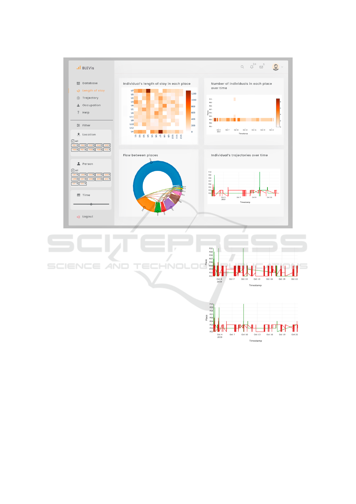
Figure 1: Visual exploration tool interface.
4.1 G1: Length of Stay Analysis
Our first design goal is to support the visual analysis
of information related to the length of stay, to answer
the research questions RQ1 and RQ4 presented in the
section 3.
To answer RQ1 (How long does a specific indi-
vidual remain in each place?), we propose a Time
versus Place interactive chart, where each Place
is a Gateway. The name of each gateway represents a
location in the chart. The time has a granularity of 30
seconds. Each line color named as Person represents
one individual. It is possible to select each person to
show in the chart. For instance, in Figure 2b, the in-
dividual represented by U6 (red line), moved among
P01, P02, and P03 most of the time, and eventually
went to P06 and P04. If we zoom in a certain pe-
riod, it is possible to precisely get how long they re-
mained in each place. Besides, when hovering over
the cells, we can see the details of the selected data
point: name, place, and time. Figures 2a and 2b show
the same individuals within a certain period, compar-
ing raw (a) and processed (b) data in the server. The
charts also help designers adjust the sensors to obtain
better place coverage and less interference.
As the tool allows filtering the individuals, the an-
alyst can select two individuals to estimate how long
(a) Raw data
(b) Preprocessed data
Figure 2: Individual’s trajectories over time versus places:
(a) using the raw data; (b) using the preprocessed data.
they remained in the same place. And this same vi-
sualization allows answering RQ4 (How long do two
individuals stay at the same place?).
This kind of visualization enables the extraction
of unexpected movement, outliers, and groups of in-
dividuals with similar trajectories over time. In the
context of this analysis, weekends, holidays, vacation
periods, and specific special days may be relevant and
helpful to understand patterns and anomalies.
Visual Analysis Tool for a BLE Technology based Tracking Data
235
(a) Raw data
(b) Preprocessed data
Figure 3: Flows between places.
Chord diagrams (Holten, 2006) represent the tran-
sitions between places and individuals. Loop lines
show whether individuals remain in a place. Having a
perception of the movement behavior between places
and total remaining time in the same place is easier in
chord diagrams. In Figure 3, each origin place is rep-
resented by one color, which identifies the direction
of the movement. This figure considers all individ-
ual’s movements, and it does not identify each single
individual, but that is possible by filters.
Figures 3a and 3b show chord diagrams using the
raw and processed data, respectively. Some relations
disappeared in the second chord diagram (Figure 3b)
when compared with the first chord diagram (Fig-
ure 3a). Gateway interference presented in raw data
were false movements represented as relations in Fig-
ure 3a. Since this paper does not analyze the indi-
vidual’s paths during the transition between places,
we consider that each user is in a place if they re-
main at least three consecutive acquisition times. The
reason for that is to eliminate false positives in the
pre-processing analysis. As in Figures 2a and 2b,
these chord diagrams reinforce the importance of pre-
processing data and removing false movements be-
tween places.
(a) All Places
(b) P03 Place
Figure 4: Heatmap: Shows the amount of time that each
pair of individuals are at the same place during a given in-
terval of time.
A heatmap represents a matrix, a relation between
two categorical variables. The color gradient can ex-
press the intensity of a third variable. It is illustrated
in Figure 4 and can also answer RQ4 (How long do
two individuals stay at the same place?). This chart
indicates the relation between individuals by showing
the amount of time (in minutes) that each pair of indi-
viduals stays at the same place during a given period.
We can observe any patterns in the change of color in-
tensity of cells across each axis. Besides, when hover-
ing the cells, we can see the frequency in which each
pair of users were together. The proposed heatmap
can help select users and evaluate their paths through
trajectory visualizations, as shown in Figure 2 (Indi-
vidual’s trajectories over time versus place).
4.2 G2: Trajectory Analysis
Our second design goal is related to getting informa-
tion regarding trajectory analysis and answering RQ2
and RQ5.
For RQ2 (What is an individual’s indoor trajec-
tory within a certain period?), we also proposed an in-
teractive chart of Time versus Place (see Figure 2)
and another interactive chart of Time versus Place
per day per person. Each line represents individ-
ICEIS 2021 - 23rd International Conference on Enterprise Information Systems
236
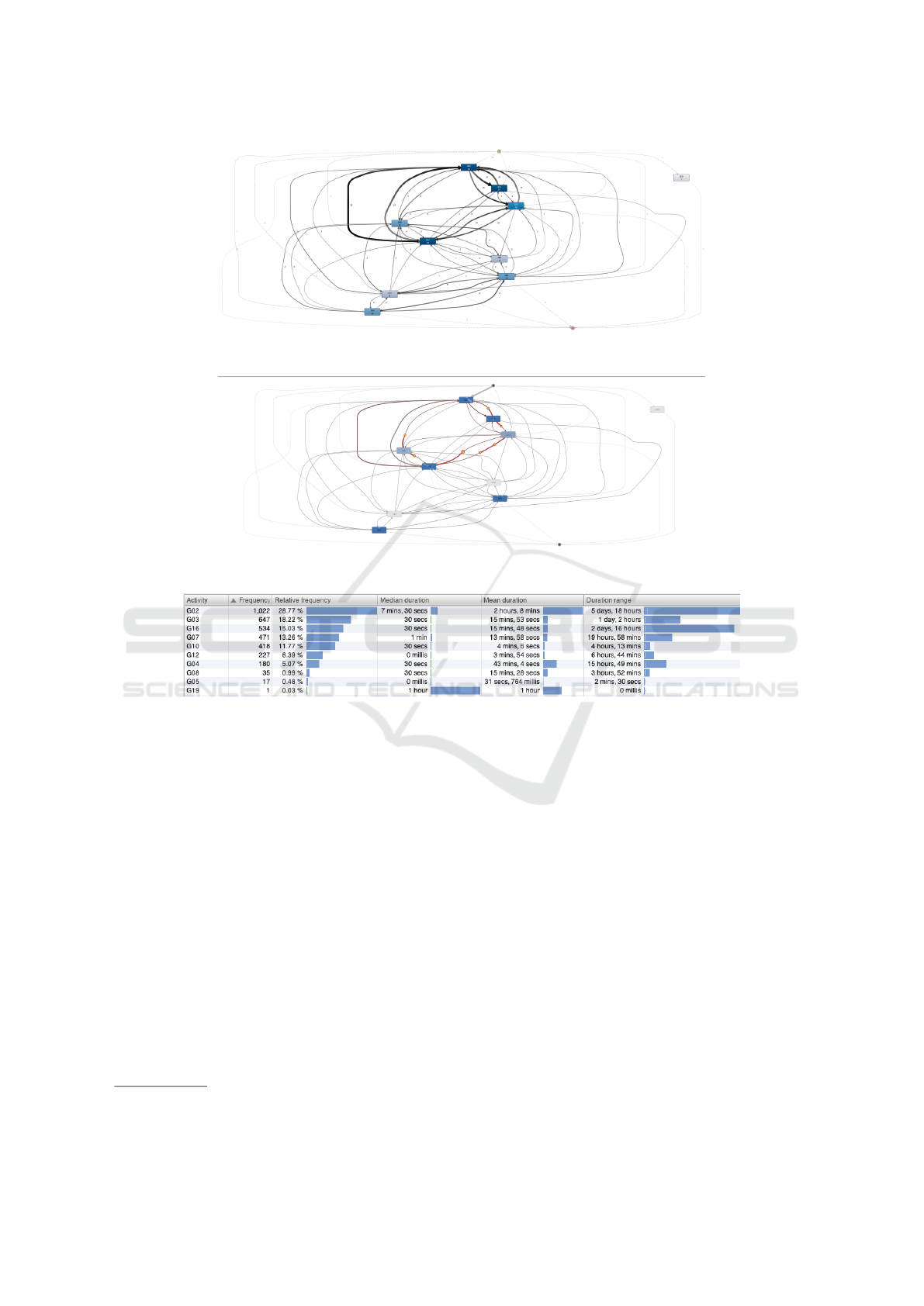
Figure 5: Process view of individuals’ movement, using Fluxion Disco.
Figure 6: Animation view of individuals’ movements, using Fluxion Disco(c).
Figure 7: Place statistics.
uals’ trajectories through places and the time spent
at each one. Each graph of the Time versus Place
per day per person chart represents each day of a
person in one different color. The daily charts sup-
port the visualization of path patterns and behavior
identification between days and persons. As previ-
ously mentioned, the data on a certain person can be
selected from the chart according to the period of in-
terest. From one to all persons can be selected.
We may also analyze individuals’ movements
through specific process mining visualizations, like
the ones provided on the Disco process mining com-
mercial software
1
. This tool allows analyzing the
performance metrics directly and intuitively and an-
imates the movement history on the model. We con-
verted the data into an event log, where individuals’
ids became cases, and places became the activities in
a process mining context (Van Der Aalst, 2011). Fig-
ure 6 shows the frequency of different individuals in
1
https://fluxicon.com/disco – last visited in September
2020.
a specific path (from one place to another). Here, the
boxes and lines represent the places and the trajec-
tory from one place to another. A similar view with
absolute frequency or the maximum number of repe-
titions is also available, instead of frequency of cases.
Another useful Disco view is the animation, which
dynamically presents the history of user movement
within a specific period, and shows, for instance, an
evaluation of bottlenecks, illustrated in Figure 6. Fig-
ure 7 presents statistics on places, which show that
29% of individuals appeared in G02 and presented a
mean duration of two hours for five days and 18 hours.
Figure 8 shows two different snapshots of an anima-
tion that represents individuals’ movements through
places configured with gateways in a dynamic visual-
ization. Each colored point identifies one individual.
Each place is illustrated in the figure by a gateway
number. For instance, place 01 is G01. This visualiza-
tion enables the analysis of dynamics of individuals’
movements in an enterprise within a certain period or
in real-time. This dynamic visualization was inspired
Visual Analysis Tool for a BLE Technology based Tracking Data
237

(a) Timestamp 1
(b) Timestamp 2
Figure 8: Images of an animation of individ-
uals’ movements through places at two differ-
ent time stamps. Figure based on code from
https://flowingdata.com/projects/2015/timeuse-simulation/.
by one at Flowingdata.
2
We propose some visualizations and animations to
address RQ5 (What is the relation between the places
in individuals’ trajectories?). The first one is the use
of a directed graph visualization of individuals’ move-
ments. It shows relations among places, directions,
and frequency of individuals’ movements between
places in a certain period. However, it does not ev-
idence how long each person remains in a place. Fig-
ure 9 illustrates this idea with the raw and processed
data. The second one is chord diagram (Figure3)
which provides the flows between places and also evi-
dences the time remained in each place. However, the
exact number of interactions or movements between
places is not as straightforward as in directed graphs.
2
https://flowingdata.com/projects/2015/timeuse-
simulation - last visited on December 2020.
(a) Raw data
(b) Preprocessed data
Figure 9: Directed graph of place transitions during a period
of time.
4.3 G3: Occupancy Analysis
Our third goal is to support the visual of occupancy
analysis. To reach this goal and answer RQ3 (How
many individuals are at each place at a given times-
tamp?), we selected a dynamic heatmap chart, as il-
lustrated in Figure 10. This chart shows the number of
people in each location over time. The time granular-
ity is 30 seconds. The period selection directly in the
heatmap is also available. One can use this informa-
tion to manage and optimize the usage of places and to
help with the automation of environmental conditions
in offices, such as controlling lighting and air condi-
tioning systems. In the epidemic situation that we are
facing, we could use this system to monitor each place
occupancy to keep social distancing requirements, be-
ing aware of the maximum number of individuals in
each place. This chart is interactive: which places to
see and the time range selection are available.
ICEIS 2021 - 23rd International Conference on Enterprise Information Systems
238

Figure 10: Occupancy of individuals in places over time.
5 CONCLUSIONS
We proposed a visual tool prototype and demon-
strated it with some charts and animations to visualize
a real-case scenario of an indoor movement dataset
generated in two university buildings used by faculty,
staff, and students. In this set, we explored the data
visually to answer some questions about individuals’
movements. We visualized the relations between in-
dividuals and places and the inter-relations with in-
dividuals × individuals and places × places. The
contribution is how we adapted the charts and ani-
mations to answer questions in this context and to
enhance analysts’ experience by reducing the time
spent on the analysis. Our future work aimed to in-
corporate more chart integration, filters, and function-
alities such as event thresholds in the dash tool to
(a) to facilitate environmental automation or monitor-
ing for social-distance control for COVID-19, to ad-
just the air-conditioning temperature, and to estimate
resources available; (b) to identify outliers and predict
movement online for indoor environments; and (c) to
make it more usable for human operators to derive in-
sights about the indoor movements. Finally, we plan
to test the tool by using another dataset and to conduct
an empirical study to evaluate its efficiency and ease
of use.
ACKNOWLEDGEMENTS
This work was partially supported by CNPq - Con-
selho Nacional de Desenvolvimento Cient
´
ıfico e Tec-
nol
´
ogico.
REFERENCES
Andrienko, N. and Andrienko, G. (2013). Visual analyt-
ics of movement: An overview of methods, tools and
procedures. Information Visualization, 12(1):3–24.
Curran, K. (2018). Hybrid passive and active approach to
tracking movement within indoor environments. IET
Communications, 12(10):1188–1194.
Dardari, D., Closas, P., and Djuri
´
c, P. M. (2015). Indoor
tracking: Theory, methods, and technologies. IEEE
Transactions on Vehicular Technology, 64(4):1263–
1278.
Dogan, O. (2020). Discovering customer paths from loca-
tion data with process mining. European Journal of
Teaching and Education, 2(1):55–60.
Dogan, O., Bayo-Monton, J.-L., Fernandez-Llatas, C., and
Oztaysi, B. (2019a). Analyzing of gender behaviors
from paths using process mining: a shopping mall ap-
plication. Sensors, 19(3):557.
Dogan, O., Martinez-Millana, A., Rojas, E., Sep
´
ulveda, M.,
Munoz-Gama, J., Traver, V., and Fernandez-Llatas, C.
(2019b). Individual behavior modeling with sensors
using process mining. Electronics, 8(7):766.
Holten, D. (2006). Hierarchical edge bundles: Visualiza-
tion of adjacency relations in hierarchical data. IEEE
Transactions on visualization and computer graphics,
12(5):741–748.
Kaplan, E. and Hegarty, C. (2005). Understanding GPS:
principles and applications. Artech house.
Krueger, R., Heimerl, F., Han, Q., Kurzhals, K., Koch, S.,
and Ertl, T. (2015). Visual analysis of visitor behavior
for indoor event management. In 2015 48th Hawaii
International Conference on System Sciences, pages
1148–1157. IEEE.
Marini, G. (2019). Towards indoor localisation analytics
for modelling flows of movements. In Adjunct Pro-
ceedings of the 2019 ACM International Joint Con-
ference on Pervasive and Ubiquitous Computing and
Proceedings of the 2019 ACM International Sympo-
sium on Wearable Computers, pages 377–382.
Martella, C., Miraglia, A., Frost, J., Cattani, M., and van
Steen, M. (2017). Visualizing, clustering, and predict-
ing the behavior of museum visitors. Pervasive and
Mobile Computing, 38:430–443.
Melamed, R. (2016). Indoor localization: Challenges and
opportunities. In Proceedings of the International
Conference on Mobile Software Engineering and Sys-
tems, pages 1–2.
Oppermann, M. and Munzner, T. (2020). Ocupado: Visu-
alizing location-based counts over time across build-
ings. In Computer Graphics Forum, volume 39, pages
127–138. Wiley Online Library.
Schneider, F. A., Branco, A., Rodrigues, A. M., Carvalho,
F., Endler, M., and Lopes, H. (2021). Yet another ble
technology based tracking system. In SAC 2021, page
771. ACM Digital Library.
Tableau (2003). Tableau software. http://www.
tableausoftware.com/, last accessed on July 2020.
Van Der Aalst, W. (2011). Process mining: discovery,
conformance and enhancement of business processes,
volume 2. Springer.
Van Rossum, G. and Drake, F. L. (2011). The python lan-
guage reference manual. Network Theory Ltd.
Visual Analysis Tool for a BLE Technology based Tracking Data
239
