
Vis2Learning: A Scenario-based Guide to Support Developers in the
Creation of Visualizations on Educational Data
Maylon Pires Macedo
1 a
, Ranilson Oscar Ara
´
ujo Paiva
2 b
, Isabela Gasparini
3 c
and Luciana A. M. Zaina
1 d
1
Federal University of S
˜
ao Carlos (UFSCar), Sorocaba, S
˜
ao Paulo, Brazil
2
Federal University of Alagoas (UFAL), Alagoas, Brazil
3
Santa Catarina State University (UDESC), Santa Catarina, Brazil
Keywords:
Information Visualization, InfoVis, HCI, User Evaluation, e-Learning, Educational Data.
Abstract:
Information Visualization provides techniques to build graphics representation that enhance human perception
from data. In educational data area, visualizations support professionals to analyze a great amount of data to
then make decisions to improve the learning-teaching process. However, the visualizations of educational data
often do not fulfill the needs of the end-users. In this paper, we present a scenario-based guidelines for the
development of visualizations in e-learning context. For each scenario, we provide the chart format, describe
its aim and characteristics and gives examples of its application in the e-learning context. Besides, we provide
recommendations to bring improvements to the data visualized from the users interaction with that chart. We
conducted an evaluation with 26 participants divided into two groups where one of them used our guidelines
and the other did not. Our results revealed that the participants who used the guidelines were more successful
in building the visualizations. They reported that the guidelines allow them to be concentrated on the main
purpose of the visualizations. We saw that the participants background on e-learning or on the use of charts
did not have influence in the building of suitable solutions which reinforce the usefulness of our guidelines.
1 INTRODUCTION
Information Visualization (InfoVis) area proposes
methods and techniques to assist the construction of
visualizations that are more adherent to the needs of a
target audience (Ware, 2012). From the point of view
of Human-Computer Interaction (HCI), InfoVis aims
to provide users with better graphics representation to
enhance human perception using data (Ware, 2012;
Munzner, 2014). The main focus of InfoVis is to cre-
ate visualizations that amplify the user’s perception to
facilitate the decision-making process based on data
observation and prevent users from employing exces-
sive efforts to interpret data (Card et al., 1999; Ware,
2012).
The use of charts differs from the visualization
of data in flat tables, as the latter does not assist
users to infer patterns, find trends or outliers (Card
a
https://orcid.org/0000-0002-2686-1103
b
https://orcid.org/0000-0002-0894-751X
c
https://orcid.org/0000-0002-8094-9261
d
https://orcid.org/0000-0002-1736-544X
and Jacko, 2012). One of Infovis premisses is the
use of graphical representations to obtain information
from the recognition of visual patterns (Carneiro and
Mendonc¸a, 2013).
The design of visualizations are highly attached
to the domain of data, because its main purpose is to
show data to specific users that want to achieve par-
ticular goals. Tervakari et al. (2014) report that vi-
sualizations for educational context need to show rel-
evant information in a simple and straight way with-
out requiring users to know statistics. Majumdar and
Iyer (2016) point out that visualization-based tools
are more suitable for the analysis of educational data,
since the data are numerous and complex to be under-
stood without proper treatment (Reyes, 2015). Ac-
cording to the literature, educational data comprises
information such as grades, demographic data, fre-
quency of access, delivered activities and other data
related to student’s interactions with materials (Jord
˜
ao
et al., 2014; Tervakari et al., 2014; Vieira et al., 2018).
The literature points to a gap in investigations on
methods and techniques that help the development
of visualizations that are adherent to the e-leaning
Macedo, M., Paiva, R., Gasparini, I. and Zaina, L.
Vis2Learning: A Scenario-based Guide to Support Developers in the Creation of Visualizations on Educational Data.
DOI: 10.5220/0010443804510462
In Proceedings of the 23rd International Conference on Enterprise Information Systems (ICEIS 2021) - Volume 2, pages 451-462
ISBN: 978-989-758-509-8
Copyright
c
2021 by SCITEPRESS – Science and Technology Publications, Lda. All rights reserved
451

context and fulfill the users’ needs at the same time
(Schwendimann et al., 2017; Vieira et al., 2018). For
being a learning modality that involves computer sys-
tems, e-learning environments handle large amounts
of data related to students’ interaction with materials.
The purpose of appropriate visualizations in this con-
text allows educational professionals (i.e. teachers,
coordinators) to have relevant information for track-
ing and assessing students’ performance. With this in-
formation, these professionals are able to make more
precise decisions about learning and teaching pro-
cesses (Schwendimann et al., 2017).
Considering the gaps presented in the literature,
we propose a set of guidelines that supports devel-
opers and designers developing visualizations in the
educational context. Our proposal differs from other
visualization guidelines to provide recommendations
to scenarios applied in the educational domain. We
designed the guidelines from lessons learned found in
the literature concerned on visualizations in the edu-
cation context. We also validated our proposal with
three specialists in the HCI and Computers in Educa-
tion area.
We performed a study with 26 participants divided
into two groups. One of these groups built visual-
izations by considering the guidelines, the other did
not use the guidelines. We gathered the two groups’
perceptions regarding the easy and difficult points for
building the visualizations. Besides, the group that
used the guidelines answered a questionnaire about
perceptiveness of ease and usefulness of the guide-
lines.
2 RELATED WORK
Many studies concentrate on the definition of pro-
cesses for creating visualizations from educational
data. However, little has been done in terms of
proposing guidelines that support developing these vi-
sualization, as we can see below.
Conde et al. (2015) and Maldonado et al. (2015),
proposed a workflow for preparing visualizations
whose data came from learning analytics (LA) algo-
rithms. Conde et al. (2015) present a 4-stages pro-
cess: (1) identify the characteristics of the expected
results; (2) assess what data is needed; (3) select the
algorithms that will manipulate the data and which
visualizations will be used to report it; and (4) col-
lect the user’s impressions to generate new products.
Whereas Maldonado et al. (2015) defines a process
focused on evaluating tools that can be used to pro-
vide visualizations. To develop solutions for MOOCs
(Massive Open Online Courses), Chen et al. (2016)
propose an iterative process in which visualization
prototypes are successively refined through interac-
tion with experts (not with end-users).
Considering specific proposal of visualizations,
Ruip
´
erez-Valiente et al. (2016) present a process
composed of the analysis of teaching materials avail-
able in an online learning environment and interviews
with stakeholders to choose the most suitable visual-
ization. Issues regarding users’ context and/or pref-
erences are not considered in the process of choos-
ing the visualizations. Park et al. (2017) devel-
oped a dashboard for students and teachers to follow
the learning process using e-books. The visualiza-
tions prototypes were based on related works that per-
formed usability tests. The prototypes were presented
to the interviewees for them to choose the best option.
Taking into account end-users in the construction
of visualizations in general, Victorelli et al. (2019)
propose a mixed approach between the use of guide-
lines and participatory design to engage stakeholders
throughout the development process. As a result, the
visualizations developed under the proposed process
were more adherent to the users’ needs. However, the
stakeholders classified the approach as inadequate,
as the process was considered costly because it con-
sumed a lot of time with several long meetings that
required a lot of availability from everyone involved.
In the context of educational data, Klerkx et al. (2017)
proposes a guideline to assist the construction of visu-
alizations to analyze the path of learning. The authors
define which data is relevant to evaluate performance
and then choose the visualization format, according
to the characteristics of the data. However, the pro-
posal does not concern aspects related to the user’s
interaction with the visualization.
Munzner (2014) defines a framework to guide the
evaluation and development of visualizations based
on the user’s data, tasks and domain. The author seeks
to raise awareness about the importance of contextu-
alizing the “idiom of visualization” to the user’s work.
Visualization idiom can be understood as the way in
which the user is communicated about the data, and
can be perceived by: chart formats; interaction fea-
tures (eg zoom and pinch); navigation between differ-
ent granularity of information; among other features.
The framework proposed by Munzner (2014) has
been a reference for the development of investigations
in the visualization area. However, the recommenda-
tions proposed by the author do not deal with spe-
cific visualization formats, but with aspects related to
the interaction of users with the use of visualizations.
In addition, the recommendations do not have a spe-
cific context and target audience, and are presented
throughout the different chapters of the book, requir-
ICEIS 2021 - 23rd International Conference on Enterprise Information Systems
452

ing the complete reading of the work.
3 Vis2Learning
Our guidelines are based on scenarios to assist the
development of educational data visualizations in e-
learning contexts. It has 15 scenarios for applying vi-
sualizations within the e-learning context (see Table 1
for common charts and Table 2 for advanced charts).
Each scenario describes a situation where a particular
chart can be applied with no repetition of chart format
for each scenario. For each scenario, the following in-
formation is provided: the most suitable chart and its
main characteristics and examples of application (first
table column); and general recommendations to bring
improvements to the data visualized from the users
interaction with that chart (second table column).
The guidelines were built in a contextualized way
based on lessons learned from the literature during the
development and evaluation of educational data visu-
alizations for e-learning environments. All the pro-
cess of guidelines construction is available in previous
work of the authors (Macedo et al., 2020). In this pa-
per, we will describe the steps of the guidelines con-
struction briefly. For the conception of the guidelines,
a rigorous literature search was carried out follow-
ing the Systematic Literature Review Method. The
search string was applied on five scientific papers’
search engine, returning 1207 papers. After applying
the inclusion and exclusion criteria and the analysis
of the title, abstract and conclusion of all the papers,
12 papers were considered relevant to our proposal.
They were fully read for extracting the lessons learned
presented in each paper, regarding the design and/or
evaluation of educational data visualizations. The ex-
tracted information were consolidated and submitted
to the evaluation of three specialists in HCI and Com-
puters in Education. From the validation, we refined
the guidelines to its current version.
4 EVALUATION
We evaluated the use and the acceptance of our guide-
lines. In our study, two group of participants repre-
senting developers/designer constructed prototypes of
charts considering scenarios of use in e-learning con-
text. Only one group used the guidelines. Our eval-
uation was guided by two research questions: (RQ1)
How did the participants of both groups build the vi-
sualizations?, and (RQ2) What are the participants’
feedback about the guidelines?. For the RQ1, the aim
was to understand the strategies the participants took
to produce their solutions, including those that used
the guidelines. From RQ2, we explored the accep-
tance of the guidelines in the participants perspective.
Our study was approved by the ethical committee of
UFSCar with protocol number 4105750. Our study
follows the methodology proposed by Wohlin et al.
(2012) . We will present the planning, execution,
analysis and threats to the validity of our study in the
next sections.
4.1 Planning
Taking into account our RQs, we started by planning
a set of artifacts to support our study.
First, we created two scenarios of use (SU). To
fulfill the scenarios, the visualizations should be con-
structed taking into account our guidelines. The first
scenario of use (SU1) followed the guideline SC2 (see
Table 1) and described a teacher’s need to visualize
the final grade of students, composed of four partial
grades. The second scenario of use (SU2) followed
the guideline SC6 and described the teacher’s needs
to know the time students take an exam, and the aver-
age time to answer each question. The teacher had to
create one chart per student.
We also selected a tool for the prototyping of the
visualizations. We set five requirements that the se-
lected tool should fulfill. The requirements are: R1
- to work via a browser; R2 - allow the editing of
the tooltip text; R3 - allow the editing of the subti-
tle of a chart; R4 - allow changes in colors and the
transparency inside charts; and R5 - allow the use of
colors and patterns to differentiate groups of data in
charts. Besides, the tool should not demand expertise
in programming.
We tested the selected tools to see if they allowed
to apply SU1 and SU2, following the guidelines SC2
and SC6, respectively. We got the recommenda-
tions about the tools in JUSTINMIND blog (JUSTIN-
MIND, 2020) and applied our set of requirements.
After analysis of basic characteristics, four tools were
chosen and evaluated according to the five require-
ments mentioned above. The results can be seen in
Table 3. The two last columns show whether the SUs
could be applied or not, by using these tools. After the
analysis, we chose AMCHARTS as the most suitable
tool to our purposes. After selecting the tool, we de-
veloped the templates for the SU1 (see Figure 1 - A)
and SU2 (see Figure 1 - B), following the guidelines.
The two templates served as baselines for comparing
with the solutions produced by the participants of the
study.
We also created an online feedback questionnaire
based on the Technology Acceptance Model (TAM)
Vis2Learning: A Scenario-based Guide to Support Developers in the Creation of Visualizations on Educational Data
453
Table 1: Vis2Learning - Scenarios with common charts - Identification:: id, chart’s name, and its purpose; Characteristics: the
main chart features in the education data context; Recommendations:: how the interaction with the chart can be improved.
Identification :: Characteristics Recommendations
(SC1) Pie chart - Distribution of student data in pre-planned categories :: (i) Aim: represents the proportion in relation
of the whole; (ii) Chart characteristics: pie chart provides an overview about proportions of the chosen variables (i.e.
slices) in relation of the whole (complete pizza = sum of the slices); it is mandatory that the variables represented (i.e.
slices) add 100 % in whole; (iii) Example of application: illustrate proportions of the evasion rates; visualization of
students’ demographic and profile data (e.g. education level, age, gender).
(i) Exact value: as this chart often hides the real value of each slice, tooltips or
legends are recommended to present the real value; in charts composed by many
different categories, captions are suitable to show the total value of each categories;
(ii) Filtering data mechanisms: usually not applied; (iii) Highlight data: stand
out the slices of the categories selected by users; (iv) Specificities: it is recom-
mended do not use more than 5 different categories for data classification to pre-
vent the legibility issues which can be caused by overlapping of slices or even by
the use of small fonts; in cases with more than 5 categories the recommendation is
to present the 4 main ones and agglomerate the others by labelling as “others”.
(SC2) Horizontal bar chart - Representation of the total amount of data for a category :: (i) Aim: shows quantitative
values of X-Axis identified by the categories presented at Y-Axis; (ii) Chart characteristics: in aggregate viewing,
the bar of each category is composed of two or more small bars arranged on the top of each other to represent the idea
of parts of the whole; however, the aggregate viewing is suitable only in cases that by adding the individual values of
each small bar it has the representation of a total; nevertheless this total does not necessarily bring information for the
analysis; horizontal bar chart fits to illustrate timeline visualizations where the X-axis represents the timeline while the
bars arranged from the Y-axis represent quantitative values; (iii) Example of application: show how students’ averages
are composed in a course, from an aggregate viewing, where each full bar represents the total grade of a student and
each piece of the bar outlines a component of the total grade (e.g. tests, tasks, assessments, activities in group).
(i) Exact value: real values are displayed from tooltips by positioning the mouse
over the bars or the captions; (ii) Filtering data mechanisms: allows the visual-
ization of students’ individual data; (iii) Highlight data: as a student is selected,
display in the foreground the full bar (i.e. highlight the bar); (iv) Specificities:
in agglomerate mode bars, colors and patterns (e.g. scratches, dots, dashes) are
applied to demonstrate clearly what is the size of each piece of the total bar; the
use of 3D bar format is not recommended due to it can insert difficulties for users
comparing the different data.
(SC3) Vertical bar chart - Comparison of values one each other, or with an average or target value :: (i) Aim: represents
quantitative values of Y-Axis identified by the categories assigned in the X-Axis; (ii) Chart characteristics: it has the
same characteristics of horizontal bars however in a vertical mode; (iii) Example of application: illustrate to students
information from their performance compared to the average of the class to support them in managing their needs of
learning; this visualization motivates students to review, if they need, their learning strategies with the aim of getting
better outcomes.
(i) Exact value: display the real value from tooltips by positioning the mouse over
the bars or the captions; (ii) Filtering data mechanisms: provides the option of
visualizing students’ individual data; (iii) Highlight data: as a student is selected,
display in the foreground the full bar (i.e. highlight the bar); make clear the dif-
ference among the bar by applying colors and patterns; (iv) Specificities: as in
vertical bar chart, the use of 3D bar format is not recommended.
(SC6) Area chart - Illustrates the midway students’ outcomes showing the evolving and data changings over time :: (i)
Aim: represents variables associating them to progress viewing (e.g. percentage completed, time elapsed); (ii) Chart
characteristics: a continuous line passes through all the crossing points presented between the X and Y-axis; the use
of several lines is suitable to describe different groups of data; it is recommended to the X-axis to contain the progress
scale (e.g. time, steps.), and to the Y-axis, the quantitative variables; (iii) Example of application: provide to students
a visualization of the distribution of time that they spent on each part/step of an activity; from this visualization the
students are able to evaluate their pace of studies and consequently make adjustments if they need; as well visualize the
performance of workgroups versus an expected outcome to search for difficulties that they could have in one activity.
(i) Exact value: display from tooltips the real values when users hover the mouse
on the chart; (ii) Filtering data mechanisms: provide ways to see data of partic-
ular students; (iii) Highlight data: in cases of multiple variables representation,
colors with transparency are recommended to avoid the missing of information
caused by the overlapping of areas, for instance; (iv) Specificities: use patterns
(e.g. dots, dashes) to contrast the areas in cases of colors are not available; the 3D
bar format is not recommended because it can insert difficulties to the comparison
of data; provide the meaning of the colors and format of the lines in captions.
(SC8) Wordcloud chart - Illustrates terms most used in courses or in forum discussions :: (i) Aim: represents the
occurrence of terms within a sample of words; (ii) Chart characteristics: it encodes few variables and the font size
of each word indicates its number of occurrences in that sample without showing its real value; the chart often is
constructed in real-time easily; the analysis of data from this chart type is subjective as the exact value of each word
is expressed by the font size of the word; (iii) Example of application: wordclouds help teachers on explaining the
understandings of those terms that the class have; it is useful to link the discussions of forum posts to the wordcloud
chart; it allows visualizing the questions that received the most correct answers by the students.
(i) Exact value: captions or tooltips provide the value of the occurrences and
their classification (e.g. 250 times, 3rd most repeated word); (ii) Filtering data
mechanisms: option of removing words from the cloud; (iii) Highlight data:
usually not applied; (iv) Specificities: usually not applied.
(SC9) Map chart - Represents data from the geographic localization of students :: (i) Aim: represent the distribution
of data related to the geographic position (e.g. countries, states, cities); useful for distance learning courses; (ii) Chart
characteristics: the world map is often the format of representation where the regions of the map get the focus according
to the needs of data or users; the color shades are applied to illustrate the quantitative data and the colors tones give
the perception of having a great or less amount of data in that map region; (iii) Example of application: allows the
visualization of rates on dropouts, retentions or approvals by location.
(i) Exact value: by positioning the mouse over a map region, tooltips provide
the real value; (ii) Filtering data mechanisms: zoom in allows to see details of
some location (e.g. users can see data from particular schools in some region of a
city); (iii) Highlight data: put in the foreground a location selected by users; (iv)
Specificities: shades support the perception of amount of data for the same color
(e.g. bold colors express more retention than the light color).
(SC15) Bubble chart - Provides an overview involving 3 variables (X, Y and Z) where X and Y are categories and Z is
quantitative number :: (i) Aim: represent a quantitative variable (bubble size) distributed in a categorical plane (i.e. X
and Y); (ii) Chart characteristics: while a bubble depicts the crossing point of X and Y (i.e. categories descriptions) the
bubble size draws the value of a quantitative variable associated with this crossing point; (iii) Example of application:
see the engagement of students from the frequency they access the materials and from which source (e.g. personal
computer, mobile phone).
(i) Exact value: consider the addition of captions inside the bubbles to provide
the exact value whenever the bubble size accommodate it. For small bubbles use
tooltips; (ii) Filtering data mechanisms: allow the selection of which students
will have the data shown; (iii) Highlight data: stand out a bubble according to the
category selected by users; (iv) Specificities: the bubble colors can encode a 4th
variable.
(Davis, 1989). TAM questions are divided into the
dimensions of ease-of-use perception and usefulness
perception. The ease-of-use is related to the percep-
tion that a technology can be adopted with no efforts.
The perceived usefulness represents how much a per-
son considers that the use of a specific technology
may improve their performance. We also added an
open question about the guidelines in the feedback
questionnaire.
4.2 Execution
We carried out an evaluation with 26 participants, 4
graduated and 22 undergraduate students of a Human-
Computer Interaction course at the Federal University
of S
˜
ao Carlos (UFSCar) - campus Sorocaba.
All participants filled an informed consent form to
take part in the study. Before the study session, the
participants answered a profile questionnaire which
supported us in dividing them into groups. In this
questionnaire participants were asked about (a) their
experience with programming languages, InfoVis,
and the tools that would be used in the evaluation; (b)
their experience as developers; (c) where they were
used to handle charts; and (d) where they searched
for information about the application of charts. Table
4 shows the participants’ responses. Each participant
is identified by ID followed by the group they were in
(i.e A or B). The participant D-26 was the only one
not to answer the profile questionnaire. We used the
information collected by the profile questionnaire to
assign participant to each groups in a balanced way.
Participants in group A used the guidelines, while par-
ticipants in group B did not. The participants that
already used the chosen visualization tool were as-
signed to group B, in order to avoid that their previous
expertise biased the results.
The evaluation took place in a computer lab at the
UFSCar which had tables arranged in rows and di-
vided into two parts by a central corridor. We divided
the participants per groups on the right side (i.e. group
A) and on the left side (i.e. group B). All the partici-
pants had the same infrastructure resources, i.e. insti-
tution’s computers to perform the required activities.
Before starting the activity of prototyping, the par-
ticipants took part of a warm-up session where one
researcher presented (i) the fundamentals of educa-
ICEIS 2021 - 23rd International Conference on Enterprise Information Systems
454
Table 2: Vis2learning - Scenarios with advanced charts - Identification:: id, chart’s name, and its purpose; Characteristics: the
main chart features in the education data context; Recommendations:: how the interaction with the chart can be improved.
Identification :: Characteristics Recommendations
(SC4) Violin plot - Identification of subgroups from the distribution of data quickly :: (i) Aim: represents the distribution
of a data set correlated to a variable through scale (i.e. minimum to maximum values); (ii) Chart characteristics: in
violin plot, the data is disposed along a line depicting the values; data relates to one single variable, but with different
identifiers; it enables the visualization of subgroups from the data without applying equations or algorithms; (iii) Example
of application: show students’ grades in one activity or course to identify subgroups as such as students who fail or pass;
or show the number of students positioned above/below of the class average (or any other grade).
(i) Exact value: display from tooltips the real values when users hover the
mouse on the violin plot border; (ii) Filtering data mechanisms: usually not
applied; (iii) Highlight data: stand out the dot on the line related to the selected
data (i.e. a student); (iv) Specificities: colors and patterns are applied to delimit
data ranges and are enabled by user interaction.
(SC5) Radar chart - Illustrating data of the different students’ interaction versus a material :: (i) Aim: represents the
value of 3 or more quantitative variables that have a common identifier (e.g. grades, the variables and a particular student,
the identifier); (ii) Chart characteristics: this chart contains axes, lines and data points, where the axes represent the scale
values for each variable; the line that connects all the axes represents a data set; and the data point in the axis that the line
touches represents the data value of that variable attributed to group that the line represents; one chart can include several
lines, and each one represents a set of data being differentiated by colors; a 3rd variable is represented by adding a bar chart
in the center of radar chart; (iii) Example of application: see grades from student workgroups that performed the same
activities; it provides a feedback to the groups about which activities they should put effort to improve their knowledge on
a topic; observe whether there was a balance in the composition of workgroups concerning on students performance.
(i) Exact value: display from tooltips the real values when users hover the
mouse on the chart; (ii) Filtering data mechanisms: provide ways to see spe-
cific students or workgroups; (iii) Highlight data: stand out the line linked to
the selected student; (iv) Specificities: patterns (e.g. dots, dashes) in the format
of the lines are recommended as a way of identifying and distinguishing data in
cases of colors are not available; provide the meaning of the colors and formats
of the lines in the captions.
(SC7) Activity network diagram - Represents the instructional design of courses or steps of workgroup projects :: (i)
Aim: shows the paths taken the execution of steps; (ii) Chart characteristics: the shapes depict activities and the arrows
the movements from one to another step; the chart main purpose is not the representation of quantitative data; (iii) Example
of application: the chart provides the linear visualization of activities arrangement supporting teachers in detecting issues
from the activities to then they make improvements; for instance, from the visualization teachers can observe whether
some element affect all the activities flow as well as analyze the relevance in the order that activities are performed.
(i) Exact value: usually not applied; (ii) Filtering data mechanisms: usually
not applied; (iii) Highlight data: usually not applied; (iv) Specificities: colors
and line patterns are assigned to arrows to indicate, for example, steps where
delays or problems arisen during the activities executions; captions provide the
meaning of the colors and line patterns adopted.
(SC10) Heatmap chart - Illustrates the performance of large groups of students :: (i) Aim: represent information from
3 variables, being X and Y categories and Z the quantity or category; (ii) Chart characteristics: the chart is built on a
cartesian plane where the data crossing point X and Y are assigned with a color that denotes the 3rd variable (i.e. Z); in
each cell instead of using the absolute value in the standard format, this chart employs colors which facilities the detection
of patterns of data; another representation of this chart is on pictures where X and Y are coordinates and Z represents the
number of times that point was observed; (iii) Example of application: visualization of students’ performance and the
identification of common characteristics based on the colors (e.g. all students who failed in an exam).
(i) Exact value: by positioning the mouse over a cell, tooltips show the ex-
act value; captions show the absolute value inside the cell; (ii) Filtering data
mechanisms: usually not applied; (iii) Highlight data: usually not applied;
(iv) Specificities: patterns (e.g. scratches, dots, dashes) is an alternative in re-
placing of the use of colors to differentiate and identify data; the use of captions
to report the meaning of formats and colors employed in the chart.
(SC11) Treemap chart - Shows the data about the students’ participation categorized by topics and ordered by a raking ::
(i) Aim: represent data that follows a well-defined hierarchical distribution; the viewing of total are got by adding each;
(ii) Chart characteristics: rectangular shapes represent the data, but there area alternatives to plot in circular formats as
pie charts, it often occupies all the area available for it; treemap provides an overview with the existing hierarchy in the
data and the percentage that each category represents in the whole; (iii) Example of application: see the number of topics
discussed in forums in a distributed or ranked way, being possible to observe the most commented topics.
(i) Exact value: by moving the mouse over the rectangles, tooltips show the
real value; (ii) Filtering data mechanisms: usually not applied; (iii) Highlight
data: usually not applied; (iv) Specificities: color shades are applied to illus-
trate the larger and smaller samples of data.
(SC12) Scatter plot - Shows a comparison of datasets (e.g. students’ grades) to illustrate the cause-effect from the
application of a teaching-learning method :: (i) Aim: represents two or more datasets (Y) that are related to a categorical
variable (X) to observe the relationship between two groups; (ii) Chart characteristics: this chart compares two datasets
displayed by dots which are plotted at the intersection of X and Y-axis in a cartesian plane; whether only one dataset is
used it represents a dot plot; scatter plot is not suitable for overviewing of high-density data due to the large volume of
data can cause overlapping of lines or high density of dot clouds; (iii) Example of application: compare students’ grades
from activities executed online and offline mode to uncover patterns in relation of the mode applied; compare the average
of students to the time spent on activities; observe the differences on the performance among students.
(i) Exact value: by moving the mouse over the dots, tooltips reveal the value for
X and Y; (ii) Filtering data mechanisms: usually not applied; (iii) Highlight
data: usually not applied; (iv) Specificities: for each dataset, dots have different
colors and shapes (e.g. group A represented by green circles and group B by
blue triangles); a matrix of scatterplots is a well-representation for cases that
there are more than one pair of variables; captions report the meaning of formats
and colors employed in the chart.
(SC13) Q-Q plot - Compares a group of students performance with baseline values :: (i) Aim: represents the distribution
of data; (ii) Chart characteristics: the X-axis contains the performance measures and the Y-axis the baseline values; this
chart is suitable to confirm and illustrate the existence of subgroups of data when used together with violin chart; (iii)
Example of application: from the students’ grades are possible to identify subgroups (e.g. groups of failed students or
passed students); check whether the level of difficulty of activities are balanced.
(i) Exact value: by pointing the mouse over dots, tooltips show the values of
X and Y, and the student’s name; (ii) Filtering data mechanisms: usually not
applied; (iii) Highlight data: stand out the point correspondent to the student
selected by users; design a line as a baseline value to show the groups of data
which are close or far from the line (e.g. the line show the minimum average of
approval and the points above the line represent the approvals and the below the
retentions); (iv) Specificities: usually not applied.
(SC14) Hexbin plot - Compares datasets with a large volume (high density) of data to find out patterns :: (i) Aim: represent
data from 3 variables (i.e. X and Y are categories and Z is the quantitative value or category); (ii) Chart characteristics:
a hexagon represents the crossing point between X and Y values and the color encodes the Z value; the “dots” are replaced
by hexagons so that the data is not overlapping and fits in all the space available without having no-used spaces; (iii)
Example of application: visualize the student session in a Learning Management System and their grades.
(i) Exact value: by pointing the mouse over a chart point, tooltips show the
value for X and Y and the student’s name; (ii) Filtering data mechanisms:
usually not applied; (iii) Highlight data: shaded borders help to delimit data
in neighbor hexagons that often is close due to the high-density of data; (iv)
Specificities: by combining colors and captions, the data representation mean-
ing informs the larger and smaller samples of data; use patterns (e.g. scratches,
dots, dashes) in cases that colors are not available.
Table 3: Evaluation of tools based on the five requirements.
Tool R1 R2 R3 R4 R5 SU1 SU2
Chartblocks
1
OK - - OK - OK -
Plotly
2
OK - OK OK - OK -
Datawrapper
3
OK - - OK - OK -
AMCHARTS
4
OK OK OK OK OK OK OK
tional data and InfoVis (Munzner, 2014; Ware, 2012),
and conducted a (ii) hands-on exercise by using the
AMCHARTS tool to explore its resources. Besides,
the researcher pointed out the activity objective and
all the steps the participants should follow during the
evaluation. After the warm-up, the participants car-
ried out the prototype activity. All the participants
(i.e. groups A and B) built prototypes of both SUs.
The participants in group B, i.e. who did not use our
guidelines, were free to search for information about
the charts on the Internet.
After building each chart, participants should sub-
mit, to an online platform, the source code automati-
cally generated by AMCHARTS; the list of references
used to produce the visualization and the reason for
using it (in the case they searched for information on
Internet); and the description of the difficulties s/he
faced. Each participant should pack all this informa-
tion in a single file and submitted it. Only participants
in group A answered the feedback questionnaire (i.e.
TAM questions) at the end of the study.
4.3 Analysis
We explored all the prototypes produced by the par-
ticipants and the answers from the feedback ques-
tionnaire. Table 5 shows the details of our analysis
for each scenario of use (SU1 and SU2) per partici-
pant. First, we checked the chart format the partici-
pant used and the recommendations each one applied
(about the use of tooltip, 3D, and so on). We also ver-
ified whether the participant’s solution was suitable to
the scenario of use, using our templates as baselines.
After examining the participants’ visualizations,
we concentrated on exploring the participants’ com-
ments as well as the references they used to construct
Vis2Learning: A Scenario-based Guide to Support Developers in the Creation of Visualizations on Educational Data
455
Table 4: Participants profile — (a) Knowledge: (1) I’ve never heard of; (2) I have theoretical knowledge; (3) I have practical
and theoretical knowledge; (4) I have deep knowledge — (b) Exp: (2) I programmed only at school; (3) I’ve worked with
programming; (4) I currently work with programming — (c) Use of charts: (1) I don’t use it; (2) I used it a few times; (3) I
always use it because it is necessary; (4) I always use — (d) Information about charts: (1) I don’t use, (2) I seek tips on the
internet; (3) I’m looking for ready examples, (4) I search for guidelines that have detailed descriptions of charts usage.
Identification (a) Knowledge (b) Exp (c) Use of charts (d) Information
ID Age Higher education HTML JS Charts InfoVis AMCHARTS Dev Personal use At school At work about charts
D1-B 23 Complete 3 3 2 1 1 3 1 2 2 2;3
D2-B 21 Incomplete 4 3 3 3 3 2 2 3 3 2;3
D3-B 22 Incomplete 4 4 3 3 3 2 4 4 3 2;3
D4-B 34 Complete 4 3 3 3 1 4 3 3 3 2;3
D5-A 22 Incomplete 3 3 2 1 1 4 2 3 1 2;3
D6-A 21 Incomplete 3 3 3 3 1 2 2 2 1 2;3
D7-B 20 Incomplete 3 3 2 1 1 2 1 2 1 2
D8-A 35 Complete 2 2 2 2 1 2 2 2 2 2;3
D9-A 21 Incomplete 3 3 3 2 1 2 2 2 1 2;3
D10-A 23 Incomplete 3 3 3 3 1 4 2 3 3 1
D11-A 21 Incomplete 3 3 3 2 1 2 2 2 1 2;3
D12-A 22 Incomplete 3 3 2 2 1 4 4 2 1 2;3
D13-A 21 Incomplete 3 3 2 1 1 2 1 2 1 2;3
D14-B 22 Incomplete 4 4 3 2 1 2 2 2 1 2;3;4
D15-A 24 Incomplete 2 2 2 2 1 4 1 1 1 3;4
D16-B 20 Incomplete 3 3 3 2 1 2 1 2 1 2;3
D17-B 21 Incomplete 3 3 3 2 1 2 2 3 1 3
D18-A 27 Complete 3 3 4 1 1 4 4 2 3 2;3;4
D19-B 24 Incomplete 3 3 2 1 1 2 2 2 1 2
D20-A 21 Incomplete 4 3 2 1 1 2 2 2 1 2
D21-B 22 Incomplete 3 2 2 2 1 2 2 3 3 2
D22-B 22 Incomplete 2 2 2 1 1 2 1 2 1 2;3
D23-A 25 Incomplete 3 2 1 1 1 2 2 2 2 2;3
D24-B 20 Incomplete 3 3 1 1 1 4 2 2 2 3
D25-A 26 Incomplete 3 3 3 2 1 4 2 1 2 2;3
the solutions. This allowed us to observe the steps
taken and the problems encountered by the partici-
pants during the process of choosing the visualiza-
tions’ formats. From this analysis, we could notice
the difference between the problems listed by the par-
ticipants in groups A and B. Finally, we explored the
participants’ responses (group A, only), regarding the
acceptance of our guidelines.
4.4 Threats to Validity
There are four threats to validity determined by
Wohlin et al. (2012) that we should check in our
study, which are: conclusion, construct, internal and
external. We will discuss each one as follow. The el-
ements to mitigate these threats are described below:
Several sources of information were used to give
reliability to our conclusions from the results. The fol-
lowing sources were considered: the code generated
by the AMCHARTS tool; the visualizations resulting
from the codes; the comments made by participants
about the strategies they used for constructing the so-
lution; the references used by the participants; and the
data collected via the feedback questionnaire. To mit-
igate construct problems, we prepared a set of arti-
facts that support the application of our study. We also
conducted a warm-up session providing the concepts
about InfoVis and education data to the participants.
A hands-on exercise helped the participants to handle
AMCHARTS tool.
To mitigate the participants’ fatigue, an internal
validity threat, we adopted the strategy of prototyping
solutions and not developing them from programming
languages. We used a tool that allowed participants
to change all parameters of the visualization without
the need to interact with the source code. Besides,
all formatted data was provided so that participants
could make efforts only in the design of the visualiza-
tions. In our study, students represented a sample of
developers which could comprise the external validity
threat. In the study of Salman et al. (2015), the au-
thors concluded that professionals and students tend
to perform similarly when developing new tasks. In
the context of our evaluation, only one participant de-
clared to work with visualization development, sug-
gesting that most of the group had no experience with
the charts construction even the ones with more expe-
rience in development of visualizations.
5 FINDINGS
We present our findings in three sections. In the first
two sections we discuss the results that supported us
to answer the RQ1 and RQ2 (see in Section 4.1). In
the third section, we discuss whether the participants
profile had influence or not in our results.
ICEIS 2021 - 23rd International Conference on Enterprise Information Systems
456
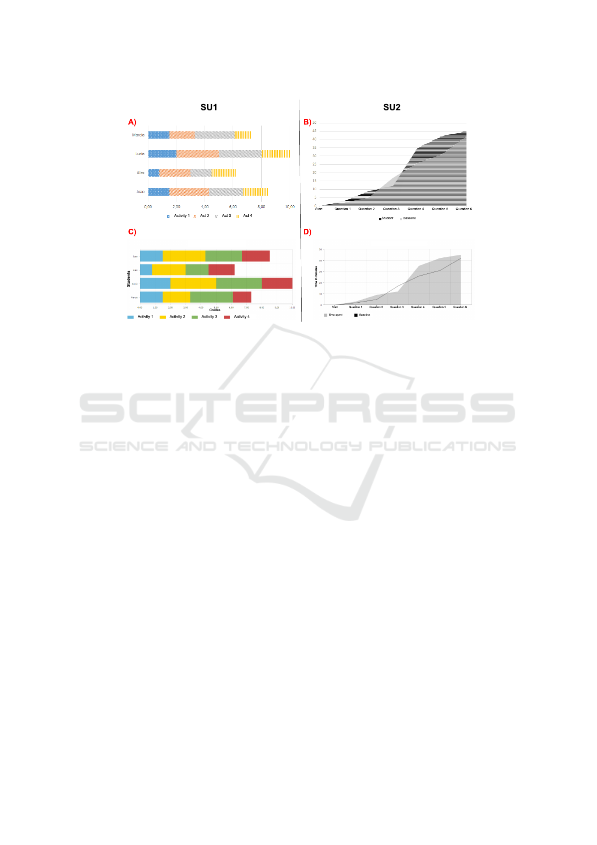
Figure 1: Charts example — A and B baseline developed by the authors — C was develop by participant D25-A and D by
participant D20-A.
fill any of the two scenarios and, among them, 3 fol-
lowed the guidelines.
Overall, the participants could develop visualiza-
tions for both scenarios. Some solutions were very
close to the baseline developed by the authors, such
as the solution proposed by participants D25-A and
D20-A (see Figures 1 - C and 1 - D). For these solu-
tions, the only recommendation (from the guideline)
not applied was the use of patterns or textures to dis-
tinguish data.
By exploring the solutions for the scenarios (i.e.
SU1 and SU2), our results revealed that all those who
developed visualizations for SU1 did not follow the
recommendation for using patterns (i.e. visual marks
as such dots) to identify elements in the chart. On
the other hand, in SU2, the participants applied the
patterns. We considered the participants used the pat-
terns because they were informed that the chart would
be printed in black and white.
Participants in group B (i.e. the group that did not
use the guidelines) reported the elaboration of the vi-
sualizations took long due to the lack of guidelines
with tips about how they could apply the different
chart formats. For instance, participant D22-B, when
developing a solution to SU1, stated that “I was strug-
gling in deciding on what type of charts available in
the tool should I use from which I could show the data
to that audience in an appropriate way”. The same
participant opinion was noticed when developing the
solution to SU2: “again my difficulties were concen-
trated on how to choose, among the chart formats
available, the most suitable one to show comparison
of information”.
Participants in group B adopted a strategy for
searching information about the charts that was close
to the organization approach by scenarios, provided
by the guideline. These participants extracted key-
words from the scenario description (i.e. SU1 or SU2)
and looked for the charts by pasting the keywords on
internet browsers as reported by the participants D1-
B and D4-B, respectively: “To get some examples, I
searched on Google Images ‘how to construct charts
to show students grades’”, and “I accessed Google
Images to explore the types of charts that could be
used to present students’ performance.”.
We found out that the participant D11-A decided
not to adopt the guidelines even being in group A.
The participant stood out taking a testing-based ap-
proach by visualizing the different charts available in
the tool, until s/he found the suitable one. However,
by following this approach, the participant faced diffi-
culties to select what would be the best chart to repre-
sent the data, as reported: “[I had] a little difficulty to
choose between line chart, [...] diagram chart (activ-
ity network) or area chart”. After some unsuccessful
attempts, this participant started to explore the guide-
lines and develop suitable solutions for SU1 and SU2.
This participant also realized that some choices that
seemed natural at first, did not match the scenario’s
needs (i.e. SU1 and SU2). At the end of the evalua-
Figure 1: Charts example — A and B baseline developed by the authors — C was develop by participant D25-A and D by
participant D20-A.
5.1 RQ1: How Participants Build the
Visualizations
From the 26 participants, 11 produced suitable visu-
alizations, considering both scenarios (SU1 and SU2)
and, among them, 7 created the visualizations by fol-
lowing the guidelines. However, considering the 26
participants, 8 of them built solutions that did not ful-
fill any of the two scenarios and, among them, 3 fol-
lowed the guidelines.
Overall, the participants could develop visualiza-
tions for both scenarios. Some solutions were very
close to the baseline developed by the authors, such
as the solution proposed by participants D25-A and
D20-A (see Figures 1 - C and 1 - D). For these solu-
tions, the only recommendation (from the guideline)
not applied was the use of patterns or textures to dis-
tinguish data.
By exploring the solutions for the scenarios (i.e.
SU1 and SU2), our results revealed that all those who
developed visualizations for SU1 did not follow the
recommendation for using patterns (i.e. visual marks
as such dots) to identify elements in the chart. On
the other hand, in SU2, the participants applied the
patterns. We considered the participants used the pat-
terns because they were informed that the chart would
be printed in black and white.
Participants in group B (i.e. the group that did not
use the guidelines) reported the elaboration of the vi-
sualizations took long due to the lack of guidelines
with tips about how they could apply the different
chart formats. For instance, participant D22-B, when
developing a solution to SU1, stated that “I was strug-
gling in deciding on what type of charts available in
the tool should I use from which I could show the data
to that audience in an appropriate way”. The same
participant opinion was noticed when developing the
solution to SU2: “again my difficulties were concen-
trated on how to choose, among the chart formats
available, the most suitable one to show comparison
of information”.
Participants in group B adopted a strategy for
searching information about the charts that was close
to the organization approach by scenarios, provided
by the guideline. These participants extracted key-
words from the scenario description (i.e. SU1 or SU2)
and looked for the charts by pasting the keywords on
internet browsers as reported by the participants D1-
B and D4-B, respectively: “To get some examples, I
searched on Google Images ‘how to construct charts
to show students grades’”, and “I accessed Google
Images to explore the types of charts that could be
used to present students’ performance.”.
We found out that the participant D11-A decided
not to adopt the guidelines even being in group A.
The participant stood out taking a testing-based ap-
proach by visualizing the different charts available in
the tool, until s/he found the suitable one. However,
by following this approach, the participant faced diffi-
culties to select what would be the best chart to repre-
sent the data, as reported: “[I had] a little difficulty to
Vis2Learning: A Scenario-based Guide to Support Developers in the Creation of Visualizations on Educational Data
457
Table 5: Results of the participants visualizations — (-1) Not applicable, (0) Not applied, (1) Partially applied, (2) Fully
applied — *Use of the 3D format was not appropriate.
SU1
ID Chosen chart Tooltip 3D* Stacked Patterns Suitable?
D1-B bar chart 1 0 2 1 Yes
D2-B column chart 1 0 2 1 Yes
D3-B bar chart 1 0 0 1 No
D4-B column chart 1 2 0 1 No
D5-A bar chart 2 0 0 1 No
D6-A bar chart 1 0 2 1 Yes
D7-B column chart 1 0 2 1 Yes
D8-A bar chart 1 0 0 1 No
D9-A bar chart 1 0 2 1 Yes
D10-A column chart 1 0 0 1 No
D11-A column chart 1 0 2 1 Yes
D12-A bar chart 1 0 2 1 Yes
D13-A bar chart 1 0 2 1 Yes
D14-B column chart 1 0 0 1 No
D15-A column chart 1 0 0 1 No
D16-B column chart 1 0 2 1 Yes
D17-B column chart 1 0 2 1 Yes
D18-A bar chart 1 0 2 1 Yes
D19-B column chart 1 0 2 1 Yes
D20-A column chart 1 0 2 1 Yes
D21-B line chart 0 0 -1 1 No
D22-B column chart 1 2 2 1 No
D23-A bar chart 1 0 2 1 Yes
D24-B bar chart 1 0 2 1 Yes
D25-A bar chart 1 0 2 1 Yes
D26-B column chart 1 0 2 1 No
SU2
Chosen chart Tooltip 3D* Label Transparency Paterns Suitable?
column + line 1 0 2 2 1 No
column + line 1 0 2 -1 1 No
line chart 2 0 2 -1 2 No
column chart 1 2 1 -1 0 No
area chart 1 0 2 2 0 Yes
area chart 2 0 2 2 2 Yes
line 1 0 2 -1 2 Yes
column chart 1 0 2 -1 0 No
column + line 1 0 2 -1 1 No
column + line 0 0 2 -1 1 No
line chart 1 0 2 -1 2 Yes
column chart 1 0 2 -1 2 No
line chart 1 0 2 -1 2 Yes
line chart 1 0 2 -1 2 Yes
column + line 1 0 2 -1 1 No
line chart 1 0 2 -1 2 Yes
area + line 1 0 2 2 2 Yes
area chart 2 0 2 2 0 Yes
bar chart 1 0 2 -1 0 No
area + line 2 0 1 -1 0 Yes
overlap bar chart 1 0 2 1 0 No
overlap column 1 2 1 0 0 No
line 2 0 2 -1 2 Yes
line 0 0 2 -1 0 Yes
line 2 0 2 -1 2 Yes
column chart 1 0 2 -1 0 No
choose between line chart, [...] diagram chart (activ-
ity network) or area chart”. After some unsuccessful
attempts, this participant started to explore the guide-
lines and develop suitable solutions for SU1 and SU2.
This participant also realized that some choices that
seemed natural at first, did not match the scenario’s
needs (i.e. SU1 and SU2). At the end of the evalua-
tion, the participant declared “I found it interesting to
apply these concepts [of the guidelines], because even
though it seems intuitive when looking at visualization
models [format], in practice we should consider a set
of requirements before constructing the visualization
to make the data interpretation more intuitive ”.
Even using the Internet to search for examples and
tips, the participants in group B reported a lack of con-
fidence to choose a chart type, as we could as reported
by participant D1-B: “As I do not have much knowl-
edge about which chart is the most appropriate, I was
very confused at the time of choice and I ended up try-
ing different charts until I found out the one that could
be the best to visualize that information”.
Finally, we could notice that some participants in
group B (i.e. D7-B, D14-B, D16-B, D17-B and D24-
B) who did not have access to the guidelines, were
able to produce visualizations that fulfill practically
all the recommendations available in the SC6 (see Ta-
ble 1). By checking the profile of these participants
(see Table 4), we saw they have a preference for seek-
ing ready-made tips and examples on the Internet,
based on the context of the scenario. In particular,
the participant D24-B has already worked on the con-
struction of charts for web applications.
Participant D1-B, who had experience in the de-
velopment of visualizations, stated difficulties be-
cause the visualization design is often handled in a
generic perspective without looking the data domain
characteristics. The participant reported “I’ve never
made an effort to think on how the design of the visu-
alization can impact the end-users... As a developer,
I’ve taken the trial and error approach to see what is
the best one, but I realized that some charts may not
give the user any information or may not present it
more effectively what the user needs to see”.
5.2 RQ2: Feedback of the Guidelines
Acceptance
Taking into account the responses collected from the
participants in group A, i.e. those who used the guide-
lines, we explored the feedback regarding the per-
ceived usefulness and ease-of-use of the guidelines
(see Table 6). We used a Likert scale of four point
as answer options, ranging from strongly disagree to
totally agree. Figure 3 and Figure 2 illustrate the re-
sults of the acceptance feedback. We also considered
the comments added by the participant in the open
question of the questionnaire.
Figure 2 shows that for the questions F1 and F2
(see Table 6) only 3 of 13 participants reported to
have difficulties related to the learning about the rec-
ommendations. From this result, we could under-
stand that the guidelines provide information enough
to the individuals guide themselves to building visu-
alizations and that it does not require training for its
use. We want to restate that we did not provide any
ICEIS 2021 - 23rd International Conference on Enterprise Information Systems
458
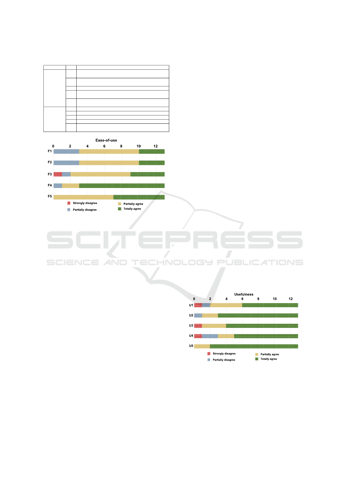
Table 6: Feedback questionnaire.
Dimension ID Question
Perceived
of
Usefulness
U1 Using the guidelines allowed me to choose the visualization
format more quickly.
U2 Using the guidelines improved my perception of good prac-
tices for building visualizations.
U3 Using guidelines is important and adds value to my work.
U4 Guidelines made the result of the visualization more interest-
ing.
U5 I find the guidelines useful for developing educational data
visualizations.
Perceived
of
Ease-of-use
F1 It was easy to learn how to use the guidelines.
F2 I find the guidelines easy to understand.
F3 I find it easy to apply the guidelines.
F4 Using guidelines makes my work easier.
F5 Guidelines allow flexibility for the development of visualiza-
tions.
ommendations. From this result, we could under-
stand that the guidelines provide information enough
to the individuals guide themselves to building visu-
alizations and that it does not require training for its
use. We want to restate that we did not provide any
explanation or training on the guidelines to the partic-
ipants of the group, being the evaluation activity the
first contact of that group with them.
Figure 2: Participants’ feedback on the perceived ease-of-
use.
Taking into account the answers of the questions
F4 and F5, we see a high degree of agreement about
the usefulness of Vis2Learning to guide the partici-
pants in building of their solutions in a flexible way.
According to the participant D6-A, “the guidelines
provide a set of recommendation which explains the
best way to apply each chart type... this kind of knowl-
edge is not easily found any other place... the guide-
lines are well-organized and contain full details on
how to use the charts”. The participants in group A
considered, in general, that the guidelines provide in-
formation regarding the characteristics of the visual-
ization formats, focusing on the most relevant points
of the data visualization. Participant D5-A men-
tioned: “the guidelines supported me choosing the
suitable chart for each type of data that I wanted to
present, keeping the focus on the proposed scenario”.
Taking into account the easy-of-use dimension
(see Figure 2), F3 was the only question that received
a “totally disagree” answer. We observed that the
disagreement came from participant D15-A, who in-
formed, in the profile questionnaire, to have never
used charts to design visualizations. Besides, the par-
ticipant mentioned that was struggling to use the AM-
CHARTS tool. D15-A demonstrated the frustration
with the prototyping tool during the development of
the solutions for SU1 and SU2, as shown in the fol-
lowing quotes: “First I chose the radar chart [...] but
I couldn’t plot it on the tool”, and “ [...] for me the
biggest block was to be able to fix the labels [...]”.
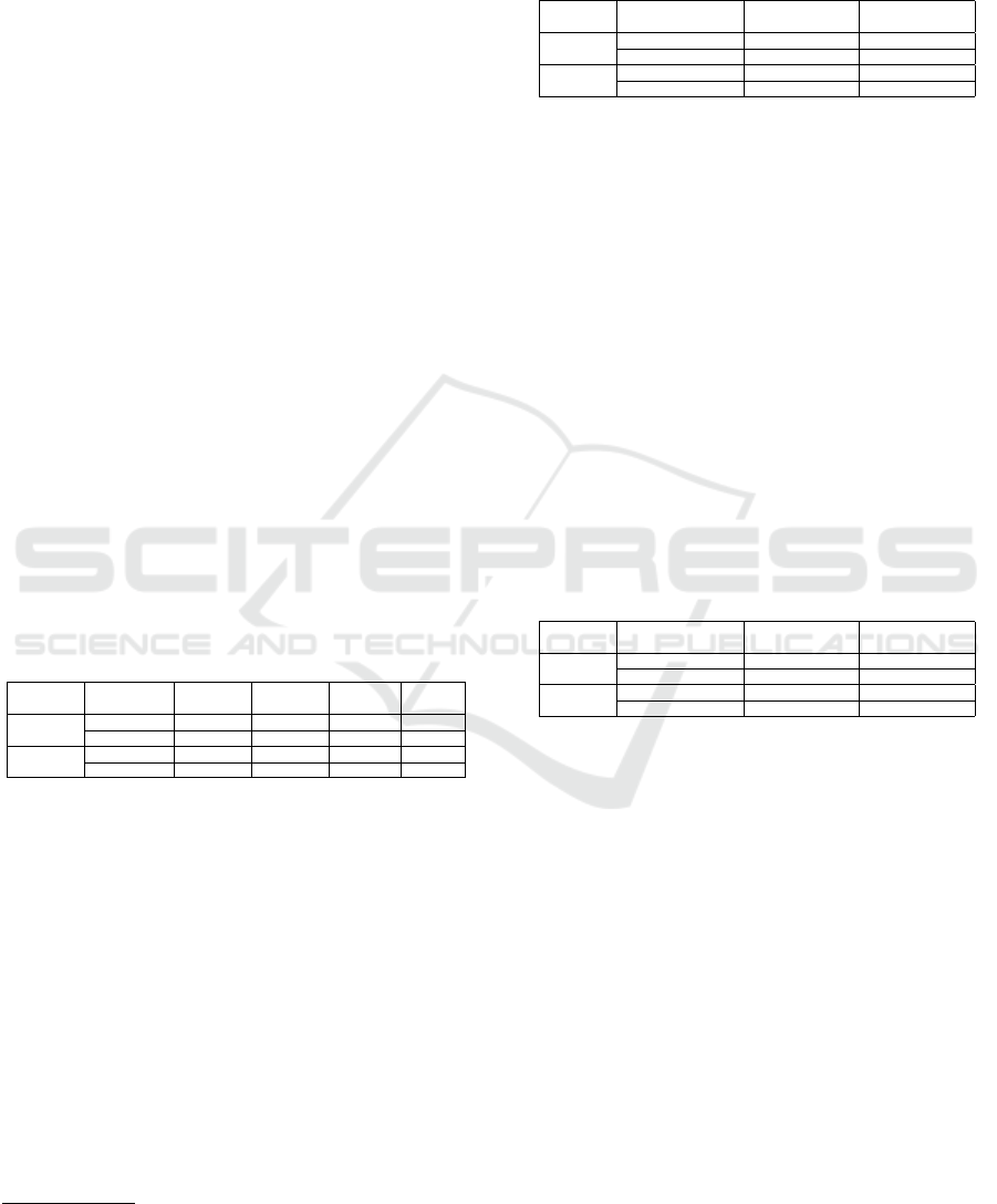
In Figure 3, we see that the participants consid-
ered the guidelines useful to support the design of vi-
sualizations in the educational context. Both ques-
tions U5 and U2 got a high level of agreement on
the usefulness of the guidelines as can be seen from
the comment of participant D12-A: “The guidelines
really helped me making a reflection on the possible
problems and benefits of using each type of chart”.
There was no consensus on questions U1, U3 and
U4. Considering the responses for U4, we notice that
10 out of 13 participants agreed that the guidelines
supported them building visualizations which relevant
results. By looking to the positive answers for ques-
tion U1 (10 out of 13), we saw that the information
about the context of use for each chart present in the
guidelines, aided the participants in the solution de-
sign as mentioned by the participants D5-A and D8-
A, respectively: “the examples of how to apply each
chart were essential to make my decision about the
best visualization for the data.”, “the examples were
really important for the selection of the best chart.”.
For U3 only participant D15-A disagreed. By exam-
ining our results in-depth, we observed that all totally
disagree answers in the usefulness dimension were
from participant D15-A. As we mentioned above, this
participant disagreement reflected the difficulties s/he
faced using the prototyping tool. However, this par-
ticipant assigned a totally agreed answer the question
U5 which, even having difficulties with the tool.
Figure 3: Participants’ feedback on the perceived useful-
ness.
5.3 Influence of Participants’ Profile in
the Results
We decided to run the Fisher’s exact test (1922) to see
whether the participants’ profile (i.e. their experience)
could influence on the acceptance of Vis2Learning
and the selection of the correct chart. We took the
Fisher’s exact test because it allows comparing cat-
egorical data collected from small samples. It cal-
culates the exact significance of the deviation from a
Figure 2: Participants’ feedback on the perceived ease-of-
use.
explanation or training on the guidelines to the partic-
ipants of the group, being the evaluation activity the
first contact of that group with them.
Taking into account the answers of the questions
F4 and F5, we see a high degree of agreement about
the usefulness of Vis2Learning to guide the partici-
pants in building of their solutions in a flexible way.
According to the participant D6-A, “the guidelines
provide a set of recommendation which explains the
best way to apply each chart type... this kind of knowl-
edge is not easily found any other place... the guide-
lines are well-organized and contain full details on
how to use the charts”. The participants in group A
considered, in general, that the guidelines provide in-
formation regarding the characteristics of the visual-
ization formats, focusing on the most relevant points
of the data visualization. Participant D5-A men-
tioned: “the guidelines supported me choosing the
suitable chart for each type of data that I wanted to
present, keeping the focus on the proposed scenario”.
Taking into account the easy-of-use dimension
(see Figure 2), F3 was the only question that received
a “totally disagree” answer. We observed that the
disagreement came from participant D15-A, who in-
formed, in the profile questionnaire, to have never
used charts to design visualizations. Besides, the par-
ticipant mentioned that was struggling to use the AM-
CHARTS tool. D15-A demonstrated the frustration
with the prototyping tool during the development of
the solutions for SU1 and SU2, as shown in the fol-
lowing quotes: “First I chose the radar chart [...] but
I couldn’t plot it on the tool”, and “ [...] for me the
biggest block was to be able to fix the labels [...]”.
In Figure 3, we see that the participants consid-
ered the guidelines useful to support the design of vi-
sualizations in the educational context. Both ques-
tions U5 and U2 got a high level of agreement on
the usefulness of the guidelines as can be seen from
the comment of participant D12-A: “The guidelines
really helped me making a reflection on the possible
problems and benefits of using each type of chart”.
There was no consensus on questions U1, U3 and
U4. Considering the responses for U4, we notice that
10 out of 13 participants agreed that the guidelines
supported them building visualizations which relevant
results. By looking to the positive answers for ques-
tion U1 (10 out of 13), we saw that the information
about the context of use for each chart present in the
guidelines, aided the participants in the solution de-
sign as mentioned by the participants D5-A and D8-
A, respectively: “the examples of how to apply each
chart were essential to make my decision about the
best visualization for the data.”, “the examples were
really important for the selection of the best chart.”.
For U3 only participant D15-A disagreed. By exam-
ining our results in-depth, we observed that all totally
disagree answers in the usefulness dimension were
from participant D15-A. As we mentioned above, this
participant disagreement reflected the difficulties s/he
faced using the prototyping tool. However, this par-
ticipant assigned a totally agreed answer the question
U5 which, even having difficulties with the tool.
ommendations. From this result, we could under-
stand that the guidelines provide information enough
to the individuals guide themselves to building visu-
alizations and that it does not require training for its
use. We want to restate that we did not provide any
explanation or training on the guidelines to the partic-
ipants of the group, being the evaluation activity the
first contact of that group with them.
Figure 2: Participants’ feedback on the perceived ease-of-
use.
Taking into account the answers of the questions
F4 and F5, we see a high degree of agreement about
the usefulness of Vis2Learning to guide the partici-
pants in building of their solutions in a flexible way.
According to the participant D6-A, “the guidelines
provide a set of recommendation which explains the
best way to apply each chart type... this kind of knowl-
edge is not easily found any other place... the guide-
lines are well-organized and contain full details on
how to use the charts”. The participants in group A
considered, in general, that the guidelines provide in-
formation regarding the characteristics of the visual-
ization formats, focusing on the most relevant points
of the data visualization. Participant D5-A men-
tioned: “the guidelines supported me choosing the
suitable chart for each type of data that I wanted to
present, keeping the focus on the proposed scenario”.
Taking into account the easy-of-use dimension
(see Figure 2), F3 was the only question that received
a “totally disagree” answer. We observed that the
disagreement came from participant D15-A, who in-
formed, in the profile questionnaire, to have never
used charts to design visualizations. Besides, the par-
ticipant mentioned that was struggling to use the AM-
CHARTS tool. D15-A demonstrated the frustration
with the prototyping tool during the development of
the solutions for SU1 and SU2, as shown in the fol-
lowing quotes: “First I chose the radar chart [...] but
I couldn’t plot it on the tool”, and “ [...] for me the
biggest block was to be able to fix the labels [...]”.
In Figure 3, we see that the participants consid-
ered the guidelines useful to support the design of vi-
sualizations in the educational context. Both ques-
tions U5 and U2 got a high level of agreement on
the usefulness of the guidelines as can be seen from
the comment of participant D12-A: “The guidelines
really helped me making a reflection on the possible
problems and benefits of using each type of chart”.
There was no consensus on questions U1, U3 and
U4. Considering the responses for U4, we notice that
10 out of 13 participants agreed that the guidelines
supported them building visualizations which relevant
results. By looking to the positive answers for ques-
tion U1 (10 out of 13), we saw that the information
about the context of use for each chart present in the
guidelines, aided the participants in the solution de-
sign as mentioned by the participants D5-A and D8-
A, respectively: “the examples of how to apply each
chart were essential to make my decision about the
best visualization for the data.”, “the examples were
really important for the selection of the best chart.”.
For U3 only participant D15-A disagreed. By exam-
ining our results in-depth, we observed that all totally
disagree answers in the usefulness dimension were
from participant D15-A. As we mentioned above, this
participant disagreement reflected the difficulties s/he
faced using the prototyping tool. However, this par-
ticipant assigned a totally agreed answer the question
U5 which, even having difficulties with the tool.
Figure 3: Participants’ feedback on the perceived useful-
ness.
5.3 Influence of Participants’ Profile in
the Results
We decided to run the Fisher’s exact test (1922) to see
whether the participants’ profile (i.e. their experience)
could influence on the acceptance of Vis2Learning
and the selection of the correct chart. We took the
Fisher’s exact test because it allows comparing cat-
egorical data collected from small samples. It cal-
culates the exact significance of the deviation from a
Figure 3: Participants’ feedback on the perceived useful-
ness.
5.3 Influence of Participants’ Profile in
the Results
We decided to run the Fisher’s exact test (1922) to see
whether the participants’ profile (i.e. their experience)
Vis2Learning: A Scenario-based Guide to Support Developers in the Creation of Visualizations on Educational Data
459
could influence on the acceptance of Vis2Learning
and the selection of the correct chart. We took the
Fisher’s exact test because it allows comparing cat-
egorical data collected from small samples. It cal-
culates the exact significance of the deviation from a
null hypothesis using the p-value, while other meth-
ods use an approximation. In addition to provid-
ing a p-value with greater accuracy in small samples,
the exact significance tests do not require a balanced
or well-distributed sample (Mehta and Patel, 1996)
which matches our sample’s characteristics. A 95%
(i.e. 0.05) confidence interval was considered to mit-
igate errors in the results
5
.
First, we checked the acceptance in the perspec-
tive of ease-of-use. In our test, we checked whether
the previous experience with InfoVis could influence
the acceptance of our guidelines. We thus defined the
null and alternative hypothesis, taking into account
the answers of questions F1 and F2 (see Table 6), as
follows: H0 - The previous knowledge of the partic-
ipant on InfoVis has no influence in the acceptance,
and H1 - The previous knowledge of the participant
on InfoVis has influence in the acceptance. We com-
piled the data for the test in Table 7. After running the
Fisher exact test, we got a p-value=0.4615 to question
F1 and p-value=0.8368 to question F2. The results
suggest that there is no statistical evidence to support
that having previous knowledge of InfoVis influence
on the acceptance of the Vis2Learning.
Table 7: Previous knowledge on InfoVis vs feedback of ac-
ceptance.
TAM
question
Knowledge
in InfoVis?
Strongly
disagree
Partially
disagree
Partially
agree
Totally
agree
F1
No 0 0 4 1
Yes 0 3 3 2
F2
No 0 0 4 1
Yes 1 1 3 3
In a second checking, we considered whether the fact
of the participants are familiar with using charts could
influence the construction of suitable visualizations.
In this checking, we took data from groups A and
B, about the visualizations produced for the scenar-
ios SU1 and SU2 (see Table 5), and the participants’
profile (see Table 4). Table 8 shows the compila-
tion of these data. The null and alternative hypothesis
were defined as follows: H0 - The participant famil-
iarity with visualizations did influence the selection
of suitable chart, and H1 - The participant familiarity
with visualizations influenced the selection of suitable
chart. Fisher exact test returns a p-value=0.3748 for
SU1 and p-value=0.6652 for SU2. The results sug-
gest that there is no statistical evidence that the par-
5
We run tests from this website https://astatsa.com/
FisherTest/.
ticipant’s familiarity with charts influenced the par-
ticipants’ choices for both scenarios.
Table 8: Familiarity with visualizations vs suitable solu-
tions of visualizations.
Scenario Familiarity with
visualizations?
Suitable
visualization
Unsuitable
visualization
SU1
No 6 1
Yes 12 7
SU2
No 3 4
Yes 11 8
Finally, we run the test to verify if experience in pro-
gramming could impact the selection of the appropri-
ate chart format by the participants. In this test we did
not took the participants divided in groups (i.e. A or
B). The data used is displayed in Table 9. The null
and alternative hypotheses were defined as follows:
H0 - The level of experience in programming of the
participant did not have an influence on the choice of
the suitable chart format, and H1 - The level of ex-
perience in programming of the participant did have
an influence on the choice of the suitable chart for-
mat. We obtained the p-value=0.3821 for SU1, and
the p-value=0.6828 for SU2 leading the rejection of
null hypotheses. The results suggest that there is no
statistical evidence that experience in programming
helped the participants make appropriate choices of
the charts.
Table 9: Experience in programming vs suitable visualiza-
tions.
Scenario Expert in
programming?
Suitable
visualization
Unsuitable
visualization
SU1
No 13 4
Yes 5 4
SU2
No 10 7
Yes 4 5
6 DISCUSSION
Taking into account our RQ1 (How did the partici-
pants in both groups build the visualizations?), the
results show that the participants who used the guide-
lines were more successful in building the solutions.
These participants stated that they have never been in
contact with similar guidelines. The participants that
did not use the guidelines made more efforts in the
construction of their visualizations as we saw from
their quotes. They often took the trial and error ap-
proach, which led them to spend more time to build
the solutions. We could also see that the participants
did not have issues related to the accessibility of vi-
sualizations when this was not pointed out explic-
itly. This way, we believe that the guidelines need to
evolve in order to properly address recommendations
for accessibility.
ICEIS 2021 - 23rd International Conference on Enterprise Information Systems
460

Our results showed that the guidelines had a pos-
itive acceptance, i.e. our RQ2 ( What are the partic-
ipants feedback about the guidelines?). The partic-
ipants’ feedback considered our proposal as easy to
use and usefulness to the development of visualiza-
tions of educational data. The participants pointed
out that providing examples and recommendations
aimed at to a context could better support the solu-
tion design. Concerning the participants’ profile, we
saw that these profiles did not have influence on the
Vis2Learning acceptance as well as in the choice of
the suitable chart.
By looking at the related work (see Section 2),
we see that our proposal presents important contri-
butions by providing guidelines related to data do-
main. Most of the related works proposed processes
to conduct the development of visualizations for e-
learning (Conde et al., 2015; Maldonado et al., 2015;
Ruip
´
erez-Valiente et al., 2017; Chen et al., 2016;
Klerkx et al., 2017). Even though our related work
section has presented works with proposals to the con-
text of educational data, none of them provides rec-
ommendations regarding the type of visualization to
be used. Others provided general guidelines not ad-
herent to the context of educational data (Victorelli
et al., 2019). Our proposal differs from the related
work by offering a set of guidelines for educational
data-related context and also by supporting develop-
ers with application scenarios.
Taking into account that Munzner’s recommenda-
tions (2014) are the most used in the literature, we de-
cided to compare the similarities between our guide-
lines and Munzner’s recommendations. To carry out
a parallel between the two works, we extracted the
rules from Munzner’s book which are spread in dif-
ferent chapters. After that, we analyzed the links be-
tween our guidelines and Munzner’s rules. We con-
sidered that there are similarities when our guidelines
encompassed at least one of the rules. To characterize
the strength of the link, we adopted an index ranging
from 1 to 3 which was applied as follows: 1 - our
guideline had the same purpose as a rule from Mun-
zner’s book; 2 - we applied concepts of a rule from
Munzner’s book but in a contextualized way to edu-
cational data; or 3 - our guideline partially presented
aspects to those of a rule from Munzner’s book.
Figure 4 illustrates the results of our comparison.
We noticed that all the scenarios (i.e. X-axis) of our
guidelines established at least one link (represented
by bubbles) with Munzner’s rules (i.e. Y-axis). We
see that 18 of the 35 links are characterized by in-
dex 2 (i.e. red bubble), indicating that our proposal
covers the rules. This result shows that our guide-
lines follows the best practices for constructing visu-
alizations, however, it is concerned on applying them
into the context of educational data. The guidelines
SC2, SC3, SC6 and SC9 stand out, because each of
them incorporates three or more aspects of Munzner’s
rules.
Figure 4: Comparison between our guidelines and rules of
thumbs (Munzner, 2014).
7 CONCLUSION AND FUTURE
WORK
In this paper, we presented a set of guidelines to sup-
port developers and designers in the development of
visualizations in the educational context. Our pro-
posal was evaluated by 26 participants. We analyzed
the results in three perspectives: (1) how the partic-
ipants constructed visualizations (in the educational
context), whether using or guidelines or not; (2) The
participants’ feedback, regarding the acceptance of
our guidelines and; (3) The influence that the partici-
pants’ profile had on building suitable visualizations.
The results allowed us to conclude that our guide-
lines helped the participants to focus on the construc-
tion of visualization related to the data domain (i.e.
educational context), and on important details that im-
prove the users’ perception on the information. In ad-
dition, our guidelines work on the participants con-
scious of the importance of considering users’ inter-
action with the visualization and not just the chart for-
mat, when building the visualizations. Finally, the
participants show positive perceptions regarding the
the guidelines’ easy-of-use and usefulness. From sta-
tistical testings, we noticed that the participants’ pro-
file did not influence the construction of suitable so-
lutions, which reinforces the idea that our guidelines
are applicable to their purposes.
However, from our evaluation, we could notice
that our guidelines require some improvements to ad-
dress accessibility issues. We intend to extend our
guidelines by adding items related to accessibility as
further work, running additional evaluation with de-
velopers in the industry.
ACKNOWLEDGMENTS
The authors would like to thank the Coordenac¸
˜
ao
de Aperfeic¸oamento de Pessoal de N
´
ıvel Superior –
Brasil (CAPES) – Finance Code 001 and the Con-
selho Nacional de Desenvolvimento Cient
´
ıfico e Tec-
Figure 4: Comparison between our guidelines and rules of
thumbs (Munzner, 2014).
alizations, however, it is concerned on applying them
into the context of educational data. The guidelines
SC2, SC3, SC6 and SC9 stand out, because each of
them incorporates three or more aspects of Munzner’s
rules.
7 CONCLUSION AND FUTURE
WORK
In this paper, we presented a set of guidelines to sup-
port developers and designers in the development of
visualizations in the educational context. Our pro-
posal was evaluated by 26 participants. We analyzed
the results in three perspectives: (1) how the partic-
ipants constructed visualizations (in the educational
context), whether using or guidelines or not; (2) The
participants’ feedback, regarding the acceptance of
our guidelines and; (3) The influence that the partici-
pants’ profile had on building suitable visualizations.
The results allowed us to conclude that our guide-
lines helped the participants to focus on the construc-
tion of visualization related to the data domain (i.e.
educational context), and on important details that im-
prove the users’ perception on the information. In ad-
dition, our guidelines work on the participants con-
scious of the importance of considering users’ inter-
action with the visualization and not just the chart for-
mat, when building the visualizations. Finally, the
participants show positive perceptions regarding the
the guidelines’ easy-of-use and usefulness. From sta-
tistical testings, we noticed that the participants’ pro-
file did not influence the construction of suitable so-
lutions, which reinforces the idea that our guidelines
are applicable to their purposes.
However, from our evaluation, we could notice
that our guidelines require some improvements to ad-
dress accessibility issues. We intend to extend our
guidelines by adding items related to accessibility as
further work, running additional evaluation with de-
velopers in the industry.
Vis2Learning: A Scenario-based Guide to Support Developers in the Creation of Visualizations on Educational Data
461

ACKNOWLEDGMENTS
The authors would like to thank the Coordenac¸
˜
ao
de Aperfeic¸oamento de Pessoal de N
´
ıvel Superior –
Brasil (CAPES) – Finance Code 001 and the Con-
selho Nacional de Desenvolvimento Cient
´
ıfico e Tec-
nol
´
ogico - Brasil (CNPq grants 313312/2019-2 and
308395/2020-4).
REFERENCES
Card, S. and Jacko, J. A. (2012). Human-Computer Inter-
action Handbook: Fundamentals, Evolving Technolo-
gies, and Emerging Applications, Third Edition. CRC
Press, Boca Raton, FL, USA.
Card, S., Mackinlay, J., and Shneiderman, B. (1999). Read-
ings in Information Visualization: Using Vision To
Think. Morgan Kaufmann Publishers Inc., San Fran-
cisco, CA, USA.
Carneiro, G. d. F. and Mendonc¸a, M. G. d. (2013).
Sourceminer - a multi-perspective software visualiza-
tion environment. In Proceedings of the 15th Inter-
national Conference on Enterprise Information Sys-
tems - Volume 2: ICEIS, pages 25–36. INSTICC,
SciTePress.
Chen, Y., Chen, Q., , Boyer, S., Veeramachaneni, K., and
Qu, H. (2016). Dropoutseer: Visualizing learning
patterns in massive open online courses for dropout
reasoning and prediction. In 2016 IEEE Conference
on Visual Analytics Science and Technology (VAST),
pages 111–120.
Conde, M. A., Garc
´
ıa-Pe
˜
nalvo, F. J., G
´
omez-Aguilar, D.,
and Ther
´
on, R. (2015). Exploring software engineer-
ing subjects by using visual learning analytics tech-
niques. IEEE Journal of Latin-American Learning
Technologies, 10(4):242–252.
Davis, F. D. (1989). Perceived usefulness, perceived ease of
use, and user acceptance of information technology.
MIS Q., 13(3):319–340.
Fisher, R. A. (1922). On the interpretation of x2 from con-
tingency tables, and the calculation of p. Journal of
the Royal Statistical Society, 85(1):87–94.
Jord
˜
ao, V., Gonc¸alves, D., and Gama, S. (2014). Eduvis:
Visualizing educational information. In Proceedings
of the 8th Nordic Conference on Human-Computer In-
teraction: Fun, Fast, Foundational, NordiCHI ’14,
page 1011–1014, NY, USA. ACM.
JUSTINMIND (2020). 8 data visualization tools for
ux designers. https://www.justinmind.com/blog/8-
data-visualization-tools-for-ux-designers-visualize-
insights-prototype-better-products. Accessed:
2020-10-22.
Klerkx, J., Verbert, K., and Duval, E. (2017). Learning an-
alytics dashboards. In Lang, C., Siemens, G., Wise,
A. F., and Ga
ˇ
sevic, D., editors, The Handbook of
Learning Analytics, page 143–150. Society for Learn-
ing Analytics Research, Alberta, Canada.
Macedo, M. P., Paiva, R. O. A., Gasparini, I., and Zaina, L.
A. M. (2020). Vis2learning: A scenario-based guide
of recommendations for building educational data vi-
sualizations. In Proceedings of the 19th Brazilian
Symposium on Human Factors in Computing Systems,
IHC ’20, New York, NY, USA. Association for Com-
puting Machinery.
Majumdar, R. and Iyer, S. (2016). isat: a visual learning
analytics tool for instructors. Research and Practice
in Technology Enhanced Learning, 11(16).
Maldonado, R. M., Pardo, A., Mirriahi, N., Yacef, K., Kay,
J., and Clayphan, A. (2015). The latux workflow: De-
signing and deploying awareness tools in technology-
enabled learning settings. In Proceedings of the Fifth
International Conference on Learning Analytics And
Knowledge, LAK ’15, pages 1–10, New York, NY,
USA. ACM.
Mehta, C. and Patel, N. (1996). SPSS exact tests.
Munzner, T. (2014). Visualization analysis and design.
A.K. Peters visualization series. A K Peters.
Park, Y.-G., Cho, Y.-S., and Son, J.-E. (2017). Design of
a learning analytics dashboard based on digital text-
books and online learning. In Workshop Proceedings
of the 25th International Conference on Computers in
Education, pages 326 – 334. Asia-Pacific Society for
Computers in Education.
Reyes, J. A. (2015). The skinny on big data in education:
learning analytics simplified. TechTrends, 59:75–80.
Ruip
´
erez-Valiente, J. A., Merino, P. J. M., Gascon-Pinedo,
J., and Delgado-Kloos, C. (2017). Scaling to massive-
ness with analyse: A learning analytics tool for open
edx. IEEE Transactions on Human-Machine Systems,
47(6):909–914.
Salman, I., Misirli, A. T., and Juristo, N. (2015). Are
students representatives of professionals in software
engineering experiments? In 2015 IEEE/ACM 37th
IEEE International Conference on Software Engineer-
ing, volume 1, pages 666–676.
Schwendimann, B. A., Rodr
´
ıguez-Triana, M. J., Vozniuk,
A., Prieto, L. P., Boroujeni, M. S., Holzer, A., Gillet,
D., and Dillenbourg, P. (2017). Perceiving learning
at a glance: A systematic literature review of learning
dashboard research. IEEE Transactions on Learning
Technologies, 10(1):30–41.
Tervakari, A. M., Silius, K., Koro, J., Paukkeri, J., and Pirt-
til
¨
a, O. (2014). Usefulness of information visualiza-
tions based on educational data. In 2014 IEEE Global
Engineering Education Conference, EDUCON, page
142–151, NY, USA. IEEE.
Victorelli, E. Z., Reis, J. C. d., Santos, A. A. S., and
Schiozer, D. J. (2019). Design process for human-
data interaction: Combining guidelines with semio-
participatory techniques. In Proceedings of the 21st
International Conference on Enterprise Information
Systems - Volume 2: ICEIS, pages 410–421. IN-
STICC, SciTePress.
Vieira, C., Parsons, P., and Byrd, V. (2018). Visual learning
analytics of educational data: a systematic literature
review and research agenda. Computers & Education,
122:119–135.
Ware, C. (2012). Information Visualization: perception for
design. Morgan Kaufmann Publishers Inc., San Fran-
cisco, CA, USA, 3 edition.
Wohlin, C., Runeson, P., H
¨
ost, M., Ohlsson, M. C., Reg-
nell, B., and Wessl
´
en, A. (2012). Experimentation in
Software Engineering. Springer Publishing Company,
Incorporated, USA.
ICEIS 2021 - 23rd International Conference on Enterprise Information Systems
462
