
Visual Analytics for Industrial Sensor Data Analysis
Tristan Langer
a
and Tobias Meisen
b
Chair of Technologies and Management of Digital Transformation, University of Wuppertal,
Rainer-Gruenter-Str. 21, 42119 Wuppertal, Germany
Keywords:
Time Series Analysis, Industrial Sensor Data, Visual Analytics, Analytic Provenance.
Abstract:
Due to the increasing digitalization of production processes, more and more sensor data is recorded for sub-
sequent analysis in various use cases (e.g. predictive maintenance). The analysis and utilization of this data
by process experts raises optimization potential throughout the production process. However, new analysis
methods are usually first published as non-standardized Python or R libraries and are therefore not available
to process experts with limited programming and data management knowledge. It often takes years before
those methods are used in ERP, MES and other production environments and the optimization potential re-
mains idle until then. In this paper, we present a visual analytics approach to facilitate the inclusion of process
experts into analysis and utilization of industrial sensor data. Based on two real world exemplary use cases,
we define a catalog of requirements and develop a tool that provides dedicated interactive visualizations along
methods for exploration, clustering and labeling as well as classification of sensor data. We then evaluate the
usefulness of the presented tool in a qualitative user study. The feedback given by the participants indicates
that such an approach eases access to data analysis methods but needs to be integrated into a comprehensive
data management and analysis process.
1 INTRODUCTION
With the visions of Industry 4.0 and the Smart Fac-
tory, manufacturers have begun equipping their pro-
duction facilities with more sensors. The analysis
and utilization of this data by process experts offers
great potential for optimizing decisions, product qual-
ity and maintenance cycles throughout the produc-
tion process (Jeschke et al., 2017). Process experts
play an important role, because they have the neces-
sary expertise to interpret the recorded data as well as
recognize and label conspicuous patterns in the sen-
sor curves. Thus, they are needed to transform data
into information that is required for the application
of further methods like supervised machine learning
(Holmes et al., 1994; Hu et al., 2019). However, the
integration and utilization of modern analysis meth-
ods for their production process usually poses great
challenges for manufacturing companies. The reason
for this is that sensor data analysis falls into the area
of time series analysis, whereas time series analysis
itself is a well established research area that has de-
veloped many methods over the past years e.g. (Sakoe
a
https://orcid.org/0000-0002-4946-0388
b
https://orcid.org/0000-0002-1969-559X
and Chiba, 1978; Yeh et al., 2016; Hamilton, 2020).
These methods are then first implemented in Python
or R and made available as non-standardized libraries
to the community e.g. (Law, 2019; L
¨
oning et al.,
2019; Tavenard et al., 2020). Hence, they are reserved
for those companies who have the necessary exper-
tise to write a program to apply these libraries to their
own data and evaluate the results. Especially the code
to produce visual representations, which help to in-
terpret the results, is complex (Batch and Elmqvist,
2018). Usually, Manufacturing companies do not pro-
cess this kind of expertise and process experts do not
have the necessary programming knowledge to imple-
ment new methods on their own. This leads us to the
research question: How can we involve process ex-
perts and their knowledge in the rapid visualization
and analysis of new sensor data?
In this paper, we present a Visual Analyt-
ics (VA) approach, a proven method that combines the
strengths of human cognitive abilities with analysis
methods (Keim et al., 2008), to build a tool for inter-
active analysis and labeling of industrial sensor data.
Using two industrial exemplary use cases, where pro-
fessional data scientists worked with domain experts
to analyze and label industrial sensor data, we in-
vestigate how the use of dedicated interactive visu-
584
Langer, T. and Meisen, T.
Visual Analytics for Industrial Sensor Data Analysis.
DOI: 10.5220/0010399705840593
In Proceedings of the 23rd International Conference on Enterprise Information Systems (ICEIS 2021) - Volume 1, pages 584-593
ISBN: 978-989-758-509-8
Copyright
c
2021 by SCITEPRESS – Science and Technology Publications, Lda. All rights reserved

alizations along state of the art methods for explo-
ration, clustering and labeling as well as classifica-
tion compares to detailed data analysis by data scien-
tists. We provide the following contributions: 1. a
requirements catalog for visual analytics tools to sup-
port industrial sensor data analysis and labeling; 2.
our interactive VA system that enables process experts
to perform sensor analysis and labeling without any
programming knowledge; 3. a qualitative user study
that compares the results of the analyses performed by
data scientists in the original projects with the results
that study participants achieved using our tool.
2 RELATED WORK
In this section, we describe the state of the art of the
application of VA tools in industrial settings and give
an overview of recent advances in time series analysis
frameworks and knowledge generation by interactive
labeling.
2.1 Visual Analytics in Industrial
Settings
Visual Analytics has proven in various scenarios to be
a helpful method to involve people in industrial set-
tings in decision-making processes (Xu et al., 2016;
Wu et al., 2018). A recent survey on the use of VA in
manufacturing scenarios show the successful applica-
tion of specialized VA applications in diverse indus-
trial settings (Zhou et al., 2019). The authors high-
light the extensive need for professional domain spe-
cific knowledge and see human-in-the-loop analysis
as one of the major ongoing key challenges of VA
systems. These findings coincide with our efforts to
involve process experts directly in the analysis of sen-
sor data.
2.2 Advances in Time Series Analysis
Methods
Analysis of time series has a long history and plays
an important role in various disciplines like medicine,
meteorology and economics (Granger and Newbold,
2014). That lead to the development of many dif-
ferent methods and new advances of the past years.
In the following, we present some of the most rele-
vant research for industrial sensor data analysis. Ef-
forts are underway to find a uniform file format for
time series to facilitate the management of time se-
ries data (Pfeiffer et al., 2012). Dynamic Time Warp-
ing (DTW) (Sakoe and Chiba, 1978) allows to mea-
sure similarity of two time series that vary in speed
by finding the best alignment between them. Soft-
DTW (Cuturi and Blondel, 2017) and FastDTW (Sal-
vador and Chan, 2007) are two notable enhancements
to the original approach. Yeh et al. (Yeh et al., 2016)
developed the Distance Profile and the Matrix Pro-
file for time series. The Distance Profile is a vector of
pairwise distances of a single window to all other win-
dows of a specific length in a time series. The Matrix
Profile is a vector that stores distances between sub-
sequences of a specified window length and its near-
est neighbor. Both allow quick human evaluation of
time series characteristics (e.g. outliers and trends).
There are further advances in the uses of clustering to
find similar time series and classification algorithms
(Ali et al., 2019) as well as forecasting for time se-
ries (Hamilton, 2020). The variety of different meth-
ods lead to the development of machine learning tool-
boxes that offer unified application programming in-
terfaces (APIs) for the use of those methods. Two
notable comprehensive toolboxes are sktime (L
¨
oning
et al., 2019) and tslearn (Tavenard et al., 2020).
Furthermore, there are many research projects on
the application of deep learning methods to time se-
ries data e.g. (Ronao and Cho, 2016; Psuj, 2018).
However, at the moment these methods usually have
a long computing time and require a large number of
labeled data. Therefore, in their current state they are
not suitable for the initial interactive analysis by a pro-
cess expert, but are predestined as subsequent appli-
cations that make use of analyzed and labeled data
created in our tool.
2.3 Interactive Labeling
Accurate machine learning models, which are used
in the industry to support decision-making processes
and optimize production environments, require a
comprehensive set of labeled data. However, since
these are difficult to obtain, Sacha et al. (Sacha et al.,
2014) suggest involving the user in this process of
knowledge generation. One of the great strengths
of VA tools is to support human experts in finding
anomalies in data. In order to mark findings and
make them usable for further analysis methods, sys-
tem designs and labeling strategies were researched
that allow interactive labeling of data during analysis
(Bernard et al., 2018). Eirich et al. (Eirich et al., 2020)
show the usefulness of interactive labeling for classi-
fication problems by presenting VIMA - a specialized
VA tool that supports technicians from the automo-
tive sector in the analysis and labeling of produced
parts. The labels are then used to train a quality pre-
dictor for further production. The workflow of our
tool uses these insights and also implements a form
Visual Analytics for Industrial Sensor Data Analysis
585
of interactive labeling and estimation for the quality
of a classifier trained on the existing labels.
3 VISUAL ANALYTICS FOR
INDUSTRIAL SENSOR DATA
In this section, we describe two exemplary use cases
for the development of our system. Both use cases
were actual real world industrial data analysis use
cases that were originally performed by professional
data scientists in cooperation with domain experts.
We use these use cases to extract requirements for
our interactive VA tool and use the original labels and
classifiers as benchmark during our user study (Sec-
tion 4).
3.1 Deep Drawing Use Case
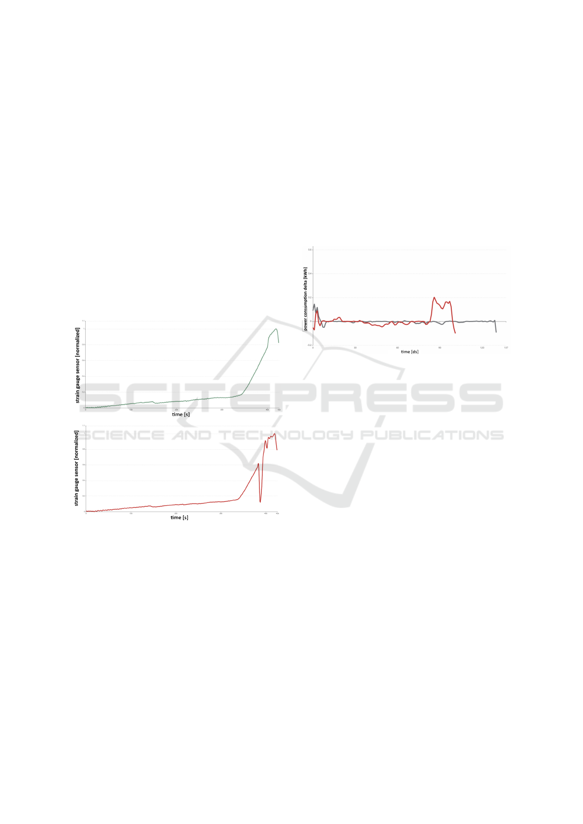
Figure 1: Exemplary data of the deep drawing use case.
Top: good stroke of the deep drawing tool - a smooth pro-
gression of strain gauge sensor data. Bottom: bad stroke
of the tool - sudden drop of the values of the gauge sensor
caused by a crack.
Deep drawing is a sheet metal forming process in
which a sheet metal blank is radially drawn into a
forming die by the mechanical action of a punch (DIN
8584-3, 2003). Our data comes from a deep drawing
tool that is equipped with a strain gauge sensor at the
blank holder of the tool. The sensor contains a strain
sensitive pattern that measures the mechanical force
exerted by the punch to the bottom part of the tool.
The deformation of the metal during a stroke some-
times causes cracks to appear, which cause a brief loss
of pressure to the bottom of the tool and thus a sudden
drop in the values of the strain gauge sensor. Figure
1 shows two example sensor value curves: a curve
of a good stroke at the top where the progression of
the sensor values is smooth and no crack occur and a
curve of a bad stroke at the bottom where there ap-
pears a sudden drop in sensor values. Data scientists
analyzed the sensor data and identified three different
classes of curves: clean, small crack and large crack.
They trained a classifier on the labeled data set and
achieved an accuracy of 94.11% (Meyes et al., 2019).
3.2 Conveyor Switch Use Case
Figure 2: Exemplary data of the conveyor switch use case.
Black: normal power consumption with slight noise at the
beginning and end of the switch’s setting cycle. Red: nor-
mal power consumption in the beginning but high power
consumption in the end which indicates that one of the lock-
ing mechanisms of the switch is jammed.
The second use case considers the course of the power
consumption of several electric motors which adjust
switches in a production line to directs components
to their predetermined workstation. A setting cycle
of a switch operates in three steps: first the switch is
unlocked, then the motor moves the switch, and fi-
nally the switch is locked in the new position. Since
the base power consumption of the motors is differ-
ent for each individual motor, delta values to the ref-
erence curve of the respective motor are considered
here. The delta power consumption curves can be
used to determine the pressure that the respective mo-
tor exerts on the mechanical switch. Thereby, slug-
gish or jammed switches can be detected and main-
tenance cycles can be optimized. Figure 2 shows two
example curves: a black curve that shows usual power
consumption with slight noise in the beginning and
end of the switch’s setting cycle and a red curve that
shows normal power consumption at the start but high
power consumption deviation at the end of the setting
cycle which indicates that one of the locking mecha-
nisms of the switch is jammed and needs to be main-
tained. Data scientists analyzed the sensor data and
identified five different classes of curves: okay, slug-
gishness during unlocking, sluggishness during lock-
ICEIS 2021 - 23rd International Conference on Enterprise Information Systems
586
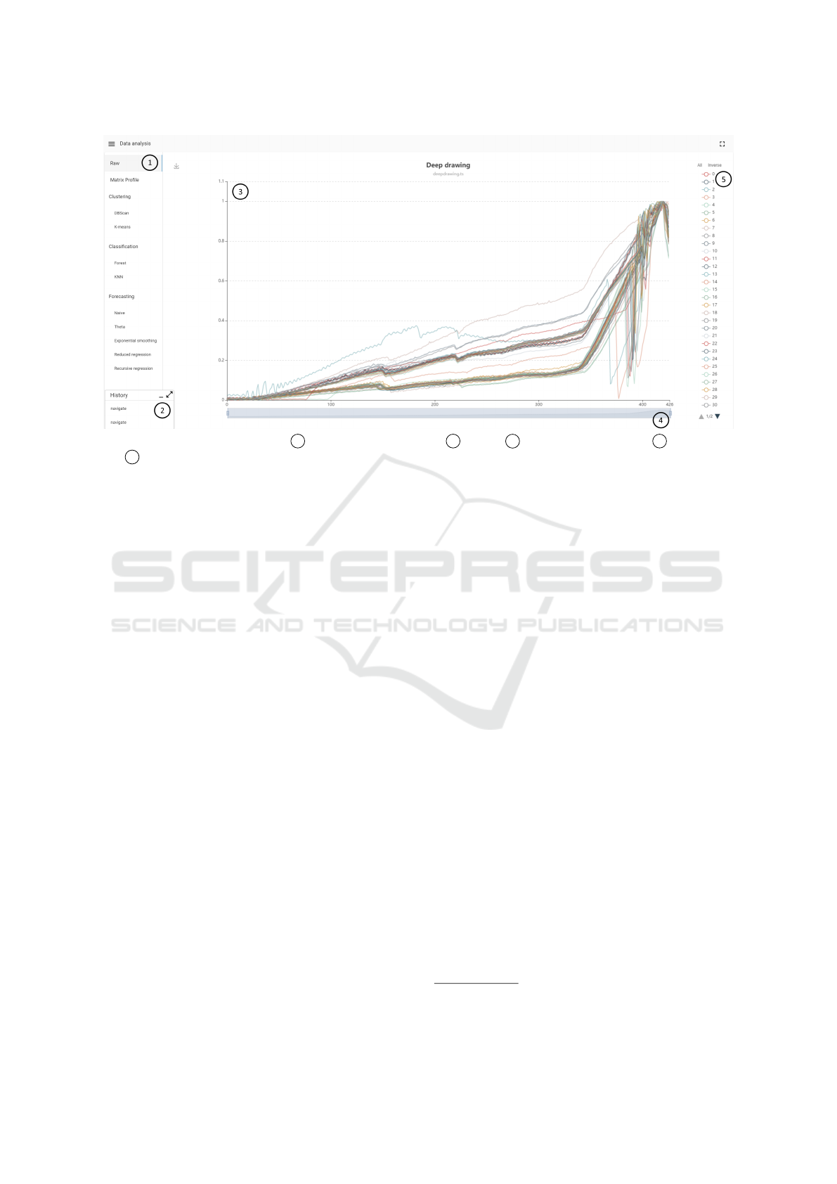
Figure 3: Initial raw data view with 1 navigation of all methods, 2 history, 3 raw view of sensor data, 4 x-axis zoom
and 5 legend.
ing, sluggishness during locking and unlocking and
jammed switch. They trained a classifier on the la-
beled data set and achieved an accuracy of 84.86%.
3.3 Requirements
We collected the requirements for our tool from inter-
views with experts from both use cases presented in
the previous sections. During the development pro-
cess, feedback from experts was repeatedly sought as
purposed by the user-centered design principle (Abras
et al., 2004). The following is a list of the most im-
portant requirements for our system prioritized by the
experts:
1. General. The system shall be capable of visu-
alizing a sensor data set containing an arbitrary
number of curves.
2. Exploration. The system shall provide methods
to explore the data set to find interesting patterns
and trends. The system needs to provide means to
filter data ranges and select subsets of the whole
data set to analyze specific parts of the data set.
3. Labeling. The system shall offer methods to find
similar series e.g. that have a specific discovered
pattern and allow its user to label those efficiently
i.e. not force the user to label all series individu-
ally.
4. Classification. At each step of the labeling pro-
cess the system shall provide functions to run
a classification algorithm and review its perfor-
mance.
5. Navigation. The system must enable its users to
compare and revisit previously visited views i.e.
method, parametrization and filtering.
3.4 Visual Analytics Tool
In this section we discuss the visualizations and meth-
ods provided by our VA tool
1
. Our implementation
mainly uses the echarts
2
library in the frontend for
the presentation of the charts, partly extended by own
components, and in the backend the Python libraries
STUMPY (Law, 2019), sktime (L
¨
oning et al., 2019),
scikit-learn (Pedregosa et al., 2011) and tslearn (Tave-
nard et al., 2020).
3.4.1 Exploration
Our tool initially only supports uploading data in ts
format, which is used by the sktime library. This for-
mat allows to handle any number of already labeled
time series as specified by our requirements. After
uploading, the user first lands on the view shown in
Figure 3. This view contains a sidebar to navigate be-
tween methods, the history described later in Section
3.4.5 and a raw view of all sensor curves in the up-
loaded data set. To explore parts of the data, the value
range of the x-axis can be restricted and individual
sensor curves can be filtered via the legend. The nav-
igation menu and the history can be toggled or min-
imized and are hidden for better visibility of method
1
Latest version available at: http://sensor-analysis.com/
2
https://echarts.apache.org/
Visual Analytics for Industrial Sensor Data Analysis
587
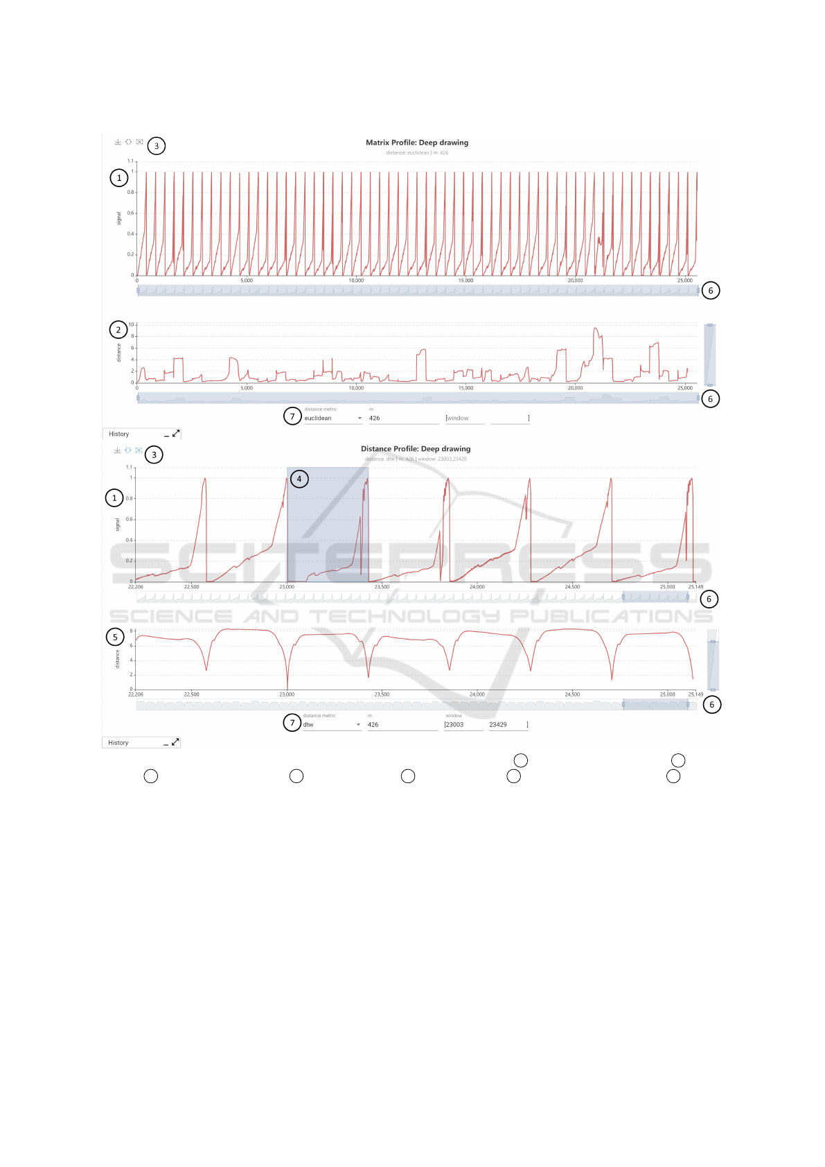
Figure 4: Combined Matrix Profile (top) and Distance Profile (bottom) view with 1 concatenated sensor signal, 2 Matrix
Profile, 3 window selection tools, 4 selected window, 5 Distance Profile 6 connected axis zooms and 7 method
parameters.
views in the following figures.
Furthermore, a visualization for the Matrix Pro-
file and Distance Profile has been implemented for
further exploration of the data. Both methods have
proven to be effective for the discovery of anoma-
lies and recurring patterns in time series and require
in their initial implementation only one parameter to
specify the used window length. In its initial form,
the view shows the original signal by concatenating
all sensor data into a single time series. Below the sig-
nal the calculated matrix profile is plotted. The x-axis
can again be restricted to arbitrary ranges. Both charts
are connected with each other, so that the restriction is
always applied synchronously to both charts and the
x-axis values always align. To display the Distance
Profile of a specific window we have integrated the
possibility to select a window either with the mouse
or by entering an interval. The chart below the signal
will then change to the Distance Profile of the selected
window. Figure 4 shows examples of Matrix and Dis-
tance Profile for the deep drawing use case. Notice
how a human can visually identify sections (e.g. x:
ICEIS 2021 - 23rd International Conference on Enterprise Information Systems
588
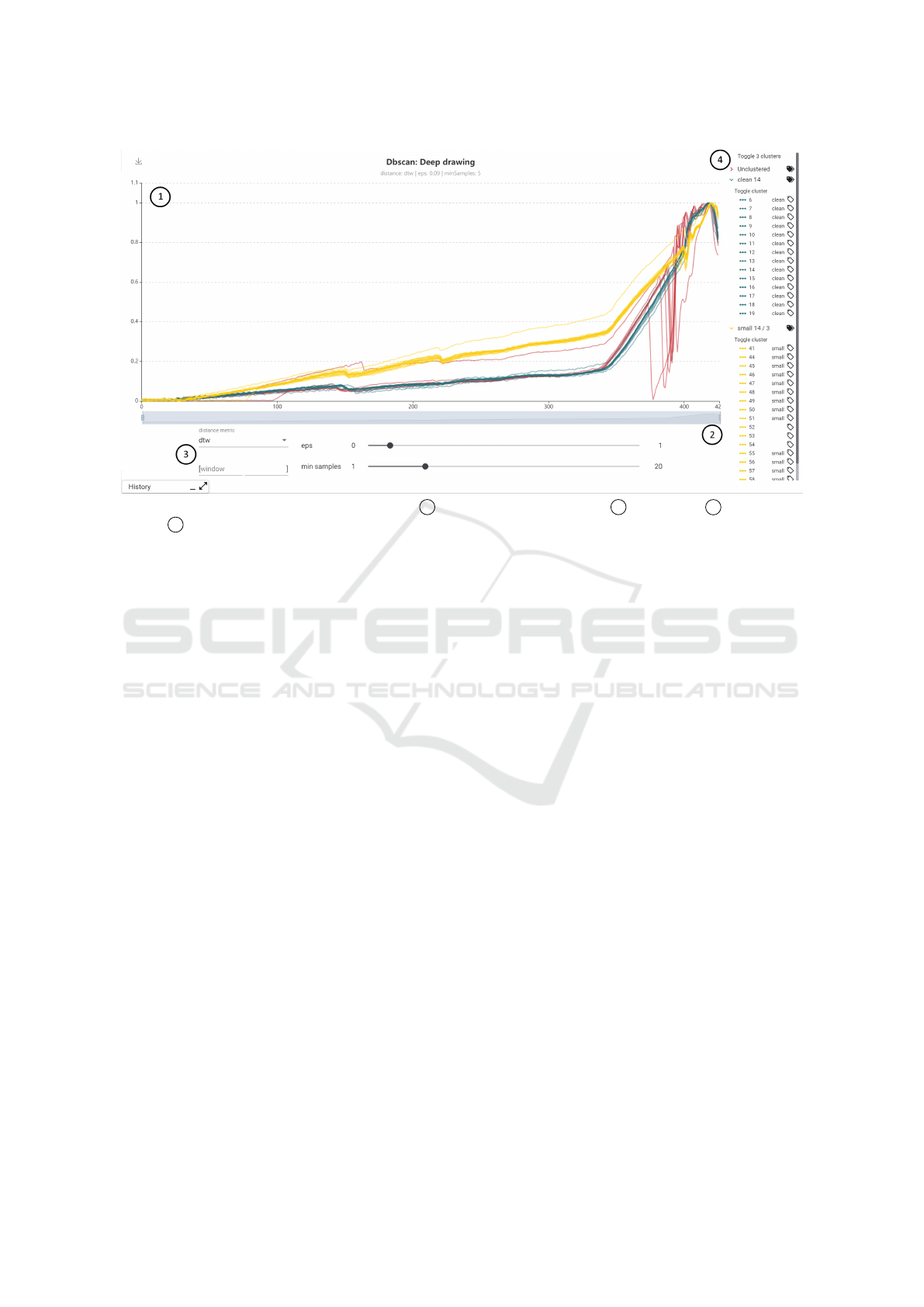
Figure 5: Clustering view example for DBSCAN with 1 sensor data colored by cluster, 2 x-axis zoom, 3 method param-
eters and 4 custom legend to select and label single series and clusters.
21k - 22k) where abnormal strain gauge sensor pat-
terns occur.
3.4.2 Clustering and Labeling
For our third requirement of a method to identify and
label similar sensor curves, we have designed a view
for clustering and labeling sensor data. As cluster-
ing methods we have implemented DBSCAN as rep-
resentative for density-based clustering and k-means
as representative for distance-based clustering. The
respective views differ only in the parameterization
of the methods (DBSCAN: eps and minSamples; k-
means: k). In addition, for both methods the used
distance metric can be selected from a list (euclidean,
DTW, soft-DTW, FastDTW). Furthermore, during the
development of this view we have found that it is
sometimes advantageous to limit clustering to a cer-
tain area of the sensor data set. For example, by set-
ting the window parameters you can limit the cluster-
ing in the deep drawing use case to the area where
cracks normally occur (i.e. [350, 415]) which im-
proves the resulting clusters. To enable users to label
the data efficiently, we have developed a custom leg-
end. The legend shows the sensor curves aggregated
by clusters. All as well as individual clusters can be
toggled completely. The colors in the legend corre-
spond to the colors in the sensor data display. Next to
the clusters and the individual sensor curve we have
added a label icon. Clicking on this icon opens a small
dialog where the user can assign a label. Labels that
have already been assigned to other curves are sug-
gested in an auto-completion. If the label is assigned
to a cluster, all sensor curves within the cluster will
be labeled, otherwise only the selected curve will be
labeled. The assigned label is then displayed in text
form in the legend. In addition, the name of the cluster
changes based on the majority assigned labels within
the cluster. With this design, we intend to enable a
user to quickly label large parts of the data by assign-
ing labels to clusters and then to refine labels of indi-
vidual sensor curves if clustering assignment and se-
ries class do not match. Figure 5 shows an example
clustering and labeling view for the deep drawing use
case.
3.4.3 Classification
To see how well a classifier works on the already la-
beled data according to requirement four, we have im-
plemented a random forest adaptation for time series
(Deng et al., 2013) and k-nearest neighbors (KNN)
classification methods. As input data the respective
algorithm takes all already labeled data. These are di-
vided into training and test data set by setting the test
size. After the classifier has been trained and predic-
tions for the test data set were created, the user can
evaluate the result in the view. The view shows the
sensor data of the test data, a legend with true and
predicted labels to filter the data and a confusion ma-
trix. This allows the user to evaluate which classes are
difficult to distinguish from each other and to decide
if further labels for these classes are needed. Further-
more the current accuracy score is displayed above
Visual Analytics for Industrial Sensor Data Analysis
589
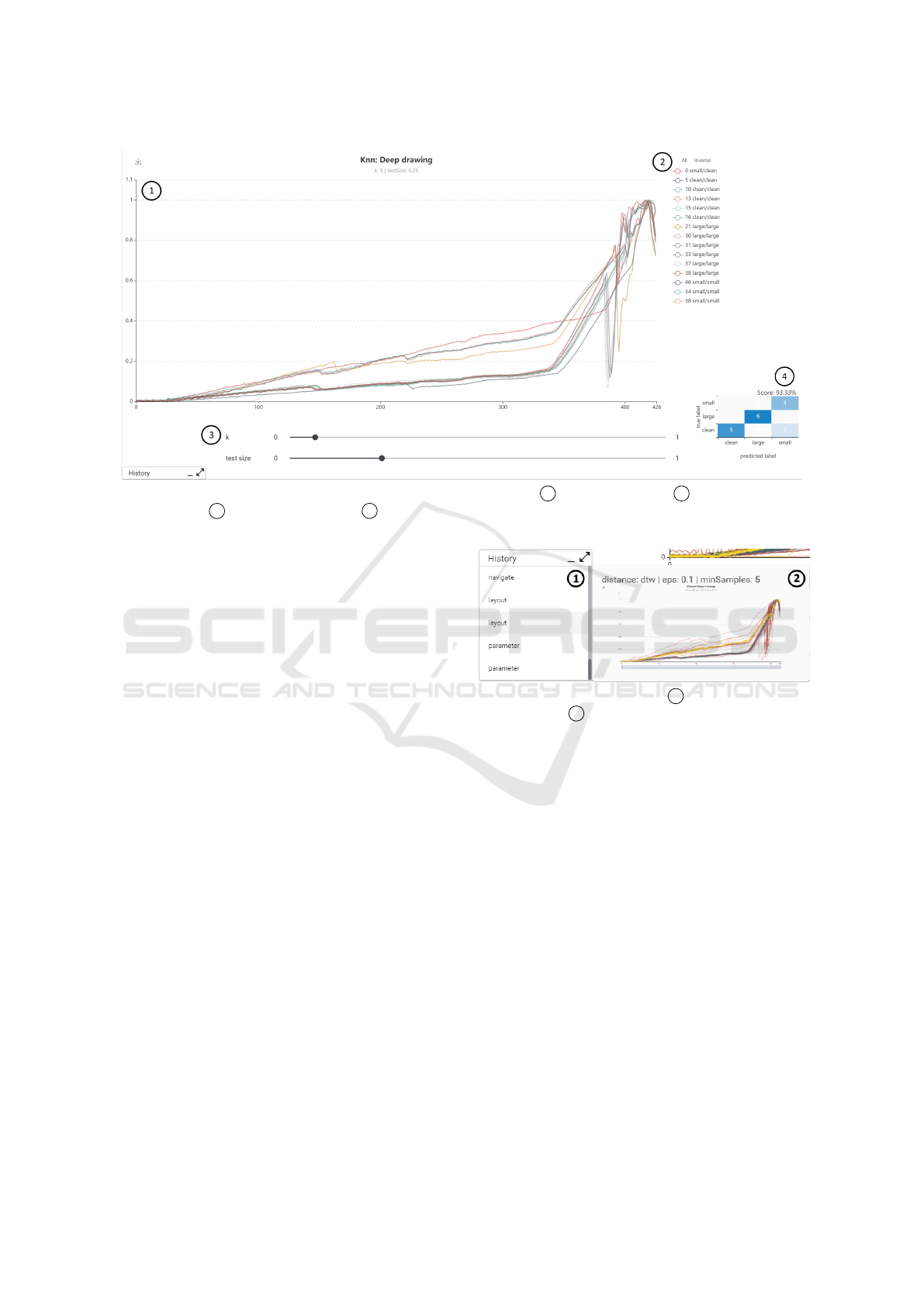
Figure 6: Classification view example for k-nearest neighbors (KNN) with 1 sensor test data set, 2 legend with true and
predicted labels, 3 method parameters and 4
confusion matrix with accuracy score.
the matrix. Figure 6 shows an example classification
view for the deep drawing use case.
3.4.4 Forecasting
Besides classification, forecasting is a frequently used
method in the field of time series analysis. Although
this is not indicated by the requirements, we have im-
plemented a view for forecasting sensor values be-
cause we wanted to test if this method was still useful
for our two classification use cases during our user
study (Section 4). In this view, the sensor curves are
concatenated similar to the Matrix Profile view and an
area is selected for forecasting. The forecasted values
are then plotted against the actual values.
3.4.5 History
To complete the last requirement of the navigation
options, we have implemented an interaction history
so that users can easily retrace their previous steps
and, if necessary, jump back to views they have al-
ready visited. For this purpose, our tool records all
interactions that have been performed, which are di-
vided into the categories navigation (e.g. navigate to
a method view), layout (e.g. filter via legend or ap-
ply x-axis zoom) and parameterization (e.g. change
parameters of method). The underlying data model
also contains information about the time of execution
in the changed parameters, so that the time between
interactions can be tracked. The history also stores
the settings of the resulting views (method, layout and
parameters) and a preview image. Figure 7 shows an
Figure 7: Analysis history with 1 history overview and
navigation, and 2 parameters and preview of the currently
hovered history item.
example of a recorded history. Hovering the list of
recorded interactions will show parameters and a pre-
view of the resulting view, whereas clicking an item
will navigate the user to the resulting view.
4 EVALUATION
To evaluate the usefulness of our tool in comparison
to detailed data analyses performed by data scien-
tists, we performed a qualitative user study to explore
strengths and weaknesses of the current implementa-
tion. In this section we describe the study design and
discuss the results.
4.1 Study Design
For this study we used a subset of 60 data points
per use case described in Section 3.1 to reduce the
time and complexity for the study. The deep draw-
ICEIS 2021 - 23rd International Conference on Enterprise Information Systems
590

ing data set contained an equal amount of data for all
classes (20 clean / 20 small cracks / 20 large cracks).
The conveyor switch data set was reduced to contain
only data of a single switch to reduce the complex-
ity of the use case and, due to the number of data
contained, an unequal distribution between classes (7
okay / 7 sluggishness during unlocking / 6 sluggish-
ness during locking / 31 sluggishness during locking
and unlocking / 10 jammed switch). Both data sets
were made available to the participants without la-
bels. The labels, which were originally created by
professional data scientists, were later used as refer-
ence values to assess the participant’s performance
with the tool. For our study, we recruited 6 partic-
ipants with technical background. Before the study,
we asked them which tools they were regularly using
for data analysis and if they were familiar with the
distance metrics (euclidean, DTW) and methods (Ma-
trix/Distance Profile, clustering, classification, fore-
casting) that our tool provides. All participants were
familiar with distance metrics and methods with ex-
ception of Matrix/Distance Profile that only three out
of six participants knew and all of them would typi-
cally use pure Python for sensor data analysis. Then,
participants worked both use cases, starting with the
deep drawing use case. During the study we used the
think aloud method (Van Someren et al., 1994) and
tracked interactions performed by the participants us-
ing the history described in Section 3.4.5. For each
use case we first described the use case and asked the
participants to work the following tasks using our VA
tool while thinking aloud:
1. Describe the characteristics of the data. How
many classes do you think exist in the data set?
2. Label the data according to the classes.
3. What is the expected performance of a classifier
trained on the labeled data?
After each session, we asked the participants to give
us detailed feedback on their experience with the tool
along the following questions:
1. How do you estimate your own performance with
the tool?
2. If you have experience with Python libraries for
data analysis: Would you prefer Python libraries
over the tool? For which of the tasks?
3. Did you miss any functionality?
4. Which features did you find particularly useful?
4.2 Results
Figure 8 shows a summary of the results of our study.
Below each use case, the number of the respective
Figure 8: Summary of study results.
participant and the number of classes identified by
him or her for the use case can be seen. For the
deep drawing use case all participants were able to
produce the original three classes. For the conveyor
switch use case the participants identified between 4
and 5 classes. To evaluate the assigned labels, we
have mapped semantically matching labels to each
other. Accordingly, the chart in the figure shows the
match of the assigned class labels with the labels orig-
inally assigned by the data scientists. The deep draw-
ing use case shows small deviations from 1 to 3 curves
that were labeled differently. The conveyor switch use
case shows 5 to 15 differences. Furthermore, the val-
ues of the achieved accuracy of the tested classifiers
can be seen. The participants each used three quarters
of the data to train the classifier and one quarter of the
existing data as a test data set. For the deep drawing
use case the participants achieved an average accu-
racy of 88.88% (orig. 94.11%) and for the conveyor
switch use case 84.47% (orig. 84.86%). This also cor-
responds with the self-assessment of the participants,
who were more convinced of their performance in the
deep drawing use case than in the conveyor switch use
case.
To solve the tasks, participants mostly used the
raw view for exploration, DBSCAN for clustering and
labeling and random forest classifier to test classifica-
tion. Matrix Profile and Distance Profile were only
used by half of the participants and the forecasting
methods were not used at all. Through the history of
our tools we were also able to track frequent inter-
action patterns of the participants. A typical interac-
tion pattern is that the participants zoom into individ-
ual sections of the data during exploration and look at
those section for a longer time. For clustering and la-
beling, they first select the method and then adjust the
layout and parameters in quick iterations. The classi-
fier was always tested only at the very end.
Overall the participants liked our tool. When they
were asked which tasks they would prefer to perform
Visual Analytics for Industrial Sensor Data Analysis
591

with our tool instead of Python, they mentioned data
exploration and clustering and labeling. No function-
ality was missed for the tasks either. There were
many suggestions to add to the existing functional-
ity. The participants especially wanted the integration
of the assigned labels into the views for exploration,
especially Matrix Profiles, in order to use them for
the refinement of the labels. In addition, participants
wanted to be able to mark individual sensor curves in
the clustering view to make it easier to track which
cluster they are assigned to when the parameters are
changed. The participants especially liked the possi-
bility to retrace their own steps by using the history.
Nevertheless, none of the participants could imagine
to do without Python. The biggest concern was that
our tool does not integrate well into the workflow with
other systems and currently only supports the use of
data in ts format, for example.
4.3 Discussion
Our study indicates that our tool is well suited for
interactive exploration, labeling and classification of
industrial sensor data. From this we deduce that pro-
viding dedicated interactive views can be a useful ad-
dition to new analysis algorithms and provides bet-
ter accessibility in industrial environments. Overall,
our participants were able to achieve good results that
were only slightly less accurate than the results of the
original analyses of the data scientists. The results
for the conveyor switch use case differ more from the
original results. We attribute this to the higher com-
plexity of the use case which also shows in the dif-
ferent number of classes identified. The fact that the
corresponding classifiers performed well despite the
supposedly less accurate labels is probably also due
to the fact that the original labels, that we used as ref-
erence, were not 100% accurate. This is also indi-
cated by the lower accuracy of the reference classifier
trained by a data scientist.
On the basis of the analysis of the interactions per-
formed during the study, we also found that the fast
iteration of parameterizations shows the strengths of
interactive visual analytics tools, since here the qual-
ity of the results can be quickly interpreted visually
by humans. This is particularly evident in clustering
methods, where a visual interpretation of the clus-
ter results and the subsequent labeling were consid-
ered very useful by the participants. We expected the
classifiers to be tested more often during the label-
ing phase, but it seems that the participants worked
through the tasks one by one. Matrix and Distance
Profile were used less than we expected. We attribute
this mainly to the fact that not all study participants
were familiar with the methods. The forecasting view
was not used at all but we also have not included a
corresponding task in our study design. Therefore its
usefulness remains an open research question. The
extensive feedback shows that the participants are in-
terested in the further development of the tool, but
also that the development is not yet finished and that
there are many possible improvements. We hypothe-
size that our tool is also generally applicable to other
domains with time series data. However, we have not
tested this. Though, we find that it is more difficult
to integrate such a tool well into the whole process
of data analysis (i.e. from integration to making the
data usable e.g. through deep learning), as it means a
change between different applications and workflows
for the user.
5 CONCLUSION AND OUTLOOK
In this paper we presented a Visual Analytics ap-
proach for interactive analysis of industrial sensor
data by process experts. We first recorded require-
ments for our tool using two real world examples, de-
signed and implemented the tool itself, and evaluated
the current version using a qualitative user study. The
results of the study indicate that our tool is well suited
for the interactive exploration, analysis, labeling and
estimation of a classifier. The strengths of the interac-
tive analysis showed up in the study especially in the
fast parameterization of methods and visualization of
the corresponding results. The participants saw the
biggest challenge for the tool in integrating well with
other systems.
Therefore, we plan to extend our tool to cover a
complete data analysis process from data integration
and analysis up to utilization of applied labels by deep
learning methods. To do so, we will research solu-
tions for the accessible integration of sensor data and
for the direct connection of deep learning processes
through e.g. deep learning toolboxes with our tool. In
addition, we received much valuable feedback from
the study participants for the further development of
the already existing functionality. We also see great
potential in the utilization of the data recorded by the
interaction history, which process experts record dur-
ing their analysis. This interaction data provides us
with information about the experts’ sensemaking pro-
cess and thus also indirectly about their understanding
of the analyzed data.
ICEIS 2021 - 23rd International Conference on Enterprise Information Systems
592

REFERENCES
Abras, C., Maloney-Krichmar, D., Preece, J., et al. (2004).
User-Centered Design. Bainbridge, W. Encyclope-
dia of Human-Computer Interaction. Thousand Oaks:
Sage Publications, pages 445–456.
Ali, M., Alqahtani, A., Jones, M. W., and Xie, X. (2019).
Clustering and Classification for Time Series Data in
Visual Analytics: A Survey. IEEE Access, pages
181314–181338.
Batch, A. and Elmqvist, N. (2018). The Interactive Vi-
sualization Gap in Initial Exploratory Data Analy-
sis. IEEE Transactions on Visualization and Com-
puter Graphics, pages 278–287.
Bernard, J., Zeppelzauer, M., Sedlmair, M., and Aigner, W.
(2018). Vial: a unified process for visual interactive
labeling. The Visual Computer, pages 1189–1207.
Cuturi, M. and Blondel, M. (2017). Soft-DTW: a differen-
tiable loss function for time-series. In 34th Interna-
tional Conference on Machine Learning, pages 894–
903.
Deng, H., Runger, G., Tuv, E., and Vladimir, M. (2013). A
time series forest for classification and feature extrac-
tion. Information Sciences, pages 142 – 153.
DIN 8584-3 (2003). Manufacturing processes forming un-
der combination of tensile and compressive conditions
- Part 3: Deep drawing; Classification, subdivision,
terms and definitions. Beuth Verlag, Berlin.
Eirich, J., J
¨
ackle, D., Schreck, T., Bonart, J., Posegga,
O., and Fischbach, K. (2020). VIMA: Modeling and
Visualization of High Dimensional Machine Sensor
Data Leveraging Multiple Sources of Domain Knowl-
edge. IEEE Transactions on Visualization and Com-
puter Graphics.
Granger, C. W. J. and Newbold, P. (2014). Forecasting eco-
nomic time series. Academic Press.
Hamilton, J. D. (2020). Time Series Analysis. Princeton
university press.
Holmes, G., Donkin, A., and Witten, I. H. (1994). Weka:
A machine learning workbench. In IEEE Australian
New Zealnd Intelligent Information Systems Confer-
ence, pages 357–361.
Hu, R., Granderson, J., Auslander, D., and Agogino, A.
(2019). Design of machine learning models with do-
main experts for automated sensor selection for en-
ergy fault detection. Applied Energy, pages 117–128.
Jeschke, S., Brecher, C., Meisen, T.,
¨
Ozdemir, D., and Es-
chert, T. (2017). Industrial internet of things and cy-
ber manufacturing systems. In Industrial internet of
things, pages 3–19. Springer.
Keim, D., Andrienko, G., Fekete, J.-D., G
¨
org, C., Kohlham-
mer, J., and Melanc¸on, G. (2008). Visual analytics:
Definition, process, and challenges. In Information
visualization, pages 154–175. Springer.
Law, S. M. (2019). STUMPY: A Powerful and Scalable
Python Library for Time Series Data Mining. The
Journal of Open Source Software, page 1504.
L
¨
oning, M., Bagnall, A., Ganesh, S., Kazakov, V., Lines, J.,
and Kir
´
aly, F. J. (2019). sktime: A Unified Interface
for Machine Learning with Time Series. In Workshop
on Systems for ML at NeurIPS 2019.
Meyes, R., Donauer, J., Schmeing, A., and Meisen, T.
(2019). A Recurrent Neural Network Architecture for
Failure Prediction in Deep Drawing Sensory Time Se-
ries Data. Procedia Manufacturing, pages 789 – 797.
47th North American Manufacturing Research Conf.
Pedregosa, F., Varoquaux, G., Gramfort, A., Michel, V.,
Thirion, B., Grisel, O., Blondel, M., Prettenhofer, P.,
Weiss, R., Dubourg, V., et al. (2011). Scikit-learn:
Machine learning in Python. the Journal of machine
Learning research, pages 2825–2830.
Pfeiffer, A., Bausch-Gall, I., and Otter, M. (2012). Proposal
for a Standard Time Series File Format in HDF5. 9th
International MODELICA Conf., pages 495–505.
Psuj, G. (2018). Multi-sensor data integration using deep
learning for characterization of defects in steel ele-
ments. Sensors, page 292.
Ronao, C. A. and Cho, S.-B. (2016). Human activity recog-
nition with smartphone sensors using deep learning
neural networks. Expert systems with applications,
pages 235–244.
Sacha, D., Stoffel, A., Stoffel, F., Kwon, B. C., Ellis, G., and
Keim, D. A. (2014). Knowledge Generation Model
for Visual Analytics. IEEE Transactions on Visual-
ization and Computer Graphics, pages 1604–1613.
Sakoe, H. and Chiba, S. (1978). Dynamic programming
algorithm optimization for spoken word recognition.
IEEE transactions on acoustics, speech, and signal
processing, pages 43–49.
Salvador, S. and Chan, P. (2007). FastDTW: Toward Ac-
curate Dynamic Time Warping in Linear Time and
Space. Intelligent Data Analysis, pages 561–580.
Tavenard, R., Faouzi, J., Vandewiele, G., Divo, F., Androz,
G., Holtz, C., Payne, M., Yurchak, R., Rußwurm, M.,
Kolar, K., and Woods, E. (2020). Tslearn, A Machine
Learning Toolkit for Time Series Data. Journal of Ma-
chine Learning Research, pages 1–6.
Van Someren, M., Barnard, Y., and Sandberg, J. (1994). The
think aloud method: a practical approach to modelling
cognitive. London: AcademicPress.
Wu, W., Zheng, Y., Chen, K., Wang, X., and Cao, N. (2018).
A visual analytics approach for equipment condition
monitoring in smart factories of process industry. In
2018 IEEE Pacific Visualization Symposium, pages
140–149.
Xu, P., Mei, H., Ren, L., and Chen, W. (2016). ViDX:
Visual diagnostics of assembly line performance in
smart factories. IEEE transactions on visualization
and computer graphics, pages 291–300.
Yeh, C.-C. M., Zhu, Y., Ulanova, L., Begum, N., Ding, Y.,
Dau, H. A., Silva, D. F., Mueen, A., and Keogh, E.
(2016). Matrix profile I: all pairs similarity joins for
time series: a unifying view that includes motifs, dis-
cords and shapelets. In IEEE 16th international con-
ference on data mining, pages 1317–1322.
Zhou, F., Lin, X., Liu, C., Zhao, Y., Xu, P., Ren, L., Xue,
T., and Ren, L. (2019). A survey of visualization for
smart manufacturing. Journal of Visualization, pages
419–435.
Visual Analytics for Industrial Sensor Data Analysis
593
