
Word-sized Visualizations for Exploring
Discussion Diversity in Social Media
Franziska Huth
1 a
, Tanja Blascheck
1 b
, Steffen Koch
1 c
, Sonja Utz
2 d
and Thomas Ertl
1 e
1
University of Stuttgart, Germany
2
Leibniz-Institut f
¨
ur Wissensmedien T
¨
ubingen and University of T
¨
ubingen, Germany
Keywords:
Word-sized Visualization, Visualization of Categories, Social Media Analysis.
Abstract:
In this paper, we explore the design space of word-sized visualizations—small graphics, usually the same
size as a word, that visualize data in or related to a text—for displaying and exploring categories in social
media feeds such as Twitter streams. Social media contributions are typically microposts, which allow us
to attach word-sized visualizations to show category assignment, diversity, or development. We consider
and combine word-sized visualizations made up of basic marks and visual variables, existing word-sized
visualization concepts, as well as large text visualizations. In an application example we show how word-
sized visualizations can evince context changes within a discussion on Twitter and reveal topic diversity.
1 INTRODUCTION
Context change is a common phenomenon in social
media—text content, photos, and videos are often torn
out of context or changed while sharing. This re-
quires extreme caution when reading or sharing digi-
tal content in times of “fake news” and “social bots”
(Vosoughi et al., 2018). Especially because the gate-
keeping influence of journalists has diminished, con-
tent is moderated less and less while it is spreading
at an ever increasing rate. To the purpose of help-
ing people investigate context change as well as dis-
cussion diversity within (controversial) discussions in
social media, usually large visual analytics systems
are proposed. Often the target audience of visual an-
alytics systems are experts, as they give a top-down
overview of data and involve a learning phase.
Typically, social media feeds compile a number of
microposts, e.g., Twitter messages, which are usually
short and there is not much space for larger visualiza-
tions. Therefore, these microposts can be enriched by
placing word-sized visualizations, i.e., small visual-
izations of word size, next to them. We investigate the
design space of word-sized visualizations for convey-
a
https://orcid.org/0000-0003-1393-5641
b
https://orcid.org/0000-0003-4002-4499
c
https://orcid.org/0000-0002-8123-8330
d
https://orcid.org/0000-0002-7979-3554
e
https://orcid.org/0000-0003-4019-2505
ing discussion diversity of a discourse in a social me-
dia feed, helping people understand context change
and observe how a discourse changes over time.
Our goal is to give an overview about discussion
diversity and embed this information into each micro-
post, to enable a person to place this micropost into a
larger context without having to leave the social me-
dia feed. Our approach permits a person to investigate
the driving factors within a discussion, inspect con-
text change at a glance within a social media feed, ob-
serve how diverse the discourse is during a discussion,
examine where in that discourse individual contribu-
tions are located, as well as follow the development
and change of a discussion over time. This can help
people realize how easily content on social media is
placed out of context or in a different context.
We explore which word-sized visualizations are
suitable for social media data. We assume that the
individual microposts within a social media feed can
be categorized and each micropost can be assigned to
one specific category. For example, Twitter messages
from a political campaign could be labeled based on
the topics discussed (e.g., education, climate change,
economy, pandemic). The word-sized visualizations
we imagine show the category for each micropost as
well as the larger context it is discussed in.
We use a systematic approach by exploring poten-
tial word-sized visualizations made from scratch by
exploiting the basic marks and visual variables from
visualization design. In addition, we look at the exist-
256
Huth, F., Blascheck, T., Koch, S., Utz, S. and Ertl, T.
Word-sized Visualizations for Exploring Discussion Diversity in Social Media.
DOI: 10.5220/0010328602560265
In Proceedings of the 16th International Joint Conference on Computer Vision, Imaging and Computer Graphics Theory and Applications (VISIGRAPP 2021) - Volume 3: IVAPP, pages
256-265
ISBN: 978-989-758-488-6
Copyright
c
2021 by SCITEPRESS – Science and Technology Publications, Lda. All rights reserved

ing collection of word-sized visualizations (Latif and
Beck, 2018) and discuss how they can be adapted to
our needs. Last, we examine the suitability of large
visualizations and visual analytics systems available
for text visualizations to investigate if the visual el-
ements used in these visualizations can be scaled to
word size. With an application example, we demon-
strate how different word-sized visualizations are in-
tegrated into a Twitter stream and describe what peo-
ple can observe about the diversity of the discussion.
2 RELATED WORK
We discuss the related work of the research areas that
are most relevant to this paper—how discourse in so-
cial media can be analyzed with the help of visualiza-
tions and visual analytics systems, as well as design
of word-sized visualizations and their applications.
2.1 Visual Analysis of Discourse in
Social Media
For visualizing topics, sentiment, or discourse, as well
as their development in social media, in contrast to
our bottom-up approach usually top-down visual an-
alytics systems are proposed. Several versions of vi-
sualizing topic development as streams exist (Cuenca
et al., 2018; Havre et al., 2002; Xu et al., 2013), with
variations such as adding keywords and glyph mark-
ers for critical events (Cui et al., 2011), or grouping by
sub-topics (Heimerl et al., 2016a). When geographi-
cal data is available or extracted from the text corpus,
in addition to the categorical data that we use, spatio-
temporal visualizations can be implemented, for ex-
ample, chart overlays on a map (Bosch et al., 2013;
He and Chen, 2016) to show topics in certain regions.
Due to their visual complexity, however, those are
more difficult to scale to word size and might require
some abstraction.
For the task of analyzing discourse in social media
or blogs, Heimerl et al. (2016b) and Kim et al. (2017)
use point clouds to show sub-groups of topics in two-
dimensional arrangements, while Brandes and Cor-
man (2016) and Liu et al. (2014) employ node-link
diagrams for displaying how topics are connected. El-
Assady et al. (2018) contribute a timeline that is con-
nected with arcs to show conversation threads. How-
ever, these works all focus on different aspects of data
from social media feeds than we do, e.g., connections
between individual social media contributions on a
topic, or the back-and-forth of a discussion.
To track the progression of a discourse, El-Assady
et al. (2016) place speakers of a conversation in one
of multiple topic-corners of a circle, with trails across
the circle to signal which topic they moved from
last. The visualization is interactive and has differ-
ent small visual elements, again designed as a top-
down approach and while effective for their use-case,
not transferable to our data. Circular graphs are fur-
ther used by Liu et al. (2016) and Xu et al. (2017)
to visualize opinion in the center and topics arranged
around it. However, in general a circular graph is not
well suited as a word-sized visualization because of
its small aspect ratio. When scaled to word size, it
becomes narrow and details are not distinguishable.
Coordinated views combine several of the above
visual elements, e.g., by Lu et al. (2018). In con-
trast, our goal is to show one or two word-sized vi-
sualizations instead of multiple visualizations at the
same time.
2.2 Word-sized Visualizations
The first versions of word-sized visualizations were
introduced by Tufte (2006), who called them
sparklines. Building on that, Latif and Beck (2018)
as well as Goffin et al. (2014, 2017) discuss design
considerations for word-sized visualizations in gen-
eral, which we expand on in this paper, while Heer
et al. (2009) explore options for reducing the height of
line charts to fit text size. In addition to defining de-
sign aspects, we explore in this paper which of these
word-sized visualizations are suitable for visualizing
discussion diversity within a larger discussion. Gof-
fin et al. (2015, 2020) investigate how word-sized vi-
sualizations affect the reading behavior of people and
present various interaction techniques.
Supplementary to those general considerations,
several usage scenarios for word-sized visualizations
have been proposed, like visualizing eye tracking
data (Beck et al., 2017), code understanding and
code quality visualization (Hoffswell et al., 2018),
and better understanding of scientific texts (Beck and
Weiskopf, 2017). VIS author profiles (Latif and Beck,
2019) and sparkClouds (Lee et al., 2010) focus on
using word-sized visualizations for development over
time. However, none of those employ word-sized vi-
sualizations for social media data.
2.3 Applications
Real-world applications of word-sized visualizations
include visualizing stock price development with
spark lines, as introduced by Tufte (2006) ,
or analyzing soccer matches as in Perin et al. (2013).
Word-sized graphics that are not data driven, and thus
less interesting for our paper, are widely used. Those
Word-sized Visualizations for Exploring Discussion Diversity in Social Media
257

include emoticons , especially in social media
contributions, and icons, for example, for showing
readers which keys to press when giving software re-
lated instructions
Ctrl
+ +
Esc
.
3 DESIGN SPACE
Before discussing word-sized visualizations embed-
ded into microposts of social media feeds, we de-
scribe the data source we consider, the structure of the
data, specific design aspects, tasks, and requirements
that our word-sized visualizations need to fulfill and
to confine our design space.
3.1 Data Source
The underlying data source for the word-sized vi-
sualizations are social media feeds with microposts,
such as Twitter
1
messages, and social news aggre-
gation platforms like Reddit
2
, Instagram
3
stories, or
Wikipedia
4
articles. We define a corpus as a subset of
such a social media feed based on a common connec-
tion, for example, a hashtag, a community, an event,
a personal feed, or an item that is shared. We refer
to this common connection as a digital fragment, that
can be a link to an image, a video, or a news article.
Each micropost in the social media feed is considered
as an individual data item. The word-sized visualiza-
tion is embedded into this data item, for example, it is
placed at the end of a Twitter message (cf. Figure 1).
3.2 Data Structure
A corpus is a collection of data items, with exactly
one data item representing the digital fragment. We
categorize, i.e., label, the data items to analyze the di-
versity of a corpus. For example, a categorization can
be based on a clustering approach, topic modeling,
sentiment analysis, or manual labeling. Therefore,
our first dimension is a category. Each data item is as-
signed to exactly one category. Because we consider
microposts, such as Twitter messages, which are short
text messages, we assume that each micropost only
contains one aspect. Each data item has a time stamp,
allowing us to investigate a specific point in time or
a time-series with a range of time stamps. Therefore,
our second dimension is time. In addition, the word-
sized visualizations should show the data item explic-
1
www.twitter.com
2
www.reddit.com
3
www.instagram.com
4
www.wikipedia.org
itly and potentially also the digital fragment. Thus,
these two form the third and fourth dimension.
3.3 Design Aspects
A category contains a number of data items from the
corpus. The number of possible categories can be be-
tween two and possibly infinite. If the number of cate-
gories becomes too large, however, the representation
becomes difficult due to the limited size of the word-
sized visualizations as width and height are typically
constrained to a few hundred pixels. Therefore, if a
large number of categories is represented, the space
per category might be limited to one pixel. However,
we categorize the data items to decrease the complex-
ity of the corpus and assume that an appropriate num-
ber of categories is chosen.
Based on the chosen categorization scheme, the
categories can have an inherent order (e.g., political
parties are often ordered from left to right based on
their political orientation) or not (e.g., if clustering is
used the order is arbitrary). If an inherent order is
given, the word-sized visualization should represent
this order. When the categories have no inherent or-
der, an order should be chosen and should not change
to preserve the mental map a person builds.
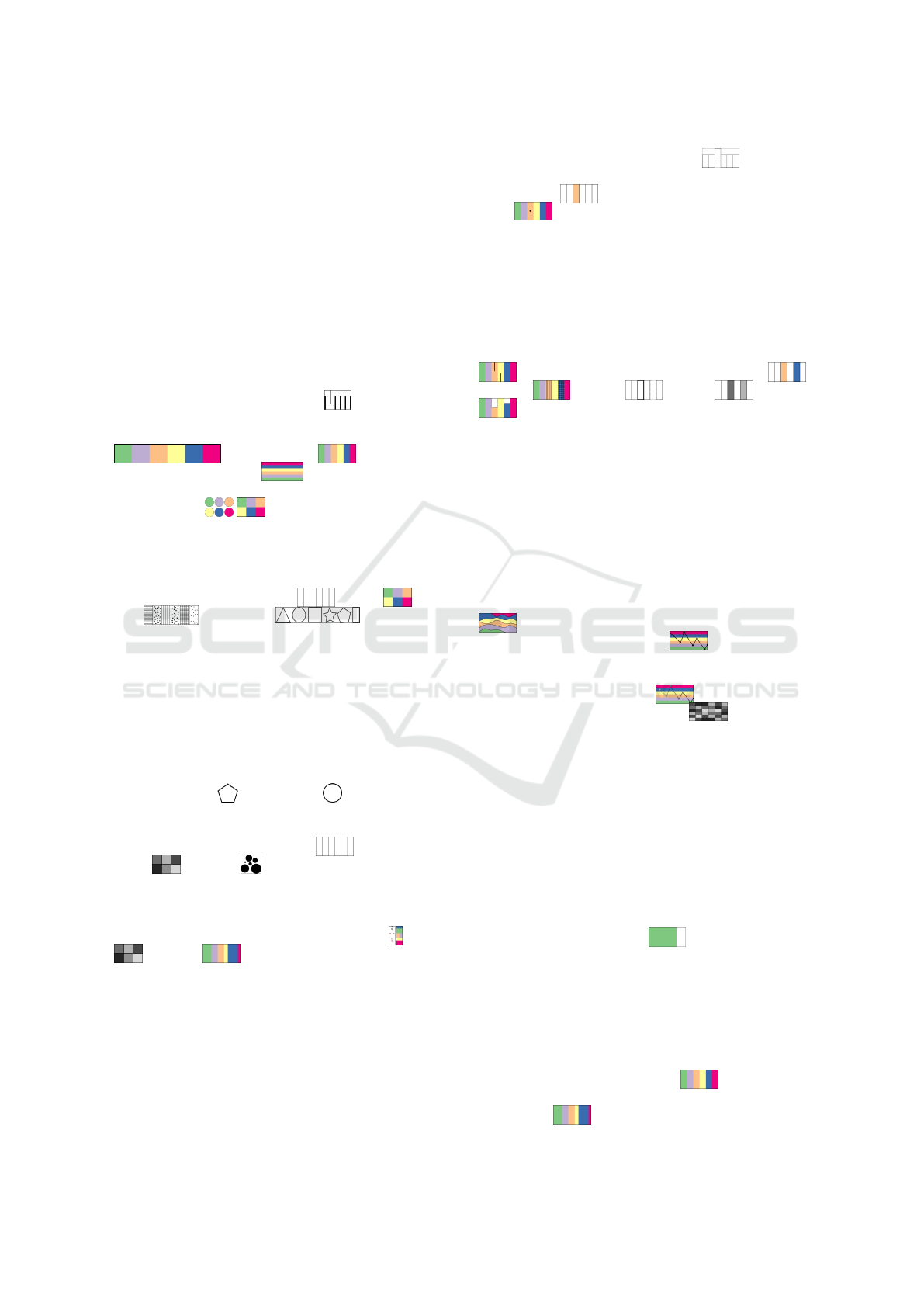
Table 1 shows the dimensions with example word-
sized visualizations for each of them. Representing
the size—the number of data items in each category—
again requires some consideration. For example, one
category can be overly large or small in comparison
to the other categories. In either case a minimum or
maximum width can be defined, however, this may
come with incorrectly representing the exact number
of data items. A tooltip showing the exact number or
a visual mark indicating this discrepancy (e.g., using
a color gradient ) can be added. Also, if many
categories are small they should not be placed next
to each other to avoid them blurring together into one
category .
In addition, the corpus can change over time.
Therefore, we are both interested in representations
for a specific point in time or a representation depict-
ing a time range. If we consider a time range, we can
either focus on how the number of data items per cat-
Table 1: Dimensions of our word-sized visualizations. Cat-
egory can represent the number of data items (size) or not.
Time can be a point in time or a range. The data item is
shown as a circle or as multiple circles connected by lines.
category
no size size
time
point
range
IVAPP 2021 - 12th International Conference on Information Visualization Theory and Applications
258

egory changes over time or we can investigate how
the category of an individual data item changes over
time. Categories changing over time can mean that
new categories are added or removed, but also that
the number of data items changes (e.g., more/less data
items belong to a category) . Again, the order-
ing should remain as stable as possible to not disturb
the mental map an analyst has of the categories. New
categories should be added at the top and categories
that are removed at the bottom, similar to Sankey Di-
agrams (Kennedy and Sankey, 1898). If the category
of an individual data item changes over time, multi-
ple markers need to be added at different time steps
. This could lead to overcrowding and using a
second encoding such as value to indicate older points
in time can reduce this effect .
We assume that each data item can be assigned
to a category. In cases for which there is no cate-
gory that fits, an “other” category could be used. This
special type of category should then be highlighted to
indicate that something is different about it (e.g., sep-
arating the “other” category from the rest by adding
some horizontal space ). Another option is to
not represent the data items marker in the word-sized
visualization, or show the closest match and encode it
in a specific way to indicate this mismatch .
Last, the digital fragment that defined the corpus
can be explicitly shown or not. For example, if the
digital fragment is a link to an image that is shared
and discussed on Twitter, this digital fragment is also
assigned to a category, because it is also a data item in
the corpus. Therefore, we need a separate representa-
tion for this specific data item to show, for example,
where the digital fragment is positioned in compari-
son to an individually inspected data item (up-
per and lower marker, respectively).
Other aspects we need to consider when design-
ing word-sized visualizations due to their small form-
factor are defined by Latif and Beck (2018). Word-
sized visualizations do not show labels, grid lines,
axes, or legends. Their size should fit into an as-
pect ratio that is 45
◦
for the average orientation of
a line segment. Latif and Beck (2018) also recom-
mend using a border to enhance interpretability and
readability. Another challenge is the use of colors
in the context of word-sized visualizations. Using
large color or brightness contrasts helps to discern
colors for small areas (Latif and Beck, 2018). In addi-
tion, we are limited to twelve colors that humans can
distinguish (Ware, 2013) and should use color-blind
friendly colors. In all our examples, we use the color
scheme provided by Harrower and Brewer (2003) for
qualitative data.
3.4 Tasks and Requirements
We assume a lay person as our primary analyst. The
main tasks we consider are that the analyst wants to
get an overview (T1) about different aspects within a
corpus (e.g., inspect the diversity of a discussion); in-
vestigate the driving factor within a discussion (T2)
(e.g., if the digital fragment drives the discussion); in-
spect a change of context (T3) from a digital frag-
ment (e.g., is someone drawing attention to a differ-
ent issue); examine the development and change of a
discussion over time (T4) (e.g., which issues are dis-
cussed at what point in time and how frequently).
Based on these tasks, the description and the data
structure presented above, the following requirements
for our word-sized visualizations ensue. First, a lim-
ited number of categories are always represented with
a stable ordering that is predefined (R1). Next, the
current data item is represented and shown at the cat-
egory it belongs to (R2) and the digital fragment can
optionally be shown (R3). The word-sized visualiza-
tion should either show one specific point in time or
a time range (R4). Word-sized visualization specific
design considerations need to be followed (R5) (e.g.,
width, height, etc.), and perception issues should be
considered (R6) (e.g., color-blind friendly).
4 WORD-SIZED VISUALIZATION
DESIGNS
Based on the design aspects and requirements, we
designed and collected word-sized visualizations that
would represent our different dimensions (category,
time, data item, and digital fragment). Our first step is
to use the basic marks and visual variables for design-
ing novel visualizations and explore how to use them
to represent the dimensions. Next, we look at exist-
ing word-sized visualizations (Latif and Beck, 2018)
and how we can adapt them to our needs. Last, we in-
spect state-of-the-art text visualizations (Kucher and
Kerren, 2015) fitting for our dimensions and discuss
if and how we can shrink them to word size.
Our main dimension is category, therefore, the fo-
cus is to find a representation of the categories first,
since we always want to represent our complete cor-
pus to set the data item into this larger scope instead
of only depicting the data item with its category (R1).
Therefore, after finding a suitable representation for
the categories, we add a reference to the specific data
item (R2). Optionally, the digital fragment is shown
together with the data item (R3). In a first iteration,
we focus on a specific point in time. Later, we look at
Word-sized Visualizations for Exploring Discussion Diversity in Social Media
259
word-sized visualizations that could be used to repre-
sent our data depicting changes over time (R4).
4.1 Visual Variables
Table 2 shows examples of different visual vari-
ables (Bertin, 1967) suitable for representing multi-
ple categories and a data item using the area mark.
All marks can represent categories in the word-sized
visualizations. However, at word scale we need to
ensure that the point is large enough, e.g., at least
the size of the letter “o”. Lines too close together
lead to blurring effects, therefore, enough space be-
tween the lines needs to be added . Area can be a
square, a horizontal bar, or vertical bar. Since word-
sized visualizations are most often elongated, squares
or vertical bars use space bet-
ter than horizontal bars . A more compact rep-
resentation can be used if the order of the categories
is not relevant .
For representing categories, the chosen visual
variable needs to be selective, i.e., easy to distinguish
from the others, and have a certain length, i.e., the
number of values that can be differentiated. Possible
visual variables are position , color , tex-
ture , and shape (Carpendale,
2003). Each of them has some drawbacks: position is
ordered, which is only a slight drawback in this case
because some order needs to be chosen. Color, al-
though theoretically infinite, is limited in its length to
about 12 colors, which is the number of colors a hu-
man can distinguish (Ware, 2013). Texture is not well
suited to be scaled to word size. Shape, although po-
tentially infinite in length, in practice is limited when
scaled to word size because similar shapes, for exam-
ple, a pentagon and a circle , can be hard to
distinguish when too small. If order is of relevance
for the category, then position is the most effective
visual variable to represent this . Even though
value and size are also visual variables that
can depict order, they are less suited for categorical
data (Wolfe and Horowitz, 2004). If the number of
data items in a category is to be encoded as well, the
most effective visual variables are position , value
, and size as they show which category has
more or less data items (Wolfe and Horowitz, 2004).
The benefit of value over size is that we are less lim-
ited in the categories becoming small (=1px).
For an appropriate representation of the data item,
selectiveness is particularly important, which all vi-
sual variables (partially) fulfill (Carpendale, 2003).
However, some combinations are less suited than oth-
ers. For example, if using the area mark for the
data item, position (on the y-axis) leads to vertically
squeezed word-sized visualizations . If color is
not used for the categories, this is a good choice for
the data item . Changing the x-position of a line,
point , or also shape based on a data items cate-
gory are good choices as well.
As an addition, the digital fragment can also be
explicitly shown. If we extend the word-sized visu-
alizations we need another visual variable to repre-
sent the digital fragment. This could be, for example,
position—the digital fragment is always shown at the
upper half and the data item in the lower half of the
word-sized visualization using a line marker for both
. We can also use two distinct colors ,
textures , shapes , values , or sizes
for each item. One challenge to consider when
choosing a visual variable is the case in which the data
item and the digital fragment are shown together. Ei-
ther we need a double encoding, for example, position
and color, or we need a visual variable that is easily
distinguishable, for example, shape.
If we consider a time range, we can either focus on
how the number of data items per category changes
over time or we can investigate how the category of
an individual data item changes over time. Time is
represented either on the x- or y-axis. The other axis
can then be used to encode the categories with size
or without size changes, in this case the change
of the data item is of relevance . Another option
is to use value to indicate a change over time. This is
both suitable for representing the change of categories
for an individual data item or the size of the
categories for multiple time steps .
4.2 Existing Word-sized Visualizations
Latif and Beck (2018) discuss word-sized visualiza-
tions for different data types: univariate, multivariate,
spatial, as well as relational data. We inspect each of
the word-sized visualizations they propose for these
data types and discuss if and how they could be ap-
plied to our data. We refer to the visual variables and
word-sized visualizations mentioned in Section 4.1
when appropriate.
A simple quantity chart has limited options,
only color and area, for showing the data. It cannot vi-
sualize multiple categories and might, at best, be used
to show the total number of categories found or the
number of data items within a category in compari-
son to the number of data items in the corpus. Much
better suited is the subdivided area chart with which
we can display multiple categories. This can be done
either with fixed-width elements
to show which
categories there are, or with elements whose width is
data-driven to show, for example, the size (the
IVAPP 2021 - 12th International Conference on Information Visualization Theory and Applications
260
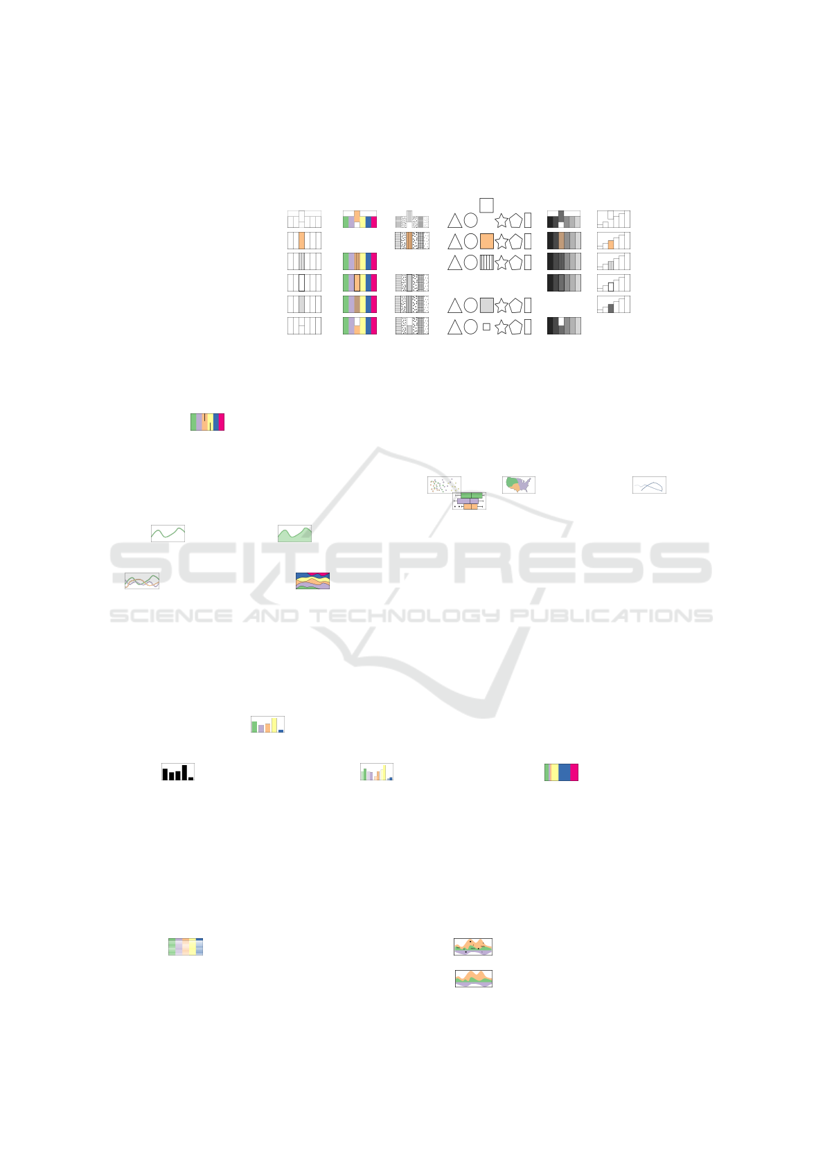
Table 2: Word-sized visualizations representing multiple categories and one data item using different visual variables (Bertin,
1967) (except orientation) for a specific point in time.
category
position color texture shape value size
data item
position
color x
texture x
shape x
value x
size x
number of data items) of the categories in relation to
each other. If color is used for the different categories,
then shape, value, or texture markers can be added to
show which categories the data item and digital frag-
ment belong to . Similarly this holds if any of
the other visual variables are used for the categories.
However, if a category is small, it is hard to see. This
can be remedied by enforcing a minimum width in
the visualization, although this either leads to a dis-
tortion of the relations of the categories to each other,
or makes the whole visualization wider.
Line and area charts can be used to
show the development of the size of one category over
time. For showing multiple categories, line compari-
son and stacked area charts can be use-
ful and allow marking the categories of both data item
and digital fragment with texture, value, shape, or size
(line width). Due to the added time component, they
are, however, slightly harder to read than the subdi-
vided area chart. Similarly, small categories can be-
come barely visible. Enforcing a minimum category
size in the visualization, however, leads to more dis-
tortion than for the subdivided are chart.
When using a bar chart , the underlying data
can either be the size of the categories or one cat-
egory over time in time intervals, which makes it a
histogram . For a bar comparison chart ,
the data is the size of multiple categories over time,
for which color value is used to depict time. How-
ever, for a medium or large number of categories, it
becomes prone to visual overcrowding. If there are
small categories, the same problem arises as with line
charts, as word-sized bar charts cannot extend in the
y-direction. As for markers, for the bar chart texture,
value, shape and size (border around the bar) and for
the bar comparison chart texture, shape and size are
possible and reasonably selective.
A table
can represent the number of data
items per time step, encoded using grayscale or color
values—the darker, the more data items belong to a
category. The row or individual cells can be high-
lighted (using texture, shape, or border size) to show
which category the data item belongs to. If the digital
fragment is represented as well, texture or shape are in
our opinion the best options. However, the individual
cells are not distinguishable well and a heatmap effect
occurs, yet a data overview might still be possible.
Finally, some of the existing word-sized visual-
izations do not fit our data types, such as scatter plots
, maps , and trajectories . In a box
plot , data on the y-axis is the category, but plot-
ting the data for category size on the x-axis would be
a point rather than a box. It could be more suitable,
however, when there is uncertainty in the data, e.g.,
from clustering of the categories.
4.3 Large Visualizations
With the help of the Text Visualization Browser
(Kucher and Kerren, 2015) we categorized visual ele-
ments of existing visualizations and visual analytics
systems whose goal it is to show discussion diver-
sity. We surveyed publications that focus on discourse
analysis in online forums, blogs, or social media.
Some of the visualizations and visual analytics
systems mentioned in Section 2.1 use visual elements
already discussed in the previous section, like sub-
divided area charts by Hoque and Carenini
(2014). However, most either have a different under-
lying data structure than our categorical data, e.g., ge-
ographical data or network data, different tasks that
focus on a top-down approach, or are too complex to
scale well to word size.
One of the most popular visualizations for dis-
playing discussion development in social media or
blogs are stream graphs. Widely used are glyphs
and text overlays of events or category characteris-
tics, which when scaled to word size become unread-
able
. Without those overlays, however, stream
graphs are suitable word-sized visualizations for our
data . They are similar to stacked area charts
that we discussed in Section 4.2, except that their y-
Word-sized Visualizations for Exploring Discussion Diversity in Social Media
261

baseline typically is not at the bottom, but at the mid
line of the chart area. Stream graphs suffer from the
same limitations as stacked area charts, i.e., it is diffi-
cult to display small category sizes or a large number
of categories while maintaining readability, though
they otherwise fulfill our requirements defined in Sec-
tion 3.4 and are a suitable candidate.
4.4 Summary
Based on the different word-sized visualizations dis-
cussed in the previous sections, we suggest the word-
sized visualizations we think represent our data the
best as well as fulfill the requirements. For represent-
ing categories without depicting size together with the
data item and digital fragment for one point in time,
our suggested word-sized visualization is a subdi-
vided area chart with fixed-width elements . We
choose a subdivided area chart with variable-width el-
ements or a bar chart for best represent-
ing categories with size information together with the
data item and digital fragment for one point in time.
For representing categories without depicting size in-
formation together with the data item and digital frag-
ment for a time range, our suggested word-sized visu-
alization is a stacked area chart with fixed-sizes and
an overlay for the category of the data item or digital
fragment . For representing categories with size
information together with the data item and digital
fragment for a time range, we advise using a stacked
area chart or a stream graph .
5 USAGE EXAMPLE
There are multiple scenarios in which a person might
want to see word-sized visualizations integrated into
a social media feed. First, a social media feed for a
hashtag or a feed compiled based on a specific search
result. Then, there is one digital fragment which is the
hashtag or search term. Second, their personal social
media feed, in which case there are multiple digital
fragments. Third, a social media feed of a specific
group or organization. Then multiple digital frag-
ments are relevant again. In the following we focus
on the first scenario.
To illustrate how word-sized visualizations can
be integrated into a social media feed, we collected
251.146 Twitter messages for a digital fragment—a
video about the explosion in Beirut in August 2020
(cf. Figure 1). For demonstration purposes, we
use the tf-idf features of the corpus to cluster the
tweets with a simple k-means++ algorithm, with a
data-adaptive number of clusters (Davies–Bouldin in-
dex (Davies and Bouldin, 1979) and elbow method
(Thorndike, 1953)), yielding k = 3. We create the
word-sized approaches that show temporal evolution
by binning the tweets of each cluster into intervals ac-
cording to their timestamp.
The intention of the word-sized visualizations is
that they are placed within an individual data item,
i.e., Twitter message. Where to place the word-
sized visualization exactly within a text has been thor-
oughly discussed by Goffin et al. (2014), hence we
follow their recommendations and suggestions. In a
social media feed, the word-sized visualization should
always be at the same position in all data items to en-
able comparison. For our demonstration, we decided
to place the word-sized visualization next to the link
of the digital fragment, because the categories are re-
lated to it. We show the Twitter stream similar to the
way it would appear online and place the digital frag-
ment tweet as well as a permanently visible legend
with color coding and the most salient words for each
category at the top of the stream of Twitter messages
with integrated word-sized visualizations.
To showcase visualization variants, we chose the
subdivided area chart as well as a stream graph. For
comparison of suitability of the word-sized visualiza-
tions in our example, we added one of the tweets with
a pie chart and a stacked area chart at the bottom of
Figure 1, each separated by a horizontal line. The sub-
divided area chart shows variable-width elements rep-
resenting the size (number of data items) of the cate-
gory. We set a minimum width of 5 pixels for the cat-
egories to ensure readability as well as a maximum to-
tal width of 75 pixels for the word-sized visualization.
The pie chart represents category size as arc length, its
diameter is set to 1.5 times the height of the surround-
ing text. The stream graph shows the amount of data
items in each category over time through variable-
height streams, while the ratio of category sizes over
time becomes visible with the height of the areas in
the stacked area chart.
The category of the digital fragment is marked
with a line from the top of the chart in the subdivided
area charts and with a circle in the other charts. The
data item is marked with a line from the bottom and a
triangle, respectively. It is visible at a glance whether
those marks are in the same category, i.e., they touch
in case of the subdivided area chart or not.
This indicates whether the data item is close to the
digital fragment, or if they are in different categories
and this specific tweet seems to be discussing a dif-
ferent topic and a change in context may be arising
that might be worth investigating. Further, with the
number of categories explicitly represented, analysts
can get an overview about how many different con-
IVAPP 2021 - 12th International Conference on Information Visualization Theory and Applications
262
Figure 1: Comparison of visualizing categories in a Twit-
ter stream with subdivided area charts and pie charts, which
are semantically similar but show a clear difference in vi-
sual readability, in addition to stream graphs and stacked
area charts. The digital fragment (a video about the Beirut
explosion in August 2020) and the legend with ten most
salient words per cluster are shown on top. The same ex-
ample tweets from several clusters are shown for the word-
sized visualization versions. We removed real user names
and profile pictures and replaced them with pseudonyms.
text categories a digital fragment is discussed in, and
through the category sizes how prevalent each con-
text category is (T1). If the category of a digital frag-
ment is the largest, the digital fragment is the driving
factor in a discussion (T2). In our example, the dig-
ital fragment is in the largest cluster 2 , whereas
clusters 1 and 3 have less tweets assigned to
them. Therefore, the context of the discussion does
not seem to have changed into a different direction
much, which can be further examined by inspecting
individual tweets.
When a data item is in a different category than
the digital fragment, it is an indicator that someone
is trying to change the discussion and draw attention
to a different issue (T3). An analyst can detect those
context changes, for example, cluster 3 (prayers,
stay, safe). Examining the discourse over time (T4)
is possible when time is added as a variable into the
word-sized visualizations, as with the stream graph
or the stacked area chart. To depict temporal devel-
opment, without adding time as a variable to the chart
directly and to keep the visualization from being over-
loaded, two charts of the same type could be placed
before and after the digital fragment of the data item,
that show data that temporally occurred before and
after. This way, the data of two time points or time
ranges can be observed, and whether the discussion
changed. Another option is to place word-sized visu-
alizations showing different kinds of categories, e.g.,
topics and sentiment, next to each other, with the pos-
sibility to filter the data of one through interaction
with the other, showing sentiment within a category.
There are several possibilities for interaction, on
various elements of the word-sized visualization, i.e.,
on the categories, markers, legend, single words, or
the whole visualization. In Section 4.2 we elaborate
on why fulfilling (R6) is often an issue, i.e., maintain-
ing readability of the visualizations at word size, as,
for example, with cluster 3 in Figure 1. A possi-
ble remedy is through interaction, for example, with a
focus lens as a mouse-over interaction, although this
hinders an overview at a glance of the social media
feed. For a subdivided area chart, a possibility to add
temporal data is through interaction by adding a tem-
poral timeline overlay over the surrounding text, with
time on the y-axis and the top of the visualization de-
picting the latest state , which resembles the order-
ing of items in a social media feed. A way to omit the
legend is showing the characteristics of each category
on mouse-over. Mouse interaction, maybe altered by
pressing a key, e.g.,
Ctrl
, while hovering or clicking,
can further be used to lead a person to a visual ana-
lytics system that enables a more detailed review, to
Word-sized Visualizations for Exploring Discussion Diversity in Social Media
263

switch from the text-centric view to a visualization-
centric view. In general, interaction with the word-
sized-visualization should show additional data and
further enable navigation through the corpus, to allow
finding ways out of a potential filter bubble and un-
derstanding details about the different categories.
6 CONCLUSION
In this paper, we discussed the design aspects of
word-sized visualizations for discourse analysis in so-
cial media, showed which word-sized visualizations
are suitable for this task, and suggested word-sized
visualizations for several example applications. Fur-
ther, we described an example Twitter stream with in-
tegrated word-sized visualizations.
One of the main challenges of word-sized visu-
alizations is that their visual elements should be rec-
ognizable at word scale. In our example with real-
world data this is evident for several visualization
types. While the font size of this paper is 11 pixels,
social media sites often use larger font sizes. Twitter
messages, for example, have a font size of 15 pixels,
which slightly helps overcome this challenge.
We see the main advantage of word-sized visual-
izations in a social media feed in their possibility to
give an overview of discussion diversity directly in
a data item, without leaving the environment of the
feed. Further, through interaction, word-sized visual-
izations can lead analysts to a visual analytics system
for a more detailed analysis of the discourse.
In addition to social media feeds, word-sized visu-
alizations can similarly be embedded in news articles,
e.g., for showing topics throughout the article.
To supplement our discussion, we are planning
evaluations with lay people as well as experts, com-
paring different word-sized visualizations on discus-
sion diversity analysis tasks. Though we expect mul-
tiple versions to be equally effective, studies will be
helpful in validating this assumption.
ACKNOWLEDGEMENTS
This work has been funded by the University of
Stuttgart as part of the project Context Changes In
Social Media Contributions in cooperation with the
Leibniz-Institut f
¨
ur Wissensmedien as part of the
Leibniz Wissenschaftscampus ”Cognitive Interfaces”.
Tanja Blascheck is indebted to the European Social
Fund and the Ministry of Science, Research, and Arts
Baden-W
¨
urttemberg.
REFERENCES
Beck, F., Blascheck, T., Ertl, T., and Weiskopf, D.
(2017). Word-Sized Eye-Tracking Visualizations. In
Burch, M., Chuang, L., Fisher, B., Schmidt, A., and
Weiskopf, D., editors, Eye Tracking and Visualiza-
tion, Mathematics and Visualization, pages 113–128.
Springer.
Beck, F. and Weiskopf, D. (2017). Word-Sized Graphics for
Scientific Texts. IEEE Transactions on Visualization
and Computer Graphics, 23(6):1576–1587.
Bertin, J. (1967). S
´
emiologie graphique. Paris,
Mouton/Gauthier-Villars, 1st edition.
Bosch, H., Thom, D., Heimerl, F., P
¨
uttmann, E., Koch, S.,
Kr
¨
uger, R., W
¨
orner, M., and Ertl, T. (2013). Scat-
terBlogs2: Real-Time Monitoring of Microblog Mes-
sages through User-Guided Filtering. IEEE Trans-
actions on Visualization and Computer Graphics,
19(12):2022–2031.
Brandes, U. and Corman, S. R. (2016). Visual Unrolling
of Network Evolution and the Analysis of Dynamic
Discourse. Information Visualization.
Carpendale, M. S. T. (2003). Considering visual variables
as a basis for information visualisation. Technical re-
port, University of Calgary.
Cuenca, E., Sallaberry, A., Wang, F. Y., and Poncelet, P.
(2018). MultiStream: A Multiresolution Streamgraph
Approach to Explore Hierarchical Time Series. IEEE
Transactions on Visualization and Computer Graph-
ics, 24(12):3160–3173.
Cui, W., Liu, S., Tan, L., Shi, C., Song, Y., Gao, Z., Qu,
H., and Tong, X. (2011). TextFlow: Towards Bet-
ter Understanding of Evolving Topics in Text. IEEE
Transactions on Visualization and Computer Graph-
ics, 17(12):2412–2421.
Davies, D. L. and Bouldin, D. W. (1979). A Cluster Separa-
tion Measure. IEEE Transactions on Pattern Analysis
and Machine Intelligence, PAMI-1(2):224–227.
El-Assady, M., Gold, V., Acevedo, C., Collins, C., and
Keim, D. (2016). ConToVi: Multi-Party Conversa-
tion Exploration using Topic-Space Views. Computer
Graphics Forum, 35(3):431–440.
El-Assady, M., Sevastjanova, R., Keim, D., and Collins,
C. (2018). ThreadReconstructor: Modeling Reply-
Chains to Untangle Conversational Text through
Visual Analytics. Computer Graphics Forum,
37(3):351–365.
Goffin, P., Boy, J., Willett, W., and Isenberg, P. (2017). An
Exploratory Study of Word-Scale Graphics in Data-
Rich Text Documents. IEEE Transactions on Visual-
ization and Computer Graphics, 23(10):2275–2287.
Goffin, P., Isenberg, P., Blascheck, T., and Willett, W.
(2020). Interaction Techniques for Visual Exploration
Using Embedded Word-Scale Visualizations. In Pro-
ceedings of the 2020 CHI Conference on Human Fac-
tors in Computing Systems, pages 1–13.
Goffin, P., Willett, W., Bezerianos, A., and Isenberg, P.
(2015). Exploring the effect of word-scale visual-
izations on reading behavior. In Proceedings of the
33rd Annual ACM Conference Extended Abstracts on
IVAPP 2021 - 12th International Conference on Information Visualization Theory and Applications
264

Human Factors in Computing Systems, pages 1827–
1832. ACM.
Goffin, P., Willett, W., Fekete, J.-D., and Isenberg, P.
(2014). Exploring the Placement and Design of Word-
Scale Visualizations. IEEE Transactions on Visualiza-
tion and Computer Graphics, 20(12):2291–2300.
Harrower, M. and Brewer, C. (2003). ColorBrewer.org: An
online tool for selecting colour schemes for maps. The
Cartographic Journal, 40(1):27–37.
Havre, S., Hetzler, E., Whitney, P., and Nowell, L. (2002).
ThemeRiver: visualizing thematic changes in large
document collections. IEEE Transactions on Visual-
ization and Computer Graphics, 8(1):9–20.
He, J. and Chen, C. (2016). Spatiotemporal Analytics of
Topic Trajectory. In Proceedings of the 9th Interna-
tional Symposium on Visual Information Communi-
cation and Interaction, VINCI ’16, pages 112–116.
ACM.
Heer, J., Kong, N., and Agrawala, M. (2009). Sizing the
horizon: the effects of chart size and layering on the
graphical perception of time series visualizations. In
Proceedings of the SIGCHI Conference on Human
Factors in Computing Systems, CHI ’09, pages 1303–
1312.
Heimerl, F., Han, Q., Koch, S., and Ertl, T. (2016a). Ci-
teRivers: Visual Analytics of Citation Patterns. IEEE
Transactions on Visualization and Computer Graph-
ics, 22(1):190–199.
Heimerl, F., John, M., Han, Q., Koch, S., and Ertl, T.
(2016b). DocuCompass: Effective exploration of doc-
ument landscapes. In 2016 IEEE Conference on Vi-
sual Analytics Science and Technology (VAST), pages
11–20.
Hoffswell, J., Satyanarayan, A., and Heer, J. (2018). Aug-
menting Code with In Situ Visualizations to Aid Pro-
gram Understanding. In Proceedings of the 2018 CHI
Conference on Human Factors in Computing Systems,
CHI ’18, pages 1–12. ACM.
Hoque, E. and Carenini, G. (2014). ConVis: A Visual Text
Analytic System for Exploring Blog Conversations.
Computer Graphics Forum, 33(3):221–230.
Kennedy, A. and Sankey, R. (1898). The thermal efficiency
of steam engines. In Minutes of the Proceedings of
the Institution of Civil Engineers, volume 134, pages
278–312. Thomas Telford-ICE Virtual Library.
Kim, M., Kang, K., Park, D., Choo, J., and Elmqvist,
N. (2017). TopicLens: Efficient Multi-Level Visual
Topic Exploration of Large-Scale Document Collec-
tions. IEEE Transactions on Visualization and Com-
puter Graphics, 23(1):151–160.
Kucher, K. and Kerren, A. (2015). Text visualization tech-
niques: Taxonomy, visual survey, and community
insights. In IEEE Pacific Visualization Symposium,
pages 117–121. IEEE Computer Society.
Latif, S. and Beck, F. (2018). Visually Augmenting Docu-
ments With Data. Computing in Science Engineering,
20(6):96–103.
Latif, S. and Beck, F. (2019). VIS Author Profiles: Interac-
tive Descriptions of Publication Records Combining
Text and Visualization. IEEE Transactions on Visual-
ization and Computer Graphics, 25(1):152–161.
Lee, B., Riche, N. H., Karlson, A. K., and Carpendale,
S. (2010). SparkClouds: Visualizing Trends in Tag
Clouds. IEEE Transactions on Visualization and
Computer Graphics, 16(6):1182–1189.
Liu, S., Wang, X., Chen, J., Zhu, J., and Guo, B. (2014).
TopicPanorama: A full picture of relevant topics. In
2014 IEEE Conference on Visual Analytics Science
and Technology (VAST), pages 183–192.
Liu, X., Xu, A., Gou, L., Liu, H., Akkiraju, R., and Shen,
H.-W. (2016). SocialBrands: Visual analysis of public
perceptions of brands on social media. In 2016 IEEE
Conference on Visual Analytics Science and Technol-
ogy (VAST), pages 71–80.
Lu, Y., Wang, H., Landis, S., and Maciejewski, R. (2018).
A Visual Analytics Framework for Identifying Topic
Drivers in Media Events. IEEE Transactions on Visu-
alization and Computer Graphics, 24(9):2501–2515.
Perin, C., Vuillemot, R., and Fekete, J.-D. (2013). Soccer-
Stories: A Kick-off for Visual Soccer Analysis. IEEE
Transactions on Visualization and Computer Graph-
ics, 19(12):2506–2515.
Thorndike, R. L. (1953). Who belongs in the family? Psy-
chometrika, 18(4):267–276.
Tufte, E. R. (2006). Beautiful Evidence. Graphics Press, 1
edition.
Vosoughi, S., Roy, D., and Aral, S. (2018). The spread of
true and false news online. Science, 359(6380):1146–
1151.
Ware, C. (2013). Information Visualization: Perception for
Design. Morgan Kaufmann Publishers Inc., 3 edition.
Wolfe, J. M. and Horowitz, T. S. (2004). What attributes
guide the deployment of visual attention and how do
they do it? Nature reviews neuroscience, 5(6):495–
501.
Xu, J., Tao, Y., Lin, H., Zhu, R., and Yan, Y. (2017). Ex-
ploring controversy via sentiment divergences of as-
pects in reviews. In 2017 IEEE Pacific Visualization
Symposium (PacificVis), pages 240–249.
Xu, P., Wu, Y., Wei, E., Peng, T.-Q., Liu, S., Zhu, J. J., and
Qu, H. (2013). Visual Analysis of Topic Competition
on Social Media. IEEE Transactions on Visualization
and Computer Graphics, 19(12):2012–2021.
Word-sized Visualizations for Exploring Discussion Diversity in Social Media
265
