
A Replication Study on Glanceable Visualizations: Comparing Different
Stimulus Sizes on a Laptop Computer
Tanja Blascheck
1 a
and Petra Isenberg
2 b
1
University of Stuttgart, Stuttgart, Germany
2
Universit
´
e Paris Saclay, CNRS, Inria, France
Keywords:
Glanceable Visualization, Quantitative Evaluation, Desktop, Smartwatch, Display Size, Perception.
Abstract:
We replicated a smartwatch perception experiment on the topic of glanceable visualizations. The initial study
used a setup that involved showing stimuli on an actual smartwatch attached to a wooden stand and a laptop
to run and log the experiment and communicate with the smartwatch. In our replication we wanted to test
whether a much simpler setup that involved showing the same stimuli on a laptop screen with similar pixel
size and density would lead to similar results. We also extended the initial study by testing to what extent the
size of the stimulus played a role for the results. Our results indicate that the general trends observed in the
original study mostly held also on the larger display, with only a few differences in certain conditions. Yet,
participants were slower on the large display. We also found no evidence of a difference for the two different
stimulus display sizes we tested. Our study, thus, gives evidence that simulating smartwatch displays on laptop
screens with similar resolution and pixel size might be a viable alternative for smartwatch perception studies
with visualizations.
1 INTRODUCTION
In a recent publication Blascheck et al. (2019) pre-
sented the results of a perception experiment con-
ducted on smartwatches. The authors evaluated how
quickly on average participants could perform a sim-
ple data comparison task with different visualizations
and data sizes. In the study, the authors used an actual
smartwatch strapped to a wooden stand whose dimen-
sions were modeled after average viewing distances
and display tilt collected from a study of smartwatch
wearers. This setup ensured more ecological validity
compared to a study performed on a common desktop
or laptop computer. Yet, the setup was technically com-
plicated both in software and hardware design, which
makes it difficult to reproduce or replicate these types
of smartwatch perception studies. We set out to study
whether the same research questions can be studied
with a simpler setup, in which the study stimuli are
shown on a laptop computer that can run both the soft-
ware to show the stimuli and log responses. This sim-
pler setup using a single computer would not require
complicated network connections between smartwatch
a
https://orcid.org/0000-0003-4002-4499
b
https://orcid.org/0000-0002-2948-6417
and the controlling computer running the software. In
addition, we were interested in clarifying to which ex-
tent the findings of the original study were due to the
size of the stimuli on the smartwatch and whether the
results would hold for larger visualizations. Based on
related work, we hypothesized that thresholds would
increase for larger visualizations, but that the ranking
of techniques would stay the same.
To follow up on these questions we chose to repli-
cate the study design by Blascheck et al. (2019) to
answer:
•
do trends observed by Blascheck et al. (2019)
hold for smartwatch-sized visualizations shown
on larger displays?, and
•
do trends observed by Blascheck et al. (2019) hold
for larger visualizations shown on larger displays?
To address these questions we conducted a
between-subject experiment using a laptop computer
instead of a smartwatch and used two different stimuli
sizes (
320 px×320 px
and
1280 px×1280 px
). Except
for these two changes, the study setup was the same,
allowing us to compare the trends observed in our
experiment with those from the smartwatch study.
Therefore, the main contribution of our paper is
three-fold: First, a between-subject study for a simple
Blascheck, T. and Isenberg, P.
A Replication Study on Glanceable Visualizations: Comparing Different Stimulus Sizes on a Laptop Computer.
DOI: 10.5220/0010328501330143
In Proceedings of the 16th International Joint Conference on Computer Vision, Imaging and Computer Graphics Theory and Applications (VISIGRAPP 2021) - Volume 3: IVAPP, pages
133-143
ISBN: 978-989-758-488-6
Copyright
c
2021 by SCITEPRESS – Science and Technology Publications, Lda. All rights reserved
133

data comparison task on a laptop computer following
the setup of Blascheck et al. (2019). Second, a compar-
ison of the results of the two stimuli sizes as well as a
comparison of the trends for the small stimulus to the
trends found in Blascheck et al. (2019) who conducted
the same study on a smartwatch. Last, a discussion
of the results and the implications that follow from
these results for future studies analyzing glanceable
visualizations at micro scale. Overall, our work brings
us one step closer to understanding visualizations that
have a small form factor (micro visualizations), how
to design, and evaluate them.
2 RELATED WORK
We discuss related work on micro visualizations, the
studies thereof especially about size comparisons, as
well as studies on smartwatches.
2.1 Micro Visualizations
Micro visualizations are data representations that are
high-resolution visualizations designed for small to
medium-sized displays (Blascheck et al., 2019; Bran-
des, 2014). This includes data glyphs (Borgo et al.,
2013), sparklines (Tufte, 2001), as well as word-sized
graphics (Beck and Weiskopf, 2017; Goffin et al.,
2017), and most visualizations designed for smart-
watches or fitness trackers.
Data glyphs are representations that encode mul-
tiple data dimension of a single data point in a single
represention. They are often used in small multiples
settings and some typical applications include the rep-
resentation of meteorological data (Anderson, 1957),
medical data (Ropinski et al., 2011), their use in multi-
field (Chung et al., 2014), flow, tensor, or uncertainty
visualizations (Borgo et al., 2013).
Sparklines in comparison are defined by Tufte
(2001) as “small, high-resolution graphics usually
embedded in a full context of words, numbers, im-
ages.” This definition was later extended by Goffin
et al. (2017) to word-sized graphics that include both
data-driven and non-data driven graphics and that can
vary from the size of a word to the size of a paragraph.
Beck and Weiskopf (2017) use a similar definition.
They define word-sized graphics as “data-intense vi-
sual representations at the size of a word. In particular,
[...] [this] even include[s] the coding of information
using icon images.” Examples and applications of
word-sized graphics includes the representation of eye
movement data (Beck et al., 2017), GestaltLines (Bran-
des et al., 2013), or the representation of source code
metrics (Beck et al., 2013a,b).
Visualizations designed for smartwatches also fall
into this category of micro visualizations, because their
typical size ranges between 128–
480 px
(Blascheck
et al., 2019) at 200 or more PPI. Their small form-
factor, similar to data glyphs and word-sized graphics,
implies that they are typically designed without labels,
axes, grid lines, or tick marks. Therefore, we can apply
the same design guidelines and learn from both stud-
ies conducted with data glyphs as well as word-sized
grpahics. However, a difference in usage of micro vi-
sualizations on smartwatches versus data glyphs and
word-sized graphics is their context. Whereas data
glyphs are used in small multiples settings and word-
sized graphics are embedded into texts, tables, or lists,
visualizations on smartwatches are typically used to
satisfy quick information needs—have I reached my
goal? How many steps have I taken today? Was I run-
ning faster on Monday or Thursday? This implies that
visualizations are only glanced at for a few seconds
(
≤
5 s) (Pizza et al., 2016), opening up new research
questions regarding studies of micro visualizations.
2.2 Studies of Micro Visualizations
There are not many evaluations about the size of micro
visualizations. Fuchs et al. (2017) did a systematic
review of 64 papers that included evaluations of data
glyphs, however, they found no studies that specifically
investigate display size.
In the context of word-sized graphics, Heer et al.
(2009) evaluated horizon graphs (Saito et al., 2005),
which are line charts that are mirrored and compressed
along the y-axis. One of the research questions the
authors studied was the size of these charts, scaling
them by 0.5, 0.25, and 0.125. They found that as chart
size increases the error decreases but the estimation
time increases. Their explanation for this was that par-
ticipants spent more time on the larger charts, because
they felt that they could get better results.
Javed et al. (2010) compared three different types
of line charts—simple line graphs, braided graphs,
small multiples, and horizon graphs for four different
chart sizes: 48, 96, and
192 px
. Their results indicate
that decreasing chart size had a negative impact on
accuracy but only a small effect on completion time.
Based on these two studies, we can hypothesize
that accuracy is higher for larger charts and completion
times increases or stays stable. One main difference
of our replication study is that we set a time threshold
for depicting the stimuli. Therefore, participants are
not free to take as long as they want to answer and we
do not measure a trade-off between accuracy and time.
Instead, we target a
~
91% correct response rate and see
how long people need to see the visualization stimulus
IVAPP 2021 - 12th International Conference on Information Visualization Theory and Applications
134

to answer on average with this correctness (Garc
´
ıa-
P
´
erez, 1998).
Perin et al. (2013) created different word-sized
graphics to represent the phases of a soccer game and
evaluated them based on different sizes (between
20 px
× 15 px
and
80 px × 60 px
). However, they only asked
participants to evaluate the combination of represen-
tation and size on a Likert scale and rank the four
representations by preference. There was no evalua-
tion of performance. The results show that the smaller
the word-sized graphic was, the less preferred it was.
2.3 Studies of Visualizations on
Smartwatches
In recent years, studies of visualizations on smart-
watches have become popular. For example, Neshati
et al. (2019) studied line charts and different compres-
sion techniques on a smartwatch. They found that their
novel x-axis compression lead to better performance,
in respect to reaction time, error rate, and interactivity.
Although, they looked at different sizes of a graph, the
main goal of the study was decrease the size of the line
chart (x-, y-, and xy-axis compression of a baseline,
which was
184 px × 68 px
) rather than comparing it
to a desktop sized visualization.
Blascheck et al. (2019) studied different chart types
and data sizes with a simple data comparison task on a
smartwatch. The main result was that donut charts had
the minimal time threshold followed by bar and then
radial charts for all data sizes. We replicate their study
to investigate if trends observed on smartwatches hold
for smartwatch-sized visualizations as well as large
visualizations shown on a larger display, i.e., a laptop
computer.
Other studies related to visualizations for smart-
watches include a survey by Aravind et al. (2019) who
asked participants which types of visualizations they
would like to see on their smartwatch or fitness tracker
for different types of sleep data. They found that peo-
ple mostly preferred different forms of bar chart, donut
charts, or a hypnogram to depict different types of
sleep data and time granularities. Aravind et al. (2019)
distinguished between smartwatches and fitness track-
ers, but in most cases (6/8 comparisons) the same type
of visualization was preferred for both. However, the
authors did not compare performance differences be-
tween the devices.
Islam et al. (2020) conducted a survey to find out
how many data items people represent on their watch
face, which type of data, as well as which type of rep-
resentations they use. They found that people have
between 3 and 5 data items shown on their watch face
together with time. The most common type of data
Table 1: Similarities and differences between the study con-
ducted by Blascheck et al. (2019) and our own.
Blascheck et
al.
Our study
Study Design Within-g. Between-group
Study Device Smartwatch Laptop
Chart Types Bar, donut, radial chart
Data Size 7, 12, 24 data values
Stimuli Size 320 × 320 px 320 × 320 px
1280 × 1280 px
Participants 18 2 × 18 p. group
represented were health and fitness data and people
mostly used icon and text together. Representations
using charts were less common, however, there is still
a lot of potential for representing data using charts on
watch faces. Islam et al. (2020) focus was on under-
standing the current usage of watch face space, but
they neither compared display sizes nor performance.
3 STUDY METHODOLOGY
We replicated the second study (called “random dif-
ferences”) by Blascheck et al. (2019) using a laptop
computer instead of a smartwatch and two different
stimuli sizes (
320 px×320 px
and
1280 px×1280 px
).
The goal of the original study was to find the minimum
time threshold of a simple data comparison task for
three chart types (
Bar
,
Donut
and
Radial
)
and three data sizes (7, 12, and 24 data values). We
compare the trends from our study to the original study
to investigate if there is an effect of screen size. We
also add an additional analysis that compares the re-
sults of two stimulus sizes (
small
and
large
). We
summarize similarities and differences between the
study by Blascheck et al. (2019) and our study in Ta-
ble 1.
3.1 Study Design
Largely we used the same study design as Blascheck
et al. (2019). However, we ran a between-subject
design where stimuli were displayed on a laptop
computer. One group of participants saw
small
stimuli (
320 px×320 px
), the size used by Blascheck
et al. (2019) and the other group saw
large
stimuli
(
1280 px×1280 px
). Each group consisted of the same
nine conditions: 3 chart types
×
3 data sizes (cf. Ta-
ble 2). We counterbalanced the order of chart type
and the order of data size using a Latin square and
participants were randomly assigned to one of the two
groups.
The experiment was set up as a two-alternative
forced choice design (Greene and Oliva, 2009; King-
A Replication Study on Glanceable Visualizations: Comparing Different Stimulus Sizes on a Laptop Computer
135

dom and Prins, 2010), in which participants had to
choose which of two marked elements was the larger.
The exposure duration was adapted based on the re-
sponse using a weighted up-down staircase procedure:
the exposure duration was decreased by
300 ms
after
three correct responses and increased by
100 ms
after
one incorrect response. This procedure allows us to
estimate a psychometric function (Kingdom and Prins,
2010), in which the time thresholds represents
~
91%
correct responses (Garc
´
ıa-P
´
erez, 1998). The staircase
was terminated if one of two criteria were reached:
either after 15 reversals or after 150 trials in total.
3.2 Procedure
Participants conducted nine staircases in total (3 chart
types
×
3 data sizes). When participants arrived, they
signed a consent form and then filled out a background
questionnaire. They then picked a random ID, which
assigned them to one of the two groups and a spe-
cific chart type and data size order. Next, they read
a short paper description of the study, which gave an
overview of the different conditions and explained the
general procedure for one trial. Participants then were
placed in front of the laptop. Each staircase began with
ten practice trials immediately followed by the actual
stimuli. When one of the two termination criteria was
reached—15 reversals or 150 trials—the next condi-
tion began. The starting time of each staircase was
between
2800 ms
and
9000 ms
(based on Blascheck
et al. (2019)).
The general procedure for one trial began with
participants seeing a stimulus and giving a response
by pressing a button. Then the laptop showed if the
participants’ input was correct or not. Based on the
answer, the exposure duration was adapted and the
next stimulus was shown for the determined duration.
Afterwards four intervening images were shown to
reduce after effects. After each chart type we asked
participants about their strategy to perform the task.
After finishing all chart types, participants were asked
to rank the charts based on preference and confidence.
3.3 Stimuli
We used the same stimuli as the second study (called
“random differences”) by Blascheck et al. (2019) (cf.
Table 2). However, we created them with two sizes
(
320 px×320 px
and
1280 px×1280 px
). The first tar-
get bar had a size between 40–270 data values (gener-
ated randomly) and the second between 30 and a max
of target value1
−10
, to ensure that there was at least a
ten data value difference between the two targets. The
two targets were highlighted using black dots. The
Table 2: Examples of the stimuli we used in the study: three
chart types:
Bar
,
Donut
, and
Radial
as well as
three data sizes: 7, 12, and 24 data values.
Chart Type
Bar Donut Radial
Data Size
7
12
24
Figure 1: The study setup showing the keyboard (front) and
the laptop (back) with a large stimulus (1280 px×1280 px).
position of the target value was varied and the two
targets were
~
95 px
apart. Overall, for both groups we
created 396 images.
3.4 Apparatus
We used a Lenovo Yoga 2 Pro running a Windows 8
operating system. The laptop’s display size was
13.3 in
with a viewable screen area of 294
× 166 mm
, and a
screen resolution of 3200
×1800 px
(
=
a pixel size
of
0.092 mm
). We chose this laptop, because it had
almost the same pixel size as the Sony SmartWatch 3
used by Blascheck et al. (2019) (viewable screen area:
28.73
× 28.73 mm
, screen resolution: 320
× 320 px
,
pixel size:
0.089 mm
). Figure 1 shows an image of the
setup with a large Bar stimulus.
The laptop was placed at an angle of
50°
with
a viewing distance of
28 cm
,
20 cm
height from the
table surface, and roughly
90 cm
from the floor. This
IVAPP 2021 - 12th International Conference on Information Visualization Theory and Applications
136
●
●
●
allallall
radial
donut
bar
0 2000 4000 6000
●
●
●
allallall
radial − bar
radial − donut
bar − donut
0 2000 4000 6000
●
●
●
allallall
radial
donut
bar
0 2000 4000 6000
●
●
●
allallall
radial − bar
radial − donut
bar − donut
0 2000 4000 6000
●
●
●
allallall
radial
donut
bar
0 2000 4000 6000
●
●
●
allallall
radial − bar
radial − donut
bar − donut
0 2000 4000 6000
large small smartwatch
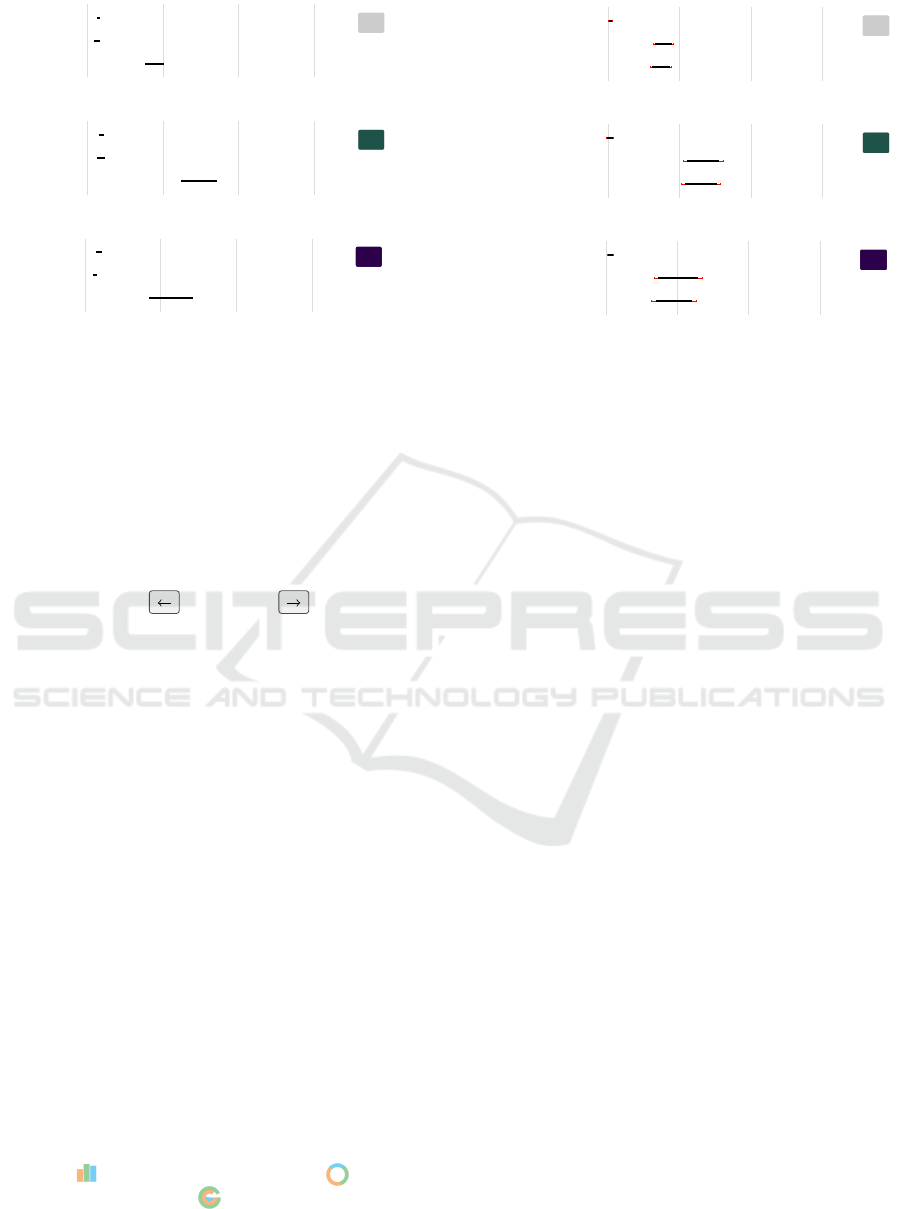
Figure 2: Left column: Average thresholds in milliseconds for each chart type across all data sizes. Right column: Pair-wise
comparisons between chart types. The three rows represent results for the original smartwatch study, our study with
small
and
then
large
stimuli. Error bars represent 95% Bootstrap confidence intervals (CIs) adjusted for three pairwise comparisons
with Bonferroni correction.
mirrored the size of the stimuli used in the smartwatch
study. We placed participants in front of the screen at
the beginning of the study but they were allowed to
adjust their position during the study. A keyboard was
placed in front of them and they used the arrow keys to
indicate if the left or the right target element
was larger. The laptop recorded the key presses, wrote
a log file, determined each stimulus’ exposure duration
based on the input, and whether the termination criteria
had been reached.
3.5 Participants
Our study task involves simple size comparisons that
a broad spectrum of the population can complete with
little training. We, therefore, recruited 36 participants
(17 female, 19 male) via a diverse range of mailing
lists inside and outside of the university. Participants
average age was 30 years (SD = 12.3). Their high-
est degree was certificate of secondary education (6),
general certificate of secondary education (5), final
secondary-school examination (10), Bachelor (9), and
Master (6). All participants had normal or corrected-
to-normal vision and only one participant reported to
have a color vision deficiency. Participants were com-
pensated with 10
e
. If participants were employees
of the university where the study was conducted, they
received a chocolate bar.
Participants had on average 4.5 years (SD = 3) expe-
rience with visualizations. They rated their familiarity
with
Bar
(M = 4.7, SD = 0.6),
Donut
(M = 3.5,
SD = 1.6), and
Radial
(M = 2.3, SD = 1.5) on
a 5-point Likert scale (1: not familiar at all–5: very
familiar).
4 RESULTS
In the following, we report on our analysis of the
collected data. As done in Blascheck et al. (2019)’s
second experiment, we use inferential statistics with
interval estimation (Dragicevic, 2016) for calculat-
ing the sample means of thresholds and 95% confi-
dence intervals (CIs). With these intervals we can be
95% confident that the interval includes the population
mean. We use BCa bootstrapping to construct confi-
dence intervals (10,000 bootstrap iterations) and adjust
them for multiple comparisons using Bonferroni cor-
rection (Higgins, 2004). To compare the
large
and
small
stimuli conditions we use bootstrap confidence
interval calculations for two independent samples. All
scripts, data, and stimuli are available as supplemental
material in an Osf repository (https://osf.io/7zwqn/).
4.1 Thresholds
Overall, we collected 324 staircases. We calculated
a time threshold for each staircase, which should
represent
~
91% correct responses for the particular
combination of chart type
×
data size (Garc
´
ıa-P
´
erez,
1998). Following the same procedure as Blascheck
et al. (2019), for each participant and each staircase,
we computed the threshold as the mean time of all
reversal points after the second.
We first present the thresholds for the
small
stim-
uli (
320 px×320 px
), then for the
large
stimuli
(
1280 px×1280 px
), and then the comparison between
both. Last, we compare the trends from both stimuli
sizes to the trends reported in the second study (called
A Replication Study on Glanceable Visualizations: Comparing Different Stimulus Sizes on a Laptop Computer
137
●
●
●
777
radial
donut
bar
0 2000 4000 6000
●
●
●
777
radial − bar
radial − donut
bar − donut
0 2000 4000 6000
●
●
●
121212
radial
donut
bar
0 2000 4000 6000
●
●
●
121212
radial − bar
radial − donut
bar − donut
0 2000 4000 6000
●
●
●
242424
radial
donut
bar
0 2000 4000 6000
●
●
●
242424
radial − bar
radial − donut
bar − donut
0 2000 4000 6000
Figure 3: Results for the
small
stimuli displayed on the laptop screen (
320 px×320 px
). Left: Average thresholds in
milliseconds for each chart type and data size. Right: Pair-wise comparisons for each chart type and data size. Error bars
represent 95% Bootstrap confidence intervals (CIs) adjusted for nine pairwise comparisons with Bonferroni correction.
“random differences”) by Blascheck et al. (2019) using
a smartwatch.
Some of the detailed results can be found in the
supplemental material uploaded to an Osf repository
(https://osf.io/7zwqn/). All analyses we conduct in the
paper can be done with the presented figures, however,
for sake of completeness we add the tables with actual
numbers.
Small Stimuli on the Laptop.
The middle row of Figure 2 shows the CIs of the
means of the chart types, and of their mean differ-
ences, for all data sizes of the
small
stimuli on the lap-
top screen.
Bar
and
Donut
clearly outperformed
Radial
. We did not find evidence of a difference
between
Bar
and
Donut
; neither across all data
sizes nor for individual data sizes (7, 12, 24) (cf. Fig-
ure 3). We saw large thresholds for
Radial
: around
6.1 s
for 24 data values,
1.7 s
for 12 data values, and
1 s for 7 data values.
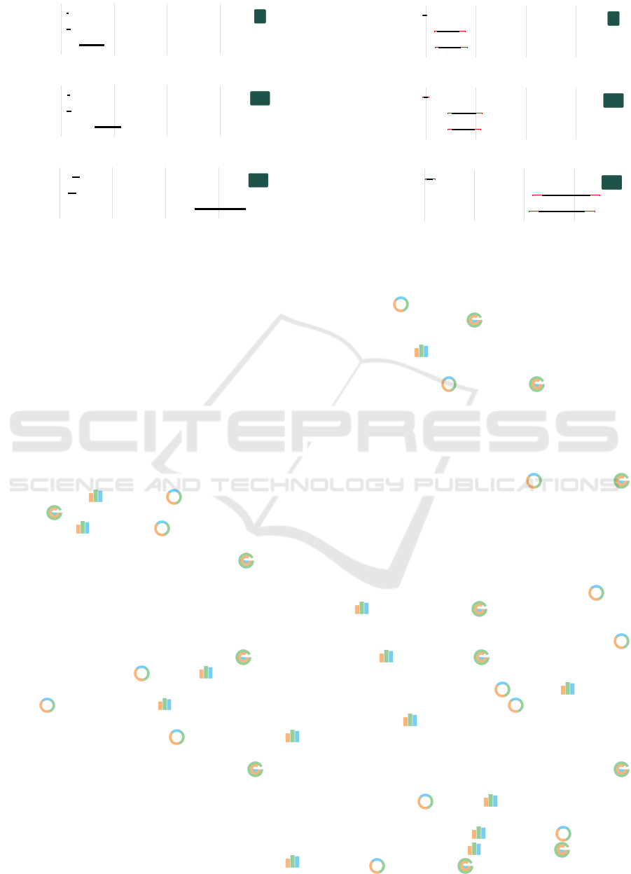
Large Stimuli on the Laptop.
The bottom row of Figure 2 shows the CIs of the means
for each chart type, and of their mean differences for
the
large
stimuli. We see that
Radial
is again
outperformed by
Donut
and
Bar
. Looking at the
individual differences between techniques, we see that
Donut
outperforms
Bar
. Breaking the results
down to the differences for individual data sizes (cf.
Figure 4), we see that
Donut
outperforms
Bar
for 12 and 24 data values but that there is no evidence
of a difference for 7 data values.
Radial
is the
worst technique for each data size.
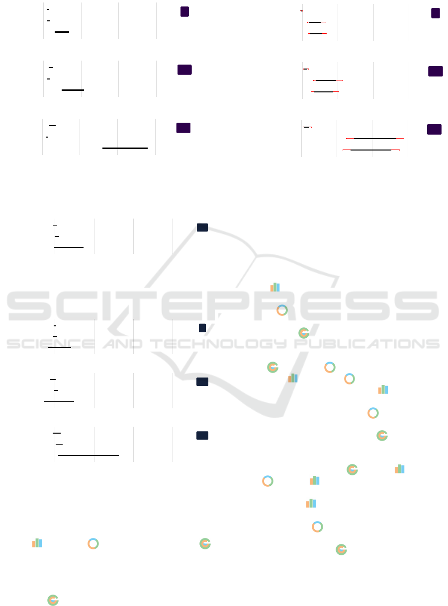
Small vs. Large Stimuli on Laptop.
Figure 5 shows the differences between the
small
and
large
stimuli across all data sizes for all chart
types. Across all data sizes the difference for
Bar
and
Donut
in terms of display size is small (
4 ms
–
161 ms
). For
Radial
the difference is larger
(
197 ms
–
1717 ms
). Given that the CIs overlap 0
clearly for
Bar
, we have no evidence of a difference
between
small
and
large
stimuli for this chart. The
CIs for both
Donut
and
Radial
overlap 0 only
slightly giving us some evidence that participants per-
formed more slowly with the
small
charts. However,
Figure 5 and Figure 6 show that there is no evidence
for a difference of thresholds for
small
and
large
stimuli for 7 and 12 data values (CIs clearly intersect
0). The only exceptions are
Donut
and
Radial
for the 24 data values.
Small Stimuli on Smartwatch vs. Laptop.
The results of the original study can be found in Fig-
ure 7. Comparing the trends of the thresholds for the
small
stimuli to the trends observed from the smart-
watch study, we find that for all chart types and data
sizes the order of charts is the same:
Donut
and
Bar
, and then
Radial
. Inspecting the trends for
the different data sizes individually, the same trends
for 7 and 12 data values can be observed:
Donut
and
Bar
, then
Radial
. The only exception are
the 24 data values. Here, the smartwatch study found
no difference between
Donut
and
Bar
, however,
for the
small
stimuli the
Donut
was slightly better
than the Bar .
Looking at individual differences between the three
chart types, we observe similar trends to the smart-
watch study for the
small
stimuli. The
Radial
across all data values has by far the highest threshold,
whereas
Donut
and
Bar
are fairly close. This is
also reflected in the mean threshold differences (small
difference between
Bar
and
Donut
but large
difference between
Bar
and
Radial
as well as
Donut
and
Radial
). Average thresholds were,
IVAPP 2021 - 12th International Conference on Information Visualization Theory and Applications
138
●
●
●
777
radial
donut
bar
0 2000 4000 6000
●
●
●
777
radial − bar
radial − donut
bar − donut
0 2000 4000 6000
●
●
●
121212
radial
donut
bar
0 2000 4000 6000
●
●
●
121212
radial − bar
radial − donut
bar − donut
0 2000 4000 6000
●
●
●
242424
radial
donut
bar
0 2000 4000 6000
●
●
●
242424
radial − bar
radial − donut
bar − donut
0 2000 4000 6000
Figure 4: Results for the
large
stimuli displayed on the laptop screen (
1280 px×1280 px
). Left: Average thresholds in
milliseconds for each chart type and data size. Right: Pair-wise comparisons for each chart type and data size. Error bars
represent 95% Bootstrap confidence intervals (CIs) adjusted for nine pairwise comparisons with Bonferroni correction.
●
●
●
allallall
Radial
Donut
Bar
0 2000 4000 6000
Figure 5: Difference between independent means of the
small
and
large
stimuli on the laptop screen for all chart
types across all data sizes. Error bars represent 95% Boot-
strap confidence intervals (CIs).
●
●
●
777
Radial
Donut
Bar
0 2000 4000 6000
●
●
●
121212
Radial
Donut
Bar
0 2000 4000 6000
●
●
●
242424
Radial
Donut
Bar
0 2000 4000 6000
Figure 6: Difference between independent means of the
small
and
large
stimuli on the laptop screen for all chart
types and individual data sizes. Error bars represent 95%
Bootstrap confidence intervals (CIs).
however, slower on the laptop, in the range of 100 ms
for Bar and Donut and 1400 ms for Radial .
For individual data sizes we can again observe the
same trends as in the smartwatch study. For 7 data
values all three charts have fairly similar thresholds,
but with the increase of data values the threshold for
the Radial increases as well.
4.2 Accuracy
We also report the accuracy for each stimulus type, for
which we target
~
91% correct responses. However, for
both stimuli types, all chart types, and all data sizes
the errors are larger than 9-10%. For the
small
stimuli
and
Bar
the mean error is 23% (7 data values =
18%, 12 data values = 25%, 24 data values = 26%),
for
Donut
the mean error is 19% (7 data values =
17%, 12 data values = 18%, 24 data values = 22%),
and for
Radial
the mean error is 23% (7 data val-
ues = 23%, 12 data values = 23%, 24 data values =
23%). There is some evidence of a difference between
Radial
and
Donut
for 7 data values as well as
between
Bar
and
Donut
for 12 and 24 data val-
ues. For the
large
stimuli and
Bar
the mean error
is 22% (7 data values = 18%, 12 data values = 21%,
24 data values = 27%), for
Donut
the mean error is
17% (7 data values = 15%, 12 data values = 16%, 24
data values = 20%), and for
Radial
the mean error
is 21% (7 data values = 22%, 12 data values = 22%,
24 data values = 18%). There is some evidence of a
difference between
Radial
and
Bar
as well as
Donut
and
Bar
for 24 data values. These error
rates are similar to the results reported by Blascheck
et al. (2019):
Bar
had a mean error of 23% (7 data
values
=
16%, 12 data values
=
23%, 24 data val-
ues
=
29%),
Donut
had a mean error of 16% (7 data
values
=
13%, 12 data values
=
13%, 24 data val-
ues
=
18%), and
Radial
had a mean error of 29%
(7 data values
=
28%, 12 data values
=
28%, 24 data
values = 31%).
A Replication Study on Glanceable Visualizations: Comparing Different Stimulus Sizes on a Laptop Computer
139

●
●
●
777
radial
donut
bar
0 2000 4000 6000
●
●
●
777
radial − bar
radial − donut
bar − donut
0 2000 4000 6000
●
●
●
121212
radial
donut
bar
0 2000 4000 6000
●
●
●
121212
radial − bar
radial − donut
bar − donut
0 2000 4000 6000
●
●
●
242424
radial
donut
bar
0 2000 4000 6000
●
●
●
242424
radial − bar
radial − donut
bar − donut
0 2000 4000 6000
Figure 7: Data from the original smartwatch study. Left: Average thresholds in milliseconds for each chart type over all data
sizes. Right: Pair-wise comparisons for each chart type and data size. Error bars represent 95% Bootstrap confidence intervals
(CIs) adjusted for nine pairwise comparisons with Bonferroni correction.
4.3 Post-questionnaire
In the post-questionnaire participants ranked all chart
types on preference and confidence. Table 3 summa-
rizes the results for both stimuli sizes.
Overall,
Bar
was the most preferred and partici-
pants felt the most confident for all data sizes and both
stimuli sizes.
Donut
was the second most preferred
and the chart type participants felt second most con-
fident with for both stimuli sizes. The only exception
for the large stimuli preference are the 7 data val-
ues, for which the second rank is shared with
Bar
.
Radial
was the least preferred and participants felt
the least confident for both stimuli sizes.
5 DISCUSSION
We set out to understand if there is a difference be-
tween device type (laptop versus smartwatch) and dif-
ferent stimuli sizes (small versus large).
In general showing the small stimuli on a laptop in-
stead of a smartwatch led to similar overall trends. We
did not find evidence of a difference between
Bar
and
Donut
except for 24 data values. All threshold
averages slightly increased for the
small
stimuli in the
laptop study compared to the smartwatch; in the order
of
100 ms
for
Bar
and
Donut
but in the order of
seconds for Radial .
Based on previous work, we also expected to see a
difference in stimulus size. For our simple data com-
parison task we found no clear evidence that the size
of the stimulus had an effect on the answer thresh-
olds. Both
Bar
as well as
Donut
could still
be read within less than
360 ms
. We observed the
same trends as in the smartwatch study (
Bar
and
Donut
outperform
Radial
). In contrast to pre-
vious studies (Heer et al., 2009; Neshati et al., 2019)
who found that completion time increased as chart
size increased we saw an overall decline in completion
time for the larger stimuli. This effect needs to be
studied further. In our study, in contrast to previous
work, participants did not explicitly have to choose
their own error vs. completion time tradeoff as each
trial had a pre-determined completion time.
The error rates for both stimuli sizes and the smart-
watch study were more or less the same, however, not
within the 9-10% targeted. This could be because the
number of reversals was not chosen large enough and
participants did not reach their true threshold. Com-
paring the actual accuracy rates, the difference be-
tween
small
and
large
stimuli was minimal, and
only slightly lower for the
large
stimuli. However,
these results are similar to findings in previous stud-
ies (Heer et al., 2009; Javed et al., 2010; Neshati et al.,
2019), in which the authors found that as chart size
increases the error decreases. Interestingly, for the
large
stimuli on the laptop there is clear evidence
that
Bar
had a higher error rate than
Donut
and
Radial
. This is interesting and warrants further
study. We hypothesize that the presence of distractors
or the thinner bars might have played a greater role for
larger stimuli.
Comparing the rankings, the
Bar
was mostly
ranked first, followed by the
Donut
and last
Radial
for both preference and confidence across
both stimuli sizes. This result was not the same as in
the smartwatch study. In the study by Blascheck et al.
(2019) the donut was preferred and participants felt
more confident, which could indicate that for a smart-
IVAPP 2021 - 12th International Conference on Information Visualization Theory and Applications
140

Table 3: Ranking of the three chart types for each data size. Top: Chart types participants preferred. Bottom: Chart
types participants felt most confident with. Left: For the
small
stimuli (
320 px×320 px
). Right: for the
large
stimuli
(1280 px×1280 px).
RANKING OF CHART PREFERENCE
SMALL STIMULI LARGE STIMULI
DATA SIZE RANK Bar Donut Radial Bar Donut Radial
1 15 3 0 9 7 2
7 2 3 14 1 9 9 0
3 0 1 17 0 2 16
1 12 6 0 10 8 0
12 2 6 12 0 8 10 0
3 0 0 18 0 0 18
1 10 7 1 9 7 2
24 2 7 10 1 7 11 0
3 1 1 16 2 0 16
RANKING OF CHART CONFIDENCE
SMALL STIMULI LARGE STIMULI
1 13 5 0 12 4 2
7 2 5 13 0 4 12 2
3 0 0 18 2 2 14
1 11 7 0 11 7 0
12 2 7 11 0 7 10 1
3 0 0 18 0 1 17
1 11 6 1 9 7 2
24 2 6 10 2 8 10 0
3 1 2 15 1 1 16
watch people prefer a different type of chart than for a
laptop computer. It could also be that familiarity with
Donut
was rated a bit lower in our study (M = 3.5,
SD = 1.6) than in the smartwatch study (M = 4.28,
SD = 1.13), however, the difference was minimal.
A major difference we see in the two studies is the
type of participants recruited. In our study, less than
half of the participants (15 of 36) had a bachelor or
master degree. Most had a higher education degree (A-
levels) and lower. In the smartwatch study, more than
three-quarters had a bachelor or master degree and had
a background in computer science. While the low-level
task we tested should not be impacted by academic
background, we cannot exclude the possibility that
prior exposure to charts might have influenced the
results slightly. Should there be an effect, the results
from the smartwatch study are likely a “best case” and
the thresholds for a population with less experience
reading charts might be higher, which was the case in
our study.
Initially for this study, we planned to recruit 24 par-
ticipants per condition (48 in total). However, due to
difficulties with recruitment, we reduced the number
of participants to 18 per condition during the study.
This lead to some orders of the conditions being used
only once and others being used three times. This
might have an effect on performance, i.e., conditions
done first lead to better results because participants
are not tired. However, with the still large number of
participants per condition, we are confident that this
effect can be neglected.
In addition, especially for the
large
stimuli we
have to consider how realistic the scenario is. Initially,
the study design was inspired by a smartwatch us-
age scenario—people quickly glancing at their device
while potentially even performing a different task (e.g.,
running). Therefore, the charts were designed with no
labels, axes, grid lines, and tick marks, which would
not be the case for a large bar chart. Typically, usage
scenarios on a regular laptop would also be different
as people use visualization as their primary focus to
analyze some type of data.
In summary, our replication indicated that using a
setup that is less technically complicated in both soft-
ware and hardware design will allow us to reproduce or
replicate these types of smartwatch perception studies.
Our results show that the overall trends found on the
smartwatch hold for smartwatch-sized visualizations
on a larger display. However, we saw a slight increase
in thresholds for
Bar
and
Donut
and a larger in-
crease of thresholds for
Radial
. In addition, we
were interested to find out to which extent the results
from the initial study would hold for larger visualiza-
tions. Our results indicate that the overall trends hold,
A Replication Study on Glanceable Visualizations: Comparing Different Stimulus Sizes on a Laptop Computer
141

Bar
and
Donut
still outperformed
Radial
.
However, we expected that thresholds would increase
for the large visualizations, which they did not.
6 CONCLUSIONS
We replicated the study by Blascheck et al. (2019)
on a laptop using two different stimuli sizes
(
320 px×320 px
and
1280 px×1280 px
). We investi-
gated if trends observed for small visualizations on
smartwatches hold for smartwatch-sized visualizations
as well as large visualizations shown on a larger dis-
play. Our results indicate that for this simple data
comparison task there was no difference between stim-
uli sizes and only minor differences when comparing
the results from the small stimuli to the smartwatch
study. Therefore, in the future, studies could also be
performed on desktop computers with small stimuli to
overcome complicated technical setups, but we recom-
mend to attempt similar resolutions. However, ecolog-
ical validity is diminished both for the smartwatch as
well as the large stimuli. Therefore, the context should
be considered when designing similar studies.
ACKNOWLEDGEMENTS
We would like to thank Ali
¨
Unl
¨
u for conducting the
study. The research was supported by the DFG grant
ER 272/14-1 and ANR grant ANR-18-CE92-0059-01.
Tanja Blascheck is indebted to the European Social
Fund and the Ministry of Science, Research, and Arts
Baden-W
¨
urttemberg.
REFERENCES
Anderson, E. (1957). A semigraphical method for the analy-
sis of complex problems. Proceedings of the National
Academy of Science, 43(10):923–927.
Aravind, R., Blascheck, T., and Isenberg, P. (2019). A survey
on sleep visualizations for fitness trackers. In EuroVis
2019 - Posters. The Eurographics Association.
Beck, F., Blascheck, T., Ertl, T., and Weiskopf, D. (2017).
Word-sized eye tracking visualizations. In Burch, M.,
Chuang, L., Fisher, B., Schmidt, A., and Weiskopf,
D., editors, Eye Tracking and Visualization, pages 113–
128. Springer.
Beck, F., Hollerich, F., Diehl, S., and Weiskopf, D. (2013a).
Visual monitoring of numeric variables embedded in
source code. In 2013 First IEEE Working Confer-
ence on Software Visualization (VISSOFT), pages 1–4.
IEEE.
Beck, F., Moseler, O., Diehl, S., and Rey, G. D. (2013b). In
situ understanding of performance bottlenecks through
visually augmented code. In 2013 21st International
Conference on Program Comprehension (ICPC), pages
63–72. IEEE.
Beck, F. and Weiskopf, D. (2017). Word-sized graphics for
scientific texts. IEEE Transactions on Visualization
and Computer Graphics, 23(6):1576–1587.
Blascheck, T., Besan
c¸
on, L., Bezerianos, A., Lee, B., and
Isenberg, P. (2019). Glanceable visualization: Stud-
ies of data comparison performance on smartwatches.
IEEE Transactions on Visualization and Computer
Graphics, 25(1):630–640.
Borgo, R., Kehrer, J., Chung, D., Maguire, E., Laramee, R.,
Hauser, H., Ward, M., and Chen, M. (2013). Glyph-
based visualization: Foundations, design guidelines,
techniques and applications. In Eurographics Con-
ference on Visualization - STARs, pages 39–63. The
Eurographics Association.
Brandes, U. (2014). Visualization for visual analytics: Micro-
visualization, abstraction, and physical appeal. In Pro-
ceedings of the IEEE Pacific Visualization Symposium,
pages 352–353. IEEE Computer Society Press.
Brandes, U., Nick, B., Rockstroh, B., and Steffen, A. (2013).
Gestaltlines. Computer Graphics Forum, 32(3):171–
180.
Chung, D., Laramee, R., Kehrer, J., and Hauser, H. (2014).
Glyph-based multi-field visualization. In Hansen, C.,
Chen, M., Johnson, C., Kaufman, A., and Hagen,
H., editors, Scientific Visualization, pages 129–137.
Springer.
Dragicevic, P. (2016). Fair statistical communication in HCI.
In Robertson, J. and Kaptein, M., editors, Modern
Statistical Methods for HCI, pages 291–330. Springer.
Fuchs, J., Isenberg, P., Bezerianos, A., and Keim, D. (2017).
A systematic review of experimental studies on data
glyphs. IEEE Transactions on Visualization and Com-
puter Graphics, 23(7):1863–1879.
Garc
´
ıa-P
´
erez, M. (1998). Forced-choice staircases with fixed
step sizes: Asymptotic and small-sample properties.
Vision Research, 38(12):1861–1881.
Goffin, P., Boy, J., Willett, W., and Isenberg, P. (2017). An
exploratory study of word-scale graphics in data-rich
text documents. IEEE Transactions on Visualization
and Computer Graphics, 23(10):2275–2287.
Greene, M. and Oliva, A. (2009). The briefest of glances:
The time course of natural scene understanding. Psy-
chological Science, 20(4):464–72.
Heer, J., Kong, N., and Agrawala, M. (2009). Sizing the
horizon: The effects of chart size and layering on the
graphical perception of time series visualizations. In
Proceedings of the Conference on Human Factors in
Computing Systems, pages 1303–1312. ACM.
Higgins, J. J. (2004). Introduction to Modern Nonparametric
Statistics. Thomson Learning, 1st edition.
Islam, A., Bezerianos, A., Lee, B., Blascheck, T., and Isen-
berg, P. (2020). Visualizing information on watch faces:
A survey with smartwatch users. In IEEE Visualization
Conference (VIS).
IVAPP 2021 - 12th International Conference on Information Visualization Theory and Applications
142

Javed, W., McDonnel, B., and Elmqvist, N. (2010). Graphi-
cal perception of multiple time series. IEEE Trans-
actions on Visualization and Computer Graphics,
16(6):927–934.
Kingdom, F. and Prins, N. (2010). Psychophysics: A Practi-
cal Introduction. Elsevier Science BV, 1st edition.
Neshati, A., Sakamoto, Y., Leboe-McGowan, L. C., Leboe-
McGowan, J., Serrano, M., and Irani, P. (2019). G-
sparks: Glanceable sparklines on smartwatches. In
Proceedings of the 45th Graphics Interface Conference
on Proceedings of Graphics Interface 2019, pages 1–9.
Canadian Human-Computer Communications Society.
Perin, C., Vuillemot, R., and Fekete, J.-D. (2013). Soccer-
Stories: A kick-off for visual soccer analysis. IEEE
Transactions on Visualization and Computer Graphics,
19(12):2506–2515.
Pizza, S., Brown, B., McMillan, D., and Lampinen, A.
(2016). Smartwatch in vivo. In Proceedings of the
Conference on Human Factors in Computing Systems
(CHI), pages 5456–5469. ACM.
Ropinski, T., Oeltze, S., and Preim, B. (2011). Survey
of glyph-based visualization techniques for spatial
multivariate medical data. Computers & Graphics,
35(2):392–401.
Saito, T., Miyamura, H. N., Yamamoto, M., Saito, H.,
Hoshiya, Y., and Kaseda, T. (2005). Two-tone pseudo
coloring: Compact visualization for one-dimensional
data. In Proceedings of the Conference on Information
Visualization, pages 173–180. IEEE Computer Society
Press.
Tufte, E. (2001). The visual display of quantitative informa-
tion. Graphics Press, 1st edition.
A Replication Study on Glanceable Visualizations: Comparing Different Stimulus Sizes on a Laptop Computer
143
