
Visual Data Story Protocol: Internal Communications from Domain
Expertise to Narrative Visualization Implementation
Apiwan Duangphummet
1a
and Puripant Ruchikachorn
1,2 b
1
Institute of Public Policy and Development, Bangkok, Thailand
2
Department of Statistics, Chulalongkorn University, Bangkok, Thailand
Keywords: Data Storytelling, Visualization Design, Visualization Development.
Abstract: Data stories play an important role in effectively and intuitively communicating data insights as well as
enabling the audience to understand important social issues. Crafting a data story needs several sets of skills,
we propose a five-phase data story protocol in order to guide data story design and development, and promote
interdisciplinary team collaboration. This protocol was developed from our working team reflection on four
data story projects and researching the related work. We hope that this protocol could be one potential way
for non-journalism organizations to conduct data stories for their target audience.
1 INTRODUCTION
In recent years, data visualization has become
popular for its ability to transform data, information,
and knowledge into a form that relies on the human
visual system. Many news organizations especially
online journalists have been incorporating data
visualization into their narratives, often called ‘data
story’ (E. Segel and J. Heer, 2010).
Creating a data story is challenging and requires
interdisciplinary collaboration. Many visualization
models and frameworks have been proposed to
guide the design and development, mostly for
visualization systems. We therefore took lessons
learned from our experiences working on
communicating public issues through data, and a
careful analysis of related work on visualization
process and visualization collaboration in order to
propose a data story protocol consisting of five
major phases. While many frameworks for
visualization creation are developed by journalists
or information visualization specialists, we hope
that our work offers practical protocol created by
practitioners in other fields.
a
https://orcid.org/0000-0002-8080-9402
b
https://orcid.org/0000-0002-2721-6915
2 RELATED WORK
We conducted a literature review in the two main
topics: data visualization design and development
process, and data visualization design and
development collaboration.
2.1 Data Visualization Design and
Development Process
Stuart K. Card et al.
(
1999) suggest a four-stage
information visualization reference model: raw data,
data tables, visual abstractions and views. The first
two stages of the model are similar to data preparation
of our data story protocol. The last two stages of the
model are similar to visualization design and
visualization development of our protocol. The
difference is that our data story protocol requires
conceptualization for team alignment and realization
for insight discovery while Stuart K. Card et al.’s
model for information visualization development
does not require these phases.
Fry (2007) presents seven stages of data
visualization workflow: acquiring, parsing, filtering,
mining, representing, refining and interacting. More
than half of the processes have to do with getting data,
preparing data and making a visualization work
240
Duangphummet, A. and Ruchikachorn, P.
Visual Data Story Protocol: Internal Communications from Domain Expertise to Narrative Visualization Implementation.
DOI: 10.5220/0010327602400247
In Proceedings of the 16th International Joint Conference on Computer Vision, Imaging and Computer Graphics Theory and Applications (VISIGRAPP 2021) - Volume 3: IVAPP, pages
240-247
ISBN: 978-989-758-488-6
Copyright
c
2021 by SCITEPRESS – Science and Technology Publications, Lda. All rights reserved

properly. Our data story protocol emphasizes these
phases too in the data preparation, realization and
visualization design.
Munzner (2009) presents a nested model for
visualization design and validation with four tasks:
problem characterization in the vocabulary of the
problem domain, data and operation abstraction
design, visual encoding and interaction technique
design, and algorithm design to execute techniques
efficiently. This model has made a contribution to a
broad range of visualization papers, including design
studies, visualization technique study, frameworks,
and systems. Although the nested model guides the
design and validation of visualization systems and our
protocol guides the design and development of data
stories, both have similar core processes. The first
level to the last level of the nested model are similar
to conceptualization, data preparation, visualization
design and visualization development of our data
story protocol, respectively. Our protocol for data
story needs a realization phase to explore useful
insights while Munzner’s model for visualization
does not need this phase.
Design study approach is used for conducting
problem-driven visualization research in an
application area. Sedlmair et al. (2012) propose a
methodological framework for conducting design
studies consisting of the three following phases: a
precondition phase, a core phase and an analysis
phase. Both Sedlmair et al’s model and our protocol
are designed to be practical guidance on collaborating
with domain experts. The difference is that our data
story protocol focuses on the core phase of Sedlmer
et al.’s framework as we assume that learning
visualization literature, selecting promising
collaborations, and identifying collaborator roles in
the precondition phase are prepared and a data story
creation does not need the analysis phase to reflect
and write a design study paper.
McKenna et al. (2014) present the design activity
framework based on Munzner’s nested model. This
model consists of four tasks: understanding the
problem domain and target users, idea generation, idea
concretization into tangible prototypes and prototype
deployment. Walny et al. (2019) present five major
phases of their design projects: project
conceptualization, data characterization, visualization
design, visualization development, deployment and
use. Although McKenna et al.'s and Walny et al’s share
common phases with our data story protocol, both
works do not focus on data preparation.
Nina McCurdy et al. (2016) propose the four-
stage Action Design Research (ADR) methodology:
problem formulation, building, intervention and
evaluation, reflection and learning, and formalization
of learning. Both the ADR methodology and our data
story protocol are designed to tackle real-world
problems and share common stages. However, the
ADR methodology focuses on intervention and
learning for visual analytics systems research while
our data story protocol focuses on visualization
design and development processes for
communication.
In summary, our data story protocol partially
shares common phases with several data
visualization creation models and frameworks. The
difference lies in that many frameworks are
developed by journalists or information
visualization specialists, our work offers a protocol
created by practitioners in public policy in
collaboration with domain experts from different
fields. We hope this protocol can be a generalized
guideline for any practitioners who desire to
communicate important issues through data stories.
2.2 Data Visualization Design and
Development Collaboration
Visualization viewer background is not limited to the
sciences and engineering, but also other fields:
economics, business, and humanities, for example.
The knowledge and expertise for visualization design
and development are no longer restricted to computer
science. Visualization expertise requires several sets
of skills including human-centered design,
evaluation, cognition and perception (Kirby and
Meyer, 2013).
McCormick et al. (1987) present five types of
interdisciplinary team members: computational
scientists and engineers, visualization scientists and
engineers, system support personnel, artists and
cognitive scientists. Kirby and Meyer (2013) further
proposes an updated list of the roles: domain experts,
visualization experts, designer and human-computer-
interaction experts, cognitive and perceptual
psychologists, data analysis experts, database and data
management experts, and high-performance and high-
throughput computing experts. The first two roles are
the primary ones. Each of the other roles is either
assigned to a team member or assumed by a primary
member. Real-world visualization design projects
often consist of team members with diverse and
overlapping subsets of these skills. Our data story
protocol is closely aligned with the latter work in which
domain experts and visualization experts are involved.
3 DATA STORIES AND
PROTOCOL DEVELOPMENT
In this digital era, the broader accessibility of data
has dramatically increased the quantity of
Visual Data Story Protocol: Internal Communications from Domain Expertise to Narrative Visualization Implementation
241
information directed toward people including policy
makers and the general public. At the Institute of
Public Policy and Development (IPPD), a policy
laboratory and impact-oriented platform, we try to
utilize data story as one of effective ways to present
idea, intelligence, evidence, and public opinion in a
visual format for long-term sustainable
development.
Regarding overall storytelling format, we chose
the scroll-based and long-form of articles widely used
in journalism called “scrollytelling” (Doris Seyser
and Michael Zeiller, 2018) because this storytelling
format is designed to fit consumer behavior in the
digital world.
We have developed four data stories for IPPD
since 2019. As well as the literature review, the
reflections from our team members have guided our
data story protocol presented in Section 4.
3.1 Where is Thailand?:
Labor Productivity
The first data story (IPPD, 2020a) started from the
difficulty to gain insights from our visualization
shown in Figure 1. The visualization is a connected
scatterplot which can show the time series of two
variables at the same time (Steve Haroz, Robert
Kosara, Steven L. Franconeri, 2015). We gathered
several time series from various sources and hoped
a user can connect two previously separate variables
to comprehend the current state of Thailand—hence
a rhetorical question, Where is Thailand?—
compared to other countries and continent-level
aggregates. Despite a recent user study on connected
scatterplot (Steve Haroz, Robert Kosara, Steven L.
Franconeri, 2015), many early testers said that they
could not extract useful information from our
visualization.
We developed a data story to help users
understand and make sense of the same information
provided in the visualization. From our own
exploration, we found an interesting variable pair,
work hours per person per year and GDP per capita,
that could tell a story about labor productivity.
The data story starts with a controversial
question whether Thai people are hard working or
not. If the user scrolls down, the question fades out
as the visualization starts showing a line chart
(Figure 2) and a connected scatterplot of the related
global indexes to answer the question. As the user
scrolls through the presentation, the key
visualization maintains a consistent format and
changes only the content within the text box and
indexes.
What we have learned from developing our first
data story is that storytelling allows data visualization
to reveal analysis results compellingly and effectively
as we can see from increasing user questions and
opinions about Thailand’s labor productivity on
social media.
However, we spent four months on this data story
and wondered if the entire process of data story
design and development can take less time. Thus, we
started to reflect with the working team and
developed our first version of data story protocol
consisting of visualization tool development,
realization and presentation development, shown in
sketches in Figure 3.
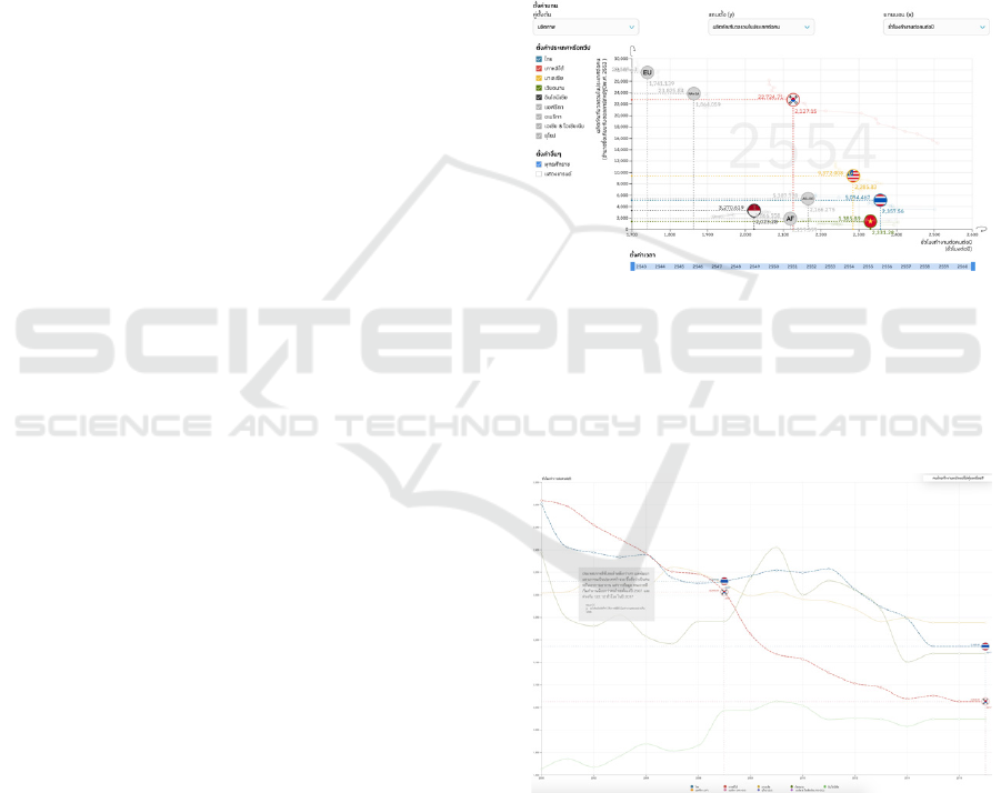
Figure 1: A connected scatterplot of work hours per person
per year (horizontal axis) and GDP per capita (vertical
axis). Each circle represents a country with its flag or a
continent with its acronym. In this chart, Thai people
(bottom right) work long hours but do not generate much
GDP, compared to European counterparts (top left), for
example.
Figure 2: A data story about labor productivity. The key
visualization was based on the same information provided
in the visualization in Figure 1. The horizontal axis
represents time whereas the vertical axis represents annual
hours worked.
IVAPP 2021 - 12th International Conference on Information Visualization Theory and Applications
242
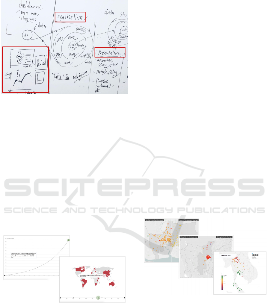
Figure 3: Our first version of data story protocol,
created from the working team reflection, has three phases:
visualization tool development for data analysis,
realization, and presentation development.
3.2 Where is Thailand?:
Plastic Management
The second data story (IPPD, 2020b) started from the
need to communicate an urgent issue about plastic
management to the public. It was not based on the
same visualization (Figure 1) as the first data story.
The data story on plastic management starts with
the prediction of waste in 2050 (Roland Geyer, Jenna
R. Jambeck and Kara Lavender Law, 2017). When
the user scrolls down, the prediction fades out and
another visualization starts showing with explanation.
Similar to the first data story, key visualizations stay
in the same formats, namely a line chart and a world
map (Figure 4).
Figure 4: Visualizations in the data story about plastic
management. The line chart on the left shows historical data
of cumulative plastic waste generation and disposal from
1950 to 2015, and projections of historical trends to 2050.
The world map on the right shows countries that have
introduced regulations on plastic bags and polystyrene
foam products.
Using our first version of data story protocol, the
entire process took only two months which is fifty
percent of time spent on the first data story. Other
observations for improvement are summarized as
follow:
1. The involvement of domain experts in the
working team improved the depth and variety of
content.
2. Not every data story required visualization tool
development for data analysis.
3. Realization phase took the longest time as we
changed the content direction multiple times. The
direction changes were mainly caused by the lack of
data.
We then researched related work and updated our
protocol to solve the mentioned issues. There were
five phases in our updated protocol as follows:
conceptualization, data preparation, realization,
visualization design and visualization development.
3.3 When Big Data Meets Small
Particles
Another interesting issue for data story development
was the exacerbating air pollution problem in the
greater Bangkok and the northern part of Thailand.
We used a mix of visualization techniques including
a stacked bar chart and various forms of geographical
maps.
Our third data story (IPPD, 2020c) starts with
important statistics about negative impacts of air
pollution in Thailand. As the user scrolls down, he or
she can interact with various interactive
visualizations as shown in Figure 5.
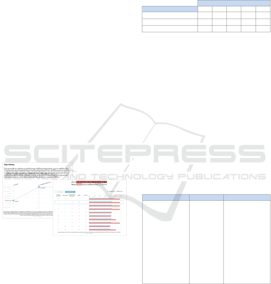
Figure 5: Visualizations in the data story about the air
pollution problem. First, the choropleth in the top left
compares Bangkok air quality index before and after
COVID-19 lockdown. Second, the choropleth in the middle
compares air quality index in the northern part
of Thailand before and after COVID-19 lockdown. Lastly,
the choropleth in the bottom right shows air quality in
Thailand throughout the reference year.
Using our current five-phase protocol, we spent
only two months creating the third data story. Another
key success factor was the involvement of domain
Visual Data Story Protocol: Internal Communications from Domain Expertise to Narrative Visualization Implementation
243
experts with strong analytical skills. In the making of
this data story, we collaborated with a data scientist
and a data analyst from a data analytics consulting
company. They primarily involved in the first three
phases: conceptualization, data preparation and
realization.
3.4 Reflections on Policy Options
for Road Safety
Thailand is one of the top five countries in the world
with the highest road traffic fatality rate (The World
Health Organization, 2018). So we picked this topic
for our fourth data story (IPPD, 2020d).
The data story starts with important statistics
about car accidents in Thailand. As the user scrolls
down, he or she can interact with different interactive
visualizations as shown in Figure 6. Similar to the
third data story, we used a mix of visualization
techniques including a bump chart and various forms
of bar charts.
We have learned that not every key visualization
needed to be interactive. We chose static format for
some key visualizations. Designing and developing
an interactive visualization usually takes more effort
than a static visualization, we should carefully
consider which key visualization is worth our team
effort.
Figure 6: Visualizations in the data story about policy
options for road safety. The bump chart on the left shows
the number of mortality rates by causes of death in 2018.
The bar charts on the right compare costs and benefits of
different policy options.
4 DATA STORY PROTOCOL
As data story design and development requires
several sets of literacy and skills, clarifying roles and
responsibilities (Table 1) of a cross-functional team
enables the teams to work efficiently and reduce the
unnecessary duplication of tasks.
Table 1: Involvement of each role in the protocol. Domain
experts are responsible for conceptualization, data
preparation and realization. Visualization experts oversee
visualization design. Visualization developers are in charge
of visualization development.
Phase in data story protocol
Role 1 2 3 4 5
Domain experts
✓ ✓ ✓
Visualization experts
✓ ✓
Visualization developers
✓
In practice, the working team could be divided
into three main positions: domain experts,
visualization experts and visualization developers.
Domain experts are typically researchers with subject
matter knowledge. Visualization experts are
specialists in effectively encoding data visually and
storytelling with data. Visualization developers are
software engineers with skills in graphic
representation creation.
The design objectives of our data story protocol
are to serve as a useful guideline for data story design
and development projects and to encourage
interdisciplinary collaboration between domain
experts. We illustrate the five phases with
documented artifacts from our last data story,
Reflections on Policy Options for Road Safety, as
follows. Please note that we do not describe data
analysis and visualization validation in details as
many previous works already covered the topics.
Table 2: A result from the conceptualization phase for
the data story ‘Reflections on Policy Options for Road
Safety’.
Target audience Channel Key messages
- General audience
who are interested in
or have knowledge
about wellbeing,
health and risk. An
interest in related
public policy would
be a plus.
- General audience
with curiosity to
learn from data and
understanding of
basic statistics
- IPPD
website
- IPPD
Facebook
page
- Road accidents are
the leading cause of
death in Thailand
comparing to other
causes
- The main risk
factors for road are
night-time driving
and motorcycle
driving
- Exploring what are
effective policy
options to reduce
road traffic fatalities
4.1 Conceptualization
As we begin working together as a team, it is
important that everyone on the team has a clear
understanding of project conceptualization. Domain
experts are responsible for identifying characteristics
of the target audience, distribution channel that we
IVAPP 2021 - 12th International Conference on Information Visualization Theory and Applications
244
expect the target audience to see our work and key
messages we would like to tell the audience.
(Table 2)
4.2 Data Preparation
After the scope of content has been defined, the
domain experts obtain and organize the data. This can
be either complicated (i.e., a dataset from an external
organization that requires a memorandum of
understanding) or very simple (i.e., readily machine-
readable dataset available in a public website).
A deliverable of this phase is the data that is relevant
to the use. A data dictionary is an optional
deliverable.
4.3 Realization
After having necessary data, the domain experts
discover useful insights and develop a storyline with
supervision from visualization experts. This step
involves basic statistics, data mining, and
storytelling. Oftentimes, defining key messages in the
first phase, data preparation in the second phase and
developing a storyline in the third phase are iterative.
For example, we set marine plastic leakage as one of
the key messages for the second data story ‘Where is
Thailand?: Plastic Management’ during the
conceptualization phase, but decided to cut off this
part and shifted focus to types of national policies on
plastic management during the realization phase.
A deliverable of this phase is the storyline that
includes detailed content and initial form of key
visualizations. An initial form of key visualization
does not need any detailed design. It could be
visualization from the original source or visualization
created by off-the-shelf software as we can see in
Figure 7.
4.4 Visualization Design
To quickly get feedback on the key visualizations,
visualization experts redesign the visualizations and
create visualization prototypes. An example is shown
in Figure 8. This step requires visualization expertise
to visually encode data effectively. Deliverables of
this phase are the final visualization prototypes.
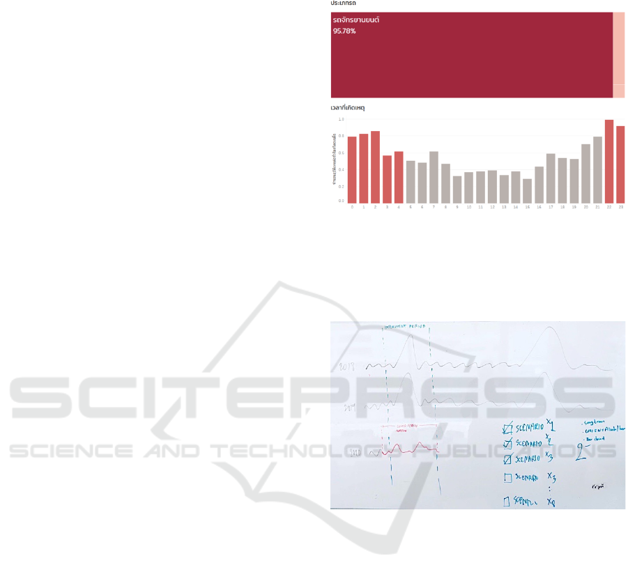
In Figure 9, the change was made during the
visualization design phase. Visualization experts
suggested a line chart (Figure 8) representing benefits
and costs of every policy option scenario. However,
domain experts figured out data limitations and were
able to analyze only some scenarios. After a few
discussions, they came up with bar charts in Figure 9
to explicitly compare the benefit and cost of each
possible scenario.
Figure 7:Two key visualizations in an initial form. Treemap
on the top shows the number of road traffic deaths by type
of vehicle. Bar chart on the bottom shows the number of
road traffic deaths by time of day. These initial
visualizations were simply made by a data analyst and do
not need any design skills.
Figure 8: A visualization prototype of our last data story
‘Reflections on Policy Options for Road Safety’. In this
prototype, we tried to answer the question ‘which is the best
policy option on road safety?’ taking benefits and costs into
consideration.
4.5 Visualization Development
After finalizing key visualization prototypes,
visualization developers then define technical
requirements, develop and deploy the key
visualizations to support target devices. A deliverable
of this phase is the finished data story (see Figure 9)
that is ready for publishing.
Visual Data Story Protocol: Internal Communications from Domain Expertise to Narrative Visualization Implementation
245
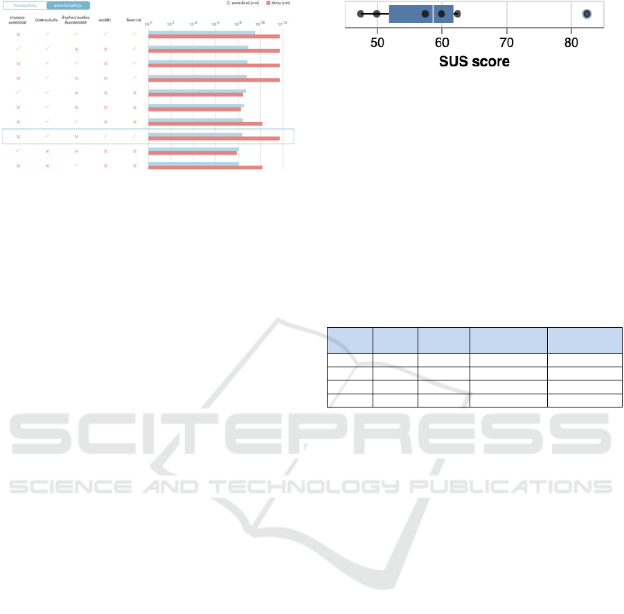
Figure 9: One of final visualizations from our last data story
‘Reflections on Policy Options for Road Safety’. Starting
from the first prototype in Figure 8 and a few feedback
loops, we came up with an interactive visualization that a
user can compare policy options from five columns on the
left with benefits (blue bar charts) and costs (red bar charts)
on the right.
5 PROTOCOL USABILITY
TESTING
To evaluate the effectiveness, the efficiency and
satisfaction of the protocol, we used a modified
System Usability Scale (SUS) questionnaire
(J. Brooke, 1996). Widely used by many researchers,
SUS can quickly and easily collect a user's subjective
rating and can be used on small sample sizes
(A. Bangor, P. T. Kortum, and J. T. Miller, 2008). We
have also modified the SUS questionnaire to make it
suitable for the protocol by changing the word
‘system’ with ‘protocol’, and ‘functions’ with ‘parts’
as follow:
1. I think that I would like to use this protocol
frequently
2. I found the protocol unnecessarily complex
3. I thought the protocol was easy to use
4. I think that I would need the support of a
technical person to be able to use this
protocol
5. I found the various parts in this protocol were
well integrated
6. I thought there was too much inconsistency in
this protocol
7. I would imagine that most people would learn
to use this protocol very quickly
8. I found the protocol very cumbersome to use
9. I felt very confident using the protocol
10. I needed to learn a lot of things before I could
get going with this protocol
Figure 10: Box plot of SUS scores. The maximum score is
82.5, the average score is 60, the median score is 58.75 and
the minimum score is 47.5.
We surveyed six domain experts, visualization
experts, and visualization developers, who had
experience with our data story protocol. The average
SUS score was 60 (Figure 10). We compared SUS
scores of our protocol with nearly a thousand SUS
surveys for relative judgement. The protocol has
demonstrated an “okay” level of usability based on
the adjective scale presented by Bangor et al. (2009).
Table 3: Total weeks spent on data story creation and
the numbers of domain experts, visualization experts and
visualization developers involved in each data story.
Data
story
Weeks Domain
experts
Visualization
experts
Visualization
developers
116 0 1 1
28 5 1 1
36 7 1 1
46 8 1 1
6 DISCUSSION AND
CONCLUSIONS
We have presented a five-phase data story protocol
formed by reflecting on our experiences as members
of the working team for four data stories and the
literature review.
Regarding a usability testing, the protocol
usability is in the marginally acceptable area. That
means we need to improve the protocol in order to
increase the effectiveness, the efficiency and
satisfaction of the protocol. In terms of effectiveness,
we also compare total weeks spent and the number of
each role participated in each data story as shown in
Table 3. Using our protocol and involvement of
domain experts in the fourth data story can reduce
62.5 percent of total weeks spent, compared to total
weeks spent on the first data story.
Interesting areas for improvement came from the
user feedback including brainstorming and early
involvement of an approver. Some domain experts
said that it was difficult to come up with ideas on key
visualizations. Thus, we suggested adding a
brainstorming session between domain experts and
visualization experts as a part of the realization phase.
Some visualization experts also mentioned that they
had to revise the entire data story that had been
IVAPP 2021 - 12th International Conference on Information Visualization Theory and Applications
246

developed due to late feedback. An early approval
from the decision maker of a data story project should
be added, at least for the deliverables of the
conceptualization, realization and visualization
development.
We generalize data story design and development
processes with the hope that this protocol could be an
alternative approach for the practitioners in the non-
journalism industry to effectively communicate vital
issues for improvement through data stories.
ACKNOWLEDGEMENTS
We would like to record our gratitude to the protocol
users for their feedback and dedication in data story
creation, and visualization experts who have been a
part of this research for their insightful guidance and
support.
REFERENCES
Bangor, A., Kortum, P. T., & Miller, J. T. (2008). An
Empirical Evaluation of the System Usability Scale.
International Journal of Human-Computer Interaction,
24(6), PP.574-594.
Bangor, A., Kortum, P. T., & Miller, J. T. (2009).
Determining What Individual SUS Scores Mean:
Adding an Adjective Rating Scale. Journal of Usability
Studies, 4, PP.114-123.
Brooke, J. (1996). SUS: A “Quick and Dirty” Usability
Scale. Usability Evaluation in Industry, PP.189-194.
Taylor & Francis, London.
Card, S., Mackinlay, J., Shneiderman, B. (1999). Readings
in Information Visualization: Using Vision to Think.
Morgan Kaufmann Publishers, San Francisco.
Fry, B. (2007). Visualizing Data. O'Reilly Media, Inc.
Geyer, R., Jambeck, J.R. and Lavender Law, K. (2017).
Production, Use, and Fate of All Plastics Ever Made.
Science Advances, Vol.3, No.7, e1700782.
DOI: 10.1126/sciadv.1700782.
Haroz, S., Kosara, R., Franconeri, S.L. (2015). The
Connected Scatterplot for Presenting Paired Time
Series. IEEE Transactions on Visualization and
Computer Graphics. 22. PP.1-1.
DOI: 10.1109/TVCG.2015.2502587.
Institute of Public Policy and Development (IPPD).
(2020a). Where is Thailand?: Labor Productivity.
Retrieved from https://ippd.or.th/thailand-productivity-
story.
Institute of Public Policy and Development (IPPD).
(2020b). Where is Thailand?: Plastic Management.
Retrieved from http://www.data.ippd.or.th/plastic-
story.
Institute of Public Policy and Development (IPPD).
(2020c). When Big Data Meets Small Particles.
Retrieved from http://www.data.ippd.or.th/plastic-
story.
Institute of Public Policy and Development (IPPD).
(2020d). Reflections on Policy Options for Road
Safety. Retrieved from
https://data.ippd.or.th/roadsafety.
Kirby, R.M. and Meyer, M. (2013). Visualization
Collaborations: What Works and Why. IEEE Computer
Graphics and Applications, 33(6),
PP.82–88. DOI:10.1109/MCG.2013.101.
M. Sedlmair, M. D. Meyer, and T. Munzner. (2012). Design
Study Methodology: Reflections from the Trenches and
the Stacks. IEEE Transactions on Visualization and
Computer Graphics, 18(12), PP.2431–2440.
McCurdy, N., Dykes, J. and Meyer, M. (2016). Action
Design Research and Visualization Design.
In Proceedings of the Sixth Workshop on Beyond Time
and Errors on Novel Evaluation Methods for
Visualization (BELIV '16). Association for Computing
Machinery, New York, USA, 10–18.
DOI: https://doi.org/10.1145/2993901.2993916.
McCormick, B.H., DeFanti, T.A. and Brown, M.D. (1987).
Visualization in Scientific Computing. Computer
Graphics, Vol. 21, No. 6.
McKenna, S., Mazur, D., Agutter, J. and Meyer, M. (2014).
Design Activity Framework for Visualization Design.
IEEE Transactions on Visualization and Computer
Graphics, 20(12), PP.2191–2200.
Munzner, T. (2009). A Nested Model for Visualization
Design and Validation. IEEE Transactions on
Visualization and Computer Graphics, Vol. 15, No. 6,
PP.921-928, DOI:10.1109/TVCG.2009.111.
Segel, E. and Heer, J. (2010). Narrative Visualization:
Telling Stories with Data. IEEE Transactions on
Visualization and Computer Graphics, Vol. 16, No. 6,
PP.1139-1148, DOI:10.1109/TVCG.2010.179.
Seyser, D. and Zeiller, M. (2018). Scrollytelling – An
Analysis of Visual Storytelling in Online Journalism.
International Conference on Information Visualisation
(IV). 401-406. 10. DOI: 1109/iV.2018.00075.
The World Health Organization. (2018). Global Status
Report on Road Safety 2018. Retrieved from
https://apps.who.int/iris/bitstream/handle/10665/27646
2/9789241565684-eng.pdf.
Walny, J., Frisson, C., West, M., Kosminsky, D.,Knudsen,
S., Carpendale, S., Willett, W. (2019). Data Changes
Everything: Challenges and Opportunities in Data
Visualization Design Handoff. IEEE Transactions
on Visualization and Computer Graphics. 1-1.
DOI: 10.1109/TVCG. 2019.2934538.
Visual Data Story Protocol: Internal Communications from Domain Expertise to Narrative Visualization Implementation
247
