
Applying Uncommon Visualizations to Government Dashboards
Puripant Ruchikachorn
1,2 a
1
Institute of Public Policy and Development (IPPD), Bangkok, Thailand
2
Chulalongkorn Business School, Chulalongkorn University, Bangkok, Thailand
Keywords:
Visualization Design, Government, Dashboard.
Abstract:
Many governments provide data dashboards to present the state of the countries or administrative activities.
Their main target audience is typically the citizens but the dashboard design process is usually top-down and
leads to formulaic results. Developing three data dashboard projects for the government of Thailand, we
successfully applied two uncommon data visualizations, grid map and connected scatterplot, despite initial
resistance from the government agencies. We documented the design process including feedback on the two
visualizations and solutions to alleviate their concerns. Academic studies had little success in convincing
stakeholders. In both visualizations, animations helped to frame the concept of the uncommon visualizations.
1 INTRODUCTION
Although the government of Thailand is not a leader
in open data (Lemieux et al., 2015), there has been
an attempt to gather data into a centralized web-
site: https://data.go.th. However, having clean data
in machine-readable formats alone does not yield any
insights. Open data needs a way to visualize, even
as a simple heatmap for its metadata (Carvalho et al.,
2015). Common solutions include data dashboards
that present the economic or administrative statistics
relative to other countries, smaller administrative lev-
els, or historical periods.
A data dashboard is a visual display that con-
solidates various important information on a single
screen so its user can scan the dashboard and per-
ceive the data overview (Few, 2006). With real-time
data, it can be used for operational purpose to observe
outliers and take immediate actions (Sarikaya et al.,
2019). In a dashboard, there are usually many vi-
sualization types; each one for a particular function.
For example, a dashboard may have both a line chart
and a pie chart to show the trend of gross domestic
product (GDP) over the last decade and the compo-
sition of the latest GDP, respectively. A government
dashboard can increase data interpretability (Barcel-
los et al., 2017), empower the citizens through inter-
acting with data (Bowyer et al., 2019), and even pre-
vent corruption (Petasis et al., 2018).
a
https://orcid.org/0000-0002-2721-6915
In the past three years, we have involved with
three government dashboards for different purposes.
The main tasks were broad and the data varied so
we were able to implement a diverse set of visual-
ization types including a grid map (or a tile grid map)
and a connected scatterplot in the dashboards. To our
knowledge, we had not seen any prior use of such
visualizations in Thailand. Because of their obscu-
rity, there were some reluctance from the government
agencies, not unlike many digital transformation ini-
tiatives (Schirrmacher et al., 2019). We gathered their
feedback and developed the visualizations further to
address their concerns. We found that, instead of prior
studies, animated visualizations could persuade un-
convinced stakeholders.
2 CASE STUDIES
All dashboard projects were unrelated and had differ-
ent data sources and tasks. However, all shared the
characteristic of multiple stakeholders of which one
was in charge of project finance and also test users in
the first few design iterations. Another group of im-
portant stakeholders included end users without any
specific details and could cover as large as all the cit-
izens. They were usually involved only in the end of
the process.
Dashboard for Spending Data of the Royal Thai
Government. The first dashboard was commissioned
Ruchikachorn, P.
Applying Uncommon Visualizations to Government Dashboards.
DOI: 10.5220/0010298102030209
In Proceedings of the 16th International Joint Conference on Computer Vision, Imaging and Computer Graphics Theory and Applications (VISIGRAPP 2021) - Volume 3: IVAPP, pages
203-209
ISBN: 978-989-758-488-6
Copyright
c
2021 by SCITEPRESS – Science and Technology Publications, Lda. All rights reserved
203

by the Comptroller General’s Department (CGD),
the Ministry of Finance, to increase the data trans-
parency of the finance of the Royal Thai Govern-
ment (Ruchikachorn et al., 2019), similar to an-
other project for the federal finance of the United
States (B
¨
ohm et al., 2012). The budgetary data is ge-
ographical and updated on a weekly basis. The main
task is to inspect budgetary distribution and locate ar-
eas of particular statistics such as provinces receiving
large budget allocations.
Thai People Map and Analytics Platform
(TPMAP). Developed for National Electronics
and Computer Technology Center (NECTEC),
TPMAP is a dashboard designed to target geo-
graphical areas for poverty alleviation programs
in Thailand (Surasvadi et al., 2019). Unlike the
government spending dashboard, the data is also
hierarchical. The user should be able to not only
spot poor population density but also drill down onto
lower administrative levels.
Development Index Dashboard. The Institute of
Public Policy and Development (IPPD) would like to
compare Thailand to other countries and present the
results to the general public. The underlying dash-
board data were public development data from the
websites of the World Economic Forum (WEF) and
United Nations Development Programme (UNDP)
for the Sustainable Development Goals (SDGs).
There were many time series and the analysts at the
institute wanted to show their pairwise relations in-
cluding correlation and trend.
3 UNCOMMON
VISUALIZATIONS AND THEIR
IMPLEMENTATIONS
There is no thorough worldwide survey on visual lit-
eracy, so it is hard to pinpoint uncommon visualiza-
tions. In this work, we define uncommon visualiza-
tions as the ones that are not readily available in pop-
ular commercial visualization applications: Tableau
Desktop, Microsoft Power BI, and Google Data Stu-
dio. Common visualizations are a treemap, a choro-
pleth map, a pie chart, a donut chart, a bar chart, a line
chart, an area chart, a scatterplot, a bubble chart, their
stacked and clustered variants—if possible, and their
combinations. Hence, we consider a grid map and
a connected scatterplot as uncommon visualizations.
Although certain customizations in some visualiza-
tion applications support other visualization types due
to their similar visual grammars, we do not count
them as common visualizations because those config-
urations are not expected to be frequently used or even
discovered.
Our method was comparable to the selection pro-
cess of unfamiliar visualizations (Lee et al., 2016),
which were manually selected and excluded the vi-
sualizations in K-12 curricula such as a pie chart, a
bar chart, a line chart, and a scatterplot. Note that a
treemap was considered as an unfamiliar visualization
but it was available in all commercial visualization ap-
plications that we surveyed. We intentionally differ-
entiate the terms because familiarity implies having
known, read, or created such visualization beforehand
(for example, through classroom materials) while an
uncommon visualization may be created via coding
or other means but is not taught or directly available
for laypeople in any commercial applications.
Federal regulations do not allow any online ser-
vices that require cloud storage servers outside of the
country so we ruled out many cloud solutions and fi-
nally decided to self-host the dashboards. All visual-
izations support minimal interaction, namely, details-
on-demand. They were implemented with web stan-
dard technologies and a JavaScript library D3.js.
3.1 Grid Maps
A common method of displaying quantitative values
over regions is a choropleth map but it may show bias
in favor of large areas due to uneven administrative
region sizes. Some media outlets use a grid map that
presents all regions as equal in size. It can also de-
emphasize the size of map regions that are more cou-
pled with geopolitical history than with data context.
Several related techniques can be applied to create
a grid map. Recently, there is a research project that
directly addresses grid map generation (McNeill and
Hale, 2017). The proposed technique can have grids
or tiles of varied geometries including triangular, rect-
angular, and hexagonal grids with certain constraints.
For the dashboards, we designed and implemented
a hexagonal grid map of Thailand. Among all three
regular tilings i.e. tessellations by convex regular
polygons, a hexagonal grid provides the highest edge-
to-edge connectivity of six compared to three and four
for triangular and rectangular grids, respectively. The
hexagonal grid is therefore more suitable for a dense
map whose regions are well-connected. The central
area of Thailand has that characteristic so we picked
the hexagonal grid for our grid map of Thailand. The
position of each province was manually placed to
closely match the mental image of the geographical
map of Thailand. Since there were only 77 provinces,
IVAPP 2021 - 12th International Conference on Information Visualization Theory and Applications
204
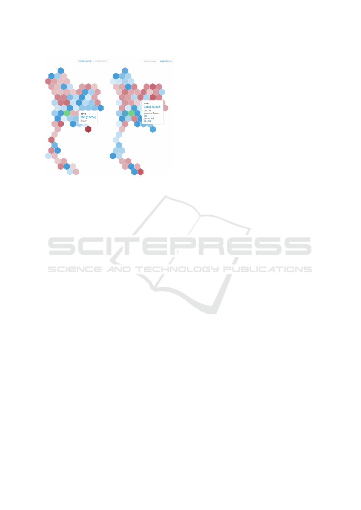
Figure 1: The grid maps of the government spending dash-
board with the same diverging color scale (low in red and
high in blue) but different measures. As an outlier, Bangkok
is shown in green. Both show provincially aggregated bud-
get but the map to the right performs per capita transforma-
tion first. Shown are tooltips of the same province, Trat.
it was not necessary to use an algorithm for automatic
layout. A grid map example is shown in Figure 1.
3.2 Connected Scatterplots
One polyline in a line chart can represent only one
time series while a polyline in a connected scatter-
plot can represent two time series (Haroz et al., 2016).
A correlation between two time series can be visu-
ally observed through the direction of the polyline.
A polyline between the top-left and the bottom-right
corners suggests a negative correlation while the other
diagonal direction implies that the two time series are
positively correlated.
We implemented and used this visualization in a
dashboard that compares Thailand’s development in-
dices to other countries’ in the region. With a lot of in-
dices, putting two indices on a chart at the same time
can provide a good overview of development progres-
sion across countries and time frames. The connected
scatterplot in Figure 2 tells a story that Thai people
work long hours, but the productivity is low. All cir-
cles show their tooltips when they are triggered by a
mouseover event.
4 PRELIMINARY FEEDBACK
AND ITERATIVE DESIGN
As our main concern was not a formal validation of
the visualization techniques that had been previously
evaluated, we did not try to acquire a large group
of users to test a statistical hypothesis (Nielsen and
Landauer, 1993). We adopted an iterative design pro-
cess and tried to apply appropriate validations for all
dashboards with the same groups of stakeholders who
had provided the requirements (Munzner, 2009). We
did not aim to use uncommon visualizations in the
projects, but they were appropriate for the tasks and,
to the development teams, the visualizations seemed
not really unusual. During the first design iterations,
we had a feeling that they could feel slightly uncon-
ventional but did not expect unenthusiastic feedback
from some stakeholders.
The uncommon visualizations, a grid map and
a connected scatterplot, were introduced through
sketches and later digital mock-ups of higher fidelity.
All early prototypes were not interactive and there
were quite a few questions regarding the usability of
the visualizations. We experienced some common pit-
falls in visualization design (Sedlmair et al., 2012)
that most government officials had specific visualiza-
tion types and dashboard designs in mind. Expanding
their horizon on visual possibility helped; in our case,
we discussed dashboard taxonomy and various types
beyond the commonly known (Sarikaya et al., 2019).
There were more questions and doubts about the
visualizations after the first interactive prototype had
been shown outside of the immediate working team.
The connected scatterplot in the development index
dashboard received a lot of questions second-guessing
whether the general public could read the visual en-
coding or interpret the data. More specifically, there
were concerns that people might not understand that
both vertical and horizontal axes showed development
indices and the temporal progression did not have to
be left-to-right. Besides a short text to serve as an
instruction, we added an animated visual cue in the
beginning to suggest the direction of time; all points
and lines showed up with cascaded delays. Also, the
dashboard started with one development index on the
vertical axis and the horizontal axis represented year.
The users could add an index to the horizontal axis
and the data lines would morph to the new positions,
serving as a tutorial on the unknown visualization.
We tried to present a previous study as a proof
of usability. For instance, a study on connected scat-
terplots (Haroz et al., 2016) observed many cases of
this visualization usage even in mass media and con-
ducted an experiment to confirm its usability. The re-
Applying Uncommon Visualizations to Government Dashboards
205
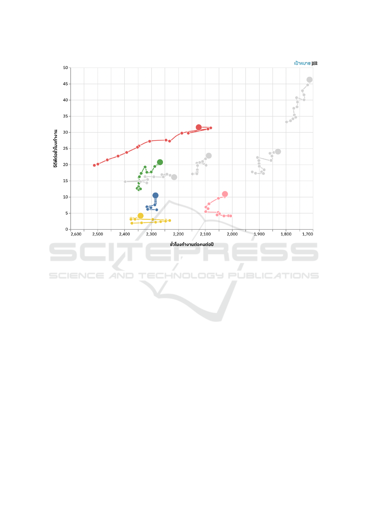
Figure 2: The connected scatterplot of work hours per person per year (x-axis, reversed as lower work hours imply a better
quality of life) and productivity measured in GDP per work hour (y-axis). Blue, red, green, yellow, and pink lines represent
Thailand, South Korea, Malaysia, Vietnam, and Indonesia, respectively, while gray lines represent continent-level aggregates
i.e. Africa, Americas, Asia & Oceania, and Europe.
searchers found that the chart might take some time
to recognize but the participants could understand the
visual representation with little explanation and even
engage with the chart more, compared to a line chart.
The early users simply disregarded the study, doubted
the study setup, or questioned whether culture or vi-
sual literacy played an important role in understand-
ing the encoding of a connected scatterplot. This
shows that an academic study, at least from an ex-
ternal source, has little effect to convince stakehold-
ers. This is also in stark contrast to a more objec-
tive assessment of unknown visualizations of science
community (Dasgupta et al., 2017a; Dasgupta et al.,
2017b).
A grid map did not raise any serious issues. A
common comment was that it was hard to see the
provinces with the most or least poor population as
the users had to scan throughout the map. We created
another view to sort all hexagons by value. To link
both views together, we introduced an animation to
morph between the two as depicted in Figure 3.
Other qualitative comments such as aesthetics
were taken into consideration during the development
process as well. The users might request contradic-
tory adjustments and were unaware of their trade-
off. For example, one asked for all straight lines in a
connected scatterplot for accurate portrayal while an-
other preferred more curved and smooth lines without
acknowledging the fact that monotonicity might not
have been preserved.
5 DISCUSSION AND FUTURE
WORK
Our use of animations to show the temporal direc-
tion in a connected scatterplot and transitions between
visualization types and views was based on previous
studies on how people make sense of uncommon vi-
sualizations (Ruchikachorn and Mueller, 2015; Lee
et al., 2016). The animations of both grid map and
connected scatterplot also addressed a comment that
the visualizations are not attractive enough. The an-
imations excited some users and invited them to in-
teract. To the users, animated hexagons in a grid map
and lines in a connected scatterplot felt more concrete.
IVAPP 2021 - 12th International Conference on Information Visualization Theory and Applications
206

Figure 3: The source, an in-between, and the target of the transition from a hexagonal grid map of Thailand in TPMAP to a
hexagon list sorted by the data values. Each hexagon’s position is linearly interpolated between the source and target positions
with cascaded delays.
They were helpful to construct a frame to familiarize
themselves with what they do not know (Lee et al.,
2016).
Between two uncommon visualizations, adopting
a grid map seemed to have less resistance. Although
it cannot be directly compared to connected scatter-
plot in terms of commonness or complexity due to
subjectivity and difficulty of such measurement, the
relatively easy acceptance of an uncommon map was
quite surprising. This could be due to its more obvi-
ous benefit compared to a choropleth map and that the
hexagons forming as the shape of Thailand still look
familiar and less abstract than a connected scatterplot.
To further analyze the reluctance to initially accept
the uncommon visualizations, we can refer to other
related psychological and sociological topics such as
mental models, previously explored in the context of
security dashboards (Maier et al., 2017), and face
which is a widely referenced sociological concept on
how a person behaves within social relations (Zhang
et al., 2006). In the case of uncommon visualizations,
face can imply the tendency to maintain the status
quo or existing systems. Psychologically, this may
be the clash between System 1 and System 2 thinking
i.e. people tend to fit a new thing within the context
of the already known and fail to see the uniqueness
unless they are given more time and conditions for
slow thinking (Kahneman, 2013). To compete with
known visualizations, particularly in an existing sys-
tem, an uncommon visualization needs not only show
clear advantages but also overcome cognitive biases
and fallacies such as endowment effect and sunk cost
fallacy (Dobelli, 2014).
Another complication that may happen but has
never been explored in the context of visualization is
preference falsification. A person may publicly ex-
press their opinion opposite of their real preference
due to social pressure (Kuran, 1987; Kuran, 1997).
This may lead slow and then sudden change as evi-
denced by social movements (Sunstein, 2019). With
the same model, unfamiliar and uncommon visualiza-
tions may be more popular than anticipated and gain
rapid public acceptance as well.
The concepts of preference falsification and di-
verse thresholds in behavioral science (Sunstein,
2019) can be applied and studied in the context of
human-computer interaction and visualization. A
common visualization task categorization often im-
plies one user tier of similar experience and expertise.
In reality, people have diverse thresholds to under-
stand or interact with a certain interface. Even within
a single tier, the users may request a more conven-
tional user interface and interaction because of pref-
erence falsification.
For future work, we may study and follow the
ISO on human-centered design (International Orga-
nization for Standardization, 2019) to reassure stake-
holders. Also, we would like to formally evaluate
Applying Uncommon Visualizations to Government Dashboards
207

the readability of the grid map and connected scatter-
plot, specifically in the context of Thailand, to verify
whether Thai audience can understand the uncommon
visualizations without a training, tutorial, or other vi-
sual cues. This can be coupled with visual literacy
assessment (Boy et al., 2014). When all the dash-
boards are released to the public, a larger study to
validate the dashboard and the uncommon visualiza-
tions can be conducted and we hope this will lead to
more adoption of various visualization types beyond
the common ones.
ACKNOWLEDGEMENTS
This work was supported in part by Chulalongkorn
University, CGD, NECTEC, and IPPD. The govern-
ment spending dashboard and TPMAP were devel-
oped by Boonmee Lab.
REFERENCES
Barcellos, R., Viterbo, J., Miranda, L., Bernardini, F., Ma-
ciel, C., and Trevisan, D. (2017). Transparency in
practice: using visualization to enhance the inter-
pretability of open data. In Proceedings of the 18th
Annual International Conference on Digital Govern-
ment Research, pages 139–148, New York, NY, USA.
ACM Press.
B
¨
ohm, C., Schmidt, M., Freitag, M., Heise, A., Lehmann,
C., Mascher, A., Naumann, F., Ercegovac, V., Hernan-
dez, M., and Haase, P. (2012). GovWILD: Integrating
Open Government Data for Transparency. Proceed-
ings of the 21st international conference companion
on World Wide Web, pages 321–324.
Bowyer, A., Wilson, R., Wheater, S., Snape, M., and Mon-
tague, K. (2019). Human-Data Interaction in the Con-
text of Care: Co-designing Family Civic Data Inter-
faces and Practices. In Extended Abstracts of the 2019
CHI Conference on Human Factors in Computing Sys-
tems - CHI EA ’19, pages 1–6, New York, NY, USA.
ACM Press.
Boy, J., Rensink, R. A., Bertini, E., and Fekete, J.-D.
(2014). A Principled Way of Assessing Visualiza-
tion Literacy. IEEE Transactions on Visualization and
Computer Graphics, 20(12):1963–1972.
Carvalho, P., Hitzelberger, P., Otjacques, B., Bouali, F., and
Venturini, G. (2015). Information Visualization for
CSV Open Data Files Structure Analysis. In Pro-
ceedings of the 6th International Conference on Infor-
mation Visualization Theory and Applications, pages
101–108. SCITEPRESS.
Dasgupta, A., Burrows, S., Han, K., and Rasch, P. J.
(2017a). Empirical Analysis of the Subjective Impres-
sions and Objective Measures of Domain Scientists’
Visual Analytic Judgments. In Proceedings of the
2017 CHI Conference on Human Factors in Comput-
ing Systems, pages 1193–1204, New York, NY, USA.
ACM.
Dasgupta, A., Lee, J.-Y., Wilson, R., Lafrance, R. A.,
Cramer, N., Cook, K., and Payne, S. (2017b). Fa-
miliarity Vs Trust: A Comparative Study of Domain
Scientists’ Trust in Visual Analytics and Conventional
Analysis Methods. IEEE Transactions on Visualiza-
tion and Computer Graphics, 23(1):271–280.
Dobelli, R. (2014). The art of thinking clearly. Harper
Paperbacks.
Few, S. (2006). Information dashboard design. O’Reilly
Media.
Haroz, S., Kosara, R., and Franconeri, S. L. (2016). The
Connected Scatterplot for Presenting Paired Time Se-
ries. IEEE Transactions on Visualization and Com-
puter Graphics, 22(9):2174–2186.
International Organization for Standardization (2019). Er-
gonomics of Human-system Interaction—Part 210:
Human-centred Design for Interactive Systems. ISO,
2 edition.
Kahneman, D. (2013). Thinking, fast and slow. Farrar,
Straus and Giroux.
Kuran, T. (1987). Preference Falsification, Policy Continu-
ity and Collective Conservatism. The Economic Jour-
nal.
Kuran, T. (1997). Private truths, public lies: The social
consequences of preference falsification.
Lee, S., Kim, S.-H., Hung, Y.-H., Lam, H., Kang, Y.-A.,
and Yi, J. S. (2016). How do People Make Sense
of Unfamiliar Visualizations?: A Grounded Model
of Novice’s Information Visualization Sensemaking.
IEEE Transactions on Visualization and Computer
Graphics, 22(1):499–508.
Lemieux, V. L., Trapnell, S. E., and Excell, C. (2015).
Transparency and Open Government: Reporting on
the Disclosure of Information. JeDEM, 7(2):75–93.
Maier, J., Padmos, A., S. Bargh, M., and W
¨
orndl, W.
(2017). Influence of Mental Models on the Design
of Cyber Security Dashboards. In Proceedings of the
12th International Joint Conference on Computer Vi-
sion, Imaging and Computer Graphics Theory and
Applications, pages 128–139. SCITEPRESS.
McNeill, G. and Hale, S. A. (2017). Generating Tile Maps.
Computer Graphics Forum, 36(3):435–445.
Munzner, T. (2009). A Nested Model for Visualization De-
sign and Validation. IEEE Transactions on Visualiza-
tion and Computer Graphics, 15(6):921–928.
Nielsen, J. and Landauer, T. K. (1993). A mathematical
model of the finding of usability problems. In Pro-
ceedings of the SIGCHI conference on Human factors
in computing systems - CHI ’93, pages 206–213, New
York, NY, USA. ACM Press.
Petasis, G., Triantafillou, A., and Karstens, E. (2018). Your-
DataStories: Transparency and Corruption Fighting
Through Data Interlinking and Visual Exploration.
pages 95–108. Springer, Cham.
Ruchikachorn, P. and Mueller, K. (2015). Learning Vi-
sualizations by Analogy: Promoting Visual Liter-
acy Through Visualization Morphing. IEEE Trans-
IVAPP 2021 - 12th International Conference on Information Visualization Theory and Applications
208

actions on Visualization and Computer Graphics,
21(9):1028–1044.
Ruchikachorn, P., Suveeranont, R., and Luangaroonlerd,
T. (2019). A Case Study of Open Data Visualiza-
tion System for Government Transparency in Thai-
land. In 2019 IEEE Pacific Visualization Symposium
(PacificVis), pages 353–354. IEEE.
Sarikaya, A., Correll, M., Bartram, L., Tory, M., and Fisher,
D. (2019). What Do We Talk About When We Talk
About Dashboards? IEEE Transactions on Visualiza-
tion and Computer Graphics, 25(1):682–692.
Schirrmacher, N.-B., Ondrus, J., Tan, F., Loh, Y., and
Hardoon, D. R. (2019). Overcoming Status Quo Bias:
Nudging in a Government-Led Digital Transforma-
tion Initiative. In ICIS 2019 Proceedings.
Sedlmair, M., Meyer, M., and Munzner, T. (2012). Design
Study Methodology: Reflections from the Trenches
and the Stacks. IEEE Transactions on Visualization
and Computer Graphics, 18(12):2431–2440.
Sunstein, C. R. (2019). How Change Happens.
Surasvadi, N., Ruchikachorn, P., Siripanpornchana, C.,
Thajchayapong, S., and Plangprasopchok, A. (2019).
TPMAP: A Data Analytics and Visualization Platform
to Support Thailand Target Poverty Alleviation Pro-
grams. In 2019 IEEE Pacific Visualization Symposium
(PacificVis), pages 331–332. IEEE.
Zhang, Q., Chintakovid, T., Sun, X., Ge, Y., and Zhang,
K. (2006). Saving Face or Sharing Personal Informa-
tion? A Cross-Cultural Study on Knowledge Sharing.
Journal of Information & Knowledge Management,
05(01):73–79.
Applying Uncommon Visualizations to Government Dashboards
209
