
Graph Design: The Data-ink Ratio and Expert Users
Kevin McGurgan
1
, Elena Fedoroksaya
2
, Tina M. Sutton
1
and Andrew M. Herbert
1
1
Department of Psychology, Rochester Institute of Technology, Rochester, NY, U.S.A.
2
Integrated Science Academy, Rochester Institute of Technology, Rochester, NY, U.S.A.
Keywords: Graph Design, Data-ink-Ratio, Data Visualization.
Abstract: Graphical depictions of data are common but there is little empirical work that has examined how graph design
principles are instantiated by graph makers. The data-ink ratio is one popular measure of graphical information
content, where the “ink” related to data is divided by the total amount of “ink” in the graph. Expert interviews
were conducted to examine graph use, creation, and opinions about the data-ink ratio concept. Interviewees
had a variety of opinions and preferences with regard to graph design, many of which were dependent upon
the specific circumstances of presentation. Most interviewees did not believe that high data-ink graph designs
were superior. The results suggest that arguments regarding the data-ink ratio deal with the subjective issue
of graph aesthetics.
1 INTRODUCTION
Graphical depictions of data are common in
publications of all types (from websites to journal
articles). Graph designers need to present information
in a way that graph users can understand (Katz, 2012).
Graphs provide a means of communicating
quantitative information in an easily-comprehensible
format and can make complex information visually
salient (Lohse, 1997; Shah, Freedman, & Vekiri,
2005; Wickens & Holland, 2000). Their usefulness
derives in part from grouping information for easy
search and reducing demands on memory, thereby
decreasing the complexity of tasks by imposing
structure on data (Tory & Moller, 2004). However,
poorly designed graphs can lead to difficulty in
understanding information and ultimately to negative
consequences (Freedman & Shah, 2002; Tufte, 1997).
2 THE DATA-INK RATIO
Most graphs are now generated using software and
the starting point for graph design is often determined
by the presets in such software. We are taught how to
make graphs in various courses, but most in the
sciences and social sciences do not take design
courses. Edward Tufte has written extensively on
graph design and proposed one design guideline in
particular called the data-ink ratio (Tufte, 1983).
Tufte argues that because the purpose of a graph is to
help people draw conclusions from data, graphs
should comprise data and little else. Tufte proposed
that there are two types of information in a graph –
data-ink and non-data-ink. Data-ink is “the non-
erasable core of a graphic” and “the non-redundant
ink arranged in response to variation in the numbers
represented” (Tufte, 1983, p. 93). According to Tufte,
all ink that does not depict statistical information, or
“chartjunk,” should be removed.
Data-ink ratios range between zero and one and
can be calculated by dividing data-ink by the total
amount of ink (or equivalent) in a graph (Tufte,
1983). Figure 1 provides an example of published bar
graphs and boxplots that have had the data-ink ratio
varied according to Tufte’s guidelines. It is unclear
how a data-ink ratio can be accurately calculated in
practice, and Tufte makes estimations rather than
numerical calculations.
The data-ink ratio is an influential concept in the field
of design (Zhu, 2007; Fry, 2008), and it is believed
that higher data-ink ratios will result in faster
judgments and increased accuracy in graph reading
tasks (Wickens & Holland, 2000). However, some
have characterized the data-ink ratio as having its
basis in Tufte’s design intuitions and lacking
experimental validation with behavioral data
(Carswell, 1992). For example, Tufte notes that
188
McGurgan, K., Fedoroksaya, E., Sutton, T. and Herbert, A.
Graph Design: The Data-ink Ratio and Expert Users.
DOI: 10.5220/0010263801880194
In Proceedings of the 16th International Joint Conference on Computer Vision, Imaging and Computer Graphics Theory and Applications (VISIGRAPP 2021) - Volume 3: IVAPP, pages
188-194
ISBN: 978-989-758-488-6
Copyright
c
2021 by SCITEPRESS – Science and Technology Publications, Lda. All rights reserved
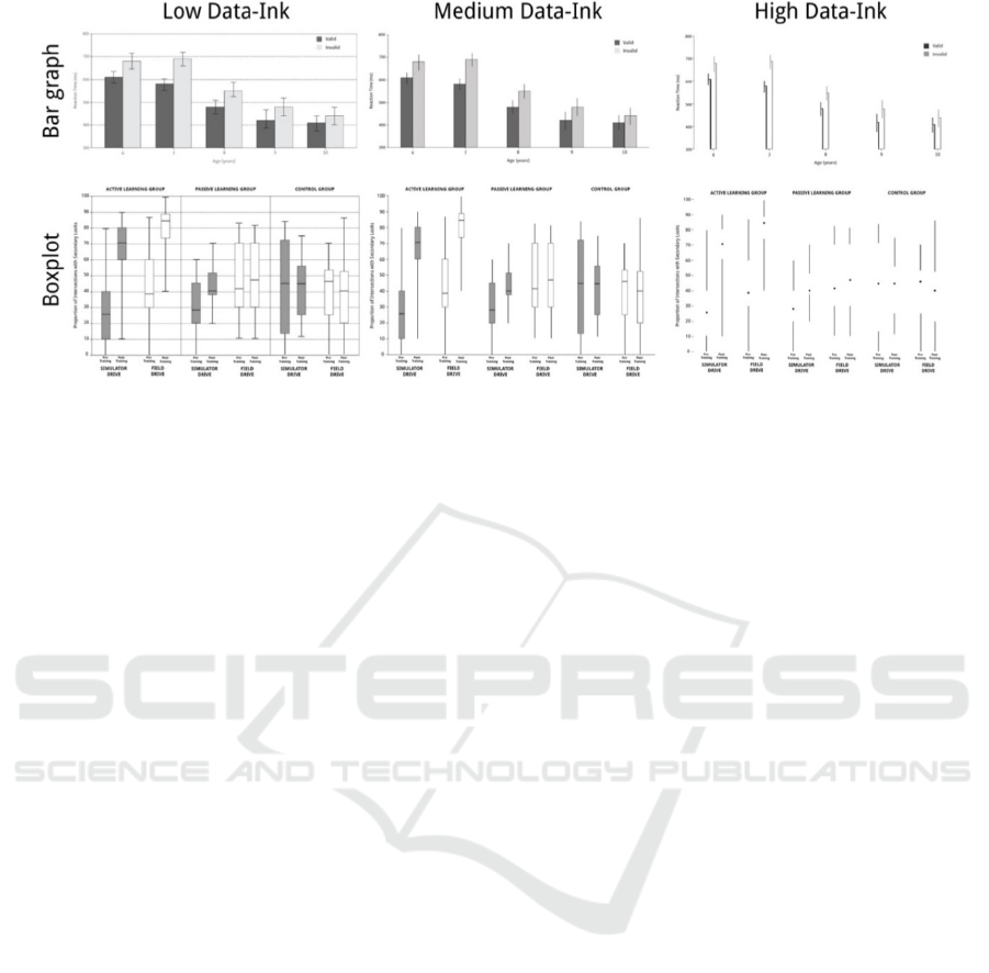
Figure 1: Example bar graphs and boxplots varying in data-ink ratio per Tufte’s guidelines. These are adapted from published
studies to create three levels of data-ink ratio. These were provided as examples to the participants interviewed. Bar graphs
from Lellis et al., 2013 and boxplots from Romoser & Fisher, 2009.
chartjunk should only be removed “within reason”
(Tufte, 1983, p. 96). This lack of specificity reflects
subjectivity in graph design choices.
2.1 Responses to the Data-ink Ratio
The data-ink ratio and Tufte’s design
recommendations have met with mixed reactions in
the literature. Some argue that the data-ink ratio is a
convenient way to measure the extent to which
chartjunk is used (Wainer, 1984). In contrast, Tukey
(1990) describes the data-ink ratio as a “dangerous
idea” and argues that overreliance on it can be
destructive and result in graphs that are both busy and
distracting. Removal of the box portion of a boxplot
results in three distinct perceptual groupings that are
from unrelated samples. Although the underlying idea
behind maximizing the data-ink ratio is to avoid
busyness and distraction in graph design, both
Kosslyn (2006) and Tukey (1990) suggest that those
recommendations alone would not produce the type
of graphs which Tufte advocates. There is some
evidence that chartjunk may benefit graph users
(Hullman, Adar, & Shah, 2011).
Empirical tests of the data-ink ratio have yielded
mixed results. When data-ink ratio has been varied,
high data-ink ratio graphs were not preferred over
lower ratio graphs (Kulla-Mader, 2007; Tractinsky &
Meyer, 2007) and did not produce consistent
differences in graph interpretation performance
(Gillan & Sorensen, 2009). Similarly, recall of
information from low and high data-ink ratio graphs
has not been found to differ, with some evidence that
low data-ink ratio graphs with embellishments are
better remembered (Bateman et al. 2010; Kelly,
1989). Other findings suggest better performance for
subjects viewing medium data-ink ratio graphs
(Blasio & Bizantz, 2002; Gillan & Richman, 1994).
2.2 Graph Comprehension
A variety of cognitive processes are associated with
graph comprehension, with most research focusing on
perception of graph components (Carswell, 1992;
Cleveland & McGill, 1984, 1985; Pinker, 1990).
Perceptual grouping of graph elements has been
emphasized as important for graph comprehension
(Kosslyn, 2006) and users find effective graphs allow
users to group information by colour, shape and so on
(Shah et al., 1999).
2.3 Rationale
Tufte (2015) has disparaged research on the data-ink
ratio concept for using undergraduate students as
participants. Models of graph comprehension include
graph literacy skills, or graph schemas, as an
important factor, so Tufte’s criticism may have some
merits. An interview method was used to gather
qualitative data from experts who produce and use
graphs.
A semi-structured interview method was used
(Carpendale, 2008). A discussion guide was created
to provide the necessary structure for the interviews,
including introductory information, potential
interview questions, and a rough outline for the
interview. The goal was to have some structure but to
allow for flexibility during the interviews (Portigal,
2013). The qualitative interview data were analyzed
using thematic analysis, a flexible method in which
Graph Design: The Data-ink Ratio and Expert Users
189

interviewee opinions and interviewer observations
are grouped into common themes (Carpendale, 2008).
Themes represent patterns in responses which relate
to the research questions and researcher judgment is
inherent in thematic analysis (Braun & Clarke, 2006).
A list of codes is generated from the transcribed
interviews, and the codes are further organized into
themes.
3 METHODS
Interviews were conducted with 7 faculty members
from the Rochester Institute of Technology (RIT)
with a variety of academic backgrounds. Five
interviewees held doctorate degrees. Three of those
were in psychology, one was in psychophysiology
and one was in industrial engineering, but taught
courses in applied statistics. The other two
interviewees held a master’s degree (the terminal
degree in their field) – one in graphic design and the
other in visual and verbal communication.
Participants were solicited based on a preference for
faculty who were likely to have opinions regarding
graph design (e.g., faculty in design, human factors
and statistics) and/or those with frequent graph use.
Participants were found through recommendations
from faculty members and departmental web pages.
3.1 Materials and Procedure
After agreeing to participate, interviewees were sent
a common set of nine pre-interview questions via e-
mail (e.g., What type(s) of graphs do you create most
frequently? What are the most important factors in the
design of graphs you create?). These questions were
focused on graph use and creation, and participants’
responses were used to create discussion guides
tailored to each person interviewed. Two
interviewees had prior knowledge of the study and
interview methodology (EF & TMS), but it was
determined that their responses were not
substantively different from those of other
interviewees.
Each interview lasted roughly one hour and
focused on the use and creation of graphs, context of
graph use, the importance of aesthetics in graph
design, knowledge of and opinions about the data-ink
ratio concept, and feedback on example graphs with
varying data-ink ratios. The example graphs were bar
graphs and boxplots that were systematically edited
to increase or decrease the data-ink ratio. Thus, a low,
medium and high data-ink ratio version of a bar graph
and boxplot were shown as part of the interview.
Interviews were conducted in participants’ offices to
allow access to personal materials, research
publications, graph-making software, or any other
work artifact that the interviewee wished to reference.
Audio recordings of the interviews (recorded with a
Sony ICD-PX312) were summarized and synthesized
using thematic analysis. Interviewees were given a
gift certificate ($10 value) for their participation in
the interview, but were not aware of any remuneration
at the time they agreed to participate. Gift certificate
funding was provided by RIT’s College of Liberal
Arts.
4 RESULTS
Interviewees reported using graphs for a variety of
reasons, including publishing empirical results,
understanding research, teaching courses, measuring
student progress in courses, evaluating the
effectiveness of interventions, and more. Frequency
of graph use ranged from daily usage to a few times
over the course of a semester, and heavy usage was
reported when involved in research projects.
Bar graphs, scatterplots and line graphs were
mentioned most often by the interviewees, with
others such as radial graphs, boxplots, ISOTYPE and
histograms mentioned infrequently. Some
interviewees preferred to use particular types of
graphs, such as bar graphs, because of ease of
interpretation, or boxplots because they show
complete distributions. One interviewee had a
preference for graphs that plotted every data point.
Others didn’t have preferences for particular types of
graphs, and instead preferred whichever graph was
most appropriate for the particular situation.
4.1 Data-ink Ratio and Example
Graphs
Three interviewees were familiar with the data-ink
ratio concept and provided opinions about it. One of
those three had a background in design. Two owned
copies of Tufte’s book. One of the three described the
data-ink ratio as a “neat idea” and agreed that graph
features with no relevance should be removed.
However, like Carswell (1992), that individual
expressed doubts as to whether data-ink ratios can
actually be measured and did not believe that the data-
ink ratio should be maximized, but rather that there is
a “sweet spot” for data-ink levels which is lower than
the maximum. This interviewee reported that he did
not apply the data-ink ratio to the design of graphs he
creates. The interviewee with an imaging science
IVAPP 2021 - 12th International Conference on Information Visualization Theory and Applications
190

background described the data-ink concept as a
design argument that didn’t result in more usable
graphs. The third interviewee, with a background in
design, felt much more positively about the data-ink
concept and followed and taught many of Tufte’s
recommendations for graph creation. The remaining
four interviewees were either unfamiliar or only
vaguely familiar with the data-ink ratio.
Feedback regarding the low data-ink bar graph
tended to be negative or neutral. It was described as
both “fat” and “chunky” by different interviewees.
One interviewee described it as heavy handed, not
due to the size of the bars, but because of the “noise”
in the form of gridlines, tick marks, and other
elements that could be described as non-data-ink. On
the other hand, the graph was also described as having
“some nice elements” – the T-intersections on the
error bars were seen as helpful and the gridlines were
not “too heavy,” but could have been fainter. Another
interviewee identified this as their favorite bar graph
version, as the gridlines were helpful due to width of
the graph. That interviewee also found T-
intersections at the end of error bars to be helpful.
One participant described the medium data-ink
graph as “more pleasing” than the low data-ink bar
graph due to the increased white space and thinner
bars, but would have added faint gridlines and T-
intersections to the error bars. On the other hand, a
different participant felt that the bars should have
been closer together to facilitate comparisons, but
identified the graph as their favorite bar graph
version.
Two participants believed that the high data-ink
ratio bar graph would take longer to interpret than the
other versions, although one did note that familiarity
with the high data-ink style might make it easier to
use. An additional interviewee described the graph as
“horrible.” Another interviewee found this graph to
be elegant and minimal, but unnecessarily wide given
the increase in white space created by the thin bars.
One interviewee felt that there was “less in the way”
in the high data-ink bar graph, and that it could be
improved further by removing the “bar” portions of
the graph. This interviewee saw bars in general as a
waste of ink which might not add anything, as the
error bars are the key information. Another
interviewee felt that the high data-ink bar graph had
been “cleaned up” compared to the others, but that the
bars could be thicker to make it easier to differentiate
between their colors.
The low data-ink boxplot was generally described
as too busy. More interviewees gave negative
comments about the gridlines in this graph than about
the bar graph gridlines. Although they were the same
size and color as the gridlines in the bar graph, there
were a greater number in the boxplot (4 vs. 9,
respectively), suggesting that opinions regarding the
inclusion of gridlines are dependent upon the specific
graph. The medium data-ink boxplot received more
positive feedback than the low data-ink boxplot,
though many interviewees suggested varied
alterations to the design which they felt would
improve it.
The high data-ink boxplot was widely disliked –
all but one interviewee found it hard to read. It was
noted that the box portion, present in the low and
medium data-ink boxplots, helps to make each
distribution cohesive. This is similar to Kosslyn’s
(1985) argument that completing forms results in
fewer perceptual units. One interviewee commented
that the graph required too many “mental
gymnastics,” and wasn’t sure that she would have
known it was a boxplot in a different context. A
different interviewee felt that the high data-ink
boxplot “says the same thing as the others,” but does
so more efficiently. Additionally, that interviewee felt
that the high data-ink design would be accepted with
time, and that the other designs may eventually look
archaic. Finally, two interviewees who gave negative
feedback about this graph commented that it does
highlight the trend of median values in the graph
given the large amount of white space around them.
4.2 Graph Creation
A number of salient themes emerged on the topic of
graph creation goals. Nearly all interviewees named
clarity as a design goal, which was defined as
readability or “ease of use,” as well as avoiding
clutter. Interviewees wanted their graphs to be
understood by others with little effort. Accuracy was
also mentioned frequently as a design goal – graphs
should show the data as they actually are without
obscuring phenomena. The use of truncated axes was
the typical example of inaccuracy or dishonesty in
graph design.
Interviewees reported using a variety of software
packages to create graphs, including Excel, SPSS, R
Statistics, Adobe Illustrator, InDesign, MATLAB,
and JMP. Some interviewees used multiple programs
for graph creation, choosing whichever is more
appropriate (or easier) for a given graph creation task.
Two interviewees reported sketching graphs by hand
when early in the graph design process, which was
described as a way to avoid the limitations of software
and find the best way to display the data. The
importance of matching graph type to data type was
emphasized by three interviewees. For example, bar
Graph Design: The Data-ink Ratio and Expert Users
191

charts were listed as appropriate for comparing
categorical data, and scatterplots or line graphs for
trend data. This was seen as an aspect of graph
creation and design requiring particular skills and
knowledge.
Aside from an emphasis on accuracy, there were
four other graph design factors mentioned: aesthetics,
good labeling, Gestalt (notably grouping), and a
consistent hierarchy. All interviewees were conscious
of the aesthetics of graphs they create, but had a
variety of definitions for this concept. Some used
words like “clean” or “elegant” to describe their goals
with regard to aesthetics. Both of the interviewees
with a design background mentioned “balance” as a
graph design goal – the idea that a graph creator must
make trade-offs between simplicity, visual interest,
clarity, and completeness. Some interviewees
described graph-making conventions as “heavy-
handed” or even ugly, and nearly all interviewees
expressed some level of dissatisfaction with the look
of default designs offered in software packages.
Effective labeling was critical to a number of
interviewees – three reported that labels are among
the first features of graphs that they read, and that they
are helpful for identifying the variables or conditions
in an experiment. Gestalt principles were mentioned
in multiple interviews by those with both psychology
and design backgrounds. Features such as color and
grouping via proximity were seen as important to
good graph design. The principle of closure was
explicitly discussed – one interviewee noted that the
“box” portion of a boxplot helps each element to look
like a cohesive unit. Hierarchical structure in graph
design was explicitly mentioned by two interviewees.
One reported that the data should always be primary
in visual emphasis. The other interviewee reported
that the “most important things” in a graph should be
emphasized in the design, and that the designer
should know what the hierarchy of their graph is. For
example, if a line graph is being used to show trend
data, the line portion is most important, and that
element should be bolder than elements such as axes
or tick marks.
Interviewees had few absolute rules with regard to
graph creation – the majority of design choices
described during the interviews were dependent upon
the specific features of the data and context of
presentation. Interviewees did not want graphs to be
“busy” or to include features such as gridlines or T-
intersections, but definitions of what constitutes
superfluous varied between participants and
situations. It is notable that interviewees did not
explicitly focus on or mention the data-ink ratio in
their graph design factors.
5 DISCUSSION
The interviews suggest that if there is an optimal
design, it may be a medium data-ink level, as most
interviewees preferred and used such designs.
With regard to Tufte’s claim that his high data-ink
designs would be accepted with time, interview
feedback indicated that high data-ink designs are not
encountered or accepted by frequent users of graphs.
Although models of graph comprehension and the
results of the present study do seem to support the
claim that viewers would be accustomed to high data-
ink ratio designs, it does not seem that are “catching
on” given Tufte first published the data-ink concept
in 1983.
There may be several reasons for this. First,
Tufte’s designs disrupt the grouping of elements in a
graph. Although Tufte’s boxplot design allows for the
medians to be grouped continuously this may not be
useful if the x-axis doesn’t represent a continuous
variable. And experienced users find the lack of boxes
and empty space to disrupt their understanding of
what the boxplot is designed to show, namely the
distribution of scores for a sample. In boxplots, the
vertical grouping of elements is more important than
seeing how the medians relate horizontally.
As noted previously, instantiated graph schemas –
knowledge regarding specific graph types – have
been identified as an important factor in graph
comprehension (Pinker, 1990). Adding elements may
have acted to reduce visual complexity by facilitating
grouping elements or interpreting the data (Donderi,
2003). One interviewee commented that she would
not have been able to identify Tufte’s high data-ink
boxplot as a boxplot without the context provided by
the interview. This suggests that the high data-ink
ratio graph did not activate the boxplot schema.
6 CONCLUSIONS
The results suggest that the data-ink ratio concept
relates to the subjective issue of graph aesthetics.
Arguments about the aesthetics of graphs are worth
having – interview data showed that graph creators
care about the appearance of graphs and make efforts
to ensure that their graphs meet their aesthetic
standards. Our results indicate a graph creator who
prefers the look of Tufte’s high data-ink graphs
should feel free to use them, but graph creators should
not feel that maximizing data-ink ratio will result in
more usable graphs. In defending his ideas, Tufte
argued that it would be a mistake to underestimate the
IVAPP 2021 - 12th International Conference on Information Visualization Theory and Applications
192

audiences of graphical information. With regard to
graph designs with different data-ink ratios, this
sentiment seems to be appropriate – graph users with
varying levels of experience can extract complex
information from high data-ink ratio designs.
ACKNOWLEDGEMENTS
Thanks to the faculty who agreed to participate in our
study. Thanks also to funding provided by the College
or Liberal Arts at RIT.
REFERENCES
Bateman, S., Mandryk, R., Gutwin, C., Genest, A.,
McDine, D., & Brooks, C. (2010). Useful junk? the
effects of visual embellishment on comprehension and
memorability of charts. Proceedings of the SIGCHI
Conference on Human Factors in Computing systems,
2573–2582.
Blasio, A. J., & Bisantz, A. M. (2002). A comparison of the
effects of data-ink ratio on performance with dynamic
displays in a monitoring task. International Journal of
Industrial Ergonomics, 30, 89-101.
Braun, V., & Clarke, V. (2006). Using thematic analysis in
psychology. Qualitative Research in Psychology, 3 (2),
77-101.
Carpendale, S. (2008). Evaluating information
visualizations. In A. Kerren, J. T. Stasko, J.-D. Fekete,
& C. North (Eds.), Information visualization (p. 19-45).
Berlin, Heidelberg: Springer-Verlag.
Carswell, C. M. (1992). Choosing specifiers: An evaluation
of the basic tasks model of graphical perception.
Human Factors, 34, 535-554.
Cleveland, W., & McGill, R. (1984). Graphical perception:
Theory, experimentation, and application to the
development of graphical methods. Journal of the
American Statistical Association, 79, 531-554.
Cleveland, W., & McGill, R. (1985). Graphical perception
and graphical methods for analyzing scientific data.
Science, 229 , 828–833.
Donderi, D. C. (2003). Visual Complexity: A Review.
DDRC Scientific Authority Contract Report. Defence
Research and Development Canada, Toronto.
Freedman, E., & Shah, P. (2002). Toward a model of
knowledge-based graph comprehension. In M. Hegarty,
B. Meyer, & N. Narayanan (Eds.), Diagrammatic
representation and inference (Vol. 2317, p. 18-30).
Springer Berlin Heidelberg.
Fry, B. (2008). Visualizing data. Beijing: OReilly Media,
Inc.
Gillan, D. J., & Richman, E. H. (1994). Miinimalism and
the syntax of graphs. Human Factors, 36, 619-644.
Gillan, D. J., & Sorensen, D. (2009). Minimalism and the
syntax of graphs ii: Effects of graph backgrounds on
visual search. Proceedings of the human factors and
ergonomics society annual meeting, 53, 1096-1100.
Hullman, J., Adar, E., & Shah, P. (2011). Benifetting
infovis with visual difficulties. IEEE Transaction on
Visualization and Computer Graphics, 17 (12), 2213-
2222.
Katz, J. (2012). Designing information: Human factors and
common sense in information design. Hoboken, NJ:
Wiley.
Kelly, J. D. (1989). The data-ink ratio and accuracy of
newspaper graphs. Journalism Quarterly
, 66, 632–639.
Kosslyn, S. M. (1985). Graphics and human information
processing: A review of five books. Journal of the
American Statistical Association, 80, 499-512.
Kosslyn, S. M. (2006). Graph design for the eye and mind.
New York: Oxford University Press.
Kulla-Mader, J. (2007). Graphs via ink: Understanding
how the amount of non-data ink in a graph affects
perception and learning. (Unpublished master’s thesis).
University of North Carolina at Chapel Hill.
Lellis, V. R. R., Mariani, M. M. d. C., Ribeiro, A. d. F.,
Cantiere, C. N., Teixeira, M. C. T. V., & Carreiro, L. R.
R. (2013). Voluntary and automatic orienting of
attention during childhood development. Psychology
and Neuroscience, 6(1), 15-21.
Lohse, G. (1997). The role of working memory on graphical
information processing. Behaviour and Information
Technology, 16, 297–308.
Pinker, S. (1990). A theory of graph comprehension. In R.
Friedle (Ed.), Artificial intelligence and the future of
testing (p. 73-126). Hillsdale, NJ: Erlbaum.
Portigal, S. (2013). Interviewing users: how to uncover
compelling insights. Brooklyn, New York: Rosenfeld
Media. Retrieved from www.summon.com
Romoser, M. R. E., & Fisher, D. L. (2009). The effect of
active versus passive training strategies on improving
older drivers’ scanning in intersections. Human
Factors: The Journal of the Human Factors and
Ergonomics Society, 51(5), 652-652.
Shah, P., Freedman, E. G., & Vekiri, I. (2005). The
comprehension of quantitative information in graphical
displays. In P. Shah & A. Miyake (Eds.), Cambridge
handbook of visuospatial thinking. New York:
Cambridge University Press.
Shah, P., Mayer, R. E., & Hegarty, M. (1999). Graphs as
aids to knowledge construction: Signaling techniques
for guiding the process of graph comprehension.
Journal of Educational Psychology, 91(4), 690 - 702.
Tory, M., & Moller, T. (2004). Human factors in
visualization research. IEEE Transactions on
Visualization and Computer Graphics, 10 (1), 72-84.
Tufte, E. (1983). The visual display of quantitative
information. Cheshire, CT: Graphics Press.
Tufte, E. (1997). Visual Explanations: Images and
Quantities, Evidence and Narrative. Cheshire, CT:
Graphics Press.
Tufte, E. (2001). The visual display of quantitative
information. Cheshire, CT: Graphics Press.
Tufte, E. (2015, March 11). Analytical design and human
factors. Retrieved from
Graph Design: The Data-ink Ratio and Expert Users
193

www.edwardtufte.com/bboard/q-and-a-fetch-
msg?msg_id=0000KI
Tukey, J. W. (1990). Data-based graphics: Visual display in
the decades to come. Statistical Science, 5 (3), 327–339.
Wainer, H. (1984). How to display data badly. The
American Statistician, 38 (2), 136-147.
Wickens, C., & Holland, J. (2000). Engineering psychology
and human performance. Upper Saddle River, NJ:
Prentice Hall.
Zhu, Y. (2007). Measuring effective data visualization. In
G. Bebis et al. (Eds.), Advances in visual computing
(Vol. 4842, p. 652-661). Springer Berlin Heidelberg.
IVAPP 2021 - 12th International Conference on Information Visualization Theory and Applications
194
