
Usability Heuristics for Tabletop Systems Design
FiVinícius Diehl de Franceschi
1
, Lisandra Manzoni Fontoura
1
and Marcos Alexandre Rose Silva
2
1
Programa de Pós-Graduação em Ciência da Computação, Federal University of Santa Maria (UFSM), Brazil
2
Colégio Politécnico, Federal University of Santa Maria (UFSM), Brazil
Keywords: Tabletop, Heuristics, Usability.
Abstract: Tabletops are large interactive displays that enable many users to interact at the same time. These devices
have different characteristics than other touchscreen devices, such as smartphones or tablets. They cannot be
easily moved to bring the screen closer to the eyes or rotate interface elements, changing the screen to
horizontal or vertical, for example. In this context, this paper presents a set of heuristics to be considered in
tabletop interface design from the initial planning until validation. Nielsen’s heuristics and others adapted or
formalized from Nielsen, as well as researches about tabletop characteristics and user tests, were identified
and analyzed to adapt and formalize heuristics to tabletop context. A set of twelve heuristics for tabletop
context was created and they were considered to design simulator interfaces. Observing the militaries using
them, we have gathered evidence that these heuristics can help designers to think about essential interface
characteristics to support users to realize and understand the interface goal and how to interact with it.
1 INTRODUCTION
Different technological devices as laptops,
smartphones, and tablets are changing people’s
behaviors and activities (Shneiderman, 2016). Then,
systems for these devices must be designed to
support people’s use. On the other hand, this design
can be a challenge because each device may have
different characteristics and specificities to be
considered.
Tabletops, large dimension devices, have been
used in different contexts, and their use shows
satisfactory results, e.g., with systems related to
maps, because of the birds-eye view. In health, due
to the number of elements that can be displayed on
the screen, allowing to see more details about the
medical image and supporting better analysis,
among other contexts (Madni, 2016; Yang, 2014).
Tabletops size and weight represent different
characteristics from other devices as smartphones,
and this paper describes research that allowed
noticing these characteristics to be considered, and
they were useful to adapt Nielsen’s heuristics for
tabletop context.
According to Prates and Barbosa (2003),
heuristic evaluation is one of the evaluation methods
more widespread and better known by researchers
and professionals from human-computer interaction.
This evaluation examines the interface and judges its
compliance with recognized usability principles,
which are the heuristics (Nielsen, 1994).
Dourado (2016) says heuristics are easy to
understand and useful to identify usability problems
with low costs. In contrast, they can be very general,
causing the recognition of specific problems a
difficult task. The evaluators need much experience
with these heuristics and device to judge the specific
characteristics and needs of a device. Therefore, it is
possible to improve the effectiveness of the method
significantly using adapt heuristics with problems
and examples related to a specific context (Rusu et
al., 2011; Dourado 2016; Nielsen, 1994).
2 METHODOLOGY
The potential and use of Nielsen’s heuristics,
heuristics adapted from Nielsen or others formalized
for different contexts, such as smartphone and tablet,
are described in Chuan et al. (2014), Joyce et al.
(2014), Neto et al. (2013), Humayoun et al. (2017),
Shneiderman et al. (2016). However, these authors
do not describe the process of adapting or
formalizing heuristics. In this context, Rusu et al.
(2011) report a six-step methodology for defining
heuristics. Rusu's methodology was used in this
work to adapt and formalize heuristics to tabletop
context.
Diehl de Franceschi, V., Fontoura, L. and Silva, M.
Usability Heuristics for Tabletop Systems Design.
DOI: 10.5220/0009389805550562
In Proceedings of the 22nd International Conference on Enterprise Information Systems (ICEIS 2020) - Volume 2, pages 555-562
ISBN: 978-989-758-423-7
Copyright
c
2020 by SCITEPRESS – Science and Technology Publications, Lda. All rights reserved
555
2.1 Step 1 – Exploratory
It was intended to investigate works related to use,
formalization, and adaptation of interface heuristics
for multi-touch tabletop, but few works were found.
Because of that, works related to any touchscreen
devices were considered in this investigation.
Shneiderman (2016) formalized eight heuristics
to be considered in any interactive technology. Neto
et al. (2013) describe heuristics to mobile devices
like smartphones and tablets. D’Carlo et al. (2017)
present a set of heuristics to evaluate the usability of
mobile educational devices. Humayoun et al. (2017),
Inostroza et al. (2012), and Chuan et al. (2014)
formalized heuristics to analyze multi-touch gestures
in mobile devices. Rusu et al. (2011) defined a set of
heuristics to evaluate grid computing systems. Joyse
et al. (2014) formalized a set of heuristics based on
touchscreen mobile devices.
Heuristics for tabletop context were not found,
and then works about tabletop systems design were
collected to observe important information and
experience. Madni et al. (2016) reported the use of
tabletop for supporting medical diagnostics based on
images where a group of doctors could see and
interact at the same time. Yang et al. (2014) describe
a tabletop system design about GIS (Geographical
Information System). Bortolaso et al. (2013) present
a multi-display tabletop simulator to support military
training.
2.2 Step 2 – Descriptive
Table 1 contains investigated heuristics and
Nielsen’s heuristics comparison to identify the most
essential characteristics, interface elements
discussed by these heuristics, among others. This
comparison showed that Nielsen’s heuristics are
widely used in them.
For example, the first heuristic proposed by
Nielsen is “Visibility of system status” which
describes the system should always keep users
informed about what is going on. Joyces et al.,
(2014), [P6] in Table 1, also describe that the system
should show new users a welcome message, at their
first heuristic (H1), as well as their second heuristic
(H2) is related to show the status of system as soon
as users interaction happens. It is important to
highlight that this reasoning was considered with
other heuristics from other studies.
Some heuristics describe specific contexts and
examples not related to Nielsen’s heuristics. In this
case, a line was created with this information and
which heuristics are related to this specific context.
Franceschi et al. (2018) describe the systematic
review to identify these works, describing their
names and more details about their content. Because
of that, this paper aims to present the use of this
information to formalize and adapt heuristics.
Works about tabletop were also analyzed and
compared among them, as shown in Table 2. Each
work designed system to be used in a different
context, but there are many common characteristics
among their works and the one presented in this
paper as radial menu, geographic information at
different angles as described in Yang (2014); route
planning, geographical charts as described by
Bortolaso (2013); and manipulating digital content
and images as in the work of Mandi (2016).
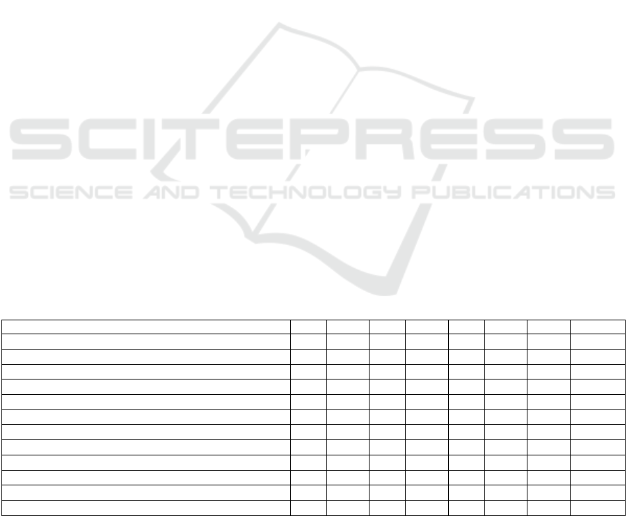
Table 1: Heuristics Comparison.
Nielsen’s heuristics [P1] [P2] [P3] [P4] [P5] [P6] [P7] [P8]
Visibility of system status
H1 H4 H2 H4 H1 H1, H2 H9, H3 H1
Match between system and the real world
H2 H1, H2 ------ H5 H2 H3 H5 H2
User control and freedom
H3 H8, H9 ------ ------ H3 H4 H8 H3, H6
Consistency and standards
H4 H5 H3 H1 H4 H5 H2 H4
Error prevention
H5 H10 ------ H6 H5 H6 H6 H5
Recognition rather than recall
H6 H7 H1 H8 H6 ------ H11 H11, H13
Flexibility and efficiency of use
H7 H6 H4 H3, H9 H7 H7, H8 H7, H1 H9, H10
Aesthetic and minimalist design
H8 H3 ------ ------ ----- H9 ------ H7
Help users recognize, diagnose, and recover from errors
H9 H11 H10 H8 ------ H4 H13
Help and documentation
H10 H12 ------ H14 ----- ------ H10 H8
Cooperative/Collaborative Usability
H11 ------ ------ H11 ----- ----- ------ ------
View adaptation
------ ------ ------ ------ ----- ------ ------ H15
Authors - [P1] Inostroza et al.; [P2] Rusu et al; [P3] Chuan et al.; [P4] D’Carlo et al.;[P5] Shneiderman et al.; [P6] Joyce et
al.; [P7] Neto et al.; [P8] Humayoun et al.
ICEIS 2020 - 22nd International Conference on Enterprise Information Systems
556
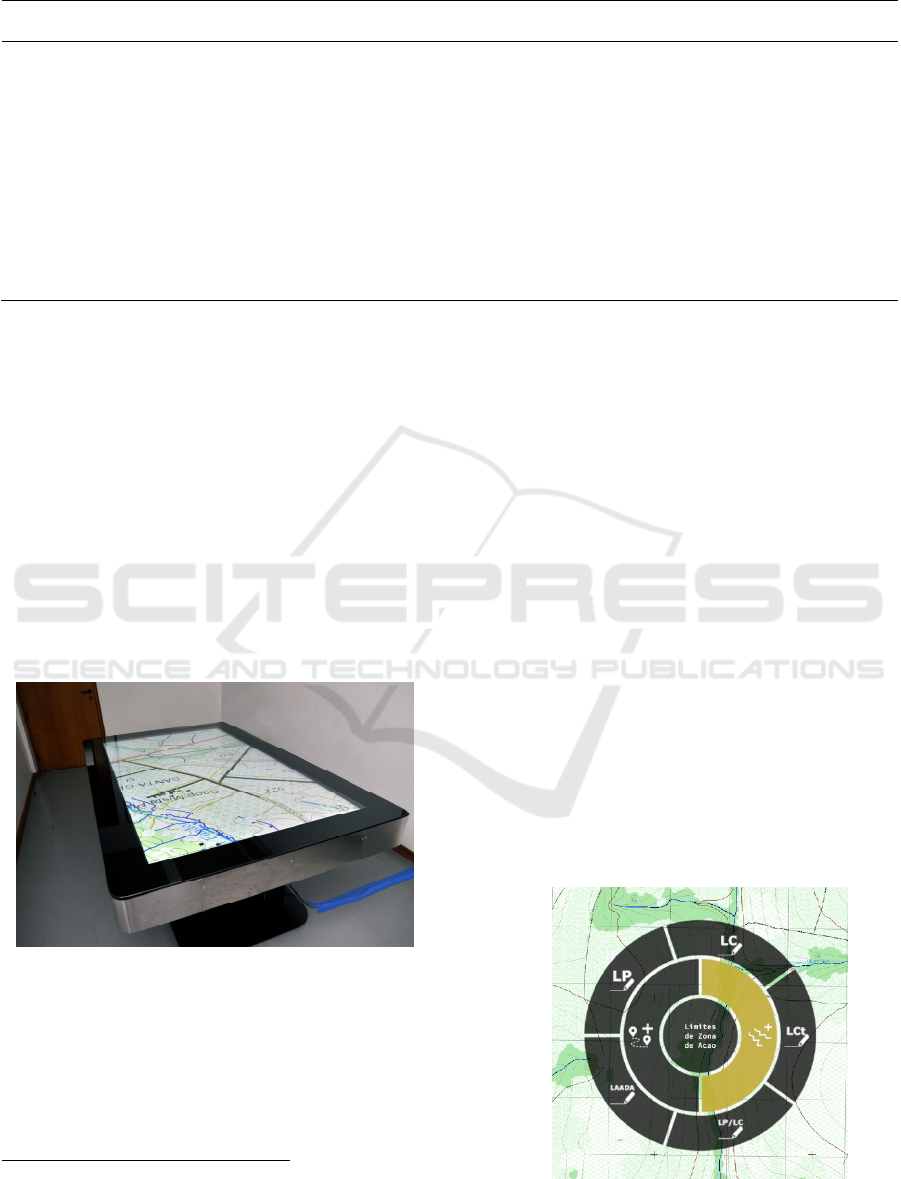
Table 2: Tabletop Characteristics Comparison.
[Yang et al. 2014] [Bortolaso et al. 2013] [Madni et al. 2016]
• Simultaneous and collaborative
interaction
• Interactive table 40-inch
• Blocks can be dynamically
oriented
• Radial menu
• Can be used on multiple devices
simultaneously
• Works with geographic
information at different angles and
dimensions
• Shared interaction for multiple users
• 55-inch 2D tabletop
• Multi-touch inputs
• Bifocal lenses (Zoom)
• Route planning by drawing waypoints
• Can be used on multiple devices
simultaneously
• Uses geographical charts
• Allows future and past locations,
tracking line, visibility, and range of a
military unit
• Collaborative interaction
• Samsung SUR40 (40-
inch interactive tabletop)
• Manipulation of digital
content and images
• 2D / 3D information
display
• Multi-touch interaction,
tangible objects, pens, or
mouse.
• Zoom in/on objects
2.3 Step 3 – Correlational
This step is to identify the useful characteristics for
tabletop usability heuristics based on other heuristics
and observation analysis. The observation occurred
in a military simulator project (Franceschi et al.
2018). This project means to develop a tactical
virtual simulator for teaching military doctrines
1
related to recognition, choice, and position
occupation of a missile and rocket battery for
commanders from these areas. Figure 1 shows the
tabletop where the simulator is working. It is TV 84-
inch with a capacitive sensor to recognize users’
interaction by touch on the screen.
Figure 1: Tabletop Tactical Virtual Simulator.
There were maps, cards, spatial/geographical
information in this simulator where a group of five
users interacted with during observation. According
to Nielsen (2000), the best results come from testing
no more than 5 users.
1
Military doctrine is the expression of how military forces
contribute to campaigns, battles, and engagements.
The users are military instructors who will use
this simulator to support missile and rocket battery
teaching. It is important to say that this simulator
was developed by other professionals with no
influence by the group of researchers of this paper.
Figure 2 shows one of the perceptions where
users did not find where to click because after
pressing a button with an icon, its name shows up in
the middle of the radio button, and users tried to
click on it, but the name is just an instruction, not a
button, so users need to click on icon button again.
The five users wrongly clicked on the name.
Interface element showed upside down
considering user’ view in some times because the
interface of the simulator was programmed
considering the proximity of the sides, that is, if the
user is on one side but extends his hand to be closer
to the other side, the tabletop will show the elements
in this other side. The tabletop size also allows many
users to interact at the same time, and some
interaction conflicts happened, such as a user could
cancel another user’s action, even they were on
opposite sides.
Figure 2: Radial Menu.
Usability Heuristics for Tabletop Systems Design
557
Considering characteristics from other heuristics,
tabletop studies, and this observation, it was
collected essential characteristics to be considered
on tabletop design. Figure 3 shows them into two
parts, elements and quantity.
Elements can be shown, taking into
consideration where the user is, i.e., which side
occurred touch on the screen. Through this informa-
tion, tabletop recognizes users’ place to show visual
elements (proximity) to them and oriented
(orientation) to them, facilitating the interaction.
The proximity of the sides is not a perfect
criterion to identify where users are. Because of that,
there is a necessity to allow rotating the visual
elements 360 degrees. Zoom out and zoom in
represent other useful strategies to consider design,
allowing wider view, for example, to see a country,
or detailed view, to see a street in a city. Moving
elements is also another required to be thought
because if an element appears over what users want
to see, they can move it, as well as bring the element
closer to where they are (zoom/move).
Tabletop sizes allow displaying a lot of
information at the same time, so it is important to
highlight which information can be clicked so that
interactivity is highlighted, and the user does not
have to look for options. Whenever items and sub-
items exist, it is necessary to visually inform the user
(highlighted interactivity).
The (quantity) is a tabletop characteristic that
stands out from other types of smaller touchscreen
devices, such as smartphones and tablets, which
usually only one person uses at a time. In tabletop, it
is important to identify how many users can use at
the same time, and how many features can be
performed at the same time, and the action of one
user should not interfere with the action of another.
Figure 3: Characteristics of tabletop design.
The quantity of (touches) should also be
considered, because users, with no intention to enter
in an option, can unintentionally click on it, while
they are explaining and just pointing with their
fingers what they want to show. It is necessary to
identify how to show the feedback for each system
feature and possible click (highlighted interactivity)
for each user who is interacting with, as well as
always indicate when an item was selected and if
there are other sub-items available (feedback).
2.4 Step 4 - Explicative
This step intends to specify the set of the proposed
heuristics. Ten heuristics aimed by Nielsen for the
tabletop, and two new heuristics (H11 and H12).
H1 - Visibility of System Status
Definition: System status visibility refers to how
well system status is transmitted to users.
Adaptation: In a tabletop, there are interactive
elements that blend in with non-interactive elements.
Because of their size, the amount of these elements
can make it difficult for the user to understand where
on the screen to look for feedback, so it should be
clear enough to indicate which feature is related to
and be concerned with the location of the feedback.
The location should be close to the clicked
component because it is possibly the location the
user is looking at. On a smaller device, the user can
view what happens across the screen. On the other
hand, on a tabletop, feedback may be outside the
user’s field of view. Also, items and sub-items, for
example, in menus, need to be visually informed to
users, indicating what items are, if they have sub-
items, e.g., with arrow like dropdown, and whether
they have been selected, e.g., changing the color.
Related Characteristics: Feedback, Item and sub-
item.
H2 - Match between System and the Real World
Definition: The system should speak the user's
language with familiar words.
Adaptation: Evaluate whether icons are self-
explanatory regarding their function and application
domain conventions. There may be a textual
description to help users understanding the meaning
of the icon, but it should always be close to and in
the same visual element as the icon. For example, in
a button design, the icon and description may be
within the button area. Any distance between icon
and description can make the user confused as to
which one to click to confirm the interaction.
Because tabletops are touch, some gestural
ICEIS 2020 - 22nd International Conference on Enterprise Information Systems
558

conventions of these devices should be used for
sliding, dragging, and so on.
Related Characteristics: Icons and textual
description.
H3 - User Control and Freedom
Definition: Users can choose system functions by
mistake and need to undo and redo options without a
lengthy process.
Adaptation: Enable the user to undo their actions
even when using multiple users at the same time,
ensuring that undoing one user’s actions will not
impact another user’s actions. Undo and redo
options should be easily understood by all users
interacting at the table.
Related Characteristics: Quantity of Users,
Quantity of Features.
H4 - Consistency and Standards
Definition: The device must follow established
conventions, allowing the user to do things in a
standardized and consistent manner.
Adaptation: Conventions established for other
touchscreen devices should be followed, such as
gestures to select, execute, zoom in/out, slide and
drag used on smartphones, for example. It is
emphasized that the proportion of the movement will
not always be equal to the desired result. On the
smartphone, the user can pinch the element and open
their fingers to the desired size. In the case of the
tabletop, the user may be interested in greatly
enlarging an element, so with a little opening
between fingers could allow enlarging the image to a
much larger size than is between your fingers.
Interactions throughout the system must be
consistent.
Related Characteristics: Proximity Adaptation,
Zoom/Move Adaptation.
H5 - Error Prevention
Definition: Verify that the interface contains only
essential elements and eliminate error-prone
conditions.
Adaptation: Context-associated menus can be used
to reduce user choice options, disabling options not
currently available. Depending on the outcome of
the interaction, confirmations must be requested for
the user to have the option to rethink an action. For
example, the user may tap the screen only to point
out an element during the explanation and not to
activate a feature, so it is essential to question if the
user wants to do the action. In case of just opening a
feature or a menu option, no problem, since realizing
that opened the option, the user can click the close or
cancel icon. Besides, because of potential touch
accuracy issues, it may be desirable to identify the
user’s intent.
Related Characteristics: Quantity of Touches.
H6 - Recognition Rather than Recall
Definition: The user should not have to remember
information for system use.
Adaptation: The icons should be accompanied by
textual descriptions making it easy for the user to
understand the action that will be performed. When
selecting an element, before executing, it is essential
to make it clear which action the element will
perform. It is also necessary to highlight the next
actions to be performed. Interactive elements should
be distinct from other elements, not requiring the
user to remember. Because of their size, which
allows many more elements to be displayed than
other touch devices, the difficulty in identifying
what can and cannot be clicked impairs interaction.
User-tabletop interaction may occur similarly to
smartphones. On these devices, users do not analyze
the entire system to understand it before starting the
interaction, but find clickable items and compare it
with their intention of finding out where to click. On
a smaller device, when the user does not identify
what can be clicked, the user can click on what is
being displayed to identify resources by trial and
error. This possibility can also occur on a tabletop,
but more clicks will be done. Therefore, the
interactive components must be distinct from the
other components. Icons and descriptions should be
defined to clearly illustrate their goals.
Related characteristics: Icon and textual
description, Highlighted interactivity.
H7 - Flexibility and Efficiency of Use
Definition: The device must be able to load and
display information within a reasonable period and
minimize the steps required to perform a task.
Adaptation: The interaction elements (menus) must
be distributed considering each context and close to
the respective feature. This enables fewer options in
each menu and fewer interactions to perform the
task because each feature will be close to its
interface element. It is also necessary to ensure that
the information is displayed in sufficient detail for
the correct operation of the application, and zoom
operations will perform satisfactorily.
Related Characteristics: Quantity of Features.
H8 - Aesthetic and Minimalist Design
Definition: The device should avoid displaying
unwanted information by overloading the screen.
Usability Heuristics for Tabletop Systems Design
559

Adaptation: Tabletops allow users to view a large
amount of content at the same time, but too much
information can compromise the viewing of
information. Whenever possible, enable the user to
access information without overloading the
interface. Swipe menus can be hidden whenever not
in use, making it easy to access when needed. Also,
the menus should be aesthetically simple and describe
the features clearly. The buttons, text, and colors
should be a contrast to the background and, when
necessary, be transparent enough to see what is in the
background, allowing the information to be viewed.
Related Characteristics: Icon and textual
description, Highlighted interactivity.
H9 - Help Users Recognize, Diagnose, and
Recover from Errors
Definition: Error messages should be expressed in
plain language (no codes), accurately indicate the
problem, and constructively suggest a solution.
Adaptation: Messages indicating errors should be
clearly defined to assist the user in identifying and
correcting them. The error may have been caused by
another user’s interaction with the tabletop so that it
may be distant from the user’s current interaction
location. In this case, it is necessary to indicate the
error information so that all users can view it.
Related characteristics: Quantity of Feedback.
H10 - Help and Documentation.
Definition: Provide user-friendly, task-focused help,
and documentation mechanisms.
Adaptation: Assist the user in interacting with the
system, providing relevant information. It is
noteworthy that the use of instruction manual or any
other option with a lot of content/text is not always
the best way, because just like smartphones, users
tend not to read all the help information to start the
interaction. Therefore, help may be indicated
according to the user’s need and interaction. For
example, by designing a symbol that represents the
action that should be taken, such as a hand symbol
with the finger-pointing at an item may indicate that
it is clickable.
Related Characteristics: Quantity of Feedback,
Highlighted interactivity.
H11 – View Adaptation
Definition: Whereas several people use the table at
the same time, the system must identify each user's
position and display interactive visuals oriented to it.
If the guidance is not efficient or the user wishes to
orient the visual element to another person, the
system must be able to change this orientation
simply. Because tabletops can be large, interactive
elements should be displayed close to and oriented
to the interacting user. For devices of this type, it is
relevant to be able to zoom in on the viewer
allowing users to display more detail or show more
interface elements with less detail (multiresolution).
These operations must be associated with
conventions established by touchscreen devices.
Related Characteristics: Orientation Adaptation,
Proximity Adaptation, Zoom/ Move Adaptation.
H12 - Cooperative/Collaborative Usability
Definition: Collaborative devices must allow
multiple users to interact at the same time. It is
essential to evaluate whether the tabletop allows
more than one user to interact with the same or
different elements at the same time. The execution
of a feature by one user may not affect the execution
of another user. Actions taken by one user must be
visible to other users. The use of elements to
explicitly express the user’s intent is required. For
example, a close button to close a feature or option.
In this case, an explicit touch on close is required to
close the feature. Another user interaction with other
elements cannot close it.
It is crucial to verify that an action that a user is
performing does not cancel another action that is
being performed by another user. Therefore, if a user
is choosing or has already chosen an option, the
other options, which may cancel or directly affect it,
must be blocked. If they become available, when
chosen, there should be a warning that this option
will influence another user’s action. In this case,
explicitly report which option will be influenced.
Related Characteristics: Quantity of Touches,
Quantity of Users, Quantity of Features, Quantity of
Feedback.
2.5 Step 5 – Validation
The validation of the proposed heuristic set was
performed through a case study, in which a
prototype was elaborated. The prototype was an
instance of the simulator (Figure 4).
2.5.1 Prototype Design
This prototype was developed based on tabletop
heuristics, as well as the characteristics are shown in
Figure 3. The following is a brief description of how
each characteristic was contemplated.
Orientation Adaptation: Icons are always
displayed considering the proximity of the touch and
oriented to the user’s position (compared to center
ICEIS 2020 - 22nd International Conference on Enterprise Information Systems
560
and edges). If the click occurs between the center
and the left edge, the elements are initially facing
left; however, there is an arrow to rotate the view
360 degrees so that the user can adjust to the view.
Proximity Adaptation: Menus are displayed
where the user clicks, but he can drag them on the
screen with one tap. Feature-specific icons appear
next to that feature, without the option to move it
because, without the feature, the option could lose
context, and the user might have difficulty
recognizing its purpose later.
Zoom/Move Adaptation: There is a possibility
to move the elements of the screen by dragging them
with one touch. You can zoom in by zooming in on
a specific area and showing more detail about the
displayed scenario, as well as zooming out, showing
less detail and more elements with multi-resolution
rendering that performs well.
Icon and Textual Description: Each menu item
contains the icon associated with its description,
making it easy for the user to understand.
Highlighted Interactivity: When a radial menu
item contains interaction sub-items, there is an
indicator (arrow, as illustrated in Figure 5 - Embark
option). Besides, there is a hand icon for all
clickable options, as shown in Figure 4. We chose to
have a visible hand, but not so prominent in color, so
as not to detract from the background view.
Figure 4: Simulator Interface.
Quantity of Users and Features: The simulator
is intended for use by more than two people, so
menus are closed only when explicit close
commands are executed (click the X icon) and not
the next click, which could interrupt or cancel
another user’s interaction. Therefore, more than one
menu may be visible at a time, and commands may
be entered into each menu by different users.
Quantity of Touches: The click hand icon
(Figure 4) indicates that only one tap is required to
open the options.
Quantity of Feedback: Feedbacks are always
displayed next to the clicked items, and when an
option is active, it turns a different color to stand out
from the default background color.
Figure 5: Radial Interaction Menus.
2.5.2 Case Study
It was performed with five users. All users have a
military background and they frequently use
touchscreen applications: three captains, two from
Artillery (user 1 and 2), and one from Computer
Engineer (user 3) and two Artillery sergeants (users
4 and 5). User 1 uses the simulator very easily and
often; User 2 is familiar but does not use very often;
User 3 is unfamiliar and uses infrequently. Users 4
and User 5 never interacted with the simulator.
During the study, the ease of completion of the
tasks was assessed by observing the interaction and
understanding of the user to perform the tasks, as
well as the feedback provided. In the end, the users
were asked about: Q1) It is easy to identify which
interface elements are associated with some
interaction; Q2: You can understand the content of
each interface and what its purpose is.
Regarding Q1, 80% of users strongly agreed that
it was easy to identify the interactive elements, while
20% partially agreed i.e., one user who had never
used the simulator. He commented about some
difficulty initially in finding the elements of
interaction, but when he noticed the hand sign, the
interaction became easier. All users agree that it was
possible to understand the interface elements (Q2).
Later, other questions were asked: Q3: It is
possible to verify the features and objectives of the
menus; Q4: The menu icons correspond to the
purpose itself. In Q3 and Q4, all users strongly
agreed that the features, their names, objectives, and
icons presented are consistent.
2.6 Step 6 – Refinement
By observing the use of the prototype, it was
necessary to refine some information of the adapted
Usability Heuristics for Tabletop Systems Design
561

heuristics. It is noteworthy that all refinements have
already been included in the description of heuristics
in Section 2.4 so that each description already
represents the final version for ease of understanding
and use by other researchers, designers, among
others.
A refinement occurred in H10, as users reported
the hand drawing as a decisive factor to indicate
clickable options, as the drawing somewhat
illustrates the action they should take. Therefore, in
this heuristic, it was explicitly described the
possibility of using a symbol that represents the
action that must be done.
The H12 was changed to reinforce that multiple
users can interact at the same time, but one user’s
action cannot interfere with another user’s action.
The use of icon and textual description was rewritten
on H2 because icons like arrows "menu rotate -
arrow" can allow many interpretations such as
returning an action or rotating, then a text can
facilitate this interpretation.
3 CONCLUSIONS
In short, adapting usability heuristics for tabletop
applications is relatively new compared to the
proposed web and mobile heuristics. In this context,
this research adapted usability heuristics and defined
some observations that can be useful during the
design of interactive interfaces for the tabletop
context. As future work, it is proposed to use these
heuristics for other systems contexts and to invite
other researchers/developers to use these heuristics
to develop and evaluate other systems.
ACKNOWLEDGEMENTS
We thank the Brazilian Army for the financial
support through the SIS-ASTROS Project
(813782/2014), developed in the context of the PEE-
ASTROS 2020.
REFERENCES
Bortolaso, C., Oskamp, M., Graham, T. C. N., Brown, D.
2013. OrMiS: a tabletop interface for simulation-based
training. In ACM Interactive Tabletops and Surfaces.
Chuan, N., K., Sivaji, A., Ahmad, W., F., W. 2014.
Proposed Usability Heuristics for Testing Gestural
Interaction. In Artificial Intelligence with Applications
in Engineering and Technology.
D’Carlo, D., Barbosa, G., A., R., Oliveira, E., R. 2017.
Proposta de Um Conjunto de Heurísticas para
Avaliação da Usabilidade de Aplicativos Móveis
Educacionais. Abakós, Belo Horizonte, 2
nd
edition.
Dourado, M., Canedo, E. 2018. Usability Heuristics for
Mobile Applications - A Systematic Review. In
Proceedings of the 20th International Conference on
Enterprise Information Systems.
Franceschi, V., D., Fontoura, L., M., Silva, M., A., R.
2018. Heurísticas para o Design de Sistemas
Educacionais em Tabletop. In Nuevas Ideas en
Informática Educativa.
Humayoun, S., R., Chotala, P., H., Bashir, M., S., Ebert,
A. 2017. Heuristics for evaluating multi-touch
gestures in mobile applications. In British Computer
Society Human Computer Interaction.
Inostroza, R., Rusu, C., Roncagliolo, S., Jimenez, C.,
Rusu, V. 2012. Usability Heuristics for Touchscreen-
based Mobile Devices. In Proceedings - 9th
International Conference on Information Technology:
New Generations.
Joyce, G., Lilley, M. 2014. Towards the Development of
Usability Heuristics for Native Smartphone Mobile
Applications. In Proceedings Design, User
Experience, and Usability. Theories, Methods, and
Tools for Designing the User Experience.
Madni, T. M., Nayan, Y., B., Sulaiman, S., Abro, A.,
Tahir, M. 2016. Usability evaluation of orientation
techniques for medical image analysis using a tabletop
system. In 3rd International Conference on Computer
and Information Sciences.
Neto, M.; José, O. 2013. Usabilidade da interface de
dispositivos móveis: heurísticas e diretrizes para o
design. In Phd thesis – São Paulo University.
Nielsen, J. 2000. Why You Only Need to Test with 5
Users. In https://www.nngroup.com/articles/why-you-
only-need-to-test-with-5-users/.
Nilsen, J. 1994. Usability Inspection Methods. In:
Conference Companion on Human Factors In
Computing Systems.
Prates, R., O., Barbosa, S., D., J. 2003. Avaliação de
interfaces de usuário–conceitos e métodos. In:
Jornada de Atualização em Informática do Congresso
da Sociedade Brasileira de Computação.
Rusu, C., Roncagliolo, S., Rusu, V., Collazos, C. 2011. A
methodology to establish usability heuristics. In: 4
th
International Conferences on Advances in Computer-
Human Interactions.
Shneiderman, B., Plaisant, C., Cohen, M., Jacobs, S.,
Elmqvist, N., Diakopoulos, N. 2016. Designing the
user interface: strategies for effective human-
computer interaction. Pearson,6
th
edition.
Yang, Q., Liu, J., Qin, Y., Yu, C., Yuan, Q., Shi, Y. 2014.
Studying accessible states of user interfaces on
tabletops. In IEEE 11th Intl Conf on Ubiquitous
Intelligence and Computing and IEEE 11th Intl Conf
on Autonomic and Trusted Computing and IEEE 14th
Intl Conf on Scalable Computing and Communications
and Its Associated Workshops.
ICEIS 2020 - 22nd International Conference on Enterprise Information Systems
562
