
GlyphSOMe: Using SOM with Data Glyphs for Customer Profiling
Catarina Mac¸
˜
as
a
, Evgheni Polisciuc
b
and Penousal Machado
c
CISUC, Department of Informatics Engineering, University of Coimbra, Coimbra, Portugal
Keywords:
Data Glyph, SOM, Visualisation, Force-directed Graph, Customer Profiling, Mixed Data.
Abstract:
With the possibility of storing customer data, retail companies can improve their marketing strategies, creating
promotions and special offers specific for individual customers. The application of information visualisation
combined with machine learning methods can facilitate the tasks related to customer profiling, and therefore,
the creation of individualised campaigns. More specifically, we argue that clustering and segmentation meth-
ods, in particular SOM algorithms, foster customer characterisation by defining a shopping topology that can
distinguish different patterns of consumption. Furthermore, we believe that adding visual descriptors of the
shopping behaviours through the means of data glyphs, can further improve the efficiency and efficacy of
SOMs. We present a visualisation method that combines SOMs and data glyphs, with an ultimate goal to re-
veal purchasing patterns of individual customers. Additionally, we apply two SOM projections: the traditional
matrix projection, and a novel force-directed projection, for a more detailed view over the clusters of the SOM.
1 INTRODUCTION
Customer profiling is an important task in support-
ing retail business and decision making (Rajagopal
et al., 2011). Also, this task is crucial for business
which direct their products and marketing campaigns
to their customers (Azcarraga et al., 2003). Whereas
before, most marketers clustered their customers only
by demographics, now, with the acquisition of cus-
tomer data and the analysis of their individual pat-
terns, such segmentation can be more individualised
(Olszewski, 2014). To find meaningful patterns for
customer profiling, data mining techniques can be
used to cluster their behaviours in a more efficient
and meaningful way. Self-organising map (SOM) is
a method for unsupervised learning capable of pro-
jecting high-dimensional data into a low-dimensional
representation space (Kohonen, 1990). Its ability to
preserve the data topological order is an important as-
set to customer profiling, as it reduces substantially
the complexity in detecting different consumption be-
haviours (Olszewski, 2014). Additionally, data visu-
alisation, as part of the data exploration process, has
become a beneficial component in data analysis and
knowledge discover (Olszewski, 2014; Tai and Hsu,
2012). The use of visualisation techniques to repre-
a
https://orcid.org/0000-0002-4511-5763
b
https://orcid.org/0000-0001-9044-2707
c
https://orcid.org/0000-0002-6308-6484
sent different customer behaviours, combined with a
SOM method to cluster the data, can enhance customer
profiling and be advantageous as it can demonstrate
visually how the profiles are clustered.
In the present work, we apply a SOM technique
to enable the understanding of the diversity of shop-
ping behaviours of each individual customer, enabling
their profiling. Having access to a large and complex
dataset on consumption, we argue that it is possible
to identify such individualised behaviours and enable
the company to create individualised marketing cam-
paigns. To differentiate the consumption patterns, we
applied 3 visualisation techniques: (i) a glyph-based
approach to represent each neuron of the SOM; (ii)
the positioning of each neuron through a matrix pro-
jection; and (iii) a force-directed projection, in which
neurons, from the SOM, and the transactions from the
original dataset, are related to each other. With this
last visualisation we aim to enable a more detailed
understanding of both the resulting clusters from the
SOM and the customer characterisation.
The remainder of the article proceeds as follows.
In section 2, we overview the application of SOM
with mixed data types, its visualisation and the use of
glyphs as a visualisation technique. In 3, we describe
the application of SOM for the profiling of individual
customers, our dissimilarity metric, and the visualisa-
tion models used. In 4, we analyse and discuss the
results and in 5 we define future work.
Maçãs, C., Polisciuc, E. and Machado, P.
GlyphSOMe: Using SOM with Data Glyphs for Customer Profiling.
DOI: 10.5220/0009178803010308
In Proceedings of the 15th International Joint Conference on Computer Vision, Imaging and Computer Graphics Theory and Applications (VISIGRAPP 2020) - Volume 3: IVAPP, pages
301-308
ISBN: 978-989-758-402-2; ISSN: 2184-4321
Copyright
c
2022 by SCITEPRESS – Science and Technology Publications, Lda. All rights reserved
301

2 BACKGROUND AND RELATED
WORK
Taking into account the nature of the present work,
this section starts with a brief introduction to SOMs,
namely the neural network, and the different ap-
proaches to train the network with continuous and
mixed data. A deep analysis of SOMs falls out of the
scope of the present work. We proceed with the visu-
alisation methods used to depict the trained nets, par-
ticularly with glyphs — special composite elements
to depict the neurons of the network.
2.1 SOM
Self-organising maps take advantage of artificial neu-
ral networks to map a high-dimensional data onto
a discretised low-dimensional grid (Kohonen, 1990).
Therefore, SOM is a method for dimensionality re-
duction that preserves topological and metric relation-
ships of the input data. Also, SOM can be thought as
an abstraction method, and combined with visualisa-
tion, can be used as a tool for different kinds of tasks
(e.g., process and data analysis, profiling). As such,
SOMs are a powerful tool for communicating com-
plex, nonlinear relationships among high-dimensional
data through simple graphical representations.
Although there are multiple variants of the learn-
ing algorithm, the traditional SOM passes through dif-
ferent stages that affect the state of the network (Ko-
honen, 1990). Generally, the learning process starts
with the initialisation of all neurons with random val-
ues. The next stage, the competitive learning, con-
sists in the discovery of the so called best matching
unit (BMU) given a training data input. This is done
by computing Euclidean distances to all the neurons,
and choosing the closest one. Next, the weights of the
BMU and the neighbour neurons are adjusted towards
the input data (adaptation phase). The neighbourhood
function between the BMU and other neurons is com-
monly a Gaussian function, which shrinks with time.
This process is repeated for each input vector for a
predefined number of cycles.
There are multiple variations of the SOM algo-
rithm. Although the majority focus on continuous
data, and since the present work deals with mixed
data, the pivotal approaches are those that also tackle
mixed data type. The topological self-organising al-
gorithm for analysing mixed variables was proposed
in (Rogovschi et al., 2011). The method is prepared
for dealing with continuous data and categorical, by
encoding the later with binary coding. Also, the algo-
rithm uses variable weights to adjust the relevance of
each feature in the data. Another example of a SOM
that handles mixed data type was proposed by Hsu et
al. (Hsu and Lin, 2011; Hsu and Kung, 2013). In
these articles, they use semantics between attributes
to encode the distance hierarchy measure for categor-
ical data. Similarly, the authors in (Tai and Hsu, 2012)
use semantic similarity inherent in categorical data to
describe distance hierarchy by a value representation
scheme. The authors in (Hsu, 2006) use distance hier-
archies to unify categorical and numerical values, and
measure the distances in those hierarchies. Finally,
in (Del Coso et al., 2015) frequency-based distance
measure was used for categorical data, and a tradi-
tional Euclidean distance for continuous values.
2.2 SOM Visualisation
The visualisation of SOMs is typically concerned with
the projection of neurons into a 2D/3D grid. The
most common projection is the Unified Distance Ma-
trix (U-matrix), in which neurons are placed in a grid
and the Euclidean distances between neighbouring
neurons are represented through a grey scale colour
palette. This visual mapping can be used in the detec-
tion of clusters (Koua, 2003; Shen et al., 2006) or in
the definition of thresholds (Olszewski, 2014). Addi-
tionally, hexagonal grids (Milosevic et al., 2012) can
also be used, increasing neighbourhood relations, al-
though not always resulting in more detailed insights
(Astudillo and Oommen, 2014).
The results of SOMs have also been used as data
inputs for other visualisation models. In most cases,
researchers used SOMs to define clusters or charac-
terise different behaviours, and then represent such
clusters in the visualisation models. In (Gorricha and
Lobo, 2011), a 3D SOM was used to define clusters
distinguished through colour, which later is applied
in geographic areas with different characteristics. In
(Morais et al., 2014), SOM was also used to define
clusters in data, and then those clusters were repre-
sented through various visualisation models, such as
parallel coordinates and Chernoff faces. In fact, the
usage of Chernoff faces and glyphs in general were
found in multiple works, which will be discussed in
more detail in the following subsection. Finally, in
(Andrienko et al., 2010), the neurons resulting from
the SOM technique were visualised through a two
views visualisation consisting on the representation of
the clusters on a map and in a temporal grid.
2.3 Glyph Visualisation
In the context of information visualisation, data
glyphs are composite graphical objects that use their
visual and geometric attributes to encode multidimen-
IVAPP 2020 - 11th International Conference on Information Visualization Theory and Applications
302

sional data (Anderson, 1957). For instance, an arrow,
which is mainly used in vector field visualisation, is a
primitive glyph whose visual variables can be used to
encode other attributes besides direction (Wittenbrink
et al., 1996). Another simple in design, yet complex
and efficient in application, is the Star Glyph (Siegel
et al., 1972; Peng et al., 2004; Yang et al., 2003). Star
glyphs consist of a number of equally spaced lines ar-
ranged radially whose lengths encode the magnitude
of the corresponding data value.
There are different kinds of glyphs with varying
designs and conceptual diversity, such as Whiskers
(Borg and Staufenbiel, 1992), Polygons (Fuchs et al.,
2014), or Motifs (Dunne and Shneiderman, 2013).
Various surveys about glyphs and their usage have
been published in recent years (Fuchs et al., 2017;
Borgo et al., 2013). Ward summarised their main
advantages, limitations and proposed a set of tax-
onomies and methodologies for the development of
effective glyphs (Ward, 2002). Another survey pre-
sented a thorough analysis of this technique, from the
glyph design to its application (Borgo et al., 2013).
Nevertheless, not all variations of glyphs were found
in SOM visualisations. To improve the reading and
understanding of each neuron, some works improved
their representations through the use of line and ra-
dial graphs as glyphs. In (Furletti et al., 2012), the
neurons are represented through a timeline, portray-
ing the temporal profile of call logs, and, in the back-
ground, a circle is drawn with the size depending on
the number of elements used to train each neuron. In
(Schreck et al., 2009), each neuron is represented by a
squared glyph coloured according to the quantisation
error and, inside each square, a line is drawn to rep-
resent a certain trajectory. In (Kameoka et al., 2015),
the neurons are represented with a radar glyph which
shows, in each segment, the consumption value of a
specific product. Finally, in (Wehrens et al., 2007)
a rose diagram is applied to represent the weights of
each variable used to train the SOM.
3 VISUALISING CUSTOMER
PROFILES
Thousands of transactions can be represented in a sin-
gle image to depict the consumption patterns of indi-
vidual customers. These images can be seen as the
characterisation of customers to enable a more indi-
vidualised marketing campaigns. With this project,
we aim at creating such a summarised image of the
customers consumption through the implementation
of a SOM technique, and its visualisation through a
complex glyph design. These glyphs are projected
into canvas through two approaches: a common ma-
trix projection and a force-directed graph projection.
The data used in this project consists of an
anonymised dataset of all purchases made within 729
Portuguese super- and hyper-markets from SONAE, a
Portuguese retail company. When shopping in these
chains, customers tend to use their client cards, en-
abling the company to track their shopping behaviour.
We retrieved the transactions made by different cus-
tomers between January and December of 2013. Each
transaction from the dataset contains the details re-
garding the purchase (e.g., price, product ID), the
client (e.g., zip code, client ID), and the store (e.g.,
store ID, location). Additionally, all products are cat-
egorised according to a product hierarchy that starts
with departments and proceeds to the product itself.
3.1 SOM Algorithm
Traditional SOM algorithms do not provide meaning-
ful results when applied on mixed datasets. There-
fore, we applied a variant of the batch algorithm
prepared to handle mixed data — Frequency neu-
ron Mixed Self-Organising Map (FMSOM) (Del Coso
et al., 2015). This consists on preserving the origi-
nal algorithm for handling the numerical part of the
data, and extending the neuron prototype with a set of
category frequency vectors. Ultimately, the algorithm
follows the traditional competition, cooperation and
adaptation process. Since we focus on the visuali-
sation tier of the SOM and not on the algorithm, any
other method could be used. However, the FMSOM
model allowed us to adapt it to define the dissimilarity
between neurons, which is used in the visualisation.
Features. The first step consisted in extracting fea-
tures for each input raw data. In our project, 7 fea-
tures and their types were identified, and they are the
following: price, quantity, season, nearest store, de-
partment, product necessity, discount. The price of
the product and the bought quantity are used as is in
the raw data being both of the continuous type. The
season indicates the corresponding quarter of the year
in which the client performed the purchase (e.g., win-
ter, spring, summer, or autumn). The feature nearest
store indicates whether the client made purchases in
the nearest supermarket or not in relation to his/her
place of residence. The department corresponds to
the department to which the product belongs to (e.g.,
fresh food, grocery). The products are defined as nec-
essary or unnecessary based on the SONAE’s criteria
(e.g., healthy/unhealthy food, basic textile products,
among others). Finally, the discount tag was applied
on the products being sold with discount or not.
GlyphSOMe: Using SOM with Data Glyphs for Customer Profiling
303

Spring Summer Fall Winter Unnecessary Necessary With Discount Without Discount
SEASONS
(UN)NECESSARY
WITH(OUT) DISCOUNT
Not ClosestClosest
STORE CLOSENESS
Figure 1: From left to right, the representations of: (i) the four seasons of the year; (ii) (un)necessary products; (iii) products
with discount; and (iv) product bought in the closest store.
3.1.1 Dissimilarity Metric
In traditional SOM, the BMU is determined by the
shortest geometric distance (e.g., Euclidean or Man-
hattan distance). While for the datasets with continu-
ous variables it is an adequate measure, for categori-
cal features such metrics are inapplicable. Since the
categorical features are not ordinal in nature, it is not
possible to define a numerical distance that is mean-
ingful. For this reason different measures were used
— traditional Euclidean distance for continuous val-
ues, and the measure based on the probabilities for the
categorical features as described in (Del Coso et al.,
2015). Ultimately, two types of dissimilarity mea-
sures were defined: one for the training of the SOM;
another for the visualisation.
Regarding the SOM domain, as in FMSOM
(Del Coso et al., 2015), the dissimilarity measure
between neuron and the input feature vector consist
on the following. Suppose that P is the number of
input feature vectors X
p
= [x
p1
, ..., x
pF
], where F is
the number of features in that vector. Also, sup-
pose that n and k are the number of continuous and
categorical features, respectively, where [a
1
k
, ..., a
r
k
] is
the set of categories of the k
th
feature. Finally, sup-
pose that the reference vector of the i
th
neuron is
W
i
= [W
i1
, ..., W
in
, W
in+1
, ..., W
iK
], where I is the num-
ber of the neurons in the network. With that said, the
dissimilarity between an input vector and the refer-
ence vector of a neuron is defined as the sum of the
numerical and categorical parts. The numerical part
is calculated using Euclidean distance on normalised
values. For the categorical dissimilarity measure the
sum of the partial dissimilarities is calculated, i.e., the
dissimilarity is measured as the probability of the ref-
erence vector not containing the category in the input
vector. For more details on the implementation of the
FMSOM algorithm consult (Del Coso et al., 2015).
Regarding the visualisation domain, the dis-
similarity measure between two neurons is deter-
mined as follows. For the numerical part the tra-
ditional Euclidean distance is applied Dn(W
i
, W
j
) =
q
∑
n
z=1
(W
iz
−W
jz
)
2
. For the categorical features
the dissimilarity measure was defined as the Eu-
clidean distance between the probabilities for each
of the categories present in the reference vector
Fresh Food Grocery Pharmacy Textile Backery Leisure
Figure 2: The colours attributed to each Department.
Price Quantity Graph Limits
>= minimum and < Q25
>= Q25 and < median
>= median and < Q75
>= Q75 and <= maximum
Figure 3: Quarter circle bar graphs to depict the price and
quantity values. Both graphs represent the values as de-
picted in the rightmost image.
Dk(W
i
, W
j
) =
q
∑
k
z=n
∑
r
m=1
(W
iz
[a
m
] −W
jz
[a
m
]). So,
the final dissimilarity measure is given by d(W
i
, W
j
) =
Dn(W
i
, W
j
) + Dk(W
i
, W
j
).
3.2 Neuron Representation
To visualise the multiple features of the neurons and
to enable their comparison, we created a glyph-based
visualisation (Figure 1). We defined different vi-
sual mappings to represent each feature (described
in subsection 3.1) and defined a visual hierarchy to
emphasise the most relevant for customer profiling.
Hence, the features are sorted by three levels of rel-
evance: (i) type of product bought (Department and
(un)necessary purchase); (ii) purchase details (price,
quantity, and discount); and (iii) geographic and tem-
poral position (closest store and season of the year).
All neurons base shape is a circle. The other com-
ponents of the glyph, created to represent the features,
are then placed inside or outside the circle, being the
levels 1 and 2 represented inside the circle, with the
exception of the discount feature that belongs to level
2, and the level 3 represented outside the circle. As
colour is the most impactful visual variable to high-
light attributes (Mackinlay, 1986) and the department
is a key feature to categorise the customer purchases,
we coloured each circle depending on the correspond-
ing department (Figure 2). The type of consumption,
necessary or unnecessary, is represented by the ab-
sence or presence of colour, respectively. If a certain
product is considered unnecessary, a bright red cir-
cle is drawn in the upper half of the circle (Figure 1).
With this, we aim to highlight unnecessary purchases.
IVAPP 2020 - 11th International Conference on Information Visualization Theory and Applications
304
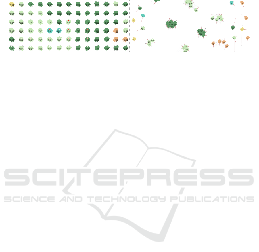
Figure 4: On the left, a detail of the matrix projection. All neurons are placed according to the the SOM’s matrix grid. On the
right, a detail of the force-directed projection. All neurons are placed according to the attraction and repulsion forces.
We apply similar representations for the price and
quantity features of the second level. As both are
concerned with continuous values, we use two quar-
ter circle bar graphs at the bottom half of the base
circle (Figure 3). We place the graph on the left or
right for the price or quantity features, respectively.
To translate the continuous values to bars, we com-
puted the quartiles, separating the values according to
the limits depicted in Figure 3. To represent the dis-
count feature, we applied a similar rationale as in the
(un)necessary feature. If a certain neuron represents
a purchase with discount, we draw the outline of a
circle in grey, slightly bigger than the base circle. If
there is no discount, no outline is drawn (Figure 1).
Finally, for the third level features, we represent a
product bought in one of the four seasons of the year
by drawing a curve which is positioned around the cir-
cle according to the season of the year, as depicted in
Figure 1. To represent whether a product was bought
in the nearest supermarket, a polygon is drawn in the
bottom of the circle. If the product was not bought in
the closest supermarket, no polygon is drawn (Figure
1). With the binary representations, we aim to empha-
sise the differences between two values and aid the
user in the search of specific visual marks/features.
3.3 SOM Projections
We implemented two different approaches for the po-
sitioning of the neurons on the canvas. In the first, we
place each neuron within a conventional matrix, com-
monly applied in the visualisation of SOMs. To com-
pute the SOM, the neurons are placed within a regular
matrix of n columns and m rows. We use their po-
sition in the matrix to distribute them on the canvas
within a grid with the same number of columns and
rows (Figure 4, left). This approach enables the user
to perceive the distribution of the different types of
neurons, their relations and extrapolate the character-
istics of the dataset at a higher level. Additionally, it
enables to perceive the type of products most bought
by a certain customer. However, it lacks a more de-
tailed representation of the dataset, which could en-
able, for example, the representation of how many
transactions are related to each neuron, and which
neuron is more representative of the dataset. The lat-
ter task is specially difficult to achieve when more
than one feature is being represented. Therefore, we
implemented a second approach, in which we place
each neuron within a force-directed graph, to repre-
sent their relations to the transactions and achieve a
better comprehension of the customer profile.
For the force-directed graph, neurons and trans-
actions are represented as nodes. Our implementa-
tion of the graph is based in the Force Atlas 2 algo-
rithm (Jacomy et al., 2014). This type of projection
is characterised by the use of forces of repulsion and
attraction between nodes. All nodes have forces of
repulsion towards each other so they do not overlap.
Only the nodes which dissimilarity is below a prede-
fined threshold have forces of attraction. The similar
two nodes are, the higher their forces of attraction and
the closest they will get. With this approach, we aim
to create visual clusters, that are defined by the SOM
topology. To prevent the nodes to move out of the
canvas, a gravitational force is applied, attracting all
nodes to the centre of the canvas. This gravitational
force depends on the number of connections between
neurons and transactions, the higher the number of
connections, the closer they will be to the centre. With
this, clusters more representative of the customer pur-
chases will be in the centre of the canvas, and the ones
representing atypical purchases in the periphery.
To avoid clutter, only the neurons which were se-
lected as a BMU in the training process are repre-
sented, leading to a more representative graph of the
SOM, and thus, of the customer. Additionally, the
transaction nodes are clustered as follows: (i) we ag-
gregate all transactions which have the same neuron
as BMU; (ii) we group those transactions into groups
of 100, and calculate their average force of attraction
to the other neurons, to define their attraction forces.
Note that groups can have less than 100 transactions.
The nodes have distinct representations. To rep-
resent the neurons we apply the glyphs described in
subsection 3.2. The groups of transactions are repre-
GlyphSOMe: Using SOM with Data Glyphs for Customer Profiling
305
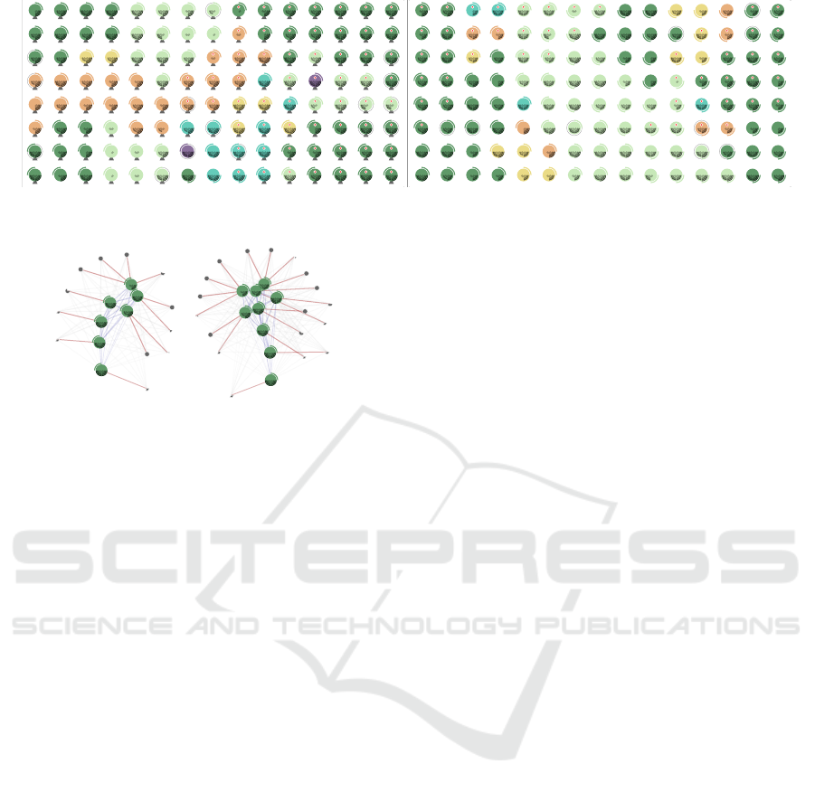
Figure 5: SOM visualisation of two different customers, customer A (left) and customer B (right).
Figure 6: Two clusters representing two types of purchases
on the same department but in different periods of time.
sented with a small dark grey pie chart that depicts the
quantity of transactions within the group. We opted
to represent the transactions in a simpler way, as the
main goal is to represent the amount of transactions
similar to the BMU neuron. Also, if they are con-
nected to certain neurons, it means they share simi-
lar characteristics with it, being redundant to use the
glyphs approach.
We connect visually the transactions with their
BMU and other neurons to which they share a sim-
ilarity value above a predefined threshold. All neu-
rons which are similar are also connected. All these
connections are represented differently. We coloured
the lines: (i) in red, if they connect a node represent-
ing a group of transactions and their BMU neuron; (ii)
in light grey, if they connect a group of transactions
and other neurons which are also similar to them,
but are not their BMU; and (iii) in blue, if they con-
nect two similar neurons. These lines are represented
to enhance the comprehension of the nodes proxim-
ity. However, they should be represented in a second
plane, and for this reason their opacity and thickness
diminishes according to the similarity values. The
less similar, the less opaque and smaller its thickness.
4 RESULTS
The design choices for the neurons representation
were based on the principles of graphic excellence
defined by Tufte (Tufte, 2001) and on the ranking of
perceptual tasks proposed by Mackinlay (Mackinlay,
1986). According to the data type of each data vari-
able, we chose the first visual variables from the cor-
responding rank. For ordinal data, position is used to
distinguish the four seasons of the year. Also, to rep-
resent the three ranges of values, that groups the con-
tinuous price and quantity values, we use position and
saturation. For nominal data, the department and nec-
essary product features are represented through hue,
as we intended to give them more relevance, and the
nearest store is represented through position. The
principles of graphical integrity were taken into ac-
count regarding the proportionality of quantities and
the use of one visual variable per data attribute, with
the exception of price and quantity, in which satura-
tion is applied to emphasise higher values. Regarding
data ink and density, by representing only the most
representative neurons in the graph projection, we aim
to reduce redundancy and data-ink ratio. Also, chart-
junk is avoided as we only represent the dataset.
To understand the readability of the matrix and
force-directed projections, we conducted an use case.
We started by comparing the SOM results of two cus-
tomers (Figure 5). It was possible to perceive distinct
customer shopping behaviours. Through the analy-
sis of the colour distribution, one can perceive that
customer A has a more diverse shopping list than
customer B. By looking at the red circles of each
glyph, it is possible to characterise customer A as
a more unnecessary shopper than customer B. Cus-
tomer B, can be characterised as a healthy shopper,
as its main products are from the Fresh Food depart-
ment (e.g., fruits, vegetables, fresh meat) and has less
unnecessary types of products. These two customers
are also distinct in terms of geographic shopping, as
customer A usually shops in the closest supermar-
ket to his place of residence, and customer B does
not. However, both customers share one characteris-
tic, the unusual shopping of products with discount,
as a reduced number of glyphs present the discount
representation. Through a closer look at the quantity
sections graph, both customers tend to purchase more
than one product of the same type.
IVAPP 2020 - 11th International Conference on Information Visualization Theory and Applications
306

We analysed customer B in more detail using the
force-directed projection. We could attest the conclu-
sions taken from the matrix projection. We could per-
ceive the small diversity of glyphs representing dif-
ferent departments, and the small amount of products
considered as unnecessary. We could also identify
different clusters that characterise the customer shop-
ping behaviour in the same department. For example,
in Figure 6, we show two distinct clusters. Both repre-
sent purchases of the Grocery Department, with high
quantities and not in the closest store. However, they
represent different periods of time. While the clus-
ter on the left, represents purchases made during the
winter season, the cluster on the right, represents pur-
chases made during spring. Through the comparison
between the number of transaction nodes near each
cluster, we can conclude, that this customer tends to
shop more on the grocery Department during Spring.
Additionally, as they are central in the visualisation,
we can endorse this reasoning as neurons on the pe-
riphery are considered as less representative of the
customer purchase patterns than the central ones.
5 CONCLUSION
In this paper, we presented a method for visualising
SOMs applied on mixed data. More specifically, we
address the application of glyphs on the representa-
tion of the neurons of a SOM, so the features used in
the training become visible in a single representation.
In our approach, the design of a glyph takes a cir-
cular form, with different elements representing dif-
ferent features. We tested the visualisation with seven
features, and our critical review indicates that the pro-
posed glyphs are capable of conveying the needed in-
formation and of being distinguished from each other.
However, a deeper study should be conducted to test
the efficiency and scalability of the approach.
In what concerns the layout, in this paper we pre-
sented an application of the traditional matrix place-
ment of elements that represent the neurons, as well
as a force-directed distribution of the glyphs. In the
latter, the forces vary in proportion to the similarity
between neurons, which according to our hypothe-
ses should better express the relation among clus-
tered data and emphasise the most typical consump-
tion. Additionally, in the force-based layout, the input
vectors that were used to train the network are also
displayed, and further aggregated to allow a more de-
tailed analysis of the shopping characteristics.
We applied the proposed method on the dataset
from SONAE, a super and hypermarket chain in Por-
tugal. The data consisted of consumption transac-
tions that are registered during the purchasing of prod-
ucts in supermarkets. The goal was to depict patterns
present in customer purchasing behaviours, enabling
customer profiling. Our analysis of the results indi-
cates that the application of complex glyphs, in com-
bination with SOM algorithms, can improve the char-
acterisation of customers, as well as the understand-
ing of SOMs themselves applied on mixed data.
As future work, we intend to improve the visuali-
sation by adding interaction in the graph layout. Still
regarding the interaction with the graph, we expect to
enable the visualisation of the details of each group of
transactions and the details of each individual transac-
tion. Also, we plan to test the limits of the glyphs in
terms of generalisation and scalability, when used in
SOM visualisation applied on mixed data. Addition-
ally, it is in our plan to validate the proposed approach
compared to the traditional visualisation through an
user testing. Also, we intend to validate the quality of
the clustering of the used SOM algorithm, and com-
pare it with other algorithms and datasets.
ACKNOWLEDGEMENTS
The work is supported by the Portuguese Foundation
for Science and Technology (FCT), under the grant
SFRH/BD/129481/2017.
REFERENCES
Anderson, E. (1957). A semigraphical method for the
analysis of complex problems. Proc. of the National
Academy of Sciences, 43(10):923–927.
Andrienko, G., Andrienko, N., Bak, P., Bremm, S., Keim,
D., von Landesberger, T., P
¨
olitz, C., and Schreck, T.
(2010). A framework for using self-organising maps
to analyse spatio-temporal patterns, exemplified by
analysis of mobile phone usage. Journal of Location
based services, 4(3-4):200–221.
Astudillo, C. A. and Oommen, B. J. (2014). Topology-
oriented self-organizing maps: a survey. Pattern anal-
ysis and applications, 17(2):223–248.
Azcarraga, A., Hsieh, M.-H., and Setiono, R. (2003). Vi-
sualizing globalization: A self-organizing maps ap-
proach to customer profiling. ICIS 2003 Proceedings,
page 49.
Borg, I. and Staufenbiel, T. (1992). Performance of snow
flakes, suns, and factorial suns in the graphical rep-
resentation of multivariate data. Multivariate Behav-
ioral Research, 27(1):43–55.
Borgo, R., Kehrer, J., Chung, D. H., Maguire, E.,
Laramee, R. S., Hauser, H., Ward, M., and Chen, M.
(2013). Glyph-based visualization: Foundations, de-
GlyphSOMe: Using SOM with Data Glyphs for Customer Profiling
307

sign guidelines, techniques and applications. In Euro-
graphics (STARs), pages 39–63.
Del Coso, C., Fustes, D., Dafonte, C., N
´
ovoa, F. J.,
Rodr
´
ıguez-Pedreira, J. M., and Arcay, B. (2015). Mix-
ing numerical and categorical data in a self-organizing
map by means of frequency neurons. Applied Soft
Computing, 36:246–254.
Dunne, C. and Shneiderman, B. (2013). Motif simplifica-
tion: improving network visualization readability with
fan, connector, and clique glyphs. In Proceedings of
the SIGCHI Conference on Human Factors in Com-
puting Systems, pages 3247–3256. ACM.
Fuchs, J., Isenberg, P., Bezerianos, A., Fischer, F., and
Bertini, E. (2014). The influence of contour on simi-
larity perception of star glyphs. IEEE transactions on
visualization and computer graphics, 20(12).
Fuchs, J., Isenberg, P., Bezerianos, A., and Keim, D. (2017).
A systematic review of experimental studies on data
glyphs. IEEE Trans. on Visualization and Computer
Graphics, 23(7).
Furletti, B., Gabrielli, L., Renso, C., and Rinzivillo, S.
(2012). Identifying users profiles from mobile calls
habits. In Proceedings of the ACM SIGKDD int. work-
shop on urban computing, pages 17–24. ACM.
Gorricha, J. M. and Lobo, V. J. (2011). On the use of
three-dimensional self-organizing maps for visualiz-
ing clusters in georeferenced data. In Information Fu-
sion and Geographic Information Systems, pages 61–
75. Springer.
Hsu, C.-C. (2006). Generalizing self-organizing map for
categorical data. IEEE transactions on Neural Net-
works, 17(2):294–304.
Hsu, C.-C. and Kung, C.-H. (2013). Incorporating unsu-
pervised learning with self-organizing map for visual-
izing mixed data. In 2013 Ninth International Con-
ference on Natural Computation (ICNC), pages 146–
151. IEEE.
Hsu, C.-C. and Lin, S.-H. (2011). Visualized analysis of
mixed numeric and categorical data via extended self-
organizing map. IEEE transactions on neural net-
works and learning systems, 23(1):72–86.
Jacomy, M., Venturini, T., Heymann, S., and Bastian, M.
(2014). Forceatlas2, a continuous graph layout algo-
rithm for handy network visualization designed for the
gephi software. PloS one, 9(6).
Kameoka, Y., Yagi, K., Munakata, S., and Yamamoto, Y.
(2015). Customer segmentation and visualization by
combination of self-organizing map and cluster anal-
ysis. In 2015 13th International Conference on ICT
and Knowledge Engineering (ICT & Knowledge En-
gineering 2015), pages 19–23. IEEE.
Kohonen, T. (1990). The self-organizing map. Proceedings
of the IEEE, 78(9):1464–1480.
Koua, E. (2003). Using self-organizing maps for informa-
tion visualization and knowledge discovery in com-
plex geospatial datasets. Proceedings of 21st int. car-
tographic renaissance (ICC), pages 1694–1702.
Mackinlay, J. (1986). Automating the design of graphical
presentations of relational information. Acm Transac-
tions On Graphics (Tog), 5(2):110–141.
Milosevic, M., McConville, K. M. V., Sejdic, E., Masani,
K., Kyan, M. J., and Popovic, M. R. (2012). Visualiza-
tion of trunk muscle synergies during sitting perturba-
tions using self-organizing maps (som). IEEE Trans-
actions on Biomedical Engineering, 59(9):2516–
2523.
Morais, A. M. M., Quiles, M. G., and Santos, R. D. (2014).
Icon and geometric data visualization with a self-
organizing map grid. In International Conference on
Computational Science and Its Applications, pages
562–575. Springer.
Olszewski, D. (2014). Fraud detection using self-organizing
map visualizing the user profiles. Knowledge-Based
Systems, 70:324–334.
Peng, W., Ward, M. O., and Rundensteiner, E. A. (2004).
Clutter reduction in multi-dimensional data visualiza-
tion using dimension reordering. In Information Visu-
alization, 2004. INFOVIS 2004. IEEE Symposium on,
pages 89–96. IEEE.
Rajagopal, D. et al. (2011). Customer data cluster-
ing using data mining technique. arXiv preprint
arXiv:1112.2663.
Rogovschi, N., Lebbah, M., and Bennani, Y. (2011). A self-
organizing map for mixed continuous and categorical
data. Int. Journal of Computing, 10(1):24–32.
Schreck, T., Bernard, J., Von Landesberger, T., and
Kohlhammer, J. (2009). Visual cluster analysis of tra-
jectory data with interactive kohonen maps. Informa-
tion Visualization, 8(1):14–29.
Shen, Z., Ogawa, M., Teoh, S. T., and Ma, K.-L. (2006).
Biblioviz: a system for visualizing bibliography in-
formation. In Proceedings of the 2006 Asia-Pacific
Symposium on Information Visualisation-Volume 60,
pages 93–102. Australian Computer Society, Inc.
Siegel, J. H., Farrell, E. J., Goldwyn, R. M., and Friedman,
H. P. (1972). The surgical implications of physio-
logic patterns in myocardial infarction shock. Surgery,
72(1):126–141.
Tai, W.-S. and Hsu, C.-C. (2012). Growing self-organizing
map with cross insert for mixed-type data clustering.
Applied Soft Computing, 12(9):2856–2866.
Tufte, E. R. (2001). The visual display of quantitative in-
formation, volume 2. Graphics press Cheshire, CT.
Ward, M. O. (2002). A taxonomy of glyph placement strate-
gies for multidimensional data visualization. Informa-
tion Visualization, 1(3-4):194–210.
Wehrens, R., Buydens, L. M., et al. (2007). Self-and super-
organizing maps in r: the kohonen package. Journal
of Statistical Software, 21(5):1–19.
Wittenbrink, C. M., Pang, A. T., and Lodha, S. K. (1996).
Glyphs for visualizing uncertainty in vector fields.
IEEE Trans. on Visualization and Computer Graph-
ics, 2(3):266–279.
Yang, J., Peng, W., Ward, M. O., and Rundensteiner, E. A.
(2003). Interactive hierarchical dimension ordering,
spacing and filtering for exploration of high dimen-
sional datasets. In Information Visualization, 2003.
INFOVIS 2003. IEEE Symposium on, pages 105–112.
IEEE.
IVAPP 2020 - 11th International Conference on Information Visualization Theory and Applications
308
