
Dynamic Collaborative Visualization of the United Nations
Sustainable Development Goals (SDGs): Creating an SDG Dashboard
for Reporting and Best Practice Sharing
Kathleen Campbell Garwood, David Steingard and Marcello Balduccini
Saint Joseph’s University, 5600 City Avenue, Philadelphia, PA, U.S.A.
Keywords: Collaborative Visualization, Sustainability, Sustainable Development Goals (SDGs), Interactive
Visualization, Dynamic Collaborative Visualization, Collaborative Dashboard.
Abstract: Dynamic data visualization is a collaborative dashboarding methodology used to identify trends and insights
in data while revealing changes in activity and work progress. This paper introduces a dashboard technique
that collects, reports, and shares global business schools’ fulfillment of the United Nations Sustainable
Development Goals (SDGs)--the SDG Dashboard. With this tool, business schools can share experiences
with the goal of promoting sustainable change and advancing the work (e.g. research papers, partnerships,
and syllabi) being done internationally within schools. By revealing patterns and trends that may not be
evident when reading individual school level accounts of SDG alignment, this dashboard was created to
promote inter-school collaboration while highlighting best practices. Overall, it can be used as a high-level
assessment tool to highlight areas of greatest impact on the SDGs as well as opportunities for growth. The
SDG Dashboard allows users to drill down into the data, revealing patterns of global impact, while also
highlighting the breadth of work that is being done. This dynamic dashboard is an agent for collaborations in
all topics outlined in the United Nations Sustainable Development Goals, which are: sustainable economic
growth, responsible consumption and production, availability for decent work, poverty eradication, cleaner
energy, environmental conservation, and the foray of issues concerning overall inequality and quality
education.
1 INTRODUCTION
This paper introduces a dynamic dashboard
visualization technique with a primary focus on
fostering collaboration. The dashboard itself is
dynamic in two respects. First, the end goal of
interacting with the data is to provide academics
worldwide with information that stimulates change or
advances progress as to how SDGS are taught,
studied, and processed and second the drill down
feature allows for a changing view of the data
depending on the focus of the viewer. In this paper
the term collaborative means working with a variety
of schools and faculty, the dashboard represents the
shared use of computer-supported, (interactive)
visual representations of data by more than one
person with the common goal of contribution to joint
information processing activities (as defined by
Isenberg et. al., 2011). To be truly collaborative, the
goal is to concisely share best practices to promote
change in the world. The use of a dashboard as the
method of sharing the data was chosen as the
graphical interface allows at-a-glance key
information while also providing drill down
functionality allowing for both broad and narrow
information retrieval. Before explicating the
technique, it is important to establish some
background on the context for its application. Our
work is both an exploration of an innovative
visualization technique, as well as a solution to the
particular problem of usefully communicating and
analyzing large amounts of data referencing social
and environmental transformation promoted by the
United Nations.
On the heels of the successful 2000 campaign to
address Millennium Development Goals, the United
Nations generated a new set of 17 Sustainable
Development Goals (SDGs) to be realized by 2030.
The SDGs include some of the same goals as the
Millennium Goals, but their reach extends into an
even wider range of transformative social and
environmental objectives like promoting decent work
294
Garwood, K., Steingard, D. and Balduccini, M.
Dynamic Collaborative Visualization of the United Nations Sustainable Development Goals (SDGs): Creating an SDG Dashboard for Reporting and Best Practice Sharing.
DOI: 10.5220/0009172302940300
In Proceedings of the 15th International Joint Conference on Computer Vision, Imaging and Computer Graphics Theor y and Applications (VISIGRAPP 2020) - Volume 3: IVAPP, pages
294-300
ISBN: 978-989-758-402-2; ISSN: 2184-4321
Copyright
c
2022 by SCITEPRESS – Science and Technology Publications, Lda. All rights reserved

and economic growth; advancing sustainable
industry, innovation, and infrastructure; stewarding
life below water and on land; and collaborating to
foster peace, justice, and strong institutions. Since
their launch, the SDGs have become strategically
adopted in many sectors: nation-states, corporations,
non-governmental organizations, and higher
education institutions.
All of these sectors share a common problem of
performance reporting, how to thoughtfully “manage
what they measure” in terms of fulfilling these goals;
the SDG Dashboard was developed as a pilot for the
global business school membership organization
Principles for Responsible Management (PRME).
The initial goal was to collect and share data about
how schools are teaching, researching, and partnering
with other institutions to influence change related to
the SDGs. Participating business schools pledged to
collect information on how they participated as
teachers, researchers, and practitioners in
understanding methods to address their goals. These
reports aim to communicate each school’s
effectiveness in addressing SDGs and provide best
practices. Through an iterative and open discussion
collaboration, the SDG Dashboard was created to
expand the work being done globally, and collect and
disseminate this data in one location with input from
multiple institutions, academics, and students.
2 LITERATURE REVIEW
Simple data visualizations have been used as a tool to
monitor and report SDGs in many studies. Clements,
Sarkar, & Wei (2014) considered satellite photos
visualized in grid space to identify vegetation
changes in South Africa to address food scarcity
(SDG 2: Zero Hunger) and WattDepot (Brewer, Lee,
and Johnson, 2011) provided enterprise-level
collection, storage, analysis, and visualization of
energy data (SDG 7: Affordable and Clean Energy)
to effect behavior change and energy literacy.
Individuals have done work to assess metrically and
visually how they have been able to impact needs for
a specific goal or a set of goals and prepare great
interactive dashboards to display their efforts. There
is value in these individual dashboards to inform
users about SDG impact data as there is value in the
papers being done by academic researchers, and in
the partnerships being forged by institutions with in
need communities. Our collaborative dashboard
provides an opportunity to present all work being
done from various sources in one location creating a
resource that can provide computer supported
cooperative work (CSCW) as multiple schools share
data and insights that enable the dashboard to grow
while also being open to adapting the dashboard to
the needs of the users. The term computer supported
cooperative work, first coined by Greif and Cashman
in 1984, considers the depth to which we use
technology to support people in their work (Grudin
1994). As stated by Iseberg et al. (2011) traditional
visualization and visual analytics tools are typically
designed for a single user interacting with a
visualization application on a standard desktop
computer. However, extending these tools to include
support for collaboration clearly goes a long way
towards increasing the scope and applicability of
visualization in the real world (Isenberg et al 2011).
This dashboard can be used to allow the work being
done by universities to grow collaboratively with the
dashboard as a central focus.
Taking the time to incorporate multitudes of work
that can be viewed when considering only an
individual school (using the drop down list) or the
culmination of all reporting schools provides end-
users with control of scope. Meanwhile the display
provides a broad view where one can consider all 17
SDGs by impact area to quickly identify areas where
a plethora of work is being done and where more
work is still needed. Moreover, if someone had a
specific goal and impact area in mind (for example,
planning to teach a course addressing one or more
goals like ending poverty and hunger), a person could
narrow down the dashboard focus to only the exact
works available providing insights, information and
feasible opportunities for collaboration. The SDGs as
set forth by the United Nations are by design intended
to be considered as an amalgamated and
interdependent set of goals and this tool is meant to
provide a platform that encourages school interaction,
promotes cooperation, and gives access to work for
future partnerships.
This collaborative visualization addresses the
need for a tool that can share data and grow with the
feedback of those who provide the source data as has
been done iteratively since its inception. Ultimately
it offers a robust and effective technique to enhance
SDG impact performance. The goals have been
adopted as strategically and operationally important
objectives in higher education, where there is a need
for collaborative SDG visualization similar to what is
being done at the country level. Globally, efforts are
being made to assess how well countries are meeting
the SDGs and move forward with best practices. For
example, island countries like Indonesia have sought
to explore the benefits of data visualization in SDG
monitoring (Pulse Lab, 2018) with a “mission to
Dynamic Collaborative Visualization of the United Nations Sustainable Development Goals (SDGs): Creating an SDG Dashboard for
Reporting and Best Practice Sharing
295

accelerate the discovery and adoption of data
innovation for sustainable development and
humanitarian action.” The United Nations itself
offers a variety of official platforms to assess human
progress towards fulfilling these goals. A further
example, Schmidt-Traub et al., (2017) present the
SDG Index and Dashboards (released
annually),which explore differences in countries'
performance, considers the empirical relationship to
subjective wellbeing (SWB), and discusses how
remaining gaps in data and analysis can be filled.
This came in the wake of Bertelsmann Stiftung and
the Sustainable Development Solutions Network
(SDSN) jointly releasing their first SDG Index and
Dashboards (SDG Index and Dashboards) in July
2016, with data covering 149 of 193 UN member
states.
This Dashboard provides the type of visualization
most aligned with information sharing through
collaboration. Through many iterations, the current
dashboard exists due to feedback and open
conversation with schools who have shared their data,
information and best practices while asking
meaningful questions that have allowed for updates
and adaptations as well as informative discussions at
several presentations globally. Between its inception,
continued collection with constant interaction with all
participating schools, and final goal of helping to
share out best sources or data and encouragement of
future partnerships, the dashboard is at its core
created to be a collaborative tool. It is dedicated to
sharing and reporting best SDG practices in global
higher education (not comparing and ranking) using
a drill down visualization. There is a need to begin to
characterize the increasingly diverse audience for
visualization technology and map out the design
space for new creative and collaborative tools to
support these users (Heer et al., 2008). We propose
this dynamic dashboard that can be used to connect
professors, students, and institutions to collaborate on
projects, research, and teaching to help a new
generation of students prepare to be socially
responsible citizens and corporate employees
working for change in accord with the SDGs.
3 METHODOLOGY AND
DEVELOPMENT OF
COLLABORATIVE
VISUALIZATION IN THE SDG
DASHBOARD
Our team set out to determine a creative method of
reporting and sharing data across institutions in an
accessible reporting tool that considered SDG by
impact area. The reporting tool was developed with
an ability to discern activity quickly, which led to a
tool that drills down into the reported data revealing
usable information at the broad SDG level through a
heatmap and key performance indicators (KPI).
Drilling down (as seen in Figure 1), the dashboard can
portray just the data reported by a single SDG
(column view), or it can highlight only work being
done in one specific impact area like teaching (row
view), or it can be narrowed down in scope to only
consider one SDG across one impact area. In all
cases, the drilled down data can be viewed and
interacted with at the finite level promulgating titles,
abstracts and links connecting the user to the data
source shared within the dashboard. The creation of
the final product requires data collection, cleaning,
organization, and visualization of the aggregated
sustainability data.
3.1 Survey Tool Created in Order to
Perform Data Collection
In order to collect the data for aggregation, an initial
compilation tool using SurveyMonkey.com was
introduced, which asked hundreds of questions in
order to ascertain SDG detailed data at the impact
area and target levels. According to PRME partners,
this collection was bulky and cumbersome, which led
to immediate modifications. To reduce time and
effort for the user, the collection, Qualtrics.com
replaced SurveyMonkey.com because of the
powerful survey flow logic option and was then tested
and updated with several pilot schools across the
globe participating and providing insights.
The Qualtrics survey was developed to aggregate
information and control flow components were
placed within each question level to allow for a more
concise, targeted collection tool. The current tool
considers data down to the SDG and impact levels. It
allows respondents from schools to upload portions
of data at varying times. This puts the power of data
selection, control, and evaluation into the users’
hands.
IVAPP 2020 - 11th International Conference on Information Visualization Theory and Applications
296

Built-in logic allows respondents to view only
questions that pertain to their current data. The set-
up is as follows:
● Each school using the survey chooses which of
the 17 SDGs they are interested in uploading data
(See Appendix Figure A1).
● Once SDGs are chosen, the survey asks users
which impact areas they would like to report (see
Appendix Figure A2).
● Finally, the survey requests data within the SDG
where the user reports the number of activities
being uploaded (see Appendix Figure A3).
The collected data generates a report that allows for
aggregation and reporting within the dashboard. The
report consists of a list of items describing the data
type under that SDG (e.g., a course, a research paper,
or a project).
3.2 Data Cleaning and Organization
for Dissemination
It took multiple iterations of collection and cleaning,
as well as discussions with pilot schools, and
feedback form PRME presentations before the final
product, this collaborative dynamic dashboard, was
produced. From a data design perspective, it is
important that a clear and whole picture is available
displaying the SDGs met and the areas of impact. To
learn more about any specific activity within an SDG,
the tool will concisely report the most important
findings, actions, or partnerships. The Dashboard
uses live web links to provide users with current
information (e.g., research papers or partnership
documents), providing future collaboration at a finite
level.
The current process of collection and cleaning has
expedited the time between data upload and
dashboard integration using consistent variables.
Each school can upload data that is then exported into
an excel document, formatted for visualization, and
then forwarded to the initial stakeholder to assure
accuracy. Fields that are required for best use are:
● Year of impact
● SDG and Impact Area an activity meets
● Title of the activity
● Short description (e.g. abstract, course description
for classes)
● City and country impacted
● Link to related information (e.g. doi for papers, a
website for partnerships)
4 SDG DASHBOARD
The final product is the SDG Dashboard, an
interactive tool created to allow end users
opportunities for collaboration and best practices
within the academic realm of SDG teaching, research,
partnerships, dialogue, and organizational practices.
Figure 1 represents the broad design, which provides
a pictorial view of which school is being considered
if it is one individual school under consideration. The
top row of data provides the key performance
indicators (KPIs), specifically, how many SDGs have
been reported on (out of the 17), how many distinct
activities are available to view, and how many
countries have been impacted by these activities.
Below the KPIs is a broad view heatmap portraying
all 17 goals and what was reported by a school within
the SDG and impact area level using color where
more shade is indicates increased activity. The right,
side and bottom contain bar charts which provide
total counts of all activities by SDG as well as by
impact area. The bottom-left area shows a world map
and again uses color to denote which global areas are
being impacted by the activities provided. On the
bottom right, a drop-down chart provides a detailed
list of all activities reported. A user can click on a
specific SDG to dig deeper into the data which can be
viewed in figure 2. Here, SDG 16 (Peace, Justice, and
Strong Institutions) is highlighted which updates the
KPIs, map and list on the bottom right. In this case,
a specific title for a research paper is being hovered
over to reveal the abstract that is available in order to
get a better understanding of the paper. If openly
available, the paper itself is simple a click away, as
the titles have embedded links. This can also be done
within a singular impact and are considered across
one or more SDGs. Users hover over each activity
for detailed descriptions and a simple click links the
user directly to the pertinent research, partnerships, or
syllabi (see Figure 2).
This dynamic dashboard allows for views of
school efforts being made on specific SDGs while
also allowing for a drill-down view and immediate
access to the most recent activities and papers for best
practices and collaboration.
Dynamic Collaborative Visualization of the United Nations Sustainable Development Goals (SDGs): Creating an SDG Dashboard for
Reporting and Best Practice Sharing
297
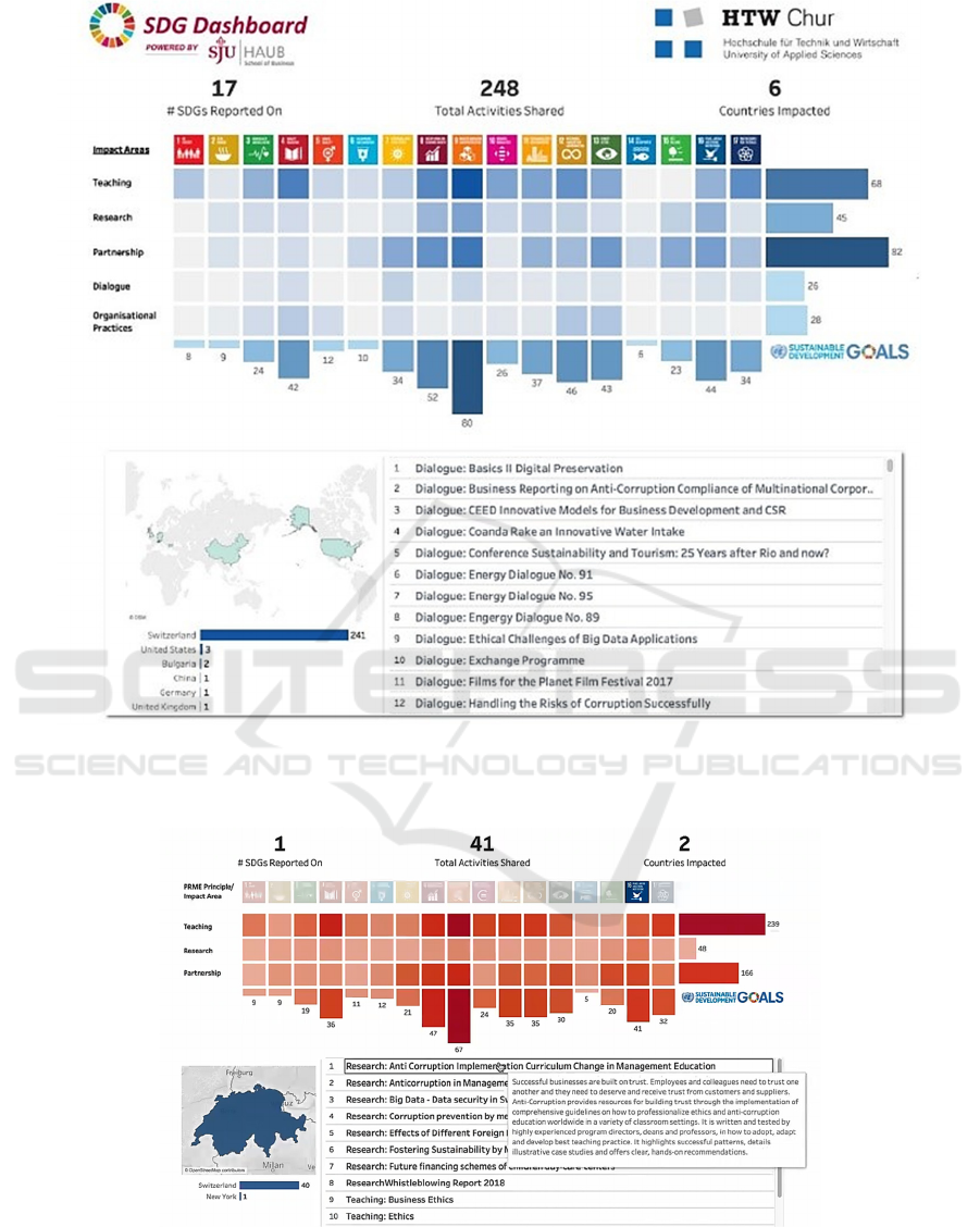
Figure 1: View of a singular school data, where KPI represent overall performance, top visual represents activities shared across
all SDGs and impact areas, the map Bottom left shows coordinates of where work is being done, and the text box on right allows
for list of individual activities.
Figure 2: View of a singular school data, where KPI represent overall performance, top visual represents activities shared across
all SDGs and impact areas but with drill down on SDG 16. The map (bottom left) shows coordinates of where work is being
done, and the text box on right shows top 10 activities. First research paper title is hovered over revealing the abstract and a
double click would lead to access to paper if publicly available.
IVAPP 2020 - 11th International Conference on Information Visualization Theory and Applications
298

5 CONCLUSION: THE FUTURE
OF DYNAMIC
COLLABORATIVE
VISUALIZATION
This project aims to achieve two objectives. First, it
proposes a framework for this dynamic dashboard
visualization. Much of the theory, models, and
application of dashboard visualizations in the
literature are limited in their power to communicate
with a variety of stakeholders and persuade people to
take action using the data (basic goals of data
visualization). The sustainable issues faced globally
as reflected in the sustainable development goals are
being addressed by ever-changing and integrated
techniques that require nimble data collection and
reporting. Collaboration from diverse sources over
time is a critical factor in successfully providing
current, shareable, and actionable data to advance the
fulfillment of sustainability. Dynamic Collaborative
Visualization addresses these limitations by offering
access to multiple scale data generated by the actual
users who share their data and are partners in the
changes made to both the data collection and final
visualization. The second objective is the application
of this dashboard in one particular domain, a case
study, of the United Nations 17 Sustainable
Development Goals (SDGs) in higher education
institutions. The SDGs outline an inspiring,
implementable, and measurable plan for humanity to
manifest a more prosperous, equitable, and
sustainable future. This SDG Dashboard provides
opportunities for growth and expansion of current
SDG practices within business schools and
universities across the globe. This visualization
technique provides a solution to a particular problem,
that of usefully communicating large amounts of data
about social and environmental transformation
promoted by the United Nations.
By revealing useful information, assessing areas
of high impact, as well as areas where there are
opportunities for growth, the Dashboard features
reveal patterns of global impact (breadth) and activity
title and description (depth) while also providing
direct links to the overall activity where viable. The
application in the form of the SDG Dashboard,
advances data-driven best practices while enhancing
global business schools’ performance on the SDGs
and techniques to continue visualization
collaboration. Goals moving forward include the
ability to provide analytical insights as far as growth
for individual schools and address areas where more
needs to be done (example Life Below Water, SDG
14, has very little activity).
Future work will require further theoretical
development and differentiation from the existing
literature. This project provides a platform to
showcase the dashboards communicative power in a
novel context, reinforcing its value as a powerful tool
for data visualization, analysis, and application.
Overall, the dashboard provides quick access and
opportunities for organizations and institutions
working together to solve complex problems and
address challenges. At the center of the shared data
is easy access, which in this case is done through
visualization.
REFERENCES
Brewer, R. S., Lee, G. E.M & Johnson, P. M. (2011). The
Kukui Cup: a dorm energy competition focused on
sustainable behaviour change and energy literacy. 44th
Hawaii International Conference of System Sciences.
(HICSS, 2011),1-10.
Clements, N, Sarkar, S., Wei, W. (2014). Multiplicative
Spatio-Temporal Models for Remotely Sensored
Normalized Difference Vegetation Index Data. Journal
of International Energy Policy, 3(1), 1 – 14.
Grudin, J. (1994). Computer-supported cooperative work:
history and focus. Computer. 27(5), 19-26.
Heer J., van Ham F., Carpendale S., Weaver C., Isenberg P.
(2008). Creation and Collaboration: Engaging New
Audiences for Information Visualization. In: Kerren A.,
Stasko J.T., Fekete JD., North C. (eds) Information
Visualization-Human Centered Issues and
Perspectives, 4950, 92-133. Springer
Verlag: Heidelberg, Berlin, 2008
Isenberg, P., Elmqvist, N., Scholtz, J., Cernea, D., Ma, K.,
& Hagen, H. (2011). Collaborative visualization:
definition, challenges, and research agenda.
Information Visualization. 10(4), 310-326.
Pulse Lab Jakarta (2018). Indonesian Government
Develops a Monitoring Dashboard for the SDGs.
Published April 1, 2018. Retrieved from:
https://medium.com/pulse-lab-jakarta/indonesian-
government-develops-a-monitoring-dashboard-for-
the-sdgs-fb17ebf59d05
Schmidt-Traub, G., Kroll, C., Teksoz, K., Durand-Delacre,
D. & Sachs, J. (2017) National baselines for the
Sustainable Development Goals assessed in the SDG.
Index and Dashboards. Nature Geoscience, 10, 547-
555.
Dynamic Collaborative Visualization of the United Nations Sustainable Development Goals (SDGs): Creating an SDG Dashboard for
Reporting and Best Practice Sharing
299
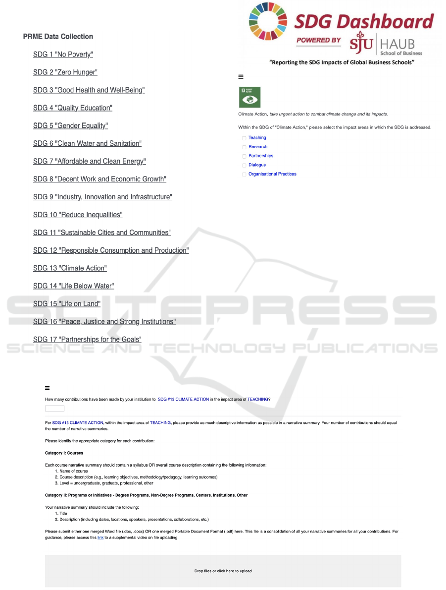
APPENDIX
Figure A1: First page of Qualtrics survey allows user to
check each SDG that they would like to report on.
Figure A2: Screen shot of next survey level for SDG 13,
specifically, which impact areas will be reported on.
Figure A3: Screen shot of detail level reporting page for SDG 13, impact area teaching. Respondent is asked to tell how
many items will be reported on and then upload a link of the combined sheets representing these actions.
IVAPP 2020 - 11th International Conference on Information Visualization Theory and Applications
300
