
A Timeline Metaphor for Analyzing the Relationships between
Musical Instruments and Musical Pieces
J. Kusnick
1
, R. Khulusi
1
, J. Focht
2
and S. J
¨
anicke
3
1
Image and Signal Processing Group, Institute for Computer Science, Leipzig University, Leipzig, Germany
2
Music Instrument Museum, Institute for Musicology, Leipzig University, Leipzig, Germany
3
Department of Mathematics and Computer Science, University of Southern Denmark, Odense, Denmark
Keywords:
Music Visualization, Timeline Visualization, Geovisualization, Visual Design.
Abstract:
Digitization projects make cultural heritage data sustainably available. However, while digital libraries may
capture various aspects, relations across different sources often remain unobserved. In our project, musicol-
ogists aimed to relate musical instruments with historical performances of musical pieces, both contained in
different sources. We defined a similarity measure taking instrumentation, temporal as well as geospatial
metadata into account, with which we were able to hypothesize potential relations. We propose a novel time-
line design that offers a specific semantic zoom metaphor enabling the collaborating musicologists to observe
and evaluate the results of our similarity analysis. The value of our system for research in musicology is
documented in three case studies.
1 INTRODUCTION
In musical instrument museums, we encounter histor-
ical musical instruments or musical instruments from
around the world (Dawe, 2012). Instruments are typi-
cally arranged in glass showcases or separate subdivi-
sions, only a few instruments can be played in sound
laboratories or heard during performances. In rather
modern, global collections, as offered by the Musi-
cal Instrument Museum (MIM)
1
in Phoenix, Arizona
(United States), the exhibition is further enriched with
video and sound material from performances convey-
ing sound and functionality of instruments. However,
in historical collections, such enrichments can hardly
be offered. This is caused by most instruments not
having recording data and the instruments not being
in a playable condition without risking to damage or
destroy the rare or unique items. Further, even musi-
cologists sometimes wonder in which particular com-
position’s performances a historical music instrument
was used. The musicological term auralization de-
scribes this research interest of framing an instrument
with related compositions in order to picture its ca-
reer and to facilitate forming “a mental impression of
a sound not yet heard” (Summers, 2008).
Past digitization endeavors provide exhaustive
1
https://mim.org
digital collections of musical instruments and perfor-
mances alike. On the one hand, the “Musical In-
struments Museum Online” (MIMO)
2
provides struc-
tured information about around 65,000 music instru-
ments, while, on the other hand, the “R
´
epertoire In-
ternational des Sources Musicales” (RISM)
3
holds a
database with information about more than 1,100,000
musical pieces. By matching instrument types, tak-
ing geospatial as well as temporal constraints into
account, we combined both data sources that pre-
pared the ground to support generating hypotheses
for the auralization of music instruments by quantita-
tive, computational means. This paper outlines our in-
terdisciplinary collaboration involving both visualiza-
tion scholars and musicologists for the development
of an interactive visual timeline environment support-
ing the musicologists’ auralization task. In summary,
our contributions to the visualization community are:
• Assigning Compositions to Instruments: For
various geospatial, temporal and descriptive at-
tributes of instruments and performances, we de-
signed similarity measures that reflect the likeli-
ness of a composition being played with an instru-
ment in accordance to musicological conceptions.
2
https://www.mimo-international.com/MIMO/
3
https://opac.rism.info/
240
Kusnick, J., Khulusi, R., Focht, J. and Jänicke, S.
A Timeline Metaphor for Analyzing the Relationships between Musical Instruments and Musical Pieces.
DOI: 10.5220/0008990502400251
In Proceedings of the 15th Inter national Joint Conference on Computer Vision, Imaging and Computer Graphics Theory and Applications (VISIGRAPP 2020) - Volume 3: IVAPP, pages
240-251
ISBN: 978-989-758-402-2; ISSN: 2184-4321
Copyright
c
2022 by SCITEPRESS – Science and Technology Publications, Lda. All rights reserved

• Auralization System: We designed a visual an-
alytics system that is used by musicologists to
interactively evaluate hypothesized matchings of
compositions and instruments, supporting to grad-
ually form the aura of a particular instrument or
instrument types.
• A Novel Timeline Metaphor: We propose a
timeline metaphor for the explorative analysis of
instrument/performance matches that are exposed
in a historical frame. Additional views can be
consulted to foster or refute automatized match-
ing suggestions.
• Visual Encoding for Uncertainty: Within the
timeline view, we reflect temporal uncertainties
for instrument datings as well as the likeliness of a
detected match visually, preventing the user from
drawing false conclusions.
• Semantic Zoom: We propose a customized se-
mantic zoom approach that satisfies quantitative
(distant reading) and qualitative (close reading)
research interests alike.
We emphasize the utility of our visual matching sys-
tem for musicologists by providing various usage sce-
narios. In a storytelling style, each scenario exempli-
fies how our system can be used for generating hy-
potheses on the auralization of an instrument or in-
strument type. Additionally, we report experiences
gained during our project, which includes the iterative
evaluation of our auralization system with musicolo-
gists, limitations due to the nature of humanities data
and future prospects.
2 RELATED WORK
Schlegel and L
¨
udtke (Schlegel et al., 2011) arrange
instruments — Lutes and lute-like instruments —
on a timeline to convey developments in instrument
making. Annotated with descriptive metadata and
related compositions for those instruments, the de-
velopment of this instrument type can be explored
visually. In opposite to the printed form, interac-
tive timeline visualizations have been proven valu-
able for related research inquiries in digital human-
ities applications, typically directed towards person
groups (Andr
´
e et al., 2007; Daniels, 2014; Khulusi
et al., 2019; Khulusi et al., 2020a; Miller et al., 2012;
Zhao et al., 2012). Similar to time periods influencing
a person’s life, the development of instrument types
is likely influenced. Much research has been done
concerning time-oriented data visualization. Exam-
ples are given by Aigner et al. (Aigner et al., 2011)
and Brehmer et al. (Brehmer et al., 2016). Both in-
clude different timeline visualizations, and the latter
one proposes a taxonomy for timeline visualization in
particular. These works highlight different visualiza-
tion strategies for temporal data, like parallel lines or
theme rivers (Bunout, 2016; Havre et al., 2002) and
their ability to help in analyzing trends.
The time-dependent inspection of the instrument’s
careers visualization is as of now under-represented
in literature. Typically, visualizations of instruments
focus on structural aspects of instruments, often ob-
tained through X-ray or computed-tomography (Bor-
man and Stoel, 2009; Kirsch, 2019; Hopfner, 2018).
Further, functional analysis of how an instrument
generates sound is visualized (Berthaut et al., 2013;
Bou
¨
enard et al., 2008).
The static visualization by Schlegel et
al. (Schlegel et al., 2011) is our motivation, but
we propose an interactive visualization, making
use of the timeline metaphor and digital interac-
tion methods to help musicologists getting insight
into the careers of instruments. A similar system
is Continuum (Andr
´
e et al., 2007) that utilizes a
semantic zoom functionality for a timeline but does
not consider human career information. Another
comparable approach is MusikerProfiling, which
performs a similarity analysis for musicians based on
their biographical data (J
¨
anicke et al., 2016). This
work also addresses the visualization of uncertain
temporal data, which has also been discussed in other
works (Khulusi et al., 2020b; Mchedlidze, 2019).
Communicating such uncertainties is also subject to
our work to prevent misinterpretations.
3 DESIGN
In close collaboration with musicologists, we de-
signed the system in an iterative and user-centered
process to maximize the usability of our approach.
Two musicologists specialized in organology and
restoration were mainly involved in the development.
This section reports on the project following the
nested model by Munzner (Munzner, 2009).
3.1 Domain Situation
Musicologists focusing on organology know much
about the history and properties of inspected instru-
ments. When instruments seemed outdated, they were
restored, repaired or modified to get them ready for
next performances. As it is mostly not easy to state
which musical pieces were performed on a histori-
cal instrument, this work is motivated by musicolo-
A Timeline Metaphor for Analyzing the Relationships between Musical Instruments and Musical Pieces
241

gists who strive to picture an instrument’s career with
possible musical works (or genres) performed with it,
creating an instrument’s “aura”. With traditional, ana-
log means this task is near to impossible to be done.
Due to various branches of musicology like compo-
sition analysis and organology, different methods and
conventions of musical terminology exist. This makes
it difficult to find exact matches among repositories
listing musical instruments and compositions. We
support generating hypotheses for the task of match-
ing the instrument to musical pieces by digital means
and a tailored matching algorithm considering instru-
mentation, time and location, to create hypothetically
matches for further investigations. The two digital
repositories on which our analysis is based on are ex-
plained in the next subsection. We further propose an
interactive timeline visualization that helps to analyze
the hypothesized matching pairs. All in all, we pro-
pose a system that supports musicologists investigat-
ing the research question Which musical pieces have
been performed on a particular instrument? with an
interactive tool outlined below.
3.2 Data & Task Abstraction
The data was harvested from different online sources
and then transformed and cleaned to make them com-
patible with each other. Information on instruments
are extracted from MIMO, a project for the standard-
ized description and archiving of digital and multi-
media information about around 65,000 music instru-
ments in a database. The records include keywords
and classifications, for the type of the instrument,
as well as images and detailed events with different
types. An instrument is defined with properties as de-
scribed below:
I
i
=
(
I
titles
i
, set of instrument titles
E(I
i
), set of instrument events of I
i
(1)
Where an event is described by its type, date and
location (place name and coordinates).
Information on musical works are listed in RISM,
an international online documentation of more than
1,100,000 musical sources. Information like title and
scoring were harvested for each source. Many mu-
sical works are annotated with related performance
events, for which provided location and date are used
for the matching task. Musical sources are described
as:
P
j
=
(
P
title
j
, title of musical source
E(P
j
), set of performances of P
j
(2)
After extracting and cleaning the data sets for the fur-
ther processing, the resulting numbers were:
• 6,670 musical instruments I
1
, . . . , I
n
– with 6,826
events E(I) and
• 24,760 musical pieces P
1
, . . . , P
m
– with 29,192
performance events E(P).
Due to the geocoding during the cleaning process
some place names could not be resolved and got lost
and so some extracted events were discarded. Thus,
the amount of completely described instruments and
sources was minorly decreased.
3.2.1 Similarity between Instruments and
Sources
The matching between instruments and sources is de-
termined on the basis of locations, dates, and instru-
ment type of the corresponding events. Only events
with all those information were taken into account.
For musical sources, the instrumentation is given, and
an instrument is labeled with terms for its type. For
a matching task, one musical instrument or a group
of musical instruments can be selected and matching
scores for all possible pairs of instruments and musi-
cal pieces are determined dependent on three similar-
ity scores. The similarity S
e(I
i
), e(P
j
)
between an
instrument event e(I
i
) ∈ E(I
i
) and a musical perfor-
mance event e(P
j
) ∈ E(P
j
) is determined as
S
e(I
i
), e(P
j
)
= w
inst
· S
inst
e(I
i
), e(P
j
)
+w
time
· S
time
e(I
i
), e(P
j
)
+w
geo
· S
geo
e(I
i
), e(P
j
)
(3)
where w
k
is the weight of the corresponding similar-
ity measure S
k
. The weights can be adjusted by the
users during the matching process to modify search
results. The combined similarity score is used to gen-
erate a result set of pairings. A limited number of t
best matches for each instrument is taken into account
for processing the visual output. Each similarity mea-
sure is described in the following.
3.2.2 Instrumentation Similarity S
inst
Matching instrument and the musical piece is only
possible if the instrument type is part of the com-
position. Therefore, we check if the labels of an in-
strument appear in the list of considered instruments
for the musical piece. As the terminologies used in
both repositories are not coherent, they needed to be
mapped to each other. Each instrument is tagged with
a set of titles, to describe what type of instrument it is.
These could be special types of instruments, classes,
and families of them. On the other side, the musi-
cal sources are equipped with information for what
IVAPP 2020 - 11th International Conference on Information Visualization Theory and Applications
242

instrumentation the work is intended. The instrumen-
tal scoring of a RISM source is given by a list of ab-
breviations for each instrument playing parts of the
musical piece, e.g. “vl, t-fag”. “vl” corresponds to
“violin” and “t-fag” to “tenor bassoon”. Both title
sets are available in different languages (e.g., English,
German, French, Italian), which further complicated
the matching task. An instrument is a possible candi-
date according to the titles, if one of its terms, or its
translation, is included in the instrumentation of the
source. S
inst
is ranging from 0.0 to 1.0 depending on if
it is an exact match, a substring match or none within
the extended title set out of translations and overlying
classes:
S
inst
=
1.0, exact match,
0.5, substring match,
0.0, no match
(4)
While an instrument with the title “violin” matches
with score 1 due to the exact match, the instrument
“bassoon” results in a score of 0.5 because of a sub-
string match with the full RISM name “tenor bas-
soon”. This rather simple approach is used as the
underlying repositories do not use uniform terminol-
ogy. Instrumentation of a musical source from RISM
is only given as a list of abbreviations. On the other
hand, the available amount of information about the
MIMO instruments ranges from names for the in-
strument, instrument families and partially concepts
out of the Hornbostel Sachs classification (Von Horn-
bostel and Sachs, 1961), but these classification is
missing in RISM. The collaborating musicologists
pointed out that terms for historic instruments are in-
herently ambiguous and that there is not a comprehen-
sive classification for instruments, especially not for
such between different groups. Thus, a string match-
ing based approach was best suited to determine in-
strumentation similarity.
3.2.3 Temporal Similarity S
time
The temporal similarity score S
time
between two
events depends on the difference between the corre-
sponding dates ∆
y
in years and the maximally allowed
temporal distance y
max
and is defined as:
S
time
= 1 −
∆
y
y
max
(5)
This maximally allowed temporal distance with a de-
fault value of 25 years is user-configurable. By ad-
justing this value, the user is enabled to customize the
matching process, depending on the research question
at hand.
Due to the textual tradition of information, the granu-
larity of temporal data ranges from exact dates to pe-
riods like years or centuries. Both sources comprise
such temporal uncertainties. Annotations like “first
half of 18th century” were translated into timestamps
for the earliest and latest possible dates. In the case
of a period for a given event, it is mapped to a sin-
gle day (the mean day between the upper and lower
border of the period) to be used for comparison. Fur-
thermore, the temporal similarity is decreased by sub-
tracting the period length in years ∆
y
span
proportion-
ally to the maximum temporal distance y
max
. This is
caused by the uncertainty of the exact event dating
within the given period. So, the result strongly de-
pends on the maximum temporal distance chosen by
the user in combination with temporal uncertainties.
In the case of temporal distances and in consideration
of the mean day the maximum distance could be the
worst case of 0.5 · ∆
y
span
.
S
time
= 1 −
∆
y
y
max
− 0.5 ·
∆
y
span
y
max
(6)
So, a given event in 1805 matches an event annotated
with 1807 with a similarity around 0.866, with a max-
imal possible time difference of 15 years. Whereas an
event in the period of 1800-1810 would match to 1807
with a value of around 0.533, even if the difference
in years to the mean day is the same, due to its un-
certainty. The temporal similarity is also defined be-
tween 0.0 and 1.0, so in cases of S
time
(e(I
i
), e(P
j
)) < 0
we set S
time
(e(I
i
), e(P
j
)) = 0.0.
3.2.4 Geographical Similarity S
geo
The score for geographical similarity S
geo
refers to
the actual geographical distance between two places
p
1
(x
1
, y
1
) and p
2
(x
2
, y
2
) that is computed with the
great circle formula delivering the distance in kilome-
ters (Head, 2003):
G = 6378 · arccos
sin(y
1
) · sin(y
2
) + . . .
+cos(y
1
) · cos(y
2
) · cos(x
1
− x
2
)
(7)
With the user-configurable maximum permitted dis-
tance between the places of two events G
max
(default
value is 50 kilometers), S
geo
is then defined as
S
geo
= 1 −
G
G
max
(8)
3.3 Task Abstraction
The outcomes of our algorithm are hypothetical
matches between an instrument and a performance
event. But the numerical results are hard to evaluate
A Timeline Metaphor for Analyzing the Relationships between Musical Instruments and Musical Pieces
243
by the musicologists, they require interactive visual
access in order to be able to regard a result in the mu-
sicological context to assess its reliability. To describe
user requirements of the system, we utilized the task
taxonomy by Munzner (Munzner, 2014):
• Analyze: At the beginning of our project, the mu-
sicologists outlined their needs and wishes for the
system in their application field. Most of all they
wanted to see and discover interesting new pat-
terns or anomalies in the combination of the two
data sets to generate and verify hypotheses for
possible new research questions. In comparison to
the numerical, algorithmic results, visualizations
make it much easier to detect such groupings and
patterns. Also, the communication of uncertain-
ties benefits from visual encoding. With further
qualitative investigation, they are able to derive
new knowledge about the correlations of musical
instruments and musical pieces. New and already
known relationships have to be presentable for the
discussion between musicologists as well. Also,
an enjoyable use of the visualization is focused,
e.g. with a poster depicting all the modification
states of a special musical instrument, enhanced
through appropriate music, besides its presenta-
tion in a museum for visitors.
• Search: To interact with the underlying reposi-
tories, the users require to search the data sets in
manifold ways. The musicologists need to lookup
already known correlations for hypothesis verifi-
cation. The search interface enables them to lo-
cate object identifiers and special instrument ti-
tles of interest. The visualizations and even the
search interface encourages to browse and explore
through the results and data sets by filtering for ar-
eas in temporal or geographical space.
• Query: Further tasks supported by the system are
query, identify, compare and summarize.
4 VISUAL ENCODING &
INTERACTION IDIOM
The presented visualization aim to display the results
by focusing on temporal and geographical similarity
and show them in separate, but linked views. To en-
able the user to inspect the results in an interactive
way and to create hypotheses for further investiga-
tions, we created a comprehensive metaphor and vi-
sual encoding. To do so, we utilized a consistent
color coding for the two entity classes, which are
symbolized with two color schemes inspired by Col-
orBrewer (Harrower and Brewer, 2003). Instrument
events are colored in different discrete colors with a
high red component, depending on the type of the
event. Whereas musical piece performances are col-
ored in green with different saturation from a continu-
ous color scale, to visually encode the similarity score
of the matching between the two entity classes. The
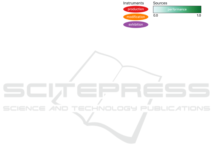
overall legend can be seen in Figure 1. Also visible
there is the choice of different shapes to symbolize
instrument events as ellipses and matching piece per-
formances as rectangles.
Figure 1: Overall color coding, with two color schemes for
the different entity classes. The color scale over the satura-
tion of green encodes similarity of one piece performance
to a instrument event.
4.1 Timeline
We use a timeline to visualize the resulting matches
in dependence of the temporal dimension (S
time
). To
minimize the visual clutter, we group the result set
entries by single instruments. So every matched in-
strument I
i
∈ I
1
. . . I
n
is symbolized by one row on
the y-axis, started by an eventual image of the instru-
ment to offer the first view of it. If no image could
be found for the instrument, the place at the begin-
ning of the row stays blank. The x-axis represents
the time, so the temporal located instrument’s career
events e
1
. . . e
o
∈ E(I
i
) are placed along with the row’s
horizontal extension. These events are enhanced by
the matched musical pieces P(e) with e ∈ E(I
i
) to
show their relation.
4.1.1 Uncertainties
In the case of uncertainty, the inaccuracy is communi-
cated by an out fading border and width of the event’s
glyph, as visible in Figure 2. The height of each row
(I
i
) is given by the maximum amount of matches from
P(E(I
i
)) in it.
One upcoming challenge was the fact, that large
objects draw more attention than smaller ones. Due
to the uncertainties and the focused similarity mea-
sures, lower (more unlikely) matches are getting more
screen space on a timeline or map than exact matches
in temporal and geographical consideration, because
of their higher distances. Equally in calculating and
visualizing the result sets, closeness is the significant
property to describe likeness. To encounter that, we
implemented the continuous color scale and with it,
IVAPP 2020 - 11th International Conference on Information Visualization Theory and Applications
244
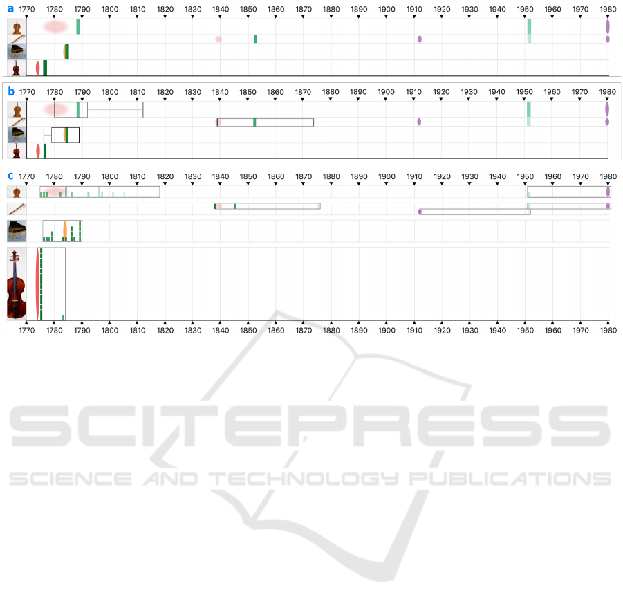
Figure 2: The different semantic zoom levels enable distant reading of distributions of matched results (a,b), as well as the
close reading of all results in detail. In the highest zoom level (c) the musical piece performances are stacked on each other,
creating a bar chart and encode the quantities and qualities for each instrument event.
in combination with transparency, the lower matches
are fading out towards the borders of the maximally
allowed distances.
4.1.2 Semantic Zoom
Following the Visual Information-Seeking Mantra
from Shneiderman (Shneiderman, 1996), the user can
browse through different semantic zoom levels.
The first zoom level of the timeline shows a first
overview of the matched instruments and their events.
All possible similar pieces P(e) of each instrument
event e
1
. . . e
o
∈ E(I
i
) are summarized in one glyph
at this level. This glyph is a rectangle with a width
of one year on the timeline, positioned on the average
year of all summarized performance events. The color
is given by the sum of scores for the temporal similar-
ity of all binned matches. With this view, it is possible
to get a first overview of the temporal distribution of
the matched events in a distant reading manner. Like
on a classical heatmap, whole areas of interest or spe-
cial outliers could be derived and picked for further
investigation. The overview of some matched instru-
ments is visible in Figure 2a.
The second zoom level extends the rectangle
glyphs to box plots, to uncover the distribution of the
matched performances. The previously drawn rectan-
gles remain as medians and get surrounded by their
quartiles. Additionally, whiskers indicate the mini-
mum and maximum extension of the quartiles over
time, but outliers were ignored. An example of box
plots could be seen in Figure 2b.
On the last zoom level, the box plots become bar
charts to reveal all underlying performance matches.
Each matched musical piece is symbolized by its
small rectangle at the year of its performance. We
stack multiple performances in the same year on top
of each other so that they are creating a bar chart like
glyph for the distribution of all matches for one in-
strument event e ∈ E(I
i
). To clarify the connections of
the bars, all matched P(e) are framed by a thin border
from earliest to latest performance. This time frame
could be expanded via one checkbox to show the min-
imum and maximum possible year (y
max
), to show if
there would be more room for further sources. Peri-
ods around the instrument’s events are stacked on top
of each other too and margins between the rows are
growing, to maintain the separation of the instrument
rows as visible in Figure 2c.
4.1.3 Shape of Similarity
Although the shapes of piece performances are chang-
ing over zoom levels, an overall shape of all matches
to an instrument is recognizable. Width, height,
and saturation are indicating inaccuracy, destination,
amount and quality of the underlying matches. A thin,
high and saturated shape of e.g. a bar chart shows
A Timeline Metaphor for Analyzing the Relationships between Musical Instruments and Musical Pieces
245
much more certainty and quantity than a broad and
flat shaped frame around the bars. These are patterns
to search for during the analysis, as well as the visual
encoding for uncertainty.
4.1.4 Interactions
To explore the result set of matches a variety of in-
teractions were applied to the visual elements. First
of all the interactive search form with its text fields,
buttons and easy to use filter bar “VisualSearch”
4
enables visual analytics and is visible in Figure 4.
Additionally to the dynamic adaption to different
research questions and changing search results via
search form, the user could change the sorting algo-
rithm of the instrument rows in the timeline. The de-
fault is the chronological sorting, where the instru-
ments are sorted by the dates of their matches. Other
sorting methods are the average or the sum of all
matches of one instrument, to get a ranking by quality
and quantity of resulting instrument/piece pairs. With
them, it is possible to encounter the demands of dif-
ferent research questions, like the penalty of the set of
matches through low similarity scores via the average.
For a closer look at one single instrument and its
matches, it is possible to click on the instrument im-
ages or their event glyphs, to filter the whole result
set. There, due the small number of elements, the ele-
ments are able to become larger. Some information
about the matched events are accessible via mouse
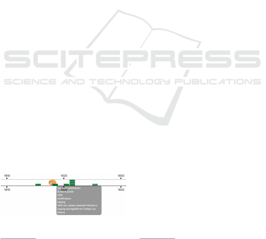
hover over their drawn glyphs, like seen in Figure 3.
Both, timeline and map, are connected through the
hover effects, to bring geographical and temporal di-
mension into context.
4.1.5 Map
Analogous to the timeline, the map is focusing on the
geographical similarity of the different events. Also
the most visual metaphors are the same. Shape, size,
and color are indicating entity class, amount of sum-
marized entries and type, respectively the geographi-
cal similarity score. Because of the different dimen-
Figure 3: The tooltip uncovers, that this lute was converted
into a guitar by Johann Samuel Fritsche in 1818 in Leipzig,
Germany.
4
https://documentcloud.github.io/visualsearch/
sions, and thus overlapping of events, it is not possible
to group the result set after instruments in the same
way as at the timeline, but overlapping data points
get clustered. The clusters are divided into separate
glyphs for summarized instruments and piece perfor-
mance events in that cluster, as seen in Figure 6. If
multiple types of instrument events are clustered to-
gether, they are symbolized by a pie chart in the men-
tioned color map. When zooming into the map, clus-
ters of less than eight items of one entity class are
split into single features, placed around the first fea-
ture in the center on a circular path. It is possible to
show a circle around the single instrument events to
display the maximum allowed distance between the
matched items, analogous to the time frames around
the timeline’s bar charts. To highlight the connections
between the entities, lines could be drawn, which con-
nect instrument events with their matched piece per-
formance events, as visible in Figure 5. We waive to
draw the detailed connections between split single el-
ements, because of the visual cluttering.
5 USE CASES
In discussion with four musicologists, we observed
multiple use cases during their use of the system,
which underline the work with the visualizations and
the system and point out possible improvements as
well.
5.1 The Protestant Trombone
The first is the case that an object is exhibited in a
display case e.g. in a museum. With the knowl-
edge about all of its conversions and stations, its life
could be enriched by possible musical piece perfor-
mances. For a trombone of the Music Instrument Mu-
seum of Leipzig University (Germany)
5
, they chose
to set G
max
= 200 km and y
max
= 50 years. Inspect-
ing the timeline from Figure 4a, the musicologists
saw two distinct red production events of it, in each
case with a given period of 10 years, indicated by
the stretched and out fading ellipses. When hovering
over the events, they noticed that the production of
the whole instrument is divided into the manufactur-
ing of the lower part around 1740 and the upper part
around 1785. When zooming in (b of Figure 4), the
glyphs get enhanced by the box plots around them,
uncovering the distribution of matched performances.
A first glance shows, that the left box plot has a longer
range of whiskers than the other one. On the next
5
https://mfm.uni-leipzig.de
IVAPP 2020 - 11th International Conference on Information Visualization Theory and Applications
246
Figure 4: The timeline of a trombone from the Music Instrument Museum of Leipzig University in its different zoom level
states.
zoom level (c of Figure 4) the single matched per-
formances become visible. To assess the quality of
the recommendations the musicologists wanted to get
insights into the first matched performances for each
instrument event. Without question, the first half of
the trombone is not playable without its other half.
Nevertheless, a closer inspection of the first musical
pieces by hovering revealed, that some of them are
different parts of an opera. Also striking is, that many
of the matched musical pieces are sacred songs. That
leads the users to the geographical similarity of the
result set. Both parts of the trombone were manu-
factured in Nuremberg (Germany) and the musical
pieces were performed in cities around that place in
the radius of G
max
, as displayed in Figure 5. With
the additional knowledge of the musicologists, it turns
out, that all cities have been Protestant, except for
Munich, which was Catholic. So considering the high
amount of Protestant pieces, from Protestant com-
posers, in the result set, e.g. Frankfurt am Main is cul-
turally closer to the instrument from Nuremberg, than
Munich, although Munich is geographically nearer.
Despite everything, for users it is at least possible to
get an insight into the music e.g. operatic arias com-
posed for trombones in Southern Germany around the
late 18th century.
5.2 The Playlist for a Violin
Another possible use case is the generation of a
“playlist” around a special instrument or a group of
it. For example an imagined chamber orchestra with
multiple concertmasters, who play Italian violins.
With the system now it is possible to easily gener-
ate a playlist of matching musical pieces for a themed
concert or the production of recordings around an-
cient violins. The musicologists started with the first
look on all of the available violins in the data set
and their best matches. Selected settings here were
y
max
= 25 years and G
max
= 50 km. Noticeable at
first glance was the clear gap between matches around
1850 and 1870. Looking at the map showed, that most
of the instruments were located in Germany and just
circa 10 percent of them in Italy. Focusing on the
seven violins from Italy with matches within a dis-
tance of 30 years and 75 kilometers, the timeline is
changing to Figure 6. With such a condensed set of
instruments and nevertheless a manifold variation of
possible musical pieces, the musicologists suggested
“A foray through the Italian baroque for the violin”
as one name for the playlist, where stations could be
Rome around 1710, Cremona around 1750 and Parma
around 1810. Matching pieces are from composers
like Antonio Vivaldi or Andrea Bernasconi and pri-
mary operatic arias. Interesting to see is the already
mentioned gap after 1820 in Italy and the raising vi-
olins and performances on the north side of the Alps.
Also noticeable by further investigations, is that Ital-
Figure 5: The map for a trombone from the Music Instru-
ment Museum of Leipzig University, produced in Nurem-
berg (Germany), surrounded by its matched piece perfor-
mances.
A Timeline Metaphor for Analyzing the Relationships between Musical Instruments and Musical Pieces
247

Figure 6: All Italian violins with their piece performance matches within a distance of 30 years and 75 kilometers.
ian music was not just played in Italy. For example
the source “Didone abbandonata”
6
made its way from
Milan (1738) over Venice (1741) to Munich (1756).
5.3 The Conversion of Lutes
The lute instruments are an ancient plucked string in-
strument family. Due to their high value the lutes,
some particular instruments experienced multiple de-
velopments and changes over the time from classical
lutes over mandolins and theorbos to guitars, pictur-
ing the passed trends. The search for such instrument
families in the presented system creates the timeline
and map view from Figure 7.
Apparently, the timeline is divided into three dif-
ferent characteristic epochs. The first episode is for
the renaissance and baroque european lutes like the
one in the row d in Figure 7. Unfortunately, musi-
cal pieces for lutes from RISM are very rare (a search
on RISM for lute as instrumentation gives 38 results).
After that period, the music culture was changing and
with it, performance practices. The lute was dis-
placed from the established ensembles because it had
no place in the rising orchestras.
The many exact datings of instrument productions
in the second epoch (1770 - 1860) may come from
the high amount of good logged contract manufac-
turing for the courtly culture, the analyzing musicol-
ogists assumed. Most of the instruments in that pe-
riod are mandolins and first guitars. The data of the
lute-guitar in row c of Figure 7 is manually enhanced
and corrected by a musicologist specialized on lutes.
In MIMO the instrument is tagged as lute-guitar with
two production events. The information, that the in-
strument was manufactured as a classical lute (first
half of the 17th century) is only available in the tex-
tual metadata of the events. As well as the conver-
sion of the instrument into a lute-guitar in 1818 is
written down, but not easily automatically processi-
ble, as seen in Figure 3. Such example shows the real
value of the system to visualize and auralize a partic-
ular instrument career, cause of the musical changes
of matched piece performances to its station.
6
https://opac.rism.info/metaopac/search?View
¯
rism&id=
450014602&View
¯
rism
The last episode is dominated by uncertain pro-
duction dates of guitars. Due to that the amount and
quality of matches are decreased. The musicologists
working with the system assumed the more industrial
production of instruments. These instruments were
produced on stock and not for a specific customer who
made an order. This might be the reason for the uncer-
tain manufacturing records. Besides, the lutes experi-
enced a revival through the conversion to lute-guitars
or bass lutes, like the one in row b of Figure 7, which
were used in operas e.g. the hypothetically matched
“Meistersinger von N
¨
urnberg”
7
by Richard Wagner.
5.4 The Historical Performance
Practice
Even the other way, finding matches to one selected
musical piece, is conceivable. Imagined a given mu-
sic manuscript, with its past performance dates and
maybe additional knowledge about the work e.g. the
composition event. With such information, feasible
historic instruments come into consideration by the
use of the system, to perform the musical piece in a
way of historically informed performance practices,
with appropriate instruments.
6 RESULTS
6.1 Discussion
While evaluating the system through the work with
musicologists, we observed the following effects.
Different close and distant reading research questions
are supported by the system. For resilient results, fur-
ther close reading is still necessary, but the system is
capable of revealing so far unseen correlations, now
possible with a digital humanities approach to mu-
sicological data. The different levels of the seman-
tic zoom create a smooth transition between temporal
granularities. Even if the matching results are not ex-
act matches in the real world, at least we receive in-
7
https://opac.rism.info/metaopac/search?View=rism&id
=270000986&View=rism
IVAPP 2020 - 11th International Conference on Information Visualization Theory and Applications
248
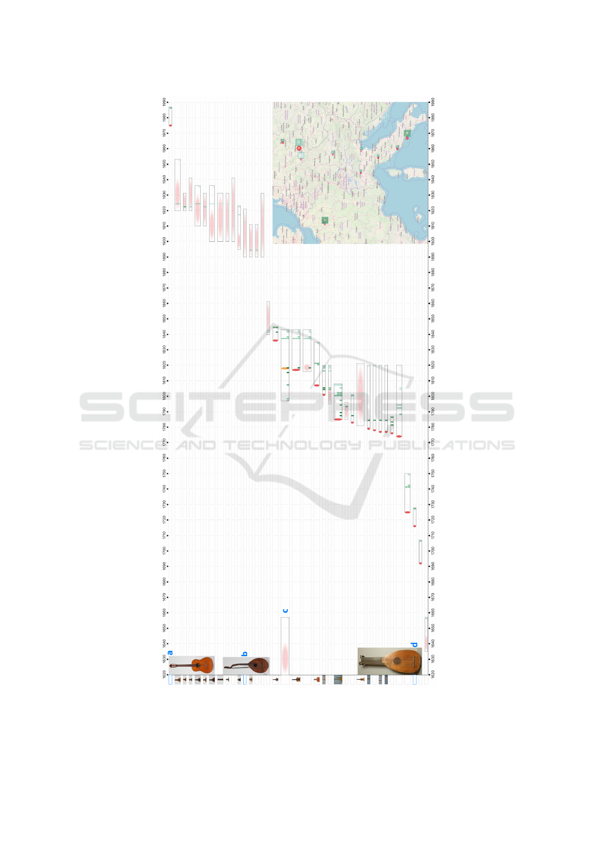
Figure 7: All lutes and its similar instrument families with their piece performance matches within a distance of 50 years
and 100 kilometers. Visual striking and interesting are the three distinct episodes and the differences between the certainties
inside of them.
A Timeline Metaphor for Analyzing the Relationships between Musical Instruments and Musical Pieces
249

dications about how the music was intended to sound
at the dedicated lifetime events of one instrument or
their instrument family.
One advantage could be the research and education in
organology, instrument careers and socio-cultural de-
velopments over the centuries of music. Indirectly the
system creates a similarity measure for instruments
through the analysis of similar events and shared pos-
sible performances. The use cases show that available
databases and the post-processing of data sets have
yet to be improved in order to increase the quality
of results of the recommendation system. For exam-
ple, detailed information about tuning and tones are
missing for a better instrumentation similarity analy-
sis. But for now, the system satisfies the intention of
creating hypotheses of joint appearance, which can be
verified or falsified by further inspections of musicol-
ogists.
6.2 Limitations
In general the amount of displayable items is not lim-
ited. All instruments in the timeline are stacked atop
each other so the scrollable height is growing with
each new entry. However, the number of instrument
rows and related events is limited by the amount that
is humanly processible. We observed a result set with
150 oboes from one museum with the same produc-
tion event date and location and the same matched
musical pieces were stacked on each other, using a
lot of screen space. This output requires the screen’s
height three times (depending on resolution and used
minimum of instrument rows height) but is also neg-
ligible by the user who is aware of the general quality
of the data. Also, the system is not meant to review,
but rather to direct towards new hypotheses. Such re-
view, especially verification of suggested facts, has
to be performed intellectual with additional knowl-
edge. Nevertheless, the falsification is easily possi-
ble by using the visualizations, but this use case un-
derlines again the dependence of calculated and dis-
played statements on the quality and quantity of the
used data points.
6.3 Future Work
The measurement of similarity will be improved e.g.
by the consideration of geopolitical information like
provinces and countries. Therefore, the aggregation
of information from other repositories and a better
alignment of the different existing vocabularies is
necessary. Also, the derivation of new information
out of existing is possible. For example, the database
of the musiXplora (Khulusi et al., 2020a) contains
over 32.000 persons in the musical context with a va-
riety of information about them, e.g., the denomina-
tion of musicians. Hypotheses like the denomination
of cities (as mentioned in the first use case in Sec-
tion 5) could be derived from the denominations of all
locally born persons. Further, the system is expand-
able by e.g. a force-directed graph for the results of
the recommendation system. Therefore instruments
or musical pieces could be grouped depending on the
demand of research questions. A box plot glyph could
be evolved to a bean plot (Kampstra et al., 2008) for
the better creation of shapes for the matched results.
Furthermore, we want to increase the linkage of the
different attributes and views e.g. by implementing a
time slider for the map, to see the geospatial trends of
the two entity classes over time.
7 CONCLUSION
Due to the increasing amount of digital cultural her-
itage resources, user interfaces that support aggrega-
tion, mapping and linkage gain more and more im-
portance. Our project aimed to find relations between
musical instruments and historical performances of
musical pieces. To encounter this, we cooperated
with musicologists, aggregated and linked two digital
repositories. In addition, we defined a multi-faceted
similarity measure for the likeness of two matching
events. To achieve the ability of qualitative close
reading and quantitative distant reading of the results,
we designed a new timeline metaphor with semantic
zoom levels accompanied with a map to review results
in a temporal as well as a geographical context. The
presented use cases indicate the value of our approach
to support new research questions in musicology.
REFERENCES
Aigner, W., Miksch, S., Schumann, H., and Tominski, C.
(2011). Visualization of time-oriented data. Springer
Science & Business Media.
Andr
´
e, P., Wilson, M. L., Russell, A., Smith, D. A., Owens,
A., and Schraefel, M. (2007). Continuum: Designing
Timelines for Hierarchies, Relationships and Scale. In
Proceedings of the 20th Annual ACM Symposium on
User Interface Software and Technology, UIST ’07,
pages 101–110, New York, NY, USA. ACM.
Berthaut, F., Marshall, M., Subramanian, S., and Hachet,
M. (2013). Rouages: Revealing the mechanisms of
digital musical instruments to the audience. In NIME:
Proceedings of the International Conference on New
Interfaces for Musical Expression (pp. 165-169).
IVAPP 2020 - 11th International Conference on Information Visualization Theory and Applications
250

Borman, T. and Stoel, B. (2009). Review of the uses of com-
puted tomography for analyzing instruments of the vi-
olin family with a focus on the future. J Violin Soc
Am: VSA Papers, 22(1):1–12.
Bou
¨
enard, A., Gibet, S., and Wanderley, M. M. (2008).
Enhancing the visualization of percussion gestures by
virtual character animation. In NIME, pages 38–43.
Brehmer, M., Lee, B., Bach, B., Riche, N. H., and Mun-
zner, T. (2016). Timelines revisited: A design space
and considerations for expressive storytelling. IEEE
transactions on visualization and computer graphics,
23(9):2151–2164.
Bunout, E. (2016). Visualisation of the prosopography of
polish and german experts on eastern europe: Are
non-computed data useable for visualisation? In DH
Benelux conference 2016.
Daniels, M. (2014). The largest vocabulary in hip
hop. https://pudding.cool/projects/vocabulary/ (Ac-
cessed 2019-06-24).
Dawe, K. (2012). The cultural study of musical instruments.
In The Cultural Study of Music, pages 217–227. Rout-
ledge.
Harrower, M. and Brewer, C. A. (2003). Colorbrewer.org:
An online tool for selecting colour schemes for maps.
The Cartographic Journal, 40(1):27–37.
Havre, S., Hetzler, E., Whitney, P., and Nowell, L. (2002).
Themeriver: Visualizing thematic changes in large
document collections. IEEE transactions on visual-
ization and computer graphics, 8(1):9–20.
Head, K. (2003). Gravity for beginners. University of
British Columbia, 2053.
Hopfner, R. (2018). Violinforensic. http://www.violinforen
sic.com (Accessed 2019-06-24).
J
¨
anicke, S., Focht, J., and Scheuermann, G. (2016). Interac-
tive visual profiling of musicians. IEEE transactions
on visualization and computer graphics, 22(1):200–
209.
Kampstra, P. et al. (2008). Beanplot: A boxplot alternative
for visual comparison of distributions.
Khulusi, R., J
¨
anicke, S., Kusnick, J., and Focht, J. (2019).
An Interactive Chart of Biography. Pacific Visualiza-
tion Symposium (PacificVis), 2019 IEEE.
Khulusi, R., Kusnick, J., Focht, J., and J
¨
anicke, S. (2020a).
musiXplora: Visual Analysis of Musicological Data.
In Proceedings of the 11th International Conference
on Information Visualization Theory and Applications
(IVAPP).
Khulusi, R., Kusnick, J., Meinecke, C., Gillmann, C.,
Focht, J., and J
¨
anicke, S. (2020b). A survey on visual-
izations for musical data. Computer Graphics Forum.
Kirsch, S. (2019). Computed tomography as a tool
for archiving ethnomusicological objects. In Com-
putational Phonogram Archiving, pages 305–319.
Springer.
Mchedlidze, T. e. a. (2019). Network visualization chal-
lenges and opportunities in digital humanities. Jour-
nal of Historical Network Research (to be published).
Miller, M., Walloch, J., and Pattuelli, M. C. (2012). Visual-
izing linked jazz: A web-based tool for social network
analysis and exploration. Proceedings of the Ameri-
can Society for Information Science and Technology,
49(1):1–3.
Munzner, T. (2009). A nested model for visualization de-
sign and validation. IEEE transactions on visualiza-
tion and computer graphics, 15(6):921–928.
Munzner, T. (2014). Visualization Analysis and Design.
CRC press.
Schlegel, A., L
¨
udtke, J., and Cabral, P. C. (2011). Die Laute
in Europa 2: Lauten, Gitarren, Mandolinen und Cis-
tern. Lute Corner.
Shneiderman, B. (1996). The Eyes Have It: A Task by Data
Type Taxonomy for Information Visualizations. In
Proceedings., IEEE Symposium on Visual Languages,
pages 336–343. IEEE.
Summers, J. E. (2008). What exactly is meant by the term
“auralization?”. The Journal of the Acoustical Society
of America, 124(2).
Von Hornbostel, E. M. and Sachs, C. (1961). Classification
of musical instruments: Translated from the original
german by anthony baines and klaus p. wachsmann.
The Galpin Society Journal, pages 3–29.
Zhao, J., Drucker, S. M., Fisher, D., and Brinkman, D.
(2012). Timeslice: Interactive faceted browsing of
timeline data. In Proceedings of the International
Working Conference on Advanced Visual Interfaces,
pages 433–436. ACM.
A Timeline Metaphor for Analyzing the Relationships between Musical Instruments and Musical Pieces
251
