
Deep Dive into Deep Neural Networks with Flows
Adrien Halnaut, Romain Giot
a
, Romain Bourqui
b
and David Auber
c
Univ. Bordeaux, Bordeaux INP, CNRS, LaBRI, UMR5800, F-33400 Talence, France
Keywords:
Deep Neural Network, Explainable Machine Learning, Sankey Diagram, Parallel Coordinates.
Abstract:
Deep neural networks are becoming omnipresent in reason of their growing popularity in media and their
daily use. However, their global complexity makes them hard to understand which emphasizes their black-box
aspect and the lack of confidence given by their potential users. The use of tailored visual and interactive
representations is one way to improve their explainability and trustworthy. Inspired by parallel coordinates and
Sankey diagrams, this paper proposes a novel visual representation allowing tracing the progressive classification
of a trained classification neural network by examining how each evaluation data is being processed by each
network’s layer. It is thus possible to observe which data classes are quickly recognized, unstable, or lately
recognized. Such information provides insights to the user about the model architecture’s pertinence and can
guide on its improvement. The method has been validated on two classification neural networks inspired from
the literature (LeNet5 and VGG16) using two public databases (MNIST and FashionMNIST).
1 INTRODUCTION
There is a growing interest and usage of deep neural
networks in various domains (LeCun et al., 2015) dur-
ing the last decade as they offer reliable assistance
in solving problems with good performances. For in-
stance, data classification (Krizhevsky et al., 2012),
image segmentation (Delassus and Giot, 2018), data
generation (Goodfellow et al., 2014) and reinforce-
ment learning (Mnih et al., 2013) are some tasks ex-
pected to be accomplished by such technology.
Deep Neural Networks (DNNs) rely on the compo-
sition of simple functions in order to produce a glob-
ally complex one that is strongly dependent on factors
that are not fixed by the architect when assembling
the model layers. When a model processes input data,
each neuron computes and returns one value which has
a variable impact on the final result. This value also de-
pends on weights fixed during the training phase which
itself relies on a dataset given by the trainer. The com-
mon question
Q1
: How well is the model performing
? is usually answered with various evaluation metrics,
but since the model inner workings are dependent on
the architecture, the training dataset and the learning
process at once, it is difficult to understand and explain
those performances, and neural networks are then of-
a
https://orcid.org/0000-0002-0638-7504
b
https://orcid.org/0000-0002-1847-2589
c
https://orcid.org/0000-0002-1114-8612
ten considered as “black boxes”. For this reason, it is
difficult to improve or debug models and answer the
following questions without proceeding to expensive
tries, testing different network architectures and/or pa-
rameters in order to verify various hypotheses:
Q2
:
Should we add or remove layers in the model?
Q3
:
Should we change the number of filters of that convo-
lutional layer?
Q4
: Is our training dataset efficient
enough to train our model?
Recently, various works leverage information vi-
sualization in order to progress into the field of ex-
plainable artificial intelligence. Consequently, several
explanation techniques have been presented and imple-
mented with visual interfaces (Hohman et al., 2018)
and help to answer similar questions. To design such
visual interfaces is a real design challenge because of
the complexity of neural networks. For instance, sim-
ple typical handwritten digit recognition models (Le-
Cun et al., 1998) are commonly composed of at least
ten layers, composed themselves of thousands inter-
connected neurons, involving millions of parameters.
The main contribution of this paper is a novel visu-
alization technique that
helps to
address the questions
Q1
,
Q2
,
Q3
and
Q4
. It relies on studying how data is
being processed by a trained model during its evalua-
tion. Using this visualization method, the progressive
classification of input data and how each model layer
contributes to this task is being revealed. The original-
ity of the method corresponds to:
Halnaut, A., Giot, R., Bourqui, R. and Auber, D.
Deep Dive into Deep Neural Networks with Flows.
DOI: 10.5220/0008989702310239
In Proceedings of the 15th International Joint Conference on Computer Vision, Imaging and Computer Graphics Theory and Applications (VISIGRAPP 2020) - Volume 3: IVAPP, pages
231-239
ISBN: 978-989-758-402-2; ISSN: 2184-4321
Copyright
c
2022 by SCITEPRESS – Science and Technology Publications, Lda. All rights reserved
231
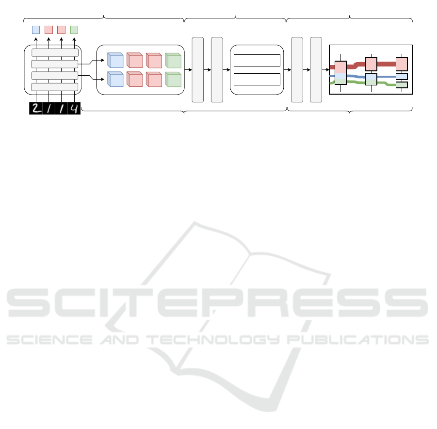
Activation maps
L3(a)
a b c d
Layer L1
Layer L2
Layer L3
....
2 1 1 4
DNN
L3(b) L3(c) L3(d)
L2(a) L2(b)
L2(c) L2(d)
Activation maps collection
Analysis method f
Clustering
Clusters
L2 : {a, d}, {b, c}
L3 : {a}, {d}, {b, c}
DAG Building
Flow transformation
a
L1 L2
b
c
a
d
b
c
a
d
b
c
d
L3
Data analysis and
clustering
Glyph encoding
Distributed computing Client interface
Figure 1: Approach overview: First step is to collect information during a network evaluation, then apply an analysis method
on it, cluster the results, then render them into a flow visualization.
−
its versatility by not being specific to the nature
of the data being processed by the model (e.g. no
constrains to pictures or words);
−
its independence to the model architecture and
inner neuron connections;
−
its compatibility with any kind of information
which is computable at the model layer level such as
neuron activation, gradients, analysis methods (such
as contribution analysis) or saliency;
The paper is organized as follows. Section 2
presents related works on DNN deep neural network
explanation and visualization techniques. Section 3
gives an outline of the proposed method and its inner
details in Section 4. Section 5 presents several case
studies of the method. Finally, Section 6 discusses on
the limitations and future evolution of that work.
2 PREVIOUS WORKS
Explainable machine learning becomes a requirement
for legal reasons (Goodman and Flaxman, 2016) and
one can leverage on interactive information visualiza-
tion to achieve this goal. Several methods and tools
have already been designed for classification models.
Neuron activation aggregation consists in examin-
ing the aggregation of every intermediate result com-
puted by each layer of the model. Using visualiza-
tion methods such as matrix views, as seen in Ac-
tiVis (Kahng et al., 2017), CNNVis (Liu et al., 2016)
and in the work of Harley (Harley, 2015), one can
find processing similarities between different input
data, helping in the understanding of classification pat-
terns. Forward data projection is another explaination
method using dimensionality reduction and projection
techniques (Saeed et al., 2018) to project activation
maps into 2-dimensional spaces, allowing the user to
obtain an intuitional knowledge about the classifica-
tion process. This kind of visualization is extensively
used in explaination tools, such as TensorBoard (Abadi
et al., 2015), ActiVis (Kahng et al., 2017), Deep-
Eyes (Pezzotti et al., 2017) or Re-VACNN (Chung
et al., 2016). Analog to data projection, backward
data propagation aims to explain data transformations
by rebuilding the original input data starting from the
later layers of the model (Zeiler and Fergus, 2014;
Springenberg et al., 2014; Montavon et al., 2018; Mon-
tavon et al., 2017). This method is useful in a way
that pertinent detected features by the network can be
highlighted to the user, which is helpful in the case of
image classification (Ribeiro et al., 2016; Olah et al.,
2018). Other strategies exist, such as model compar-
ison (Zeng et al., 2017; Zhang et al., 2018) which
consists in comparing models to detect learning differ-
ences.
Several tools emphasize on different data analysis
and visualization techniques at once. ActiVis (Kahng
et al., 2017) choses to focus on multiple analysis meth-
ods for fully connected layers while others tempt to
collect as much information as possible on the full
network and complete dataset (Liu et al., 2018); some
focus on the manner data is being progressively clas-
sified using data flow visualizations and techniques
previously mentioned. Such systems can be seen in
CNNVis (Liu et al., 2016), Summit (Hohman et al.,
2020), and some experiments on Distill (Olah et al.,
2018), which are focused on image classification, and
Neural Network Playground (Smilkov et al., 2016),
which proposes an interactive neural network building
tool mixing network representation and forward data
projection. Those visualization systems give hints on
active parts of the model and justify its decision. The
method presented in this paper belongs to this cate-
gory. By combining previously cited analysis methods
and presenting their results into a data flow visualiza-
tion. However, instead of clustering data based on
neuron behavior as seen in CNNVis (using mean neu-
ron activation values) or Summit (using top
k
active
neurons), this method clusters data based on the simi-
larities of activation maps using an existing analysis
IVAPP 2020 - 11th International Conference on Information Visualization Theory and Applications
232

method. Displayed flows on the visualization tool can
be considered as data being similarly processed, show-
ing the network’s progressive dataset classification.
3 APPROACH OVERVIEW
This section presents the set of challenges and require-
ments that were identified in order to answer questions
Q1
to
Q4
. Figure 1 depicts the complete step-by-step
process going from the collection of data related to the
evaluation of a model to its visualization.
A network is composed of connected layers that
act as a succession of data transformations from the
input to the output. Each layer transforms its input
data in values and shape before feeding it to the next
layer. Those intermediate values are called “activation
maps” and are usually seen as multidimensional ma-
trices. It must be noted that activation maps usually
reach high levels of dimensionality (e.g. VGG16’s
activation maps reach sizes of
28 × 28 × 256
shaped
matrices) and can be technically challenging to handle
by a classic computer:
(R1): The method must scale
to gigabytes of data computing.
The chosen analysis method makes use of all of
the activation maps computed for each input sample.
Furthermore, to compare good model prediction from
bad model prediction,
(R2): Each activation map
must be collected in order to support layered high-
dimensional data analysis, along with its ground
truth and its model prediction result.
The visualization method must be a reliable tool
to answer
Q1
to
Q4
.
Q1
is usually expressed with
a metric such as accuracy and/or loss function. This
metric is easily interpretable by the user, and
(R3):
The recognition performances must be limpidly re-
flected on the visualization.
The classification performances of a model are
usually related to the quality of the refinement pro-
cess across its layers: early layers detect low-level
features (e.g. shapes in pictures) and later layers build
correlations between those features. To help answer
questions
Q2
to
Q4
and by following this concept,
(R4) The refinement process must be noticeable on
the visualization.
Finally, in order to debug the model, the method
gives more precise answers to
Q2
and
Q3
by present-
ing how the refinement process is evolving across the
network. To compare each layer refinement perfor-
mance with others gives insight on where the model
needs improvements, and this comparison can be
achieved using analysis method as mentioned in the
previous section and must be encoded in the visualiza-
tion:
(R5) Each layer contribution to the classifica-
tion process must be comparable with others.
To address
R1
and
R2
, one can leverage large scale
computing infrastructure such as computer clusters.
Modern systems are able to handle petabytes of data
at reasonable cost, which is appropriate to analyze
complex networks, as computation charge can be dis-
tributed since the evaluation of a single input sample
does not require information from other samples.
Processing large quantities of high-dimensional
data implies a proper perceptual scalability: in the case
of
R2
, it is frequent to visualize computed data into a
2
-
dimensional space using various linear (e.g. PCA) and
nonlinear (e.g. t-SNE) data projection methods. To
efficiently interpret the results of the analysis method,
clusters are being built, for each layer
L
I
, as follows:
given
L
I
x
the activation map computed by
L
I
for the
input data
x
and
f
the chosen analysis function, the
input data
a
and
b
are in the same cluster if, and only
if f (L
I
a
) ∼ f (L
I
b
).
Addressing
R3
is done by evaluating the cluster
compositions computed on the model’s last layer: a
perfect classification implies each element of a same
cluster has the same ground truth as the others, while
a bad classification will lead to more heterogeneous
ground truth among the elements of a same cluster.
Following the clustering approach, addressing
R4
and
R5
is related to the visualization of evolving clus-
ter compositions over layer traversal. That topic has
already been studied previously to represent a story-
line (Tanahashi et al., 2015) or to visualize the evolu-
tion of software components (Telea and Auber, 2008).
Design choices are mainly based on these previous
results. Clusters of each layer are represented using
a containment diagram, composed of their respective
input data. Since the method is considering a large
amount of input data, it was a design choice not to
represent them individually. Instead, each cluster is
sized proportionally to its cardinality, then segmented
proportionally for each ground truth present in its com-
position. This approach enables to meet
R3
and
R5
,
but
R4
is trickier to address. To trace each input data
during the refinement process, the same metaphor as a
storyline has been used: mainly inspired by parallel co-
ordinates diagram, it consists in drawing connections
between clusters of consecutive layers which contain
a same set of input data.
4 APPROACH DETAILS
This section details each step of the method proposed
in this paper. The overall process can be split into two
parts: a first procedure which focuses on collecting
data, applying analysis method and clustering results,
Deep Dive into Deep Neural Networks with Flows
233
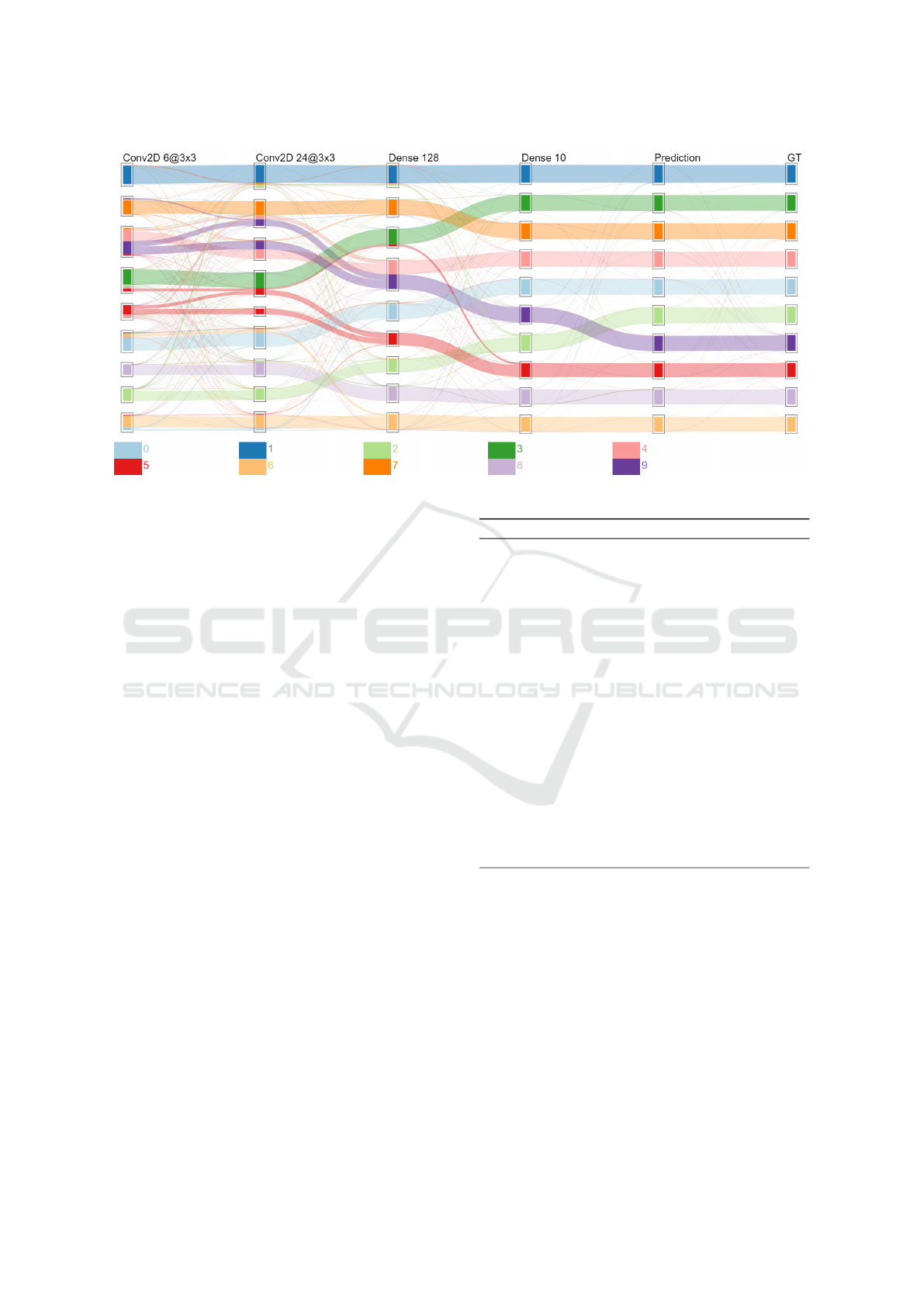
Figure 2: Visualization result on a LeNet5-inspired model evaluated on MNIST.
while the second procedure transforms those results
into a flow visualization.
4.1 Implementation Choices
In order to evaluate a layer’s performances, activation
maps analysis is not sufficient; how each individual
neuron value is impacting on the rest of the neural
network is also important. The Layer-wise Relevance
Propagation analysis method (Montavon et al., 2018),
or LRP, is a method measuring each neuron contribu-
tion to the rest of the computation. This is done by the
propagation of the model’s final activation maps back
to the input space by estimating each layer contribu-
tion thanks to the weights of each neuron. This method
was chosen to detect the different contribution patterns
a layer could bring to the rest of the network. By
comparing each pattern with others and labeling their
respective data classes, it allows to measure which in-
put data was finely processed by the layer and which
were not. It should be noted that the LRP analysis
function is not tied to the proposed framework and
other analysis methods can be applied if needed.
Each pattern is represented as a node of a graph
and its similarity measure with others as weighted
edges. With that, the Markov Cluster Algorithm (Don-
gen, 2000), or MCL, can be applied on the graph to
generate clusters of similar patterns. This algorithm is
an efficient scalable method to find dense communities
of nodes in a graph by simulating a random walk on it,
which is influenced by the edge weights.
Algorithm 1: Data collection and processing.
procedure PREPAREDATA(M,D, f )
% M: a DNN to inspect
% D: an evaluation dataset
% f : an analysis function
% act,res, pred,C: empty associative lists
for all x ∈ D do
act[x] ← getActivationMaps(m,x)
res[x] ← applyAnalysis( f , act[x],m)
pred[x] ← getModelPrediction(m, x)
end for
for all L
I
∈ M.layers do
V ← ∀x ∈ D : res[x][L
I
]
M ← buildSimilarityMatrix(V )
M
0
← applyKNN(M,k)
C[l] ← applyMCL(M
0
)
end for
return (C, pred)
end procedure
4.2 Data Analysis and Clustering
Algorithm 1 depicts the procedure which is expen-
sive to compute. As mentioned earlier by addressing
R1
and
R2
, it should be processed using distributed
computing on a computer cluster.
As it can be seen, the procedure is performing two
iterations: the first one over the evaluation dataset to
collect and perform analysis over model computations,
the other on each layer to prepare those results into
specific encodings. They can be efficiently performed
across computer clusters, since neither iterations is
depending on their previous state.
IVAPP 2020 - 11th International Conference on Information Visualization Theory and Applications
234

getActivationMaps (
R1
): The first step is to collect
the data transformations of each model’s layers for the
current input data. This collection may be done by
various ways, but it is necessary to keep a record of
which activation map belongs to which layer.
applyAnalysis (
R2
): The chosen analysis method is
being applied. This algorithm will transform activation
map values while keeping the multidimentional aspect
of the matrices.
getModelPrediction (
R3
): The model predictions
are collected to label data flows during the visualiza-
tion encoding.
buildSimilarityMatrix (
R3
,
R4
): In order to cluster
the data, it is necessary to first vectorize each element
of the evaluation dataset into their
n
-dimensional
space imposed by each layer of the model. For
example, a matrix
M
of size
16 × 16 × 64
resulting
of a convolutional layer will be vectorized into
V
as:
V = [M
1,1,1
,M
1,1,2
,...,M
1,1,64
,M
1,2,1
,...,M
16,16,64
]
T
.
Those vectors can be compared to each other using a
similarity metric. Measuring similarity of one vector
against each other builds up a similarity matrix which
will be used to cluster data. Cosine similarity was
used in the scenario of the section 5 to emphasize on
pattern diversity rather than neuron value magnitude
computed by Euclidean similarity. The construction
of these similarity matrices is an extremely expensive
operation because of the amount of comparison to
perform (O(n
2
)) and the compared vector size.
applyKNN (
R3
,
R4
): The previously built similar-
ity matrix corresponds to a graph of weighted edges.
However, this graph is very dense because the similar-
ity between all the elements has been computed. To
obtain a sparser graph which is adequate to cluster,
one can filter out some edges with low weight.
However, removing edges lower than an
ε
factor
does not guarantees that the graph is still connected
and may overly bias the clustering algorithm leading
to misinterpretation of the clusters, as each node be-
ing left out will form a cluster by itself. Instead, a
KNN approach is presented, which will filter out low
weighted edges from dense communities, while keep-
ing the connexity of the graph. As for the
k
factor of
the KNN algorithm, it was arbitrary considered that a
pattern could not be similar to more than
D/N
other
samples,
D
being the dataset size and
N
the number of
different classes present in the evaluation dataset. The
edges filtered out by KNN were set at a weight of 0.
applyMCL (
R3
,
R4
,
R5
): The final operation is to
cluster the graph in order to obtain a list of clusters
and their composition. Along with the prediction data
computed earlier and the evaluation dataset, there is
enough information to trace how the evaluation data
was processed by the model. The size of this informa-
Algorithm 2: Visualization construction.
procedure DRAWDATA(C, pred,gt)
% Parameters:
% C: clusters grouped by layer belonging
% pred: predictions given by the model
% gt: ground truths of the evaluation dataset
C[
0
pred
0
] ← generateClusters(pred)
C[
0
gt
0
] ← generateClusters(gt)
G ← buildDAG(C)
G ← orderDAGVertices(G)
G
0
← mergeEdgesIntoFlows(G)
drawFlows(G
0
)
end procedure
tion is also significantly lower than the analysis method
computation and the similarity matrices, while keeping
the essential information.
4.3 Visualization Generation
Algorithm 2 presents the visual encoding process.
Compared to the first procedure, this one is way less
expensive to compute, mainly because of the data size
to process, and can be performed on a single, classic
computer.
generateClusters (
R3
): To display the overall pre-
dictions versus ground truths in the same way as the
layer contributions to the classification, clusters of
input data are artificially built based on their model
prediction and their ground truth. This approach is
used to compare the visualization results with actual
performances of the model, and is discussed in the
next section.
buildDAG (
R3
,
R4
): Similarly to the parallel coor-
dinate visualization method, this visualization can be
represented as a directed acyclic graph, or DAG; each
cluster will be represented as a vertex, and each edge
will signify that there is a same single sample in the
two concerned clusters. A constraint is applied on the
vertex coordinates
(x,y)
, in which
x
will be related to
the cluster’s layer position in the model, and
y
will be
different for each cluster of a same layer, in order to
not overlap each other.
orderDAGVertices (
R4
): Before drawing the DAG,
its readability can be improved by reducing edge cross-
ing by ordering each vertex along its
y
coordinate.
Here, the barycentric ordering, described in the work
of Sugiyama (Sugiyama et al., 1981), is applied mainly
because of its ease of implementation and efficiency.
mergeEdgesIntoFlows (
R4
,
R5
): The diagram’s
flows must represent a quantity of data that shares
similar information. Here, the information displayed
is the ground truth of the concerned samples and the
connected clusters. Edges of input data that share the
Deep Dive into Deep Neural Networks with Flows
235

same ground truth and extremities are thus merged
together. The merging result is a DAG with the same
vertices as before, but with weighted edges reflecting
the ground truth of the data they represent.
drawFlows (
R3
,
R4
,
R5
): The computed data is
now a graph in which each vertex describes a cluster,
its composition, and its position in the visualization,
and each edge describes a flow, its starting position
and destination, and its composition, in which each
item shares the same ground truth.
In continuation of what was addressed for
R4
and
R5
, a color is assigned to each ground truth, and clus-
ters are represented by "boxes" which are colored in
a way to indicate the proportion of each ground truth
into their compositions. Flows are represented as col-
ored transparent Bezier curves to ease their reading.
Furthermore, each axis is labeled by the type of layer
responsible for the clustering, and a legend is being
added to understand how each data classes are being
represented.
5 CASE STUDIES
This section sets out several realistic use cases to val-
idate the method. They rely on two distinct convolu-
tional neural networks for classification:
−
A simple model inspired from LeNet5 (LeCun
et al., 1998) which is a fairly popular, simple and
efficient model designed to recognize handwritten dig-
its. It serves as an example to illustrate the proposed
method.
−
An adapted version of VGG16 (Simonyan and
Zisserman, 2014) to work on
32 × 32
pictures. It
is more complex and has been designed to classify
the ImageNet dataset with high accuracy (Krizhevsky
et al., 2012), which is featuring thousands of different
classes out of 14 million pictures. Since training such
a model has a high computational cost (Simonyan and
Zisserman, 2014), convolutional layers of the original
model were resized to work with the MNIST dataset
while keeping the training results of ImageNet (ie. neu-
ron weights).
Model training and evaluation were done on Ten-
sorFlow (Abadi et al., 2015) on an nVidia GeForce
GTX 1080Ti using the Keras API (Chollet et al., 2015).
The computer cluster is composed of 51 machines
for a total of 2.7TB RAM, using Hadoop for data
transfers and Spark for task distribution, without op-
timizations such as efficient memory and computing
resources management. The clustering process uses
the MCL program proposed by its creator (Dongen,
2000). Finally, the visualization process is imple-
mented as a Web application using the HTML Canvas
API. A demonstration of this interface can be found at
http://pivert.labri.fr
. Table 1 summarizes the
performance results of the various scenarios experi-
mented.
Scenario 1: LeNet5 trained and evaluated on
MNIST.
This illustrative scenario aims to explain
how this visualization method helps to understand in-
ner work of a classification model and to determine
which classes of the dataset are easier to classify than
others. The model was trained (60000 samples) and
evaluated (10000 samples) on MNIST during 6 epochs,
achieving an accuracy score of 98.5%.
Figure 2 depicts the model classification results.
Few divergent flows exist between the
Prediction
and
GT
(Ground Truth) axis revealing a few classifica-
tion errors, but otherwise the classification looks great:
the model performances are well represented. The
cluster composition between the latest layer (
Dense
10
) and the
Prediction
axis are different and will
be discussed later. The classification progress across
the model is easily distinguishable: some classes are
detected early (e.g.,
1
and
7
) while similar digits are
detected later with the help of the second convolu-
tional layer (e.g.
0
and
6
) or the first dense layer (e.g.
4
and
9
). A majority of classes are distinguished from
each other at the
Dense 128
layer, except for a few
5
mixed with
3
, and
9
with
4
. By looking at the previ-
ous layer, it can be seen that the convolutional layer
is incorrectly splitting those items leading the
Dense
128 into errors.
Scenario 2: LeNet5 and Fashion-MNIST.
The
same experiment has been run using the Fashion-
MNIST (Xiao et al., 2017) dataset. It is a proposed as
an alternative to the classic MNIST dataset, featuring
clothing pictures instead of handwritten digits; they
share the same input and output shapes and number
of classes in order to be interchangeable and is sup-
posed to be more complex. The model was trained
with 60000 samples and evaluated with 10000 sam-
ples, and reached an accuracy score of 87.9%. Results
are not shown due to space issues but are available
online. They prove the system works by giving a re-
sult similar to the previous scenario with more mixed
clusters toward the end of the model. Looking at the
convolutional layers shows that data was less sparse
before reaching the Dense layers.
Scenario 3: Detection of Bad Model - LeNet5
Model Trained with MNIST and Evaluated on
Fashion-MNIST.
The model was trained to achieve
high accuracy on MNIST and is expected to fail on
Fashion-MNIST because of the different nature of the
IVAPP 2020 - 11th International Conference on Information Visualization Theory and Applications
236
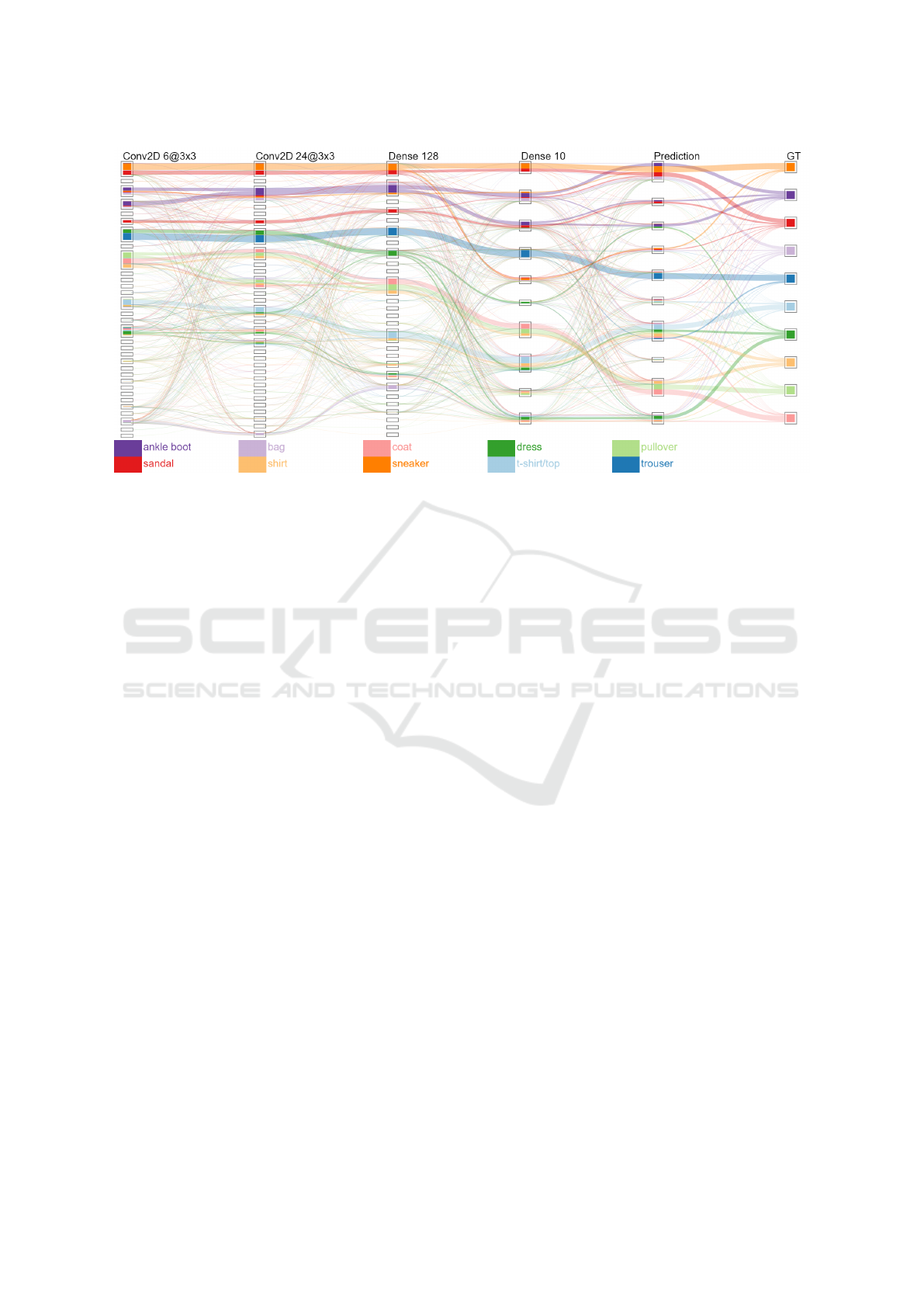
Figure 3: Visualization result on a model that has not learned to classify the evaluation dataset.
processed data. In this case, we use the visualization
results to analyze the behavior of the proposed method
in a worst case scenario (5.6% accuracy). Figure 3
depicts the visualization result; if differs greatly from
the others by the number of clusters generated and
drawn. Furthermore, processed data doesn’t seem to
be equally distributed across computed clusters de-
spite the balanced composition of the training dataset.
When looking at the convolutional layers, it seems that
a few visual traits have been identified by the model,
but wrongly associated with the classes in the later
Dense layers.
Scenario 4: Simplification Direction for Complex
Models - VGG16 with MNIST.
To adapt the model
to the MNIST dataset, we applied some modifications
on both VGG16 and the MNIST dataset: (i) MNIST
images are considered to be colored image by duplicat-
ing the gray channel, (ii) MNIST images are padded
to use a shape of
32 × 32 × 3
in order to avoid issues
with the latest pooling operation of VGG16 (pooling
area larger than the input tensor), (iii) end of the net-
work has been modified to classify 10 classes instead
of 1000, (iv) only this latest layer is trained, while the
weights of the other layers are transferred from public
ImageNet training.
These steps do not replace a full training process
of VGG16 on the MNIST dataset, but it still gives us
an accurate enough model with an accuracy score of
≈
97%
. Since VGG16 is more complex than the previous
model, we assume there are unnecessary computations
in the model to achieve similar accuracy results. With
this experimentation, we expect to see early merged
data fluxes in our visualization, meaning that the data
is being overprocessed since the activation maps are
already similar enough to be predicted as a same class.
Figure 4 presents the results. The higher number
of axis displayed is justified by the model’s higher
complexity. Using transfer learning, although those
layers have been trained on ImageNet, the first con-
volution layers have nicely discerned a majority of
classes except of the
5
/
3
,
4
/
9
and
0
/
6
couples, which is
a behavior really similar to LeNet5. The classification
then get stagnant with both improvements and regres-
sions at each pooling operation. By the first Dense
layer, most classes are recognized, but there are mixed
clusters in the
Dense 10
layer, which still provides
correct predictions. A few hypotheses can be made:
(a) The sudden increase in clustering quality on the
first Dense layer means that some of the previous con-
volution/pooling layers are not very effective in this
task. (b) The numerous differences between the
Dense
10
and
Prediction
axis mean that a few classes were
in a very similar state by the end of the model. The
model still managed to make the right decision, but
without high certitude because of the way the Softmax
activation works by taking the highest certitude value.
6 DISCUSSION AND
CONCLUSION
DNNs suffer from lack of explainability and visual-
ization is one way to overcome this issue. This paper
has presented a novel way to provide insights on how
data are considered by the various layers of a trained
network. It helps to answer questions model designers,
Deep Dive into Deep Neural Networks with Flows
237
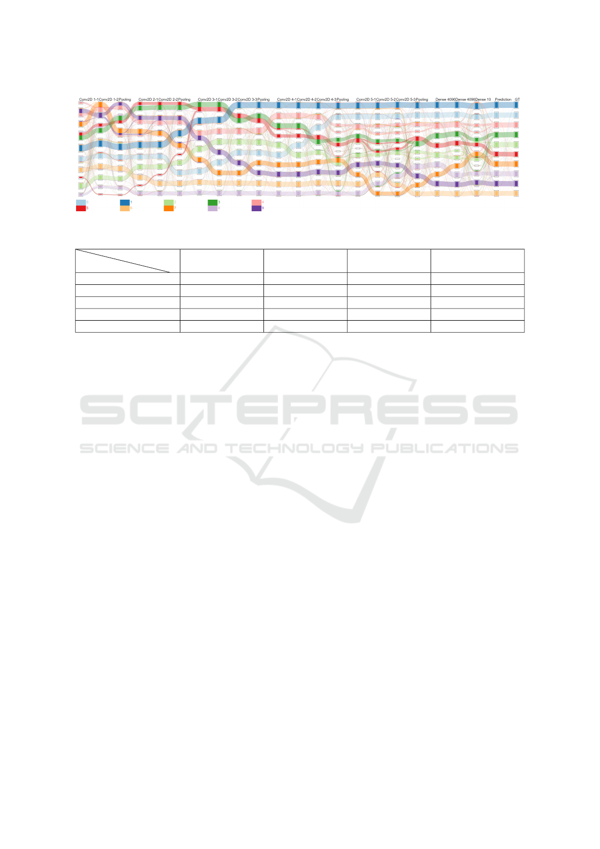
Figure 4: Visualization result on evaluating the modified VGG16 model with MNIST dataset.
Table 1: Performances overview on each scenario.
Process
Scenario
Scenario 1 Scenario 2 Scenario 3 Scenario 4
Process execution time ∼66 minutes ∼68 minutes ∼65 minutes ∼26 hours
Matrices size / sample ∼2GB ∼2GB ∼2GB ∼12.1GB
Clustering time 4 layers in 7m38s 4 layers in 7m14s 4 layers in 15m3s 21 layers in 39m44s
# of clusters found 37 43 99 201
Visualization drawing less than 1s less than 1s less than 1s 4s
trainers and non-experts might ask to understand or
improve their model and reduce its “black box" aspect.
The combination of analysis on neuron activation
maps and clustering on evaluation data builds up a
flexible framework for a simple visualization method.
The user can, in one glance, see how data is handled
by each layer and understand where sources of mis-
classifications are, leading to improvements for both
the model and the training set.
Being an early prototype, this visualization method
can be further expanded and improved, notably in
both visualization and clustering quality. As the cur-
rent visualization system gives good hints on the inner
working of a model, experts may need to access more
low-level and detailed information about the classifi-
cation. Usage of distributed computing infrastructure
is not a long-term solution to
R1
and
R2
when using
distance matrix computation, since its complexity is
quadratic and thus will be an issue when processing
very large evaluation datasets and/or models. Concern-
ing clustering quality, the method used in the previous
scenario, namely cosine similarity, presents a few un-
satisfactory clustering results, such as the difference
between the decision layer’s clusters and the actual
predictions made by the model. An extensive study on
combining similarity and cluster computing method
would surely improve the method results. The current
flow encoding is limited by the color palette and could
lose in efficiency in the case of complex classification
networks recognizing numerous classes. Also, layers
of complex networks may not be ordered sequentially
but instead be composed of multiple branches and
junctions, which is currently not supported by such a
visualization. Finally, it would be interesting to eval-
uate the usefulness of this method when used during
the learning phase of a model, precisely on its capacity
at detecting learning specific issues such as overfitting
or slow learning rate.
REFERENCES
Abadi, M., Agarwal, A., Barham, P., Brevdo, E., Chen,
Z., Citro, C., Corrado, G. S., Davis, A., and et al.
(2015). TensorFlow: Large-scale machine learning
on heterogeneous systems. Software available from
tensorflow.org.
Chollet, F. et al. (2015). Keras. https://keras.io.
Chung, S., Park, C., Suh, S., Kang, K., Choo, J., and Kwon,
B. C. (2016). Re-vacnn: Steering convolutional neural
network via real-time visual analytics. In Future of
interactive learning machines workshop at the 30th
annual conference on neural information processing
systems (NIPS).
Delassus, R. and Giot, R. (2018). Cnns fusion for building
detection in aerial images for the building detection
challenge. In Proceedings of CVPR Workshop Deep-
Globe: A Challenge for Parsing the Earth through
Satellite Images.
Dongen, S. M. V. (2000). Graph clustering by flow simula-
tion. PhD thesis.
Goodfellow, I., Pouget-Abadie, J., Mirza, M., Xu, B., Warde-
Farley, D., Ozair, S., Courville, A., and Bengio, Y.
(2014). Generative adversarial nets. In Advances in
neural information processing systems, pages 2672–
2680.
Goodman, B. and Flaxman, S. (2016). Eu regulations on al-
gorithmic decision-making and a “right to explanation”.
IVAPP 2020 - 11th International Conference on Information Visualization Theory and Applications
238

In ICML workshop on human interpretability in ma-
chine learning (WHI 2016), New York, NY. http://arxiv.
org/abs/1606.08813 v1.
Harley, A. W. (2015). An interactive node-link visualization
of convolutional neural networks. In ISVC, pages 867–
877.
Hohman, F., Kahng, M., Pienta, R., and Chau, D. H. (2018).
Visual analytics in deep learning: An interrogative
survey for the next frontiers. IEEE Transactions on
Visualization and Computer Graphics.
Hohman, F., Park, H., Robinson, C., and Chau, D. H. (2020).
Summit: Scaling deep learning interpretability by vi-
sualizing activation and attribution summarizations.
IEEE Transactions on Visualization and Computer
Graphics (TVCG).
Kahng, M., Andrews, P. Y., Kalro, A., and Chau, D. H. P.
(2017). [activis: Visual exploration of industry-scale
deep neural network models. IEEE transactions on
visualization and computer graphics, 24(1):88–97.
Krizhevsky, A., Sutskever, I., and Hinton, G. E. (2012). Im-
agenet classification with deep convolutional neural
networks. In Advances in neural information process-
ing systems, pages 1097–1105.
LeCun, Y., Bengio, Y., and Hinton, G. (2015). Deep learning.
nature, 521(7553):436.
LeCun, Y., Bottou, L., Bengio, Y., Haffner, P., et al. (1998).
Gradient-based learning applied to document recogni-
tion. Proceedings of the IEEE, 86(11):2278–2324.
Liu, D., Cui, W., Jin, K., Guo, Y., and Qu, H. (2018). Deep-
tracker: Visualizing the training process of convolu-
tional neural networks. ACM Transactions on Intelli-
gent Systems and Technology (TIST), 10(1):6.
Liu, M., Shi, J., Li, Z., Li, C., Zhu, J., and Liu, S. (2016).
Towards better analysis of deep convolutional neural
networks. IEEE transactions on visualization and com-
puter graphics, 23(1):91–100.
Mnih, V., Kavukcuoglu, K., Silver, D., Graves, A.,
Antonoglou, I., Wierstra, D., and Riedmiller, M. (2013).
Playing atari with deep reinforcement learning. arXiv
preprint arXiv:1312.5602.
Montavon, G., Samek, W., and Müller, K.-R. (2018). Meth-
ods for interpreting and understanding deep neural
networks. Digital Signal Processing, 73:1–15.
Montavon, G., Samek, W., and Müller, K. (2017). Tutorial:
Implementing deep taylor decomposition / lrp.
Olah, C., Satyanarayan, A., Johnson, I., Carter, S.,
Schubert, L., Ye, K., and Mordvintsev, A. (2018).
The building blocks of interpretability. Distill.
https://distill.pub/2018/building-blocks.
Pezzotti, N., Höllt, T., Van Gemert, J., Lelieveldt, B. P.,
Eisemann, E., and Vilanova, A. (2017). Deepeyes:
Progressive visual analytics for designing deep neu-
ral networks. IEEE transactions on visualization and
computer graphics, 24(1):98–108.
Ribeiro, M. T., Singh, S., and Guestrin, C. (2016). Why
should i trust you?: Explaining the predictions of any
classifier. In Proceedings of the 22nd ACM SIGKDD
international conference on knowledge discovery and
data mining, pages 1135–1144.
Saeed, N., Nam, H., Haq, M. I. U., and Muhammad Saqib,
D. B. (2018). A survey on multidimensional scaling.
ACM Computing Surveys (CSUR), 51(3):47.
Simonyan, K. and Zisserman, A. (2014). Very deep con-
volutional networks for large-scale image recognition.
arXiv preprint arXiv:1409.1556.
Smilkov, D., Carter, S., Sculley, D., Viégas, F. B., and Wat-
tenberg, M. (2016). Direct-manipulation visualization
of deep networks. In ICML 2016 Visualization Work-
shop.
Springenberg, J. T., Dosovitskiy, A., Brox, T., and Ried-
miller, M. (2014). Striving for simplicity: The all
convolutional net. arXiv preprint arXiv:1412.6806.
Sugiyama, K., Tagawa, S., and Toda, M. (1981). Methods for
visual understanding of hierarchical system structures.
IEEE Transactions on Systems, Man, and Cybernetics,
11(2):109–125.
Tanahashi, Y., Hsueh, C.-H., and Ma, K.-L. (2015). An effi-
cient framework for generating storyline visualizations
from streaming data. IEEE transactions on visualiza-
tion and computer graphics, 21(6):730–742.
Telea, A. and Auber, D. (2008). Code flows: Visualizing
structural evolution of source code. Computer Graph-
ics -New York- Association for Computing Machinery-
Forum, pages 831–938.
Xiao, H., Rasul, K., and Vollgraf, R. (2017). Fashion-mnist:
a novel image dataset for benchmarking machine learn-
ing algorithms.
Zeiler, M. D. and Fergus, R. (2014). Visualizing and under-
standing convolutional networks. In European confer-
ence on computer vision, pages 818–833.
Zeng, H., Haleem, H., Plantaz, X., Cao, N., and Qu,
H. (2017). Cnncomparator: Comparative analytics
of convolutional neural networks. arXiv preprint
arXiv:1710.05285.
Zhang, J., Wang, Y., Molino, P., Li, L., and Ebert, D. S.
(2018). Manifold: A model-agnostic framework for
interpretation and diagnosis of machine learning mod-
els. IEEE transactions on visualization and computer
graphics, 25(1):364–373.
Deep Dive into Deep Neural Networks with Flows
239
