
SALATA: A Web Application for Visualizing Sensor Information in
Farm Fields
Nao Akayama
1
, Daisaku Arita
2
, Atsushi Shimada
1
and Rin-Ichiro Taniguchi
1
1
Faculty of Information Science and Electrical Engineering, Kyushu University,
744 Motooka, Nishi-ku, Fukuoka 819-0395, Japan
2
Faculty of Information Systems, University of Nagasaki,
1-1-1 Manabino, Nagayo, Nishisonogi, Nagasaki, 851-2195, Japan
Keywords:
Smart Agriculture, IoT, Visualization, Sensor Information in Farm Fields, Usability, Web Application, User
Interface.
Abstract:
Semi-automated sensing and visualization of conditions and activities in farm fields have been actively pursued
in recent years. There are three types of agricultural information: sensor information, farm work information,
and plant biological information. Measuring and visualizing these agricultural information can provide valu-
able support to farm managers. In this study, we focus on sensor information and farm work information and
develop a web application named SALATA (Sharing and AccumuLating Agricultural TAcit knowledge) that
collects and shares sensor information and farm work information collected in farm fields and correlates the
information in time series. SALATA need to have intuitive operation and quick response in order that people
of various ages will use it on a daily basis. Therefore, there are two primary pages: the main page for visual-
izing simple information quickly and the analytical page for visualizing multiple pieces of information on one
page. Usability evaluation experiments are performed, showing that SALATA can be operated intuitively and
respond quickly.
1 INTRODUCTION
Japan is an island country surrounded by an irregu-
lar coastline. It is also a mountainous country with
small flatlands. These geographical features bring di-
verse climates and soils to Japan. Japanese cultivation
has been hindered by the increase in scale, and spe-
cialized agriculture is also practiced in various kinds
of local conditions. These characteristics of Japanese
cultivation make it difficult to accumulate cultivation
knowledge and to automatically control farm field en-
vironments, even in a greenhouse based on cultivation
know-how. Therefore, farm managers must, by them-
selves, acquire specialized know-how for their own
farm fields.
The problem of knowledge acquisition is becom-
ing more critical owing to the rapid ageing of the
Japanese population. In mountainous farming ar-
eas, for example, 39% of farmers are over 65 years
old(Ministry of Agriculture, Forestry and Fisheries,
Japan, 2019). Many experienced farm managers are
retiring every year due to their age. In addition, many
young farm managers are leaving the farming profes-
sion owing to lack of cultivation know-how.
In recent years, rapid advances in technologies
related to the Internet of Things (IoT) have made
various sensor devices and their networks popular
and economical. Therefore, small farmers in Japan
can introduce sensor networks to their farm fields
to measure and quantify cultivation know-how. The
Japanese Government also promotes this movement.
As a result of these circumstances, we are developing
SALATA, which is a web application to facilitate the
visualization of various types of farm field data, and
to support farm managers in acquiring important cul-
tivation know-how and awareness of causal relation-
ships among field environments, farm work activities,
and crop conditions.
2 RELATED WORK
There are three types of agricultural information that
are of interest in this study: sensor information, farm
work information, and plant biological information.
Measuring and visualizing these agricultural data can
Nao, A., Arita, D., Shimada, A. and Taniguchi, R.
SALATA: A Web Application for Visualizing Sensor Information in Farm Fields.
DOI: 10.5220/0008987501130120
In Proceedings of the 9th International Conference on Sensor Networks (SENSORNETS 2020), pages 113-120
ISBN: 978-989-758-403-9; ISSN: 2184-4380
Copyright
c
2022 by SCITEPRESS – Science and Technology Publications, Lda. All rights reserved
113

provide valuable support to farm managers. Wjtow-
icz et al.(W
´
ojtowicz et al., 2016) described the impor-
tance of sensor information, which are of three types:
satellite, airborne, and ground based. These infor-
mation sources contribute to the forecasting of crop
yield, assessment of nutritional requirements of plants
and the nutrient content in soil, and determination of
plant water demand and weed control. This optimizes
the profitability of crop production and improves en-
vironmental protection. In this study, we focused on
sensor information and farm work information. There
has been much research and many developments re-
lated to visualization of sensor information and farm
work information.
For example, MIHARAS
1
, developed by Nishimu
Electronics Industries Co. Ltd., Agrilog
2
, developed
by ITKOBO-Z Co. Ltd., and SEnviro(Trilles Oliver
et al., 2019) visualize sensor information. MIHA-
RAS provides an open-field sensor unit, a weather
sensor unit, and a paddy field sensor unit. The open-
field sensor unit measures temperature, humidity, soil
moisture, soil electrical conductivity, and soil temper-
ature. The weather sensor unit measures wind direc-
tion, wind speed, rainfall, solar radiation, tempera-
ture, and humidity. The paddy field sensor unit mea-
sures temperature, humidity, water level, water tem-
perature, and soil temperature. MIHARAS visualizes
the information from these sensors on personal com-
puters (PCs), smartphones, and tablets (hereinafter,
referred to as user devices). Agrilog is an environ-
mental monitoring service for greenhouses that can
measure temperature, humidity, CO
2
concentration,
solar radiation, soil temperature, soil moisture, and
soil electrical conductivity. This sensor information
is visualized by user devices, and some processed in-
formation such as an average temperature can be cal-
culated and plotted. In addition, users can share their
sensor information with each other. SEnviro can mea-
sure temperature, humidity, barometric pressure, soil
moisture, wind direction, wind speed, and rainfall.
This sensor information is visualized by a web ap-
plication in real-time. The primary aim of SEnviro
is to use disease warning models of crops in order to
alert users to the danger of crop infection. Sensing
and analyzing in real-time enable them to tackle the
infection with the appropriate treatments.
The Priva FS Reader
3
, developed by Priva Inc.
and Hashimoto et al.(Hashimoto et al., 2016), pro-
vides visualization of farm work information. The
Priva FS Reader is a device that can easily record
farm work information. It was developed to manage
1
https://www.nishimu-products.jp/miharas
2
https://itkobo-z.jp/agrilog
3
https://www.priva.com/us/products/fs-reader
a large number of laborers on a large farm field. A
special tag is installed at the edge of the each ridge in
the farm field, making it possible to perceive where
the farm laborer worked by scanning it with a device
each farm laborer wears. For example, by associating
with the box ID that contains the yield, it is possible
to perceive when and how many were harvested, and
by whom. In addition, crop conditions, diseases, and
pests can be easily registered and visualized on a map.
Hashimoto et al. estimated a farm laborer’s position
in a greenhouse by using a smartphone and beacons
placed in the greenhouse. At the same time, they es-
timated the farm laborer’s actions to harvest based on
the worker’s motion as measured by smartwatches,
and subsequently measured the yield. Finally, they
created a harvesting map by integrating the position
and action information. Using this, they can generate
much detailed farm work information.
Midori Cloud
4
, developed by SERAKU Co. Ltd.
visualizes sensor information and farm work informa-
tion on a user device by installing a sensor unit in a
greenhouse. This sensor unit measures temperature,
soil temperature, humidity, CO
2
concentration, and
solar radiation. In addition, the Midori Cloud also
has a function to record farm work information called
Midori Notes. However, sensor information and farm
work information are not integrated for visualization.
It is necessary to integrate and visualize sensor in-
formation and farm work information, because there
are causal relationships between them. For example,
if high solar radiation continues, the yield, or the har-
vesting work will increase, and if the greenhouse is
ventilated, the CO
2
concentration will change rapidly.
SALATA, our web-based application, visualizes both
sensor information and farm work information such
that farm managers can easily understand the causal
relationships between them.
3 SHARING AND
ACCUMULATING
AGRICULTURAL TAcit
KNOWLEDGE (SALATA)
We have developed SALATA to visualize sensor in-
formation and farm work information. We anticipate
that farm managers will improve the farm field envi-
ronment by using SALATA as discussed below.
1. SALATA collects sensor information and farm
work information.
4
https://info.midoricloud.net
SENSORNETS 2020 - 9th International Conference on Sensor Networks
114
2. SALATA visualizes sensor information and farm
work information.
3. Farm managers analyze and compare with the
other farm field’s information or the past informa-
tion.
4. Farm managers improve the farm field environ-
ment based on the analysis.
Moreover, it will be easy to understand the rela-
tionship between the farm field environment and the
farm manager’s decisions by associating sensor in-
formation and farm work information in time series.
For example, if farm manager A ventilated the green-
house because of the increase in temperature. When
Farm manager B sees only the sensor information, he
can only understand that the temperature has suddenly
dropped. However, if farm work information, such
as ventilation changes, is posted by farm manager A
in SALATA, farm manager B can understand that the
temperature has suddenly dropped because farm man-
ager A has ventilated the greenhouse.
In this paper, we focus on visualizing sensor infor-
mation and indicate various functions and their eval-
uation results.
3.1 Sensor Information
In this study, we employ Midori Cloud developed by
SERAKU Co., Ltd. for farm field sensing. The Mi-
dori Cloud sensor unit measures temperature, humid-
ity, solar radiation, soil temperature, and CO
2
con-
centration every two minutes. In addition to these pa-
rameters, we deal with ”humidity deficit,” which is
the amount of water vapor that must be added to a
gas in order to achieve 100% humidity at the current
temperature. Humidity deficit is one of the dominant
factors affecting the rate of photosynthesis. Humidity
deficit D[g/m
3
] is calculated from temperature T [
◦
C]
and humidity H[%]. The formula for calculating hu-
midity deficit D is shown in Equation 1 below.
D =
(100 − H) × 217 × 6.1078 × 10
(7.5×T /(T +237.3))
(T + 273.15) × 100
(1)
where H and T represent the humidity and Celsius
temperature, respectively.
3.2 User Interface
SALATA must ensure intuitive operation and quick
response. This is because it is assumed that people
of various ages will use it on a daily basis. It seems
that there are farm managers of various ages and some
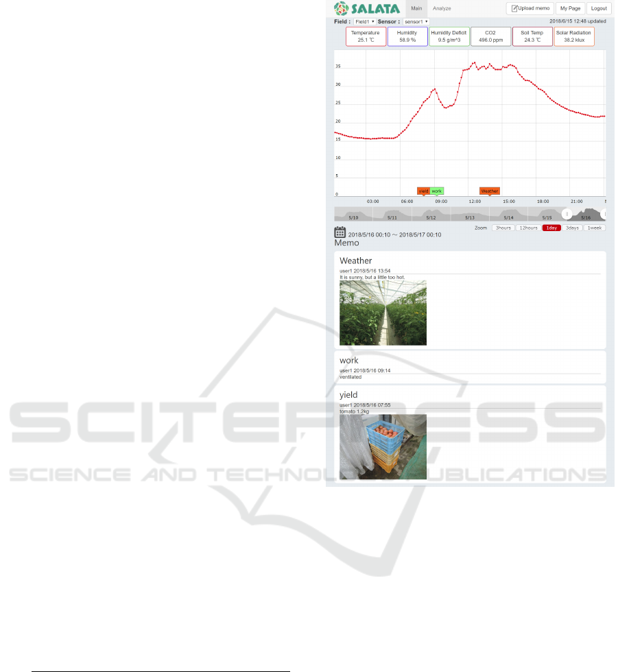
Figure 1: The main page of SALATA.
people are not familiar with user devices. SALATA
must have a user interface that can be operated intu-
itively by farm managers who are not familiar with
user devices. To that end, we unified SALATA’s con-
figuration. In addition, it is assumed that SALATA
is used daily because farm managers usually do farm
work every day. In order for farm managers to use
SALATA daily, SALATA must offer a user-friendly
experience. To that end, we minimized the amount of
data loaded at once.
There are two primary pages displayed by
SALATA: the main page and an analytical page. If
the user wants simple information quickly, we recom-
mend the use of the main page. If the user wants to
view multiple pieces of information on one page, we
recommend the use of the analytical page. The main
page simply displays sensor information and farm
work information. This page displays real-time data
and dynamic graphs. On the analytical page, the user
can observe sensor information. This page displays
multiple-series graphs and parallel display graphs.
SALATA: A Web Application for Visualizing Sensor Information in Farm Fields
115
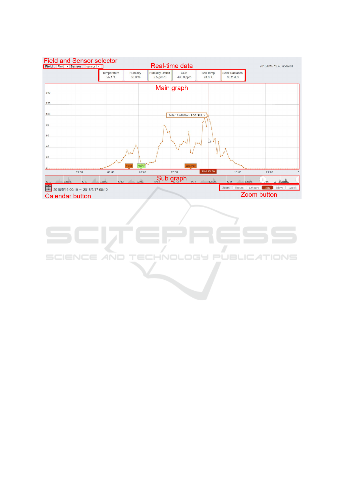
Figure 2: Dynamic graphical displays.
3.2.1 Real-time Data
The main page of SALATA is shown in Fig.1. At the
top of the page, there are buttons showing the cat-
egories of sensor information; the latest data is dis-
played on each button. The user can change the cat-
egory of the graph by clicking these buttons. For ex-
ample, when the user clicks the solar radiation button,
the graph switches from temperature data to solar ra-
diation data. Moreover, the items ”Field” and ”Sen-
sor” displayed above these buttons indicate the source
of the sensor information displayed on the main page.
The user can change the graph displayed on the main
page by switching the ”Field” or ”Sensor” item.
3.2.2 Dynamic Graphical Displays
SALATA uses amCharts
5
for graphical displays. am-
Charts is a javascript-based graph creation library
suitable for dynamic graphical displays. There are
two graphs(Fig.2) on the main page: the graph with a
white background at the top is the main graph, and the
graph with a gray background at the bottom is the sub-
graph. If the amount of data loaded for these graph is
large, the response will be slow. To avoid this, we set
a loading period T [min] and an interval of data sub-
sampling as t[min] (T ≥ t ≥ 10). Then, the amount of
data loaded at once is n, where n satisfies the follow-
ing Equation 2.
5
https://www.amcharts.com
n =
T
t
(2)
If the data interval in the database is smaller than
t, we take the average for t minutes. For example, the
Midori Cloud sensor units measure every two min-
utes, but if t = 10, the amount of data will be one fifth
of the total data. In this way, SALATA can respond
quickly.
To provide flexible viewing of the loaded data,
there are three ways to change the period displayed
in the main graph: the zoom, sub graph, and calen-
dar buttons. First, the zoom button at the bottom right
of the main graph can specify the exact period. We
can determine an arbitrary value of this button. In this
study, we decided on values of 3 hours, 12 hours, 1
day, 3 days, and 1 week. If the user clicks the 3 hours
button, the loaded data from the last 3 hours is dis-
played in the main graph. Second, the sub graph be-
low main graph can flexibly change the period. The
period displayed in the main graph is changed by slid-
ing the bar on the side of the selection range in the
sub-graph or by dragging the selection range. Third,
the calendar button at the bottom left of the main
graph can specify any day of all periods measured by
the sensors. By specifying a date from this calendar
button, a user can load the data for the past T minutes
from the specified date and display the data from the
specified date in the main graph. As a result, the user
can change the period displayed in the main graph.
In addition, units, minimum values and maximum
SENSORNETS 2020 - 9th International Conference on Sensor Networks
116

values of range, and colors have been unified under
a category so that users can operate SALATA intu-
itively. The correspondence table is shown in Table
1. The minimum and maximum values were deter-
mined to be values that can cover all values except
the outliers from the data set collected by Hashimoto
et al(Hashimoto et al., 2016).
Table 1: Unit, Minimum, Maximum and Color by a Cate-
gory.
Category Unit Min Max Color
Temperature
◦
C 0 40 #E50000
Humidity % 0 100 #3A10F2
Humidity Deficit g/m
3
0 20 #43B929
CO
2
ppm 350 700 #68645A
Soil Temp
◦
C 0 40 #9A031E
Solar Radiation klux 0 150 #FF6000
3.2.3 Multiple-series Graphs
In a multiple-series graph(Fig.3), multiple categories
of multiple sensors can be displayed on a single
graph. This view is suitable for investigating the re-
lationship between categories on a time series. For
example, when an anomaly is detected in a humidity
deficit measurement, it is easier to determine whether
it is being caused by temperature or humidity, by
displaying the temperature, humidity, and humidity
deficit in the multiple-series graph.
The method for creating a multiple-series graph is
as follows. First, the user can transition to the analyt-
ical page by clicking ”Analyze” at the top of the main
page(Fig.1). When the user clicks the ”Create a new
graph” button on the analytical page, a mode selec-
tion window appears, which allows the user to enter
options for the multiple-series graph. There are three
options: farm field, period, and categories. When the
user selects a farm field, the category field changes
to the sensor information corresponding to the farm
field. When the user specifies a period, the interval
of data sub-sampling is automatically determined ac-
cording to the period. This is done to avoid a slow
response due to an excessive amount of loaded data.
In this study, data are sub-sampled by the average so
that the number of samples becomes 150 or less.
3.2.4 Parallel Graphical Displays
The created multiple-series graphs are shown in
parallel(Fig.4). Specifically, the user can display a
multiple-series graph in parallel by creating another
multiple-series graph. This allows the user to com-
pare the available information with those of other
farm fields or with past data.
4 EXPERIMENT
In this experiment, we gave human subjects a set of
tasks based on actual use to evaluate the usability of
the dynamic display graph, the multiple-series graph,
and the parallel display graph.
4.1 Experimental Method
This experiment was conducted on 14 subjects aged
19 to 26 who had previously never used SALATA.
All of the subjects have operated personal computers
(PCs) and smartphones with graphical user interfaces
on a daily basis. The data set used in this study con-
sists of sensor information on temperature, humidity,
CO
2
concentration, soil temperature, and solar radia-
tion observed in a tomato farm field in Fukuoka City
from September 19, 2017 to February 1, 2018. In ad-
dition to these data, we also handled humidity deficit
calculated from the temperature and humidity. The
parameters related to the loading of data for the dy-
namic display graph were set to t = 10 and T = 10080
(1 week). As a result, n = 1080.
The 14 subjects were divided into two groups.
One group was given only tasks and no lecture, and
the other group was given tasks after a lecture on how
to use SALATA. Subjects of both groups practiced for
three minutes before doing the first task. There were
three types of tasks, and we measured the time re-
quired for completing each task. Task 1 is related to
the dynamic display graph on the top page, such as
”Please display the graph of solar radiation on De-
cember 13, 2018 on the top page.” Task 2 is related
to the multiple-series graph and the parallel display
graph on the analytical page, such as ”Please display
graphs of temperature and solar radiation from De-
cember 1, 2018 to December 31, 2018, and January
1, 2019 to January 31, 2019 so that you can compare
temperature and solar radiation.” Task 3 is to find an
anomaly value of CO
2
assuming actual use, such as
”Normally, a CO
2
generator runs to maintain the CO
2
concentration in the greenhouse above a certain level.
In this data set, there are several days when this equip-
ment does not run.Please find a day when this equip-
ment does not run by using the analysis page.” Both
subject groups performed Task 1 and Task 2 first (first
trial). After an interval of 30 or more minutes, the
subjects performed Task 1 and Task 2 again (second
trial). The first trial and the second trial are same ex-
cept for the dates and categories. After those tasks,
Task 3 was performed, and finally, we conducted a
questionnaire.
The questionnaire was created based on the web
usability scale (WUS)(Nakagawa et al., 2001) and
SALATA: A Web Application for Visualizing Sensor Information in Farm Fields
117
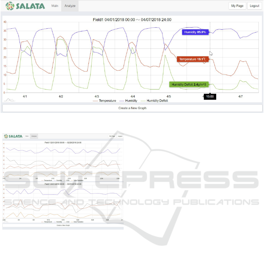
Figure 3: Multiple-series graphs.
Figure 4: Parallel graphical displays.
modified for this experiment. WUS is a questionnaire
to evaluate the Web Usability developed in Japanese,
because the existing questionnaire (QUIS(Chin et al.,
1988) and SUMI(Kirakowski and Corbett, 1993)) was
developed in English and it is difficult to adminis-
ter it in Japan. There are seven evaluation factors in
WUS: favorability, usefulness, reliability of contents,
operability, composition, visibility, and response. In
this experiment, we evaluated SALATA with five fac-
tors: operability, composition, visibility, response,
and functionality. There are two questions for each
evaluation factor, as listed below (5 means an invert
scale).
1. Operability
• This website is simple and easy to use.
• I immediately understood how to use this web-
site.
2. Composition
• This website is consistent.
• The structure of this website makes it is easy to
understand the available content.
3. Visibility
• The graphs and charts on this website are diffi-
cult to see. 5
• Using this website tires my eyes. 5
4. Response
• This website returns a quick response to my ac-
tions.
• When using this website, items may not be dis-
played correctly. 5
5. Functionality
• The functionality of this website is meets ex-
pectations.
• It took a long time to get the information I
wanted. 5
The scoring method was in accordance with WUS.
Each questionnaire item was scored on a scale of one
to five. In case of an inverted scale, the corrected
score was achieved by subtracting the original score
from six. Each factor score was calculated as the av-
erage of the scores of its two questionnaire items.
4.2 Results
Fig.5 shows the time taken to complete Task 1 in the
first and second trials. In the first trial, the differ-
ence between results with and without a lecture was
SENSORNETS 2020 - 9th International Conference on Sensor Networks
118
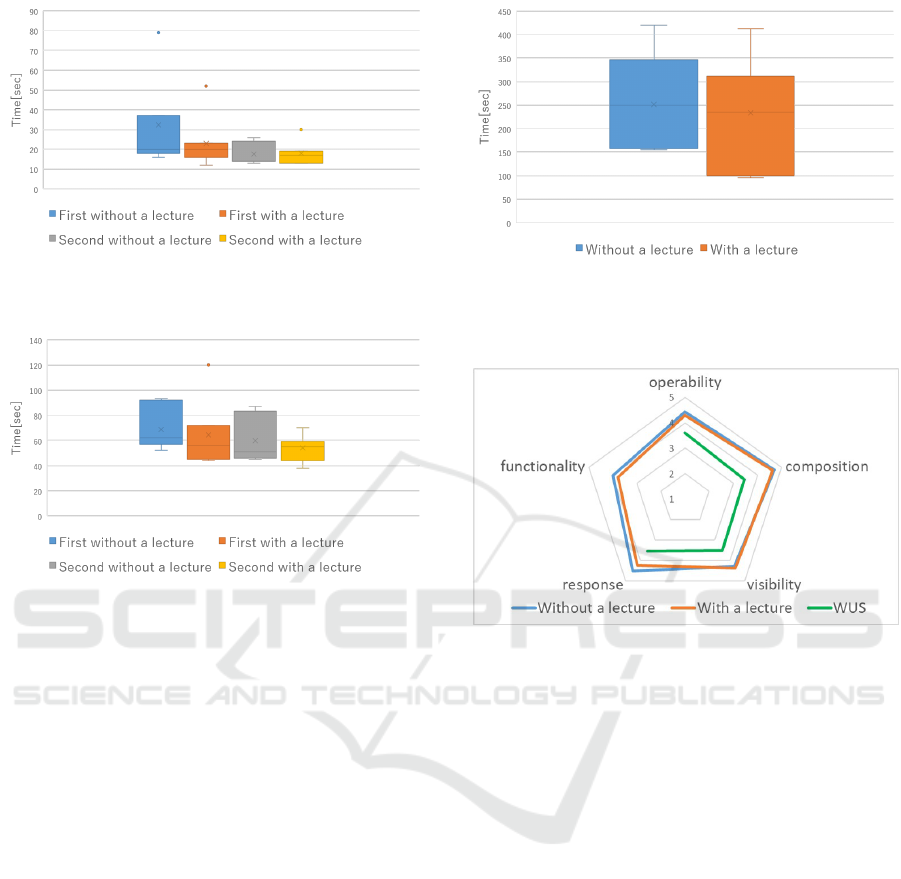
Figure 5: Result of the times to complete Task 1 in the first
and second trials with and without a lecture.
Figure 6: Result of the times to complete Task 2 in the first
and second trials with and without a lecture.
remarkable. The average without a lecture is 32.3 sec-
onds, the average with a lecture is 23.0 seconds; the
difference is thus seen to be 9.3 seconds. However, in
the second trial, the average was 17.6 seconds with-
out a lecture and 18.0 seconds with a lecture, and the
difference is almost negligible. Hence, the results in-
dicate that there was little dependence on the lecture.
In other words, the dynamic display graph can be op-
erated intuitively.
Fig.6 shows the first and second trials required for
completing Task 2 with and without a lecture. In Task
2, there was almost no difference between the trials
with and without a lecture. The first trial is 68.7 sec-
onds on average without a lecture and 64.4 seconds on
average with a lecture. The second trial is 59.7 sec-
onds on average without a lecture and 54.0 seconds
on average with a lecture. Hence, the multiple-series
graph and the parallel display graph can be operated
intuitively.
For Task 3, 12 out of 14 subjects were able to an-
swer correctly. Both subjects who could not answer
correctly were in groups without a lecture. Except for
those who did not answer correctly, the time required
for completing Task 3 with and without a lecture is
shown in Fig.7. The average completion time with-
out a lecture was 251.4 seconds, and that with a lec-
Figure 7: Result of the time to complete Task3 with and
without a lecture, except for those who did not answer cor-
rectly.
Figure 8: Result of the questionnaire and the average score
of WUS.
ture was 233.4 seconds. The answer rate of the group
without a lecture was lower. The time taken to com-
plete the task for the group was longer. This may be
due to the subjects not knowing that the data interval
of a multiple-series graph is automatically determined
according to the specified period. In addition, as a
whole, it took a long time to complete this task. From
this result, we found that a system which automati-
cally detects an anomaly from sensor information and
informs farm managers is necessary.
The result of the questionnaire and the average
score of WUS are shown in Fig.8. There is no av-
erage WUS score concerning functionality because
functionality is our original evaluation factor. Over-
all, SALATA was evaluated higher than the average
score for WUS, that is, the usability of SALATA is
high. This may be because SALATA has an intuitive
user interface, as indicated by the Task 1 and Task 2
results. In addition, since the score related to response
time was high, it showed SALATA responds quickly.
SALATA: A Web Application for Visualizing Sensor Information in Farm Fields
119

5 CONCLUSION
In this study, we introduced SALATA, a web applica-
tion for visualizing sensor information and farm work
information in farm fields. We explained and eval-
uated SALATA’s function of for displaying various
graphs of sensor information. The experimental re-
sults showed its high usability supported by the in-
tuitive user interface with quick response. Proposed
future work includes the following:
• Development and evaluation of functions of
searching, filtering, and sorting for farm work in-
formation
• Development of a function to display graphs of
processed data such as cumulative temperature
• Development of a function to allow searching
similar graphs
In addition, we are planning to apply SALATA to
an agricultural high school to support lectures. Col-
lecting and visualizing sensor information and farm
work information can help students in finding causal
relationships between them.
ACKNOWLEDGEMENTS
This work was supported by JSPS KAKENHI Grant
Number JP18H04117 and JP17H01768.
We would like to thank Mr. Yano, Itoshima Agri-
cultural High School, Japan.
REFERENCES
Chin, J. P., Diehl, V. A., and Norman, K. L. (1988). Devel-
opment of an instrument measuring user satisfaction
of the human-computer interface. In Proceedings of
the SIGCHI Conference on Human Factors in Com-
puting Systems, CHI ’88, pages 213–218, New York,
NY, USA. ACM.
Hashimoto, Y., Arita, D., Shimada, A., Yoshinaga, T.,
Okayasu, T., Uchiyama, H., and ichiro Taniguchi, R.
(2016). Measurement and visualization of farm work
information. CIGR-AgEng Conference, 5:1–7.
Kirakowski, J. and Corbett, M. (1993). Sumi: the software
usability measurement inventory. British Journal of
Educational Technology, 24(3):210–212.
Ministry of Agriculture, Forestry and Fisheries, Japan
(2019). Summary of the annual report on food, agri-
culture and rural areas in japan. Technical report,
Japanese Government.
Nakagawa, K., Suda, T., Zempo, H., and Matsumoto, K.
(2001). The development of questionnaire for evalu-
ating web usability. Human Interface Symposium.
Trilles Oliver, S., Gonz
´
alez-P
´
erez, A., and Huerta Guijarro,
J. (2019). Adapting models to warn fungal diseases in
vineyards using in-field internet of things (iot) nodes.
Sustainability, 11(2).
W
´
ojtowicz, M., W
´
ojtowicz, A., and Piekarczyk, J. (2016).
Application of remote sensing methods in agricul-
ture. COMMUNICATIONS IN BIOMETRY AND
CROP SCIENCE, 11(1):31–50.
SENSORNETS 2020 - 9th International Conference on Sensor Networks
120
