Visualization of Data for Decision Making in a University
Gabriela Cruz-Guzmán and Lorna V. Rosas-Téllez
a
Autonomous Popular University of the State of Puebla, AC. (UPAEP), Puebla, Mexico
Keywords: Data Visualization, Automated Systems, Interactive Graphics, Information Disclosure.
Abstract: The management of a large amount of information generated from different media is chaotic when there is no
technological tool that standardizes and organizes the data provided by different users. The present work
shows a web system that allows to store in a database the information of the research products that each year
the researchers of the institution perform, thus simplifying and improving information management, in order
to support the making decision based in the follow-up of the projects and activities of investigation of the
researchers. The system records and displays the changes made by researchers and allows generating the
visualization of data, providing an easier and faster way to see and understand trends, outliers and patterns in
the data which is essential for analyzing information and making decisions based on the data.
1 INTRODUCTION
Automating tasks in organizations with the
implementation of information systems generates
benefits such as creating sustainable competitive
advantages, improving the quality of service,
increasing sales, reducing costs, making wise
decisions, or allocating resources appropriately
(Sánchez & Álvarez, 1999). But information systems
also generate large volumes of data that only acquire
value when they are analyzed and generate some
benefit for the organization (Vázquez, 2019).
Currently in various industries, organizations handle
large volumes of data (Patil & Mason, 2015). The
analysis and treatment of the data is carried out with
the objective of providing those involved with the
necessary information to make optimal decisions
(Sharda, Denle & Turban, 2013).
Due to these large volumes of data, information
systems are used that Andreu, Ricart & Valor (1996)
define as "a formal set of processes that operating on
a data collection structured according to the needs of
a company collects, elaborates, and distributes part of
the information necessary for the operation of that
company and for the corresponding management and
control activities, relying at least in part on the
decision-making necessary to perform the functions
and business processes of the company in accordance
with its strategy". For their part, K and J Laudon
a
https://orcid.org/0000-0001-5245-2402
(1996) classified the information systems according
to their usefulness at the levels of the business
organization (operational, knowledge, administrative
and strategic level), see table 1.
Table 1: Classification of information systems.
Operations
Processing
System (OPS)
Routine day-to-day operations
required for business management
(operational level)
Knowledge
Work System
(KWS)
In charge of contributing to the agents
that handle information in the
creation of new knowledge in the
company (knowledge level)
Office
Automation
Systems (OAS)
In charge of increasing the
productivity of employees at low
hierarchical levels (knowledge level)
Administration
Information
System (AIS)
Employees in the planning, control
and decision-making process at
medium and high hierarchical levels
(administrative level)
Decision
Support
Systems (DSS)
Interactive systems that help users
make decisions using different data
and models for solving middle
management problems (strategic
level).
Management
Support
System (MSS)
SI designed to make strategic
decisions using advanced graphics
and communications (strategic level)
This article focuses on the implementation of a
Management Information System (MIS). Information
Cruz-Guzmán, G. and Rosas-Téllez, L.
Visualization of Data for Decision Making in a University.
DOI: 10.5220/0008984702230230
In Proceedings of the 15th International Joint Conference on Computer Vision, Imaging and Computer Graphics Theory and Applications (VISIGRAPP 2020) - Volume 3: IVAPP, pages
223-230
ISBN: 978-989-758-402-2; ISSN: 2184-4321
Copyright
c
2022 by SCITEPRESS – Science and Technology Publications, Lda. All rights reserved
223
system used for planning, control and decision
making on the graphs and reports of the publications
generated by the researchers of the Autonomous
Popular University of the State of Puebla (UPAEP)
and managed by the Research Directorate.
2 DELIMITATION OF THE
PROBLEM
Managing all the information, product of research and
dissemination of researchers in each area at the
Autonomous Popular University of the State of
Puebla (UPAEP) is a complex task. For this reason,
systems were developed that automated repetitive
tasks. The main objective of these systems is to help
manage the information generated by the storage of
the results by the users of the system and present it so
that those in charge can focus on analyzing the
information and making the pertinent decisions.
The UPAEP is interested in registering all the
knowledge generated by its researchers. Therefore,
UPAEP has an area dedicated exclusively to
promoting and supporting teachers and students
interested in developing research projects and
activities. The Research Directorate created five calls:
(1) Categorization, (2) Incentive to Teaching
Research, (3) Editorial Fund, (4) Research Fund and
(5) Support to congresses and publications in
journals, to provide support to researchers for their
efforts in generating knowledge.
The annually available call, called "Teaching
Research Incentive", aims to grant an economic
incentive corresponding to the System of
Categorization and Teaching Research to professors
and administrators who validate their research
products. The Research Directorate oversees
collecting the research products that the researchers
generated during the last year. These research
products (table 2) include: publications of articles in
national or international journals, translations,
chapters or editions of books, congress organizations,
participation in projects financed by agencies outside
UPAEP, prizes awarded for research, patents, utility
models or plant breeders' rights, councils or
appointments in which professors or administrators
attached to UPAEP from any of the 14 departments:
1. Administrative
2. Research Directorate
3. Arts and Humanities
4. Centre for Research and Economic Intelligence
(Postgraduate)
5. Biological Sciences
6. Health Sciences
7. Social Sciences
8. Business School
9. Engineering
10. Humanities
11. Arts and Humanities (Postgraduate)
12. Health Sciences (Postgraduate)
13. Engineering and Business (Postgraduate)
14. Study of Language and Culture (DELC)
Table 2: Order of the categories.
Categories
Books
Publication of books
Chapters of books
Book Publishing
Translation of books
Thesis direction
Master
Doctorate
Articles in magazines
International Arbitration
National Arbitrator
Congress
Presentations at
congresses
Organization of
congresses
Intellectual Property
Patents
Utility Models
Plant Breeders' Rights
Project Evaluator
Editorial Board
External projects
Citation in magazines
Research Awards
The Research Directorate organized and stored
the information and then the Organizational
Development and Evaluation Directorate of UPAEP
will validate the research products that meet the
requirements of the call and then a score was assigned
to each evidence. When the call was closed, the
Research Directorate developed spreadsheet reports
on the results of the call manually.
There were three main problems in the process:
(1) The lack of homologation of the information, due
to the fact that different devices were received (in
USB or CD/DVD, email or paper) and in different
formats (PDF, word processors, spreadsheets,
images, slide presentations, among others). (2) The
amount of time invested in receiving the information,
as it was necessary that one person devote himself
completely to this task for approximately one month.
During this month the person had to be available 8
hours a day or 160-man-hours a month from Monday
to Friday exclusively to answer calls or emails and
receive the researchers who attended the physical
IVAPP 2020 - 11th International Conference on Information Visualization Theory and Applications
224
offices to deliver their research products. (3) The
personnel necessary to organize the information, a
process in which up to 5 people were designated and
an average of 800-man-hours per annual call.
Although the Research Directorate invested
between 1000 and 1500 man hours for each call
launched annually, when a researcher had doubts
about his evaluation process, he went to the physical
offices of the Research Directorate to request his
personal report, which the Research Directorate
carried out manually, increasing the man hours and
the personnel used in each call.
3 DESIGN AND DEVELOPMENT
Based on the Administration Information System
(AIS), the UPAEP Publications Management System
for Researchers (SAPI) was developed. This system
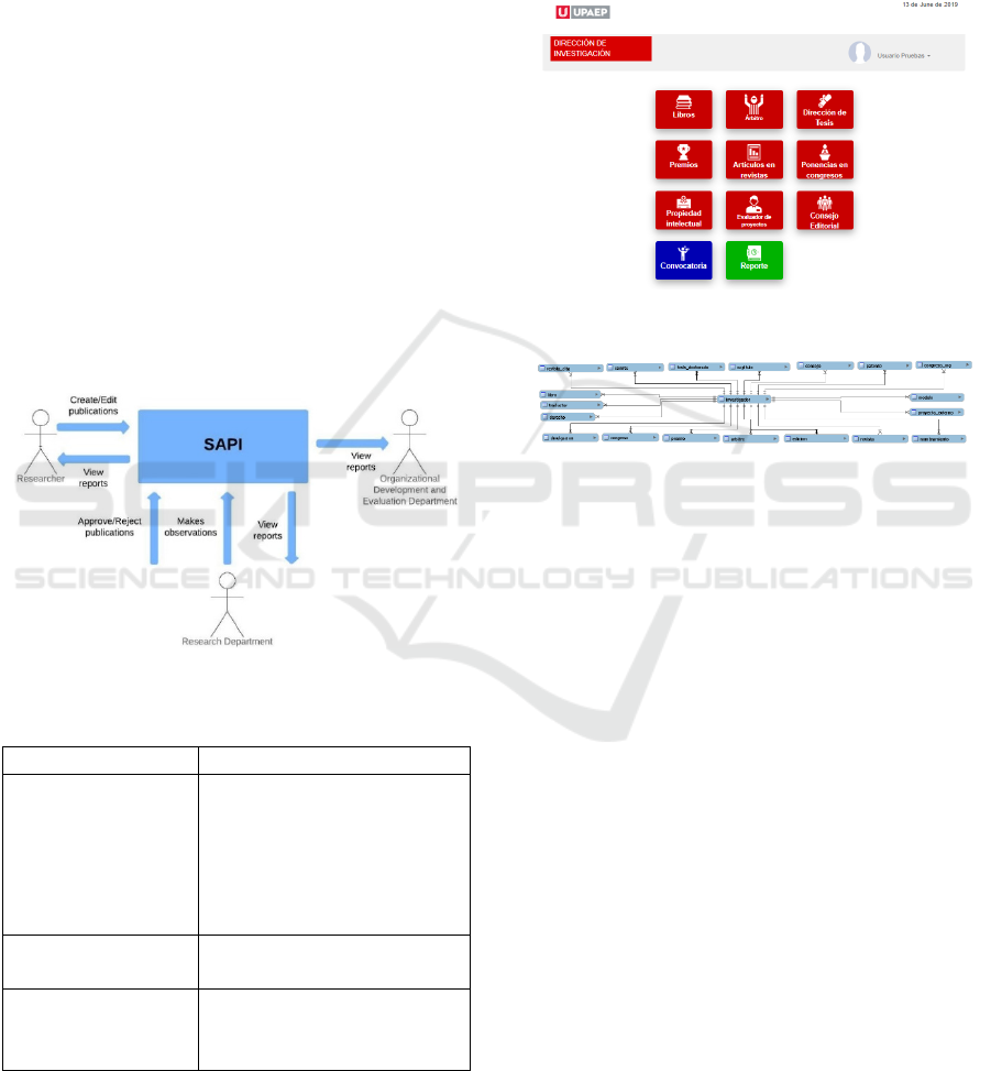
redesigned the communication process (figure 1)
between the different types of users and their
responsibilities (table 3).
Figure 1: Communication process.
Table 3: Types of users.
Type of user Actions
Researcher
Captures, modifies, eliminates
and visualizes own
information in the system,
reviews comments and status
of your research products,
generates own reports.
Research Directorate
Query, assign scores and
generate general reports.
Organizational
Development and
Evaluation Division
Consult general reports.
The system uses a website developed in PHP as
an interface to collect and store information from
UPAEP researchers' publications (figure 2) in a
database developed in MySQL (figure 3) that has 21
tables in total, each table belongs to a category of the
call "Incentive to Teaching Research". There is also a
table to store the academic and professional
information of each researcher. Finally, another table
was assigned to identify in which call each
publication was approved.
Figure 2: Main system interface.
Figure 3: Database.
After researchers capture their information into
the system, it is sorted, categorized, and processed for
visualization by the Research Directorate through
reports and interactive graphs. For its part, the
Research Directorate reviews and assigns a score to
each publication depending on the category and level
of complexity. At the end of the review, the graphs
and reports are analyzed, and the advances made in
the University during the last year are presented to the
academic vice rectory. From the presentation of the
data provided by the system, the Direction of
Research carries out different actions such as:
Allocation of bonuses depending on performance
and research production
Detection of growth or decrease by department,
category
Analysis of the profile of current UPAEP
researchers
Selection and implementation of performance
strategies
Analysis of the scope of short- and long-term
objectives
Design of action plans in accordance with the
available economic resources of the Research
Directorate.
Visualization of Data for Decision Making in a University
225
Changes in categories according to historical
trends of previous years
Early detection of possible technical problems in
the platform based on the history of the flow of
users
4 RESULTS
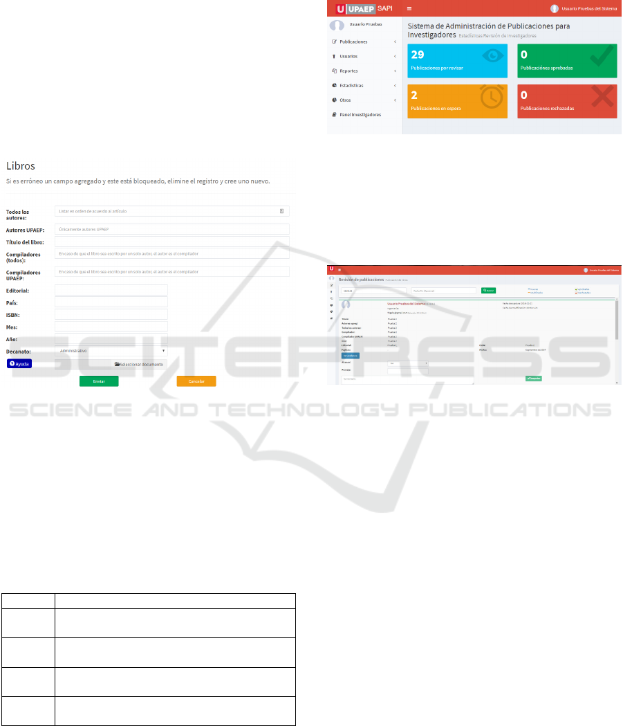
For a researcher to capture a publication in the system
there is a different form for each category (figure 4),
but in general all the forms have fields to fill in with
all the information of the researcher's publication.
Figure 4: Information capture interface.
As an identifier of the review process in which
each publication is found, a color code was defined
that allows researchers to quickly identify the status
of each publication (table 4) when they enter their
profile to consult which research products from which
they captured were accepted or not and the comments
of these.
Table 4: Colors assigned to the statuses that a publication
can have during the validation process.
Color Status
Grey
Research products that have not been
reviewed
Green
Research products that were reviewed and
approved
Red
Research products which were reviewed
and rejected
Orange
Research products that were reviewed
and need modification by Investigators
The main page, to access the research products
captured by researchers ordered by categories,
followed by users who have access to the system
ordered alphabetically, then reports, statistics, calls
and, finally, access to the profile as a researcher, this
option is only available if the user is registered in the
system as a researcher (figure 5).
Figure 5: Main menu of the Research Directorate.
The Research Directorate can evaluate (comment,
approve or reject) a publication of a researcher in an
interface that shows all the necessary fields of
publication with direct access to download the file of
evidence that the researchers attached (figure 6).
Figure 6: View in which an administrator comments on,
rejects, or approves a publication.
4.1 Graphics
The system generates a considerable number of
interactive graphics, fields are removed or added with
a single click on any graph, which are used to see
more quickly and easily the data recorded in each of
the calls. The graphs are generated by the system
automatically with the information that the
researchers captured during the call. These were
designed according to the needs of the Research
Directorate who decided that they needed to be able
to see one or more calls, categories or departments in
the same graph and that they could be easily added or
removed data. Graphs are generated on publications
that were approved or rejected during the calls; a bar
graph shows the general quantity of approved and
rejected publications per call (Figure 7); another
graph shows only approved publications (Figure 8),
and another graph shows only rejected publications
(Figure 9). These graphs are used to compare the total
number of publications in each call, with this
comparison is determined the scope that has been
IVAPP 2020 - 11th International Conference on Information Visualization Theory and Applications
226
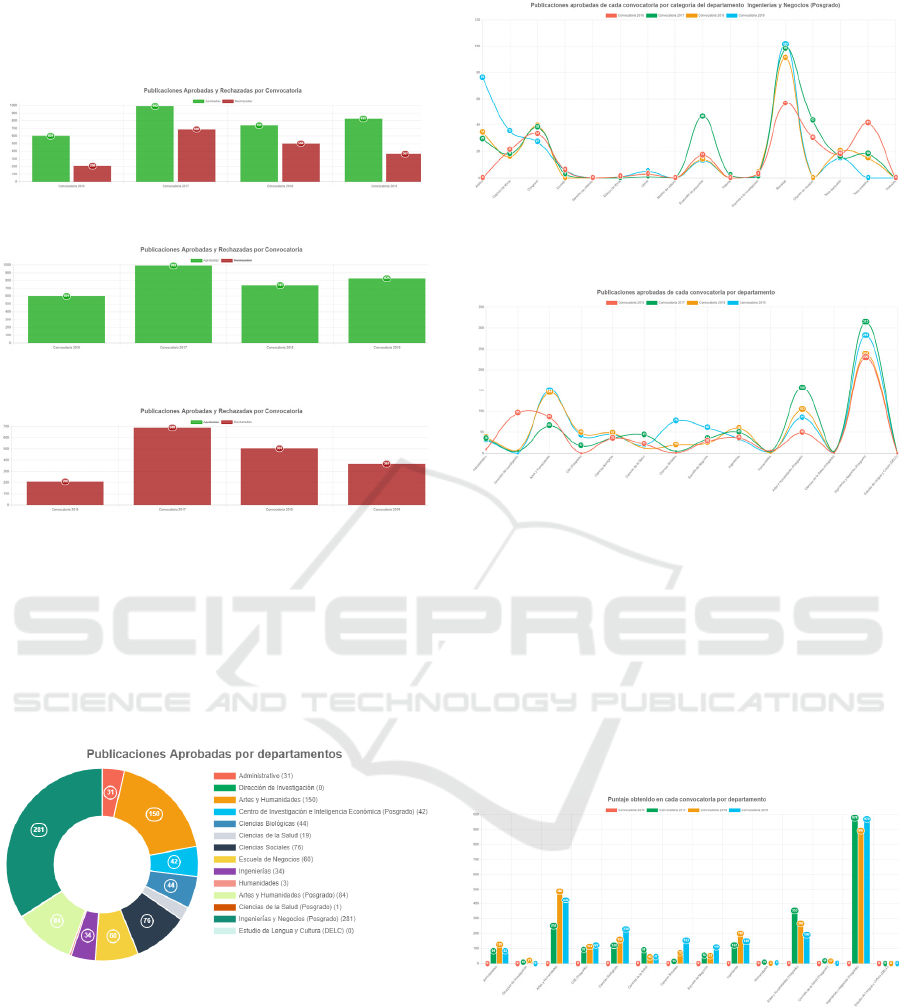
achieved against the investment made in research,
concluding whether the objectives of the Research
Directorate have been achieved.
Figure 7: Publications approved and rejected by call.
Figure 8: Graphic of publications approved by call.
Figure 9: Graphic of publications rejected by call.
It is important to know the number of publications
generated by each department of the University and
validate whether the support provided is having the
expected results. For this reason, a pie chart was chosen
from the total number of publications in which a
specific department can be selected to visualize the
information of this department only (figure 10).
Figure 10: Graphic of approved publications by department.
In addition to knowing which department is more
productive, it is required to know the category of
publications that researchers are generating, which is
why the system generates a series of line graphs of the
total number of publications approved in each call per
department (figure 11). A line graph of all departments
can be generated to compare the number of
publications per call (figure 12).
Figure 11: Graphic of approved publications by call, by
category.
Figure 12: Graphic of approved publications for each call by
department.
Another relevant aspect is the number of points
obtained by department since each category has a
different score, so the system generates a bar graph of
the total score obtained by department (figure 13) and
another linear graph of how the score was assigned by
category (figure 14) and a line graph of each of the 14
departments, which shows the detail of how each
department's score was assigned by each category
(figure 15).
Figure 13: Graphic of the score obtained per call.
Another requirement fulfilled by the system was to
note the categories in which researchers are generating
the most publications. Therefore, the system generates
an interactive pie chart of the total number of approved
publications by category for each call (Figure 16).
Another linear graph shows all the publications by
category for each call allowing to compare the
behavior of the researchers' contributions (figure 17).
Visualization of Data for Decision Making in a University
227
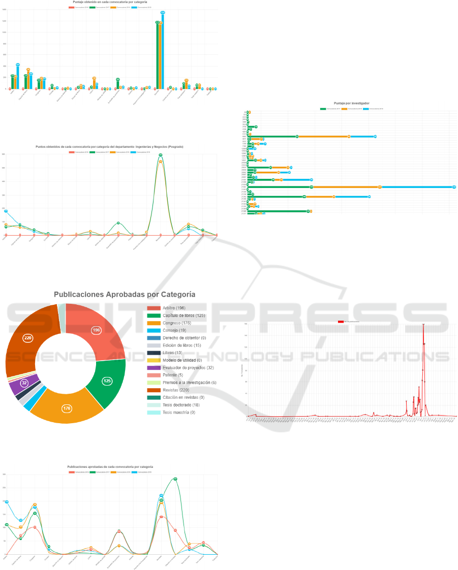
Figure 14: Graphic of the score obtained in each call for
proposals by category.
Figure 15: Graphic of the score assigned in each call by
category and department.
Figure 16: Graphic of publications approved by category
during the 2019 call for proposals.
Figure 17: Graphic of publications approved for each call
by category.
A general vertical bar graph of all the researchers
and the score assigned during the calls is shown
(image 18). This graph is extremely important for the
Direction and Research to analyze the profile of the
researchers, and if the production level is low, it is
investigated to determine the causes and strategies are
generated to increase the levels of performance or
otherwise encourage them to carry out the process of
affiliation to the National System of Researchers
(SNI).
Figure 18: General graphic of the score obtained by each
researcher.
In order to maintain the integrity of the system, a
graph was developed that shows the use of the
platform during the information capture period
(figure 19), helping to develop strategies that allow
for maintaining an efficient service for researchers.
Figure 19: Graphic of the flow of information captured by
researchers during the call 2019.
4.2 Reports
The system allows you to generate different reports
and download them in spreadsheets. Each report has
different filters for combined searches. A report is
shown by researcher and contains basic information
about the researcher, the number of approved
publications by category and the total number of
points that were assigned to each publication (figure
20). The system also generates this same report, but
from publications that were not approved to the
researcher (figure 21).
Another report shows by department the approved
publications and the score assigned to each one.
IVAPP 2020 - 11th International Conference on Information Visualization Theory and Applications
228
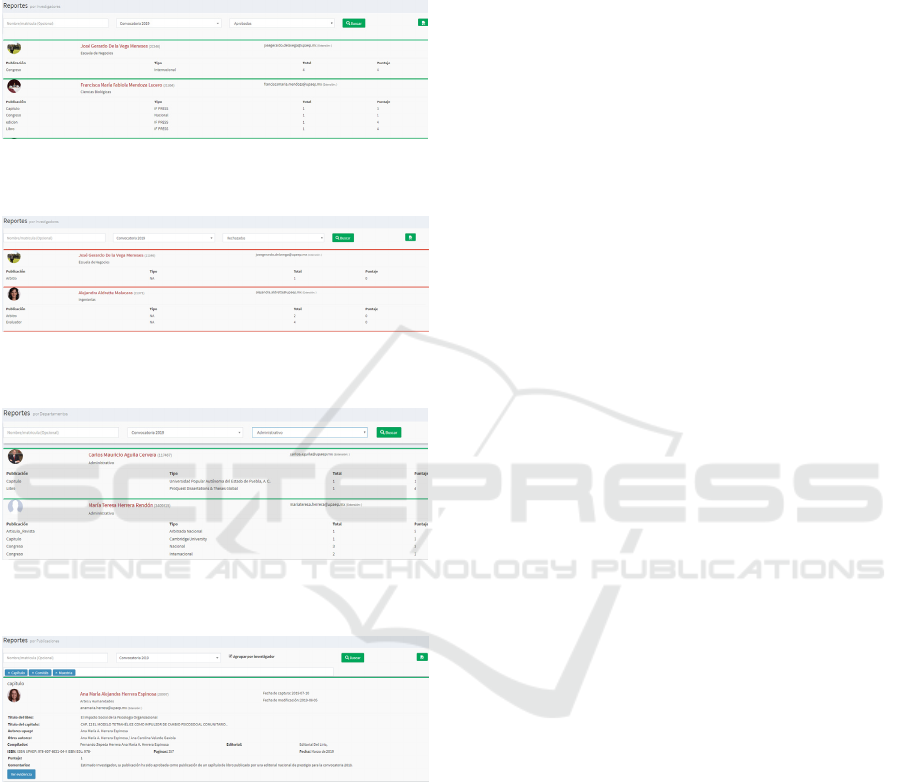
A report is generated by category of the publications
that were approved where the information and
evidence (archives) of all the publications that were
captured is visualized in detail, organized by category
(figure 23).
Figure 20: Report of the general summary of approved
publications by category of each researcher.
Figure 21: General summary report of rejected publications
by category.
Figure 22: General summary report of approved
publications by department.
Figure 23: Detailed report of approved publications by
category.
5 CONCLUSIONS
The visualization of the data with diagrams and
interactive graphs helped to process the information
in an easier way for the end user, among the most
important findings that were obtained with this
system are: Finding patterns and some ambiguities
that the evaluation instrument had regarding the
categories into which the call was divided “Incentive
to teaching research, this allowed reducing the
number of categories and defining a new score for
each one of them. It was also possible to find out more
easily and quickly which departments generate more
research, which researcher and which type of
contribution is having more participation, so that it
can be determined which researchers should be
followed up so that they can be proposed to carry out
the process to belong to the National System of
Researchers (SNI). In general, the final user of this
system can provide reports on how the research is
growing in the institution and how the budget
allocated to the research is being distributed, adding
value to identify that improvements are needed,
establish which factors influence the participation of
researchers, help to understand which publications
should be placed in which category and predict the
volume of publications to make a better budget for
future calls. Another important aspect that could be
detected thanks to the graphs was an important peak
of information capture during specific dates of the
opening of the call, if these situations persist they
could compromise the system, therefore, it is
necessary to generate strategies or a plan of action
before possible eventualities related to this topic.
6 FUTURE WORK
The SAPI system has a great potential, it is planned
to generate other interactive graphs and diagrams to
complement what has been seen so far in the system.
It is also planned to develop systems that automate
the other calls that the Research Department has,
which are: (1) Categorization, (3) Editorial Fund, (4)
Research Fund and (5) Support to conferences and
publications in journals, all of this will allow more
efficient current return processes, since a system that
centralizes the information allows a better
management of the data, saves time in the generation
of reports or statistics instantly, provides clearer and
more organized information. In addition, due to the
growth in the number of publications entered into the
system and the incorporation of new researchers, a
plan is being created to capture information on the
platform by department, maintaining the regularity,
reliability and efficiency of the service to researchers.
REFERENCES
Sánchez, F. M., & Álvarez, H. M. (1999). Los sistemas de
información como instrumentos de creación de ventajas
competitivas. Dirección y Organización, (21).
Visualization of Data for Decision Making in a University
229

Vázquez, A. (2019). Generación automática de interfaces
software para el soporte a la toma de decisiones.
Aplicación de ingeniería de dominio y machine
learning (Tesis Doctoral, Universidad de Salamanca).
García, J. A. (2018). Analytics, Big Data y BI - Transformar
datos en conocimiento. Recuperado de:
http://hdl.handle.net/10654/20720.
Patil, D.J & Mason, H. (2015). Data Driven. United States
of America: O’Reilly.
Sharda, R., Delen, D., & Turban, E. (2013). Business
intelligence: a managerial perspective on analytics:
Prentice Hall.
Andreu, R., Joan, E. & Valor J. (1996). Estrategia y
Sistemas de Información. México: Mc Graw Hill.
Laudon, K. & Laudon J. (1996). Administración de los
Sistemas de Información. México: Prentice Hall.
IVAPP 2020 - 11th International Conference on Information Visualization Theory and Applications
230
