
MapStack: Exploring Multilayered Geospatial Data in Virtual Reality
Maxim Spur
1 a
, Vincent Tourre
1 b
, Erwan David
2 c
, Guillaume Moreau
1 d
and Patrick Le Callet
3
1
Architectural and Urban Ambiances Laboratory, Centrale Nantes, Nantes, France
2
Department of Psychology, Goethe University Frankfurt, Frankfurt am Main, Germany
3
Polytech’Nantes, Universit
´
e de Nantes, Nantes, France
Keywords:
Coordinated and Multiple Views, Virtual Reality, Geospatial Data Visualization, Immersive Analytics.
Abstract:
Virtual reality (VR) headsets offer a large and immersive workspace for displaying visualizations with stereo-
scopic vision, compared to traditional environments with monitors or printouts. The controllers for these
devices further allow direct three-dimensional interaction with the virtual environment. In this paper, we make
use of these advantages to implement a novel multiple and coordinated view (MCV) in the form of a vertical
stack, showing tilted layers of geospatial data to facilitate an understanding of multi-layered maps. A formal
study based on a use-case from urbanism that requires cross-referencing four layers of geospatial urban data
augments our arguments for it by comparing it to more conventional systems similarly implemented in VR:
a simpler grid of layers, and switching (blitting) layers on one map. Performance and oculometric analyses
showed an advantage of the two spatial-multiplexing methods (the grid or the stack) over the temporal mul-
tiplexing in blitting. Overall, users tended to prefer the stack, be ambivalent to the grid, and show dislike for
the blitting map. Perhaps more interestingly, we were also able to associate preferences in systems with user
characteristics and behavior.
1 INTRODUCTION
Analysis and decision-making in geospatial domains
often rely on visualizing and understanding multiple
layers of spatial data. Cartographers have for cen-
turies created methods of combining multi-layered in-
formation into single maps to provide multidimen-
sional information about locations. More recently, the
Semiology of graphics (Bertin, 1973), and research
on visual perception (Ware, 2012) led to advances in
understanding how e.g., visual channels can be best
employed to clearly represent as much data as pos-
sible in an effective and (often space-) efficient way
(Munzner, 2014).
While the above led to established practices for
displaying many types of geospatial information, cre-
ating effective maps showing multilayered informa-
tion remains a nontrivial task even for domain experts,
and research is ongoing (Andrienko et al., 2007).
With an ever-increasing amount of spatial data being
a
https://orcid.org/0000-0001-7815-1915
b
https://orcid.org/0000-0003-4401-9267
c
https://orcid.org/0000-0002-5307-1795
d
https://orcid.org/0000-0003-2215-1865
collected and generated at faster rates, and a rising
demand to get ahead of this data, there may not al-
ways be the time and resources to craft bespoke map
visualizations for each new analysis task that requires
understanding a multitude of layers. It may also not
be practical to display too much information on one
map, no matter how well designed, when the maps
are too dense or feature-rich (Lobo et al., 2015).
An alternative solution is displaying multiple
maps of the same area at the same time. With comput-
erization, this approach of multiple coordinated views
(MCVs) (Roberts, 2007) was adapted to this use-case
(Goodwin et al., 2016), which can juxtapose different
maps, or layers of a map, on one or multiple screens,
and synchronize interactions between them, such as
panning, zooming, the placement of markers, etc.
A downside to spatial juxtaposition is a reduction
in the visible size of each map, as limited by screen
space, and the head/eye movement required to look
at different maps. On the other hand, MCVs should
be employed when the different views “bring out cor-
relations and or disparities,” and can help to “divide
and conquer,” or “create manageable chunks and to
provide insight into the interaction among different
88
Spur, M., Tourre, V., David, E., Moreau, G. and Callet, P.
MapStack: Exploring Multilayered Geospatial Data in Virtual Reality.
DOI: 10.5220/0008978600880099
In Proceedings of the 15th International Joint Conference on Computer Vision, Imaging and Computer Graphics Theory and Applications (VISIGRAPP 2020) - Volume 3: IVAPP, pages 88-99
ISBN: 978-989-758-402-2; ISSN: 2184-4321
Copyright
c
2022 by SCITEPRESS – Science and Technology Publications, Lda. All rights reserved
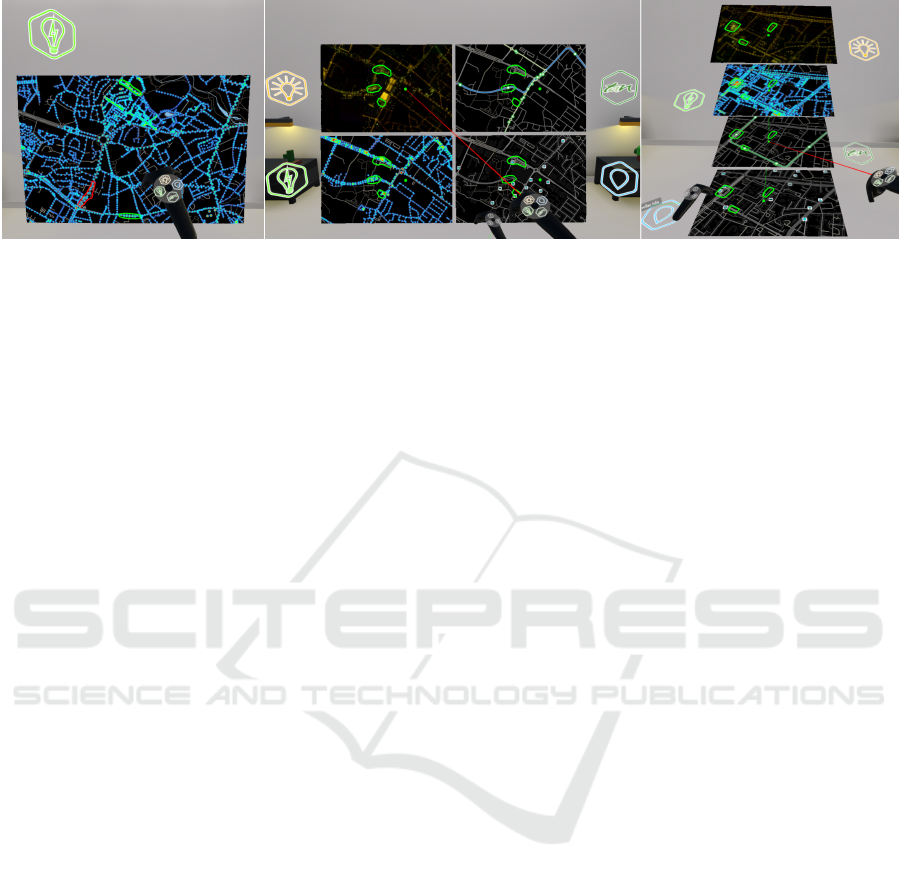
Figure 1: Left: Temporal multiplexing (blitting); center and right: spatial mutliplexing — in a grid (center), and in our
proposed stack (right). Shown as implemented for the user study, with controller interaction.
dimensions,” as recommended in the guidelines set
forth by (Wang Baldonado et al., 2000).
Commodity-grade virtual reality headsets (VR-
HMDs) are steadily increasing their capabilities in
terms of resolution and field of view, offering
an omnidirectional and much more flexible virtual
workspace than what is practical or economical with
positioning monitors, prints or projections in a real
environment. Another benefit VR-HMDs provide is
stereoscopic vision, which allows for a more natu-
ral perception of three-dimensional objects. Further-
more, VR devices such as the HTC Vive or the Oculus
Quest usually come with controllers that are tracked
in all axes of translation and rotation, presenting users
with direct means of three-dimensional interaction
with the virtual environment.
A crucial advantage of VR over AR for our appli-
cation is the complete control over the environment
even in small offices, whereas the translucent nature
of AR-HMDs requires a controlled real environment
— a large enough and clutter-free real background to
place the virtual objects. Another advantage with cur-
rently available headsets is the typically much larger
field-of-view of VR-HMDs, providing less need for
head movements, and, crucially, showing more data
at the same time, which is essential for preattentive
processing (Healey and Enns, 2011).
These potential advantages appear applicable even
to the display of flat topographic maps without 3D
features , and allow for different kinds of spatial ar-
rangements than otherwise feasible (no restrictions
on monitor numbers or placement). A case has been
made for separating and vertically stacking different
data layers of a map (Spur et al., 2017), an MCV ap-
plication which seems most suited for such an immer-
sive system.
For this work, we developed an implementation
of this stacking system (the titular MapStack, further
referenced as the stack) specifically with the VR case
in mind, as we believe this is where its advantages
are most pronounced and could be best utilized. The
main benefit under analysis here is its hypothesized
ability to balance a trade-off of MCVs: stacking lay-
ers in this way allows them to be larger and still closer
together than by other means of juxtaposition. To
evaluate this stack’s performance in visualizing multi-
layered maps in a decision-making task, we set up a
controlled user study. In it, we compared the stack
to two more traditional methods of MCVs (Figure 1):
temporal multiplexing or blitting, where all layers oc-
cupy the same space and a user toggles their visibility,
and spatial multiplexing in a grid, showing all layers
side by side.
Even though these methods work well in the
traditional desktop computer environment, we im-
plemented them using the same VR environment
and means of interaction as our proposed stacking
method. This allows for a fairer comparison and con-
trols for the “wow-effect” of using VR, particularly
for test participants with little experience in it.
The design space for comparative or composite
(map) visualization encompasses more than these op-
tions (Javed and Elmqvist, 2012), but other methods,
such as overloading and nesting (e.g., by using a lens
or by swiping), appear more practical for just two lay-
ers, and have indeed been investigated for that pur-
pose (Lobo et al., 2015). To our knowledge, no stud-
ies exist to date on evaluating these map comparison
techniques with more than two layers or in VR.
Our paper contributes to research on multilayered
map visualization:
• with a novel spatial multiplexing approach based
on a stack of maps, derived from a study of the
available design space for comparison tasks and
its application in VR; and
• an evaluation of this stack wholly done in VR,
in comparison to two more traditional systems
within a controlled user study.
MapStack: Exploring Multilayered Geospatial Data in Virtual Reality
89

2 RELATED WORK
2.1 Urban Data Visualization
As a particular domain in geospatial visualization to
focus on, we chose the rapidly expanding field of ur-
ban data visualization. In (Zheng et al., 2016), many
current examples of urban data visualization are given
from the point of view of visual (Keim et al., 2008)
and immersive analytics (Dwyer et al., 2018). Typical
systems present one type of information, or closely
related data like transportation on an interactive map
(Ferreira et al., 2013), or superimpose few and sparse
layers (Liu et al., 2011). While most systems work
with a flat map view, some others started utilizing
and showing in perspective projection the 3D shape of
cities and buildings (Ferreira et al., 2015). While this
provides a better sense of the urban shape, occlusion
of data can occur — this is addressed in (Chen et al.,
2017a) by “exploding” the building models. Vertical
separation of data layers has also been done for legi-
bility purposes when there was no occlusion to miti-
gate in (Edler and Dickmann, 2015).
2.2 Immersive Analytics
The emerging field of immersive analytics (Fonnet
and Pri
´
e, 2019) aims to combine the advances of
immersive technologies with visual analytics (Chan-
dler et al., 2015) and has already resulted in applica-
tions for large-scale geospatial visualizations (Yang
et al., 2018). Urban environments however have so
far mostly been immersively explored only in 3D city
models (Chen et al., 2017b), or by adding data to one
spatial layer (Filho et al., 2019).
2.3 Multiple and Coordinated Views
In (Knudsen and Carpendale, 2017), arguments for
immersive analytics are reiterated, with a call for
more research into its application to coordinated and
multiple views (interchangeably abbreviated to CMVs
or MVCs) (Roberts, 2007) — a powerful form of
composite visualization by juxtaposition (Javed and
Elmqvist, 2012). Many of the systems mentioned
above contain MCVs in the shape of a map view aug-
mented by connected tables or charts, others (Lobo
et al., 2017; Mahmood et al., 2018) also link related
maps in innovative ways. While studies have been
made to explore the efficacy of different compositions
of such map views (Lobo et al., 2015), to our knowl-
edge they have so far only evaluated the case of two
map layers, and also not within immersive environ-
ments.
3 SYSTEM DESIGN
3.1 Visual Composition Design Patterns
As explained in (Lobo et al., 2015), combining mul-
tiple layers of geospatial data into one view can be
a straightforward superposition, as long as the added
information is sparse and the occlusion of the base
map or blending of color or texture coding is not an
issue. This is not the case when the map layers are
dense and feature-rich, and this is where other design
patterns of composite visualization views as defined
in (Javed and Elmqvist, 2012) should be explored:
Juxtaposition: Placing visualizations side-by-side in
one view;
Superimposition: Overlaying visualizations;
Overloading: Utilizing the space of one visualiza-
tions for another;
Nesting: Nesting the contents of one visualization in-
side another; and
Integration: Placing visualizations in the same view
with visual links.
Superimposition methods, as opposed to the plain su-
perposition described above could be made useful if
applied locally, e.g., like a lens (Lobo et al., 2015).
With more than two layers though, a lens-based com-
parison interface quickly becomes less trivial to de-
sign, e.g., a “base” layer becomes necessary, as well
as either controls or presets for the size, shape and
placement of a potentially unwieldy number of lenses
(Trapp and D
¨
ollner, 2019). When mitigating this by
using less lenses than layers, it becomes necessary to
fall back to temporal multiplexing as discussed below.
Overloading and nesting can be dismissed for map
visualizations. Though they are related to superimpo-
sition, they are defined to lack a “one-to-one spatial
link” between two visualizations, which is central to
most map comparison tasks.
This leaves juxtaposition and its augmented form,
integration, which adds explicit linking of data items
across views. Those are familiar and relatively easy
to implement design patterns that have been shown to
increase user performance in abstract data visualiza-
tion (North and Shneiderman, 1997). The challenges
in designing effective juxtaposed views, as (Javed and
Elmqvist, 2012) describe, lie in creating “efficient re-
lational linking and spatial layout”. The first chal-
lenge could be addressed by relying on the integration
design pattern, and the second one is where we pro-
pose the vertical stack method as an alternative to be
evaluated against a more classical, flat grid of maps.
In Gleicher’s earlier paper (Gleicher et al., 2011),
juxtaposition is also talked about in the temporal
IVAPP 2020 - 11th International Conference on Information Visualization Theory and Applications
90

sense: “alternat[ing] the display of two aligned ob-
jects, such that the differences ‘blink’”. Lobo et al.
(Lobo et al., 2015) refer to this as temporal multi-
plexing or blitting and see it also as a version of su-
perimposition. As one of the most common compo-
sition techniques (e.g., flipping pages in an atlas, or
switching map views on mobile device), and one we
observed being used by the urbanists in our lab work-
ing with geographic information systems, we also in-
cluded it in our comparative study.
3.2 The Stack
Since the strategy a user will employ for comparing
the layers will be a sequential scan (Gleicher, 2018),
we believe a design where the distances between the
layers are minimal would fare better. Figure 2 shows
how the stack helps this sequential scan by presenting
each layer in the same visual way — all layers share
the same inclination relative to the viewer and are thus
equally distorted by perspective. Increasing this incli-
nation allows the layers to be stacked closer together
without overlap, while still preserving legibility up to
reasonable angles (Vishwanath et al., 2005).
α
α
α
α
β
Stack
α
1
α
2
β
Grid
h
h
γ
γ
d
d
d
d
d
1
d
2
Stack
Grid
Figure 2: Spatial arrangement of the layers in the stack and
grid systems, highlighting the larger visual distance (β) be-
tween layers in the grid, assuming same height (h) of the
maps, same minimum distance to viewer (d
1
), and same
gap between layers (γ). Viewing angles (α) and distances
(d) are constant in the stack and different in the grid.
Scanning through a stack also requires eye movement
in one direction only — all representations of an area
are aligned vertically. Additionally, the way the indi-
vidual maps are arranged in the stack mirrors the way
maps are traditionally, and still today, often viewed in
professional settings: as a flat print or display on a
table, inclined to the viewer — even in VR applica-
tions (Wagner Filho et al., 2019). All maps share the
same relative inclination and distance to the viewer,
and thus the same perspective distortion, making them
easier to compare (Amini et al., 2014).
The stereoscopic display of VR gives an immedi-
ate clue that the maps are inclined and not just dis-
torted, helping the visual perceptive system decode
the effect of perspective and removes the need for ki-
netic depth cues (Ware and Mitchell, 2005). In ad-
dition, this inclination is also made clearly visible to
a user by framing the map layers in rectangles, which
helps to indicate the perspective surface slant. Studies
exist that show how picture viewing is nearly invari-
ant with respect to this kind of inclination or “viewing
obliqueness,” bordering on imperceptibility in many
cases (Vishwanath et al., 2005).
4 STUDY
4.1 Task Design
In (Schulz et al., 2013), the concepts of data, tasks,
and visualization are combined in two ways to ask
different questions:
Data + Task = Visualization? and
Data + Visualization = Task?
The first combination asks which visualization needs
to be created for a given task and data, whereas the
second can follow as an evaluation process, once a
visualization has been defined: how well can tasks be
performed on this data using this visualization?
To perform this evaluation, the task and data had
to be well defined. Usually, the effectiveness of geovi-
sualization systems is evaluated with simplified tasks,
such as detecting differences between maps or finding
certain features on a map (Lobo et al., 2015). While
these methods can often be generalized to map leg-
ibility, we aimed at defining a task that could more
directly test how well a system can facilitate an under-
standing of multiple layers of spatial data. Such task
design was focal to this project, and conducting the
experiment with it, the applicability of that method-
ology to evaluate geovisualization systems could also
be investigated.
4.2 Comparison Design Considerations
Gleicher argues that “much, if not most of analysis
can be viewed as comparisons” (Gleicher, 2018). He
describes comparison as consisting in the broadest
sense of items or targets, and an action, or what a
user does with the relationship between items.
Following Gleicher’s considerations on what
makes a “difficult comparison”, our task needs to be
refined:
the number of items being compared;
the size or complexity of the individual items; and
the size or complexity of the relationships.
The first two issues we directly addressed by sim-
plifying the choice a user had to make. We divided the
area of the city for which we had coverage of all four
data layers into twelve similarly-sized regions — one
MapStack: Exploring Multilayered Geospatial Data in Virtual Reality
91

for each scenario. In each, we outlined three items
— the candidate areas, out of which a user would
then only select the one most “problematic” candi-
date. This considerably reduces the number of items,
their size and complexity. Having a fixed number of
candidates in all scenarios allows us to compare com-
pletion time and other metrics, such as the number of
times participants switched their attention from one
candidate to another, in a more consistent way. Differ-
ent numbers of candidates could help generalize find-
ings, but would also require accordingly longer or a
larger number of experiment sessions , an endeavor
which we relegate to future work.
To address the relationships’ complexity, we pro-
vided candidates that were as similar to each other as
possible, while differing in ways that are interesting
from the urbanist point of view. For example: One
scenario’s candidates are all segments with a round-
about, have similar energy consumption, but one of
them is close to a tram stop, and another has stronger
light pollution. We aimed for the users to balance
fewer aspects, while providing insights to urbanists
regarding the remaining differences that mattered the
most in a decision.
4.3 Use Case: Urban Illumination
With the help of a group of experts consisting of ur-
banists, architects, and sociologists, we developed a
use case around ongoing research into public city il-
lumination that requires understanding multilayered
spatial information to make informed choices. It re-
lies on four data layers (Figure 3):
Light Pollution: an orthoimage taken at night over
the city
Energy Consumption: a heatmap visualization of
the electrical energy each street lamp consumes
Night Transportation: a map of public transit lines
that operate at night and their stops, including bike-
sharing stations, and
Night POIs: a map of points of interest that are rele-
vant to nighttime activities.
Figure 3: The four data layers: light pollution, street light
energy consumption, nighttime transportation, and points of
interest at night.
Given these four layers, a user would be tasked with
identifying areas they consider most “problematic”,
based on an explanation on the significance of each
layer and then comparing them. The user in this sce-
nario is a citizen, participating in shaping updates to
urban illumination — new regulations are being put
in place to limit light pollution and energy consump-
tion. Excesses should be reduced, while critical ar-
eas such as transportation hubs or highly frequented
places should stay well-illuminated, or even receive
additional lighting where not sufficiently present.
4.4 Implementation and Interaction
Using data provided by the local metropolitan area ad-
ministration (light pollution and street lamp informa-
tion) and OpenStreetMaps (transportation and points
of interest), we created the four layers as map styles
on the Mapbox platform (Mapbox, 2019). Using its
API, we could load these as textures directly into
Unity 3D (Theuns, 2017) to build a system for nav-
igating the layers and candidates.
The layers were presented as floating rectangular
surfaces with a 3:2 aspect ratio in front of the user,
at an apparent distance around 1.5 meters from the
viewer and perpendicular to the ground plane for blit-
ting and the grid, and tilted at about 45 degrees rela-
tive to the user’s viewing axis in the stack (Figure 2).
Tracking the position of the HMD in virtual space,
the individual layers were accordingly rotated to keep
vertical viewing angles constant, ensuring all layers
looked equally distorted by perspective from any po-
sition of the viewer.
The aforementioned position, size and orientation
of the layers were determined with direct feedback
from the previously mentioned group of experts dur-
ing the development and pre-testing phases to achieve
a comfortable display — similar to a printed map ly-
ing flat on a table in front of a viewer. Since users are
free to move around in a sitting position in a rolling
office chair and adjust their view, or even stand up as
they see fit during viewing, a more precise method of
devising those parameters was deemed not necessary
for this study. Our goal here was to make viewing the
three methods equally comfortable for a fair compar-
ison.
We used the HTC Vive kit, which provides con-
trollers tracked in 3D space. The two controllers were
divided into two main functions: one for controlling
the map — panning, zooming, and switching layers
in the blitting system, and the other for controlling
the candidates — highlighting, fading, selecting and
confirming the selection of chosen candidate areas.
Panning and zooming was accomplished by holding
the side button and moving the controller in 3D space
— motion parallel to the map plane translated the im-
IVAPP 2020 - 11th International Conference on Information Visualization Theory and Applications
92

age, while perpendicular motion (pushing or pulling
it) translated to zooming. This controller was given to
users in their dominant hand, as the highest dexterity
required for the other controller was to just swipe a
thumb across the touchpad to select candidates on an
annular menu.
As an additional visual aid, pressing the map con-
troller’s trigger activates a “laser beam” emanating
from the tip of the controller, painting a marker at the
point where it hits a map layer. In the case of the
grid and stacking views, that marker (a green sphere)
is mirrored on each layer, and in the latter case also
linked by a thin green line. This creates additional
visual linking, ranging from implicit to explicit and
elevating the stacking view to an integrated view de-
sign pattern (Javed and Elmqvist, 2012).
4.5 Participants
26 participants took part in the experiment (9 female,
17 male), with ages ranging from 18 to 45 years
(M=21, SD=6.33).
21 reported as currently being students, with 17
holding at least a bachelor’s degree. Most participants
had either never tried VR before (10), or for only less
than five hours total (13). Two have had between five
and twenty hours of VR experience, and one more
than twenty hours. We also asked about experience
with 3D video games: Nine participants reportedly
never play those, nine others only a few times per
year. Four play a few times per month, one a few
times per week and three play every day.
The participants’ responses to questions about
their familiarity with the city we visualized, its map
and their comfort of reading city maps were normally
distributed on the visual analog scales we employed.
All participants were tested on site for visual acuity
and colorblindness and all have passed.
4.6 Stimuli
As described in subsection 4.2, the map of the city
for which we had data coverage was divided into sce-
narios that each contained three candidate areas for
consideration. One stimulus thus consists of a pairing
between a viewing system and a scenario — a portion
of the map beyond which the user could not pan and a
limited zoom range, and the three candidate areas pre-
selected for this portion. Twelve such scenarios were
created — one was chosen to always be shown first,
in the first tutorial that introduced the layers and the
interactions with the blitting system. The remaining
eleven scenarios were presented in random order —
the next two tutorials, which introduced the remain-
ing two systems also used a random scenario from
this pool.
4.7 Design And Procedure
The experiment was a within-subject design — each
participant was exposed to each system equally, and
we could directly inquire about preferences among
the systems. It was further split into a tutorial and
evaluation phase, consisting of multiple scenarios.
Each scenario consisted of the task, preceded by in-
structions (full introductions in the tutorial phase, and
short reminders in the evaluation phase), and a ques-
tionnaire part. Completion of a task stopped the data
recording and prompted the participant to remove the
headset to proceed to the questionnaire on a separate
PC, which then guided to the next task and its intro-
duction.
4.7.1 Tutorial Phase
After a brief introduction on how to handle the VR
headset and controllers by the experimenter, the tuto-
rial phase — consisting of three scenarios — began.
The first scenario showed the same map region and
used the blit layering system for each user, to ensure
maximum consistency in their training. Blitting was
chosen here as this is the closest to what participants
were likely to already be familiar with from using dig-
ital maps, and because it appears as just a single map
at a time, which allowed to explain the significance of
each map layer in sequence and without interference.
At first, all controller interaction is disabled. The
tutorial system gradually introduced and enabled pan-
ning, zooming, and blitting the maps, and selecting
and confirming candidates by asking the participant
to perform simple tasks and waiting for their success-
ful completion. While introducing the blitting mech-
anism, each layer was explained in detail — partic-
ipants could not switch to the next one before con-
firming their understanding of the summary. The first
scenario concluded with a reiteration of the common
task of all scenarios: selecting and confirming one of
the three candidates, following by the instruction to
remove the VR headset and proceed with the ques-
tionnaire, which introduced the types of questions that
will be answered throughout the session.
The second and third scenarios introduced in a
similar fashion the grid and stack systems, omitting
the blitting and individual layer explanations. They
similarly ended with the actual task and the question-
naire. Here, the order was balanced between the par-
ticipants: half were first exposed to the grid, the other
half to the stack. The map regions were randomized
from this point on.
MapStack: Exploring Multilayered Geospatial Data in Virtual Reality
93

4.7.2 Evaluation Phase
The remaining nine scenarios were divided into three
blocks of three tasks: a repeating permutation of the
three layering systems (G(rid), S(stack), B(blit)), bal-
anced across the participant pool, e.g., GSB-GSB-
GSB, or BGS-BGS-BGS. The tutorial system was
pared down to only instruct participants in the blitting
system to switch between all layers at least once, and
to show reminders of the controller functions as well
as the layer descriptions if requested. Instructions ap-
peared to evaluate the scenario, pick a candidate and
proceed to the questionnaire.
4.7.3 Balancing
The balancing may seem to be impacted by this
choice of procedure, but we believe the benefits of
presenting blitting — the simplest of the three sys-
tems in terms of visual complexity — outweighs the
downsides, especially since we were particularly in-
terested in whether the differences between the two
spatial multiplexing systems were significant. The
simplicity of blitting allowed us to craft an in-system
tutorial that is consistent for each participant and
gradually eases them into interpreting the visuals and
interacting with the environment. This consistency
was ultimately deemed to be more “balancing” in our
view than a random choice of system for the first pre-
sentation — the rest of each session (the nine trials
after the tutorial part) was completely balanced.
4.8 Apparatus and Measurements
The test procedure was split between two devices: the
HTC Vive VR setup, and a separate PC running a
questionnaire (Guse et al., 2019). All instructions af-
ter the start of the experiment (including the tutorial)
and interactions with the participants were handled
automatically by the questionnaire and the prototype:
instructing the user to put on the headset, instructing
to select one candidate and taking the headset off af-
ter having done that, asking questions about the per-
ceived workload, asking to put the headset back on
for the next task, and so on. This procedure had the
additional benefit of providing the participants with
regular breaks from wearing the headset and the asso-
ciated physical and mental fatigue.
For interacting with the software prototype, the
HTC Vive was used, connected to a Windows PC ca-
pable of running it at the maximum frame rate of 90
Hz and the maximum resolution of 1080 × 1200 pix-
els per eye (approx. 100×100 degrees of field of view
excited binocularly). Standard HTC Vive controllers
were used, and the headset was fitted out with an SMI
binocular eye tracking device, capable of sampling
gaze positions at 250 Hz with a reported accuracy of
0.2 degrees.
For subjective assessments, we asked the partic-
ipants via questionnaire for explanations as to why
they chose each candidate after each trial, and finally,
presented post-hoc questions about pairwise prefer-
ences for the systems in terms of legibility, ease of
use and visual design, as well as solicited free-form
feedback for each system in form of a voluntary text
field.
In addition to this declarative user feedback, we
also recorded performance aspects (completion times,
interaction measurements) and physiological data via
oculometry. Eye movements bring a wealth of infor-
mation — they are overt clues about an observer’s at-
tention deployment and cognitive processes in gen-
eral, and are increasingly being tracked for evaluat-
ing visual analytics (Kurzhals et al., 2016). In the
context of map reading, measuring gaze allows us to
know precisely which map layers participants chose
to observe in particular, and at which times. Further-
more, gaze features and their properties, such as sac-
cades and fixations can be derived, in this case by pro-
cessing with the toolkit developed for the Salient360!
dataset (David et al., 2018), using a velocity-based
parsing algorithm (Salvucci and Goldberg, 2000).
5 RESULTS
5.1 User Preferences
The post-hoc, pairwise questions about user prefer-
ences for the systems asked which one of two (ran-
domly ordered and balanced, creating full pairwise
comparison matrices (PCMs)) they thought was bet-
ter in terms of map legibility, ease of use, and visual
design. The questions were clarified, respectively:
1. Which system showed the map layers in the clear-
est way and made them easier to understand for
you?
2. Which system made interaction with the maps
and candidate areas easier for you?
3. Which system looked more appealing to you?
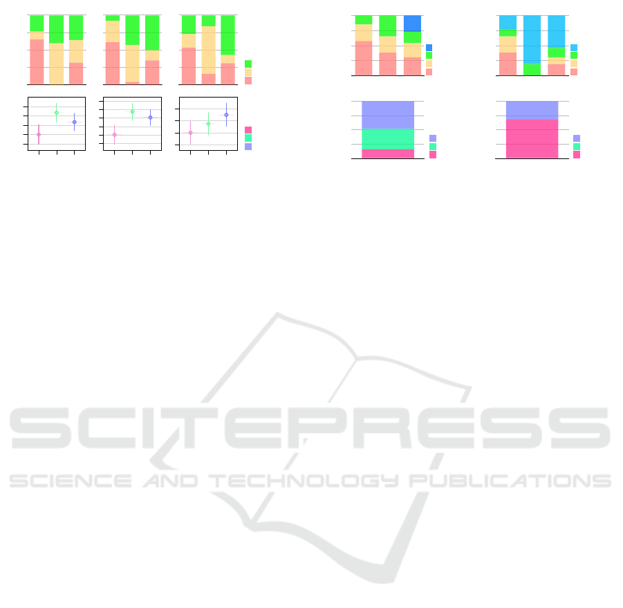
From the PCMs, we derived rankings for each system
under each aspect, as shown in Figure 4(a). This was
done by counting the number of times a system “won”
against another in the pairwise comparisons — two
times means it is “preferred” by the user, one time
puts it in second place, and zero times in the third and
last place — it then is the “disliked” system under that
aspect.
IVAPP 2020 - 11th International Conference on Information Visualization Theory and Applications
94
Readability
0%
25%
50%
75%
100%
Blit
Grid
Stack
36%
40%
23%
32%
60%
12%
32%
65%
3rd
2nd
1st
Ease of Use
Blit
Grid
Stack
50%
42%
8%
15%
54%
31%
35%
4%
62%
Visual Design
Blit
Grid
Stack
58%
15%
27%
12%
69%
19%
31%
15%
54%
(a) System
Rankings
Readability
0%
25%
50%
75%
100%
Blit
Grid
Stack
36%
40%
23%
32%
60%
12%
32%
65%
Stack
Grid
Blit
Completion times
Seconds
0
30
60
90
120
Blit
Grid
Stack
Total
pB
pG
pS
Total
pB
pG
pS
Total
pB
pG
pS
54
55
63
63
79
67
86
86
86
66
73
71
Blit Grid
-0.5 0.5 1.5
Blit Grid
-0.5 0.5 1.5
Blit Grid
-0.5 0.5 1.5
Blit Grid
-0.5 0.5 1.5
Blit Grid
-0.5 0.5
Blit Grid
-0.5 0.5
(b) Bradley-
Terry Scores
Table 1-1-1
Blit
Grid
Stack
0 firsts
58%
38%
31%
1 firsts
27%
27%
23%
2 firsts
15%
35%
19%
3 firsts
0%
0%
27%
Number of “Wins”
0%
25%
50%
75%
100%
Blit
Grid
Stack
27%
19%
35%
15%
23%
27%
27%
31%
38%
58%
0 wins
1 wins
2 wins
3 wins
Table 2
Blit
16%
Grid
36%
Stack
48%
Overall Preferred
0%
25%
50%
75%
100%
48%
36%
16%
Blit
Grid
Stack
Table 1-2-1
Blit
Grid
Stack
3 lasts
38%
0%
19%
2 lasts
27%
0%
12%
1 lasts
12%
19%
15%
0 lasts
23%
81%
54%
Table 1-1-1-1
Blit
Grid
Stack
0 firsts
58%
38%
31%
1 firsts
27%
27%
23%
2 firsts
15%
35%
19%
3 firsts
0%
0%
27%
Number of “Lasts”
0%
25%
50%
75%
100%
Blit
Grid
Stack
54%
81%
23%
15%
19%
12%
12%
27%
19%
38%
3 lasts
2 lasts
1 lasts
0 lasts
Table 2-1
Wins
Lasts
Blit
16%
42%
Grid
36%
27%
Stack
48%
31%
Overall Disliked
0%
25%
50%
75%
100%
31%
27%
42%
Blit
Grid
Stack
Figure 4: (a) How often (in percent) each system was
ranked first, second, or last in terms of legibility, ease of
use, and visual design by the users; (b) Pairwise compar-
isons scored with the Bradley-Terry model.
The blitting system came in last in each regard
with more than half of our participants. The grid was
close to evenly rated first or second in terms of legi-
bility and ease of use (only one participant rated it last
in ease of use), while being behind the stack in terms
of best-ranked visual design and also slightly in ease
of use.
The same PCMs were fit with the Bradley-Terry
model (Bradley, 1984) to assign each system a rel-
ative score (c.f. Figure 4(b)); the results mirror the
preference rankings in Figure 4(a), aside from giving
an advantage to the grid over the stack in all but visual
design. The grid evoked quite consensual responses,
being most often rated as second place in all aspects
and almost never as the worst. The stack received
the most first place rankings, but also a considerable
number of last place ones, showing that it provoked
stronger “love it or hate it” responses. The blit system
is similar in that regard, only that the best and worst
ratings are reversed for it.
Condensing those pairwise comparisons further,
we counted how many times each system was given
a “first” and a “last” ranking by each user, combined
across all aspects, shown in Figure 5 (a). This shows
how the majority of users gave the blit system zero
firsts — it is not the “best” under any aspect for them,
and how the stack was the only system to receive all
three possible firsts by any users (a quarter of our sam-
ple). The number of “lasts” received mirrors those
observations, and further highlights how the grid was
a middle ground — receiving only very few single
“lasts,” if at all. Most participants found either the
stack, or more so, the blit system worse than the grid
in at least one aspect.
The last distillation of the PCMs results in which
system a user “preferred” or “disliked” overall, by
choosing the one that has received the most “firsts”
or the most “lasts,” (as described above) respectively,
shown in Figure 5 (b). By this measure, almost half
our participants preferred the stack, and only a small
Number of “Firsts”
0%
25%
50%
75%
100%
Blit
Grid
Stack
27%
19%
35%
15%
23%
27%
27%
31%
38%
58%
0 firsts
1 firsts
2 firsts
3 firsts
Overall Preferred
0%
25%
50%
75%
100%
48%
36%
16%
Blit
Grid
Stack
Number of “Lasts”
0%
25%
50%
75%
100%
Blit
Grid
Stack
54%
81%
23%
15%
19%
12%
12%
27%
19%
38%
3 lasts
2 lasts
1 lasts
0 lasts
Table 2-1
Wins
Lasts
Blit
16%
68%
Grid
36%
0%
Stack
48%
32%
Overall Disliked
0%
25%
50%
75%
100%
32%
68%
Blit
Grid
Stack
(a) First/Last
Counts
(b) Extreme
Ratings
Figure 5: (a) Which proportion of participants gave the sys-
tems a number of zero to four first or last rankings across
all aspects (legibility, ease of use, and visual design); (b)
which proportion gave the most “firsts” (and therefore “pre-
ferred”) or “lasts” (and therefore “disliked”) to each system
in the pairwise comparisons.
fraction the blit system, while the blit was disliked by
a majority, and not a single user rated the grid system
as the worst in most aspects.
5.2 Subgroupings
Since our main goal was to evaluate the legibility of
the systems, we used the rankings from Figure 4 to
split the participants’ data (Figure 6 and Figure 7)
into three subgroups (plus the total): pB, pG, and
pS. Those refer to data from users who preferred the
B(lit), G(rid), or S(tack) system, i.e., ranked it first
in the pairwise comparisons under that aspect. This
could be done since the number of participants who
did so were roughly comparable: out of the 26 total
participants, 6 fell into pB, 10 into pG, and 9 into pS.
5.3 Interactions
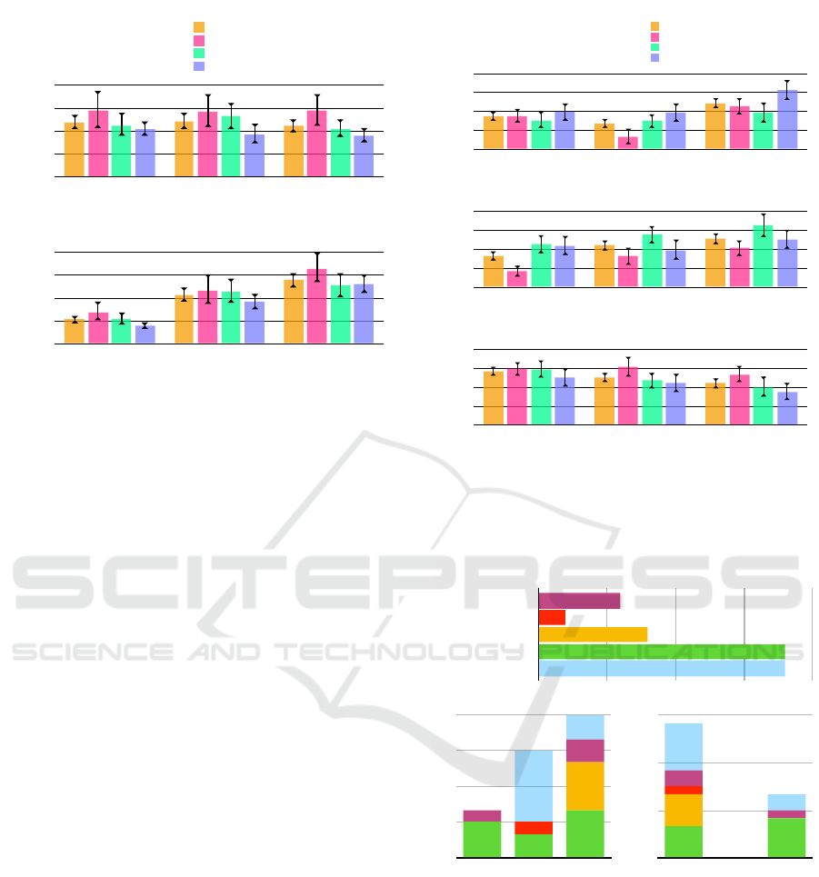
Task completion times (Figure 6(a)) show how pG
users were faster than pB, and pS faster still, while
the total differences between the systems are balanced
out by the preference groups.
The stacking system saw the most gaze switches
(Figure 6(b)) from layer to layer, and blitting the least,
with a lower variability from subgrouping — this can
clearly be attributed to the requirement to manually
switch between layers for the blit system, as opposed
to just switching one’s gaze over. There is a tendency
for pS users to make the fewest gaze changes across
all systems than other users, most strongly though in
the blitting system.
5.4 Oculometry
Saccade amplitudes (Figure 7(a)) were lowest in the
grid and highest in the stack, with pS users having
MapStack: Exploring Multilayered Geospatial Data in Virtual Reality
95
(a) Saccade amplitudes
Degrees
6
6.5
7
7.5
8
Blit
Grid
Stack
Total
pB
pG
pS
Total
pB
pG
pS
Total
pB
pG
pS
7.6
7.0
7.0
7.0
6.7
6.8
7.1
6.3
6.9
7.2
6.7
6.9
(c) Fixation durations
Milliseconds
210
220
230
240
250
Blit
Grid
Stack
Total
pB
pG
pS
Total
pB
pG
pS
Total
pB
pG
pS
227
232
235
230
233
239
237
241
240
232
235
238
(a) Completion times
Seconds
0
30
60
90
120
Blit
Grid
Stack
Total
pB
pG
pS
Total
pB
pG
pS
Total
pB
pG
pS
54
55
63
63
79
67
86
86
86
66
73
71
(b) Gaze changes between map layers
Number
0
25
50
75
100
Blit
Grid
Stack
Total
pB
pG
pS
Total
pB
pG
pS
Total
pB
pG
pS
65
45
20
64
57
26
82
58
34
69
53
26
(b) Saccade peak velocities
Degrees per µs
11
14
18
21
24
Blit
Grid
Stack
Total
pB
pG
pS
Total
pB
pG
pS
Total
pB
pG
pS
19.2
17.3
18.1
21.7
20.0
18.3
17.7
16.3
13.7
19.3
18.2
16.3
Table 2-1-1-1
Total
16.33
18.21
19.30
pB
13.71
16.27
17.67
pG
18.29
20.02
21.66
pS
18.08
17.31
19.16
(a) Saccade amplitudes
Degrees
6
6.5
7
7.5
8
Blit
Grid
Stack
Total for system
by users who preferred Blit (pB)
by users who preferred Grid (pG)
by users who preferred Stack (pS)
Total for system
by users who preferred Blit (pB)
by users who preferred Grid (pG)
by users who preferred Stack (pS)
Total for system
by users who preferred Blit (pB)
by users who preferred Grid (pG)
by users who preferred Stack (pS)
7.6
7.0
7.0
7.0
6.7
6.8
7.1
6.3
6.9
7.2
6.7
6.9
Total for system
by users who preferred Blit (pB)
by users who preferred Grid (pG)
by users who preferred Stack (pS)
Figure 6: Each system’s recorded performance mea-
surements (means and bootstrapped confidence intervals);
grouped by users who preferred the blit, grid or stack sys-
tem (pB, pG, pS) and in total.
a tendency to make the largest, especially in their
preferred system. In contrast, saccade peak veloci-
ties (Figure 7(b)) were highest with pG and lowest
with pB users, and the differences across the systems
are corresponding to those with gaze changes (Fig-
ure 7(a)).
Mirroring the number of gaze changes and sac-
cade peak velocities, users in general fixated the
shortest (Figure 7(c)) in the stack, and the longest in
the blitting system. That trend is followed by pG and
pS (who had the shortest of all), but not by pB users,
who had consistently higher fixation durations, less
affected by the systems.
5.5 User Characteristics
Of the personal characteristics we gathered about the
participants, their habits with 3D-based video games
yielded the most interesting results when paired with
their preferred and disliked systems, as shown in Fig-
ure 8. Most of those who never play 3D video games
prefer the grid, the rest the stack, and none the blit
system. Most of those who identify as playing at least
a few times per month prefer the stack.
Concerning the “disliked” system chart, the blit
system overwhelmingly earned the least favorite sta-
tus, from all kinds of participants almost proportion-
ally to their distribution in our sample. As seen before
in Figure 5 (b), none placed the grid system last.
(a) Saccade amplitudes
Degrees
6
6.5
7
7.5
8
Blit
Grid
Stack
Total
pB
pG
pS
Total
pB
pG
pS
Total
pB
pG
pS
7.6
7.0
7.0
7.0
6.7
6.8
7.1
6.3
6.9
7.2
6.7
6.9
(c) Fixation durations
Milliseconds
210
220
230
240
250
Blit
Grid
Stack
Total
pB
pG
pS
Total
pB
pG
pS
Total
pB
pG
pS
227
232
235
230
233
239
237
241
240
232
235
238
(a) Completion times
Seconds
0
30
60
90
120
Blit
Grid
Stack
Total
pB
pG
pS
Total
pB
pG
pS
Total
pB
pG
pS
54
55
63
63
79
67
86
86
86
66
73
71
(b) Gaze changes between map layers
Number
0
25
50
75
100
Blit
Grid
Stack
Total
pB
pG
pS
Total
pB
pG
pS
Total
pB
pG
pS
65
45
20
64
57
26
82
58
34
69
53
26
(b) Saccade peak velocities
Degrees per µs
11
14
18
21
24
Blit
Grid
Stack
Total
pB
pG
pS
Total
pB
pG
pS
Total
pB
pG
pS
19.2
17.3
18.1
21.7
20.0
18.3
17.7
16.3
13.7
19.3
18.2
16.3
Table 2-1-1-1
Total
16.33
18.21
19.30
pB
13.71
16.27
17.67
pG
18.29
20.02
21.66
pS
18.08
17.31
19.16
(a) Saccade amplitudes
Degrees
6
6.5
7
7.5
8
Blit
Grid
Stack
Total for system
by users who preferred Blit (pB)
by users who preferred Grid (pG)
by users who preferred Stack (pS)
Total for system
by users who preferred Blit (pB)
by users who preferred Grid (pG)
by users who preferred Stack (pS)
Total for system
by users who preferred Blit (pB)
by users who preferred Grid (pG)
by users who preferred Stack (pS)
7.6
7.0
7.0
7.0
6.7
6.8
7.1
6.3
6.9
7.2
6.7
6.9
Total for system
by users who preferred Blit (pB)
by users who preferred Grid (pG)
by users who preferred Stack (pS)
(a) Saccade amplitudes
Degrees
6
6.5
7
7.5
8
Blit
Grid
Stack
Total for system
by users who preferred Blit (pB)
by users who preferred Grid (pG)
by users who preferred Stack (pS)
Total for system
by users who preferred Blit (pB)
by users who preferred Grid (pG)
by users who preferred Stack (pS)
Total for system
by users who preferred Blit (pB)
by users who preferred Grid (pG)
by users who preferred Stack (pS)
7.6
7.0
7.0
7.0
6.7
6.8
7.1
6.3
6.9
7.2
6.7
6.9
Total for system
by users who preferred Blit (pB)
by users who preferred Grid (pG)
by users who preferred Stack (pS)
Figure 7: Each system’s recorded physiological mea-
surements (means and bootstrapped confidence intervals);
grouped by users who preferred the blit, grid or stack sys-
tem (pB, pG, pS) and in total.
3D Video Game Playing Frequency
EveryDay
SomePerWeek
SomePerMonth
SomePerYear
Never
9
9
4
1
3
Preferred System
0
3
6
9
12
Blit
Grid
Stack
2
6
2
1
1
4
4
2
3
Disliked System
0
6
12
18
Blit
Grid
Stack
2
6
1
2
1
4
5
4
Figure 8: The numbers of participants who play 3D-based
video games at different frequencies, and their distribution
among who “preferred” and “disliked” each system.
5.6 User Feedback
The free-form feedback yielded positive and negative
commentary for all systems. Complaints about the
blit system included the need to constantly change
layers, making comparisons more difficult or taking
more time. The bigger surface of the single map in it
was remarked as a positive, in fact as being better or
simpler than the other systems for analyzing a single
IVAPP 2020 - 11th International Conference on Information Visualization Theory and Applications
96

layer.
The grid system received mostly positive remarks
in terms of giving a good and simple overview over
the layers, however there were complaints about the
reduced size of each layer and also about the need for
large head movements to view them in sequence.
The comments about the stack were mostly sug-
gestions about a specific part that needs improve-
ments, rather than comparisons to the other systems:
position, orientation, and size of the layers were all
suggested to be changed in specific ways. Some ex-
pressed the demand for a way to change the orien-
tation and order of the layers. The direct positives
named were a practical “ensemble” view of all layers,
and it being the fastest system to compare them.
Interestingly, the participants’ overall system pref-
erences, or even particular comparisons had little
bearing on the kind of feedback they offered — users
expressing that one system as their favorite did not
necessarily choose that one during the pairwise com-
parisons over the other systems. What did correlate
however to the content of their feedback was their
categorization into 3D gaming frequency — those
who play more were generally more likely to offer
more detailed and constructive feedback, and were
also more inclined to comment positively on the stack
and its potential for improvement.
5.7 Discussion
Our exploration-based task design with no “correct”
answers allowed participants to freely interact with
the map layers, coming up with their own strategies.
Measurements and questionnaires allowed us to link
preferences with behavior, showing how there is no
one system that is universally better, only better suited
for certain behaviors. Examples linking behavior and
preferences, as taken from figures 7 and 6 are:
• Users with the lowest peak saccade velocities, low
saccade amplitudes and longest fixation durations
preferred the blit system, which allowed switch-
ing layers in place instead of moving their eyes.
• Users who preferred the grid appeared to be those
most comfortable with quickly bridging the large
distances between layers in that system — they
were the ones with the fastest peak saccade veloc-
ities.
• Users with the fastest completion times and the
fewest gaze changes between layers preferred the
stack — that system, with its short distance be-
tween layers may have allowed them to view mul-
tiple ones from one fixation point, without need-
ing to shift their gaze to neighboring layers. Mul-
tiple users, particularly those in favor of the stack
expressed a wish to be able to rearrange the layers,
probably to aid this behavior further.
Completion times did not vary substantially from sys-
tem to system, but the number of gaze changes did.
The “distance” between layers (physical, or temporal
by way of switching) is anti-proportional to that num-
ber, and proportional to fixation durations — a shorter
distance reduced the barrier to switch attention to dif-
ferent layers.
When looking beyond performance and physio-
logical measurements and deeper into the preferences
and user characteristics, more patterns emerge that
could explain users’ perception and acceptance of a
system. Participants who were already familiar with
navigating 3D environments in the form of video
games were more likely to take advantage of the con-
trols and views offered in both the blitting and the
stack system. One requires more interaction, the other
perhaps an ability to understand “unusual” spatial ar-
rangements. The “middle ground,” i.e., the grid is by
far preferred among those who play video games the
least: it requires no interaction to switch layers, and
the layout is much simpler than the stack.
In this study, we deliberately evaluated the three
concepts in isolation, i. e. each system on its own, and
not a combination of them, making effects easier to
separate. We especially did not compare the layering
systems to a single map that contains all information
in one layer. We assume a situation where that is not
a practical solution — if it were, there would be no
need for a separation into any of the layering systems
in the first place.
We also limited the scenarios to four data layers
to keep an “even playing field”: increasing that num-
ber would have resulted in worse layer navigation in
the blitting system (no longer mapped to cardinal di-
rections on the touchpad, requiring finer interaction),
and smaller tiles with often irregular arrangements
(such as for prime numbers of layers) for the grid sys-
tem. We therefore believe stacking could accommo-
date higher numbers of layers more easily — needing
only slightly more vertical space and/or flatter angle
for more layers — and would have a clearer advantage
over the other systems in those cases.
Similarly, we also limited customizability by hav-
ing the sizes, shapes and orientations of all systems
fixed for consistency between users and trials, though
there were multiple wishes for exactly that being ex-
pressed by the participants.
MapStack: Exploring Multilayered Geospatial Data in Virtual Reality
97

6 CONCLUSION
We investigated an extension of MCVs into VR and
cartography with comparisons of map layers greater
in number than two, while contributing to research
into visual and immersive analytics of multilayered
geospatial data.
Arguing from previous work on composite visual-
ization, we introduced a novel MCV system specifi-
cally tailored to VR and evaluated its merits using a
task design that is close to actual tasks in urbanism
and similar geospatial domains. Our analysis shed
light on differences in users’ map reading behavior
and how that affects their judgement of different sys-
tems, or which kinds of comparison views are better
suited to which users.
Furthermore, that analysis through different as-
pects (user preferences, characteristics and perfor-
mances) showed there is no one measurement suffi-
cient to compare or judge systems. Slower comple-
tion times could mean a deeper focus on the task, and
a high or low number of gaze changes between maps
could indicate both more or less comparisons being
done, just as well as a feeling of concentration or of
being lost.
Different users can have opposing priorities and
preferences when it comes to these systems, so op-
timizing for one type would probably make it worse
for another. This came to light by limiting the flexi-
bility of our participants in their choice of system or
arrangement, and brought us to the conclusion that
precisely that flexibility is what may be necessary in
a truly useful system.
Future work could see an implementation of re-
quested features, such as being able to rearrange the
order of layers and their shape and position. A hy-
brid system, combining the advantages of blit, grid
and stack should also be investigated. With the stack
by itself being shown to be usable, a number of them
side-by-side — like a tilted grid, or even cyclically
arranged — could accommodate a larger number of
layers, especially if those layers can be grouped by
columns, like quarterly data in different years.
A different kind of user study could also be set
up that presents participants with all available options
(choice of system, possibilities of rearrangement) and
lets them freely choose and customize as they see fit
for their task at hand. Switching up the number of
layers or other interactive elements could then shed
light on which configurations work best for which
scenario.
REFERENCES
Amini, F., Rufiange, S., Hossain, Z., Ventura, Q., Irani, P.,
and McGuffin, M. J. (2014). The impact of interac-
tivity on comprehending 2d and 3d visualizations of
movement data. IEEE transactions on visualization
and computer graphics, 21(1):122–135.
Andrienko, G., Andrienko, N., Jankowski, P., Keim, D.,
Kraak, M., MacEachren, A., and Wrobel, S. (2007).
Geovisual analytics for spatial decision support: Set-
ting the research agenda. International Journal of Ge-
ographical Information Science, 21(8):839–857.
Bertin, J. (1973). S
´
emiologie graphique: Les diagrammes-
les r
´
eseaux-les cartes.
Bradley, R. A. (1984). 14 paired comparisons: Some ba-
sic procedures and examples. Handbook of statistics,
4:299–326.
Chandler, T., Cordeil, M., Czauderna, T., Dwyer, T.,
Glowacki, J., Goncu, C., Klapperstueck, M., Klein,
K., Marriott, K., Schreiber, F., and Wilson, E. (2015).
Immersive Analytics. In 2015 Big Data Visual Ana-
lytics (BDVA), number September, pages 1–8. IEEE.
Chen, Z., Qu, H., and Wu, Y. (2017a). Immersive Urban
Analytics through Exploded Views. In Workshop on
Immersive Analytics: Exploring Future Visualization
and Interaction Technologies for Data Analytics.
Chen, Z., Wang, Y., Sun, T., Gao, X., Chen, W., Pan, Z.,
Qu, H., and Wu, Y. (2017b). Exploring the Design
Space of Immersive Urban Analytics. Visual Infor-
matics, 1(2):132–142.
David, E. J., Guti
´
errez, J., Coutrot, A., Da Silva, M. P.,
and Callet, P. L. (2018). A dataset of head and eye
movements for 360
◦
videos. In Proceedings of the
9th ACM Multimedia Systems Conference, pages 432–
437. ACM.
Dwyer, T., Marriott, K., Isenberg, T., Klein, K., Riche, N.,
Schreiber, F., Stuerzlinger, W., and Thomas, B. H.
(2018). Immersive analytics: An introduction. In Im-
mersive Analytics, pages 1–23. Springer.
Edler, D. and Dickmann, F. (2015). Elevating Streets in Ur-
ban Topographic Maps Improves the Speed of Map-
Reading. Cartographica: The International Jour-
nal for Geographic Information and Geovisualization,
50(4):217–223.
Ferreira, N., Lage, M., Doraiswamy, H., Vo, H., Wilson, L.,
Werner, H., Park, M., and Silva, C. (2015). Urbane:
A 3D framework to support data driven decision mak-
ing in urban development. In 2015 IEEE Conference
on Visual Analytics Science and Technology (VAST),
pages 97–104. IEEE.
Ferreira, N., Poco, J., Vo, H. T., Freire, J., and Silva, C. T.
(2013). Visual Exploration of Big Spatio-Temporal
Urban Data: A Study of New York City Taxi Trips.
IEEE Transactions on Visualization and Computer
Graphics, 19(12):2149–2158.
Filho, J. A. W., Stuerzlinger, W., and Nedel, L. (2019).
Evaluating an Immersive Space-Time Cube Geovi-
sualization for Intuitive Trajectory Data Exploration.
IEEE Transactions on Visualization and Computer
Graphics, (c):1–1.
IVAPP 2020 - 11th International Conference on Information Visualization Theory and Applications
98

Fonnet, A. and Pri
´
e, Y. (2019). Survey of immersive analyt-
ics. IEEE transactions on visualization and computer
graphics.
Gleicher, M. (2018). Considerations for Visualizing Com-
parison. IEEE Transactions on Visualization and
Computer Graphics, 24(1):413–423.
Gleicher, M., Albers, D., Walker, R., Jusufi, I., Hansen,
C. D., and Roberts, J. C. (2011). Visual comparison
for information visualization. Information Visualiza-
tion, 10(4):289–309.
Goodwin, S., Dykes, J., Slingsby, A., and Turkay, C.
(2016). Visualizing Multiple Variables Across Scale
and Geography. IEEE Transactions on Visualization
and Computer Graphics, 22(1):599–608.
Guse, D., Orefice, H. R., Reimers, G., and Hohlfeld, O.
(2019). Thefragebogen: A web browser-based ques-
tionnaire framework for scientific research. arXiv
preprint arXiv:1904.12568.
Healey, C. and Enns, J. (2011). Attention and visual mem-
ory in visualization and computer graphics. IEEE
transactions on visualization and computer graphics,
18(7):1170–1188.
Javed, W. and Elmqvist, N. (2012). Exploring the design
space of composite visualization. In 2012 IEEE Pa-
cific Visualization Symposium, pages 1–8. IEEE.
Keim, D., Andrienko, G., Fekete, J.-D., G
¨
org, C., Kohlham-
mer, J., and Melanc¸on, G. (2008). Visual analytics:
Definition, process, and challenges. In Information
visualization, pages 154–175. Springer.
Knudsen, S. and Carpendale, S. (2017). Multiple Views in
Immersive Analytics. Proceedings of IEEEVIS 2017
Immersive Analytics (IEEEVIS).
Kurzhals, K., Fisher, B., Burch, M., and Weiskopf, D.
(2016). Eye tracking evaluation of visual analytics.
Information Visualization, 15(4):340–358.
Liu, H., Gao, Y., Lu, L., Liu, S., Qu, H., and Ni, L. M.
(2011). Visual analysis of route diversity. In 2011
IEEE conference on visual analytics science and tech-
nology (VAST), pages 171–180. IEEE.
Lobo, M.-J., Appert, C., and Pietriga, E. (2017). Mapmo-
saic: dynamic layer compositing for interactive geo-
visualization. International Journal of Geographical
Information Science, 31(9):1818–1845.
Lobo, M.-J., Pietriga, E., and Appert, C. (2015). An Eval-
uation of Interactive Map Comparison Techniques.
In Proceedings of the 33rd Annual ACM Conference
on Human Factors in Computing Systems - CHI ’15,
pages 3573–3582, New York, New York, USA. ACM
Press.
Mahmood, T., Butler, E., Davis, N., Huang, J., and Lu, A.
(2018). Building Multiple Coordinated Spaces for Ef-
fective Immersive Analytics through Distributed Cog-
nition. In 4th International Symposium on Big Data
Visual and Immersive Analytics, pages 119–128.
Mapbox (2019). Mapbox, Inc. location data platform. https:
//www.mapbox.com. Accessed: 2019-04-06.
Munzner, T. (2014). Visualization analysis and design. AK
Peters/CRC Press.
North, C. and Shneiderman, B. (1997). A Taxonomy of
Multiple Window Coordination. Technical report,
University of Maryland.
Roberts, J. C. (2007). State of the Art: Coordinated & Mul-
tiple Views in Exploratory Visualization. In Fifth In-
ternational Conference on Coordinated and Multiple
Views in Exploratory Visualization (CMV 2007), num-
ber Cmv, pages 61–71. IEEE.
Salvucci, D. D. and Goldberg, J. H. (2000). Identifying
fixations and saccades in eye-tracking protocols. In
Proceedings of the 2000 symposium on Eye tracking
research & applications, pages 71–78. ACM.
Schulz, H.-J., Nocke, T., Heitzler, M., and Schumann, H.
(2013). A Design Space of Visualization Tasks. IEEE
Transactions on Visualization and Computer Graph-
ics, 19(12):2366–2375.
Spur, M., Tourre, V., and Coppin, J. (2017). Virtually phys-
ical presentation of data layers for spatiotemporal ur-
ban data visualization. In 2017 23rd International
Conference on Virtual System & Multimedia (VSMM),
pages 1–8. IEEE.
Theuns, J. (2017). Visualising origin-destination data with
virtual reality: Functional prototypes and a framework
for continued vr research at the itc faculty. B.S. thesis,
University of Twente.
Trapp, M. and D
¨
ollner, J. (2019). Interactive close-up ren-
dering for detail+ overview visualization of 3d digital
terrain models. In 2019 23rd International Conference
Information Visualisation (IV), pages 275–280. IEEE.
Vishwanath, D., Girshick, A. R., and Banks, M. S. (2005).
Why pictures look right when viewed from the wrong
place. Nature neuroscience, 8(10):1401.
Wagner Filho, J. A., Stuerzlinger, W., and Nedel, L. (2019).
Evaluating an immersive space-time cube geovisual-
ization for intuitive trajectory data exploration. IEEE
Transactions on Visualization and Computer Graph-
ics, 26(1):514–524.
Wang Baldonado, M. Q., Woodruff, A., and Kuchinsky, A.
(2000). Guidelines for using multiple views in infor-
mation visualization. In Proceedings of the working
conference on Advanced visual interfaces - AVI ’00,
pages 110–119, New York, New York, USA. ACM
Press.
Ware, C. (2012). Information visualization: perception for
design. Elsevier.
Ware, C. and Mitchell, P. (2005). Reevaluating stereo and
motion cues for visualizing graphs in three dimen-
sions. In Proceedings of the 2nd symposium on Ap-
plied perception in graphics and visualization, pages
51–58. ACM.
Yang, Y., Dwyer, T., Jenny, B., Marriott, K., Cordeil, M.,
and Chen, H. (2018). Origin-Destination Flow Maps
in Immersive Environments. IEEE Transactions on
Visualization and Computer Graphics.
Zheng, Y., Wu, W., Chen, Y., Qu, H., and Ni, L. M. (2016).
Visual Analytics in Urban Computing: An Overview.
IEEE Transactions on Big Data, 2(3):276–296.
MapStack: Exploring Multilayered Geospatial Data in Virtual Reality
99
