
Time-series Visualization of Twitter Trends
Atsuro Konishi
1
and Hiroshi Hosobe
2
1
Graduate School of Computer and Information Sciences, Hosei University, Tokyo, Japan
2
Faculty of Computer and Information Sciences, Hosei University, Tokyo, Japan
Keywords: Twitter Trends, Retweet, Time-series, Visual Data Analysis and Knowledge Discovery.
Abstract: Twitter provides a function called “trend” that presents popular words and hashtags. Typically, one trend
word or hashtag is related to thousands of tweets. It is difficult to understand such thousands of tweets in a
short time by using the standard sort methods and the standard display method provided by Twitter. Most of
previous studies analyzed and visualized tweets by using text-based clustering methods. However, these
methods suffer from the accuracy of clustering results, because a typical tweet has only poor textual
information. This paper presents a Twitter trend analysis system that combines retweet clustering and time-
series visualization to allow users to understand flows of topics in a Twitter trend in a short time. This system
also provides a list of effective legends and a display of individual tweets with photos in order for users to
further understand topics in a trend. To illustrate the effectiveness of this system, this paper presents the results
of experiments on the analysis of Twitter trends related to a popular sport event and a popular music program.
1 INTRODUCTION
Twitter provides a function called “trend” that presents
popular words and hashtags (Twitter, inc., 2017).
Twitter trends are determined from words that appear
in many tweets (that are messages in Twitter) by
Twitter’s specialized algorithm, and they are provided
to users based on the accounts that they follow and
their locations and interests. One trend is typically
related to thousands of tweets and sometimes to over
one hundred thousand tweets. It is difficult to
understand such thousands of tweets in a short time by
using the standard sort methods like “Top” or “Latest”
and the standard display method that shows tweets in
one line.
Most of previous studies analyzed and visualized
tweets by using text-based clustering methods.
However, these methods suffer from the accuracy of
clustering results, because a typical tweet has only poor
textual information. Twitter restricts the length of a
tweet to at most 140 characters for certain Asian
languages and to at most 280 characters for other
languages. In addition, many tweets have only short
sentences, and many other tweets have only photos and
links to web pages. Therefore, it is difficult to classify
these tweets correctly by text-based clustering
methods.
In this paper, we present an interactive Twitter
trend analysis system that combines retweet clustering
and time-series visualization to allow users to
understand flows of topics in a Twitter trend in a short
time. Retweet is a quotation function in Twitter; when
a user retweets a tweet, a new tweet that has a link to
the original tweet is posted to the user’s account, and
the user can spread and discuss the tweet. We use a
retweet clustering method (Uchida, Toriumi, & Sakai,
2017) that classifies tweets based on degrees of
similarities. Retweet clustering determines a degree of
similarity between a pair of tweets by the multiplicity
of the users who retweeted both tweets, and then it
generates clusters so that their similarity degrees are
small. We regard such a cluster as a distinct topic and
consider that a cluster has a unique topic. To show
flows of topics in a simple and clear manner in
chronological order, we use a time-series visualizing
method called ThemeRiver (Harve, Hetzler, Whitney,
& Nowell, 2002).
It is still difficult to understand the result because
each cluster has little information that describes its
topic. To solve this problem, we additionally generate
effective legends, which is one of our main
contributions. We use morphological analysis to
extract typical words and show such words as legends.
To generate such legends, we use a set of
documents, each of which consists of all text of tweets
in a cluster except URLs and the corresponding Twitter
Konishi, A. and Hosobe, H.
Time-series Visualization of Twitter Trends.
DOI: 10.5220/0008964802010208
In Proceedings of the 15th International Joint Conference on Computer Vision, Imaging and Computer Graphics Theory and Applications (VISIGRAPP 2020) - Volume 3: IVAPP, pages
201-208
ISBN: 978-989-758-402-2; ISSN: 2184-4321
Copyright
c
2022 by SCITEPRESS – Science and Technology Publications, Lda. All rights reserved
201
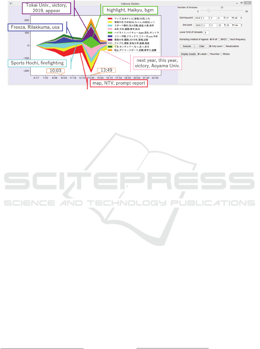
Figure 1: Visualization of tweets related to a Twitter trend “Hakone Ekiden” with legends extracted with tf-idf.
trend keyword. We present multiple methods for
extracting words, and the user can switch them if the
user wants. This system also supports the analysis of
tweets by changing conditions, the lowest number of
retweets, and the range and the number of division of
time scales, which allows the user to obtain different
interesting results. In addition, the system displays
individual tweets including photos and URLs by
multiple methods for ordering tweets. We also present
a function for zooming in an interested area based on
the values specified by the user.
Our experimental results showed that this system
made it easy to understand flows of topics in Twitter
trends in a short time. In a clustering result, tweets that
did not have the same words in their text but that
essentially had the same topic were classified in the
same cluster. We support the users in understanding
these clusters by a display of individual tweets because
it is sometimes difficult to understand these clusters
only from generated legends. We also visualize flows
of topics in further detail by narrowing the range of
time scales and zooming in an interested area.
2 RELATED WORK
2.1 Twitter’s Trend Function
There have been a few studies related to Twitter’s trend
function.
1
Gillespie evaluated the reliability of
Twitter’s algorithm for extracting trends (Gillespie,
2011). He mentioned that hashtags such as
“#occupywallstreet” and “#wikileaks” did not appear
as Twitter trends in spite of the fact that they seemed to
become popular in Twitter. Zubiaga et al. classified
1
We mean “trends” that are provided as part of Twitter’s
social networking service and are widely used by many
Twitter trends into four specific themes (i.e., news,
ongoing events, memes, and commemoratives) in real
time (Zubiaga, Spina, Matrinez, & Fresno, 2014).
Their classification was based on early tweets that were
potential for yielding Twitter trends, in order to classify
Twitter trends as early as possible. Unlike our work,
they did not perform the analysis of tweets inside
Twitter trends.
2.2 Time-series Visualization of Twitter
There has been much research on the time-series
visualization of Twitter. Senticompass (Wang,
Sallaberry, Klein, Takatsuka, & Roche, 2015)
visualized a classification result in one period of time
as a ring-shaped histogram that put it in chronological
order on a concentric circle. EvoRiver (Guodao, et al.,
2014) employed a river metaphor visualization and
represented a topic as a strip. It used multidimensional
information, and painted the positive/negative
competition and other types of opinion leaders in
different colors. OpinionFlow (Wu, Liu, Yan, Liu, &
Wu, 2014) visualized the diffusion of opinions among
many users in topics. It used two visualizing methods,
a stacked tree for showing the hierarchical structure of
topics and a combination of a Sankey diagram with a
density map to display the dynamics of opinion flows.
Xu et al. visualized relations between opinion leaders
and topics by using ThemeRiver (Xu, et al., 2013). It
displayed strengths of topics in gray scales and types
of opinion leaders in colors. These two studies
visualized topics across users.
Twitter users. In this paper, we do not consider trends in
a more general sense.
IVAPP 2020 - 11th International Conference on Information Visualization Theory and Applications
202

3 RETWEET CLUSTERING
We use Uchida et al.’s retweet clustering method
(Uchida, Toriumi, & Sakai, 2017) to classify tweets.
This method decides the degree of similarity between
a pair of tweets by the multiplicity of the users who
retweeted both tweets. This method assumes that the
tweets retweeted by the same users have a common
topic. Users retweet tweets when they want to discuss
or spread them; in other words, retweeted tweets reflect
the users’ interests and preferences.
The method consists of three steps. First, it
calculates the degree of similarity between a pair of
tweets by using the multiplicity of the users who
retweeted both tweets. For a tweet 𝑖 and a user 𝑗, define
𝑟
,
as follows:
𝑟
,
=
1 if user 𝑗 retweets tweet 𝑖
0otherwise
It defines a row vector 𝒕
that corresponds to tweet 𝑖 as
follows (𝑈 denotes the number of the users in the
dataset):
𝒕
= 𝑟
,
,𝑟
,
,… 𝑟
,
It calculates the degree of similarity between tweets 𝑖
and 𝑗 by using the following Simpson coefficient:
sim𝒕
𝒊
,𝒕
𝒋
=
𝒕
𝒊
⋅𝒕
𝒋
min(|𝒕
𝒊
|,|𝒕
𝒋
|)
Second, it calculates the similarities of all pairs of
tweets in the dataset. Then it links the 𝑁 most similar
pairs of tweets to construct a weighted undirected
graph.
Finally, it clusters the weighted undirected graph
by using the Louvain method (Blondel, Guilaume,
Lambiotte, & Lefebvre, 2008), which is the clustering
method based on modularity that represents degrees of
connectivity among a set of clusters. It calculates a
clustering in which weights between tweets in the same
cluster become large while weights between tweets in
different clusters become small.
4 PROPOSED METHOD
In this paper, we construct a system for analyzing
tweets related to Twitter trends by combining Uchida
et al.’s retweet clustering and Harve et al.’s
ThemeRiver. We obtain datasets by searching for
keywords of Twitter trends. Since a visualization result
itself does not describe the topics of a Twitter trend,
our system additionally generates legends and displays
individual tweets. Legends are generated by the
morphological analysis of the text of tweets in each
cluster. It displays individual tweets with photos and
URLs for each cluster.
4.1 Retweets Clustering
We generate multiple topics from a single Twitter trend
by using Uchida et al.’s retweet clustering method,
which we explained in Section 3. By applying this
method to a Twitter trend, we obtain a set of clusters,
each of which we regard as a distinct topic. We change
the second step of the retweet clustering method;
instead of processing all pairs of tweets in the dataset,
we process approximately 1500 tweets that have
retweets between the user-specified lower limit and the
relevant upper limit. This reduces the amount of
calculation, guarantees the repeatability of the
clustering result, and adapts the system to user
interaction.
4.2 Visualization using ThemeRiver
Our system visualizes a Twitter trend as shown in
Figure 1, on the left side of which it uses ThemeRiver
to visualize a clustering result. ThemeRiver is basically
a stacked graph that is symmetric along a horizontal
line, and visualizes a time series of multiple topics like
a river flow, assigning different colors to the topics. We
adopt the ThemeRiver visualization because it shows
flows and strengths of topics in a simple and clear
manner.
In our system, each flow in a specific color
corresponds to a single topic in a Twitter trend. It uses
the vertical and the horizontal axis for the numbers of
tweets and the time series respectively. The system
visualizes the ten highest clusters in the descending
order of tweets.
4.3 Generating Legends
As shown in Figure 1, our system provides the legends
of clusters on the right side of the ThemeRiver
visualization, using the same colors as those of the
flows in ThemeRiver. We generate the legend of each
cluster by using morphological analysis and
information retrieval techniques. Specifically, the
system adopts three methods to generate legends. One
is a word frequency method, and the other two are tf-
idf and BM25 (Robertson, Walker, Jones, Hancock-
Beaulieu, & Gatford, 1994). For these methods, we
generate a set of documents, each of which consists of
all text of tweets in a cluster except URLs and the
corresponding Twitter trend keyword. This increases
the number of words that are candidates of legends. We
Time-series Visualization of Twitter Trends
203
extract nouns, verbs, and adjectives as words from
documents. The word frequency method simply counts
the frequencies of words in each document, and
extracts the five most words as legends. Tf-idf is a
method for measuring how important a word is for a
document, and BM25 introduces the concept of
document lengths into tf-idf. The three methods for
generating legends can be switched from one to
another to obtain different results.
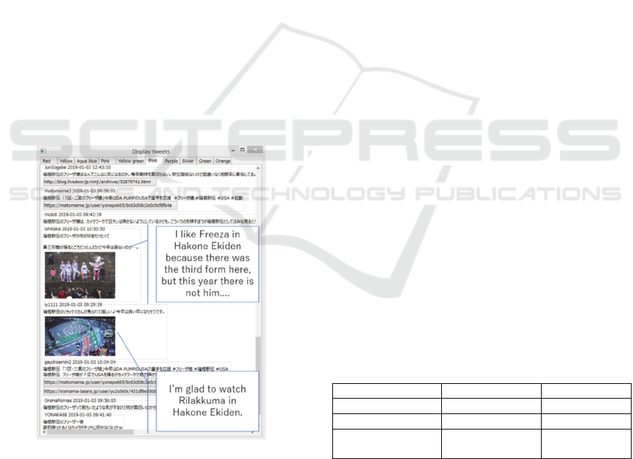
4.4 Displaying Individual Tweets
Our system displays individual tweets to allow its user
to actually read and see them. It is sometimes difficult
to understand topics from legends because tweets in a
cluster share few words or because they mainly contain
photos instead of words. The system lists tweets in
each cluster together and sorts them from the newest to
the oldest, in the descending order of favorites, or in
the descending order of attached photos. As shown in
Figure 2, the system displays tweets in the same cluster
in line as Twitter’s standard display method does. The
system also allows its user to switch among clusters by
selecting tabs. For each tweet, the system shows its
user name, post time, text, photos, and links to URLs.
The system first displays the ten highest tweets in the
sorted result.
Figure 2: Displaying individual tweets (related to the blue
cluster in Figure 1 and sorted in the order of favorites).
When the user scrolls down to the bottom of the
window, the system displays the next ten highest
tweets.
5 IMPLEMENTATION
Our system provides a GUI that allows changing the
starting and ending points of the time series, the
number of division of the time series, the lower limit of
the number of retweets, and the method for generating
legends. It also provides radio buttons (on the right side
of the “Execute” button) that allows selecting the way
to apply these changes. In the case of “Only zoom”, it
redraws the ThemeRiver visualization to reflect the
changes, while keeping the already calculated
clustering result. In the case of “Recalculation”, it
draws a new ThemeRiver visualization after
reconstructing the internal weighted undirected graph
by applying the changes and performing the clustering
again.
The system is based on the concept of Visual
Information Seeking Mantra (Shneiderman, 1996); it
first displays a general view, and then shows necessary
details according to user-specified conditions.
Specifically, when the “See tweets” button is pressed,
it displays individual tweets that are sorted from the
newest to the oldest, in the descending order of
favorites, or in the descending order of attached photos.
6 DATASETS
To experimentally evaluate our system, we collected
tweets related to two Twitter trends “Hakone Ekiden”
and “#NHKKohaku” (part of which were written in
Chinese characters but are alphabetically written in this
paper) by the Search API of Twitter. Details of the
collection of the tweets are shown in Table 1. In Table
1, only the tweets that have at least one retweet are
counted because our system uses only such tweets for
its analysis. One tweet has eight attributes, a tweet ID,
text, a post time, a user ID, a user name, the number of
photos, and URLs.
Table 1: Characteristics of the datasets.
Twitter tren
d
Hakone Ekdien #NHKKohaku
# tweets 34,894 47,187
# retweets 10,027,794 16,279,103
Data acquisition date
and time
1:14,
J
an. 4, 2019
16:37,
J
an. 3, 2019
The trend “Hakone Ekiden” is short for the 95th
Tokyo-Hakone collegiate Ekiden relay race, which
was held on January 2 and 3, 2019. This race is a
traditional sport event in Japan. Approximately 20
teams representing Japanese universities participated
in this race. The forward path is a distance of 107 km
from Tokyo to Hakone, where five runners in each
IVAPP 2020 - 11th International Conference on Information Visualization Theory and Applications
204
team ran on January 2. The backward path is a distance
of 109 km from Hakone to Tokyo, where five runners
in each team ran on January 3. The rank of this race is
determined by the total time for the forward and
backward paths.
The trend “#NHKKohaku” is a hashtag related to
“Kohaku Utagassen”, the annual contest between male
and female popular singers in Japan on New Year’s
Eve, sponsored and broadcasted by the NHK TV
broadcasting station. This program was broadcasted
from 19:15 to 23:45 on December 31, 2018, and
marked the viewing rate of 41.5%.
7 EXPERIMENTS
In our experiments, we applied our system to analyze
and visualize tweets in the datasets that we described
in the previous section. Figures 1 and 4 visualize the
trends “Hakone Ekiden” on January 3, 2019,
“#NHKKohaku” on December 31, 2018 respectively.
In Figure 1, the system analyzed 1580 tweets that
satisfied the conditions in Table 2. It generated ten
legends by using tf-idf, and their English translations
are shown in Table 3. In Figures 4(a) and 4(b), the
system analyzed 1733 and 2008 tweets respectively.
Table 2: Conditions of the analyzed tweets.
V
isualization
Min. #
retweets
Max. #
retweets
Period of time
series
F
igures 1 and 3 8 14
6:17–17:40,
Jan. 3, 2019
F
igure 4(a) 10 15
19:00–23:59,
Dec. 31, 2018
Figure 4(b) 30 57
19:00–23:59,
Dec. 31, 2018
7.1 Hakone Ekiden
Figure 1 shows the result of applying our system to
tweets related to the trend “Hakone Ekiden”. The relay
race started at 8:00, and runners ran Hakone to Tokyo
in five to six hours. It was broadcasted on TV. In the
visualization, the number of tweets increased rapidly at
13:49, around which runners reached the goal. In this
figure, different topics appear around the time when
runners reached the goal, and the topics corresponding
to each time period appear during the race.
Let us see further details about the topics during the
race. The cluster shown in red in Figures 1 and 3 was
related to a website for prompt reports of the race,
while the other topics during the race were not directly
related to the race itself. Therefore, we can consider
that Twitter users checked and disseminated the state
of the race by using this website.
The number of tweets increased at 10:03, which was
caused by the increased tweets shown in blue in Figure
1. Legends of this cluster include “Freeza” and
“Rilakkuma”, characters that were not related to the
race, and it is difficult to know the topic of the cluster.
Therefore, we display individual tweets of this cluster
with the GUI, as shown in Figure 2. Here we can see
photos of the characters “Freeza” and “Rilakkuma”
because some people watching the race on roadsides
were dressed in the costumes of “Freeza” (an enemy
character who appeared in a TV animation series) and
“Rilakkuma” (a teddy bear-like stuffed doll character).
It should be noted that, although these tweets had a few
common words in text, our system was able to classify
them as the same cluster; this was because there were
users interested in distinctive-looking people on
roadsides. This is a typical case that our system is able
to classify a topic that is difficult for text-based
methods to treat.
Next, let us see more details about topics
approximately between
13:00 and 14:00, i.e., for a
Table 3: Legends and the number of retweets of clusters in Figure 1.
Cluster # tweets Legends (tf-idf)
Red 205 map, NTV, prompt report, 95th, this
Yellow 192 Tokai Univ, Nogizaka 46, chan, 46th, go
Aqua-blue 178 Sports Hochi, firefighting, passing, fire, various place
Pink 116 next year, this year, victory,
Yellow-green 115 highlight, Haikyu, bgm, play music, soundtrack
Blue 96 Mr. Freeza, Rilakkuma, Freeza, usa, this year
Purple 91 Tokai Univ, victory, 2019, appear, record
Silver 67 Ameblo, update, Tokai Univ, image, backward
Green 66 do, century, become, run, be
Orange 55 stop, Daily Sports, earnest wish, Aoyama Univ, consecutive victory
Time-series Visualization of Twitter Trends
205
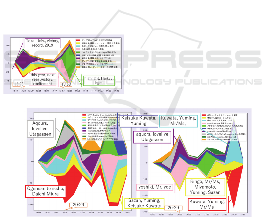
period when runners reached the goal. We zoom in and
change the number of division of this period. Figure 3
shows this result, where the color of each cluster is the
same as in Figure 1, but the legends are regenerated
from the document that is composed of the tweets
posted during this period. In Figure 1, the clusters that
correspond to purple, yellow-green, and pink increased
during this period. We can read the following from the
legends of these clusters: the purple cluster indicates
that Tokai University became a champion; the yellow-
green cluster indicates the highlight of the race; the
pink cluster includes words such as this year and the
next year. By zooming in this period as shown in
Figure 3, the shift of major topics becomes visible.
Tweets about the purple cluster increased rapidly in
13:23. Around this time, the first and the second team
reached the goal on the backward path. These tweets
increased around this time because the champion of the
whole race was determined. In individual tweets, the
pink cluster indicates impressions of the race and
expectations for the next year’s race. Tweets about this
cluster increased around 13:50, immediately after
13:48 when the lowest team reached the goal.
Figure 3: Zoom in the time series of Figure 1.
7.2 #NHKKohaku
We explain difference between clustering and
visualization results caused by changing the lowest
number of retweets. We use the trend “#NHKKohaku”
and show the results in Figures 4(a) and 4(b). Both
analyzed tweets between 19:00 and 23:59 on
December 31, 2018. We defined the lowest numbers of
retweets as 10 in Figure 4(a) and as 30 in Figure 4(b).
In Figure 4(a), the highest number of retweets is 15,
and there are 1733 analyzed tweets. In Figure 4(b), the
highest number of retweets is 57, and there are 2008
analyzed tweets. Although the general forms of Figures
4(a) and 4(b) are similar, they include different topics.
Around 20:29, the number of tweets increased
rapidly, and there are different topics as well as the
same topics. The gray cluster in Figure 4(a) and the
purple cluster in Figure 4(b) have the same words
“aqours” and “lovelive” in legends. These two clusters
have a common topic about a Japanese animation
series “Love Live”. Although the red cluster in Figure
4(a) and the pink cluster in Figure 4(b)
increased
rapidly
around
this
time,
they
have
different topics
and appear only in one of the two results. The reason
why this happened might be because of the different
strengths of these topics. The legends of the red cluster
include “Ogensan to issho”, which is the name of a
program broadcasted by NHK. The legends of the pink
cluster include “yoshiki” (YOSHIKI), who is a
member of a famous rock band X JAPAN. “Ogensan
to issho” is a famous program, but YOSHIKI has a
stronger topicality because he appeared together with
other famous singers.
(a) (b)
Figure 4: Difference between the visualization results of “#NHKKohaku” with the lowest numbers of retweets set to (a) 10 and
(b) 30.
IVAPP 2020 - 11th International Conference on Information Visualization Theory and Applications
206
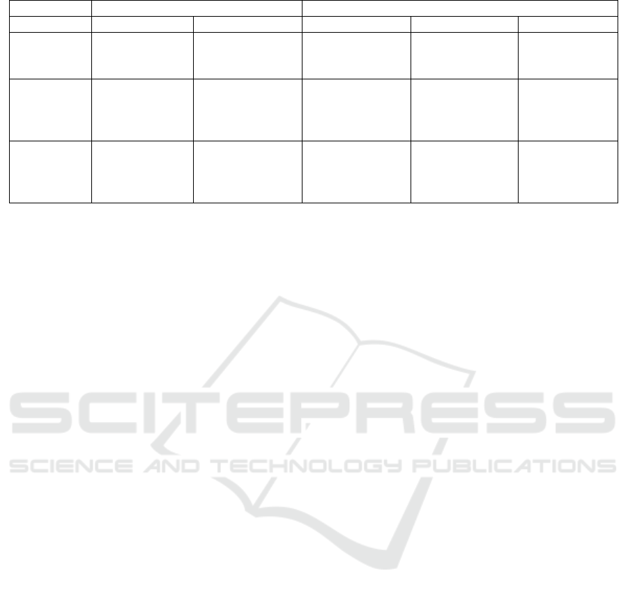
Table 4: Legends extracted by applying the three methods to certain clusters in Figure 4.
Visualization Fi
g
ure 4(a) Fi
g
ure 4(b)
Cluster Yellow Blue Red Yellow Aqua-blue
Word
frequency
Utagassen,
Yuming, Sazan
Keisuke Kuwata,
Yuming,
Monomane, JAPA
Mr/Ms, Yuming,
Kuwata, Together
Mr/Ms, Yuming,
Miyamoto, Ringo
Mr/Ms, Yuming,
Kuwata
Tf-idf
Sazan, Yuming,
Utagassen, Yumi
Matsutoya,
Keisuke Kuwata
Keisuke Kuwata,
Yuming,
Monomane, japa,
duet
Kuwata, Yuming,
Mr/Ms, Together,
Amazing
Ringo, Mr/Ms,
Miyamoto,
Yuming, Sazan
Kuwata,
Yuming, Mr/Ms,
duet,
collaboration
BM25
Suzu, co-star,
stable, proceed,
earnest
Monomane,
japanwww, japa,
Showa, line
un, specification,
live site, whole
song, Amazing
Ringo, recent
year, unnatural,
worldview,
Nagano
Was fun, raise
me up, last
performer, 7th
day
Therefore, the pink cluster appeared not in Figure 4(a)
but in Figure 4(b), which was clustered by using tweets
that have more retweets.
Next, we explain difference between methods for
generating legends. By using tf-idf, the system
generated the same legends for the yellow and blue
clusters in Figure 4(a) and for the red, yellow, and
aqua-blue clusters in Figure 4(b). They have “Yuming”
and “Kuwata”, “Keisuke Kuwata”, or “Sazan” in the
legends. “Yuming” is the stage name of a singer Yumi
Matsutoya. Keisuke Kuwata is a member of a rock
band Southern All Stars, also called Sazan for short.
They appeared as special guests on this program in
2018. Although these topics might look the same, there
are differences. Table 4 gives a list of the legends of
the five clusters in Figures 4(a) and 4(b) that were
generated by using the word frequency, tf-idf, and
BM25.
Although tf-idf generated only the legends related
to Yuming and Kuwata for the yellow cluster in Figure
4(a), BM25 generated “Suzu”, “stable”, and “progress”.
Most tweets related to the yellow cluster in Figure 4(a)
mentioned their impressions about the whole program
in 2018 or the presenters of this program. Suzu Hirose
is one of the presenters, and the presenters progressed
this program smoothly and stably. Therefore, legends
generated by using BM25 were better than legends of
tf-idf for this cluster.
Both the blue cluster in Figure 4(a) and the yellow
cluster in Figure 4(b) have two subtopics, one of which
is about Yuming and Kuwata. In the blue cluster, the
other subtopic is about Monomane JAPAN, a group of
five impersonators. In the yellow cluster, the other
subtopic is about a duet of Ringo Sheena and Hiroji
Miyamoto. In legends generated by using BM25,
Monomane JAPAN and Ringo Sheena appear, but
Yuming and Kuwata disappear. However, the actual
topic of the two clusters were related to both subtopics.
Therefore, legends generated by using tf-idf are better
than legends of BM25 for these clusters.
The red and aqua-blue clusters in Figure 4(b) are
similar. Tweets in these clusters mentioned how
exciting the duet of Yuming and Kuwata was. This
topic appeared as legends generated by using BM25.
They included “amazing”, “was fun”, and “rise me up”
as legends. Therefore, it is better to use legends
generated by using both tf-idf and BM25 to understand
these clusters.
8 DISCUSSION
The experiments showed that our system was able to
analyze and visualize flows of topics in tweets related
to Twitter trends. It classified tweets that had a smaller
degree of textual similarity in the same cluster like the
blue cluster in Figure 1 because it classified tweets
based on retweets. This made it possible to find the new
flows of topics by changing conditions like zooming in
Figure 3. When it was difficult to understand the topics
of clusters by using only the visualization, it was
possible to additionally use the display of individual
tweets.
On the other hand, the aqua-blue cluster in Figure
1 was a case that needed a longer time to understand its
topic by using our system. We find the fire and the
firefighting from legends of the aqua-blue cluster, and
about half of the tweets are related to the fire that
happened during the race. However, when our system
displays individual tweet, there are unrelated tweets at
the top such as a supporting message and an impression
about the race. To solve this problem, it needs to
increase kinds of methods for sorting tweets, such as
first displaying tweets that include words generated as
legends.
In Subsection 4.1, we explained that the number of
tweets to analyze is limited to about 1500 by the
Time-series Visualization of Twitter Trends
207

number of retweets to decrease the amount of the
calculation. The amount of the calculation in Section 4
is O(𝑛
) for 𝑛 tweets. Relations between numbers of
tweets and execution times in the environment of our
experiments (Intel Core i7-8565U with 16 GB of RAM
running Windows 10) are shown in Table 5. Our
method puts a higher priority on the execution time
than the accuracy of the calculation, because our
system assumes that a user repeats operation to change
conditions in order to find topics or periods of interest.
Table 5: Execution time under each number of tweets.
# tweets to analyze Execution time (sec)
1,034 9.71
2,120 41.00
3,026 91.03
4,057 157.82
5,123 334.29
We did not perform any formal, numeral
evaluation partly because it is difficult to compare our
method with existing methods. It might be possible to
replace ThemeRiver with another visualizing method
or to remove legends from our method and then to
compare how long users need to finish analysis.
However, in this case, we would also need to measure
how well they perform analysis, which would be more
difficult.
9 CONCLUSIONS AND FUTURE
WORK
This paper presented a system for analyzing tweets
related to Twitter trends by combining retweet
clustering and time-series visualization to allow users
to understand a topic flow of a Twitter trend in a short
time. It analyzes tweets that have little textual
information, visualizes a topic flow of tweets related to
a Twitter trend as a chart, and finds new flows of topics
by changing conditions with a GUI. It also supports
understanding topics of clusters by using legends and
displaying individual tweets.
This system assumes that its user finds interested flows
of topics by changing conditions. It is important to
reduce the execution time in order to operate smoothly
when the user modifies conditions. Therefore, it is
necessary to perform more efficient execution when
tweets to analyze increase. Also, it is necessary to
implement the function of recommending ideal
conditions because a user takes time and effort to find
topics of interest by modifying conditions manually.
Using the modularity of the clustering result might help
to solve this problem.
REFERENCES
Blondel, V. D., Guilaume, J.-L., Lambiotte, R., & Lefebvre,
E. (2008). Fast Unfolding of Communities in Large
Networks. Journal of Statistical Mechanics: Theory and
Experiment, 2008(10008), 1-12.
Gillespie, T. (2011). Can an Algorithm Be Wrong? Twitter
Trends, the Specter of Censorship, and Our Faith in the
Algorithms around Us. Retrieved from
https://socialmediacollective.org/2011/10/19/can-an-
algorithm-be-wrong/
Guodao, S., Wu, Y., Liu, S., Peng, T.-Q., Zhu, J. J., & Liang,
R. (2014). EvoRiver: Visual Analysis of Topic
Coopetition on Social Media. IEEE Trans. Visual.
Comput. Gr, 20(12), 1753-1762.
Harve, S., Hetzler, E., Whitney, P., & Nowell, L. (2002).
ThemeRiver: Visualizing Thematic Changes in Large
Document Collections. IEEE Trans. Visual. Comput.
Gr., 8(1), 9-20.
Robertson, S. E., Walker, S., Jones, S., Hancock-Beaulieu,
M. M., & Gatford, M. (1994). Okapi at TREC-3. The
Third Text Retrieval Conference.
Shneiderman, B. (1996). The Eyes Have It: A Task by Data
Type Taxonomy for Information Visualization. Proc.
IEEE Symposium VL, 336-343.
Twitter, inc. (2017). Twitter trends FAQs. Retrieved from
https://help.twitter.com/en/using-twitter/twitter-
trending-faqs
Uchida, K., Toriumi, F., & Sakai, T. (2017). Evaluation of
Retweet Clustering Method Classification Method Using
Retweets on Twitter without Text Data. Proc. WI, 187-
194.
Wang, F. Y., Sallaberry, A., Klein, K., Takatsuka, M., &
Roche, M. (2015). SentiCompass: Interactive
Visualization for Exploring and Comparing the
Sentiments of Time-Varying Twitter Data. Proc. IEEE
PacificVis, 129-133.
Wu, Y., Liu, S., Yan, K., Liu, M., & Wu, F. (2014).
OpinionFlow: Visual Analysis of Opinion Diffusion on
Social Media. IEEE Trans. Visual. Comput. Gr, 20(12),
1763-1772.
Xu, P., Wu, T., Wei, E., Peng, T.-Q., Liu, S., Zhu, J. J., & Qu,
H. (2013). Visual Analysis of Topic Competition on
Social Media. IEEE Trans. Visual. Comput. Gr, 19(12),
2012-2021.
Zubiaga, A., Spina, D., Matrinez, R., & Fresno, V. (2014).
Real-time Classification of Twitter Trends. Journal of the
Association for Information Science and Technology,
66(3), 462-473.
IVAPP 2020 - 11th International Conference on Information Visualization Theory and Applications
208
