
Interactive 3D Visualization of Network Traffic in Time for Forensic
Analysis
Daniel Clark
a
and Benjamin Turnbull
b
School of Engineering and Information Technology, University of New South Wales, Canberra, Australia
Keywords: Cybersecurity, Visualization, Network Forensics.
Abstract: This paper outlines a novel approach to 3D visualization of network traffic. Existing approaches, which
present node-graphs in 3D space may not be making the best use of the advantages of 3D. By combining the
time component of network traffic data with nodal information and displaying these on separate planes it
should be possible to provide analysts with insights that go beyond just the nodal information. The goal of
allowing analysts to quickly form a mental map that corresponds with the network traffic ground truth may
be achieved with this approach. The visualization approach is demonstrated through development of a tool
which implements the approach and discusses its application to a recent network forensics challenge.
a
https://orcid.org/0000-0002-6456-3596
b
https://orcid.org/0000-0003-0440-5032
1 INTRODUCTION
Increases in network traffic and cyber-security threats
are outpacing the ability for analysts to defend against
them. The cyber security industry needs ways of
ingesting data faster and converting this data into
information in the collective minds of analysts,
thereby creating knowledge (Rowley, 2007) which
contributes to better decision making and responses.
Three-Dimensional (3D) visualization has been
used for data analysis in computer security and other
fields since as early as 1997 (Risch et al., 1997).
Computer generation of 3D-looking images goes
back to computer games of the 1980’s, such as
Battlezone (Rotberg, 1980), and since then the
gaming industry has driven significant advances in
the realism and immersive quality of 3D gaming. The
application of this technology to data analysis in the
cyber security domain is ongoing, but is yet to see
significant traction (Goodall, 2009, Staheli et al.,
2014).
Advances in the use of interactive 3D models in
the field of medicine (Tanagho et al., 2012,
Czauderna et al., 2018), archaeology (Sommer et al.,
2017) and chemistry (Müller et al., 2018) suggest that
there is utility in this type of display over traditional
tabular or 2D graphical representations. While there
have been attempts to display computer network
traffic in a 3D setting, either as an immersive
abstraction (Bass et al., 2017), or as a 3D
representation on a 2D screen, the efforts have not
being widely adopted by industry, which suggests
they have not demonstrated significant advantages
over existing 2D approaches.
This research proposes an approach to display of
raw network traffic data that seeks to improve
conversion of data into knowledge about a network.
In 2002 Dwyer and Eades proposed an approach
(Dwyer and Eades, 2002) presenting time in the third
dimension and applied it to movement of fund
managers within the stock market. This work
extended work by Koike in 1993 applying the concept
of a third data axis to power control and robotic
systems (Koike, 1993).
The approach to visualization of network traffic
proposed here is unique in the use of time-based
information as a display axis combined with a
computer network topology in a single, interactive
model of the network traffic data. The novelty of this
work comes from this alternate perspective; instead of
forcing an analyst to concentrate over time to interpret
replayed instances of communication between
systems, the information is presented statically.
This paper is structured as follows. Related work
in 3D representation of computer security information
is presented in Section 2. Section 3 describes the
Clark, D. and Turnbull, B.
Interactive 3D Visualization of Network Traffic in Time for Forensic Analysis.
DOI: 10.5220/0008950601770184
In Proceedings of the 15th International Joint Conference on Computer Vision, Imaging and Computer Graphics Theory and Applications (VISIGRAPP 2020) - Volume 3: IVAPP, pages
177-184
ISBN: 978-989-758-402-2; ISSN: 2184-4321
Copyright
c
2022 by SCITEPRESS – Science and Technology Publications, Lda. All rights reserved
177

proposed visualization approach and its
implementation. Section 4 outlines the application of
the approach to a network forensics challenge and
Section 5 discusses results and Section 5 outlines
future work.
2 RELATED WORK
A visual display showing network traffic at the instant
it is occurring would require constant attention from
an analyst and be of little use from a security or post-
event analysis point of view. For this reason, most
efforts in visualization have relied on some
mechanism to capture behavior over time and present
it in a single display or set of displays (Cappers et al.,
2018, Arendt et al., 2016, Leichtnam et al., 2017).
Plotting data against a time axis is an established
approach to data visualization (Aigner et al., 2011).
Fingerprinting of malicious behavior through simple
2D graphs was presented to VizSEC in 2004 (Conti
and Abdullah, 2004) and again in 2005 (Krasser et al.,
2005). This research was based on the idea that
specific types of malicious behavior could be
identified visually, provided the right data processing
could be conducted to produce useful visual
representations. Several implementations, such as
CLIQUE, Traffic Circle and VACS(Best et al., 2010,
Fischer and Keim, 2013), expanded on this concept.
Bass et al (Bass et al., 2017) used the approach of
converting network information into 3D spaces
showing nodal connections to achieve this effect. A
similar approach based on event information was
implemented in STARLORD (Leichtnam et al.,
2017). The concept of presenting network data in 3D
is not new, with the “Spinning Cube of Potential
Doom” being one of the first attempts to do this,
described by Stephen Lau in 2004 (Lau, 2004).
There exist real-time tools that provide
visualization of attacks, but they are mostly based on
sensors flagging known malicious traffic and plotting
it globally (Baykara et al., 2018). Although these
tools are visually interesting, they are not well suited
to identifying anomalous traffic from within a
complex network. The human capacity to remain
alert, combined with the speed and complexity of
network data exchange and the added difficulty
differentiating malicious from benign traffic combine
to make this a challenging task (Bliss et al., 1995,
Stubler and O'Hara, 1996). Human-System Interfaces
(Stubler and O'Hara, 1996) research in the control
domain has highlighted that the disparity between the
mental model of a system held by an analyst
compared to the ground truth can be a cause for error.
This principle also applies to visual abstractions of
network traffic. The effectiveness of 3D abstractions
in assisting with fast development of accurate mental
models was a key component of Koike’s work in
1993(Koike, 1993).
Based on examination of published work to date,
there are no other projects using the combination of
force directed nodegraphs (Harary et al., 1965) with
time-series information in a single 3D visualization
for the purpose of allowing cyber security analysts to
quickly develop knowledge of a network.
3 VISUALIZATION APPROACH
AND IMPLEMENTATION
Given the assumption that real-time visual detection
by human analysts is not practical, the design goal
selected for this research was to present a segment of
historical traffic data to an analyst in a way that
allows insights which might not be possible when
looking at the data in other formats, such as tabular
packet analysis tools like Wireshark (Combs, 1998).
The approach also avoids signature-based Intrusion
Detection Systems (IDS), as this field is already quite
mature (Wanda and Jin Jie, 2018). The goal of the
visualization approach is to provide a security analyst
with a means to do in-depth analysis of a segment of
network traffic, likely prompted by alerts from an
IDS.
Early iterations of the Scanmap3D (Clark, 2013)
software, first released in 2003, utilized a grid layout
to show connections between hosts based on port
number. Packets were shown through animation with
an adjustable replay speed. One key drawback of this
approach was that the analyst had to watch the
activity progress, rather than view the overall scenario
using a single static display. It was difficult to make
correlations between packets across time using a
replay-based approach.
The second key drawback was that the
visualization was still essentially a 2D display with
minor excursion into the 3rd dimension to show
different ports associated with each host (an approach
often referred to as 2.5D (Cockburn and McKenzie,
2002). This resulted in significant problems with
occlusion and edge crossing (Jianu et al., 2009),
making it difficult to interpret the display when
density of nodes exceeds the resolution and size of the
display. These problems can limit the utility of 3D
visualization. Lessons from the initial design were
used in the development of the new iteration of the
software.
IVAPP 2020 - 11th International Conference on Information Visualization Theory and Applications
178
3.1 Visualization Approach
Based on the challenges outlined above a new
approach to the visualization of packet information
was developed. The underlying approach to this has
been twofold; to highlight time, and to create an
effective immersive network visualization. The
former of these concerns the approach to position,
colour and size of glyphs, and the latter overcomes
some of the known limitations with 2.5D approaches
through providing multiple layout styles and easy
manipulation of orientation of the viewer and the
dataset.
The approach is based on network node data
displayed in a 2D plane using cylindrical host
symbols combined with a representation of time-
series packet information in the third dimension.
Layout of host nodes in the 2D plan can be cycled
through circular, spiral-grid or a force directed graph
layout, based on the GraphStream
(GraphStreamDevelopers, 2018) library.
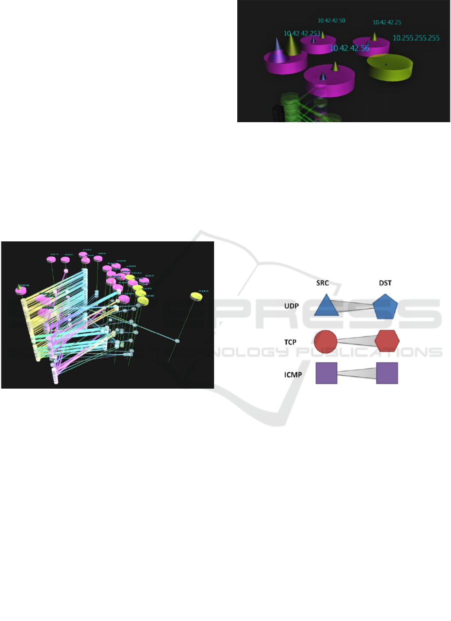
Figure 1: Scanmap3D v4.1.
Figure 1 shows the graph view with hosts
represented by cylindrical icons (including two cones
showing the relative number of packets and size of
data as the height and base for traffic as source and
destination (Detail in Figure 2). Host objects are
colored based on their role in the traffic capture as
source, destination or both.
The vertical axis is used to show the time
sequence of individual packets. Raw PCAP (Saavedra
and Yu, 2017) files from the IDS dataset published by
the University of New Brunswick (Shiravi et al.,
2012) and the Network Forensics Puzzle Contest
(Davidoff, 2019) were used to initially test the tool.
While the visualization could have focused on a
dataset of flow data or individual alert information,
raw packets were chosen as a good foundation data
set with clear node-to-node attributes. Future
iterations could be expanded to use any nodal data.
Figure 2: Host Symbols.
Individual packets appear on the vertical axis as a
quad mesh between host locations in the horizontal
plane (representing a point in time or single entry in
the packet capture) with specific shapes (glyphs) at
the source and destination depending on the IP
Protocol (Postel, 1990) in use. UDP packets are
shows as a triangular prism for the source and
pentagonal prism for the destination, while TCP
packets have a cylinder for the source and a
hexagonal prism for the destination. ICMP packets
are square prisms. Glyphs are showing in Figure 3.
Figure 3: Traffic Glyphs.
The analyst can cycle the vertical arrangement of
packets as either a sequential distribution over the
whole timeframe of the packet capture (which is
scalable), a cyclic/round robin of the packets over a
specific time frame (hourly or daily) or a stack of all
packets in the order they appear in the capture.
It is expected that a degree of pre-processing
would occur on raw packet captures prior to viewing
them with this tool, however, a limited filtering
capability has been included which allows the analyst
to select several host objects and then filter the
display to only show traffic and hosts connected to
the selected objects.
3.2 Implementation Technical Detail
The example implementation of the visualization
approach was developed using the jMonkeyEngine
Interactive 3D Visualization of Network Traffic in Time for Forensic Analysis
179
(jMonkeyDevelopers, 2017) including community
supported libraries for PCAP processing (jNetPcap)
and nodegraph layout (GraphStreamDevelopers,
2018). Full source code for the project is provided at
SourceForge.
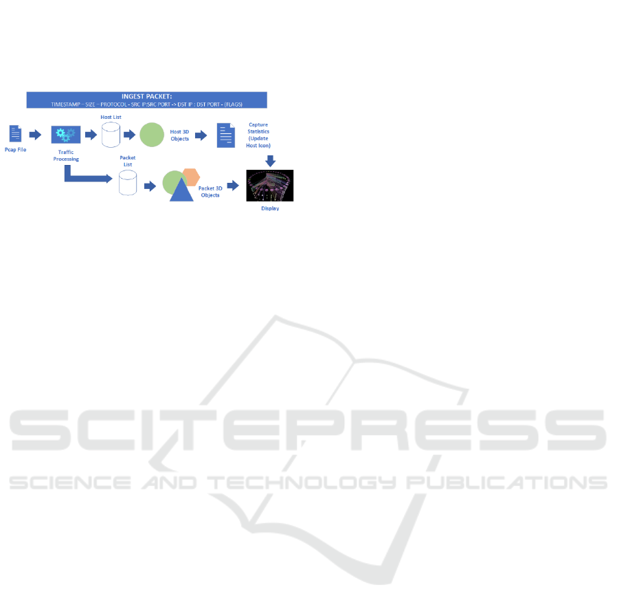
Figure 4: Packet Processing Model.
The packet processing model for the example
implementation is shown in Figure 4. The raw PCAP
file is iterated through based on either the full file or a
user selected number of packets. The current
implementation is limited to processing ICMP, UDP
and TCP packets. As each packet is processed, a list
of hosts and packets is developed, along with a 3D
shape relating to each object. Per-host statistics across
the whole capture are built-up during the processing
phase and used to adjust the appearance of each host
icon and form the edge weighting for the nodegraph.
Once the initial 3D mesh has been constructed,
the operator can pan, zoom, rotate and translate the
resulting model. Filtering has been implemented to
allow a set of hosts to be selected and only the related
traffic and hosts displayed.
The detail for each packet is available as a text
overlay when the mouse is hovered over the line
representing a packet. This approach follows
Schneiderman’s Overview, Zoom, Filter, Details-on-
Demand task model (Shneiderman, 2003). It is
expected that an analyst would initially adjust the
layout and spacing of the visualization to show an
overview then zoom to an area of interest, filter
irrelevant traffic and then look at packet detail.
Display of the packet detail in the default view would
make the scene cluttered and decrease legibility.
Providing additional information when hovering
allows the analyst to stay within the visualization
while accessing additional information about a
component of the visualization.
Two mechanism are utilized to visually queue the
analyst to the direction of traffic flow, the quad mesh
between the send and receive port prisms is tapered
from the send to the receive glyphs and a common
glyph is used for the send port in TCP/UDP. A
gradual color change from source port to destination
port is applied. As it is not possible to display 64435
unique colors, colors that are as far apart as possible
are generated using the Golden Ratio (Livio, 2008) in
the Hue color space method described by Martin
Ankerl (Ankerl, 2019).
4 APPLICATION TO NETWORK
FORENSICS
In order to conduct preliminary assessment of the
approach, prior to engaging the network forensics
community in a more structured assessment, the tool
was trialed on a published network forensics problem
from 2010. Noting the age of this data, the same
approach was also taken with an example challenge
from 2018 to confirm that the dataset was still
relevant (outside the scope of this paper).
The dataset from the 2010 network forensics
challenge was selected because the task aligns with
the expected utility of the visualization tool. For the
selected challenge, the raw packets, questions, ideal
solution and a range of participant approaches are all
published.
4.1 Network Forensics Puzzle
LMG Security conduct a regular Network Forensics
Puzzle Contest (Davidoff, 2010) which includes
PCAP files and published user solutions. The 2010
challenge included a 1MB evidence file with the
associated task of identifying a network
reconnaissance actor on the network. This challenge
was used to test the tool, as it had the following
characteristics:
• A filtered set of data suited for an analyst to work
with
• Several questions commensurate with questions
that would be posed to a network security
professional or analyst
• A suitable ground-truth and responses against
which the visual approach could be validated.
Within the challenge the summarized questions
posed relating to the packet capture were:
1. What was the IP address of Mr. X’s scanner?
2. For the FIRST port scan that Mr. X conducted,
what type of port scan was it?
3. What were the IP addresses of the targets Mr. X
discovered?
4. What was the MAC address of the Apple system he
found?
5. What was the IP address of the Windows system he
found?
IVAPP 2020 - 11th International Conference on Information Visualization Theory and Applications
180
6. What TCP ports were open on the Windows
system?
The questions in the challenge represent a
reasonable set of generalized information goals that a
network forensics analyst may have when provided
with a packet capture. The existence of several
worked solutions to the puzzle allowed for easy
comparison with the information that can be gathered
from the visualization. The packet capture was first
analyzed with the visualization tool then several
published example answers were compared with the
results from the visual approach.
It is acknowledged that the data in this puzzle is
old, the capture size is trivial by current standards and
that a port scan is a very simple attack type, however,
the purpose of the testing was to make an initial
observation of the use of a time-based 3D view in a
known problem space. Issues of scalability for large
packet captures and observation of more complex
attack types is planned for future research. The
verification that the data set is still relevant to current
tasks was confirmed using a 2018 network forensics
challenge.
4.2 Visualization Applied to the Puzzle
The Scanmap3D application ingested the 13,625
packets in the capture and produced the initial view
shown in Figure 5. Fourteen packets were not
processed, possibly due to failed checksums or a
protocol other than TCP/ICMP/UDP.
Figure 5: View of hosts.
The initial view of the hosts layer shows several
machines on the 10.42.42.0/24 network. From the
size of the source/destination cones on the
10.42.42.253 host we can see that this is the most
active node on the network.
By looking more closely at the traffic symbols we
see that most of the initial traffic consists of TCP
[SYN] packets from .253 being sent to three other
nodes, .50, .56 and .25. These are mostly responded to
with TCP [RST, ACK], indicating no listening
service on the requested ports. Hovering over each
connection request and responding rejection, it can be
seen that common service ports are being targeted
(22:SSH, 139:Netbios and 80:HTTP).
With this information visible within minutes of
generating the visualization it is possible to answer
questions 1, 2 and 3 from the forensics challenge.
1. What was the IP address of Mr. X’s scanner?
Answer: 10.42.42.253
2. For the FIRST port scan that Mr. X conducted,
what type of port scan was it?
Answer: SYN Portscan (TCP Connect)
3. What were the IP addresses of the targets Mr. X
discovered?
Answer: 10.42.42.50, 56 and 25.
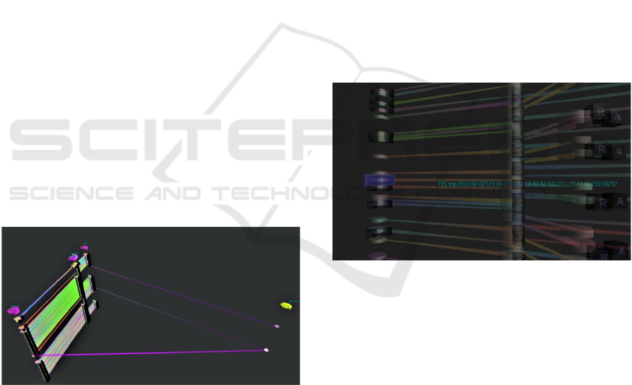
A feature added to the application during the
testing was the highlighting of [SYN, ACK] packets,
indicating a connection response from an active host
(or possibly a scan using the [SYN, ACK] flags),
shown in Figure 6.
Figure 6: Connect Highlight.
By scrolling down the stack of traffic, like floors
in a high-rise building, it was possible to quickly by-
pass traffic from failed scan packets and identify
where a listening service had replied to the probes.
Host .50 replies on port 139, showing a NetBIOS
service listening on this host, and most likely an
indicator of a Windows machine. This information
answers questions 5 and 6, or at least provides a
trigger to look more closely at this traffic exchange
within Wireshark.
Further into the scan an additional successful
connection is made to .50 on port 135, mostly likely a
Remote Procedure Call service on the suspected
Windows machine.
5. What was the IP address of the Windows system he
found?
Interactive 3D Visualization of Network Traffic in Time for Forensic Analysis
181

Answer: 10.42.42.50
6. What TCP ports were open on the Windows system?
Answer: Ports 139 and 135
Scans to host .25 stand out because of the absence
of a [RST, ACK] response, indicating some filtering
of ports on the host.
Towards the very end of the capture, the
suspected scanner pings each of the hosts and
receives a response. There is then two-way UDP
traffic from each of the hosts on non-service ports
(>1024).
Finally, there is a series of packets sent from .253
to .56 with a range of flags set to port 1. This possibly
suggests an attempt at OS fingerprinting.
Question 4. related to identifying an Apple system
based on the MAC Address of the host. As the
visualization tool does not currently ingest MAC data,
it was not possible to answer this question. With a
reference list of network device manufacturers, it
would be possible to indicate on the host symbol
which manufacturer is indicated by the MAC
Address.
4.3 Comparison to Other Answers
LMG has published the worked solutions of the
winner and the four finalists for the Mr X challenge.
Without replicating the full content of the
submissions, some general comments about the
approaches will be made. One of the finalists was not
included as the response provided only answers and
no description of the analysis process. Full text of the
submissions and access to generated tools are
available at the LMG site (Davidoff, 2019).
4.3.1 Winning Response –
Argus/Pyscanxtract
The winning response, by Sebastien Damaye
(Damaye, 2010), began with a sequence of script-
based statistical analysis of the packet capture,
showing the breakdown of protocols and the unique
hosts that appear in the PCAP. Damaye relied mostly
on Argus (QoSient, 2015) for this phase of analysis.
Once the raw PCAP is analyzed by Argus, there are
several steps used to show different statistical
information about the capture, including a list of all
hosts seen, and then hosts sorted by the number of
packets associated with each host pair. The address of
the scanner is assumed based on the most active host
within the capture.
Damaye uses the pyScanXtract tool written for the
challenge (available at the submission reference). The
tool generates statistical graphs and reports based on
detected scan types.
A question answered by Damaye, which was not
answerable using the current iteration of the
Scanmap3D tool was Question 4, regarding the MAC
address of the Apple system. Network device vendors
can be identified by the first 3 octets of the MAC
Address. Of course, MAC addresses can be modified
in software, and it would be necessary to validate the
assumption using OS matching at the
Network/Transport layers.
4.3.2 Adam Bray – SQL Approach
One of the top four responses was from Adam Bray
(Bray, 2010). All the analysis was conducted by
loading the packet capture into an SQL database.
Analysis was conducted by direct SQL queries using
grouping, sorting and filtering of the primary data to
answer the puzzle questions. In cases where packet
content needed to be inspected, the SQL query results
were used as a cue to go back to the original PCAP
file and extract a specific subset of packets. This
method relied on a significant amount of experience
and prior knowledge of how to structure SQL queries
to get the desired results.
4.3.3 Eric Kollman – Bespoke Tool
Like Damaye, Kollman (Kollmann, 2010) wrote a
bespoke scan analysis tool specifically for the
challenge. The tool conducts statistical analysis of the
PCAP file based on known characteristics of network
scans.
4.3.4 Eugenio Delfa – Bespoke Tool
Delfa (Delfa, 2010) also write a bespoke Python
script to collate statistical data from the PCAP file.
Existing tools were then used to fingerprint the
operating system (p0f) and an IDS rule to characterize
the specific scans (Snort).
There are several key common features that the top
responses had:
• Multiple returns to the dataset to extract new
pieces of information.
• Iterative branching approach to discovery of the
desired information.
• Use of several specialist tools, or single tools with
specialist sub-functions used in isolation.
This approach, while reaching the desired answer,
has potential to be greatly improved using automated,
visual based, statistics generation.
IVAPP 2020 - 11th International Conference on Information Visualization Theory and Applications
182

5 RESULTS AND DISCUSSION
The application of the Scanmap3D tool to a published
network forensics problem demonstrated that the
approach is effective in this specific instance.
Information which was gathered through several
iterations in the top published responses was
immediately available visually in the 3D tool.
The use of multiple bespoke tools for analysis of
PCAP data by the puzzle respondents could be easily
incorporated into the visualization, for example, the
output of OS fingerprinting could be visually shown
with a symbol on each host.
None of the respondents generated a topology of
the network represented by the PCAP. The value of
such a map to the process of network forensics would
need to be tested. The ability to see the scans and
responses as a sequential time-series allowed for a
faster assimilation of the sequence of events.
Only in the winning response, from Sebastien
Damaye, was a 2D graph used to show the time series
visually. The limitation of a 2D graph in only
showing the activity from a whole of network
perspective, rather than a host to host perspective was
clearly a contrast to the ability of Scanmap3D to show
both the topology and time series.
6 CONCLUSION AND FUTURE
WORK
While the broader commercial cyber security
community is yet to embrace 3D display as a key
component of cyber security operations, there are
researchers continuing to demonstrate the ways that
these tools can be effective additions to the set of
tools used in post-event network forensics and in
network intrusion detection.
The ability to turn raw traffic capture files into
rich visualizations using inexpensive hardware should
be an area attracting investment both in terms of
academic research and commercial development.
These visualizations have the capability to rapidly
move from raw data to shared knowledge amongst
analysts, provided effective mechanism for conveying the
data can be found.
This paper outlined the development of a 3D
visualization approach focused on the unique idea of
combining network topology in one plane, with the time
series network traffic in a third axis.
The approach was applied to a published network
forensics challenge and the results compared to the top
responses to the challenge using more traditional statistical
and 2D graphical analysis approaches. More structured
testing with a diverse range of network forensics specialists
on recent network forensics challenges needs to be
undertaken.
REFERENCES
Aigner, W., Miksch, S., Schumann, H. & Tominski, C.
2011. Visualization of time-oriented data, Springer
Science & Business Media.
Ankerl, M. 2019. How to Generate Random Colors
Programmatically. Martin Ankerl [Online]. Available
from: https://martin.ankerl.com/2009/12/09/how-to-
create-random-colors-programmatically/ 2019].
Arendt, D., Best, D., Burtner, R. & Paul, C. L. CyberPetri at
CDX 2016: Real-time network situation awareness.
2016 IEEE Symposium on Visualization for Cyber
Security (VizSec), 2016. IEEE, 1-4.
Bass, T., Zuech, R. & Gutzwiller, R. 2017. Virtualized
Cyberspace - Visualizing Patterns & Anomalies for
Cognitive Cyber Situational Awareness.
Baykara, M., Gurturk, U. & Das, R. 2018. An overview of
monitoring tools for real-time cyber-attacks. 6th
International Symposium on Digital Forensic and
Security (ISDFS). Antalya, Turkey: IEEE.
Best, D. M., Bohn, S., Love, D., Wynne, A. & Pike, W. A.
2010. Real-time visualization of network behaviors for
situational awareness. Proceedings of the Seventh
International Symposium on Visualization for Cyber
Security. Ottawa, Ontario, Canada: ACM.
Bliss, J. P., Gilson, R. D. & Deaton, J. E. 1995. Human
probability matching behaviour in response to alarms of
varying reliability. Ergonomics, 38, 2300-2312.
Bray, A. 2010. Forensic Puzzle Contest #4 - Submission.
Cappers, B., Van Wijk, J., Etalle, S. & Meessen, P.
Eventpad: Rapid Malware Analysis and Reverse
Engineering using Visual Analytics. IEEE Symposium
on Visualization for Cyber Security, 2018.
Clark, D. 2013. Scanmap3D [Online]. Available:
http://sourceforge.net/projects/scanmap3d/ [Accessed
30 July 2019 2019].
Cockburn, A. & Mckenzie, B. 2002. Evaluating the
effectiveness of spatial memory in 2D and 3D physical
and virtual environments. Proceedings of the SIGCHI
Conference on Human Factors in Computing Systems.
Minneapolis, Minnesota, USA: ACM.
Combs, G. 1998. Wireshark Website [Online]. Available:
https://www.wireshark.org/ [Accessed 2 Apr 2018
2018].
Conti, G. & Abdullah, K. 2004. Passive visual
fingerprinting of network attack tools. Proceedings of
the 2004 ACM workshop on Visualization and data
mining for computer security. Washington DC, USA:
ACM.
Czauderna, T., Haga, J., Kim, J., Klapperstück, M., Klein,
K., Kuhlen, T., Oeltze-Jafra, S., Sommer, B. &
Schreiber, F. 2018. Immersive Analytics Applications
in Life and Health Sciences. In: MARRIOTT, K.,
Schreiber, F., Dwyer, T., Klein, K., Riche, N. H., Itoh,
Interactive 3D Visualization of Network Traffic in Time for Forensic Analysis
183

T., Stuerzlinger, W. & Thomas, B. H. (eds.) Immersive
Analytics. Cham: Springer International Publishing.
Damaye, S. 2010. Forensic Puzzle Contest #4 - Submission.
Davidoff, S. H., Jonathan; Rice, Randi; Fretheim, Scott;
Harrison, David. 2010. Network Forensics Puzzle
Contest: The Curious Mr X [Online]. LMG Security.
Available: http://forensicscontest.com [Accessed 8 May
2019 2019].
Davidoff, S. H., Jonathan; Rice, Randi; Fretheim, Scott;
Harrison, David. 2019. Network Forensics Puzzle
Contest [Online]. LMG Security. Available:
http://forensicscontest.com [Accessed 8 May 2019
2019].
Delfa, E. 2010. Forensic Puzzle Contest #4 - Submission.
Dfrws. 2019. DFRWS Forensic Challenge [Online]. Digital
Forensics Research WorkShop. Available:
https://www.dfrws.org/dfrws-forensic-challenge
[Accessed 2019].
Dwyer, T. & EADES, P. Visualising a fund manager flow
graph with columns and worms. Proceedings Sixth
International Conference on Information Visualisation,
10-12 July 2002 2002. 147-152.
Fischer, F. & Keim, D. Vacs: Visual analytics suite for
cyber security-visual exploration of cyber security
datasets. IEEE VIS, 2013.
Goodall, J. R. Visualization is better! A comparative
evaluation. Visualization for Cyber Security, 2009.
VizSec 2009. 6th International Workshop on, 11-11 Oct.
2009 2009. 57-68.
Graphstreamdevelopers 2018. GraphStream. GraphStream
Devlopers.
Harary, F., Norman, R. Z. & Cartwright, D. 1965.
Structural models: an introduction to the theory of
directed graphs, Wiley.
Jianu, R., Rusu, A., Fabian, A. & Laidlaw, D. 2009. A
Coloring Solution to the Edge Crossing Problem. 13th
International Conference Information Visualisation.
Barcelona, Spain: IEEE.
Jmonkeydevelopers 2017. jMonkeyEngine. jMonkeyEngine
Developers.
Koike, H. 1993. The role of another spatial dimension in
software visualization. ACM Trans. Inf. Syst., 11, 266-
286.
Kollmann, E. 2010. Forensic Puzzle Contest #4 -
Submission.
Krasser, S., CONTI, G., GRIZZARD, J., GRIBSCHAW, J.
& OWEN, H. 2005. Real-Time and Forensic Network
Data Analysis Using Animated and Coordinated
Visualization. 2005 IEEE Workshop on Information
Assurance and Security. United States Military
Academy, West Point, NY.
Lau, S. 2004. The Spinning Cube of Potential Doom.
Commun. ACM, 47, 25-26.
Leichtnam, L., Totel, E., Prigent, N. & MÉ, L. Starlord:
Linked security data exploration in a 3D graph. 2017
IEEE Symposium on Visualization for Cyber Security
(VizSec), 2017. IEEE, 1-4.
Livio, M. 2008. The Golden Ratio: The Story of PHI, the
World's Most Astonishing Number, Crown/Archetype.
Müller, C., Krone, M., Huber, M., Biener, V., Herr, D.,
Koch, S., Reina, G., Weiskopf, D. & ERTL, T. 2018.
Interactive Molecular Graphics for Augmented Reality
Using HoloLens. Journal of Integrative Bioinformatics.
Postel, J. 1990. RFC 791: Internet Protocol, September
1981. Darpa Internet Protocol Specification.
Qosient 2015. Argus. QoSient.
Risch, J. S., Rex, D. B., Dowson, S. T., Walters, T. B., May,
R. A. & MOON, B. D. 1997. The Starlight information
visualization system. Information Visualization, IEEE.
London.
Rotberg, E. 1980. Battlezone. Atari.
Rowley, J. 2007. The wisdom hierarchy: representations of
the DIKW hierarchy. Journal of Information Science,
33, 163-180.
Saavedra, M. & YU, W. 2017. A Comparison between Text,
Parquet, and PCAP Formats for Use in Distributed
Network Flow Analysis on Hadoop. Journal of
Advances in Computer Networks, 5, 59-64.
Shiravi, A., Shiravi, H., Tavallaee, M. & Ghorbani, A. A.
2012. Toward developing a systematic approach to
generate benchmark datasets for intrusion detection.
Computers & Security, 31, 357-374.
Shneiderman, B. 2003. The eyes have it: A task by data type
taxonomy for information visualizations. The craft of
information visualization. Elsevier.
Sommer, B., Barnes, D. G., Boyd, S., Chandler, T., Cordeil,
M., Czauderna, T., Klapperstück, M., Klein, K.,
Nguyen, T. D., Nim, H., Stephens, K., Vohl, D., Wang,
S., Wilson, E., Zhu, Y., LI, J., Mccormack, J., Mariott,
K. & Schreiber, F. 2017. 3D-Stereoscopic Immersive
Analytics Projects at Monash University and University
of Konstanz. Electronic Imaging, 2017, 179-187.
Staheli, D., YU, T., Crouser, R. J., Damodaran, S., Nam, K.,
O'gwynn, D., Mckenna, S. & Harrison, L. 2014.
Visualization evaluation for cyber security: trends and
future directions. Proceedings of the Eleventh
Workshop on Visualization for Cyber Security. Paris,
France: ACM.
Stubler, W. F. & O'hara, J. M. 1996. Human Factors
Challenges for Advanced Process Control. Proceedings
of the Human Factors and Ergonomics Society Annual
Meeting, 40, 992-996.
Tanagho, Y. S., Andriole, G. L., Paradis, A. G., Madison, K.
M., Sandhu, G. S., Varela, J. E. & Benway, B. M. 2012.
2D versus 3D visualization: impact on laparoscopic
proficiency using the fundamentals of laparoscopic
surgery skill set. J Laparoendosc Adv Surg Tech A, 22,
865-70.
WANDA, P. & JIN JIE, H. 2018. A Survey of Intrusion
Detection System, Researchgate.
IVAPP 2020 - 11th International Conference on Information Visualization Theory and Applications
184
