
DataShiftExplorer: Visualizing and Comparing Change
in Multidimensional Data for Supervised Learning
Bruno Schneider
a
, Daniel A. Keim and Mennatallah El-Assady
b
University of Konstanz, Germany
Keywords:
Dataset Shift, Information Visualization, Classification.
Abstract:
In supervised learning, to ensure the model's validity, it is essential to identify dataset shifts, i.e., when the
data distribution changes from the one the model encountered at the time of training. To detect such changes,
a comparative analysis of the multidimensional data distributions of the training data and new, unseen datasets
is required. In this paper, we span the design space of visualizations for multidimensional comparative data
analytics. Based on this design space, we present DataShiftExplorer, a technique tailored to identify and an-
alyze the change in multidimensional data distributions. Throughout examples, we show how DataShiftEx-
plorer facilitates the identification and analysis of data changes, supporting supervised learning.
1 INTRODUCTION
Supervised learning is ubiquitous in diverse appli-
cation domains, ranging from image recognition to
health-care and disease prevention. The success of
its application depends on the data used to train a
model. However, even when a classification or re-
gression model achieve high accuracy during the
model building phase, their performance might drop
when applied on new data that has not been seen
during training. This issue is known as the dataset
shift problem in machine learning (Moreno-Torres
et al., 2012). Common causes for this problem are
non-stationary environments (due to temporal or spa-
tial change) and the sample selection bias (Herrera,
2011). Under these scenarios, it is particularly help-
ful if we can foresee and analyze the change in new
data, especially when we do not have the new data
labels or cannot track the model’s performance. Nu-
merical methods can produce the same statistics for
data with entirely different properties (Matejka and
Fitzmaurice, 2017). A way to reveal and convey what
statistics alone can not capture is through data visual-
ization and analytics (Tukey, 1977; Chambers, 2017).
This paper spans the design space of visualiza-
tions for multidimensional comparative data ana-
lytics. Based on this space, we identify an under-
explored problem, namely, the explicit encoding of
a
https://orcid.org/0000-0001-5679-3781
b
https://orcid.org/0000-0001-8526-2613
change in multidimensional data. In our work, we ad-
dress the general problem of how to capture and vi-
sualize changing data properties in multidimensional
data distributions. The application to the dataset shift
problem in supervised learning guided our efforts in
developing a visual analytics technique to analyse
change between two multidimensional datasets, the
DataShiftExplorer.
We visually integrate different data representa-
tions and facilitate the comparison in a single view,
instead of analyzing separate visualization compo-
nents. Our approach also enables interactions, e.g.,
local data selections that reveal shift-patterns that
conventional visualization techniques may not find.
Regarding the data preparation, we simplify the rep-
resentation of each multidimensional data record in
order to further create a visual hierarchy that empha-
sizes the most recurring data structures. Hence, our
tailored visual representations and data filtering en-
able the analysis and comparison of the changes in
data distributions at different levels of detail, both,
during the training and testing (with unseen data)
phases of supervised learning.
In this paper, we contribute with a design space
for developing visual methods that explicitly encode
the change in multidimensional data, for comparing
two or more data subsets. Both, the visualization
of data distributions, as well as the dataset shift are
well-studied problems in the visual analytics and
machine learning fields, respectively. However, in
this work we attempt to connect both sides through
Schneider, B., Keim, D. and El-Assady, M.
DataShiftExplorer: Visualizing and Comparing Change in Multidimensional Data for Supervised Learning.
DOI: 10.5220/0008940801410148
In Proceedings of the 15th International Joint Conference on Computer Vision, Imaging and Computer Graphics Theory and Applications (VISIGRAPP 2020) - Volume 3: IVAPP, pages
141-148
ISBN: 978-989-758-402-2; ISSN: 2184-4321
Copyright
c
2022 by SCITEPRESS – Science and Technology Publications, Lda. All rights reserved
141
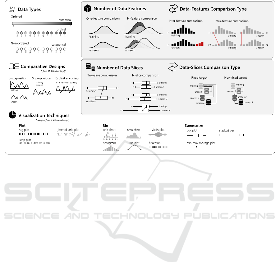
Figure 1: The design space for multidimensional comparative data analysis. This space spans seven dimensions to
structure the design of comparative VA solutions. It provides a systematization of all aspects to be considered for the visual
comparison of two or more data distributions. It also facilitates the identification of under-studied alternatives, opening gaps,
and providing directions and opportunities for future research.
an explicit visualization of data change. We present
the DataShiftExplorer, an interactive visual analyt-
ics technique to identify, analyze, and compare the
change in multidimensional data distributions, in
general.
2 RELATED WORK
We present what the dataset shift problem in machine-
learning is, and briefly revise the existing approaches
for visualizing data distributions, respectively in the
two next subsections.
2.1 The Dataset Shift Problem
Many machine learning algorithms follow the as-
sumption that the training data is governed by the
same distribution which the model will later be ex-
posed. (Bickel et al., 2009). However, in real-
life settings, the data a system faces after deploy-
ment does not necessarily have the same proper-
ties of the data available during development. This
issue is called dataset shift (Moreno-Torres et al.,
2012). It is a well-investigated real-world problem, by
machine-learning practitioners and researchers (Her-
rera, 2011), (Storkey, 2009), (Kull and Flach, 2014).
Regarding the terminology, most of the dataset
shift literature uses training, validation and test sets
when they refer to data subsets. The first two ones are
different splits of the labeled data one has at hand to
build a model, by training and evaluating it. Then, the
test set corresponds to the unlabeled data for classifi-
cation after model building. The shift, when it occurs,
happens between training and test sets. We prefer to
use the term unseen, instead of test. We want to make
a distinction because the test data is also used to refer
to a data split available at the time of model building,
in which the labels are omitted temporarily. On the
other hand, our definition of unseen encompasses data
that come after the process of model building, and are
not available during its construction.
The most basic form of dataset shift is the covari-
ate shift, when only the distribution of the input data
variables changes, comparing training to unseen data
(Herrera, 2011), (Storkey, 2009). One example is data
collected from a population for predictive analysis of
consumer behavior that, due to budget constraints,
did not consider all the regions of its relevant mar-
ket. Then, after building a model for this task, more
data comes, this time with all the relevant areas. In
this case, the performance of the model may drop be-
cause it has to deal with data not seen at the time of
training. Another common form of dataset shift is the
prior probability shift. It occurs when only the dis-
IVAPP 2020 - 11th International Conference on Information Visualization Theory and Applications
142

tributions of the target output variable change (Kull
and Flach, 2014). In classification, the target variable
is the class label. A typical example is a system for
spam-detection that deals with different proportions
of spam and no-spam messages during development
and in production.
The most common causes of dataset shift are non-
stationary environments (due to a temporal or spatial
change) and sample selection biases (Herrera, 2011;
Moreno-Torres et al., 2012). There are more sophisti-
cated types of shift, like the concept-drift (or concept-
shift), when the relationship between the input and
target variables change, and what the model has to
learn changes over time. The latter type is out of our
scope. Our aim is providing novel visual exploratory
methods to support the identification and analysis of
the two most basic dataset shift scenarios.
2.2 Visualization of Data Distributions
The use of graphical methods for exploratory data
analysis received a lot of attention over the last
decades (Tukey, 1977; Tufte, 2001; Chambers, 2017).
Among these methods, we focus on the visualizations
of data distributions, alone or in comparative layouts.
Approaches that enable the selection and visualiza-
tion of data subsets (Lex et al., 2010) are out of our
scope. We are interested in visualizing all the data.
We use the categorization of data-distribution visual-
izations proposed by Cherdarchuk in (Cherdarchuk,
2016). The categories describe what to do with the
data, plot, bin or summarize (see Visualization Tech-
niques in Figure 1). The three categories comple-
ment each other and offer different perspectives on the
same data. Individually, the techniques inside each
category have limitations (Correll et al., 2018). The
author proposes a forth category, rank, that we con-
sider an operation over the existing ones, and we do
not use.
In the first category, plot the data, examples are the
rug-plot (Hilfiger, 2015) and the strip-plot (Waskom,
2018). The idea is directly representing each data
point using the graphic element of choice. It provides
direct information on the number of points as well
as its distribution, but overplotting is an issue if the
dataset is vast. Jittering (Chambers, 2017) may alle-
viate that issue, by randomly changing the position of
the graphical elements in the axis that does not en-
code the data value.
The second category of data-distribution visual-
izations proposed in (Cherdarchuk, 2016) includes
techniques based on binning and on the estimation
of densities. The histogram (Poosala et al., 1996)
is a typical example of a visualization based on bin-
ning. The density-plots, another technique, produce a
smoothed representation of the histogram. However,
instead of directly representing the number of counts
in each bin, they use more sophisticated estimation
methods (Silverman, 2018) to represent a probability
density function. Variations of the density plot ex-
ist, like the violin-plot and the bean-plot (Wickham
and Stryjewski, 2011; Kampstra et al., 2008; Correll
and Gleicher, 2014; Hintze and Nelson, 1998; McGill
et al., 1978). They add a mirrored density plot, pro-
ducing a symmetrical figure that helps in compar-
ing certain types of distributions. Dot plots (Sasieni
and Royston, 1996) also use binning but representing
the counts with circles instead of rectangles. In (Ro-
drigues and Weiskopf, 2017), Rodrigues et al. present
a technique to construct non-linear dot plots for a high
dynamic range of data frequencies.
In the last category, summarize, box-plots (Wick-
ham and Stryjewski, 2011; Benjamini, 1988) are an
example. In this visualization, the idea is represent-
ing the second and third quartiles, together with the
median, to communicate where half of the data is in
the distribution. Additionally, it can also show out-
liers, for instance, or minimum and maximum val-
ues, depending on the variations of box-plot used.
Enhancements exist, like adjusting the box-plot to
show skewed distributions (Hubert and Vandervieren,
2008). There are plots which combine summarizing
with density curves. The vase-plot (Wickham and
Stryjewski, 2011) is an example, which shows sum-
mary statistics like the box-plot, together with the
shape of the distribution for the middle-half of the
data. We can also find examples in which violin-
plots and bean-plots appear with additions of sum-
mary statistics on top of them.
3 VISUALIZING CHANGE
We propose a design-space for multidimensional
comparative data analysis (details in Figure 1). It
helps in the systematization of which are the main
aspects that we should consider when approaching
the problem of visualizing the change in multidimen-
sional data, and what options are available for each of
those aspects, or problem dimensions. This system-
atization also helps to identify options that are not ex-
plored yet in its full potential.
3.1 Design Space for Comparative Data
Analysis
The task of comparing data distributions may sound
not too complicated. However, if we consider our ap-
DataShiftExplorer: Visualizing and Comparing Change in Multidimensional Data for Supervised Learning
143

plication context, one may need to analyze and com-
pare an initial set of training data with a series of dif-
ferent incoming unseen data sets, for instance. In this
analysis, it may also happen that the data has not only
a few but dozens of features. So, the problem we in-
vestigate demands scalability in different directions,
one or N-feature, and one or N-data slices in our par-
ticular case.
To cope with a dynamic scenario and the compara-
tive needs our application brings, we work with seven
problem dimensions. In the following, we describe
one-by-one.
Data Types: the data are either numerical, or-
dinal, or categorical. The first two ones, numerical
and ordinal, are ordered types. However, the ordinal
data fall into categories, while the numerical data fall
into a continuous or discrete numerical scale. Exam-
ples are one person's weight for numerical data or rat-
ing a hotel from one to five starts for the ordinal data
type. The categorical type also falls into categories
but does not have an implicit order. One example is
the hair color of individuals (e.g., blonde, red, brown,
and black). The type of data directly impacts which
statistical methods and visualization techniques are
available in each case. In (Kosara et al., 2006), for in-
stance, Kosara et al. present Parallel sets, a technique
based on the parallel-coordinates plot, but tailored to
deal with categorical data.
Number of Data Features: How many data fea-
tures (also called data attributes, or dimensions) take
part in the comparison. Each feature in each data sub-
set (e.g., training or unseen) has its distribution. We
want to compare them, and as the number of features
increase, more difficult is finding a suitable visualiza-
tion solution that does not overload the analyst and
hinder the comparative analysis.
Data-features Comparison Type: One can com-
pare the distributions of the same feature in different
data subsets (inter-feature comparison). Another pos-
sibility is comparing the relationships between two or
more feature in one subset, versus the same relation-
ships in another subset (intra-feature comparison).
By relationships, we mean, for instance, analyzing if
a given range of values in a numerical feature majorly
connects to a particular range in another feature and
if this behavior changes across different data subsets.
Number of Data Slices: In our application for su-
pervised learning, typically there are two data slices,
the training set, and another set of unseen data. How-
ever, an increasing number of unseen data subsets
may appear in a supervised learning problem. We call
this the N-slice scenario, which turns the comparison
of a growing number of sets even more challenging.
Data-slices Comparison Type: If we have more
than two data slices for comparison, then one possibil-
ity is to have a fixed target, i.e., comparing the incom-
ing sets always with the training data. Another op-
tion is comparing the next slice always with the pre-
vious one, and we call it the non-fixed target compar-
ison type.
Comparative Designs: Regarding the data visu-
alization and how to organize a layout for visual com-
parison, we use the categorization proposed by Gle-
icher in (Gleicher, 2018). There are three possible
arrangements: juxtaposition, in which different plots
appear side-by-side, the superposition, in which two
or more plots appear on top of each other, and the ex-
plicit encoding. In this last case, an example is the
subtraction of values between two data series to ob-
tain and visualize the change. Explicit in this case
means that we directly represent and visualize the
amount of change, instead of inferring it by looking to
what is different between two side-by-side plots, for
instance. The three arrangements do not exist only in
isolation. One can combine them in the same visual
comparison, supported by a set of visualizations.
Visualization Techniques: We consider three
types from the categorization of data-distribution
visualizations proposed by Cherdarchuk in (Cher-
darchuk, 2016): plot, bin or summarize the data, as we
discuss in Section 2.2. They complement each other
and may appear in combination, in superposed lay-
outs, for instance. If one uses a box-plot, which sum-
marize the data, the goal is not showing in detail value
ranges are distributed, but a few descriptive statistics.
On the other hand, to see data counts per value range,
the bin type is an alternative, using a histogram. The
first strategy, to directly plot the data, provides a very
compact representation of the distributions, but over-
plotting is an issue.
3.2 Under-explored Comparative
Approaches
The design-space we propose served to the purpose
of systematizing how we approach the problem of vi-
sualizing the data-shift. The problem-dimensions we
present and the options inside each of those also ac-
cept combinations. For instance, the same application
may contain more than one data type, combinations
of comparative designs, and a set of different visual-
ization techniques.
Among the alternatives we illustrate in the design-
space figure, we want to draw attention to the intra-
feature comparison type (in Figure 1, Data-Features
Comparison Type). In this comparison, it is necessary
to show not only the data distributions shapes in isola-
IVAPP 2020 - 11th International Conference on Information Visualization Theory and Applications
144
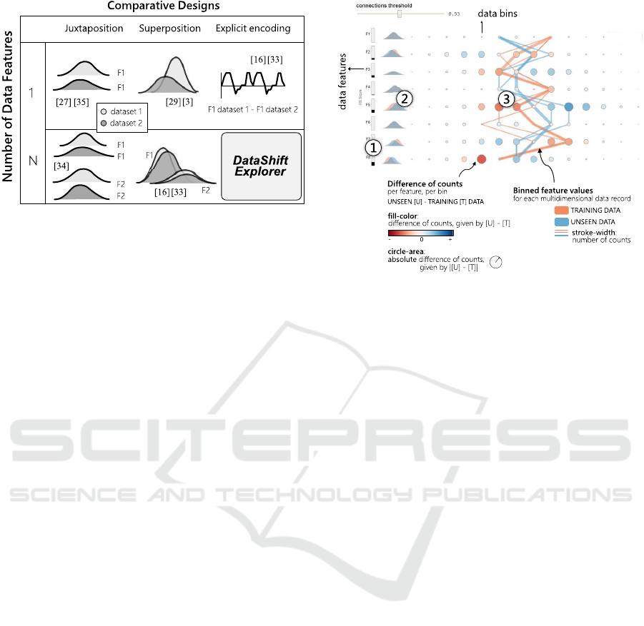
Figure 2: Using the terminology we propose in our design-
space (Figure 1), we identify an under-served task in com-
parative data analysis, namely the explicit visualization
of change in multidimensional datasets. We present the
DataShiftExplorer to support this task.
tion but also how the values across different features
and corresponding distributions connect. And not
only how they are connected in a single data slice, but
what are the main changes between these connections
in two different data slices, for instance. That compar-
ison is one of the goals we pursue with our DataShif-
tExplorer, which we present in the following section.
Finally, we identify, using the terminology from
the design-space, a visual comparison type of multi-
dimensional data that, to the best of our knowledge,
is still under-explored (Figure 2), taking into account
the existing techniques we revise in Section 2.2. This
type is about visualizing the change in multidimen-
sional datasets using a single visualization, instead
of replicating series of visualizations for each fea-
ture and putting them side-by-side. Starting from this
opportunity, we develop our approach to experiment
with new ideas and solutions to support this compar-
ison. The data preprocessing requirements and the
visual-encoding decisions appear in detail in the fol-
lowing section.
4 THE DataShiftExplorer
We present the DataShiftExplorer, a visualization
technique to identify and analyze the dataset shift in
supervised learning. This technique is tailored to en-
code the change in data distributions explicitly, be-
tween the training data and the unseen set, for N-
feature comparison in a single and compact visual-
ization. It is also model-agnostic because it does not
need the classification data labels, as well as it sup-
ports binary and multiclass problems.
Figure 3: Identification and analysis of change in mul-
tidimensional data distributions. We present DataShift-
Explorer, a visual analytics technique to analyze the data
shift between two multidimensional distributions. It enables
users to (1) sort the features by data change; (2) compare
the shapes of the data distributions in superimposed den-
sity plots; and (3) explore in detail the data-shift patterns in
a tailored visualization, composed of a parallel-coordinates
style plot and a difference-plot in a compact form. The tar-
get application domain is the comparison between training
and unseen data for supervised learning.
4.1 Basic Idea
The DataShiftExplorer main visualization has three
components. The first one (Figure 3.1) is a bar chart
that shows the magnitude of change between training
and unseen data per feature. The second (Figure 3.2)
is a series of superimposed density plots to com-
pare the shapes of the data distributions. Finally, the
third component (Figure 3.3) is a tailored visualiza-
tion to explore in detail the data-shift patterns, com-
posed of two layers of information. The first layer is a
difference-plot, which shows the (normalized) differ-
ence of counts between data bins per feature, in un-
seen and training sets. In this layer, we use the ex-
plicit encoding comparative design. The second layer
shows the connections among binned feature values in
training and unseen sets using the superposition com-
parative design, for all the data instances in both sets.
In the difference of counts layer (Figure 3.3
again), we show in a very compact form, in a single
plot, where are the more significant data changes be-
tween two datasets. We inform, based on a diverg-
ing color scale and dots of varying size, if new data
ranges per feature appeared for the first time in the un-
seen data. Conversely, we show if data ranges appear
in training but do not exist in unseen data. However,
DataShiftExplorer: Visualizing and Comparing Change in Multidimensional Data for Supervised Learning
145
despite the compact form of a difference-plot, it can-
not communicate the amounts of data which gener-
ated the differences. To overcome this limitation, we
have an additional layer with the lines that show the
connection among all the binned feature values for
every multidimensional data record, like a parallel-
coordinates plot. Therefore, these lines give an idea
of the amount of data in each set that respond to the
differences in counts.
To align the layers of information in the visual-
ization and simplify the data representation, we use
data binning in both cases (dots and lines). Instead
of using the exact value for each feature, we substi-
tute it by to which bin the value belongs for every fea-
ture, in case of numerical data. With this new rep-
resentation, we group the data by the same (trans-
formed) value for every feature and count the num-
ber of occurrences of multidimensional data-records
with that same representation. Lastly, we give more
importance to the data-records with more counts, by
increasing the stroke-width in the visualization using
a non-linear exponential scale. This visual hierarchy
has a significant impact on the simplification of the
visualization, and helps the visual comparison of data
in different sets. In contrast, directly plotting the data
without preprocessing in bins result in overplotting.
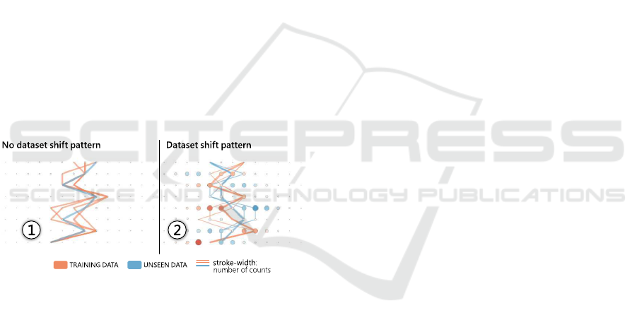
Figure 4: We use different datasets to show which pat-
terns the DataShiftExplorer produces when there is a data
change and when there is not, between training and unseen
sets. In the left example (1), the lines follow a very similar
path, which corresponds to the no data-shift pattern. In the
right (2), there are crossings between training and unseen
data lines, and they follow opposite directions. We can also
see blue and red circles in the difference-plot, which corre-
sponds to the data-shift pattern.
4.2 Visual Encoding
We build our difference-plot (Figure 3.3) by first com-
puting, for each bin (value range) in each feature, the
normalized number of counts in both training (T) and
unseen (U) data. Then, we build, in both cases, ma-
trices of counts per bin per feature and compute [U]
- [T], element-wise. We use a diverging color scale
to map the result of the subtraction to the fill color
of the dots in the difference-plot. Negative values ap-
pear in red, zero in white, and positive values in blue.
Regarding the data preprocessing before the construc-
tion of our difference-plot, we normalize the num-
ber of counts using simple proportional scaling, tak-
ing into account differences of size between training
and unseen data. Then, we compute [U] - [T]. How-
ever, before plotting the resulting matrix, we first look
back individually in [U] and [T] counts per row. For
each row, which corresponds to one feature, we take
the maximum value we find. This number gives us
the magnitude of change per feature, and we map this
maximum (maxPerFeature) to the extremes of the di-
verging color scale before plotting each row, using [-
maxPerFeature, maxPerFeature]. The normalization
per feature avoids that an outlier makes the changes
in other features almost imperceptible.
We organize the layout of the difference-plot in
the following way: each feature corresponds to one
row in the visualization along the vertical axis, and
each bin corresponds to one column in the horizontal
axis. Then, each dot, which corresponds to one pos-
sible combination of feature and value range, has the
fill color mapped to the result of the subtraction [U]
- [T], normalized per feature as we explained before.
Shades of blue mean that more data appear in unseen
for the given feature and bin. Conversely, red corre-
sponds to a negative value and means that, in training
data, there are more counts for the respective dot than
in unseen data. Also, the absolute value of unseen mi-
nus training, | [U ]− [T ] | , is mapped to the size (area)
of the circles.
In the parallel-coordinates style plot (Figure 3.3
again) that show all feature value ranges for each data
record, we use distinct solid colors to set the stroke
color, salmon for training and blue for unseen data.
We then use a non-linear exponential scale to map
the number of counts to the stroke-width, because we
want to emphasize the data-records with more counts
and make the lines of the less frequent connections
appear with much less visual importance. Regard-
ing the data preprocessing for the parallel-coordinates
style plot, we also use simple proportional scaling to
normalize the data instances counts and consider dif-
ferences of size between datasets.
4.3 Interaction, Data-filtering, and
Details-on-demand
On top of the data preprocessing steps and visual en-
coding, the interaction plays an essential role in the
DataShiftExplorer, facilitating our visual comparison
task. Interactive components allow us to support three
subtasks (see Figure 5). The first one, identifying the
most recurring feature vectors (T1), works by reduc-
IVAPP 2020 - 11th International Conference on Information Visualization Theory and Applications
146
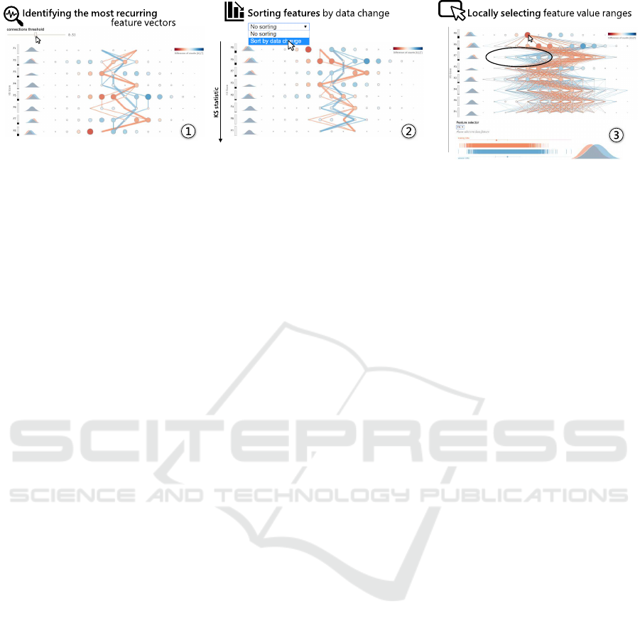
Figure 5: We use the DataShiftExplorer to compare training and unseen sets. We generate synthetic classification data with
eight features and two classes. From left to right, we first filter the data to show only the most recurring data-instances in both
training and unseen sets (1), which reduces the number of lines and the over-plotting in our main visualization. Then, we can
identify the dataset shift pattern we describe in Figure 4. After, we sort the features to see the ones that most change next
to each other in the visualization (2). We also support the task of locally selecting feature value ranges (3). This selection
triggers a filter that shows only the data instances, both in training and unseen sets, in which the values for the data feature
under analysis fit into the selection. Using this resource, we can investigate in which other features there is less overlap
between training and unseen data lines in the visualization for a given selected range. Lastly, auxiliary visualizations reveal
additional information on the distributions of one particular data feature.
ing overplotting and keeping only the most recurring
changes among feature values. Then, by sorting fea-
tures by data change (T2), we organize the visualiza-
tion layout and see significant changes first. The third
subtask, locally selecting feature value ranges (T3),
profits from the interaction capabilities to reveal local
changes, besides the overall view.
To support the first task (T1), the interactive com-
ponent we use is a data-filter that controls the number
of lines to appear in our visualization, the ones that
show the value ranges for all features in the training
and unseen sets. This filter interactively updates the
threshold of the minimum number of counts, so that
lines representing multidimensional data instances
with fewer counts than this threshold do not appear.
There is a clear trade-off between seeing all data, and
in this case with poor legibility for comparison, or fil-
tering it and keeping only the most recurring struc-
tures for comparison in both sets, for better legibility.
Regarding the possibility to sort the features
by data change (T2), we use the two-sample
Kolmogorov-Smirnov (KS) statistic (Cieslak and
Chawla, 2009), which tests whether two samples are
drawn from the same distribution. The KS statistics
lies between 0 and 1 and works as a distance measure
between data distributions. The smaller the KS statis-
tics value is, more similar are the distributions. We
precompute the KS for each feature between train-
ing and unseen sets and allow the interactive selec-
tion of this sorting criterion, which updates our visu-
alization accordingly. As an auxiliary plot, we show
next to the rectangle bars that encode the KS statistics
for each feature a small superposition of two density
plots, showing the shapes of the distributions in train-
ing and unseen sets. The density plots are efficient for
comparing differences in shape between both distri-
butions, as well as confirm the data-shift indicated by
the KS statistic.
For the third task (T3), we provide an interaction
on mouse-click that shows, for a selected data range
per feature in the difference plot, only the lines in
training and unseen data that fits into this selection.
It also works as a filter, but this time we are filtering
by a range of values in one feature. The mouse-click
on a particular circle in the difference-plot determines
which feature and which value range to filter (exam-
ple in Figure 5). Using this interaction, we can se-
lect one data range we know is new in unseen data by
looking for the biggest blue circle in the difference-
plot, for instance. Then, we inspect where the lines
go, analyzing where there is no overlap between train-
ing and unseen data lines. This way, we identify, for
a given selection, in which features and value ranges
the dataset shift occurs.
Finally, we also work with three linked visualiza-
tions: one rug-plot, a simplified version of a box-
plot, and one density-plot (Figure 5.3, on the bot-
tom). The density plot is the same one that appear in a
much smaller version next to the KS statistics rectan-
gle bars. We use these visualizations to show the data-
distribution of one feature at each time, both in train-
ing (in red color) and unseen sets (in blue color). They
offer three different perspectives on the same data dis-
tributions. As we present in Section 3, there are the
plot, bin and summarize data distribution visualiza-
tion types, which correspond respectively to our aux-
iliary rug plot, density plot and simplified box-plot.
DataShiftExplorer: Visualizing and Comparing Change in Multidimensional Data for Supervised Learning
147

5 FUTURE WORK
After spanning the design-space of multidimensional
comparative data analytics, we identify a potential re-
search gap, and develop an interactive visualization
prototype, the DataShiftExplorer
1
.
However, our work has limitations. The main one
is that user studies are missing. We plan to vali-
date our prototype in controlled environments as fu-
ture work. Regarding the prototype, one limitation is
that we do not let the user change the number of data
bins interactively. Binning is a necessary preprocess-
ing step in our pipeline. However, a different number
of bins may affect the visual outcome significantly.
A necessary extension is letting the user interactively
update this number.
Lastly, in the user studies, it will also be important
to explore real datasets with our tool. So far, in the
examples we provide in this paper, we generate the
data using a synthetic classification data generator
2
,
to have complete control over the generation process.
REFERENCES
Benjamini, Y. (1988). Opening the box of a boxplot. The
American Statistician, 42(4):257–262.
Bickel, S., Br
¨
uckner, M., and Scheffer, T. (2009). Discrimi-
native learning under covariate shift with a single opti-
mization problem. In Dataset Shift in Machine Learn-
ing, pages 161–177. MIT.
Chambers, J. M. (2017). Graphical Methods for Data Anal-
ysis. Chapman and Hall/CRC.
Cherdarchuk, J. (2016). Visualizing distribu-
tions. http://www.darkhorseanalytics.com/blog/
visualizing-distributions-3.
Cieslak, D. A. and Chawla, N. V. (2009). A framework for
monitoring classifiers’ performance: when and why
failure occurs? Knowledge and Information Systems,
18(1):83–108.
Correll, M. and Gleicher, M. (2014). Error bars considered
harmful: Exploring alternate encodings for mean and
error. IEEE transactions on visualization and com-
puter graphics, 20(12):2142–2151.
Correll, M., Li, M., Kindlmann, G., and Scheidegger, C.
(2018). Looks good to me: Visualizations as sanity
checks. IEEE transactions on visualization and com-
puter graphics, 25(1):830–839.
Gleicher, M. (2018). Considerations for visualizing com-
parison. IEEE transactions on visualization and com-
puter graphics, 24(1):413–423.
Herrera, F. (2011). Dataset shift in classification: Ap-
proaches and problems. http://iwann.ugr.es/2011/pdf/
InvitedTalk-FHerrera-IWANN11.pdf.
1
http://datashiftexplorer.dbvis.de
2
http://scikit-learn.org/stable/modules/generated/
sklearn.datasets.make classification.html
Hilfiger, J. J. (2015). Graphing Data with R: An Introduc-
tion. O’Reilly Media, Inc.
Hintze, J. L. and Nelson, R. D. (1998). Violin plots: a box
plot-density trace synergism. The American Statisti-
cian, 52(2):181–184.
Hubert, M. and Vandervieren, E. (2008). An adjusted box-
plot for skewed distributions. Computational statis-
tics & data analysis, 52(12):5186–5201.
Kampstra, P. et al. (2008). Beanplot: A boxplot alternative
for visual comparison of distributions. Journal of Sta-
tistical Software.
Kosara, R., Bendix, F., and Hauser, H. (2006). Parallel sets:
Interactive exploration and visual analysis of categori-
cal data. IEEE transactions on visualization and com-
puter graphics, 12(4):558–568.
Kull, M. and Flach, P. (2014). Patterns of dataset shift. In
First International Workshop on Learning over Multi-
ple Contexts (LMCE) at ECML-PKDD.
Lex, A., Streit, M., Partl, C., Kashofer, K., and Schmalstieg,
D. (2010). Comparative analysis of multidimensional,
quantitative data. IEEE Transactions on Visualization
and Computer Graphics, 16(6):1027–1035.
Matejka, J. and Fitzmaurice, G. (2017). Same stats, differ-
ent graphs: Generating datasets with varied appear-
ance and identical statistics through simulated anneal-
ing. In Proceedings of the 2017 CHI Conference on
Human Factors in Computing Systems, pages 1290–
1294. ACM.
McGill, R., Tukey, J. W., and Larsen, W. A. (1978).
Variations of box plots. The American Statistician,
32(1):12–16.
Moreno-Torres, J. G., Raeder, T., Alaiz-Rodr
´
ıGuez, R.,
Chawla, N. V., and Herrera, F. (2012). A unifying
view on dataset shift in classification. Pattern Recog-
nition, 45(1):521–530.
Poosala, V., Haas, P. J., Ioannidis, Y. E., and Shekita, E. J.
(1996). Improved histograms for selectivity estima-
tion of range predicates. SIGMOD Rec., 25(2):294–
305.
Rodrigues, N. and Weiskopf, D. (2017). Nonlinear dot
plots. IEEE transactions on visualization and com-
puter graphics, 24(1):616–625.
Sasieni, P. D. and Royston, P. (1996). Dotplots. Journal of
the Royal Statistical Society: Series C (Applied Statis-
tics), 45(2):219–234.
Silverman, B. W. (2018). Density estimation for statistics
and data analysis. Routledge.
Storkey, A. J. (2009). When training and test sets are dif-
ferent: characterizing learning transfer. In In Dataset
Shift in Machine Learning, pages 3–28. MIT Press.
Tufte, E. R. (2001). The visual display of quantitative in-
formation, volume 2. Graphics press Cheshire, CT.
Tukey, J. (1977). Exploratory data analysis. Addison-
Wesley Publishing Company.
Waskom, M. (2018). Seaborn: statistical data visualization.
http://seaborn.pydata.org.
Wickham, H. and Stryjewski, L. (2011). 40 years of box-
plots. Am. Statistician.
IVAPP 2020 - 11th International Conference on Information Visualization Theory and Applications
148
