
Curtain Graphs: Using a Floating Baseline for Comparison in a
Two-dimensional Graphical Space
Kassandra Raymond and Andrew Hamilton-Wright
School of Computer Science, University of Guelph, Canada
Keywords:
Relative and Absolute Measurement, Multi-dimensional Data, Floating Baseline, Inter-series Comparison,
Time-series, Data Analysis.
Abstract:
We present a novel visualization tool designed to provide support for the analysis of data sets focused around
deviation from a baseline and including data from multiple series. The incorporation of a floating baseline
makes the curtain graph distinct from waterfall plots and bar charts. Each data series therefore has a visual
anchor that assists in interpretability, gives focus, and provides a means for easily broadening analysis across
all presented series. The use of this tool in real-world examples based on relative and absolute comparisons is
discussed.
1 INTRODUCTION AND
RELATED WORK
This paper presents a novel tool for inter- and within-
series comparisons where a defining feature of the se-
ries is its relationship to a particular anchor point, rep-
resenting an initial condition or exemplar. This static
graph can be used to visualize comparisons between
multi-dimensional numerical and categorical data.
1.1 Background
The complexity of data analysis is increasing, both in
terms of the complexity of the data sets themselves,
and in the insights expected to be derived from them.
The relationship between multiple variables of dif-
ferent types frequently captures the critical insight
allowing us to understand a multi-dimensional data
problem. This dimensionality, coupled with data of
different types, such as discrete, continuous and cat-
egorical, can create a complicated set of data which
can be difficult to visualize. Moreover, we are often
limited to static plots when creating reports, books or
articles, causing it to be increasingly difficult to dis-
play multi-dimensional data.
The field of information visualization has a long
history of both broadly applicable and context spe-
cific visualization techniques. Great ideas in the field
build on the work of pioneers such a Bertin (2001) and
we see books regularly appearing that provide excel-
lent advice in how to proceed both in general and in
specific cases (Shneiderman, 1996; Tufte, 2001, 1991,
1997, 2006; Cairo, 2012, 2016; Evergreen, 2020).
A central focus within this long history is the iden-
tification of tools specific to a certain decision making
paradigm. Inside of a decision making context, identi-
fication of a particular narrative (Klanten et al., 2011)
or decision point (Agrawala et al., 2011) allows con-
struction of a context for the specific data interpreta-
tion needs (Cairo, 2016).
Evaluation of visualization techniques has pro-
ceeded by applying various metrics to elucidate the
understandability, utility and efficacy of the tool (Zen,
2013; Agrawala et al., 2011; Daru, 2001), including
metrics such as the data-ink ratio (Tufte, 2001; In-
bar et al., 2007) and identification of patterns driv-
ing our understand such as ‘small multiples’ (Tufte,
1991, pp. 67–80). This analysis has resulted in toolk-
its (Heer et al., 2005; Klimov et al., 2010) and advice
(Shneiderman, 1996; Evergreen, 2020; Hicks, 2009;
Metoyer et al., 2012) based around selecting exactly
the correct visualization for a specific purpose, result-
ing in tailored visualizations for specific applications
(de Almeida and Roselli, 2017; Klimov et al., 2010;
Klanten et al., 2011).
In this paper we target a specific instance of data
set interpretation, focusing on a multi-dimensional
data set whose interpretation is based on the context
of changes relative to a particular exemplar point—
either an initial sample forming a point in time, or a
particular datum from which all of the other points
derive their meaning in some other form.
Raymond, K. and Hamilton-Wright, A.
Curtain Graphs: Using a Floating Baseline for Comparison in a Two-dimensional Graphical Space.
DOI: 10.5220/0008874001250132
In Proceedings of the 15th International Joint Conference on Computer Vision, Imaging and Computer Graphics Theory and Applications (VISIGRAPP 2020) - Volume 3: IVAPP, pages
125-132
ISBN: 978-989-758-402-2; ISSN: 2184-4321
Copyright
c
2022 by SCITEPRESS – Science and Technology Publications, Lda. All rights reserved
125

−200
0
200
400
Initial Sales Refunds Payouts Court LossesCour t Wins Contracts End Cash
desc
type
in
net
out
Figure 1: Waterfall plot
showing consecutive
changes in a series, from
Few (2006).
0
20
40
60
80
banana poacee sorgho triticum
species
value
condition
Nitrogen
Normal
Stress
Figure 2: Stacked barchart
showing series data in sum-
mation, from Holtz (2019).
Figure 3: Hat graphs (rightmost two plots), as related to
barcharts of the same data; reproduced from Witt (2019).
A related visualization technique is the ‘waterfall
chart’ (Metoyer et al., 2012; Few, 2006; Evergreen,
2020), which is constructed as a sequence of bars
with a start and end showing change at an interval de-
scribed on the x axis relative to the previous bar, as
shown in Figure 1, which is reproduced from the data
discussed in Few (2006).
In a waterfall chart, there are three assumptions
that are different from those of our needs:
• the initial value from which the first change starts
is assumed to be zero;
• the changes as one works through the series are to
be compared primarily only to their neighbours;
and
• there is only one series in the chart.
Another related visualization is the common
stacked bar chart, as discussed in Talbot et al. (2014)
and shown in Figure 2. In this presentation, data from
several series over a common baseline are combined
into stacks. however the readability within a given
series is compromised in support of an overall under-
standing of the extent of the sum of the series. The
difficulty of visually separating a single series from
the stack is evident.
Other work improves on the data-ink ratio of the
bar char, providing the hat graph, shown in Figure 3,
reproduced from the paper developing this technique,
(Witt, 2019). In the hat graph, only the tops of the
bars of a bar chart, providing a floating appearance of
the relevant data, and using as visual anchor the top of
the first bar. This reduces the amount of int required,
to present the same data as the analogous bar chart, as
shown in Figure 3.
1.2 Identifying the Need
We wish to extend the use of the waterfall plot for the
specific context in which we have multiple series of
data, and where the initial point is the focus of com-
parison across all points on the x axis. We break the
association with a single baseline, allowing various
types of comparisons across and among the data se-
ries within the plot, unifying the whole within a com-
mon y axis.
The next section of this paper will outline our pro-
posed solution to this problem, and outline the defin-
ing features of our idea. Following this we will eval-
uate our tool on several interesting data sets drawn
from real world problems. Finally, we present a dis-
cussion summarizing the data trends, patterns and
comparisons that can be expressed by the curtain
graph.
2 PROPOSED VISUALIZATION
The motivation for this visualization comes from the
desire to represent three-dimensions within a clear
two-dimensional set of axes. The measures along the
x dimension form a series relative to a fixed starting
location, but where this starting location is not nec-
essarily the same for other series within the same x
variable. The y axis provides a common system for
interpretation, and a set of data series arranged hori-
zontally captures a variable in the z axis.
Thus, we present the curtain graph (Figure 4). The
curtain graph is a novel, comprehensible method of
visualizing high dimensional, multivariate data. This
plot allows correlations of various attributes of a data
set involving relative and absolute value comparisons
to be easily identified on a single plot.
2.1 The Curtain Graph
The fundamental property of the curtain graph is the
inclusion, within a single y axis, of a series of bar-
chart type representations, allowing the visualization
to be especially useful when comparing data with
multiple treatment types. Figure 4 shows a detailed
example of the curtain graph.
In Figure 4, each of the bar chart representations,
which we will now refer to as ‘subplots,’ are placed
vertically in a position on the curtain graph which acts
as an anchor for that subplot. This anchor represents
a common baseline, from which each bar from each
subplot extends. A single subplot is identified in Fig-
ure 4 within the single line yellow box.
IVAPP 2020 - 11th International Conference on Information Visualization Theory and Applications
126

10
20
30
40
50
60
1 2 3 4 5
Pesticide Type
Number of Plants
type
corn_muck
corn_sand
soybean_muck
soybean_sand
squash_muck
squash_sand
Difference
from Baseline
Curtain Rod
(baseline)
Sequential
data x axis
Subplot - the
sequence
of subplots
captures
a categorial
variable
along the z axis
Figure 4: The anatomy of a curtain graph; colour/line vari-
ations used to show the graphical terminology used to refer
unique areas on the plot. This figure was rendered from R
using ggplot2 and modifications to the geom rect func-
tionality.
We will refer to the this floating baseline as the
‘curtain rod’ as it provides the anchor for the strips
forming the ‘curtain’ to ascend or descend. This float-
ing axis rod is shown in Figure 4 enclosed by a blue
double box near the right hand side of the figure.
The subplot consisting of the floating curtain rod
axis and the attached bars can be placed in a se-
quence representing some categorical variable. Fig-
ure 4 presents the data obtained when measuring the
response variable “Number of Plants” obtained when
applying one of six (numbered) pesticide preparations
to plants growing in various ‘muck’ and ‘sand’ soils.
For each soil type there is a base expected yield, and
the pesticide performance is measured against this
base yield.
Such a sequence is shown in Figure 4 within the
dotted ellipse identifying the individual bars making
up the curtain running along the rod presented within
the leftmost subplot of the figure. This sequence of
the bars allows a second variable within an inner x
axis, providing side-by-side comparison of some vari-
able for whom the values form the basis of the most
sensitive consideration in the visualization design (as
opposed to the set of subplots forming the outer, or z
axis, following the advice from Talbot et al. (2014).
In this case, this would be pesticide type.
By placing the bars of the subplots all together at
the same y coordinate, the absolute and relative po-
sition of each of the bar from the curtain rod of the
bars respective subplot can be identified. Each sub-
plot contains the data for a specific instance of a vari-
able of interest for which we have performed repeated
measures. The same bar within each curtain then per-
tains to a measure of the same variable within a dif-
ferent data series.
As noted in Cleveland and McGill (1984), posi-
tion along a given access is an easily apprehended
measure, and in particular more easily understood
than data represented purely by length. In the exten-
sive experimentation provided by Talbot et al. (2014),
these conclusions are extended by statements about
relative bar length, separation and position that sup-
port our placement within disparate series.
Because the curtain rod acts as the anchor for
comparison of the variables within each subplot, the
units of measure forming the y axis must be conduc-
tive to measurement within this number line. Each
bar of the curtain provides an easily approachable
measure of the degree of deviation from the baseline,
while the absolute position of the ends of these bars
provides an ability to compare the data across the full
graphic, in absolute terms. This allows both simple
absolute comparisons of values as typically found on
a standard bar chart, or in a waterfall plot, as well
as relative comparisons within the series attached to
each floating curtain rod baseline.
Note the distinction from the hat graph described
by Witt (2019); while both graph types display an ap-
parently floating sequence, in the hat graph, this se-
quence is driven by the need to display only the tops
of bars arising in the same direction from a baseline
at an axis. Here, the baseline itself is floating, and
the potential variability in sign requires us to keep the
bars linking the data with each floating baseline.
While the properties commonly held on any
number-line axis measurement (such as linear, loga-
rithmic etc.) must be considered for the y axis, the x
axis can be comprised of other variable types such as
ordinal or categorical. The x axis of the curtain graph
is comprised of the axes on the subplots. The number
of labels on each x axis will correspond to the number
of bars extending from each curtain rod. For exam-
ple, with three subplots, each containing six bars, the
x axis would consist of three sequences of multiply
measured variables with six labels.
Curtain Graphs: Using a Floating Baseline for Comparison in a Two-dimensional Graphical Space
127
Back/Frontal Back/Sagittal Head/Frontal Head/Sagittal
Sitting
●
● ● ●
● ●
●
0
5
10
15
234567 8
● ● ● ● ● ● ●
0
5
10
15
234567 8
●
●
●
●
● ● ●
0
5
10
15
234567 8
● ● ● ● ● ● ●
0
5
10
15
234567 8
S/S45%
●
●
●
●
● ● ●
0
5
10
15
234567 8
● ● ● ● ● ● ●
0
5
10
15
234567 8
●
●
● ●
● ●
●
0
5
10
15
2345678
●
●
●
●
● ●
●
0
5
10
15
234567 8
Figure 5: Four subplots showing the comparison of five dimensions of data using the curtain graph. Subplot curtain identifiers:
Back Avoid
HS00 HS-1 HS00 HS+1
à à à
Postural state sequence duration and musculoskeletal
disorder marker perception at sit-stand workstations
Kassandra'Raymond¹. Andrew'Hamilton-Wright¹.'Nancy'Black
2
.'''
!"# $%&''()'*)+',-./01)$%203%04)53260172/8)'*)9.0(-&): ;1<8,'3=>.'?.0(-&@%< !A#)B<%.(/C =D23?C3201204)53260172/C =0)E'3%/'3
INTRODUCTION
Musculoskeletal disorders (MSDs) account for approximately 43% of all workers
compensation claims in Ontario, costing the government up to 22 billion dollars a year [1].
Prolonged static postures, such as those required in office work, are a known cause of
MSDs [2]. In a past study by Black et al., significant postural gestures that were associated
with perceived pain or fatigue were identified, however duration of postural state was not
considered [3]. Objective: To add duration analysis to a previous study of the
relationship between postural gestures (movements) and participants’ perception of
pain and fatigue during office work.
References
1, Owen, N., Healy, G.N., Mathews, C.E. and Dunstan, D.W. (2010). Too much sitting: The population health science of sedentary behavior. Exercise and Sport Sciences Reviews 38 (3): 105-13
2. Bhanderi D, Choudhary S, Parmar L, Doshi V. A Study of Occurrence of Musculoskeletal Discomfort in Computer Operators. Indian J Community Med Off Publ Indian Assoc Prev Soc Med. 2008 Jan;33(1):65–6.
3. Black N, Hamilton-Wright A, Lange J, Bouet C, Shein MM, Samson M, et al. Postural Deviation Gestures Distinguish Perceived Pain and Fatigue Particularly in Frontal Plane. In: Bagnara S, Tartaglia R, Albolino S, Alexander T, Fujita Y, editors. Proceedings of the 20th Congress of the International Ergonomics Association (IEA 2018). Springer; 2019. p. 495–501.
4. Keyserling, W.M. (1986). Postural analysis of the trunk and shoulders in simulated real time. Ergonomics. 29, 569–583.
5. McAtamney, L., and Corlett, N. (1993). RULA: A Survey Method for the Investigation of Work Related Upper Limb Disorders. Applied Ergonomics, 24(2), 91-99.
METHODOLOGY
(A) Data Collection
• 10 participants completed a 1 hr data entry task at each of 3 workstations (sitting,
S/S30%, S/S45%) and used a 10 point visual analogue scale to mark their perception of
fatigue and neck and back pain
• 16 Hz, 2D inclinometers on the back and neck of each participant measuring angles in
the frontal and sagittal planes
RESULTS & DISCUSSION
Back Frontal Back Sagittal Head Frontal Head Sagittal
SittingS/S30%S/S45%
CHANNEL STATE*
ID
ANGULAR*
RANGE
HS HS
-1
-∞ -5
HS00 -5 10
HS+1 10 20
HS+2 20 ∞
HF HF
-2
-∞ -10
HF
-1
-10 -2
HF00 -2 2
HF+1 2 10
HF+2 10 ∞
BS BS
-2
-∞ -5
BS
-1
-5 10
BS00 10 20
BS+1 20 60
BS+2 60 ∞
BF BF
-2
-∞ -10
BF
-1
-10 -2
BF00 -2 2
BF+1 2 10
BF+2 10 ∞
CONCLUSION & FUTURE DIRECTIONS
While the data are noisy, there is evidence to suggest that there are postural movements that may be
associated with the risk or avoidance of pain and fatigue. Future work will explore subtle movements
based on direct measurements of postural angles to compare found patterns with those reported here
with the RULA paradigm. This study provides a novel method for categorizing human movement
based on raw inclinometer measurements and underscores the importance of understanding
quantization boundaries upon their introduction.
Figure 1: Waterfall plots showing the absolute and relative change in number of postural sequences significantly associated with a
given perception as an MPD filter is applied for each workstation (sitting, S/S30%, S/S45%) and channel (head frontal plane, head
sagittal plane, back frontal plane, back sagittal plane).
(E) Perceptual Features
Black et al.’s (2018) quintile separation method was
used to categorize perceptual data from the visual
analogue scale into the ‘absence’ or ‘presence’ of a
given perception, for each participant and workstation.
q Filtering using a lower MPD filter shows that in 15 cases there is an increase in the number of
patterns found, while filtering with a longer MPD causes a decrease in the number of patterns (Fig 1).
q Mapping of dynamic posture into quantization boundaries can introduce an apparent increase in the
number of postural state changes. When this occurs due to a small overall change in the measured
angle that crosses into a new quantization region and then returns to the original, this small change
may be better ignored.
q While using RULA allows for the quantification of postural movements, smaller movements that are
occurring within a RULA defined region may be lost.
(B) Postural State Quantization
Each raw sample was quantized using the thresholds
adapted from RULA in Table 1.
(D) Postural Sequence Identification
Postural states were linked together to length 4 to
create postural gestures.
(C) Minimum Persistent Duration (MPD)
A state must have occurred for a minimum number of
samples to be considered a postural state change,
otherwise the sample was assigned to the previous
state. An MPD of 1 through 8 was calculated.
Table 1: Angular thresholds used to assign State
IDs to raw inclinometer angles. Thresholds
adapted from the Rapid Upper Limb Assessment
(RULA) methodology [4][5].
(F) Chi squared contingency test
If the postural gestures for a given perception occurred at least 5 times in both the present
and absence group and the results of the !
"
contingency comparison resulted in a p < .01,
then the postural gesture was deemed significant
●
● ● ●
● ●
●
0
5
10
15
23 4 5 6 78
● ● ● ● ● ● ●
0
5
10
15
23 4 5 6 7 8
●
●
●
●
● ● ●
0
5
10
15
23 4 5 6 7 8
● ● ● ● ● ● ●
0
5
10
15
23 4 5 6 7 8
● ● ● ● ● ●
●
0
5
10
15
23 4 5 6 78
● ● ● ● ● ●
●
0
5
10
15
23 4 5 6 78
●
●
● ●
●
●
●
0
5
10
15
23 4 5 6 78
●
● ● ● ● ● ●
0
5
10
15
23 4 5 6 7 8
●
●
●
●
● ● ●
0
5
10
15
23 4 5 6 7 8
● ● ● ● ● ● ●
0
5
10
15
23 4 5 6 7 8
●
●
● ●
● ●
●
0
5
10
15
234 567 8
●
●
●
●
● ●
●
0
5
10
15
23 4 5 6 7 8
0 5 10 15
LEGEND
Back'avoid
Back'risk
Fatigue'avoid
Fatigue'risk
Neck'avoid'
Neck'risk
Minimum Persistent Duration
# of Significant Postural Sequences
2 4 6 8
3 5 7
. Back Risk
HS00 HS-1 HS00 HS+1
à à à
Postural state sequence duration and musculoskeletal
disorder marker perception at sit-stand workstations
Kassandra'Raymond¹. Andrew'Hamilton-Wright¹.'Nancy'Black
2
.'''
!"# $%&''()'*)+',-./01)$%203%04)53260172/8)'*)9.0(-&): ;1<8,'3=>.'?.0(-&@%< !A#)B<%.(/C =D23?C3201204)53260172/C =0)E'3%/'3
INTRODUCTION
Musculoskeletal disorders (MSDs) account for approximately 43% of all workers
compensation claims in Ontario, costing the government up to 22 billion dollars a year [1].
Prolonged static postures, such as those required in office work, are a known cause of
MSDs [2]. In a past study by Black et al., significant postural gestures that were associated
with perceived pain or fatigue were identified, however duration of postural state was not
considered [3]. Objective: To add duration analysis to a previous study of the
relationship between postural gestures (movements) and participants’ perception of
pain and fatigue during office work.
References
1, Owen, N., Healy, G.N., Mathews, C.E. and Dunstan, D.W. (2010). Too much sitting: The population health science of sedentary behavior. Exercise and Sport Sciences Reviews 38 (3): 105-13
2. Bhanderi D, Choudhary S, Parmar L, Doshi V. A Study of Occurrence of Musculoskeletal Discomfort in Computer Operators. Indian J Community Med Off Publ Indian Assoc Prev Soc Med. 2008 Jan;33(1):65–6.
3. Black N, Hamilton-Wright A, Lange J, Bouet C, Shein MM, Samson M, et al. Postural Deviation Gestures Distinguish Perceived Pain and Fatigue Particularly in Frontal Plane. In: Bagnara S, Tartaglia R, Albolino S, Alexander T, Fujita Y, editors. Proceedings of the 20th Congress of the International Ergonomics Association (IEA 2018). Springer; 2019. p. 495–501.
4. Keyserling, W.M. (1986). Postural analysis of the trunk and shoulders in simulated real time. Ergonomics. 29, 569–583.
5. McAtamney, L., and Corlett, N. (1993). RULA: A Survey Method for the Investigation of Work Related Upper Limb Disorders. Applied Ergonomics, 24(2), 91-99.
METHODOLOGY
(A) Data Collection
• 10 participants completed a 1 hr data entry task at each of 3 workstations (sitting,
S/S30%, S/S45%) and used a 10 point visual analogue scale to mark their perception of
fatigue and neck and back pain
• 16 Hz, 2D inclinometers on the back and neck of each participant measuring angles in
the frontal and sagittal planes
RESULTS & DISCUSSION
Back Frontal Back Sagittal Head Frontal Head Sagittal
SittingS/S30%S/S45%
CHANNEL STATE*
ID
ANGULAR*
RANGE
HS HS
-1
-∞ -5
HS00 -5 10
HS+1 10 20
HS+2 20 ∞
HF HF
-2
-∞ -10
HF
-1
-10 -2
HF00 -2 2
HF+1 2 10
HF+2 10 ∞
BS BS
-2
-∞ -5
BS
-1
-5 10
BS00 10 20
BS+1 20 60
BS+2 60 ∞
BF BF
-2
-∞ -10
BF
-1
-10 -2
BF00 -2 2
BF+1 2 10
BF+2 10 ∞
CONCLUSION & FUTURE DIRECTIONS
While the data are noisy, there is evidence to suggest that there are postural movements that may be
associated with the risk or avoidance of pain and fatigue. Future work will explore subtle movements
based on direct measurements of postural angles to compare found patterns with those reported here
with the RULA paradigm. This study provides a novel method for categorizing human movement
based on raw inclinometer measurements and underscores the importance of understanding
quantization boundaries upon their introduction.
Figure 1: Waterfall plots showing the absolute and relative change in number of postural sequences significantly associated with a
given perception as an MPD filter is applied for each workstation (sitting, S/S30%, S/S45%) and channel (head frontal plane, head
sagittal plane, back frontal plane, back sagittal plane).
(E) Perceptual Features
Black et al.’s (2018) quintile separation method was
used to categorize perceptual data from the visual
analogue scale into the ‘absence’ or ‘presence’ of a
given perception, for each participant and workstation.
q Filtering using a lower MPD filter shows that in 15 cases there is an increase in the number of
patterns found, while filtering with a longer MPD causes a decrease in the number of patterns (Fig 1).
q Mapping of dynamic posture into quantization boundaries can introduce an apparent increase in the
number of postural state changes. When this occurs due to a small overall change in the measured
angle that crosses into a new quantization region and then returns to the original, this small change
may be better ignored.
q While using RULA allows for the quantification of postural movements, smaller movements that are
occurring within a RULA defined region may be lost.
(B) Postural State Quantization
Each raw sample was quantized using the thresholds
adapted from RULA in Table 1.
(D) Postural Sequence Identification
Postural states were linked together to length 4 to
create postural gestures.
(C) Minimum Persistent Duration (MPD)
A state must have occurred for a minimum number of
samples to be considered a postural state change,
otherwise the sample was assigned to the previous
state. An MPD of 1 through 8 was calculated.
Table 1: Angular thresholds used to assign State
IDs to raw inclinometer angles. Thresholds
adapted from the Rapid Upper Limb Assessment
(RULA) methodology [4][5].
(F) Chi squared contingency test
If the postural gestures for a given perception occurred at least 5 times in both the present
and absence group and the results of the !
"
contingency comparison resulted in a p < .01,
then the postural gesture was deemed significant
●
● ● ●
● ●
●
0
5
10
15
23 4 5 6 78
● ● ● ● ● ● ●
0
5
10
15
23 4 5 6 7 8
●
●
●
●
● ● ●
0
5
10
15
23 4 5 6 7 8
● ● ● ● ● ● ●
0
5
10
15
23 4 5 6 7 8
● ● ● ● ● ●
●
0
5
10
15
23 4 5 6 78
● ● ● ● ● ●
●
0
5
10
15
23 4 5 6 78
●
●
● ●
●
●
●
0
5
10
15
23 4 5 6 78
●
● ● ● ● ● ●
0
5
10
15
23 4 5 6 7 8
●
●
●
●
● ● ●
0
5
10
15
23 4 5 6 7 8
● ● ● ● ● ● ●
0
5
10
15
23 4 5 6 7 8
●
●
● ●
● ●
●
0
5
10
15
234 567 8
●
●
●
●
● ●
●
0
5
10
15
23 4 5 6 7 8
0 5 10 15
LEGEND
Back'avoid
Back'risk
Fatigue'avoid
Fatigue'risk
Neck'avoid'
Neck'risk
Minimum Persistent Duration
# of Significant Postural Sequences
2 4 6 8
3 5 7
. Fatigue Avoid
HS00 HS-1 HS00 HS+1
à à à
Postural state sequence duration and musculoskeletal
disorder marker perception at sit-stand workstations
Kassandra'Raymond¹. Andrew'Hamilton-Wright¹.'Nancy'Black
2
.'''
!"# $%&''()'*)+',-./01)$%203%04)53260172/8)'*)9.0(-&): ;1<8,'3=>.'?.0(-&@%< !A#)B<%.(/C =D23?C3201204)53260172/C =0)E'3%/'3
INTRODUCTION
Musculoskeletal disorders (MSDs) account for approximately 43% of all workers
compensation claims in Ontario, costing the government up to 22 billion dollars a year [1].
Prolonged static postures, such as those required in office work, are a known cause of
MSDs [2]. In a past study by Black et al., significant postural gestures that were associated
with perceived pain or fatigue were identified, however duration of postural state was not
considered [3]. Objective: To add duration analysis to a previous study of the
relationship between postural gestures (movements) and participants’ perception of
pain and fatigue during office work.
References
1, Owen, N., Healy, G.N., Mathews, C.E. and Dunstan, D.W. (2010). Too much sitting: The population health science of sedentary behavior. Exercise and Sport Sciences Reviews 38 (3): 105-13
2. Bhanderi D, Choudhary S, Parmar L, Doshi V. A Study of Occurrence of Musculoskeletal Discomfort in Computer Operators. Indian J Community Med Off Publ Indian Assoc Prev Soc Med. 2008 Jan;33(1):65–6.
3. Black N, Hamilton-Wright A, Lange J, Bouet C, Shein MM, Samson M, et al. Postural Deviation Gestures Distinguish Perceived Pain and Fatigue Particularly in Frontal Plane. In: Bagnara S, Tartaglia R, Albolino S, Alexander T, Fujita Y, editors. Proceedings of the 20th Congress of the International Ergonomics Association (IEA 2018). Springer; 2019. p. 495–501.
4. Keyserling, W.M. (1986). Postural analysis of the trunk and shoulders in simulated real time. Ergonomics. 29, 569–583.
5. McAtamney, L., and Corlett, N. (1993). RULA: A Survey Method for the Investigation of Work Related Upper Limb Disorders. Applied Ergonomics, 24(2), 91-99.
METHODOLOGY
(A) Data Collection
• 10 participants completed a 1 hr data entry task at each of 3 workstations (sitting,
S/S30%, S/S45%) and used a 10 point visual analogue scale to mark their perception of
fatigue and neck and back pain
• 16 Hz, 2D inclinometers on the back and neck of each participant measuring angles in
the frontal and sagittal planes
RESULTS & DISCUSSION
Back Frontal Back Sagittal Head Frontal Head Sagittal
SittingS/S30%S/S45%
CHANNEL STATE*
ID
ANGULAR*
RANGE
HS HS
-1
-∞ -5
HS00 -5 10
HS+1 10 20
HS+2 20 ∞
HF HF
-2
-∞ -10
HF
-1
-10 -2
HF00 -2 2
HF+1 2 10
HF+2 10 ∞
BS BS
-2
-∞ -5
BS
-1
-5 10
BS00 10 20
BS+1 20 60
BS+2 60 ∞
BF BF
-2
-∞ -10
BF
-1
-10 -2
BF00 -2 2
BF+1 2 10
BF+2 10 ∞
CONCLUSION & FUTURE DIRECTIONS
While the data are noisy, there is evidence to suggest that there are postural movements that may be
associated with the risk or avoidance of pain and fatigue. Future work will explore subtle movements
based on direct measurements of postural angles to compare found patterns with those reported here
with the RULA paradigm. This study provides a novel method for categorizing human movement
based on raw inclinometer measurements and underscores the importance of understanding
quantization boundaries upon their introduction.
Figure 1: Waterfall plots showing the absolute and relative change in number of postural sequences significantly associated with a
given perception as an MPD filter is applied for each workstation (sitting, S/S30%, S/S45%) and channel (head frontal plane, head
sagittal plane, back frontal plane, back sagittal plane).
(E) Perceptual Features
Black et al.’s (2018) quintile separation method was
used to categorize perceptual data from the visual
analogue scale into the ‘absence’ or ‘presence’ of a
given perception, for each participant and workstation.
q Filtering using a lower MPD filter shows that in 15 cases there is an increase in the number of
patterns found, while filtering with a longer MPD causes a decrease in the number of patterns (Fig 1).
q Mapping of dynamic posture into quantization boundaries can introduce an apparent increase in the
number of postural state changes. When this occurs due to a small overall change in the measured
angle that crosses into a new quantization region and then returns to the original, this small change
may be better ignored.
q While using RULA allows for the quantification of postural movements, smaller movements that are
occurring within a RULA defined region may be lost.
(B) Postural State Quantization
Each raw sample was quantized using the thresholds
adapted from RULA in Table 1.
(D) Postural Sequence Identification
Postural states were linked together to length 4 to
create postural gestures.
(C) Minimum Persistent Duration (MPD)
A state must have occurred for a minimum number of
samples to be considered a postural state change,
otherwise the sample was assigned to the previous
state. An MPD of 1 through 8 was calculated.
Table 1: Angular thresholds used to assign State
IDs to raw inclinometer angles. Thresholds
adapted from the Rapid Upper Limb Assessment
(RULA) methodology [4][5].
(F) Chi squared contingency test
If the postural gestures for a given perception occurred at least 5 times in both the present
and absence group and the results of the !
"
contingency comparison resulted in a p < .01,
then the postural gesture was deemed significant
●
● ● ●
● ●
●
0
5
10
15
23 4 5 6 78
● ● ● ● ● ● ●
0
5
10
15
23 4 5 6 7 8
●
●
●
●
● ● ●
0
5
10
15
23 4 5 6 7 8
● ● ● ● ● ● ●
0
5
10
15
23 4 5 6 7 8
● ● ● ● ● ●
●
0
5
10
15
23 4 5 6 78
● ● ● ● ● ●
●
0
5
10
15
23 4 5 6 78
●
●
● ●
●
●
●
0
5
10
15
23 4 5 6 78
●
● ● ● ● ● ●
0
5
10
15
23 4 5 6 7 8
●
●
●
●
● ● ●
0
5
10
15
23 4 5 6 7 8
● ● ● ● ● ● ●
0
5
10
15
23 4 5 6 7 8
●
●
● ●
● ●
●
0
5
10
15
234 567 8
●
●
●
●
● ●
●
0
5
10
15
23 4 5 6 7 8
0 5 10 15
LEGEND
Back'avoid
Back'risk
Fatigue'avoid
Fatigue'risk
Neck'avoid'
Neck'risk
Minimum Persistent Duration
# of Significant Postural Sequences
2 4 6 8
3 5 7
. Fatigue Risk
HS00 HS-1 HS00 HS+1
à à à
Postural state sequence duration and musculoskeletal
disorder marker perception at sit-stand workstations
Kassandra'Raymond¹. Andrew'Hamilton-Wright¹.'Nancy'Black
2
.'''
!"# $%&''()'*)+',-./01)$%203%04)53260172/8)'*)9.0(-&): ;1<8,'3=>.'?.0(-&@%< !A#)B<%.(/C =D23?C3201204)53260172/C =0)E'3%/'3
INTRODUCTION
Musculoskeletal disorders (MSDs) account for approximately 43% of all workers
compensation claims in Ontario, costing the government up to 22 billion dollars a year [1].
Prolonged static postures, such as those required in office work, are a known cause of
MSDs [2]. In a past study by Black et al., significant postural gestures that were associated
with perceived pain or fatigue were identified, however duration of postural state was not
considered [3]. Objective: To add duration analysis to a previous study of the
relationship between postural gestures (movements) and participants’ perception of
pain and fatigue during office work.
References
1, Owen, N., Healy, G.N., Mathews, C.E. and Dunstan, D.W. (2010). Too much sitting: The population health science of sedentary behavior. Exercise and Sport Sciences Reviews 38 (3): 105-13
2. Bhanderi D, Choudhary S, Parmar L, Doshi V. A Study of Occurrence of Musculoskeletal Discomfort in Computer Operators. Indian J Community Med Off Publ Indian Assoc Prev Soc Med. 2008 Jan;33(1):65–6.
3. Black N, Hamilton-Wright A, Lange J, Bouet C, Shein MM, Samson M, et al. Postural Deviation Gestures Distinguish Perceived Pain and Fatigue Particularly in Frontal Plane. In: Bagnara S, Tartaglia R, Albolino S, Alexander T, Fujita Y, editors. Proceedings of the 20th Congress of the International Ergonomics Association (IEA 2018). Springer; 2019. p. 495–501.
4. Keyserling, W.M. (1986). Postural analysis of the trunk and shoulders in simulated real time. Ergonomics. 29, 569–583.
5. McAtamney, L., and Corlett, N. (1993). RULA: A Survey Method for the Investigation of Work Related Upper Limb Disorders. Applied Ergonomics, 24(2), 91-99.
METHODOLOGY
(A) Data Collection
• 10 participants completed a 1 hr data entry task at each of 3 workstations (sitting,
S/S30%, S/S45%) and used a 10 point visual analogue scale to mark their perception of
fatigue and neck and back pain
• 16 Hz, 2D inclinometers on the back and neck of each participant measuring angles in
the frontal and sagittal planes
RESULTS & DISCUSSION
Back Frontal Back Sagittal Head Frontal Head Sagittal
SittingS/S30%S/S45%
CHANNEL STATE*
ID
ANGULAR*
RANGE
HS HS
-1
-∞ -5
HS00 -5 10
HS+1 10 20
HS+2 20 ∞
HF HF
-2
-∞ -10
HF
-1
-10 -2
HF00 -2 2
HF+1 2 10
HF+2 10 ∞
BS BS
-2
-∞ -5
BS
-1
-5 10
BS00 10 20
BS+1 20 60
BS+2 60 ∞
BF BF
-2
-∞ -10
BF
-1
-10 -2
BF00 -2 2
BF+1 2 10
BF+2 10 ∞
CONCLUSION & FUTURE DIRECTIONS
While the data are noisy, there is evidence to suggest that there are postural movements that may be
associated with the risk or avoidance of pain and fatigue. Future work will explore subtle movements
based on direct measurements of postural angles to compare found patterns with those reported here
with the RULA paradigm. This study provides a novel method for categorizing human movement
based on raw inclinometer measurements and underscores the importance of understanding
quantization boundaries upon their introduction.
Figure 1: Waterfall plots showing the absolute and relative change in number of postural sequences significantly associated with a
given perception as an MPD filter is applied for each workstation (sitting, S/S30%, S/S45%) and channel (head frontal plane, head
sagittal plane, back frontal plane, back sagittal plane).
(E) Perceptual Features
Black et al.’s (2018) quintile separation method was
used to categorize perceptual data from the visual
analogue scale into the ‘absence’ or ‘presence’ of a
given perception, for each participant and workstation.
q Filtering using a lower MPD filter shows that in 15 cases there is an increase in the number of
patterns found, while filtering with a longer MPD causes a decrease in the number of patterns (Fig 1).
q Mapping of dynamic posture into quantization boundaries can introduce an apparent increase in the
number of postural state changes. When this occurs due to a small overall change in the measured
angle that crosses into a new quantization region and then returns to the original, this small change
may be better ignored.
q While using RULA allows for the quantification of postural movements, smaller movements that are
occurring within a RULA defined region may be lost.
(B) Postural State Quantization
Each raw sample was quantized using the thresholds
adapted from RULA in Table 1.
(D) Postural Sequence Identification
Postural states were linked together to length 4 to
create postural gestures.
(C) Minimum Persistent Duration (MPD)
A state must have occurred for a minimum number of
samples to be considered a postural state change,
otherwise the sample was assigned to the previous
state. An MPD of 1 through 8 was calculated.
Table 1: Angular thresholds used to assign State
IDs to raw inclinometer angles. Thresholds
adapted from the Rapid Upper Limb Assessment
(RULA) methodology [4][5].
(F) Chi squared contingency test
If the postural gestures for a given perception occurred at least 5 times in both the present
and absence group and the results of the !
"
contingency comparison resulted in a p < .01,
then the postural gesture was deemed significant
●
● ● ●
● ●
●
0
5
10
15
23 4 5 6 78
● ● ● ● ● ● ●
0
5
10
15
23 4 5 6 7 8
●
●
●
●
● ● ●
0
5
10
15
23 4 5 6 7 8
● ● ● ● ● ● ●
0
5
10
15
23 4 5 6 7 8
● ● ● ● ● ●
●
0
5
10
15
23 4 5 6 78
● ● ● ● ● ●
●
0
5
10
15
23 4 5 6 78
●
●
● ●
●
●
●
0
5
10
15
23 4 5 6 78
●
● ● ● ● ● ●
0
5
10
15
23 4 5 6 7 8
●
●
●
●
● ● ●
0
5
10
15
23 4 5 6 7 8
● ● ● ● ● ● ●
0
5
10
15
23 4 5 6 7 8
●
●
● ●
● ●
●
0
5
10
15
234 567 8
●
●
●
●
● ●
●
0
5
10
15
23 4 5 6 7 8
0 5 10 15
LEGEND
Back'avoid
Back'risk
Fatigue'avoid
Fatigue'risk
Neck'avoid'
Neck'risk
Minimum Persistent Duration
# of Significant Postural Sequences
2 4 6 8
3 5 7
. Neck Avoid
HS00 HS-1 HS00 HS+1
à à à
Postural state sequence duration and musculoskeletal
disorder marker perception at sit-stand workstations
Kassandra'Raymond¹. Andrew'Hamilton-Wright¹.'Nancy'Black
2
.'''
!"# $%&''()'*)+',-./01)$%203%04)53260172/8)'*)9.0(-&): ;1<8,'3=>.'?.0(-&@%< !A#)B<%.(/C =D23?C3201204)53260172/C =0)E'3%/'3
INTRODUCTION
Musculoskeletal disorders (MSDs) account for approximately 43% of all workers
compensation claims in Ontario, costing the government up to 22 billion dollars a year [1].
Prolonged static postures, such as those required in office work, are a known cause of
MSDs [2]. In a past study by Black et al., significant postural gestures that were associated
with perceived pain or fatigue were identified, however duration of postural state was not
considered [3]. Objective: To add duration analysis to a previous study of the
relationship between postural gestures (movements) and participants’ perception of
pain and fatigue during office work.
References
1, Owen, N., Healy, G.N., Mathews, C.E. and Dunstan, D.W. (2010). Too much sitting: The population health science of sedentary behavior. Exercise and Sport Sciences Reviews 38 (3): 105-13
2. Bhanderi D, Choudhary S, Parmar L, Doshi V. A Study of Occurrence of Musculoskeletal Discomfort in Computer Operators. Indian J Community Med Off Publ Indian Assoc Prev Soc Med. 2008 Jan;33(1):65–6.
3. Black N, Hamilton-Wright A, Lange J, Bouet C, Shein MM, Samson M, et al. Postural Deviation Gestures Distinguish Perceived Pain and Fatigue Particularly in Frontal Plane. In: Bagnara S, Tartaglia R, Albolino S, Alexander T, Fujita Y, editors. Proceedings of the 20th Congress of the International Ergonomics Association (IEA 2018). Springer; 2019. p. 495–501.
4. Keyserling, W.M. (1986). Postural analysis of the trunk and shoulders in simulated real time. Ergonomics. 29, 569–583.
5. McAtamney, L., and Corlett, N. (1993). RULA: A Survey Method for the Investigation of Work Related Upper Limb Disorders. Applied Ergonomics, 24(2), 91-99.
METHODOLOGY
(A) Data Collection
• 10 participants completed a 1 hr data entry task at each of 3 workstations (sitting,
S/S30%, S/S45%) and used a 10 point visual analogue scale to mark their perception of
fatigue and neck and back pain
• 16 Hz, 2D inclinometers on the back and neck of each participant measuring angles in
the frontal and sagittal planes
RESULTS & DISCUSSION
Back Frontal Back Sagittal Head Frontal Head Sagittal
SittingS/S30%S/S45%
CHANNEL STATE*
ID
ANGULAR*
RANGE
HS HS
-1
-∞ -5
HS00 -5 10
HS+1 10 20
HS+2 20 ∞
HF HF
-2
-∞ -10
HF
-1
-10 -2
HF00 -2 2
HF+1 2 10
HF+2 10 ∞
BS BS
-2
-∞ -5
BS
-1
-5 10
BS00 10 20
BS+1 20 60
BS+2 60 ∞
BF BF
-2
-∞ -10
BF
-1
-10 -2
BF00 -2 2
BF+1 2 10
BF+2 10 ∞
CONCLUSION & FUTURE DIRECTIONS
While the data are noisy, there is evidence to suggest that there are postural movements that may be
associated with the risk or avoidance of pain and fatigue. Future work will explore subtle movements
based on direct measurements of postural angles to compare found patterns with those reported here
with the RULA paradigm. This study provides a novel method for categorizing human movement
based on raw inclinometer measurements and underscores the importance of understanding
quantization boundaries upon their introduction.
Figure 1: Waterfall plots showing the absolute and relative change in number of postural sequences significantly associated with a
given perception as an MPD filter is applied for each workstation (sitting, S/S30%, S/S45%) and channel (head frontal plane, head
sagittal plane, back frontal plane, back sagittal plane).
(E) Perceptual Features
Black et al.’s (2018) quintile separation method was
used to categorize perceptual data from the visual
analogue scale into the ‘absence’ or ‘presence’ of a
given perception, for each participant and workstation.
q Filtering using a lower MPD filter shows that in 15 cases there is an increase in the number of
patterns found, while filtering with a longer MPD causes a decrease in the number of patterns (Fig 1).
q Mapping of dynamic posture into quantization boundaries can introduce an apparent increase in the
number of postural state changes. When this occurs due to a small overall change in the measured
angle that crosses into a new quantization region and then returns to the original, this small change
may be better ignored.
q While using RULA allows for the quantification of postural movements, smaller movements that are
occurring within a RULA defined region may be lost.
(B) Postural State Quantization
Each raw sample was quantized using the thresholds
adapted from RULA in Table 1.
(D) Postural Sequence Identification
Postural states were linked together to length 4 to
create postural gestures.
(C) Minimum Persistent Duration (MPD)
A state must have occurred for a minimum number of
samples to be considered a postural state change,
otherwise the sample was assigned to the previous
state. An MPD of 1 through 8 was calculated.
Table 1: Angular thresholds used to assign State
IDs to raw inclinometer angles. Thresholds
adapted from the Rapid Upper Limb Assessment
(RULA) methodology [4][5].
(F) Chi squared contingency test
If the postural gestures for a given perception occurred at least 5 times in both the present
and absence group and the results of the !
"
contingency comparison resulted in a p < .01,
then the postural gesture was deemed significant
●
● ● ●
● ●
●
0
5
10
15
23 4 5 6 78
● ● ● ● ● ● ●
0
5
10
15
23 4 5 6 7 8
●
●
●
●
● ● ●
0
5
10
15
23 4 5 6 7 8
● ● ● ● ● ● ●
0
5
10
15
23 4 5 6 7 8
● ● ● ● ● ●
●
0
5
10
15
23 4 5 6 78
● ● ● ● ● ●
●
0
5
10
15
23 4 5 6 78
●
●
● ●
●
●
●
0
5
10
15
23 4 5 6 78
●
● ● ● ● ● ●
0
5
10
15
23 4 5 6 7 8
●
●
●
●
● ● ●
0
5
10
15
23 4 5 6 7 8
● ● ● ● ● ● ●
0
5
10
15
23 4 5 6 7 8
●
●
● ●
● ●
●
0
5
10
15
234 567 8
●
●
●
●
● ●
●
0
5
10
15
23 4 5 6 7 8
0 5 10 15
LEGEND
Back'avoid
Back'risk
Fatigue'avoid
Fatigue'risk
Neck'avoid'
Neck'risk
Minimum Persistent Duration
# of Significant Postural Sequences
2 4 6 8
3 5 7
. Neck Risk
HS00 HS-1 HS00 HS+1
à à à
Postural state sequence duration and musculoskeletal
disorder marker perception at sit-stand workstations
Kassandra'Raymond¹. Andrew'Hamilton-Wright¹.'Nancy'Black
2
.'''
!"# $%&''()'*)+',-./01)$%203%04)53260172/8)'*)9.0(-&): ;1<8,'3=>.'?.0(-&@%< !A#)B<%.(/C =D23?C3201204)53260172/C =0)E'3%/'3
INTRODUCTION
Musculoskeletal disorders (MSDs) account for approximately 43% of all workers
compensation claims in Ontario, costing the government up to 22 billion dollars a year [1].
Prolonged static postures, such as those required in office work, are a known cause of
MSDs [2]. In a past study by Black et al., significant postural gestures that were associated
with perceived pain or fatigue were identified, however duration of postural state was not
considered [3]. Objective: To add duration analysis to a previous study of the
relationship between postural gestures (movements) and participants’ perception of
pain and fatigue during office work.
References
1, Owen, N., Healy, G.N., Mathews, C.E. and Dunstan, D.W. (2010). Too much sitting: The population health science of sedentary behavior. Exercise and Sport Sciences Reviews 38 (3): 105-13
2. Bhanderi D, Choudhary S, Parmar L, Doshi V. A Study of Occurrence of Musculoskeletal Discomfort in Computer Operators. Indian J Community Med Off Publ Indian Assoc Prev Soc Med. 2008 Jan;33(1):65–6.
3. Black N, Hamilton-Wright A, Lange J, Bouet C, Shein MM, Samson M, et al. Postural Deviation Gestures Distinguish Perceived Pain and Fatigue Particularly in Frontal Plane. In: Bagnara S, Tartaglia R, Albolino S, Alexander T, Fujita Y, editors. Proceedings of the 20th Congress of the International Ergonomics Association (IEA 2018). Springer; 2019. p. 495–501.
4. Keyserling, W.M. (1986). Postural analysis of the trunk and shoulders in simulated real time. Ergonomics. 29, 569–583.
5. McAtamney, L., and Corlett, N. (1993). RULA: A Survey Method for the Investigation of Work Related Upper Limb Disorders. Applied Ergonomics, 24(2), 91-99.
METHODOLOGY
(A) Data Collection
• 10 participants completed a 1 hr data entry task at each of 3 workstations (sitting,
S/S30%, S/S45%) and used a 10 point visual analogue scale to mark their perception of
fatigue and neck and back pain
• 16 Hz, 2D inclinometers on the back and neck of each participant measuring angles in
the frontal and sagittal planes
RESULTS & DISCUSSION
Back Frontal Back Sagittal Head Frontal Head Sagittal
SittingS/S30%S/S45%
CHANNEL STATE*
ID
ANGULAR*
RANGE
HS HS
-1
-∞ -5
HS00 -5 10
HS+1 10 20
HS+2 20 ∞
HF HF
-2
-∞ -10
HF
-1
-10 -2
HF00 -2 2
HF+1 2 10
HF+2 10 ∞
BS BS
-2
-∞ -5
BS
-1
-5 10
BS00 10 20
BS+1 20 60
BS+2 60 ∞
BF BF
-2
-∞ -10
BF
-1
-10 -2
BF00 -2 2
BF+1 2 10
BF+2 10 ∞
CONCLUSION & FUTURE DIRECTIONS
While the data are noisy, there is evidence to suggest that there are postural movements that may be
associated with the risk or avoidance of pain and fatigue. Future work will explore subtle movements
based on direct measurements of postural angles to compare found patterns with those reported here
with the RULA paradigm. This study provides a novel method for categorizing human movement
based on raw inclinometer measurements and underscores the importance of understanding
quantization boundaries upon their introduction.
Figure 1: Waterfall plots showing the absolute and relative change in number of postural sequences significantly associated with a
given perception as an MPD filter is applied for each workstation (sitting, S/S30%, S/S45%) and channel (head frontal plane, head
sagittal plane, back frontal plane, back sagittal plane).
(E) Perceptual Features
Black et al.’s (2018) quintile separation method was
used to categorize perceptual data from the visual
analogue scale into the ‘absence’ or ‘presence’ of a
given perception, for each participant and workstation.
q Filtering using a lower MPD filter shows that in 15 cases there is an increase in the number of
patterns found, while filtering with a longer MPD causes a decrease in the number of patterns (Fig 1).
q Mapping of dynamic posture into quantization boundaries can introduce an apparent increase in the
number of postural state changes. When this occurs due to a small overall change in the measured
angle that crosses into a new quantization region and then returns to the original, this small change
may be better ignored.
q While using RULA allows for the quantification of postural movements, smaller movements that are
occurring within a RULA defined region may be lost.
(B) Postural State Quantization
Each raw sample was quantized using the thresholds
adapted from RULA in Table 1.
(D) Postural Sequence Identification
Postural states were linked together to length 4 to
create postural gestures.
(C) Minimum Persistent Duration (MPD)
A state must have occurred for a minimum number of
samples to be considered a postural state change,
otherwise the sample was assigned to the previous
state. An MPD of 1 through 8 was calculated.
Table 1: Angular thresholds used to assign State
IDs to raw inclinometer angles. Thresholds
adapted from the Rapid Upper Limb Assessment
(RULA) methodology [4][5].
(F) Chi squared contingency test
If the postural gestures for a given perception occurred at least 5 times in both the present
and absence group and the results of the !
"
contingency comparison resulted in a p < .01,
then the postural gesture was deemed significant
●
● ● ●
● ●
●
0
5
10
15
23 4 5 6 78
● ● ● ● ● ● ●
0
5
10
15
23 4 5 6 7 8
●
●
●
●
● ● ●
0
5
10
15
23 4 5 6 7 8
● ● ● ● ● ● ●
0
5
10
15
23 4 5 6 7 8
● ● ● ● ● ●
●
0
5
10
15
23 4 5 6 78
● ● ● ● ● ●
●
0
5
10
15
23 4 5 6 78
●
●
● ●
●
●
●
0
5
10
15
23 4 5 6 78
●
● ● ● ● ● ●
0
5
10
15
23 4 5 6 7 8
●
●
●
●
● ● ●
0
5
10
15
23 4 5 6 7 8
● ● ● ● ● ● ●
0
5
10
15
23 4 5 6 7 8
●
●
● ●
● ●
●
0
5
10
15
234 567 8
●
●
●
●
● ●
●
0
5
10
15
23 4 5 6 7 8
0 5 10 15
LEGEND
Back'avoid
Back'risk
Fatigue'avoid
Fatigue'risk
Neck'avoid'
Neck'risk
Minimum Persistent Duration
# of Significant Postural Sequences
2 4 6 8
3 5 7
.
3 REAL-WORLD APPLICATIONS
The applications of the curtain graph are very robust;
it can be used in many fields, with different types and
dimensionalities of data. To understand the type of
data that can be expressed using the curtain graph, we
outline three real-world examples of the visualization.
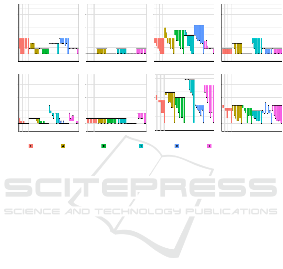
3.1 Example: Posture Data
The data analysis problem which spurred our inter-
est in this type of visualization is a problem in pos-
tural data analysis. (This data and the soil type
data available at the authors’ website https://qemg.
uoguelph.ca/data/.) This data analysis is charac-
terized by evaluating observations regarding percep-
tion (‘perception’) across multiple channels simulta-
neously (‘channel’), as well as across multiple exper-
imental setups (‘modality’). For each of these, we
needed a visualization to explore the relationship be-
tween the effects of progressive degrees of applica-
tion of a new filter (‘filtering’) and the response vari-
able, which in this case was the number of patterns
obtained under the filtering strategy (‘number of pat-
terns’).
The dataset: Researchers are studying sedentary
behaviour in office workers and are concerned with
understanding gestures that are associated with the
risk and avoidance of back pain, neck pain and fatigue
in four different bodily modalities at three different
workstations. The results of this work were presented
at the July 2019 meeting of the Canadian Association
of Ergonomists (Raymond et al., 2019).
The data consists of angular data obtained from
the head and neck measured as an incline from ver-
tical. This data was obtained for a the set of per-
ceptions mentioned above (risk and avoidance of fa-
tigue and of pain at the neck, and of pain at the back),
and under experimental modalities of controlled sit-
ting and standing alternating within a 20 minute cy-
cle. Example data shown here includes at 45% stand-
ing (S/S45%) and sitting, for several channels. Only
the channels ‘Head/Sagittal’ and ‘Back/Frontal’ are
reproduced here, due to space constraints.
This results in a numerical y axis with a numeri-
cal x axis along each curtain rod and a categorical z
between the series of bars (Figure 5).
In Figure 5 the curtain graphs are arranged in a
grid table similar to a matrix. Note that the axes, and
colour/pattern in each curtain graph is consistent with
the other curtain graphs. The column and rows of the
matrix are based on the planes of the body and each
workstation, respectively.
Representation of this five dimensional problem
gave birth to this visualization strategy through the
observation that the critical comparison was the itera-
tive application of the ‘filtering’ factor. As the filter-
ing is occurring relative to the state of a baseline data
set, new values for filtering are understood only in the
context of observations given in relation to the initial
IVAPP 2020 - 11th International Conference on Information Visualization Theory and Applications
128

or base point for that series — we can see any changes
as a refinement of an initial setup. Applying succes-
sively greater amounts of filtering yields a series of
points in a logical progression. This requires a lo-
cal display space in order to be coherently understood
relative to the base position, but which also require
comparison with our other variables.
As shown in Figure 5, the curtain plot displays this
data in order of comparison precedence, moving up
from the number of patterns obtained through succes-
sive filtering through data channel and experimental
modality. Specifically:
1. In a typical multi-plot grid, the two least critical
variables lay out a grid of inner plots, indexed by
channel and experimental modality. This reduces
the remaining visualization dimensionality needs
to three.
2. Within each plot, we can then associate the num-
ber of patterns on the y axis with both perception,
shown as the group of measures within a given
series placed along a specific curtain rod, and the
filtering values arranged along the rod.
The filtering setting is the experimental variable
that we wish to fall under the closest scrutiny. By set-
ting these within the adjacent bar sequence arranged
along each ‘curtain rod’ we easily see the effects of
increasing the filtering control, moving from no filter-
ing at the leftmost end of the rod through to a filter
setting of 8 units at the rightmost end of each series.
The curtain rod bars themselves float in space at the
baseline position provided by no filtering, which al-
lows easy and direct comparison of any of the num-
ber of patterns obtained by different filtering settings
within a series to the number obtained at baseline.
For example, in the lower leftmost plot in Fig-
ure 5 (S/S 45%, Back/Frontal) the sequences for ‘back
avoid’ and ‘back risk’ are easily recognized as hav-
ing little change relative to their baseline position,
and also immediately indicate that the direction of the
changes that are seen are in opposite sign to one an-
other, back avoid projecting upwards from the rod,
while back risk descends. The relative position of
these two rods in this plot show that while the range
is the same, the opposite change is shown. Compar-
ing these two series to the other series in the plots,
we can easily locate those where significant change is
apparent, as well as the overall trend of the change.
In the display for both experimental modalities of
the Head/Frontal data large visible trends of decreas-
ing measures are shown. The cascade of bars down
from the curtain rod gives us the name for the tool.
Again, several insights are easily captured here that
would not be available without the relative position-
ing of the curtain rod chart:
• the similarity of structure across all the subplots;
• the right shifting along the rod of ‘back risk’ and
‘fatigue risk’ within S/S45%; and
• the similar trend but different initial sign in ‘back
avoid’.
Turning to the Back/Sagittal column, we easily
see here the consistency of the changes noted, as well
as the distinct representation of an unfilled baseline
curtain rod. While in this data all of the empty rods
happen to be at the y = 0 axis, it is easy to imagine
plots in which they might be scattered.
Overall, this plot type employs the type of imme-
diate insight described as ‘small multiples’ by Tufte
(1991, pp. 67–80) which allows immediate recogni-
tion of visually accessible patterns within the display.
As the purpose here is to facilitate recognition of both
overall trends as well as patterns of association of the
‘number of patterns’ variable across the many plots,
the concept of the small multiple is particularly im-
portant here. For example, the power of the plot
is shown in particularly striking fashion by the way
that ‘neck avoid’ on the lower right plot leaps from
the page (S/S 45%, Head/Sagittal), showing how un-
usual cases are easily recognized relative to the float-
ing baseline.
Movement along the x axis can be identified as
progression when labels are numerically and tempo-
rally sequential in Figure 5. Here, the progression in
the x axis corresponds to the increase in the length of
the minimum persistent duration filter. Further, when
the curtain graphs are grouped together in a matrix,
the patterns of different combinations of data can be
easily identified.
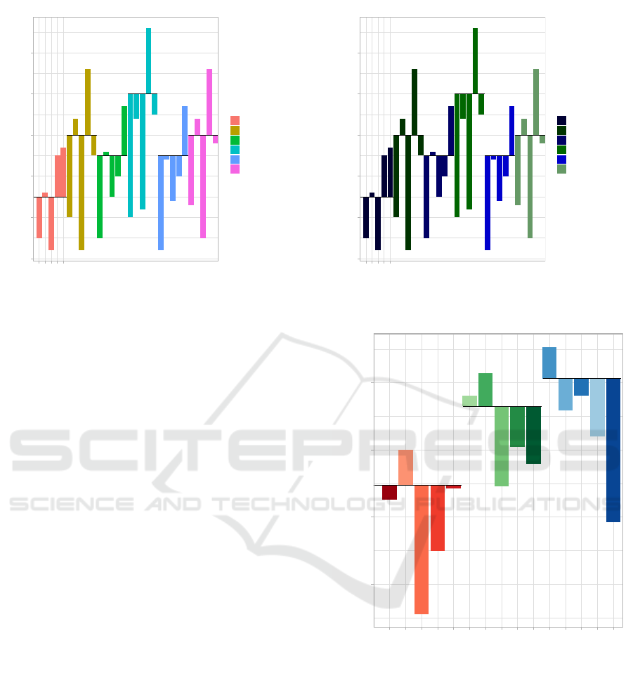
3.2 Example: Crop Data
The curtain graph can also be used to visualize a
data set consisting of multiple categorical factors as
well as numerical data. Several modifications to
colour/pattern and symbols are shown to emphasize
specific trends in the data set.
The dataset: Researchers are interested in study-
ing the survival rate of three crops, in two different
soil types after the application of five pesticides com-
pared to when there are no pesticides applied. The
crops are soybean, corn and wheat and the soil types
are sandy and muck soil (sapric organic soils). The
pesticides used are simply labelled one to five, and
zero (for no pesticide applied).
Figure 6 displays the data on the curtain graph.
Colours are used to distinguish the subplots which
represent the different soil/crop types. Each bar
within a subplot shows the plant survival rate of the
crop it represents in comparison to the baseline. Here,
Curtain Graphs: Using a Floating Baseline for Comparison in a Two-dimensional Graphical Space
129
10
20
30
40
50
60
1 2 3 4 5
Pesticide Type
Number of Plants
type
corn_muck
corn_sand
soybean_muck
soybean_sand
squash_muck
squash_sand
Figure 6: A curtain plot showing the data from the “crop”
data set.
10
20
30
40
50
60
1 2 3 4 5
Pesticide Type
Number of Plants
type
corn_muck
corn_sand
soybean_muck
soybean_sand
squash_muck
squash_sand
Figure 7: A curtain plot showing the data from the “crop”
data set, with updated colour scheme to emphasize soil type.
pesticide level zero (no pesticide applied), acts as the
curtain rod (baseline), which is the solid black line
on each subplot. The extension of the bars from the
curtain rod therefore represents the absolute and rela-
tive difference in survival rate from when there is no
pesticide applied.
Note that while here, ‘no pesticide applied’, acts
as the curtain rod, if the researcher was interested in
the difference in survival rate from a gold standard
pesticide, they could simply use that pesticide as the
curtain rod anchor point.
The curtain graph can be modified using colour,
pattern or symbols to visually emphasize different
trends or patterns in the data. For example, the vari-
ation in pattern between soil type can be explored in
this manner. From Figure 6, the viewer can conclude
that for this experience, the baseline survival rate of
all crops was higher when plants were grown in the
soil type identified as muck soil, compared to sandy.
To easily distinguish this trend, the curtain plot could
be refined using shades of the same colour or varieties
of the same pattern, to show which that these crops
were all grown in the same soil type (Figure 7).
3.3 Example: Non-linear Axes
The curtain graph is robust in its ability to accommo-
date non-linearity in the y axis, in spite of the need to
support both relative and absolute data comparisons.
For example, the curtain graph can be used with a log-
arithmic axis.
The dataset: This UNICEF (2019) dataset (avail-
able from UNICEF at https://mics.unicef.org)
consists of the estimated number of deaths by diar-
rhoeal disease in children under five in the year 2000
1e+02
1e+03
1e+04
1e+05
SA−PER
SA−BRA
SA−CRI
SA−ECU
SA−GTM
A−ETH
A−NGA
A−LBR
A−RWA
A−ZAF
AS−IND
AS−BGD
AS−PAK
AS−AFG
AS−THA
Countries
Number of Mortalities
X
A−ETH
A−LBR
A−NGA
A−RWA
A−ZAF
AS−AFG
AS−BGD
AS−IND
AS−PAK
AS−THA
SA−BRA
SA−CRI
SA−ECU
SA−GTM
SA−PER
Figure 8: A curtain plot showing the data from the
‘UNICEF’ data set. Sublots with data beginning ‘SA-’ are
South America, ‘A-’ are Africa, and ‘AS-’ are Asia. Coun-
tries are rendered in shades of red, green and blue respec-
tively.
by country. The countries used were organized into
geographic region. South America is represented by
Peru (SA-PER), Brazil (SA-BRA), Costa Rica (SA-
CRI), Ecuador (SA-ECU) and Guatemala (SA-GTM).
Africa is represented by Ethiopia (A-ETH), Nige-
ria (A-NGA), Liberia (A-LBR), Rwanda (A-RWA)
and South Africa (A-SA) and Asia consists of data
from India (AS-IND), Bangladesh (AS-BGD), Pak-
IVAPP 2020 - 11th International Conference on Information Visualization Theory and Applications
130

istan (AS-PAK), Afghanistan (AS-AFG) and Thai-
land (AS-THA).
Figure 8 shows the described UNICEF dataset us-
ing a log
10
y axis. Here, each subplot represents a
geographic region, while the bars each represent a
different country within that region. Visually, each
geographic region is a different colour, with the bars
consisting of different hues of this colour. The coor-
dinates of the curtain rod were calculated by taking
the mean mortality rate of children under five due to
diarrhea in the region.
We chose the mean as the anchor point for the cur-
tain rod baseline to provide an example of a differ-
ent type of analysis, where variation around a central
theme, rather than a series based on initial conditions,
is the focus of the visualization.
As there is still a common space defined by the
y axis, and there is a meaning to the anchor point
and the extent of the curtain bars, all of our previ-
ous observations on interpretability still hold in this
scenario.
4 DATA PROPERTIES
The fundamental property of this graph is the inclu-
sion, within a single y axis, of a series of bar chart
type representations, where the vertical position of the
baseline of each of the individual sub-charts is placed
at a position representing the anchor of that data se-
ries. By placing these together within the same set of
coordinate systems, both the absolute and relative po-
sition of each of the bars within the various sub-charts
correctly represents the data changes both across and
between the data series.
The units of the measure forming the y axis must
therefore be conducive to measurement within this
number line, so this measure must obey the proper-
ties of a metric space — in other words the properties
of a distance measurement must hold:
• points falling at the same position must indicate
that there is no difference in the measurement
(there must be only one measured value that falls
at each point);
• the distance between any two points mapped to
the y axis must be the same regardless whether
measured in the positive or negative direction; and
• the triangle inequality must hold, such that the
sum of two consecutive distances on this line must
represent a difference at least as large as that be-
tween the two end points.
These properties commonly hold on any number
line based axis measurement, such as linear, logarith-
mic, etc. The other axes within the visualization are
free to be other non-metric types, such as ordinal or
categorical.
The motivation for this visualization comes from
the desire to represent three dimensional data within
a clear two-dimensional plotting space. We are inter-
ested in the case where the measures along our x di-
mension form a series relative to a fixed starting loca-
tion, but where this starting location is not necessarily
the same for the other series within the x variable. The
existing waterfall chart also presents a series of values
relating to a fixed starting point, but in that case, the
starting point must be y = 0. In addition, we com-
bine multiple series with different starting points in
the same plot.
5 CONCLUSIONS AND FUTURE
WORK
The visualization tool presented allows for the visu-
alization of high-dimensional multivariate data in one
conceptual two-dimensional plot. We are deliberate
with the layout of the curtain graph such that it allows
for comparisons between and within the interrelated
data groupings of a given data set. The curtain graph
is flexible in its ability to accommodate data of differ-
ent types; while the y axis must be numerical, while
the x and z axes can be categorical, ordinal or numer-
ical.
In this paper, we outline three different real-world
examples from different disciplines and data sets, pro-
viding the reader examples of the benefits of using the
curtain graph and its ability to visualize information
in a fashion that was not previously as coherent. Fur-
ther, we provide the properties of data that must be
true for an individual to use the curtain graph.
Future work will consist of creating a software
package for the creation of the curtain graph. We
currently use modifications to the ‘geom-rect’ func-
tionality in R’s ggplot2 package (Wickham, 2016)
to create the graphs. Ideally, this would allow a user
to simply format their data in a data frame and curate
the graph using a function call. This will allow for use
of the visualization from a broader audience.
ACKNOWLEDGEMENTS
We would like to thank Nancy Black of the Univer-
sity of Moncton, New Brunswick, for providing us
with the data that inspired the early workings of our
visualization. Further, thank you to Jack Johnson for
motivating the use of the term ‘subplots’ in our work.
Curtain Graphs: Using a Floating Baseline for Comparison in a Two-dimensional Graphical Space
131

REFERENCES
Agrawala, M., Li, W., and Berthouzoz, F. (2011). De-
sign principles for visual communication. Communi-
cations of the ACM, 54(4):60–69.
Bertin, J. (2001). Matrix theory of graphics. Information
Design Journal, 10(1):5–19.
Cairo, A. (2012). The Functional Art. Pearson Education.
Cairo, A. (2016). The Truthful Art. New Riders.
Cleveland, W. S. and McGill, R. (1984). Graphical per-
ception: Theory, experimentation, and application to
the development of graphical methods. Journal of the
American Statistical Association, 79(387):531–554.
Daru, M. (2001). Jacques Bertin and the graphic essence of
data. Information Design Journal, 10(1):20–25.
de Almeida, A. T. and Roselli, L. R. P. (2017). Visual-
ization for decision support in fitradeoff method: Ex-
ploring its evaluation with cognitive neuroscience. In
Proceedings of the 2017 International Conference on
Decision Support System Technology.
Evergreen, S. D. (2020). Effective Data Visualization: the
Right Chart for the Right Data. Sage Publications
Ltd., second edition.
Few, S. (2006). Graph designs for reviewing transactions
and the changing balance. Technical report, Percep-
tual Edge.
Heer, J., Card, S. K., and Landay, J. A. (2005). prefuse:
a toolkit for interactive information visualization. In
Proceedings of the SIGCHI conference on Human fac-
tors in computing systems (CHI’05).
Hicks, M. (2009). Trends in Interactive Visualization.
Advanced Information and Knowledge Processing.
Springer.
Holtz, Y. (2019). Grouped, stacked and percent stacked
barplot in ggplot2. Technical report, R Graph Gallery.
Inbar, O. I., Tractinsky, N., and Meyer, J. (2007). Minimal-
ism in information visualization: Attitudes towards
maximizing the data-ink ratio. In Proceedings of the
14th European conference on Cognitive ergonomics:
invent! explore!, pages 185–188.
Klanten, R., Ehmann, S., and Schulze, F., editors (2011).
Visual Storytelling: Inspiring a New Visual Language.
gestalten, Berlin.
Klimov, D., Shahar, Y., and Taieb-Maimon, M. (2010).
Intelligent visualization and exploration of time-
oriented data of multiple patients. Artificial Intelli-
gence In Medicine, 49(1):11–31.
Metoyer, R., Lee, B., Henry Riche, N., and Czerwinski, M.
(2012). Understanding the verbal language and struc-
ture of end-user descriptions of data visualizations. In
Proceedings of the 2012 ACM annual conference on
Human Factors in Computing Systems - CHI’12, CHI
’12, pages 1659–1662, New York, NY, USA. ACM
Press.
Raymond, K., Hamilton-Wright, A., and Black, N. L.
(2019). Postural state sequence duration and mus-
culoskeletal disorder marker perception at sit-stand
workstations. In Proceedings of the 50th Annual Con-
ference of the Association of Canadian Ergonomists.
ACE’19.
Shneiderman, B. (1996). The eyes have it: a task by data
type taxonomy for information visualizations. In Vi-
sual Languages, 1996. Proceedings., IEEE Sympo-
sium on, pages 336–343.
Talbot, J., Setlur, V., and Anand, A. (2014). Four ex-
periments on the perception of bar charts. IEEE
Transactions on Visualization and Computer Graph-
ics, 20(12):2152–2160.
Tufte, E. R. (1991). Envisioning Information. Graphics
Press, Cheshire, Conneticut.
Tufte, E. R. (1997). Visual Explanations: Images and
Quantities, Evidence and Narrative. Graphics Press,
Cheshire, Conneticut.
Tufte, E. R. (2001). The Visual Display of Quantitative In-
formation. Graphics Press, Cheshire, Conneticut, 2nd
edition. Original edition 1983.
Tufte, E. R. (2006). Beautiful Evidence. Graphics Press,
Cheshire, Conneticut.
UNICEF (2019). Multiple indicator cluster survey. Techni-
cal report, United Nations Children’s Fund.
Wickham, H. (2016). ggplot2: Elegant Graphics for Data
Analysis. Springer-Verlag New York.
Witt, J. K. (2019). Introducing hat graphs. Cognitive Re-
search: Principles and Implications, 4(1).
Zen, M. (2013). Metric-based evaluation of graphical
user interfaces: Model, method, and software support.
In Proceedings of the 5th ACM SIGCHI Symposium
on Engineering Interactive Computing Systems, EICS
’13, pages 183–186, New York, NY, USA. ACM.
IVAPP 2020 - 11th International Conference on Information Visualization Theory and Applications
132
