
Visualizing 2016 U.S. Presidential Election: A Twitter Point of View
Ahmad Hamim Thohari
1a
, Muhammad Riza Alifi
2b
, Hashri Hayati
2c
,
Yansyah Saputra Wijaya
3d
and Yohanes Perdana Putra
4e
1
Informatics Department, Politeknik Negeri Batam, Batam, Indonesia
2
Department of Computer Engineering, Politeknik Negeri Bandung, Bandung, Indonesia
3
Informatics Department, STMIK AMIK Riau, Pekanbaru, Indonesia
4
Dual Degree Program, Institut Teknologi dan Bisnis STIKOM Bali, Denpasar, Indonesia
yperdana@stikom-bali.ac.id
Keywords: Visualization, Twitter, U.S. Election.
Abstract: Social media is now one of the centres of human activity, especially for the young generation. It has big
impact on their lives, including political preference. The 2016 U.S. Presidential election was considered very
impactful for the global economy and politics. Mass media and social media conversations are focused on the
topic. We collected more than 3.7 million tweets related to the 2016 U.S. election 90 days before the election
day, until 7 days after the election day. We visualized the data to see the sentiment, the number of weekly
tweets from U.S. presidential candidates, and the words that most people use to describe the candidates. The
evaluation result shows that the visualization provides new insight and knowledge for readers.
1 INTRODUCTION
The internet and social media have eliminated the
limitations of space and time in interaction. Social
media is not only a place for people to communicate,
but also expressing ideas, opinions, promoting and
selling, even political campaigns (Gil de Zúñiga et al.,
2012).
Twitter is one of the social media that facilitate
interaction, continuous dialogue and engagement for
political campaigns (Enli and Skogerbø, 2013). The
2016 U.S. presidential election was one of the
instances where Twitter spotlight around the world
was focused into (Darwish et al., 2017; Francia,
2018).
The argument between candidate supporters was
very intense. Both to support their candidate and to
attack their opponents. Many hashtags i.e. a word or
phrase begins with the # (octothorpe) that can be used
to classifies the accompanying text, was created to
a
https://orcid.org/0000-0001-6950-2648
b
https://orcid.org/0000-0003-0047-1059
c
https://orcid.org/0000-0003-4602-2769
d
https://orcid.org/0000-0002-4420-123X
e
https://orcid.org/0000-0002-2988-1476
accumulate the support and opposition for each
candidate.
In this research, we aim to gather and visualize
twitter data to provide insight to the phenomenon.
Remainder of this paper is structured in this fashion.
In section 2, we present related research on this topic,
section 3 describes the method we used to visualize
the data. Section 4 presents the result and evaluation
of the visualization while the last section delivers the
discussion.
2 RELATED WORK
Underlying theory for this study is that social media
has been widely used for political campaigns (Gil de
Zúñiga et al., 2012). Numbers of research have been
conducted to examine the use of social media in
politics. The use of social media in political
campaigns has been in many countries at various
levels of elections, from presidential elections to
34
Thohari, A., Alifi, M., Hayati, H., Wijaya, Y. and Putra, Y.
Visualizing 2016 U.S. Presidential Election: A Twitter Point of View.
DOI: 10.5220/0010351300340039
In Proceedings of the 3rd International Conference on Applied Engineering (ICAE 2020), pages 34-39
ISBN: 978-989-758-520-3
Copyright
c
2021 by SCITEPRESS – Science and Technology Publications, Lda. All rights reserved
elections of mayor (Pătruţ and Pătruţ 2014).
Politicians realize the great potential of social media
in reaching constituents directly.
Although social media has been used extensively
in politics, new forms of campaigning have continued
to emerge and have become a different campaign
style. Especially Donald Trump's campaign style in
the 2016 elections, which was considered very
different (Francia, 2018). Politicians continue to look
for the most effective form of political campaign.
Social media consulting services have sprung up and
are widely used by politicians to win elections
(Johnson, 2015).
Young people who are just eligible to vote are said
to be the main target of political campaigns in social
media. These voters are usually more open in political
preferences than the older generation. The use of
social media in political campaigns has an impact on
political knowledge and political preferences of
young adults (
Edgerly et al., 2018).
In this paper, we focus on the 2016 U.S.
presidential election The election is considered to
greatly affect the global economy and politics, thus
dominating the conversation in mass media and social
media all over the world (Darwish et al., 2017). We
collect data through Twitter, where both candidates in
the election also actively use the platform. We
visualize the data to have a point of view on what
happened on social media during the presidential
campaign until 7 days after election days.
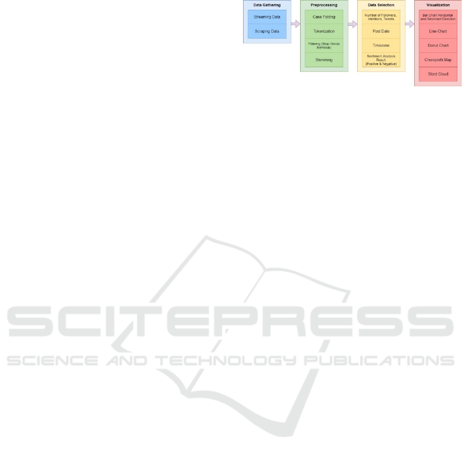
3 METHOD
There are four stages in this research to visualize the
Twitter data of the 2016 U.S. presidential election.
The first stage is to gather the data from Twitter,
preprocess the data, feature selection and finally the
visualization stages. Figure 1 depict the stages and
sub stages of visualization.
3.1 Data Gathering
We gather the data from Twitter, a microblogging
service that has an active influence in the world and
provides an Application Programming Interface
(API) that makes it easy to collect tweet data (Kwak
et al., 2010). Data collection activities via Twitter are
divided into two types namely streaming and
scraping. We store the data using an open source no-
SQL database.
Figure 1: Visualization process.
Scraping method was done by collecting data
from pre-existing tweets that are not real-time.
Tweets taken are tweets from the official account of
U.S. presidential candidates @RealDonaldTrump
and @HillaryClinton.
3.2 Preprocessing
The data that has been collected then passes the
preprocessing stage to eliminate noise. The more
noise is minimized, the less complexity for
visualizing data. The preprocessing stage adopts
(Agarwal et al., 2011; Sahayak et al., 2015) and some
adjustments are based on data characteristics. The
following are the preprocessing steps taken:
1. Case Folding: convert text to lowercase,
delete special characters used on Twitter
(RT, @{mention}), delete punctuation
except emoticons, delete whitespace
2. Tokenizing: the process of separating text
into tokens
3. Filtering: eliminating meaningless words
and non-English text
4. Stemming: reduce the words in the text to
basic words.
3.3 Data Selection
Preprocessed data then filtered to select only needed
data for the visualization process. The data selection
stages consist of eight steps:
1. Data grouping
At this stage the data is grouped to separate
tweets related to candidates Donald Trump
and Hillary Clinton. Tweets collected are
grouped into two groups namely Trump and
Clinton. Tweets containing the word
"Trump" are grouped into groups of
"Trump", while tweets containing the words
"Hillary" or "Clinton" are grouped into
groups of "Clinton".
Visualizing 2016 U.S. Presidential Election: A Twitter Point of View
35

2. Follower count
The number of followers are gathered from
the official Twitter accounts of U.S.
presidential candidates namely
@realDonaldTrump & @HillaryClinton.
3. Mention count
The number of mentions are calculated
based on the appearance of the words
"@realDonaldTrump" & "@HillaryClinton"
on all tweet data.
4. Tweet count
The number of tweets posted are gathered
from the official Twitter account of the U.S.
presidential candidates in the specified time
frame.
5. Tweet grouping
To visualize the intensity of weekly tweet
posting for each candidate in the campaign
period, we group the tweets posted using the
timestamp.
6. Sentiment analysis
Sentiment analysis of the tweets is
performed for each candidate. Tweets for
each candidate will be grouped into two
groups namely positive and negative.
Sentiment analysis aims to see the reaction
of Twitter users to each candidate.
Determination of positive and negative
sentiments obtained from the words
contained in the tweet. We use the words
that indicate positive, for example ("good",
"great") and words that indicate negative, for
example ("fail", "don't", "poor") and
positive emoticons, for example
(":)", ";)", ":D", " :-)", ":-D ") and negative
(":(", ":-(", ":'(", ":'(") (Agarwal et al., 2011;
Sahayak et al., 2015). We use a library in
Node.js to analyze sentiment data of tweets.
7. Geographical grouping
The grouping of tweets by geographical
location i.e country is done using the
timezone data. Timezone data is used
because the location variable in the majority
of tweets are null.
8. Counting adjectives
The calculation is done by counting the most
frequent words that appear in the tweet data
that has been tokenized. Then filtered for
English adjectives.
3.4 Visualization
The final stage is to visualize the data into graphic or
chart that appropriate, to show the data in in the form
of visual cues. Bar chart is used to show comparison
between candidates' Twitter profiles. To visualize
weekly tweets for each candidate, we use a line chart,
which is good in showing trends. Donut chart is
chosen to show proportion between negative and
positive sentiment for each candidate, while the
choropleth map is used to show geographical location
for sentiment analysis. Finally, to show the most
frequent adjective to describe each candidate, we use
word clouds.
4 RESULT
Data collection was carried out from 11 August 2016
to 16 November 2016. The selection of this time
period is based on the campaign period that started 90
days before the election day, and 7 days after the
election to catch the responses after the election day.
We use the scraping method to get the data backward
from election day (11 August 2016 to 9 November
2016). Meanwhile the streaming method we use to get
data in real time starting from election day (9
November 2016) to 7 days later (16 November 2016).
We collected 3,796,293 tweets which occupy 14
gigabytes of storage. The data are then cleaned and
processed. to produce four types of visualization,
namely twitter profile, weekly tweet, sentiment
analysis, and word cloud. The aim of the
Visualization is to compare profiles, activities, and
perceptions or community responses in social media
of both American and non-American citizens to the
two candidates.
4.1 Twitter Profile
A Twitter profile visualization aims to compare the
quantity of followers, mentions, and tweets of each
candidate when the data is obtained. The number of
followers, mentions, and tweets is an initial
description of how the candidates' activities and
popularity are in cyberspace. The data gathering is
using methods that have been explained in the
methodology section. The data are presented in Table
1.
Table 1: Twitter Profile on 16 November 2016.
@realDonaldTrump @HillaryClintion
Followers 11.2 Million 15.8 Million
Mentions 38 Thousan
d
90 Thousan
d
Tweets 2.5 Thousan
d
1.2 Thousan
d
ICAE 2020 - The International Conference on Applied Engineering
36
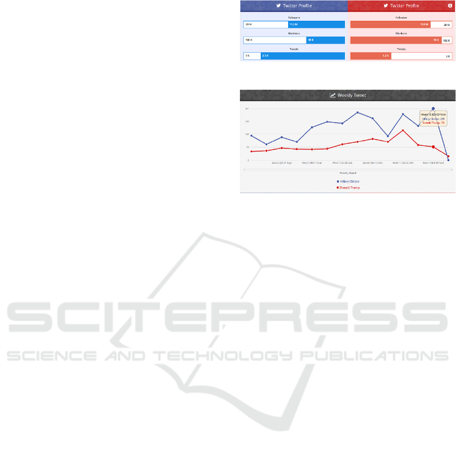
Twitter profiles are visualized using bar charts.
The length of a bar chart represents the quantitative
amount of data with a scale located on each bar. The
color on the bar chart represents the identity of the
candidate based on the color identity of the party,
namely blue for Hillary Clinton and red for Donald
Trump. Scale is made relative to each data because all
three data have a wide range of values so as to
facilitate the acquisition of insight from scale data is
made relative per data for both candidates.
Figure 2 shows the results of data visualization
from each candidate's Twitter Profile based on data
from Table 1. Donald Trump tends to be more
popular than Hillary Clinton, as indicated by the
number of followers and mentions. While viewed in
terms of activity on social media, Hillary Clinton
looks more active than Donald Trump which is shown
by the number of tweets.
4.2 Weekly Tweet
Weekly tweet visualization aims to see the
candidate's activities on Twitter during the campaign
period, election day, and one week after election day.
The visualization is presented in Figure 3 using a line
chart. The chart was chosen to visualize the trend of
posting from each candidate over time during the
campaign period until the period after the election.
The position on the line chart represents the number
of tweets with a scale on the Y axis. The color on the
line chart represents the candidate's identity based on
the color identity of the party.
Figure 3 shown, the account @HillaryClinton
posts more tweets during the campaign period. The
number of tweets from the @HillaryClinton account
peaked on week 13, which is 3 to 9 November 2016
or the last week of the campaign and on election day.
While the number of tweets from the
@realDonaldTrump account peaked in the 11th week
of October 26th to 26th, about 2 weeks before the
election day.
4.3 Sentiment Analysis
The 2016 U.S. presidential election is an event that
seizes the attention of the world. The world view of
this event is also interesting to examine. Therefore,
there are two objectives from visualization of
sentiment analysis, namely the comparison of the
proportions of positive and negative sentiments for
each candidate, and the grouping of positive or
negative sentiment trends from tweets for each
country. Grouping tweets by country is done using the
timezone data.
Figure 2: Twitter profile of each candidate.
Figure 3: Weekly tweet of each candidate.
We visualize the number of positive and negative
sentiments about the candidates using the donut chart
to compare the proportion of positive and negative
sentiments. The area on the donut chart represents the
quantitative ratio of positive and negative sentiment
of each candidate. The color on the donut chart
represents the color identity of the bearer party with a
color that has a higher intensity as a positive
sentiment, and a lower one as a negative sentiment.
The area portion is determined based on the ratio
between the number of sentiments and the total
number of tweets calculated for each candidate.
Figure 4 shows the results of the sentiment analysis
of the two candidates in the form of a donut chart.
To visualize the distribution of sentiments
towards candidates by considering geo-spatial
aspects, namely the state, we use the choropleth map.
The color saturation on the choropleth map represents
the concentration of dominant sentiment (positive-
negative sentiment) with a range of green (positive)
to brown (negative). The position on the choropleth
map represents the country where the tweet was
issued. The location of the tweet is obtained by
converting the location on the tweet timezone to the
Country code. Figure 5 and Figure 6 show the results
of visualization of sentiment analysis per country for
each candidate. Based on the visualization, the two
candidates tend to get more positive sentiment on the
data obtained. Details of the dominant sentiment
trends for each country can be seen through the
choropleth map.
Visualizing 2016 U.S. Presidential Election: A Twitter Point of View
37
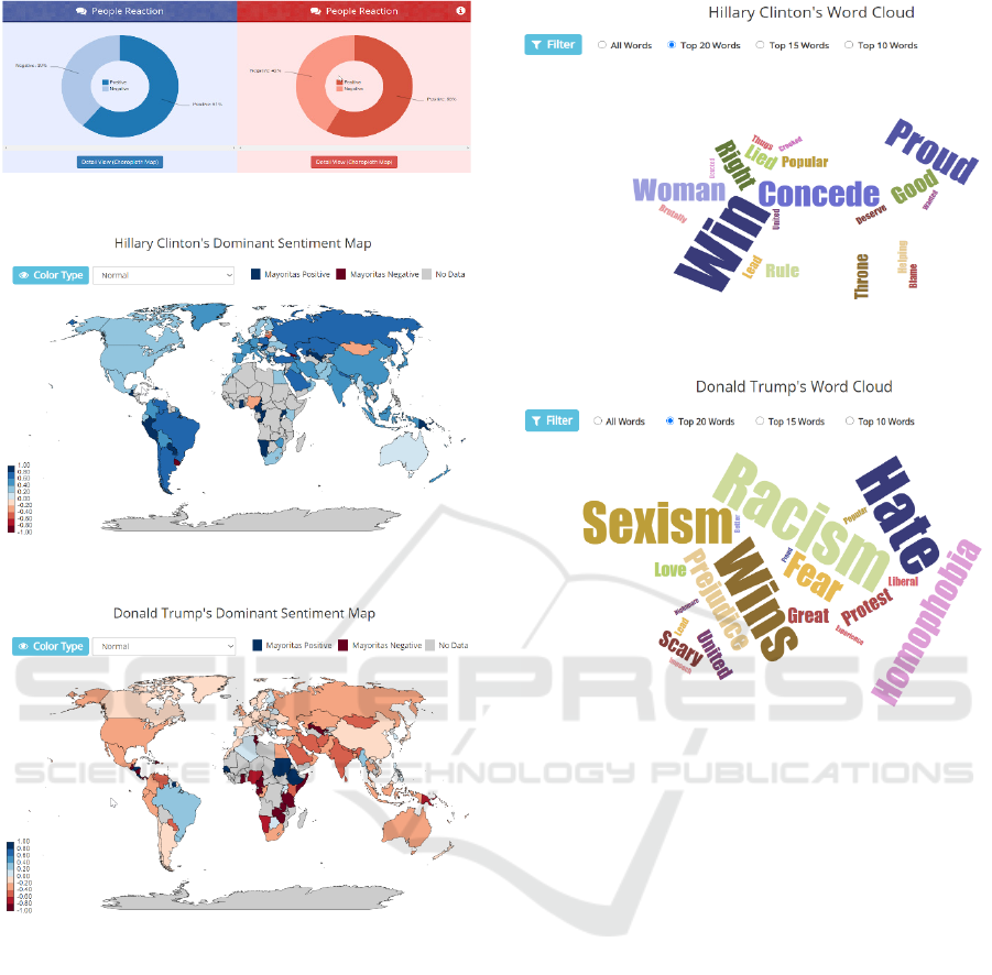
Figure 4: Sentiment analysis for each candidate.
Figure 5: Clinton sentiment map.
Figure 6: Trump sentiment map.
4.4 Word Cloud
This section visualizes the adjectives that most often
appear in the tweets associated with each candidate.
We use word cloud graphs to illustrate these
adjectives. The words displayed are obtained from the
adjective calculation results that have been described
in the method section. Figure 7 and Figure 8 illustrate
the 20 most frequent adjectives that appear in each
candidate tweet group. The size of the word depicts
the quantity of the tweet using that adjective.
Figure 7: Clinton word cloud.
Figure 8: Trump word cloud.
4.5 Evaluation
We evaluate the visualization result by using a
questionnaire to test two aspects, namely the
achievement of visualization goals and the accuracy
of visualization techniques. Achievement of the
visualization goals is tested by asking about whether
the visualization provided is interesting, easy to
understand, and provides new knowledge for the
reader. The accuracy of visualization techniques is
tested by asking whether the use of data is considered
to be sufficient in number and representative for the
problem domain, and graph for each visualization is
considered appropriate and relevant.
We use an online form to collect the responses. A
total of 27 respondents participated in the evaluation.
Respondents are postgraduate students in the field of
informatics and have knowledge related to data
visualization. Respondents were asked to choose a
Likert scale for 12 statements related to the two
aspects that were mentioned earlier. The Likert scale
used consists of four categories: strongly agree, agree,
disagree, and strongly disagree. Figure 9 shows the
ICAE 2020 - The International Conference on Applied Engineering
38
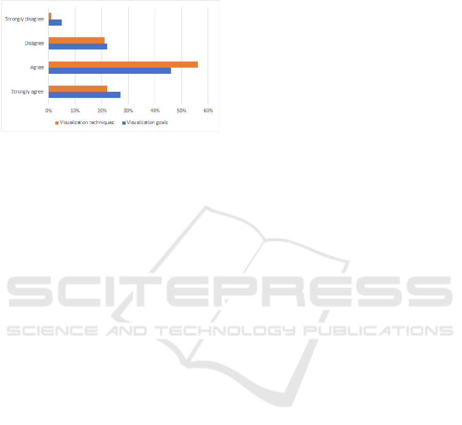
percentage results of the category of answers obtained
from respondents.
Figure 9: Evaluation results.
5 CONCLUSIONS
This study has collected more than 3.7 million Twitter
data during the campaign period until a week after
election day in the 2016 U.S. Presidential election,
then visualize the data to provide insight about the
phenomenon. We present the four visualization
categories, namely Twitter profile, weekly tweet for
candidates, sentiment analysis and adjective word
cloud.
ACKNOWLEDGEMENTS
The authors would like to thank all team members
involved in the project: Joshua Tanuraharja and Dwi
Prasetya Sujoko. Also to Dr.techn. Saiful Akbar for
the supervision.
REFERENCES
Darwish, K., Magdy, W., Zanouda, T., 2013. Trump vs.
Hillary: What Went Viral During the 2016 US
Presidential Election. In Social Informatics, Cham
2019, pp. 143–161.
Edgerly, S., Thorson, K., Wells, C., 2018. Young Citizens,
Social Media, and the Dynamics of Political Learning
in the U.S. Presidential Primary Election. In American
Behavioral Scientist, vol. 62, no. 8, pp. 1042–1060, Jul.
2018.
Enli, G. S,, Skogerbø, E., 2013. Personalized Campaigns
in Party-Centred Politics. In Information,
Communication & Society, vol. 16, no. 5, pp. 757–774,
June 2013.
Francia, P. L., 2018. Free Media and Twitter in the 2016
Presidential Election: The Unconventional Campaign
of Donald Trump. In Social Science Computer Review,
vol. 36, no. 4, pp. 440–455, Aug. 2018.
Gil de Zúñiga, H., Jung, N., & Valenzuela, S., 2012. Social
Media Use for News and Individuals’ Social Capital,
Civic Engagement and Political Participation. In
Journal of Computer-Mediated Communication, vol.
17, no. 3, pp. 319–336, Apr. 2012.
Johnson, D. W., 2015. Hired to Fight, Hired to Win.
Routledge.
Kwak, H., Lee, C., Park, H., Moon, S., 2010. What is
Twitter, a social network or a news media? In
Proceedings of the 19th international conference on
World wide web, Raleigh, North Carolina, USA, Apr.
2010, pp. 591–600.
Pătruţ, B., Pătruţ, M, 2014. Social media in politics: case
studies on the political power of social media, vol. 13.
Springer.
Sahayak, V., Shete, V., Pathan, A., 2015. Sentiment
analysis on twitter data. In International Journal of
Innovative Research in Advanced Engineering,
IJIRAE, vol. 2, no. 1, pp. 178–183.
Visualizing 2016 U.S. Presidential Election: A Twitter Point of View
39
