
Towards Adaptive Dashboards for Learning Analytic
An Approach for Conceptual Design and Implementation
Dabbebi Ines
1, 2
, Iksal Sebastien
1
, Gilliot Jean-Marie
2
, May Madeth
1
and Garlatti Serge
2
1
UBL, University of Maine, LIUM Laboratory, Laval-LeMans, France
2
UBL, Telecom Bretagne, LABSTICC Laboratory, Brest, France
Keywords:
Learning Analytic Dashboard, Dashboard Generator, Dashboard Model, User’s Needs, Context.
Abstract:
Designing Learning Analytic (LA) dashboards can be a challenging and complex task when dealing with
abundant data generated from heterogeneous sources with various uses. On top of that, each dashboard is
designed in accordance with the user’s needs and their observational objectives. Therefore, understanding the
context of LA and its users is compulsory as it is part of the dashboard design approach.
Our research effort starts with an exploratory study of different contextual elements that could help us define
what an adaptive dashboard is and how it fulfills the user’s needs. To do so, we have conducted a needs
assessment to characterize the user profiles, their activities, their visualization preferences and objectives when
using a dedicated dashboard. In this paper, we introduce a conceptual model, which will be used to generate a
variety of LA dashboards. Our main goal is to provide users with adaptive dashboards, generated accordingly
to their context of use while satisfying the users’ requirements. We also discussed the implementation process
of our first prototype as well as further improvements.
1 INTRODUCTION
Human has been producing an overwhelming amount
of data and information on the Web (John et al.,
2016). In a learning situation, every time a learner
or a teacher interacts with the learning environment
such as taking an online class in a MOOC (Mas-
sive Open Online Course) or signing into their virtual
learning environment; he leaves behind him a signifi-
cant amount of digital footprint or traces of his actions
(Greller and Drachsler, 2012). Through better use of
this data, teachers can be able to adapt their courses
and learners can use it to change their learning be-
haviors. As for the researchers, they are more inter-
ested in extracting new knowledge and in exploring
the phenomena of learning data exploitation (Verbert
et al., 2013). However, in the meantime, information
expand faster than our capacity to understand them
(Speier et al., 1999). Consequently, it becomes much
harder for users to observe, to control and to adjust
their learning process. For example, while MOOCs
helps teachers to reach thousands of students simul-
taneously (de Waard, 2015), it also creates a major
challenge for them to follow the interactions occurred
throughout a learning session effectively. To address
the problem of information overload, the adoption of
a learning analytic (LA) process is required. LA helps
the measurement, collection, analysis and reporting
of data about learners and their contexts, along with
a purpose of understanding and optimizing learning
and the environments in which it takes place (Siemens
et al., 2011). The development of this LA process rep-
resents a core objective of HUBBLE project (HUman
Observatory Based on analysis of e-Learning traces)
1
.
This project aims at creating a national observatory
with the scope of building and sharing extensive data
analysis processes based on traces generated from e-
learning environments. This process offers ways to
collect a critical mass of digital traces and to calcu-
late a significant set of data called indicators (Iksal
and Choquet, 2007). Therefore, the visualization of
these indicators in the right way can help different
users such as decision makers (teachers, designers,
administrators or policy) to extract various facts about
a particular learning situation. They can then draw
meaningful conclusions about their different decision
contexts. Moreover, the visualization task can sup-
port other users such as researchers and analysts to
share, capitalize and reuse various tools and models,
and also dashboard models.
1
http://hubblelearn.imag.fr/
120
Ines, D., Sebastien, I., Jean-Marie, G., Madeth, M. and Serge, G.
Towards Adaptive Dashboards for Learning Analytic - An Approach for Conceptual Design and Implementation.
DOI: 10.5220/0006325601200131
In Proceedings of the 9th International Conference on Computer Supported Education (CSEDU 2017) - Volume 1, pages 120-131
ISBN: 978-989-758-239-4
Copyright © 2017 by SCITEPRESS – Science and Technology Publications, Lda. All rights reserved

Being part of HUBBLE project, the scope of our
research work covers the design of reusable dash-
board templates based on a user’s requirements, and
the generation of dynamic, contextual and adaptive
dashboards. In fact, the design of a dashboard model
should take into account various constraints related to
the user’s profile and their characteristics, distinct de-
cision and learning contexts, etc. Our research also
has a strong connection with existing works where
a considerable number of heterogeneous indicators
produced by different analysis tools (KTBS (Zarka
et al., 2012), UnderTracks (Bouhineau et al., 2013),
SMOOPLE (Gilliot et al., 2013), UTL (Iksal and
Choquet, 2007)) will be dynamically and contextually
visualized.
In order to design an effective contextual dash-
board that provides a useful and dynamic way to
access to relevant indicators, a central assumption
in our work is that it is necessary to work on the
identification of both visualization and decision con-
text’s elements. Hence, we conducted a needs assess-
ment study to better understand user’s requirements
in terms of data visualization, which leads us to pro-
pose a conceptual design process for a dynamic gen-
eration of contextual LA dashboards. The study we
have conducted helps us to shape our research ques-
tion that focuses on: (i) what is the user’s visualiza-
tion and decision contexts? What are the most rele-
vant indicators users need to make decisions? How to
present these indicators for maximizing the assistance
of the decision-making? How starting from context’s
description, an efficient dashboard can be provided
to meet user’s needs? Our work aims to introduce
a conceptual model for a dashboard generator pro-
cess which will be used to generate a variety of LA
dashboards according to the different context of use.
This paper is structured as follows: in the first sec-
tion, we provide a brief background on the field of
LA dashboards. We present in the second section, the
study about user’s needs and their different contexts.
The process of building an LA dashboard based on
the identification of our user’s contexts is discussed
in section 3. A case study and our first prototype are
presented respectively in sections 4 and 5. We draw a
conclusion and highlight future works in the last sec-
tion.
2 RELATED WORKS
Making use of a large amount of data such as pro-
duced artifacts (Arnold and Pistilli, 2012), social in-
teractions (May et al., 2011), resource usage (Verbert
et al., 2013), time spent (Arnold and Pistilli, 2012)
and exercise results (Mazza and Milani, 2004) in LA
process aims at providing a better understanding and
optimizing the learning experiences (Siemens et al.,
2011). To facilitate the process, especially in the
decision-making, data analysis tools such as data min-
ing and data visualization techniques are widely used
and integrated into learning analytic dashboards.
Data mining techniques can help users to de-
tect new patterns and new knowledge that are likely
to be relevant. While it can provide visualization
along with tools that support data interpretation, it
do not support decision-making (Wolff et al., 2013).
It should be noted that it is not how a data mining
process is meant to be used in LA as the data visual-
ization is another domain of applications. Plus, data
mining techniques are often too complicated for non-
experts such as some teachers and students to make
use of them and to interpret their meaning.
The other well-known visualization solution is
learning analytic dashboard (LAD). LADs have been
developed by a number of researchers. They aim at
consolidating and arranging a set of the most rele-
vant data related to user’s objectives on a single com-
puter screen in order to visualize and monitor them
at a glance (Few, 2013). In this section, we present a
group of LAD applications that have been deployed
over the past few years. Similar to our objectives,
these dashboard applications are designed to select
and visualize digital footprints in order to support
viewers to deal with the huge amount of data streams
generated from different sources. While various exist-
ing dashboards are targeted to provide users with gen-
eral information related to only one particular learn-
ing environments such as Travis (May et al., 2011)
and GISMO (Mazza and Milani, 2004), others go fur-
ther and work on giving the opportunities to users
to control data generated from multiple sources such
as REFLET CourseVis (Mazza and Dimitrova, 2007)
and Tatiana (Dyke et al., 2009). Concerning evalu-
ation, various research works highlighted the impor-
tance of the positive effect on different users given by
the use of the dashboard (Santos et al., 2013). A line
of existing works has been conducted with learning
analytics to help teachers in their activities, for exam-
ple, to track progress or to make their reports (Kelly
et al., 2013), (Xhakaj et al., 2016). Other works have
studied the effect of learning analytics on student re-
tention (Nunes et al., 2013), on their performance
(Arnold and Pistilli, 2012) or on improving students’
engagement (Bouvier et al., 2014). Another example
of learning analytic tool is the Open Learning Ana-
lytic platform (Siemens et al., 2011). This tool aim at
considering the need of four users’ categories at the
same time: learners, educators, administrators, and
Towards Adaptive Dashboards for Learning Analytic - An Approach for Conceptual Design and Implementation
121

researchers.
The problem is, in most cases, dashboards are
imposed on users, and provide them general infor-
mation without considering their abilities, prefer-
ences and personal observation objectives (Martinez-
Maldonado et al., 2016). In fact, the use of LADs
should satisfy users’ needs in several contexts. How-
ever, having multiple users with different character-
istics may imply different requirements for visualiza-
tion, where the same data can be presented at a dif-
ferent time and in a several ways for various reasons
(Olmos and Corrin, 2012). In other words, to in-
crease the dashboard efficiency, it is crucial to con-
sider the variety of users’ context during the design
process. Even though data visualization can be ap-
plied to a wide range of contexts, the creation of a
context-aware dashboard tends to be a complicated
task (Li et al., 2015). As, the context definition itself
is considered to be a challenge mainly because of its
differences from one case to another (Baldauf et al.,
2007). Several works such as the CAVE platform (Xi-
aoyan et al., 2012) tried to define their visualization
contexts in order to help their users to monitor visu-
alizations regarding different situations. Three con-
text categories are defined: user’s problem, knowl-
edge and purpose contexts where the difficulty is to
ensure that visualization can not only match the prob-
lem, purpose and knowledge of user but also have to
be deployed in a way that makes sense.
With the diversity of existing visualization tech-
niques, it remains difficult to represent an accurate
data with an adequate visualization technique. For in-
stance, performance results can deliver through sev-
eral techniques such as histograms, bubble, pies, ta-
ble, and so forth (Scheuer and Zinn, 2007). Ad-
ditionally, the diversity of data representations can
also be related to the visualization vision that changes
from one person to another and regarding their con-
texts (Silius et al., 2013). To better understand user
goals and needs, many research studies tried to ex-
plain and to define users needs through the use of sev-
eral techniques such as inquiry (Xhakaj et al., 2016),
interviews (Bakharia et al., 2016), questionnaires (Ali
et al., 2012), the evaluation of the dashboard design
(Park and Jo, 2015) or survey (Mazza and Dimitrova,
2007). Our proposal has a strong connection with
these works. However, our aims are not only based
on the study of the users visualization objectives,
and user’s characteristics, including their visualiza-
tion preferences, but also the study of their decision-
making context in order to pursue users to visualize
their desired data in a meaningful way that supports
them take action or a decision. We attempt to present
an expressive dashboard to be easily interpreted by
each user. As a matter of fact, a visual representation
can be meaningful to one user, but it may be incom-
prehensible to another. In the study, we defined dif-
ferent learning context elements that led to the design
of a dashboard generator. Our goal with the latter is
to provide users with a dynamic dashboard along with
the data indicators and their visualization tools at the
right moment based on their context of use.
3 DASHBOARD GENERATOR
ARCHITECTURE
Answering users’ needs regarding LAD represents a
central part of our work. For this reason, we place
a special focus on identifying the users profiles and
their requests. In HUBBLE project, the study of the
massive amount of data produced by the interaction of
students and teachers with the existing learning tech-
nologies, interests not only students and educators
themselves as decision-makers, but also researchers,
analysts, designers, administrators, and policy mak-
ers and so forth. As we are dealing with a wide range
of contexts and we are aware of how important to
fully explore the user’s requirements (Stodder, 2013)
throughout the process of designing LAD, the study
of the variety of users, their different learning prob-
lems, and their intended purposes take a prominent
place among our research challenges.
Our work aims at designing a dashboard generator
process which enables a dynamic production of dif-
ferent effective dashboards in order to answer various
visualization needs expressed by each user in a wide
variety of contexts. Hence, each generated dashboard
should provide, on the one hand, a set of indicators
gathering that facilitates the links between the data
and the visualization objective. On the other hand,
it should provide adequate visualization components
to maximize the value of this relevant set of data to be
visualized at the right time.
The core of this generator process is to integrate
visualization components, user descriptions and dif-
ferent data/indicators where every set of indicators re-
lated to one visualization objective will be gathered
together in order to add an additional semantic in-
formation (as illustrated in Figure 1). These set of
components will act as a semantic framework for stor-
ing contextual information required for generating an
adaptive dashboard.
However, the problem within this information re-
lated to the user’s contexts is that they can change
rapidly (Dey, 2001), since users themselves may not
be able to easily maintain the same preferences or
objectives when, for example, observing a dynamic
CSEDU 2017 - 9th International Conference on Computer Supported Education
122
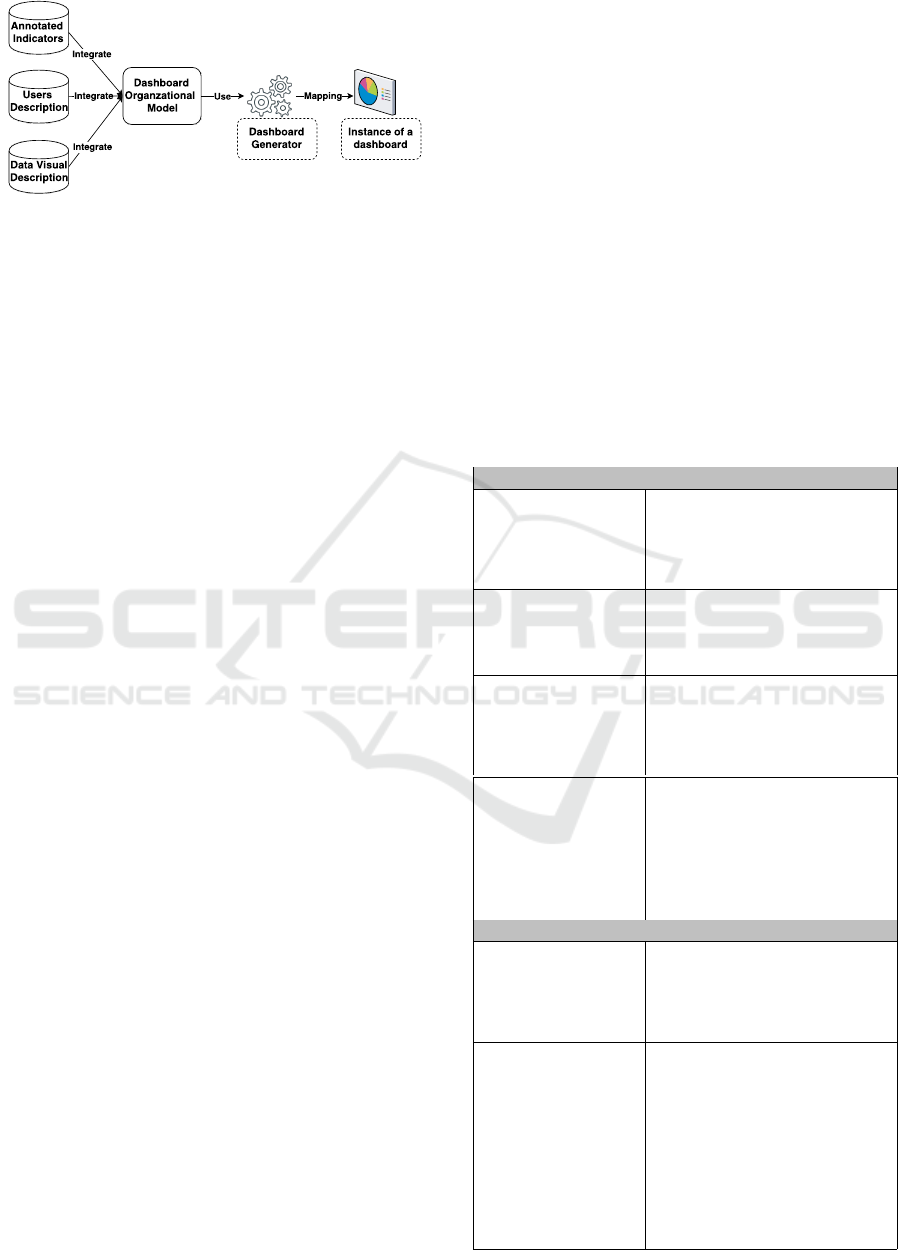
Figure 1: Dashboard generator illustration.
data evolving network. Hence, it can affect the choice
of indicators or visualization component selection.
Apparently, to bridge the gap between these differ-
ent dashboard components within a dynamic context,
a full description of the user’s contexts and desired
dashboards are needed. This description aims at facil-
itating the understanding of the links between existing
components and dynamic user’s needs.
Our work relies on user-centered (Abras et al.,
2004) and context identification design. In the fol-
lowing section, we introduce a contextual study with
the aim of better understanding user’s requirements.
This need’s identification will bring us to create the
main components for dashboard modeling, including
user, visualization, and data models.
3.1 Identifying Users Needs
We conducted a needs assessment study including
survey and interviews to investigate different users’
contexts. This needs assessment is used to gather
a different set of data about our probable end-users.
More specifically, it may help us to define what is
a user’s visualization and decision context? What
are the most relevant indicators users need to make
decisions? How to present these indicators to max-
imize the assistance of the decision-making pro-
cesses? How starting from context’s description effi-
cient dashboards can be provided to meet user needs?
To answer these questions, we organized our study
into five sections presented in the table 1 where each
one describes a contextual factor: who, what, how,
when and then? The first section ”WHO” aims at
gathering data to help the description of users char-
acteristics: their roles, their visualization knowledge
level, their activities, their preferences and what kinds
of decisions they want to make. This information
helps the dashboard generator to identify who is the
user, in which category they can be assigned. The sec-
ond section is dedicated to the identification of ”what”
information each user needs to visualize to make de-
cisions. The third section is used to identify ”when”
does it make sense to visualize a particular data and
when it can be more useful in a given observational
scenario. The section thereafter focuses on what is
the best way to visualize data in a given situation for
a particular viewer. In other words, each user needs
to choose ”how” to view each data in order to facil-
itate its understanding and interpretation. Lastly, in
the case of context evolution or change in the situa-
tion, a user may detect, for example, some interesting
patterns which require to obtain more details or even
to get additional data visualization to ensure deep data
interpretation. For this reason, it seems necessary for
the user to identify also his needs and preferences in
such situation in order to improve the dashboards gen-
erator adaptation to their new requirements and this
new context. For example, how they want to be in-
formed? How can they interact with this evolution?
The following table 1 presents highlighted questions
raised in our needs assessment.
Table 1: Needs assessment sections and elements descrip-
tion.
WHO?
User profile and
role: tutor, stu-
dents, etc.
This is about identifying the
user category in order to pre-
pare different dashboard ver-
sions, if it is possible.
Personal informa-
tion: name, age,
physical condition,
etc.
This refers to specific infor-
mation that can be used for
user classification.
Preferences and
abilities
This question defines the
level of knowledge of the
user, and it helps to determine
his prior preferences.
Goals and interests
This is the main question
to understand what the user
wants to do with the dash-
board and to explain his
needs to have a personal or
specific dashboard.
WHAT?
Analysis scenario
It is helpful to provide the
user with a set of data gath-
ered during his assigned anal-
ysis scenario.
Desired indicators
Among the list of indicators
provided by a given anal-
ysis scenario, the user can
precisely determine what is
most relevant indicators to be
visualized in his dashboard
and they can explain their
choices.
Towards Adaptive Dashboards for Learning Analytic - An Approach for Conceptual Design and Implementation
123
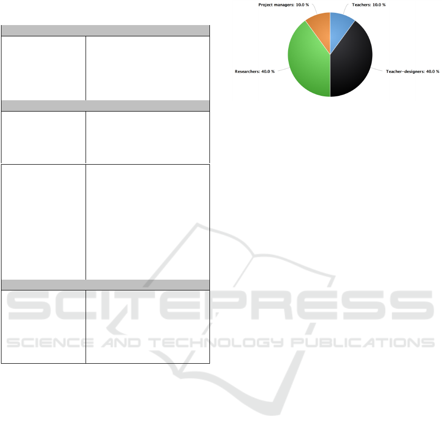
Table 1: Needs assessment sections and elements descrip-
tion (cont.).
HOW?
Visual represen-
tation : Textual,
graphical repre-
sentation or using
audio effect, etc.
Each user may prefer or used
to a given data visualization
technique and thus, it is pos-
sible to maintain the same
data visualization preference
with the dashboard.
WHEN?
Temporal modal-
ity: synchronous,
asynchronous or a
hybrid visualiza-
tion,
It defines the possible time of
visualization.
Users interaction
and collaboration
We study the needs of the
integration of collaboration
tools to facilitate decision-
making via dashboards. This
information helps to iden-
tify ”when” the dashboard
should be generated to ensure
the communication between
a group of users and how in-
teract with dashboard during
visualization?
THEN?
How react during
context evolution?
Modify graphical
representation,
notify users, so on
and so forth.
This information helps the
dashboard generator to pro-
pose the relevant adaptive
strategy in order to guarantee
user satisfaction even with
change of context.
3.2 The Needs Assessment Analysis
We targeted several members working on 13 differ-
ent use cases involved in HUBBLE project through
either by contacting them through a survey or an in-
terview about their visualization needs. A use case, as
defined in HUBBLE project, can be the study of data
gathered during a learning environment or a pedagog-
ical scenario that involve produced by a set of users
(teachers, students, researchers, and so on.). Each use
case includes a detailed documentation that would al-
low describing a sequence of events, activities, and
users involved in such platform.
Among 13 use cases, we received 10 feedbacks
which represent 10 different application of contexts.
As a result, we noticed a diversity of users’ profiles
that could be interested in data visualization, repre-
sented in Figure 2. While 4 use cases have targeted
the works and the requirements of researchers, 4 oth-
ers use cases interested in teachers-designers, and the
Figure 2: Breakdown of user’s profile.
last two use cases are dedicated to teachers and to
project managers. Based on the initial results of our
needs assessment study, we identified a diversity of
user’s profile and their different visions about the ef-
ficient dashboard related to their situations and con-
texts. These primary results are detailed as follows:
Researcher Vision:
Three out of four use cases involving researchers
consider data visualization as a multi-user activity
which requires sharing the same dashboard to better
collaborate with other researchers. This collaboration
requires the integration of different tools of commu-
nication to facilitate users’ interaction such as chats
or forums, and so forth. These researchers expressed
the need to visualize data in order to:
1. Study the evolution and the progress of learners in
order to identify students behaviors with the aim
to allow extracting student series/ patterns of ac-
tions.
2. Determine learner typology.
We also understand that user like researcher is
able to interpret data with different and complex rep-
resentations. Regarding their high knowledge level
with visualization techniques, they can express eas-
ily what they expect to have in terms of graphical
representations. For this reason, they expressed their
need to have the ability not only to be a dashboard’s
viewer but also to manage their dashboards by hav-
ing the right and the possibility to personalize their
dashboards directly: the set of data, the choice of data
representation, dashboard template, time of visualiza-
tion, etc.
Teacher-designer Vision:
Regarding the study of the different answers col-
lected from the use cases designed for teachers-
designers, we observed that unlike the researchers’
demands, three use cases consider the use of dash-
boards as a single-user activity where sharing infor-
mation with other users from the same categories is
unnecessary to satisfy their visualization needs, espe-
cially when they have the need to:
CSEDU 2017 - 9th International Conference on Computer Supported Education
124
1. Evaluate proposed exercises and courses.
2. Determine the typology of their students.
Some pedagogical designers/teachers proposed to
integrate not only visual representations but also
sound effects like being informed with alert notifica-
tions in order to detect unusual situation. Therefore,
it requires the development of a hybrid dashboard that
provides real-time visualization and alert notifications
during session and proposes a visual overview after
session.
Teacher and Pedagogical Team Visions:
Both users have described similar goals and inter-
ests. Their main purpose is to:
1. Identify parameters representing the popularity
and the healthiness of courses.
2. Determine parameters indicating the reason for
both failure and learner success.
3. Understand the situation and interact with stu-
dents.
For example, in the case of MOOCs, with the remark-
able number of registered students, analysts paid at-
tention to the use of simple visualization representa-
tion in order to facilitate the interpretation of this mas-
sive amount of data, such as using significant colors
to indicate success as green color and red one repre-
senting fail.
Hence, we can consider that their most impor-
tant challenge here is to reduce the number of failure
students. For this reason, it seems necessary to of-
fer teachers and the pedagogical team a hybrid dash-
board. Thus, it may allow them to be reactive and
aware of the situation of their students, to be informed
about the student’s problems and to detect the student
risk to be a failure as soon as possible with the aim
to help them very quickly. One of their requests is to
provide sound effects and alerts and to have also the
ability to share some results, if it is necessary, with
other users (other teachers or project managers).
Based on the first results of our needs assessment
study, namely what and how users need to visualize
and to organize the data visualization to get ”the best”
dashboard for a particular scenario, we represent a
proposed model of the different learning context el-
ements related to the dashboard generator’s process.
This proposed model is described in detail in the fol-
lowing section.
Figure 3: The structure of a generated dashboard.
4 TOWARDS THE GENERATION
OF CONTEXTUAL LEARNING
DASHBOARDS
Based on our needs assessment analysis of how each
end-user perceives his dashboards, we identified a set
of dashboard descriptions. The dashboard could be
defined as a visual display that enables visualizing the
most important indicators produced during the analy-
sis process. In our case, a structure of the dashboard,
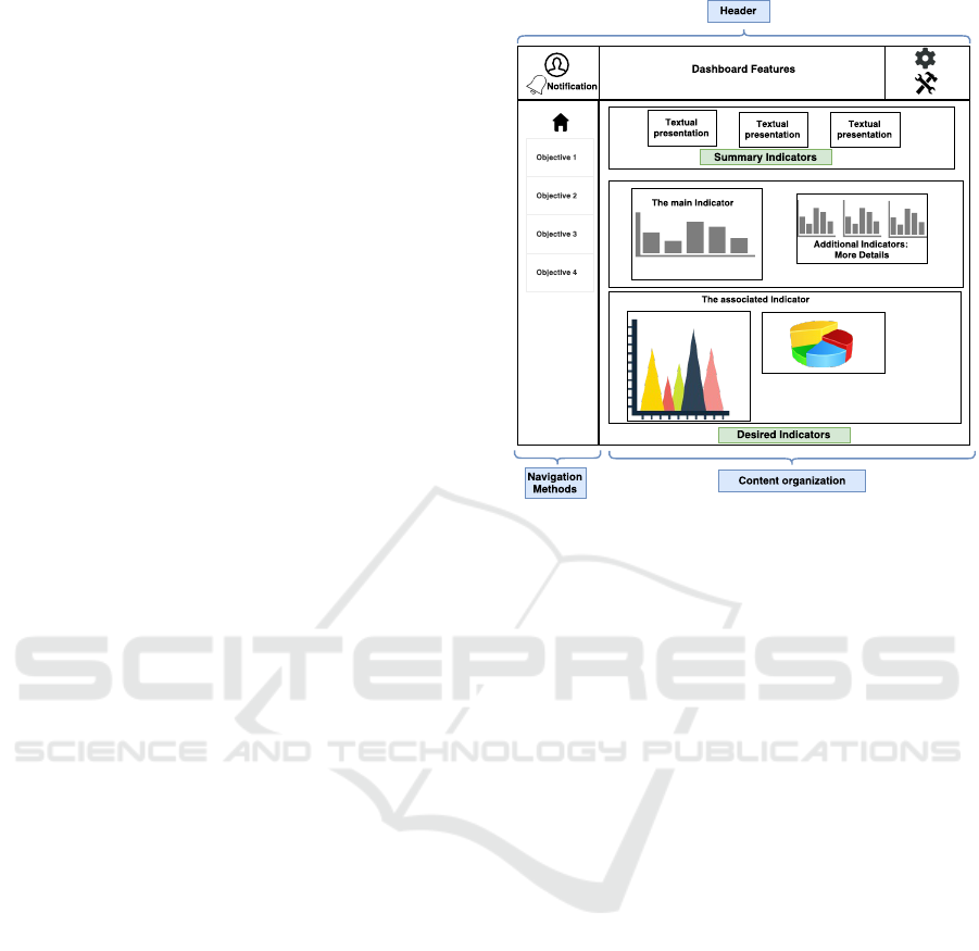
presented in Figure3, not only have included a set of
indicators consolidated on a single computer screen
(Few, 2013), but also to regroup and link a set of indi-
cator together based on their relationship. In addition,
it has to incorporate different visualization function-
alities which may help to manipulate and to highlight
the most relevant information. These functionalities
can be the use of alert notifications, positioning on
the page, and careful use of colors and fonts, etc.
4.1 Dashboard Organizational Model
As introduced earlier in the paper (refer to Figure1),
the proposed dashboard generator process, takes into
account, every time, the different contextual descrip-
tion provided by each particular user.
Based on this description, we depict in Figure3 a
sample of dashboard structure as it will be proposed
to our users.
This dashboard template (Figure4) incorporates
Towards Adaptive Dashboards for Learning Analytic - An Approach for Conceptual Design and Implementation
125
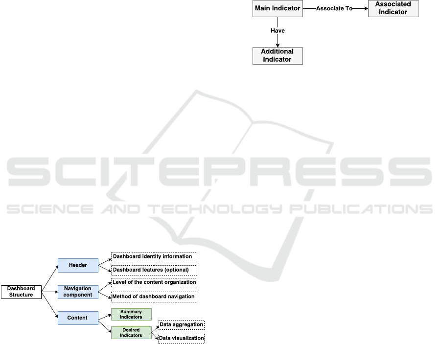
three basic components. The first component is dash-
board headers. Headers provide dashboard identity or
logos and incorporate the set of functionalities that it
can make the dashboard more useful. It can facilitate
the collaboration between a group of users by adding,
for instance, sharing tools or chat. Other requested vi-
sualization functionalities may be used to re-organize
the dashboard structure. The dashboard can also in-
corporate other functionalities such as alert warning
notifications with the aim of providing a hint about
unusual events and to highlight the most interesting
changes in the dashboard.
The second component represents the choice of
the navigation methods and the levels of the content
organization. It may allow the representation of the
set of presented indicators either on one page or using
a menu or tabs with the aim to facilitate the naviga-
tion on the dashboard and also it will serve to pool
indicators with the same objective together in order to
maximize efficiency.
The third component represents the core of the
dashboard or the content area which focuses on in-
dicators. It consists of two main elements. The first
element -defined as summary indicators in Figure3-
consists of the representation of textual indicators that
ensure the display of a textual description about the
most relevant indicators. The second element con-
cerns the visualization of a set of organized and re-
grouped indicators. This part takes into account the
importance of choice of visualization forms and the
choice of which indicators will be grouped together
in a way that facilitates understanding and shows the
relationship between them.
Figure 4: Main components of the dashboard structure.
Organizing dashboard’s contents in a meaning-
ful way is considered as a challenging issue where
indicators are not designed to be placed anywhere
on the dashboard and every item related to another
one should be positioned close to each other (Few,
2013). For this reason, we defined relationships be-
tween dashboard content in order to set the appropri-
ate way to look at user’s objectives. This component
is represented by the model in Figure5, and consists
of two main relationships:
1. To group main/desired indicators -defined by the
user- associated with other selected and proposed
indicators that may serve to satisfy the same ob-
jectives (refer to the first and the second indicator
in Figure3). The simple way to relate associated
indicators can add more accessibility to them.
2. Moreover, this component represents a set of dif-
ferent structures for the same information with a
different level of detail such as the additional In-
dicators in Figure3.
Figure 5: The relationship between indicators.
So, the dashboard generator has to identify the re-
lationship between these indicators and to represent
them appropriately for every end-user. In order to
achieve that, three main information are required. The
first one is related to the user’s characteristics. It in-
cludes models that define their visualization prefer-
ences. The second information corresponds to data
representation layer or visualization model, including
the dashboard’s functionalities. The last component
is related to modeling data including the learning sce-
nario and the activities’ models.
These different components are represented in
Figure 4, in order to provide the user with a set of
appropriate data and kind of visualization. In the fol-
lowing paragraphs, we describe these different com-
ponents.
4.2 Dashboard User Model
The user model is a fundamental component of an
adaptive system. Our generator has to adapt the dash-
board in different contexts automatically, so, the de-
sign of the user model is crucial. It must take into
account the analysis of the results we gather in our
needs assessment grid. This model has to represent a
broad range of assumptions about different users. A
user model should consider these two major needs:
First, it has to represent the user’s multiple visualiza-
tion objectives. Next, it has to be sufficiently adapt-
able to integrate the evolution of a user’s needs. Our
model is initialized with a stereotype, and in a future
stage, it will be modified according to the user activity
on the dashboard.
In this section, we describe the user model’s el-
ements necessary to establish our objectives. This
CSEDU 2017 - 9th International Conference on Computer Supported Education
126

model considers the user’s level of visualization
knowledge, preferences, interests, behaviors and
other facts. The different sections of our user model
are the following:
Personal Information: It helps to classify users ac-
cording to their personal characteristics such as their
roles, their visualization objectives. This section has
a twofold purpose. On the one hand, it is necessary
to the dashboard identification (use case, user id) that
will lead dashboard generator to identify the user sta-
tus. Knowing the use case assigned to our end-user, it
may help us to limit the data selection and then help us
to provide only interesting data related to user needs.
When users log on, they will be driven to their dash-
board according to their preferences. In fact, the dash-
board generator will present an overview dashboard
containing all the latest visualized indicators in order
to keep them informed about the last events.
On the other hand, personal information section
aims at classifying viewers by their roles, their visual-
ization objectives or even by their skills and abilities.
The purpose of user classification is to help in facil-
itating the display of the right information for each
user. Moreover, we will be able to infer other user
preferences based on similar profiles in order to en-
hance the accuracy of the provided data.
• User id: It is used to identify the user and to con-
nect him to their session.
• User role: It aims at categorizing users by their
roles, such as tutor and student.
• User type: It indicates whether the user is con-
nected as an individual or is associated with an-
other group of users. In case, the user is related
to a particular group of users; dashboard gener-
ator will enable the use of collaboration tools to
ensure the communication within the group.
• User status: It identifies whether the user is
active/connected or not. It appears to be a relevant
information which helps to ensure the best way of
presenting data: the dynamism of data represen-
tation. For example, while a newly active user is
interested in visualizing real-time indicators, the
other user may prefer to have a summative repre-
sentation and an overview of the interesting infor-
mation due in a given period.
• Use case: Every use case is attached to an analysis
scenario and their list of data. This information is
important for data selection where each user will
be provided with a set of indicator related to his
specific use case to ensure data accuracy.
• Visualization objective: It describes the user’s
goals and interests: what he needs to explore, ex-
plain or decide. It describes the visualization ac-
tivity that users care about. It helps also to rec-
ognize what users are trying to achieve with the
dashboard. Knowing users objectives are consid-
ered more than just comprehension; it also in-
volves defining his context. For example, users’
goals and interests can be the identification of
a particular phenomenon or the evaluation of a
group of activities, signaling problems, transfer
knowledge.
User’s Knowledge: This part describes the visual-
ization experience of the user and their abilities. It is
initialized with his previous experience. Users can be
a beginner, a competent, a proficient, an expert level:
For example, a beginner level user often needs step-
by-step support for how to manipulate visualizations
while an expert-level user may require more support
for personalizing visualization to complete complex
tasks.
User’s Visual Preferences: A user preference in-
cludes the dashboard template, the desired data, users
preferred graphics and another in which it describes
users adequate dashboard. Users’ preferences can be
assigned to not only to a particular user but also to
an entire group of users sharing similar users’ pro-
files. This section is necessary for the definition of
an adaptive strategy in which the automatic creation
of information graphics tailored to users’ preferences
and tasks.
4.3 Dashboard Visualization Model
The main objective of data visualization is to let the
viewer get a relevant analysis and understand what is
happening. Visual representation does not only repre-
sent a significant amount of data coherently but also
help to extract new knowledge and/or to let the viewer
be a decision maker within this particular context.
However, with the variety of existing visual graph-
ics and a large amount of data, the choice of the ade-
quate data representation may be critical. The choice
of a visual form should be easily understood by users
and should represent information in a meaningful way
to ensure the user’s needs by providing familiar vi-
sual components to the user and respect their level of
visualization knowledge. Presenting a wrong visual
graphics or providing a sophisticated type of visual-
ization to a beginner viewer, for example, may lead to
wrong data interpretation.
In an attempt to easily provide the best-suited data
representation, we devoted the following part to de-
scribe and to index the characteristics of our visual-
ization model or a right visual graphic selection:
• Form of visualization: It helps to determine the
presentation types: It can be a table, chart, text or
Towards Adaptive Dashboards for Learning Analytic - An Approach for Conceptual Design and Implementation
127

image.
• Number of dimensions: It specifies the amount of
information that one single visual form can repre-
sent.
• The quantity of data: It describes some items that
could be displayed for each dimension. Only a
few or many?
• Data structures: It indicates the appropriates
structure of data and format of the information to
be represented. This information is necessary to
link the desired data with the best visual form.
• Purpose of visualization: Another way to offer the
suited display from the angle of what user tasks a
visualization aims to support. Visualization can
help viewers to compare data sets easily or may
present composition, data distribution or to high-
light the relationship between data. For exam-
ple, tables are useful to show the differences or
similarities between values while a hierarchical
data representation shows relationships between
groups.
• Visual granularity: It allows changing the aggre-
gation of the data to display the desired level of
detail.
• Meta data: It is optional information that contains
details. It serves to index visual representations
like if the associated chart is a multidimensional,
temporal, hierarchical graph.
• Similar visualization: It serves to recommend and
to associate other visual graphics that share simi-
lar characteristics (number of dimensions, the for-
mat of the information) and can be used in the
same context or some contexts which fulfill sim-
ilar objectives. This can help the user to have a
different interpretation of the same data.
4.4 Analysis Scenario Model
The key objective of scenario description is to ex-
press an additional contextual information like data
relationships that allows the dashboard generator to
understand, find the right indicators easily and to be
able to combine it with other information as needed
in a meaningful way. In each specific scenario, all
data and indicators are related to satisfying a particu-
lar analysis objective. Each specific scenario involves
different activities including a set of data. For in-
stance, to identify student engagement, we need to
access to each student activities like the number of
possible connections established by each student or
the amount of exchanging messages between forum’s
members.
In this section, we define different scenario prop-
erties:
Analysis Scenario Description:
• Learning Scenario Objectives: Each scenario is
associated with visualization goals and interests.
Every objective of visualization can be achieved
by including one or multiple tasks. For example,
to classify of students over time, dashboard gen-
erator need to access to every student’s activities
like student response rates, connection ratio, etc.
• Use case: It defines the user’s pedagogical con-
text, their field of education or training, used in-
formation technology platforms and their users. It
helps to associate a list of data for each user.
Activity Description: Each activity is described by a
set of data like its users, the activity status to indicate
whether the activity is finished, started or ongoing.
• Task-related purpose: It defines the specific goal
of activity within a particular scenario.
• Activity status: The activity status indicates the
level of processing activity (planned, started or
finished), where a planned activity is yet to begin,
a started activity is continuing or ongoing activity
and a finished activity is complete. This field is
bound with the date and time stamp that provides
information about the right moment to visualize
the set of indicators/data related to the activity.
• User of an activity: e.g. group of students
Dashboard Indicator Description: Every scenario
includes a list of indicators related to different activi-
ties. The data/indicators should be organized and de-
scribed in such a way that it can be selected easily by
the dashboard generator for a specific context. The
part illustrates the data structure and characteristics:
• Type of data: Data can be quantitative if it is in
numerical form, whether it is continuous and dis-
crete or whether it is qualitative. For instance, line
Graphs can be used to display the development
of quantitative values over a period of time rather
than pie charts and bar charts that can both be ef-
fective methods of portraying qualitative data.
• Number of dimensions: It indicates the amount of
information that one indicator can provide. For
example, an indicator can represent user devel-
opment over time. This indicator provides two
information: Time and users work’s evolution.
Both types of data and number of dimensions aim
at bridging the gap between data and visualiza-
tion model by finding best match data (the type
of data) and visual elements and properties (data
structure) to pick the right data visual presentation
easily.
CSEDU 2017 - 9th International Conference on Computer Supported Education
128
• The quantity of data: When the user has a signif-
icant amount of data to visualize, the dashboard
generator can propose data visualization at a dif-
ferent level of abstraction in order to be able to
facilitate the data interpretation.
• Meta data: It associates other similar indicators
that are dedicated to the same context, scenario,
use cases, users and may have related purpose.
In order to fulfill the requirements identified due to
our needs assessment survey and interviews, we pro-
posed and designed a dashboard generator process,
which is further presented through the presentation
and the implementation of a prototype (section 5).
5 ILLUSTRATIVE CASE STUDY
In HUBBLE project, we had to work on various
datasets; each dataset is associated with a use case.
A use case is composed of a data and individuals de-
scription such as the teacher, researchers, analysts,
who were involved in a real learning session. In or-
der to build our first prototype, we did focus and used
data from the MOOCAZ case study; it is a MOOC
which concerns the creation of a MOOC from A to
Z. We received data and observational needs from re-
searchers of the French ENS Cachan. We had two-
course sessions with approximately 5000 students in
each one. Each course session has a start date, set by
the pedagogical teams, and an end date. The learn-
ers of the same session follow the MOOC with pro-
posed deadlines. These learners had to work on sev-
eral proposed chapters that may include videos, quiz,
and assessments. During these MOOC sessions, re-
searchers have identified a set of users stereotypes.
After conducting its analysis, a visualization of learn-
ers categories and their work’s evolution during the
entire MOOC sessions are needed.
6 PROOF OF CONCEPT OF
CONTEXTUAL DASHBOARD
Our dashboard generator is defined as a context-
sensitive framework that adapts continuously to many
viewers’ contexts with the aim at satisfying their de-
scribed needs where these different components rep-
resent together the dashboard context. This frame-
work as illustrated in Figure 1 depends on three fun-
damental components that are, user, data, and visual-
ization models according to the dashboard structure
model discussed in the previous sections.
Figure 6: A sample of generated dashboard page:
MOOCAZ use case.
To validate our work in a real world setting, we
implemented a prototypical tool, an example of a gen-
erated dashboard is presented on Figure 6. The pro-
totype helps the viewer to answer their contextual re-
quirements through providing an adaptable visualiza-
tion solution that satisfies their desired visualization
representations of a specific set of indicators. For a
first time, the adaptation of the generated dashboard
will be done at any time but only on the demand of
the users where they can manually configure the entire
dashboard. This will be our first step toward the de-
sign of adaptive dashboards. As illustrated in Figure
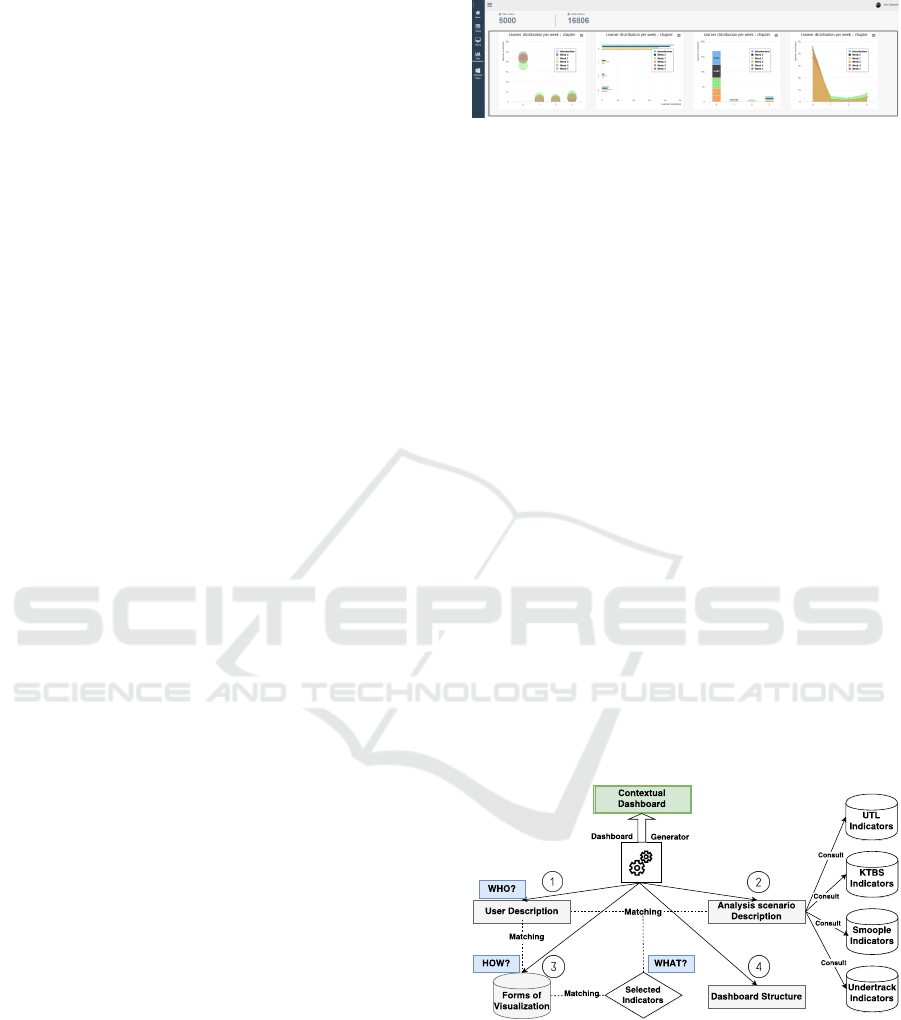
7, the dashboard generator starts by identifying the
concerned viewer: his role, his objectives, and his use.
These information aim at distinguishing the appropri-
ate analysis scenario including a set of indicators. In
the HUBBLE project, indicators are collected, trans-
formed and calculated separately by various analysis
platforms: UTL, KTBS, SMOOPLE, UnderTracks.
When some indicator’s descriptions meet users’
described objectives, they will be selected by the
dashboard generator that will prepare a set of associ-
ated indicators that serves for the same analysis sce-
nario or user activities (as it is explained in Figure 5)
as means of enriching the dashboard’s content.
Figure 7: Dashboard generation process.
In the third step or form of visualization selection
step, the dashboard generator will take into account
the description of the selected indicators such as a
number of dimensions, the type of data. This step
helps to sort a group of visual representations -already
pre-selected based on user preference- then, to select
the adequate visual form that matches with the indi-
cator description.
Towards Adaptive Dashboards for Learning Analytic - An Approach for Conceptual Design and Implementation
129

Finally, by having the set of appropriate content
depending on users’ visualization preferences, the
dashboard generator will propose the integration of
this content with a set of desired functionalities to the
viewer regarding his dashboard description.
As a result of this process implementation, we
generate a dashboard’s instance, presented in Figure 6
to answer the visualization objective requested by an
analyst in our case study MOOCAZ. The user main
objective was to study the learners’ behavior through-
out the MOOC. Three types of pedagogical resources
are available to the learners and four possible actions
they can do: to watch a video, to download a video, to
answer a quiz, to work on an exercise. These different
actions are used to determine the learner states. The
dashboard generator has provided to the end-user the
possibility to visualize the evolution of the learners
through a time display in order to enable the study of
user behavior week after week. Hence, it may allow
learners classification through a comparative visual-
ization form.
To facilitate the indicator interpretation, we re-
grouped the set of proposed visualization forms an-
swering the same objective together according to
dashboard structure defined in Figure 3.
7 CONCLUSIONS AND FUTURE
WORKS
The main objective of our work is to provide an ad-
equate learning analytic dashboard by meeting each
user’s requirements. The design of such LA dash-
boards requires a deep understanding of users’ con-
texts such as his preferences, his main objectives, and
activities and his dashboard’s vision. In this paper,
we conducted a needs assessment study with 8 use
cases out of 13 involved in the HUBBLE project with
the aim of generating a solution to meet his identified
needs. This study led us to construct a dashboard gen-
erator which it based on a set of models that enable the
process of learning contextual dashboard design. By
describing each of user, data, and visualization com-
ponent models, the dashboard generator will set the
link between these different components to allow data
visualization according to different contexts.
We applied the proposed dashboard generator pro-
cess for designing and deploying dashboard for HUB-
BLE project’s use cases where the results and the ex-
periment demonstrate the feasibility of this process.
However, users often have just a slight idea about
their preferences, and they are not able to express
them precisely. In this case, our aim in the future is
that users will not be asked directly for their prefer-
ences, but this information will be derived from their
behavior while interacting with the dashboard. It re-
quires from the dashboard generator to take into ac-
count and to adapt dynamically to this user’s context
evolution. Therefore, user’s visualization preference
and the change of context will be captured through
the study of their user’s interaction history. For ex-
ample, through the combination of visual activities or
the repetitive choice of data representation. Where
our tool should tracks and memorizes a sequence of
actions and interaction with the dashboard that may
describe the choice of data, visual representation, the
combination of data, the time of visualization. Having
a history provides the dashboard generator with new
user visual preferences that help eventually to modify
the dashboard’s behavior dynamically.
ACKNOWLEDGEMENTS
This research activity is funded by the French Na-
tional Research Agency (ANR). We specially thank
all participants of the needs assessment study, and
people involved in MOOCAZ, the project used as our
illustration.
REFERENCES
Abras, C., Maloney-Krichmar, D., and Preece, J. (2004).
User-centered design. Bainbridge, W. Encyclopedia of
Human-Computer Interaction. Thousand Oaks: Sage
Publications, pages 445–456.
Ali, L., Hatala, M., Gasevic, D., and Jovanovic, J. (2012).
A qualitative evaluation of evolution of a learning ana-
lytics tool. Computers and Education, pages 470–489.
Arnold, K.-E. and Pistilli, M.-D. (2012). Course signals at
Purdue: using learning analytics to increase student
success. The 2nd International Conference on Learn-
ing Analytics and Knowledge, pages 267–270.
Bakharia, A., Corrin, L., de Barba, P., Kennedy, G., Gase-
vic, D., Mulder, R., and Lockyer, L. (2016). A con-
ceptual framework linking learning design with learn-
ing analytics. The Sixth International Conference on
Learning Analytics and Knowledge, pages 329–338.
Baldauf, M., Dustdar, S., and Rosenberg, F. (2007). A sur-
vey on context-aware systems. International Journal
of Ad Hoc and Ubiquitous Computing, 2:263–277.
Bouhineau, D., Luengo, V., Mandran, N., Ortega, M., and
Wajeman, C. (2013). Conception et mise en place
d’un entrep
ˆ
et de traces et processus de traitement
EIAH: UnderTracks. 6e Conf
´
erence sur les Environ-
nements Informatiques pour l’Apprentissage Humain,
pages 41–42.
Bouvier, P., Sehaba, K., and Lavoue, E. (2014). A trace-
based approach to identifying users engagement and
CSEDU 2017 - 9th International Conference on Computer Supported Education
130

qualifying their engaged-behaviors in interactive sys-
tems: application to a social game. User Modeling
and User-Adapted Interaction, 24:413–451.
de Waard, I. (2015). MOOC factors influencing teachers in
formal education. Revista mexicana de bachillerato a
distancia, 13.
Dey, A. K. (2001). Understanding and using context. Per-
sonal and Ubiquitous Computing, 5:4–7.
Dyke, G., Lund, K., and Girardot, J.-J. (2009). Tatiana:
an environment to support the CSCL analysis pro-
cess. Proceedings of the 9th international confer-
ence on Computer supported collaborative learning
- CSCL’09, pages 58–67.
Few, S. (2013). Information Dashboard Design: Display-
ing data for at-a-glance monitoring. Burlingame, CA:
Analytics Press.
Gilliot, J.-M., Garlatti, S., Rebai, I., and Belen-Sapia, M.
(2013). Le concept de iMOOC pour une ouverture
ma
ˆ
ıtris
´
ee. EIAH 2013-6e Conf
´
erence sur les Environ-
nements Informatiques pour l’Apprentissage Humain.
Greller, W. and Drachsler, H. (2012). Translating learning
into numbers: A generic framework for learning an-
alytics. Educational Technology and Society, pages
42–57.
Iksal, S. and Choquet, C. (2007). Mod
´
elisation et
construction de traces d’utilisation d’une activit
´
e
d’apprentissage: une approche langage pour la
r
´
eing
´
enierie d’un EIAH. Revue des Sciences et Tech-
nologies de l’Information et de la Communication
pour l’Education et la Formation, pages 14–24.
John, B., Thavavel, V., Jayaraj, J., Muthukumar, A., and
Jeevanandam, P. K. (2016). Comparative analysis of
current methods in searching open education content
repositories. The Online Journal of Science and Tech-
nology, pages 21–29.
Kelly, K., Heffernan, N., Heffernan, C., Goldman, S., Pel-
legrino, J., and Soffer Goldstein, D. (2013). Estimat-
ing the effect of web-based homework. The interna-
tional Conference on Artificial Intelligence in Educa-
tion. Springer, Heidelberg, pages 824–827.
Li, X., Eckert, M., Martinez, J. F., and Rubio, G. (2015).
Context aware middleware architectures: Survey and
challenges. Sensors (Switzerland), 15(8).
Martinez-Maldonado, R., Pardo, A., Mirriahi, N., Yacef,
K., Kay, J., and Clayphan, A. (2016). LATUX: an
Iterative Workflow for Designing, Validating and De-
ploying Learning Analytics Visualisations. Journal of
Learning Analytics, 2:9–39.
May, M., George, S., and Pr
´
ev
ˆ
ot, P. (2011). TrAVis to
Enhance Students Self-monitoring in Online Learn-
ing Supported by Computer-Mediated Communica-
tion Tools. Computer Information Systems and Indus-
trial Management Applications, 3:623–634.
Mazza, R. and Dimitrova, V. (2007). CourseVis: A graph-
ical student monitoring tool for supporting instructors
in web-based distance courses. International Journal
of Human Computer Studies, 65:125–139.
Mazza, R. and Milani, C. (2004). GISMO: a Graphical
Interactive Student Monitoring Tool for Course Man-
agement Systems. Technology Enhanced Learning In-
ternational Conference. Milan, pages 18–19.
Nunes, B. P., Fetahu, B., and Casanova, M. A. (2013).
Cite4Me: Semantic Retrieval and Analysis of Scien-
tific Publications. LAK-Data Challenge ’13.
Olmos, M. and Corrin, L. (2012). Academic analytics in
a medical curriculum: Enabling educational excel-
lence. Australasian Journal of Educational Technol-
ogy, 28:1–15.
Park, Y. and Jo, I. H. (2015). Development of the Learn-
ing Analytics Dashboard to Support Students Learn-
ing Performance. UCS, pages 110–133.
Santos, J. L., Verbert, K., Govaerts, S., and Duval, E.
(2013). Addressing Learner Issues with StepUp!: An
Evaluation. Proceedings of the Third International
Conference on Learning Analytics and Knowledge,
pages 14–22.
Scheuer, O. and Zinn, C. (2007). How did the e-learning
session go? The Student Inspector. Proc. of the Conf.
on Artificial Intelligence in Education, pages 487–
494.
Siemens, G., Gasevic, D., Haythornthwaite, C., Dawson, S.,
Shum, S. B., and Ferguson, R. (2011). Open Learning
Analytics : an integrated and modularized platform.
Knowledge Creation Diffusion Utilization, pages 1–
20.
Silius, K., Tervakari, A. M., and Kailanto, M. (2013). Vi-
sualizations of user data in a social media enhanced
web-based environment in higher education. Global
Engineering Education Conference., pages 4893–899.
Speier, C., Valacich, J. S., and Vessey, I. (1999). The influ-
ence of task interruption on individual decision mak-
ing: An information overload perspective. Decision
Sciences, pages 337–360.
Stodder, D. (2013). Data Visualization and Discovery for
Better Business Decisions. TDWI Best Practices Re-
port, Third Quarter, 1:36.
Verbert, K., Duval, E., Klerkx, J., Govaerts, S., and Santos,
J. L. (2013). Learning Analytics Dashboard Applica-
tions. American Behavioral Scientist, 57:1500–1509.
Wolff, A., Zdrahal, Z., Nikolov, A., and Pantucek, M.
(2013). Improving retention: predicting at-risk stu-
dents by analysing clicking behaviour in a virtual
learning environment. Third Conference on Learning
Analytics and Knowledge.
Xhakaj, F., Aleven, V., and McLaren, B. M. (2016). How
Teachers Use Data to Help Students Learn: Contex-
tual Inquiry for the Design of a Dashboard. Euro-
pean Conference on Technology Enhanced Learning.
Springer International Publishing 2016, pages 340–
354.
Xiaoyan, B., White, D., and Sundaram, D. (2012). Contex-
tual adaptive knowledge visualization environments.
Electronic Journal of Knowledge Management, 10:1–
14.
Zarka, R., Champin, P. A., Cordier, A., Egyed-Zsigmond,
E., Lamontagne, L., and Mille, A. (2012). Tstore:
A web-based system for managing, transforming and
reusing traces. ICCBR (2012): True and Story Cases
Workshop, pages 173–182.
Towards Adaptive Dashboards for Learning Analytic - An Approach for Conceptual Design and Implementation
131
