
Multiple-perspective Visual Analytics for GRC Platforms
Vagner F. de Santana
1
, David Byman
2
, Nathaniel Mills
2
, Beatriz S. Ribeiro
1
and Rogério de Paula
1
1
IBM Research, Tutoia St. 1157, Sao Paulo, SP, Brazil
2
IBM Research, Rogers St. 1, Cambridge, MA, U.S.A.
Keywords: Governance, Risk, and Compliance, Information Visualization, Visual Analytics, GRC Platform.
Abstract: GRC (Governance, Risk, and Compliance) data is voluminous and highly interrelated, yet sparsely
populated. This fact represents one of the biggest challenges when creating visualizations for such datasets:
the data does not align well in a tabular structure typically used to populate displays and reports. GRC
Platforms provide reporting capabilities and data visualization techniques to summarize data, yet most
common GRC visualizations are restricted to certain inflexible perspectives, e.g., Risk Matrix. This work
presents a Visual Analytics system that provides multiple visual perspectives over GRC data. The
evaluation of the system involved four GRC specialists. The results show that the multiple perspectives
approach supports the summarization of different portions of the GRC data, especially regarding business
process and business entity taxonomies, and risk/control relationships. The results provide useful insights
for specialists working to explore and summarize GRC data and to integrate Visual Analytics Systems with
GRC platforms. In addition, the multiple-perspective approach presented could also be applied in systems
sharing the same data structure GRP Platforms use.
1 INTRODUCTION
Governance addresses the processes, systems, and
controls by which organizations operate.
Governance is usually administered by governments,
which typically includes the exercise of legal and
regulatory authority, and considers the use of
institutional resources to manage organizations.
Corporate governance is the process by which an
organization defends the interests of the
stakeholders. Risk refers to the possibility of a loss
or an injury created by an activity or by a person.
Risk management seeks to identify, assess, and
measure risks, and then develop countermeasures to
handle them, typically minimizing any impact. Risk
should not be viewed as inherently bad, since all
opportunities come with some degree of risk. The
types of risks vary depending on the home country
location, industry, level of globalization, and many
other factors; e.g., banks worry about credit and
market risks. Compliance involves acting in
accordance with established laws, regulations,
protocols, standards, and specifications. Corporate
compliance typically includes compliance with
external laws, regulations, and internal protocols
(Tarantino, 2008).
The complexity of business and the relationships
among organizations guided the approach of
integrating the triad of Governance, Risk, and
Compliance (GRC). GRC is managed in a holistic
way, since tackling them separately is costly due to
duplicated efforts and greater chances of failure in
each of the three areas (Tarantino, 2008).
In this context, the role of GRC Platforms is to
provide an integrated set of tools that combines
multiple data sources, roles, and goals concerning
GRC. Challenges in such systems often involve the
following: sparsely populated data structures since it
takes time to determine ratings and test results;
numerous interrelationships between these different
structures, e.g., risks, controls, assessments,
taxonomies; and providing multiple views for the
many stakeholders involved in GRC management.
The critical issue for GRC is the cost of failing to
mitigate risk in civil, criminal, reputation, financial,
or market-based areas. For instance, a big oil and gas
company recently suffered serious image and
investment damage after a series of corruption cases;
one of the ways of showing investors, as well as
governments, that the company was working to
resolve these issues was announcing "a new
Governance, Risk and Compliance Office aimed at
stamping out fraud and corruption in the company"
(NY Times, 2015).
Santana, V., Byman, D., Mills, N., Ribeiro, B. and Paula, R.
Multiple-perspective Visual Analytics for GRC Platforms.
DOI: 10.5220/0006285900410052
In Proceedings of the 19th International Conference on Enterprise Information Systems (ICEIS 2017) - Volume 3, pages 41-52
ISBN: 978-989-758-249-3
Copyright © 2017 by SCITEPRESS – Science and Technology Publications, Lda. All rights reserved
41
The plurality of tasks related to GRC Platforms,
ranging from management to accurate reporting of
GRC data, depends on multiple disciplines.
Moreover, the sparseness and heterogeneity of the
data structures commonly employed in GRC
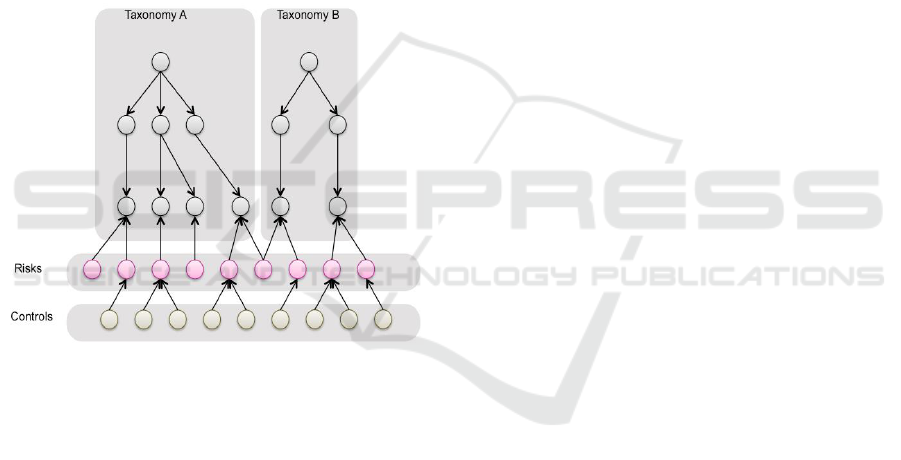
platforms constitutes another challenge (Figure 1).
For input capabilities, GRC Platforms should
support flexible consistency tests and extensible
functions to adapt to business policies. For output,
GRC Platforms should offer standard GRC reporting
capabilities to inform decisions, identify critical
issues needing attention, highlight outliers, and
identify recurrent patterns and best practices. In this
context, this paper presents a system to be used to
augment existing GRC platforms, providing flexible
multiple-perspective visual analytics that address the
sparse yet complex, interrelated GRC data structures
(Figure 1).
Figure 1: Example of the data structures commonly found
in GRC platforms, employing one or more organizational
taxonomies, and layers of shared risks and controls
connected with these taxonomies.
This paper contributes with a method on how to
structure GRC data and how to present it visually all
the voluminous and sparsely connected GRC data,
allowing users to consume GRC data via multiple
perspectives during multiple decision making tasks.
Moreover, we detail the system evaluation involving
GRC specialists and summarize the results obtained
from interviews realized with FI staff.
The next sections of this paper discuss the
following: related work, the developed system, the
evaluation performed, the results, and finally, the
conclusions.
2 RELATED WORK
As background, we have identified several
commercial GRC Platforms and have summarized
their main features and capabilities.
BWise GRC offers multiple role based solutions,
allowing departments across an organization to work
from one common risk taxonomy, focused on
business objectives using a common language for
internal audit, risk, and compliance (BWise, 2015).
Compliance 360 offers configurable modules
that help identify gaps and risks, eliminate duplicate
procedures and maintain the records needed to
demonstrate control of compliance, risk and audit
programs (Compliance 360, 2012).
IBM OpenPages offers a set of core services and
functional components that span all risk and
compliance domains including operational risk,
policy and compliance, financial controls
management, IT governance and internal audit, and
Issues Management (IBM Open Pages, 2015).
MetricStream GRC offers solutions for
managing risk to meet regulatory requirements while
lowering the associated costs and uses core modules
to support reporting, data integration, and workflow
(MetricStream Enterprise, 2015).
OneSumX GRC is an enterprise GRC
management tool for financial institutions. Its
modular components measure, monitor and manage
compliance, financial and operational risk. It
provides a cross-silo view of enterprise risk.
Featuring high-level reports, interactive dashboards
and multi-risk discipline support, the solution is
leveraged to support decision-making and resource
allocation (OneSumX GRC, 2015).
RSA Archer GRC allows you to adapt solutions
to your requirements, build new applications, and
integrate with external systems, without coding
(RSA Archer GRC Platform, 2015).
GRC SAP supports flexibility regarding changes
in business, technology, and regulations. It informs
business decisions by visualizing and predicting how
risk may impact performance (SAP GRC, 2015).
SAS GRC offers an integrated GRC platform,
supporting management of strategic and operational
risks, and consolidated information from all
financial risk management systems (credit risk,
market risk, etc.) (SAS GRC, 2015).
These GRC platforms provide their organizations
and stakeholders several features, capabilities, and
benefits through a common set of characteristics: (1)
Integrated approach to managing centralized GRC
data; (2) Flexible GRC data management; (3)
Simplified tooling configuration and management;
ICEIS 2017 - 19th International Conference on Enterprise Information Systems
42
(4) Modular, extensible platform architecture; (5)
Standardized GRC reporting. However, these GRC
platforms also share the following limitations:
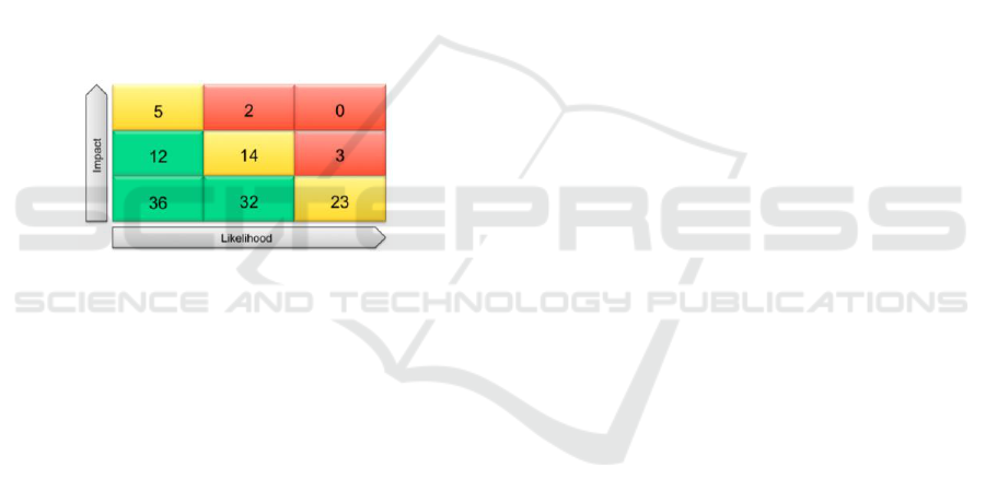
Reports are usually risk-centric and are difficult
to create visualizations beyond the standard
table-based GRC reporting charts, for instance,
Risk Matrix (Figure 2).
The flexibility offered by some tools may require
complex queries to connect related elements
typically found in the GRC Platform data
structures (Figure 1) because normalizing foreign
keys is not possible due to optional, sparsely
populated fields.
The Visual Design Seeking Mantra suggests
presenting overview first, then zoom and filter,
then details-on-demand (Shneiderman, 1996).
However, these GRC platforms rely on standard
GRC visualizations to provide an overview, but
complicate the tasks of filtering and consuming
detailed GRC content from the visual analytics
they provide.
Figure 2: Risk Matrix, a risk-centric visualization and one
of the most common GRC charts.
3 PROPOSED SYSTEM
This year-long, applied research initiative involved
teams from two of our research labs and a major
American financial institution. The financial
institution (FI) used both RSA Archer and IBM
OpenPages platforms, so the expected outcome was
to provide useful business insights for corporate risk
managers across both platforms.
The requirements elicitation involved corporate
risk specialists from the financial institution and
knowledge engineers from our research labs.
Understanding the data structures from both data
sources also required interactions with specialists
from the partners’ IT department. We conducted
monthly semi-structured interviews with GRC
experts to help us comprehend current practices
involving both GRC platforms in use, and we
proposed different means of displaying and
interacting with their GRC data. After analyzing the
information gathered from the initial interviews and
reviewing feedback from our initial designs, we
proposed a Visual Analytics layer encompassing
data extracted and merged from both GRC platforms
used by the FI. Our system offered new integrated
perspectives for corporate risk management to
seamlessly explore all their GRC data; this was not
possible before given the disparate nature of the two
existing GRC Platforms.
3.1 System Requirements
In the development of the system, the primary goal
was to provide business insights for corporate risk
managers at FI. However, we were presented with
large, complex, disparate databases with hundreds of
tables containing highly related, but sparsely
populated real financial, operational, and IT risk
data. The requirements and limitations of traditional
web design driving requests for server side queries
to retrieve and display GRC data lead us to the
design discussed next.
To save money and improve management
consistency, the FI had centralized their financial
and operational risk data by asking their business
units to migrate content from disparate, home grown
point solutions into a single, comprehensive risk
management application. In doing so, they
compromised on requiring many data fields to
facilitate data entry and avoid heavy customization
to accommodate specific (sometimes contradictory)
business unit requirements. This enabled rapid
acceptance of the new GRC application, but resulted
in data that could not leverage explicit foreign key
relations due to missing content. Instead, the FI
required development of very complex SQL queries
to perform separate selections and joins to provide
needed views across tables. Some queries were 30 or
more pages long.
We sought to simplify matters and speed
reporting and data exploration by providing high
level, filterable, summaries of risk mitigation
positions organized across various business
taxonomies (e.g., by business units, business
processes, risk assessments, regulatory topics and
programs). These taxonomies used extensive one-to-
many relationships between the parent and child
elements, and had many cross dependencies, making
them inefficient to fit into a tabular view (there
would have been many empty cells). Because many
of the business insights were tied to how the data
were related, we decided to preserve the
relationships by using a directed graph to store the
content in an efficient manner.
Because the data resided in disparate databases
and did not change very often, and because data
Multiple-perspective Visual Analytics for GRC Platforms
43
analysis would typically result in a set of
coordinated (transactional) changes to be made, it
was deemed best to produce a graph on a regularly
scheduled (e.g., daily) basis. This ensured we had a
consistent data snapshot to support data exploration,
allowing users to explore the data without
interruption and confusion caused by real-time
updates, while empowering them to elect when they
wanted to refresh their content.
To further complicate matters, data being served
needed to be decrypted as well as restricted so
recipients only received the secured data they were
allowed to explore. The graph structure was
considered as we could reduce the exported graph
according to security policies, and decrypt its
content to form a personalized copy of the graph for
the individual user. When the user initially logged in
(or requested a data refresh) we then perform the
graph reduction and serve their personalized graph
to their browser to drive their visual analysis session.
On average, no fewer than half a million nodes and
edges would be served in a few seconds during log
in. From that point forward, no further server side
communications is required, allowing all analysis to
be performed using the client’s CPU and memory in
their browser. This ensures the system could scale
and perform well while preserving security and
providing flexible reporting and data exploration.
The visual analytics should provide summaries
that could be filtered to focus attention and highlight
anomalies. These visual analytics also needed to
preserve any filters the FI chose to apply while
exploring their data no matter which perspective
they chose to view. This ensures they could maintain
their exploratory focus on a consistent subset of the
GRC data graph. These filters should leverage the
data relationships enabling both logical tests (e.g.,
all risks with high inherent ratings, and having
control counts equal to 0 or greater than 5) as well as
(or combined with) taxonomy membership tests
(e.g., all risks in North American Business Units
relating to Retail Banking Business Processes).
Filter updates should also support collaboration
across the WAN and/or to drive multiple,
synchronized displays. The rationale of this
requirement is to allow for multi-site collaboration
to explore data by coordinating the focus among
collaborators while allowing them to view the data
from different perspectives.
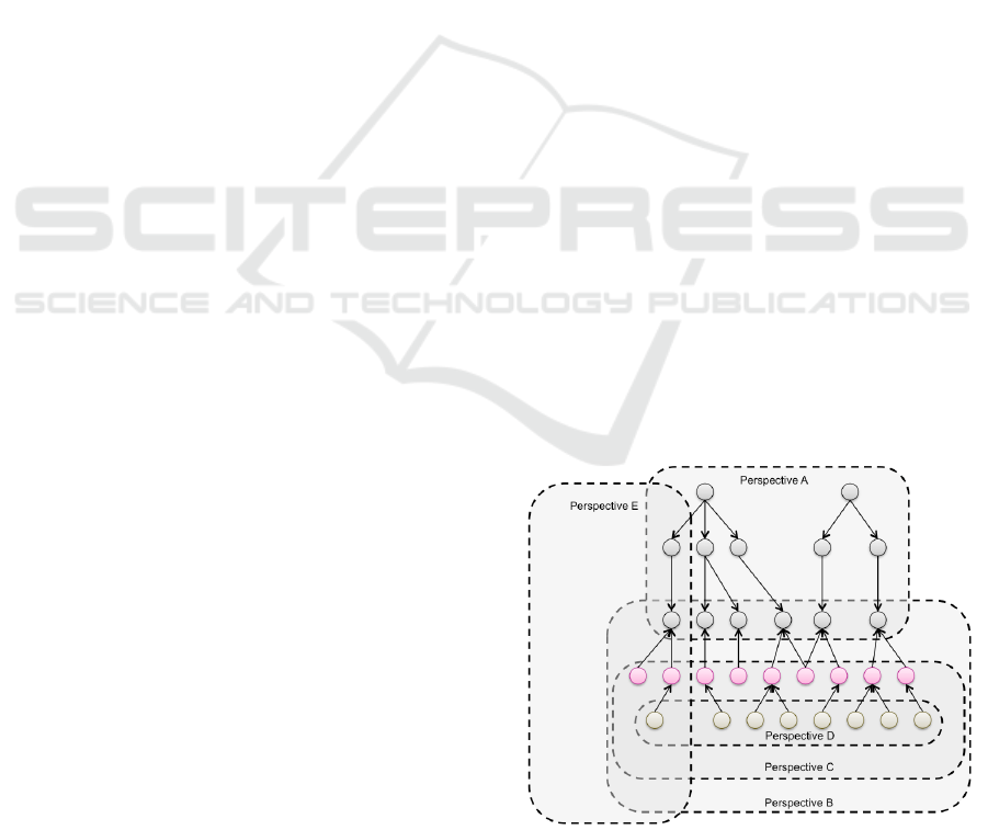
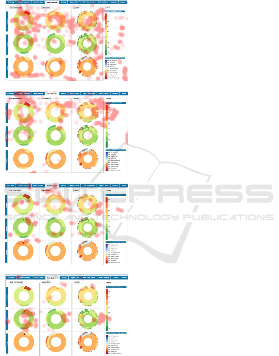
3.2 The Multiple Perspective Rationale
The developed visual analytics provided
differentperspectives of related GRC graph data
(Figure 3). Figure 4 presents the visual analytic that
combines Perspective A and multiple Sunburst
charts (aka Risk Overview). A Sunburst chart is a
radial space-filling visualization that represents
trees, by placing the root node at the center and child
nodes adjacent to the parent in such a way that the
arc is proportional to some defined value (Stasko,
2000). Risk Overview is an adjacency diagram that
summarizes risk mitigation positions for multiple
taxonomies, showing the initial “inherent” risk
(Figure 4, top), the resulting “residual” risk based on
anticipated impact of controls associated with risks
(Figure 4, center), and the change magnitude
considering inherent-residual pair ratings as well
(Figure 4, bottom). Risk managers using this Risk
Overview visual analytic can quickly ascertain
which Business Units, Processes, or Risk
Assessments need attention based on change
magnitude color, and can quickly explore the
number of risks and the impact of their controls
using mouse hovering exploration or by clicking on
a Sunburst segment of interest.
Figure 5 shows the Risk Map designed to
highlight situations where errant risk ratings had
been introduced by showing outliers on the y-axis
compared with the expected locations of risk
groupings. Figure 6 shows the Risk Clusters
visualization. It provides a force directed graph that
helps visualize patterns of risk mitigation. The visual
analytic highlights situations where changes in
ratings are not supported by controls, or where
potentially excessive controls associated with risks
could raise questions about redundancy or the
possibility of automating them to save time and
money. Figure 7 shows the use of a Sankey diagram
to represent the relationship individual risks had
Figure 3: Multiple perspectives employed by various
visual analytics in the proposed system over the GRC data
structure presented in Figure 1.
ICEIS 2017 - 19th International Conference on Enterprise Information Systems
44
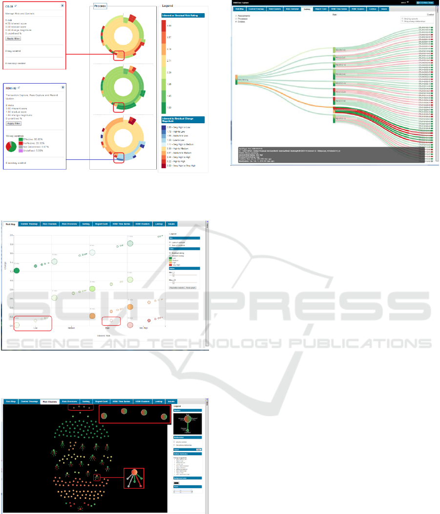
Figure 4: Risk Overview. In the top is shown a process
with high inherent rating. In the bottom a process counting
on 15 controls shows a rating lowered from high to low.
Figure 5: Risk Map. The highlighted circles represent risks
with errant risk ratings where the residual rating is worse
than the inherent rating.
Figure 6: Risk Clusters. The nodes highlighted at the top
show risks improving without controls. The node
highlighted at the bottom shows a risk is not well
mitigated (Very High down to High), but is linked to five
controls (two have not been tested (grey), one is
ineffective (red), and two are effective (green).
Figure 7: Sankey diagram. The highlighted node shows a
risk in Retail Banking related to Money Laundering was
only lowered from Very High (red) to High (orange).
with their parent taxonomies, e.g. Business Entities,
Business Processes, and Risk Assessments, as well as the
risk's relationships with controls used to mitigate it.
3.3 Data Structure
The system uses a JSON Graph data structure
produced by the extract, transform, and load (ETL)
process against multiple data sources to manage all
the GRC content. Each taxonomy element (e.g.,
Business Units, Business Processes, Risk
Assessments, Regulatory Topics, Regulatory
Programs) as well as the GRC elements (e.g., Risks,
Controls, Tests, Test Plans, Key Risk Indicators,
Issues, Applications) are each stored as richly
attributed objects in an Elements list. These objects
also maintain incoming and outgoing relationships
to other elements in this list based on the element's
ID and type of relationship.
Another section of the graph contains the
recursive taxonomy tree comprising each root
taxonomy element and an array of its child elements
based on their element IDs.
A third section of the graph contains commonly
referenced labels reflecting the ratings (e.g., Very
High, High, Medium, Low), or other textual
attributes used to classify elements. By using
indirection, the elements attributes point to these
labels, avoiding replicating the longer text
throughout the graph, and making it easier to support
multiple languages. When filters are applied to the
graph, element attributes are updated to reflect
whether they should be displayed.
Multiple-perspective Visual Analytics for GRC Platforms
45
3.4 System Architecture
The system uses a Single-Page Application
architecture (SPA). SPAs are web applications that
usually have just a single HTML page, and use
JavaScript in conjunction with asynchronous web
services to provide a richer user experience than the
traditional multiple-HTML page environment
(Figure 8).
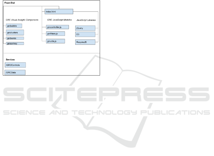
Figure 8: GRC Visual Analytics System Architecture.
3.4.1 Web Service Layer
When the client side visual analytic framework
application is initialized, all system configuration
and application data is retrieved asynchronously,
through the use of two web services, GRCControls
and GRCData.
The GRCControls service returns a small JSON
object that contains information about which Visual
Analytic components are to be loaded by the system,
as well as configurable parameters for the system,
such as colors and legend text labels.
After the GRCControls service is completed, the
system loads the required visual analytics
components through the use of the Asynchronous
Module Definition (AMD) JavaScript specification.
This reduces the overall latency due to parallel
retrieval, and prevents unnecessary JavaScript from
being loaded. In addition, users can extend the
system with their own visual analytics by listing
them in the GRCControls JSON file.
The GRCData service returns a large JSON
object that contains the personalized GRC data
graph allowed for the user to explore using the
system's visual analytics.
The GRCData service is called asynchronously;
however, the system will not complete loading until
all of the GRC graph data is loaded into client
memory. Depending on the amount of data the user
is allowed to receive, this may result in a slight delay
(typically less than a few seconds) when initializing
the application. Locally caching the GRC graph data
allows for a more responsive and interactive user
experience, thereafter.
3.4.2 Front End Layer
The front end consists of a single HTML page, GRC
JavaScript modules, visual analytic component
specific JavaScript and CSS, and open-source
JavaScript libraries.
The front end uses the publish/subscribe event
model to allow each component to listen for, and
respond to events.
Index.html is the HTML container of the core
GRC JavaScript modules, JavaScript for each
configured visual analytic, and CSS for each visual
analytic component. It also includes open-source
JavaScript libraries such as D3.js (D3, 2016), jQuery
(jQuery, 2016), and RequireJS (RequireJS, 2016).
3.4.3 GRC JavaScript Modules
The two main JavaScript modules are
GRCController.js and GRCFilters.js.
GRCController.js communicates with the server
for retrieval of JSON application control and graph
data, dynamically loads and initializes the visual
analytics that are configured for the system, and
manages the event communication between the
visual analytics.
GRCFilters.js manages the set of filters that are
shared by all of the visual analytics. It also controls
the interactive taxonomy navigation panel display
which displays the taxonomy structure in a tree
diagram, and is synchronized with the filters, so
when a node in the tree is selected, the filters change
accordingly.
3.4.4 Visual Analytic Components
Each visual analytic component has a corresponding
JavaScript module that creates the visualization, and
handles interactive events through its
publish/subscribe event model.
Each visual analytic component can also have a
CSS file that enhances the look and feel of the visual
analytic.
The following are some of the visual analytic
JavaScript components that have been configured
for this system:
• grcbursts.js: Sunburst diagrams that visualize
inherent and residual risk in a hierarchical
ICEIS 2017 - 19th International Conference on Enterprise Information Systems
46

structure, as well as the effectiveness of controls
on risks.
• grcbubble.js: Bubble charts that illustrate the
effectiveness of controls on risk, using a
Cartesian layout.
• grcclusters.js: Cluster visualizations that use
animated force directed layouts to display
clusters of risks based on the inherent-residual
rating pairs and the effectiveness of their controls
on reducing risk.
• grcsankey.js: Visualizations of taxonomies leaf
nodes, risks and the effectiveness of controls
using a Sankey, or flow diagram.
3.4.5 Publish/Subscribe Event Model
This system uses a publish/subscribe event model.
In the publish/subscribe event model, senders, or
publishers of events are not aware of its subscribers,
which allows greater flexibility and modular in the
overall design.
Each event is triggered by either a data or user
action, and any JSON object can be included as part
of the event's message content.
The following events are part of the system:
• grcControlsLoaded: This event occurs
immediately after the configuration data has been
loaded into client memory. It publishes
configuration information for the system. This
includes the list of visual analytics, the default
visual analytic, and other configurable settings
such as colors and labels. This event only occurs
once, at application initialization.
• grcDataLoaded: This event occurs when the
graph data has been loaded into client memory. It
publishes the contents of the graph database, and
only occurs during application initialization.
• grcMenuSelection: This event occurs when a
visual analytic has been selected. It publishes the
name of the visual analytic that has been
selected. This event is published by the system
after the configuration information is loaded, and
is also published whenever a user selects a
different visual analytic by clicking on its tab.
The subscribers to this event typically include
individual visual analytic JavaScript components
such as grcsankey.js and grcbursts.js that
perform a specific action when that visual
analytic is selected.
• grcFiltersChanged: This event occurs each time a
user changes the filters. It publishes all of the
new filters that are available. Subscribers to this
event typically include individual visual analytic
JavaScript components.
• grcFiltersLoaded: This event occurs when the
Visual Analytics System loads the filters, during
application initialization. It publishes all of the
filters that are available. Subscribers to this event
typically include individual visual analytic
JavaScript components.
• grcVisualAnalyticsLoaded: This event occurs
after the Visual Analytics System has finished
initializing all of the configured visual analytics,
during application initialization. Subscribers to
this event typically include individual visual
analytic JavaScript components.
4 SYSTEM EVALUATION
This section details how the presented system was
evaluated, including how the participants were
invited, how materials were used, how the
experiment was designed, how the procedure was
performed, and how the data analysis was
conducted.
4.1 Participants
The evaluation participants included four specialists:
three females and one male. They averaged five
years of experience (standard deviation of 1.87
years) with GRC platforms. The participants work in
the risks and controls department of a major IT
company, in partnership with our lab. The
recruitment was done by email and the initial group
of contacts reached 18 GRC specialists; six
participants expressed interested in participating;
five scheduled the evaluation, four specialists ended
up participating in the evaluation.
The initial email contained a questionnaire
asking the participants four questions regarding
GRC platforms: years of experience with GRC
platforms, which GRC platforms the participant
uses, the reports generated by these platforms, and
the tasks performed in these GRC platforms. This
first email was structured to invite participants,
collect data regarding their GRC platform user
experience, and support the experiment design
regarding the most relevant tasks as well as the order
the tasks were organized.
4.2 Materials
The study was performed in a quiet room located at
the participants' workplace. The study was
conducted by a facilitator and counted on one
observer. The study used the Visual Analytics
Multiple-perspective Visual Analytics for GRC Platforms
47

System, a preparation checklist for the facilitator to
set up the evaluation consistently, an observer form,
a task list, an eye tracker (Figure 9), a MacBook Pro
with a 13" display used to the store the eye tracker
data, and an extra 19" display used by the
participants, and a mouse used by the participants to
interact with the system (Figure 9).
The observer form counted on fields for
gathering time intervals considering calibration and
the execution of the tasks. Observers also recorded
participants' comments and issues faced by
participants.
The device used to capture eye interaction was
the Eye Tribe eye tracker (The Eye Tribe Eye
Tracker, 2016). The data captured by the eye tracker
counts on coordinates for each of the eyes, the
average coordinates, pupil center, and pupil size for
each of the eyes, and a Boolean value indicating
whether or not the gaze was a fixation. The heat map
visualizations were created using D3 (D3, 2016).
Figure 9: Test environment setup.
Heat maps present the areas where users looked at a
display. Heat maps can be created using the fixation
length—the time users spend looking at a specific
region, or by the number of times users looked at a
specific region (Pernice and Nielsen, 2009). In this
study, custom individual reports using the number of
gazes were generated.
4.3 Experiment Design
The experiment design consisted of in-depth user
test sessions that had each participant perform a set
of eight tasks. Information regarding task
completion success, and the time to complete the
tasks was also analyzed.
The data collected involved eye movements (via
eye tracker), client side events (via a Firefox Add-on
developed to log each triggered event), as well as
screen and audio (via QuickTime Player).
The participant tasks were designed based on the
feedback from the initial questionnaire, and were
ordered based on a meaningful sequence based on
the answers provided by participants.
The eye tracker experiment was designed based
on work from Pernice and Nielsen (2009). The
usability test plan and conduction was performed
according to Rubin’s work (1994). Furthermore, in
order to gather each participant's impressions about
the tasks and visualizations, users were instructed to
use the Thinking Aloud Protocol (Lewis and Mack,
1982) during the user test.
4.4 Procedure
The facilitator initiated the test session by providing
the participant with the consent form, clarifying the
evaluation goals, the role of the participant, and
explaining the type of data that would be captured.
The facilitator presented a brief overview of each
of the system's screens, explaining the goals of each
visualization, in order to standardize terms and
provide knowledge about the visualizations for
consistency amongst all of the participants. The
facilitator also recalled the structure of the GRC
data, standardizing (when needed) the terms used
throughout the session. The facilitator also explained
that the dataset used in the system was anonymized,
to be used for evaluation purposes.
Once the details about the underlying system
were presented, the facilitator explained to the
participant how the evaluation would be performed.
The facilitator explained that the participant would
perform tasks, using the Thinking Aloud Protocol,
which was explained in detail, and that during the
session the observer would take notes. After
presenting the procedure and answering any
participant questions, the participant was given five
minutes to explore the system prior to the
evaluation. The rationale was to allow participants to
review certain reports and terms without having a
task in mind. After that, the eye tracker calibration
began, and the facilitator started to record the eye
movements, user interface events, screen capture,
and audio. Once all recording setup was completed,
the list of tasks was presented to the participants.
Note that the next task was only presented after the
participant provided an answer to the task at hand.
The tasks were as follows:
1. What is the risk assessment / business entity /
business process that draws your attention
considering the highest inherent rating?
ICEIS 2017 - 19th International Conference on Enterprise Information Systems
48
2. What is the risk assessment / business entity /
business process that draws your attention
considering the lowest inherent rating?
3. What is the risk assessment / business entity /
business process that draws your attention
considering the highest residual rating?
4. What is the risk assessment / business entity /
business process that draws your attention
considering the lowest residual rating?
5. Identify one risk that impacts more than one
taxonomy (e.g., business process and business
entity).
6. Identify one control that is reused in more
than one risk.
7. Identify one risk with a data entry issue
considering the rating, e.g., residual rating that is
improved without a control or a residual rating that
is worse than an inherent rating.
8. Identify one control with a data entry issue,
e.g., a control that is supposedly effective, but with
no effect when applied to a risk.
After the tasks were performed, the participants
were asked two questions about their preferences: 1)
What is the visualization that you have found the
most useful? 2) What is the visualization that you
have found the most useless?
Finally, the facilitator stopped all types of
recording and checked with the participant if he or
she had any final questions regarding the study or
the system in use.
4.5 Data Analysis
The data collected has three main components: eye
tracking data, user interface events, and audio and
video recordings. Eye tracking data were used for
creating heat maps involving the visualizations
created. This method enabled us to focus on
identifying hot spots when there was a task to be
performed, and to summarize the portions of the user
interface that were used by the participants. In this
study, the interaction data supported the filtering and
organization of the eye tracking data, since it
contained the exact timestamp that users scrolled the
screen, accessed a new page, and pinpointed other
user behavior. The audio and video recordings
provided additional information for the analysis of
eye tracking, user interface events, as well as
contextual information for insights found in the
explicit interaction data, allowing triangulation
among data captured and results obtained.
Moreover, the observer registered task completion,
time to complete tasks, and participant quotes.
For analysis of the eye tracking data after
filtering, heat maps were generated using the D3
library. For each single eye tracking data point
captured, D3 was used to draw a geometric shape at
that specified X-Y coordinate. In order to allow the
heat map to be drawn over the visualizations, a
custom colored heat map was created using low
opacity for the individual gazes, which highlighted
points where recurrent eye gazes occurred.
5 RESULTS
Next, we present results in terms of how the tool
supported the interaction with GRC data from the
multiple perspectives when used by the target users,
gathering user feedback from the tools he or she
used, and how the system differs in tasks related to
the identification of outliers, patterns,
inconsistencies, etc.
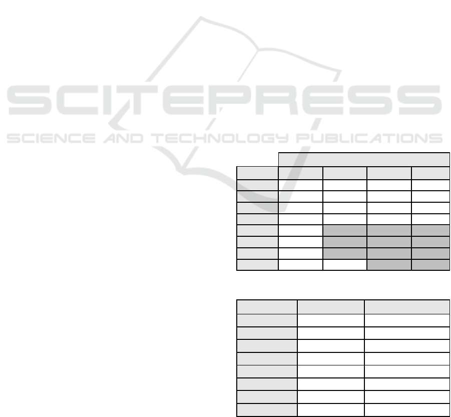
Table 1 shows the task completion. From this
data, one can see that the tasks 5, 6, and 7 were not
accomplished by three out of four participants. Table
2 shows the mean time to complete tasks. From
these results, one can infer that between tasks 1 and
4 there is a learning curve effect, because of the
subsequent tasks related to the prior tasks and the
fact that the participants commonly used the same
Risk Overview visualization; eye tracker data also
shows this effect (see Figure 13). Tasks 5, 6, 7, and
8 took the most time to complete, since they
Table 1: Task completion.
Participant
Task
P1
P2
P3
P4
1
Y
Y
Y
Y
2
Y
Y
Y
Y
3
Y
Y
Y
Y
4
Y
Y
Y
Y
5
Y
N
N
N
6
Y
N
N
N
7
Y
N
N
N
8
Y
Y
N
N
Table 2: Time to complete tasks.
Task
Mean time
Standard deviation
1
1:07
1:07
2
0:44
0:35
3
0:36
0:32
4
0:31
0:26
5
1:07
0:50
6
2:39
1:21
7
2:44
1:54
8
3:03
1:41
Multiple-perspective Visual Analytics for GRC Platforms
49
required participants to recall the GRC data structure
and remember which visualizations would offer the
best solution for the task. During tasks 7 and 8,
participants interacted with filters in order to narrow
down the number of risks and controls to analyze.
Figure 10 shows the heat map for the Risk
Overview visualization, which recorded the eye gaze
data collected from the four participants. From this
data, one can infer that participants interacted most
frequently with the first row of sunburst diagrams.
When compared to other studied visualizations
(Figures 11 and 12), one can also infer that the Risk
Overview was the most frequently interacted
visualization in conjunction with the filters at the
right side of the screen.
Figure 11 shows the heat map generated using
the eye gaze data collected from the four participants
while they were interacting with the Risk Map
visualization. From this figure, one can infer that the
participants concentrated their gazes at the borders
of the chart, more intensively at the lower right and
lower left sections. Moreover, participants also
frequently interacted with the options panel
positioned at the right-hand section of the chart,
which allowed them to manipulate diameter,
position, and ranking of chart elements.
Figure 12 presents the eye gaze data collected
from the four participants and summarizes the
Figure 10: Heat map showing the data collected from the
four participants when interacting with the risk overview
visualization.
Figure 11: Heat map showing the data collected from the
four participants when interacting with the Risk Map
visualization.
Figure 12: Heat map showing the data collected from the 4
participants when interacting with the Sankey diagram.
regions that the participants looked at while
interacting with the Sankey diagram. The Sankey
diagram was developed to represent risks at the
center, connecting them with controls at the right
side and with the taxonomy leaves at the left side. In
the eye gaze heat map overlay, it is possible to verify
that the participants rarely interacted with the risks,
controls, and taxonomy leaves. Instead, most of the
interactions were concentrated at the label risks,
located at the top center of the chart, and several
gazes were captured at the center left, center, and
center right of the screen, at the links connecting the
risks with the controls and taxonomies.
Figure 13 shows how participant P1 performed
tasks 1 (top), 2, 3, and 4 (bottom) while interacting
with the Risk Overview. One can infer that in the
first task, participant P1 explored the user interface
and all the visualization elements. In task 2, the
participant focused on the row related to the charts
most relevant to the task. In tasks 3 and 4, there were
fewer eye gazes than the first two tasks; time to
complete task also shows this effect (see Table 1). It
is noteworthy in that the mean task completion time
and standard deviation were reduced as the
participants went through the first four tasks.
Participant P1 used the Sankey diagram path-
highlighting feature of the (presented in Figure 7) to
show connections of controls and taxonomies related
to a certain risk. After highlighting the connections,
the participant correctly identified how the risk is
related to business processes and business entities,
displayed in the Sankey diagram on the left-hand
side. Participant P1 was the only one to properly
perform task 5. Other participants faced difficulties
in identifying the visualization that showed the
relationship of risks to multiple taxonomies.
Participant P1 also used the Sankey diagram to
identify controls at the right-hand side of the screen
that were connected with more than one risk. For
tasks 5 and 6 participants P2, P3, and P4 focused on
the Risk Overview and spent time trying to find the
connections between taxonomies using the Sunburst
diagrams.
ICEIS 2017 - 19th International Conference on Enterprise Information Systems
50
(a) Heat map for participant P1 performing task 1.
(b) Heat map for participant P1 performing task 2.
(c) Heat map for participant P1 performing task 3.
(d) Heat map for participant P1 performing task 4.
Figure 13: Heat maps for participant P1 performing tasks
1 (a), 2 (b), 3 (c), and 4 (d). It is possible to identify the
learning curve as gazes reduce for similar tasks.
For tasks 7 and 8, all participants explored the
filters and learned how to find inconsistencies and
anomalies in the data by selecting, for example, risks
that did not have any controls, or risks whose rating
increased after applying a control.
Participants had clear preferences for the most
and least-useful visualizations. They considered the
Risk Cluster (four votes) and the Risk Overview
(three votes) the most useful; the Control Treemap
was voted the least useful (three votes). When
choosing the preferred visualizations, all participants
picked two visualizations. When picking the least
useful visualizations, all participants picked only
one. Participants were free to point at any number of
visualizations. The answers provided for the
preferred visualizations reinforce the multiple
perspectives approach.
This study helped us identify two user interface
problems: 1) the filters panel response was
confusing for two out of four participants due to a
behavioral inconsistency in the chevrons used to
open and hide the panel; 2) some of the colors
selected for the Risk Overview scales were
confusing, e.g., the same orange color is used in both
the rating (located at the top right region of the Risk
Overview visualization) and change scales (located
at the top right region of the Risk Overview
visualization), but have different meanings.
6 CONCLUSIONS
The graph-empowered Visual Analytics System
designed, developed, and evaluated supported
insights beyond those available with typical tabular
reporting capabilities. This paper details the
techniques used for extracting, transforming, and
loading (ETL) data from multiple GRC platforms
and organizing it as a unified, directed graph in
order to provide a Multiple Perspective Visual
Analytics System for GRC Platforms. The
evaluation considered a set of tasks that represented
common duties performed by GRC specialists.
The Risk Clusters visualization was the most
preferred visualization, while the Risk Overview
was the most used. The Risk Clusters visualization
represents risk and controls in a graph, and the
placement of nodes is performed according to a
force-directed layout algorithm. Moreover, the
values representing the "weight" of nodes is set
according to the inherent-residual ratings pairs (e.g.,
high-high, high-medium, high-low). Risks with
similar ratings are clustered, providing specialists
with an overview of proportions and helping them
Multiple-perspective Visual Analytics for GRC Platforms
51

identify items (or clusters) that require attention.
During the evaluation P4 said: “I want this [Risk
Clusters visualization] in the tool I use.” The Risk
Overview features multiple Sunburst diagrams that
represent taxonomies used to organize risks. Each
node in a taxonomy summarizes the rating of the
risks associated with that taxonomy node and its
children. Furthermore, each taxonomy occurs on
three separate Sunburst charts: one that is colored by
the inherent rating (top), one by the residual rating
(middle), and one by the change magnitude between
the inherent and residual rating (bottom), which
takes into account the final mitigation position.
During the evaluation P2 emphasized: “this [Risk
Overview] is really useful.”
The visualization that participants identified as
the least useful was the Control Treemap. The
Control Treemap represents control ratings and
displays creation and maintenance dates that
highlight controls whose ratings may need to be
reviewed or controls needing to be tested. When
participants needed to interact with controls, they
used the Risk Clusters or Sankey diagram, since they
are focused on connections with other elements
(e.g., risks and taxonomies) that provide context for
the controls rendered at the display.
The successful completion of tasks, as well as
the overall task completion time, was adversely
impacted by tasks where participants had to recall
the overall GRC data structure in order to focus on a
certain perspective. Thus, a possible improvement
for the system would be to show an overview of the
GRC data structure, perhaps as the initial
visualization, which would help users choose the
appropriate perspective. This problem was identified
during tasks 6, 7 and 8, when participants P3 and P4
looked quickly at all the visualizations and were not
able to accomplish the tasks.
The main limitation of the study was the limited
number of specialists involved in the study.
However, bearing in mind that GRC is a highly
specialized and restricted domain, this study
provided useful insights, corroborating the value of
the multiple perspective approach for the visual
analytics system developed. Future works will
consider involving more specialists and a case study
involving multiple displays in a control center-like
environment.
Finally, the system addresses an existing gap
found in current GRC platforms, since it provides
reports beyond standard and risk-centric reports, and
instead leverages how GRC elements are
interrelated. We detailed the system's technologies,
the knowledge engineering and design approach, the
proposed visualizations, and the user study
performed to validate them. The user study
considered multiple data sources: eye gazes, user
impressions, observations, and audio/video
recording.
ACKNOWLEDGEMENTS
We thank all participants for taking time to
participate in this study and also for the valuable
feedback provided.
REFERENCES
BWise, 2015, http://www.bwise.com/solutions/integrated-
grc/bwise-grc-platform.
Compliance 360, 2012. http://www.compliance360.com/
D3 – Data Driven Documents. 2016. http://d3js.org.
IBM Open Pages, 2015. http://www-03.ibm.com/
software/products/en/openpages-grc-platform/
jQuery.js, 2016. http://jquery.com.
Lewis, C. and Mack, R. 1982. Learning to use a text
processing system: Evidence from “thinking aloud”
proto- cols. In Proceedings of the 1982 Conference on
Human Factors in Computing Systems (CHI '82).
ACM, New York, NY, USA, 387-392.
MetricStream Enterprise GRC, 2015. www.metricstream
.com/industries/banking/enterprise-grc-solutions.htm.
N. Y. Times. 2015. Former Petrobras Executive Held in
Brazil Corruption Probe. http://www.nytimes.com/ap
online/2015/01/14/world/americas/ap-lt-brazil-petrobr
as.html?_r=0.
OneSumX GRC, 2015. https://www.wolterskluwerfs.com/
onesumx/risk/GRC.aspx.
Pernice, K. and Nielsen, J. 2009. How to Conduct
Eyetracking Studies. NNGroup.
RequireJS – A module loader. 2016. http://requirejs.org/
RSA Archer GRC Platform, 2015. http://uk.emc.com/secu
rity/rsa-archer-governance-risk-compliance/rsa-archer-
platform.htm.
Rubin, J. 1994. Handbook of usability testing: how to
plan, design, and conduct effective tests. John Wiley
& Sons.
SAP GRC, 2015a. http://go.sap.com/solution/platform-
technology/governance-risk-compliance.html.
SAS GRC, 2015b. http://www.sas.com/en_us/ software/
risk-management/enterprise-grc.html.
Shneiderman, B. 1996. The eyes have it: A task by data
type taxonomy for information visualizations. In
Visual Languages, 1996. Proceedings, IEEE
Symposium on (pp. 336-343). IEEE.
Stasko, J. and Zhang, E. 2000. Focus+Context Display and
Navigation Techniques for Enhancing Radial, Space-
Filling Hierarchy Visualizations Proceedings of the
IEEE Symposium on Information Vizualization.
Tarantino, A. 2008. Governance, Risk, and Compliance
Handbook. John Wiley & Sons.
The Eye Tribe Eye Tracker. 2016. http://theeyetribe.com/
ICEIS 2017 - 19th International Conference on Enterprise Information Systems
52
