
Visualizing Ergonomic Data of Industrial Work Processes: A Design
Study
Walentin Heft
1
, Linda Pfeiffer
2
and Paul Rosenthal
1
1
Faculty of Computer Science, Chemnitz University of Technology, Straße der Nationen 62, Chemnitz, Germany
2
Faculty of Humanities, Chemnitz University of Technology, Th
¨
uringer Weg 11, Chemnitz, Germany
Keywords:
Information Visualization, Ergonomics, HCI, Evaluation.
Abstract:
Ergonomics deals with the analysis and design of work processes. To identify ergonomically critical situations,
appropriate evaluation options have to be developed to enable an efficient analysis process. Nowadays, such
analyses are typically carried out with the help of digital models of the surrounding area and virtual humans.
These produce a multitude of geo-referenced and time-oriented data. We present a design study on how
to visualize this data to support the ergonomically analysis process optimally. As consequence of a thorough
requirements analysis and design process, we propose a novel interactive visualization which provides the user
an overview of ergonomically critical situations and their causes. Simultaneously, the user obtains the main
stress factors in a compressed form by a glyph-based visual design. Final expert interviews and a usability
study depict the utility of the proposed visualization tool.
1 INTRODUCTION
For a few years, the scientific institute of the Ger-
man health insurance AOK (WIdO) (Zok, 2010) per-
formed an employee survey in 147 German compa-
nies about health disorders and workload. In total,
more than 28,000 people were surveyed in companies
with a size between 35 and 2,252 employees. When
asked, “What do you find more important for your
health” 55 percent of the respondents answered (after
enough sleep and a balanced diet) that healthy work-
ing conditions are decisive. Many employees suffer
under heavy physical work. This includes particularly
heavy loads as “lift and carry”. Thus, there is gener-
ally a need for action to improve the employment sit-
uation in the companies. Especially ergonomists deal
with the elimination of bad work situations. They ex-
amine the work, take measurements, and analyze the
data obtained. According to the analysis they present
their findings to third parties, for example to the man-
agement.
In this regard, studies of longer periods (an entire
shift or several working cycles) can lead to a huge
amount of data and complex structures. Thus, the
evaluation of the values obtained and the presentation
towards the authorities concerned can be very chal-
lenging. However, satisfactory visualizations are cur-
rently still rare and often limited to simple line or bar
charts. In a previous publication (Heft et al., 2015),
we presented an user-interaction concept and first pre-
liminary designs to visualize ergonomic data. In this
paper, we present a thorough design study and inves-
tigate how an interactive visualization could lead to
a facilitation of the evaluation work of ergonomists.
At first, we performed a requirements analysis in co-
operation with real ergonomists and with the help of
everyday use cases from real work places, see Sec-
tion 2. Afterwards, we performed an iterative design
process on basis of the gathered requirements, lead-
ing to a working prototype, see Section 5. Finally,
we conducted a user study with different usergroups
(ergonomists and laymen) to valuate the usability and
benefit of this interactive visualization, see Section 6.
2 REQUIREMENT ANALYSIS
For obtaining a human-centered visual design, a de-
scription of user context and user requirements has to
be made. In order to analyze the user context it is nec-
essary to record user characteristics, work tasks, and
framework conditions.
We obtained these insights by means of work-
shops (in two German companies) with ergonomists
and occupational health and safety practitioners (in
total seven experts). We used the method “focus
274
Heft W., Pfeiffer L. and Rosenthal P.
Visualizing Ergonomic Data of Industrial Work Processes: A Design Study.
DOI: 10.5220/0006175202740282
In Proceedings of the 12th International Joint Conference on Computer Vision, Imaging and Computer Graphics Theory and Applications (VISIGRAPP 2017), pages 274-282
ISBN: 978-989-758-228-8
Copyright
c
2017 by SCITEPRESS – Science and Technology Publications, Lda. All rights reserved

group” (Courage and Baxter, 2005, pp. 25ff), i.e., we
presented our questions to groups of experts. We dis-
cussed the steps of the requirements analysis in detail
in Heft et al. (Heft et al., 2015).
We summarize its results below:
The user’s task
The ergonomists have the task of analyzing and
improving the technical, organizational, and so-
cial conditions of work processes. For this pur-
pose data needs to be collected, evaluated, and
transferred into adequate solutions. Furthermore,
their outcomes will be presented to the manage-
ment or to the worker.
Requirements
• an easy-to use program
– interactive explanations on all displayed ele-
ments
– detailed information about the analyses should
be easily obtainable (if required)
• intuitive and sustainable data representation
– understandable to non-experts
– fast overview of all ergonomic problems over
time
– falling above/below limit values should be vis-
ible at a glance
– color coding, instead of tabular form
– simple images for presentation
– video to show the workers the work flow
• hardware requirements
– executable on standard PCs
Data to be visualized
• posture
• time of occurrence
• duration of a ergonomically critical situation
• score of the different evaluation methods
• reasons for an issue, such as the weight of a
carried object
• additional variables, for instance, the body joint
angles as well as their limit values
3 STATE OF THE ART
The presentation of ergonomic results is often bound
to lists, simple graphical dialogs, and graphs. The
most popular representations of ergonomic reports for
RULA (McAtamney and Nigel Corlett, 1993) origi-
nate from the digital human models (DHM) “Human
Builder” (Dassault Syst
`
emes) and “Jack” (Siemens).
In either case, they based on a straightforward tabular
form. Their views show the ratings of the individual
body parts (e.g. for the upper arm, neck, and legs), the
force and load values, and the total number of points
of the pose (incl. a color coding in the traffic light
scheme). “Dynamicus” (Institut f
¨
ur Mechatronik e.V.,
2016) is an example of an ergonomic report, which
represent the results of the EAWS method (Schaub
et al., 2013) in a DHM. Here, the representation of
the time component is incorporated. It indicate the
pose through a rotatable DHM, duration, partial eval-
uations, and the total score of the analysis, for exam-
ple. Bad poses are notified over a gantt chart.
The programs, however, are not fully capable to
comply with the desired user requirements. First,
there is no way to change the depth of analysis. On
the other hand, only a static pose can be displayed, in-
stead of a complete overview of all problems. Visual
analysis of the data by zoom and filter mechanisms is
often not supported. Moreover, the problems are al-
ways displayed for a single method of analysis. This
means, that possible interrelated causes cannot be per-
ceived.
4 RELATED WORK
Since time-oriented data is relevant in many practical
situations, the visualization of such data is ubiquitous.
Many recent work exists (Aigner et al., 2011), (Silva
and Catarci, 2000), (Tominski and Aigner, 2015).
However, visualizations in digital human models for
showing critical ergonomic situations or illustrating
time-oriented processes are very limited.
The concept of timelines for time-oriented data is
used in LifeLines (Plaisant et al., 1996). LifeLines
was developed to create an overview about certain
events in the life of a person. Because of the pres-
ences of all import information at one stage, the doc-
tors can provide a better prognosis about the medical
condition.
However, an overview for a mass of data can
quickly lead to confusion. LifeFlow (Wongsupha-
sawat et al., 2011) delivers a possibility to counter-
act this circumstance with event sequences (series of
temporal distinct and consecutive events). In connec-
tion to the aforesaid work (LifeLines), individual data
records can be displayed with much more detail.
In order to perform a performance analysis in real-
time sports events (e.g., rugby or football), videos are
annotated by analyst teams. However, this leads to
a large amount of statistics or tables with many data
records. It would be almost impossible for a trainer to
capture this data in real time. Thus, important details
could easily be overlooked. Matchpad (Legg et al.,
Visualizing Ergonomic Data of Industrial Work Processes: A Design Study
275

2012) provides a solution by means of a glyph-based
overview visualization. Kicks, a line out, or referee
events are displayed on a time scale in real time.
Timelines are mostly used for the visualization of
time-oriented data. These often begin on the left side
and run horizontally to the right side (as LifeLines or
programs for editing and displaying video and audio
files). However, this is not always necessary. For ex-
ample the VisRuption project (Rosenthal et al., 2013)
facilitates timelines that run from the bottom to the
top.
The above listed publications provide approaches
and ideas for this work. However none of the exist-
ing work corresponds to the user requirements of an
interactive visualization for an overview display of er-
gonomic problems.
5 DESIGN PROCESS
The designing of the workable visualization was done
on basis of the user requirements and iterative proto-
typing. During the implementation, the current state
was discussed with the experts in several meetings.
Some errors in the design and programming were dis-
covered and subsequently removed. New enhance-
ments were proposed and integrated into the program.
C++ and Qt was used to create the software.
The functional parts of the GUI are shown in Fig-
ure 1. It can be divided into two main sections. The
upper part provides a quick overview and is divided
into three levels, such as the display of selected crit-
ical situations as pictograms, the total scores of se-
lected problems per analysis method, and a timeline
with all ergonomic problems. The lower part provides
opportunities for detailed analysis with a video-view
and a display, which may include detailed informa-
tion about calculations and other results. A help but-
ton is located at the right edge of each level. The help
describes the elements, and the interaction of the re-
spective level.
5.1 Pictogram Level
The pictograms of the five currently selected er-
gonomically critical situations are shown on the first
level (see Fig. 1, pictogram level). The presentation
symbolizes bad poses, impairments by noise, etc. The
problem can be selected by a click on a pictogram.
This selection leads to two reactions, an optical and a
functional.
Optical: The problem is shown with a gray back-
ground (see Fig. 1, the centrally positioned prob-
lem). The background stretches over the correspond-
ing evaluation points (see Sec. 5.2) of the selected
problem and ends at the problem position on the time-
line (see Sec. 5.3). This is intended to help the user to
keep the data of a critical situation, across all levels,
in mind.
Functional: By selecting a problem, the appropriate
video sequence shows the current problem in a loop
(see Sec. 5.4). In addition, the corresponding calcu-
lation details are displayed. Additional information
can be attached to the right of a pictogram. They are
intended to provide information about the reasons for
a poor assessment, such as a carried (heavy) weight
or an excessively bent body. Besides the symbolic
representation, the user receives the exact values via
tooltip. Directly below a pictogram, there is a stop-
watch symbol and the duration of a single action. The
distance line between two pictograms is labeled with
the duration from the end of an action to the begin-
ning of the following problem. If more than five prob-
lems are selected in the timeline, the arrows on the left
and right of the pictogram bar allow a navigation. By
means of a mouse click, additional problems can be
displayed. There are two arrows on each side: A sim-
ple arrow is used to move one problem at a time, the
double arrow shows the next five problems. The for-
mer makes it possible to compare problems that occur
in succession but are not presented in the view. The
double arrow allows faster selection of all selected
problems, so the next five are displayed. Between the
two arrows, the number of the following resp. preced-
ing cases is given.
5.2 Assessment Level
On the second level (see Fig. 1, assessment level),
the total score points for each analysis method (e.g.
RULA, EAWS, noise and climate) are shown for the
displayed five problems. The results are structured
in tabular form. Each row contains the values of a
analysis method. The method is indicated at the be-
ginning of each row. This allows a comparison of
all values over time. The first column of a table (lo-
cated below a pictogram) indicates the severity of a
problem by color coding. The red color symbolizes a
very high-risk problem and improvements should be
made immediately. Orange represents an intermedi-
ate risk and changes should be made soon. A low
risk is expressed by yellow. If there is no risk, white
is used for the corresponding evaluation method. This
was implemented in contrast to the original color cod-
ing (green), due to the reasons mentioned in Section
5.5. A click on the color field selects the problem and
marks it with a gray background as explained in the
description of pictogram level. Furthermore, it will
IVAPP 2017 - International Conference on Information Visualization Theory and Applications
276
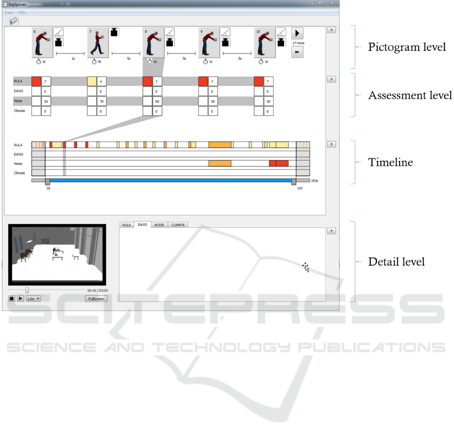
Figure 1: The implemented interactive visualization with a chosen area on the timeline and a selected problem. The pictogram
level symbolizes the reasons of the problems. The assessment level shows the overall scores of the corresponding analysis.
The severity of the problem is color coded. The third level (timeline) contains selectable bars. The bars starts at the position
relative to the real time. The length corresponds to the duration of the problem and the color to its severity. The detail view
encloses a video and space for further informations.
open the corresponding tab in the detailed view (see
Sec. 5.4). For example, if the user clicks on a color
field in the “noise” row, the noise tab is automatically
selected in the detail view. The second column of a
table contains the total points of an analysis.
5.3 Timeline
A timeline is depicted on the third level (see Fig. 1,
timeline). The colored bars symbolize the ergonomic
problems. The beginning of a bar starts at the posi-
tion relative to the real time. The length corresponds
to the duration of the problem and the color to its
severity. The problem can be selected by a click on
the bar. This displays the corresponding details in the
other levels (pictogram, assessment, detail). The crit-
ical cases are listed in rows for each analysis method.
Below the timeline is a slider. At the right end, the
total time is indicated in seconds. Two controllers
are located on the slider. A certain time range can
be chosen by setting the respective controller to the
desired position. The current position is located di-
rectly below the controllers. A vertical auxiliary line
is located on each controller over the entire height of
the timeline. This allows a precise positioning of the
controllers (e.g., directly before or after a problem).
The start time of a problem can also be determined
via tooltip. If a time period has been selected, the in-
side area is zoomed in. The bars and the time are in-
creased in proportion. All problems before and after
the selected time period are collapsed by compressing
the time and the bars. In order to highlight the area of
interest, the external problem areas are grayed out.
5.4 Detail Level
On the detailed view (see Fig. 1, detail level) there
is a video and a detail representation. In the nor-
mal state, the video shows automatically the sequence
of the currently selected problem in a loop. The
“FullScreen” button opens the video in full screen.
The “Esc” key or a double-click terminates the full
Visualizing Ergonomic Data of Industrial Work Processes: A Design Study
277

screen mode. Pressing the stop button closes the
video and sets it to the beginning. By pressing the
play button, the entire workflow can be viewed from
start to end. A slider below the video shows the
current position/time (as well as the total time) and
allows the user a navigation (forward / backward)
within the displayed animation. The contents of the
detailed view are not implemented in this work, but
are intended to provide the exact values for each
analysis. This means that the intermediate results
(which contribute to the overall score of each valu-
ation method) can be selected and displayed via the
already available tabs.
5.5 Color Selection
In the field of ergonomics, the results are preferably
visualized in the traffic light scheme (green, yellow,
occasionally additional orange, and red). First, it
may be useful to maintain the domains-specific design
guidelines in terms of the recognition value. How-
ever, we avoided a “red-green”-visualization for two
reasons:
1. Red-green weakness: About eight percent of the
European males are affected. The corresponding
colors cannot be perceived correctly.
2. Show only problems: The core task of the er-
gonomists is to examine the most dangerous activ-
ities and to improve their execution. Using green
in the visualization for uncritical situations can
leads to an overloading of the overview and a dis-
traction from interesting points.
Instead, we have chosen to indicate the problems with
a color coding that changes from yellow to red. All
non-problematic time points are colorless or white.
6 EVALUATION
As the final step of our design study, we have evalu-
ated the prototype. In the following, we describe the
procedure and the results of our user study.
6.1 Methodology
6.1.1 Study Design
We decided to do a qualitative evaluation. This has
two advantages. On the one hand the users’ thoughts
and feelings can be assessed in more detail. This is
an important quality in order to understand the users
experience. On the other hand is this approach more
explorative. This is an important quality, because it is
impossible to know about the specific problems that
will occur during the study in advance. To ensure that
the functionality of the prototype was discovered by
the test persons, a set of tasks was given to them. They
were told to follow the “think aloud” approach during
the test of the visualization, in order to get a deeper
understanding of their thoughts and feelings. Thus,
we had the chance to understand the users experience
and the reasons for their problems.
We used the standard norm of “EN ISO 9241-110”
for our evaluation, which defines aspects of good dia-
logues (DIN, 2010):
• suitability for the task,
• suitability for learning,
• suitability for individualization,
• conformity with user expectations,
• self descriptiveness,
• controllability, and
• error tolerance.
These aspects, as well as the readability, may give
hints on potential sources of problems. Thus, we
wanted to have another measurement for these as-
pects and introduced an additional questionnaire. The
evaluation was complemented by an interview, that
gave the chance to get detailed information on spe-
cific problems. The prototype was tested in a labora-
tory study. This allows a calibration of the soft- and
hardware and a controlled surroundings. Observa-
tions with “pen and paper” and video recording were
done.
6.1.2 Participants
According to Nielsen (Nielsen, 2016) 5 participants
are sufficient for a qualitative study. Additional par-
ticipants would encounter almost the same usability
problems. Several groups of highly distinct users
need 3-4 users from each category. This study in-
cluded two categories of users:
• 3 experts on ergonomics
• 4 non-experts
The group of experts was chosen in order to ensure
the relevance of the visualization in practice and its
suitability to the ergonomists. On the other hand, the
tool should also be intuitively comprehensible to non-
experts, like managers or small companies, that have
no ergonomist.
6.1.3 Test Setup
The study took place in a separated room. The ob-
server and the participant were present. The proto-
IVAPP 2017 - International Conference on Information Visualization Theory and Applications
278

type ran on a standard laptop (Windows). The vi-
sualization was shown on a 22” display. Interaction
devices have been a standard mouse and keyboard.
Each session lasted at most one hour and consisted of
a briefing, the usability test, answering the question-
naire, and an interview.
6.1.4 Briefing
The briefing consisted of an information about the le-
gal and ethical aspects of the study, as well as an stan-
dardized explanation of the “think aloud’ approach
and the prototype. At this point the subject had the
chance to ask questions.
6.1.5 Tasks
The tasks were given to the subject in order to test
whether he finds the needed functionality, whether
understands the visualization, and how much time he
needs. The scenario data was based on a simulation
program of industrial work processes (M
¨
uller et al.,
2014). The scenario was manually analyzed in mat-
ters of different ergonomic assessments and the crit-
ical problems were added to the scenario data. The
following tasks should be processed while using the
visualization:
• How many highly critical problems occur? (every
analysis methods)
• Is there a period of time wherein an increased
number of highly critical problems occur? Which
one?
• When and where do noise problems occur?
• Describe the two problems between seconds 87
and 95!
– How severe are these problems? (your subjec-
tive impression)
– What are their values? (every analysis method)
– If there is any bending in the upper part of the
body: what is the angle of the bending?
– If the workman has an object in his hand: What
is its weight?
– What is the workman doing at this moment?
The relevance of the tasks to the ergonomists work
was confirmed by some experts.
6.1.6 Questionnaire
Afterwards, the participants were confronted with a
questionnaire, which consisted of 14 questions (VBG,
2016) that tested for the aspects of software er-
gonomics as stated in Section 6.1.1. The answering
of the questionnaire took about 10 minutes. The an-
swers were given in German grades (1 - very good, 2
- good, ..., 6 - insufficient).
6.1.7 Analysis
Finally the qualitative data (the observers notes, video
recordings, interview notes and the free comments
from the questionnaire) was coded and categorized.
We did an open coding and used an affinity diagram
(Courage and Baxter, 2005, pp. 715ff) as method for
categorization. Several researchers were involved in
the analysis process in order to ensure objectivity. The
analysis of the questionnaires included the computa-
tion of the arithmetic means, thus giving a tendency
on the fulfillment of the ergonomic aspects.
6.2 Results and Discussion
Altogether, every participant was able to solve the
given tasks with the help of the prototype. Hence,
its effectivity was verified. The time needed for solv-
ing the tasks was between 14 and 39 minutes (without
briefing, questionnaire, and interviews). Each subject
that needed more than twenty minutes for solving the
tasks, did a very detailed description of the prototype.
The study revealed advantages and disadvantages of
the interactive visualization. First we specify the ad-
vantages and disadvantages of the overall picture of
the visualization. Afterwards, we concentrate on sin-
gle elements. The latter advantages and disadvantages
can be categorized in:
• recognizing the functionality of the interactive el-
ements
• perception of time segments
• getting an overview of the situation
• detailed analysis of ergonomic problems
6.2.1 Overall Picture
The overall tool was helpful in solving the tasks at
hand. All possibilities of interaction were detected by
the users. At the same time they considered the han-
dling as complex, especially for inexperienced users.
The selection of single problems was denoted as intu-
itive. The characteristics, that had some influence are
listed below:
Starting the Tool: Before examining ergonomic
analyses, the data has to be loaded. Most of the
test persons did this very intuitively, but one was
somehow confused. The subject tried to load
the data by pressing the play button of the video
player. Another subject proposed to show a start
Visualizing Ergonomic Data of Industrial Work Processes: A Design Study
279

screen with some hints on the first steps, e.g. on
how to load the data.
Help: The help buttons seemed to be hard to see.
Two participants proposed to position help ele-
ments directly at the place that requires it. How-
ever, showing a help as tooltips next to the ele-
ments, may interfere with the work flow, e.g. if
they appear while they are not needed. Thus, we
should realize this direct help conditionally. Then,
the user would be able to switch this functionality
on or off.
Layout: One of the subjects addressed the white
space. He suggested to use it to show additional
information about the problems. This may cause
an even more complex visualization. Further-
more, the test persons experienced the layout as
unbalanced. This appeared especially when less
than five problems were selected, that caused the
disappearing of the buttons for choosing the next
five problems and, thus, the timeline was longer
than the line of pictograms. In order to align these
elements the buttons should rather be masked than
disappeared.
Colors: The color coding was well understood by the
test persons. Nevertheless, one subject wanted
to have a different color coding for each assess-
ment method and another one preferred a color
coding from green to yellow to red. We deliber-
ately avoided a color coding that highlights any-
thing else than problematic situations. Other sub-
jects complimented on this fact.
Readability: One subject wanted larger buttons and
larger letters. No other (negative) remarks were
done concerning readability.
Form of Representation: The concept of the infor-
mation levels and its meanings was not obvious
to all of the test persons. For instance, the time-
line was not identified as well as the assessment
level. Captions for each section, may solve this
problem.
6.2.2 Pictogram Level
The first section that should give an overview con-
tains pictograms, that allow for a quick assessment
of a problem and its neighboring problems. Several
test persons used this section for a detailed analysis
of the problems. The pictograms were perceived as
realistic situations. This perception was supported by
the fact that the men shown at the pictograms were
similar to the digital human being shown by the film.
Thus, there was no difference in the level of detail
perceived. Most parts of the pictogram were compre-
hensible to the users and they liked that the neighbor-
ing problems are shown. The test persons expected
the chosen problem to be the one in the middle of
the screen. A revision of the interactive visualization
should consider this. As well as the expectation that
problems that are shown in a line are perceived as se-
quential problems in time. The controls (arrows for
jumping back and forwards) of this section were in-
tuitive, but the button for showing the next five prob-
lems was never used. Thus, it seems to be unneces-
sary.
6.2.3 Assessment Level
The second layer shows the values of the ergonomic
assessment methods. Especially users without any ex-
perience in ergonomics were unable to see the con-
nection between the pictograms and the assessment
table. Following this connection should be more vis-
ible, a grey shadow is not sufficient. There was some
confusion about the plain fields for the assessment
methods EAWS and climate, they were interpreted as
the absence of problems. The missing of data should
be shown in a different way than the absence of a
problem, for example as a light grey field. Is there a
whole assessment method missed, this line should be
erased from the table. Showing the assessment num-
bers color coded as well as alphanumeric seemed to
be unnecessary for a first impression. Showing the
exact number after selecting the problem may be suf-
ficient. These numbers should be complemented by
indicating its unit (e.g. decibel (dB) in the case of
noise). In order to make this tool internationally avail-
able, it should be considered to use the units generally
used in the chosen language.
6.2.4 Timeline
The third section shows every problem on a timeline.
Two controllers are used for selecting a certain pe-
riod in time. The subjects liked this solution and un-
derstood its functionality intuitively. Although, the
test persons often used alternative ways of interac-
tion for selecting a period of time. The relationship
of the timeline and the video sequence was not clear
to all test persons. Two subjects expected that the
whole timeline is synchronized with the duration of
the video and they tried to control the timeline with
the cursor of the video player and vice versa. This
situation uncovered the need of indicating the time
spread of the video sequence on the timeline visually.
Another problematic feature was the partition of the
timeline. This partition is accurate to the second: If
the controller is placed within a second, it automati-
IVAPP 2017 - International Conference on Information Visualization Theory and Applications
280

cally jumps to the beginning of the second. This was
confusing to the test persons, especially when they
tried to select the beginning of a problem, but did not
meet it exactly. Thus the controller jumped back to a
point before the problem. It would be conceivable to
allow only the positioning of the controller on exact
seconds or a second-wise visual scale may put things
right.
6.2.5 Detail Level
The last section should allow for a detailed analy-
sis of the selected problem. It consists of the video
player and a detail view. The detail view was not
part of this evaluation. Concerning the video, one
test person used it not only for a detail analysis but
also for gaining a situation overview. Their first step
was watching the video. Nonetheless most of the sub-
jects used the video for detail analysis and they liked
that the video sequence showed directly the selected
problem. As noted above the test persons expected a
synchronization between the video and the timeline.
Hence, a parallel run through the problems on the
timeline, should be done while playing the video se-
quence. Furthermore a participant suggested to mark
the problem directly in the video. Sometimes the con-
trols of the video player were confusing. One subject
has problems in leaving the full screen mode and pro-
posed a backwards button. Furthermore the leaving
of the loop (showing the selected problem) back to
the whole video sequence seemed to be difficult (the
users had to stop the video loop and then to restart it).
A possible solution may be the use of two play but-
tons. One starting the selected sequence and another
one starting the whole video. The advantages and dis-
advantages, should be investigated in another test, in
order to avoid to much complexity of the interface.
6.2.6 Tooltips
At some elements of the visualization tooltips were
used in order to give some detailed information. For
example when hovering over a problem on the time-
line, a pop-up shows the exact time span of the prob-
lem. This feature was widely used by the subjects.
They used it for identifying the starting point of a
problem or for finding out the exact weight or the
exact body angle at the hints next to the pictograms.
However, the majority of test persons discovered this
functionality rather by accident. Therefore, the infor-
mation shown by the tooltips should also be accessi-
ble on an alternative way (e.g. showing the weights
and body angles next to the pictograms permanently.
6.2.7 Complementary Elements
Sometimes the test persons wished for some elements
or functionality, that was not considered yet. One
subject wanted to select a time span on the timeline
directly by typing its starting and ending point. An-
other test person also wanted to show the video se-
quence correlated to the whole time span chosen on
the timeline. Furthermore, the subjects looked for a
possibility to filter problems. For example they were
interested to see all problems with a bad body pos-
ture. A zoom function for a more detailed analysis in
the video was suggested. Further wishes, like infor-
mation about the composition of the assessments, are
already planned to be shown in the detail level.
6.2.8 Evaluation of the Questionnaire
The arithmetic mean of all question categories is a
2.4 (good), this means that in terms of software er-
gonomics there is not much need of action. Only
the category “individualization” was badly graded by
the test persons (3.5). During the development pro-
cess we focused on the main requirements as stated in
Section 2. For a final product the following aspects
should be considered (VBG, 2016):
• Can the user choose the way of interaction?
(Mouse, keyboard, command prompts, touch)
• Is the software adjustable in terms of assistance
(help, hints, list of abbreviations, ...) and display
qualities (color, text size, ...)?
• Is the software adaptable to the users characteris-
tics (language, skills, cultural background,...)?
Some of these points were already criticized by the
test persons during their walk through. For example
considered one subject the texts and buttons as too
small. The font size as well as the size of the controls
should be adaptable. Further improvements may be
achieved through additional help options. Some have
already been discussed in section 6.2.1 (e.g. tooltips
that the user can switch on and off). Likewise, we al-
ready discussed the implementation of language spe-
cific features in section 6.2.3. Merely the control by
mouse was not criticized yet.
Additional to these questions the group of experts
was asked about the relevance and efficiency of the
prototype in practice. The relevance of the prototype
was considered as “good” by the experts. The visu-
alization is a simple and well arranged interface, that
allows for an analysis of the working processes and
for a detailed ergonomic assessment. The efficiency
was seen as moderate. The reasons for this laid in the
font size, the controls on the timeline, the complex-
ity of the visualization, the lack of descriptions about
Visualizing Ergonomic Data of Industrial Work Processes: A Design Study
281

the numbers. Nevertheless the test persons labeled the
tool as usable.
7 CONCLUSION
The facts and figures from business and research
showed that there is a general need for an adequate
visualization of ergonomic data. In a previous paper
(Heft et al., 2015) we discussed the user requirements
and introduced a new design approach. In this work,
we presented the final design including an evaluation
of the implemented prototype. The visualization take
the following user’s wishes into account. First and
foremost, the participants expressed the desire for an
easy-to-use application. The second wish was a user-
friendly presentation of the analysis data. The most
important ergonomic problems should be displayed at
a glance and additional information are easily acces-
sible when required.
The final prototype was validated in a user study.
A qualitative study with seven persons, including
three ergonomists, was carried out. The test resulted
in the overall score “good”. Therefore, from the soft-
ware ergonomic point of view, it is not compulsively
necessary to improve the program. Nevertheless,
some features have been worked out which could en-
rich the program (in a subsequent version). All partic-
ipants, especially those of the non-experts, were able
to solve the tasks independently and quickly. Thus
the goal of an interactive and intuitive overall presen-
tation of ergonomically critical situations (over any
period of time) was achieved.
REFERENCES
Aigner, W., Miksch, S., Schuman, H., and Tominski, C.
(2011). Visualization of Time-Oriented Data. Human-
Computer Interaction. Springer Verlag, 1st edition.
Courage, C. and Baxter, K. (2005). Understanding your
users : a practical guide to user requirements meth-
ods, tools, and techniques. Morgan Kaufmann Pub-
lishers, San Francisco, CA.
DIN (2010). Prozess zur Gestaltung gebrauchstauglicher
interaktiver Systeme (ISO 9241-210:2010); Deutsche
Fassung EN ISO 9241-210:2010. DIN-Normen:
Deutsches Institut f
¨
ur Normung. Beuth.
Heft, W., Spitzhirn, M., Bullinger, A. C., and Rosenthal,
P. (2015). An Approach for Intuitive Visualization of
Ergonomic Issues. Springer International Publishing,
Cham.
Institut f
¨
ur Mechatronik e.V. (2016). Institut f
¨
ur
mechatronik e.v. - systemdynamik nach maß.
http://docplayer.org/15119271-Institut-fuer-
mechatronik-e-v-systemdynamik-nach-mass.html
- Access date: 07.09.2016.
Legg, P. A., Chung, D. H. S., Parry, M. L., Jones, M. W.,
Long, R., Griffiths, I. W., and Chen, M. (2012).
Matchpad: Interactive glyph-based visualization for
real-time sports performance analysis. Comp. Graph.
Forum, 31(3pt4):1255–1264.
McAtamney, L. and Nigel Corlett, E. (1993). Rula: a sur-
vey method for the investigation of work-related upper
limb disorders. Applied ergonomics, 24(2):91–9.
M
¨
uller, N. H., Truschzinski, M., Fink, V., Schuster, J.,
Dinkelbach, H.
¨
U., Heft, W., Kronfeld, T., Rau, C.,
and Spitzhirn, M. (2014). The smart virtual worker
- digitale menschmodelle f
¨
ur die simulation indus-
trieller arbeitsvorg
¨
ange. Technische Sicherheit 7-
8/2014, Technische Sicherheit(Ausgabe 7-8).
Nielsen, J. (2016). Why you only need to test with
5 users. https://www.nngroup.com/articles/why-
you-only-need-to-test-with-5-users/ - Access date:
12.02.2016.
Plaisant, C., Milash, B., Rose, A., Widoff, S., and Shnei-
derman, B. (1996). Lifelines: Visualizing personal
histories. In Proceedings of the SIGCHI Conference
on Human Factors in Computing Systems, CHI ’96,
pages 221–227, New York, NY, USA. ACM.
Rosenthal, P., Pfeiffer, L., M
¨
uller, N. H., and Ohler, P.
(2013). Visruption: Intuitive and efficient visualiza-
tion of temporal airline disruption data. Computer
Graphics Forum, 32(3pt1):81–90.
Schaub, K., Caragnano, G., Britzke, B., and Bruder, R.
(2013). The european assembly worksheet. Theoreti-
cal Issues in Ergonomics Science, 14(6):616–639.
Silva, S. F. and Catarci, T. (2000). Visualization of linear
time-oriented data: a survey. In Web Information Sys-
tems Engineering, 2000. Proceedings of the First In-
ternational Conference on, volume 1, pages 310–319.
IEEE.
Tominski, C. and Aigner, W. (2015). The timeviz browser
- a visual survey of visualization techniques for time-
oriented data. http://survey.timeviz.net - Access date:
05.08.2016.
VBG (2016). C2web - barrierefreie web-
sites und ergonomische softwaregestaltung.
http://www.c2web.de/ - Access date: 04.03.2016.
Wongsuphasawat, K., G
´
omez, J. A. G., Plaisant, C.,
Wang, T. D., Taieb-Maimon, M., and Shneiderman,
B. (2011). Lifeflow: visualizing an overview of event
sequences (video preview). In Tan, D. S., Amershi, S.,
Begole, B., Kellogg, W. A., and Tungare, M., editors,
CHI Extended Abstracts, pages 507–510. ACM.
Zok, K. (2010). Gesundheitliche Beschwerden und
Belastungen am Arbeitsplatz: Ergebnisse aus
Besch
¨
aftigtenbefragungen. KomPart, Berlin.
IVAPP 2017 - International Conference on Information Visualization Theory and Applications
282
