
3D Vizualization of Large Scale Data Centres
Giannis Drossis
1
, Chryssi Birliraki
1
, Nikolaos Patsiouras
1
, George Margetis
1
and Constantine Stephanidis
1,2
1
Institute of Computer Science, Foundation for Research and Technology Hellas,
N. Plastira 100, Vassilika Vouton, GR-70013, Heraklion, Crete, Greece
2
Computer Science Department, University of Crete, Heraklion, Crete, Greece
Keywords: Data Centre Visualization, Big Data Visualization, Interactive Real-Time Visualization, 3D Visualization,
Virtual Reality, Immersive Visualization, Data Centre Infrastructure Management,
Large High-Resolution Displays, Data Centre Resource Planning, Gestural Interaction.
Abstract: This paper reports on ongoing work regarding interactive 3D visualization of large scale data centres in the
context of Big Data and data centre infrastructure management. The proposed approach renders a virtual area
of real data centres preserving the actual arrangement of their servers and visualizes their current state while
it notifies users for potential server anomalies. The visualization includes several condition indicators, updated
in real time, as well as a color-coding scheme for the current servers’ condition referring to a scale from
normal to critical. Furthermore, the system supports on demand exploration of an individual server providing
detailed information about its condition, for a specific timespan, combining historical analysis of previous
values and the prediction of potential future state. Additionally, natural interaction through hand-gestures is
supported for 3D navigation and item selection, based on a computer-vision approach.
1 INTRODUCTION
Big data analysis is at the centre of modern science
and business (Eaton et al. 2012). On the other hand,
the need for additional storage space due to the
massive growth of the data volume (Schneider 2012)
has resulted into the expansion of existing data
centres.
High quality and reliable services are essential for
the data centres. Any potential issues that may arise
should be dealt with as soon as possible in order to
eliminate, or at least minimize, the downtime of
servers. The increasing dependency on the reliability
and responsiveness of systems and services requires
continuous and real-time monitoring, creating the
need for real-time rich interactive visualizations that
assist data centre experts.
Additionally, several approaches successfully
manage to not only identify problems, but also to
reason on the cause of the issues and predict future
behaviours. Such examples include Root Cause
Analysis, comprising many different tools, processes
and philosophies, and Data Centre Predictive
Modelling (Moore, Chase and Ranganathan, 2006),
forecasting the performance of a data centre into the
future respectively.
Data centre infrastructure management consists
an integral part of Big Data, as this sector provides
the means for supporting Big Data storage, retrieval
and monitoring as a whole. Although much work
exists in literature regarding both Big Data
visualization (LaValle et al., 2011) and (Keim et al.,
2013) and data centre infrastructure management
(Moore et al., 2005), (Moore et al.,2006) and (Harris
and Genq, 2015), limited research targets the
direction of visualizing the state of the data centres.
Several indicators exist that can provide insights of
the current state of each server, such as CPU usage,
power consumption, network load, etc. A major issue
for data centre infrastructure management involves
real-time monitoring of the existing facilities. In this
context, this paper addresses the need for an intuitive,
rich and adaptable visualization of all the hardware
and software components that exist in a data centre.
Maintenance of Big Data infrastructure involves
providing continuous monitoring and troubleshooting
any potential issues that may arise (such as hardware
inefficiencies) as soon as possible. The growth of data
volumes results into the further expansion of data
centres, and consequently, the addition of further data
servers. Potential issues may either be resolved
remotely or physically on site; in any case, the first
388
Drossis, G., Birliraki, C., Patsiouras, N., Margetis, G. and Stephanidis, C.
3D Vizualization of Large Scale Data Centres.
In Proceedings of the 6th International Conference on Cloud Computing and Services Science (CLOSER 2016) - Volume 1, pages 388-395
ISBN: 978-989-758-182-3
Copyright
c
2016 by SCITEPRESS – Science and Technology Publications, Lda. All rights reserved

step of solving a problem is identifying it. This fact
adds up to the complexity of locating the area of
interest instantly, a process which is solved within
minutes only in 26% of the cases (Cole, 2012).
The proposed approach aims at creating an
adaptive, multi-purpose system which is able to allow
database experts to manage a data centre effectively
and efficiently. To this end, the system employs a
three-dimensional virtual environment to visualize
the data centre and supports gesture-based
interaction. The innovative aspects that enhance the
visualization of the data centre layout include the
notification of problematic units, the on-demand
exploration of server details and the historical
overview of past values.
Furthermore, this approach aims at generating a
self-explanatory environment which will minimize
the need for training users. To achieve this goal, the
proposed approach focuses on providing a virtual
environment of large-scale data centres that is very
close to the real ones, realising in this way procedures
for identifying and addressing a problem similar to
those procedures that are followed by the experts on
site. Moreover, it introduces alternative ways of
interaction, based on hand gestures, facilitating thus
different scales of installations, from a desktop
monitor to the very large screens of a situation room.
In this context, the proposed work aims to fill-in
the gap of innovative real-time data centre
infrastructure visualization and management in the
context of Big Data. Furthermore, the method
combines state-of-the-art 3D visualization techniques
and gestural interaction. In the following sections,
this paper reports on the work presented in literature
in the related areas of research, presents the proposed
approach in terms of system design, interaction and
data storage/retrieval, gesture-based interaction and
finally outlines conclusions and potential future
directions of interest.
2 RELATED WORK
Data centre infrastructure management heavily
involves finding the optimal architecture by
identifying imbalances in the existing setups. The
work presented by (Moore et al. 2005) analyses
existing facilities’ performance data, as well as
workload playback methods. Furthermore, data
centres’ impact to the environment is a subject of
research in terms of energy consumption (Andrae and
Edler, 2015), workload distribution and isolation
(Sfakianakis et al., 2014) and data centre network
virtualization.
3D visualizations exist in various forms in
literature due to their ability to display increased
information at a glance. The authors of (Reda et al.,
2013) apply 3D visualization in hybrid-reality
environments in order to visualize large
heterogeneous data.
Regarding real space visualization, literature
mainly contains work focusing on dissimilar
simulated areas, such as architecture (Koutamanis,
2000), homes (Lozada and De la Rosa, 2014) and
(Lazovik et al., 2009), and industrial setups (Lawler,
2010) and (Chen, 2012). Lawler focuses on creating
a toolkit to improve performance using a packaging
line as a case study, while Chen emphasises on floor
area reduction and visual management. The technique
of color-coding is widely adopted in literature (Ware,
2012) and especially in the case of visualizing
complex information which can be categorised
(Gölitz et al., 2013) and (Kriglstein et al., 2013).
As far as gestural interaction is concerned, hand
gesturing is an approach widely adopted in literature
as a straightforward, intuitive and easy to memorise
interaction method. According to Aggarwal
(Aggarwal and Ryoo, 2011) gestures are defined as
elementary movements of a person’s body part, most
commonly involving the hands, arms, face, head,
defining the expressive atomic components that
describe the meaningful motion of a person. Gestural
interaction is both applied in the air (Drossis et al.,
2013) and (Ren et al., 2013) and using touch (Valdes
et al., 2014). Computer vision based hand gesture
tracking allows interaction in a similar manner to
every day human to human communication without
the burden of actually coming to physical contact
with any object. Despite the considerable research
efforts and advances, hand-based gesture recognition
and incorporation in interaction remains a
challenging task.
The presented work aims to address new aspects
that have emerged with the vast inflation of data
centres, as a result of the need for very large scale
infrastructures accommodating big data and cloud
services. To this end, the proposed approach extends
existing approaches for data centres’ monitoring, by
providing a more realistic visualization combined
with natural interaction.
3 SYSTEM DESIGN
The Data Centre 3D Visualization application aims at
helping data centre experts to get an intuitive
overview of a specific data centre room, regarding its
current condition. Additionally, the application
3D Vizualization of Large Scale Data Centres
389
facilitates inspection of the racks and servers by the
users and warns them, in an intuitive manner, about
situations that need further investigation, such as an
anomaly regarding a particular set of servers that may
bring to surface malfunctions or degraded operation.
Taking into account the various potential contexts of
use, ranging from an office to a control room, the
application is able to be deployed in a laptop or a PC,
featuring interaction with the mouse, as well as in
large displays, with gestures.
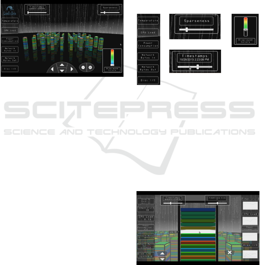
Figure 1: Main Scene view.
3.1 3D Overview
The main screen of the Data Centre 3D Visualization
application, which comprises a virtual representation
of a data centre room and the basic interactive UI
components (e.g., navigation buttons) is depicted in
Figure 1. All the servers of the room are grouped and
displayed as 3D racks according to their physical
location in space. Each rack may contain at most 40
units, each displayed as a slice with a specific colour,
annotating its current condition [Figure 6Figure 3].
Overall, the virtual data centre room is constructed as
a grid in the 3D space. The virtual environment that
encloses the scene is spherical and the servers’ grid is
placed in the centre, so that users can have a 360
degrees overview.
The application provides details and insights of
the displayed data centre room through its intuitive
user interface. In more details, at the left side of the
application’s viewport a menu of five components is
displayed, highlighting elementary values of the data
centre’s servers such as temperature, CPU load,
power consumption, network Bytes In/Out, Disk I/O
[Figure 1]. Upon the selection of one of these values,
the visualized information of the data centre is
updated accordingly, representing the current status
for the selected characteristic. This way, the users are
able to instantly switch between different server
characteristics and correlate the displayed state of the
data centre with specific server characteristics (e.g.,
CPU Load and Power Consumption: usually, a high
CPU Load is expected to result into a higher power
consumption).
Furthermore, the application provides historic
information of the data centre state by allowing users
to select the date and time of the information that is
visualized. Upon the selection of a time frame, all the
servers update their values accordingly. If the
selection is performed in the close-up view of a rack,
then additional options are provided in order to
present the history of the selected unit [Figure 3].
Figure 2: [Left] Visualization Μenu Οptions, [Middle-Up]
Scene Sparseness Filtering, [Middle-Down] Date Time
Filtering, [Right] Displayed Unit Colours Filtering.
In addition, the system offers filtering and
arrangement options [Figure 2], allowing users to
manipulate the information provided and focus on
specific aspects of the data centre. In more details,
filtering according to the state of the displayed servers
(color-coded) allows exclusion of elements which are
not in the field of the user’s interest, resulting in a
comprehensible and clear view of the available
information (e.g., the user can easily view all the
servers in critical state). On the other hand,
arrangement according to the level of sparseness of
Figure 3: Close-up state shows the units of the selected rack
and focuses on the "worst" one, with number 33. On the left
the UI-information for this unit and on the right the line
charts for the specified history.
DataDiversityConvergence 2016 - Workshop on Towards Convergence of Big Data, SQL, NoSQL, NewSQL, Data streaming/CEP, OLTP
and OLAP
390
the data centre, aids in defining the view of the data
centre (e.g., the servers can be densely placed in order
to provide an overview of the data centre or sparsely
so as to facilitate inspection of server values in detail
over specific areas of the data centre room).
3.2 Navigation
Navigation in the scene is accomplished through an
orbit virtual camera providing, in this way, different
levels of details. For example, if the camera moves
forward then the scene focuses towards a particular
server (zoom in) and the user gets a closer and
detailed view of the server details and its units. On the
other hand, if the camera moves away (zoom out)
then the user gets the whole picture of the data centre.
Furthermore, the camera can also move left and right
to provide a better view of all the sides of the data
centre. Upon the selection of a specific rack, the
camera zooms into it, allows moving up or down to
focus on a specific unit, and explore the provided
information.
3.3 Close-up View
Investigation of a rack is achieved by either using the
controls at the bottom of the screen or performing
appropriate hand gestures. This view [Figure 3] is
used for inspecting information on a per-server level,
displaying the current values of the server’s attributes
(e.g., temperature, CPU load, etc.) along with line
charts. Any of these charts can be enlarged on users’
request, in order to provide a more detailed view. The
close-up view of a rack provides up-down navigation
to the user for selecting a particular unit. When the
user does so, the current values of the selected unit
are illustrated on the left side of the screen, while
history values are depicted as line charts on the right
side. On top of the screen, there are two sliders: the
displayed timestamp slider and the time window
slider. The first slider provides the ability to the user
to select a past time value for the selected unit in order
to investigate its previous states. The time window
slide sets the size of the time frame used for the
calculation of the visualization of the mean values
illustrated by the charts. For instance, if a user
increases the value of the time window slider then
he/she increases the timespan over the means of
previous unit’s values are estimated and displayed,
getting in this way a broader view of the unit’s history.
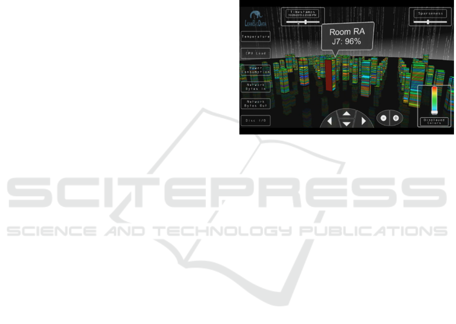
3.4 Anomaly Detection Visualization
The purpose of the 3D data centre visualization is to
provide a real-time view of a data centre and to
facilitate the efficient handling of a critical situation
when it is turned up. Therefore, the system provides
a mechanism that supports the representation of
anomaly detections regarding the temperature or
power consumption. When a problematic unit is
detected, then the colour of the rack that contains this
unit changes to red and a notification message pops-
up above it, displaying a short description of the
problem and the unit’s number [Figure 4].
Figure 4: Upon anomaly detection, the server has changes
colour accordingly (red).
3.5 Interaction Techniques
The application supports mouse-based and gesture-
based interaction, aiming to address the potential
contexts of use, i.e., a typical desktop environment
and a control room.
3.5.1 Mouse-based Interaction
The interactive elements of the scene include both the
server racks and the server units. Upon mouse
hovering a server rack, a notification pops-up
presenting basic information (i.e., the rack’s id, the
room it is located in, and its coordinates in the room,
if the unit is in critical state). If the user clicks on a
specific rack, the scene changes to a close-up view,
the camera zooms in towards the selected rack and
specifically displays the unit of the rack which is in
the “worst situation”, and which defines the criticality
level of the server [Figure 3]. While in close-up view,
the user can select a specific unit of a rack, through a
mouse click. Then, at the right side of the rack, four
different line charts are displayed, illustrating the
history of the selected unit, as already discussed in
section “Close-up View”. If the user hovers the
mouse pointer over a specific chart, then the chart
expands in order to display a better view of the unit’s
history and its temporal evolution [Figure 5].
3D Vizualization of Large Scale Data Centres
391
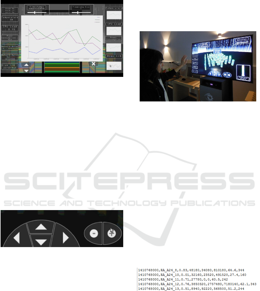
Figure 5: Maximized chart on mouse over the interactive
item at the right screen side.
In addition, aiming to facilitate users’ navigation in
the 3D environment, a navigation tool has been
developed, through which the view of the camera is
controlled [Figure 6]. This component comprises four
navigation buttons for moving the camera forward,
backward, left and right, as well as a minus and a plus
button for camera zoom out and in accordingly. These
buttons are triggered on hover. For example, as long as
the mouse pointer hovers the up arrow button the
camera moves forward. The navigation component
changes when a rack is selected and the scene switches
to the close-up view. In this state, the navigation
buttons provide only the up or down functionality since
the server’s units are stacked vertically on the rack.
Furthermore, there is an exit button in order allowing
users to return to the full scene view.
Figure 6: Camera navigation tools.
3.5.2 Gesture-based Interaction
In order to make the interaction more natural and
friendly to the user, especially when the system is
deployed in a large-screen setting, gesture-based
interaction is supported. The current version supports
a small vocabulary of gestures that enable users’
interaction with the 3D scene using a cursor metaphor
(hand-mouse).
In more details, through a hand tracking
mechanism, the user’s movements are filtered and a
mouse event emulator is raised and listens to the
incoming events that correspond to the user’s moves.
As a result, when the user moves his right hand in the
space in front of him, the mouse moves accordingly
in the scene [Figure 7]. In order to select an
interactive element the user has to raise his left hand
and open the palm, showing at the same time with his
right hand the component that he wants to select.
Figure 7: Gesture-based interaction.
Future versions of the application will support
gesture-based interaction through a larger vocabulary
of intuitive gestures (e.g., move hands apart for
zooming in). Nevertheless, the hand-mouse metaphor
will continue to be supported, as it is an easy-to-learn
interaction modality for first-time users of gesture-
based interaction.
4 DATA STORAGE AND
RETRIEVAL
4.1 Input Data and Analysis
In order to create the scene layout and fill in the server
racks and the corresponding units with their values, a
mechanism has been implemented to parse an input
file (.csv format) and to retrieve all the data written in
it, analyse it - if needed - and create the necessary data
structures in memory for information representation
of the scene data elements.
Figure 8: Input CSV file format.
Each line of the file features comma-separated
values providing information for a specific unit of a
server of a room in a specific Date and Time. The
comma-separated values represent information
regarding the temperature of the server, its CPU load,
power consumption, network bytes in/out and Disk
I/O. The parsing of the file is based on the specific
format of each line, as shown in Figure 8. For
DataDiversityConvergence 2016 - Workshop on Towards Convergence of Big Data, SQL, NoSQL, NewSQL, Data streaming/CEP, OLTP
and OLAP
392

example, “1410768000, RA_A24_8, 0.83,48180,
34080, 810180, 64.6, 344” reports that:
1410768000 is the Date Time (long)
RA_A24_8 the information refers to Room A,
for the server which is located in Row A,
Column 24 and the unit for which the data in
this line refer to is the 8th.
0.83 is the CPU load in the specific timestamp
(float)
48180 are the Network Bytes In for the
specific timestamp (long)
34080 are the Network Bytes Out for the
specific timestamp (long)
810180 is the Disk Input/Output for the
specific timestamp (long)
64.6 is the temperature load for the specific
timestamp (float)
344 is the power consumption for the specific
timestamp (integer)
The data provided in the input file is used to
populate the data structures that are required to
visually represent the aforementioned information in
the 3D scene. In more details, the following data
structures are used: (a) a server-description structure,
featuring the room in which the server is stored, the
position of the server in the grid layout, and the units
of the server, (b) a unit-description structure, which
involves all the unit values that have been explained
above (CPU load, network bytes in, network bytes
out, disk I/O, temperature, power consumption), as
well as the timestamp information.
4.2 Scene Creation
Apart from the data structures needed, a scene
generator has been created in order to visualize the
data according to the information stored in the file.
The scene generator asynchronously creates all the
3D racks with their units and all the coloured values
in them and places them according to their positions
given in the input file for the specific room. As
illustrated in Figure 1 and explained in section “Input
Data and Analysis”, positions are defined by rows and
columns, which is an easy to understand and effective
way to visually map them in the scene as a grid with
the corresponding rows and columns.
4.3 Real-time Communication
Information regarding the servers’ state is acquired in
real time, both in terms of raw data (such as
temperature, CPU usage, etc.) and in terms of
anomalies. Information retrieval is accomplished by
automatic anomaly detection and root cause analysis
CEP Operators, which is part of a system developed
in the context of the LeanBigData FP7 project
[LeanBigData, 2014-2017]. The data currently
provided comes from recorded datasets, while
ongoing work involves the provision of real-time
information. The communication is implemented
using REST API endpoints and provides both current
and previous values for any given server.
5 GESTURE-BASED
INTERACTION
For supporting gesture based interaction a framework
has been implemented based on the approach
discussed in (Michel et al., 2014). The adopted
framework encompasses a collection of techniques
that enable robust, real-time and efficient gesture
recognition based on visual information acquired by
an RGBD camera. The framework encompasses hand
detection, hand tracking, hand posture recognition
and hand gesture recognition processes and interprets
the recognized hand gestures to windows native
mouse events, acting as a Human Interface Device
(HID). To this end, it can be installed on any
computer with windows operating system, providing,
in a transparent way, gesture – based interaction to
any windows application.
The employed gestural vocabulary is composed of
three different classes of physical hand-arm actions.
Mouse Button Press: The case of a mouse button
press is recognised if the posture of a tracked hand
changes from “closed hand” to “open hand” and the
“open hand” posture is maintained for a number of
consecutive frames.
Mouse Button Release: The case of a mouse
button release is recognized if the posture of a tracked
hand changes from “open hand” to “close hand” and
the “closed hand” posture is maintained for a number
of consecutive frames.
Cursor Move: A hand has a posture that is
classified as “index up”. Then, the 2D projection of
its centroid in the image plane as it moves around,
defines the x-y coordinates of the mouse cursor in the
application area.
6 CONCLUSIONS AND FUTURE
DIRECTIONS
The work presented in this paper attempts to combine
innovative, state-of-the-art technologies in the fields
3D Vizualization of Large Scale Data Centres
393

of Big Data anomaly detection, information
visualization and computer vision gesture
recognition, in order to deal with visualization needs
for Big Data and data centre infrastructure
management.
The proposed approach primarily deals with the
monitoring and the intuitive display of existing data
centres’ information, using their actual layout, in
order to inform data centre experts about the servers’
current state and assist navigation in actual space. The
proposed approach takes advantage of 3D rendering,
providing seamless transition from the data centre’s
overview to on-demand specific server information.
Finally, the presented work is designed not only to
suit traditional desktop interaction but also to support
natural interaction by employing gesture-based
interaction.
Future work involves enriching the gestural
vocabulary and conducting an in-depth qualitative
and quantitative evaluation, in order to assess the
system’s usability, scalability and the overall user
experience. Another challenging issue upon which
further research can be directed is the ability to
incorporate the visualization of relationships between
servers in the system.
Finally, this work aims to act as a starting point
for developing a complete framework for Big Data
Infrastructure Management. Due to the nature of Big
Data, a plethora of information exists that is
significant and meaningful for data centre experts,
constituting a very demanding area in the
interdisciplinary domain of 3D Graphics, Human-
Computer Interaction and Visual Big Data Analytics.
ACKNOWLEDGEMENTS
This research has been partially funded by the
European Commission under project LeanBigData
(FP7-619606)
REFERENCES
Aggarwal, J., Ryoo, M., 2011. Human activity analysis: A
review. ACM Comput. Surveys. 43.
Andrae, A. S., & Edler, T. (2015). On Global Electricity
Usage of Communication Technology: Trends to
2030. Challenges, 6(1), 117-157.
Chen, C. P., & Zhang, C. Y. (2014). Data-intensive
applications, challenges, techniques and technologies:
A survey on Big Data. Information Sciences, 275, 314-
347.
Chen, Z. (2012). Production system improvement: floor
area reduction and visual management (Doctoral
dissertation, Massachusetts Institute of Technology).
Cole, D. (2012). Data center infrastructure
management. Data Center Knowledge.
Drossis, G., Grammenos, D., Birliraki, C., & Stephanidis,
C. (2013). MAGIC: Developing a Multimedia Gallery
Supporting mid-Air Gesture-Based Interaction and
Control. In HCI International 2013-Posters’ Extended
Abstracts (pp. 303-307). Springer Berlin Heidelberg.
Eaton C., Deroos D., Deutsch T., Lapis G. and Zikopoulos
P. (2012), Understanding Big Data: Analytics for
Enterprise Class Hadoop and Streaming Data.
Harris, M., & Geng, H. (2015). Data Center Infrastructure
Management. Data Center Handbook, 601-618.
Gölitz, P., Struffert, T., Lücking, H., Rösch, J., Knossalla,
F., Ganslandt, O., & Doerfler, A. (2013). Parametric
color coding of digital subtraction angiography in the
evaluation of carotid cavernous fistulas. Clinical
neuroradiology, 23(2), 113-120.
Keim, D., Qu, H., & Ma, K. L. (2013). Big-data
visualization. Computer Graphics and Applications,
IEEE, 33(4), 20-21.
Koutamanis, A. (2000). Digital architectural
visualization. Automation in Construction, 9(4), 347-
360.
Kriglstein, S., Wallner, G., & Rinderle-Ma, S. (2013). A
visualization approach for difference analysis of
process models and instance traffic. InBusiness Process
Management (pp. 219-226). Springer Berlin
Heidelberg.
LaValle, S., Lesser, E., Shockley, R., Hopkins, M. S., &
Kruschwitz, N. (2011). Big data, analytics and the path
from insights to value. MIT sloan management
review, 52(2), 21.
Lawler, M. E. (2010). Improving shop floor visualization
and metrics (Doctoral dissertation, Massachusetts
Institute of Technology).
Lazovik, A., Kaldeli, E., Lazovik, E., & Aiello, M. (2009).
Planning in a smart home: visualization and simulation.
In Application Showcase Proceedings of the 19th
(ICAPS) Int. Conf. Automated Planning and
Scheduling.
LeanBigData - Ultra-Scalable and Ultra-Efficient
Integrated and Visual Big Data Analytics, Funded by
FP7 ICT 619606, 2014-2017, http://leanbigdata.eu/,
http://cordis.europa.eu/project/rcn/191643_en.html
(last accessed on 21/1/2016).
Lozada, C., & De la Rosa, R. (2014, June). Simulation
platform for domotic systems. In Communications and
Computing (COLCOM), 2014 IEEE Colombian
Conference on (pp. 1-6). IEEE.
Michel, D., Papoutsakis, K., & Argyros, A. A. (2014).
Gesture recognition supporting the interaction of
humans with socially assistive robots. In Advances in
Visual Computing (pp. 793-804). Springer
International Publishing.
Moore, J., Chase, J., Farkas, K., & Ranganathan, P. (2005,
February). Data center workload monitoring, analysis,
DataDiversityConvergence 2016 - Workshop on Towards Convergence of Big Data, SQL, NoSQL, NewSQL, Data streaming/CEP, OLTP
and OLAP
394

and emulation. In Eighth Workshop on Computer
Architecture Evaluation using Commercial Workloads.
Moore, J., Chase, J. S., & Ranganathan, P. (2006, June).
Weatherman: Automated, online and predictive thermal
mapping and management for data centers.
In Autonomic Computing, 2006. ICAC'06. IEEE
International Conference on (pp. 155-164). IEEE.
Reda, K., Febretti, A., Knoll, A., Aurisano, J., Leigh, J.,
Johnson, A., ... & Hereld, M. (2013). Visualizing large,
heterogeneous data in hybrid-reality
environments. IEEE Computer Graphics and
Applications, (4), 38-48.
Ren, Z., Yuan, J., Meng, J., & Zhang, Z. (2013). Robust
part-based hand gesture recognition using kinect
sensor. Multimedia, IEEE Transactions on, 15(5),
1110-1120.
Schneider, R.D. (2012), Hadoop for Dummies Special
Edition, John Wiley&Sons Canada.
Sfakianakis, Y., Mavridis, S., Papagiannis, A.,
Papageorgiou, S., Fountoulakis, M., Marazakis, M., &
Bilas, A. (2014, November). Vanguard: Increasing
Server Efficiency via Workload Isolation in the Storage
I/O Path. In Proceedings of the ACM Symposium on
Cloud Computing (pp. 1-13). ACM.
Valdes C., Eastman D., Grote C., Thatte S., Shaer O.,
Mazalek A., Ullmer B., Konkel M. (2014). Exploring
the design space of gestural interaction with active
tokens through user-defined gestures. ACM.
Ware, C. (2012). Information visualization: perception for
design. Elsevier.
3D Vizualization of Large Scale Data Centres
395
