
Iso-edges for the Geovisualization of Consumptions
Catarina Mac¸
˜
as, Pedro Cruz, Evgheni Polisciuc, Hugo Amaro and Penousal Machado
Department of Informatics Engineering, CISUC, University of Coimbra, Coimbra, Portugal
Keywords:
Isolines, Big Data, Information, Consumptions, Geovisualization, Thematic Maps.
Abstract:
Data Visualization is emerging as a tool to understand and explore data in various ways. It enables us to
interpret, synthesise, and present complex and vast amounts of information. We use Data Visualization to
represent the evolution of consumptions in 729 hypermarkets and supermarkets of the biggest Portuguese
retail company, for a time span of two years. We aim to apply an Information Visualization technique in order
to study how, through Data Visualization, we can represent, synthesize, and interpret consumptions’ data. The
geospatial data enables us to represent the consumptions in the different municipal districts and to analyze
how consumptions evolve over time. To present this data, we apply an isoline approach, introducing a new
technique called iso-edges. We also implement an interface for the exploration and analysis of the data.
1 INTRODUCTION
The number of structures to collect and save data on
retail companies is increasing, and thus the necessity
to analyze and understand this data is of the utmost
importance. Data Visualization can be an invaluable
asset in this process. The representation of geospatial
data with the goal of understanding how data evolves
through time in specific regions is an important task
for retail companies. This type of information may
assist retail companies in, for instance, stock manage-
ment, understanding seasonal variations, determining
where to place new facilities, etc.
For this project, we have access to the dataset of
729 Portuguese supermarkets and hypermarkets of the
SONAE chains, which covers the entire country. We
used all transactions made on those supermarkets and
hypermarkets from May 2012 to April 2014. Further-
more, we have access to the zip-codes of all clients
of the SONAE chains, which gives us an estimate of
the clients’ geographic position, and to the locations
of the main buildings of Portugal. This data about
the consumptions was already explored through a cal-
endar visualization which aided in the understanding
of how the consumptions evolved in the different de-
partments of the SONAE chains (Macas et al., 2015;
Mac¸
˜
as et al., 2015). We also used the geographi-
cal data of the consumptions to explore how the cus-
tomers move from one supermarket to another (Polis-
ciuc et al., ). The main goal for this project is to apply
an Information Visualization technique to represent
how consumptions are distributed throughout Portu-
gal and how this distribution evolves through time,
thus highlighting the changes in the patterns of con-
sumption in specific times of the year, such as Christ-
mas. Additionaly, it is a first step in the development
of a visualization tool to assist decision making re-
garding the opening, or renewal, of facilities.
To represent the geographical variations of con-
sumptions, and as an initial approach, we resort to
contour lines, i.e. isolines, which delineate areas with
similar values of consumption, thus identifying re-
gions with different consumptions. Isolines depict
consumptions that were not measured in those spe-
cific geographical points, but that were calculated in
relation to the area of collection. The use of isolines
allows us to identify, delimit and highlight geographic
areas of high and low consumption values. When
applying this technique to our data we realized that
the isoline density was low, which impaired the read-
ability of the visualization. As such we introduce a
new approach to complement the isolines, iso-edges,
increasing their density in order to promote the effi-
ciency of the visualization.
The paper is structured as follows: in Section 2
and Section 3 we present a short overview of spa-
tiotemporal visualizations and thematic maps, respec-
tively; Section 4 describes the data, our approach for
the geo-representation of consumptions using isolines
and iso-edges, and the interface, which enables the
user to explore the visualization; Finally, in Section
5, we draw some conclusions.
222
Maçãs, C., Cruz, P., Polisciuc, E., Amaro, H. and Machado, P.
Iso-edges for the Geovisualization of Consumptions.
DOI: 10.5220/0005785702200227
In Proceedings of the 11th Joint Conference on Computer Vision, Imaging and Computer Graphics Theory and Applications (VISIGRAPP 2016) - Volume 2: IVAPP, pages 222-229
ISBN: 978-989-758-175-5
Copyright
c
2016 by SCITEPRESS – Science and Technology Publications, Lda. All rights reserved

2 SPATIOTEMPORAL
VISUALIZATIONS
Data representing time and space are found in a wide
range of domains, and can be used to find and com-
prehend natural and social patterns, and to help make
predictions. Spatiotemporal visualization techniques
can efficiently organize and represent temporal ge-
ographic data sets, providing a global view of the
activities, and thus revealing overall tendencies and
movement patterns (Meirelles, 2013). The applica-
tion of these visualization techniques carries some
challenges such as their computational requirements,
caused by the usually large data sets, and the need for
a sound understanding of how information and knowl-
edge can be extracted from the data, and transposed in
the visualization (Zhong et al., 2012).
Traditionally, maps have been used as models for
spatiotemporal datasets (Meirelles, 2013). Through
the use of maps, the geospatial patterns and clusters
are generally easier to identify. Zhong et al. (Zhong
et al., 2012) groups the most important spatiotem-
poral visualization techniques in 5 different types:
(1) Timestamps and Time Labels, which are series
of events marked with date and time information.
The time labels are specific graphic variables used
in maps indicating changes. This type of visualiza-
tion is static. Minards famous graphic of Napoleons
Russian campaign is one example of this technique;
(2) Baselines, which use arrows and lines to repre-
sent the changes in the data. This technique can ap-
ply animation methods to represent the progress. Na-
talia Andrienko and Gennady Andrienko (Adrienko
and Adrienko, 2011) propose a method for spatial ag-
gregation of movement data, which can be explored
in an interactive visualization that creates legible flow
maps; (3) Image Series, where timelines are used
as the basis for mapping events over time, and the
dataset is represented through series of images. Guo
et al. (Guo et al., 2006) developed a tool called VIS-
STAMP which aid in the exploration and understand-
ing of spatiotemporal patterns. Their approach in-
cludes several visualizations within which one of geo-
graphic small multiple display; (4) Space-Time Cube,
developed by H
¨
agerstraand (H
¨
agerstraand, 1970) is a
three-dimensional diagram with time as the third spa-
tial dimension. He explored this technique to show
life histories of people and how people interact in
space and time; and (5) Real-Time Rendering of Dy-
namic 3D Scenes, which uses real-time animated 3D
rendering techniques. Weber et al. (Weber et al.,
2009) creates an interactive simulation of 4D cities,
which is based in 3D models of an urban environment
and its evolution through time.
3 THEMATIC MAPS
Thematic maps appeared in the second half of the
seventeenth century representing data in the natural
sciences, and can be defined as the representation of
attribute data on a base map. Thematic maps dis-
play qualitative or quantitative data. Their purpose
is to reveal patterns and frequencies in the geography
where they occur (Meirelles, 2013), to discover the
geographical structure of the subject, and to relate its
distribution on the map (Robinson, 1982).
The 1701 isoline map of magnetic fields by Ed-
mond Halley is considered the first thematic map.
These maps can be divided in: dot distribution
maps (Fry, 2004); graduated symbol maps (Brewer
and Campbell, 1998); choropleth maps (Brewer and
Pickle, 2002); isometric and isopleth maps (Mellier
et al., 1988); flow and network maps (Thorp, 2009);
and area and distance cartograms (Meirelles, 2013).
The first isopleth maps depicting population den-
sities were created by N. F. Ravn in 1857. The Gen-
eral Bathymetric Chart of the Oceans records from the
International Hydrographic Organization is another
isopleth example, which uses as a visual metaphor
for coloring “the deeper or higher, the darker”. It
shows the great ocean trenches of the western Pa-
cific and Japan Sea, and has numbered contours to
improve accuracy of reading (Tufte, 1990). In 2006,
Chris Lightfoot created a Travel-time Map that rep-
resents the time needed to travel from site A to site
B (Lightfoot, 2006). The visualization is drawn on a
base map where the color of each pixel depends on
the time spent, having warm colors to indicate short
journeys and cool colors for longer journeys.
For this project, we will only focus in the isopleth
maps, more specifically, in the isolines. Isopleth maps
are composed by a set of lines or areas that show
the distribution of values that cannot be referenced to
points. These lines, depict data that were not mea-
sured in those specific points, but were calculated in
relation to the area of collections. The calculated cen-
troid of each area is considered the data point for the
line construction (Meirelles, 2013). Some examples
of this technique can be seen in maps that represent
the mean temperatures or the average precipitation
levels. In 2013, the Department of Energy & Cli-
mate Change of England created an isopleth map that
shows the actual heat demand from buildings across
England (DECC, 2013). With this map developers
and planners can perceive which areas are suitable for
the development of local heat networks. Isoline maps,
are isopleths where there is no shading. Edmond Hal-
leys 1701 map of magnetic lines is considered the first
map to make use of lines of equal value to encode
Iso-edges for the Geovisualization of Consumptions
223

data. Nowadays, the use of isolines to represent pop-
ulation data is less popular, and the majority of iso-
metric and isopleth maps, shows natural phenomenas,
such as climate and geology.
4 GEO-REPRESENTATION OF
CONSUMPTIONS
We propose the application of the isoline technique
as a method to visualize and explore the evolution of
consumptions in the different municipal districts of
Portugal through time. We also propose a comple-
mentary method, which we designate as iso-edges, to
increase the density of information presented in the
map, improving readability.
In this project, the isolines are projected on the
Portuguese map along with the representation of
the main buildings (retrieved from the Open Street
Maps
1
) and the zip codes of costumers. This data pro-
vides a visual reference to the viewer, highlighting on
the map the main residential conglomerates and build-
ings
2
. These locations are represented in the map with
small, black circles of equal size so they do not over-
power the visualization but, at the same time, are vis-
ible and can be compared with the consumption data.
For this project, and since we wanted to analyse the
differences between the different months, we calcu-
lated the average consumption of every month from
the dataset.
To differentiate the areas with different consump-
tions we draw a set of lines to separate them: isolines.
Each one of these lines, is representative of one con-
sumption value and separates the areas with more and
less consumptions than the lines’ value. With this In-
formation Visualization technique we are able to see
the geographic map behind and to analyze the differ-
ences in consumptions.
To generate the isolines, first we had to create a
triangulation between the centroids of all municipal
districts of Portugal. We used the Delaunay Triangu-
lation algorithm to do so (Lee and Schachter, 1980).
Ideally, to avoid cluttering and promote readability,
the isolines should have a similar distance among
them, as in the work of Bruno Jobard (Jobard and
Lefer, 1997). Considering that we want our isolines
to be evenly distributed, the isolines’ values cannot be
1
https://www.openstreetmap.org
2
It is important to notice that the areas where people
live and the areas where people shop are not necessarily the
same. In certain cases areas with low population density
correspond to business centers which are highly populated
throughout the day. As such it is necessary to convey both
types of information.
predefined. As such, we defined a minimum distance
and represented only the isolines that have that mini-
mum distance among them. With this first approach,
the resulting isolines were too sparse, which trans-
lated into a small amount of information, difficulting
the reading of the data. To give more insight, we de-
cided to complement the isolines. As such, in addition
to the previously drawn isolines, we also draw isolines
which are not closed—iso-edges. These iso-edges,
are calculated in the same way as the isolines, but, if
the isoline has segments which are too close from the
previous drawn isolines, those edges are eliminated
until the isoline is drawable. This technique resulted
in a wide number of iso-edges, which completed the
visualization and gave more insight about the data,
specially in cluttered areas created by municipal dis-
tricts which are too close to each other.
This section is divided in three sub-sections. In
the first, we describe the dataset and explain how we
aggregated the data. In the second sub-section, we
describe how we generated the isolines and iso-edges,
and present some results. In the last sub-section we
present the interface which enables the user to explore
the visualization.
4.1 Data
The consumptions data is retrieved from 729 Por-
tuguese supermarkets and hypermarkets of the SONAE
chains, which covers the entire country. The clients
from these chains tend to use their client cards when
shopping, to accumulate discounts and other benefits.
Currently, the number of active cards is above 6 mil-
lion, which can be considered an impressive number,
specially if we take into consideration that the Por-
tuguese population is below 11 million, and that the
cards are issued by “household” and shared by the en-
tire family. For this project we used all the transac-
tions made on those supermarkets and hypermarkets
from May 2012 to April 2014. Each transaction cor-
responds to one product bought and it has properties
such as price, date, place, and time of purchase. Each
product is placed in the product hierarchy of the com-
pany, which has 6 levels and corresponds to a type of
the product. For this work, we aggregate all the pur-
chases independently of the type of product. Since
the goal of the project is to give an overview of the
consumptions differences among the months of our
dataset, we also calculated the average consumption
value for every month, depending on the municipal
district where the purchases occurred. The shapes
of Portugal and its municipal districts were both re-
trieved from the Open Street Maps.
Our data, has some inherit characteristics: first,
IVAPP 2016 - International Conference on Information Visualization Theory and Applications
224

the consumption volumes are not related to each
other, meaning, municipal districts close to each other
can have different consumption volumes, what causes
the consumption distribution to be irregular; and sec-
ond, the distance between municipal district centers
is not the same, some districts are close to each other
and others far apart. These two characteristics are,
in some way, related: in general, the nearer from the
coast the municipal district is, the higher the con-
sumption value is and the closest the districts are from
each other; and the nearer to the interior of Portugal
the municipal district is, the lower the consumption
value is and the farthest the districts are from each
other. Furthermore, the places where the consump-
tions are higher, occur mostly in the same areas, such
as, Lisbon, Porto and Faro. These characteristics are
deeply linked with the demographics of Portugal.
4.2 Isolines and Iso-edges
To visualize the consumption differences between the
municipal districts of Portugal we implement an iso-
line technique which delimits the areas with different
consumption values. One isoline represents one con-
sumption value. To generate them, we have to define
the values that they are going to represent. Given the
inherent characteristics of our data, and the goal of
having the isolines evenly distributed along the Por-
tuguese map, we cannot divide the space of consump-
tion values in equal ranges, as our range of consump-
tion values are not linearly distributed by the munic-
ipal districts. Furthermore, in our consumption data
there are more municipal districts with low consump-
tions then with high consumptions, so if we divide the
range of consumption values in a linear way, the iso-
lines would be very irregular, some too close to each
other, others too far apart (Figure 1).
To attain a more uniform and informative distribu-
tion of isolines over the map, we defined their values
using an iterative process. First, we find the higher
consumption value of all months, so that it is pos-
sible to compare the differences among the different
months, and use this value, iso
max
as reference for an
isoline. The remaining isolines are obtained by de-
creasing values of consumptions with a sampling step
of step, in other words, the i
th
isoline corresponds to a
consumption value of iso
max
−i×step. The higher the
step is, the fewer isolines are calculated, resulting in a
map with less detail, since the range of consumption
values is divided in fewer parts. In order to have as
much isolines as possible without compromising leg-
ibility, we used a step of 100, so small differences in
the consumptions are discarded. Once the isolines’
values are calculated, the drawing algorithm deter-
Figure 1: Isolines generated with a linear division of the
consumption values.
mines which isolines are drawn. We start by draw-
ing the isoline corresponding to iso
max
and proceed
by iteratively decreasing the consumption values; An
isoline is drawn if, and only if, all of its points are,
at least, at a minimum predefined distance, min
dist
,
of the isolines that were already drawn. The isolines
which are too close to those that were already drawn
are discarded. The values for the constants step and
min
dist
are empirically determined.
Before computing the isolines, it is necessary to
create a triangulation between the municipal districts
centroids. These centroids are pre-calculated for each
municipal district shape through the centroid of the
polygon (Bourke, 1988). Afterwards, we imple-
ment the Delaunay Triangulation (Lee and Schachter,
1980) for these centroids, and we get an array of tri-
angles that link the closest municipal district centers.
Note that our triangulation does not connect the cen-
troids of the municipal districts that are in the edges
of Portugal and have more than one municipal district
centroid in the middle (Figure 2) (Ahlen, 2010). The
connection of all the centroids would create isolines
which are out of the area of Portugal and that do not
represent the data.
For every month, each centroid has a value cor-
responding to the consumption in that municipal dis-
trict. To find the points that compose the isoline cor-
responding to a given consumption value, we search
pairs of vertices of the triangulation whose associ-
ated consumption values define an interval compris-
ing the value of the isoline. To position the isoline
point along the vertex defined by these two points, we
interpolate linearly between the the vertices’ values.
Iso-edges for the Geovisualization of Consumptions
225
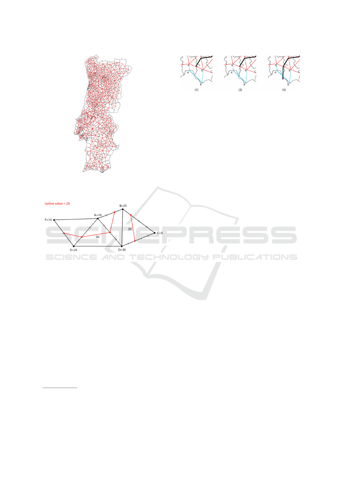
Figure 2: Triangulation of the municipal districts of Portu-
gal. Note that there are no connections out of the Portugal’s
Shape.
Figure 3: Six centroids [A..F] and corresponding consump-
tion values. The points of the isoline corresponding to a
consumption value of 20 are determined through interpola-
tion between the extremes of each edge.
Figure 3 illustrates this process.
Once the points of the isoline are determined, the
isoline is defined by connecting the two points of each
triangle belonging to the isoline path
3
, generating an
iso-edge. We save each iso-edge in a hash map that
has as key the consumption value of the isoline and
as value an array of the edges. This way, we easily
separate the iso-edges of different values.
Once all the iso-edges are calculated, we group
the edges that belong to the same isoline and see if
the isolines have a predefined minimum distance from
each other. To generate an isoline, and since an iso-
edge is represented by two points, we just need to join
the iso-edges that have one point in common.
We generate all isolines for every isoline value and
3
If the triangle belongs to the isoline path, then it will
always be intercepted in exactly two points, except when
all the vertices of the triangle have the exact value of the
isoline. In that case the isoline matches the shape of the
triangle
Figure 4: Schematic of the isoline closing technique. 1)
Projection and connection of the Municipal District cen-
troids; 2) Connection of the end of the isoline and it’s pro-
jection; 3) closing the isoline.
save them. At each iteration through the isoline’s val-
ues, we need to determine which isolines are to be
drawn. To do so, and to make this process faster, we
defined a radius, so the algorithm only searches for
isolines whose centroid is close to the current isoline’s
centroid. For each point of the closer isolines, we
compare the distance among the points of the current
isoline. If the distance between two points is smaller
than the minimum distance, we do not draw the cur-
rent isoline and repeat the process for the next isoline.
It is important to note that we start our algorithm with
the isoline with higher consumptions, so no isoline
intersects. With this method we are able to create a
relatively uniform distribution for the isolines.
Next, since the triangulation does not use the
edges of the Portuguese map, it is necessary to con-
nect the isoline’s endings which are placed near the
outline of Portugal. We decided to: project the cen-
troid of the municipal district by placing it in the mid-
dle of the coast line; map the isoline value into an
imaginary line that connects the projected centroid of
the two municipal districts; generate a line that con-
nects that point to the end of the isoline; and draw
it until it reaches the outline of Portugal. This way,
there is no isoline with unclosed endings (Figure 4).
The final step for the creation of the isolines is
the rounding of the isolines’ corners and the color-
ing. For the rounding of the isoline’s corners we ap-
plied a method described in (Polisciuc et al., 2015).
With this method we were able to smooth the corners
and to give a more organic aesthetics to the visual-
ization. With all isolines set, it is necessary to distin-
guish the different consumption values that they rep-
resent. Since our data has substantial differences in
the number of isolines with high and low consump-
tions, a linear color palette, that goes from one color
to the other to represent the range of values between
the lower and higher consumptions, would not differ-
entiate enough the low values and would create detail
in the high values, which is not desired. Therefore,
we need to create an algorithm to generate a color
palette that gives more detail in the low values and
less detail in the high values. First, we calculated all
the isolines which are drawn in each month of the two
IVAPP 2016 - International Conference on Information Visualization Theory and Applications
226
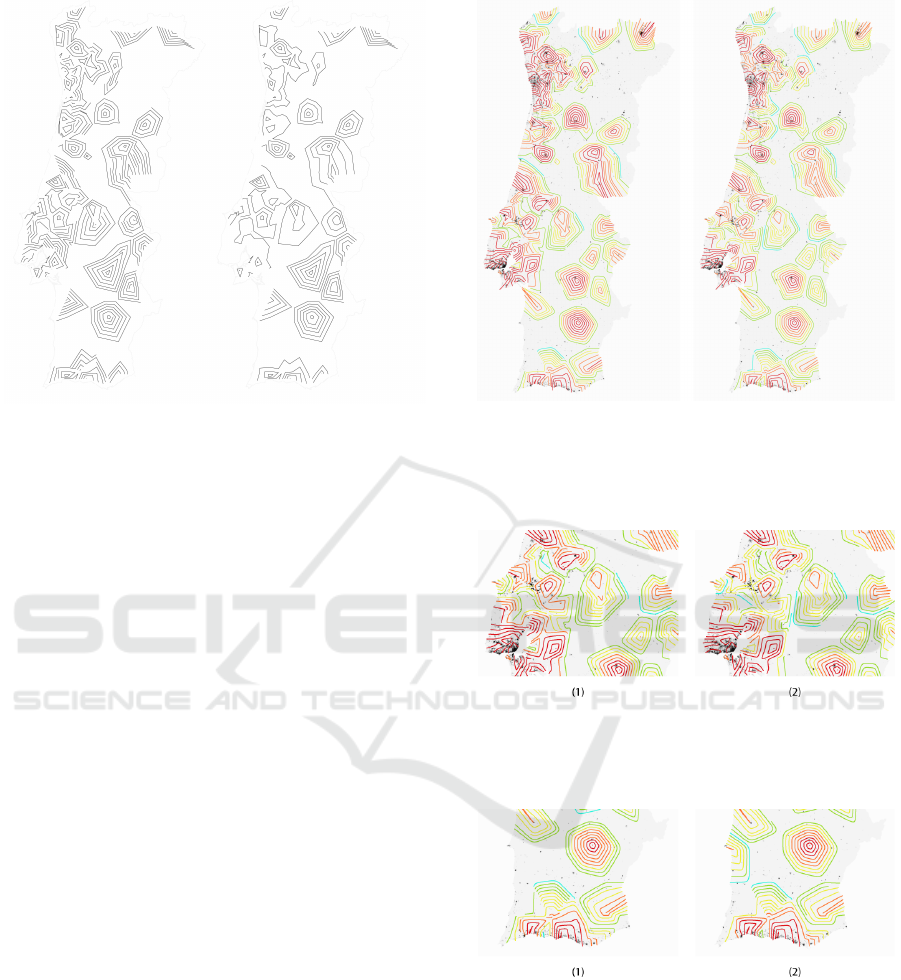
Figure 5: Differences of the visualization with iso-edges
(left) and without (right). One can perceive that in the left
side of Portugal, specially in the center and upper part, the
iso-edges generate more density, thus creating more insight
about the consumptions.
years of data, and group them by consumption value.
Note that, having calculated the color palette for every
month enables us to use the same color palette, and
thus enables us to compare the different months and
the evolution of consumptions over time. To define
the color palette we divided our consumption values
in equal sized bins (quantile) to group the consump-
tion values in different ranges. With this method, we
have more colors to distinguish the isolines with low
consumptions, since there are more isolines in those
ranges, and less detail in higher consumptions. Our
color palette goes from the cold colors, for the low
consumptions, to the warm colors, for the high con-
sumptions.
Since some centers of the municipal districts are
too close to each other, and the isolines are restricted
to a minimum distance among them, we get few iso-
lines in some areas of Portugal. This is translated in
a lack of information about the consumptions, which
does not fulfill our objectives. To generate a complete
visualization of the consumptions we propose a new
method—iso-edges. This method, creates more den-
sity in our visualizations promoting readability. We
used the isolines that were not drawn in the previous
approach. Implementing a similar algorithm, every
time that an isoline cannot be drawn, we save it into an
array. When all the drawable isolines are generated,
we start again with every non-drawable isoline. Then,
to each point of the isoline we see if it is too close, or
not, to the points of the other isolines. Here, instead of
not drawing the isoline, if one or more points are too
Figure 6: Visualization of the consumptions in December
2012 (left) and January 2013 (right). Between these two
months, the average consumption is similar, having higher
differences in the center of Portugal, higher consumptions
in December than in January.
Figure 7: Visualization of the consumptions in February
2013 (1) and February 2014 (2). Small differences in the
generated isolines and iso-edges. Higher consumptions in
February 2013 in the west coast of Portugal.
Figure 8: Visualization of the consumptions in October
2012 (1) and October 2013 (2). One can perceive the open-
ing of a new store in October 2013 through the appearance
of new isolines.
close, we cut the isoline in edges, so that the drawable
edges have, at least, a minimum distance from the
other isolines already drawn. Figure 5 highlights the
differences between including or not the iso-edges.
In Figure 6 we can see the results of our approach.
With the use of the color palette we can better distin-
guish the areas with different consumptions. In Fig-
Iso-edges for the Geovisualization of Consumptions
227
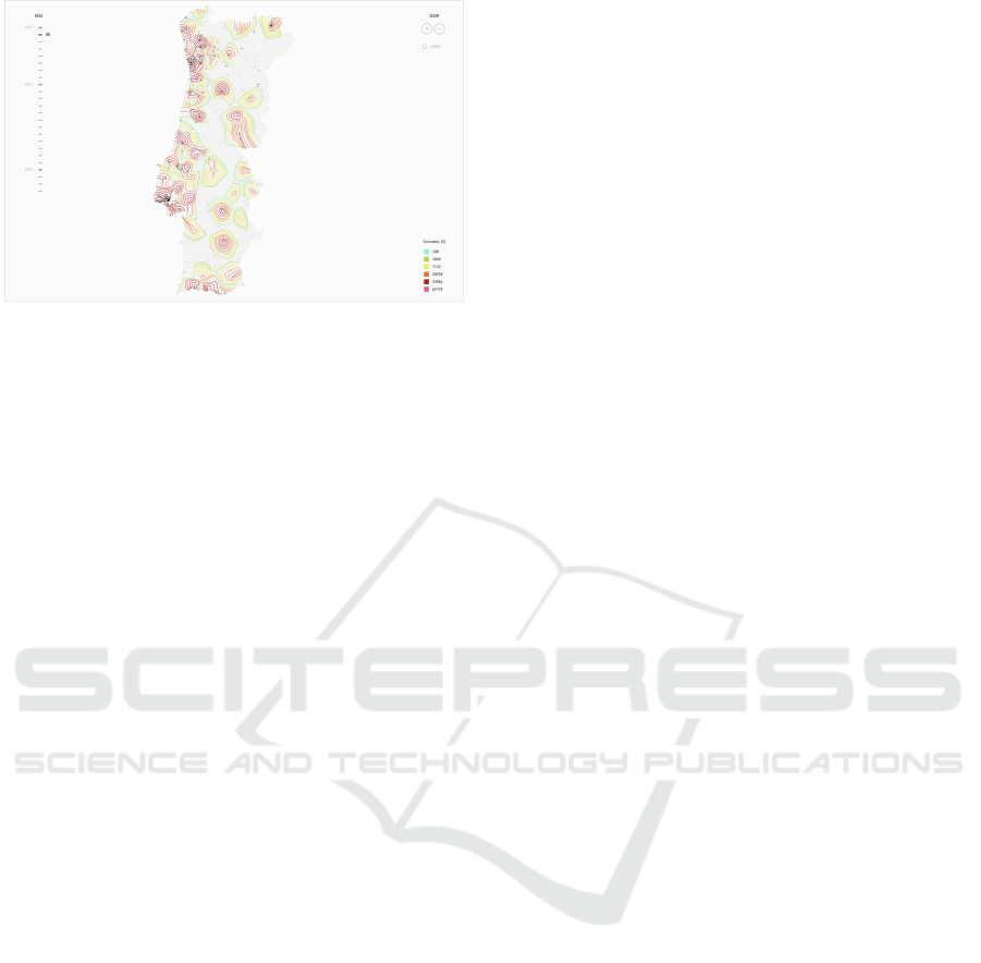
Figure 9: Isolines interface.
ure 7, we can perceive that the consumptions were
higher in 2013 than in 2014 in the region of Lisbon.
It is possible to see that our isolines do not have sig-
nificant changes as time passes. They are almost in
the same locations only with different colors. This is
due to the fact that the triangulation is the same and
the places where the consumptions occur also stay the
same. The only exception to this, is the opening of a
new store in October of 2013 in the district of Sines.
In the visualization (Figure 8), it is possible to find a
new set of isolines in the south of Portugal (2).
4.3 Interface
To facilitate the interaction and exploration of the vi-
sualization, we developed a intuitive interface which
allows the user to explore the map and to change
the displayed time period (Figure 9). To change the
month, the user has a slider on the right side of the
interface. This slider allows the user to choose be-
tween the different months simply by clicking on the
intended month. The user can also interact with the
map by zooming, using the buttons in the right upper
corner or by using the scroll of the mouse. The zoom
has different levels in which the isolines and iso-edges
are updated. As the user zooms in, more isolines and
iso-edges appear creating a more detailed map of the
consumptions in the zoomed area (Figure 10). The
user can also drag the map and explore different areas
of Portugal.
In order to have a more extensive understanding
of the consumptions, it is also possible to see the lo-
cation of the stores where the consumptions occurred.
To do that, the user has to click in the upper right cor-
ner, in the “lojas” (stores) toggle. Finally, to help the
user to read the values, a caption with the color palette
of the isolines is displayed in the right bottom corner.
5 CONCLUSION
Through Data Visualization we are able to explore,
comprehend and synthesize big and complex datasets.
With access to the geo-localization of the hypermar-
kets we represented the evolution of consumptions in
Portugal in the 729 hypermarkets and supermarkets of
the biggest Portuguese retail company, SONAE. We
applied an isoline technique to differentiate the ar-
eas with different consumptions. An isoline is a line
which represents a value that is calculated through the
consumption value in the municipal districts. Our first
approach was considered unsatisfactory since, due to
the dataset characteristics and the demographics of
Portugal, the resulting visualization conveyed little in-
formation regarding the areas of Portugal with high-
est population densities and consumptions. As such,
we introduced a new technique, iso-edges, which can
be defined as unclosed isolines. This technique over-
comes the problem by providing additional visual in-
formation to these regions, which are, arguably, the
most important ones from a facility allocation stand-
point. With this technique, we are able to analyze the
differences in consumption among the municipal dis-
tricts, to analyze the areas which are not covered by
the SONAE’s hypermarkets, and to highlight areas of
low consumptions and high populations, which can be
promising locations for opening new stores. Further-
more, we implemented an interface to enable the user
to easily explore the visualization. Through this inter-
face the user can access different zoom levels which
give to the visualization of different levels of com-
plexity.
Future work will focus on providing, through vi-
sualization, a tool to further support decisions con-
cerning the opening of new facilities. To this end we
will take into account the number of inhabitants per
region, their estimated income, the percentage of ac-
tive and inactive costumers, the proximity to existing
surfaces and their capacity.
ACKNOWLEDGEMENTS
This project was developed within a partnership with
SONAE: Sonae Viz – Big Data Visualization for retail.
REFERENCES
Adrienko, N. and Adrienko, G. (2011). Spatial generaliza-
tion and aggregation of massive movement data. Visu-
alization and Computer Graphics, IEEE Transactions
on, 17(2):205–219.
IVAPP 2016 - International Conference on Information Visualization Theory and Applications
228
Figure 10: Different zoom levels.
Ahlen, T. (2010). Poly2tri, a 2d constrained delaunay trian-
gulation library. https://code.google.com/p/poly2tri/.
Bourke, P. (1988). Calculating the area and centroid
of a polygon. URL. http://local.wasp.uwa.edu.au/ -
pbourke/geometry/polyarea.
Brewer, C. and Campbell, A. J. (1998). Beyond gradu-
ated circles: varied point symbols for representing
quantitative data on maps. Cartographic Perspectives,
(29):6–25.
Brewer, C. A. and Pickle, L. (2002). Evaluation of meth-
ods for classifying epidemiological data on choropleth
maps in series. Annals of the Association of American
Geographers, 92(4):662–681.
DECC (2013). National heat map shows heat de-
mand from buildings. http://infosthetics.com/
archives/ 2012/03/national heat map shows heat
demand from buildings.html.
Fry, B. (2004). Zip code map. http://benfry.com/zipdecode/.
Guo, D., Chen, J., MacEachren, A. M., and Liao, K. (2006).
A visualization system for space-time and multivari-
ate patterns (vis-stamp). Visualization and Computer
Graphics, IEEE Transactions on, 12(6):1461–1474.
H
¨
agerstraand, T. (1970). What about people in regional sci-
ence? Papers in regional science, 24(1):7–24.
Jobard, B. and Lefer, W. (1997). Creating evenly-spaced
streamlines of arbitrary density. Springer.
Lee, D.-T. and Schachter, B. J. (1980). Two algorithms
for constructing a delaunay triangulation. Interna-
tional Journal of Computer & Information Sciences,
9(3):219–242.
Lightfoot, C. (2006). Travel-time maps. https://www.mysoc
iety.org/2006/03/04/travel-time-maps-and-their-uses/
Macas, C., Cruz, P., Amaro, H., Polisciuc, E., Carvalho, T.,
Santos, F., and Machado, P. (2015). Time-series ap-
plication on big data – visualization of consumption in
supermarkets. In Braz, J., Kerren, A., and Linsen, L.,
editors, IVAPP 2015 – Proceedings of the 6th Interna-
tional Conference on Information Visualization The-
ory and Applications, Berlin, Germany, 11-14 March,
2015., pages 239–246. SciTePress.
Mac¸
˜
as, C., Cruz, P., Martins, P., and Machado, P. (2015).
Swarm systems in the visualization of consumption
patterns. In Yang, Q. and Wooldridge, M., editors,
Proceedings of the Twenty-Fourth International Joint
Conference on Artificial Intelligence, IJCAI 2015,
Buenos Aires, Argentina, July 25-31, 2015, pages
2466–2472. AAAI Press.
Meirelles, I. (2013). Design for Information: An Introduc-
tion to the Histories, Theories, and Best Practices Be-
hind Effective Information Visualizations. Rockport
publishers.
Mellier, Y., Mathez, G., Mazure, A., Chauvineau, B., and
Proust, D. (1988). Subclustering and evolution of the
coma cluster. Astronomy and Astrophysics, 199:67–
72.
Polisciuc, E., Alves, A., and Machado, P. (2015). Under-
standing urban land use through the visualization of
points of interest. In Proceedings of the Fourth Work-
shop on Vision and Language, pages 51–59, Lisbon,
Portugal. Association for Computational Linguistics.
Polisciuc, E., Cruz, P., Amaro, H., Mac¸
˜
as, C., Carvalho, T.,
Santos, F., and Machado, P.
Robinson, A. H. (1982). Early thematic mapping in the
history of cartography.
Thorp, J. (2009). Just landed: Processing, twitter, metacarta
and hidden data. http://blog.blprnt.com/blog/blprnt/j
ust-landed-processing-twitter-metacarta-hidden-data
Tufte, E. (1990). Envisioning information. Cheshire
(Conn.), page 91.
Weber, B., M
¨
uller, P., Wonka, P., and Gross, M. (2009). In-
teractive geometric simulation of 4d cities. In Com-
puter Graphics Forum, volume 28, pages 481–492.
Wiley Online Library.
Zhong, C., Wang, T., Zeng, W., and Arisona, S. M. (2012).
Spatiotemporal visualisation: A survey and outlook.
In Digital Urban Modeling and Simulation, pages
299–317. Springer.
Iso-edges for the Geovisualization of Consumptions
229
