
Responsive Course Design
An Adaptive Approach to Designing Responsive m-Learning
Ivan Madjarov
Aix Marseille Université, CNRS, ENSAM, Marseille, France
Université de Toulon, LSIS UMR 7296, 13397, Toulon, France
Keywords: Responsive m-Learning Design, Responsive Web Design, Web Services, Content Adaptation.
Abstract: The ubiquitous availability of a wide range of Internet connected mobile devices makes possible to dedicate
small amounts of spare time for mobile learning. The limited screen size makes current mobile devices quite
hard to visualize multifaceted web pages, so this kind of content could be adjusted to meet the device needs.
CMS-based websites, in general, are designed for large screens and when users go online with mobile phones,
smartphones and tablets they feel some discomfort. The usability and user experience may be reduced when
interacting with learning platforms that are not optimized for such features. A possible solution has arisen
with recent advances in Responsive Web Design specifications. This adaptive web design technique advocates
a single self-adaptive interface and avoids thereby multiplication of information sources and technical
supports and promotes the possibility to design adaptive e-Learning courses and adaptive e-Learning mobile
applications. In this paper we discuss about the possibilities of Responsive Web Design technique to adapt a
learning content compared to an adaptive service-based approach to design responsive learning contents for
m-Learning usage.
1 INTRODUCTION
With the advent of connected phones, smartphones
and tablets web users have gradually changed
behavior. Website developers in majority have
reacted by duplicating the content to make one
version suitable for the small screen of mobile units
and another standardized version for wide screens of
desktops and laptops. It is obvious that this approach
is impractical and does not really fit the needs of
mobile web browsers users. On the other hand, web
browsers in mobile devices typically render a given
web page without taking into account the difference
in the user's visual requirements (Sunkara, 2014).
The Responsive Web Design (RWD) is a solution
for content adaptation on different connected mobiles
units (Ben, 2013). RWD essentially means that the
content presented on a device will adjust to fit the
screen size it detects (Marcotte, 2011). This new
technology is changing the way to design a website.
User interfaces are no longer fixed and they are
adapted automatically to any medium (desktops,
laptops, smartphones, tablets, TV, etc.) without any
zooming. Zooming, in particular, significantly
accentuates the flawed ergonomics sensation
especially on touch devices.
Our motivation for this paper is inspired by two
factors: (1) Our university curriculum in computer
network and telecommunication offers students
modules that handle web development problems,
design and administration. In these modules the
competencies for RWD implementing are directly
targeted. (2) The pedagogical policy of our university
is to provide in the near future more than 30% of
online courses (MOOC). This has an impact on our
courses, not only about the content, but also for the
form if one wishes to facilitate the "mobile" access to
our pedagogy and encourage students to enjoy at their
leisure, without limits, even moving. Today, students
are rarely limited on desktop stations because they
often revise in transit or elsewhere using their
smartphone or tablet. It is therefore crucial that RWD
and e-Learning become interrelated so that students
can learn their lessons in the most ergonomic way.
Following tests, carried out as part of tutored
project, we found that the implementation of RWD in
Moodle or Dokeos Learning Content Management
Systems (LCMS) for course authors is a difficult task
and vary from one system version to another. So,
Madjarov, I.
Responsive Course Design - An Adaptive Approach to Designing Responsive m-Learning.
In Proceedings of the 8th International Conference on Computer Supported Education (CSEDU 2016) - Volume 1, pages 275-280
ISBN: 978-989-758-179-3
Copyright
c
2016 by SCITEPRESS – Science and Technology Publications, Lda. All rights reserved
275

authors are pushed towards a noncommercial and
practical solution that is to manually tag the web page
and the style file or to use an HTML-compatible
editor that better respects the break-points defined by
CSS.
In this paper, we discuss and compare some
solutions. The paper is organized as follows: first in
section 2 we present the state of the art for a
responsive e-Learning and related work. In section 3
we present a use case scenario for responsive e-
Learning design and a services-based approach.
Finally, in section 4 we conclude with some
comments about future developments related to this
work.
2 BACKGROUND AND
MOTIVATION
An obstacle to open and ubiquitous learning is that
mobile devices may have several different hardware
and software features. The usability and the user
experience may be reduced when interacting with
learning platforms that are not optimized for such
features. This heterogeneity of resources and devices
makes the design of e-Learning content a relevant
issue. So, approaches to design websites and
applications that are responsive and adaptive to
different kinds of devices in different contexts
becomes an important task.
Solutions based on applications for mobile
devices (native applications) exploit to the full the
device's features, but they are platform specific and
must be developed, updated and managed separately.
Web-based solutions, on the contrary, follow the
principles of open Web and run in standards-
compatible web browser. As a consequence, being
not developed for a specific device, web-based
solutions are typically less powerful and with a poorer
look and feel when accessed through a mobile device.
An answer to this problem has been the use of
techniques borrowed from adaptive hypermedia
systems. Device feature include browser version and
platform, availability of plug-ins, band-width, display
size, input size. Adaptive techniques are an effective
solution but their design and implementation is costly
and time consuming.
An alternative solution is RWD. This paradigm
exploits new specifications for web technologies in
particular HTML5 and CSS3 to deploy websites that
respond to the user's media environment. RWD
enables web applications to have a better look and
feel and enables user interfaces to dynamically suite
the user device without the implementation of
specialized adaptive modules.
2.1 Related Work
In the field of adaptive web design we can enumerate
three categories of approaches (Koehl, 2012):
Platform-specific mobile design includes
mobile mark-up languages (XHTML Mobile
Profile; WML) and various graphical authoring
tools to facilitate the creation of a mobile
website. The platform-specific mobile design
needs mobile designers to invest a significant
amount of manual efforts on implementing a
mobile website, which is especially optimized
to fit the distinct features of mobile devices.
Web page restructuring supports browsing a
desktop webpage on a mobile device by
adapting the original layout. It first segments a
desktop webpage into semantically related
information blocks (i.e., page segmentation)
and then provides a semantics-directed
adaptation (Madjarov, 2012).
Zooming based interaction avoids adaptation,
and provides an alternative solution to support
browsing desktop webpages on mobile devices.
It displays a desktop webpage within a mobile
screen as an overview, and provides a mobile-
friendly navigation facility to efficiently zoom
in on any portion for a detailed reading.
In (Koehl, 2012) a complex work is presented. A
site administrator visually selects objects within a
web page, and assigns one or more attributes to page
objects from a rich collection of predefined page
modifications. The proposed system then generates
code for a multi-session, php-based proxy server to
provide dynamic mobile content adaptations based on
the selected attributes. The proposed adaptation
approach cannot be computed on demand or in an
independent manner.
2.2 Responsive m-Learning
For an adaptive m-Learning it is important to have
visuals that communicate effectively on all display
sizes and so to deliver user-friendly learning content
on multiple devices. To achieve this goal, as
mentioned above, we can proceed either by
developing a different version for every target device
and browser or by the implementation of the RWD
technique for our courses. To apply this technique to
responsive e-Learning (m-Learning) we can define
three key technical features (Baturay, 2013):
CSEDU 2016 - 8th International Conference on Computer Supported Education
276

2.2.1 Screen Resolutions with CSS3 Media
Queries
Flexibility is the key factor to take in consideration
when designing responsive e-Learning courses so that
the learning content can be restructured and adjusted
to fit different screen sizes and resolutions.
Figure 1: The main Responsive Web Design task: reshaping
depending on screen sizes and resolutions.
Media queries, as part of CSS3 recommended
standard, return information on devices physical
specifications (width, height, orientation, resolution,
etc.). So, different styles can be delivered to different
devices in order to offer the best visual experience to
each user. With Media Queries we can build multiple
layouts and direct the fluid grid and flexible images
to be aligned to the device dimensions.
A best practice is to define breakpoints for each
layout to cover the largest, medium and smallest
screen sizes e.g. a desktop, a portrait tablet, and a
portrait smartphone. A breakpoint defines the size at
which the style rules change and the elements in the
layouts are dynamically resized and readjusted to fit
screen sizes. As suggested in (Baturay, 2013) and
shown in Figure 1, we can base our responsive design
on three breakpoints, e.g. 1024px for largest screen,
768px for medium screen size and 320px for
smallest screen size.
2.2.2 Fluid Grid Layouts
A traditional e-Learning course design consists of
texts, tables, frames and images. For each element,
stored in e-Learning system, is assigned a fixed or
absolute value in pixels, which specifies exactly his
size when displayed on the required web page. With
a fluid grid design, the size of each cell in the grid and
its contents is defined in relative terms, in proportion
to its container. Containers, fonts and images are
assigned relative rather than absolute values,
expressed as percentages or ems.
The "em" is defined as a size relative to its parent
unit, i.e. the web browser. So, we can set 1em to be
equal to the browser's default font size which in
general is 16px (Marcotte, 2011). From there on, we
can structure learning content and set relative font
sizes in "ems" for texts in different layouts.
The font type is another not insignificant detail.
Serif fonts are more difficult to read on digital
devices, so it is recommended to select a sans serif
font (Rasmussen, 2014).
2.2.3 Flexible and Scalable Images and
Media
Most of e-Learning courses include either raster
images or vector graphics or animations. Image
flexibility is another important point to consider in the
responsive context. This point allows images to be
moved and be scaled proportionally on the screen
size. Scaling or cropping eliminates the need to
upload multiple versions (resolutions) of the same
image on the server.
Scaling operation resizes image to screen size. For
this it is recommended to use bigger images and
dynamically scale them down based on information
about device size. Scaling smaller image up may lead
to quality loss.
Cropping operation means using a larger image
and then reducing its size by cutting the image around
a focus area that holds the essential area. This
operation is preferred when images are scaled to a
very small size and their meaning gets lost because
one no longer sees the details.
A combination of these operations is always
possible to dynamically crop and then scale image to
device size.
A flexible solution that bypasses the problem of
screen resolution is to use or to convert animations
and schemas to Scalable Vector Graphics (SVG). The
SVG format is XML based and can be manipulated
and styled just like any other HTML element. This
format is natively recognized by most Web browsers,
(for details see Figure 2).
2.3 Responsive e-Learning Design
Limitations
The RWD approach (1) is not presented as a panacea
and cannot settle all issues related to a complex
pedagogical content, (2) it is not straightforward to
adapt an existing course, (3) a new course requires
careful preparation, (4) there are few technical things
to consider when implement:
Not all mobile browsers and devices support all
CSS3 features. For some former models
pronounced incompatibilities are observed.
Responsive Course Design - An Adaptive Approach to Designing Responsive m-Learning
277
The responsive technique aims to resize
content for any device, but in practice there will
always be some mobile devices with unusual
resolutions.
The responsive technique aims also to resize
bitmap image. This process may impact the
mobile unit's performance because the full
image is downloaded on a user’s device and
then scaled and cropped to fit the screen.
An e-Learning course that presents multiple
multimedia concepts is less easy to adapt for
scaling down.
3 SERVICES-BASED APPROACH
FOR RESPONSIVE
E-LEARNING DESIGN
3.1 Use Case Scenario
In content adaptation, one challenge is to group
semantically related information since the HTML
specification does not reveal an information
organization (Roudaki, 2015). To cover all device
capabilities and to lead an efficient course adaptation
process we advocate for a semantically clear format
for learning content repository and content mining.
To deliver a single version of a course to multiple
devices we adopt service oriented approach. So, we
can show different content on different devices and
we can adapt content depending on the context, e.g.
provide learners a highlighted summary of a larger
course on mobile devices as a refresher. The full
content is downloaded if requested in adapted format.
We favor the scroll instead of single page style by
learning activity. This technique is more suited to
mobile units without zooming or horizontal scrolling.
In case we have some complex multimedia
elements on a desktop version, we may decide
depends on the mobiles characteristics to substitute
this content with an alternative text or audio
description. Because of these difficulties and limits,
we think that in certain cases making the entire course
available on mobile devices may not be the best
approach. The main idea here is to make e-Learning
content independent of his presentation by adopting a
unified XML based format for learning content
storage, editing and searching. This approach greatly
facilitates content adaptation, (data) extraction and
content (data) integration in a composite course on
demand (mining).
3.2 Mobile Browsers Responsive
Compatibility
A study conducted in late 2013 shows that 50% of
mobile phone users use mobile as their primary
Internet source (Roudaki, 2015). However, the
development of mobile websites and especially for
LCMS lags behind mobile devices.
We have created courses for some informatics
modules using authoring tools accessible in LCMS
Moodle (www.moodle.com) and Dokeos
(www.dokeos.com) and we have had multiple
requests from students for options that they could run
on Smartphones to fit the content on the screen size
to obtain better legibility.
To proof the content portability for mobile
browsers, we have processed by several tests. We put
a representative selection of mobile browsers through
a series of web pages under mentored projects. For
this experience a common type of web pages were
designed by students, not especially to work on small
screens.
Figure 2: Mobile browsers tests results for Web options
support: Θ partially supported; √ supported; none
supported; p plug-in needed.
The results of conducted tests are shown in Figure
2. The results analysis confirms that a multimedia
pedagogical content, which is especially appreciated
by students, is suitable on mobile browsers.
Opera
for
Android
Firefox
for
Android
Safari
iOS
Chrome
for
Android
IE
Android
browser
Opera
Mini
HTML 5.0
√√√√√√√
CSS 3.0
√√√√√√√
Canvas
√√√√√√√
Tables
√√√√√√√
JavaScript
√√√√√√√
Image
√√√√√√√
Audio
√√√√√√√
Vid e o
√√√√√√√
XML
√√√√√√
XSLT
√√√√√√
MathML
√Θ ᵖᵖ
SVG
√√√√√√√
AJAX
√√√√√√
SMIL
√√√√
√
Base64
√√√√√√√
ACID3
√√√√
Θ
√
Θ
CSEDU 2016 - 8th International Conference on Computer Supported Education
278
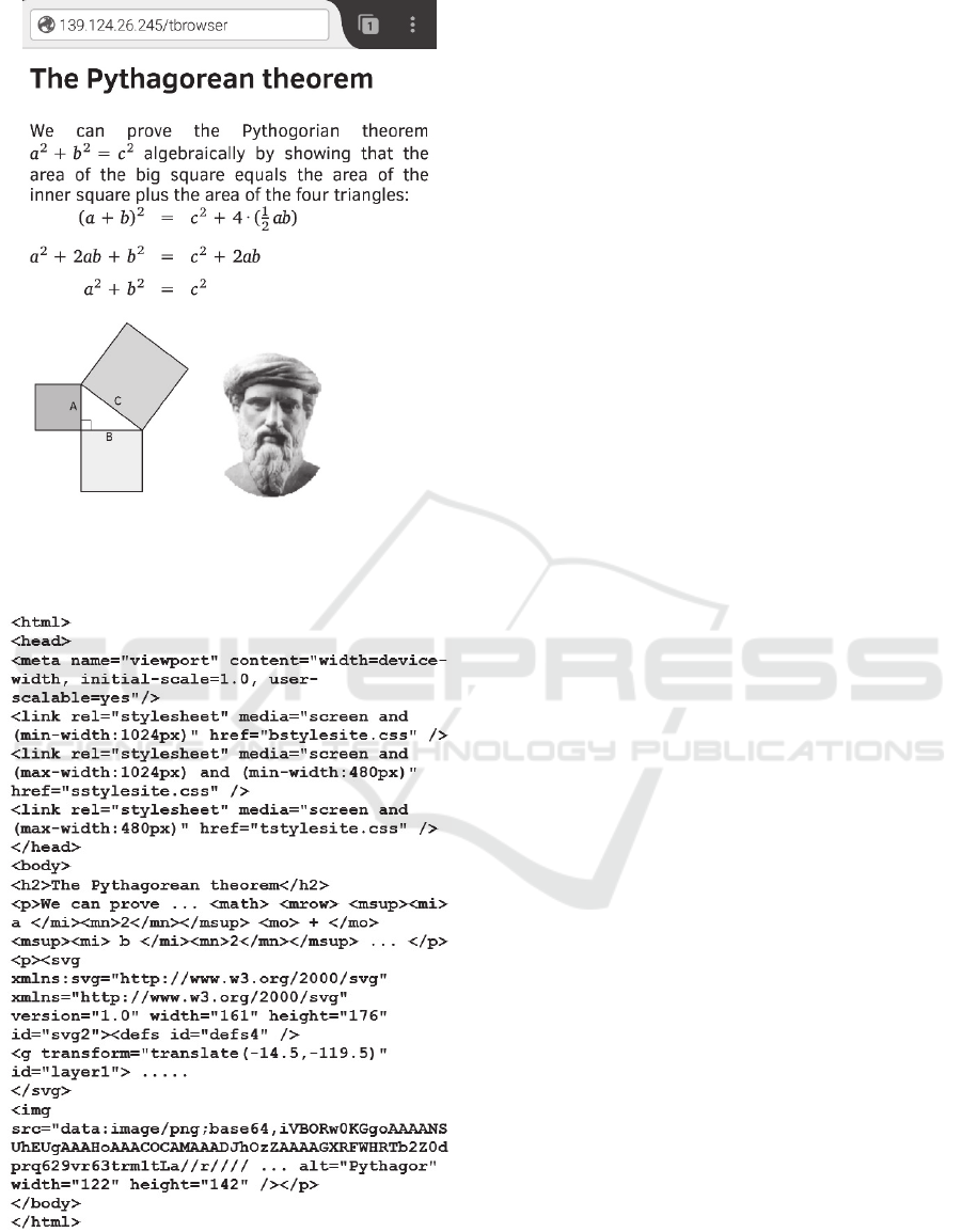
Figure 3: HTML5 page with CSS3 styled text, MathML,
SVG and raster image in Firefox mobile browser (available
at: http://139.124.26.245/tbrowser/).
Figure 4: Fragment of source code from Web page in Figure
3 with stylesheet breakpoints, MathML, SVG and Base64-
encoded image.
The essential problem to manage here does not
focus on the complexity of pedagogical hypermedia
content, but its responsive presentation on small-
screen devices. This process include the development
of a suitable page-adaptation technique that analyzes
course structure and generates pages into logically
related units to be fitted to mobile device browser
(Madjarov, 2012).
MathML is part of HTML5 standard and it is
supported natively or via plug-ins by the majority of
modern browsers. A scientific content can serve in
standards-compliant HTML pages some MathML
equations. But this is not necessarily true for the
mobile versions of these browsers. Our tests,
conducted with some basic MathML elements, prove
that only the mobile version of Firefox web browser
provides complete satisfaction. In Figure 3 and Figure
4 the MathML script is natively interpreted by the
Firefox browser mobile version. Other tested
browsers required for the same task additional
resources as shown in Figure 2 for each tested mobile
browser.
Tests (Figure 3 and Figure 4) also show the
natively compatibility of SVG scripts for vector
graphics visualization for all tested browsers. This
point is important and may replace in certain cases the
unwieldy raster graphics. The SVG script is XML-
based and fully integrated in the web page in the same
manner as MathML.
In this HTML5 collection, we can insert a bitmap
image or any other binary data using Base64
encoding method to produce an ASCII sequence
natively interpreted by latest versions of mobile
browsers. So, we obtain a smart script for a
responsive pedagogical content compatible with any
existing LCMS. The raster image of Pythagoras in
Figure 3 is Base64 encoded in Figure 4.
The latest W3C-HTML5 recommendation
remains semantically poor and limits the possibility
for a learning content adaptation on the fly. The
adaptation process for a mobile unit is associated with
complex algorithms and techniques for splitting,
restructuring, extraction, and summarizing the
learning content (Madjarov, 2012). Taking into
account the previously mentioned limits of RWD this
stage can be simplified if we use a semantically clear
and adapted course structure as presented in Figure 5.
The course semantics schema shows common
elements of a scientific learning content (Fig. 5). A
science course contains chapters, sections, text
paragraphs, bitmap images, scalable vector graphics,
and mathematical equations, programming code,
charts and tables. This XML schema defines the
course grammar for a XML-based description of a
Responsive Course Design - An Adaptive Approach to Designing Responsive m-Learning
279
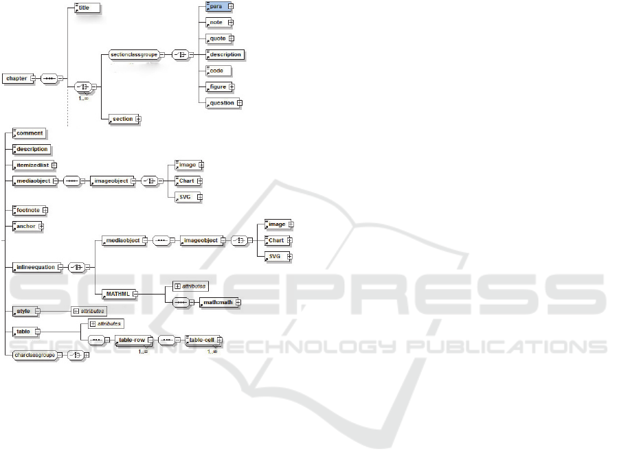
learning content with a wide range of scientific
elements. By using XML-based content, we can
create course collection and then extract and dispatch
selected parts of learning content in an appropriate
(responsive) format by using simple transformation.
This allows producing a responsive learning content
on demand in function of mobile unit's
characteristics.
Figure 5: The course semantics schema.
In our concept we promote the use of XML as a
medium-neutral data format for data storage and
processing that allows the learning contents to be
classified hierarchically, to be structured at the
desired level of granularity and to be adjusted to
different contexts, situations and devices. In addition,
we propose a method for external applications
integration through Web services (Madjarov, 2012).
This allows extending existing LCMS without
modifications of their own source code. The
feasibility of this concept was tested during the
academic year as part of AMETICE system (Moodle
based e-Learning system).
4 CONCLUSIONS
The benefits of building responsive design into e-
Learning courses are obvious and many. While the
extra time needed to create these courses can’t be
argued, it is well worth the effort because responsive
e-Learning delivers single version of a course to
multiple devices. In our concept an adaptive m-
Learning system is based on responsive course design
that combines wide range of multimedia components
and put scrolling as principle of page (chapter)
design. New mobile media are very well suited to
eBook style. Like an eBook, a course chapter retains
unlocked the scroll bar, but keep a page to a single
learning objective or activity, i.e. context oriented
since its pedagogical objectives remain intact.
Future research efforts will be focused on: (1) the
integration of HTML5 applications built with
Apache-Cordova technology in our Web service-
based concept. When done properly we can create
multi-platform applications that is just as responsive
to the user as a native application; (2) the feasibility
of personalizing and adapting the m-Learning
applications and contents to learner preferences, in
regard to the increasing capabilities of mobile
devices; and (3) the development of an adapted
learning-podcasting service that will be used in a
mobile pedagogical (social) networks.
REFERENCES
Aaron Koehl and Haining Wang, m.Site: Efficient Content
Adaptation for Mobile Devices, Volume 7662 of the
series Lecture Notes in Computer Science pp 41-60,
Middleware 2012.
A.Roudaki,J.Kong n, N.Yu, A classification of web
browsing on mobile devices, Journal of Visual
Languages and Computing, Vol. 26, pp.82–98,
Elsevier, 2015.
Ben Frain, Responsive Web Design avec HTML5 et CSS3,
Pearson 2013.
Ethan Marcotte, Responsive Web Design, A Book Apart,
New York, 2011, ISBN 978-0-9844425-7-7.
Ivan Madjarov and Omar Boucelma, XESOP: a Content-
Adaptive m-Learning Environment, 7th European
Conference on Technology Enhanced Learning, A.
Ravenscroft et al. (Eds.): EC-TEL 2012, LNCS 7563,
pp. 531–536, Springer 2012.
James Rasmussen, Learner Engagement: Tips for
Responsive Design, Learning Solutions Magazine, May
21, 2014.
Meltem Huri Baturay, Murat Birtane, Responsive web
design: a new type of design for web-based
instructional content, 4th International Conference on
New Horizons in Education, Volume 106, pps. 2275–
2279, Elsevier, 2013.
Sunkara, S.; Tetali, R.; Bose, J., Responsive, adaptive and
user personalized rendering on mobile browsers, in
Advances in Computing, Communications and
Informatics (ICACCI, 2014), pp.259-265, 2014.
CSEDU 2016 - 8th International Conference on Computer Supported Education
280
