
MULTI-LAYER DISTORTED 1D NAVIGATION
Michael W
¨
orner
Graduate School for advanced Manufacturing Engineering, University of Stuttgart, Nobelstr. 38, Stuttgart, Germany
Institute for Visualization and Interactive Systems, University of Stuttgart, Universit
¨
atsstr. 38, Stuttgart, Germany
Thomas Ertl
Institute for Visualization and Interactive Systems, University of Stuttgart, Stuttgart, Germany
Keywords:
Navigation, Timelines, Distortion.
Abstract:
We propose a novel interactive user interface for the efficient, one-dimensional navigation in massive, ordered
datasets. Applying a multi-layered, distorted visualization we provide both context and detail information
about the investigated data and allow for both large scale and precise navigation. Adjacent layers display
the data at gradually varying scales. This creates a visual relation between data points at different levels of
detail and enables the user to browse through the data at varying speeds. Thereby, a sense of global context is
retained, while at the same time detail information about the current focus position is kept in view.
We believe that this approach is suitable for the investigation of massive, ordered datasets such as time-based
data series, lists, or tables and discuss its possible applications in an example scenario.
1 INTRODUCTION
One challenge often seen in visual data analysis is
having to navigate massive datasets. Frequently, the
data is ordered and is being navigated primarily in one
dimension (such as back and forth or up and down). A
common example is time-based data which stretches
over a large period of time: Visualizing the entire
timeline gives great overview over the entire dataset
but will lose vital details in most cases. Showing
a very detailed view, however, does not provide any
sense of global context. There are two common so-
lutions to this dilemma: One might present multiple
views which show different levels of detail. This is
what most personal calendar programs do: The de-
tailed day or week view is accompanied by a small
view that shows the days and weeks of the month and
provides orientation on how the time span shown in
the detailed view relates to the current week, month,
and year. The second approach is to show all data in
one view, but to distort this view in a way which al-
locates a big portion of the available display space to
the data close to the focus point. The more distant
data is then compressed to fit into the remaining dis-
play space. This compression may be purely visual,
or it may be combined with semantic compression,
aggregating context data into less detailed data items.
It is common for timeline-based software such as
digital audio workstations to provide an additional,
smaller, and less detailed view of the main timeline to
provide context information. This overview timeline
shows the entire time span or a considerable portion
thereof at reduced visual and semantic detail, while
the main view shows the current focus point and its
immediate temporal context in full detail. One draw-
back of this approach is that the relation between such
overview and detail views may be hard to grasp for the
user if the scale (or zoom factor) of both views differs
greatly. Also, choosing an overview zoom factor is
often a trade-off: If the zoom factor is too small, the
overview display may be too coarse for meaningful
navigation. If the factor is too large, the display may
not provide useful context information.
To address this problem, we propose to make use
of the fact that this kind of data is navigated in only
one dimension, which leaves one screen dimension
to extend the display to multiple scales. Combining
the multi-view and the distortion techniques, we in-
sert several layers in between the full detail and the
overview visualizations, with the scale of the indi-
vidual layers being interpolated between those of the
detail and the overview layer. This provides a clear
198
Wörner M. and Ertl T..
MULTI-LAYER DISTORTED 1D NAVIGATION.
DOI: 10.5220/0003370501980203
In Proceedings of the International Conference on Imaging Theory and Applications and International Conference on Information Visualization Theory
and Applications (IVAPP-2011), pages 198-203
ISBN: 978-989-8425-46-1
Copyright
c
2011 SCITEPRESS (Science and Technology Publications, Lda.)
and gradual visual relationship between the contents
of the detail layer and those of the overview layer. It
also ensures that the user can navigate the data using a
detail level suitable to the task at hand without having
to change the current detail level first.
2 RELATED WORK
The efficient presentation of massive amounts of data
in limited screen space is a major concern of vi-
sualization and visual data analysis. Approaches
following the focus + context paradigm try to show
both a high-detail focus area and a low-detail con-
text area. One way to achieve this is to distort
the data display (Leung and Apperley, 1994) so that
all the data remains visible and no occlusion oc-
curs. The classic approaches include the Fisheye
view (Furnas, 1999), which has been applied to one-
dimensional (Bederson, 2000) and two-dimensional
(Sarkar and Brown, 1992) data alike. A related
concept is overview + detail (Spence and Apperley,
1982), (Robertson and Mackinlay, 1993), which di-
vides the display space into separate areas of differ-
ent zoom and aggregation levels without attempting
to generate a gradual transition between them.
In visual analytics, efficient interaction is just as
important as efficient visualization. One-dimensional
navigation (in lists, tables, or menus, for example)
is usually performed using scrollbars or sliders. For
very large lists, this gets tedious and imprecise: Mov-
ing the scrollbar “thumb” or “knob” by one pixel
might result in a jump by 100 data entries. As a re-
sult, there is a need for navigation techniques that en-
able the user to reach distant parts of the data quickly
and, at the same time, make precise adjustments to the
current position. One proposition for such a naviga-
tional control is the Alphaslider (Ahlberg and Shnei-
derman, 1994). Its thumb is divided into three sec-
tions that correspond to fine, medium, and coarse
granularity. Other modes change granularity based on
mouse movement acceleration or mouse movement
orthogonal to the data direction, i.e. vertical for a hor-
izontal slider). This last idea has been explored fur-
ther in the OrthoZoom Scroller (Appert and Fekete,
2006). The OrthoZoom control is similar to a normal
scroll bar in that the user can scroll through the data
by moving the mouse vertically. Additionally, hor-
izontal mouse movements scale both the associated
data display and the scroll bar panning speed. Unlike
our approach, the OrthoZoom control displays only a
single representation of the data at a time, using the
zoom factor corresponding to the current horizontal
mouse pointer position.
Concerning time-oriented data, (Aigner et al.,
2008) gives an overview over visual methods for
analysing such data. The SIMILE project includes
a web-based timeline widget (Huynh, 2006), which
supports multiple “bands” at different zoom fac-
tors. Most SIMILE timelines display two bands
(one overview, one detail). When displaying one-
dimensional time-based data on a two-dimensional
screen, a matrix display (Hao et al., 2007) has been
used to better utilize screen space. This has been com-
bined with a degree-of-interest approach that selects
an appropriate matrix resolution for different sections
of data.
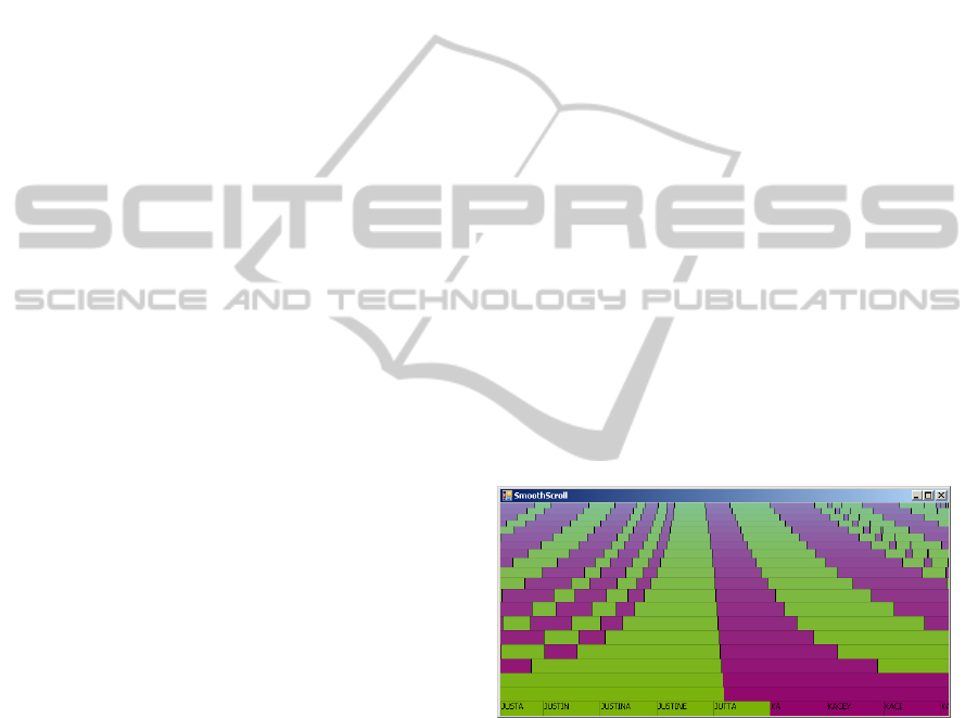
3 THE SmoothScroll CONTROL
Our implementation of a multi-layered one-
dimensional data display, which we dubbed
“SmoothScroll” control, can be seen displaying
a list of first names in Figure 1. In this configuration,
the control divides its display space into 20 horizontal
layers. The topmost layer represents the entire list
of well over 4000 names while the bottommost layer
displays the 8 names around the current focus point.
The coloured stripes mark groups of names that
start with the same letter and provide some visual
orientation in the data set.
Figure 1: The SmoothScroll control displaying a list of
roughly 4000 names with a detail window size of 8 names.
As is apparent from the shape of the stripes, the
scale interpolation is non-linear. At first sight, a lin-
ear scale interpolation might seem more visually ap-
pealing, as it creates (imaginary) straight lines from
the focus point area in the overview layer to the edges
of the detail layer. This linearity may cause the re-
lation between the detailed and the coarse data to be
more intuitive. However, this approach is not prac-
tical for large scale differences. As can be seen in
Figure 2, the linear interpolation causes the scale to
increase rapidly, so that none of the intermediate lay-
MULTI-LAYER DISTORTED 1D NAVIGATION
199
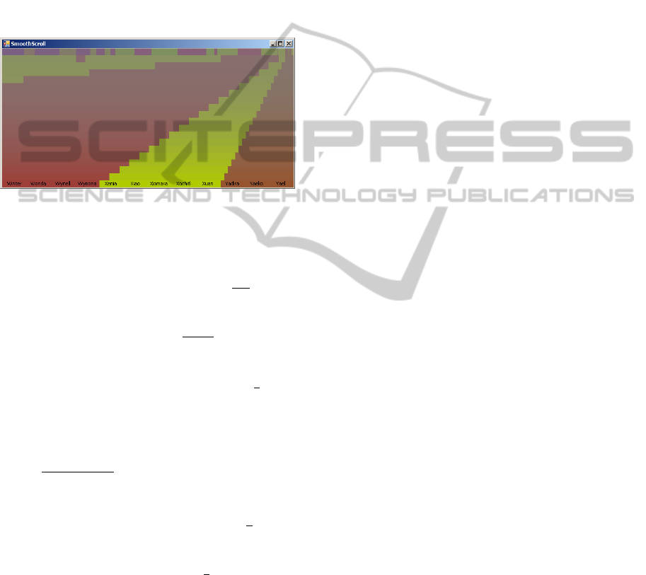
ers display a significant part of the whole dataset. In
the example in Figure 2, the total magnification factor
is roughly 350 (detail compared to overview). If we
apply linear scale interpolation, the scale increases by
a factor of 18 on the first step from the topmost to the
following layer. As a result, this second layer displays
only about 5% of the total data. Therefore, this con-
figuration is not very useful in terms of orientation, as
any navigation to data positions outside the immedi-
ate vicinity of the focus point can only take place in
the topmost layer.
Figure 2: The SmoothScroll control displaying the same list
using linear scale interpolation.
As an alternative, we base our interpolation on a
perspective projection and associate a distance z(λ)
with each normalized layer position λ =
l
l
max
(l being
the layer index with 0 representing the overview layer
and l
max
representing the detail layer). This distance
determines a scale factor s(λ) =
e
z(λ)+e
for every layer
(e being an arbitrary “eye distance” between camera
and screen). s(λ) is the pixel size of a data item on
the corresponding layer. We require s(0) =
S
n
(S be-
ing the available display size in pixels and n being the
number of data items) and can freely choose s(1), the
size of data items on the detail layer. Using a linear
interpolation of z values along the layers, we arrive at
s(λ) =
S·s(1)
(1−λ)n·s(1)+λS
.
We position each layer so that it displays the cur-
rent focus point at screen coordinate x(λ). We require
the overview layer to remain fixed: x(0) =
f
n
S ( f be-
ing the index of the focused element). On the detail
layer, we want the focus point to always be displayed
at the center of the control: x(1) =
S
2
. We determine
the position of the intermediate layers using linear in-
terpolation.
Navigating the distorted timeline is straightfor-
ward: Clicking any point will set the focus to this
position, adjusting all layers accordingly. This allows
for crude selections along the entire time frame by
clicking in the coarsest layer, precise selections by
clicking in the most detailed layer, and many com-
promises between those two extremes by clicking in
one of the intermediate layers.
It is also possible to move the mouse while the
button is pressed, continuously browsing through the
data. Due to the different scales, the speed at which
the focus point moves changes as the mouse pointer
passes through different layers: The user can influ-
ence the speed of the movement by moving the mouse
pointer vertically while scrolling through the data.
This is similar to the zoom/pan control of the Ortho-
Zoom Scroller, which has been evaluated to be very
effective in (Appert and Fekete, 2006). An important
difference is that the SmoothScroll control keeps the
multi-scale context information instead of changing
the scale of the single data display next to the slider.
Even when moving through the data at high speeds,
the bottommost layer will always display the current
position at full detail and the topmost layer will pro-
vide global context information.
Since moving the focus point will also move the
data in any but the topmost layer, holding down the
mouse button will keep the focus moving until focus
point and mouse pointer meet.
Navigating the data with the mouse gives a dis-
tinct three-dimensional effect. The bottommost layer
moves quickly, whereas the layers above it move con-
tinuously slower. The topmost layer is stationary.
This effect is similar to a motion parallax and, com-
bined with the non-linear scale interpolation, gives
the impression of looking into the distance. We think
this might be a suitable visual metaphor and increased
this impression by adding a subtle depth fog effect to
the upper layers. We think that this visual continuity
between the layers can alleviate the problem of non-
linear scales being generally more difficult to under-
stand than linear ones. We intend to conduct a user
study to verify this.
4 EXAMPLE APPLICATIONS
We implemented two example applications that use
the SmoothScroll control to navigate real data sets.
4.1 Navigating a Document Collection
For this example, we used the data set provided for
the first mini challenge of the 2010 IEEE VAST chal-
lenge. This (synthetic) data set consists of a num-
ber of text fragments from various sources (intelli-
gence reports, newspaper accounts, e-mail messages,
etc.). Figure 3 shows a SmoothScroll control display-
ing those documents along a time scale with alternat-
ing background colours indicating months and thin
vertical lines indicating days. Documents are dis-
IVAPP 2011 - International Conference on Information Visualization Theory and Applications
200
Figure 3: The SmoothScroll control displaying documents
along a timeline. Documents matching search terms are
highlighted.
played by brightening the background colour of the
corresponding day and, on the more detailed levels,
by displaying glyphs that indicate the number of doc-
uments created on that date and show the document
type.
Additionally, a full-text search for two search
terms was performed and days that have documents
containing the first term, the second term, or both of
the terms are highlighted in green, red, and brown re-
spectively. This gives a quick visual overview over
the distribution of occurrences along the timeline.
The multi-layer nature of the control makes it easy
to navigate across the time scale and visually iden-
tify groups of occurrences that appear extraordinary.
Once an interesting point in time is reached, the more
detailed layers allow for precise selection of the rele-
vant days and documents.
An actual application would combine this with
other widgets or controls for interactive search term
input and for viewing the full text of a selected docu-
ment. Additionally, a display of the current date under
the mouse cursor as well as meta-data information for
the document the user is pointing at would be useful.
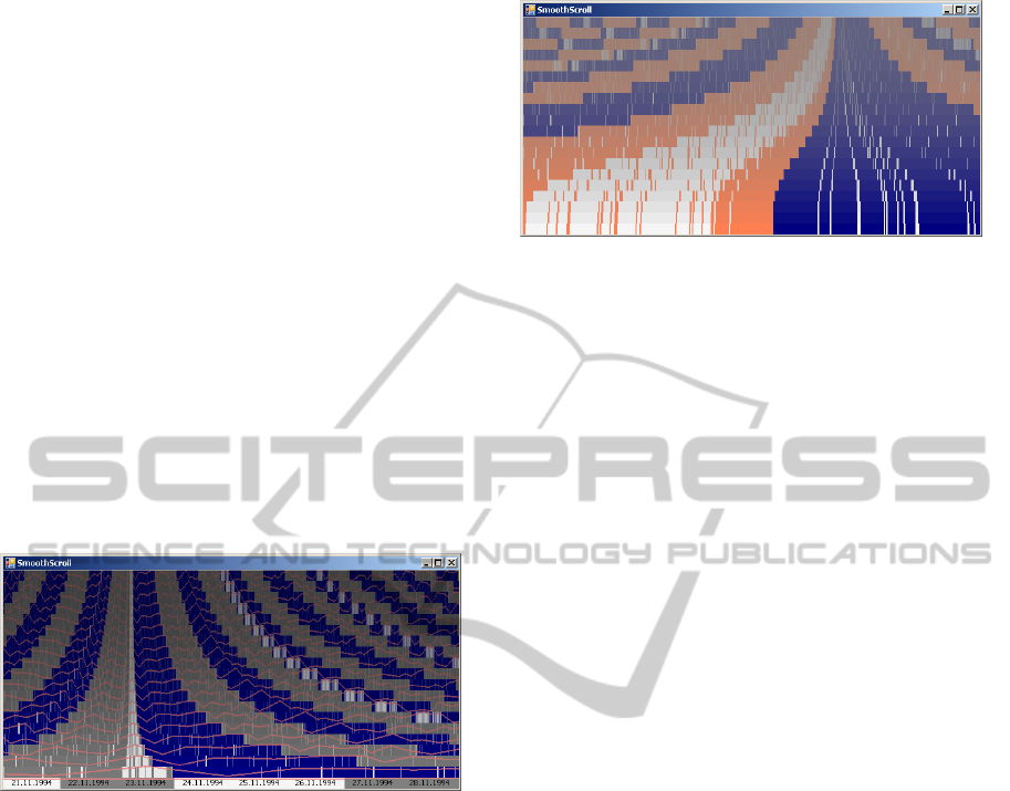
4.2 Navigating a Picture Collection
A picture collection is another typical example of data
that is often navigated based on the creation time of
the elements. For Figure 4, we used the pictures
stored on a digital camera and arranged them accord-
ing to the date and time they were taken. In this ex-
ample, we also used a more sophisticated aggregation
scheme: The alternating shades of the topmost lay-
ers indicate months. Only on the lower layers do we
display alternating shades per month.
In the upper half of the image, pictures are
grouped according to days, with orange coloured el-
ements indicating the days on which at least one pic-
ture was taken. Days with many pictures are coloured
in brighter shades of orange (or white). Only the bot-
tom half of each layer is coloured according to the
number of pictures. The top half continues to provide
temporal context. In the bottom half of the image, al-
ternating colours still indicate days, but the pictures
are now grouped according to hours of the day, with
thin stripes showing the distribution of images across
the day. The shades of orange from the layers above
are blended into the background colour of the day
to ensure visual continuity between the layers. Text
overlays support temporal orientation. One of the day
layers shows the day of the month as a number. The
bottommost layer shows the date and hour of the ele-
ment along with the number of pictures taken within
that time frame.
An actual picture browsing application could add
picture thumbnails to the bottommost layer and addi-
tional controls and widgets to filter and view pictures.
Figure 4: The SmoothScroll control displaying documents
along a timeline. Documents matching search terms are
highlighted.
5 DISCUSSION
5.1 Screen Space
While the SmoothScroll control has a number of ben-
efits over other methods of one-dimensional naviga-
tion, there are drawbacks as well: The most promi-
nent disadvantage is its screen space requirement.
When compared to a simple timeline control, the
SmoothScroll control needs to be significantly higher
(or wider in vertical mode) to display a reasonable
number of layers. Where screen space is scarce, the
benefits of more intuitive overview and navigation
may not be as important as other information that
could have otherwise been displayed to the user. This
is especially true as there is a certain redundancy in
the display, although this redundancy is essential to
ensure the intended gradual scale progression.
The key to alleviating the screen space issue is re-
ducing the redundancy. One approach is to use vary-
ing levels of abstraction and aggregation across lay-
ers, as has been shown in Figure 4. Another idea is to
make use of the spatial extent of the layers to display
glyphs or textual information, as in Figure 3. One
could include a continuous line plot of one or more
relevant values (such as a feature vector value of some
MULTI-LAYER DISTORTED 1D NAVIGATION
201
previous analysis) across the timeline. See Figure 5
for an example. These overlays benefit from the same
focus + context distortion as the rest of the timeline:
The topmost layer shows a low detail representation
of line plot values over the entire time span. We con-
sider this possibility to add two-dimensional informa-
tion a significant advantage over a layerless, continu-
ous visualization, which can be achieved by increas-
ing the number of layers until one layer corresponds
to one row of pixels on screen. When adding addi-
tional information to the layers, care must be taken
not to overload the user with information. Displayed
information should be consistent along layers, repeat-
ing the same information in order to aid in naviga-
tion and orientation. Displaying different pieces of
information across the layers could both overfill the
display with information and reduce the visual conti-
nuity between the layers. Also, aggregation schemes
should be considered in order to display less detailed
representations of on-layer information on the upper
layers.
Figure 5: A scalar value visualized across time as a line plot
on the timeline.
5.2 Interpolation
While a hyperbolic scale interpolation is clearly supe-
rior to a linear one, it comes at the cost of a consid-
erable scale difference between the two most detailed
layers at the bottom of the control, which makes it
hard at times to spot exactly which portion of the sec-
ond layer is displayed in the most detailed layeer. We
have experimented with different interpolation func-
tions. Figures 3 and 4 use an interpolation similar to
a perspective projection.
A bifocal transfer function (Leung and Apperley,
1994) that ensures gentle scale changes on both the
detailed and the coarse end might yield better results.
Figure 6 shows how such an interpolation might look
like.
Figure 6: An alternative interpolation function, which
causes smaller scale differences among the detailed (bot-
tom) layers.
6 CONCLUSIONS AND FUTURE
WORK
We presented the SmoothScroll control, an intuitive
one-dimensional navigation in massive data sets, as
in the form of a timeline. It provides a focus + context
view by dividing the timeline into multiple layers,
each displaying the data at a different scale. There is
an overview layer, which shows the entire dataset, and
a detail layer, which shows a detailed view of a small
portion of the data. Intermediate layers use non-linear
interpolation to provide a distorted, two-dimensional
view of the timeline. This facilitates both orientation
and navigation in time-dependent data. We also gave
two application examples.
There is potential for future work, both in the fea-
tures of the control itself and in its applications. As
has been discussed in the previous section, the cur-
rent interpolation scheme is not optimal and could
be improved. The actual interaction with the con-
trol while navigating the data needs to be evaluated
further. For mobile devices, kinetic scrolling (which
continues for a time after the finger has been lifted)
would probably better meet users’ expectations. The
integration of textual and iconic information into the
layers should be improved and advanced aggregation
schemes included. Other types of on-layer visualiza-
tion (icons, text, mini charts) may prove to be use-
ful in drawing the attention of the user to important
dates in the timeline. Extensive user studies will be
necessary to identify visualizations which provide an
enhanced data display and at the same time do not
overwhelm the user with too many details. Configur-
ing the control for other domains and datasets, such
as personal calendar data, can be expected to unveil
additional benefits and applications.
IVAPP 2011 - International Conference on Information Visualization Theory and Applications
202

REFERENCES
Ahlberg, C. and Shneiderman, B. (1994). The alphaslider:
a compact and rapid selector. In Proceedings of the
SIGCHI conference on Human factors in comput-
ing systems: celebrating interdependence, page 371.
ACM.
Aigner, W., Miksch, S., Muller, W., Schumann, H., and
Tominski, C. (2008). Visual methods for analyzing
time-oriented data. IEEE Transactions on Visualiza-
tion and Computer Graphics, 14(1):47–60.
Appert, C. and Fekete, J. (2006). OrthoZoom scroller: 1D
multi-scale navigation. In Proceedings of the SIGCHI
conference on Human Factors in computing systems,
page 30. ACM.
Bederson, B. (2000). Fisheye menus. In Proceedings of
the 13th annual ACM symposium on User interface
software and technology, page 225. ACM.
Furnas, G. (1999). The FISHEYE view: A new look at
structured files. Readings in information visualiza-
tion: using vision to think, pages 312–330.
Hao, M., Dayal, U., Keim, D., and Schreck, T. (2007).
Multi-Resolution Techniques for Visual Exploration
of Large Time-Series Data. In Eurographics/IEEE-
VGTC Symposium on Visualization.
Huynh, D. (2006). SIMILE-Timeline. http://www.simile-
widgets.org/timeline/.
Leung, Y. and Apperley, M. (1994). A review and tax-
onomy of distortion-oriented presentation techniques.
ACM Transactions on Computer-Human Interaction
(TOCHI), 1(2):126–160.
Robertson, G. and Mackinlay, J. (1993). The document
lens. In Proceedings of the 6th annual ACM sympo-
sium on User interface software and technology, page
108. ACM.
Sarkar, M. and Brown, M. (1992). Graphical fisheye views
of graphs. In Proceedings of the SIGCHI conference
on Human factors in computing systems, pages 83–91.
ACM New York, NY, USA.
Spence, R. and Apperley, M. (1982). Data base navigation:
an office environment for the professional. Behaviour
& Information Technology, 1(1):43–54.
MULTI-LAYER DISTORTED 1D NAVIGATION
203
