
DESIGN PRINCIPLES FOR DESKTOP 3D USER INTERFACES
Case Movie Plaza
Marja Tyynelä, Timo Jokela, Minna Isomursu
Department of Information Processing Science, University of Oulu, Rakentajantie 3, Oulu, Finland
Petri Kotro, Olli Mannerkoski
Valkeus Interactive Ltd, Pohjolankatu 4, Rovaniemi, Finland
Keywords: 3D user interfaces, Design principles, Usability, User experience, Interaction, Orientation, Navigation
Abstract: 3D user interfaces in desktop applications are becoming more common and available to all users. However,
not many guidelines are available to support desktop 3D user interface design. We derived a set of design
principles from the practices of a company specialized to 3D graphics and user interfaces and made a
prototype to evaluate these principles. The results of our evaluations show that some of the principles - on
the structure of the space, navigation and interaction - helped users while some others did not have the
desired impact. We conclude that design guidelines for 3D user interfaces can be derived from the
designers’ practices but research is needed to make principles more specific and to test their affect more
precisely.
1 INTRODUCTION
In recent years the amount of digital information has
increased. How to manage, browse, explore, and
retrieve all this vast amount of information has
become an important and challenging research topic.
One approach to solve this problem is to use
t
hree dimensional, 3D, desktop user interfaces
instead of the 2D desktop, which has been the de
facto standard in most operating systems and
desktop applications during the past 20 years.
There are studies suggesting that the 3D
m
etaphor would help users to remember the location
of the information objects, because it utilizes natural
human capabilities, such as spatial memory
(Robertson et al. 1998; Robertson et al. 2000).
The 3D user interfaces are often associated with
virtual reality
systems utilizing head-mounted-
displays (HMD) and data gloves (Barrilleaux, 2001).
Desktop 3D user interfaces, however, require only
one special device: a 3D-accelerated video card.
These cards are common nowadays, but the use of
the desktop 3D is still rare outside gaming and
scientific communities (Chin, 2002).
Earlier 3D technology has been available only
fo
r specialists who have been using Computer Aided
Design (CAD) or similar applications in their work,
but today, after the web has made 3D applications
popular amongst ordinary users, it is likely that the
desktop 3D user interfaces will become more
common (Barrilleaux, 2001). Thus, it is important to
understand and pay attention to how to design usable
3D desktop interfaces (Poupyrev, 1995). However,
not many guidelines are available to support desktop
3D user interface design (Herndon et al. 1994).
1.1 Usability Problems
The lack of guidelines and design principles has lead
to poor design, which has caused usability problems
in 3D user interfaces. Earlier, when 3D technologies
were not so common, the problems related, among
other things, to insufficient performance of the
computers. Users did not get immediate feedback, so
the interaction was difficult (Carey et al. 1994).
Nowadays these problems are not relevant, because
the development of 3D graphics standards, like
Virtual Reality Modelling Language (VRML), and
3D-accelerated video cards has increased these
performance related problems (Li & Ling, 2002).
Nowadays the problems relate to users perceptive
and cognitive skills. For example there have been
difficulties in orientation in some 3D user interfaces
85
Tyynelä M., Jokela T., Isomursu M., Kotro P. and Mannerkoski O. (2005).
DESIGN PRINCIPLES FOR DESKTOP 3D USER INTERFACES - Case Movie Plaza.
In Proceedings of the Seventh International Conference on Enterprise Information Systems, pages 85-90
DOI: 10.5220/0002554100850090
Copyright
c
SciTePress

(Chin, 2002) and users have experienced interfaces
with 3D more cluttered and less efficient than their
2D counterparts (Cockburn & McKenzie, 2002).
Designing navigation methods for 3D user interface
is a challenge for designers. Many studies suggest
that using the navigation methods provided by 3D
virtual space is difficult for users (Elliot &
Bruckman, 2002; Hendricks et al. 2003). Also
moving virtual camera, view to the virtual space, can
cause problems. The camera can “get stuck” in
certain parts of the environment (Li & Ting, 2002)
or user may feel that the environment moves
towards him/her when user is supposed to feel that
he/she is moving (Chin, 2002).
In summary, the typical problems in 3D user
interfaces are related to orientation, incoherence,
navigation and handling the virtual camera.
Designers need design guidance that would address
the challenge of creating 3D user interfaces that are
easier to use.
1.2 Research setting
The guidelines for two-dimensional world do not
take into account special characteristics of the three-
dimensional world. A designer has to make
decisions on elementary 3D design aspects such as
how to organize the space, how to use light and
textures on different surfaces and objects, and how
to let the users orientate themselves in a 3D world.
Our hypothesis is that if users were able to
perceive the structure of the virtual space better and
if they would be provided with natural navigation
methods they would orientate themselves better and
the user interface would be easier to use. The
purpose of this article is to preliminary evaluate a set
of design principles that address the specific design
challenges of the 3D user interfaces. We derived the
design principles from the practices of a company
specialized to 3D graphics and user interfaces. The
designers of the company have knowledge also from
architecture – designing real world spaces, and
cultural philosophy – the cultural knowledge of how
people interact with the environment. The
experience of this company’s designers is
transformed for the first time to design principles.
Material from the earlier studies that the company
had performed, including interviews, discussions
and written material was used during the
development of the principles.
Following the design principles, we built a 3D
prototype called Movie Plaza. Then we carried out a
set of qualitative usability evaluations, in which we
studied how these principles worked and, in more
general, how the users experienced 3D user
interface.
In the next section, we describe the design
principles. Then we describe shortly how those
principles were used to build our prototype, the
Movie Plaza. Thereafter, we draw conclusions on
how well those principles worked according to the
user evaluations.
2 DESIGN PRINCIPLES
The design principles (DP) fall into three categories:
the structure of the space, lighting and textures, and
navigation and interaction.
2.1 The Structure of the Space
The design of the structure of space aims at
providing the user with a possibility to use spatial
memory efficiently in memorizing the location of
user interface objects and outline the boundaries of
accessible space.
DP1: Four orthogonal main directions
should be used in the basic spatial layout.
Vast majority of real world buildings are based on
four orthogonal main directions. Orthogonal co-
ordinate system is fast to perceive and easy to
remember. Humans have a bodily co-ordinate
system that has four directions: human body has
clear front and back, and symmetric left and right
directions. These directions are so obvious for us
that we do not have to count them to be able to
utilize them in our memory and decision making
processes. Our hypothesis is that users would easily
understand the four main directions and be able to
know their orientation in space at all situations.
Using symmetrical order and shapes of geometric
primitives would enhance this. Utilizing this ability
in 3D user interfaces would help users to understand
the layout of the space and orientate themselves in
the space with a small cognitive load.
DP2: If there is a lot of data to be visualized,
the space should be divided into several
elevations rather than only one.
Effective usage of computer screen requires
effective use of z-axis in the spatial design. The idea
behind this design solution is simply to imitate the
idea of multi-floor spaces. The specific advantage of
this principle would be the effective use of the
screen area. Many of 3D user interface applications
have only one level, a model probably adopted from
the open landscapes. If lots of data must be visible, it
ICEIS 2005 - HUMAN-COMPUTER INTERACTION
86

means that objects are “far” and users may have
difficulties in seeing them clearly. In addition,
navigation and moving from one side of the space to
the other with standard mouse and keyboard is time
consuming (Elliot & Bruckman, 2002). Allocating
the data on several elevations would mean more
effective use of the screen space. Our hypothesis is
that if the screen is used effectively for displaying
the relevant data, there is less need for movement
and navigation is more effective. Users also
understand the structure of the space and thus they
are able to orientate themselves.
2.2 Lighting and Textures
Lighting is used for drawing the attention of the user
as well as giving information about the directions for
the user. In real world, the same principles are used
for marking pathways and to grab attention to
important and relevant details.
DP3: There should be one main light source
used throughout the space giving a sense of
directions. The general lighting should be
neutral, and the shadows of the general
lighting should be used throughout the space.
Some people and many animals are known to use
sunlight direction as a navigational tool in real world
navigation. These light effects have an important
meaning in orientation. The hypothesis is that in 3D
user interfaces the use of light effects would also be
important for orientation. Simulation of sunlight that
comes from one direction and creates lights and
shadows to the walls should be used to help
orientation inside the space.
DP4: Spotlights should be used to highlight
important and interesting places and
landmarks.
Spotlights are used to emphasize points of interest.
Several specific pointed lights should be used to
highlight important and interesting places and to
imply of warm and inviting atmosphere. Our
hypothesis is that users are able to see where to pay
attention with the help of the spotlights and thus,
they are able to understand the structure of the space
better.
DP5: The grids on surfaces should be used
for emphasizing the structure.
In 3D user interfaces grids should be used for
emphasizing the structure of space in order to give
for the user a better understanding of distances and
scales of the space. Grids are also one way to make
more effective perspective impression. Our
hypothesis is that the grids help user to better
understand the structure of the space.
DP6: Textures of objects other than the ones
containing the actual information should be
simple and minimalist in detail.
Our hypothesis is that surfaces that surround the
information should not divert user’s attention from
the actual information but to give an understanding
of the space and structure in order for the user to
find the information.
2.3 Navigation and Interaction
Navigation and interaction design principles are
used for providing the user with the possibility to
interact with the system using the metaphors of the
three-dimensional worlds.
DP7: Interaction should be direct, which
means that objects are manipulated by direct
actions. Indirect user interface components
such as menus and scroll bars should not be
used.
The 3D user interface makes possible and
understandable to use real world direct interaction,
which means that operations can be done for
example by pointing and clicking the objects
directly. Our hypothesis is that direct interaction
decreases users’ cognitive load and makes the
choices easier and more natural to the user. This
should help users to navigate easily.
DP8: Browsing - i.e. looking the environment
- and moving in it should be different
operations.
Our hypothesis is that if natural ways to move from
the real world are exploited in the 3D user interface
by differentiating browsing and moving, it helps
users to navigate in the environment. The hypothesis
is based on assumption that users are able to utilize
their real world experiences and thus, the user feels
moving methods natural and easy. This should help
users to navigate easily and also moving the virtual
camera should be easy.
DP9: Moving should be restricted to natural
movements.
In real world gravity restricts movements so that it is
impossible to float in the air or sink down through
the floor. In some virtual reality applications user is
able to have six degrees of freedom (6dof), which
DESIGN PRINCIPLES FOR DESKTOP 3D USER INTERFACES - Case Movie Plaza
87
makes them able to incline camera view in
correlation to Z-axis or to turn around in horizontal
or vertical direction. This may cause difficulties for
users, because they may lose their orientation. Our
hypothesis is that in 3D user interfaces moving
should be restricted so that user easily understands
the limitations and possibilities of the environment.
This is best done by restricting users’ moves so that
free flying in the air is not possible and users’ are
not able to turn upside down. This principle should
help users to navigate easily and also moving the
virtual camera should become easy.
3 THE MOVIE PLAZA
PROTOTYPE
The Movie Plaza environment was developed to
demonstrate and evaluate the principles outlined in
the previous section. The goal was to design a 3D
user interface that would be easy to use and that
would enable users to achieve their objectives in a
natural and enjoyable way. This means utilizing
natural human abilities, such as spatial memory.
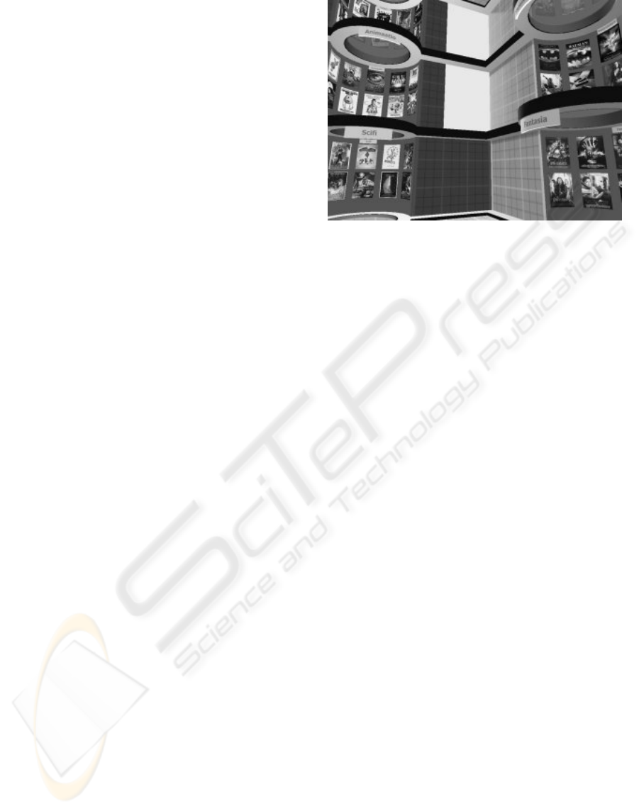
The Movie Plaza is a gallery where a user can
browse movie information. The user interface is
illustrated in Figure 1.
3.1 Applying the design principles in
the prototype
The Movie Plaza was designed using the preceding
ten design principles. The usage of the principles is
described in the following.
DP1: The virtual space in the Movie Plaza
strongly emphasizes the four orthogonal main
directions in the spatial layout. The space consists of
four equally long and high walls, so the space is
shaped like a cube. Four movie cylinders are
symmetrically organized to these walls. Geometric
primitives, cube and cylinder, are used to enhance
the effect of the four main directions.
DP2: The virtual space of the Movie Plaza
composes of three elevations, and so the whole
screen is used effectively for displaying essential
information: movie posters. There is, however, some
empty space between categories so that user can
Figure 1: The Movie Plaza.
separate the groups from each other and the visual
image is clear.
DP3: General lighting that helps in orientation is
implemented in the Movie Plaza by placing two
windows on one wall for illuminating the space.
With the help of this one main light source, users
should have better understanding of their orientation.
The windows are illustrated in Figure 1.
DP4: The contrast of cool-toned general lighting
and warm-toned spotlights is used to illuminate the
movie cylinders and draw the focus to the movies.
Warm light spots are also used for providing user
feedback: light is switched on when user points the
cylinder and switched off when the user moves the
cursor away from the cylinder. The tone of lighting
used in the cylinders is warm so that cylinders would
look inviting.
DP5: In the Movie Plaza walls, floor and roof
are consistently covered with 3x3 grids. Colors of
the grids are white and green. Thus, the visual image
is simple.
DP6: Simple textures have been used on
surfaces. Only the actual information items, i.e.
movie posters, are rich in color and detail. All other
surfaces are simple as they try not to draw user’s
attention.
Lighting is simple and light effects are not used
in textures. This is done to avoid the assumption that
the user interface provides the possibilities of real
world interaction often available in computer games.
DP7: Only buttons used in the Movie Plaza are
elevator buttons that can be used for taking the user
up or down in the space. Otherwise functions such
as getting information about movie or changing view
or viewpoint is done by moving the mouse or
pointing or clicking an object. Information window
opens when the user clicks on the poster and closes
when the user clicks on the information window.
ICEIS 2005 - HUMAN-COMPUTER INTERACTION
88
Figure 2: The user browses the environment with the
automatic view change.
DP8: The Movie Plaza offers two different ways
to move in the space. User can move between
different elevations by using an elevator, which
works by clicking the elevator buttons. Another way
to move is restricted flying between the categories,
which works by clicking the destination category
with a mouse. There is also two ways to browse the
environment. User can keep the left mouse button in
the bottom and move the mouse, when the view
changes in relation to mouse movements. Another
way is to move mouse to the other side of the screen
which makes the view to change automatically. With
these navigation methods users should be able to
move fluently and efficiently. View change is
illustrated in Figure 2.
DP9: In the Movie Plaza moving is limited so
that view’s Z-axis is always kept inline with the
world’s Z-axis. Also, looking up and down is natural
so that it is not possible for the user to turn up side
down and look what is behind him without turning
around. Also navigation routes are restricted so that
users are able to move only between three central
points and categories and from category to category.
Restricted flying in the air is one way to move, but
flying freely in the air is not possible.
4 EVALUATION
The evaluation of our design principles using Movie
Plaza prototype was based on qualitative usability
testing as depicted in (Dumas & Redish, 1993), i.e.
we observed how subjects were able to perform
given tasks with the prototype. We were interested
in the performance of the subjects and their
subjective experience evoked by the system. We
evaluated how the subjects liked to use the system,
what cognitive responses did the user interface
evoke, and how the design principles affected these.
Analysis was qualitative and it was based on
user comments and researchers’ observations,
interviews and video analysis. Evaluation must be
considered to be only preliminary, as we had only
six users.
Users found the test interesting. Design
principles seemed to have effect to usability,
because only few of the typical usability problems
appeared. The evaluation results are summarized in
Table 1.
User evaluation showed that most of the users
perceived the space well during the first task and
they were able to move there smoothly and
efficiently. Vertical orientation was experienced
easy. Users considered the space simple and
according to their opinion they were able to find
movies easily, although some users would have
wanted to use text-based search in search tasks.
Table 1: Summary of design principles and results.
Design
principle
Result
DP1 Positive results. Users did not get lost
and perceived the space easily.
DP2 Positive results. Users were able to
remember if a certain movie or
category was above or below them.
DP3 Negative results. Light did not help
in orientation and users lost their
orientation.
DP4 Neutral results. Lights made
categories look inviting, but did not
help in giving feedback to user.
DP5 Results suggest that simple grids
helped understanding the structure of
the space and did not draw users’
attention from more important issues.
DP6 Results suggest that textures could be
even simpler so that users do not
confuse 3D user interfaces with
games.
DP7 Positive results. Users were able
move smoothly and getting more
information about a movie was self-
explanatory.
DP8 Positive results. Users understood
immediately that moving mouse
moves their view. Most of the users
found navigation easy.
DP9 Positive results. Navigation methods
guided users to the right actions.
DESIGN PRINCIPLES FOR DESKTOP 3D USER INTERFACES - Case Movie Plaza
89

Horizontal orientation was experienced to be
hard, because light did not help users in orientation.
The users thought that a clear landmark for helping
in horizontal orientation would be needed, for
example a compass on the floor, windows that
would provide a view to outside world or some
object inside the space that calls users’ attention.
Some users had problems related to navigational
controls, partly because they did not get any
guidance at the beginning. Especially two older
users had difficulties in navigation tasks that may
have been derived from the fact that they had less
experience of different types of computer
applications.
Evaluation showed that users find 3D desktop
metaphor useful and also exciting. In general users’
experiences were positive and most of them said that
3D user interface could be useful in their every day
life.
5 DISCUSSION
We created a set of design principles for 3D user
interfaces. The user evaluations showed that some of
these principles would be beneficial in designing 3D
user interfaces and that these principles are a good
start for developing the design of 3D interfaces.
Although the results are preliminary, we find this
work as an important contribution. More and more
3D user interfaces are being designed but no
guidelines for designing desktop 3D user interfaces
exist.
Our research has limitations that need to be
understood. First, the study was done based on a
single prototype. The principles were implemented
in the prototype but the details of user interface
design impact on the usability, too. Thereby, the
isolation of the impact of principles from the other
design solutions is not easy.
Second, our tests were preliminary ones and of
qualitative nature. In qualitative research results are
always subjective despite that the results are based
on thorough analysis of video and written material.
The results suggest paths for further research.
The principles could cover better horizontal
orientation and logical ways of starting and ending
using the application. Standard moving methods
could be developed so that users could use different
applications after they have learned one. Another
interesting question is whether 3D user interfaces
could be an answer to the problems small 2D screens
of mobile devices.
Our research suggests, that design principles can
be derived from the existing 3D user interface
design practices, and this can result in 3D interfaces
that are easy and effective to use.
REFERENCES
Barrilleaux, J., 2001. 3D user interfaces with Java 3D,
Manning. Greenwich (CT).
Carey, R., Fields, T., van Dam, A., & Venolia, D., 1994.
Why is 3-D interaction so hard and what can we really
do about it? In SIGGRAPH’01, International
Conference on Computer Graphics and Interactive
Techniques. ACM Press, 492-493.
Chin, R., 2002. Three-dimensional file system browser.
Crossroads, 9, 1, 16-18.
Cockburn, A., & McKenzie, B., 2002. Evaluating the
effectiveness of spatial memory in 2D and 3D physical
and virtual environments. In CHI’02, Conference on
Human Factors in Computing Systems. ACM Press,
203-210.
Dumas, J.S., & Redish, J.C., 1993. A practical guide to
usability testing. Ablex Publishing Corporation.
Norwood (NJ).
Elliot, J., & Bruckman, A., 2002. Design of a 3D
interactive math learning environment. In DIS’02,
Symposium on Designing Interactive Systems. ACM
Press, 64-74.
Hendricks, Z., Tangkuampien, J., & Malan K., 2003.
Virtual galleries: is 3D better? In AFRIGRAPH’03,
Computer graphics, virtual reality, visualisation and
interaction in Africa. ACM Press, 17-24.
Herndon, K., van Dam, A., & Gleicher, M., 1994. The
challenges of 3D interaction. SIGCHI Bulletin 26, 4,
36-43.
Jordan, B., & Henderson A., 1994. Interaction analysis:
foundations and practice (IRL Report No. IRL94-
0027). Xerox Palo Alto Research Center and Institute
for Research on Learning, Palo Alto, California.
Li, T.-Y., & Ting, H.-K., 2002. An intelligent user
interface with motion planning for 3D navigation. In
Virtual Reality. IEEE. 177-178.
Poupyrev, I., 1995. Research in 3D user interfaces. The
IEEE Computer Society's Student Newsletter 3, 2, 3-5.
Robertson, G., Czerwinski, M., Larson, K., Robbins, D.,
Thiel, D., & van Dantzich, M., 1998. Data
mountain: using spatial memory for document
management. In UIST’98, Symposium on User
Interface Software and Technology. ACM Press, 153-
162.
Robertson, G., van Dantzich, M., Robbins, D.,
Czerwinski, M., Hinckley, K., Risden, K., Thiel, D., &
Gorokhovsky, V., 2000. The Task Gallery: a 3D
window manager. In CHI’00, Conference on Human
Factors in Computing Systems. ACM Press, 494-501.
ICEIS 2005 - HUMAN-COMPUTER INTERACTION
90
