
Typography as a Reflection of Cultural Imprint in Indonesian
History
Budi Sriherlambang
1
, Angela Oscario
2
, Laura Christina Luzar
1
and Liliek Adelina Suhardjono
1
1
New Media Program, Visual Communication Design Department, School of Design, Bina Nusantara University, Jakarta,
Indonesia 11480
2
Creative Advertising Program, Visual Communication Design Department, School of Design, Bina Nusantara University,
Jakarta, Indonesia 11480
Keywords: Typography, Cultural Imprint, Indonesian History.
Abstract: The paper will investigate the possibility of finding new letterform based on three different major culture
that ruled in Indonesia. Cultures bring their unique characteristics when encountering other culture.
Letterform are the visible artefact of a culture that can be seen spreading across the world. There are
cultures that interact with Indonesian cultures are being absorbed and modified before it can become fully
accepted. The culture acceptance in the letterform in Indonesia is changing depends on who is having the
authority. Even the current letterform used in Indonesia is the Latin letterform, but the history shown that
there are also other letterform being used, such as Pallava and Arabic. The attempt is to create new
letterform that can be a symbol of harmonious cultural dialogue, knowing ourselves as Indonesian and try to
contribute to the identity of Indonesia as Bhinneka Tunggal Ika, unity in diversity.
1 INTRODUCTION
Historical journey is one of significant aspects to
create an identity (Berger, 2007). Based on historical
perspective, a country develops in parallel with the
development of globalization. The globalization has
made a country to have interaction with another
country, together with their culture, has influencing
each other. From the interaction happened, a new
culture or mixed-culture can be formed. As in every
culture has created their specific and unique
artefacts. Furthermore, the culture can be recognized
by the artefacts they created (Sampson, 2009).
Letters are one of the artefacts of a culture can
created which can be seen in the culture daily
activity. Letters, as a visual representation of the
sound and meaning, carried over by verbal
communication culture. The communication for
each culture, has their own history and meaning,
specific to their origin. To ensure the
communication conveyed correctly, a set of visual
form, called letters, are created to help people to
communicate clearly. By using visual approach of
communication, people can transmit more abstract
and in more emotional level compared to verbal.
Letters, have a feature to narrowed down meanings
during communication between the sender and
receivers (Carter, R., Day, B., & Meggs, 2012).
Typography, an approach of human knowledge
to arrange letters into visual compositions, has been
able to empower a culture to create their own
identity showing a culture’s geographical ancestor
and specific time stamp. During the period of pre-
Indonesia era, there are various cultures enter
Indonesia, bringing their visual communication
culture. The culture enters Indonesia together with
the arrival of different people and culture
background, during the ocean trade route. Various
culture, strongly related to specific religion, Hindu,
Islam, and so on until the arrives of western culture
brought by VOC, Dutch Trade Company. Different
ruler in Indonesia in their own time stamps of
Indonesian history, has introduced different
particular way of living. During the time, the
authority of the culture implemented were also
including the culture of communication. Verbal and
visual communication were entering into Indonesia
culture. From the perspective of written
communication culture, typography and letters, have
their important mark and role. A typeface can show
the time period of use and also the identity of a
306
Sriherlambang, B., Oscario, A., Luzar, L. and Suhardjono, L.
Typography as a Reflection of Cultural Imprint in Indonesian History.
DOI: 10.5220/0010007000002917
In Proceedings of the 3rd International Conference on Social Sciences, Laws, Arts and Humanities (BINUS-JIC 2018), pages 306-310
ISBN: 978-989-758-515-9
Copyright
c
2022 by SCITEPRESS – Science and Technology Publications, Lda. All rights reserved

nation that uses it, slowly it influenced a nation’s
identity (Sampson, 2009).
Different period of time and culture have gone
passed Indonesia’s history, but there are less cultural
artefact that are properly archieved, especially using
digital media. Typography, in this current of time,
have become a taken for granted artefacs. By the
development of technology, the distribution of
knowledge can be more impactful if using digital
media. Digital media has its own opportunity to
become one of the inggredients of forming Indonesia
identity. This research will take standpoint of how
typography has become a common ground for
different culture from visual communication design
perspective. The research will try to knot the missing
peace of different culture that had ruled in Indonesia.
The shape of a letter, is the focus in this research.
From the perspective of historical cultures that have
been entering Indonesia, there is an opportunity to
translate the typographic form and translates it into
more today and current situation. It is important to
keep observing the development and evolution of
culture, especially when encountering different
culture with each other unique background and
values. One way the effort of translating a culture to
be more relevant is by using digital medium. Digital
medium has offered different dimensions of what
paper and print can offer. By using digital mediums,
artefacts can be preserved, translated, studied and
developed to keep a culture relevant to the society.
One of the strongest point of digital is how it is easy
and accessible for people to have interact with, and
have more opportunities of more engaging
interactions (King, L., James, S. F., & Cooke, 2016).
This research an attempt to not only preserving
national culture, but also can be used as a ground to
respond the current and future national identity
issues. The historical journey will become a
historical and cultural record of how an artefact
formed from the occurrences of diverse cultures and
good intercultural dialogue (Sampson, 2009).
2 METHOD
The reinterpretation effort will certainly start by
revisiting some of the letters used by previous
dominant culture in the history of Indonesia. The
study will use study case approach, because most of
the study is being experienced by the researcher,
reflecting on the journey of the history. The
reflection of the experience and information will be
converted in visual communication design work. In
the writing of this paper, letters of the past will be
shown the details of their shape. The extraction
phase is used as a ground for further design
development. By using dominant culture that have
existed in Indonesia, as have been mentioned above,
the culture of Hindu, Islam and Western, as a
starting point to develop letter design that will
relevant with current era. The final design will be in
digital form, so that the result can be easily accessed
and improved in the future (UNESCO, 2018).
The semiotic approach will be used especially in
terms of form and context. The excavation of the
content is not considered as major factor in
developing the final design, because the content will
relate with wider considerations. The goal of the
research is to create new set of letter, based on
letters used in the history of Indonesia. The process
of developing this new form will use artistic
approach, in the same time the process will maintain
the basic design principles related to visual
communication design (Carter, R., Day, B., &
Meggs, 2012).
A descriptive explanation will be used in the
phase of creating the new visual shape of the
typography. Detailed explanations will tend to have
qualitative approach and processes, although the
study of the letter anatomy will be more measured
and quantitative. The researcher background as
visual communication designer contributes to the
constructive way of interpretation. The design will
gain its value by using design principles in
developing new design form (Lidwell, W., Holden,
K., & Butler, no date).
The design process starts from observing the
existing letters of Pallava from Hindu culture,
Arabic from Islamic culture and Latin letter from
western culture brought by the Dutch. Anatomical
studies are performed to dissect and take each letter
unique form and characteristics. Each culture has
long history of interaction with Indonesia culture,
even while Indonesia name was not existed.
Indonesia has long history of culture with Hinduism
Kingdom in the past. The Arabic culture is entering
Indonesia from the traders from India. The Arabic
letter, even has successfully permeated into the
pronunciation of Indonesia language but using
Arabic letters, instead of using Arabic letters for
Arab language, marked by the book called ‘Kitab
Kuning’ (Laffan, 2008). The Dutch, which has the
longest period of colonizing Indonesia, has the most
powerful influence in the letter used even until
today. Japanese culture is not included because the
culture assimilation is not happening across time,
only existed during the Japanese occupation of
Indonesia. Letters chosen are from the cultures that
Typography as a Reflection of Cultural Imprint in Indonesian History
307
have already pervaded into daily life and culture of
Indonesian peoples (Raab, J., & Butler, 2008).
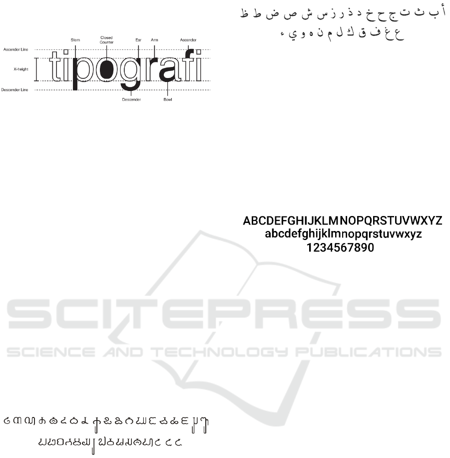
Figure 1: Modern Latin letterform anatomy (typographical
anatomy).
The final letterform is determined by the
researcher interpretative and aesthetical experience,
by take into consideration of design principles in
typography. Does not matter how decorative a letter
form can be, the main function of typography is
readable (Kana, 2001). Typography, as one of the
form of communication, is important to be ensured
that the message have to be delivered between the
sender and receiver of the visual message (Carter,
R., Day, B., & Meggs, 2012).
3 RESULTS AND DISCUSSIONS
The study will start from understanding basic and
unique characteristic of different letters mentioned
before. Hereby we will see different letterforms will
be studied so each of them will be taken each and
specific part to design new letterform. Different
letterform will be presented, and there will be some
remarks for each letterform from different culture.
Section 1.01 Pallava letterform
Figure 2: Pallava letters.
The anatomy of Pallava letterform shows that
there is a dynamic outer shapes and structure
between letters. Although, it can be recognized that
the letters are still constructed from basic visual
forms such as circles and squares. The thickness of
the line of the letters has minor differences, due to
this, it is a bit difficult to accurately measure the
thickness. The different thickness gives the
letterforms better visual balance and composition.
All of the letters, has rounded corner and curved
shapes which gives the experience of organic form.
In contrary, the height consists only two heights.
Section 1.02 Arabic letterform
Figure 3: Arabic letters.
The letters are written from right to left, and use
consistent slanted angle of strokes. Even though
there are variety of the letterform, it is clearly seen
that there are a pattern of shape. Some letter has the
same form, and they are marked differently with the
use of prism dot. Each amount of the dot, represents
different type of letter. The stroke width has extreme
contrast of thickness. There is no contrast size of
height between Arabic letters.
Section 1.03 Latin letterform
Figure 4: Latin letters.
Currently used in Indonesia as the main letter for
Indonesia language. There are varieties in the
development of Latin letterform. The most classic
letterform widely used for reading materials is letters
with serif. There are two main categorizations in
typography, serif and sans serif. The most common
used in daily life of current modern culture is the
one displayed above, the sans serif letterform. The
letter was created during the era of industry
revolution, which has focus on the easiness of mass-
production.
The characteristic of modern Latin letterform is
they have more simplified form. The letterform has
more thickness in vertical stroke compared to
horizontal. The height has few variations, only on
specific letters that has ascender and descender
(figure 1). The capital letter, or used to be called as
upper-case, has no variation in height.
Section 1.04 Letterform comparation study.
It is crucial to be able to identify basic forms
which become the identity of each letterform of
Pallava and Arabic. Each separate part of a letter
from the letterform was studied and collected into
one database of unique part of a letter. Different part
of letter is being used for different letter in Latin
letter, this is the phase where the researcher finds
different part should be suitable for which letter in
Latin letter.
BINUS-JIC 2018 - BINUS Joint International Conference
308

Figure 5: Study of anatomy letters used in Latin letters.
Section 1.05 Letterform merging study
Observation and study of different letterform has
shown that different letterform has their own unique
and recognizable form. There is opportunity of
combining the different form to create new set of
letterforms. The basic letterform which will be the
base of the design is the Latin letterform, because
the letter is the one used and will be identified easily
by Indonesian people or culture that uses Latin
letterform as their main letter. In the process of
synthesizing the different form, gestalt visual
perception is being used to support the visual
communication design principles. The methods of
adding, subtracting and eliminating visual elements
are used constantly during the creation process of
the letterform.
Figure 6: Study of unique visual character into Latin.
Section 1.06 Final result of new letterform
Figure 7: Final new letterform.
The letterform created has undergone several
development stages. The final form presented here is
the best collection of letter that shows the balance of
visual aesthetic and also the readable function of
letterform. As shown above, there are different parts
from other letterform comes from different culture.
The Pallava characteristic has more dominant
influence compared with the Arabic letters. The
Arabic letters subtly inserted in the different widths
of the strokes. The most prominent visual appearing
for the Arabic letters will be in the dot for the letter
“i” and “j”. There are several separations of shapes
created, this was done to give a dimension and form
related construction with the Pallava letterform.
4 CONCLUSIONS
The result of the design could contribute the
sustainability of Indonesia history in visual culture
context. Furthermore, the visual design offers
possibility for the upcoming generation in how
maintaining history and culture. By offering new
visual shape in a relevant way with current
generation, open possibility for further development
by current and following generations. The new
letterform has been showed to several respondents to
gain input for further development in different
research. The comments are that they can see the
characteristics of the Pallava letterform easily, but
the challenge for the reviewer was to find the
characteristic of the Arabic letterform. Even though
the letterform is considered as decoratively
interesting, most importantly was the new letterform
is successful in the readability factor in transferring
local values using digital format. As visual design is
expected to an ever-expanding communication
environment (Kana, 2001). With the successful
achievement of combining different culture into one
letterform has shown that different cultures can be a
harmony in hybrid culture, with the consideration of
cultural negotiation (Raab, J., & Butler, 2008).
For future research development, the area of the
combination of letterform can be widen into other
factors than only history of Indonesia. It will be
interesting to see the methods of creating the
letterform in this research is being used in
geographical factor. If the approach is used to
explore new possibilities of finding other hybrid
typography in different area of Indonesia, the result
is Indonesia will have its own set of letterform,
which will contribute to the identity of Indonesia as
Bhinneka Tunggal Ika, unity in diversity.
Typography as a Reflection of Cultural Imprint in Indonesian History
309

REFERENCES
Berger, S. (2007) History and national identity: why they
should remain divorced History and Politic, Online.
Available at: http://www.historyandpolicy.org/policy-
papers/papers/history-and-national-identity-why-they-
should-remain-divorced>.
Carter, R., Day, B., & Meggs, P. B. (2012) Typographic
Design: Form and Communication. Hoboken, New
Jersey: John Wiley & Sons.
Kana, D. (2001) ‘Digital Communication Design in teh
Second Computer Revolution’, Aksen, 2, pp. 73–80.
King, L., James, S. F., & Cooke, P. (2016) ‘Experiencing
the Digital World: The Cultural Value of Digital
Engagement with Heritage’, Heritage and Society,
9(1), pp. 76–101.
Laffan, M. (2008) ‘The New Turn to Mecca: Snapshots of
Arabic Printing and Sufi Newtorks in Late 19th
Century Java’, Revue des mondes musulmans et de la
Meditteraneee, 124, pp. 113–131.
Lidwell, W., Holden, K., & Butler, J. (no date) Universal
Principles of Design. Beverly, Massachusetts:
Rockport.
Raab, J., & Butler, M. (2008) Introduction: Cultural
Hybridity in the Americas, Online. Available at:
http://www.uni-
bielefeld.de/ZIF/FG/2008Pluribus/publications/raab-
Butler_intro-hybrid.pdf.
Sampson, F. (2009) Investing in Cultural Diversity and
Intercultural Dialogue. Paris, France: United Nations
Educational, Cultural and Scientific Organization.
UNESCO (2018) Communication and Information:
Concept of Digital Heritage, Online. Available at:
http://www.unesco.org/new/en/communication-and-
information/access-to-knowledge/preservation-of-
documentary-heritage/digital-heritage/concept-of-
digital-heritage/.
BINUS-JIC 2018 - BINUS Joint International Conference
310
