
Visual Analytics of Multi-sensor Weather Information
Georeferenciation of Doppler Weather Radar and Weather Stations
Aitor Moreno, Andoni Gald
´
os Andoni Mujika and
´
Alvaro Segura
Vicomtech-IK4, Paseo Mikeletegui 57, San Sebasti
´
an, Spain
Keywords:
Weather Stations, Geovisual Analytics, Doppler Weather Radar, Scalar Fields.
Abstract:
This work presents a geovisual tool which integrates and georeferences data coming from some of the weather
instruments installed in the Basque Country: a Doppler weather radar and the weather station network com-
posed of around 100 multi-sensors stations (temperature, precipitation, wind...). The visualization of the raw
data coming from the weather radar is based on the generation of a set of 3D textured concentric cones (one
per elevation scan). The resulting 3D model is then integrated in the 3D digital terrain of the Basque Country.
For the weather stations, we have provided a Kriging based interpolation method to produce textures from the
scalar data measured at the weather stations. These textures are then mapped in the same 3D digital terrain
as before. The integrated visualization of the weather information enhances the understanding of the data. To
illustrate the proposed methods a use case is provided: matching the precipitation measured at ground level
with the radar scans.
1 INTRODUCTION
The combination of Geographic Information Systems
and Computer Graphics is the main characteristic of
the Geovisual Analytics (Andrienko et al., 2010). The
geovisual tools have a considerable potential in en-
vironmental monitoring and in the decision making
process (Tomaszewski et al., 2007). For years, the
utilization of weather 2D maps has helped to present
the data collected in the weather networks to the users
with a great success (Kraak and Ormeling, 2002).
The presentation of animated sequences introduces
the time to show the historical or predicted evolution
of a measured variable.
This paper presents the work carried out in the 3D
geovisualization of the weather multi-sensor network
installed in the Basque Country (Spain) by the Basque
Meteorology and Climatology Agency.
The presented geovisual 3D and interactive tool
helps to centralize and to enable the analysis of
large amounts of data collected from weather sensors,
spread around the territory. These sensors are aimed
to monitor the temperature, pressure, humidity, wind,
solar radiation, etc. There are other type of weather
devices, like a Doppler weather radar, a wind profiler
and several oceanic probes.
The first section of this work introduces the
Basque Country weather network, including the
Doppler weather radar. The second section of this pa-
per presents the 3D visualization of raw data coming
from the Doppler weather radar. The nature of the
radar scans is volumetric, so we provide mechanisms
to produce a 3D model with the scanned 3D informa-
tion. These 3D models are integrated with the 3D dig-
ital terrain, constructed from the available geographic
information in the area.
The third section presents the tools to create inter-
polated images given a timestamp and a target instru-
ment (temperature, precipitation, etc.). The produced
images are overlaid over the same 3D reconstructed
digital model of the Basque Country territory.
The forth and fifth sections present how the geovi-
sual interactive applications can help to handle all the
available information from the multi-sensor weather
network (radar or weather stations) and to combine
them to produce more helpful meteorological prod-
ucts.
Finally, the paper ends with the conclusions and
the future work.
2 BASQUE COUNTRY WEATHER
NETWORK DESCRIPTION
The Autonomous Community of the Basque Country
is a territory in northern Spain bordering with south-
329
Moreno A., Galdós A., Mujika A. and Segura Á..
Visual Analytics of Multi-sensor Weather Information - Georeferenciation of Doppler Weather Radar and Weather Stations.
DOI: 10.5220/0004677603290336
In Proceedings of the 5th International Conference on Information Visualization Theory and Applications (IVAPP-2014), pages 329-336
ISBN: 978-989-758-005-5
Copyright
c
2014 SCITEPRESS (Science and Technology Publications, Lda.)

ern France. It spans an area of 7234 km
2
and is
crossed by a few mountain ranges. Established 1990,
the Basque Meteorology Agency, Euskalmet, has de-
ployed a large network of weather stations, includ-
ing a long-range radar, and provides past, present and
forecast meteorological information.
The physical data collected by the sensors in the
network are stored, managed and retrieved to provide
meteorological products. The weather forecast to the
public is one of the most common ways to use the
meteorological products (in TV or in a web page).
The acquired information from the network is also
used to help in the decision making process in two
different ways. Firstly, the information is used to an-
alyze high risk potential hazard zones, especially, to
improve the flood awareness in the territory, so pre-
ventive actions can be performed. Secondly, the his-
torical analysis of the available data is used to study
the evolution of the climate. The analysis of past
singular events is also important to extract important
knowledge and conclusions from the data and to help
to improve the numerical weather models.
2.1 Weather Radar
The Basque Weather service operates a dual Doppler
Weather Radar, located on top of Mount Kapildui,
1000 m. high and 100 km. away from the coast.
It is a Meteor 1500C model from Selex-Gematronik.
Among other variables, the radar computes the reflec-
tivity (dBZ), radial velocity (V) and spectral width
(W) fields every 10 minutes through two volumetric
and two elevation scans.
2.2 Multi-sensor Weather Stations
A weather monitoring network is composed of a set
of weather stations. Each one can be considered a
multi-sensor device, which provides periodical mea-
surements to the control center.
In the Basque Country, this weather station net-
work is composed of around one hundred network sta-
tions, each one with a variety of measurement instru-
ments. Some of them have thematic instruments, nor-
mally associated to the stations near the sea (currents,
salinity...) and the top of the main mountains. As for
the time resolution of the installed instruments, the
automated station delivers a new data package (which
includes all the measurements of all the installed in-
struments in the station) to the control center every 10
minutes.
The historical data from the Basque Country net-
work can be consulted and retrieved in the Euskalmet
web site
1
.
3 WEATHER RADAR DATA
Radar scans are typically represented as 2D images
in the form of either PPI (plan position indicator) or
CAPPI (constant altitude PPI) products.
In this work we don’t use these products. Since we
are aiming to visualize the complete radar volumes in
3D (not just individual slices from it), we use the raw
output from the weather radar, containing the whole
volume scan.
The process to construct a 3D model from the raw
data of the radar is addressed in the following subsec-
tions. Firstly, the raw output is processed and a set
of gray-scale images is created. From the metadata of
the volume scan, a 3D geometry is generated, com-
posed of a set of concentric cones. Then, the gray-
scale images are colored using a transfer function and
they are mapped as textured in the 3D cones, creating
the final 3D model for the given volume scan. The
3D model is integrated with the digital terrain of the
Basque Country, resulting a 3D visual Geographic In-
formation System (Peuquet and Marble, 1990).
3.1 Volumetric Data Processing
The volumetric datasets acquired by the radar are
composed of 14 scans at increasing elevations (from
−1
◦
to 35
◦
). Such scanning process results in a
discrete sampling of the sky volume in which each
sample has elevation, azimuth and range coordinates.
Thus, samples can be addressed by spherical coordi-
nates.
The volumetric information is converted into a set
of gray-scale images, one per elevation. The scanned
values (dBZ, V or W) provided in the raw binary file
are not the actual values and some transformations
have to be applied to the raw values to get the actual
values. Then, the range of interest (window level) in
the values is mapped to the byte range (128 values) to
create the gray-scale image pixels.
The Figure 1 shows a composition of the 6 lowest
levels of a given volume scan. The left side of each
one is the closer side to the center of the volume (the
radar location) and all the pixels in the first column
correspond to the same physical location due to the
nature of the polar coordinates.
The produced individual images require addi-
tional metadata to decode the information (encoded
1
Euskalmet web site (Basque Meteorology and Climatol-
ogy Agency): http://www.euskalmet.euskadi.net/
IVAPP2014-InternationalConferenceonInformationVisualizationTheoryandApplications
330
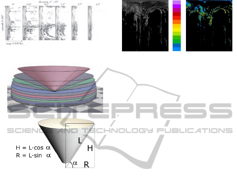
Figure 1: A composition of 6 gray-scale images corre-
sponding to the lowest elevation levels of a given radar scan.
Figure 2: A 3D model of the scanned volume is created as a
set of concentric cones. The radius and height of each cone
is calculated from the metadata of the radar scan.
variable, window level used in the byte range accom-
modation, numerical transformations, etc.) which can
be encoded in the filenames of the images. Any addi-
tional information could be still loaded from the orig-
inal raw data files.
3.2 3D Representation and
Visualization
Previous works have dealt with the visualization of
the volume scans acquired from a weather radar. We
can see an extensive classification and review of the
main techniques and methods in (Ernvik, 2002).
The geometry of the radar scans can be seen as a
set of conical sweeps at different elevations. The work
of (Sundaram et al., 2008) et al. adds a rectification
step to convert the conical grid into a rectilinear grid.
This approach suits better for the traditional methods
of volume visualization: indirect (isosurfaces, march-
ing cubes...) or direct (volume rendering).
As the rectification process is very time consum-
ing, our approach do not create such rectilinear grid.
Figure 3: Color mapping of the first level of a scanned vol-
ume by the weather radar. The images are given in polar co-
ordinates, with the weather radar located in the upper side
of the images.
Instead, a set of geometrical and concentric cones (see
Figure 2), centered in the radar location is created
(Peng and Lingda, 2007). The height and radius of
each of the cones are determined by the elevation an-
gle of such scan.
Each of the images is then used as texture of the
corresponding cone. As the images are gray-scale,
a coloring function (transfer function) is used. The
Figure 3 shows how a colored RGBA texture (on
the right) is created by applying a transfer function
(shown in the middle) to the gray-scale image (on the
left) (Ginn, 1999). The black area in the final colored
texture corresponds to the alpha channel, allowing a
proper 3D visualization of the scene when all the tex-
tures of the set of concentric cones are rendered to-
gether.
3.3 Ground Clutter Removal
Given the topography of the Basque Country, the
lower scans are affected by the surrounding moun-
tains and other topographical elements, adding almost
constant noise to the data, which should be ignored.
This constant noise is known as ground clutter.
In Mount Kapildui clean scans can be obtained at
elevations greater than 1
◦
. The elevations between
−1.0
◦
and 0.5
◦
contain noticeable ground clutter, but
they can not be discarded since they provide valuable
information.
As the ground clutter is in theory constant in time,
its effects in the lowest scans can be reduced by sub-
tracting a fixed mask to the retrieved data.
However, given the variability of radar echoes
caused by topography, a single scan of a clear sky is
not enough to create a reliable clutter filter. In order
to avoid this problem, the final clutter mask was cre-
ated as the average image of 6 radar scans taken at
different times with a clear sky.
The resulting mask effectively removes the
ground clutter from the volume scans, but it may not
filter correctly all the ground echoes due to the inher-
VisualAnalyticsofMulti-sensorWeatherInformation-GeoreferenciationofDopplerWeatherRadarandWeatherStations
331
ent variability of the radar echoes in the topography.
3.4 GEOREFERENCED 3D
VISUALIZATION
A fully interactive viewer requires the presentation of
a virtual scene to the users, which is composed of two
main elements: i) a model coming from the weather
radar data and ii) the terrain where the weather radar
is located. The most common techniques to integrate
terrain and radar data involve the overlapping of 2D
images: i) the terrain image or map, where colors rep-
resent the height and ii) the image of the weather radar
(Toussaint et al., 2000). Usually, the radar images are
typically represented as 2D images in the form of ei-
ther PPI (plan position indicator) or CAPPI (constant
altitude PPI) (James et al., 2000).
In our work, we aimed to a 3D visualization of the
volume scans and the terrain where the data has been
acquired. As presented before in the subsection 3.2,
the visualization of the weather radar data is achieved
by creating a 3D model composed of the textured 3D
cones. The resulting 3D model correspond to the 3D
visualization of the given volume radar data and it can
be used in interactive 3D applications.
For the 3D digital terrain, we have constructed a
3D model of the whole Basque Country. It was cre-
ated as a combination of highly detailed digital eleva-
tion data and a set of properly adjusted high resolution
orthophotographs (Jenson and Dominque, 1988), pro-
vided by the Basque Government. This large amount
of data has been prepared and transformed into a
PagedLOD model, ready to be loaded and rendered
by the OpenSceneGraph graphics library at interac-
tive frame rates.
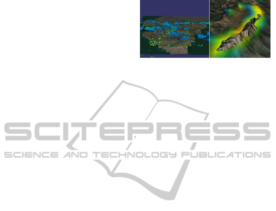
The terrain data and the radar scans are correctly
georeferenced, since the radar data includes the corre-
sponding UTM coordinates and therefore, a seamless
visualization of the 3D terrain model and the radar in-
formation at the same time is achieved without major
inconveniences. The union of radar and topographic
data clearly highlights the presence of ground clutter
around the highest mountain ranges (see Figure 4).
The Figure 5 shows some visualization examples
of volume scans with different variables. Each mea-
sured variable has its own transfer function, follow-
ing the standardized coloring functions used by the
commercial products (like Rainbow 5, from Gema-
tronik). The left column shows the reflectivity (dBZ)
of two different timestamps and viewpoints using the
trasfer function shown in Figure 3. The right column
shows the velocity (V) in the same timestamps and
viewpoints. They use a custom transfer function (a
gradient from blue to red).
Figure 4: Unfiltered Kapildui radar volumetric information
visualization using a reflectivity color map. In the left im-
age, the rain areas can be seen in blue as well as ground
clutter. In the right image, a close up of the ground clutter
is shown, matching the mountain causing it, which proves
that the georeferenciation of the volume radar and the 3D
terrain is accurate.
3.5 Animation support
The interactive visualization of a single radar volume
merged with the 3D geographic model enhances the
understanding of the radar data. The users can nav-
igate through the 3D world and visually inspect the
volume and its relationship with the terrain (moun-
tains, valleys). With the visualization of a sequence
of consecutive radar volumes, the users’ knowledge is
increased dramatically, since the temporal axis gives
additional visual information. Hidden information in
the full set of sequential 2D slides, which compose the
radar scans, emerges when several data are visualized
in an animated way. Some of most appealing retrieved
information refers to the evolution of the rain clouds,
the visual inspection of the trajectories of the storms
and the effect of the mountains in the evolution of the
rain clouds.
The animation support requires to have a quite
large amount of consecutive radar data, which will be
loaded in runtime. As the data amount could be ran-
domly huge, it is not feasible to precalculate all the 3D
model of the radar scans. Therefore, a fast on-demand
construction of the 3D models is required.
4 GEOVISUALIZATION OF
SCALAR FIELDS
This section introduces the visualization techniques
used to display the information acquired from the in-
struments installed on the weather station network.
Since the values of temperature and precipita-
tions are known only in the points where the weather
stations are, an interpolation method has to be set
in order to color the whole map. Kriging methods
(Cressie, 1993) and its variations are widely used
(Mair and Fares, 2011) (Hartkamp et al., 1999) to
interpolate the measurements from the weather net-
IVAPP2014-InternationalConferenceonInformationVisualizationTheoryandApplications
332
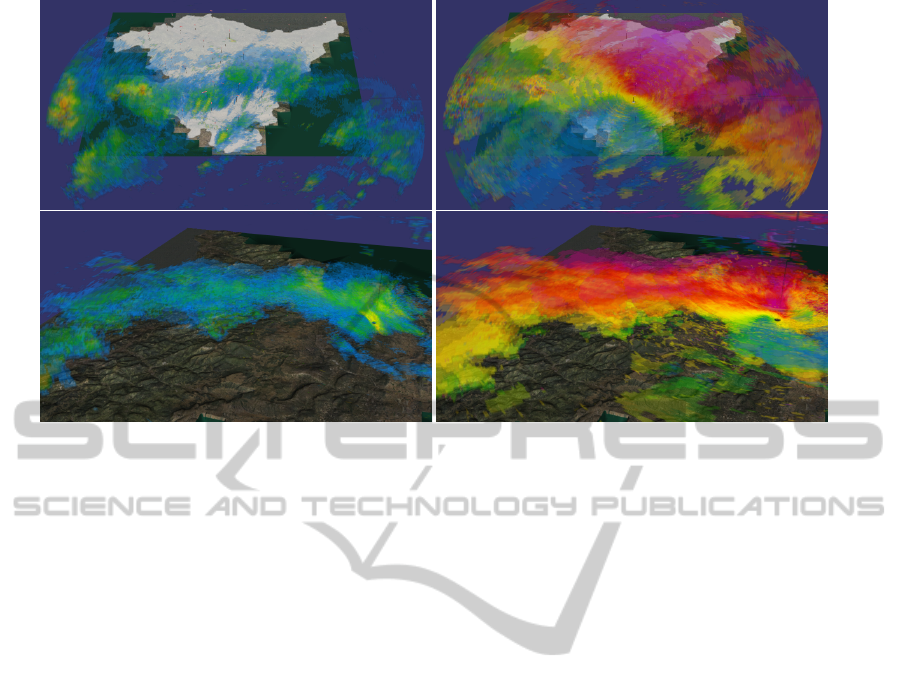
Figure 5: Weather radar 3D visualization over the Basque Country 3D digital terrain. Reflectivity (dBZ) in the left column
and Velocity (V) in the right column.
work. These methods obtain the value in a point com-
bining the values of the neighbor known values and
the distances to those points.
Let (x
1
, x
2
, ..., x
N
) ⊂ X ⊂ R
2
be the points where
the temperature is measured. In the probabilistic
model used by ordinary kriging, the temperature in
a specific point, t(x), is considered the realization of
a random variable T (x) and two degrees of station-
arity are assumed. This implies that the mean of all
random variables T (x) is the same and that the corre-
lation between two random variables depends only in
the distance between the points and not in their posi-
tions.
E{T (x)} = m ∀x ∈ X
γ(T (x
i
), T (x
j
)) = γ(h) ∀x
i
, x
j
∈ X
Where x
i
= x
j
+ h and γ(T (x
i
), T (x
j
)) =
VAR(T (x
i
) − T (x
j
)) is the variogram function.
In ordinary kriging, the random variable T (x) is
estimated by
ˆ
T (x). It is the linear combination of the
random variables referred to the known points and the
weights w
i
(x) are obtained from the stationarity as-
sumptions.
ˆ
T (x) =
∑
N
i=1
w
i
(x) ∗ T (x
i
)
In our case, universal kriging (Huijbregts and
Matheron, 1971), also known as regression kriging
(Goovaerts, 2000), has been implemented. In this
method, the variable t(x) is divided into a determin-
istic component and the residual, that is treated as a
random variable.
t(x) = m(x) + r(x)
Then, the deterministic component is approxi-
mated by a plane using least squares method and the
residual is computed with ordinary kriging. For this
latter, since the variogram function needed for the
kriging method cannot be computed, a spherical vari-
ogram model (Cressie, 1993) is used.
Once prediction for the values at random loca-
tions are obtained, the interpolated numerical values
have to be visualized somehow. A transfer color func-
tion is used to predicted values to a specific color. In
this way, anyone can take visual indications about the
warmer zones or the areas where the precipitation has
been higher. The 2D colored images break the link
with the actual terrain. One way to solve this issue
is to generate a 3D scene. A reconstructed 3D ter-
rain, textured with the colored image, georeferences
the weather data and the terrain where they have been
measured (see Figure 6). As the texture is overlaid
over the terrain, the resolution of such textures is im-
portant. A balance between the computational effort
(the interpolation method has be called for each pixel
in the image) and the quality of visualization output
has to be found.
The Basque Country can be embedded in a 150
km. × 150 km. square. Provided a 1024 × 1024
texture, we have approximately a 150 m. per pixel
resolution, which is enough to get high quality vi-
sual representation of the scalar field. In a commodity
computer, the computational time is below 2 seconds.
The interpolation techniques also predict values
outside the Basque Country territory, as the square
texture covers parts of the neighboring provinces. For
those outer regions, the number of near weather sta-
VisualAnalyticsofMulti-sensorWeatherInformation-GeoreferenciationofDopplerWeatherRadarandWeatherStations
333
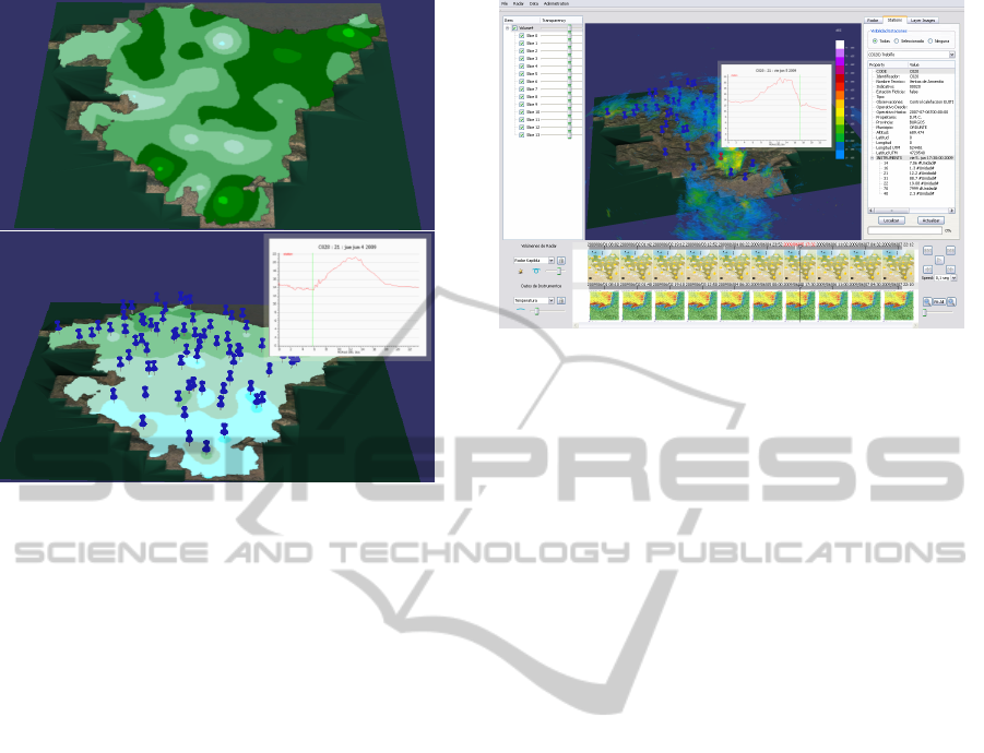
Figure 6: Temperature (
◦
C) rendered in an overlay tex-
ture and fitted to the Basque Country administrative bound-
aries. In the bottom figure, the pins show the location of the
weather stations and a 2D graph is attached to the selected
station showing the evolution of the temperature within the
selected day.
tions is very limited and therefore, the interpolated
values are less accurate. In fact, in the corners of the
texture, the method can be perceived as an extrapola-
tion method. To limit the impact of such undesired be-
havior, an alpha mask with the Basque Country shape
is used to limit the texture to the correct boundaries.
This technique also has an impact in the performance,
since the pixels out of the mask are not calculated us-
ing the interpolation method.
The upper image in the Figure 6 shows an scalar
field (temperature) mapped in a 3D model of the
Basque Country. The texture resolution is 1024 ×
1024 and an alpha mask has been added with the ad-
ministrative boundaries. The bottom image shows the
location of the weather stations as 3D pins. Although
the network is composed of almost 100 stations, not
all of them have the same instruments. And addi-
tionally, at a given time, some stations can be out-
of-service or their data could have been discarded due
to the quality control over the data and the electronics
in the weather station. In the shown case, the number
of available stations for the temperature instrument is
68 at that precise instant.
5 GEOTOOL USER INTERFACE
This section introduces the visual geotool imple-
mented to seamlessly visualize the weather radar vol-
ume scans and the weather station network.
Figure 7: The user interface of the geotool. In this case, a
weather station is selected and the evolution of the temper-
ature during the selected day. Also, the weather radar data
is displayed in the 3D environment.
The amount of available data is stored in a Post-
greSQL DataBase, queried from a QT application.
The temporal nature of the data requires to arrange a
scroll panel where the available timestamps are shown
(see bottom part of the Figure 7).
There are two main timelines: the weather radar
and the weather station network. The timeline for the
weather radar configures which one of the available
variables is shown, i.e, reflectivity (dBZ), velocity (V)
or spectral width (W). In a similar way, the timeline
for the weather stations configures which instrument
is shown in the overlaid texture over the terrain.
Some zooming functionality is added to the time-
lines to allow the user to inspect and navigate the
database. The available data in the database spans
for 7 consecutive days in our tests (around 1000 sam-
ples) but it could be extended to the whole exist-
ing database in the Euskalmet meteorological agency
(several years for the weather station network).
The 3D virtual terrain is centered in the geotool.
The selected volume data coming from the weather
radar can be configured: global and per cone visi-
bility / transparency. The textures interpolated from
the weather station network have similar options: vis-
ibility and transparency. There is also a selector to
choose the instrument to visualize: temperature, pre-
cipitation, solar radiation, pressure or any other avail-
able instrument in the database.
An additional panel is added to show metadata.
For the weather radar, the metadata embedded in the
raw files is shown which included useful information
for the meteorologists. For the weather station net-
work, information about the selected instrument and
the selected station (if any) is shown. The user can in-
spect the installed instruments on a given station and
show in a 3D panel the evolution of a variable along
the selected day (see Figure 7).
IVAPP2014-InternationalConferenceonInformationVisualizationTheoryandApplications
334
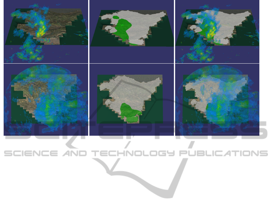
Figure 8: Two examples of georeferenciation between the weather radar and the precipitation measured at the ground level.
In both cases, the location of the water in the atmosphere matches the pattern obtained by the Kriging interpolation.
As the nature of the data is inherently 4D, we have
provided animation support for some of the typical
VCR functionality on the data: Play and stop with
some speed up functionality, go to the next data or to
the previous data. The interactive visualization of the
3D environment is kept while the animation is run-
ning, which is useful to inspect freely the evolution of
the weather in the region.
6 GEOVISUAL ANALYSIS:
PRECIPITATION
Having multiple monitoring devices produces lot of
information for the meteorologists. Analyzing all the
data using long tables is not efficient, or at least, it
is difficult to globally understand the data. The uti-
lization of textured maps with the scalar fields helps
to visualize in a concise way all the existing data in a
given timestamp.
The weather radar monitors the atmosphere and
thus, it detects the amount and type of the meteors
(ultimately, the water in the atmosphere). This in-
formation is related to the measured amount of pre-
cipitation by the weather stations. The correlation of
such variables should show that fact. But it is diffi-
cult to analyze the raw data from the weather radar
and cross-reference the values with tabular data of the
precipitation measured by the weather stations.
The presented geotool can load a 3D representa-
tion of the weather radar and visualize the precipi-
tation measured at the ground level by the weather
station network as a texture on the 3D terrain. The
Figure 8 shows that the composition of both datasets
fits perfectly. The shape produced by the precipita-
tion matches the shape of the meteors in the atmo-
sphere. Although the acquisition time is almost iden-
tical, there is a 10-20 minutes delay since the weather
data is measuring the meteor in the atmosphere and
the weather stations are measuring the water already
fallen to the ground.
The georeferenciation of both datasets can be seen
clearly in an animated loop. The volume captured by
the weather radar advances towards the East and we
can see the same pattern in the shape of the interpo-
lated texture from the stations.
7 CONCLUSIONS
Meteorologists receive tons of data coming from mul-
tiple sources. It is important to provide tools to help
them to analyze such amount of data. Visual Analyt-
ics has been proved to provide concise thematic visual
outputs from large datasets.
This work has provided a geovisual tool to help
in the integration and georeferenciation of the data
coming from the weather instruments installed in the
Basque Country: a weather radar and a weather sta-
tion network composed of around 100 multi-sensors
stations.
The generation of the 3D models from the raw
radar information provides a pseudo volumetric visu-
alization at interactive rates. Users can analyze visu-
VisualAnalyticsofMulti-sensorWeatherInformation-GeoreferenciationofDopplerWeatherRadarandWeatherStations
335

ally where the meteors are located in the atmosphere
and where it is expected to rain. Additionally, cross-
referencing the radar information with the precipita-
tion measured in the weather stations provide a unique
visualization and understanding of the process.
As future work, the massive introduction of de-
vices like the smart phones or tablets makes interest-
ing to port the presented geovisual tool to the Web
(Van Ho et al., 2012).
Additionally, the utilization of volume render-
ing techniques can provide further analysis methods
to the meteorologists, even in the Web environment
(Congote et al., 2011).
ACKNOWLEDGEMENTS
This work has been funded by the Basque Govern-
ment’s ETORTEK Project research programs.
Authors thank Basque Country Government for
the Open Data initiative, which provided part of the
geographic information and the weather data used in
this work.
REFERENCES
Andrienko, G., Andrienko, N., Demsar, U., Dransch, D.,
Dykes, J., Fabrikant, S. I., Jern, M., Kraak, M.-J.,
Schumann, H., and Tominski, C. (2010). Space, time
and visual analytics. International Journal of Geo-
graphical Information Science, 24(10):1577–1600.
Congote, J., Segura, A., Kabongo, L., Moreno, A., Posada,
J., and Ruiz, O. E. (2011). Interactive visualization of
volumetric data with webgl in real-time. In 16th Inter-
national Conference on Web 3D Technology, Web3D
2011, pages 137–146.
Cressie, N. A. (1993). Statistics for Spatial Data. Wiley-
Interscience.
Ernvik, A. (2002). 3D Visualization of Weather Radar Data.
Technical Report 3252, Linkping University, Depart-
ment of Electrical Engineering.
Ginn, E. W. L. (1999). From PPI to Dual Doppler Images
- 40 Years of Radar Observations at the Hong Kong
Observatory. In Proceedings of the 32nd Session of
the ESCAP/WMO Typhoon Committee.
Hartkamp, A., de Beurs, K., Stein, A., and White, J. (1999).
Interpolation techniques for climate variables. In
CIMMYT, editor, NRG-GIS Series 99-01, chapter 26.
Huijbregts, C. and Matheron, G. (1971). Universal kriging.
In Proc. of International Symposium on Techniques
for Decision-Making in Mineral Industry, page 159
169.
James, C. N., Brodzik, S. R., Edmon, H., Houze, R. A.,
and Yuter, S. E. (2000). Radar data processing and
visualization over complex terrain. Wea. Forecasting,
15:327 – 338.
Jenson, S. K. and Dominque, J. O. (1988). Extracting topo-
graphic structure from digital elevation data foar geo-
graphic information system analysis. Photogrammet-
ric Engineering and Remote Sensing, 54(11).
Kraak, M.-J. and Ormeling, F. (2002). Cartography: Visu-
alization of Geospatial Data. Pearson Education.
Mair, A. and Fares, A. (2011). Comparison of Rainfall
Interpolation Methods in a Mountainous Region of a
Tropical Island. Journal of Hydrologic Engineering,
16(4):371+.
Peng, C. and Lingda, W. (2007). 3D representation of
radar coverage in complex environment. International
Journal of Computer Science and Network Security,
7(7):139 – 145.
Peuquet, D. J. and Marble, D. F. (1990). Introductory Read-
ings in Geographic Information Systems. Taylor and
Francis.
Sundaram, V., Ru, Y., Benes, B., Zhao, L., Song, C. X.,
Park, T., Bertoline, G. R., , and Huber, M. (2008). An
integrated system for near real-time 3D visualization
of NEXRAD Level II Data using TeraGrid. In Tera-
Grid 08 - The 3rd Annual TeraGrid Conference, Las
Vegas, NV., pages 1 – 8.
Tomaszewski, B. M., Robinson, A. C., Weaver, C., Stryker,
M., and Maceachren, A. M. (2007). Geovisual analyt-
ics and crisis management. In Proceedings of the 4th
International ISCRAM Conference, May 13-16, 2007,
pages 173–179.
Toussaint, M., Malkomes, M., Hagen, M., Hller, H., and
Meischner, P. (2000). A real time data visualization
and analysis environment, scientific data management
of large weather radar archives. Physics and Chem-
istry of the Earth, Part B: Hydrology, Oceans and
Atmosphere, 25(1012):1001 – 1003. First European
Conference on Radar Meteorology.
Van Ho, Q., Lundblad, P.,
˚
Astr
¨
om, T., and Jern, M. (2012).
A web-enabled visualization toolkit for geovisual an-
alytics. Information Visualization, 11(1):22–42.
IVAPP2014-InternationalConferenceonInformationVisualizationTheoryandApplications
336
