Visual Anomaly Detection in Production Plants
Alexander Maier
1
, Tim Tack
1
and Oliver Niggemann
1,2
1
Institute Industrial IT, OWL University of Applied Sciences, Lemgo, Germany
2
Fraunhofer IOSB-INA, Application Center Industrial Automation, Lemgo, Germany
Keywords:
Anomaly Detection, Production Plant, Automation System, Visualization Technique, Visual Analytics.
Abstract:
This paper presents a novel method for visual anomaly detection in production plants. Since the complexity of
the plants and the number of signals that have to be monitored by the operator grows, there is a need of tools
to overcome the information overflow. The human is highly able to recognize irregularities in figures. More
than 80% of the perceived information is captured visually. The approach proposed in this paper exploits this
fact and subjects data to make the operator able to find anomalies in the displayed figures. In three steps the
operator is lead from the visualization of the normal behavior over the anomaly detection and the localization
of the faulty module to the anomalous signal.
1 INTRODUCTION
Modern production plants nowadays grow more and
more complex. Thus, the number of sensors and ac-
tuators grows also. Programmable Logic Controllers
(PLCs) are used to manage the signals and to operate
the plant. Supervisory Control and Data Acquisition
(SCADA) systems get the data from the PLC to man-
age the process automatically. Due to the increasing
number of signals the analyzing task gets more dif-
ficult. More and more the activity of the operator
changes to a passive role; from operating to analyz-
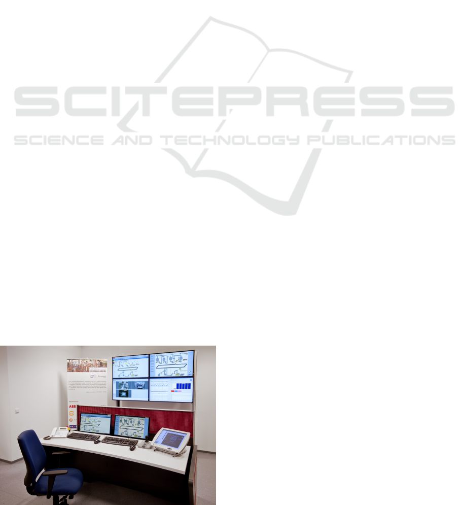
ing the production plants. Figure 1 illustrates a typical
production plant monitored with the help of a SCADA
system.
Figure 1: A typical complex interface of a SCADA system.
Different visualization techniques can help the op-
erator to analyze the plant behavior. The goal is a
graphical representation of the data which provides
the operator with an overview of the current plant
state. Additionally, the operator should be supported
in detecting unusual behavior, i.e. anomalies. Exam-
ples for anomalies are unusual power consumptions
or wears of conveyor belts. This paper adapts visual
analytic approaches from different scientific areas to
the field of automation.
In this paper, a novel visual anomaly detection ap-
proach is presented which guides the operator in a
top-down manner starting from a general overview to
a detailed description of identified anomalies. A main
new idea here is to place a visualization of the learned
normal behavior side-by-side to a visualization of
the current behavior. This side-by-side visualization
starts with an abstract graph computed by means of
data dimensionality reduction techniques which give
a coarse, time-independent system overview. The
user is then guided to a more detailed visualization
of the system’s timing behavior. So three main ideas
are combined here: (i) the usage of machine learn-
ing techniques to give the operator initially an ab-
stract view onto these complex data, (ii) the usage
of machine learning techniques to visualize the nor-
mal behavior (in comparison to the current behavior)
and (iii) a guided interface which leads the user step-
by-step to more detailed views onto anomalous data
items.
The paper is organized as follows: In section 2
67
Maier A., Tack T. and Niggemann O..
Visual Anomaly Detection in Production Plants.
DOI: 10.5220/0004039600670075
In Proceedings of the 9th International Conference on Informatics in Control, Automation and Robotics (ICINCO-2012), pages 67-75
ISBN: 978-989-8565-21-1
Copyright
c
2012 SCITEPRESS (Science and Technology Publications, Lda.)

an overview to the state of the art is given and the
research gap which should be closed is pointed out.
Section 3 defines some requirements for the visual-
ization of technical processes and introduces a new
method for the visualization of high-dimensional dis-
crete data. In section 4, based on the defined re-
quirements the visualization techniques are evalu-
ated. For this, real data from a production plant
are used. Advantages and disadvantages regarding
process overview and anomaly detection are evalu-
ated. To exploit the advantages found in the analyzed
techniques, section 5 introduces a new approach. It
combines the techniques in one new visualization ap-
proach to provide a more informative overview and
to increase the anomaly detection performance. The
results are discussed in the conclusion.
2 STATE OF THE ART
This section gives an overview to the state of the art
and related work. First, in subsection 2.1 some basics
of visual analytics process are presented.
The subsections 2.2 and 2.3 give an overview of
some techniques which can be used to visualize dis-
crete, continuous or hybrid data which are a combi-
nation of both. The visualization techniques should
support the operator in two ways. At first, the high-
dimensional data should be visualized in a neat way
that allows humans to deal with the overwhelming
information input. The second is to make process
anomalies visible in the visualization.
2.1 Visual Analytics
According to (Keim et al., 2010) the visual analytics
process is organized as follows (see also figure 2):
First, the data have to be acquired from the ob-
served system. In many cases the data have to be pre-
processed (e.g. normalization or feature generation).
From this, a (mathematical) model is created using
data mining approaches. The model can be extended
by parameter refinement. In parallel the data are vi-
sualized for the further usage. This visualization is
enhanced by user interactions. Very important in this
context is the tight coupling of automated and visual
analysis through interaction. Both steps lead to the re-
quested knowledge, i.e. the needed information about
the systems behavior. Based on this knowledge the
operator is able to detect anomalies.
There exist many approaches to create a system’s
model using observations. E.g. in (Niggemann et al.,
2012) a method to learn a behavior model by means
Data
Models
Visualization
Knowledge
Data Mining
Mapping
User interaction
Parameter
refinement
Model
building
Model
visuali-
zation
Transformation
Feedback Loop
Visual Data Exploration
Automated Data Analysis
Figure 2: Principle of visual analytics according to (Keim
et al., 2010).
of timed automata is presented. In many cases, es-
pecially in the case of high amounts of data, these
models are created to be used by computers and are
therefore not easily accessible for humans. For this,
special visualization methods have to be developed.
Visual analytic approaches have been applied for
many years. One early example is the Londoner
physician Dr. John Snow in the year 1854. To find
the reason for a cholera pandemic he used a visualiza-
tion method. He marked each place of occurrence in a
map and was therefore able to find the reason, which
was a contaminated water fountain (Tufte, 1997).
Approaches in visual analytics are applied to dif-
ferent research areas. For example it is used in the fi-
nancial sector to visualize and analyze the fall and rise
of stocks and to detect frauds, e.g. in (Huang et al.,
2009). The study of environment and climate change
also often uses visualization approaches. The temper-
ature and other relevant parameters are recorded over
a long period of time. These data are visualized to rec-
ognize dependencies and to show up the changes over
time. Another area of application is the prevention of
terrorist attacks (Thomas and Cook, 2006).
However, there are only few examples where vi-
sual analytics have been applied to the manufacturing
industry. Frey uses self-organizing maps to generate
a two dimensional map which visualizes the observed
process (Frey, 2008).
2.2 Visualization of Multidimensional
Data
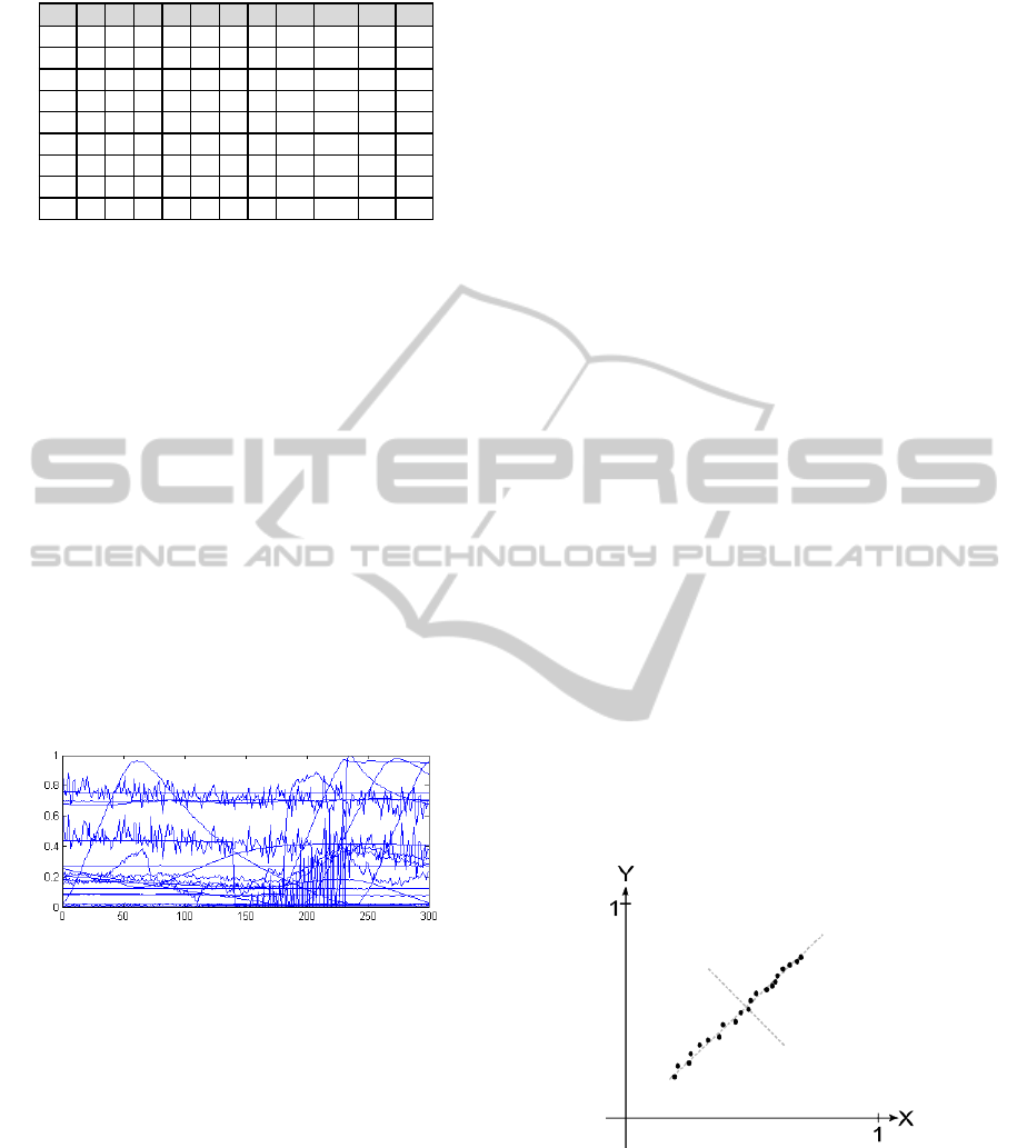
Figure 3 shows an excerpt taken from a process data
set. The dataset comprises a timestamp and the cor-
responding process variables f
1
... f
11
. The example
is rather small. Yet following the process or detect-
ing an anomaly by viewing this figure is not easy. It
can be seen that monitoring and anomaly detection in
high dimensional process datasets is a tough task for
computers and humans. Operators need to react on
ICINCO2012-9thInternationalConferenceonInformaticsinControl,AutomationandRobotics
68
time
f
1
f
2
f
3
f
4
f
5
f
6
f
7
f
8
f
9
f
10
f
11
25
0
0
1
1
1
0
1
0,60
993,3
235
1,5
60
0
0
1
0
0
0
1
0,50
983,4
235
1,8
124
0
1
1
1
1
0
0
0,38
983,7
236
2,2
149
0
1
1
0
1
1
0
0,44
982,4
233
2,5
248
0
0
1
1
0
1
1
0,46
980,1
234
2,9
324
1
0
1
1
0
1
1
0,52
978,5
231
3,2
419
1
1
1
1
0
0
0
0,48
980,5
231
3,6
455
1
1
1
0
1
0
0
0,44
990,2
232
3,9
513
1
0
1
1
1
0
0
0,42
993,4
232
4,3
Figure 3: An example dataset.
changes of large amount of different variables in dif-
ferent value ranges quite fast.
A trivial method to visualize data is to use signal
curves in dependency of time. This simple yet espe-
cially for continuous data effective method helps to
get an overview of the trends of a signal e.g. tempera-
ture over time. Further, the crossing of thresholds can
be seen very well. However, this method is only us-
able for a small number of signals. The visualization
of many signals in one diagram leads to an informa-
tion overflow, such that the single curves cannot be
detected separately. Figure 4 shows the visualization
of 30 signals with 300 data points for each. Even for
this small number the single curves cannot be sepa-
rated well and it is very difficult to find an anomaly in
this figure. This disadvantage is even worse for dis-
crete data, because here the constant parts of the sig-
nals overlap and only the signal changes can be seen.
Figure 4: Visualization with data curves.
In (Alfred, 1985) the method of parallel coordi-
nates is introduced. This technique allows the visu-
alization of multiple dimensions (as coordinates) in
parallel. This makes the dependencies between sig-
nals visible. As disadvantage, it has to be mentioned
that the quality of the datapoints within the visualiza-
tion is highly dependent on the order.
To get along with overlapping signals in high di-
mensions several figures can be depicted in a plot ma-
trix (Cleveland, 1993). Here, the dependency of each
pair of signals is displayed in one figure. All these
figures are then arranged in a matrix. However, very
high dimensions cannot be displayed clearly as well.
E.g. an input dimension of 20 leads to a matrix with
400 single plots.
A detailed description of these methods can be
found in (Keim, 2002).
The Multidimensional Scaling (MDS, e.g. in
(Bronstein et al., 2006)) is a set of techniques from the
mathematical statistics. The goal is the arrangement
of objects and their relation to each other. The far-
ther the objects are from each other, the more dissim-
ilar they are and the closer they are, the more similar
they are. There are thus collected information about
pairs of objects to identify them to metric information
about objects.
2.3 Principal Component Analysis
As outlined in the previous section, it is difficult to vi-
sualize high-dimensional data. Therefore, dimension-
ality reduction methods have to be used. The Prin-
cipal Component Analysis (PCA) was introduced by
Pearson and Hotelling and is here described based on
(Jolliffe, 2002).
The PCA finds new uncorrelated features, the
principal components. The dimensionality of the
dataset is then reduced by using just two principal
components to describe the dataset. This is possible,
because most of the variance of the original dataset,
i.e. the information, is represented by the first few
principal components. (Jolliffe, 2002). In this contri-
bution a two dimensional approach is used for the vi-
sualization (choosing two principal components), be-
cause it is difficult to extract information from a figure
with three dimensions and for more than three dimen-
sions it is impossible to create a visualization.
Figure 5 shows an example dataset visualized
based on its two features X and Y.
Figure 5: Example dataset with original features.
In figure 6 the same dataset is depicted based on
its first two principal components. We can see that
the most variance is represented by the first princi-
pal component (PC1). The variance represented by
the second principal component (PC2) is rather small.
In the notion of feature reduction only PC1 would be
used for data representation of the example dataset.
VisualAnomalyDetectioninProductionPlants
69
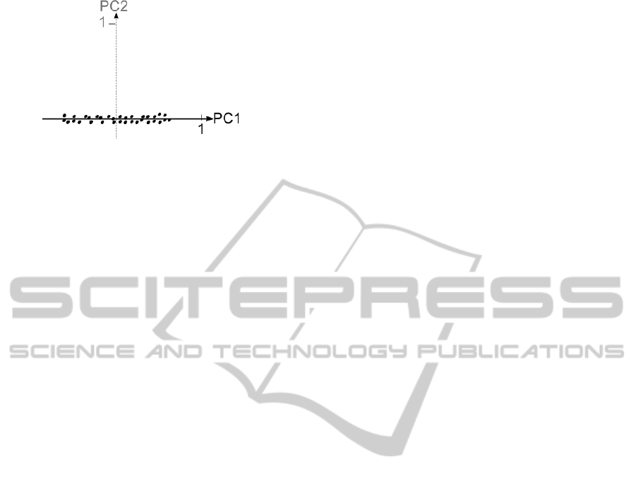
Figure 6: Example dataset with principal components.
The most information of the original dataset is pre-
served.
Although the most variance is kept it must be taken
into account how many information is lost due to the
reduction. For example reducing a dataset from 20
signals to 2 principal components (reduction of 90%)
while keeping 80% of the information (loss of 20%)
is a quite effective way of dimensionality reduction.
Nevertheless the informational loss is highly depen-
dent on the dataset and maybe worse than in the given
example. Therefore this should be considered. Be-
sides the potential of dimensionality reduction it has
to be considered that the process is not visualized ex-
plicitly with respect to its time line.
3 VISUAL DATA EXPLORATION
This section gives some requirements for the visual-
ization of technical processes. These requirements
will be used for the evaluation in the next section.
Based on the requirements section 3.2 introduces a
new approach, the Discrete State Encoding (DSE),
which is especially developed for the visualization of
high-dimensional discrete input data.
3.1 Requirements for the Automation
Domain
Every domain uses different methods to visualize the
data. While the climate study uses maps which are
colored to show the temperature, the financial indus-
try uses curves to show the trends of stocks. To place a
visualization method in the area of automation, tech-
nical requirements have to be considered:
High Dimensionality. Data of production plants is
typically high-dimensional. This is caused by a large
amount of sensors and actuators which are used to re-
alize processes. Most of them are controlled by PLCs
and need to be monitored by operation personnel in
SCADA systems.
Different Data Types. The variety of sensors and ac-
tuators that are used to realize a process may result
in different types of data. For instance a temperature
sensor provides a continuous value, the temperature.
Whereas a switch that activates a conveyor belt pro-
vides a discrete value, the state of the conveyor belt.
Each data type puts different requirements on the vi-
sualization.
Importance of Data. Due to the high amount of data
visualizing all values would lead to an information
overload. Occurring anomalies may remain unde-
tected. Therefore, only the most important data have
to be visualized. This results in the need of methods
which distinguish between important and less impor-
tant data.
Time Dependency. Processes in the automation do-
main are dependent on the factor time. The system’s
states are usually observed in relation to the process
time. Therefore, the visualization approach should
consider and preserve time information. This enriches
the process analysis and enables the operator to access
the plant state in a natural way.
Cyclic Processes. In typical production plants prod-
ucts are produced in large amounts. This leads to re-
occurring process phases. Therefore, system states
that recur should be depicted in the visualization, so
that the operator is able to recognize them as such. As
a consequence new occurring states (maybe anoma-
lies) can be visualized in a more exposed way. This is
an ease for the operator.
3.2 Discrete State Encoding
Since no appropriate method for the visualization of
discrete data exists, this section introduces the Dis-
crete State Encoding (DSE). It can be utilized for the
visualization of datasets which consist of discrete fea-
tures only. Like the PCA this technique also com-
presses high dimensional information. Here, the plant
behavior is represented by one feature only. This fea-
ture is then utilized in process visualizations to give
operators a neat view on the process progress.
Datasets are represented as tables with N features
f
i
in the columns and the measured process data, i.e.
the observations per row (see also figure 3). Each row
from the dataset is encoded to a representative num-
ber, the stateID. It needs to be mentioned that the
encoding uses only discrete values while continuous
features are ignored. Slightly changing continuous
values would result in a new state for each observa-
tion although the information has not changed signif-
icantly. The stateID computation is based on the fol-
lowing equation.
ICINCO2012-9thInternationalConferenceonInformaticsinControl,AutomationandRobotics
70
stateID =
N−1
∑
i=0
f
N−1−i
· 2
i
(1)
In the following step the stateID values are
renumbered. The first occurring stateID is renum-
bered to 1. To each newly occurring state a new num-
ber is assigned, whereas already known stateIDs al-
ways get the same number.
Renumbering stateIDs is necessary to avoid bias
in the visualization. E.g. a bit change in a highly
weighted feature would affect the visualization with
a higher impact than a bit change in a rather low
weighted feature. This misguiding perception should
be avoided, following the notion of the Lie Factor in-
troduced in (Tufte, 2001) in a figure. In the dataset the
state change itself is the important information, not
the artificial weight that is introduced for computation
purpose. The renumbering preserves the state change
information, but removes the bias resulting from the
weights. Figure 7 shows a visualized discrete state
encoding. It can be seen that two cycles are detected
which describe the same process or at least two simi-
lar ones.
Figure 7: Discrete state encoding of an example dataset.
4 EVALUATION OF
VISUALIZATION METHODS
In this section the visualization techniques described
in sections 2 and 3 are evaluated. As basis, the re-
quirements from section 3.1 are used. In the con-
text of visualization of technical processes, the most
important requirement is the visualization of high di-
mensions. Since most visualization techniques (men-
tioned in subsection 2.2) are not able to handle high
dimensions properly or to reduce to the main infor-
mation, only two methods are considered for detailed
evaluation: The discrete state encoding (subsection
4.1) and the principal component analysis (subsection
4.2).
For the evaluation, a dataset of a part of a Model
Factory (shown in figure 8) is used. The first objec-
tive is to provide an abstract process overview. The
second is to detect anomalies. This is done by com-
paring the visualizations of a reference process with
the observed process, which comprises anomalies.
The observed process produces popcorn out of the
resource maize. In total 19 continuous and discrete
features need to be analyzed online while the process
is active. The production process is separated into two
modules. Module one creates the product. The maize
is heated until it pops. Via exhaustion the popcorn is
transferred to a weight cell. In module two the pop-
corn is filled into cups or a larger pot, depending on
what is available at time. The whole process works
sequentially. First the popcorn is produced, next it is
filled into the cups.
Figure 8: A model factory as exemplary plant.
4.1 Discrete State Encoding of a
Production Process
Figure 9 shows the discrete encoded stateIDs for one
process visualized over its time line. Out of the for-
mer 19 features, one new feature, the stateID, is cre-
ated. As mentioned before, continuous values are not
taken into account in the discrete state encoding.
Figure 9: Discrete state encoded process.
VisualAnomalyDetectioninProductionPlants
71
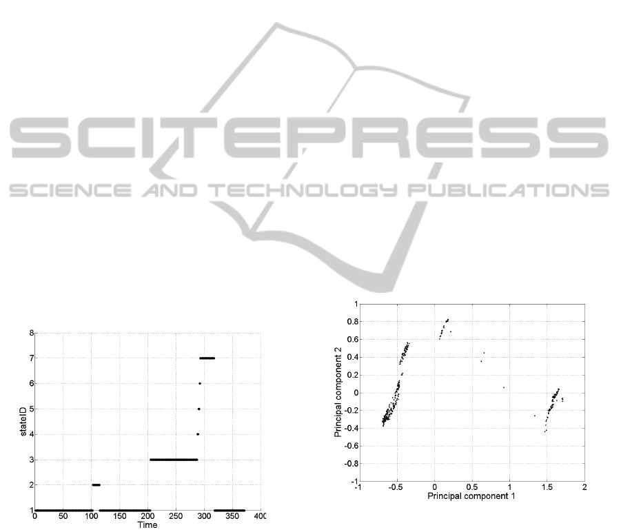
As depicted in figure 9, the operator is provided
with an abstract process overview by following the
process visualization. Without any expert knowledge,
it can be seen that the process has three main opera-
tion phases, and some short transfer phases between
time units 285 - 295. Expert knowledge allows us to
say, that the process states have been identified cor-
rectly. The stateID 1 represents the standby state of
the process. In stateID 2 the production phase is dis-
played. Once enough popcorn is produced, it is filled
into a cup. StateIDs 3-5 represent the cup filling. In
stateID 6 the heating is turned off while the ventila-
tion is still active to cool down the production module.
Afterwards the process returns to standby (stateID 1).
Utilizing the visualization from figure 9 the op-
erator is able to keep track of the process in a very
convenient way. The operator is able to see the pro-
cess over its actual time line. Furthermore, repeating
process phases are represented correctly.
In the next step, the technique is tested regard-
ing anomaly detection in the process. For that pur-
pose, an anomaly is induced into the same dataset
that was used before. A discrete sensor (e.g. a cup
filling level sensor) changes its value in an unusual
moment. Figure 10 shows the stateID representation
of that dataset. As shown, the anomaly can be rec-
ognized by comparing figures 9 and 10. The operator
is also able to determine the point in time where the
anomaly occurred. However, the operator is not able
to interpret the shown anomaly in a semantic way.
Figure 10: Discrete state encoded process containing an
anomaly.
Concluding, the discrete state encoding provides
the operator with a neat view on the process. Besides,
discrete anomalies can be detected by comparing the
visualizations. Even repeating process phases can be
perceived easily while monitoring the stateIDs. Nev-
ertheless the operator needs some expert knowledge
about the process, to benefit of all information pre-
sented by the visualization. A disadvantage of this
visualization technique is the missing ability of visu-
alizing continuous data.
4.2 Visualization of the Principal
Components
In contrast to the discrete state encoding the prin-
cipal component analysis considers both continuous
and discrete features for computation. In this sub-
section the principal component analysis is utilized
to reduce the 19 features of the dataset to two repre-
sentative features which are used in the visualization.
The timestamp is used as an additional feature for the
principal component computation. In figure 11 the
process is visualized with the help of two new fea-
tures, the two principal components. The reduction to
two new features preserves about 83% of the variance
former represented by 20 features; the informational
loss is about 20%.
At first, the operator is able to see a neat pro-
cess visualization. The process is grouped into three
clusters. Considering the knowledge gained in sec-
tion 4.1, it can be said that this is the number of the
main process phases. However, the operator is not
able to semantically interpret the three clusters. It is
not possible to determine whether the process phases
are clustered correctly, nor to see the process phases
with respect to the process time line.
Figure 11: Principal component based process visualiza-
tion.
To evaluate the performance in anomaly detection,
an anomaly has been induced into a continuous signal.
The power consumption rises without any bit change,
i.e. without actively switching on a consumer. Figure
12 shows the visualization of the anomaly-induced
process. Comparing figures 11 and 12, an anomaly is
perceptible. The operator is able to recognize a fourth
cluster in the visualization. In addition anomalies in
discrete and hybrid features were tested. Both were
visualized by this technique.
ICINCO2012-9thInternationalConferenceonInformaticsinControl,AutomationandRobotics
72
In summary, the visualization based on the princi-
pal components is able to show anomalies in contin-
uous, discrete or hybrid datasets. Yet it must be ad-
mitted that not all anomalies are depicted by the prin-
cipal component based visualization. Depending on
the influence the original feature had on the principal
component, the anomaly can be visualized in a less
exposed way than shown in figure 12. In the worst
case, anomalies in features that have no significant in-
fluence on the used principal components will not be
visualized as failures.
The PCA works well for continuous and hybrid
data. Here, the data points form a cluster in which
a certain spread is given such that a tolerance in the
test data set is allowed. In the case of only discrete
data the clusters consist of overlapping data points.
Due to the informational loss caused by choosing the
principal components, not all signal changes would
result in a new cluster and therefore not all anomalies
could be displayed.
Figure 12: Principal component based process visualization
containing an anomaly.
5 ANOMALY DETECTION IN
PRODUCTION PLANTS
The main goal of the proposed visualization ap-
proaches is to detect anomalies in the production pro-
cess. In subsection 5.1 a new anomaly detection ap-
proach based on visual analytics is presented. In sub-
section 5.2 it is evaluated and some experimental re-
sults are given.
5.1 Hybrid Visualization and Anomaly
Detection Approach
As mentioned in section 4, both visualization tech-
niques are able to provide the operator with a neat pro-
cess overview, but still have issues in visualizing dif-
ferent types or special anomalies. The discrete state
encoding focuses on anomalies in discrete signals and
gives a process overview with respect to the time line.
The principal component analysis based visualization
provides the operator with a more abstract process
overview and allows the viewer to detect anomalies
in continuous and hybrid data. Hower, the process of
dimensionality reduction considers the time informa-
tion, but the operator is not able to see the process
with respect to its timeline.
Table 1: Comparison of DSE and PCA.
DSE PCA
high dimensionality + +
time + -
continuous data - +
discrete data + -
hybrid data - +
loss of information + -
cyclic processes + +
Table 1 shows the advantages and disadvantages
for both methods. It can be seen that a combination of
both methods would enrich the possibilities of visual
anomaly detection.
To combine the advantages of both methods, the
hybrid visualization and anomaly detection approach
is introduced. The method is organized in three steps.
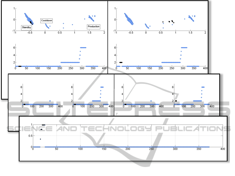
These three steps are illustrated in figure 13:
Step (1) Observation of the process and detection of
anomalies by comparing the reference process with
the currently running process:
The visualization of the principal components is used
to get an abstract view on the process based on its con-
tinuous and discrete values. The discrete state encod-
ing is used to extend the process visualization with a
reference to the point in process time. Now the opera-
tor is able to compare the reference with the ovserved
behavior in a convinient way.
Anomalies in discrete signals can be seen in the
discrete state encoding, anomalies in continuous sig-
nals are displayed in the principal component visu-
alization. To demonstrate the anomaly detection, in
figure 13, an anomalous process is observed. The
anomaly can be seen in both representations. In the
PCA based visualization the anomalous data items
form a new cluster. The discrete state encoding ad-
ditionally gives the timing information: the anomaly
occurred around the time stamp 20 seconds.
Step (2) Determination of anomalous module:
Additionally the process is separated based on its
modules, to get a more detailed view insight. Dis-
crete state encoding is utilized again to visualize each
module separately. In this example, it can be seen that
the anomaly occurred in the second module.
Step (3) Determination of anomalous signal(s):
VisualAnomalyDetectioninProductionPlants
73
Current process Reference process
PCA
DSE
StateID
StateID
Time Time
PC1 PC1
PC2
PC2
DSE
StateID
StateID
StateID
StateID
Time Time Time Time
Module 1
Module 2 Module 1
Module 2
Sensor PL1
Time
1
2
3
Figure 13: Hybrid visualization and anomaly detection approach.
The last element of the hybrid visualization approach
refers to the continuous process values. The dif-
ference between values in a reference process and
such in an anomaly induced process is calculated and
shown. It allows the viewer to see which continuous
sensor value differs by which amount to the process
time line. Following the example in the top down
manner, it can be said that the anomaly is based on
an unusual energy consumption; in the signal P
L1
.
All mentioned visualization methods are inter-
nally linked with the help of the timestamp. Based
on Shneidermann’s information seeking mantra
Overview first, zoom and filter, then details-on-
demand (Shneiderman, 1996), the operator gets a pro-
cess overview and is able to interactively explore the
process. Interesting data points can be marked in one
figure and corresponding data points will be high-
lighted in each other figures. The operator is able to
see the process behavior in different levels of abstrac-
tion with respect to the time line.
In the given case, the visualization enables the op-
erator to determine the point in time the anomaly oc-
curred precisely. Additionally, the user is able to lo-
calize the module in which the anomaly occured with
the help of the module separated visualization.
The combination of linkage and different visual-
ization techniques allows the operator to find anoma-
lies and learn about the dataset. Because of this, the
PCA based visualization could be enriched with la-
bels to provide semantic information.
5.2 Discussion
As can be seen in table 2 the advantages of the pro-
posed methods could be combined. The hybrid visu-
alization approach allows an enhanced visualization
since the abstract view of the principal components is
combined with the temporal process visualization of
the system’s states. Additionally, the hybrid approach
is able to handle all relevant data types for technical
processes. It was confirmed by experts that the data
abstraction using the PCA reduces the information to
the most important needed to mirror the normal be-
havior of the system. Despite these results, it is pos-
sible that not all anomalies will be displayed by the
PCA based visualization. Especially in the case of
high dimensional input data, important information
ICINCO2012-9thInternationalConferenceonInformaticsinControl,AutomationandRobotics
74

Table 2: Evaluation of the hybrid visualization and anomaly
detection approach.
hybrid approach
high dimensionality +
time +
continuous data +
discrete data +
hybrid data +
loss of information +
cyclic processes +
may be unconsidered by choosing the first two princi-
pal components only.
The approach was also evaluated in order to de-
tect anomalies. In most cases the anomalous behavior
could be detected and the anomalous module and sig-
nal could be determined correctly.
A minor disadvantage of the proposed approach
is that still some expert knowledge is needed to ana-
lyze the plant’s behavior in detail. Nonetheless it is
possible to detect anomalies and the anomalous pro-
duction module(s) and signal(s) without any expert
knowledge.
Another disadvantage is that the proposed ap-
proach works well for the cyclic process, but not for
extended production plants which deal with different
variants of products. This will be improved in future
work.
6 CONCLUSIONS
In this paper a visual analytics approach to the vi-
sualization of technical processes is presented. The
discrete state encoding gives a neat overview of the
observed process and shows the main process states
over the time line. The principal component analy-
sis gives a more abstract overview of the process and
additionally includes continuous data. Both methods
were connected to combine their advantages.
Further it was shown how the visualization and
anomaly detection approach can be used to analyze
a technical process. In three steps the operator is
guided through the observation of the current behav-
ior and the corresponding reference behavior. This
side-by-side visualization enables to detect an occur-
ring anomaly. In the further steps (by zooming into
the process) the operator is guided to the anomalous
module and finally to the anomalous signal.
In further work some other visualization ap-
proaches will be explored. These shall show the most
relevant data in a more intuitive way to give the pos-
sibility to analyze the process behavior without (or at
least with less) expert knowledge. To face the dis-
advantage of the DSE, continuous values can be dis-
cretized using an n-bit-discretization. This will also
be considered in future work.
Furthermore, the visualized reference process will
consider more than only one reference process. This
will provide a more generalized view on the plant’s
behavior.
REFERENCES
Alfred, I. (1985). The plane with parallel coordinates. The
Visual Computer, 1:69–91.
Bronstein, M. M., Bronstein, A. M., Kimmel, R., and
Yavneh, I. (2006). Multigrid multidimensional scal-
ing. Numerical Linear Algebra with Applications,
13(2-3):149–171.
Cleveland, W. (1993). Visualizing Data. AT&T Bell Labo-
ratories.
Frey, C. W. (2008). Diagnosis and monitoring of complex
industrial processes based on self-organizing maps
and watershed transformations. In IEEE International
Conference on Computational Intelligence for Mea-
surement Systems and Applications.
Huang, M. L., Liang, J., and Nguyen, Q. V. (2009). A vi-
sualization approach for frauds detection in financial
market. In Proceedings of the 2009 13th International
Conference Information Visualisation, IV ’09, pages
197–202, Washington, DC, USA. IEEE Computer So-
ciety.
Jolliffe, I. T. (2002). Principal Component Analysis.
Springer.
Keim, D. A. (2002). Information visualization and visual
data mining. IEEE Transactions on Visualization and
Computer Graphics, 8(1):1–8.
Keim, D. A., Kohlhammer, J., Ellis, G., and Mansmann, F.,
editors (2010). Mastering The Information Age - Solv-
ing Problems with Visual Analytics. Eurographics.
Niggemann, O., Stein, B., Voden
ˇ
carevi
´
c, A., Maier, A., and
Kleine B
¨
uning, H. (2012). Learning behavior models
for hybrid timed systems. In Twenty-Sixth Conference
on Artificial Intelligence (AAAI-12), Toronto, Ontario,
Canada.
Shneiderman, B. (1996). The eyes have it: A task by data
type taxonomy for information visualizations. IEEE
Symposium on Visual Languages, page 336.
Thomas, J. J. and Cook, K. A. (2006). A visual analytics
agenda. IEEE Computer Graphics and Applications,
26:10–13.
Tufte, E. (2001). The visual display of quantitative infor-
mation. Graphics Press.
Tufte, E. R. (1997). Visual Explanations: Images and
Quantities, Evidence and Narrative. Graphics Press
LLC.
VisualAnomalyDetectioninProductionPlants
75
