
TabularVis – A Circos-inspired Interactive Web Client based Tool for
Improving the Clarity of Tabular Data Visualization
Gy
¨
orgy Papp and Roland Kunkli
Department of Computer Graphics and Image Processing, Faculty of Informatics, University of Debrecen, Debrecen,
Hungary
Keywords:
Data Visualization, Circular Layout, Sorting, Table, Diagram, Search Algorithm.
Abstract:
Table visualization is one of the earliest problems in the field of data visualization, and there are many appli-
cations which provide different solutions to this task. One of the most popular ones is Circos, a well-known
genome visualization software package based on the so-called circular layout technique. In this work, we
present an interactive web-based visualization tool inspired by Circos’ table viewer web application, in which
we provide new extensions and techniques beyond its existing main ideas, for improving the clarity of the
generated visualization. One of them is making the links easier to follow by giving an automatic solution to
reduce the number of intersections between the links. We also present different tools which could be particu-
larly useful in such situations, in which the table’s data induce extreme scatter, i.e., the difference between the
data is significantly large or small. Our proposed visualization accepts tables with non-negative numbers, and
the amount of efficiently displayable data depends on the number of zeros in the table. In the paper, besides
describing our contributions in detail, we also compare the outputs of our method and Circos table viewer to
confirm the legitimacy of our application and the implemented techniques it contains.
1 INTRODUCTION
Nowadays, it is difficult to find a scientific or indus-
trial field, in which the relationships between data do
not play an important role. Almost everything affects
something else, and it is crucial to notice these de-
pendencies and understand the relationships that they
describe. The connections are often represented by
values, and each one can indicate the related connec-
tion’s type or property.
Tables have a long history in database manage-
ment and computer science, and they suit well to store
information about relationships. In this paper, we deal
with connections which are represented by numbers.
However, organizing these connections into a table
does not make them easily readable or understandable
by itself, because when a table is formed by many
rows and columns, it becomes harder to work with
it. There are a lot of various reasons and purposes
why the users want to visualize tables, and what they
want to see in the resulting image. By using tabu-
lar visualization, our goal is to display relationship
information. There are a lot of different techniques
to achieve this goal, but the circular layout is one of
the most prominent ones. It is used in the field of
graph drawing and many visualization applications,
including the highly cited and popular Circos soft-
ware package (Krzywinski et al., 2009). In this paper,
we present an improved approach of how Circos vi-
sualizes connections based on tables, by giving new
tools for displaying the value, the direction, and the
pattern of the connections. Sometimes it is confus-
ing to follow the links in a diagram, so we introduce
a sorting method as well, to make the diagrams more
transparent by reducing the number of intersections
between the connections. Multiple search and opti-
mization algorithms were implemented for this task,
and we compare them with each other to find the one
with the best performance.
In this work, first, we discuss the related works,
then in Section 3.2, we introduce our visualization
method in detail. Also, we briefly present Circos to
make the comparison of the two visualization solu-
tions easier. After this, we propose our solution for
reducing the intersections of the connections. At the
end of the paper, we introduce the features and the
performance of our self-developed application, which
was implemented to present our results.
120
Papp, G. and Kunkli, R.
TabularVis – A Circos-inspired Interactive Web Client based Tool for Improving the Clarity of Tabular Data Visualization.
DOI: 10.5220/0006620701200131
In Proceedings of the 13th International Joint Conference on Computer Vision, Imaging and Computer Graphics Theory and Applications (VISIGRAPP 2018) - Volume 3: IVAPP, pages
120-131
ISBN: 978-989-758-289-9
Copyright © 2018 by SCITEPRESS – Science and Technology Publications, Lda. All rights reserved

2 RELATED WORK
Circular layout is often used to visualize connections,
especially for genomic data or graphs. However, its
advantages, which come from its simplicity and sym-
metry, make it perfect to visualize other general data
as well. The rotation invariant property, the ability to
reduce the number of eye movements, and weakening
the reading order implications are just three of these
advantages, which are discussed in the work of Chuah
and Eick (Chuah and Eick, 1998).
In these referenced works we can see examples of
genome (Katapadi et al., 2012; Burkart-Waco et al.,
2012; Schmutz et al., 2014; Tine et al., 2014), net-
work (Lin et al., 2014; Dang et al., 2015; Irimia and
Horn, 2013; Irimia and Van Horn, 2014), and general
(Blasco-Sopl
´
on et al., 2015; Pan et al., 2013; Fuji-
wara, 2015; Nicholas et al., 2014) data visualization
by researchers from different disciplines. There are a
lot of studies which show good use cases for how the
circular layout can easily visualize the connections;
here we would like to mention some of them. Circos
is an open-source and free application licensed under
GPL. Also, it is widely used in the field of genome
research, because of its success in displaying varia-
tion in genome structure and positional relationship
between genomic intervals. Besides, it can show dif-
ferent plot types inside the tracks of the diagram, to
provide more information about genomes. However,
despite the fact that Circos is a powerful visualiza-
tion tool, unfortunately, it is not user-friendly at all. It
is a command line application written in Perl, and it
uses configuration files to create the diagrams. More-
over, learning how to use the software can be hard and
time consuming for researchers with basic IT skills.
There are numerous applications, for example, ggbio
(Yin et al., 2012), Rcircos (Zhang et al., 2013), or
OmicCircos (Hu et al., 2014), which aim to provide
a more user-friendly and improved circular genome
visualization. These mentioned applications are pack-
ages which have been developed for the R statistical
software environment. By using them, it is ensured
that the users can take the advantages of R while they
are creating visualizations. However, only static im-
ages can be generated with all the applications that
we mentioned so far, and this makes it significantly
harder to customize the diagrams after they were cre-
ated. The possibly used third party software or any
framework assumes the knowledge of them, and they
can make the installation of the application more com-
plex and time-consuming. The circular layout com-
bined with interactive data visualization techniques
(e.g. in Mizbee (Meyer et al., 2009) or J-Circos (An
et al., 2015)) can help the users to understand their
data better and faster. Unfortunately, the possibility
of customizing the diagram in the way of removing
or changing its elements is missing in these two men-
tioned applications. In turn, this functionality could
help to make the diagram more personalized. Addi-
tionally, these software still operate with one or more
configuration files, which is still not the most user-
friendly solution. However, both applications have
inspired us to extend the possibilities of visualizing
the connections’ values in a diagram.
Beside genomic data, there is a demand for soft-
ware solutions and tools for visualizing relationships
and connections based on more general data. The
R package called circlize (Gu et al., 2014) can cre-
ate diagrams based on non-genomic data. The main
purpose of circlize is still the genomic analysis, but
thanks to its low-level graphic functions, the user can
use it for displaying other kinds of data. Circos can
visualize general data as well, but they have to be
given in one of the required formats. The InfoVis li-
brary (Li, 2012) has a visualization tool called Smith-
Graph which uses bars on the circle’s circumference.
A similar visualization method is Jen Lowe’s solution
(Bayer, 2011), with which she has won the WikiViz
2011 challenge.
There is a trend to bring the visualization right
into the browser and make it as interactive as much
as possible. Probably the most used tools for this
kind of purpose are the D3.js (Bostock et al., 2011)
and the WebGL libraries. There are many examples
in the Chrome Experiments website (creative coding
community, 2009), and WebGL also has been used in
different scientific visualization projects (Mwalongo
et al., 2015; Andrews and Wright, 2014; Bornel
¨
ov
et al., 2014; Cui et al., 2016). Circos also has an on-
line application for tabular data visualization, but it
has less much less functionality than the desktop ver-
sion of the software.
As we have pointed out above, the circular layout
has proven its ability to visualize both genomic and
general data. Also, few examples have been shown
how the lack of interactive functionality can nega-
tively affect the usability of an application. Besides,
we have seen that there is a need for an easily acces-
sible and user-friendly web-based application.
It is easy to imagine that a diagram can quickly
become crowded if there are too many connections
in it, and this may prevent the user from understand-
ing the data. Decreasing the number of intersections
between graph edges during a circular graph drawing
is a well-known problem in the field of graph theory.
In the work of Baur et al. (Baur and Brandes, 2005)
we can see an example to construct a graph using a
two-phase heuristic algorithm. The first phase mini-
TabularVis – A Circos-inspired Interactive Web Client based Tool for Improving the Clarity of Tabular Data Visualization
121
mizes the total length of the edges of the graph, and
the second one uses the shifting heuristic to optimize
the result of the previous step locally. Another exam-
ple is the work of Gansner et al. (Gansner and Koren,
2007), which tries to find the best node placement by
minimizing the length of the edges separately using a
heuristic algorithm as well. Edge bundling (Lhuillier
et al., 2017) is an efficient alternative to reduce the
number of intersections in a diagram. Another way
of avoiding crowded diagrams is the exterior routing
and in the work of Gansner et al. (Gansner and Ko-
ren, 2007) we can see an example for that. However,
we do not use the edge bundling because we want to
keep the connections thickness in the diagram. We
also want to make the diagram more transparent by
performing a sort on any predefined order and pre-
serving the relative position of selected elements.
3 TABLE VISUALIZATION
In this section, we introduce how Circos creates dia-
grams based on tabular data, and we compare it with
our proposed technique because our improvements
were inspired by Circos. We also point out a few
shortcomings of its visualization method (which uses
circular layout and B
´
ezier curves), and we suggest so-
lutions to them.
3.1 Circos’ Visualization
Circos can visualize connections between the
columns and the rows of a given table. A connec-
tion is represented by a cell and its value. Therefore,
the cell’s position determines which row and column
are affected, and the value describes the relationship
between them. The software visualizes these connec-
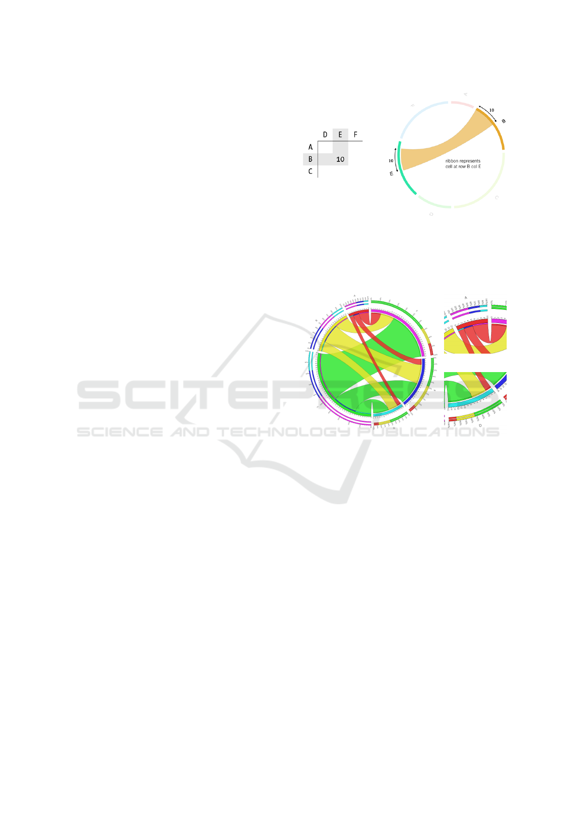
tions as we can see in Figure 1. The main concept in
Circos is that a cell can only contain a non-negative
value, and zero means no connection.
There are smaller angular segments (so-called ribbon
caps) located at the end of the connections (see Fig-
ure 2). These indicate which segment is the other par-
ticipant in the relationship, using the color of the con-
nected segment. We can see in Figure 1 that the rib-
bon caps do not always appear in the diagram. The
contribution tracks can be placed above each segment
to show the relative values of its contained row and
column and the sum of them.
3.2 Our Visualization Method
In this paper, our goal is to improve the previously in-
troduced visualization in Subsection 3.1, by increas-
Figure 1: Circos’ way to visualize connections (Krzywin-
ski, 2008). The ribbon represents the value 10 of the cell at
row B and column E. Rows and columns are represented by
circular arranged segments, and their angular size is based
on the summarized values of the corresponding one. The
thickness of the ribbon is defined by the cell’s value.
(a)
(b)
(c)
Figure 2: Circos’ visualization in detail: (a) shows the con-
tribution tracks outside the circle, the so-called tick marks
and tick labels on the segments, and the track. While (b)
shows that the links start from a row segment, (c) displays
that they end at the column segments. (b) and (c) also pro-
vide a closer look at the ribbon caps.
ing its clarity in common situations, depending on
the intentions of the user. Therefore, we specified
the following criteria to create our visualization tech-
nique based on them. The first one was to construct
a connection between two objects that helps the user
to track and identify the visualized relationship. The
second was about to give the ability to determine
and compare the value of the connections easily and
quickly. Lastly to provide more space for the labels
and to give the possibility of grouping the table’s rows
and columns. We use circular layout in our solution as
well, because of the advantages that it provides; and
similarly to Circos we also use B
´
ezier curves for con-
structing the connections. Circos can effectively dis-
play the relationships in many cases. However, there
are many situations where its visualization makes im-
IVAPP 2018 - International Conference on Information Visualization Theory and Applications
122
portant details harder to perceive. Also, it works well
when the differences between the matrix’s values are
significant because in this case the relationships rep-
resented by thick ribbons are easily and quickly no-
ticeable. However, it is harder to decide which re-
lationships have larger values in the case of minor
differences. Furthermore, the comparison of the val-
ues is not an easy task, especially if the segments are
placed far from each other. The so-called tick marks
and tick labels help this comparison by showing the
row or column values at the top of the segments (see
Figure 2).
Figure 3: The extensions of the connections and the bars
together form a block, and they can be arranged into groups
like block C and block D. The height and the angular length
of a bar have the same meaning, and they are both used
for representing the value of a link. There are concentric
circles behind the bars to make their values easier to read
and compare, even if they are far from each other.
One of our main ideas is to remove Circos’ segments
– which represent the rows and the columns – and
replace them with angular segments. These are cre-
ated as an extension of the connections in both di-
rections, and we call them bars in the rest of the pa-
per. We use them to make the values easy to read and
compare, and this is one of our mentioned criteria in
Section 3.2. The newly defined bars have the same
thickness as the links themselves, but they have differ-
ent height based on the connections’ value. They are
positioned a little bit farther from connections’ ends.
Figure 3 shows that the bars are used together with
the concentric circles to make the values easier to read
and compare (see Figure 4). The blocks represent the
row and the column from the table. It is created by
placing the bars belong to the same row or column
next to each other and marking them with the same
color. Additionally, these blocks can be arranged into
groups to represent rows and columns close to each
other (see Figure 3).
(a) (b)
Figure 4: The left image (a) shows how the bars can easily
indicate the values with concentric circles, while in Circos
(b) it is harder to read and compare the values of the con-
nections.
In Circos, wider ribbons represent larger values in the
table, and they can grab our attention immediately,
which is very useful in some cases. But if the scat-
ter in the table’s values is significant, then thick con-
nections may cover other ones and make them hardly
visible. This situation is perfect for finding out which
row and column have the largest or smallest value, but
it makes the patterns – formed by the connections or
the direction of the ribbons – hard to recognize.
(a) (b)
Figure 5: The left image (a) shows our visualization with
unified connection sizes, while in (b) we can see the result
using Circos. We can recognize that the pattern of the con-
nections is much more visible in the case of (a) than (b).
As a solution to this problem, we decided to make
it possible to create all relationships equally visible
by unifying the thickness of the links and the bars in
the diagram. This way the links represent only the
existence of a relationship between two bars (see Fig-
ure 5(a)), and as a result, thinner connections become
more visible in the diagram, than before. Further-
more, the links with unified length make the pattern
formed by the connections easier to perceive, instead
of drawing our attention to a particular part of the di-
agram, while the bars’ height still represents the rela-
TabularVis – A Circos-inspired Interactive Web Client based Tool for Improving the Clarity of Tabular Data Visualization
123
tionships’ values (see Figure 5). Moreover, the equal
thickness of the bars increases the visibility and the
comparability of them. With this feature, the redun-
dancy mentioned at Figure 3 can be eliminated.
Figure 6: Shows the connections with unified length and our
arrow-style shapes to indicate the directions. The shapes
below block e indicate the connections’ source, and the ones
below block h show its target.
In some situations, it could come in handy to be able
to determine the connections’ direction and to decide
which row or column is the start or the end of a rela-
tionship. Circos indicates the direction of a relation-
ship by distinguishing a ribbon’s starting and ending
position. However, this way of representing the direc-
tions may not clear enough for somebody who does
not have any preconception about the visualization
method to find out the direction. We intended to offer
a different and more informative way to display the
connections’ direction. Therefore we added a shape
between the block and the link in a way that Figure 6
shows us to indicate the link’s direction and the other
block of the link. This solution works best when the
connections have equal width since in this case the
mentioned new shape does not deform and keeps the
original arrow-style form without losing its meaning.
This shape is always attached to the bar, and it has
three different forms. Two of them are shown in Fig-
ure 6, and the third one, which is used for represent-
ing an undirected relationship, has a similar shape like
Circos’ ribbon cap with a different height. Our previ-
ously mentioned improvements are suffered from the
problem of barely perceptible bars when the value of
the represented relationship is too small. Because in
this case, the height of the bar could be so small that
it appears only as a circular arc. The proposed arrow-
like shapes can increase the visibility of the bars in
this case as well.
Our application provides these modifications as
optional features since they are suitable for different
situation, so the users can decide which one is the
most appropriate for their purpose.
4 SORTING THE CONNECTIONS
One of the most important aspects of a visualization
is that it should be easily understood. In our case, the
position of the blocks and groups controls where the
connections are placed, so any change in their order
affects on the number of the intersections in the di-
agram. Because the intersections of the connections
make the diagram less transparent and make the links
harder to follow, the blocks’ and groups’ order has a
huge influence on the clarity of the diagram. There-
fore, it may be important to find an easy and fast way
for modifying their order. In the rest of the paper,
we reference the process of changing the blocks’ and
groups’ order as sorting the connections. Figure 7
shows an example where sorting can help to avoid the
clutter in the diagram. However, Circos do not pro-
vide an automatic solution to perform a sorting of the
connections, which means that the user has to do it
manually. This sorting problem is known as the cir-
cular crossing minimization problem in the field of
graph drawing. it is an NP-hard problem, and re-
searchers often use heuristic ways to deal with it (e.g.
(Baur and Brandes, 2005; Gansner and Koren, 2007)).
Because of the problem’s complexity, our goal is to
automatically find one of the sequences of the blocks
and the groups, which can remove a large number of
intersections from the diagram by using a heuristic
approach as well.
(a) (b)
Figure 7: Example of how the sorting of the connections
makes the diagram more transparent. The left image (a)
shows the diagram without sorting, and the right image (b)
shows the result that we get after applying it.
IVAPP 2018 - International Conference on Information Visualization Theory and Applications
124
4.1 Used Algorithms
To get the desired order of the blocks and the groups,
we tried and used two local search algorithms (hill
climbing and max-conflicts) and three optimization
methods (cross-entropy, simulated annealing, and
bees algorithm), which are all discussed in more detail
in (Brownlee, 2011) and (Russell and Norvig, 2010).
These algorithms try to search the best possible po-
sition of the groups and the blocks to minimize the
number of the intersections in the diagram. However,
as we mentioned earlier, this is an NP-hard problem,
and these methods only can give an approximation
of the best “theoretical” solution. But in most cases,
their results are good enough to remarkably increase
the clarity of the visualization (see Figure 7).
However, not all parts of the diagram are con-
trolled by the search, because the position of the
bars is determined by the order of the blocks and
the groups. This is done by creating a temporary list
from the result of the search, starting with the block
which contains the bar we want to set, then adding the
blocks followed by it from the result. By reversing
this newly created order, we can set the bars’ position
in the block.
The used algorithms produce a result within sec-
onds or in the case of tables (20 × 20) approximately
in ≈ 17 seconds. More detailed information about the
run time of the algorithms can be found in Table 1. In
the next subsections, we briefly introduce the methods
and their time complexity.
Table 1: The running times in seconds for all algorithms
and table sizes.
5 × 5 10 × 0 15 ×15 20 ×20
Hill climbing 0 s 6 s 106 s 724 s
Min-conflicts 0 s 1 s 5 s 19 s
Cross-entropy 0 s 1 s 5 s 18 s
Cross-entropy
and
Min-conflicts
0 s 11 s 111 s 475 s
Simulated
annealing
0 s 1 s 4 s 14 s
Bees algorithm 0 s 4 s 37 s 154 s
4.2 Search Space
Before we could start to discuss the used algorithms,
we have to define a search space for the methods. It
consists of states that store all possible combinations
of the positions of the groups and the blocks. More-
over, it contains the actions of how the search meth-
ods can modify the states. The sorting methods are
operating in this search space to find better order for
the groups and blocks. This is a simple definition of
the problem, and it contains only the necessary infor-
mation for the search, the position of the blocks and
the groups and the relationships between the blocks.
This information is enough for us to find a better or-
der, which generates fewer intersections than the ini-
tial state. In the diagram, the position of the groups
and the blocks determines the location of the connec-
tions, but during the sorting, instead of using the exact
location of them, we just deal with their order. After
the search, we can easily get back their position from
this. Also, to be able to get information about the con-
nected blocks, we store the position of a connection’s
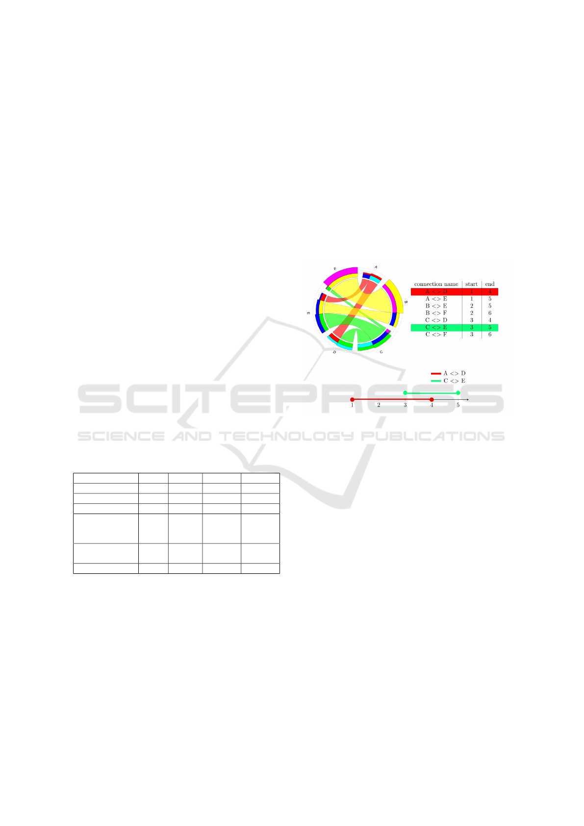
start and end segments. Figure 8 shows information
about the groups and blocks, which is stored in a state.
Figure 8: In the picture, we can see the information, which
is stored in a state. At the bottom, it also displays that by
testing the overlap of the ranges – created from the connec-
tions – we can determine whether they are intersecting or
not.
The state has to know whether the given action can
apply to it or not and if yes, the result also has to be
known. We defined our actions to move the groups
and the blocks to a new position in the order, and
since we do not want to prioritize any of the actions,
we have the same cost for all of them. Beside this, it
is important to make a difference between two states,
so they store the number of intersections to describe
the goodness of their status and give the basis for
the comparison of them. This number can be calcu-
lated by using the analogy of testing for overlapping
ranges, which were created from the stored positions
of the connection as Figure 8 shows. If two ranges
overlap, then the two connections intersect each other.
Otherwise, there is no intersection between them. To
decide whether two ranges overlap each other or not,
we have to define their midpoint. We have to use a
distance function as well, and we used the following:
f (a, b) =
2π −
|
a − b
|
,
|
a − b
|
> π
|
a − b
|
π, otherwise
TabularVis – A Circos-inspired Interactive Web Client based Tool for Improving the Clarity of Tabular Data Visualization
125

Also, we have to define a function, which normalize
the given value to the range [0, 2π]
l(a) = a −
j
a
2π
k
· 2π
The function g(a,b), that finds the midpoint of two
given points, is given in the following form:
g(a, b) =
l
a+b
2
+ π
,
|
a − b
|
> π
l
a+b
2
, otherwise
It is also important to know when a point is inside in
the given range and we can find out this by using the
h(a, b, c) function.
h(a, b, c) = f (g(a, b), c) −
f (a, b)
2
.
The overlap of two ranges is tested by using the
sgn(h(a, b, c)) function for both ranges and all of their
points.
k(a, b, c, d) = sgn (h(a, b, c) · h (a, b, d)) +
sgn(h (c, d, a) · h (c, d,b))
We denote the connections as c
1
, . . . , c
n
where n is the
number of the links in the diagram. Our connections
are defined with their start and end positions, which
are denoted with two functions, s(c
i
) and e(c
i
) respec-
tively i ∈ [1, n]. The existence of an intersection is cal-
culated from the overlap function (k(a, b, c, d)) in the
following way:
q(i, j) = 1+sgn
−1 −
k(s(c
i
), e(c
i
), s(c
j
), e(c
j
)))
2
.
With testing all connections with each other we can
calculate the number of the intersections in the dia-
gram in the following way:
n
∑
i=1
n
∑
j=1
j6=i
q(i, j).
The result of the sum is 1 if there is an intersection
between the two given edges (e
i
, e
j
) and 0 otherwise.
Therefore this function was used as an optimization
criterion to minimize the intersections in the diagram.
4.3 Hill Climbing
Our first choice was the well-known hill climbing
method because it visits all the neighbors of a state
during the search, and thus it is more likely to get bet-
ter results. Sometimes the search could trap in a lo-
cal minimum, so to avoid this, we modified it to ran-
domly choose another state if there is no better one
around it. The algorithm has two parameters. The
first one controls how many times it can jump to a
random state (the value used by us 10), and the sec-
ond one specifies how many iterations it can do (we
used 100). This search algorithm does not use any
knowledge or heuristic about the problem, it is just a
brute force method to find a better state and therefore
its running time is long.
4.4 Min-conflicts
This method is based on the idea, that the number of
intersections can be significantly reduced by replac-
ing the block, that causes the most intersections in
the diagram. The algorithm searches for this block
in every iteration, and then it tries to find a better po-
sition for the block. This method has only one pa-
rameter, which specifies the number of the iteration
that it can do before it has to stop (we used 10). The
min-conflicts algorithm is faster than the hill climbing
because it visits less state during the search.
4.5 Cross-entropy
This algorithm uses the statistics of the blocks’ po-
sition, which is updated from a specified number of
generated states in every iteration. This statistical data
is stored in a matrix, which contains the percentage of
the blocks’ occurrences for every position. The ma-
trix’s values will converge to the best position of the
blocks which means that eventually, we will find a
good solution. This algorithm has multiple parame-
ters in order to fill and maintain the matrix, but the
two most important are the number of the states gen-
erated by the algorithm in every iteration (which was
10 in our implementation) and the number of the used
ones as elite states (the value used by us 2) to update
the matrix.
4.6 Cross-entropy and Min-conflicts
We merged the cross-entropy and min-conflicts
method to get better result. We implemented the min-
conflicts methods’ idea in the cross-entropy to in-
crease the “goodness” of the elites. This means that in
every iteration a min-conflicts search is performed on
each newly generated state to get a state with fewer
intersections.
4.7 Simulated Annealing
This global optimization algorithm is based on a prob-
abilistic technique. It mimics the physical process of
heating a material first and then slowly cooling it to
improve its conditions. In our case, this means, that
the method can accept worse orders of blocks and
IVAPP 2018 - International Conference on Information Visualization Theory and Applications
126
groups at the beginning, but as the temperature drops
with each iteration, it accepts only the better orders
with fewer intersections. The algorithm has three pa-
rameters, the acceptance ratio (we used 0.8), that we
want to reach during the preheat process, the number
of iterations per temperature (which was 10 in our ap-
plication), and a maximum iteration number (we used
100 in our implementation).
4.8 Bees Algorithm
The last algorithm is also a global optimization
method, and it tries to find the best state by simulat-
ing the movements of the bees searching for pollen.
This means that in every iteration the method gener-
ates a specified number of random state, then it se-
lects the best of them to perform further search on
each of them. In our case, this means that we run the
min-conflicts method on all of the best states. The al-
gorithm’s three important parameters are the number
of the generated states, the number of the best states,
and the number of min-conflicts runs per best state
(we used the following values respectively: 20,2,10).
4.9 Algorithms Time Complexity
To present the time complexity of the proposed algo-
rithms, we introduce the following notations.
• b : the number of the blocks in the diagram
• o : the number of the groups in the diagram
• m : the maximum number of iterations of the al-
gorithm
• n : the number of the newly generated states
• w : the time complexity of quicksort
• u : the time complexity of updating all elements
of a matrix with the size of (b + o) × (b + o)
• p : the maximum number of iterations to find the
best starting temperature for simulated annealing
• t : the number of iterations on each temperature
• r : the maximum number of iterations to find the
best reheat temperature for simulated annealing
• z : the number of random searches per iteration to
find new states in the bees algorithm
• j : the number of the best states through the whole
search
• v : the number of min-conflicts runs per best state
in the bees algorithm
The time complexity of the used algorithms can be
seen in Table 2 to make the comparison between them
easier.
Table 2: The time complexity of the used algorithms.
Algorithms Time complexity
Hill climbing O
m ·
b
2
− b
·
o
2
− o
Min-conflicts O
m · (b − 1) ·
o
2
− o
Cross-entropy O
m · (n + w + u)
Cross-entropy
and
Min-conflicts
O
m · ((n · (b − 1)) + u)
Simulated
annealing
O
p + (m ·t) + r
Bees algorithm O
m · (z + ( j · v))
4.10 The Result of the Algorithms
These methods were tested on randomly filled tables
with four different sizes (5 × 5, 10 × 10, 15 × 15, and
20 × 20), and 100 tables were generated for each size
to run the sorting on them. The overall result of the
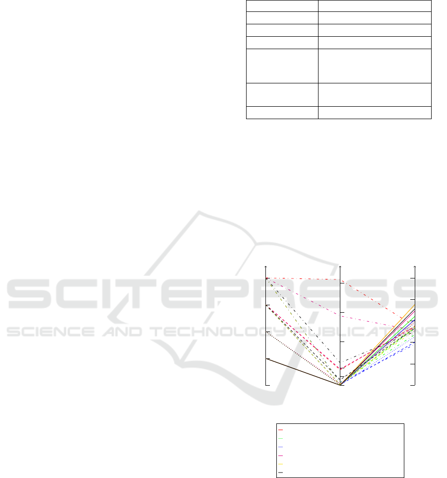
tests are shown in Figure 9, and it shows us that the
algorithms effectively reduce the number of intersec-
tions in the diagram, and the average reduction of in-
tersections was ≈ 55%.
0
5
10
15
20
0
60
120
300
500
700
0
20
40
60
80
100
Hill climbing
Min-conflicts
Cross entropy
Cross entropy and min-conflicts
Simulated annealing
Bees algorithm
The number
of rows and
columns
Time(s) Reduced
intersections(%)
Figure 9: Parallel coordinates visualization of the algo-
rithms’ performance tested on different table sizes.
However, the comparison of the sorting algo-
rithms’ running time shows large differences when
the number of the rows and columns increases in the
table. The fastest ones (min-conflict, cross-entropy,
and simulated annealing) need around 17 seconds in
average to give results, while the rest of them require
minutes to do the same for a table with the size of
20 × 20.
TabularVis – A Circos-inspired Interactive Web Client based Tool for Improving the Clarity of Tabular Data Visualization
127
35
40
45 50 55 60
0
50
100
150
Reduced intersections(%)
Time(s)
Hill climbing
Min-conflicts
Cross-entropy
Cross-Entropy and min-conflicts
Simulated annealing
Bees algorithm
Figure 10: Comparison of the search algorithms’ execution
time and the resulting reduced intersections on 100 tables
with 15 rows and columns.
When the results of the tests are grouped by sizes,
the differences between the tested methods become
clearer and more noticeable (see Figure 10). The
cross-entropy method’s performance is really poor
compared to the others, and its running time is also
not the best. However, its modified version has a bet-
ter performance, but it requires way too much time to
give a result. The hill climbing has the best perfor-
mance, but the user has to wait too long for the algo-
rithm to finish the sorting. The min-conflicts and the
bees algorithms have a good performance, but there
is a faster method with better performance, and this is
the simulated annealing.
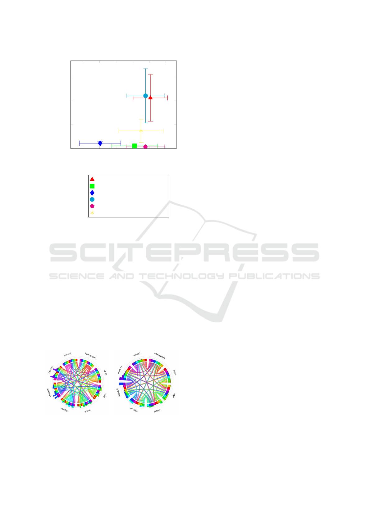
(a) (b)
Figure 11: These diagrams are created based on the heat
maps from the work of Cauda et al. (Cauda et al., 2012).
The left one shows the diagram (a) without sorting, and the
right one (b) is created by applying the sorting feature.
Based on these results, it seems that the best pos-
sible choices for sorting are the hill climbing, the
simulated annealing, the min-conflicts, and the bees
algorithm. There are not big differences between
the selected methods’ performance (≈ 5%), so when
we choose an algorithm for our sorting process, we
need to consider two important things, which are
the following. How fast is the selected method and
how much of the differences between the algorithms
are visible in the current diagram. In the case of
small table sizes, for example, tables with 5 rows and
columns, the differences between the algorithms’ re-
sults can be easily noticeable as Figure 12 shows us.
But on the other hand, this small difference is almost
negligible when the table’s size is 20 × 20. Beside
this, in Figure 12 we can also see in both cases, that
even a bit worse result is way better than the original
diagram without applying any sorting on it.
The selected algorithms have multiple parameters,
and we focused on keeping the balance between the
performance and the running time while we searched
the best settings for them. All of the images in this pa-
per are generated by using the previously mentioned
parameters in the description of each method. Fur-
thermore, we also used them in our application as de-
fault parameter values for the sorting algorithms.
5 APPLICATION
We have implemented a web application to present
the proposed visualization method and the sorting of
the connections. The software was written in the
Dart programming language, and it uses WebGL for
displaying the diagrams. These choices gave us the
opportunity to make a fully interactive application,
which lets the user modify (the data and the posi-
tion of the segments and connections) and customize
(change the visual appearance, like the color or the
shape of the segments and the connections) the di-
agram. However, the sorting feature is not interac-
tive, because the search methods need time to reduce
the number of intersections. The position of the seg-
ments can be changed in real time, and the customiza-
tion of its appearance is also possible. Our software
supports to change the connections’ shape by modi-
fying the parameters of the B
´
ezier curves. It offers
different predefined coloring scheme for the blocks
and the connections. The application can work with
Circos’ data files and Excel spreadsheets as well, in
which the values are not limited to integers. Fur-
thermore, our software has its own editor, with which
the user can enter numbers in the table. These men-
tioned features allow easy data entry. The result of
IVAPP 2018 - International Conference on Information Visualization Theory and Applications
128
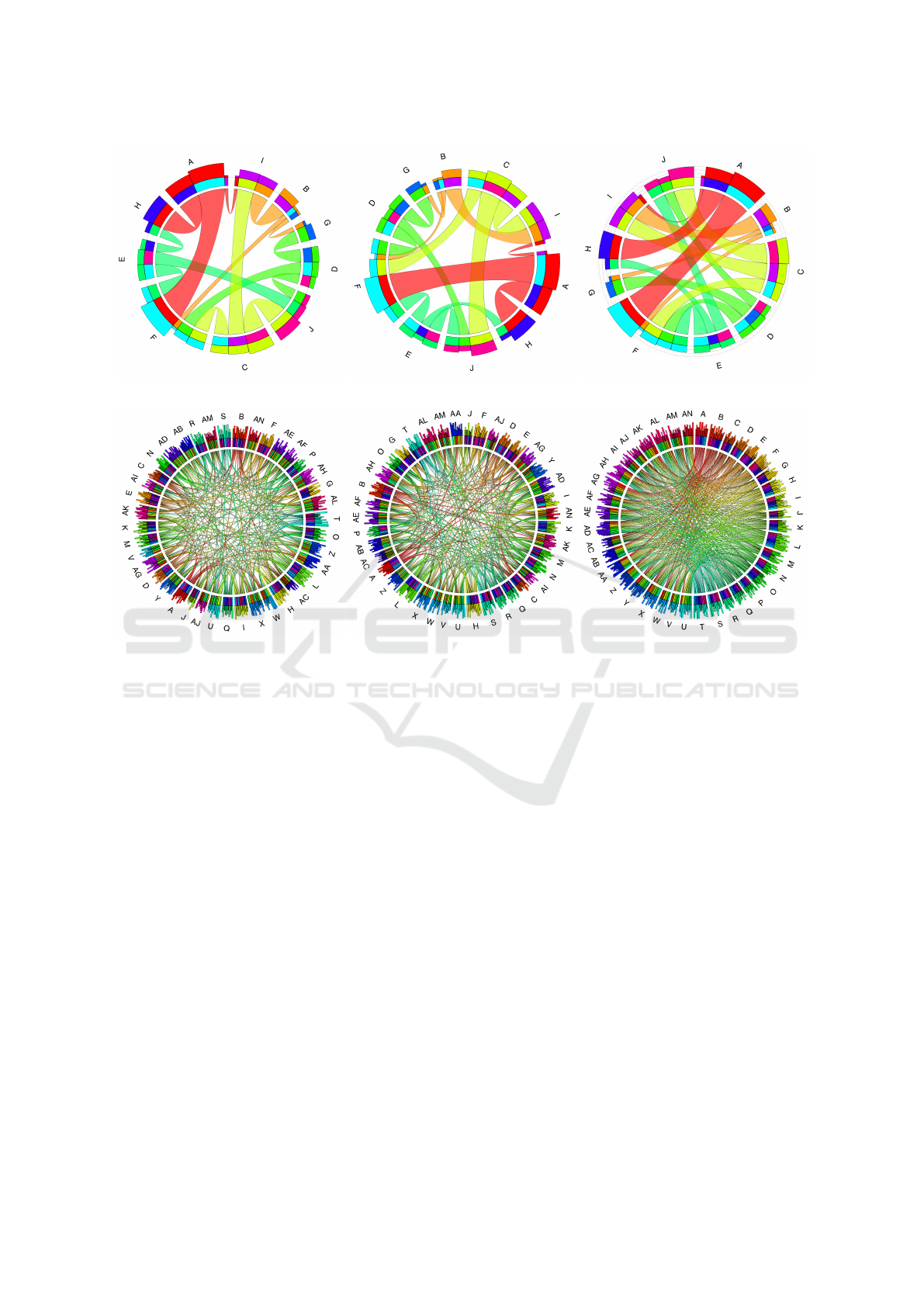
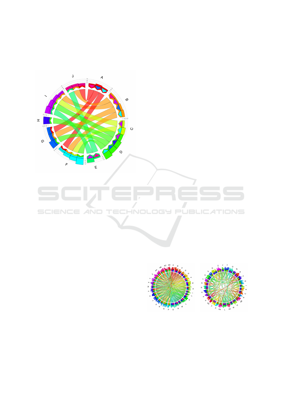
(a) (b) (c)
(d) (e) (f)
Figure 12: Comparison of search algorithms based on two different table sizes. A 5 × 5 table was used for the upper set of
images ((a), (b), (c)) and one with 20 rows and columns was used for creating the lower diagrams ((d), (e), (f)). From the
images above, (a) and (d) (sorted with simulated annealing) have the least number of intersections, (b) and (e) (sorted with
bees algorithm) contain ≈ 5% more intersections, and the last two, (c) and (f) have not been sorted.
the sorting can be downloaded as a PNG file, and
it is also possible to download the input data in the
format, which is used by Circos. The application
is available at https://arato.inf.unideb.hu/
kunkli.roland/tabularvis/index.html (at the
current state of the development, our application
works properly only with the latest stable ver-
sion of Google’s Chrome browser), and the source
code is shared on GitHub (https://github.com/
pappgyorgy/TabularVis).
6 CONCLUSION
We introduced some improvements to an existing tab-
ular visualization technique, with which we can in-
crease the clarity of the visualization in various cases.
Replacing the segments with bars makes the values
easy to read and compare, if the scatter in the values of
the table is insignificant. The conception of concen-
tric circles also serves this purpose. We used unified
thickness for the connections to provide the ability to
see the pattern more clearly, which are formed by the
connections. This feature can provide more space for
labeling in cases, when the differences between the ta-
bles’ values are large. We also introduced a new way
for representing the direction of the links with arrow-
like shapes. Moreover, an efficient solution was pro-
vided to the problem of reducing the number of inter-
sections between the links in the diagram, by modify-
ing the order of the elements around the circle, based
on different local search algorithms and global opti-
mization methods. We also implemented our visual-
ization and sorting method in a client-side web appli-
cation which is available for public usage.
The proposed techniques have some limitations
which give opportunities for further improvement.
First of all, our method can only visualize tables filled
with non-negative numbers, and it gives the best re-
sult in the case when there are elements, which are
not connected with each other. This means that some
TabularVis – A Circos-inspired Interactive Web Client based Tool for Improving the Clarity of Tabular Data Visualization
129

of the table’s cells contain zeros. Furthermore, dense
tables with a large number of rows and columns can
cause problems for our visualization method. Be-
cause in cases when the size of the tables is larger
than 20×20 and it contains only a few zeros, then the
middle part of the diagram becomes dense, and as a
result, the connections will be hard to follow. Also, in
this case, the sorting method is not effective because
it may require minutes to complete the computations.
Based on these limitations, a possible future im-
provement can be to ensure that the visualization
method works with tables filled with rational num-
bers. Because changing the position of a B
´
ezier curve
can cause intersections between the connections also
in the case of when its end positions do not justify
that, a modification of the sorting method to detect
this kind of intersections can be a part of future work.
The maximization of the used area inside the circle by
modifying the parameters of the used B
´
ezier curves
individually is another potential way of improving our
work. Besides these, we are planning to give de-
tailed information about the connections or the seg-
ments (e.g., statistical information) by hovering the
mouse over them. Because of the mentioned reason
at the end of Section 2, we did not use edge bundling
to avoid clutter in the diagram. However, it can be
worth the effort to combine this technique with our
proposed modification.
ACKNOWLEDGEMENTS
Supported by the
´
UNKP–17–4 New National
Excellence Program Of The Ministry Of Human Ca-
pacities.
REFERENCES
An, J., Lai, J., Sajjanhar, A., Batra, J., Wang, C., and Nel-
son, C. C. (2015). J-circos: an interactive circos plot-
ter. Bioinformatics, 31(9):1463–1465.
Andrews, K. and Wright, B. (2014). FluidDiagrams: Web-
Based Information Visualisation using JavaScript and
WebGL. In Elmqvist, N., Hlawitschka, M., and
Kennedy, J., editors, EuroVis - Short Papers. The Eu-
rographics Association.
Baur, M. and Brandes, U. (2005). Crossing Reduction in
Circular Layouts, pages 332–343. Springer Berlin
Heidelberg, Berlin, Heidelberg.
Bayer, T. (2011). A thousand fibers connect us”
– wikiviz 2011 winner visualizes wikipedia’s
global reach. Retrieved May 14, 2017, from
https://blog.wikimedia.org/2011/10/06/a-
thousand-fibers-connect-us-wikiviz-
winner-visualize-wikipedias-global-reach/.
Blasco-Sopl
´
on, L., Grau-Valldosera, J., and Minguill
´
on, J.
(2015). Visualization of enrollment data using chord
diagrams. In Proceedings of the 10th International
Conference on Computer Graphics Theory and Ap-
plications, GRAPP 2015, pages 511–516, Portugal.
SCITEPRESS - Science and Technology Publications,
Lda.
Bornel
¨
ov, S., Marillet, S., and Komorowski, J. (2014). Ciru-
vis: a web-based tool for rule networks and interaction
detection using rule-based classifiers. BMC Bioinfor-
matics, 15(1):139.
Bostock, M., Ogievetsky, V., and Heer, J. (2011). D3 data-
driven documents. IEEE Transactions on Visualiza-
tion and Computer Graphics, 17(12):2301–2309.
Brownlee, J. (2011). Clever Algorithms: Nature-Inspired
Programming Recipes. Lulu.com, 1st edition.
Burkart-Waco, D., Josefsson, C., Dilkes, B., Kozloff, N.,
Torjek, O., Meyer, R., Altmann, T., and Comai, L.
(2012). Hybrid incompatibility in arabidopsis is de-
termined by a multiple-locus genetic network. Plant
Physiology, 158(2):801–812.
Cauda, F., Torta, D. M.-E., Sacco, K., Geda, E., D’Agata,
F., Costa, T., Duca, S., Geminiani, G., and Amanzio,
M. (2012). Shared “core” areas between the pain and
other task-related networks. PLOS ONE, 7(8):1–10.
Chuah, M. C. and Eick, S. G. (1998). Information rich
glyphs for software management data. IEEE Com-
puter Graphics and Applications, 18(4):24–29.
creative coding community, C. E. (2009). Chrome Ex-
periments - WebGL Experiments. Retrieved June
5, 2017, from https://www.chromeexperiments.
com/webgl.
Cui, Y., Chen, X., Luo, H., Fan, Z., Luo, J., He, S., Yue,
H., Zhang, P., and Chen, R. (2016). Biocircos.js:
an interactive circos javascript library for biological
data visualization on web applications. Bioinformat-
ics, 32(11):1740–1742.
Dang, Q., Lin, X., and Konar, M. (2015). Agricultural vir-
tual water flows within the united states. Water Re-
sources Research, 51(2):973–986.
Fujiwara, Y. (2015). Visualizing open data of input-output
tables in kobe city. In SIGGRAPH Asia 2015 Visu-
alization in High Performance Computing, SA ’15,
pages 18:1–18:1, New York, NY, USA. ACM.
Gansner, E. R. and Koren, Y. (2007). Improved Circular
Layouts, pages 386–398. Springer Berlin Heidelberg,
Berlin, Heidelberg.
Gu, Z., Gu, L., Eils, R., Schlesner, M., and Brors, B. (2014).
circlize implements and enhances circular visualiza-
tion in r. Bioinformatics, 30(19):2811–2812.
Hu, Y., Yan, C., Hsu, C.-H., Chen, Q.-R., Niu, K., Komat-
soulis, G. A., and Meerzaman, D. (2014). Omiccircos:
A simple-to-use r package for the circular visualiza-
tion of multidimensional omics data. Cancer Infor-
matics, 13:13–20.
Irimia, A. and Horn, J. D. V. (2013). The structural, con-
nectomic and network covariance of the human brain.
NeuroImage, 66(Supplement C):489 – 499.
IVAPP 2018 - International Conference on Information Visualization Theory and Applications
130

Irimia, A. and Van Horn, J. (2014). Systematic network
lesioning reveals the core white matter scaffold of the
human brain. Frontiers in Human Neuroscience, 8:51.
Katapadi, V. K., Nambiar, M., and Raghavan, S. C. (2012).
Potential g-quadruplex formation at breakpoint re-
gions of chromosomal translocations in cancer may
explain their fragility. Genomics, 100(2):72 – 80.
Krzywinski, M. (2008). Articles // CIRCOS Circu-
lar Genome Data Visualization. ’Visualizing Ta-
bles’ section, first image, Retrieved February 3,
2017, from http://circos.ca/presentations/
articles/vis_tables1/.
Krzywinski, M., Schein, J., Birol,
˙
I., Connors, J., Gas-
coyne, R., Horsman, D., Jones, S. J., and Marra, M. A.
(2009). Circos: An information aesthetic for compar-
ative genomics. Genome Research, 19(9):1639–1645.
Lhuillier, A., Hurter, C., and Telea, A. (2017). State of the
art in edge and trail bundling techniques. Comput.
Graph. Forum, 36(3):619–645.
Li, Z. (2012). Infoviz: information visualization library. Re-
trieved May 13, 2017, from http://infoviz.org/.
Lin, X., Dang, Q., and Konar, M. (2014). A network anal-
ysis of food flows within the united states of america.
Environmental science & technology, 48(10):5439–
5447.
Meyer, M., Munzner, T., and Pfister, H. (2009). Mizbee: A
multiscale synteny browser. IEEE Transactions on Vi-
sualization and Computer Graphics, 15(6):897–904.
Mwalongo, F., Krone, M., Becher, M., Reina, G., and Ertl,
T. (2015). Remote visualization of dynamic molecu-
lar data using webgl. In Proceedings of the 20th Inter-
national Conference on 3D Web Technology, Web3D
’15, pages 115–122, New York, NY, USA. ACM.
Nicholas, M., Archambault, D., and Laramee, R. S.
(2014). Interactive Visualisation of Automotive War-
ranty Data Using Novel Extensions of Chord Di-
agrams. In Elmqvist, N., Hlawitschka, M., and
Kennedy, J., editors, EuroVis - Short Papers. The Eu-
rographics Association.
Pan, K.-X., Zhu, H.-X., Chang, Z., Wu, K.-H., Shan, Y.-L.,
and Liu, Z.-X. (2013). Estimation of coal-related co2
emissions: The case of china. Energy & Environment,
24(7-8):1309–1321.
Russell, S. and Norvig, P. (2010). Artificial Intelligence:
A Modern Approach. Prentice Hall Series in Artifi.
Prentice Hall.
Schmutz, J., McClean, P. E., Mamidi, S., Wu, G. A., Can-
non, S. B., Grimwood, J., Jenkins, J., Shu, S., Song,
Q., Chavarro, C., et al. (2014). A reference genome
for common bean and genome-wide analysis of dual
domestications. Nature genetics, 46(7):707–713.
Tine, M., Kuhl, H., Gagnaire, P.-A., Louro, B., Desmarais,
E., Martins, R. S., Hecht, J., Knaust, F., Belkhir, K.,
Klages, S., et al. (2014). European sea bass genome
and its variation provide insights into adaptation to
euryhalinity and speciation. Nature communications,
5:5770.
Yin, T., Cook, D., and Lawrence, M. (2012). ggbio: an
r package for extending the grammar of graphics for
genomic data. Genome Biology, 13(8):R77.
Zhang, H., Meltzer, P., and Davis, S. (2013). Rcircos: an r
package for circos 2d track plots. BMC Bioinformat-
ics, 14(1):244.
TabularVis – A Circos-inspired Interactive Web Client based Tool for Improving the Clarity of Tabular Data Visualization
131
