
Parallel Bubbles
Evaluation of Three Techniques for Representing Mixed Categorical and
Continuous Data in Parallel Coordinates
Rapha
¨
el Tuor
1
, Florian Ev
´
equoz
1,2
and Denis Lalanne
1
1
Human-IST Institute, University of Fribourg, 1700 Fribourg, Switzerland
2
Institute of Information Systems, University of Applied Sciences Western Switzerland,
HES-SO Valais-Wallis, 3960 Sierre, Switzerland
Keywords:
Visualization, Parallel Coordinates, Categorical Data, User Study.
Abstract:
Parallel Coordinates are a widely used visualization method for multivariate data analysis tasks. In this paper
we discuss the techniques that aim to enhance the representation of categorical data in Parallel Coordinates.
We propose Parallel Bubbles, a method that improves the graphical perception of categorical dimensions in
Parallel Coordinates by adding a visual encoding of frequency. Our main contribution consists in a user study
that compares the performance of three variants of Parallel Coordinates, with similarity and frequency tasks.
We base our design choices on the literature review, and on the research guidelines provided by Johansson and
Forsell (2016). Parallel Bubbles are a good trade-off between Parallel Coordinates and Parallel Sets in terms
of performance for both types of tasks. Adding a visual encoding of frequency leads to a significant difference
in performance for a frequency-based task consisting in assessing the most represented category. This study is
the first of a series that will aim at testing the three visualization methods in tasks centered on the continuous
axis, and where we assume that the performance of Parallel Sets will be worse.
1 INTRODUCTION
Parallel Coordinates (Inselberg and Dimsdale, 1990;
Wegman, 1990) are a popular visualization method
for representing multivariate data. The parallel axes
represent dimensions, and each multivariate item cor-
responds to a polyline crossing the axes. This vi-
sualization method allows to reveal patterns quickly
(Siirtola et al., 2009) and is thus a good tool for ex-
ploratory analysis tasks. A recurring problem of Par-
allel Coordinates is the visual clutter that occurs with
large numbers of polylines: it hinders data analysts
from identifying clusters and trends, and from extract-
ing relevant information from the data. Moreover,
representing categorical dimensions in Parallel Coor-
dinates is not ideal since it increases the visual con-
fusion: ”either the frequency information is not vis-
ible or a ranking is imposed on the visual mapping
transformation, influencing perception of the data”
(Kosara et al., 2006). This is due to the fact that
categorical dimensions are represented in the same
way as continuous dimensions: the continuous design
model used by Parallel Coordinates does not match
the discrete user model of the data (Kosara et al.,
2006). Another problem arising from the represen-
tation of categorical data is overplotting (Dang et al.,
2010): it occurs when the discrete number of cate-
gorical values is significantly smaller than the size of
the dataset, resulting in many samples sharing a given
categorical value. This leads to ”the increased like-
lihood of multiple lines passing successively through
the same points” (Havre et al., 2006). In the frequent
case that multiple items have identical values along
neighboring axes, their lines overlap exactly, there-
fore leaving visible only the last line segment drawn,
thus hiding the frequency information (Dang et al.,
2010; Kosara et al., 2006). In summary, clutter and
overplotting should be avoided as much as possible
since they hide frequency information and prevent
the detection of patterns. Reducing them is one of
the main challenges in the design of Parallel Coor-
dinates (Heinrich and Weiskopf, 2013). Researchers
propose several methods to address these challenges,
but very few present results form user-centered eval-
uations (Johansson and Forsell, 2016). There still
lacks an evidence of measurable benefits that would
encourage the use of a variant of Parallel Coordinates
over standard ones. For example, frequency-based ap-
252
Tuor, R., Evéquoz, F. and Lalanne, D.
Parallel Bubbles - Evaluation of Three Techniques for Representing Mixed Categorical and Continuous Data in Parallel Coordinates.
DOI: 10.5220/0006615602520263
In Proceedings of the 13th International Joint Conference on Computer Vision, Imaging and Computer Graphics Theory and Applications (VISIGRAPP 2018) - Volume 3: IVAPP, pages
252-263
ISBN: 978-989-758-289-9
Copyright © 2018 by SCITEPRESS – Science and Technology Publications, Lda. All rights reserved
proaches (Kosara et al., 2006) seem promising, but it
is unclear whether these techniques positively affect
the ability of users to quickly and reliably identify
patterns in the data. Do the users correctly interpret
categorical dimensions? Do these methods allow for
a better performance in typical data analysis tasks?
In this paper, we first give an overview on the cur-
rent state of the art of clutter reduction techniques for
Parallel Coordinates. Next, we present an enhanced
version of Parallel Coordinates, Parallel Bubbles, that
aims to tackle the problem of overplotting instances
when dealing with categorical dimensions. By adding
a visual encoding of frequency, we assume that Par-
allel Bubbles will allow to detect more effectively the
most represented categorical values, and thus should
enhance the user performance in similarity and fre-
quency tasks. In order to measure the gain of per-
formance, we lead a controlled user experiment con-
sisting of three data analysis tasks. We use randomly
generated datasets composed of one continuous di-
mension and one categorical dimension. In the last
section, we describe and discuss the outcomes of this
user experiment.
2 STATE OF THE ART
Parallel Coordinates (Inselberg and Dimsdale, 1990;
Wegman, 1990) were initially designed to represent
continuous dimensions. Kosara et al. (2006) state that
when dealing with multivariate datasets, the diver-
gence between the user’s mental model and the visual
representation of the data can be eliminated by the use
of frequency-based techniques. These techniques rep-
resent categories by visual entities that are scaled pro-
portionally to their corresponding frequency (Kosara
et al., 2006). In this chapter, we give an overview
on the existing overplotting reduction methods, de-
signed to enhance the visual representation of cate-
gorical data. We group these methods in the four cat-
egories proposed by Heinrich and Weiskopf (2013),
namely filtering, aggregation, spatial distortion, and
the use of colors.
2.1 Clutter Reduction Methods
2.1.1 Filtering
Filtering consists in removing signals from the in-
put. Brushing (Shneiderman, 1994) is one example:
specifying values ranges and using logical operators
(Martin and Ward, 1995), allows to render only a por-
tion of the polylines, reducing visual clutter and over-
plotting. However, brushing is of little use with non-
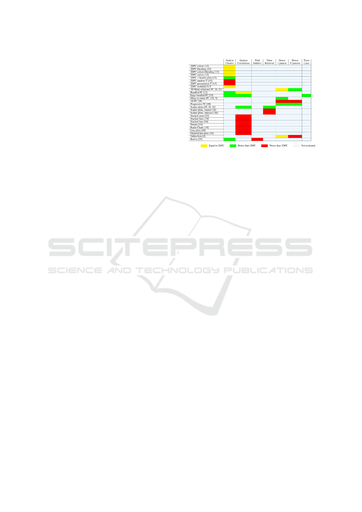
Figure 1: Comparison of evaluations of 26 visualiza-
tion techniques in relation to standard Parallel Coordinates
(2DPC). ”A yellow colour indicates no significant differ-
ence in performance. A green colour means that the tech-
nique outperforms 2DPC for the specific task. A red colour
means that the technique performs worse than 2DPC. A
light blue colour shows that no evaluation has been found
in the literature. O denotes that the technique is based on
animation” (Johansson and Forsell, 2016). Source: Johans-
son and Forsell (2016).
ordered categorical dimensions: selecting a range of
categories is not useful since their order does not have
any meaning. A good way to implement filtering for
non-ordered dimensions is to allow the user to select
a discrete amount of categories instead of a range, by
using checkboxes.
2.1.2 Aggregation
Aggregation techniques are based on the principle of
grouping data, and representing aggregate items in-
stead of individual samples (Heinrich and Weiskopf,
2013). Such aggregates include mean, median or
cluster centroid of a subset of samples. Density func-
tions are another method, and allow to reveal dense ar-
eas and clusters in the data: the mathematical model
of density in parallel coordinates proposed by Hein-
rich and Weiskopf (2009) is an example of this tech-
nique. The Angular Histogram (Geng et al., 2011) is
another example of this approach: a vector-based bin-
ning depicts the distribution of the data. For their part,
geometry-based techniques map the clusters to en-
velopes (Moustafa, 2011) or to bounding boxes (Fua
et al., 1999).
Frequency-based representations show the distri-
bution of data samples in each category, like the par-
allel coordinate dot plot (Dang et al., 2010), which
overcomes the problem of overplotting by adding a
dot plot to each axis. Kosara et al. (Kosara et al.,
2006) developed the Parallel Sets: they represent each
category with a parallelogram scaled according to its
corresponding frequency (Figure 2c) and connecting
Parallel Bubbles - Evaluation of Three Techniques for Representing Mixed Categorical and Continuous Data in Parallel Coordinates
253

the axes. This method is best suited for data contain-
ing exclusively categorical dimensions: it does not
provide a good way to integrate continuous data since
each continuous dimension axis is divided into bins,
”and thus, transformed into a categorical dimension.”
Moreover, outliers are impossible to detect with this
method. The authors note that ”showing continuous
axes as true Parallel Coordinates dimensions would
of course be the most useful display of this data”.
2.1.3 Spatial Distortion
Spatial distortion techniques consist in scaling the dis-
tance between the ticks on an individual axis accord-
ing to a meaningful criterion, or in modifying the dis-
tance between two axes. A few examples of spatial
distortion are the fisheye view and the linear zoom
(Heinrich and Weiskopf, 2013), or the method pro-
posed by Teoh and Ma (2003) defining frequency-
based intervals on categorical axes. Spatial distortion
can help in several ways: it reduces clutter, clarifies
dense areas and facilitates the brushing of individual
lines with a pointing device (Heinrich and Weiskopf,
2013). Rosario et al. (2003) present a way to give a
meaning to the spacing between the levels of a cat-
egorical dimension: similar levels are closer to each
other. Their approach transforms levels into numbers
with techniques similar to Multiple Correspondence
Analysis. By doing so, the spacing among levels con-
veys semantic relationships. Their method consists in
three steps:
1. The Distance step consists in identifying a set of
independent dimensions that allow to calculate the
distance between their nominal levels.
2. The Quantification step uses the distance infor-
mation to assign order and spacing among nomi-
nal levels.
3. The Classing step uses results from the previous
step to determine which levels within a dimension
are similar to each other, grouping them together.
This method can also be used at the dimensions
scale, to assign spacing among the axes given a sim-
ilarity measure. Heinrich and Weiskopf (2013) ad-
vocate precaution regarding the use of this method at
the dimensions scale. They state that ”horizontal dis-
tortion affects angles and slopes of lines, which can
have an impact on the accuracy of judging angles”,
and hence the correlation levels. Like filtering meth-
ods, spatial distortion does not restore the missing fre-
quency information since overplotting is still present.
2.1.4 Colors
Using colors is an efficient way to represent and iden-
tify a small set of categories. However, this approach
does not scale well with large amounts of categories,
since it is difficult for the human visual system to re-
liably distinguish more than twelve colors (Heinrich
and Weiskopf, 2013).
2.2 Research Guidelines
In a recent paper, Johansson and Forsell (2016) per-
formed a survey on 23 existing papers that present
user-centered evaluations of the standard 2D Paral-
lel Coordinates technique and its variations. They
highlight the fact that despite the large number of
publications proposing variations of Parallel Coor-
dinates, only a limited number present results from
user-centered evaluations. Figure 1 gives an overview
on the performance of 26 techniques in relation to
standard Parallel Coordinates (2DPC), for 7 tasks.
We therefore conclude that up to now, many types of
tasks have not been assessed yet (configuration, visual
mining) and some visualization methods are missing
(Trellis Plot, Scatterplot matrix). Moreover, the com-
parison lacks information about the nature of the data
(continuous, categorical, mixed) that was visualized.
They categorize the evaluations as follows :
1. Evaluating axis layouts of Parallel Coordinates.
2. Comparing clutter reduction methods.
3. Showing practical applicability of Parallel Coor-
dinates.
4. Comparing Parallel Coordinates with other data
analysis techniques.
The enhancement of the visualization of mixed
categorical and continuous data falls into the cate-
gories 1 and 2. Evaluating axis layouts of Parallel
Coordinates includes ”techniques for arranging axes
in 2D Parallel Coordinates in order to highlight spe-
cific types of relationships, or for reducing clutter”.
They discuss seven studies that evaluated the axis
layouts of Parallel Coordinates. They note that ”the
2D Parallel Coordinates axis layout is both effective
and efficient for tasks involving comparing relation-
ships between variables”. This layout is qualified as
intuitive ”and novice users learn it without effort”.
They underline the need to investigate and study sys-
tematically the differences between axis layouts with
different tasks and users.
To sum up, there still lacks an evidence of mea-
surable benefits that would encourage the use of a
variation of Parallel Coordinates over standard ones
(Johansson and Forsell, 2016). It is unclear whether
IVAPP 2018 - International Conference on Information Visualization Theory and Applications
254
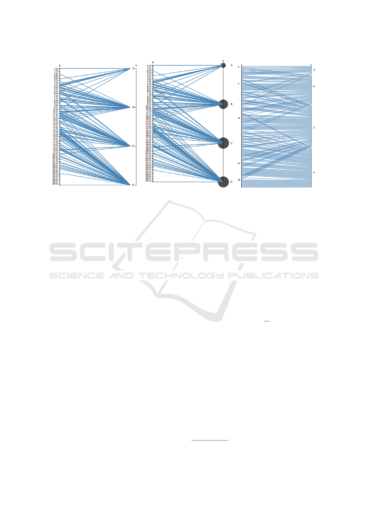
(a) Parallel Coordinates. (b) Parallel Bubbles. (c) Parallel Sets.
Figure 2: The three variants of Parallel Coordinates that we compared. The left axis is continuous, the right axis is categorical.
Here, the dataset 2 (medium correlation) is represented.
frequency-based techniques positively affect the abil-
ity of users to quickly and reliably identify patterns
in the data: do they correctly interpret categorical di-
mensions? Do these methods allow for a better per-
formance in standard data analysis tasks?
Therefore, we focus our research on testing the ef-
fect of adding a frequency encoding for categorical di-
mensions on basic data analysis tasks. The outcomes
of this study should allow to tell if a a frequency-
enhanced version of Parallel Coordinates allows the
user to accomplish configuration tasks significantly
faster than with regular Parallel Coordinates. The
next chapter describes the protocol of our user exper-
iment.
3 THE STUDY: PARALLEL
COORDINATES, PARALLEL
BUBBLES AND PARALLEL
SETS
The goal of our study is to compare the performance
of three variants of Parallel Coordinates in similarity
and frequency tasks, in order to verify if the addition
of a visual encoding of frequency results in a signifi-
cant difference in performance. Our approach, Paral-
lel Bubbles, aims to enhance the visual perception of
categorical dimensions by adding a visual encoding
of frequency.
3.1 Visual Metaphor
The cornerstone of Parallel Bubbles is a ”bubble” (a
circle) of variable radius that represents a categorical
level. It was inspired by the ”bubble plot” invented
more than two centuries ago by Playfair (1801). A
similar feature has already been available in Parabox
1
by Advisor Solutions and is presented in Few (2006).
The area of the bubble is linearly proportional to the
amount of items that belong to the said value: the
radius r
b
of each bubble b is defined by computing
the square root of the number of items n
b
belonging
to one category, and then multiplying this number by
two:
r
b
= 2
√
n
b
(1)
Sets of vertically aligned bubbles are arranged on
each categorical axis. Continuous dimensions are rep-
resented as regular Parallel Coordinates axes, and are
easily distinguishable from the categorical ones. As in
Parallel Coordinates, each data item is represented by
a polyline passing through each of the continuous and
categorical axes. This approach gives an overview of
the distribution of categories inside a dimension, and
restores the frequency information that was lost be-
cause of overplotting: the size of a bubble gives an
information about the amount of lines that intersect at
a given point on the axis.
1
https://www.advizorsolutions.com/articles/parabox
Parallel Bubbles - Evaluation of Three Techniques for Representing Mixed Categorical and Continuous Data in Parallel Coordinates
255

3.2 Advantages
This method offers several advantages: first, it has
a low computational complexity when compared to
density models (Heinrich and Weiskopf, 2009) and
kernel density estimators, making it a suitable solu-
tion even for large datasets. Secondly, bubbles offer a
minimal learning curve: it is a simple add to Parallel
Coordinates, which are widely used nowadays. Third,
Parallel Bubbles are easy to implement: one bubble
has to be added to each categorical value, which is
a trivial task with today’s available data visualization
javascript libraries, like D3.js
2
for example.
3.3 Hypothesis
Our hypothesis is that the three types of visualizations
induce a significant difference in performance, in fre-
quency and similarity tasks. We also formulate the
following sub-hypotheses: Parallel Coordinates (ab-
breviated ”ParaCoord”) offer the best performance for
similarity tasks, because the representation of refer-
ences as lines allow to assess the level of correlation
easily. Next, Parallel Sets (”ParaSet”) offer the best
performance for frequency tasks because of the visual
encoding of frequency they implement. Finally, Par-
allel Bubbles (”ParaBub”) should be a good compro-
mise in terms of performance for both types of tasks,
with a significantly better performance than Parallel
Coordinates in frequency tasks due to the add of a
frequency encoding, and a significantly better perfor-
mance than Parallel Sets in similarity tasks thanks to
the aforementioned advantages of representing links
between dimensions in the form of polylines. We de-
scribe the three tested variants of Parallel Coordinates
as follows (Figure 2):
• ParaCoord – standard Parallel Coordinates (Fig-
ure 2a). This method is sensible to clutter
and overplotting problems, making the frequency
tasks harder to complete.
• ParaBub – Parallel Coordinates, with the addi-
tion of bubbles on axes, a visual encoding of fre-
quency for categorical values (”Y” axis) (Figure
2b). This makes the frequency of categorical val-
ues easier to estimate. The similarity between di-
mensions is still easy to assess too, thanks to the
graphical representation of links between dimen-
sions in the form of polylines.
• ParaSet – a variant of Parallel Coordinates, en-
coding frequencies according to the height of the
categorical segment on the axis (Figure 2c). The
2
D3.js: https://d3js.org/
continuous axis, ”X”, is only showing a few val-
ues on the graduation. The height between two
given values on the continuous axis is propor-
tional to the number of items belonging to the
range. With this visualization method, similarity
tasks should be harder to complete because the
polylines are replaced by colored areas, adding
a layer of complexity (namely the height of each
area) that is not directly relevant to the task. This
visualization method should offer the best results
for frequency tasks.
In order to evaluate the performance of participants
on the three visualizations, we established three data
analysis tasks. We describe them in the next section.
3.4 Tasks
The tasks that we submitted to the participants only
represent a subset of the tasks commonly carried out
by data analysts – these include, among others, clus-
ters and outliers identification, classification, or selec-
tion of single data points. According to Fernstad and
Johansson (2011), ”the overall task of data analysis is
to identify structures and patterns within data. Most
patterns, such as correlation and clusters, can be de-
fined in terms of similarity. Hence, the most relevant
general tasks to focus on are, in our opinion, the iden-
tification of relationships in terms of similarity.” They
also state that ”when it comes to analysis of categor-
ical data the frequency of categories, i.e. the relative
number of items belonging to specific categories or
combinations of categories, is often of major interest
and is, as mentioned previously, the main property of
focus in categorical data visualization.” With this in
mind we defined the two types of tasks as follows:
1. Similarity – identify structures in data. To suc-
ceed, the user needs to be able to estimate the
strength of the correlation (Figure 4a).
2. Frequency – the user has to estimate the amount
of items belonging to a given categorical value.
Being able to identify the single most represented
category is important too (Figures 4b and 4c).
On this basis, we defined the three following data
analysis tasks:
• (T1) Similarity task – Are the X and Y axes cor-
related? Possible answers: Strongly, mildly, not
at all (Figure 4a).
• (T2) Frequency task – What proportion of lines
have the value B for the Y axis? Possible answers:
a range of values from 0% to 100%, by step of
10% (Figure 4b).
IVAPP 2018 - International Conference on Information Visualization Theory and Applications
256
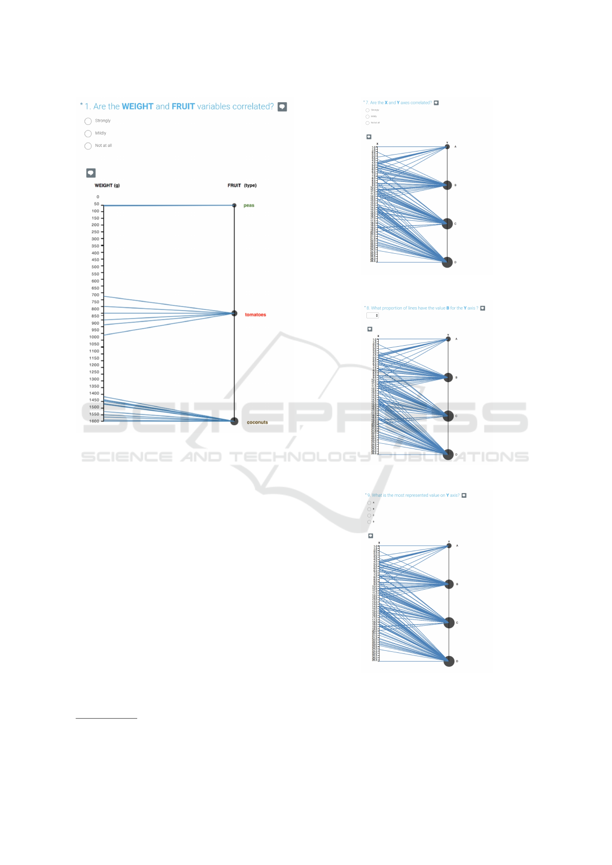
Figure 3: First task asked to participants in the tutorial. This
figure was shown to participants assigned to the Parallel
Bubbles.
• (T3) Frequency task – What is the most repre-
sented value on Y axis? Possible answers: A, B,
C, D (Figure 4c).
We reduced interaction capacities as much as pos-
sible in order to minimize the amount of dependent
variables and to obtain more robust results. Thus, we
did not allow the user to manually reorder the axes, to
change the position of categorical values on the axis
and to delete, add or group dimensions together.
3.5 Study Material
We submitted the tasks in the form of an online sur-
vey
3
and participants were recruited via Prolific
4
, a
crowdsourcing platform dedicated to research sur-
veys. In total, 367 participants filled out the survey.
Each of them was paid 0.70£. A tutorial was pro-
posed in the beginning of the survey. It explained the
assigned visualization method and the two types of
3
SurveyMonkey: https://www.surveymonkey.com
4
Prolific: https://www.prolific.ac/
(a) Task 1: similarity.
(b) Task 2: frequency.
(c) Task 3: frequency.
Figure 4: The three tasks, as asked to the participants using
the Parallel Bubbles, on the dataset 2.
Parallel Bubbles - Evaluation of Three Techniques for Representing Mixed Categorical and Continuous Data in Parallel Coordinates
257

tasks. At the end of it, participants had to complete
three questions about a fictive dataset with the highest
level of correlation (the dataset and task 1 are shown
in Figure 3). These tasks allowed to screen out partic-
ipants who didn’t meet basic criteria for our study:
• (T1) Similarity task – Are the Weight and Fruit
variables correlated? Possible answers: Strongly,
mildly, not at all.
• (T2) Frequency task – How many of the fruits
do you estimate to be tomatoes (in %)? Possible
answers: a range of values from 0% to 100%, by
step of 10%.
• (T3) Frequency task – Which fruit type is
the most represented? Possible answers: Pea,
Tomato, Coconut.
We followed the design recommendations of Kit-
tur et al. (2008) in order to maximize the usefulness
of the data we collected: answers to the questions are
explicitly verifiable, and filling them out accurately
and in good faith requires the same amount of effort
than a random or malicious completion. In the next
part of the questionnaire, we tested the visualization
methods on three datasets presenting different levels
of correlation. Using different datasets should allow
to get more robust results. In order to fully control the
correlation levels, we generated the data ourselves:
we generated three datasets with a Python script,
with a size large enough to generate overplotting
(465 to 480 data items). We used two-dimensional
datasets because the tasks that we defined are com-
parison tasks, i.e. requiring the user to assess two
dimensions at a time; this type of task focuses the
user’s attention on the smallest level of granularity
offered by Parallel Coordinates. As explained above,
multidimensional data exploration is based upon a
subset of tasks of this type. Therefore, we chose
to use one continuous dimension X and one cate-
gorical dimension Y for our datasets. The function
random.multivariate normal(mean,cov,size)
from the numpy library allowed us to generate random
samples from a multivariate normal distribution. For
each dataset we ran this function three times using
overlapping input ranges (e.g. for one dataset: [0, 20],
[10, 30] [20, 40]) in order to make the distribution
more even. The cov argument contained the covari-
ance matrix which allowed to control the variation
of the variable X in regard to the variable Y, by
multiplying the elements C
x,y
and C
y,x
by an index
taking the values 0.0 (no correlation), 0.8 (medium
correlation) and 1.0 (strong correlation) for each
dataset.
3.6 Experimental Design
We designed the study as a ”between-group”. The
independent variables were the type of visualization
(ParaCoord, ParaBub or ParaSet) and the type of data
(no correlation, medium correlation and strong corre-
lation). The presentation order of the three datasets
was counterbalanced using the Latin square proce-
dure (Graziano and Raulin, 2010), giving 6 data or-
der variants for each visualization method, for a total
of 18 questionnaires. Each participant was assigned
one visualization method. To avoid any learning bias,
each of the three datasets was shown only once to
each participant, in the order defined by the Latin
square method. Each participant had to follow a tu-
torial explaining the visualization method assigned to
him, and then had to perform 9 tasks: 3 tasks on each
of the 3 datasets.
3.7 Procedure
In order to grade the visual analysis capacities of par-
ticipants on each visualization method, we placed a
written tutorial in the beginning of the survey, using
a two-dimensional dataset of fruits and vegetables,
along with their respective weights. The categorical
value was the fruit or vegetable type (pea, tomato, co-
conut, strawberry), and the continuous value was the
weight of each data item. At the end of the tutorial,
participants had to perform a set of explicitly verifi-
able qualification tasks. We used the results of these
tasks to exclude negligent participants and keep the
remaining for further analysis. Participants were in-
formed in the beginning of the survey that we would
evaluate the performance of the visualization tech-
niques rather than their individual performance. Once
the tutorial was completed, each participant had to fill
in the main part of the survey. Using the selected visu-
alization method, they had to complete the three tasks
described above, for each dataset.
3.8 Results
This section aims to compare the results of the partic-
ipants who present the best expertise in data analysis
tasks. We selected the participants who completed the
tutorial questions with the highest scores. The aim is
to get the most representative results for a usage by
expert data analysts.
Before computing the results, we preprocessed the
data by deleting the answers of 5 participants who had
completed the first task only (1 for ParaCoord and 4
for ParaSet), 10 participants who timed out, and 1 par-
ticipant who completed the questionnaire too quickly
IVAPP 2018 - International Conference on Information Visualization Theory and Applications
258
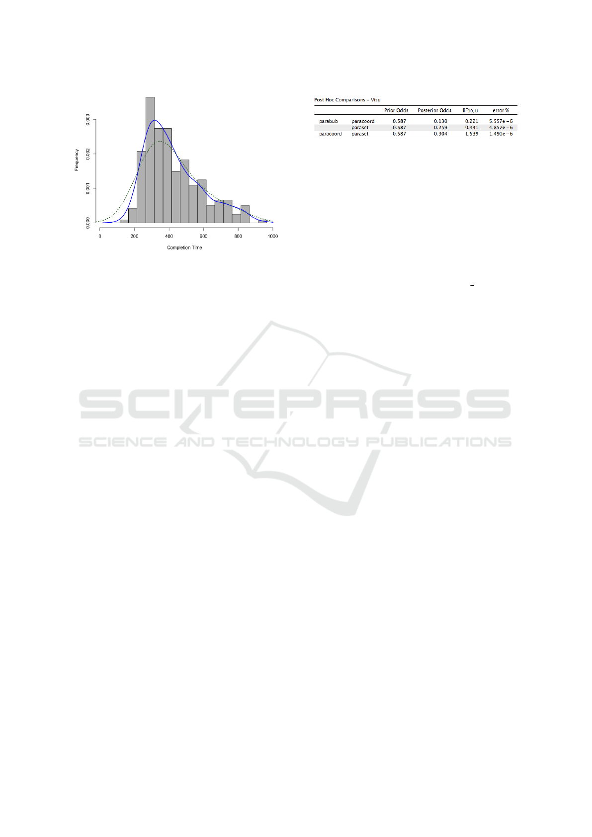
Figure 5: Frequency histogram for the distribution of the
completion time of the full questionnaire.
(6 seconds), leaving a total of 356 participants.
We wanted to determine with which visualization
method the most ”expert” users obtained the best per-
formance. In order to keep only answers made by
users that completely understood the tasks, we re-
moved the answers of the participants who had made
at least one mistake in the questions 1 and 3 of the tu-
torial, and who answered more than 10% away from
the correct percentage in the question 2. The odds
of answering correctly by chance to the 3 questions
of the tutorial were thus 1/3 * 3/11 * 1/3, about 3%.
We then conducted a χ
2
test that revealed no signifi-
cant difference between the three visualization meth-
ods (p < 0.05). This means that the results of the
qualification questions were not mainly influenced by
the visualization method, but rather by the analysis
capabilities of the participants. This qualification fil-
tering left us with the answers of 241 participants’ to
analyze: 78 for Parallel Coordinates, 76 for Parallel
Bubbles and 87 for Parallel Sets.
We did not take the completion time into account
for our analysis, because too many variables can af-
fect the time spent on the questionnaire for an online
questionnaire. Establishing a threshold for the time
spent on tasks ”[...] may not adequately identify non-
conscientious participants, and may inadvertently dis-
qualify many others” (Downs et al., 2010). Figure 5
shows the distribution of completion time for all par-
ticipants. It has a positively skewed unimodal shape,
which is typical to response time distributions (Heath-
cote et al., 1991).
3.8.1 Tasks Performance
For the task T1 (similarity) and T3 (frequency),
whose answers are dichotomous (true or false), we
computed the error rate for each participant. For task
(a) Factor: Visualization method
Figure 6: The Post Hoc tests performed on the results of the
task 1.
T2 (frequency), the answer was given in %, by step
of 10%. It should be noted that the true percentage
value could only be approximated with the proposed
answers – for example, the real proportion of B was
16.77% in the Data 1, and the closest answer the user
could give was 20%. For consistency with other stud-
ies (Heer and Bostock, 2010; Skau and Kosara, 2016),
we computed the log absolute error of accuracy in this
way: log
2
(|judgedvalue −truevalue|+
1
8
). We per-
formed an analysis of variance (ANOVA) (Graziano
and Raulin, 2010) on the results of the three tasks,
followed by a Bayesian ANOVA and Post Hoc tests.
3.9 Task 1
The average error rate of T1 can be seen in Figure
7. The Parallel Sets returned the best error rate, fol-
lowed by the Parallel Bubbles. We performed an
ANOVA which revealed no significant difference be-
tween the three factors ”Visualization method”, with a
p-value of 0.0809. The Parallel Sets are returning the
best performance, which is surprising considering the
fact that they present the largest visual clutter due to
their area representation. We performed a Bayesian
ANOVA followed by Post Hoc tests that confirmed
the results of the ANOVA (Figure 6). For the lev-
els ”Parallel Bubbles” and ”Parallel Coordinates” of
the factor ”Visualization method”, the Bayes Factor
corresponds to substantial evidence for the null hy-
pothesis (H0). For the levels ”Parallel Bubbles” and
”Parallel Sets”, the Bayes Factor corresponds to anec-
dotal evidence for H0. For the levels ”Parallel Coordi-
nates” and ”Parallel Sets” of the factor ”Visualization
method”, the Bayes Factor corresponds to substantial
evidence for the alternative hypothesis (HA). These
results suggest that for a similarity task, there is no
significant difference in error rate between the Par-
allel Bubbles and the two other visualization meth-
ods. There is an anecdotal evidence for an effect of
the factors ”Parallel Coordinates” and ”Parallel Sets”
for HA.
3.10 Task 2
For T2 (frequency), we computed the mean of quar-
tiles 1 and 3 for the log absolute error, and the 95%
Parallel Bubbles - Evaluation of Three Techniques for Representing Mixed Categorical and Continuous Data in Parallel Coordinates
259
ParaCoord ParaBub ParaSet
0.2
0.4
0.6
0.8
NS
NS
NS
0.41
0.37
0.31
Error rate
Figure 7: Average error rate for T1 (similarity) on all
datasets. Error bars show 95% CI. The ANOVA indicates
that the means of the factor ”Visualization method” are not
significantly different.
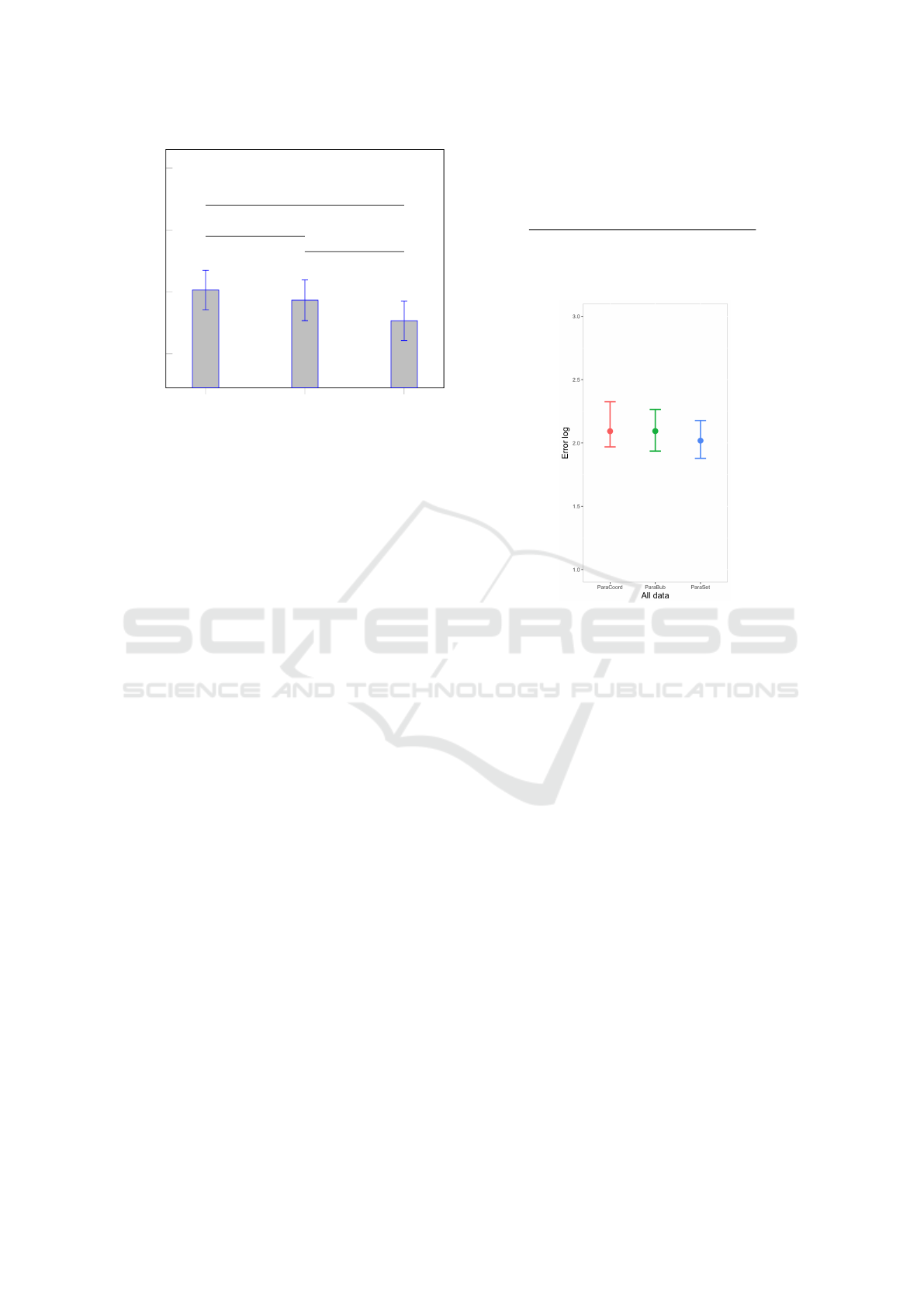
confidence interval (Table 1 and Figure 8). We con-
structed the 95% percentile interval based on 1000
bootstrap iterations. As for the first task, the Parallel
Sets give the minimal error rate. A decomposition by
type of data (1 = no correlation, 2 = medium correla-
tion, 3 = strong correlation) shows that the strongly
correlated data lead to the smallest error rate. We
performed a multiway ANOVA to test the effects of
the multiple factors (”visualization method”, ”data”)
on the mean of the vector ”Score”. It results that
only the mean responses for levels of the factor ”data”
are significantly different with a p-value smaller than
0.05. The multiple comparison shows that two groups
can be made based on the factor ”data” (see Figure
9): the first group is composed of the levels 1 and
2 (strong and medium correlation), and the second
group is composed of the level 3 (strong correlation).
The Bayesian ANOVA, followed up with a Post Hoc
test, confirms these results (Figure 10). For the fac-
tor ”data”, the Bayes Factor corresponds to substan-
tial evidence for H0 for the levels 1 and 2 (inexistent
and medium correlation). Between the levels 1 and
3, and 2 and 3, there is decisive evidence for an ef-
fect of the data type for HA. The dataset 3 (strongly
correlated), with no lines intersecting, leads to a sig-
nificantly lower error rate than the two other datasets.
3.11 Task 3
The average error rate of task T3 (frequency) can
be seen in Figure 11, showing the same ranking in
the visualization types as for T1 and T2. The mul-
tiway ANOVA reveals a significant difference be-
tween the three visualization methods. The Post Hoc
test performed after the Bayesian ANOVA suggests
Table 1: T2: Average of quartiles Q1 and Q3, for the log
absolute error. 95% confidence intervals. Split by visual-
ization type. ANOVA: F(39.23) = 1.880 21e−15, p < 0.01.
Type Log error CI 95%
ParaCoord 2.093 ±0.178
ParaBub 2.094 ±0.165
ParaSet 2.018 ±0.150
Figure 8: T2: Average of quartiles Q1 and Q3, for the log
absolute error, for all datasets. 95% confidence intervals.
a very strong evidence for an effect of the Visual-
ization method for the levels ”Parallel Coordinates”
and ”Parallel Bubbles” for HA, and a decisive evi-
dence for the levels ”Parallel Coordinates” and ”Par-
allel Sets” for HA, and ”Parallel Bubbles” and ”Par-
allel Sets” for HA too.
3.12 Discussion
The analysis of tasks T1 and T2 did not yield any sig-
nificant difference between any of the three visualiza-
tion methods. For T1, we can conclude that Paral-
lel Sets and Parallel Bubbles are suitable for similar-
ity tasks that consist in assessing the level of corre-
lation between a categorical and a continuous dimen-
sion. The same can be said for T2: the three visualiza-
tion methods are equivalent regarding the error rates.
This task was the most complex, since it required to
pick one answer out of the 11 available. For the task
T3, Parallel Sets significantly outperformed the two
other methods, and Parallel Bubbles are significantly
better than Parallel Coordinates. This partially con-
firms one of our sub-hypotheses: adding a frequency
encoding does have a significant influence on perfor-
mance with a frequency task consisting in identifying
the most represented category.
IVAPP 2018 - International Conference on Information Visualization Theory and Applications
260
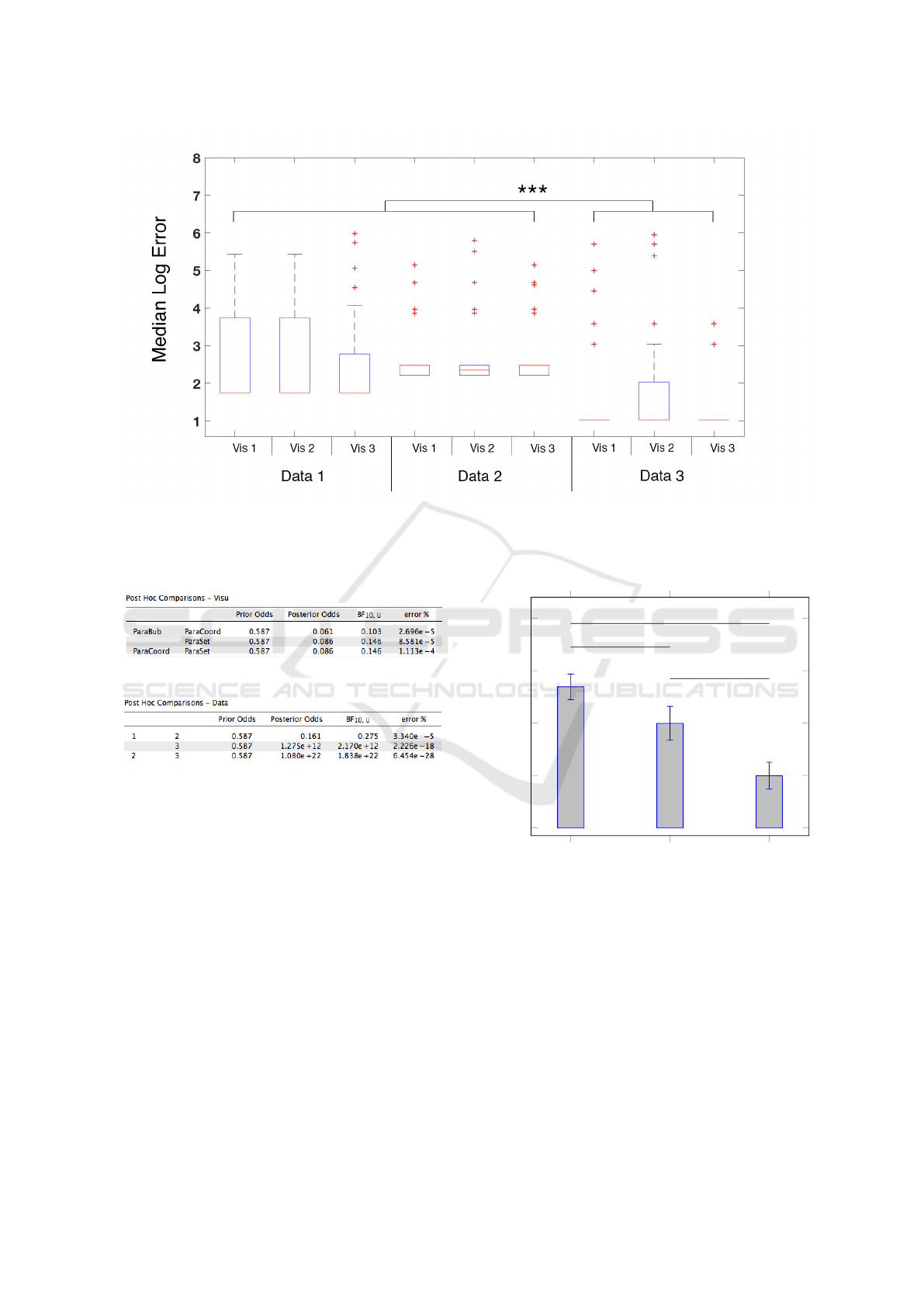
Figure 9: The distribution of Log Error per chart type, for task T2. The error bars show 95% CI and the middle black lines
represent the median for each box plot. The multiple comparisons for the multiway ANOVA show a significant effect of the
factor Data on the vector ”Log Error”. The two grouping variables are visualization method and data. Data points beyond the
whiskers are displayed using +.
(a) Factor: Visualization method
(b) Factor: data
Figure 10: The Post Hoc tests performed on the results of
the task 2.
Regarding the factor ”data”, we clearly identified
two clusters: one is composed of the data with no cor-
relation and a medium correlation, and the other clus-
ter is composed of the strongly correlated data.
We can conclude that adding a visual encoding
of frequency improves performance of the user in a
frequency task consisting in evaluating the most rep-
resented category. It does neither improve the per-
formance of the user in frequency tasks consisting in
evaluating the proportion of samples belonging to a
given category, which is somewhat surprising, nor for
a similarity task consisting in assessing the level of
correlation.
For the task T3, the better performance of Paral-
lel Sets in comparison with Parallel Bubbles might
be caused by the difference of accuracy with which
ParaCoord ParaBub ParaSet
0
0.2
0.4
0.6
0.8
***
***
***
0.54
0.4
0.2
Error rate
Figure 11: Average error rate for T3 (frequency) on all
datasets. Error bars show 95% CI. The ANOVA indicates
that the means of all three visualization methods are pair-
wise significantly different.
we perceive the channels used. Parallel Bubbles use
an area encoding: the area of bubbles is linearly pro-
portional to the number of items, the radius of a bub-
ble being equal to the square root of the frequency,
multiplied by two. For Parallel Sets, we use a length
encoding: the height of the boxes was defined as
linearly proportional to the frequency. The differ-
ence in performance when using these two encodings
can be explained by Steven’s Psychophysical Power
Law (Stevens, 1975a): this law states that the appar-
Parallel Bubbles - Evaluation of Three Techniques for Representing Mixed Categorical and Continuous Data in Parallel Coordinates
261
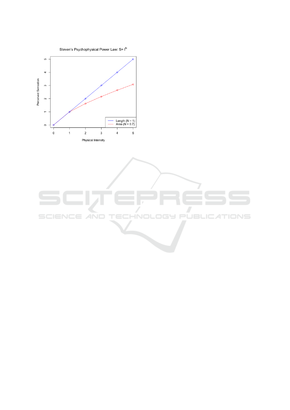
Figure 12: The psychophysical power law of Stevens
(Stevens, 1975a) for the Area and Length encodings. ”The
apparent magnitude of all sensory channels follows a power
function based on the stimulus intensity.”
ent magnitude of an area is perceptually compressed
(by a factor of 0.7), while the perception of length is
very close to the true value (see figure 12). Based on
these results, in the conclusion we propose a few ap-
proaches to improve the Parallel Bubbles.
4 CONCLUSION AND FUTURE
WORKS
Our study attempted to find out which visualization
method gives the best performance for typical data
analysis tasks. Participants were asked to perform
three types of tasks: in the first task (T1) participants
had to assess the level of correlation between the con-
tinuous and the categorical dimension. In the second
task (T2), they had to estimate the percentage of sam-
ples belonging to a given category. In the third task
(T3), they had to assess which of the four categories
was the most represented. Our hypothesis is invali-
dated for the tasks T1 and T2: for these two tasks,
adding a visual encoding of frequency does not em-
power the user with significantly better data analysis
capabilities. However, the results of task T3 confirm
one of our sub-hypotheses: a visual encoding of fre-
quency in the form of bubbles (Parallel Bubbles) or
lines (Parallel Sets) results in a significant difference
in performance between all three visualization meth-
ods for a frequency tasks consisting in identifying the
most represented categorical value.
Parallel Sets delivered the best performance in all
tasks, but Parallel Bubbles present two main advan-
tages over Parallel Sets: first, they are easier to im-
plement, requiring the simple add of a circle on each
categorical value of a Parallel Coordinates plot. Sec-
ond, they are best suited for continuous values. Thus
we recommend the use of Parallel Bubbles for basic
data analysis tasks performed on mixed categorical
and continuous datasets.
As future works, it would be interesting to further
extend the Parallel Bubbles method, implement it in a
functional system and use it in a real context. It would
be pertinent to test it in a use case. Having explicitly
verifiable tasks in the beginning of the survey allowed
us to filter out non-expert users. However, in a fu-
ture study, the tutorial could be improved by signal-
ing more clearly to users that their answers would be
scrutinized, as suggested by Kittur et al. (2008). This
would likely increase the time spent on tasks, and the
quality of the answers.
One way to improve the Parallel Bubbles would
be to replace the circles, that are evenly spaced,
but have variable areas, with vertically stacked bars
scaled proportionally to the frequency of the cate-
gorical value they represent. The user would assess
the length of segments, instead of areas. This would
counterbalance the psychophysical effects related to
area representation defined by Stevens (1975b). The
effectiveness of this encoding would approach that of
Parallel Sets, and its performance in similarity and
frequency tasks would probably increase. Next stud-
ies will continue to focus on the categorical axis, com-
paring the area encoding of frequency (bubbles) with
alternative encodings such as density functions, his-
tograms and dot plots.
REFERENCES
Dang, T. N., Wilkinson, L., and Anand, A. (2010). Stack-
ing graphic elements to avoid over-plotting. IEEE
Transactions on Visualization and Computer Graph-
ics, 16(6):1044–1052.
Downs, J. S., Holbrook, M. B., Sheng, S., and Cranor, L. F.
(2010). Are your participants gaming the system?
Screening mechanical turk workers. Proceedings of
the SIGCHI conference on Human Factors in comput-
ing systems - CHI ’10, pages 2399–2402.
Fernstad, S. J. and Johansson, J. (2011). A Task Based Per-
formance Evaluation of Visualization Approaches for
Categorical Data Analysis. 2011 15th International
Conference on Information Visualisation, pages 80–
89.
Few, S. (2006). Multivariate analysis using parallel coordi-
nates. Perceptual Edge, pages 1–9.
Fua, Y.-H. F. Y.-H., Ward, M., and Rundensteiner, E.
(1999). Hierarchical parallel coordinates for explo-
IVAPP 2018 - International Conference on Information Visualization Theory and Applications
262

ration of large datasets. Proceedings Visualization ’99
(Cat. No.99CB37067), pages 43–508.
Geng, Z., Peng, Z., Laramee, R. S., Walker, R., and Roberts,
J. C. (2011). Angular histograms: Frequency-based
visualizations for large, high dimensional data. IEEE
Transactions on Visualization and Computer Graph-
ics, 17(12):2572–2580.
Graziano, A. M. and Raulin, M. L. (2010). Research Meth-
ods - A Process of Inquiry.
Havre, S. L., Shah, A., Posse, C., and Webb-Robertson, B.-
J. (2006). Diverse information integration and visual-
ization. volume 6060, pages 60600M–60600M–11.
Heathcote, A., Popiel, S., and Mewhort, D. J. K. (1991).
Analysis of response time distributions: An exam-
ple using the Stroop task. Psychological bulletin,
109(2):340–347.
Heer, J. and Bostock, M. (2010). Crowdsourcing Graphical
Perception: Using Mechanical Turk to Assess Visu-
alization Design. Proceedings of the 28th Annual Chi
Conference on Human Factors in Computing Systems,
pages 203–212.
Heinrich, J. and Weiskopf, D. (2009). Continuous parallel
coordinates. IEEE Transactions on Visualization and
Computer Graphics, 15(6):1531–1538.
Heinrich, J. and Weiskopf, D. (2013). State of the Art of
Parallel Coordinates. Eurographics, pages 95–116.
Inselberg, A. and Dimsdale, B. (1990). Parallel coordinates:
a tool for visualizing multi-dimensional geometry.
Johansson, J. and Forsell, C. (2016). Evaluation of Paral-
lel Coordinates: Overview, Categorization and Guide-
lines for Future Research. IEEE Transactions on Vi-
sualization and Computer Graphics, 22(1):579–588.
Kittur, A., Chi, E. H., and Suh, B. (2008). Crowdsourcing
User Studies With Mechanical Turk. CHI ’08 Pro-
ceedings of the twenty-sixth annual SIGCHI confer-
ence on Human factors in computing systems, pages
453–456.
Kosara, R., Bendix, F., and Hauser, H. (2006). Parallel
sets: Interactive exploration and visual analysis of cat-
egorical data. In IEEE Transactions on Visualization
and Computer Graphics, volume 12, pages 558–568.
IEEE.
Martin, A. and Ward, M. (1995). High Dimensional Brush-
ing for Interactive Exploration of Multivariate Data.
Proceedings Visualization ’95, pages 271–278.
Moustafa, R. E. (2011). Parallel coordinate and parallel
coordinate density plots. Wiley Interdisciplinary Re-
views: Computational Statistics, 3(2):134–148.
Playfair, W. (1801). Commercial and political atlas and sta-
tistical breviary (edited by h. wainer & i. spence).
Rosario, G. E., Rundensteiner, E. A., Brown, D. C., and
Ward, M. O. (2003). Mapping nominal values to num-
bers for effective visualization. In Proceedings - IEEE
Symposium on Information Visualization, INFO VIS,
pages 113–120.
Shneiderman, B. (1994). Dynamic queries for visual infor-
mation seeking. IEEE Software, 11(6):70–77.
Siirtola, H., Laivo, T., Heimonen, T., and R
¨
aih
¨
a, K.-J.
(2009). Visual Perception of Parallel Coordinate Vi-
sualizations. In 2009 13th International Conference
Information Visualisation, pages 3–9. IEEE.
Skau, D. and Kosara, R. (2016). Arcs , Angles , or Areas
: Individual Data Encodings in Pie and Donut Charts.
35(3).
Stevens, S. (1975a). Laws that govern behavior.(book re-
views: Psychophysics. introduction to its perceptual,
neural, and social prospects). Science, 188:827–829.
Stevens, S. (1975b). Psychophysics: Introduction to its per-
ceptual, neural and social prospects.
Teoh, S. T. and Ma, K.-L. (2003). PaintingClass: interactive
construction, visualization and exploration of decision
trees. Star, pages 667–672.
Wegman, E. J. (1990). Hyperdimensional Data Analysis
Using Parallel Coordinates. Journal of the American
Statistical Association, 85(411):664–675.
Parallel Bubbles - Evaluation of Three Techniques for Representing Mixed Categorical and Continuous Data in Parallel Coordinates
263
