
Designing a Classification for User-authored Annotations in
Data Visualization
Pierre Vanhulst
1
, Florian Évéquoz
2
, Raphaël Tuor
1
and Denis Lalanne
1
1
Human-IST Institute, University of Fribourg, Boulevard de Pérolles 90, Fribourg, Switzerland
2
Institute of Information Systems, University of Applied Sciences Western Switzerland,
HES-SO Valais-Wallis, Technopole 3, Sierre, Switzerland
Keywords: Data Visualization, Collaboration, User-authored Annotations, Classification.
Abstract: This article introduces a classification system for user-authored annotations in the domain of data
visualization. The classification system was created with a bottom-up approach, starting from actual user-
authored annotations. To devise relevant dimensions for this classification, we designed a data analysis web
platform displaying four visualizations of a common dataset. Using this tool, 16 analysts recorded over 300
annotations that were used to design a classification system. That classification system was then iteratively
evaluated and refined until a high inter-coder agreement was found. Use cases for such a classification
includes assessing the expressiveness of visualizations on a common ground, based on the types of annotations
that are produced with each visualization.
1 INTRODUCTION
Visualization facilitates the understanding of data by
allowing users to rely on visual perception to identify
characteristics of the data, such as trends,
correlations, outliers, etc. Getting such “insights”
about the data through visualization is indeed a
crucial aim of data analysis. To materialize insights
and store them permanently, visualization systems
often provide tools to create “annotations”. Although
annotations have been implemented in previous
collaborative data visualization systems (Willett et
al., 2011; Ren et al., 2017; Zhao et al., 2017),
annotations per se have never been a subject of
research. In particular, research has yet to produce a
formal classification of the different types of
annotations that may be formed as a result of
interpreting data visualization. Having such a
classification would for example allow the
comparison of different visual encodings or
visualization idioms with respect to the kind of
annotations that they support. This could prove useful
as a means to recommend visualization idioms
tailored to certain specific tasks or questions.
In this work, we introduce a classification system
for visualization annotations. This classification was
created with a bottom-up approach. We collected
over 300 annotations recorded by 16 participants and
derived various dimensions from them in an iterative
fashion taking inspiration from Grounded Theory.
The resulting classification of annotations comprises
6 orthogonal dimensions. Some of these dimensions
could be linked to previous work investigating the
types of questions and tasks supported by data
visualization. We evaluated the validity of our
classification system iteratively by having the
annotations classified by three coders and by
computing Inter-Coder Reliability scores.
In the following sections, we first introduce a
formal definition of annotations (section 2). Next, we
present a literature review of conceptual work related
to annotations (section 3) and proceed to describe
how we collected a dataset of annotations (section 4).
We present the classification itself (section 5), then
the iterative process that led to both its inception and
evaluation (section 6). At the end of the article, we
present a use case for this classification system as a
tool to qualitatively compare different visualization
idioms (section 7).
2 DEFINING ANNOTATIONS
The notion of “annotations” is vast and should be
narrowed. Works like Lyra (Satyanarayan and Heer,
2014), ChartAccent (Ren et al., 2017) or Vega
Vanhulst, P., Évéquoz, F., Tuor, R. and Lalanne, D.
Designing a Classification for User-authored Annotations in Data Visualization.
DOI: 10.5220/0006613700850096
In Proceedings of the 13th International Joint Conference on Computer Vision, Imaging and Computer Graphics Theory and Applications (VISIGRAPP 2018) - Volume 3: IVAPP, pages 85-96
ISBN: 978-989-758-289-9
Copyright © 2018 by SCITEPRESS – Science and Technology Publications, Lda. All rights reserved
85

(Satyanarayan et al., 2016) treat annotations as part of
the visualization itself – they are embodied within it.
These tools are meant for visualization authoring. In
this paper, we took another definition, closer to Zhao
et al., (2017) and Munzner (2014)’s versions: to the
former, annotating is “an essential activity when
making sense of data during exploratory analysis”
and “a key step performed by analysts”. Annotations
can be used to “support the process of generating
hypotheses, verifying conjectures, and deriving
insights, where it is not only critical for analysts to
document key observations, but also to communicate
findings with others”. To the latter, annotating is "the
addition of graphical or textual annotations
associated with one or more pre-existing
visualization elements, typically as a manual action
by the user. When an annotation is associated with
data items, the annotation could be thought of as a
new attribute for them”. In this paper, we thus define
an annotation as an observation, made by exploring
a visual representation of data, that is recorded
either as text or visual selection (or both).
Annotations are metadata: they are not embodied in
the visualization. An annotation can be either an
insight about the data, or a comment left for others to
see. Annotations generally concern the data itself, and
are therefore relevant regardless of its visual
representation.
3 STATE OF THE ART
Although the research community has yet to agree
upon a formal classification system of visualization,
previous works have provided elements of interest for
such a classification. In the following section, we first
review conceptual work relevant to annotation
classification systems, and then specific collaborative
platforms that have implemented their own model for
classifying annotations.
3.1 Conceptual Work Relevant for a
Classification of Annotations
Although we are not aware of a formal annotations
classification system in the research community,
there has been some formalization of the types of
questions that can be asked about a visualization, and
the tasks that can be carried out with the help of
visualization. As annotations can be considered as
elements in the sensemaking process of visualization,
they have strong links to questions and tasks.
Jacques Bertin (1967) does not explicitly cover
annotations in his work. Nevertheless, he states that
several types of questions can be asked on a graphical
representation of data, one type of question for each
type of data component (e.g. if the data under
consideration is a time-series of stock values, date and
value would be two components of the data). He
states that questions can be of three different levels
that he coins "levels of reading":
• elementary level: questions introduced by a single
element of a component (e.g. "on a given date...")
• intermediate level: questions introduced by a
group of elements in a component (e.g. "on the
first three days, what is the trend of the price?")
• superior / overall level: questions introduced by
the overall component (e.g. "on the whole period,
what is the trend of the price?")
Following this definition, questions would be
described by their type (i.e. components of the data
impacted) and level of reading, which itself suggests
an implicit hierarchy (elementary-intermediate-
superior).
In a similar attempt to classify types of questions
that can be asked on a graphical data representation,
Frances Curcio (1987) used tasks of three different
types to evaluate graph comprehension in students:
• literal tasks, coined "read the data", where users
literally read individual data from the graph, or
from its title or axes labels;
• comparison tasks, coined "read between the data",
where users “logically or pragmatically infer” an
answer;
• extension tasks, involving e.g. inference,
prediction, coined "read beyond the data", where
users rely on preliminary knowledge to predict an
outcome or infer a discovery that could not be
derived by the visual representation of the data
alone.
Susan et al., (2001) summarizes previous research on
the topic and note that a consensus seems to emerge
for the three levels of tasks defined by Curio (1987)
with minor differences between the researchers. They
also note that while students make less errors with
tasks of "reading the data", they do experience more
difficulty with "reading between the data". The tasks
of "reading beyond the data" are the most
challenging. More recently, the concept of
“Visualization Literacy” has received an increased
interest from the visualization research community.
Boy et al., (2015) build in part upon the research
described earlier, but also contributes to define
categories of tasks that are relevant in the context of
graph interpretation. These categories of tasks are:
• Extrema: "finding maximum or minimum data
points"
IVAPP 2018 - International Conference on Information Visualization Theory and Applications
86

• Variation: "detecting trends, similarities or
discrepancies in the data"
• Intersection: "finding the point at which the graph
intersects with a given value"
• Average: "estimating an average value"
• Comparison: "comparing different values or
trends"
Additionally, Boy et al., (2015) expand the work of
Susan et al., (2001) and identify different levels of
congruency of questions: perception questions refer
to the visual aspect of a graph only (e.g. "what colour
are the dots?"), while other questions exhibit a highly
or lowly congruent relation between visual encoding
and data. More precisely, they define those concepts
as follows: "A highly congruent question translates
into a perceptual query simply by replacing data
terms by perceptual terms (e.g. what is the highest
value/what is the highest bar?). A low-congruence
question, in contrast, has no such correspondence
(e.g. is A connected to B– in a matrix diagram?)".
Munzner (2014) defines an overarching
framework for analysing and designing visualizations
that consists of three steps: “What-Why-How”. The
“Why” step is particularly relevant in our context. It
defines the user goals that are materialized into tasks.
She defines a taxonomy of tasks, where an abstract
task is a combination of an action and a target.
Actions can be of three broad types (analyse, search,
query) that can be later subdivided into specific
subtypes (for example, the creation of annotations is
one of the subtypes of the "analyse" action in this
framework). Targets of tasks can be all data, one or
several attributes of the data, topologies in case of a
graph, shapes in case of spatial visualization. We
believe that this exhaustive taxonomy of tasks related
to data visualization is a solid basis on which to build
a taxonomy of annotations.
3.2 Annotation Classifications in
Collaborative Visualization
Systems
Annotations play a crucial role in the collaborative
data analysis process based on visualization.
Therefore, several collaborative visualization
systems have been developed over the years.
ManyEyes (Viegas et al., 2007) was a pioneering
online collaborative visualization platform that
allowed users to upload data, choose a visual
representation and annotate it. Annotating
visualizations was made possible by a web comments
system similar to what appears on blogs or forums.
Annotations were simply added to a visualization as
a discussion thread and were not classified in
categories.
Heer et al., (2009) designed another platform –
sense.us – that allows users to annotate visualizations
through fours tools: “double linked discussion”,
“bookmark trails”, “geometric annotations” and
“comment listings”. In their study, they found that
these tools encourage richer discussion and globally
improve the analysis process.
CommentSpace (Willett et al., 2011) is an
enhanced version of sense.us, in which analysts can
use a set of predefined tags and links to categorize
their annotations. Namely, analysts can define an
annotation as a “hypothesis”, a “question” or a “to-
do”, and link them to previous observations either as
an “evidence-for” or “evidence-against”. Therefore,
this linking system is a way to keep trace of the
hypothesis validity checking process, or more broadly
speaking, of the sensemaking process. The authors
found that participants were overall more efficient
and consistent in their interactions with visualizations
using CommentSpace.
PathFinder (Luther et al., 2009), a collaboration
environment for citizen scientists, offers comparable
annotation features. It is based on the concept of
structured discussion that consists of background,
questions, hypothesis, evidences, conclusions and to-
dos.
Zhao et al., propose AnnotationGraph (2017), a
tool for collaborative analysis where user-authored
annotations are visually represented as a graph that
displays the relations between annotations and data
selections to explicit the annotation semantics,
therefore allowing analysts to get an overview of
comments and insights and the links between them in
the analysis process. More specifically, the authors
rely on the ESDA Framework (Exploratory
Sequential Data Analysis) to describe the cognitive
process of analysts when they annotate the
visualizations. The steps in this framework are called
the “Eight C’s (C8)” (Conversion, Constraints,
Chunks, Computations, Comparisons, Comments,
Codes, Connections). Three of them are relevant in
the context of annotations. Chunks (also referenced
by Boy et al., (2015)) are subsets of data on which
analysts make an annotation. Comments are textual
description for Chunks. Codes (tags) are labels
applied to Comments. Unlike CommentSpace,
AnnotationGraph does not use predefined Codes so
that analysts can express a wider range of views.
Authors note that their system improves the whole
annotation process from reading data to producing
new annotations.
Designing a Classification for User-authored Annotations in Data Visualization
87
3.3 Conclusion
A limitation of the annotation taxonomies used in
collaborative visualization systems is that they are
purely functional. They characterize the role of the
annotation – its purpose in the analysis process
(Willett et al., 2011). They do not attempt to classify
annotations according to other characteristics that
could be derived from the conceptual work presented
earlier, like for example congruency (relevance to
data / visualization), level of reading, target of tasks,
etc. The model we present attempts to bridge this gap.
Moreover, we expect our model to characterize
visualizations themselves: knowing what
visualizations foster the most annotations of a certain
type would allow designers to build systems with
complementary visuals. Also, to our knowledge, no
studies have been done on the reliability of
empirically assessing the type of an annotation. This
work also contributes several findings in this regard.
4 ANNOTATIONS GATHERING
Gathering annotations was the first step of our study.
We developed a web platform that offers an
annotation interface for various visualizations over
Internet. 16 participants were then recruited to
provide as many annotations as possible during the
analysis of 4 visualizations.
4.1 Web Platform
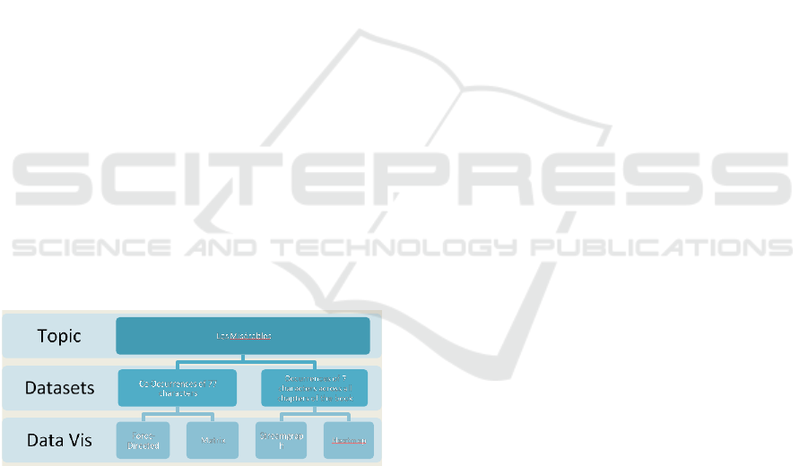
Figure 1: Graph representing the use case for this study. A
single topic, 2 datasets and 4 visualizations.
The platform developed for this study aimed to work
with any visualizations developed with the “Data-
Driven Document” (D3) JavaScript Library (Bostock
et al., 2011), including those relying on more recent
systems built on the top of D3, such as Vega
(Satyanarayan et al., 2016), Vega-Lite (Satyanarayan
et al., 2017) and Voyager (Wongsuphasawat et al.,
2016). It was configured to display a concrete use
case, the relationships between “Les Misérables”
characters, through 4 visualizations and 2 datasets.
We used 2 popular examples of D3 visualizations: the
graph from “Force-Directed Graph” (Bostock, 2017)
and the matrix from “Les Misérables Co-occurrence”
(Bostock, 2012). These two examples explore the co-
occurrences of 77 characters across the whole book.
Both visualizations are interactive: the graph offers to
move nodes by drag-and-dropping them, while the
matrix offers to sort characters depending on three
parameters (name, number of co-occurrences and
clusters). We then built a second dataset where we
recorded the occurrence of 7 characters across the 350
chapters of the story. These data were encoded into a
Streamgraph and a Heatmap, both being static D3
visualizations. Together, the four visualizations cover
almost all of the cases mentioned in the “Why” step
of Munzner’s Framework (Munzner, 2014), except
from a spatial visualization that was not considered
for feasibility reasons. Figure 1 summarizes our use
case.
4.1.1 Implementation
From an implementation perspective, the software
stack used to develop the platform was NodeJS and
the Framework Nuxt on the server side, along with a
client library that allows visualizations to
communicate with the server. Visualizations are
“hooked” inside the platform via an iFrame.
Communication is handled through the standardized
window.postMessage method. This workflow
requires only minimal adaptations from the
visualizations designers and explains why we
managed to adapt regular D3 visualizations easily.
A prevalent feature of this platform is that
annotations are “data-aware” even though
visualizations are not specifically designed for it:
users can select data from the visualization with a
rectangle selection tool. When D3 inserts new DOM
elements, it provides them with a __data__ property,
which contains the datum used to create them. In this
study, we call these elements “data units”. When
using the rectangle selection tool, the application
sends its coordinates to the visualizations, which then
identifies all data units whose positions lie within the
said coordinates. It returns these data units to the
platform that can finally record them along with the
annotation. While this process is mature in terms of
implementation, pilot tests demonstrated that
rectangle selection does not work well with all
visualization, especially Streamgraph where users
tried to select only parts of a single data units. Figure
2 shows the interface and the 4 visualizations.
IVAPP 2018 - International Conference on Information Visualization Theory and Applications
88
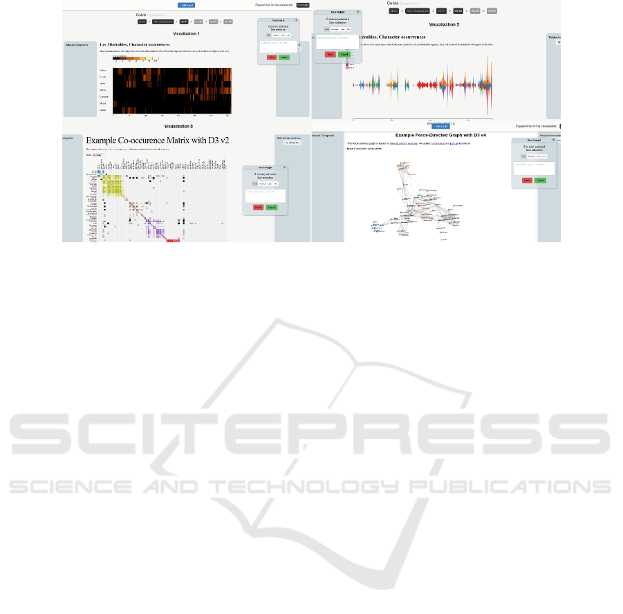
Figure 2: Screenshots of the 4 visualizations. From up left to bottom right: heatmap, streamgraph, matrix and force-directed
graph. Analysts write annotations in the floating window.
4.1.2 Interface
The interface of the platform is composed of a left-
column which displays the selected data units, a right
column which displays previously taken annotations
by chronological order and a floating window where
analysts can write their annotations and save them. At
the top of the window, a timer indicates the time
elapsed since the window.onload handler was fired.
The center of the window displays the
visualization itself, that is overlaid by a “selection
canvas” when analysts select the underlying data
units, using the rectangle selection tool.
4.2 Annotation Production
16 participants were recruited for this study. The
protocol was as follows:
1. Introduce the participant to her role as a data
analyst. She was tasked with analysing
relationships of characters across several visual
representations.
2. Assess the participant’s knowledge of the domain
- how much she knows about “Les Misérables” -
on a range from 1 (low) to 3 (high). 1 would mean
“Never heard before”, 2 means “Popular culture,
read the book or watched the movie years ago”
and 3 means “Robust knowledge, remember the
book or the movie”.
3. Instruct the participant that she will annotate 4
visualizations based on 2 different datasets related
to “Les Misérables”. The possibility to use a
stylus to annotate the visualization was introduced
at that point.
4. Offer a chance for the participant to familiarize
herself with the interface with a dummy
visualization for five minutes.
5. Lead the participant through all 4 visualizations
for 5 minutes each.
Participants were free in their annotation process:
they could analyse data and find insights, as well as
comment the visualization’s relevance.
4.2.1 Participants’ Profiles
We selected 16 participants, of which 12 were male
and 4 were females. All of them were between 20 and
35 years old. 6 participants held a Master degree (3 in
Computer Science, 1 in Psychology, 1 in Physics, 1
in Biology), 3 held a Bachelor degree or equivalent (2
in Computer Sciences, 1 in Graphic Design), 3 left
school after High School and 4 were Bachelor
students (3 in Computer Sciences, 1 in Law). 2
participants were knowledgeable of Data
Visualization, while the other 14 had only common
knowledge of the domain. Over the 16 participants, 2
assessed their knowledge of the domain as “high”, 3
judged that their knowledge was low, and the 11
others had average knowledge of the story.
4.2.2 Variants
There were 8 variations of order for the 4
visualizations. We obtained these variations by
inverting the order of each visualization within a
single dataset, then by inverting the datasets
themselves. Each variation was used with two
participants.
Designing a Classification for User-authored Annotations in Data Visualization
89

4.2.3 Preliminary Remarks on the Results
In total, participants produced 323 annotations in
French or English from which 21 were removed. Only
45 graphical annotations were taken during the
experiment, of which 38 were spread over 4
participants. The other 12 preferred to focus on the
analysis and thought the graphical annotation process
was adding an unnecessary layer of complexity to
their task.
5 CLASSIFICATION SYSTEM OF
USER-AUTHORED
ANNOTATIONS
For the sake of clarity, we describe in this section the
final classification system. The next section describes
the iterative process followed to produce it. Our
classification system has six dimensions, described
below. These are summarized in Table 1.
5.1 Insight on Data (Abbreviated:
Data)
The first dimension is used to distinguish annotations
between those concerning the data and those
concerning the visualization itself. During the
annotation gathering process, a vast majority of the
participants asked the permission to write their
opinion regarding the visual representation, usually
either to express disappointment or scepticism, or to
compare with a visualization that they had analysed
previously. These annotations are precious to
understand the learning process of a visualization.
They were sorted into three categories: positive
(positive comment regarding the visualization),
negative (negative comment regarding the
visualization) and description (descriptive comment
of the visualization’s features). As the other
dimensions of the classification could not apply for
such annotations, we skipped annotations that did not
target data for the rest of the classification process.
Some examples:
• “We see links between different groups of colors
much better” is a positive comment.
• “It looks like an audio file” is a descriptive
comment.
5.2 Multiple Observations
(Abbreviated: Multiple)
The second dimension concerns the number of in-
sights within a single annotation. As each observation
could be considered for the classification – a case that
was not expected – we decided to skip multiple
insights annotations for the rest of the process.
Example: “The apparition peaks stand out the most,
we can see the importance of Javet and Valjean near
chapter 115, the importance of Gavroche near chapter
245 and a particular peak near the end for Cosette and
Marius“.
5.3 Data Units (Abbreviated: Units)
Typical annotations refer to one or several “units” in
the one dimension of the data – may it be characters,
relationships or chapters in our use case. When no
unit can be identified, it is generally possible to find
references to aggregated groups of units. The third
dimension of our classification thus concerns the
“data units” mentioned in the annotation. The data
units have two attributes: their role (subject or
complement) and their scale (single or aggregated). A
“subject data unit” is the emphasis of an annotation,
while a “complement data unit” is usually another
dimension of the visualization used to highlight a
particularity of the subject data unit. Data units are
best thought as entries in a relational database. The
conjunction of two tables is thus also a potential data
units. In our use case, a “frequency” results from both
one or several characters and one or several chapters.
In our literature, Munzner (2014) uses the concept of
“Target”, Zhao et al., (2017) use the terms “Chunks”
to define the subsets of the whole data targeted by an
annotation. Ren et al., (2017) refers to this as
“Annotation target type”, considering whether it is
aggregated not (“Data item” for what we call “single
data unit”, “set”, “series” or “coordinate space target”
for what we call “aggregated data unit”). Some
examples:
• “Cosette, Valjean et Marius sont très présents à la
fin de l’histoire” (“Cosette, Valjean and Marius
are very present at the end of the Story”). The
three characters mentioned are three subject single
data units. They belong to the “Character”
dimension of the data. The “end of the Story” is a
complement aggregated data unit: it serves only to
underline where the subjects have a common
particularity (that is, being particularly present)
and belongs to the “Time” dimension of the data.
• “Cosette is present during all scenes, but
infrequently except for the chapter 95”. “Cosette”
is a subject single data unit, while “chapter 95” is
a complement single data unit.
• “Très longs passages durant lesquels certains
personnages n’apparaissent pas du tout”. (“Very
IVAPP 2018 - International Conference on Information Visualization Theory and Applications
90

long passages where some characters do not
appear at all”). “Very long passages” forms a
subject aggregated data unit, while “some
characters” forms a complement aggregated data
unit.
5.4 Level of Interpretation
(Abbreviated: LOI)
Some annotations propose hypotheses that go beyond
the simple reading of the data, while others simply
annotate visual phenomena. The fourth dimension of
our classification tries to categorize the “level of
interpretation” of the data in three levels.
1. Visual: references to purely visual elements. “the
squares”, “the frequency”, “the violet cluster”.
2. Data: reattribution of the visual elements toward
the data that they represent. There is an attempt at
contextualizing and making sense of the data.
3. Meaning: opinion or hypothesis going beyond
the simple observation, usually requiring prior
knowledge of the data.
These levels are non-exclusive, some annotations
using several of them to reinforce their assertion. In
our literature, Bertin (1967) and Curcio (1987) speak
of three level of reading: “elementary”,
“intermediate” and “superior” for the former; “data”,
“between data”, “beyond data” for the latter. Other
authors followed the same idea of “three steps”
(McKnight, 1990; Carswell, 1992; Wainer, 1992;
Susan et al., 2001). Some examples:
• Visual: “Valjean co-apparaît le plus souvent”
(“Valjean co-appears the most”).
• Data: “Valjean est lié à beaucoup de
personnages” (“Valjean is linked to many
characters”).
• Meaning: “Valjean est le personnage principal”
(“Valjean is the main character”).
5.5 Co-references (Abbreviated: Ref)
Even though our interface did not allow users to see
other analysts’ annotations, some annotations still
refer to others, previously written by the same
analyst. The fifth dimension specifies whether an
annotation is a reference to another, or if it is
independent. In our literature, many previous work
allows users to see and reply to others (Viegas et al.,
2007; Heer, Viégas and Wattenberg, 2009; Willett et
al., 2011; Zhao et al., 2017). This dimension is
inspired by their work. Example: “However, they are
still present during the last (225), apart from Myriel,
Fantine and Javert”. This annotation refers to another
one, which states that no character is present at the
very last chapter.
5.6 Detected Patterns (Abbreviated:
Patterns)
The sixth and last dimension of our classification
concerns the patterns detected by the analyst in her
annotation. We used three categories to sort them:
• Singularity: the annotation concerns only one
unit that stands out. Can be either implicit or
explicit.
o Implicit: specific property of a unit, such as
its distribution along another dimension of the
data. No reference to other units of the same
dimension.
o Explicit: mention of one unit that stands out
from either a larger group of similar units, or
all similar data units present on the
visualization.
• Duality: the annotation compares two data units
or more. These data units are similar in scale and
come from the same dimension. This category
regroups correlations, similitudes, dependencies
and orderings.
• Plurality: concerns a common feature of all data
units of the same dimension (or its majority).
In our literature, Munzner (2014) uses a more
complete set of patterns. In the context of this study,
it was deemed too complex to find acceptable
agreement score. Some examples:
• Singularity (Implicit): “Gavroche appears a lot
around chapter 245, then plays a minor role”.
• Singularity (Explicit): “Valjean is the most
represented character, but he does not have a peak
of occurrences, he plays his role overall well
across the chapters”.
• Duality: “Few chapters with Valjean without
mention of Cosette”.
• Plurality: “The chapters seem to switch from
character to character rather than following
everyone”.
6 DESIGN & EVALUATION
In this section, we describe the iterative process that
has led to the final classification presented in the
previous section. To design initial dimensions of the
classification, we derived a set of dimensions by
randomly selecting groups of three annotations and
Designing a Classification for User-authored Annotations in Data Visualization
91

comparing them, without prior expectations. Our goal
was to make dimensions emerge from the data, rather
than sorting data through predefined filters. Figures 3
and 4 show the web platform that we used to reach
this goal. The validity of this classification system
was then assessed in several iterations (or phases).
During each, three experts (three of the authors of this
article, also referenced to as “coders”) independently
categorized the same subsets of annotations. At the
end of each iteration, we computed an Inter-Coder
agreement (or Inter-Coder Reliability ICR) to
validate each dimension. When the score was too low,
the dimension was reworked and reassessed in
another phase. In total, the validation of all
dimensions required five phases.
The first two phases were pilots: two sets of 32
annotations – 8 for each visualization – were
randomly selected for the experts to categorize. The
initial weaknesses of the classification were thus
identified and fixed. During the third phase, all 302
annotations were annotated for all dimensions: this
process revealed new weaknesses that were addressed
in a fourth phase. The outcome of the fourth phase
was mostly satisfying, leading the experts to confront
their opinion about the last stumbling blocks that
resulted from insufficiently explained dimensions.
This discussion is regarded as the fifth phase.
We computed both a classical Pairwise
Percentage Agreement score, along with a Fleiss’
kappa. The Pairwise Percentage Agreement measures
the average agreement rate for all possible pairs of
coders, its values ranging from 0% (perfect
disagreement) to 100% (perfect agreement). In the
domain of Human-Machine Interaction, a score
superior to 80% is usually recommended to validate
the coding model. For its part, the Fleiss’ kappa
(Fleiss, 1971) (an extension of Cohen’s kappa
(Cohen, 1960) used with more than two coders) mea-
Table 1: Summary of the dimensions.
DIMENSION
POSSIBLE VALUES
EXAMPLE
Insight on data
Boolean. Annotations that do not
provide insight about data were
sorted in three categories: positive
comment, negative comment,
description. They were then skipped
for the rest of the process.
• “Valjean is the main character” provides an insight
on the data.
• “It’s hard to see relationships between more than
three characters at once” is a negative comment
about the visualization.
Multiple
observations
Boolean. Annotations that present
multiple observations were skipped
for the rest of the process.
• “Valjean is the main character, while Myriel is only
a secondary character. Valjean seems related to
Cosette in some ways”.
During the last chapters, almost all characters
appear”.
Data units
One or several mentions in the
annotation. A data unit has a scope
(single or aggregated) and a role
(subject or complement)
• “Cosette appears strongly during a few successive
chapters”. “Cosette” is a single subject data unit,
while “successive chapters” is an aggregated
complement data unit.
Level of
interpretation
Non-exclusive choices: visual, data
or meaning.
• “The green group is the leftmost” only refers to
visuals.
• “Valjean is the most connected character” starts to
refer to the data, instead of visual shapes.
• “Valjean is the main character” is a hypothesis that
gives meaning to the data.
Co-references
Boolean.
• “On the opposite, he appears the least often in the
middle of the book” obviously refers to another
annotation.
Detected
patterns
Non-exclusive choices: singularity,
duality or plurality. Singularities
can be either implicit or explicit.
• “Valjean is the main character” is an implicit
singularity.
• “Valjean is the most connected character” is an
explicit singularity.
• “Valjean is more important than Javert” is a duality.
• “In average, all characters have three connections”
is a plurality.
IVAPP 2018 - International Conference on Information Visualization Theory and Applications
92
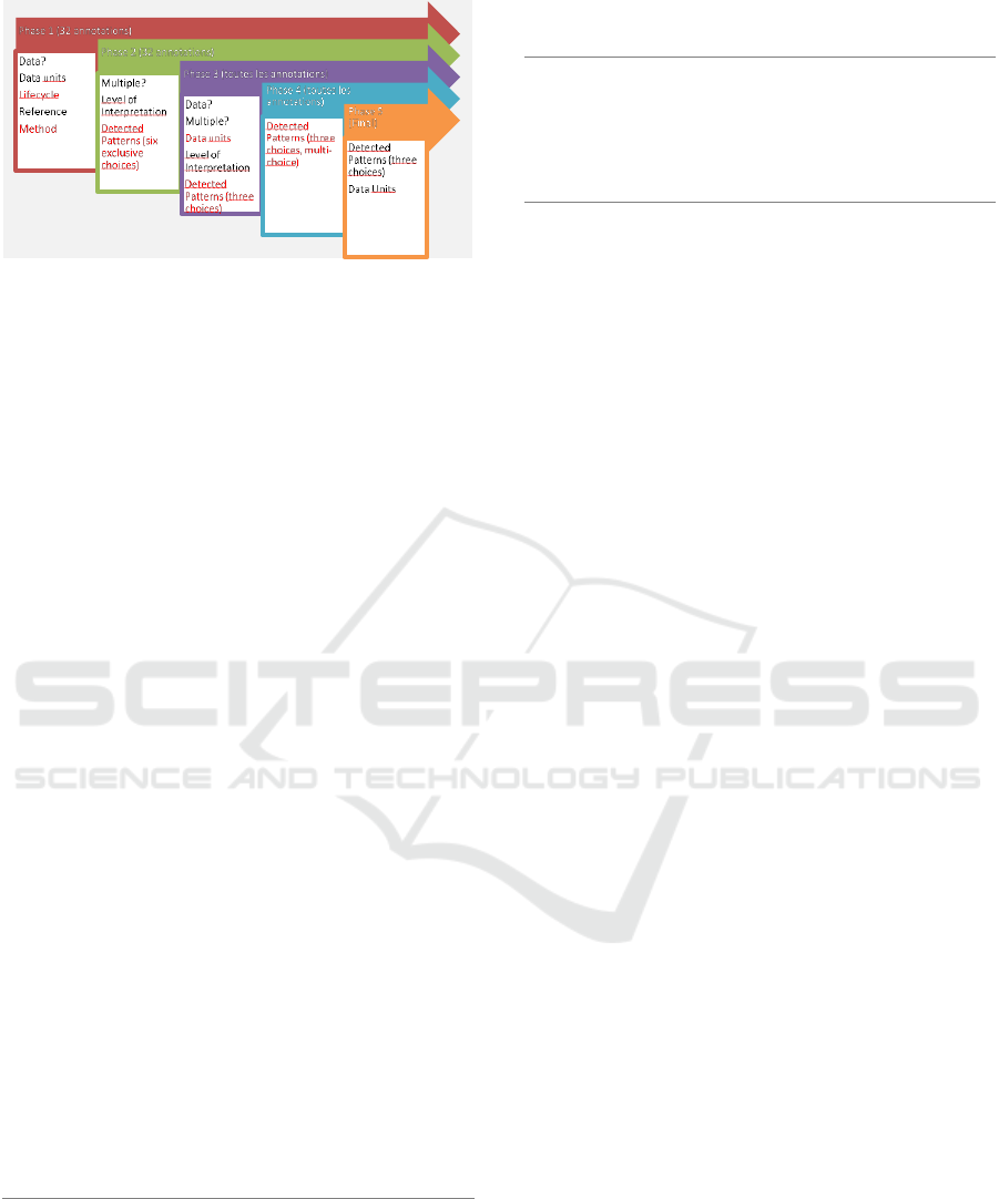
Figure 3: The 5 phases necessary to build the classification.
Dimensions that scored poorly are in red.
sures whether the perceived agreement is the result of
chance or not. It scales from -1 to 1. Negative values
implies that there is no agreement. A value of 0
represents an agreement level that can be achieved by
chance alone, while a value of 1 means a perfect
agreement between coders. Landis and Koch (1977)
propose the following interpretations for Fleiss’
Kappa: from 0.01 to 0.20, the agreement is “slight”.
From 0.21 to 0.40, the agreement is “fair”. From 0.41
to 0.60, the agreement is deemed “moderate”. From
0.61 to 0.80, the agreement is “substantial”, while it
is “almost perfect” from 0.81 to 1. For this study, we
deemed values superior to 0.21 as sufficient, since
there exists no score recommendation in the domain
of Human-Machine Interaction. Each possible choice
of multiple choices dimensions was processed
independently from the others, to judge both the
reliability of the whole dimension and each of its
choices. The dimension “Data Unit” is a special case,
since the coders had various ways of identifying the
same element. Faced with the multitude of choices
offered by this dimension, we only computed the
Pairwise Percentage Agreement.
Table 2 summarizes the results that validated our
classification as presented in the previous section.
Table 3 and 4 present the results for each choice of
the two multiple choices dimensions. Figure 3 shows
the evolution of the classification through all phases,
along with the following comments.
Table 2: All dimensions, by validation phase, percentage
agreement and Fleiss’ Kappa.
DIM
PHASE
%
KAPPA
Data
3
97.56%
0.935
LOI
3
82.43%
0.393
Ref
3
96.40%
0.549
Multiple
3
94.89%
0.232
Patterns
5
92.76%
0.778
Units
5
94.89%
NA
Table 3: “Level of interpretation” choices.
LOI
%
KAPPA
Visual
82.99%
0.398
Data
78.23%
0.361
Meaning
86.05%
0.419
Table 4: “Detected patterns” choices.
PATTERNS
%
KAPPA
Singularity
89.91%
0.702
Duality
92.66%
0.811
Plurality
95.72%
0.821
• Dimension “Level of interpretation” was initially
labelled “Cognitive lifecycle”, because we
believed that it represents a step within the
sequential process of sensemaking when
analysing a visualization, as described by Bertin
(Bertin, 1967). This claim was hard to validate
with this study, and the label was deemed too
ambiguous; hence the change for a more
comprehensive one.
• Dimension “Multiple observations” was not
present in the first phase, but proved to be
necessary during the computation of the first
Inter-Coder agreement: several annotations
unexpectedly contained more than one insight.
This fact led to a dozen of disagreements, as
coders did not classify the same part of the
annotation. We decided to tag each annotation
with a Boolean value describing whether it
contains more than one insight or not. If so, the
annotation was not considered any further.
• Dimension “Data units” scored poorly during
Phase 3. It turned out that one coder did not
consider temporal dimension in her classification
process (units such as “End of the story”). This
divergence lowered the agreement to 2/3 for most
annotations related to the Heatmap and the
Streamgraph. To a lesser extent, the same problem
occurred with the graphs, where co-occurrences
could also be considered as units. The three
experts discussed the issue after Phase 4, agreeing
on considering each dimension as bearing
potential data units. While it might seem
counterintuitive, this measure is necessary to
ensure the completeness of the classification
system.
• Dimension “Detected patterns” was the most
laborious to handle. During Phase 1, it was
labelled “Method”, referring to the method used
by the annotator to formulate her insight. It also
contained all the patterns proposed by Munzner
(2014). The label changed for “Detected Patterns”
in Phase 2, as it was deemed more self-
explanatory. Moreover, coders did not agree on
Designing a Classification for User-authored Annotations in Data Visualization
93
the definition of each pattern, as different patterns
could be used to qualify a single insight. We thus
reduced its values to three distinctive choices
during Phase 3. These choices became non-
exclusive in Phase 4, since several cases presented
insights that belonged to more than one option.
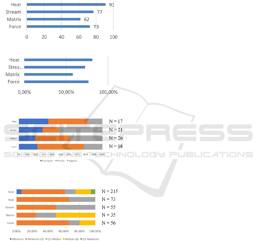
Figure 4: Annotations produced, by visualization.
Figure 5: Data related annotations, by visualization and in
percent.
Figure 6: Types of non-data related annotations, by
visualization and in percent.
Figure 7: Distribution of data related annotations by
visualization amongst participants. The number of
occurrences for each visualization is indicated to the right.
7 USE CASE
The classification of the 302 annotations provided by
the participants offers a first idea of what to expect
when the classification will be used in a large-scale
study comparing the type of annotations made over
different visualizations of the same datasets.
Of the 4 visualizations, participants generated the
least annotations with the matrix, while the heatmap
generated the most, as seen in Figure 4. Conversely,
Figure 5 shows that the visualization which generated
the most non-data annotations was the matrix: more
than a third of its annotations speak of the
visualization itself, rather than the data. Finally, as
seen in Figure 6, the matrix did not provoke the most
negative reactions – the streamgraph did. One
hypothesis is that matrix was the most confusing for
new users. If so, the “Data” dimension of our
classification could be an indicator of the ease of
learning of a visualization: the more it generates non-
data related annotations, the harder it is to
comprehend. However, this dimension alone does not
translate the perceived quality of a visualization,
since the participants complained significantly more
about the streamgraph. Figure 7 shows that for both
the heatmap and the streamgraph, participants have a
median of data-related annotations of 100%, whereas
both graphs are below. This would mean that both
temporal visualizations were easier to handle for our
participants.
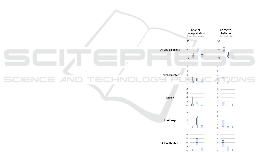
As seen in Figure 8, most annotations concern the
“data” level of interpretation. However, the extent of
this phenomenon varies importantly between each
visualization. Graphs (matrix and force-directed
graph) generate more annotations related to the visual
elements: analysts speak of the position of nodes, of
the opacity of the lines, etc. “Meaning” level of
interpretation is mostly found in the force-directed
graph: this finding should be tempered by the fact the
dummy visualization was a force-directed graph as
well. Either the knowledge of a visualization
facilitates the interpretation of the data (this might
sound trivial, but still worth validating), either the
graphs and their “proximity” metaphor are easier to
understand.
Overall, as seen in Figure 8, a large majority of
the annotations concern singularities. Analysts
usually spotted a few units standing out, rather than
comparing similar elements or qualifying of the
entirety of the data. A trivial explanation is that there
exists simply less to say about the entirety of the data,
rather than by isolating specific units.
Finally, a qualitative review of the data unit
dimension led us to believe that there exists a
distinction between annotations that mention a
subject aggregated data unit (“the violet group”, “the
main characters”) and several subject single data units
(“Valjean, Cosette and Marius”, “Fantine and
Myriel”). In the latter, the result of the annotation is
IVAPP 2018 - International Conference on Information Visualization Theory and Applications
94
to highlight a common property of a set of single data
units. In the former, annotation tend to point to a
property that is not directly linked to their common
characteristics. For instance, in the annotation “the
violet cluster is denser than the others”, the density
of the cluster is not directly linked to the colour of its
constituent single data units.
7.1 Further Improving the
Classification
Despite our best efforts, the classification struggles to
encompass several annotations met during this study.
The “role” of a Data unit is not objectively
identifiable. While the agreement score for this
dimension was acceptable, the three experts had long
discussions during each disagreement regarding the
role of a data unit; without clarifications of the analyst
who authored the annotations, it might not be possible
to find out which unit was the most prevalent for her.
The relevance of this distinction is also debatable and
should be either clarified in further studies, or simply
given up. This last option would heavily impact the
classification, since the identification of the subject is
preliminary to the identification of the “Detected
pattern”. Getting rid of this distinction could lead to a
more complex classification, where each data unit
would have different “Detected patterns”.
The “Multiple” dimension came as a surprise; we
did not expect to meet such problems when
classifying annotations. To replace this dimension
with a more expressive one, one avenue worth
exploring is that each “insight” within an annotation
could be classified, but then again, further studies are
needed to validate this idea, especially since the
Fleiss’ Kappa score of this dimension was the lowest
of our classification. Moreover, this would also result
in a more complex classification system.
7.2 Building on the Classification
Our initial study aimed to gather 300 annotations. We
did not have enough participants, datasets, use cases
and visualizations to find out significant relationships
between the knowledge of the domain and the
different dimensions of our classification. The
profiles of our participants being homogeneous, we
cannot assert that our classification can be
generalized to anyone, regardless of their
demographic affiliation or level of expertise. Another
problem is that our use case was not real: experts of a
topic might produce different annotations than non-
expert users. Further studies with a larger pool of
participants will offer more reliable results, as well as
proving the classification’s completeness. Such
studies will be able to either confirm or deny the
correlation between several of our dimensions. For
instance, while we believe a distinction is necessary
between the detected patterns and the level of
understanding, they seem to be tightly coupled, as
hinted by Bertin (1967) and many authors following
his trail (McKnight, 1990; Carswell, 1992; Wainer,
1992; Susan et al., 2001). To confirm or deny this
hypothesis, a new study is necessary: one that would
also analyse the sequence of the annotations, so that
it will be possible to find out whether users start with
“simple” annotations before building more
“complex” ones – both in terms of interpretation and
detected patterns.
Following this study, we intend to use this
classification in a new version of our annotation
platform, as we believe that it could improve sorting
and filtering through others’ annotations. A further
step will be to provide the Data Visualization
community with a ground truth regarding which
visualizations are most relevant for various tasks.
Figure 8: Distribution of levels of interpretation and
detected patterns, by visualization.
8 CONCLUSIONS
We introduced a classification system of user-
authored annotations in data visualization, designed
with a bottom-up approach inspired from Grounded
Theory, based on a dataset of 302 annotations
recorded by 16 analysts that were classified in an
iterative process by 3 coders. The final classification
Designing a Classification for User-authored Annotations in Data Visualization
95

comprises 6 dimensions, related to previous work that
investigated the types of questions and tasks
supported by data visualization. This work
contributes to data visualization research in several
ways. First, it explicitly acknowledges annotations as
a first-class citizen in visualization research. It
provides a formal definition of annotations and
introduces an original classification system for
visualization annotations. It then provides a use case
showcasing how this classification can be applied to
qualitatively compare visualizations of the same data.
The resulting classification system is a promising
basis on which the Data Visualization community
might build different long-term realizations, such as
more comprehensive visualization recommender
systems that could propose visualization design
choices based on the types of expected outcomes, or
suggest complementary sets of visual representations
for data based on these outcomes. Future research in
this domain should focus on applying this annotation
classification system to annotations produced on
different datasets represented using various other
visualization idioms, to challenge its completeness
and its generalizability, and possibly further extend it.
REFERENCES
Bertin, J. (1967) Sémiologie graphique : les diagrammes,
les réseaux, les cartes.
Bostock, M. (2012) Les Misérables Co-occurrence.
Available at: https://bost.ocks.org/mike/miserables/
(Accessed: 16 April 2017).
Bostock, M. (2017) Force-Directed Graph - bl.ocks.org.
Available at: https://bl.ocks.org/mbostock/4062045
(Accessed: 16 April 2017).
Bostock, M., Ogievetsky, V. and Heer, J. (2011) ‘D3 data-
driven documents’, IEEE Transactions on
Visualization and Computer Graphics, 17(12), pp.
2301–2309. doi: 10.1109/TVCG.2011.185.
Boy, J. et al. (2015) ‘A Principled Way of Assessing
Visualization Literacy To cite this version : A
Principled Way of Assessing Visualization Literacy’.
Carswell, C. M. (1992) ‘Choosing specifiers: an evaluation
of the basic tasks model of graphical perception.’,
Human factors, 34(5), pp. 535–554. doi:
10.1177/001872089203400503.
Cohen, J. (1960) ‘A coefficient of agreement for nominal
scales’, Educational and Psychological Measurement,
20, pp. 37–46. doi: 10.1177/001316446002000104.
Curcio, F. R. (1987) ‘Comprehension of Mathematical
Relationships Expressed in Graphs’, Journal for
Research in Mathematics Education, 18(5), pp. 382–
393. doi: 10.2307/749086.
Fleiss, J. L. (1971) ‘Measuring nominal scale agreement
among many raters.’, Psychological Bulletin, pp. 378–
382. doi: 10.1037/h0031619.
Heer, J., Viégas, F. B. and Wattenberg, M. (2009)
‘Voyagers and Voyeurs: Supporting Asynchronous
Collaborative Visualization’, Communications of the
ACM, 52(1), pp. 87–97. doi:
10.1145/1240624.1240781.
Landis, J. R. and Koch, G. G. (1977) ‘The measurement of
observer agreement for categorical data.’, Biometrics,
33(1), pp. 159–174. doi: 10.2307/2529310.
Luther, K. et al. (2009) ‘Pathfinder: An Online
Collaboration Environment for Citizen Scientists’,
Proceedings of the SIGCHI Conference on Human
Factors in Computing Systems, pp. 239–248. doi:
10.1145/1518701.1518741.
McKnight, C. C. (1990) Task Analyses of Critical
Evaluations of Quantitative Arguments: First Steps in
Critical Interpretation of Graphically Presented Data.
Boston.
Munzner, T. (2014) Visualization analysis and design. CRC
Press.
Ren, D. et al. (2017) ‘ChartAccent: Annotation for Data-
Driven Storytelling’, Ieee, pp. 18–21. Available at:
https://www.microsoft.com/en-
us/research/publication/chartaccent-annotation-data-
driven-storytelling/.
Satyanarayan, A. et al. (2016) ‘Reactive Vega: A Streaming
Dataflow Architecture for Declarative Interactive
Visualization’, IEEE Transactions on Visualization and
Computer Graphics, 22(1), pp. 659–668. doi:
10.1109/TVCG.2015.2467091.
Satyanarayan, A. et al. (2017) ‘Vega-Lite: A Grammar of
Interactive Graphics’, IEEE Transactions on
Visualization and Computer Graphics, 23(1), pp. 341–
350. doi: 10.1109/TVCG.2016.2599030.
Satyanarayan, A. and Heer, J. (2014) ‘Lyra: An interactive
visualization design environment’, Computer Graphics
Forum, 33(3), pp. 351–360. doi: 10.1111/cgf.12391.
Susan, N. et al. (2001) ‘Making Sense of Graphs: Critical
Factors Influencing Comprehension’, Journal for
Research in Mathematics Education, 32(2), pp. 124–
158. doi: 10.2307/749671.
Viegas, F. B. et al. (2007) ‘Many Eyes: A site for
visualization at internet scale’, IEEE Transactions on
Visualization and Computer Graphics, 13(6), pp. 1121–
1128. doi: 10.1109/TVCG.2007.70577.
Wainer, H. (1992) ‘Understanding Graphs and Tables’,
Educational Researcher, 21(1), pp. 14–23. doi:
10.3102/0013189X021001014.
Willett, W. et al. (2011) ‘CommentSpace: Structured
Support for Collaborative Visual Analysis’, Sigchi, pp.
3131–3140. doi: 10.1145/1978942.1979407.
Wongsuphasawat, K. et al. (2016) ‘Voyager: Exploratory
Analysis via Faceted Browsing of Visualization
Recommendations’, IEEE Transactions on
Visualization and Computer Graphics, 22(1), pp. 649–
658. doi: 10.1109/TVCG.2015.2467191.
Zhao, J. et al. (2017) ‘Annotation Graphs: A Graph-Based
Visualization for Meta-Analysis of Data Based on
User-Authored Annotations’, IEEE Transactions on
Visualization and Computer Graphics, 23(1), pp. 261–
270. doi: 10.1109/TVCG.2016.2598543.
IVAPP 2018 - International Conference on Information Visualization Theory and Applications
96
