
Data Aggregation and Distance Encoding
for Interactive Large Multidimensional Data Visualization
Desislava Decheva
1
and Lars Linsen
1,2
1
Jacobs University, Campus Ring 1, 28757 Bremen, Germany
2
Westfälische Wilhelms-Universität Münster, Einsteinstr. 62, 48149 Münster, Germany
Keywords: Multidimensional Data Visualization, Projection Methods, Visual Clutter Reduction.
Abstract: Visualization of unlabeled multidimensional data is commonly performed using projections to a 2D visual
space, which supports an investigative interactive analysis. However, static views obtained by a projection
method like Principal Component Analysis (PCA) may not capture well all data features. Moreover. in case
of large data with many samples, the scatterplots suffer from overplotting, which hinders analysis purposes.
Clustering tools allow for aggregation of data to meaningful structures. Clustering methods like K-means,
however, also suffer from drawbacks. We present a novel approach to visually encode aggregated data in
projected views and to interactively explore the data. We make use of the benefits of PCA and K-means
clustering, but overcome their main drawbacks. The sensitivity of K-means to outlier points is ameliorated,
while the sensitivity of PCA to axis scaling is converted into a powerful flexibility, allowing the user to
change observation perspective by rescaling the original axes. Analysis of both clusters and outliers is
facilitated. Properties of clusters are visually encoded in aggregated form using color and size or examined
in detail via local scatterplots or local circular parallel coordinate plots. The granularity of the data
aggregation process can be adjusted interactively. A star coordinate interaction widget allows for modifying
the projection matrix. To convey how much the projection maintains neighborhoods, we use a distance
encoding. We evaluate our tool using synthetic and real-world data sets and perform a user study to evaluate
its effectiveness.
1 INTRODUCTION
Raw representations of multidimensional data points
are traditionally found in the form of large numerical
matrices in which each column corresponds to an
attribute or dimension (Bache and Liohman, 2013).
In order to allow for an effective visual presentation
of the data, however, a mapping from the original
high-dimensional data space into a lower-
dimensional visual space needs to be discovered.
The sufficient dimensionality reduction is generally
accompanied by an equally significant loss of
information. Dimensionality reduction mappings
often aim at exploiting the intrinsic dimensionality
of the set, which can be much smaller than that of
the original data space (Bennett, 1965). The second,
more user-oriented phase of the data visualization
process is the production of an aesthetic and insight-
stimulating representation to display or interact with.
Cognitive Psychology and Information Visualization
research has demonstrated that representations of
multidimensional data generated with the aid of
computer-based visualization tools improve human
cognition (Parsons and Sedig, 2013). In order to
achieve that, many dynamic and static visualization
techniques draw on aspects of human perception
such as distance perception, shape identification,
color recognition, size differentiation, motion
detection (Healey, 1996). Although data attributes
can in principle be mapped to various properties of
representation glyphs (position, color, size, etc.), a
typical cap is reached after the fifth or sixth
dimension. Thus, for datasets of higher intrinsic
dimensionality, it is important that adequate
dimensionality-reduction and interactive-display
techniques are employed in combination.
Our goal was to design, implement, and evaluate
an easy-to-use data visualization tool through which
spatially-accurate representations of large, unlabeled
multidimensional data sets can be interactively
examined. The qualitative study of correlations,
clusters and exceptional points is empowered.
Decheva, D. and Linsen, L.
Data Aggregation and Distance Encoding for Interactive Large Multidimensional Data Visualization.
DOI: 10.5220/0006602502250235
In Proceedings of the 13th International Joint Conference on Computer Vision, Imaging and Computer Graphics Theory and Applications (VISIGRAPP 2018) - Volume 3: IVAPP, pages
225-235
ISBN: 978-989-758-289-9
Copyright © 2018 by SCITEPRESS – Science and Technology Publications, Lda. All rights reserved
225

For the development of the application, the best
characteristics of Principal Component Analysis
(PCA) and K-means clustering are drawn upon. The
fact that both methods provide for rapid computation
and process data in an unsupervised manner makes
them highly suitable for our purposes. Our tool aims
at enabling the user to investigate spatial relations
between data points via a distance-preserving
representation, so PCA is an adequate approach.
Since the tool visualizes large amounts of data in a
limited screen space, measures are taken to
minimize visual clutter and maximize cluster
definition. One half of this is achieved via the PCA
projection matrix which is further modifiable
through the star-coordinates widget and with which
data points are projected in as much of a spread-out
manner as possible.
Regions where still many data points are
accumulated then benefit from a summarization
procedure developed on the basis of K-means
clustering. By running this new adjustable-parameter
clustering algorithm, small aggregations of data
points can be unraveled and displayed at
customizable levels of granularity. Important cluster
properties, such as area, density and population
profiles (in circular parallel coordinates) are visually
encoded and displayed.
2 BACKGROUND
Dimensionality reduction approaches can be
separated into two big families. Supervised methods
operate on labeled data sets in which all data points
are preliminarily assigned to a class based on the
objective truth or an expert’s opinion. In
applications where vast amounts of unlabeled data
need to be compressed into a lower-dimensional
space unsupervised techniques are preferred.
With respect to distortion of relations within the
original set, distance-preserving versus non-
distance-preserving maps are differentiated between.
Often distance-preserving projections aim at the
arrangement of codomains whose local geometrical
characteristics reflect the characteristics of the
original set (Zhu et al., 2013).
Moreover, computational complexity and ease of
implementation can be considered. Linear as
opposed to non-linear dimensionality reduction
methods have notably low computational costs and
can be effectively implemented by reductions to
matrix factorization and/or multiplication. Nonlinear
methods have been empirically established to
produce better results on artificial tasks but in many
real- life applications linear methods prove equally
reliable (von der Maaten e´t al., 2008). Therefore,
the advantage of their computational simplicity
should not be discounted.
Principal Component Analysis (Pearson, 1901) is
an unsupervised, feature-transforming and linear
dimensionality reduction procedure which maps an
original data space with possibly correlated axes
into a target space where no linear correlation
between dimensions is observed. The basis of the
new space is formed by the principal components of
the data, which is a set of vectors existing in the
original space, but along which the variance of the
data is maximal. Geometrically, this corresponds to
computing an n-dimensional ellipsoidal container for
the data points, whose axes lie in the directions of
optimal data variance. The eigenvectors of a
symmetric matrix are by default pairwise
orthogonal. Therefore, as the extraction of ellipsoid
axes is based on eigen-decomposition of the data’s
covariance matrix, the resulting vector set is also
orthogonal. Three common approaches of centering,
scaling and standardization are discussed in
literature (Flury, 1997). Centering, the least intrusive
of the three, refers to the shifting of data points to
mean 0 along each axis before the eigen-
decomposition on the covariance matrix is
computed, and is what the majority of advanced
linear algebra programming libraries implement to
ensure minimization of the mean squared error.
Scaling divides the point entries along each axis by
the standard deviations in the data-matrix columns
representing the axes. This results in all attributes
having unit variance and ensures that variables are
treated with equal weight. Standardization is the
application of first centering and then scaling and,
like scaling alone, is recommended only when
information about differences in measuring scales is
available.
An intuitive and computationally effective
method of modifying the data projection matrix (and
thus the observation perspective) is discussed by
Kandogan in his work on Star Coordinates
(Kandogan, 2000). In a star-coordinates system the
position of a data point is computed as a vector sum
of the unit vectors representing each axis, scaled by
the point’s corresponding attribute-measurement.
The unit vectors all lie in a 2D plane, distributed by
the same angle and sharing a common origin.
The objective of clustering is the partitioning of
a dataset into groups such that intragroup variance is
minimized. Traditionally used in data mining and
statistical analysis, clustering has an alternative
application as a partial summarization procedure of
IVAPP 2018 - International Conference on Information Visualization Theory and Applications
226

data when visual clutter in graphical applications is
to be avoided. A variety of clustering techniques
exists, belonging to one out of four organizational
branches, according to cluster model. Hierarchical
cluster analysis is a greedy approach aiming at the
establishment of a ranked sub-structure of the
original data set. Hierarchical algorithms employ a
predefined cluster-similarity measure according to
which sub-clusters are merged or super-clusters are
split. Decisions about cluster treatment are based on
the local optimization criterion entailed by the
measure. Data set representations obtained through
agglomerative or divisive clustering are especially
appropriate when a dendrogram-based final
depiction is required (Long and Linsen, 2009).
When a distance-preserving representation of the
data is required however, more suitable choices
exist.
Distribution clustering takes advantage of
statistical knowledge of data distribution models. It
assumes that objects generable under the same
distribution parameters must share a deeper
commonality. The arrival at suitable distribution-
based procedures can be guided by Expectation
Maximization but it often demands the solution of a
non-trivial maximization problem, presented by the
M-step (Dempster, 1977).
Density-based clustering defines a cluster as a
regional density maximum in the original data space
and uses density drops to delineate cluster
boundaries. To identify a point as belonging to a
cluster most density-based algorithms employ a
reachability or a linkage relation whose asymmetry
guarantees the termination of successive point
inclusion (Dempster et al., 1977). The main
advantage of density- based methods is the ability to
recognize irregular cluster shapes. Disadvantages
manifest in computational speed and with highly
high-dimensional data sets where the Curse of
Dimensionality (Bellman, 1957) interfers with the
notion of density.
In centroid-based clustering, convex formations
of data points are sought such that each group is
centered around a prototype, which may or may not
be a member of the original set. Common choices of
representative points are the cluster’s mean or
median. Therefore, optimization of cluster center as
opposed to cluster border is performed. Since the
decision (simpler) version of this problem is already
NP-complete, effort has been focused on the
development of approximate solutions. Centroid-
based clustering is straightforward and efficient to
implement in an iterative fashion and has an
empirically fast convergence rate.
K-means clustering is an unsupervised centroid-
based clustering algorithm, developed in response to
the cluster-center optimization problem. Random
initialization of a predetermined-cardinality centroid
set is performed and upon convergence a Voronoi
partitioning of the data space is returned. Although
there exist synthetic data sets for which convergence
is exponential, empirical tests have established that
runtime on real-life data is polynomial (Har-Paled
and Sadri, 2005). A disadvantage of K-means is that
due to its approximative nature, it is susceptible to
local solution optima. Also, while running the
algorithm with the correct number of random
prototypes might produce inconsistent results, an ill-
informed number of centroids will almost always
result in under- or oversegmentation. Another
concern is centroid-based algorithms’ sensitivity to
outliers. One strategy to improve the reliability of K-
means is the removal of outliers (Hautamäki et al.,
2005). We argue though that outliers are of
relevance for many application scenarios.
3 APPROACH
The main idea guiding the standard workflow of the
developed visualization tool is to first lay the
examined dataset out in a maximally distance-
preserving fashion and display a low-detail summary
of it in the form of a small number of representation
glyphs encoding point-group area and relative
density. The user is then allowed to toggle the
visibility of observation points belonging to each
glyph or of the entire dataset and to further refine the
level of presented detail by modifying the tool’s
algorithm parameters.
If the user wishes to recompute the projection by
using different measurement units for a certain data
attribute, he/she is allowed to rescale the attribute
values in the original data matrix by operating one of
the tool’s widgets. Additionally, the attribute values
(in the currently used units) of points summarized by
each glyph can be plotted in circular parallel
coordinates upon request.
Observation of the dataset from various
perspectives is encouraged via an interactive
application of translations and rotations. Animated
transitions between layouts and detail-level states
are computed at interactive rates. Since viewing the
dataset from a non-distance-preserving perspective
can lead to the distortion of spatial information, a
customizable number of helper links can be output
between glyphs, encoding the represented group-
centers’ actual proximity.
Data Aggregation and Distance Encoding for Interactive Large Multidimensional Data Visualization
227
In the following, the individual steps of our
approach are detailed.
3.1 Dimensionality Reduction
In order to obtain a matrix with which to transform
the data into a simpler (fewer-dimensional)
representation, we perform a PCA. Correlations
between axes indicate that the data set possesses a
much lower intrinsic dimensionality than the space
in which it was originally recorded. To describe it in
terms of this lower-dimensional space, the tool
multiplies its original representation by the PCA
matrix. The resultant contains a sufficiently large
amount of spatial information about the data,
recorded in its first few columns (determined by the
instrinsic dimensionalty). Principal components of
lesser contribution are dismissed as the descriptive
power they hold is typically negligible and a reduced
matrix representation of the dataset is obtained.
3.2 Density Maxima Localization
The study of outliers finds various practical
applications in performance, anomaly, and behavior
monitoring. Therefore, an approach which not only
preserves exceptional points in the dataset but also
devotes equal attention to their handling as to the
processing of other internal data-set structures, is
advised. As an additional benefit, the
undeterministic properties of the original K-means
algorithm are ameliorated, since the number and the
locations of initial centroids can be pre-informed.
A method for capturing both compact groups and
outliers while minimizing distortions in the data
representation and stabilizing the K-means
clustering output, is developed, based on the analysis
of local density maxima. Therefore, the discovery of
high-density regions as a procedure prerequisite is
performed.
Firstly, the columns of the reduced matrix are
rescaled to the interval [0,1]. This is equivalent to
fitting the transformed and simplified data points
into a multi-dimensional hypercube, which is
rasterized according to the number of desired
dimensions and a fixed cell-size along each of the
considered axes. This leads to a raster with N
c
= S
-d
cells, where S is the cell size and d is the number of
considered dimensions. The exponential growth in
the number of raster cells with increasing the
number of dimensions (cf. Curse of Dimensionality
(Bellman, 1957)) justifies the decision to keep only
the leading principal components.
Secondly, data points lying in each cell are
counted with the purpose of identifying cells of
high-density levels as compared to others in their d-
dimensional neighbourhood (equivalent to a 3D 8-
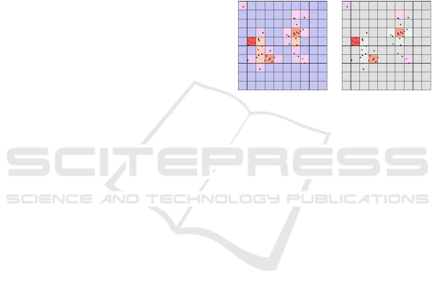
neighborhood). In Figure 1, a two-dimensional data
set containing two natural clusters and one outlier
point is presented with the purpose of illustrating the
process of density-maxima discovery and the way in
which the K-means centroid number/placement
decision is taken.
Note that we only store non-empty cells during
the processing to avoid exploding memory space.
a) b)
Figure 1: Example computation of local density maxima in
an 8-neighbourhood comparison area, performed on a
small two-dimensional dataset. The cell raster has been
created by using 2 considered dimensions and cell size =
1/10. a) A color-coding of cells based on the number of
points they contain. b) Density-maximum (centroid-
placement) cells emphasized by keeping their original
color. All non-maximum cells have been colored in gray.
3.3 Aggregation
If thousands of points from a data set are projected
to the screen individually, perceptual overload might
ensue. In order to reduce visual clutter in the final
visual representation, points with similar
characteristics are grouped and displayed as a single
appropriate-characteristics entity.
To form observation groups, a small number of
pre-informed-centroid K-means clustering iterations
are executed. This summarization procedure aims to
capture small regions of stable or radially-decreasing
concentration, reducing the discretization effects
induced by the rasterization. Due to the local rise in
density they constitute, outlier points are assigned to
their own centroids and are later on separately
projected. In this manner, outliers are prevented
from distorting the representations of more compact
structures, yet an in-depth exception analysis is
facilitated.
At the level of granularity defined in Figure 1,
the 2D dataset is summarized on the screen as
follows: one glyph for the single-point group
containing the outlier, two glyphs for two multipoint
IVAPP 2018 - International Conference on Information Visualization Theory and Applications
228

groups of close relatedness, arisen by the left cluster,
and three more glyphs for the multipoint groups
comprising the core, the upper tail, and the lower tail
of the right cluster, respectively. Each of the pre-
informed prototypes typically result in a group
unless no points have remained in its closest
proximity due to the iteration. The segmentation
level in cluster representations depends on the raster-
cell size / the number of considered dimensions and
is customizable by the user.
3.4 Intra-group Properties
In order to encode characteristic information about
each of the delineated groups into the visual
properties of its representation glyph the following
two measures are computed: group spread and
group relative density.
The multidimensional area equivalent of each
group (the group’s spread) is estimated by an
intragroup measure β, similar to a statistical
variance. First, the divergence δ
ij
is the divergence
of point j in group i is computed by:
where e
ijk
is the kth entry of point j in group i,
µ
ijk
is the analogous entry in the representation of the
group’s centroid, and d is the number of considered
dimensions. The measure β of a group is then
defined by
where n
i
is the number of points assigned to group i.
For display and comparative purposes, the area
of each group is converted to a percentage of total
groups area and is proportional to the size of the
group’s representation glyph to be output to the
screen. Thus, the total area A
i
of the representation
glyph of group i is given by:
where n is the total number of groups computed
by the K-means-like summarization procedure and ω
is a scaling factor which can differ depending on the
size of the screen.
The second important property encoded in a
group’s glyph representation is group density, as
compared to the densities of other dataset structures
presented on the screen. A straightforward
computation of group density by the formula D
i
=
n
i
/A
i
, where D
i
is the density of group i, is bound to
result in division-by-zero errors, due to the fact that
the standard deviation of 1-point groups is equal to
0, i.e., the point’s position in space coincides with
that of the centroid. To avoid this caveat and any
arbitrary threshold numerically delimiting zero and
non-zero values, the relative density of group i is
computed by
3.5 Inter-group Distances
Since the large number of small groups output by the
summarization procedure at higher levels of
granularity can be perceived as broad-structures
oversegmentation, it is important to keep track of
which glyphs encode detail in a more complicated
formation and which should indeed be considered as
separate. To achieve this, the distance between each
pair of groups is computed and the option to display
links between logically-connected groups is
provided to the user. Moreover, encoding these
distances provides information that is important, if
the data are projected to a 2D layout that cannot
fully preserve distances.
We compute the distance between the closest
two points belonging to different groups as a
measure of the groups’ logical connectedness
(similar to the procedure in single linkage
clustering). Since we have to compute pairwise
distances of n groups and need to consider in each
pairwise test all samples of both groups, which can
each be O(N) samples, if N is the number of all
samples, the time complexity is O(n
2
N
2
), which is
rather expensive for large N. We approximate the
result by finding for a group the point with minimal
distance to the centroid of the other group and vice
versa. Since centroid computations are expensive in
a high-dimensional space, we operate in the
dimensionality-reduce space (cf. Section 3.1). The
final distance is computed in the original data space
though. Time complexity drops to O(n
2
N).
3.6. Visual Encoding
For generating the layout of our visual encoding, the
locations of group centroids in the reduced data
space are projected to a 2D visual space, where the
circular glyphs are placed.
Data Aggregation and Distance Encoding for Interactive Large Multidimensional Data Visualization
229
Group spread as a percentage of total groups
spread is encoded via the size of the circular glyphs,
where the total screen area covered by glyphs sums
up to scaling factor ω introduced in Section 3.4.
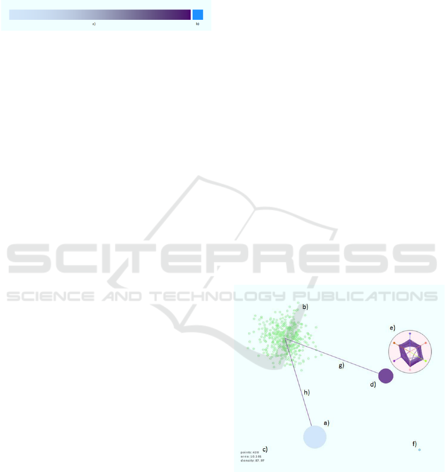
Figure 2: (a) Color map for group-relative density and
intergroup-relation strength. (b) Color of outlier glyphs.
To encode relative group density a glyph color
along the linear-interpolation gradient (Figure 2a)
between the two RGB colors (210, 230, 250) and
(75, 0, 110) is selected. The choice of the two colors
is considered appropriate due to the fact that
differences in all three HSV components of the
colors are present (dH = 71, dS = 84, dV = 55), yet
the location of an intermediate color on the resultant
gradient can be easily estimated. Additionally,
tritan-related anomalies in the general population
have the lowest documented incidences of all color-
related vision disorders (Rigden, 1999), giving
color-shades in the blue-violet end of the spectrum
the highest chance of being recognized by the
average human individual.
As possessing a maximum comparative density
of 100%, single-point groups, likely containing an
outlier, are encoded with a distinct blue color
(Figure 2b), combined with a hollow-circle
appearance of their representation glyphs. In
contrast, multi-point groups exhibiting the same
density (i.e., all points lie exactly at the group’s
centroid), are encoded as normally – by a small-size
filled-circle glyph drawn with the darkest color of
the density-encoding gradient.
There are two less aggregated views for each
group available when hovering over or clicking at a
glyph, respectively. When hovering over a glyph, a
planar plot of the points belonging to its
corresponding group according to the current
projection is rendered. The number of assigned
points, the group’s area, and relative density are
output in textural form in the lower left corner of the
screen. If the glyph is clicked, a circular parallel
coordinates plot of all points belonging to the cluster
is rendered.
To reduce overplotting in groups with large
number of members, the color of each line is chosen
according to the point’s entry value along the
original dataset axis with maximum variance. The
examination of the circular-parallel-coordinates
signature of each group can provide qualitative
information on the group’s homogeneity, the
intragroup ranges along axes, and the presence of
outstanding points, which at a higher level of
granularity may have been captured as outliers.
The option of visualizing intergroup
connectedness is provided via the concept of
neighborhood links, which improves the coherent
interpretation of larger structures presented as
multiple glyphs and will convey truthful information
on group-pairs’ proximity, regardless of chosen
projection. When hovering over a glyph,
connections in the form of colored straight lines to
the centers of other groups’ glyphs are depicted. The
neighborhood criterion according to which the links
are drawn is of a k-closest nature, where k is
between 0 and 10 and is modifiable via a slider in
the visualization tool’s interface. Furthermore, the
visibility of a user-defined maximum number of
links, in the same interval, can be permanently
enabled, while the links are additionally interactively
filtered by the strength of the relation they
represent.
For color-computation purposes the strength of
each connection is expressed in relative terms.
Naturally, links of close-to-0 lengths encode the
strongest relations among groups in the dataset and
are drawn in the darkest possible intergroup-
connectedness-encoding color. Conversely,
neighboring groups possessing closest points further
apart are paired by a less visually salient connection,
using again the color map in Figure 2a.
Figure 3. Visual encodings: (a) Large-spread low-density
group. (b) Group scatterplot appearing when the group’s
glyph is hovered over. (c) Hint reporting number of points
(426), area (10.161), and relative density (87.97) of
hoevered-over group. (d) Smaller-spread, high-density
group. (e) Circular parallel coordinates plot of the group in
(d). (f) Outlier. (g,h) High-relation-strength intergroup
links, produced by a 2-closest criterion applied on the
group in (b).
IVAPP 2018 - International Conference on Information Visualization Theory and Applications
230
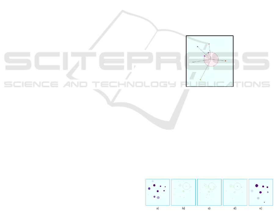
Figure 3 provides an example image showcasing
the visual encodings. To produce this image, the
visualization tool was run on a synthetically-
generated six-dimensional dataset containing three
easily-distinguishable clusters, polluted with
approximately 1% of noise objects each, and one
outlier point marked with blue in f). The clusters,
each of which has been captured as a single group at
the current low level of granularity, have different
equivalents of multidimensional area, as encoded in
their glyphs’ colors. The cluster in b) is currently the
densest multipoint object presented on screen,
having a relative density value of 87.97 (the outlier
has 100.0) and a color towards the right end of the
density-encoding gradient, which would have been
visible if the glyph had not been hovered over. The
circular-parallel-coordinates plot of the points
assigned to the group in e) reveals a homogeneous
cluster nature. Similar ranges along all axes are
observed, alluding to the almost hyper-spherical
shape of the cluster. The signatures of three foreign
(noise) points can be seen as one line crossing
through Axis 3 (green) and two lines crossing
through Axis 4 (pink) closer to the center of the plot
compared to the majority of intersections.
3.7 Interaction Mechanisms
When the visualization tool is initially launched on a
dataset, the default observation perspective provided
to the user is based on the data points’
transformation by the PCA eigenvector matrix. The
first two principal components of data are used to
arrange observation points, i.e., they define the
projection matrix to the 2D visual space.
In case relevant features of the examined
structures are not immediately visible in the default
projection plane, an opportunity to dynamically
apply transformations to data points and centroids
alike is enabled via the manipulation of the star-
coordinates widget included in the visualization
tool’s interface. The columns of the projection
matrix represent the tips of the dimension axes in the
star-coordinates plot. One operates on the star-
coordinate widget by translating the tips of the
coordinate axes. When changing the tip’s position of
the i
th
dimension, the projection matrix is updated by
replacing the i
th
column with the new coordinates of
the tip. The same projection matrix is used for both
the global layout and the layout of group as in
Figure 3(b). In the global layout the glyphs are
placed at the centroid of the projected group rather
than the projection of the group’s centroid. Figure 4
shows the interaction widget.
Statistically, rescaling one of the original data
axes results in an increase/decrease of relative
variance as considered by PCA. This can be used to
redefine attribute relevance or reduce the
undesirable effects of inappropriate unit selection or
PCA’s outliers sensitivity. In order to regroup
points, based on his/her personal understanding of
property importance, an axis-rescale widget is
provided to the user. The widget is similar in
appearance to the projection-modification star-
coordinates widget. However, variations in the
length of a ray resulting from changing its tip’s on-
screen position leads to proportionate rescales along
the corresponding original data axis. Manipulation
of the angles at which widget rays are presented has
no effect on axis-scaling but is supported such that
rays can be closely placed to each other and the
relationships among scaling factors visually
assessed. When the scaling of an original data axis is
altered, the PCA, summarization, and display
procedures are re- executed and the axis’
representation in groups’ circular parallel-
coordinates plots is adjusted accordingly.
Figure 4: Star coordinate interaction widget for a 7-
dimensional data set (here showing PCA outcome).
Other interaction mechanisms are concerned
with changing the granularity of the clustering
mainly by adjusting the cell size of the density-based
clustering. To maintain the mental map and observe
changes of assigned samples to clusters, we provide
an animated transition that first splits the groups into
fractions, which then move and reassemble
themselves to the new clusters. Figure 5 shows an
example.
Figure 5: Animation for tracking cluster changes when
modifying level of granularity: original clusters (a) are
split to fractions (b), which translate (c), and re-assemble
(d) to form the modified clustering result (e).
Data Aggregation and Distance Encoding for Interactive Large Multidimensional Data Visualization
231
4 RESULTS AND DISCUSSION
To have a known ground truth, we first apply our
data to a synthetic data set. The Fake Clover data set
(Ilies, 2010) contains 1,211 samples in 7 dimensions
that has been labeled to 6 similarly sized clusters
plus 7 outliers. Figure 6 shows the outcome of the
PCA algorithm without our visual encodings. We
observe that the clusters overlap pairwise such that 3
instead of 6 clusters are observed when not color-
coding the labeled classes.
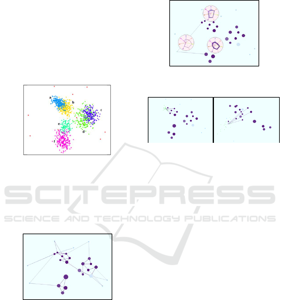
Figure 6: PCA of Fake Clover dataset leads to non-
separated cluster pairs (a,b), (c,d), and (e,f).
Figure 7 shows our visual encoding of the PCA
view with data aggregation using two iterations of
the K-means-like procedure and density-estimation
cell size 1/49. We show the 2-nearest neighborhoods
with edges. The 7 outliers stay as separate clusters
and the other samples merge to three groups of
somewhat close clusters.
Figure 7: Aggregated visual encoding of PCA view on
Fake Clover data set with 2-nearest neighborhoods.
In Figure 8, we use the circular parallel
coordinate plots to examine an outlier and its 2-
nearest neighbors. It can be observed that the outlier
is close to one of the clusters (the lower one) in all
dimensions except for one (the 6
th
dimension when
counting clockwise from top).
Figure 8: Circular parallel coordinate plots to examine the
properties of an outlier in comparison to the 2 nearest
clusters.
Figure 9: Neighborhood of a selected cluster is maintained
well by one projection (left) and not so well by another
projection (right) can be visually retrieved by linking to
nearest neighbors.
Figure 9 documents how the edges can help to
understand whether the projection is maintaining
well distances. It shows the 6-nearest neighbors of a
selected cluster. While the projection on the left
maintained neighborhoods well, the projection on
the right did not maintain it well, which becomes
obvious with our visual encoding.
Our tool also allows for top-down and bottom-up
analyses. In Figure 10, we follow the top-down
strategy by starting with a highly aggregated view
(left) that identifies three clusters in the PCA view,
which correspond to the cluster pairs (a,b), (c,d), and
(e,f) in Figure 6. When refining the aggregation
level by changing the cell size from 1/15 to 1/25, we
observe that the clusters split into two subclusters.
When changing the projection with the star
coordinate interaction widget, we obtain views that
the subclusters are indeed separate structures. The
projection in Figure 11 (left) shows that the upper
left cluster in the PCA view actually consists of two
clusters (corresponding to clusters a and b in Figure
6). The projection in Figure 11 (right) shows that
the bottom cluster in the PCA view also consists of
two clusters (corresponding to clusters e and f in
Figure 6).
IVAPP 2018 - International Conference on Information Visualization Theory and Applications
232
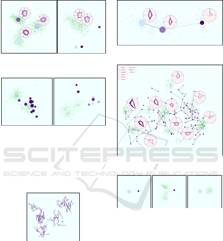
Figure 10: Top-down strategy starting with a highly
aggregated view using cell size 1/15 (left) and refining the
clusters using cell size 1/25 (right).
Figure 11: Changing the projection with the star
coordinate widget allows us to separate clusters a and b
from Figure 6 (left) as well as clusters e and f (right).
In a bottom-up analysis, we would start with
each data sample being its own cluster and
aggregate. In Figure 12, we show a projection where
the neighbourhood structures at a barely aggregated
level exhibit that the clusters c and d from Figure 6
are also separated structures. We reduce overplotting
here by just showing the edges without the clusters.
Figure 12: Bottom-up strategy starting with each sample
forming its own cluster and merging them. Here the
clusters c and d from Figure 6 could be separated.
All the results presented so far were on the
synthetic Fake Clover dataset. We also applied out
methods to non-synthetic data like the well-known
Iris (Bache and Lichman, 2013) and Out5D datasets
[23]. Figure 13 shows the result on the Iris dataset
revealing the known three clusters. Figure 14 shows
the results on the Out5D data set with various
distinct subclusters.
Figure 13: When applied to the Iris dataset we identified
the three well-known clusters.
Figure 14: When applied to the Out5D dataset, we observe
many distinct subclusters.
Figure 15: Example of a clustering result with a
heterogeneous cluster and a more homogeneous cluster,
which can be verified by switching to scatterplot
visualizations of the clusters.
The main parameter to be chosen is the cell size.
The perfect value cannot be known a priori and
should be adjusted interactively. In fact in case of
different cluster densities and sizes, it may have to
be chosen differently when analyzing different
regions of the data. However, our visual encoding
supports the analysis, as homogeneous clusters
typically do not need further refinement, while
heterogeneous might do. In Figure 15 (left), we
observe two clusters, but the left one is
heterogeneous and may consist of further
subclusters, which here can be easily confirmed by
switching to the scatterplot views for selected
Data Aggregation and Distance Encoding for Interactive Large Multidimensional Data Visualization
233

clusters (middle), while the cluster on the right is
more homogeneous (right). Another issue with the
cell size parameter is that clusters are not necessarily
changing smoothly when smoothly varying the cell
size parameter. To alleviate this issue we introduced
an animation as in Figure 5.
5 EVALUATION
To evaluate the effectiveness of our tool, we
performed a user study with 10 subjects with
different professional background, gender, and age.
We gave a short tutorial and subsequently asked 8
easy questions that should familiarize the subjects
with the functionality of the tool. We asked about
the number of dimensions, number of samples, the
dimension with the broadest range, the dimension
contributing most to the variance, the number of
outliers in one dimension, the number of visible
structures in the PCA view, a comparison between
clusters in terms of size, are, and density, and
correctness of an aggregated view. Afterwards, we
asked them to perform actual analysis tasks like
identifying the correct number of clusters, testing
clusters on homogeneity, and finding the most
similar observations to an outlier. All tasks were
conducted on the Fake Clover dataset. The outcome
was evaluated by computing the correctness of the
answers. Time was not part of the investigation, but
the study took on average 66 minutes (ranging
between 29 and 98 minutes) per participant.
The outcome of the user study was that subjects
were able to fulfil the tasks with a high average
correctness rate of 90.0% (92.5% for easy questions
and 83.3% for actual analysis tasks). There was no
difference in performance between groups of
different professional background.
6 CONCLUSIONS
We presented an interactive visual tool for
effectively analysing unlabeled multi-dimensional
data using data aggregation and distance encoding.
Data aggregation is based on K-means clustering
and a cell-based density clustering. The cell size
allowed us to modify the granularity of the data
aggregation. Cluster properties are visually encoded
in aggregated form using color and size or in
detailed form using circular parallel plots and
scatterplots in a local layout. Distances are
computed in an efficient way and conveyed by
ending k-nearest neighborhoods with edges, which
allows for analysing the neighbourhood preservation
property of the chosen projection. Projections are
based on PCA, but a dimension-scaling widget
allows for interactive weighting of axes and a star-
coordinate widget allows for changing the projection
matrix. We have shown that our tool can be
effectively applied to analyze multi-dimensional
data.
REFERENCES
K. Bache and M. Lichman. 2013. UCI Machine Learning
Repository. Available: http://archive.ics.uci.edu/ml.
R. E. Bellman, Dynamic Programming, Princeton, NJ,
Princeton Univ. Press, 1957.
R. S. Bennett, “Representation and Analysis of Signals –
Part XXI. The Intrinsic Dimensionality of Signal
Collections,” Dept. of Elect. Eng. and Comp. Science,
Johns Hopkins Univ., Baltimore, MD, Rep.
AD0475844, Dec. 1965.
A. P. Dempster, N.M. Laird, and D.B. Rubin (1977).
"Maximum Likelihood from Incomplete Data via the
EM Algorithm". Journal of the Royal Statistical
Society, Series B 39 (1): 1–38. JSTOR 2984875. MR
0501537.
M. Ester, H. Kriegel, J. Sander and X. Xu, “A Density-
Based Algorithm for Discovering Clusters in Large
Spatial Databases with Noise,” Proc. KDD, pp. 226-
231, 1996.
B. Flury, in A First Course in Multivariate Statistics, New
York, USA, Springer New York, 1997.
S. Har-Peled and B. Sadri, “How Fast is the k-means
Method?”, Algorithmica, vol. 41, no. 3, pp. 185- 202,
2005.
V. Hautamäki, S. Cherednichenko, I. Kärkkäinen, T.
Kinnunen, and P. Fränti, “Improving K-Means by
Outlier Removal,” Proc. SCIA, pp. 978-987, 2005.
C. G. Healey, “Effective Visualization of Large
Multidimensional Datasets”, Ph.D. dissertation, Dept.
of Comp. Science, Univ. of British Columbia,
Vancouver, Canada, 1996.
I. Ilies, "Cluster Analysis for Large, High-Dimensional
Datasets: Methodology and Application," Ph.D.
dissertation, School of Humanities and Social
Sciences, Jacobs University Bremen, Bremen,
Germany, 2010.
E. Kandogan, “Star Coordinates: A Multi-dimensional
Visualization Technique with Uniform Treatment of
Dimensions,” Proc. IEEE InfoVis Symposium, 2000.
P. Ketelaar. (2005, July 2005) Out5d Data Set. Available:
http://davis.wpi.edu/xmdv/datasets/out5d.html.
T. V. Long and L. Linsen, “MultiClusterTree: Interactive
Visual Exploration of Hierarchical Clusters in
Multidimensional Multivariate Data,” in
Eurographics/IEEE-VGTC Symposium on
Visualization, 2009.
IVAPP 2018 - International Conference on Information Visualization Theory and Applications
234

P. Parsons and K. Sedig, “Distribution of Information
Processing while Performing Complex Cognitive
Activities with Visualization Tools,” in Handbook of
Human Centric Visualization, New York, Springer
New York, 2013, sec. 7, pp. 693-715.
K. Pearson, "On Lines and Planes of Closest Fit to
Systems of Points in Space", Phil. Mag., vol. 2, no. 6,
pp. 559-572, 1901.
C. Rigden, “’The Eye of the Beholder’-Designing for
Colour-Blind Users,” Br. Telecomm. Eng., vol. 17,
Jan. 1999.
L. J. P. van der Maaten, E. O. Postma and H. J. van den
Herik, “Dimensionality Reduction: A Comparative
Review,” Online Preprint, 2008.
Z. Zhu, T. Similä and F. Corona, “Supervised Distance
Preserving Projections”, Neural Process. Lett., vol.
38, no. 3, pp. 445-463, Feb. 2013.
Data Aggregation and Distance Encoding for Interactive Large Multidimensional Data Visualization
235
