
Bifocal Parallel Coordinates Plot for Multivariate Data Visualization
Gurminder Kaur and Bijaya B. Karki
School of Electrical Engineering and Computer Science, Louisiana State University, Baton Rouge, Louisiana 70803, U.S.A.
Keywords: Parallel Coordinates Plot, Multivariate Data, High Dimensions, Information Visualization, Focus + Context.
Abstract: Visualization of multivariate data using parallel coordinates plot (PCP) becomes overwhelming as the
number of dimensions/variables increases beyond one dozen or so. Here we propose bifocal parallel
coordinates plot (BPCP) based on the focus + context approach. BPCP splits vertically the overall rendering
into the focus and context regions whose sizes can be adjusted to optimize the use of the available space.
The focus area maps a few selected dimensions of interest, referred to as priority axes, at sufficiently wide
spacing. The remaining dimensions are represented in the context area in a compact way so as to retain
useful information and provide the data continuity. The focus display can be further enhanced with various
options, such as axes overlays, scatterplot, and nested juxtaposed PCPs. In order to accommodate an
arbitrarily large number of dimensions, the context display supports multi-level stacked view, each PCP
level mapping a subset of the context axes. With flexible interactivity, BPCP can manage the priority axes
and data rendering with respect to the corresponding dimensions to support exploratory visualization while
providing useful context on the same visualization display.
INTRODUCTION
Parallel coordinates plot (PCP) is a popular
technique for multivariate data visualization (Avidan
and Avidan 1999; Few 2006; Inselberg, 2009;
Heinrich and Weiskof, 2013). It maps data points in
a multidimensional space to a 2D display surface by
laying out all dimensions/variables/attributes as
parallel vertical axes at uniform spacing. Each data
item is rendered as a polygonal line with its vertices
on these axes. PCP visualization helps us quickly
reveal patterns, trends, relationships, anomalies in
the multivariate data. Generally, static visualization
is not much of practical use because the data lines
quickly fill up the display space often resulting in
visual clutter. To generate insights into the
multivariate information requires appropriate ways
of interacting with the data samples and dimensions
(Siirtola and Raiha, 2006; Inselberg, 2009). Once
regions of interest are identified, the interactivity
helps perform more focused analysis.
PCP is expected to accommodate arbitrarily large
numbers of dimensions and data lines in a finite
display area. More dimensions require adding more
axes in a linear order. Such tightly packed axes
degrade visual resolution and make navigating the
data space difficult. Each data line simply consists of
many segments which are short so it is difficult for
the user to read the data lines. From a practical
viewpoint the user is not able to visually
comprehend all dimensions at a time or the user may
not be even interested to analyse all dimensions on
equal footing. It thus makes sense that only a subset
of the dimensions be better examined at a time. For
example, only five variables for 25-dimensional
automobile dataset (Figure 1) might be of the user’s
current interest. If we render the data with respect to
the five selected dimensions only, we will have
widely placed parallel axes. Visual clarity improves
considerably and the corresponding data segments
become fairly long and are easy to read.
The problem is that the data information with
respect to all other dimensions that are not mapped
into the current PCP is completely lost. One may
toggle between all-axes plot (an overview) and the
selected-axes plot (a detailed view) or use a
miniature PCP as overview and a regular plot as
detail together (Gruendl et al., 2016). Another option
is to support a regular plot (main view) and maintain
an axis repository to hold axes currently of less
importance (Riehmann et al., 2012). Such overview-
detail or detail-on-demand approaches suffer from a
(time) disconnect issue between the two views
tending to divide the user’s attention.
176
Kaur, G. and Karki, B.
Bifocal Parallel Coordinates Plot for Multivariate Data Visualization.
DOI: 10.5220/0006549901760183
In Proceedings of the 13th International Joint Conference on Computer Vision, Imaging and Computer Graphics Theory and Applications (VISIGRAPP 2018) - Volume 3: IVAPP, pages
176-183
ISBN: 978-989-758-289-9
Copyright © 2018 by SCITEPRESS – Science and Technology Publications, Lda. All rights reserved
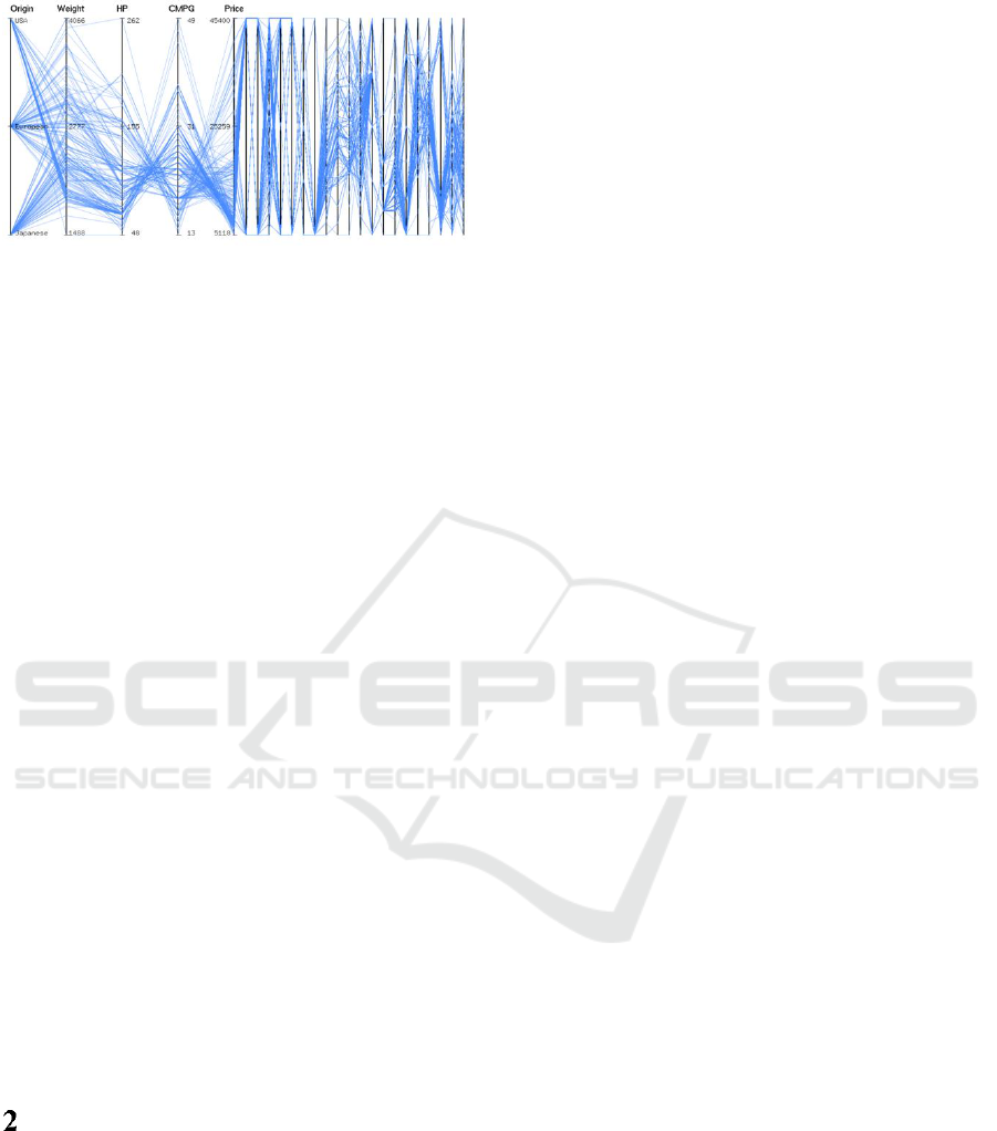
Figure 1: Parallel coordinates plot of 25-dimensional
automobile data. Five axes representing origin, weight,
horsepower, city mpg and price are widely spaced in the
left half space (focus display) and the remaining axes are
squeezed in the right half space (context display).
In this paper, we propose bifocal parallel
coordinates plot (BPCP) based on the focus +
context approach (Spence and Apperley, 2013).
BPCP represents the parallel axes corresponding to a
few priority dimensions at sufficiently wide spacing
and maps the remaining dimensions in a compact
way (Figure 1). It renders data line segments with
respect to the selected dimensions at high visual
resolution (providing a focus view which can be
further enhanced using available extra space) while
retaining at the same time the information with
respect to all other dimensions for context. The aim
is to produce a good visualization by effectively
using a finite display without much losing valuable
information. The focus + context approach was
previously applied in parallel coordinates for
highlighting certain axes groups (Brodbeck and
Girardin, 2003) and data clusters (Novotny and
Hauser, 2006). Our work is expected to serve as a
systematic bifocal presentation of parallel
coordinates. We present a novel design of the
proposed BPCP method to effectively split the total
parallel coordinates plot area into two parts. We then
explore various ways of enriching data visualization
in the “focus” part and also the ways of simplifying
rendering in the “context” part.
RELATED WORK
Parallel coordinates plot has been a subject of
extensive investigation due to its applications in
visualization of multivariate data and high-
dimensional geometry. PCP helps discover the
multivariate relations by transforming the problem
into 2D pattern recognition problem involving 2
n
subsets, and also has relative merits for tasks like
clustering and outlier detection (Inselberg, 1997;
Zhou et al., 2008). Due to the visual clutter caused
by over-plotting of data polylines and closely spaced
coordinate axes, PCP visualization may be confusing
and even intimidating at first, but with interactivity it
can actually be very approachable.
When the number of dimensions (k) increases,
the axes arrangement is crucial for finding and
understanding complex multivariate relations. To
compare different variables side-by-side requires the
reorder of axes and the trial of multiple
arrangements. For instance, the parallel coordinates
matrix plot (Heinrich et al., 2012) shows all layouts
simultaneously. A good axes order can be found
using the contribution- and similarity-based
reordering methods (Lu et al., 2016; Peltonen and
Lin, 2017). If k is large, only a subset of important
axes can be included in the main PCP view
(Riehmann et al., 2012; Gruendl et al., 2016).
Dimension spacing which is the gap between
adjacent axes is also important. The default spacing
is chosen to be uniform. The dimensions are not
equivalent to each other, and one way of conveying
this information is to vary dimension spacing (Yang
et al., 2003). For instance, similar dimensions are
mapped closer than the unrelated dimensions. Extra
space between the adjacent axes allows the user to
explore the pattern in detail. Horizontal zooming
in/out and panning or distortion can be used to adjust
the spacing of the concerned axes or to even collapse
a group of axes (Brodbeck and Girardin, 2003).
Specifying such local changes is difficult because of
narrow axial spacing when k becomes large.
One or more polylines to emphasize the selected
data samples can be highlighted with the rest still in
the background. Data lines can be pinched from the
above and below so that they are picked up
(Inselberg, 2009). Alternatively, a subset of data
items is selected by means of brush. Axis-aligned
brush picks a range on an axis corresponding to an
interval on the respective dimension in the data
domain (Turkey et al., 2011). Visual clutter can be
reduced by data filtering or clustering so as to reveal
patterns and anomalies (Fua et al., 1999; Peng et al.,
2004; Zhou et al., 2008).
With increasing k, various tasks related to
dimension management and interacting with data
samples become impractical at some point both
effectiveness- and performance-wise. Inselberg
(2009) has questioned the number of dimensions
PCP can handle. The answer is not “many” on a
single display. It is not possible to map a large
number of dimensions at the same time without
cluttering the display. Reduction techniques like
principal component analysis and multidimensional
scaling condense many dimensions to a few
Bifocal Parallel Coordinates Plot for Multivariate Data Visualization
177
dimensions (Jolliffe, 1986; Mead, 1992). Similar
dimensions may be grouped together and mapped as
closely-spaced axes or even as a single
representative axis. A more direct solution is
dimension filtering, which is to eliminate the
repetitive variables or remove unimportant axes
(Yang et al., 2003).
Our proposed bifocal PCP technique exploits
several of the above-mentioned ideas for its design
and effectiveness for multivariate data visualization.
Both “focus” and “context” display areas can
support various ways of interacting with the axes
and data samples. Our tests used the automobile
dataset (25 variables and 200 observations) and the
cardiac arrhythmia medical dataset (280 variables of
which are 130 used here, and 452 records) available
from the UCI machine learning repository
(http://archive.ics.uci.edu/ml).
DESIGN OF BIFOCAL PCP
In parallel coordinates plot, all dimensions
(variables) are laid out as vertical axes at uniform
spacing. If k dimensions are mapped on the display
surface of width X and height Y, the axial spacing is
given by X = X/(k-1). If k increases, the axes are
packed more compactly so as to fit all of them
within a given finite area. In the proposed bifocal
parallel coordinates plot (BPCP), the overall display
is vertically split into two regions corresponding to
“focus” and “context”, which use different axial
spacing (Figure 1). It thus applies a one-dimensional
focus + context across the axis dimension (i.e., in the
horizontal direction). The focus region maps a few
axes of interest at wider interval than the average X
enabling a detailed view of the data with respect to
the corresponding dimensions. On the other hand,
the context region accommodates all remaining axes
by packing them tightly to retain full information
about the data as much as possible. To explain the
design of the proposed BPCP, we consider three
parameters as follows:
3.1 Focus Area
The total display area spanned by parallel
coordinates and data lines is usually extended
horizontally more than vertically, i.e., X > Y. For a
large number of dimensions, it makes sense to
consider the total parallel coordinates plot width of
X = 2Y (Figure 2). The 2:1 display area can use the
horizontal spread of the computer screen fully for
PCP while leaving extra space in the vertical
direction for displaying axes labels, user controls,
and other features. When the display region is
divided into the focus and context parts, the
questions arise about their sizes and locations. The
default option is to have each part as a square
(Figure 2, middle) such that X
F
= Y (focus width) and
X
C
= Y (context width). To accommodate more
dimensions in the focus area, we need to increase its
width. There is a limitation because the remaining
axes must be mapped as well. We limit the
horizontal spread of the focus area to the three-
fourth of total display width (X
F
= 1.5Y) so the
minimum context area width is 0.5Y.
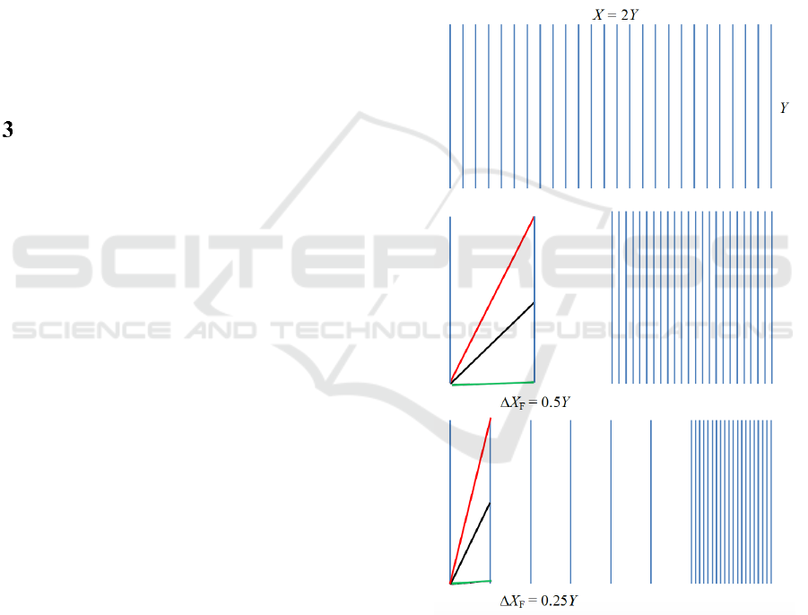
Figure 2: Axes layout of BPCP in a display area of width
X and height Y. Top: All k axes are placed at equal
spacing. Middle: The plot consists of two equal parts: the
focus part showing three axes and the context part
showing remaining k-3 axes. Bottom: The focus area maps
seven axes. Three orientation cases (low, mid and high tilt
angles with the horizontal direction) of data line segment
between the adjacent axes are shown.
The left position of the focus area with the
context area on the right as shown in Figures 1 and 2
IVAPP 2018 - International Conference on Information Visualization Theory and Applications
178

perhaps works well. Another option is to focus
symmetrically about the centre so that its left and
right sides together provide the context display.
Moreover, the focus region can be allowed to glide
along the horizontal direction to any position in an
interactive manner, and the affected axes and data
lines need to be redrawn accordingly (Brodbeck and
Girardin, 2003).
3.2 Priority Axes
The dimensions which are represented in the focus
display with wider spacing than the average spacing
are referred to as priority (focus) axes. We need, at
least, two priority axes to focus on so that the lines
joining the data values on the corresponding
variables can be drawn with better visual resolution
and the relationships can be explored in detail.
Practically it makes more sense to have three
priority axes (Figure 2, middle). We can explore the
relationships of a central axis with two other axes,
one on the left and one on the right and then provide
a flexible option of making one of three axes the
central axis. The maximum number of the priority
axes, however, can vary depending on the focus
display and the total number of dimensions, but it
must be kept small. The priority axes can be selected
manually by the user as important
dimensions/variables/attributes. Or, they can be
automatically found based on some measures, for
instance, as highly correlated dimensions using
Pearson correlation. The priority axes can be
manipulated interactively by adding to and deleting
the axis from the focus display.
3.3 Axes Spacing
It is important that the parallel axes be laid out in the
focus region sufficiently wide from each other. The
data polygonal lines consist of segments between
successive adjacent axes. The visual impression of
these data lines depends on various angles the
component segments make while moving from left
to right. Generally, a unity slope (that is, angle 45
o
with the horizontal direction) of a line is considered
to give the best visual representation (von Huhn,
1931). Obviously, the unity slope is unachievable for
all data line segments. The lines connecting the
opposite ends of the adjacent axes make tilt angles
of 45
o
and cross each other at 90
o
if the horizontal
gap between the axes is equal to the axis length (i.e.,
the vertical plot extent). We have X
F
= Y, which
should be taken as the widest gap as it is the case
with focus width of Y for two priority axes.
However, it makes more sense to consider 45
o
tilt
angle for average situations where the difference
between the data marks on two adjacent axes is
equal to the half of the axis length (Figure 2,
middle). We have X
F
= 0.5Y, which is the case with
focus width of Y for three priority axes. The data
lines between two successive axes make tilt angles
in the range 0
o
(when the lines connect the data
marks at the same height) to 63.4
o
(when the lines
connect the opposite ends of the axes).
One issue still is that the line segments for small
differences in the data marks between two adjacent
axes appear almost horizontal. Further decreasing
the dimension spacing can increase such low-angle
tilts. For X
F
= 0.25Y, the lines connecting the
opposite ends of the axes make 76
o
so the angle of
extreme line crossing becomes 28
o
, which is visually
discernable. Assuming 0.25Y as the minimum axial
spacing for the largest focus display width of X
F
=
1.5Y (Figure 2, bottom), the maximum number of
the priority axes we should allow is given by k
F
= 1+
X
F
/X
F
= 7. The maximum seven dimensions to
focus on make sense with the general notion that
parallel coordinates plot is the most effective for the
datasets with fewer than one dozen dimensions
(Inselberg, 1997; Few 2006).
The focus axial spacing (X
F
) is the main
parameter controlling the design of the proposed
BPCP. As discussed above, we recommend that the
gap between adjacent focus axes be between 0.25Y
and Y
,
where Y is the vertical display extent (height)
set for the overall plot. A spacing value outside this
range either results in very closely packed axes or
very wide focus coverage. Our design strictly
imposes the focus axial spacing range. It then
constrains the number of the priority dimensions (k
F
)
between 2 and 7. Finally, it adjusts the focus display
width (X
F
) between 0.25Y (when X
F
= Y for two
priority axes) to 1.5Y (when X
F
= 0.25Y for seven
priority axes) for the 2:1 display. If the number of
dimensions is very large, we need a wider plot. We
set X = 3Y when k is greater than 31, but the average
spacing is still less than one tenth of the vertical
extent. For the minimum focus axes spacing (0.25Y),
we can now map up to nine priority axes supporting
the widest focus display of 2Y.
The above design is such that bifocal parallel
coordinates plot is ineffective when k is less than
four for the 2:1 display. For k between four and nine,
the focus area with only axial spacing greater than
the average X can be supported. For k > 9, the
average axial spacing is smaller than 0.25Y and the
full range of X
F
values can be exploited. This is the
situation with the number of dimensions greater than
13 for the 3:1 display.
Bifocal Parallel Coordinates Plot for Multivariate Data Visualization
179
ENHANCING FOCUS DISPLAY
The focus display can be further enriched with
additional rendering and analysis options to enable
an in-depth, interactive visualization of multivariate
data with respect to the priority dimensions.
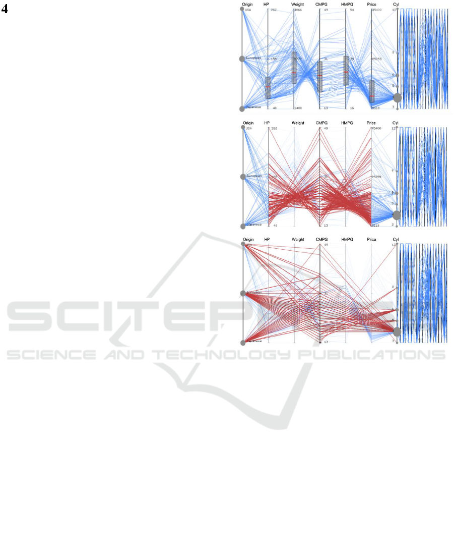
4.1 Axes Management
Understanding data dimensions in PCP involves the
manipulation of the corresponding parallel axes,
which enable us to read off the values and ranges of
data samples. To facilitate the visual perception of
data distributions on the respective dimensions, the
axes can encode additional information using
overlays like circle and box plots (Figure 3, top).
This can be helpful in deciding the priority axes.
Axes reordering option enables the user to detect
patterns within the data and pay more attention to
important dimensions (Johansson et al., 2008; Lu et
al., 2016; Peltonen and Lin, 2017). The pair-wise
relationships among the dimensions are easier to
interpret when the corresponding axes are adjacent
to each other. To explore the relationships of a
priority axis with all other priority axes, the
concerned axis is first brought to the central part
with the data lines redrawn. The central axis
represents CMPG with its adjacent axes representing
weight and HMPG in Figure 3. City mpg is
negatively correlated with weight and positively
correlated with highway mpg. To relate the central
axis to non-adjacent axes (on its left and right), the
data lines are drawn directly connecting to the
respective coordinates while suppressing or even
removing the intermediate axes and line segments
(Figure 3). This helps examine the relationships of
city mpg with four more variables including origin,
horse power, price, and the number of cylinders.
Only the focus axes and the corresponding data
segments are affected so these operations are fast.
4.2 Data Presentation
A large dataset can be better understood by breaking
it into subsets/groups and then performing inter- and
intra-group analyses. The user can choose a priority
axis (referred to as active axis drawn first) to map
the dataset into multiple subsets. If the active axis
represents categorical variable, the data samples
corresponding to each coordinate value form
asubset. For instance, the automobile dataset has
three values for the origin variable which result in
three subsets: American, European, and Japanese
cars (shown by red, green and blue in Figure 4). For
Figure 3: Focus PCP (2Y/3 wide) of 7 priority axes on left
and context PCP (Y/3 wide) on right. Circle plot for
categorical variable and boxplots for continuous variables
are shown. The data lines are directly drawn (red) from the
central axis to next-nearest neighbours (middle) and next-
next-nearest neighbours (bottom).
a continuous variable, data groups correspond to
different, non-overlapping ranges of data values.
For instance, three groups can represent low 1/4,
mid 1/2 and high 1/4 intervals on the axis
representing, say price variable. Different clustering
techniques (Fua et al., 1999; Zhou et al., 2008) can
be used to identify groups for a multiple-set
mapping of a given dataset.
Scatterplot is effective in correlation perception
and similarity detection (Huamin et al., 2012;
Kanjanabose et al., 2015). We add scatterplot for all
priority axes pair directly below their respective PCP
(Figure 4). The width and height of the scattered plot
is adjusted based on the focus axial gap X
F
. In each
scatter plot, the vertical axis is the same as the
priority axis just above it and the horizontal axis is
the right adjacent priority axis. The data lines in the
IVAPP 2018 - International Conference on Information Visualization Theory and Applications
180
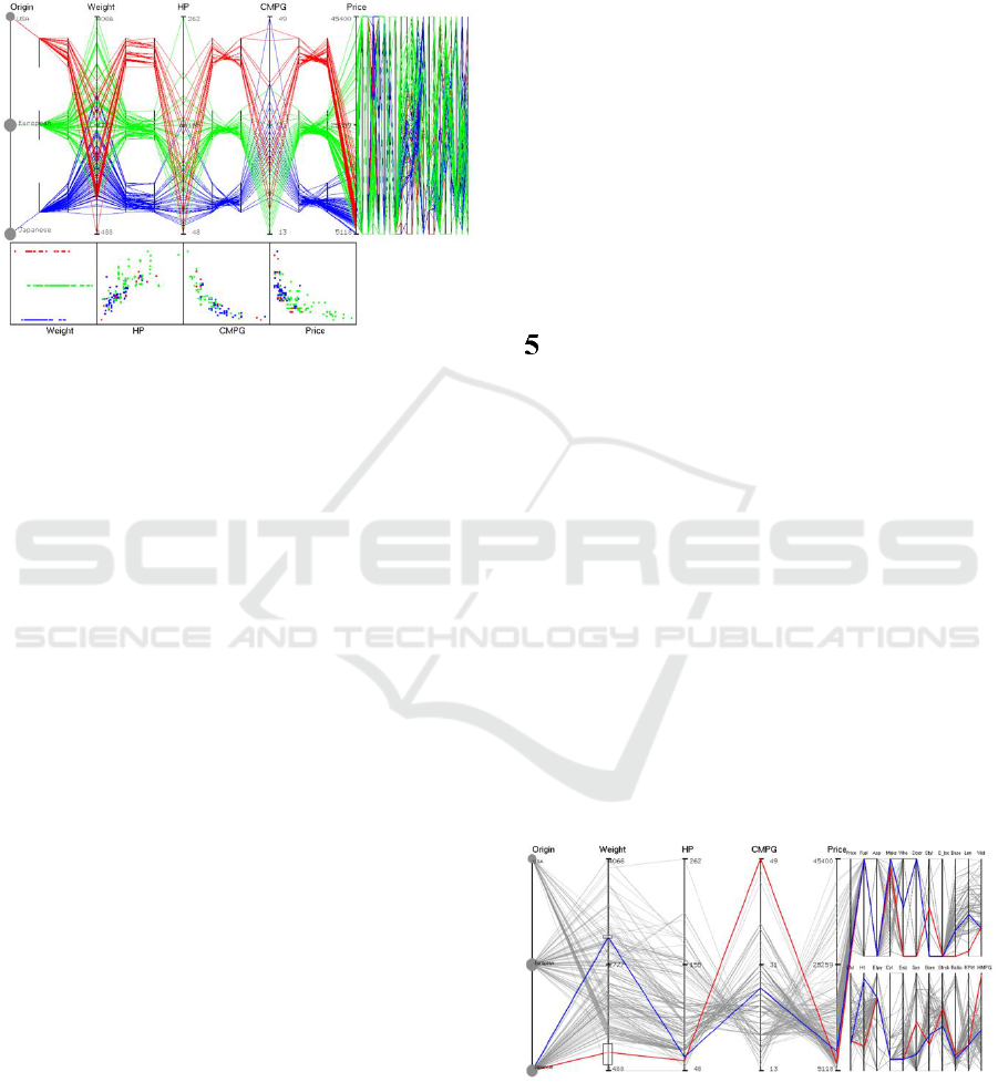
PCP and data points in the scatterplot can be brushed
in a consistent way so that two plots can
complement each other. The focus display can be
also appended with a data table instead to show the
actual data values on the priority axes.
Figure 4: Focus region showing three nested PCPs, one for
each subset of the automobile data: American (red),
European (green), and Japanese (blue). The nested plots
are symmetrically placed in between adjacent priority
axes. The context region shows a normal compact PCP.
Scatter plots are for the adjacent priority axes pairs.
4.3 Nested PCP
The nested parallel coordinates plot method has
recently been proposed to perform comparative
visualization of two or more datasets (Wang, 2016).
It helps in exploring both intra-set and inter-set
correlations among different variables/parameters
from a single visualization when multiple datasets
need to be analyzed together. We adopt this method
to visualize multiple subsets (groups/clusters) of the
data with respect to the priority axes (Figure 4). We
treat these subsets as if they were different datasets
and visualize them as different PCPs by embedding
juxtaposed plots within in the normal plot. The
original priority axes are globally scaled and the data
lines for different groups are superimposed
(overlapped) in the regions near the axes thereby
enabling direct intergroup comparison. The nested
axes are locally scaled and laid out in the central
region between the adjacent original axes pairs
thereby enabling visualization of different data
subsets in distinct PCPs. The left and right axes in
each nested plot are the same as the original priority
axes on its left and right.
The default width of a nested PCP is set at one-
third of the focus axial spacing (X
F
) symmetrically
about the middle line between the original adjacent
axes pair. The horizontal spread can be adjusted by
calculating the positions of two axes in the i
th
nested
pair as (i – 0.5)X
F
± x, where i = 1, 2, …, k
F
-1
(from the left to the right), and x can vary between
0.1X
F
and 0.4X
F
. The vertical extents and
positions of the embedded plots are determined by
uniformly dividing the original display height Y. If
n
s
is the number of data subsets/groups (n
s
= 3 in
Figure 4), the end positions of the j
th
nested axes (j =
1, 2, …, n
s
counting from the bottom) are given by (j
– 0.5)Y/n
s
± y, where y can vary between 0.2Y/n
s
and 0.5Y/n
s
. Our design assures that the nested axes
never overlap with each other horizontally or
vertically. The nested plot count should be kept
small, not more than five. Explicit encodings, such
as bundling and distorting can further aid the visual
perception of the data lines (Wang et al., 2016).
SIMPLIFYING CONTEXT
DISPLAY
The proposed bifocal PCP packs all non-priority
axes (that is, context axes) much more closely than
in the normal plot. As long as they do not overlap
with each other, individual dimensions should be
readable. However, the data lines depending on their
count can clutter the display to varying degree. The
goal is to retain the relevant information in the
context display and maintain the data continuity. For
instance, when brushing is applied, the user should
see the effects on the selected data samples not only
in focus but also in context (Figure 5). We can add
appropriate axes overlays for showing aggregates or
distributions of the data samples along the respective
dimensions while removing the data lines (if needed)
to minimize visual clutter. It supports interactive
ways of translating and reversing the axes.
Figure 5: Focus PCP (2Y/3 wide) of 5 priority axes and
context PCP (Y/3 wide) with a two-level stacking of 20
context axes for the automobile data. The last priority axis
(price) is repeated in the first level. The last context axis
(width) in the first level is repeated at the beginning of the
second level. Two data items are highlighted in red (light
car) and blue (heavy car).
Bifocal Parallel Coordinates Plot for Multivariate Data Visualization
181
To visually discern the dimensions requires that
a minimum gap be maintained between the adjacent
axes in the context display. This gap depends on the
screen resolution and zooming level. The user can
set a minimum gap in the number of the pixels such
that it can be, say, three times wider than the pixel
width of the axes. For total PCP display of the aspect
ratio 2:1, such minimum axial spacing is achievable
even for the worst situation where 28 axes (out of
total maximum 31 axes allowed) are packed in the
context display of width 0.5Y (with the widest focus
area containing only three priority axes). The 3:1
display does not impose an upper bound on the total
number of dimensions so the axial spacing in the
context area can be arbitrarily small.
To avoid the spacing problem with an arbitrarily
large number of dimensions, we propose a multi-
level parallel coordinates plot. A similar approach
has been previously proposed in the case of the star
plot technique (Sangli et al., 2016). The context axes
are divided into multiple groups and the context plot
area is horizontally partitioned into the equal number
of parts or levels. Each axes group is then mapped to
a different level subarea which is vertically
compressed. It thus represents a vertical stacking of
context axes. The width of each subarea is the same
as before the split so the axial spacing increases but
the axes get shorter. The number of levels (m) in the
stacked view can be adjusted interactively but
should be kept small. The multi-level axial spacing
(when m >1) is constrained to be smaller than
0.25Y/m
2
(that is, the minimum spacing allowed in
the focus display divided by m
2
), where Y is the
focus display height. Only two-level plot is allowed
for the 2:1 display (Figure 5) but more levels are
allowed for the 3:1 display. For example, if the
context width X
C
= Y for the data containing total
130 dimensions (Figure 6), m = 3 is allowed. Nine
are the priority axes and the remaining 121 axes are
distributed among three PCP levels. The context
axial spacing X
C
= X
C
/41 = 0.025Y, being smaller
than 0.25Y/9. Assuming that the context display
width is 500 pixels, we have X
C
= 12 pixels (that
also includes axial width) for a three-level plot. For
400 axes, m = 4 is allowed. For this four-level
stacked plot, the axial spacing is 5 pixels wide if X
C
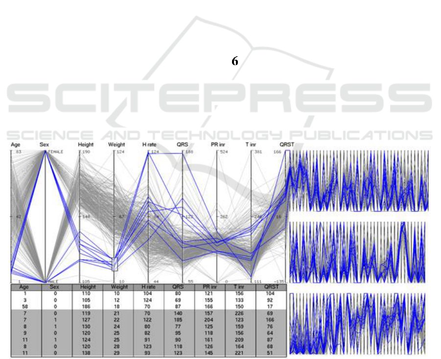
= 500 pixels. In Figure 6, the data lines taking low
weight values tell that the heart rate varies
considerably among small children (7 to 11 years
old). In the context area, these lines mostly remain
close, but they are quite scattered on some axes.
CONCLUSIONS
The parallel coordinates plot becomes less effective
when the dimensionality of the data becomes too
high. To overcome this problem, we have proposed
bifocal parallel coordinates plot (BPCP) to provide
Figure 6: The focus region (2Y wide) showing 9 priority axes and the context region (Y wide) showing three-level PCPs for
the medical dataset consisting of 130 variables. The overall PCP display aspect ratio is 3:1. Each level accommodates 41
context axes. The last priority axis also appears as the first context axis. The first axis in each level is the last axis of the
level above it. The data items using a low-weight brush are highlighted in the PCPs and data table.
IVAPP 2018 - International Conference on Information Visualization Theory and Applications
182

“focus” and “context” views on a single
visualization display by partitioning the overall
rendering into two regions with flexible widths. The
focus PCP renders the data with respect to priority
dimensions (whose number is kept small, below 10)
so that the corresponding axes are widely spaced.
The display can be enriched by adding ancillary
visualizations including axes overlays, embedded
parallel coordinates, and scatter plots. The context
PCP renders the same data with respect to all
remaining axes, which are tightly packed in a single
plot or a multi-level stacked layout. By
experimenting on two datasets consisting of 25 and
130 dimensions, we have demonstrated the potential
effectiveness of BPCP in visually exploring
high/ultra-high dimensional multivariate data, which
are on a rise in today’s big data world.
REFERENCES
Avidan, T. and Avidan, S. (1999). Parallax – a data
mining tool based on parallel coordinates.
Computational Statistics, 14:79-90.
Few, S. (2006). Multivariate analysis using parallel
coordinates. Perceptual Edge.
Inselberg, A. (2009). Parallel coordinates: visual
multidimensional geometry and its application.
Springer, New York.
Heinrich, J. and Weiskopf, D. (2013). State of the art of
parallel coordinates. In STAR Proceedings of
Eurographics, pages 95–116.
Siirtola, H. and Raiha, K. (2006). Interacting with parallel
coordinates. Interacting Computers, 18:1278-1309.
Gruendl, H., Riehmann, P., Pausch, Y., and Froehlich, B.
(2016). Time-series plots integrated in parallel
coordinates displays. In Eurographics/IEEE VGTC
Conference on Visualization, pages 321-330.
Riehmann, P., Opolka, J., and Froehlich, B. (2012). The
product explorer: Decision making with ease. In
International Working Conference on Advanced
Visual Interfaces, pages 423-432.
Spence R. and Apperley, M. D. (2013). A bifocal display.
The Encyclopedia of Human-Computer Interaction.
2
nd
Ed., Interaction Design Foundation.
Brodbeck, D. and Giradin, L. (2003). Design study: Using
multiple coordinated views to analyse geo-referenced
high-dimensional datasets. In International
Conference on Coordinated and Multiple Views in
Exploratory Visualization, pages 104-111.
Novotny, M. and Hauser, H. (2006). Outlier-preserving
focus + context visualization in parallel coordinates.
IEEE Transactions on Visualization and Computer
Graphics, 12:893-900.
Inselberg, A. (1997). Multidimensional detective. In IEEE
Symposium on Information Visualization, pages 100-
107.
Zhou, H., Yuan, X., Qu, H., Cui, W., and Chen, B. (2008).
Visual clustering in parallel coordinates. Computer
Graphics Forum, 27:1047-1054.
Heinrich, J., Stasko, J., and Weiskopf, D. (2012). The
parallel coordinates matrix. In Eurographics
Conference on Visualization, pages 37–41.
Lu, L. F., Huang, M. L., and Zhang, J. (2016). Two axes
re-ordering methods in parallel coordinates plots.
Journal of Visual Languages & Computing, 33:3–12.
Peltonen, J. and Lin, Z. (2017). Parallel coordinates plots
for neighbour retrieval. In 12
th
Joint International
Conference on Information Visualization Theory and
Applications, pages 40-51.
Yang, J., Peng, W., Ward, M. O., and Rundensteiner, E.
A. (2003). Interactive hierarchical dimension ordering,
spacing and filtering for exploration of high
dimensional datasets. In IEEE Symposium on
Information Visualization, pages 105-112.
Turkey, C., Filzmoser, P., and Hauser, H. (2011).
Brushing dimensions: a dual visual analysis model for
high-dimensional data. IEEE Transactions on
Visualization and Computer Graphics, 17:2591-2599.
Fua, Y. H., Ward, M. O., and Rundensteiner, E. A. (1999).
Hierarchical parallel coordinates for exploration of
large datasets. In IEEE Visualization, pages 43–50.
Peng, W., Ward, M. O., and Rundensteiner, E. A. (2004).
Clutter reduction in multi-dimensional data
visualization using dimension reordering. IEEE
Symposium on Information Visualization, pages 89-96.
Jolliffe, J. (1986). Principal component analysis. Springer
Verlag.
Mead, Al. (1992). Review of of the development of
multidimensional scaling methods. The Statistician,
33:27-35.
Von Huhn, R. (1931). A trigonometrical method for
computing the scales of statistical charts to improve
visualization. Journal of the American Statistical
Association, 26:319-324.
Johansson, J., Forsell, C., Lind, M., and Cooper, M.
(2008). Perceiving patterns in parallel coordinates:
determining thresholds for identification of
relationships. Information Visualization, 7:152-162.
Huamin, Q., Xiaoru, Y., Hong, Z., Peihong, G., and He, X.
(2009). Scattering points in parallel coordinates. IEEE
Transactions on Visualization and Computer
Graphics,15:1001-1008.
Kanjanabose, R., Rahman, A. A., and Chen, M. (2015). A
multitask comparative study on scatter plots and
parallel coordinates plots. In Eurographics Conference
on Visualization, 34:261-270.
Wang, J., Liu, X., Shen, H. W., and Lin, G. (2016).
Multiresolution climate ensemble parameter analysis
with nested parallel coordinates plots. IEEE
Transactions on Visualization and Computer
Graphics, 23:81-90.
Sangli, S. S., Kaur, G., and Karki, B. B. (2016). Star plot
visualization of ultrahigh dimensional multivariate
data. In International Conference on Advances in Big
Data Analytics, pages 91-97.
Bifocal Parallel Coordinates Plot for Multivariate Data Visualization
183
