
To Paint in Tongues - Interactive, Artistic and Mobile Information
Visualization for Social Media Texts
Creativity Enhancement by Painting with Tweets on a Smart Tablet
Robin Horst
1
and Elisabeth Franziska Stein
2
1
German Research Center for Artificial Intelligence (DFKI), Saarbrücken, Germany
2
Johannes Gutenberg University Mainz, Mainz, Germany
Keywords: Text Visualization, Interface and Interaction Techniques for Visualization, Computer Assisted Creativity,
Artistic Information Visualization, Computational Art, Social Media, Twitter, Painting with Data.
Abstract: A vast amount of thousands of Twitter messages are produced per second. As not only researchers and data
professionals are interested in utilizing this data, other people could make use of specific insights. Without
the skill to conduct queries with expert systems, tweets must tediously be read entirely in the traditional way.
The creativity gets constrained and neglected in this tiring and cognitive demanding process. However these
tweets could be a great source for conducting investigations as for example in sociocultural creative research,
as writing for lyrics, scripts or even books. Writers could benefit from this huge amount of free accessible
information about public opinions on recent topics. In this paper, we introduce a mobile visualization tool and
its underlying visualization concept: Paint in Tongues. It can be used in different ways to visualize text-based
social media content. Moreover it enables users that are unexperienced at information visualization to easily
interact with the data and utilize it. Techniques that even enhance creativity, as doodling and combining
different media, are utilized in an interactive visualization process to augment the data analysis for creative
and visual oriented people.
1 INTRODUCTION
Getting insights in social media data sets, like online
posts on Twitter, has become a very popular and
common task in research activities within the last
years. Though it is still far from being a simple one.
This type of information is mostly text based, so that
researchers ought to bring up a high cognitive
workload for analysing and interpreting the plain text
representation of the data set. Expert visualization
tools help to simplify this analysis work that aims on
finding patterns and relations within the data. Simply
giving a general overview or specific insights on
particular topics of interest is the core of those
visualization tasks.
While experts and researchers are able to utilize
these visualization tools, average people are excluded
from this process. However social media content is
already of pervasive nature within the daily life of
people, so that insights in social media content could
be utilized in almost every profession. Since the
creative industry is as fast-paced as the research of
social media visualization, this seems a suitable point
of contact. Thinking of creative writing, a vast
amount of research is conducted for books, scripts
and lyrics. Authors oftentimes start with a certain
intention or topic that they will write about. To
express and manifest their attitudes, broad
investigations are of matter to get inspiration. This is
a massive problem, because writing research often
implies sociocultural research (MacArthur et al.,
2008).
In this paper, we propose Paint in Tongues (PiT),
a mobile interactive visualization tool for tablets. We
target visually oriented users, whose jobs are in close
relation to creativity and sociocultural research, like
authors or even musicians. The visualization system
therefore is motivated by two main purposes: (1)
Creativity enhancement and (2) sociocultural
research. It smoothly leads the users into creative
processes and lets them overcome creative blockades
by letting them doodle with text-brush.
Simultaneously we enable them to explore
contemporary textual media, like Twitter, to draw
conclusions of sociocultural nature. In particular it
Horst, R. and Stein, E.
To Paint in Tongues - Interactive, Artistic and Mobile Information Visualization for Social Media Texts - Creativity Enhancement by Painting with Tweets on a Smart Tablet.
DOI: 10.5220/0006515401590167
In Proceedings of the 13th International Joint Conference on Computer Vision, Imaging and Computer Graphics Theory and Applications (VISIGRAPP 2018) - Volume 3: IVAPP, pages
159-167
ISBN: 978-989-758-289-9
Copyright © 2018 by SCITEPRESS – Science and Technology Publications, Lda. All rights reserved
159
combines visualizing a set of tweets relating to a
specific topic on the one hand and creativity
enhancing interaction aspects on the other hand.
Users get insights in social media content in a very
simple way and the cognitive effort for exploring
such a data set is thereby lowered. We illustrate the
usefulness and the benefit of the tool by giving an
application example and utilizing a prototype of the
proposed system. We also show that a high ease of
use is provided and that the underlying semantic
space of a limited set of tweets can be explored.
To find a start for such a creative process, it is
common to use painting or rather doodling as an
initialization approach to get into the creative
workflow. We let users actually paint with the text
data from tweets and therefore link creative
techniques with semantic visualization of explicit
information. This gives the users a quick and easy
access to the content and relations of tweets. It finally
provides insights or different views on particular
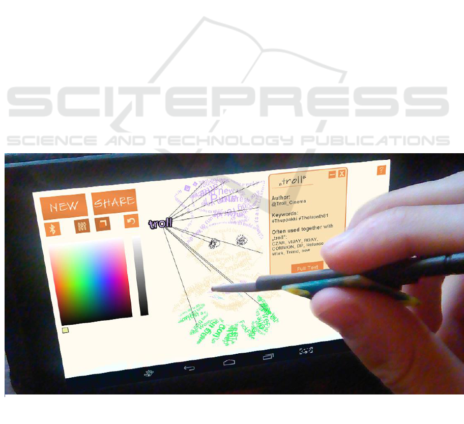
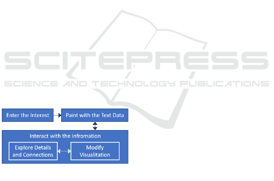
topics. An overview is shown in figure 1.
Since users only have to state a certain topic that
they are interested in, they do not know which words
they will paint with until they actually appear on the
digital canvas. Concerning this matter, the name of
the concept, “Paint in Tongues”, refers to a
glossolalia (to speak in tongues), where people speak
words of which they do not know that they will speak
them until they come out. Together with the tweets
information, our tool provides a template image that
semantically relates to the topic of interest. The initial
thoughts of the user, the tweets content, linking
techniques, semantic paintings and the template
images create a tension that will result in unexpected
conclusions and connections. These act as creative
stimuli and broaden the view of the user.
We address different distinct scenarios where the
tool can be used to carry out particular tasks:
▪ Overview: A general overview of a specific
interest is needed, which would traditionally be
achieved by reading several tweets on Twitter.
While we provide the same content, we are
however interested in interactive exploration.
▪ Comprehensive Content: Abstract
impressions are provided as well as detailed
insights regarding one special interest.
▪ Comparison: The tool can be used to compare
different sets of tweets by conducting multiple
visualization iterations with separate interests.
▪ Public Opinion and Meaning: In sociocultural
analysis, it is important to know other peoples’
opinions. The sum of these subjective opinions
is represented within the set of tweets. By
interactively exploring the information a
generalized and recent public meaning of a
certain term can be derived.
▪ Context: By only stating one topic, we give
insights on its surrounding environment, for
example which words are used frequently
together with another specific word.
▪ Unexpected Connections and Relations: A
major interest in exploring the tweets is to get
Figure 1: An overview of the interaction with the Paint in Tongues mobile application running on a smart tablet.
IVAPP 2018 - International Conference on Information Visualization Theory and Applications
160

new perspectives on a topic. Visual
connections give users a direct cue about
relations of the content that the tweets refer to.
▪ Combination: To support the development of
novel and personal ideas, different media from
different sources are combined with individual
artistic doodles. These different sources and
some individual initiative ensure that users are
not solely adapt others’ opinions. Cognitive
inertia is therefore prevented simultaneously.
▪ Share: The resulting information artworks can
be shared after finishing data exploration. So
even more external impressions can be
gathered, for example in form of comments,
messages or retweets. This feedback extends
the scope of data analysis beyond the original
set of tweets. It also gives the chance to record
final or even intermediate results.
Besides the information visualization aspect,
art creation or creativity enhancement, it is
important to mention that it is not the final artistic
doodle that is of major importance. Rather the
process between starting to doodle and finishing an
artwork is the core aspect of PiT. At this stage, we
show a fundamental and novel way of creating text
visualizations and how they can be used to explore
data, communicate emotions and support ideation.
We will however not go into further details about
the last emphases in this paper and address the
visualization, interactive exploration and analysis.
2 RELATED WORK
The nature of novelty that our work arises from is
about combining several existing approaches rather
than about fundamental research. PiT builds upon
text-based visualization approaches and refers to
painting techniques. It also draws conclusions from
concepts that we find in fields like Information
Visualization, Human-Computer Interaction.
Computer Assisted Creativity and Computational Art
are related fields, too.
Since the importance of social media has grown
in all areas of daily life, visualization, interaction and
analysis techniques that relate to this online content
became of high significance, too. As scientists, we are
interested in underlying structures of social media
content and networks, so that plenty of visual
analytics tools were proposed. Riff, Lacy and Fico
(2014) propose techniques to analyse media
messages. Quantitative content analysis is here
conducted to address typical problems in this area, as
measurement, sampling and general technological
aspects. Sticking to content analysis, the work of
Chew and Eysenbach (2009) describes an expert
analysis of Twitter content which targets on a specific
pandemic outbreak. Kennedy et al. (2007) use Flickr
content to get insights on other specific topics of
interest that relate to geographical problems.
None of the works mentioned above shifts the
targeted audience to users who are novices at
information visualization techniques. Projects like
CityBeat (Xia et al., 2014) or Selfiecity (Tifentale and
Manovich, 2015) are recent examples that at least try
not to exclude non-professionals from analysing
social media content. Yet these systems still need
experience to analyse the content and demand high
cognitive effort. With our work, we avoid this effort,
but yet provide insights in a specific topic of interest.
By dealing with messages of tweets and visual
representations, text visualization techniques like
word clouds are closely related as well. Tools like
Wordle (Feinberg, 2010) are commonly used by a
broad range of users today to somehow analyse and
represent a set of text data. Other examples of word
clouds make use of their layout to encode a semantic
feature (Wu et al., 2011) (Paulovich et al., 2012). The
trade-off in using word clouds is surely that the
sentence structure, which is made from the word
sequences, is lost in favour to the visualization layout.
We incorporated such a feature in PiT in a way that
gives users 100% freedom of decision about the
layout, while preserving the word sequences.
In the field of creative textual work, early
approaches as proposed by Davis (1985), Amabile
(1985), Messaris (1994) and Sinatra (1986) state the
benefit of combining visual with literal aspects within
a creative writing workflow. Heye (2006) states that
doodling in general is a core feature to unlock mental
blocks and draw innovative ideas out of the
unconscious. West (1991) goes even further and
proposes doodling to start a creative process, since
some people are “visual thinkers” and actually have
to see anything in order to be creative. This technique
can also be utilized as a visual stimulus to avoid
cognitive inertia, where ideas go only in one
direction, without looking at a topic in different ways
(McFadzean, 2001).
Other computer applied creativity assisting tools
can be found in papers of Shneiderman (2006) et al.
(2002), where creativity support tools were stated as
enabling and innovative for all kinds of users, like
engineers, scientists and even artists. Regarding the
artistic relation of our visualization tool, it is
commonly accepted and approved, that visualization
can surely benefit from artistic concepts. Abstract
To Paint in Tongues - Interactive, Artistic and Mobile Information Visualization for Social Media Texts - Creativity Enhancement by
Painting with Tweets on a Smart Tablet
161
painting styles for example can be used to portray
data in several dimensions (Tufte, 2001) (Wolfe,
1994). Therefore painting styles could also visualize
and express unique features in text data like tweet
texts, and furthermore allow users to easily recognize
these features.
To close this section, it must be said, that no
published work could be found where text data was
explicitly used to paint and perform analyses on these
painting-like results.
3 VISUALIZATION TECHNIQUE
Regarding the visualization technique, a brief
overview of the data handling, transformation and
flow is given first. Then we outline the algorithmic
concepts and interaction techniques that we use.
Since textual Twitter data is visualized, the
general scope of our visualization is clear. We focus
on message texts, authors and hashtags, which make
up the simple but multivariate dataset we. The overall
flow of our proposed visualization tool is divided into
three distinct tasks (figure 2). (1) State the interest,
(2) paint with the text data and (3) interact with the
information and layout. In painting the characters and
words of the tweets dynamically and continuously, it
is assured that users may stop if they found something
of particular interest, and continue if they are ready to
get further insights. A background image is provided
as a template, too. This side feature is intended to
quicken and simplify the start of the process and is
therefore able to overcome initial thinking barriers.
In step (1) of the flow, the user enters a topic of
interest. This topic is used for fetching tweets that are
closely related and of high importance regarding this
topic. Preferences allow more professional users to
filter and adjust the search. In general, we apply a
certain pre-processing that cannot be disabled.
Unknown characters, URLs and unreadable
sequences of special punctuation characters (e.g.
“!!=[!&”) are filtered out. Thereby we focus on
exploring the semantic meanings of the text data.
Step (2) is the part where the text data is painted
dynamically on the digital canvas of the smart tablet.
This feature enables to choose the scope of the visual
analysis. It can range from a simple dimension of a
few words up to a more complex size of 14000 words.
Step (3) is the interaction mode. It is possible to
interact directly with single words to get specific
detail information about it here. In addition, these
selected words can be moved within the created
painting to build up abstract and individual
constructs. Individually important aspects can be
emphasized here. It can be switched between the
interaction and the painting mode, so that the iterative
interplay creates alternative views on the data set.
This is valuable for deriving dynamic visual patterns
of the data set and can be combined with a linked
graph view. These links are used as cues for the user,
to easily draw their attention to other areas where a
similar word is used (figure 5).
3.1 Algorithmic Concepts
Since the set of data we are dealing with in this paper
has a manageable scope there is less focus on
complex algorithms. However simple algorithmic
concepts are still needed to provide a clear
visualization concept for the multivariate data set.
The simplicity gets even more important because we
are addressing beginners at data visualization. These
algorithmic concepts are likewise of notable
significance for the interaction techniques that are
supported by our visualization tool.
Most of these concepts are carried out prior to the
actual visualization, so that they are not intended to
be changed during the visualization process. The
most important concepts are filtering,
sorting/ordering, node linking, iteration and painting
with text data. The text painting algorithm is based on
the work of Bohnacker et al. (2012). Furthermore we
use a microcontroller setup to control the brush/font
size of the visualization dynamically.
The iterative aspect is reflected in several abstract
facets. Switching between the painting mode and the
interaction mode, for example, iteratively extends the
scope of the analysis and builds up the data
interpretation.
3.2 Interaction Techniques
Our visualization application supports several basic
techniques that enable users to interact with the data.
Both breadth-like and depth-like procedures are
supported, so that overall content-related aspects
between tweets can be discovered as well as detailed
Figure 2: The workflow of Paint in Tongues.
gz
IVAPP 2018 - International Conference on Information Visualization Theory and Applications
162
information on particular tweets. These interactions
are mostly regarded as proposed by Yi et al. (2007)
and Heer and Shneiderman (2012). In particular we
support these techniques: stop word elimination,
word selection/highlighting, exploration, encoding,
reconfiguration, abstraction/elaboration, filtering,
connecting, undoing/redoing and sharing.
Furthermore we add a semantic layout feature. By
interactively painting the words on a digital canvas,
users have a high degree of self-determination
concerning the visual representation of the text data.
Colour and arrangement are assigned very freely and
dynamically. Thus a semantic relation between
content and appearance can be expressed by the user.
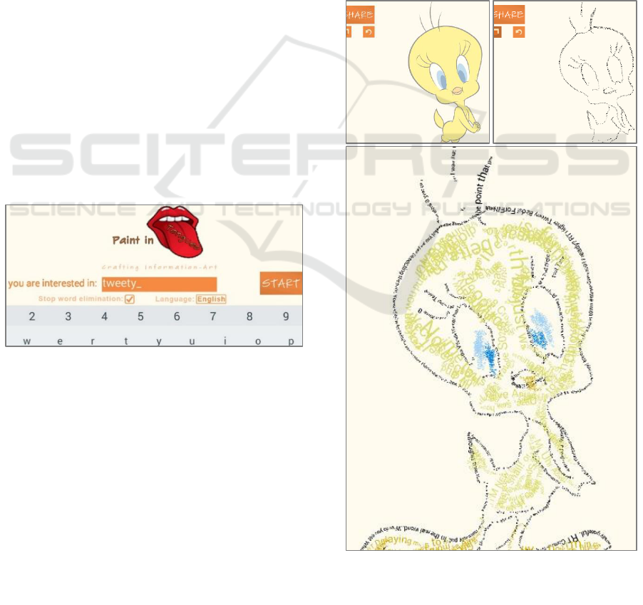
4 APLLICATION EXAMPLE
In this section, we describe a step-by-step illustration
of our proposed PiT tool by utilizing a prototype. We
show a simple example for visualizing tweets, with a
focus on interactively exploring the textual data by
doodling and adjusting the visualization layout. The
three distinct steps again are: (1) Enter a topic
interest (figure 3), (2) paint with the text data on an
initially blank canvas (figure 4) and (3) interactively
explore and modify the previously painted layout of
the data (figure 5). As described earlier, steps two and
three can alternately be repeated.
Independent from the intention of using PiT, we
start at the initial screen where a certain topic of
interest has to be entered (figure 3). In this case we
choose to fetch English tweets about the topic
“tweety” with stop word filtering applied. After all
queries are processed, we find ourselves at the blank
canvas screen in the painting mode. Then we could
for example trace an outline of the provided image
template. In figure 4 a) we can see this step visualized
with a blank canvas and the template image
displayed. In 4 b), we show the drawn outline and
decided to turn off the template option for the sake of
clarity. If we are solely focused on creating abstract
contemporary doodles with a text brush, we could
finish our visualization artwork (figure 4 c)) by
utilizing the template image and brush adjustments
like size and colour and then share it.
When we want to explore the data within the
visualization in more detail and draw conclusions
about the content and relations, we could now
iteratively switch between visualizing tweets texts in
the painting mode and interacting with the data in the
interaction mode. In figure 5 we are further interested
in the word “tweety” and select the word by tapping
on it while we are in the interaction mode. The word
is highlighted and links are drawn towards all other
similar words that are represented on the canvas.
Tapping on the word furthermore opens a window
which provides detailed information about the tweet
that our selected word is contained in (figure 5).
Figure 3: Step
(1)
: Preferences are set at the initial screen.
gz
Figure 4: Step
(2)
: a) Initial blank canvas with a template
image is displayed. b) First contours are drawn, template
is turned off. c) An artwork-like visualization is crafted.
a)
b)
c
)
To Paint in Tongues - Interactive, Artistic and Mobile Information Visualization for Social Media Texts - Creativity Enhancement by
Painting with Tweets on a Smart Tablet
163
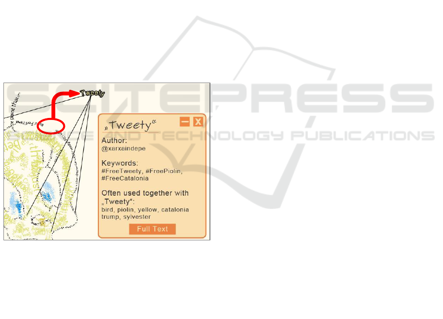
Besides author and keywords (hashtags) of this
tweet, generalized information concerning the
distinct word is displayed, which is a set of words.
These words are used most frequently within other
tweets that contain the word “tweety”. Therefore, the
message texts of the whole set of 100 tweets are used,
to make a more valid statement. If this detailed
information about “tweety” and its relations showed
us interesting aspects or inspiration that we were
looking for, we might want to be able to treat this
selected word apart from others. Therefore we
rearrange the visual layout by tapping, dragging and
dropping the word to another position (figure 5).
After this positive result of the exploration, we
switch back to the painting mode to extend the scope
of our visualization in order to find more interesting
aspects and conclusions. Node-link graphs for
example can produce patterns that are worth further
investigating. Regarding the enhancement of
creativity, the interplay between the template image
and the meanings of the written message texts can
lead to stimulating aspects as well. Totally different
or even dissonant meanings can be reflected here, so
that the topic of interest can be viewed from different
angles. Alternative views, opinions and ways of
looking at the content that might not be considered
before are the result of this interactive data set
exploration.
By looking at the tweets visualization artwork, we
can get an overview about the frequencies of specific
words using the link function. These links and the
detail information about other commonly used words
give both detailed insights and abstract impressions to
what we refer as a comprehensive content of the set
of tweets. These links and frequencies also compare
the contents visually. We get further information
about a certain public opinion, context and meaning
of words. If we choose our topic to be “tweety” for
example, we are able to see that other people use
words like “bird”, “yellow” and “sylvester” together
with “tweety”, which is very obvious (figure 5). But
more unexpected connections and relations are also
shown, so that words like “piolin”, “catalonia” and
“trump” were often used in tweets about tweety. The
combination of different media, like text, images,
semantic layout and graphs amplifies this broadening
of thoughts and helps to avoid cognitive inertia. At
the end, these elaborated information visualizations
can be shared with other people on social media
platforms to extend the scope of data analysis and get
feedback from different sources.
5 USER STUDY
Since we target an audience that consists of novices
at information visualization, we conducted a small
and simplified user study to get qualitative feedback
about the overall usability. Nine Students from
creative study programmes were asked to test the tool.
They were advised to perform some tasks and to fill a
post-study questionnaire on aspects concerning the
visualization, interaction and user experience. A
combined set of questions from the QUIS (Chin,
Diehl and Norman, 1988) and the USE questionnaire
(Lund, 2001) were used. In free text questions and
comments, the participants were asked to state
qualitative negative and positive aspects concerning
the application and the usefulness within their
creativity workflow.
The study did not aim to be a comprehensive
usability study because it was placed within the
prototype development process. It could still be
utilized to find crucial problems that must be solved
before planning a more advanced and costly user
survey, based on the results of this pilot study.
5.1 Participants and Tasks
Since all participants were students from the majors
of film studies, media studies, music studies or online
journalism, they had no experience in the field of
Information Visualization. However all of them had
experience in creative writing, like script or lyric
writing. The tool was given to them for five minutes
of unguided exploration without prior tutorial.
Figure 5: Step
(3)
: Details are provided on demand in the
interaction mode by selecting a word on the digital canvas.
Here the word “Tweety” is selected, rotated and moved
from its originally painted position. The interaction was
used to rearrange the layout of the words and to separate
personally important words from others.
IVAPP 2018 - International Conference on Information Visualization Theory and Applications
164

Afterwards, six tasks were carried out by the users.
The first four tasks were simple and straightforward
and aimed at observations on interactions with the
interface. The last two tasks were more freely to
inform about a certain topic of interest and using the
tool until the participants would say they could get
some inspiration regarding this topic. After these
tasks, the questionnaire was conducted. Besides the
survey-like part, it should be stated what they found
particular helpful, if there occurred any errors and if
they could imagine to use it within their particular
field of work. Altogether about 25 minutes at
maximum were used for each participant, depending
on their individual set end of the last two tasks. These
25 minutes were composed of five minutes free
exploration, five minutes for the first four tasks, ten
minutes for the last two tasks and five minutes for
answering the questionnaire.
5.2 Results
As a result, we could point out some minor flaws in
our tool. Participants were irritated about choosing
brush colours for the painted text and thought that
they would have any meanings. The transition
between the states of the tool were not understood as
clearly as expected. It did not impair the usability
after completing five minutes of free exploration.
Especially the comments on the conclusions about
their interest were very enlightening. Eight of nine
participants stated that they could come up with
different and novel perspectives about their topic
based on the visualization and interaction techniques
that we support. It could also be pointed out that these
participants would use the tool for getting started to
explore and investigate on a certain topic, but not
further. More comprehensive content acquisition
would need the possibility to write down personal
ideas and thoughts that the users come up with while
doodling and interacting with the visualization.
Overall each participant described that he or she
could get into a creative process easily and that basic
inspiration for further work could be acquired with
the help of the Paint in Tongues tool.
6 DISCUSSION AND
LIMITATIONS
As we do not have to handle huge data scalability
problems that are common in other areas of social
media visualization, there still are other limitations
and types of scalability issues to be considered
carefully.
We propose our tool as a mobile application for
smart tablets. This is a technical limitation, so that our
testing environment was an HP Slate 7 Extreme,
which is a tablet of average technical measurements.
The biggest problem was the screen resolution of
800x1280 pixels on a 7” display. Since this space is
sufficient for small paintings and doodles of up to
about one hundred words, visual clutter (Rosenholtz
et al., 2005) starts to appear if more words are used.
This problem is also very dependent on the user-
driven layout of the visualization, as users paint it.
Even a comparably small data set can be challenging
when lain out in an inefficient way. Therefore we
encourage to use a moderate amount of words and
increase the brush size rather than to fill areas with
many small characters. If it is taken advantage of the
whole screen size, artistic visualizations could be
elaborated that were still explorable with more than
150 words.
7 CONCLUSIONS
In this paper we proposed a mobile tool for
visualizing textual data from tweets. It is addressed at
users who are unexperienced to information
visualization techniques, but interested in meanings
and relations regarding a specific topic. Opinions and
different views of the public Twitter community have
to be revealed here. Therefore the visualization is
focused on the extraction of essential content within
a set of tweets. To support people in exploring this
data, we combined several visualization and
interaction techniques. Our approach is of particular
benefit for several scenarios when creativity shall be
enhanced in terms of textual context, for example
where song lyrics are written.
We stated the necessary data handling and
algorithmic concepts that these visualization and
interaction techniques are based on. An application
example was presented together with a small user
study. Limitations and challenges of the visual
concept and design were described briefly, as well as
issues of technical nature. These gave insights into
what could be done to improve the visualization tool.
After all we were able to prove that the general
approach supports people to get into a creative
process while simultaneously investigating on a
specific topic. As intended it is especially useful for
creative writing purposes. While the usefulness of our
tool is constrained on initializing ideation only, now
To Paint in Tongues - Interactive, Artistic and Mobile Information Visualization for Social Media Texts - Creativity Enhancement by
Painting with Tweets on a Smart Tablet
165

it is the turn for improving and elaborating the
concept reasoned by the results of this paper.
8 FUTURE WORK
Based on the discussion and a first pilot study, some
aspects of future work were already mentioned
indirectly. In following work, we will focus on a more
advanced user study to evaluate the visualization tool.
Since this paper targeted on the visualization aspect
and the prototype application of the PiT concept,
experiments with a focus on the actual creativity
enhancing process will be conducted. Further issues
in future development will therefore enable users to
take personal notes while interacting with the data.
This provides additional help especially for creative
writing, but will also help to extend the visualization
and the interaction by a “Record” technique, as
proposed by Heer and Shneiderman (2012).
While we only address Twitter as the underlying
data set of our work visualization tool, the concept
can easily be transferred to other social media
platforms that work with text/messages and tags like
hashtags in Twitter. As a next step, we will assign the
PiT concept to more objective media as articles of
online news. Big news companies like The New York
Times or The Guardian already provide APIs to get
access to exactly this kind of data: content, authors,
tags and furthermore headlines.
To improve and extend the actual visualization
concept of PiT, we plan to make use of colour coding
and size of the words, more commonly in word
clouds, to encode information. This coincidently
solves some issues that were found within the pilot
study as a nice side effect. Techniques like brushing
and linking seem to be promising and will be used in
a multiple view approach. This will emphasize the
information visualization aspect of our application
even more.
REFERENCES
Amabile, T. M. (1985). Motivation and creativity: Effects
of motivational orientation on creative writers. Journal
of personality and social psychology, 48(2), 393.
Bohnacker, H., Gross, B., Laub, J., & Lazzeroni, C. (2012).
Generative design: visualize, program, and create with
processing. Princeton Architectural Press.
Chew, C., & Eysenbach, G. (2010). Pandemics in the age
of Twitter: content analysis of Tweets during the 2009
H1N1 outbreak. PloS one, 5(11), e14118.
Chin, J. P., Diehl, V. A., & Norman, K. L. (1988, May).
Development of an instrument measuring user
satisfaction of the human-computer interface. In
Proceedings of the SIGCHI conference on Human
factors in computing systems (pp. 213-218). ACM.
Davis, S. (1985). The craft of lyric writing. Writer's Digest
Books.
Feinberg, J. (2010. “Wordle,” in Beautiful Visualization, J.
Steele and N. Iliin- sky, Eds. O’Reilly, pp. 37–58.
Heer, J., & Shneiderman, B. (2012). Interactive dynamics
for visual analysis. Queue, 10(2), 30.
Heye, D. (2006). Creativity and innovation: Two key
characteristics of the successful 21st century
information professional. Business information review,
23(4), 252-257.
Kaser, O., & Lemire, D. (2007). Tag-cloud drawing:
Algorithms for cloud visualization. arXiv preprint
cs/0703109.
Kennedy, L., Naaman, M., Ahern, S., Nair, R., &
Rattenbury, T. (2007, September). How flickr helps us
make sense of the world: context and content in
community-contributed media collections. In
Proceedings of the 15th ACM international conference
on Multimedia (pp. 631-640). ACM.
Lund, A. M. (2001). Measuring Usability with the USE
Questionnaire12.". Usability interface, 8(2), 3-6.
MacArthur, C. A., Graham, S., & Fitzgerald, J. (Eds.).
(2008). Handbook of writing research. Guilford Press.
McFadzean, E. (2001). Critical factors for enhancing
creativity. Strategic change, 10(5), 267-283.
Messaris, P. (1994). Visual" literacy": Image, mind, and
reality. Westview Press.
Paulovich, F. V., Toledo, F., Telles, G. P., Minghim, R., &
Nonato, L. G. (2012, June). Semantic wordification of
document collections. In Computer Graphics Forum
(Vol. 31, No. 3pt3, pp. 1145-1153). Blackwell
Publishing Ltd.
Riff, D., Lacy, S., & Fico, F. (2014). Analyzing media
messages: Using quantitative content analysis in
research. Routledge.
Rosenholtz, R., Li, Y., Mansfield, J., & Jin, Z. (2005,
April). Feature congestion: a measure of display clutter.
In Proceedings of the SIGCHI conference on Human
factors in computing systems (pp. 761-770). ACM.
Seifert, C., Kump, B., Kienreich, W., Granitzer, G., &
Granitzer, M. (2008, July). On the beauty and usability
of tag clouds. In Information Visualisation, 2008. IV'08.
12th International Conference (pp. 17-25). IEEE.
Shneiderman, B. (2002). Creativity support tools.
Communications of the ACM, 45(10), 116-120.
Shneiderman, B., Fischer, G., Czerwinski, M., Resnick, M.,
Myers, B., Candy, L., ... & Jennings, P. (2006).
Creativity support tools: Report from a US National
Science Foundation sponsored workshop. International
Journal of Human-Computer Interaction, 20(2), 61-77.
Sinatra, R. (1986). Visual Literacy Connections to
Thinking, Reading and Writing. Charles C. Thomas,
Publisher, 2600 South First St., PO Box 4709,
Springfield, IL 62708-4709.
IVAPP 2018 - International Conference on Information Visualization Theory and Applications
166

Tifentale, A., & Manovich, L. (2015). Selfiecity: Exploring
photography and self-fashioning in social media. In
Postdigital Aesthetics (pp. 109-122). Palgrave
Macmillan UK.
Tufte, E. R. (2001). The visual display of quantitative
information. Cheshire, Conn: Graphics Press.
West, T. G. (1991). In the mind's eye: Visual thinkers, gifted
people with learning difficulties, computer images, and
the ironies of creativity. Prometheus Books.
Wolfe, J. M. (1994). Guided search 2.0 a revised model of
visual search. Psychonomic bulletin & review, 1(2),
202-238.
Wu, Y., Provan, T., Wei, F., Liu, S., & Ma, K. L. (2011,
June). Semantic‐preserving word clouds by seam
carving. In Computer Graphics Forum (Vol. 30, No. 3,
pp. 741-750). Blackwell Publishing Ltd.
Xia, C., Schwartz, R., Xie, K., Krebs, A., Langdon, A.,
Ting, J., & Naaman, M. (2014, April). CityBeat: real-
time social media visualization of hyper-local city data.
In Proceedings of the 23rd International Conference on
World Wide Web (pp. 167-170). ACM.
Yi, J. S., ah Kang, Y., & Stasko, J. (2007). Toward a deeper
understanding of the role of interaction in information
visualization. IEEE transactions on visualization and
computer graphics, 13(6), 1224-1231.
To Paint in Tongues - Interactive, Artistic and Mobile Information Visualization for Social Media Texts - Creativity Enhancement by
Painting with Tweets on a Smart Tablet
167
