
Usability Testing of a School Website using Qualitative Approach
Uttam Kokil
and Sandra Scott
College of Humanities and Social Sciences, Kennesaw State University, Marietta campus, Kennesaw, GA 30060, U.S.A.
Keywords: Usability Testing, Think Aloud Protocol, Observational Method.
Abstract: The purpose of a school website is to provide pertinent information to parents and prospective site visitors. A
qualitative method was adopted to conduct a usability study to explore how parents interact with an
elementary school website in the USA. While the site yielded high ratings in terms of its visual appeal, the
usability test uncovered issues compromising its usefulness. Participants cited deficiencies in terms of poor
organization of information, and text labels not reflective of the contents, resulting in tedious navigation and
unsuccessful searches. Recommendations were made for site improvements with the goal to eliminate
usability issues, to make the site more efficient and effective for users.
1 INTRODUCTION
At times, website designers neglect to carry out a
website usability testing, even though it is an essential
process for ensuring that the site meets the needs of
the intended users. That often turns out to be a short-
sighted decision as unforeseen problems emerge and
users become frustrated. A cursory exploration of a
particular elementary school website revealed
possible usability issues that warranted testing, and so
a usability test was designed aiming to identify
specific problem areas through (i) observation of user
interaction with the website, (ii) think-aloud protocol
(iii) interview with the participants. Following the
findings, recommendations were made for
implementation to improve the website.
Based on the preliminary issues that were
observed, the following objectives were developed
for the test: (1) to assess how easily and successfully
users find information on the website, (2) to
determine how information retrieval relates to the
structure of the site, (3) to determine how finding
information relates to the organization of the content,
and (4) to get users’ perspectives on their overall
experience with the site. The following research
questions were formulated to focus on specific areas
contributing to the objectives of the study, as follows:
(i) Do navigation paths meet users’ expectations? (ii)
Is information organized in a logical manner (iii) Is it
easy to learn how to use the site? (iv)What kinds of
emotional reactions do users express while using the
site? (v) Does the appearance of the site make it easy
to use the website? (vi) What do users like about the
site? (vii) What do users dislike about the site?
The primary users of the school’s website are
parents who are seeking information about the school.
The site features internal information from the school,
as well as external information from the school
district administration. Piper (2012) views a school’s
website as an excellent medium for communication
between the school and the home. The author believes
that the website should facilitate active participation
in what goes on at the school—especially for
parents—and discusses a number of proactive ways
in which one school ensures this. This kind of
engagement through a school’s website must begin
with a site that caters to the needs of its users. This
study is focused on a more fundamental level of user
need regarding a school website—the ability to find
information. Its results will help to ascertain how well
the elementary school website functions as a point of
contact with the school for its primary users as it
relates to finding information with ease.
2 LITERATURE REVIEW
Usability can be evaluated using three major
constructs: apparent usability, perceived usability
and task performance (Gu et al., 2016). Apparent
usability is a user’s subjective judgment of ease of use
based on the visual appearance of a product.
Perceived usability is related to how users feel
designated by their subjective judgment of human-
Kokil U. and Scott S.
Usability Testing of a School Website using Qualitative Approach.
DOI: 10.5220/0006295500550064
In Proceedings of the 12th International Joint Conference on Computer Vision, Imaging and Computer Graphics Theory and Applications (VISIGRAPP 2017), pages 55-64
ISBN: 978-989-758-229-5
Copyright
c
2017 by SCITEPRESS – Science and Technology Publications, Lda. All rights reserved
55

product interaction. Performance is an objective
usability evaluation concerning the time it takes for a
user to complete specific tasks while using a system.
The twelve fundamental usability principles
concerning website evaluation are referred as
Nielsen’s heuristics (Nielsen, 1994). Studies on web
usability have been conducted from different angles,
notably learnability, consistency, satisfaction
(Nielsen, 1994), reliability and navigation (Egger et
al., 2003), interactivity (Lowry et al., 2006),
usefulness (Rubin and Chisnell, 2008). The usability
of websites is therefore defined by a number of
attributes listed above that provide experiential
meaning to users in the interaction with websites.
These attributes were useful in guiding the design of
the instruments for the usability test, and in indicating
necessary areas of focus.
In a study, Hartshorne et al. (2008), examined the
effectiveness of elementary school websites, cited
four functions of these sites, two of which are
considered in this study: providing an introduction to
the school itself, and providing access to other related
information—such as internal and external resources
for members of the school community. The authors
analyzed fifty elementary school websites, mainly in
the areas of content, structure and design. These areas
were detailed in a checklist aligned with factors in this
usability test. These include users’ impressions of the
homepage, aesthetics, navigation back to the
homepage, ease of moving around the site and ease of
finding information.
Spool, et al. (1997), after conducting usability
tests on nine websites (a mix of e-commerce,
corporate and other informational sites), found that
navigation issues often led to the failure of users to
find information. A site structure that users could not
follow intuitively was found to be one of the main
causes (p. 13). This seemed worthy of investigation,
and so tasks were designed in this study that would
test the ability of participants to successfully navigate
the site. Spool, et al., (1997) also found that a
website’s graphic design had no effect on the ability
of users to find information. In fact, of the sites they
tested, the one that was rated the best in terms of
usability had mostly text (p. 7). It has been shown that
aesthetically pleasing websites have led to positive
affect (Norman, 2004; Zhang and Li, 2005), user
satisfaction (Cyr et al., 2005), navigation (Battleson,
et al., 2001), fun and pleasure of usage (Creusen and
Snelders, 2002). Koutsabasis and Isitikopoulou
(2013) developed a method for evaluating the
aesthetics of websites in Human Computer
Interaction, but did not go as far as relating aesthetics
to navigation. Moshagen and Thielsch (2011) devised
the VisAWI instrument to measure perceived aesthetic
quality in websites given the importance of visual
aesthetic components play in digital products and
systems. Noting the differing opinions, and though
not intending to explore the technical details of
aesthetics, the opinions of users about the overall
appearance of the site—including whether it
enhanced the process of searching for information in
any way—was incorporated into the current usability
test.
In terms of methodology, the think-aloud protocol
and the concept of speech genre expounded by Boren
and Ramey (2000) were found to be very useful.
Speech communication in usability testing essentially
provides a refinement of the think-aloud protocol that
appears to enhance not only its practicality as a form
of human interaction, but, even more importantly, its
effectiveness.
An important aftermath of the process is
transcription of the audio recordings. Davidson
(2009) believed that selectivity and transcription go
hand in hand, and that this reality should be explained
as it relates to a study. Markle et al. (2011), in
referring to interviews, noted the inherent inadequacy
of transcription in capturing the emotion behind the
spoken word (p. 4), as well as the tedium of the task
(p. 3). The authors mentioned voice-recognition
software, which is supposed to work well with a
single voice (p.10), but such software was unlikely to
do justice to the long pauses and under-the-breath,
sometimes barely audible, utterances that were part of
the recordings in this study. It was therefore found
expedient to transcribe recordings of the think-aloud
sessions by typing them out. Bailey (2012), and Sauro
(2011), demonstrated that tracking test participants’
first clicks could yield valuable information in terms
of predicting their likelihood of success. This view
was also supported in the First Click Testing article at
www.usability.gov (n.d.). Hence, the tracking of first
clicks was incorporated into this current testing.
According to Pendell and Bowman (2012), five to
eight participants are usually required for an effective
usability test, but because of the unique requirements
of their test, they used twelve. Dickstein and Mills
(2000) felt that statistical significance could be
inferred from the results of eight to ten participants,
but acknowledged that after four or five users they
were able to tell if something was problematic. In
fact, Nielsen (2012) concluded that five users were
enough for an effective test. Ten participants were
used for this study. This number was considered ideal
to provide a reasonable body of data from which
trends, patterns, and results would be very clear for
purpose of analysis.
HUCAPP 2017 - International Conference on Human Computer Interaction Theory and Applications
56
3 METHOD
The procedures for data collection in this usability
test were:
Observation of users performing authentic
tasks.
Administration of pre- and post-test
questionnaires.
Think-aloud protocol.
Discussions with participants.
A qualitative approach was adopted because of
the exploratory nature of the study, especially useful
in observing users interacting with the website while
using the think-aloud protocol (Preece et al., 2015). A
convenience sample of ten participants was chosen
from among persons whose children were currently in
the school system or had passed through the school
system. A wide age range was targeted—18 to 60
years—to accommodate grandparents and others who
function as guardians. The generic term “parents” is
used throughout the study to refer to all. All
participants were female. Individual test was carried
out over an eleven-day period.
There were two questionnaires: a pre-test
questionnaire and a post-test questionnaire. Both sets
of questionnaires were piloted with three persons.
The pre-test questionnaire was designed to assess the
participants’ level of comfort with the Internet, get
their initial impression of the website, and provide
some demographic information. The proficiency of
the participants with the Internet varied, and while it
was desirable to have participants who had the
capability to interact comfortably with the interface,
it was also beneficial to have at least one Least
Competent User (LCU) to represent the other end of
the spectrum.
The post-test questionnaire was designed to
capture the experience with the tasks, likes and
dislikes regarding the website, and suggestions for
improvement. The recorded think-aloud protocol,
supplemented by notes from observations and post-
test discussions, provided valuable data that might not
have been included while the participants filled the
questionnaires.
In order to organize the data, an Excel workbook
was created with four sheets as follows: (1) Pre-
questionnaire, (2) Post-questionnaire Part A, (3) Post-
questionnaire Part B, (4) Task analysis. Part A of the
post-test questionnaire consisted of closed-ended
questions using the Likert scale for responses, while
Part B consisted of open-ended questions. Responses
from the questionnaires were logged in text format,
and, where applicable, tallied. Thematic analysis was
done on the answers to the open-ended questions on
the post-test questionnaire Part B to arrive at codes
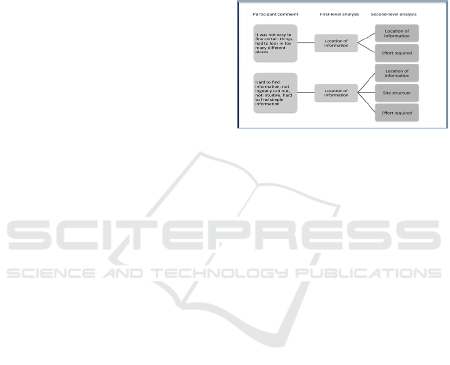
that related to the research questions. Figure 1 shows
the analysis of two comments that were made in
response to the question: What did you dislike about
the site?
Figure 1: Emergence of Themes.
Themes were derived by two levels of analysis.
Initial codes were generated from an overview of the
data, then as the data were studied in more details,
further aspects of a comment became evident, which
warranted separated codes. The frequency with which
these codes/themes occurred was then checked to
identify patterns. For example, in response to what
participants liked about the website, nine out of ten
participants, or seventeen out of a total of twenty-four
points that were made, mentioned appearance.
Location of information was the highest occurring
theme in response to what participants disliked. The
pre-test questionnaire did not have any open-ended
questions, so answers were collated/tallied for each
question, or selected answers logged for each person.
Transcription of the think-aloud recordings was
concentrated on test participants’ talk about the tabs
and links on which they clicked, so that their routes
in performing a search task could be re-created for
purpose of analysis. In transcription, those points
were put in bold lettering. As Markle, et al. (2011)
noted, it is difficult for transcription to capture the
emotions expressed by participants. This is inevitably
the case when they are not verbalized. Observer notes
proved to be a very good backup for this as body
language and expressions were noted. Transcription
synchronized well with the observer’s handwritten
notes of critical search paths.
Qualitative data was of paramount importance in
this study because, as will be shown in the Discussion
section, quantitative data, in the form of time on tasks,
for example, provided rather limited information to
examine the research questions adequately.
Usability Testing of a School Website using Qualitative Approach
57
3 ANALYSIS
This section explains how the data collected were
applied to each research question. Questionnaires and
tasks had been carefully designed to align with the
research questions, so the data collected could be
related directly to these questions. Table 1 below
outlines the specific data used to answer each
question. Data from the sources indicated were
combined to give a complete picture for each question
and ensure that the overarching objectives of the
study were addressed.
Table 1: Applying data to research questions.
QUESTIONS
DATA AS INDICATOR
Do navigation paths
meet users’
expectations?
Subjective data
Response to post
questionnaire statements:
“Navigation paths met my
expectations”, “I knew where
I was in relation to the
homepage at all times”, “I
could retrace my paths
easily”.
Performance data
Homepage tab was selected to
start each task, number of
tabs/links clicked during
search.
Other
“Think-aloud” comments and
observations”
Is information
organized in a logical
manner?
Subjective data
Response to post-
questionnaire statements:
“information was presented in
a way that made sense”,
“website is designed to meet
users’ needs”, “I think the site
is well laid out”. References
to location of information in
response to post-test
questionnaire question “what
did you dislike about the site”,
and to suggestions for
improvement. Number of
participants that mentioned
appropriateness of
headings/labels or
organization of information in
free-form comments.
Other
“Think-aloud” comments and
observations.
Is it easy to learn how
to use the site?
Subjective data
Response to post-
questionnaire statements:
“when I clicked on the
homepage tabs I found what I
expected”, “if I had to do it
again I could complete the
tasks I did”, “if I had to do it
again I could complete the
tasks I failed”, “finding
information on the site was
easy”, “I can find information
quickly on this site”.
References to
ease/difficulty of finding
information.
in free-form comments.
Performance data
Time to complete tasks.
Other
“Think-aloud” comments and
observations.
What kinds of
reactions do users
express while using
the site?
Observations and related
“think-aloud” comments
Does the appearance
of the site make it
pleasant to use?
Subjective data
Response to postquestionnaire
statement “the visual design
of the site made it pleasant to
use”, reference to aesthetics in
response to post-questionnaire
question “what do you like
about the site?”
What do you like
about the site?
Subjective data
Answers to this question on
the post-test questionnaire,
organized by themes
.
What do you dislike
about the site?
Subjective data
Answers to this question on
the post-test questionnaire,
organized by themes
4 RESULTS
In this section the answers to the research questions
will be addressed. For the purpose of this qualitative
study, the results of the Likert scale responses were
interpreted using the percentage of participants that
selected the various ratings. The statements in the
HUCAPP 2017 - International Conference on Human Computer Interaction Theory and Applications
58
table below (and the tables following) are from the
post-test questionnaire. Instructions were as follows:
1 = strongly disagree, 2 = disagree, 3 = undecided,
4 = agree, 5 = strongly agree. For the sake of brevity,
“agree” is used to include responses of “agree” and
“strongly agree”, and “disagree” to include responses
of “disagree” and “strongly disagree.”
Research Question#1. Do navigation paths meet
users’ expectations?
Table 2: Responses relating to Research Question #1.
DISAGREE UNDECIDED AGREE
Statement: Navigation paths met my expectations
90% 10% 0%
Statement: I knew where I was in relation to the
homepage at all times
30% 40% 20%
Statement: I could retrace back my path easily
20% 40% 40%
Task Performance data to measure success rate:
Task 1 – Find the Year in Which the School was
Built.
Most popular first click: About Us tab
Average number of areas clicked during search
(including areas clicked more than once): 7
Success rate: 0 out of 10
Task 2 – Find the School’s Hours.
Most popular first click on homepage: About Us
tab
Average number of areas clicked during search
(including areas clicked more than once): 3
Success rate: 9 out of 10
Task 3 – Find Information on the Gifted Program.
Most popular first click on homepage:
Academics tab
Average number of areas clicked during search
(including areas clicked more than once): 6
Success rate: 9 out of 10
Task 4 – Find Out if the School has a Clinic and a
Nurse.
Most popular first click on homepage: Staff tab
Average number of areas clicked during search
(including areas clicked more than once): 4
Success rate: 6 out of 10
Task 5 – Find the School Supplies for a 4
th
Grade
Child.
Most popular first click on homepage:
Academics tab
Average number of areas clicked during search
(including areas clicked more than once): 5
Success rate: 8 out of 10
Task 6 – Find the Size of the Student Population at
Some Point in 2015.
Most popular first click on homepage: About Us
tab
Average number of areas clicked during search
(including areas clicked more than once): 7
Success rate: 0 out of 10
Research Question#2. Is information organized
in a logical manner?
Table 3: Responses relating to Research Question #2.
DISAGREE UNDECIDED AGREE
Statement: Information was presented in a way that
made sense.
70% 30% 0%
Statement: Website was designed to meet users’ needs.
60% 40% 0%
Statement: I think the site was well laid out.
80% 20% 0%
In answers to the open-ended questions on the
post-test questionnaire, five of ten participants
mentioned “headings/labels” or “organization of
information” as something they did not like. In free-
form comments during and after the exercise, all
participants referred to the fact that “headings/labels”
were not helpful or were misleading. The tasks
eliciting these comments most frequently were the
ones initiated with clicks on the “About Us” tab—the
year the school was built, school hours, and student
population.
Nine out of ten participants thought the gifted
program was misplaced under Parent Resources in the
sidebar instead of under Academics (which was their
first click). Location of information was criticized by
seven participants in response to the post-test
questionnaire “What did you dislike about the site?”.
Six persons included location of information among
Usability Testing of a School Website using Qualitative Approach
59

their suggestions for improvement on the same
questionnaire. All participants expressed problems
with the location of information in at least two tasks
in free-form comments during and after the exercise.
Research Question#3. Is it easy to learn to use
the site?
Table 4: Responses relating to Research Question #3.
DISAGREE UNDECIDED AGREE
Statement: When I clicked on the homepage menu, I
found what I expected.
70% 30% 0%
Statement: If I had to repeat it again, I could complete
the tasks I did.
60% 40% 0%
Statement: If I had to repeat it again, I could complete
the tasks I failed.
80% 20% 0%
Statement: Finding information on the site was easy.
70% 30% 0%
Statement: I can find information quickly on this site.
80% 20% 0%
In response to the open-ended questions on the
post-test questionnaire, four of ten persons said that it
took too much effort to find information on the site.
In free-form comments during and after the exercise,
all participants referred to difficulty in completing at
least three tasks (even if they did so successfully).
The tasks that elicited these comments most
frequently were the ones pertaining to the year the
school was built, the gifted program, the student
population, and the clinic/nurse.
Average time to complete tasks
Task 1 3.3 minutes
Task 2 1.7 minutes
Task 3 2.8 minutes
Task 4 2.8 minutes
Task 5 2.1 minutes
Task 6 4.4 minutes
Research Question#4. What kinds of reactions
do users express while using the site?
Observation and the think-aloud protocol yielded
much information in this regard. A number of persons
made great effort to find the information, looking at
both the school’s website as well as the County
School District’s website to which many links/tabs
led, while others (the minority) tended to give up
more quickly.
In summary, the main reaction was puzzlement
when they were unable to find what they were looking
for in what they considered to be logical places. There
were a few instances of frustration, while some
persons laughed in disbelief either at the futility of
their search or the unlikely place in which they found
what they were looking for. The sole LCU
demonstrated evidence of fatigue pretty quickly.
Body language indicated concentration for the most
part; persons stopped speaking sometimes as they
focused intently on the tasks. Below are some of the
participants’ comments:
“I feel like I am going around in circles”.
“They don’t make it easy, do they?”
“Do they even have a gifted program?”
“Seems as if they don’t want you to find it”.
“This is really frustrating”.
“I don’t know why they even have that page”
(the page behind the Administration tab).
“I found that completely by accident”.
“About Us doesn’t have anything”.
“The sidebar is weird. It’s just jumping from one
thing to the next”.
“Nice, clean homepage. Once you click on the
tabs things go crazy”.
“The order is discombobulated”.
“Visually nice but hard to use”.
“You have to work too hard to find the
information”.
“That’s a hard spot for it to be”.
“You can’t find simple stuff but you can find all
the complex stuff about curriculum”.
Research Question#5. Does the appearance of
the site make it pleasant to use?
Table 5: Responses relating to Research Question #5.
DISAGREE UNDECIDED AGREE
Statement: The appearance of the site made it pleasant
to use.
0% 40% 60%
Research Question#6. What do you like about
the site?
The themes that emerged from the questionnaire
responses to this question, in order of frequency are:
Appearance.
Content.
Diversity, readability, and “not too busy”
each got one mention.
HUCAPP 2017 - International Conference on Human Computer Interaction Theory and Applications
60

Research Question #7. What do you dislike about
the site?
The themes that emerged from the responses to
this question on the post-test questionnaire, in order
of frequency are:
Location of information (difficult to find).
Labels (tabs and headings) not reflective of
content.
Layout not logical.
Too much effort required to find
information.
Navigation back to homepage not clear.
Misalignment of information on page and
sidebar, and the use of acronyms and
unfamiliar names (such as “Discovery” for
the gifted program) each got one mention.
5 DISCUSSIONS
This study shows the importance of qualitative data
in usability testing. The quantitative data, such as the
tasks completed correctly (no prompts were given,
but generous amounts of time were allowed) does not
reveal the circuitous routes that participants took to
find the information or the frustration and complaints
expressed.
The ratings on the post-test questionnaire pose an
interesting dilemma. Though “undecided” is
supposed to represent a neutral position, in an
exercise of this nature, it in fact ends up being
negative. If a user is undecided, whether the site
functioned in a way that it should, then the website
failed in that respect. It has not fulfilled the
organization’s intent of providing its customers with
a decidedly useful resource to connect with the
company. This is, perhaps, the primary purpose
behind the development of all company/organization
websites. Dumas (1998) noted the potential for the
participants to unwittingly “distort” results through
their personal tendency to be agreeable, to avoid
extremes on a scale, and to avoid giving something a
poor rating (p.6). This may be a factor in the
undecided ratings in this study.
In hindsight, it would have been better to
disaggregate the statement “The appearance of the
site made it pleasant to use”. All participants liked
how the site looked (one person did not state it on her
questionnaire but she expressed it to the observer),
but when that was teamed with “pleasant to use” it
created a problem. The fact is they did not find the
site easy to use, but they liked how it looked in terms
if its visual design. For that reason, four persons
resorted to “undecided” in response to that statement.
The bottom line is that an aesthetically pleasing site
cannot compensate for poor functionality. This
contradicts the notion of “what is beautiful is usable?”
(Norman, 2004).
5.1 Summary of Problems Identified
The pre-test questionnaire indicated that all
participants considered a school’s website to be very
useful if they had a child going to that school. The
data that have been presented show that there are
issues with the Dunwoody Elementary school website
that, in its current form, detract from its functionality
and therefore its usefulness. The following
deficiencies were revealed, in the order of importance
to participants and also of severity in terms of its
usability.
5.1.1 Content
The content needs to be reorganized. There are many
instances in which information is not located in
logical places, that is, in places that a normal user
would think to look at, and this was the main
complaint of the study participants. Examples are the
date the school was built and the size of the school
population at some point in 2015. This information is
located in a report located under Parent Education,
which is under Parent Resources, called 2014-2015
Prospective Parent Night (Figure 2). The location of
the gifted program under Parent Resources instead of
Academics (nine of ten participants started the search
with the Academics tab) surprised many participants
as well.
Figure 2: Unexpected location of information.
5.1.2 Labels and Headings
Labels (headings and tabs) need to be more accurately
descriptive. They, in large part, do not represent what
the participants find when they click on them. The
most misleading one is perhaps the “About Us” tab,
Usability Testing of a School Website using Qualitative Approach
61
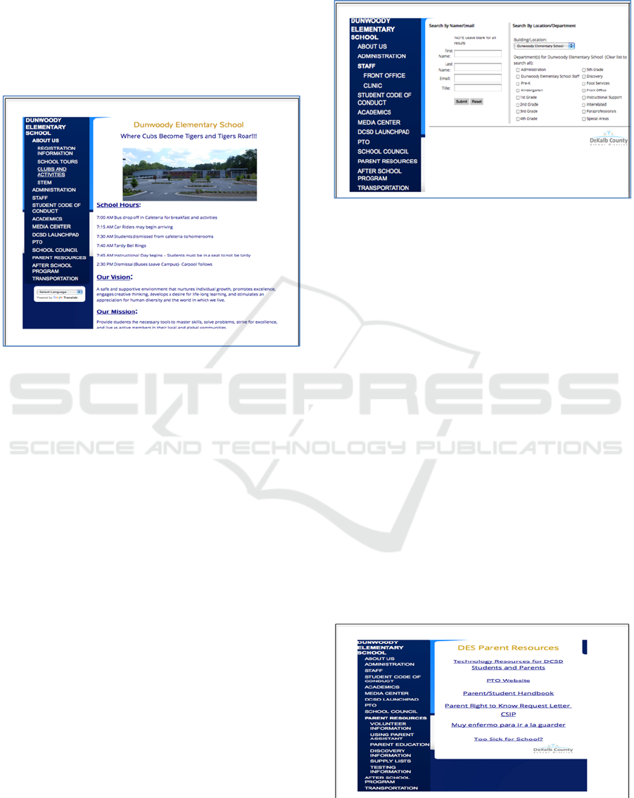
which reveals only the school’s hours of operation,
and its mission and vision (Figure 3). First click
tracking shows it to be by far the most frequent
starting point for three of the six tasks. It was actually
a good starting point only for the task relating to the
school’s hours. Also misleading is the
“Administration” tab that leads to a page with only
the name of the Principal.
Figure 3: Deficient content inside About Us tab.
5.1.3 Labels and Headings
The website features a running sidebar which
functions as the main navigation tool and portal
to the problematic site layout. Eighty percent of
users did not think the site was well laid out and
this is an important measure of its usability. The
underlying problems with layout are manifested
through this sidebar, so a lot of the usability
issues expressed by users were concentrated
here. The sidebar appears to create a visual
vertical division so that when participants arrive
at a page they either focus on the sidebar, reading
the headings listed while trying to decide which
one to click, or they focus on the content of the
page to the right and ignore the sidebar. This was
very evident with the task of finding out if the
school has a clinic and a nurse. Once the Staff
tab was clicked on the homepage, at least two
persons failed to notice “Clinic” very visible in
the lineup near the top of the sidebar, and instead
went to the content of the page and searched by
location/department (Figure 4). Using this route
the Nurse is unexpectedly listed under the Front
Office department. Two persons left the page
altogether and went to explore other areas before
coming back to find out “Clinic” on the sidebar.
Figure 4: Incorrect placement of clinic tab.
Another problem with the sidebar is that the
headings are not properly formatted. One participant
remarked “The sidebar is weird. It’s just jumping
from one thing to the next. The order is
discombobulated. Things need to stick out more”.
The effect of “jumping from one thing to the next” is
caused by the fact that the contents of the sidebar are
rearranged to reflect the page that it adjoins as one
moves from page to page (note the changes in Figures
2 – 5). Furthermore, things do not “stick out more”
because the font is consistent (all caps), so such that
the existing hierarchy does not make it clearly visible.
Participants, however, like the clarity of the font, so
any redesign on this front must be approached with
caution.
A third problem with the sidebar is that on some
pages, such as Parent Resources and School Council,
there are indented lists under those headings on the
sidebar with different items than what appear on the
adjoining page to the right (Figure 3). In addition to
that, the Parent Teachers Organization (PTO) appears
both as a standalone link in the sidebar and as a link
on the Parent Resources page (Figure 5). School
Figure 5: Parent Resources heading shows different links in
sidebar.
HUCAPP 2017 - International Conference on Human Computer Interaction Theory and Applications
62
Council which is immediately under PTO on the
sidebar currently appears on the PTO website as well.
6 RECOMMENDATIONS
An encouraging point expressed by two participants
is that the site does contain useful information.
However, the three main problem areas that have
been identified—content, labels and headings, and
sidebar (related to site layout)—are inextricably
linked. Following are the proposed recommendations
based on the results of the usability test.
1. An inventory should be conducted of all the
information on the website and items
categorized within areas that would make
reasonable headings/tabs on the homepage.
Users, especially parents, should be invited to be
a part of this participatory design process. With
the aid of a diagram, categorize the information
and map out a more functional layout of the site,
to inform the redesign. The school site is not
complicated. The single-tier hub-and-spoke
structure described by Lynch and Horton (2008)
would be an ideal arrangement.
2. The “About Us” tab is standard on most
websites. This page needs to be reworked to
include more information about the school. In
addition to the school’s vision and mission,
participants indicated that they would like to see
the history of the school, enrolment statistics,
information on the principal and staff, and a
message from the principal.
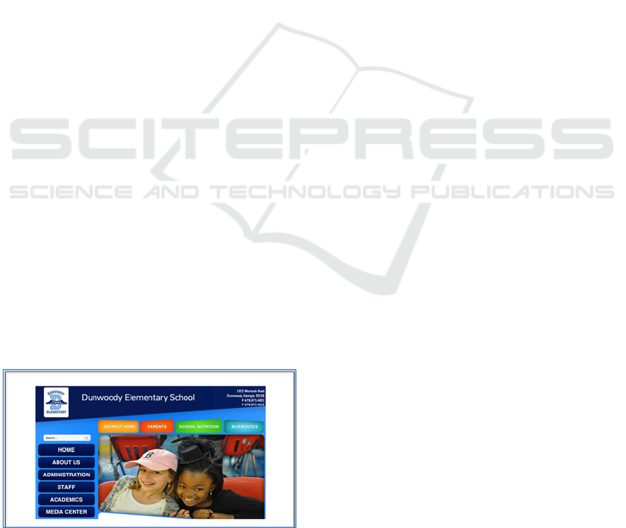
3. On the homepage, all tabs should be placed in a
commanding position at the top of the page to
form the main navigation tool. Currently, there
are tabs both on the left side and at the top
(Figure 6). Three of the four tabs at the top link
to the School District; the other is labelled
“Parents” and can also be accessed at a lower
Figure 6: Main navigation tabs are located both on the left
and at the top of the webpage.
level from the sidebar. This heading does not need to
be in two places. It should remain as part of the main
navigation.
4. In order to ensure that the user knows where
he/she is at any point, the main navigation
tool from the homepage should be carried
from page to page, with a change in the color
of the heading, or bold font, to represent the
current location. In addition, users should be
able to go back to the home page from any
page. There were instances when
participants inadvertently ended up on the
DeKalb County School District’s website,
and only realized it when the back tab would
not take them back to the school’s
homepage, because another page had
opened up altogether. There should be a
message to warn users when they are leaving
the school’s website.
7 CONCLUSIONS
The Dunwoody Elementary School’s website has a
lot of potential to be a valuable resource for members
of the school community and the wider community.
If the recommendations in this report are followed,
the website will be more user-friendly. We are living
in an age of widespread Internet connectivity, both
mobile and otherwise, and websites often represent an
important point of contact with an organization as
people connect with it through its Web presence. For
parents on the go, for example, the school’s website
should be a quick and helpful point of reference from
a smartphone or the tablets. It would be a step in the
right direction for Dunwoody Elementary School to
treat its website as a virtual ambassador for the
school, to develop it with continuous usability testing,
and listen keenly to the voice of its users as it does so.
A good reference point for further testing would be
the work of Hartshorne et al. (2008), in which they
generated a checklist to assess the effectiveness of
elementary school websites. It is a very
comprehensive and expertly crafted checklist, and
provides useful parameters for the examination of the
Dunwoody Elementary school’s website in the future.
REFERENCES
Bailey, B. (2013, October 8). FirstClick usability testing
[WWW]. Available from: http://webusability.com/
firstclick-usability-testing/ (Accessed Nov 20, 2015)
Usability Testing of a School Website using Qualitative Approach
63

Battleson, B., Booth, A., Weintrop, J., 2001, Usability
testing of an academic library web site: A case study. The
Journal of Academic Librarianship, 27(3), pp. 188-198.
Boren, M. T. and Ramey, J., 2000, Thinking aloud:
Reconciling theory and practice. IEEE Transactions
On Professional Communication, 43(3), pp. 261-278.
Creusen, M., Snelders, S., 2002, Product appearance and
consumer pleasure. In W.D Green and P.W Jordon
(eds), Pleasure with products: Beyond Usability, New
York: Taylor and Francis, pp.69-75.
Cyr, D., Bonanni, C., Bowes, J., Ilsever, J., 2005, Beyond
trust: website design preferences across cultures.
Journal of Global Information Management 13 (4), 24–
52.
Davidson, C., 2009, Transcription: Imperatives for
qualitative research. International Journal of
Qualitative Methods, 8(2), pp. 35-52.
Dickstein, R., Mills, V., 2000, Usability testing at the
University of Arizona Library: how to let the users in
on the design. Information Technology & Libraries,
19(3), pp. 144-150.
Dumas, J.S., & Redish, J.C., 1999. A Practical Guide to
Usability testing, Intellect. Portland, OR, USA, 1
st
edition.
Egger, F.N., Cover, J.L., & Producties, J., 2003, From
interactions to transactions: designing the trust
experience for business-to-consumer electronic
commerce. Eindhoven University of Technology.
Hartshorne, R., Friedman, A., Algozzine, B., & Kaur, D.,
2008, Analysis of Elementary School Web Sites.
Journal of Educational Technology & Society, 11(1),
pp. 291-303.
Koutsabasis, P., Istikopoulou, T. G., 2014., Perceived
website aesthetics by users and designers: implications
for evaluation practice. International Journal of
Technology and Human Interaction, 9(2), pp. 39-52.
Lowry, P.B., Spaulding, T., Wells, T., Moody, G., Moffit,
K., and Madariaga, S., 2006. A Theoretical Model and
Empirical Results Linking Website Interactivity and
Usability Satisfaction. Proceedings of the 39th Annual
Hawaii International Conference on System Sciences
(HICSS’06), IEEE (2006), 123a–123a.
Markle, D. T., West, R.E., & Rich, P.J., 2011, Beyond
transcription: Technology, change, and refinement of
method. Forum: Qualitative Social Research, 12(3),
pp. 1-21.
Nielsen, J. (2012, June 4), How many test users in a
usability study? Available from http://www.
nngroup.com/articles/how-many-test-users/ (Accessed
Nov 04, 2015)
Nielsen, J., 1994, Heuristic evaluation. In J. Nielsen and
R.L. Mack, eds., Usability Inspection Methods. John
Wiley & Sons, New York, NY.
Nielsen, J. 1994, Usability engineering. Elsevier.
Norman, D., 2005, Emotional Design: Why We Love (or
Hate) Everyday Things. Basic Books. New York, NY.
Pendell, K. D., Bowman, M. S., 2012, Usability study of a
library's mobile website: An example from Portland
State University. Information Technology & Libraries,
31(2), pp. 45-62.
Piper, T., 2012, Using school websites to support parent
engagement. Leadership, 42(2), pp. 36-38.
Preece, J., Sharp, H., Rogers, Y., 2015, Interaction design:
Beyond Human-Computer Interaction, 4
th
edn, Wiley &
Sons Ltd, West Sussex, United Kingdom.
Reporting usability test results. (n.d.). Available from
http://www.usability.gov/how-to-and-
tools/methods/reporting-usability-test-results.html.
Ross, J. (2012, February 6), Communicating user research
findings. Available from http://www.uxmatters.com/mt/
archives/2012/02/communicating-user-research-finding
s.php.
Rubin, J., Chisnell, D., 2008, Handbook of usability
testing: How to plan, design and conduct effective tests.
Indianapolis, IN: Wiley.
Sauro, J. (2011, October 19), Getting the first click right.
Available at http://www.measuringu.com/blog/first-
click.php.
Tuzun, H. et al., 2013, A Study on the Usability of a
University Registrar's Office Website through the
Methods of Authentic Tasks and Eye-Tracking. Turkish
Online Journal of Educational Technology, 12(2), pp.
26-38.
U.S. Department of Health and Human Services. (n.d.).
Research-based web design and usability guidelines.
Retrieved from www.usability.gov.
HUCAPP 2017 - International Conference on Human Computer Interaction Theory and Applications
64
