
Interpretation of Dimensionally-reduced Crime Data:
A Study with Untrained Domain Experts
Dominik J
¨
ackle
1
, Florian Stoffel
1
, Sebastian Mittelst
¨
adt
2
, Daniel A. Keim
1
and Harald Reiterer
1
1
University of Konstanz, Konstanz, Germany
2
Siemens AG, Munich, Germany
Keywords:
Dimensionality Reduction, Multivariate Data, Crime Data, Qualitative Study.
Abstract:
Dimensionality reduction (DR) techniques aim to reduce the amount of considered dimensions, yet preserving
as much information as possible. According to many visualization researchers, DR results lack interpretability,
in particular for domain experts not familiar with machine learning or advanced statistics. Thus, interactive
visual methods have been extensively researched for their ability to improve transparency and ease the inter-
pretation of results. However, these methods have primarily been evaluated using case studies and interviews
with experts trained in DR. In this paper, we describe a phenomenological analysis investigating if researchers
with no or only limited training in machine learning or advanced statistics can interpret the depiction of a data
projection and what their incentives are during interaction. We, therefore, developed an interactive system for
DR, which unifies mixed data types as they appear in real-world data. Based on this system, we provided data
analysts of a Law Enforcement Agency (LEA) with dimensionally-reduced crime data and let them explore
and analyze domain-relevant tasks without providing further conceptual information. Results of our study
reveal that these untrained experts encounter few difficulties in interpreting the results and drawing conclu-
sions given a domain relevant use case and their experience. We further discuss the results based on collected
informal feedback and observations.
1 INTRODUCTION
Dimensionality reduction (DR) techniques trans-
form data in high-dimensional space to a lower-
dimensional space, preserving as much information
as possible to convey the main characteristics of the
data. DR techniques are in practice typically applied
to transform the data to two-dimensional space de-
picted as a scatterplot. This abstract representation
of complex data enables exploration of the structure,
but brings in challenges about interpretability of the
visualization and how the different dimensions are re-
flected in the lower-dimensional representation.
Consider for example data analysts of Law En-
forcement Agencies (LEAs). They are eager to iden-
tify patterns among various data sources they have ac-
cess to in order to leverage resources, identify sus-
pects, relieve wrongly accused individuals, and more.
In research projects, we have worked closely together
with strategic, tactical, and case analysts of different
LEAs and gained extensive insight in their everyday
work, typical tasks, and the challenges imposed by
the huge amounts of data to be analyzed. So far, man-
ual data analysis dominates their everyday work, for
example, by creating tabular views of data, which en-
ables them to compare different cases or data sources
in the light of a specific information need. This is also
held true for applications such as the comparative case
analysis, where similarities and correlations among
crimes are subject of work in a one-to-many compar-
ison (Agency, 2008). This is a challenging task, espe-
cially when multiple attributes have to be considered
simultaneously. For instance, a correlation between a
crime category and districts in a subset of the data can
be detected, however, a correlation among crime cat-
egory, district, time, description, and day of week is
demanding without any automated data analysis and
visual support, even in small subsets of the data. With
the help of DR, we can enable analysts to visually
identify patterns and support them in interpreting the
results. One arising problem is that domain experts
may not be familiar with such abstract representation,
in particular if not trained in advanced statistics.
To this end, several interactive systems have been
presented in support of domain experts. They typi-
cally build on top of a two-dimensional depiction of
results and enhance the interpretation via different ad-
ditional interactive visualizations (Ward and Martin,
164
JÃd’ckle D., Stoffel F., MittelstÃd’dt S., Keim D. and Reiterer H.
Interpretation of Dimensionally-reduced Crime Data: A Study with Untrained Domain Experts.
DOI: 10.5220/0006265101640175
In Proceedings of the 12th International Joint Conference on Computer Vision, Imaging and Computer Graphics Theory and Applications (VISIGRAPP 2017), pages 164-175
ISBN: 978-989-758-228-8
Copyright
c
2017 by SCITEPRESS – Science and Technology Publications, Lda. All rights reserved

Figure 1: Planar projection of 1000 crime reports collected
over one week in the San Francisco Bay Area. This projec-
tion reflects the routine activity (Lawrence E. Cohen, 1979)
and considers the attributes place, time, and occasion (cate-
gory). The projection reveals two clusters. One cluster con-
tains only crimes labeled as Larceny/Theft; these are visu-
ally separated from all other categories. One problem aris-
ing is, that even if considering only three variables, we have
yet problems interpreting the effect of place and time, be-
cause they do not cause any separation. This is the starting
point for further exploration.
1995). While the focus lies in improving the inter-
pretability of DR results for domain specific tasks,
only little evidence is given that domain experts are
indeed able to interpret the depiction of the data pro-
jection. State-of-the-art systems were evaluated in
two different ways. Either by means of use cases and
application examples, or by a user study. The user
studies, however, were carried out with domain ex-
perts specifically trained in DR (Sedlmair et al., 2013)
or with users unrelated to the field (Stahnke et al.,
2016). We argue that domain experts related to the
data and tasks are differently motivated in pursuit of
their goals compared to participants unrelated to the
presented data and tasks. This effect is further am-
plified, because untrained experts need first to learn
how to read the depiction of DR results before they
can interpret them. In conclusion and to the best of
our knowledge, DR results have not been studied for
domain-specific tasks including domain experts.
In this paper, we conducted a qualitative user
study with personnel of a LEA not trained in ad-
vanced statistics. Our study is driven by the ques-
tion: can untrained domain experts use their domain
knowledge to interpret and steer the visual depic-
tion of a data projection? The study builds on top
of the well-known routine activity (Lawrence E. Co-
hen, 1979), that models crimes by using dominating
attributes for state-of-the-art intelligence data analy-
sis: place, time, and occasion, whereby the occa-
sion refers to the crime opportunity expressed by the
description or category of a crime. In this study,
we also made use of additional attributes to further
challenge the interpretation of the relevant depiction.
Based on the publicly available crime data collected
in the San Francisco Bay Area
1
, we created four co-
ordinated tasks that include different aspects of the
routine activity like, for example, the correlation be-
tween time and locations. Figure 1 illustrates the pro-
jection of the routine activity for the San Francisco
Bay dataset. Each task consists of one question in-
tending to lead the domain expert to new insight in
the data. Crime data comprises various data types,
which is why we could not rely on conventional inter-
active dimensionality reduction tools. In preparation
for our study, we developed a prototype which imple-
ments the Gower Metric (Gower, 1971) and carries
the key data types throughout the entire analysis pro-
cess. The Gower Metric computes the distance be-
tween two multivariate data entries by unifying the
pairwise distances that may be tied to different sim-
ilarity functions due to mixed data types. Our pro-
totype allows to steer projection parameters and fur-
ther provides a minimum set of interactions meeting
the visualization tasks identification, comparison, and
summarization (Brehmer and Munzner, 2013) of pro-
jected data objects.
In summary, the paper makes two contributions. First,
we present a visual analytics system for the Gower
Metric, which allows to steer and explore multivari-
ate data projections. Second, we conducted a qualita-
tive study using the phenomenological methodology,
this is a study of subjective experiences of the do-
main experts. We report on results perceived through
the eyes of the domain experts and, furthermore, pro-
vide a critical discussion of our observations includ-
ing given informal feedback.
2 RELATED WORK
Following, we discuss this paper in relation to re-
searched approaches for interactive visual analysis of
multivariate projections. Furthermore, we delineate
our visualization prototype from state-of-the-art solu-
tions for analysis of mixed datasets.
2.1 Visual Analysis of Mixed Datasets
Real-world datasets, such as crime data, typically
comprise various data types. So far, different ap-
proaches have been proposed considering mixed
datasets, this are datasets that comprise numerical and
categorical data. Visual analysis of mixed datasets
1
SF OpenData: https://data.sfgov.org/
Interpretation of Dimensionally-reduced Crime Data: A Study with Untrained Domain Experts
165
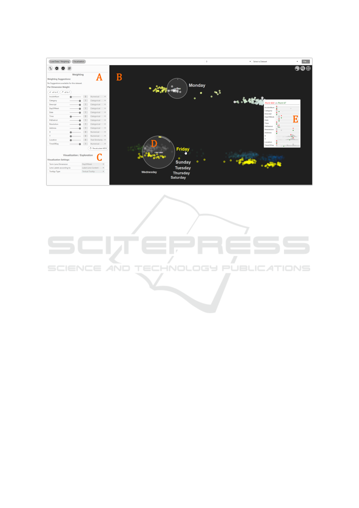
Figure 2: Overview of the visualization prototype. The image shows the (B) visual result of a planar projection of 1000 crime
reports filed in San Francisco for (A) eight different dimensions. This combination of dimensions represents the starting point
of our study with which we confronted each data analyst. In order to answer posed questions about the data, analysts used
a minimal set of interaction techniques. Analysts could (A) steer the considered dimensions, (D) investigate the data using a
selection lens, or (E) clicking and hovering points to get detailed information of single crime reports. Also, analysts could (C)
change the dimension considered by the lens and switch between a textual and histogram representation.
aims at unifying different data types and reflect their
respective nature (Bernard et al., 2014). Existing ap-
proaches consider primarily categorical data or the
combination with numerical data. For example, Par-
allel Sets (Kosara et al., 2006) shows the frequencies
of categories instead of individual data records with
a restriction to the amount of categories that can be
visualized at the same time.
For the combination of numerical and categori-
cal data, Rosario et al. (Rosario et al., 2004) and
Johansson and Johansson (Johansson and Johansson,
2009b) proposed to quantify categorical data; results
can then be visualized using, for example, Scatter-
plots or Parallel Coordinates (Inselberg, 1985). In
contrast, Bernard et al. (Bernard et al., 2014) iden-
tify relevant subgroups in mixed datasets by abstract-
ing the data into bins. Another method, named the
Contingency Wheel (Alsallakh et al., 2012), allows
to interactively analyze associations of contingency
tables using a radial representation; associations are
shown by connections between corresponding cate-
gorical segments.
One major issue in view of crime data is, that
these methods only consider numerical and categor-
ical data. Crime data, however, consists of numeri-
cal, textual, and categorical data. Making such data
comparable is challenging, in particular for combina-
tions of values. Towards incorporating multiple data
types, DR techniques are worth a look. The curse of
dimensionality (Hinneburg et al., 2000) impedes the
ability to efficiently identify patterns in large multi-
variate data. Hence, DR techniques strive for expos-
ing the most relevant dimensions and present a lin-
ear or non-linear combination of the input dimensions
(Manly, 2004). Similar to Principal Component Anal-
ysis (Jolliffe, 1986) (PCA), Correspondence Analysis
(Benz
´
ecri, 1973) (CA) applies to categorical data and
projects the values to two dimensional space using χ
2
statistic. Going one step further, Multidimensional
Scaling (Cox and Cox, 2000) (MDS) attempts to pre-
serve the distance between any two data entries as
good as possible. MDS, therefore, requires a distance
or dissimilarity matrix as input allowing to preserve
the relations between any values, whose dissimilari-
ties can be expressed numerically. Building on this,
we use the Gower Metric (Gower, 1971) to unify sim-
ilarity measures for different data types. Then, users
can steer and explore the result.
2.2 Visual Analysis of Projections
Relations between dimensions in multivariate data
projections are complex and require the human in the
loop to make sense of (Sacha et al., 2016; Yi et al.,
2005). State-of-the-art techniques assume that for
users not trained in advanced statistics it is particu-
larly difficult. Ward and Martin (Ward and Martin,
1995) and Buja (Andreas Buja, 1996) presented inter-
IVAPP 2017 - International Conference on Information Visualization Theory and Applications
166

active systems for multivariate data inspired by sev-
eral issues and combinations of interactions. Recent
work can be categorized into two evaluation types: (1)
user studies and (2) case studies, application exam-
ples, or other. Various systems have been presented
in the past claiming to improve the understanding for
users or domain experts through interactive manipu-
lation. While there is no doubt that these approaches
improve the understanding of multivariate data, only
few approaches have actually conducted a user study
to show the impact. They typically showcase their
approach using application examples (Seo and Shnei-
derman, 2005; Nam and Mueller, 2013; Krause et al.,
2016), use cases/case studies (Johansson and Johans-
son, 2009a; Ingram et al., 2010; Turkay et al., 2011;
Fernstad et al., 2013; Turkay et al., 2012; Yuan et al.,
2013; Liu et al., 2014), or other (Jeong et al., 2009).
In contrast, only few approaches conducted a user
study. For example, researchers propose systems to
help better understand DR results, in particular the
distance function (Yi et al., 2005; Brown et al., 2012).
Seldmair et al. (Sedlmair et al., 2013) went one step
further and provided guidance for DR representation
techniques, however, the study was carried out with
two users not related to the data, but trained in ma-
chine learning and advanced statistics. Another eval-
uation was presented by Stahnke et al. (Stahnke et al.,
2016). The authors evaluated the interaction with DR
results but did not involve domain experts having a
certain incentive and mind set about the data.
Krause et al. (Krause et al., 2016) find very clear
words for a situation that, to the best of our knowl-
edge, has not been proven yet: they assume, that for
domain experts not trained in advanced statistics and
machine learning, it is very difficult to interpret DR
results. This is a strong statement we pick up and
investigate in this paper. We reached out to a small
group of data analysts of a LEA who analyze raw data
tables for correlations and outliers on a daily basis.
3 VISUALIZATION PROTOTYPE
Crime data comprises different data types making it
challenging to interpret DR results; these are numer-
ical, textual, and categorical data types. For this rea-
son, we created a visualization prototype that fuses
different data types and provides a minimum set of
interactions to support the interpretation. One par-
ticular feature of our prototype is the close link be-
tween data type and interaction concepts. Each con-
sidered dimension and associated similarity function
can be interactively changed at runtime with direct ef-
fect on the depiction of the projection. Figure 3 out-
Dimension/Variable
𝐷
1
𝑠𝑖𝑚
1
𝑤
1
𝐷
2
𝑠𝑖𝑚
2
𝑤
2
𝐷
3
𝑠𝑖𝑚
3
𝑤
3
…
𝐷
𝑛
𝑠𝑖𝑚
𝑛
𝑤
𝑛
Weighting & Similarity
Visual Data Exploration
Projection
Steering
Figure 3: A multivariate dataset comprises n different di-
mensions. In the first step, the system automatically assigns
a similarity function based on the data type and a weight
to each dimension. The weight is set to the value 1 in the
possible range [0;1]. This means, every dimension is fully
considered. The data is then projected to 2D space allowing
the domain expert to explore the data, who can adapt the
weights and similarities according to the findings.
lines the structure of this section. First, we describe
the integration of weight and similarity in regard to
the dimension and data type, and then we provide an
overview of applied interaction concepts.
3.1 Weighting & Similarity
DR techniques preserve the relevant structure of the
data, which is typically represented in lower dimen-
sional space using the concept of proximity or sim-
ilarity between data objects. The application of DR
techniques considers the similarity between objects
based on all dimensions unless told otherwise, not
necessarily reflecting the incentive of the domain ex-
pert. Therefore, we include the known concept of
dimension-wise weighting. This way, the domain ex-
pert can define the impact of each single attribute al-
lowing to concentrate on relations and thus patters
that only occur in certain combinations of dimen-
sions, namely the subspaces. Furthermore, multivari-
ate crime data comprises different data types between
which similarities are expressed differently. State-of-
the-art DR techniques are typically based on similar-
ities and distances between solely numerical or cate-
gorical values. However, crime data comprises differ-
ent data types beyond merely numbers or categories.
Gower’s idea to address this issue is to use similarity
functions in the range [0;1] for each dimension D
i
and
then to aggregate the results. We compute the pair-
wise distance between two multivariate data entries A
and B based on the Gower Metric (Gower, 1971):
dist(A, B) =
|dim|
∑
i=1
sim
i
(A
i
, B
i
) · w
i
|dim|
(1)
The distance between A and B is computed by iter-
ating all dimensions (from i = 1 up to the amount of
dimensions |dim|) and calculating the respective dis-
tance between two dimensions A
i
and B
i
. Using the
Interpretation of Dimensionally-reduced Crime Data: A Study with Untrained Domain Experts
167

user-defined similarity function, the i-th similarity be-
tween the i-th dimensions is computed. sim
i
refers to
the similarity function assigned to the i-th dimension.
Finally, we multiply the result with the user-assigned
weight w
i
and build the average by dividing the over-
all result by the amount of dimensions |dim|.
The Gower Metric is applied together with
MDS (Cox and Cox, 2000), a linear DR technique
– also known as multivariate projection – that en-
ables exploration of the global data structure. We in-
clude the Gower Metric in our prototype and enable to
change the weight and similarity of each dimension at
all times with direct impact to the result. Crime data
consists of numerical, textual, and categorical data.
Numerical values include any numerical data type:
integers, floats, timestamps, etc. We compute the sim-
ilarity between numerical values V
1
and V
2
using the
Euclidean distance:
sim(V
1
, V
2
) = |V
1
−V
2
| (2)
Note that the range of computed similarity values be-
tween numerical values may vary. Therefore, numer-
ical values need to be normalized using rescaling be-
fore computing the similarity.
Textual dimensions comprise continuous text ab-
stracted from sets of documents. The similarity be-
tween two documents is typically computed using
the cosine similarity in vector space (Singhal, 2001).
To do so, the documents are transformed into vector
space according to a bag-of-words model and the re-
sulting vectors v
1
and v
2
are then compared using the
cosine similarity:
sim(v
1
, v
2
) =
v
1
· v
2
kv
1
k · kv
2
k
(3)
Categorical dimensions are typically characterized
by unordered textual values that express a category.
We apply Iverson Brackets (Graham et al., 1994) to
compute the similarity between two categorical val-
ues V
1
and V
2
:
sim(V
1
, V
2
) = [V
1
6= V
2
] (4)
If to categories are the same, the similarity is 0 and 1
otherwise. In this paper, the similarity can be seen as
a synonym for distance since our aim is to compute a
distance matrix as input for the MDS.
In the following section, we describe that users
can switch between a text label and histogram rep-
resentation. In preparation for this concept, we need
to quantify the data. Numerical values are binned
to value ranges and categorical values are binned ac-
cording to the categories. For textual values, we use
the result of the bag-of-words-model and assign the
frequency; we show a frequency distribution among
extracted terms. In order to bin textual values, we
compute the cosine distance between term vectors to
the empty string and bin the results.
3.2 Visual Data Exploration
So far, the user can control the dimension-wise
weighting and similarity function. To let the user in-
terpret and make sense of the presented depiction of
DR results, we provide a set of interaction techniques
that consider the given dimension-wise information.
We propose to combine visualization and interac-
tion with dimension-wise information allowing users
to perform the low-level tasks in an explorative setup:
identify, compare, and summarize projected data ob-
jects (Brehmer and Munzner, 2013). To ease the en-
try point to exploration, we allow panning and zoom-
ing and double encode the implicit relations in the
data using color (D
¨
ork et al., 2012). Double encod-
ing significantly helps to distinguish between patterns
or point clusters, even if they seem to overlap; when
overlapping, a color gradient reflects the separation.
We apply the perceptual linear color mapping for sup-
porting analysis of patterns in high dimensional data
spaces by Mittelst
¨
adt et al. (Mittelst
¨
adt et al., 2014).
A salient result of this method is depicted in Figure 1.
To interactively tackle the progressive tasks from
identification to comparison to summarization, we
following describe three interaction concepts adapted
to the exploration of multivariate data. For the iden-
tification and comparison of objects, we provide an
adaptive tooltip as well as an interactive lens. For
comparing and summarizing data objects, we provide
a fingerprint matrix that encodes distributions on a
per-dimension basis.
3.2.1 Tooltip and Content Lens
We distinguish between two types of visual represen-
tations for the abstraction of different data types: his-
tograms for quantitative data and weighted text labels
otherwise. This decision results from the data itself.
In multivariate crime data, we encounter text, differ-
ent types of numbers, and categories. In general, we
can use text labels to show any of this information,
however, histograms are more effective for quantita-
tive information or distributions within a dimension.
The user can interactively change the representation
from text labels to histograms and vice versa.
In order to identify and compare single data ob-
jects in relation to others, Stahnke et al. (Stahnke
et al., 2016) proposed to use a tooltip. The integration
of dimension-wise histograms into the tooltip plus a
visual cue indicating the position of the hovered data
IVAPP 2017 - International Conference on Information Visualization Theory and Applications
168
object allows to bring the object of interest into rela-
tion of the overall data distribution. If the user clicks
on one object and hovers another one, an additional
cue is inserted into the tooltip allowing to bring both
data objects into relation (see Figure 2(E)). In planar
projections, for example, one is interested in the dis-
juncture of patterns. Telling in which dimensions and
how two points differ improves the understanding.
156/402156/402
0 10
Figure 4: The interactive lens consists of three additional
parts: a textual indication of selected points, a radial his-
togram, and the visualization of the values included in the
selection. Left: visualization of the quantified content by a
histogram. Right: visualization of the content by labels.
We provide an interactive lens for the selection
and exploration of multiple data objects. A com-
prehensive survey about lenses has been carried out
by Tominski et al. (Tominski et al., 2014). Figure
4 depicts two lens approaches which can be interac-
tively swapped during exploration. The lens consists
of three additional parts: First, a textual hint of how
many points are selected located in the center of the
lens. Second, a visual representation reflecting the
content of the lens; either as text label or histogram.
Third, a radial bar indicating the amount of objects se-
lected in relation to the entire amount of objects. If the
user selects a value, all object occurrences are high-
lighted throughout the 2D data space. The left side of
Figure 4 depicts the representation of quantified val-
ues using a histogram visualization. The right side de-
picts the representation as text labels. The main issue
with labels is that they try to optimize the amount of
labels as well as the proximity to the object within the
lens. However, a label can refer to several selected ob-
jects. Our aim is to stabilize the layout and maintain
the order of information based on given frequencies.
Therefore, we use a radial labeling algorithm which
starts on the right hand side of the lens with the high-
est frequency and then adds labels counterclockwise
in descending order until the starting point is reached.
To prevent overlap, we check the position of the last
label and move along the border of the lens to posi-
tion the new label. Note that the user can exchange
the considered dimension.
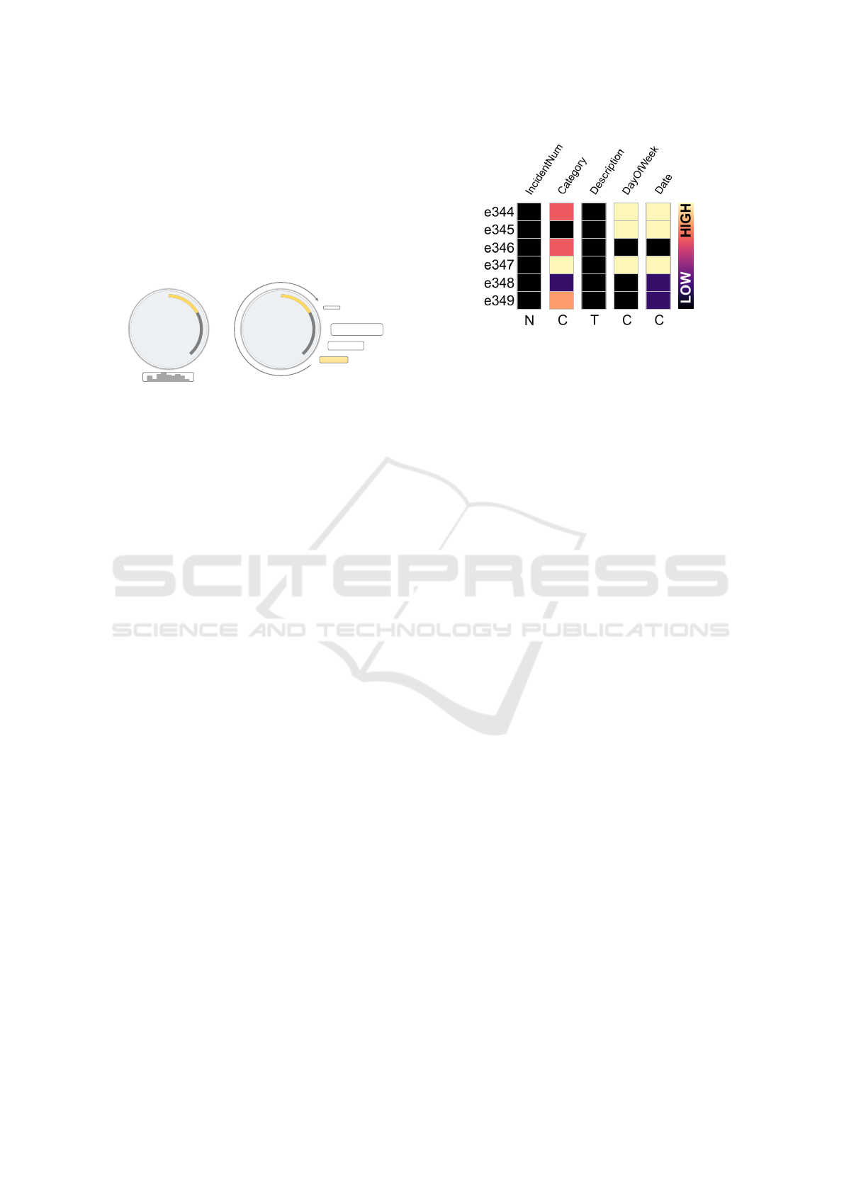
Figure 5: Excerpt from the fingerprint matrix for five di-
mensions and six entries. The value of each dimension is
binned based on the quantification. The size of the bin is
then mapped to the color. This example shows that all Inci-
dentNum are unique, because the color of all rows refers to
the lowest possible value. In contrast, the dimension Day-
OfWeek shows that the data entries happen on at least four
different days: three rows are mapped to black (unique) and
three have a very high binning value, meaning that these
entries possibly share the same day.
3.2.2 Fingerprint Matrix
The lens also serves to select object groups for further
analysis. Sets of objects can be compared dimension-
wise using a so called fingerprint matrix. Figure 5
shows an excerpt. On the top, each column is labeled
according to its dimension name. On the bottom, the
data type is shown based on the quantification: num-
ber (N), category (C), or text (T) with respect to the
crime datasets. Each dimension is colored according
to the value scale from low (black) to high (yellow)
data values. The matrix is linked to the projected data
view using brushing and linking. Users can drill down
to full detail by clicking on a row. A new window
opens showing the raw multivariate data presented as
a table. To be able to compare different patterns, the
user can store and merge multiple selections.
4 INTERPRETATION STUDY
This study investigates if domain experts, who work
with raw multivariate data tables on a daily basis, are
able to interpret the abstract 2D representation of DR
results given their inexperience in advanced statistics.
Ellis and Dix carved out problems that come along
with evaluating visualizations such as complexity, di-
versity, and measurement which can be reduced to
two major issues: the generative nature of visualiza-
tions and the lack of clarity of the purpose (Ellis and
Dix, 2006). Results of DR techniques, in particular,
Interpretation of Dimensionally-reduced Crime Data: A Study with Untrained Domain Experts
169
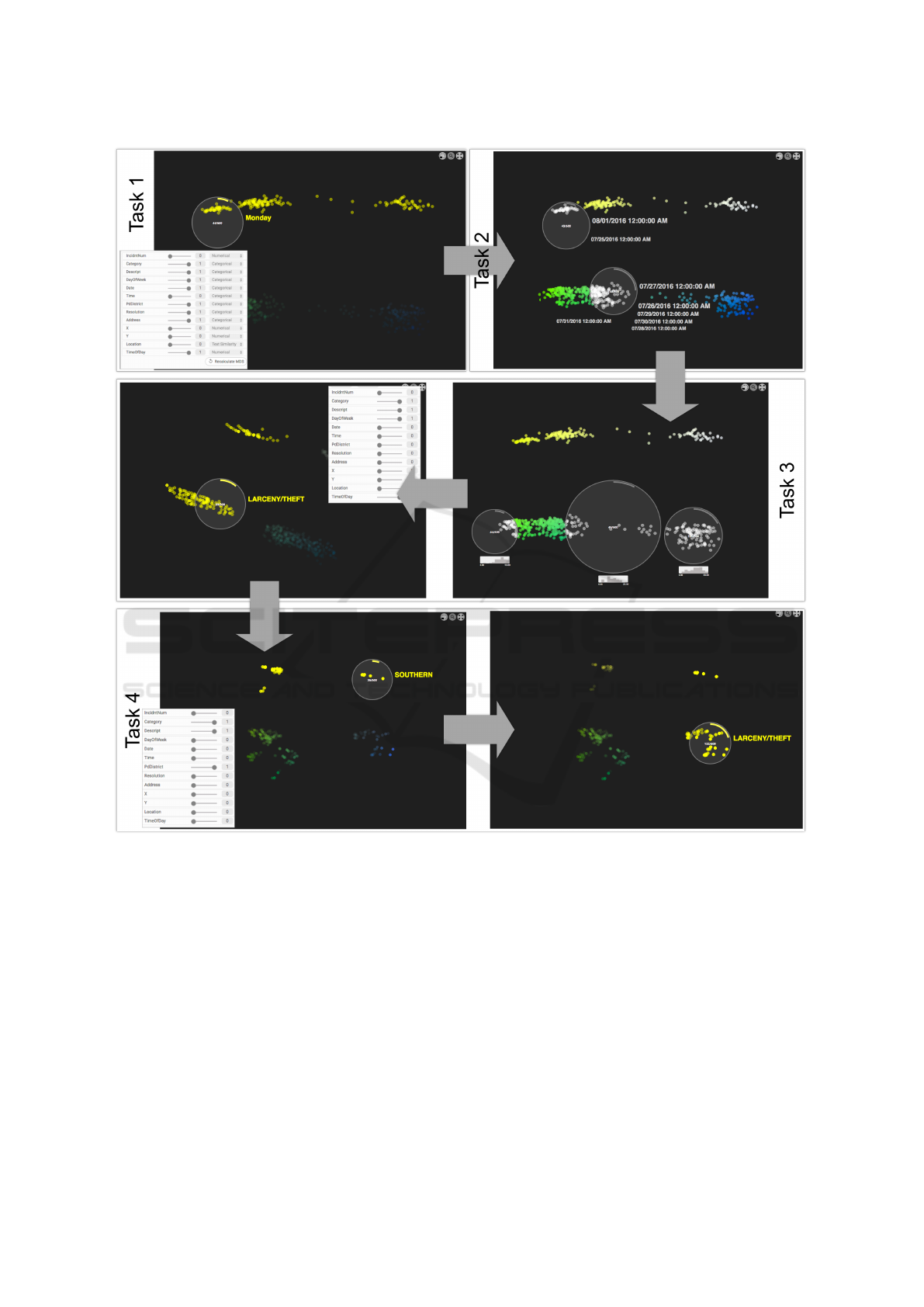
Figure 6: Subsequent workflow of interpretation tasks. Each task corresponds to one question posed to the analyst order. The
DR results of the Tasks 1 to 4 can be interpreted as follows: In Task 1, the DR result splits the data into four clusters. Using
the lens, one knows that the top left entries occurred on a Monday. This is because of the selection option: When hovering
data objects with the lens, one can click on a label and all occurrences are highlighted. In this case, the upper two clusters
are highlighted when clicking on Monday. In Task 2, we can assume that the two dates on the top left lens correspond to two
Mondays since these dates appear where the Monday cluster was found. As a result, the bottom clusters correspond to all
remaining days of the week. In Task 3, the upper two clusters still correspond to the two Mondays. Changing the lens labels
to Category reveals a huge cluster of Larceny/Theft. Building the intersection between the Monday and Larceny/Theft clusters
means that the upper left cluster contains Larceny/Theft that occurred on a Monday. Changing the dimension-wise weighting
in Task 4 reveals a similar phenomenon: Out of 10 police districts, the upper two clusters correspond to the Southern district.
The two clusters on the right are categorized as Larceny/Theft. In conclusion, the upper right cluster contains Larceny/Theft
that only occurred in the Southern part of San Francisco.
aggregate the information to such extent that it is chal-
lenging to interpret what the similarities or distances
are made of; which dimension contributes in which
way to the final layout or structure presented to the
user. We argue that domain experts approach a com-
plex visualization differently, which is why we con-
ducted a guided explorative study – a phenomenolog-
ical analysis, to be precise.
IVAPP 2017 - International Conference on Information Visualization Theory and Applications
170

4.1 Participants
We reached out to the research department of a Law
Enforcement Agency and recruited 3 data analysts
(1 female) not trained in DR techniques or advanced
statistics. One participant was trained in basic statis-
tics but not in DR techniques. All participants had
normal or corrected to normal vision. All participants
work with multivariate data tables on a daily basis,
however, are not used to working with abstract data
representations such as planar projections.
4.2 Apparatus
The studies were conducted using a 15” notebook
monitor, one QWERTY keyboard, and one cord
mouse. The display has a resolution of 1920x1080
pixels. The prototype was presented in full screen to
the LEA researchers. For later analysis, we captured
the screen as well as the voice of the participant.
4.3 Data
The main issue about real-world crime data is that it
is highly sensitive. However, for our study we con-
fronted the analysts with data that reflects real data as
realistic as possible. We found that among others, the
cities San Francisco, Chicago, and New York host an
open data clearinghouse. We asked the LEA data an-
alysts to align their data structure with the structure of
the available open data with the result that a thorough
description of the occurred crime is missing. How-
ever, the data analysts asserted that the open data re-
flects the main contents by means of dimensions and
thus suits our study. There was no need to prepro-
cess the data. In order to prepare the study and de-
fine the tasks, we chose the San Francisco Bay Area
2
as a data source. The data consists of 13 dimen-
sions, among them 6 categorical dimensions (Cate-
gory, Day of Week, Date, PdDistrict, Resolution, Ad-
dress), 5 numerical dimensions (IncidentNo, Time, X,
Y, Time of Day), and 2 textual dimension (Descrip-
tion, Location). Thereby, the Category consists of 36
different crime categories, the Resolution indicates if
and how a crime was solved, and X and Y correspond
to longitude and latitude. We – the authors of this
paper – are familiar with the city due to several vis-
its and know about specific characteristics of districts
as well as no-go areas. Because LEA data analysts
typically analyze the data in weekly intervals and due
to a seven day week this is also the shortest possible
period to identify patterns, we chose the data for the
week from Monday, July 25, 2016 to Monday, August
2
SF OpenData: https://data.sfgov.org/
1, 2016. Note that this week includes two Mondays,
a design decision to force a moment of Ah-hah!. We
will elaborate this decision in the next Section.
4.4 Tasks
The overall aim is to investigate whether untrained
data analysts can interpret the 2D depiction of DR
results given a minimum set of interactions. We
created four consecutive tasks that force the analyst
to gain a deeper understanding of the data by means
of how data objects are grouped and how they differ
from others. Figure 6 outlines all four tasks and
their ordering. Following, we describe each task, its
structure, and what the model solution looks like.
Task 1: Is there a pattern among dimensions
between days?
The first task introduces the analyst to the data.
Figure 6 and Figure 2 show the starting point. The
starting point consists of a pre-calculated result for
the dimensions Category, Description, Day of Week,
Date, PdDistrict, Resolution, Address, and Time of
Day. The analyst can change this setup at all times,
we would not interrupt the process. The sheer amount
of dimensions that build up the four big clusters force
the analyst to focus on one single dimension and
to see whether this dimension impacts the pattern.
In the model solution we can see that two out of
four clusters contain crimes that solely occurred
on a Monday. The lens is placed on the top left
cluster, a click on the only label Monday highlights
all occurrences: the upper two clusters. This task can
be solved by either using the tooltip, the content lens,
or the fingerprint matrix. For the sake of clarity, the
images in Figure 6 primarily make use of the content
lens. Once the analyst has identified this patter, we
proceed to Task 2.
Task 2: Why is the day Monday separated from all
other days of the week? What is special about the
Date distribution?
In the second task, we ask for the reason of this pat-
tern – two out of four clusters occurred on a Monday.
Switching one’s focus to the dimension Date reveals
that Monday, in contrast to all other days of the week,
is assigned to two different days. Since the two dates
appear at the same position, where the day Monday
was determined, one can assume that there are two
Mondays distributed among the two clusters at the
top. One can conclude that all other days of the week
are distributed among the two bottom clusters. Also
the Monday clusters cover approximately one third
of the overall data. This is the first Ah-hah! moment
Interpretation of Dimensionally-reduced Crime Data: A Study with Untrained Domain Experts
171

of the study, where the analyst is supposed to obtain
new insight.
Task 3: Which distribution of dimension values
can you find for the rest of the week?
The histogram attached to the lens reveals that there
is a trend of crimes towards night time. The bottom
left and bottom right lens contain increased crimes
at nighttime while the crimes in between tend to
happen on daytime. Because of this temporal trend,
the analyst adapts the multivariate projection and
narrows the dimensions down to Category, Descrip-
tion, Day of Week, and Time of Day. The result are
again four clusters, two of them separated because
of the double entry Monday. The two upper clusters
again correspond to Monday, which can be observed
via animation when one changes the weightings. To
explain this phenomenon, the analyst analyzes the
dimension Category that reveals a second pattern.
Two out of four clusters deal a lot with Larceny/Theft,
which can be identified by clicking on the lens label.
Changing to the dimension Description shows that
the category Larceny/Theft consists mainly of grand
auto theft, petty, and lock.
Task 4: Leaving the temporal aspect behind, is
there a pattern based on places or crime types?
For this task the analyst has to change the projec-
tion and neglect the temporal aspect. The selection
of the dimensions Category, Description, and PdDis-
trict, however, shows again four huge clusters. In-
vestigating these clusters by Category and PdDistrict
reveals that there is one cluster that builds the inter-
section between the Southern part of San Francisco
and the category Larceny/Theft. To locals this may be
of no surprise, but most likely for the data analyst.
4.5 Procedure
The study was carried out in a quiet room at the
premises of a LEA. Each data analyst was placed in
front of the notebook and received an introduction to
the data dimensions and the interaction techniques.
Each interaction technique was shown separately with
a different dataset in order to not influence the actual
study. The data analyst and the interviewer (experi-
menter) were the only persons present in the room.
Each data analyst was confronted with the same
task order, however, we always started with the first
task and then introduced the subsequent task as an
analysis question we posed to the analyst. We pro-
vided spoken clues if the analyst was not able to ac-
complish the given task. We further asked each data
analyst to think aloud (Boren and Ramey, 2000) and
give insight not only in which interaction he or she
is physically executing next, but also what the incen-
tive and approach was. This way, we get an idea
whether the analyst understands the results and is able
to draw conclusions. All interactions were recorded
using screen capturing and the voice was recorded us-
ing the built-in notebook microphone.
After the study, we showed the analyst a labeled
screenshot of the system and let him/her fill out a
questionnaire regarding the basic understanding, the
interaction concepts, and the extraction of knowledge.
Furthermore, analysts filled out a form providing ad-
ditional positive and negative feedback about the anal-
ysis of DR results.
5 FINDINGS
We started this study with one question we posed to
the data analysts. During the analysis we encountered
four interesting situations which we will elaborate in
this section as findings (F). Note that we introduced
the interaction techniques but did not provide any
further conceptual explanation of the meaning of the
2D multivariate projection.
F1: The analysis starts with an already known
hypothesis.
To start the study, we posed one specific question
(Task 1) to the analysts, yet we could not influence
the mindset and thus the approach taken. Each
analyst first tried to verify his or her hypothesis of
the unknown data before tackling the task asked. All
three analysts started by changing the depiction to the
setup of the routine activity. This means, they first
tried to approve a temporal and occasional pattern.
F2: Analysts always consider to add/remove dimen-
sions to the depiction to explain a cluster separation.
The tasks consisted of two examples of cluster
separations among one dimension: two clusters for
Monday and two for the category Larceny/Theft.
For both cases, all three analysts added or removed
dimensions to track visual changes in the multivariate
depiction. One participant even used dimension-wise
weights in 0.2 steps to track minor changes. This
finding is particular interesting, because we did
not provide any conceptual explanation of cluster
separation factors to the analysts.
F3: Analyst do not add/remove dimensions to explain
an anomaly they are insecure about.
We observed that analysts subsequently add or
remove dimensions to explain a cluster separation,
IVAPP 2017 - International Conference on Information Visualization Theory and Applications
172

however, they do not follow this routine if they
cannot explain something unexpected in the data. For
example, before they started to add other dimensions,
they first sought for an explanation using the content
lens, the tooltip, or the fingerprint matrix.
F4: Analysts untrained in DR have a great under-
standing of a multivariate depiction given a use case
relating to their domain.
All three data analysts had a great understanding
of the multivariate data depiction. Following their
procedure and interviewing them afterwards showed,
that in spite of initial difficulties, they easily built a
deeper understanding for the data and the correlations
in it. It took the analyst in average 30 minutes to solve
all given tasks. The first half of this time was used to
confirm their hypothesis and to solve Task 1. After
that, the analysis speed increased drastically. One
analyst noted that he is searching for variances among
one dimension but a DR technique is different, “there
is a big pot and you can combine lots of different
things together”. All analysts recognized that they
need to adapt their way of thinking but at the same
time acknowledged that using DR is a great way to
check correlations quickly.
The fact that DR techniques state an entirely different
approach to analyze crime data also hinders the in-
tegration into the standard workflow of the analysts.
To efficiently use DR in their workflow, the analysts
wish for additional statistics helping to interpret the
configuration of clusters and outliers.
The observation of the participants also revealed
the extensive use of the lens in combination with
the manual steering of the dimension-wise weights.
Steering the weights represents an essential interac-
tion concept to understand which dimensions corre-
late. Then, applying the lens enables the straight-
forward exploration of the configuration without over-
whelming the analyst with too much information.
While the simplicity of the lens was appreciated by
the analysts, they also wished for more elaborated se-
lection techniques since a lens restricts the selection
to a circular extent as well as additional statistics as
mentioned before.
The evaluation of our questionnaire furthermore
showed that all analysts found it very easy to under-
stand dependencies in the data and that clusters cor-
responded their expectations. However, one analyst
found it difficult to draw conclusions based on de-
picted correlations among dimensions.
6 DISCUSSION
We discuss the results of our study as well as the study
procedure. Overall, the study was well-received by
the data analysts. While the study seems very easy
for someone trained in advanced statistics, we like to
highlight that solving the described tasks by only an-
alyzing the raw data table represents a real challenge.
The study was structured and guided which can
be in conflict with the idea of a purely explorative
study. However, we posed a question and observed
the analyst tackling this question. There were no re-
strictions by means of time or analysis; as a matter
of fact, the analysts started the study by confirming
their own hypothesis, which can be considered as ex-
plorative, however, they had to tackle specific tasks
using a minimal set of interaction techniques.
The interaction techniques are a means to an end
to solve the tasks. The study also gives insight in the
application of the interaction techniques which, how-
ever, was not the focus of this study. The findings
of this study regarding the interpretation of multivari-
ate patterns were not possible without any interaction
possibilities given. A data point in 2D space has a
x- and y-value, we cannot assume if this point cor-
responds to Monday or belongs to a category such as
Larceny/Theft. It becomes even more difficult for cor-
relations among multiple dimensions. The position
of each data point conceals multivariate dependen-
cies. We need interaction in order to draw conclusions
about similarities and distances between data points.
Also, we used state-of-the-art interaction techniques
allowing us to transfer the results to other systems that
use similar interaction approaches.
6.1 Limitations and Future Work
The present paper has a number of limitations we aim
to cope with in future work. Our study showed that
domain experts can understand a multivariate projec-
tion, if they are familiar with the task and data type.
This raises two questions. Are three domain experts
enough to prove this point? Do domain experts, who
are not analyzing data on a daily basis, perform simi-
larly? We specifically aimed for domain experts who
analyze data on a daily basis, but are untrained in DR.
One can imagine that it is difficult to find participants
who qualify for this study, given the recent rise of ma-
chine learning and data analytics among industries.
Often domain experts apply concepts but cannot look
into the so called black box, where the algorithms are
computed. This study represents a first attempt to in-
vestigate whether domain experts can interpret the re-
sults by steering high level parameters. The domain
Interpretation of Dimensionally-reduced Crime Data: A Study with Untrained Domain Experts
173

experts showed us that one does not have to be trained
in DR or advanced statistics to understand DR results.
Even though we conducted this study with only three
participants, we consider it as representative. In fu-
ture work, we plan to extend our prototype with more
advanced interaction concepts such as touch, the se-
lection of non-circular regions, and the integration of
different data sources. We encountered that LEAs
adapt rapidly to and bring forward current research.
Furthermore, we plan to extend our study to domains
such as finance or health care, also considering dif-
ferent DR approaches. Still, it is difficult to identify
experts who work with the data and analyze it, but
have not applied machine learning or advanced statis-
tics yet.
7 CONCLUSION
In this paper, we conducted a study to investigate
whether domain experts, untrained in advanced statis-
tics, can interpret the 2D depiction of DR results.
Several approaches to improve the understanding of
multivariate data for domain experts have been pub-
lished in recent years. However, and to the best of
our knowledge, proposed approaches have not been
evaluated with domain specific data together with un-
trained domain experts. Our study shows that the do-
main experts of a LEA effectively adapt to abstract
representations of the data if they are familiar with
the tasks and the type of data.
ACKNOWLEDGEMENTS
We like to thank the LEA data analysts for their par-
ticipation in the study and their feedback during the
sessions. This work was partly supported by the EU
project Visual Analytics for Sense-making in Crimi-
nal Intelligence Analysis (VALCRI) under grant num-
ber FP7-SEC-2013-608142 and the German Research
Foundation (DFG) within projects A03 and C01 of
SFB/Transregio 161.
REFERENCES
Agency, N. P. I. (2008). Practice advice on analysis. Tech-
nical report, Association of Chief Police Officers by
the National Policing Improvement Agency.
Alsallakh, B., Aigner, W., Miksch, S., and Gr
¨
oller, M. E.
(2012). Reinventing the contingency wheel: Scalable
visual analytics of large categorical data. IEEE Trans.
Vis. Comput. Graph., 18(12):2849–2858.
Andreas Buja, Dianne Cook, D. F. S. (1996). Interactive
high-dimensional data visualization. Journal of Com-
putational and Graphical Statistics, 5(1):78–99.
Benz
´
ecri, J. (1973). L’analyse des donn
´
ees: L’analyse des
correspondances. L’analyse des donn
´
ees: lec¸ons sur
l’analyse factorielle et la reconnaissance des formes et
travaux. Dunod.
Bernard, J., Steiger, M., Widmer, S., L
¨
ucke-Tieke, H., May,
T., and Kohlhammer, J. (2014). Visual-interactive
exploration of interesting multivariate relations in
mixed research data sets. Comput. Graph. Forum,
33(3):291–300.
Boren, T. and Ramey, J. (2000). Thinking aloud: Reconcil-
ing theory and practice. IEEE transactions on profes-
sional communication, 43(3):261–278.
Brehmer, M. and Munzner, T. (2013). A multi-level ty-
pology of abstract visualization tasks. IEEE Trans.
Visualization and Computer Graphics (TVCG) (Proc.
InfoVis), 19(12):2376–2385.
Brown, E. T., Liu, J., Brodley, C. E., and Chang, R.
(2012). Dis-function: Learning distance functions in-
teractively. In 2012 IEEE Conference on Visual An-
alytics Science and Technology, VAST 2012, Seattle,
WA, USA, October 14-19, 2012, pages 83–92.
Cox, T. and Cox, A. (2000). Multidimensional Scaling, Sec-
ond Edition. Chapman & Hall/CRC Monographs on
Statistics & Applied Probability. CRC Press.
D
¨
ork, M., Carpendale, M. S. T., and Williamson, C. (2012).
Visualizing explicit and implicit relations of com-
plex information spaces. Information Visualization,
11(1):5–21.
Ellis, G. P. and Dix, A. J. (2006). An explorative analysis
of user evaluation studies in information visualisation.
In Proceedings of the 2006 AVI Workshop on BEyond
time and errors: novel evaluation methods for infor-
mation visualization, BELIV 2006, Venice, Italy, May
23, 2006, pages 1–7.
Fernstad, S. J., Shaw, J., and Johansson, J. (2013). Quality-
based guidance for exploratory dimensionality reduc-
tion. Information Visualization, 12(1):44–64.
Gower, J. C. (1971). A general coefficient of similarity and
some of its properties. Biometrics, 27(4):857–871.
Graham, R. L., Knuth, D. E., and Patashnik, O. (1994).
Concrete Mathematics: A Foundation for Computer
Science. Addison-Wesley Longman Publishing Co.,
Inc., Boston, MA, USA, 2nd edition.
Hinneburg, A., Aggarwal, C. C., and Keim, D. A. (2000).
What is the nearest neighbor in high dimensional
spaces? In VLDB 2000, Proceedings of 26th Interna-
tional Conference on Very Large Data Bases, Septem-
ber 10-14, 2000, Cairo, Egypt, pages 506–515.
Ingram, S., Munzner, T., Irvine, V., Tory, M., Bergner, S.,
and M
¨
oller, T. (2010). Dimstiller: Workflows for di-
mensional analysis and reduction. In Proceedings of
the IEEE Conference on Visual Analytics Science and
Technology, IEEE VAST 2010, Salt Lake City, Utah,
USA, 24-29 October 2010, part of VisWeek 2010,
pages 3–10.
Inselberg, A. (1985). The plane with parallel coordinates.
The Visual Computer, 1(2):69–91.
IVAPP 2017 - International Conference on Information Visualization Theory and Applications
174

Jeong, D. H., Ziemkiewicz, C., Fisher, B. D., Ribarsky, W.,
and Chang, R. (2009). ipca: An interactive system for
pca-based visual analytics. Comput. Graph. Forum,
28(3):767–774.
Johansson, S. and Johansson, J. (2009a). Interactive dimen-
sionality reduction through user-defined combinations
of quality metrics. IEEE transactions on visualization
and computer graphics, 15(6):993–1000.
Johansson, S. and Johansson, J. (2009b). Visual analy-
sis of mixed data sets using interactive quantification.
SIGKDD Explorations, 11(2):29–38.
Jolliffe, I. (1986). Principal component analysis. Springer
series in statistics. Springer-Verlang.
Kosara, R., Bendix, F., and Hauser, H. (2006). Parallel
sets: Interactive exploration and visual analysis of
categorical data. IEEE Trans. Vis. Comput. Graph.,
12(4):558–568.
Krause, J., Dasgupta, A., Fekete, J.-D., and Bertini, E.
(2016). SeekAView: an intelligent dimensionality
reduction strategy for navigating high-dimensional
data spaces. Large Data Analysis and Visualization
(LDAV), IEEE Symposium on.
Lawrence E. Cohen, M. F. (1979). Social change and crime
rate trends: A routine activity approach.
Liu, S., Wang, B., Bremer, P., and Pascucci, V. (2014).
Distortion-guided structure-driven interactive explo-
ration of high-dimensional data. Comput. Graph. Fo-
rum, 33(3):101–110.
Manly, B. (2004). Multivariate Statistical Methods: A
Primer, Third Edition. Taylor & Francis.
Mittelst
¨
adt, S., Bernard, J., Schreck, T., Steiger, M.,
Kohlhammer, J., and Keim, D. A. (2014). Revisit-
ing Perceptually Optimized Color Mapping for High-
Dimensional Data Analysis. In In Proceedings of the
Eurographics Conference on Visualization, pages 91–
95. The Eurographics Association.
Nam, J. E. and Mueller, K. (2013). Tripadvisor
n-d
: A
tourism-inspired high-dimensional space exploration
framework with overview and detail. IEEE Trans. Vis.
Comput. Graph., 19(2):291–305.
Rosario, G. E., Rundensteiner, E. A., Brown, D. C., Ward,
M. O., and Huang, S. (2004). Mapping nominal val-
ues to numbers for effective visualization. Information
Visualization, 3(2):80–95.
Sacha, D., Zhang, L., Sedlmair, M., Lee, J. A., Peltonen, J.,
Weiskopf, D., North, S. C., and Keim, D. A. (2016).
Visual interaction with dimensionality reduction: A
structured literature analysis. IEEE Transactions on
Visualization and Computer Graphics, PP(99):1–1.
Sedlmair, M., Munzner, T., and Tory, M. (2013). Empir-
ical guidance on scatterplot and dimension reduction
technique choices. IEEE Trans. Vis. Comput. Graph.,
19(12):2634–2643.
Seo, J. and Shneiderman, B. (2005). A rank-by-feature
framework for interactive exploration of multidimen-
sional data. Information Visualization, 4(2):96–113.
Singhal, A. (2001). Modern information retrieval: A brief
overview. IEEE Data Eng. Bull., 24(4):35–43.
Stahnke, J., D
¨
ork, M., M
¨
uller, B., and Thom, A. (2016).
Probing projections: Interaction techniques for in-
terpreting arrangements and errors of dimensional-
ity reductions. IEEE Trans. Vis. Comput. Graph.,
22(1):629–638.
Tominski, C., Gladisch, S., Kister, U., Dachselt, R., and
Schumann, H. (2014). A Survey on Interactive Lenses
in Visualization. In EuroVis State-of-the-Art Reports,
pages 43–62. Eurographics Association.
Turkay, C., Filzmoser, P., and Hauser, H. (2011). Brushing
dimensions - A dual visual analysis model for high-
dimensional data. IEEE Trans. Vis. Comput. Graph.,
17(12):2591–2599.
Turkay, C., Lundervold, A., Lundervold, A. J., and Hauser,
H. (2012). Representative factor generation for the
interactive visual analysis of high-dimensional data.
IEEE Trans. Vis. Comput. Graph., 18(12):2621–2630.
Ward, M. O. and Martin, A. R. (1995). High dimen-
sional brushing for interactive exploration of multi-
variate data. In IEEE Visualization, page 271.
Yi, J. S., Melton, R., Stasko, J. T., and Jacko, J. A. (2005).
Dust & magnet: multivariate information visualiza-
tion using a magnet metaphor. Information Visualiza-
tion, 4(3):239–256.
Yuan, X., Ren, D., Wang, Z., and Guo, C. (2013). Di-
mension projection matrix/tree: Interactive subspace
visual exploration and analysis of high dimensional
data. IEEE Trans. Vis. Comput. Graph., 19(12):2625–
2633.
Interpretation of Dimensionally-reduced Crime Data: A Study with Untrained Domain Experts
175
